

Brown green color palettes balance earthy warmth with natural freshness, making them easy to trust and comfortable to look at.
From forest-inspired branding to cozy interiors and modern UI, these pairings stay versatile across print and digital design.
In this article
- Why Brown Green Palettes Work So Well
-
- forest walnut
- mossy terracotta
- cedar meadow
- olive espresso
- sage linen
- pine bark contrast
- fern clay studio
- avocado cocoa pop
- woodland minimal
- vintage herb shop
- rainy trail
- desert juniper
- matcha leather
- garden stone
- autumn grove
- botanical editorial
- cozy cabin night
- fresh market signage
- earthy kids classroom
- modern eco ui
- oak and eucalyptus
- What Colors Go Well with Brown Green?
- How to Use a Brown Green Color Palette in Real Designs
- Create Brown Green Palette Visuals with AI
Why Brown Green Palettes Work So Well
Brown and green are “real-world” colors: wood, soil, leaves, herbs, stone, and textiles. That natural association makes designs feel grounded, calm, and believable—especially for eco, wellness, food, and lifestyle brands.
Visually, green often carries the structure (navigation, headers, primary UI) while brown adds warmth and tactility. Together they create contrast without looking harsh, which helps layouts stay readable and premium.
Because both families include muted and deep shades, you can dial the vibe from airy and modern (sage + linen) to cinematic and moody (pine + bark) without changing the overall theme.
20+ Brown Green Color Palette Ideas (with HEX Codes)
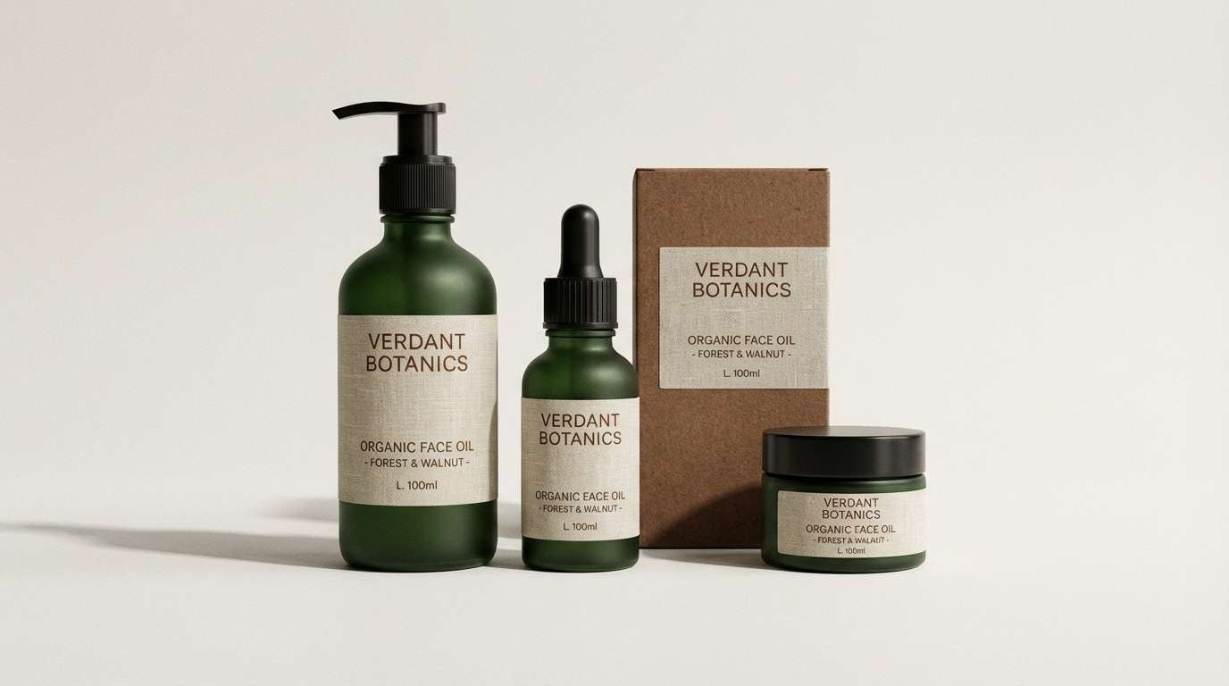
1) Forest Walnut
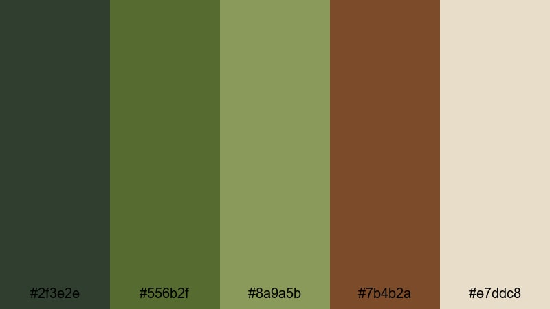
HEX: #2F3E2E #556B2F #8A9A5B #7B4B2A #E7DDC8
Mood: grounded and outdoorsy
Best for: sustainable branding and packaging
Grounded and outdoorsy, it evokes shaded pines, mossy paths, and warm walnut shells. The deep greens give authority while the walnut brown adds craft and heritage. Use the linen tone as breathing room for labels, headers, and ingredient lists. Pair with uncoated paper textures and a single metallic accent (brass or copper) for a premium eco finish.
Image example of forest walnut generated using media.io
Media.io is an online AI studio for creating and editing video, image, and audio in your browser.

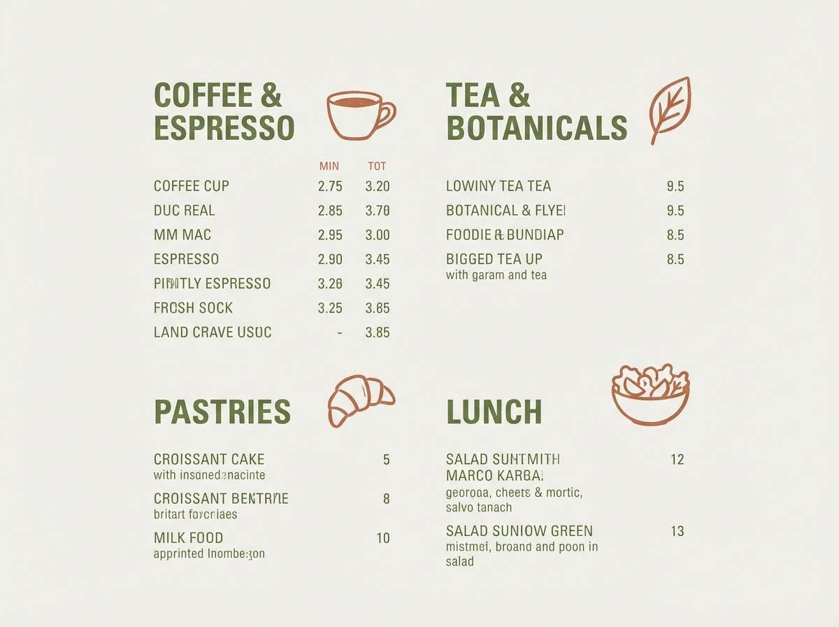
2) Mossy Terracotta
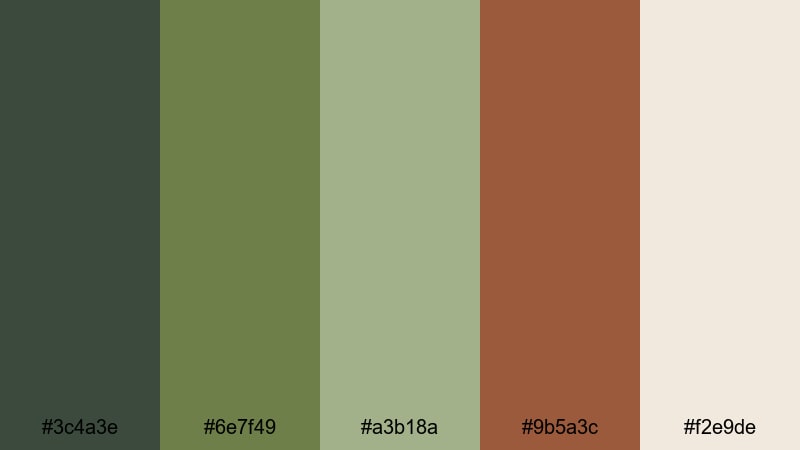
HEX: #3C4A3E #6E7F49 #A3B18A #9B5A3C #F2E9DE
Mood: warm and artisanal
Best for: cafe menus and hospitality branding
Warm and artisanal, these tones feel like a sunlit greenhouse with clay pots and fresh herbs. Terracotta brings appetite and friendliness, while moss and sage keep it calm and organic. Use the creamy neutral for menu backgrounds to improve readability under warm lighting. A tip: set headings in terracotta and reserve the darkest green for prices and key calls to action.
Image example of mossy terracotta generated using media.io
3) Cedar Meadow
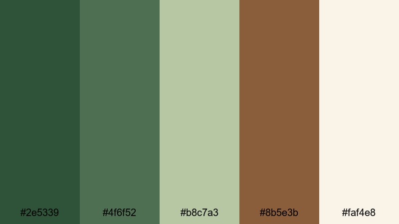
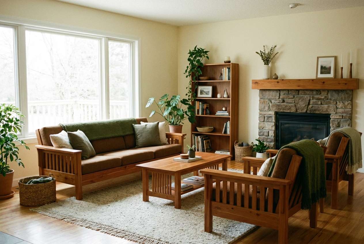
HEX: #2E5339 #4F6F52 #B8C7A3 #8B5E3B #FAF4E8
Mood: calm and homey
Best for: cozy interior design and decor
Calm and homey, it suggests cedar cabinets, leafy houseplants, and airy linen curtains. The meadow green range works beautifully on walls or textiles, and the cedar brown grounds the room with warmth. Keep the light cream for ceilings or trim to avoid a heavy look. Tip: repeat the mid green in two places (rug + artwork) to make the space feel intentional.
Image example of cedar meadow generated using media.io
4) Olive Espresso
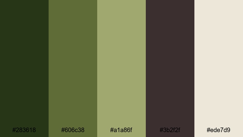
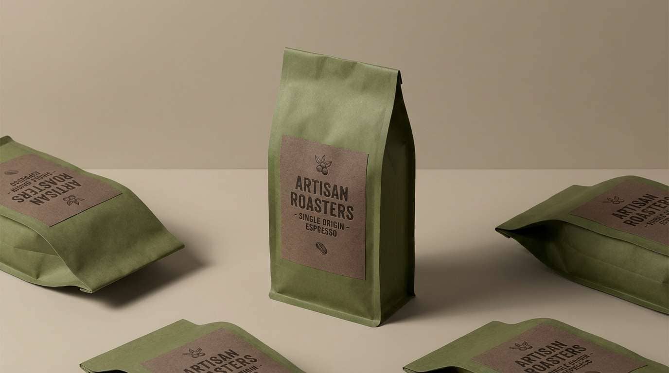
HEX: #283618 #606C38 #A1A86F #3B2F2F #EDE7D9
Mood: bold and refined
Best for: premium coffee packaging and ads
Bold and refined, it feels like an espresso bar wrapped in olive leaves and dark wood. The near-black brown adds luxury contrast, while olive and khaki keep it approachable. Use the light beige for ingredient panels and brew notes so the design stays legible. Tip: keep the darkest tone for small areas (logos, seals) to avoid over-darkening the layout.
Image example of olive espresso generated using media.io
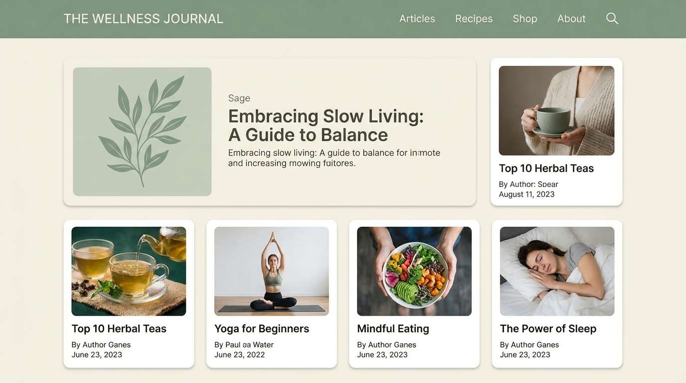
5) Sage Linen
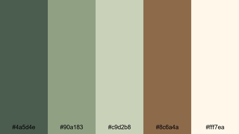
HEX: #4A5D4E #90A183 #C9D2B8 #8C6A4A #FFF7EA
Mood: soft and airy
Best for: wellness websites and blogs
Soft and airy, it brings to mind spa towels, steamed herbs, and quiet morning light. Sage and pale green create a soothing base, while the warm brown keeps the page from feeling cold. Use the near-white linen as your main background for a clean, editorial feel. Tip: set buttons in the deeper sage and use the brown only for small accents like icons or dividers.
Image example of sage linen generated using media.io
6) Pine Bark Contrast
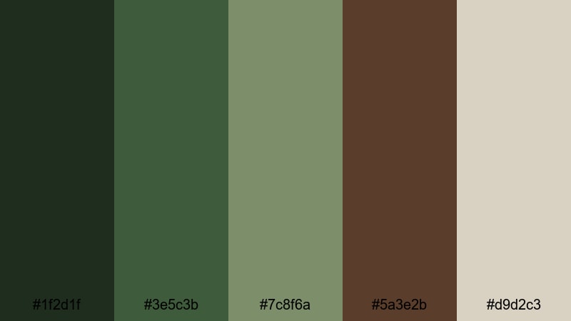
HEX: #1F2D1F #3E5C3B #7C8F6A #5A3E2B #D9D2C3
Mood: rugged and confident
Best for: outdoor gear branding and product pages
Rugged and confident, these shades read like pine needles against textured bark. The near-black green makes strong headers and badges, and the bark brown adds warmth without turning rustic. Use the pale stone neutral to give product photos room to breathe. Tip: keep accent highlights to the mid green so CTAs feel natural, not neon.
Image example of pine bark contrast generated using media.io
7) Fern Clay Studio
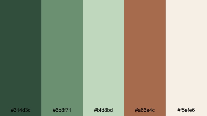
HEX: #314D3C #6B8F71 #BFD8BD #A66A4C #F5EFE6
Mood: creative and handcrafted
Best for: ceramic studio branding and social posts
Creative and handcrafted, it recalls a pottery studio with fern shadows and fresh clay. The clay brown works perfectly for stamps and marks, while the fern greens soften the overall look. Use the pale neutral for post templates so artwork and photos stay the focus. Tip: try a two-color logo using the darkest green and clay for instant artisan character.
Image example of fern clay studio generated using media.io

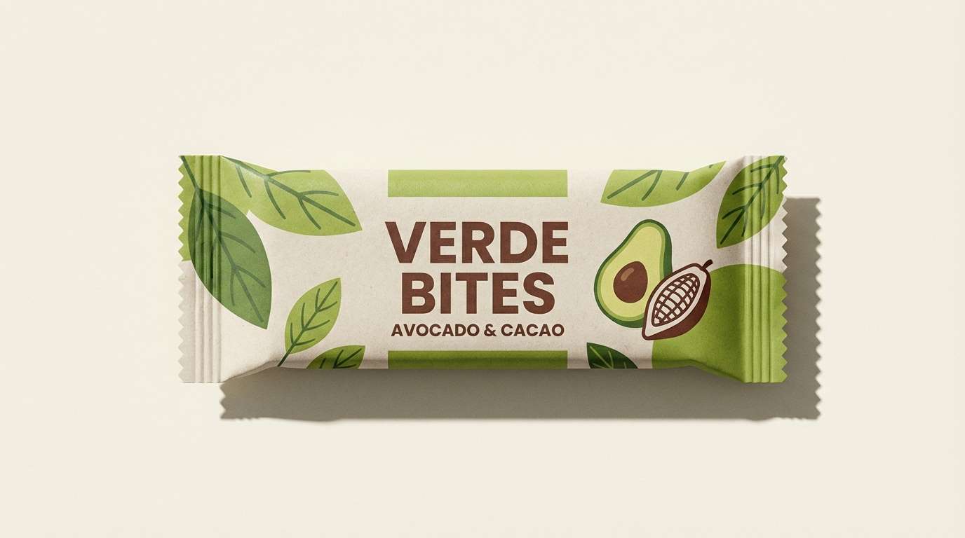
8) Avocado Cocoa Pop
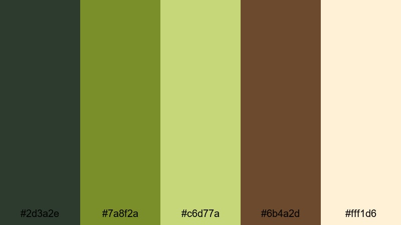
HEX: #2D3A2E #7A8F2A #C6D77A #6B4A2D #FFF1D6
Mood: playful and fresh
Best for: healthy snack packaging
Playful and fresh, it feels like sliced avocado and cocoa nibs on a bright kitchen counter. The punchy green adds energy, while cocoa brown keeps it edible and grounded. Use the creamy background to make nutrition info and icons pop. Tip: keep the brightest green for one hero element (flavor badge or stripe) so it looks intentional, not noisy.
Image example of avocado cocoa pop generated using media.io
9) Woodland Minimal
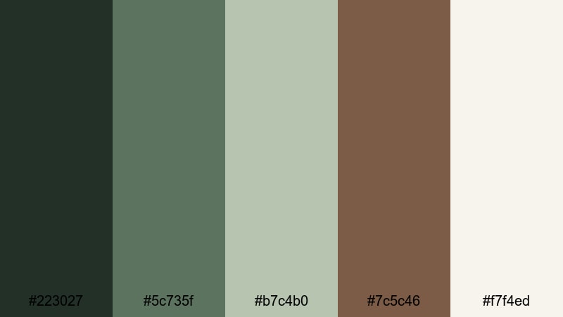
HEX: #223027 #5C735F #B7C4B0 #7C5C46 #F7F4ED
Mood: quiet and modern
Best for: minimal brand identities and logos
Quiet and modern, the mix suggests a clean cabin aesthetic with muted woods and soft greenery. The dark evergreen anchors logos, while the warm brown adds a human touch without feeling vintage. Use the off-white as primary negative space for a premium, minimal look. Tip: choose one accent (either brown or mid green) and let the rest support it to keep the identity crisp.
Image example of woodland minimal generated using media.io
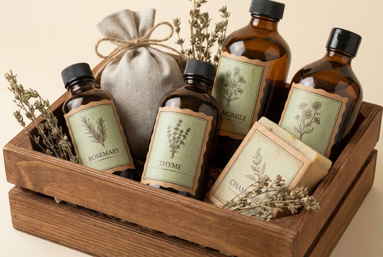
10) Vintage Herb Shop

HEX: #3A4B3F #748C69 #D2C7A8 #8A5A3A #FBF1DF
Mood: nostalgic and welcoming
Best for: apothecary labels and gift sets
Nostalgic and welcoming, it brings up old apothecary drawers, dried herbs, and paper tags. The dusty greens feel trustworthy, and the warm brown adds that hand-labeled charm. Use the tan and cream as your paper base colors to enhance the vintage vibe. Tip: add subtle line illustrations in the darkest green for a cohesive, old-world finish.
Image example of vintage herb shop generated using media.io
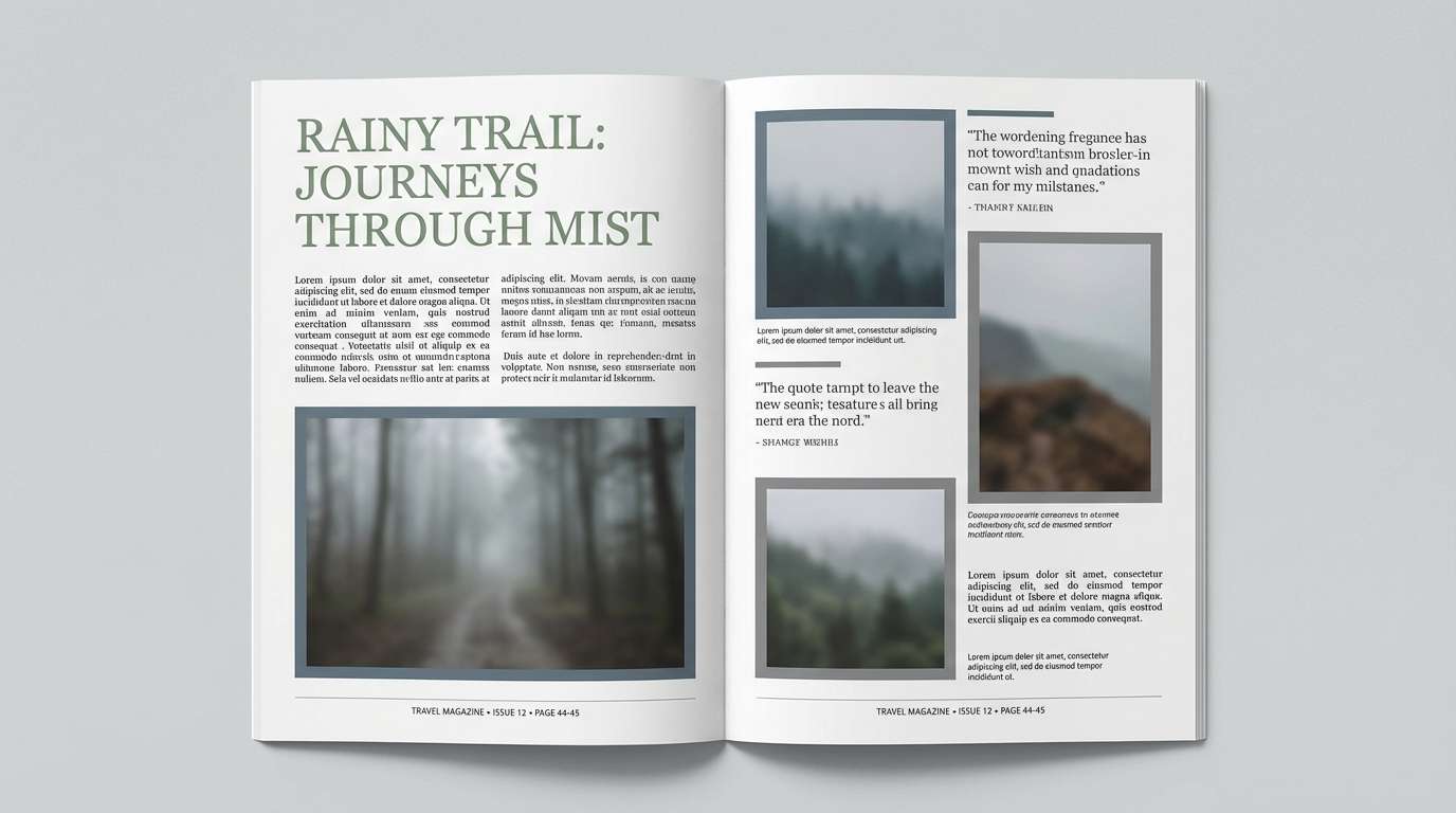
11) Rainy Trail
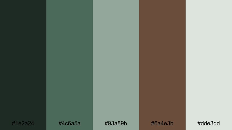
HEX: #1E2A24 #4C6A5A #93A89B #6A4E3B #DDE3DD
Mood: moody and natural
Best for: travel blogs and outdoor editorial
Moody and natural, it feels like wet leaves, foggy evergreens, and damp earth after rain. The cool greens create atmosphere, while the earthy brown keeps the palette human and grounded. Use the misty gray-green as a soft background for article layouts and photo captions. Tip: keep links and CTAs in the medium green so they stand out without breaking the calm tone.
Image example of rainy trail generated using media.io
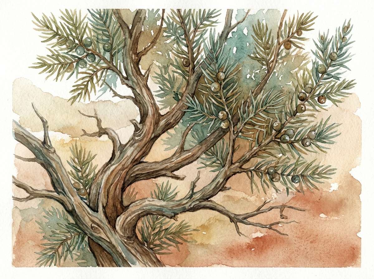
12) Desert Juniper
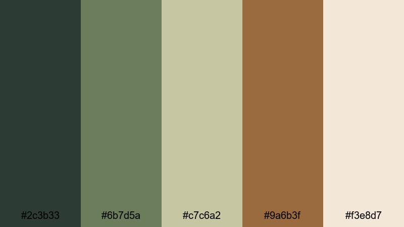
HEX: #2C3B33 #6B7D5A #C7C6A2 #9A6B3F #F3E8D7
Mood: sunbaked and serene
Best for: botanical prints and nature illustration
Sunbaked and serene, it suggests juniper shrubs against sandy trails and warm canyon light. The muted green feels dry and elegant, while the ochre-brown brings desert warmth. Use the pale sand tone for paper backgrounds to keep artwork airy. Tip: outline illustrations in the darkest green to avoid harsh black lines and keep the natural feel.
Image example of desert juniper generated using media.io
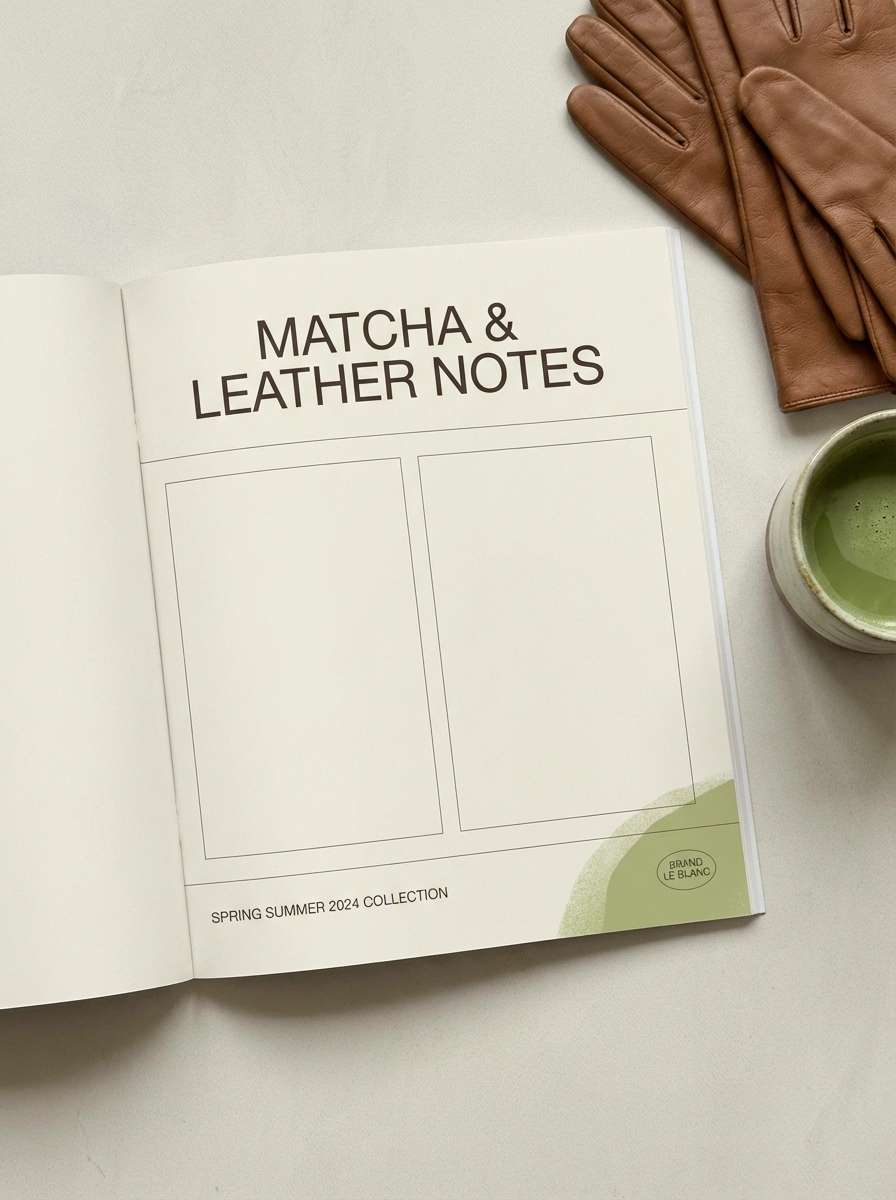
13) Matcha Leather
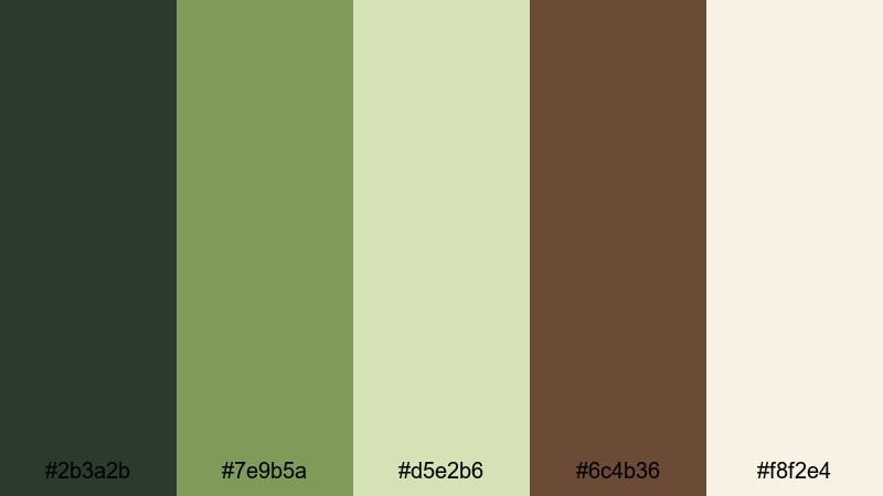
HEX: #2B3A2B #7E9B5A #D5E2B6 #6C4B36 #F8F2E4
Mood: fresh and premium
Best for: fashion lookbooks and boutique branding
Fresh and premium, these tones feel like matcha foam paired with well-worn leather. The lighter greens brighten layouts, and the leather brown adds a luxe, tactile note. Use the cream as your page base to keep the lookbook clean and high-end. Tip: reserve the darkest green for small typographic moments like section titles to maintain elegance.
Image example of matcha leather generated using media.io
14) Garden Stone
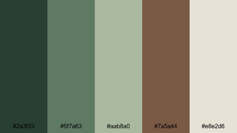
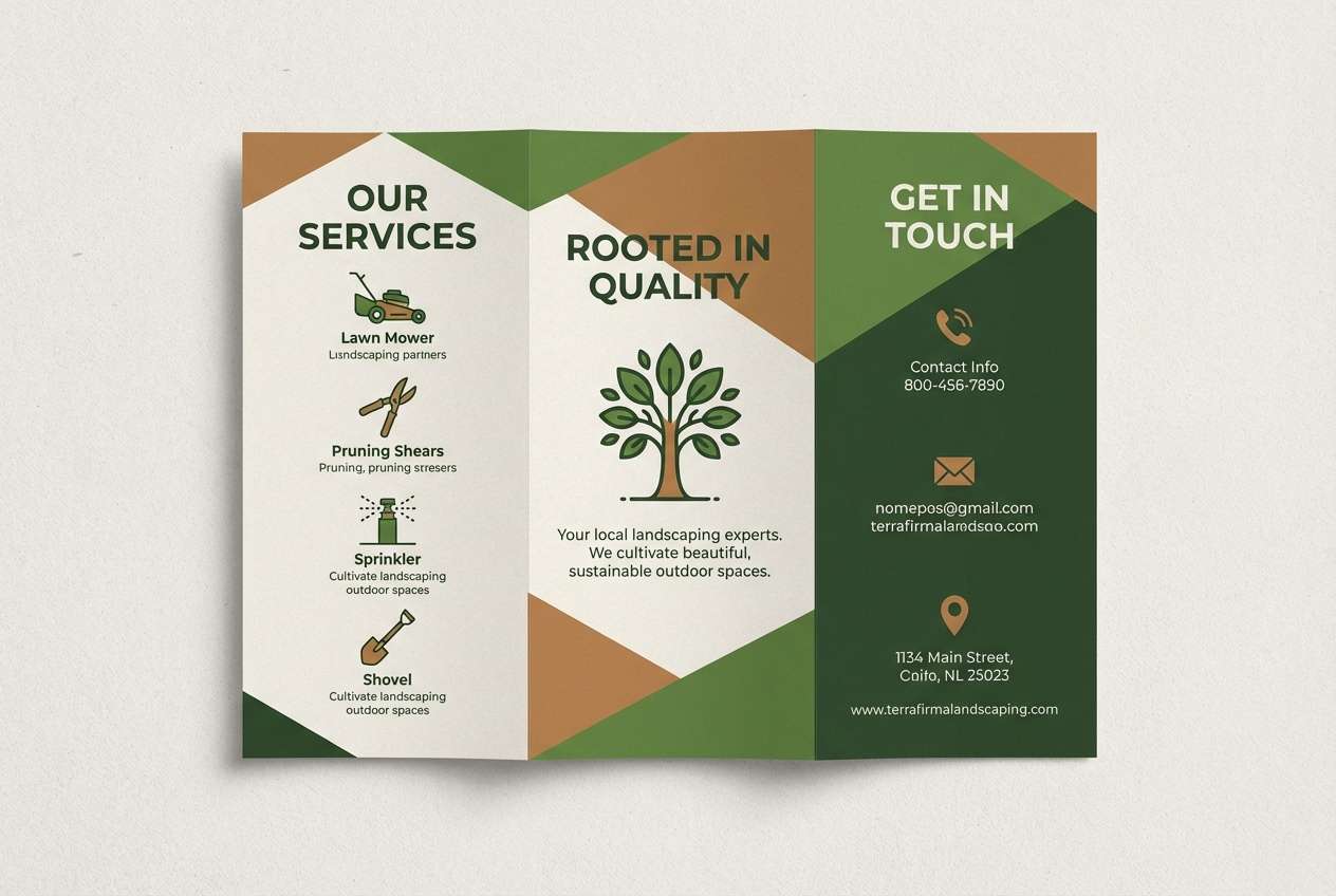
HEX: #2A3F33 #5F7A63 #AAB8A0 #7A5A44 #E8E2D6
Mood: balanced and timeless
Best for: landscaping websites and brochures
Balanced and timeless, it resembles trimmed hedges, stone pavers, and rich soil. The greens read professional and trustworthy, while the warm brown adds approachable warmth. Use the light stone neutral for brochure backgrounds and long-form text blocks. Tip: add thin rules or section dividers in the muted green to keep layouts structured without feeling rigid.
Image example of garden stone generated using media.io
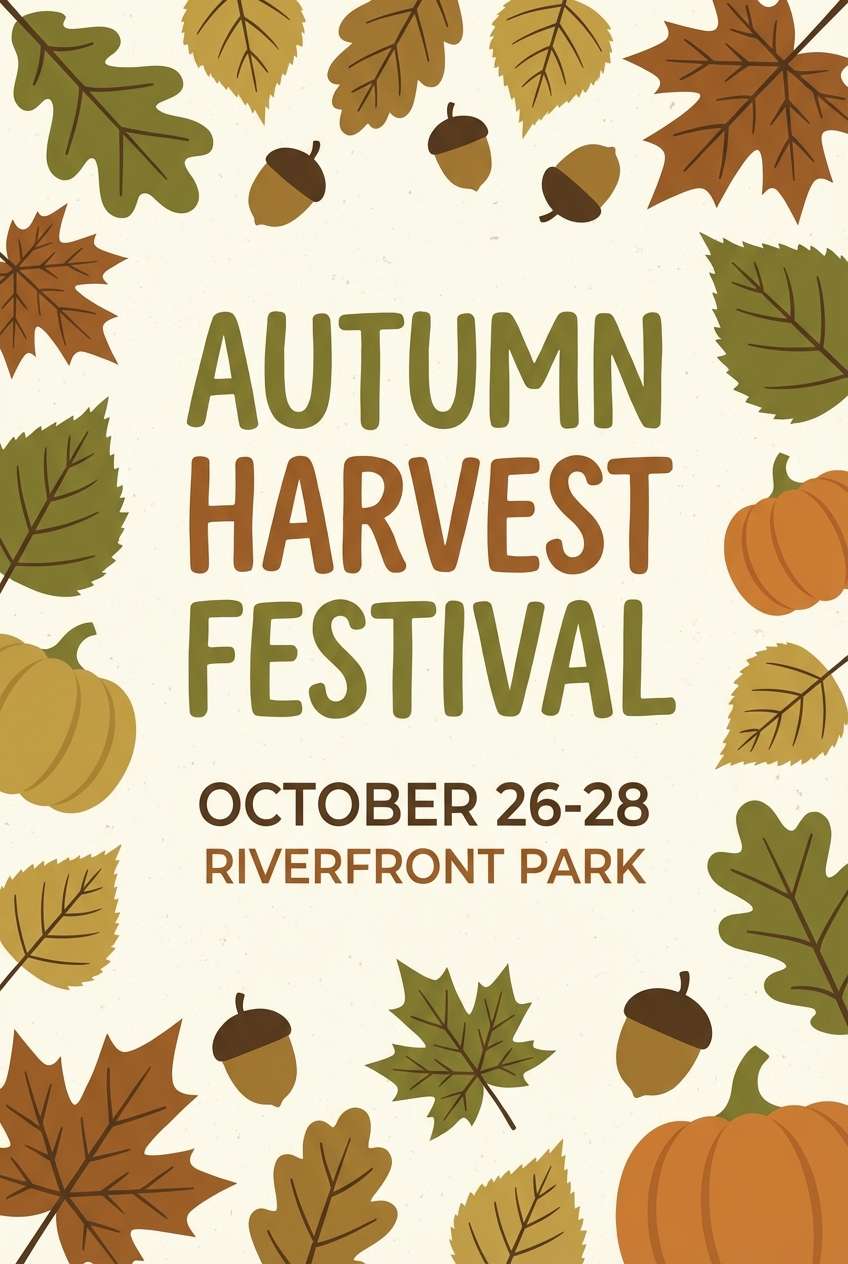
15) Autumn Grove
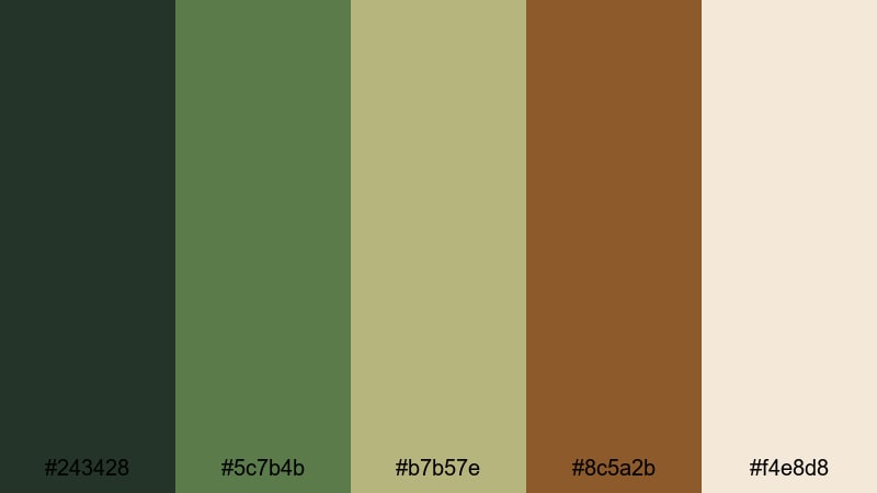
HEX: #243428 #5C7B4B #B7B57E #8C5A2B #F4E8D8
Mood: seasonal and cozy
Best for: fall event posters and promos
Seasonal and cozy, it evokes late-afternoon light in a grove where leaves turn and the air cools. The warm brown reads like toasted bark, and the olive-greens keep the scheme natural instead of overly orange. Use the pale cream for large background areas so your poster stays readable at a distance. Tip: make the headline in the darkest tone and highlight dates with the warm brown for quick scanning.
Image example of autumn grove generated using media.io
16) Botanical Editorial
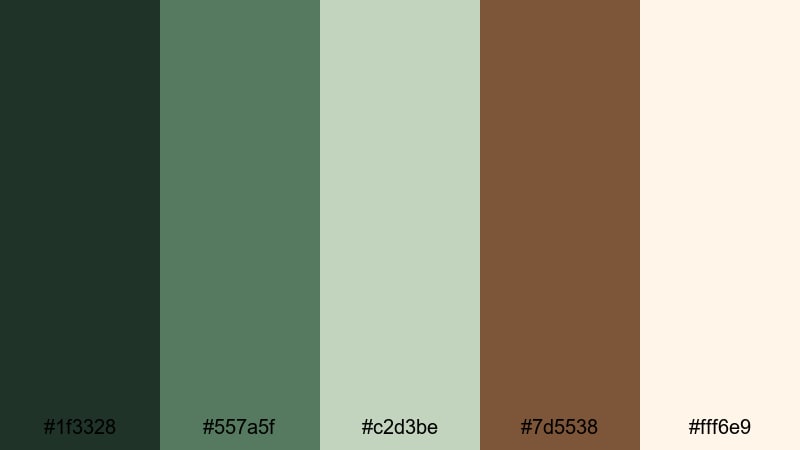
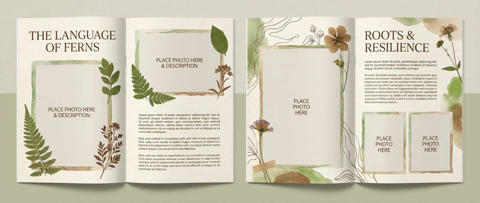
HEX: #1F3328 #557A5F #C2D3BE #7D5538 #FFF6E9
Mood: elegant and calm
Best for: magazine spreads and editorial design
Elegant and calm, it reads like botanical ink sketches on creamy paper. The deep green is perfect for refined headlines, and the brown adds warmth for pull quotes and captions. Use the pale cream for a print-like base and the light green as subtle section blocks. Tip: keep imagery slightly desaturated so the typography remains the hero.
Image example of botanical editorial generated using media.io
17) Cozy Cabin Night
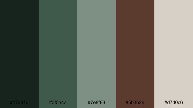
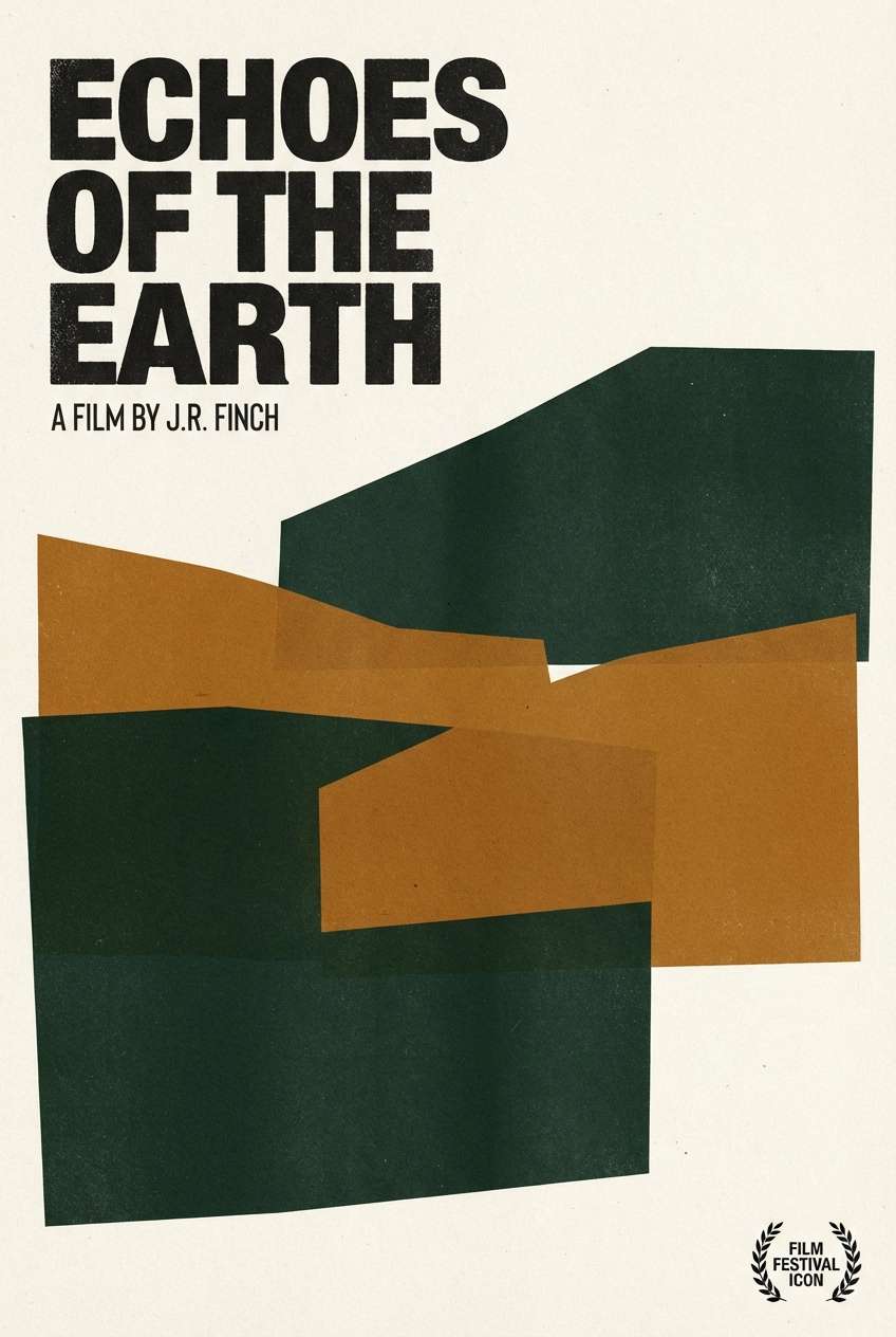
HEX: #17231D #3F5A4A #7E8F83 #5B3B2E #D7D0C6
Mood: intimate and moody
Best for: book covers and film posters
Intimate and moody, it feels like a cabin at dusk with a wood stove glowing inside. The deep green-black sets a cinematic tone, and the brown adds a hint of warmth and story. Use the pale gray-beige for titles so they stay readable on dark backgrounds. Tip: introduce grain or subtle texture overlays to enhance the night-time atmosphere without cluttering the design.
Image example of cozy cabin night generated using media.io
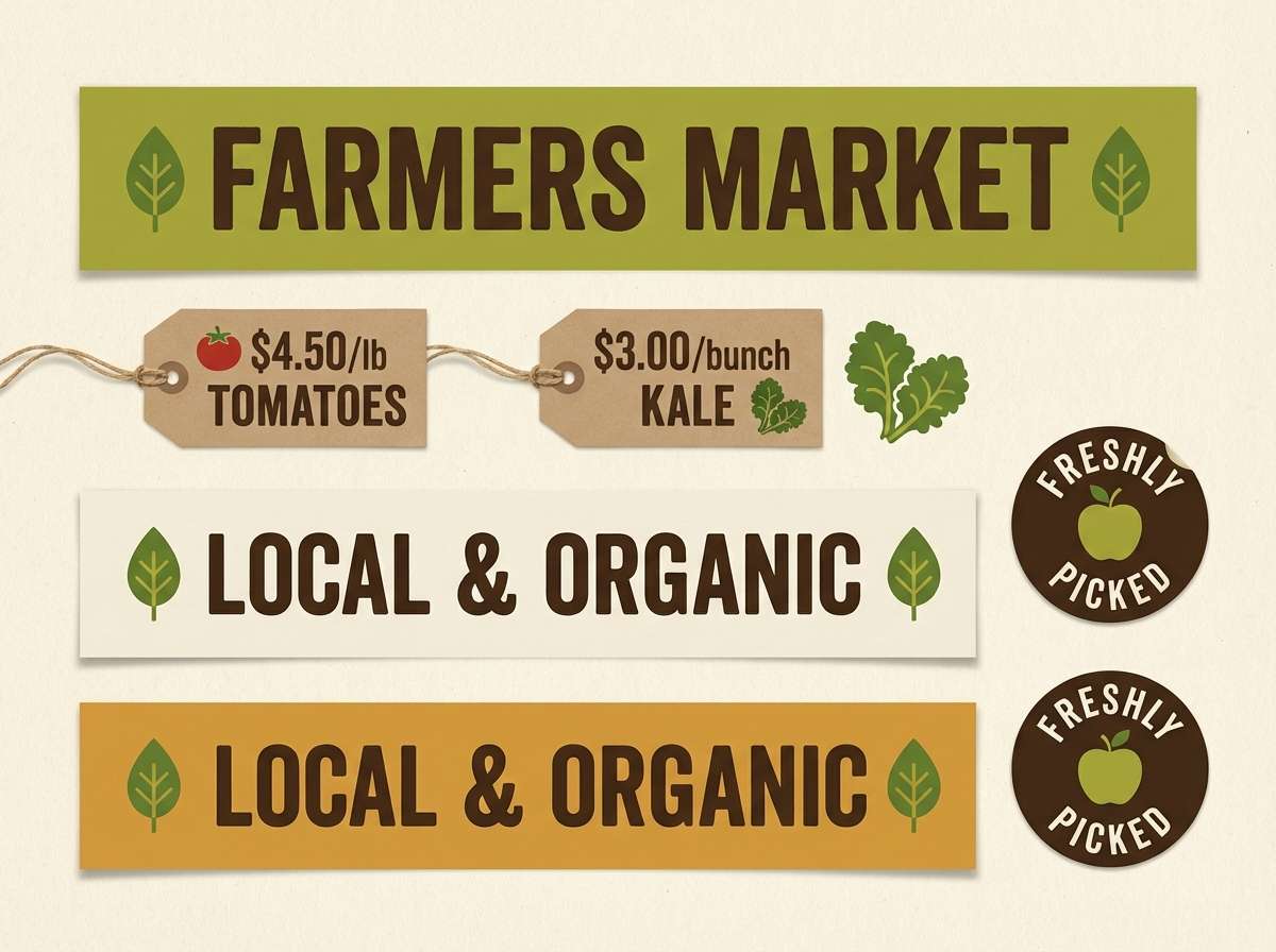
18) Fresh Market Signage
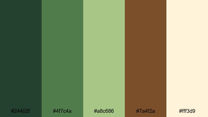
HEX: #24402F #4F7C4A #A8C686 #7A4F2A #FFF3D9
Mood: lively and wholesome
Best for: farmers market signage and labels
Lively and wholesome, it brings to mind stacked produce crates, leafy greens, and wooden stalls. The brighter green feels energetic and fresh, while the warm brown adds that market-made authenticity. Use the creamy yellow as a background so signage stays high contrast in outdoor light. Tip: keep type bold and simple, and use the light green for secondary info like origin or pricing.
Image example of fresh market signage generated using media.io
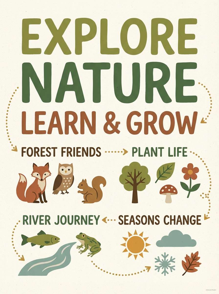
19) Earthy Kids Classroom
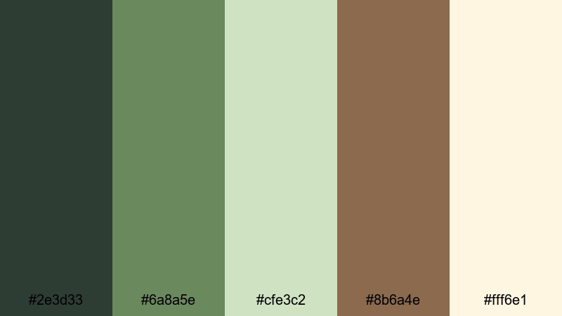
HEX: #2E3D33 #6A8A5E #CFE3C2 #8B6A4E #FFF6E1
Mood: friendly and grounded
Best for: classroom posters and learning printables
Friendly and grounded, it feels like nature-themed learning corners with plants, craft paper, and calm routines. The greens keep materials soothing, and the warm brown adds a comforting, storybook feel. Use the light cream for worksheets to maintain high readability for kids. Tip: stick to the mid green for headings and use the darker tone only for key words to avoid visual fatigue.
Image example of earthy kids classroom generated using media.io
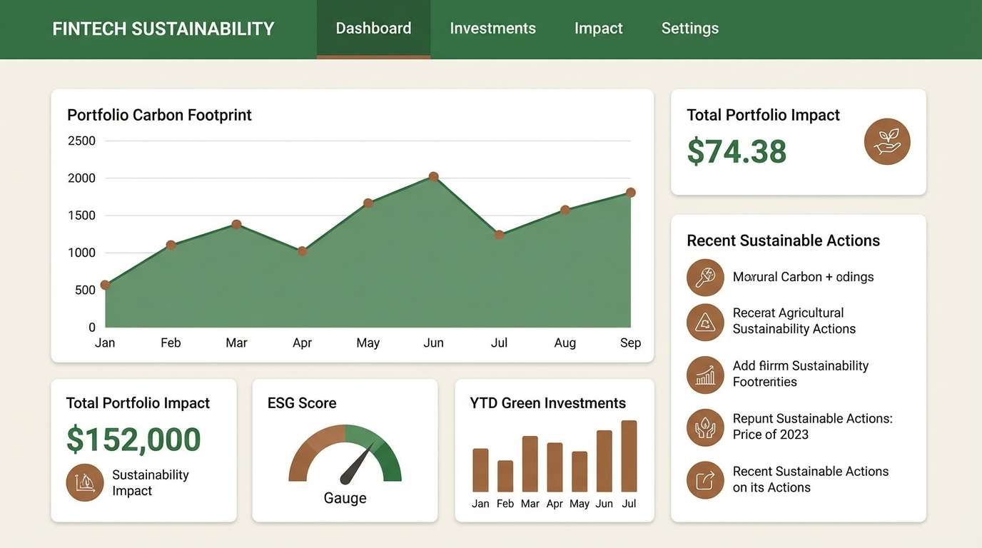
20) Modern Eco UI
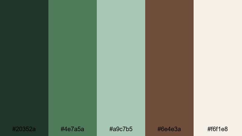
HEX: #20352A #4E7A5A #A9C7B5 #6E4E3A #F6F1E8
Mood: clean and trustworthy
Best for: fintech dashboards with a sustainability angle
Clean and trustworthy, it suggests responsible growth—like a modern dashboard softened by natural tones. The deep green works well for navigation and charts, and the warm brown adds a distinctive accent that doesn’t feel flashy. Use the off-white as the main canvas to keep data dense but readable. Tip: apply the brown sparingly for alerts, highlights, or selected states so the interface stays calm and professional.
Image example of modern eco ui generated using media.io
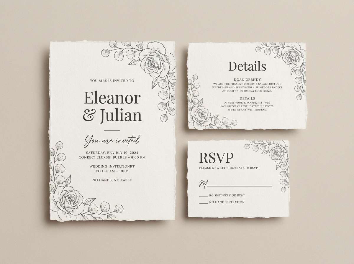
21) Oak and Eucalyptus
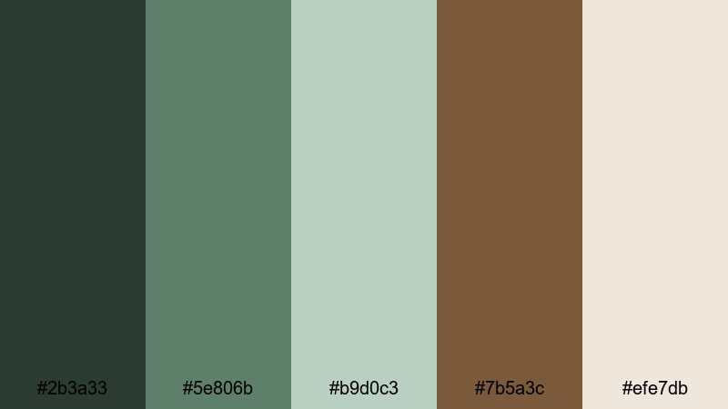
HEX: #2B3A33 #5E806B #B9D0C3 #7B5A3C #EFE7DB
Mood: fresh and natural
Best for: wedding invitations and stationery
Fresh and natural, it feels like eucalyptus sprigs tucked into an oak-toned invitation suite. The soft green reads romantic without going pastel, and the oak brown adds a classic, grounded touch. Use the warm neutral as the paper color for an elevated, tactile look. Tip: print text in the darkest tone and keep the mid green for small flourishes like monograms or borders.
Image example of oak and eucalyptus generated using media.io
What Colors Go Well with Brown Green?
Warm neutrals (cream, linen, sand, stone) make brown-green palettes feel lighter and improve readability for UI, menus, and long-form layouts. They also help product photos look more natural and less color-cast.
For accents, try brass/copper, muted terracotta, or a soft mustard to add energy without breaking the organic vibe. If you want a cooler, modern finish, add foggy gray-greens or deep charcoal instead of pure black.
When you need stronger contrast, use near-black pine or espresso tones for type and small badges, then keep brighter greens limited to one hero element (CTA, label stripe, or key data point).
How to Use a Brown Green Color Palette in Real Designs
In branding, let green lead your primary system (logo mark, navigation, packaging base) and use brown as a tactile accent for seals, borders, icons, or secondary typography. This keeps the identity natural but not overly rustic.
In interiors, repeat one mid green across two surfaces (textiles + artwork or cabinetry + decor) and anchor the room with a wood-brown element. A light cream trim or ceiling helps the scheme stay airy.
For print, choose off-white paper and avoid high-saturation greens; slightly muted tones look more premium and “crafted.” If you need metallics, brass pairs especially well with walnut and olive.
Create Brown Green Palette Visuals with AI
If you’re pitching a concept, mockups and palette visuals help stakeholders “see” the mood immediately—especially for packaging, menus, posters, and UI screens.
With Media.io’s text-to-image, you can generate on-brand examples (labels, dashboards, invitations, posters) using prompts like the ones above, then iterate quickly by swapping materials, lighting, and layout.
Start with one of these brown green palettes, pick a use case, and generate a few variations to find the most natural-looking contrast and hierarchy.
Brown Green Color Palette FAQs
-
What does a brown and green color palette communicate?
It typically signals nature, stability, and warmth—green adds freshness and trust, while brown adds grounded, craft-like authenticity. -
Are brown green palettes good for modern UI design?
Yes. Use a deep green for navigation and headings, an off-white background for clarity, and a warm brown sparingly for highlights or selected states to keep the interface calm and professional. -
How do I keep brown and green from looking too “rustic”?
Choose muted, cooler greens (sage, eucalyptus) and pair them with clean neutrals (linen, stone). Limit wood-browns to small accents and avoid overly saturated olive/orange combos. -
What neutral background works best with brown green?
Cream, linen, and warm off-white are the safest picks because they preserve warmth while improving text contrast and reducing muddiness. -
What accent colors pair well with brown green palettes?
Brass/copper, terracotta, muted mustard, and charcoal work well. Pick one accent and use it in small doses for CTAs, badges, or key headings. -
How can I choose accessible text colors for brown green designs?
Use near-black pine/espresso for body text on light backgrounds, and off-white/cream for text on dark greens. Always test contrast for buttons and links, especially on mid-tone greens. -
Can I generate palette-based mockups quickly for presentations?
Yes—use Media.io text-to-image to generate packaging, posters, invitation sets, or UI screens by describing the scene and specifying your brown-green tones and materials.
Next: Red Color Palette


