

Purple gray palettes blend the calm neutrality of gray with the creative, expressive undertone of purple. The result is a modern set of colors that feels soft, elevated, and easy to use across digital and print.
Below are 20 purple gray color palette ideas with HEX codes, moods, and ready-to-copy prompts you can use to generate matching visuals for UI, branding, posters, packaging, and editorial layouts.
In this article
- Why Purple Gray Palettes Work So Well
-
- misty lilac granite
- twilight mauve slate
- orchid ash harmony
- plum fog concrete
- lavender steel calm
- amethyst pewter night
- iris smoke minimal
- violet graphite luxe
- heather storm office
- wisteria stone spa
- mulberry cloud tech
- lilac charcoal contrast
- dusty violet cement
- purple haze alloy
- periwinkle coal modern
- mauve granite paper
- grape quartz boutique
- royal plum silverline
- lavender rain metro
- soft aubergine smoke
- What Colors Go Well with Purple Gray?
- How to Use a Purple Gray Color Palette in Real Designs
- Create Purple Gray Palette Visuals with AI
Why Purple Gray Palettes Work So Well
Purple gray sits in a sweet spot between expressive and neutral. The purple undertone adds personality, while the gray influence keeps the overall look controlled and professional.
These palettes also scale beautifully across backgrounds, surfaces, and typography. Light lilacs can act like “tinted whites,” mid mauves handle UI surfaces and brand accents, and deep charcoals deliver strong readability without pure black.
Because they’re naturally muted, purple gray combinations feel modern and premium in both digital interfaces and print materials, especially when you want calm contrast instead of loud saturation.
20+ Purple Gray Color Palette Ideas (with HEX Codes)
1) Misty Lilac Granite
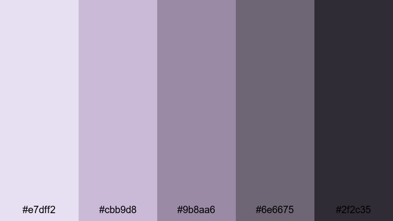
HEX: #e7dff2 #cbb9d8 #9b8aa6 #6e6675 #2f2c35
Mood: airy, calm, modern
Best for: calm landing page ui
Like morning fog drifting over lilac blooms, this purple gray color palette balances softness with structure. Use the light lilac as a page background, then step down through muted mauves for sections and cards. Keep the granite charcoal for headings and primary buttons to hold contrast without feeling harsh. It works especially well for UI when you want a soothing, trustworthy first impression.
Image example of misty lilac granite generated using media.io
Media.io is an online AI studio for creating and editing video, image, and audio in your browser.

2) Twilight Mauve Slate
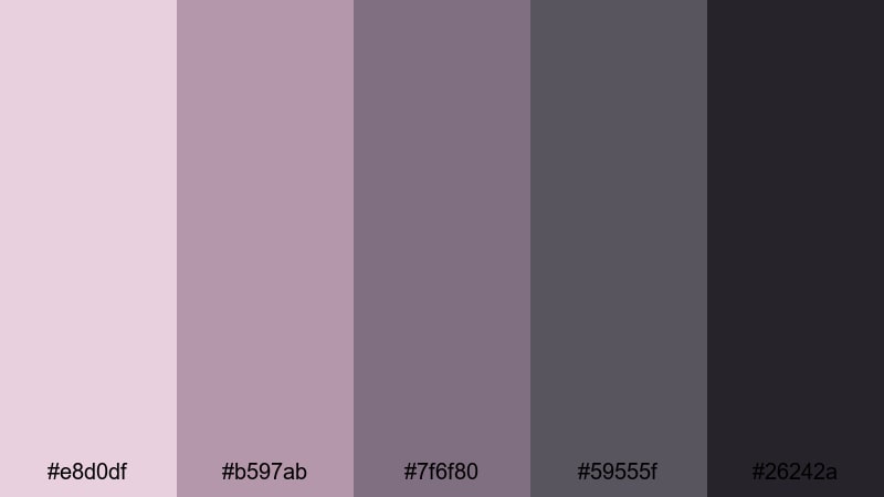
HEX: #e8d0df #b597ab #7f6f80 #59555f #26242a
Mood: moody, refined, minimalist
Best for: minimal brand identity
This set feels like twilight clouds settling into slate rooftops, with mauve glow tucked inside the shadows. A purple gray color palette with hex codes like these is ideal when you want elegance without loud saturation. Use the mid mauve for signature elements, and reserve the near-black for wordmarks and type hierarchy. It’s a strong choice for branding where print and digital need consistent contrast.
Image example of twilight mauve slate generated using media.io
3) Orchid Ash Harmony
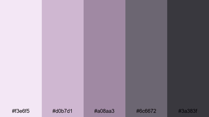
HEX: #f3e6f5 #d0b7d1 #a08aa3 #6c6672 #3a383f
Mood: soft, romantic, balanced
Best for: music festival poster
Orchid petals against ash-toned stone inspire the gentle contrast in this purple gray color palette. Start with the pale lavender as negative space, then layer dusty purple for shapes and highlights. Use the darker grays to anchor the title and event details for crisp readability. It’s especially effective for posters that need a dreamy vibe while staying legible from a distance.
Image example of orchid ash harmony generated using media.io
4) Plum Fog Concrete
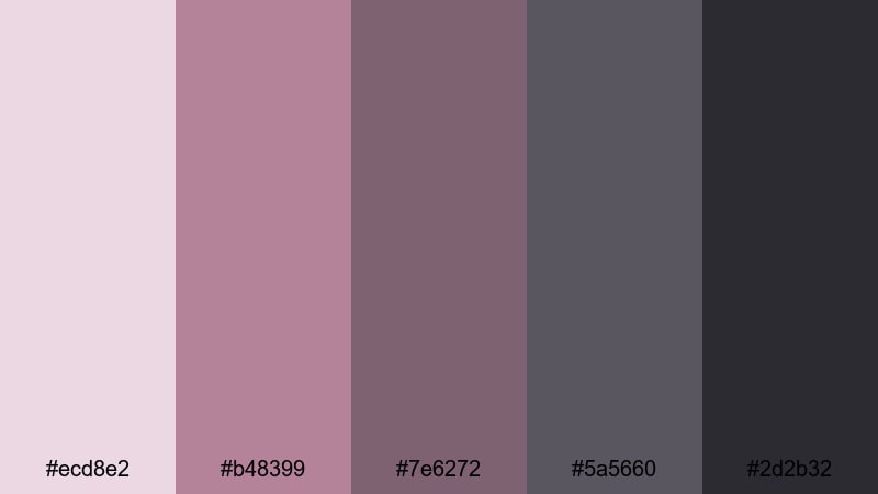
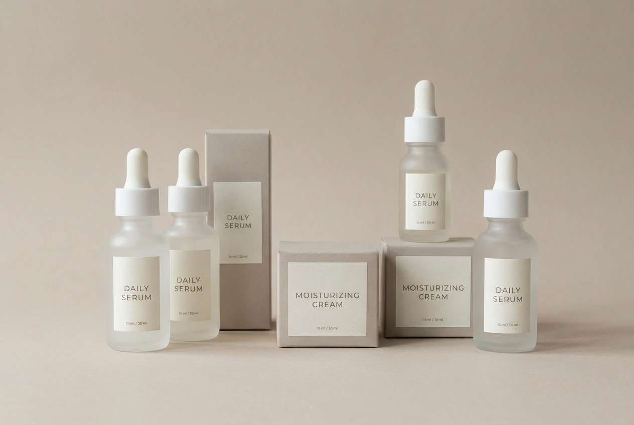
HEX: #ecd8e2 #b48399 #7e6272 #5a5660 #2d2b32
Mood: cozy, upscale, grounded
Best for: skincare packaging
Think plum jam swirling through cool fog above concrete sidewalks—warmth and grit in one view. This purple gray color palette with hex codes gives skincare packaging a premium, modern calm. Use the muted plum for labels and accents, while the pale fog shade keeps the box feeling clean and airy. For packaging, keep text in the deep charcoal to stay readable under studio lighting.
Image example of plum fog concrete generated using media.io
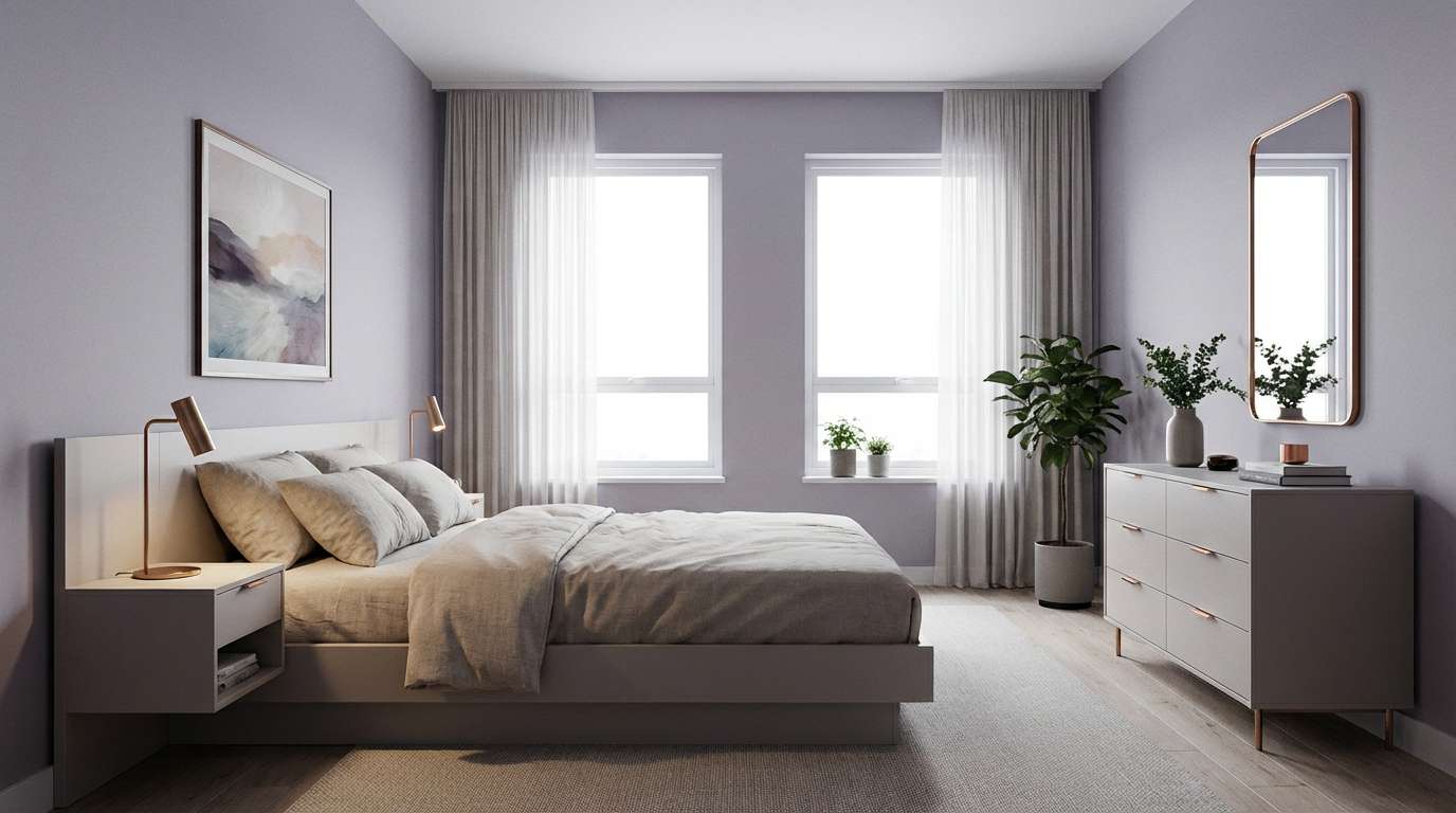
5) Lavender Steel Calm
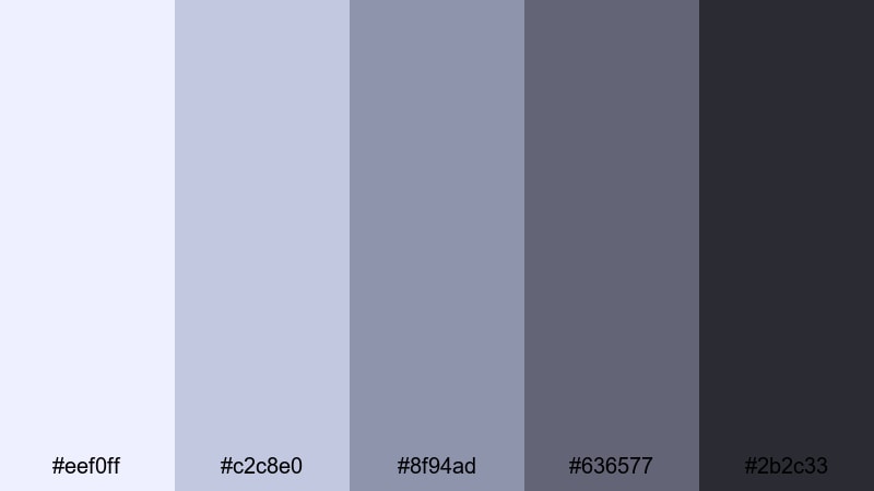
HEX: #eef0ff #c2c8e0 #8f94ad #636577 #2b2c33
Mood: cool, serene, contemporary
Best for: modern bedroom interior
This palette echoes lavender dusk reflected in brushed steel, cool and quietly comforting. A purple gray color palette like this works well when you want a restful base with just enough color personality. Paint or textiles can lean into the pale lavender, while steel grays support furniture and fixtures without clashing. It’s a dependable option for interiors where calm lighting and soft contrast matter.
Image example of lavender steel calm generated using media.io
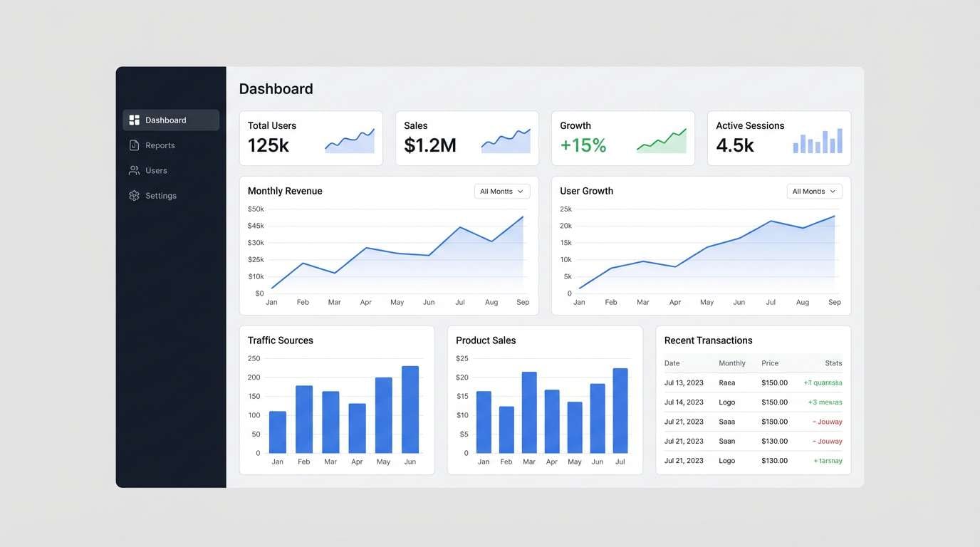
6) Amethyst Pewter Night
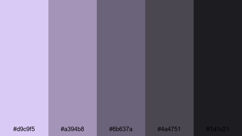
HEX: #d9c9f5 #a394b8 #6b637a #4a4751 #1d1c21
Mood: dark, confident, sleek
Best for: analytics dashboard ui
Amethyst glints inside pewter shadows, like city lights after rain. This purple gray color palette with hex codes is perfect for data-heavy screens that need depth without fatigue. Use the amethyst tint for highlights and active states, and keep the darker neutrals for panels and navigation. It’s a strong fit for UI dashboards where hierarchy and focus states must be unmistakable.
Image example of amethyst pewter night generated using media.io
7) Iris Smoke Minimal
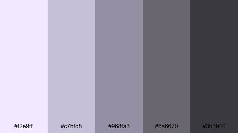
HEX: #f2e9ff #c7bfd8 #968fa3 #6a6670 #3b3940
Mood: gentle, elegant, clean
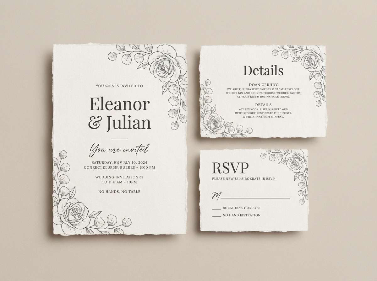
Best for: wedding invitation suite
Like iris petals caught in soft smoke, these tones feel intimate and polished. A purple gray color palette brings romance without leaning too sugary, especially when paired with airy spacing. Use the palest shade for invitation stock, keep the mid lavender for decorative rules, and set typography in the deep gray for clarity. It’s a graceful choice for wedding invitations that need a modern, understated finish.
Image example of iris smoke minimal generated using media.io
8) Violet Graphite Luxe
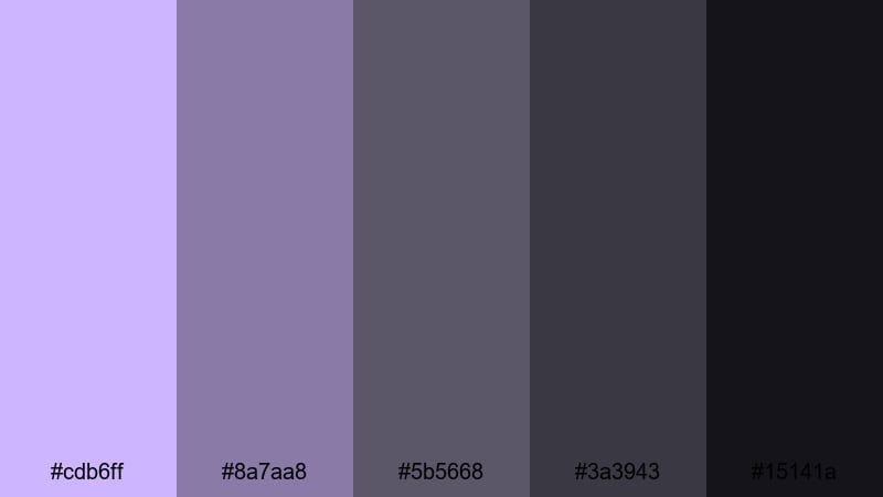
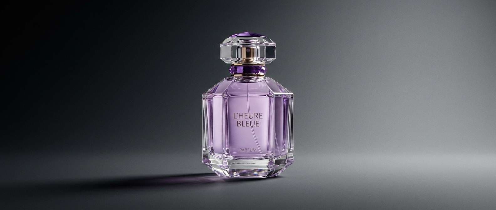
HEX: #cdb6ff #8a7aa8 #5b5668 #3a3943 #15141a
Mood: luxury, dramatic, modern
Best for: luxury perfume ad
This mix feels like violet velvet against graphite stone—rich, dark, and controlled. Use this purple gray color palette with hex codes to create premium contrast where highlights feel jewel-like. Let the light violet appear only on key callouts or reflections, while graphite supports the product silhouette. It shines for product ads that need a high-end, cinematic mood.
Image example of violet graphite luxe generated using media.io
9) Heather Storm Office
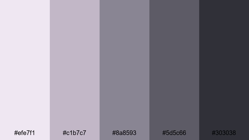
HEX: #efe7f1 #c1b7c7 #8a8593 #5d5c66 #303038
Mood: professional, steady, understated
Best for: corporate presentation slides
Heather-toned skies before a storm give this set its quiet seriousness. A purple gray color palette like this helps presentations feel modern while staying business-appropriate. Use the light heather as slide backgrounds, mid gray for charts, and the darkest shade for headings to keep contrast consistent. It’s dependable for presentations when you want subtle color that won’t compete with data.
Image example of heather storm office generated using media.io
10) Wisteria Stone Spa
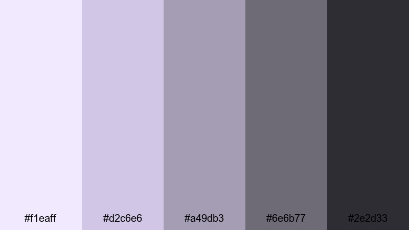
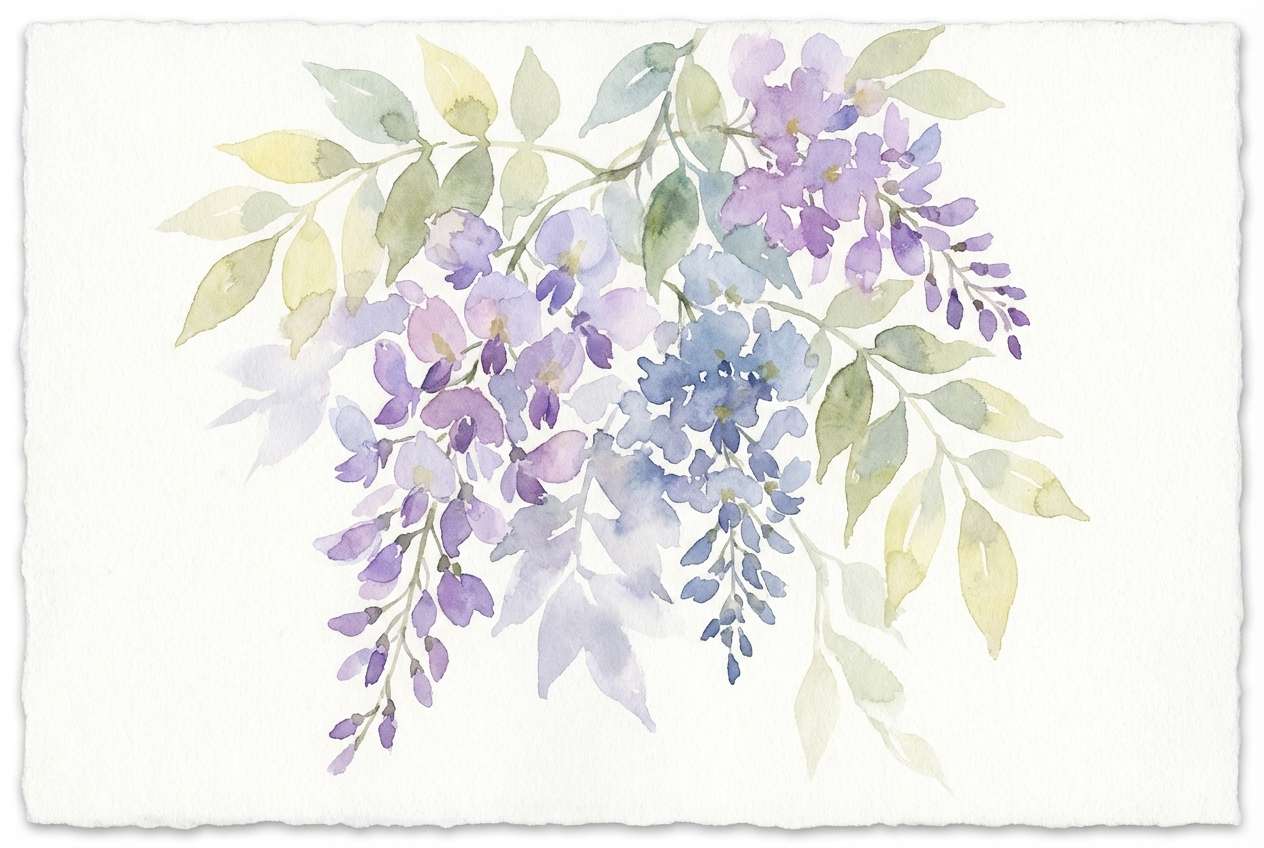
HEX: #f1eaff #d2c6e6 #a49db3 #6e6b77 #2e2d33
Mood: soothing, airy, natural
Best for: watercolor botanical illustration
Wisteria blossoms draping over smooth river stones inspired the gentle gradients here. This purple gray color palette with hex codes works beautifully when you want nature-inspired softness with enough neutral grounding. Layer the pale violet washes first, then deepen shadows with the grays to keep leaves and petals dimensional. It’s ideal for illustrations where calm, spa-like color tells the story.
Image example of wisteria stone spa generated using media.io
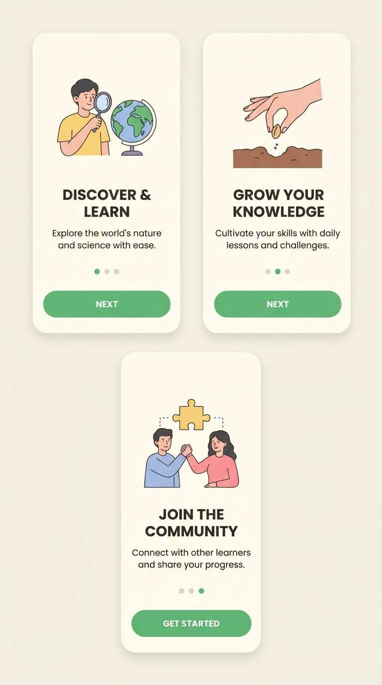
11) Mulberry Cloud Tech
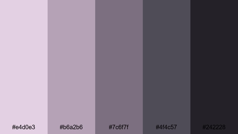
HEX: #e4d0e3 #b6a2b6 #7c6f7f #4f4c57 #242228
Mood: techy, soft, confident
Best for: app onboarding
Mulberry-tinted clouds over a dark horizon give this set a friendly, modern tech feel. A purple gray color palette helps onboarding screens feel welcoming while still serious enough for productivity apps. Use the lightest tone for screen backgrounds and reserve the deep gray for navigation and primary labels. It performs well for app onboarding where clarity and a gentle tone reduce friction.
Image example of mulberry cloud tech generated using media.io
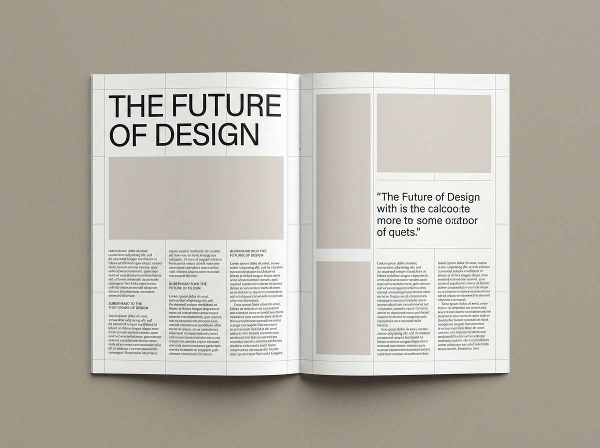
12) Lilac Charcoal Contrast
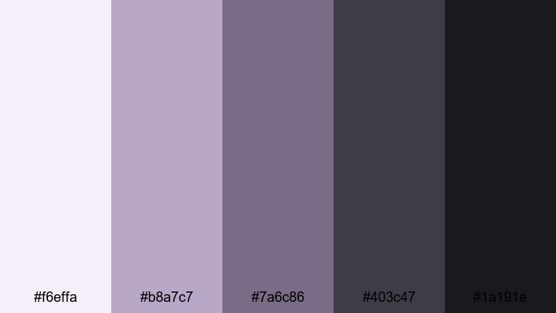
HEX: #f6effa #b8a7c7 #7a6c86 #403c47 #1a191e
Mood: bold, editorial, high-contrast
Best for: magazine spread layout
This pairing feels like lilac ink on charcoal paper—clean, sharp, and stylish. Use the purple gray color palette with hex codes to control contrast in long-form layouts without resorting to pure black and white. Let lilac highlight pull quotes and section markers while charcoal supports body text and image captions. It’s a natural match for editorial design where hierarchy must stay crisp and elegant.
Image example of lilac charcoal contrast generated using media.io
13) Dusty Violet Cement
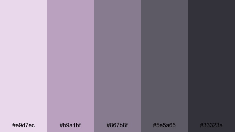
HEX: #e9d7ec #b9a1bf #867b8f #5e5a65 #33323a
Mood: urban, muted, calm
Best for: instagram quote templates
Dusty violet drifting across cement walls gives this palette an urban softness. A purple gray color palette like this keeps social graphics modern and readable without flashy saturation. Use the pale violet for backgrounds, the mid tones for frames or shapes, and the deep gray for the quote text. It works well for social posts when you want consistency across a feed and easy typographic contrast.
Image example of dusty violet cement generated using media.io
14) Purple Haze Alloy
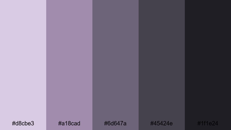
HEX: #d8cbe3 #a18cad #6d647a #45424e #1f1e24
Mood: cinematic, intense, sleek
Best for: cinematic movie poster
Purple haze over cold alloy metal creates a suspenseful, late-night atmosphere. Use this purple gray color palette with hex codes to build layered depth, letting the mid purples carry the mood while the dark grays deliver legible titles. Keep highlights sparse so the design feels cinematic rather than decorative. It’s ideal for movie posters where dramatic contrast and controlled color tell the genre instantly.
Image example of purple haze alloy generated using media.io

15) Periwinkle Coal Modern
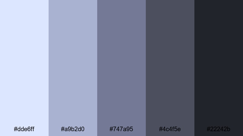
HEX: #dde6ff #a9b2d0 #747a95 #4c4f5e #22242b
Mood: modern, analytical, cool
Best for: data visualization dashboard
Periwinkle light against coal shadows feels like clear winter air over dark rock. A purple gray color palette helps charts and KPIs look modern while keeping the interface calm. Use periwinkle for data series highlights and hover states, and keep coal for axes, labels, and navigation. It’s a smart option for data dashboards where color must communicate without overwhelming the user.
Image example of periwinkle coal modern generated using media.io
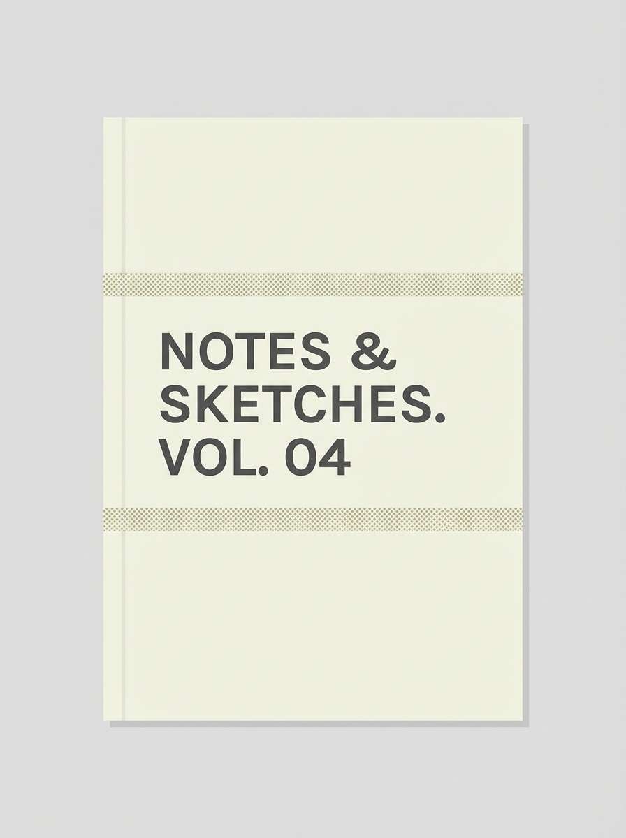
16) Mauve Granite Paper
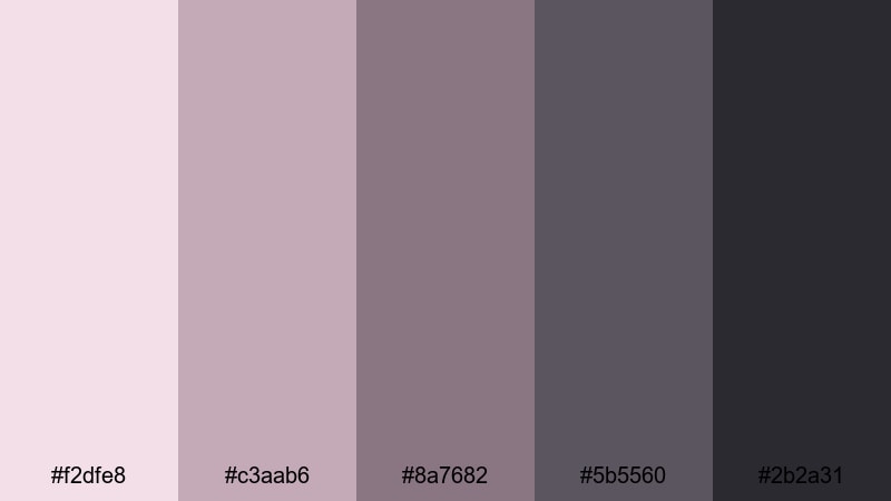
HEX: #f2dfe8 #c3aab6 #8a7682 #5b5560 #2b2a31
Mood: warm, tactile, understated
Best for: notebook cover design
Mauve ink on granite paper brings a handmade calm, like pressed flowers in an old journal. This purple gray color palette with hex codes is great for covers that need a gentle, premium feel. Use the light blush-mauve for the base, add mid tones for patterns, and keep the charcoal for titles and spine text. It’s especially suited for notebook covers where subtle contrast reads well from a shelf.
Image example of mauve granite paper generated using media.io
17) Grape Quartz Boutique
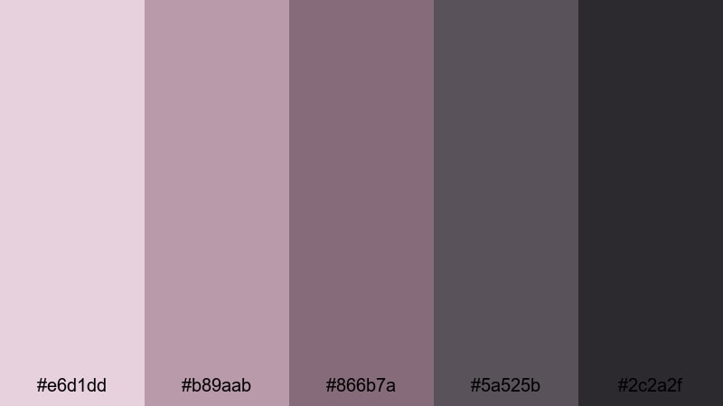
HEX: #e6d1dd #b89aab #866b7a #5a525b #2c2a2f
Mood: boutique, chic, cozy
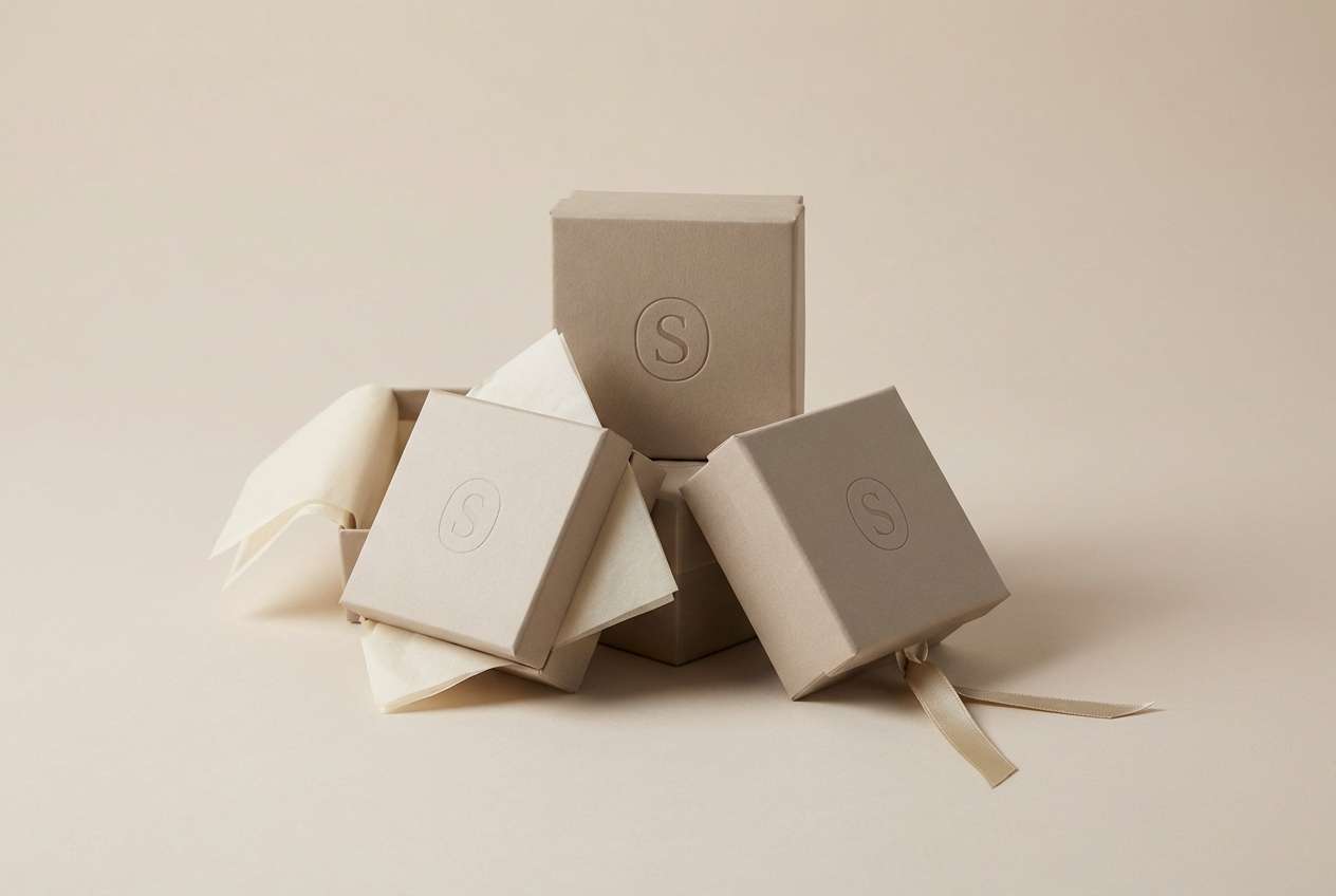
Best for: jewelry brand packaging
Grape skins and quartz crystal highlights give this set a boutique, gem-like softness. A purple gray color palette makes small packaging feel refined while keeping the brand approachable. Use the pale quartz tint for box surfaces, bring in grape tones for ribbons or seals, and set typography in the deep neutral for clarity. It’s ideal for ecommerce packaging where details must look premium in product photos.
Image example of grape quartz boutique generated using media.io
18) Royal Plum Silverline
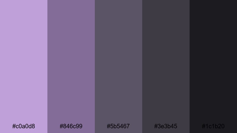
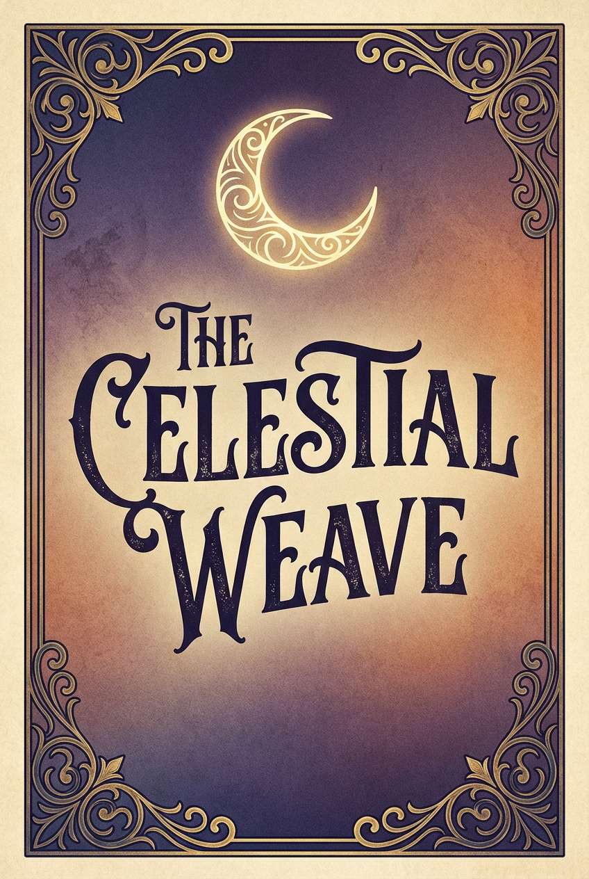
HEX: #c0a0d8 #846c99 #5b5467 #3e3b45 #1c1b20
Mood: regal, sleek, dramatic
Best for: fantasy book cover
Royal plum with a silverline edge feels like moonlight on velvet cloaks. This purple gray color palette with hex codes creates instant atmosphere while staying readable for titles and author names. Use plum for focal shapes or ornaments, keep mid grays for secondary text, and anchor everything with near-black. It’s a strong pick for book covers where you want fantasy elegance without neon color.
Image example of royal plum silverline generated using media.io
19) Lavender Rain Metro
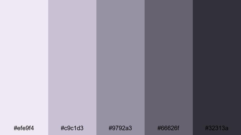
HEX: #efe9f4 #c9c1d3 #9792a3 #66626f #32313a
Mood: metropolitan, calm, polished
Best for: urban apartment living room
Lavender rain on city sidewalks gives these tones a quiet metropolitan vibe. A purple gray color palette like this supports modern interiors where you want softness without losing edge. Use the light lavender-gray on walls or large textiles, then bring in deeper metro grays for sofas, rugs, and lighting fixtures. It works well for real estate staging where neutral appeal still needs a memorable twist.
Image example of lavender rain metro generated using media.io
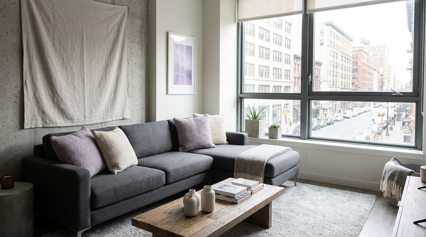
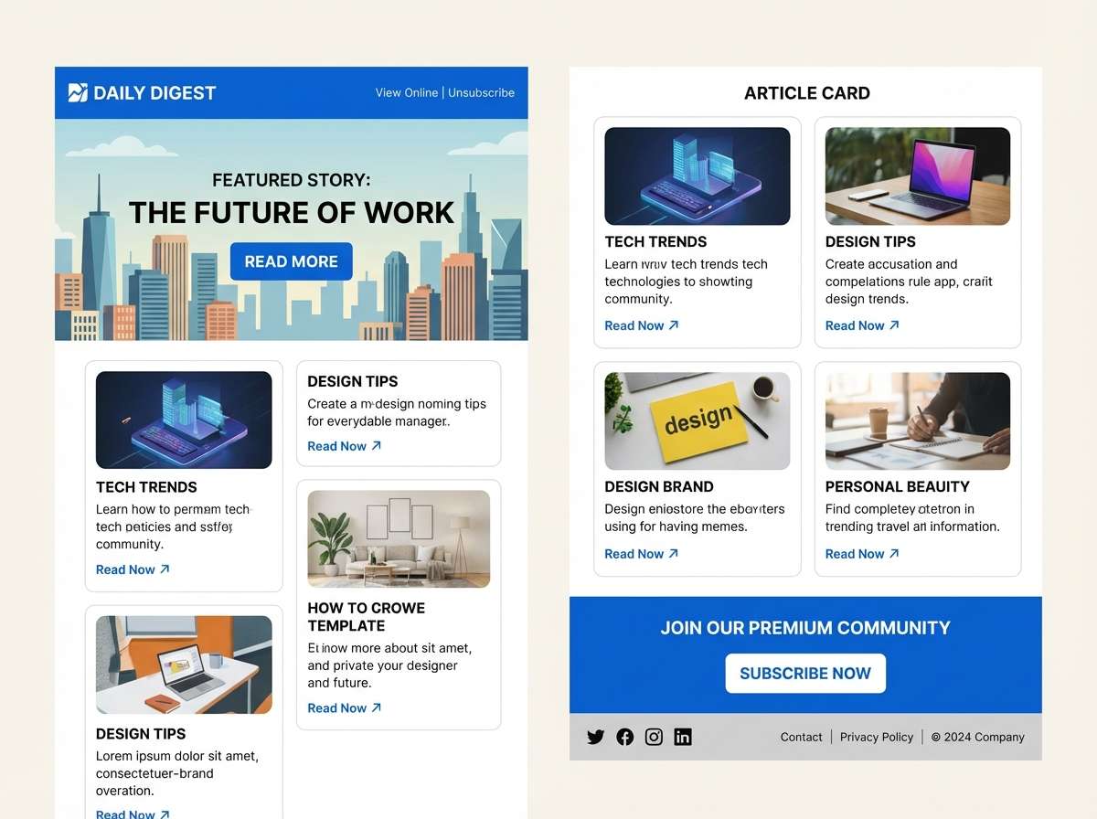
20) Soft Aubergine Smoke
HEX: #c9b0c2 #8b7387 #615767 #403c46 #1f1d22
Mood: cozy, mature, understated
Best for: newsletter template ui
Soft aubergine fading into smoke feels like dusk settling over a quiet garden. This purple gray color palette with hex codes keeps long-form layouts calm while maintaining clear hierarchy. Use the lightest tint for content blocks, apply aubergine sparingly for section headers, and rely on the darker neutrals for body text. It’s a reliable choice for email newsletters where readability and subtle brand tone matter.
Image example of soft aubergine smoke generated using media.io
What Colors Go Well with Purple Gray?
Purple gray pairs naturally with crisp neutrals like white, soft ivory, and deep charcoal, helping you control contrast without making the design feel stark. This is why lavender gray palettes are so popular in modern UI and editorial layouts.
For a warmer direction, add blush pink, dusty rose, taupe, or muted gold accents. Warm accents keep purple gray from feeling too cool or technical, especially in branding and packaging.
For a fresher, more contemporary twist, combine purple gray with sage green, eucalyptus, or pale mint. The green adds a natural counterpoint that still stays calm and sophisticated.
How to Use a Purple Gray Color Palette in Real Designs
Start by assigning roles: pick one very light tint for backgrounds, one mid purple-gray for surfaces or secondary UI, and one deep neutral for text and key actions. This keeps hierarchy clear and makes the palette feel intentional.
In branding, treat the purple tone as a “signature” accent rather than an all-over fill. A little violet in logos, seals, or highlight shapes often looks more premium than saturating the whole layout.
For print (posters, invitations, packaging), test contrast under different lighting and paper textures. Purple gray can shift visually, so anchoring type in a dark charcoal usually protects readability.
Create Purple Gray Palette Visuals with AI
If you already have HEX codes, you can generate matching mockups and concept images in minutes by describing the layout and style you want. Prompts work best when they specify composition, typography feel, lighting, and aspect ratio.
Use purple gray prompts for landing pages, dashboards, packaging, posters, and interiors, then iterate by swapping one accent shade at a time. This helps you explore “warmer mauve” versus “cooler lavender” directions without redesigning from scratch.
With Media.io, you can quickly turn a palette idea into consistent visual examples for presentations, mood boards, and client approvals.
Purple Gray Color Palette FAQs
-
What is a purple gray color palette?
A purple gray color palette is a set of colors built from gray neutrals with purple undertones (like lilac, mauve, and amethyst). It’s often used to create a modern, calm look with more personality than plain grayscale. -
Are purple gray palettes good for UI design?
Yes. Purple gray palettes are great for UI because light tints can act as soft backgrounds, mid tones work for cards and surfaces, and deep charcoals provide readable text and button contrast without harsh black. -
How do I keep text readable on lavender gray backgrounds?
Use a deep charcoal or near-black (not mid gray) for body text, and reserve lighter text for large headings only. If possible, check contrast ratios to ensure accessibility in key UI components. -
What accent colors work best with purple gray?
Blush pink and muted gold add warmth; sage and eucalyptus add a natural, modern balance; and clean whites help keep the overall design airy and minimal. -
Is purple gray more warm or cool?
It depends on the undertone: mauve-based purple grays feel warmer, while lavender/periwinkle-based purple grays feel cooler. You can control the temperature by pairing with warm neutrals (taupe/cream) or cool neutrals (steel/coal). -
What are common use cases for mauve gray colors in branding?
Mauve gray works well for beauty, wellness, boutique retail, and premium lifestyle brands. It communicates softness and sophistication while still feeling contemporary. -
Can I generate palette-based mockups with AI using prompts?
Yes. You can describe the design type (UI, packaging, poster, etc.), the mood, and the composition, then iterate variations to match your purple gray palette direction and lighting style.


