

Pastel pink and purple palettes blend softness with modern polish, making them a go-to for clean UI, gentle branding, and dreamy print designs.
Below you’ll find 20 pastel pink purple color palette ideas with HEX codes, plus quick usage tips and AI prompts to generate matching visuals in seconds.
In this article
- Why Pastel Pink Purple Palettes Work So Well
-
- rose lilac mist
- cotton candy orchid
- blush lavender haze
- peony amethyst glow
- sakura wisteria softness
- bubblegum mauve dream
- powder pink plum
- petal violet whisper
- ballet slipper iris
- frosted berry milk
- pastel fuchsia fog
- lilac rosewater
- dusk pink periwinkle
- sweetheart violet
- marshmallow grape
- heather blush gradient
- cupid pink violet
- orchid petal cloud
- lavender macaron
- pink quartz lilac
- What Colors Go Well with Pastel Pink Purple?
- How to Use a Pastel Pink Purple Color Palette in Real Designs
- Create Pastel Pink Purple Palette Visuals with AI
Why Pastel Pink Purple Palettes Work So Well
Pastel pink and purple sit close on the color wheel, so they naturally blend without harsh edges. That makes them ideal for gradients, soft shadows, and layered backgrounds that still feel clean and intentional.
These hues also balance emotion and clarity: pink brings warmth and approachability, while purple adds calm sophistication. Together, they can feel romantic, playful, or premium depending on how much contrast you introduce.
In modern design systems, pastel pink purple combinations are especially useful because they provide gentle color-coding for states and components without overwhelming content. With a dark neutral for text, you can keep accessibility while preserving the airy look.
20+ Pastel Pink Purple Color Palette Ideas (with HEX Codes)
1) Rose Lilac Mist
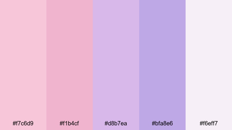
HEX: #f7c6d9 #f1b4cf #d8b7ea #bfa8e6 #f6eff7
Mood: airy, romantic, calm
Best for: for UI
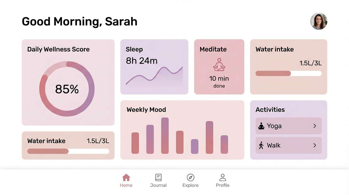
Like a sunrise drifting through rose petals and lilac fog, this pastel pink purple color palette feels weightless and polished. Use the lightest tones for backgrounds and reserve the deeper lilac for navigation and primary buttons for UI. Keep typography charcoal or deep plum to maintain contrast without losing softness. Add subtle gradients between the pinks and purples to create depth while staying minimal.
Image example of rose lilac mist generated using media.io
Media.io is an online AI studio for creating and editing video, image, and audio in your browser.

2) Cotton Candy Orchid
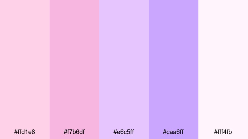
HEX: #ffd1e8 #f7b6df #e6c5ff #caa6ff #fff4fb
Mood: playful, sweet, dreamy
Best for: for posters
This pastel pink purple color palette with hex codes evokes cotton-candy clouds and orchid blooms after a spring rain. For posters, let the blush pink hold the main background and use the brighter orchid-purple for headlines and callouts. Balance the sweetness with plenty of white space and a single dark accent for legibility. Soft grain or halftone textures work well if you want a nostalgic print feel.
Image example of cotton candy orchid generated using media.io
3) Blush Lavender Haze
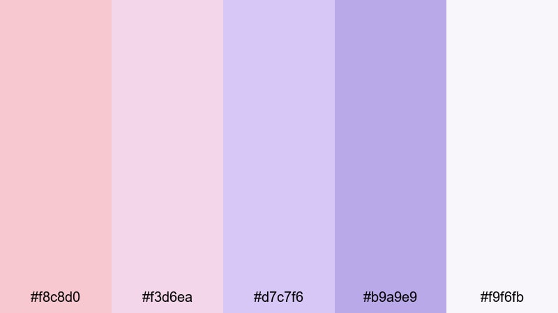
HEX: #f8c8d0 #f3d6ea #d7c7f6 #b9a9e9 #f9f6fb
Mood: soft, serene, refined
Best for: for branding
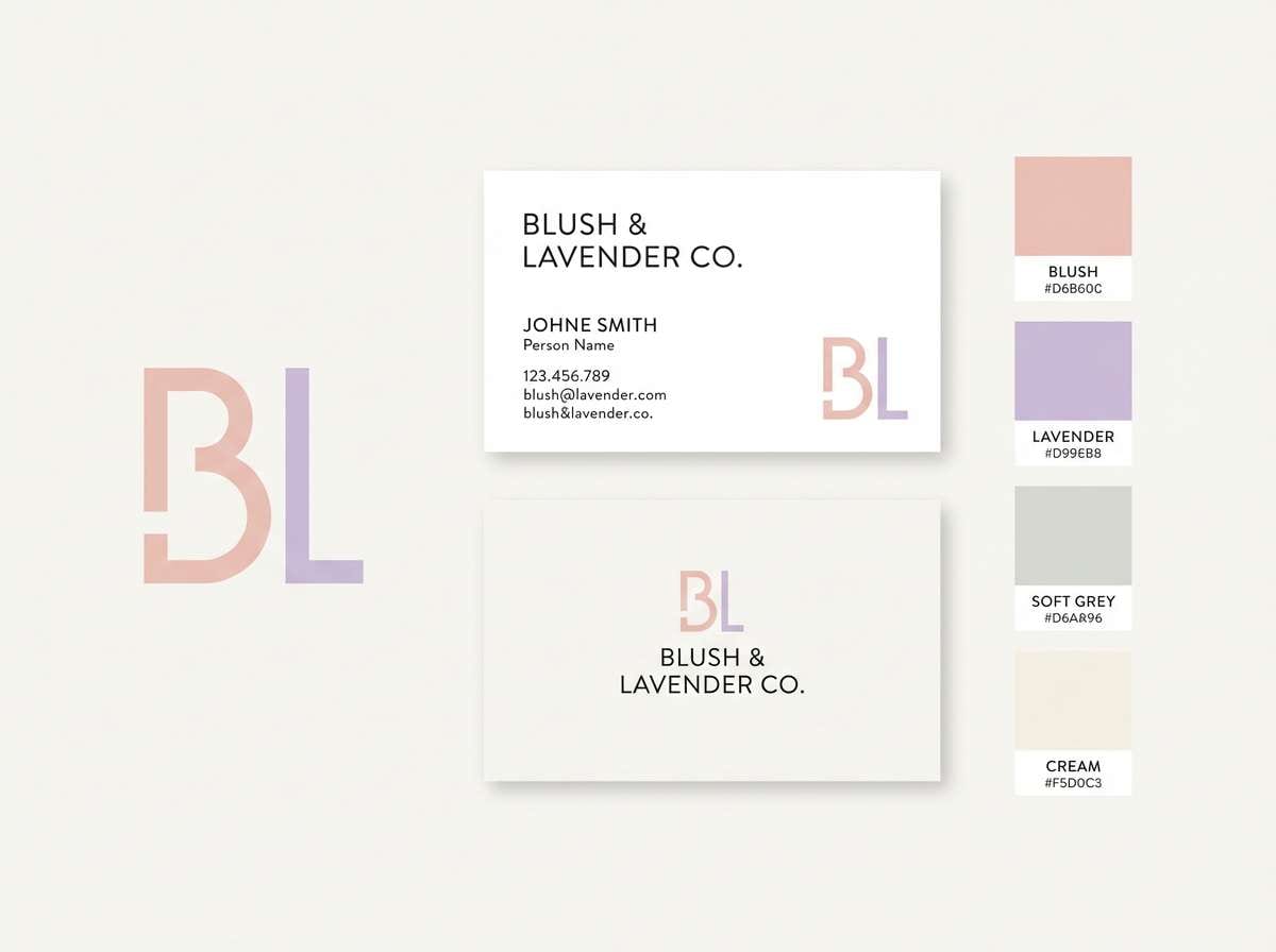
A gentle blush breeze meets lavender haze in this pastel pink purple color palette, perfect for modern femininity without feeling loud. For branding, anchor your logo on the near-white tint and pull secondary elements from the lavender midtones. Use the deeper violet sparingly for emphasis so the palette stays calm and premium. Pair with clean sans-serif type and simple geometric marks for a contemporary look.
Image example of blush lavender haze generated using media.io
4) Peony Amethyst Glow
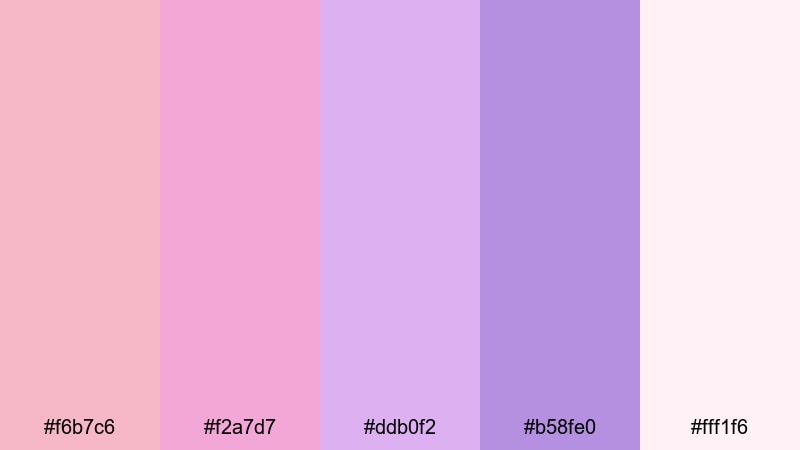
HEX: #f6b7c6 #f2a7d7 #ddb0f2 #b58fe0 #fff1f6
Mood: romantic, luminous, elegant
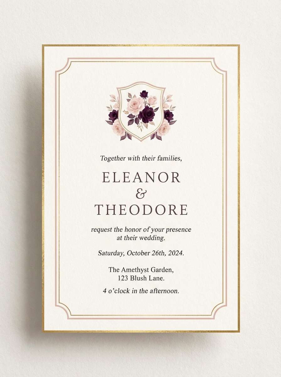
Best for: for invitations
This pastel pink purple color palette with hex codes feels like peony petals lit by a soft amethyst glow at golden hour. For invitations, set the base in warm blush and use amethyst for borders, monograms, or RSVP highlights. Keep the layout airy with thin rules and generous margins for an upscale finish. A touch of metallic foil (silver or rose gold) complements these tones beautifully.
Image example of peony amethyst glow generated using media.io
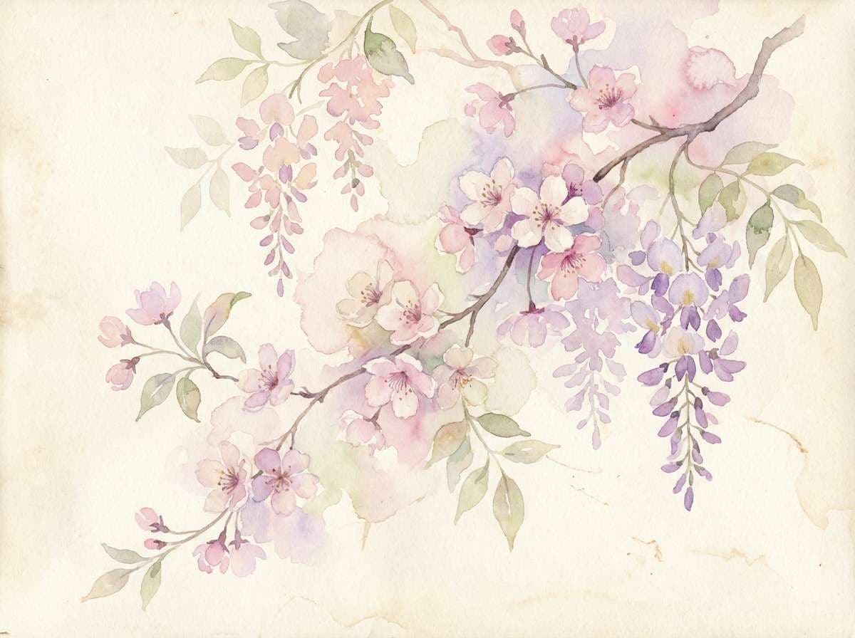
5) Sakura Wisteria Softness
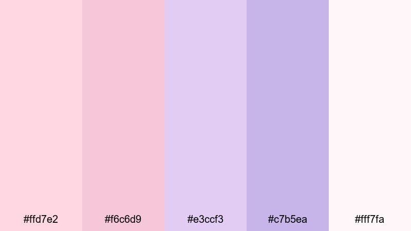
HEX: #ffd7e2 #f6c6d9 #e3ccf3 #c7b5ea #fff7fa
Mood: springtime, gentle, poetic
Best for: botanical/spring illustration
Imagine sakura blossoms floating under wisteria vines—this pastel pink purple color palette captures that breezy, petal-soft mood. For posters or stationery for spring events, paint large light areas with the palest pink and layer wisteria purple for depth. Keep shadows minimal and use soft edges to preserve the watercolor feel. A muted green accent can be added sparingly if you need botanical contrast.
Image example of sakura wisteria softness generated using media.io
6) Bubblegum Mauve Dream
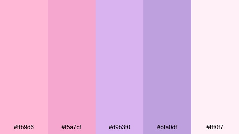
HEX: #ffb9d6 #f5a7cf #d9b3f0 #bfa0df #fff0f7
Mood: fun, trendy, upbeat
Best for: for social media
This pastel pink purple color palette with hex codes looks like bubblegum gloss melting into a mauve daydream. For social media templates, use the brighter pink for attention-grabbing badges and keep the purple as a stable secondary block. Maintain readability with dark plum text and tight, consistent spacing. Simple sticker shapes and rounded corners amplify the playful vibe without clutter.
Image example of bubblegum mauve dream generated using media.io

7) Powder Pink Plum
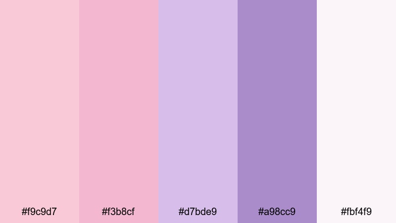
HEX: #f9c9d7 #f3b8cf #d7bde9 #a98cc9 #fbf4f9
Mood: cozy, mature, balanced
Best for: for packaging
Powdery pinks and gentle plum tones in this pastel pink purple color palette suggest soft fabric, sweet berries, and calm evenings. For packaging, keep the label base light and use plum for the brand name and key claims to improve contrast. Matte finishes look especially premium with these muted hues. Add minimal line art to keep the design clean and shelf-ready.
Image example of powder pink plum generated using media.io
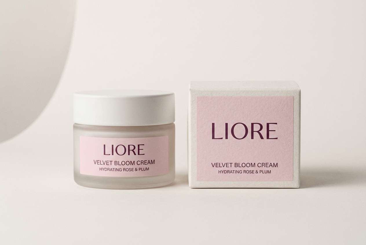
8) Petal Violet Whisper
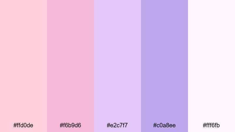
HEX: #ffd0de #f6b9d6 #e2c7f7 #c0a8ee #fff6fb
Mood: delicate, soothing, modern
Best for: for UI
Soft petals and a violet whisper make this pastel pink purple color palette feel gentle yet contemporary. For UI, keep surfaces in the pale blush and use the violet tones for active states, toggles, and focus rings. Avoid using the strongest purple on large areas to prevent visual fatigue. Pair with subtle shadows and thin dividers for a clean, accessible interface.
Image example of petal violet whisper generated using media.io
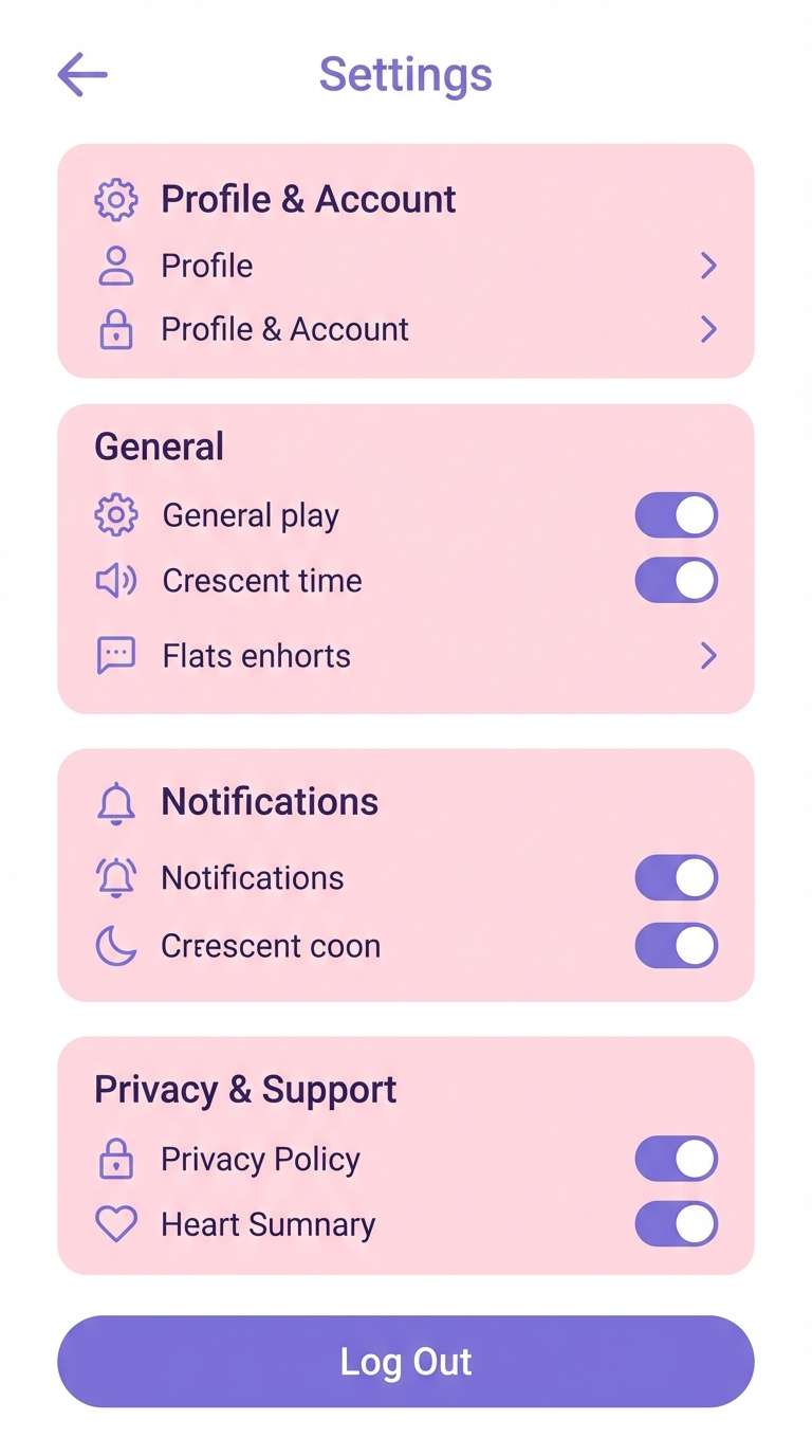
9) Ballet Slipper Iris
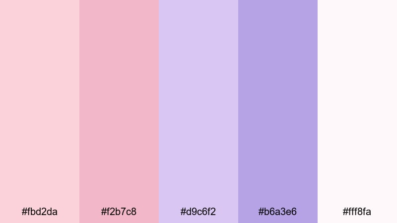
HEX: #fbd2da #f2b7c8 #d9c6f2 #b6a3e6 #fff8fa
Mood: graceful, classic, soft
Best for: for editorial
Ballet slipper pink paired with iris purple gives this pastel pink purple color palette a poised, editorial feel. For editorial layouts, use the lightest tint as negative space and pull lavender into pull quotes or section headers. Keep imagery airy and avoid heavy black blocks; charcoal text is enough. Consistent margins and delicate rules help maintain the refined rhythm across pages.
Image example of ballet slipper iris generated using media.io
10) Frosted Berry Milk
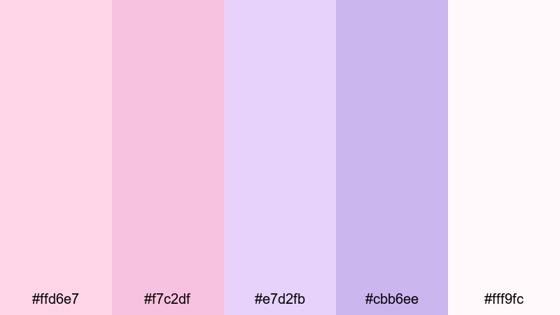
HEX: #ffd6e7 #f7c2df #e7d2fb #cbb6ee #fff9fc
Mood: creamy, sweet, comforting
Best for: for product ads
This pastel pink purple color palette with hex codes feels like frosted berry milk—creamy, light, and instantly comforting. For product ads, keep the background nearly white and use berry-lilac accents to frame the product and price points. Soft shadows and gentle reflections help the colors feel realistic and premium. Limit typography colors to one dark neutral so the pastel tones stay the hero.
Image example of frosted berry milk generated using media.io

11) Pastel Fuchsia Fog
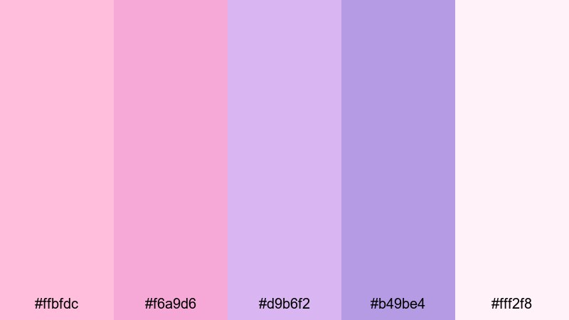
HEX: #ffbfdc #f6a9d6 #d9b6f2 #b49be4 #fff2f8
Mood: energetic, youthful, bright
Best for: for flyers
A fuchsia fog rolling over soft lilacs makes this pastel pink purple color palette feel lively but still gentle. For flyers, use the brighter pink as a headline band and keep body text on pale backgrounds for readability. Add simple geometric shapes to guide the eye without overpowering the message. Use one strong call-to-action color block and keep the rest airy to avoid clutter.
Image example of pastel fuchsia fog generated using media.io
12) Lilac Rosewater
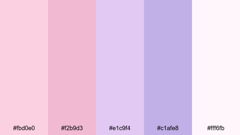
HEX: #fbd0e0 #f2b9d3 #e1c9f4 #c1afe8 #fff6fb
Mood: spa-like, gentle, fresh
Best for: for branding
Lilac rosewater tones in this pastel pink purple color palette suggest calm rituals and clean beauty. For branding, choose the palest tint for backgrounds, then use lilac for headings and packaging accents to keep everything cohesive. This mix pairs well with minimalist iconography and lots of breathing room. If you need contrast, add a deep aubergine only for small text and logos.
Image example of lilac rosewater generated using media.io
13) Dusk Pink Periwinkle
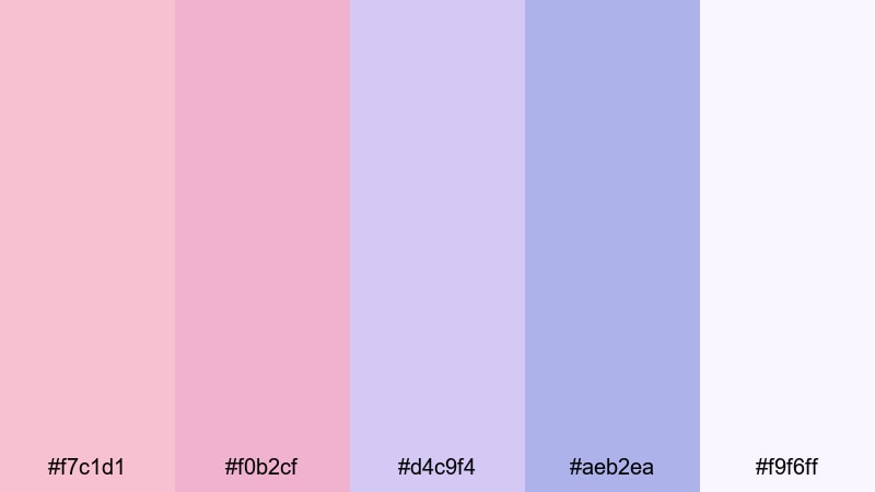
HEX: #f7c1d1 #f0b2cf #d4c9f4 #aeb2ea #f9f6ff
Mood: twilight, calm, airy
Best for: for UI
Like dusk light fading into periwinkle sky, this pastel pink purple color palette creates a calm, modern interface mood. For UI, apply the periwinkle to interactive states and keep cards in pale pink-white for clarity. Use consistent spacing and restrained shadows to keep it readable. A single dark neutral for text will ensure accessibility across the soft background tones.
Image example of dusk pink periwinkle generated using media.io
14) Sweetheart Violet
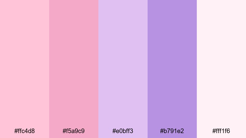
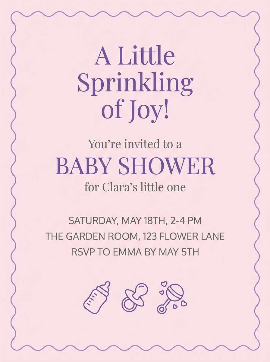
HEX: #ffc4d8 #f5a9c9 #e0bff3 #b791e2 #fff1f6
Mood: romantic, charming, upbeat
Best for: for invitations
This pastel pink purple color palette with hex codes feels like sweetheart candy and soft violet ribbons. For invitations, use pink as the main paper tone and violet for decorative flourishes, monograms, and section dividers. Keep type simple and avoid overly ornate scripts so the palette remains modern. Add tiny dot patterns or thin frames to give structure without heaviness.
Image example of sweetheart violet generated using media.io
15) Marshmallow Grape
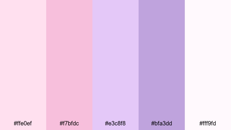
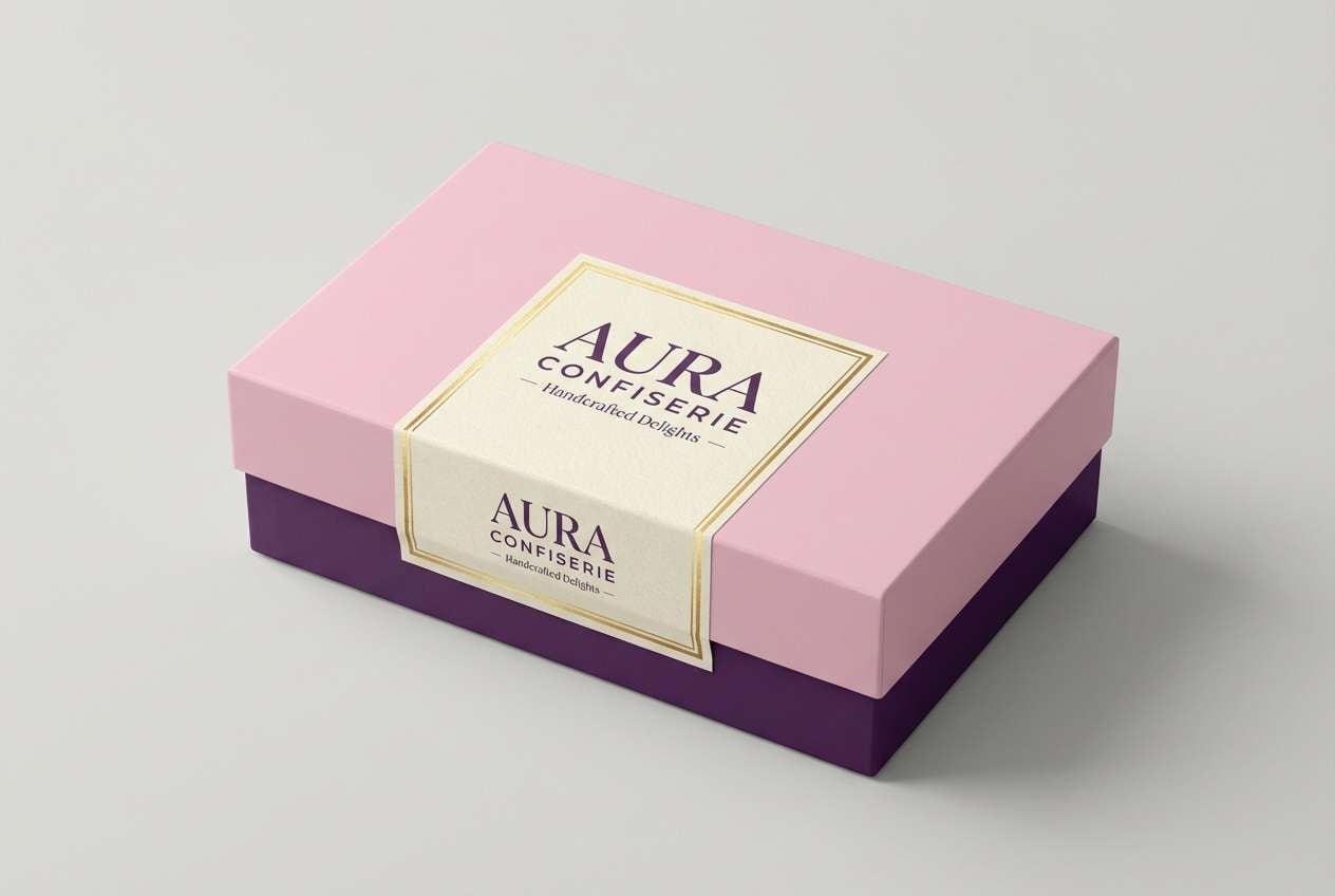
HEX: #ffe0ef #f7bfdc #e3c8f8 #bfa3dd #fff9fd
Mood: soft, cozy, sweet
Best for: for packaging
Marshmallow pink and milky grape in this pastel pink purple color palette read as cozy, gentle, and dessert-like. For packaging, use the near-white marshmallow tone as the base and bring in grape-lilac for brand accents and flavor cues. Simple serif typography can make it feel artisanal, while sans-serif keeps it modern. Avoid high-gloss finishes if you want the soft pastel effect to stay natural.
Image example of marshmallow grape generated using media.io
16) Heather Blush Gradient
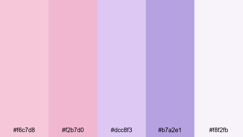
HEX: #f6c7d8 #f2b7d0 #dcc8f3 #b7a2e1 #f8f2fb
Mood: gentle, modern, romantic
Best for: for posters
This pastel pink purple color palette with hex codes looks like heather fields fading into blush skies. For posters, try a smooth gradient from pink to lavender as the main background and layer high-contrast type on top. Keep supporting elements minimal—thin lines, small icons, and one call-to-action button shape. Use the deepest purple only for the most important information to guide attention.
Image example of heather blush gradient generated using media.io

17) Cupid Pink Violet
HEX: #ffc9dc #f4b0d2 #e1c1f6 #c09ae6 #fff3f8
Mood: romantic, whimsical, bright
Best for: for branding
Cupid pink and violet hues make this pastel pink purple color palette feel flirty and light, like ribbons drifting through spring air. For branding, use the light pink as your primary background and violet for logos, icons, and key UI accents for brand consistency. Keep imagery soft-focused and avoid harsh contrast blocks. This palette pairs nicely with rounded shapes and friendly typography for an approachable identity.
Image example of cupid pink violet generated using media.io
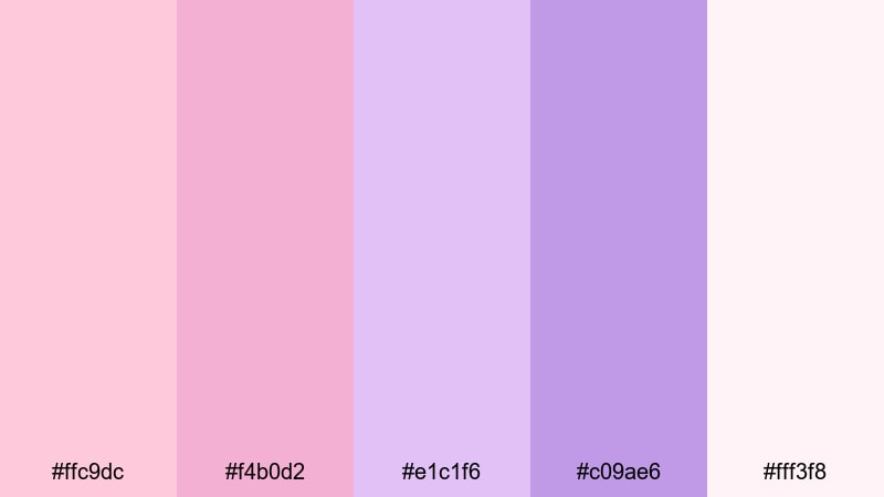
18) Orchid Petal Cloud
HEX: #ffd3e6 #f6bfe0 #e2ccfb #c2b2f0 #fff7fc
Mood: ethereal, airy, soothing
Best for: botanical/spring illustration
Orchid petals drifting through a pale cloudbank inspired this pastel pink purple color palette. For spring illustration work, paint broad washes with the lightest tones and build depth with lavender shadows instead of dark grays. Keep outlines minimal and let color transitions do the shaping. This approach looks especially soft and fresh for botanical prints and stationery.
Image example of orchid petal cloud generated using media.io
19) Lavender Macaron
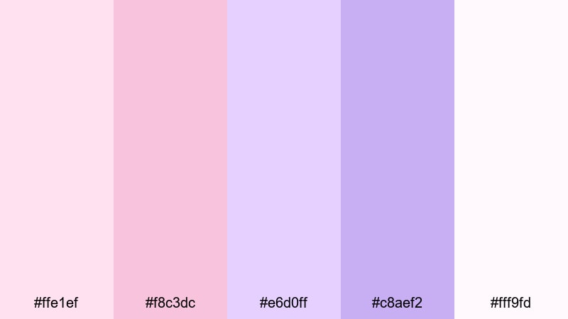
HEX: #ffe1ef #f8c3dc #e6d0ff #c8aef2 #fff9fd
Mood: sweet, chic, Parisian
Best for: for product ads
This pastel pink purple color palette with hex codes brings to mind lavender macarons and blush frosting in a bright patisserie window. For product ads, use the pale base for clean negative space and set the product against lavender accents to create a premium focal point. Add a soft shadow to ground the object without making the scene heavy. Keep text minimal and aligned to a simple grid for a luxe finish.
Image example of lavender macaron generated using media.io

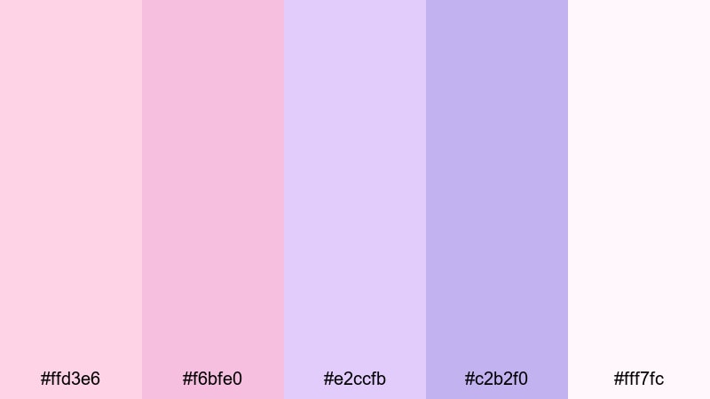
20) Pink Quartz Lilac
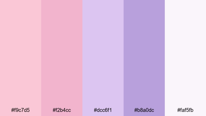
HEX: #f9c7d5 #f2b4cc #dcc6f1 #b8a0dc #faf5fb
Mood: clean, gentle, sophisticated
Best for: for UI
Pink quartz meets soft lilac in this pastel pink purple color palette, giving a smooth, polished feel like tumbled gemstones. For UI, keep most surfaces in the pale quartz tones and apply lilac only to primary actions and active indicators. Use consistent icon weights and avoid overly saturated accents so the palette stays cohesive. A cool gray text color will keep the interface crisp and readable.
Image example of pink quartz lilac generated using media.io
What Colors Go Well with Pastel Pink Purple?
Neutrals are the easiest win: soft white, warm ivory, dove gray, and cool light gray keep pastel pink purple palettes looking modern instead of overly sweet. For text and icons, charcoal or deep plum usually reads better than pure black.
If you want contrast, try muted greens (sage, eucalyptus) or dusty blues (periwinkle, powder blue). These create a gentle complementary balance without breaking the pastel mood.
For a more premium edge, add a tiny dose of deep accents like aubergine, midnight navy, or espresso brown. Use them sparingly for headlines, buttons, or key UI states to preserve the airy feel.
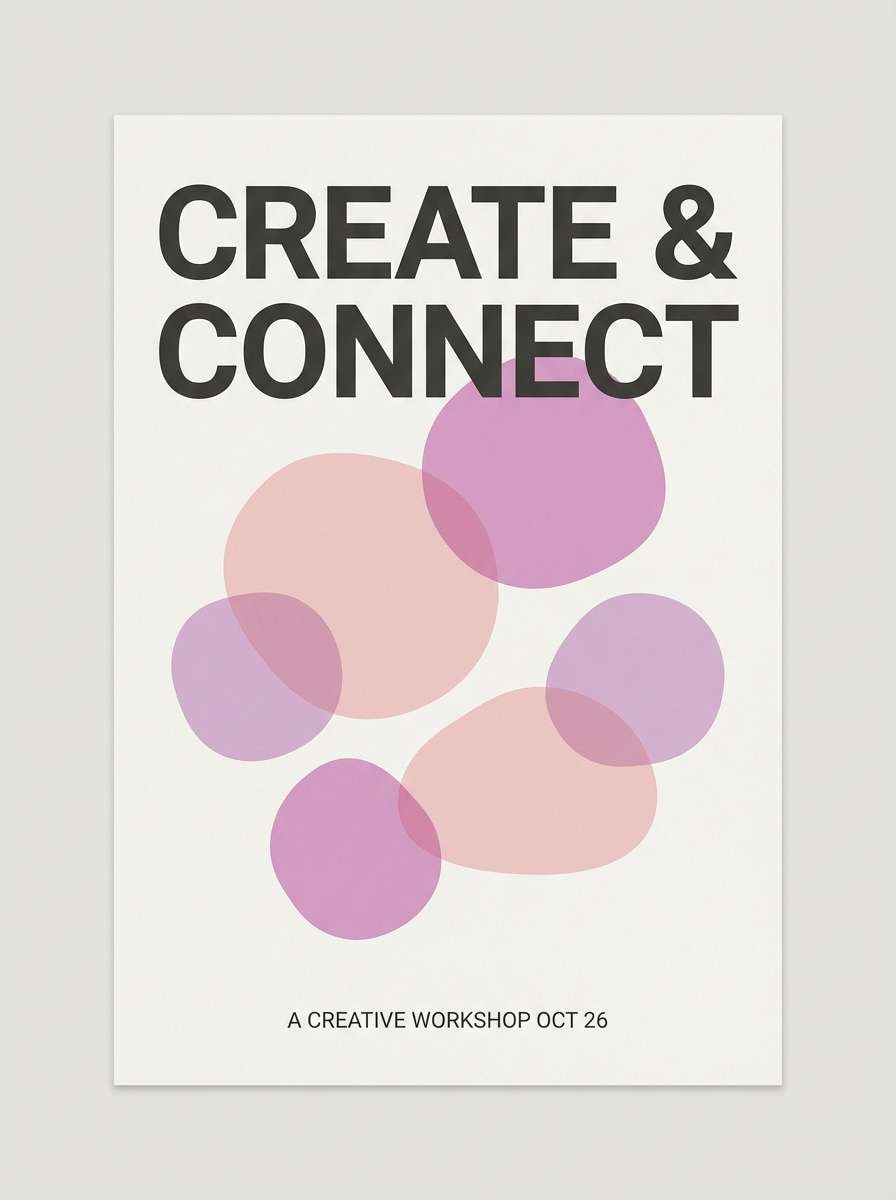
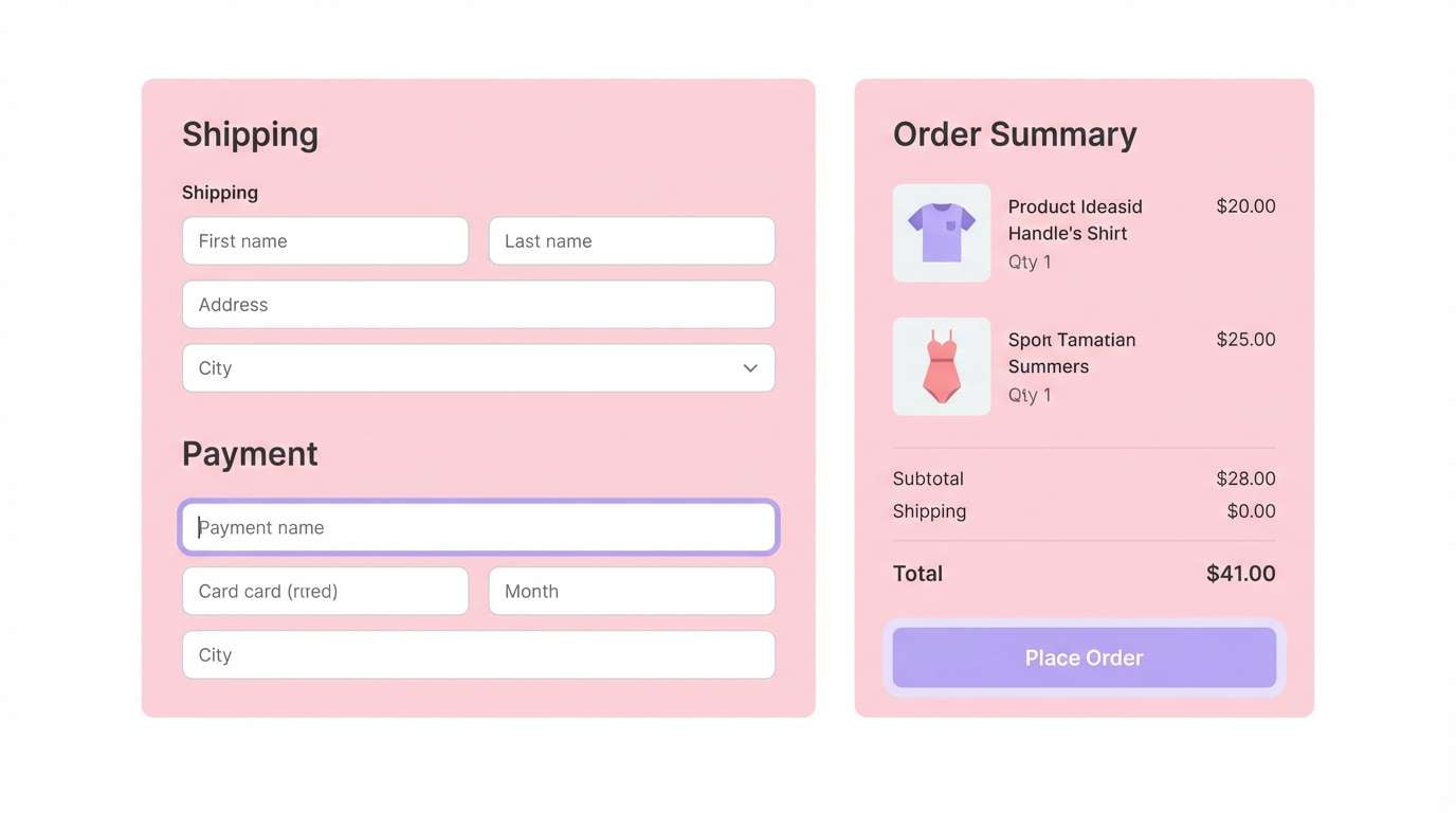
How to Use a Pastel Pink Purple Color Palette in Real Designs
Start with hierarchy: pick one near-white pastel as your base, one midtone for surfaces or sections, and one deeper lilac/violet for actions and emphasis. This keeps layouts structured while staying soft.
In UI, reserve the darkest shade for interactive elements (primary buttons, active tabs, focus rings) and keep large areas light to avoid visual fatigue. In print, gradients and subtle textures (grain, watercolor edges, halftone) add depth without needing saturation.
To keep results clean and modern, limit typography to one dark neutral and stick to consistent spacing. Pastels look best when the design system is disciplined—simple shapes, clear grids, and minimal decoration.
Create Pastel Pink Purple Palette Visuals with AI
If you already have HEX codes, you can quickly turn them into matching mockups, posters, invitations, or brand boards by describing the layout and mood you want. Add keywords like “flat design,” “minimal,” “soft diffused lighting,” or “watercolor texture” to steer the style.
For best results, keep prompts specific: include the format (poster, UI screen, packaging shot), the subject (app dashboard, perfume bottle), and the composition (white canvas, seamless background). Then iterate by adjusting one detail at a time.
Media.io makes it easy to generate cohesive pastel pink purple visuals right in your browser, so you can test multiple directions before committing to a final design.
Pastel Pink Purple Color Palette FAQs
-
What is a pastel pink purple color palette?
A pastel pink purple color palette is a set of soft, low-saturation pink and purple tones (often blush, rose, lilac, and lavender) designed to feel light, calm, and modern while still adding color. -
How do I keep pastel pink and purple readable in UI design?
Use very light pastels for backgrounds, reserve deeper lilac/violet for interactive states, and set text in a dark neutral like charcoal or deep plum. Always check contrast for buttons, links, and form fields. -
What neutral colors pair best with pastel pink purple?
Cool light gray, dove gray, and soft white are the most versatile. For higher contrast, charcoal works well; for a warmer feel, try ivory or a beige-tinted off-white. -
Can I use pastel pink purple palettes for professional branding?
Yes—choose muted, dusty versions and use the darkest tone sparingly for logo marks and key accents. Pair with clean typography and plenty of whitespace to keep the brand looking premium. -
What accent colors work with pastel pink purple besides neutrals?
Sage green, muted teal, powder blue, and periwinkle add fresh contrast while staying soft. For a more dramatic accent, use aubergine or navy in small doses. -
Are pastel pink purple palettes good for print like invitations and posters?
They’re excellent for invitations, posters, and packaging because they feel romantic and contemporary. Use thin borders, airy spacing, and one dark text color to avoid washed-out typography. -
How can I generate matching visuals for a pastel pink purple palette quickly?
Use an AI image generator and describe the design format (UI screen, poster, product ad), the mood (soft, minimal), and lighting/texture (diffused light, watercolor paper). Media.io lets you create and iterate these visuals directly in your browser.


