


 ChatGPT
 Perplexity
 Gemini
 Claude
 Grok
Grok
Navy blue is one of the most versatile “serious” colors: it feels premium like black, but softer, friendlier, and often easier to read in UI and print.
Below are 20+ navy blue color palette ideas with HEX codes—plus practical pairing tips for branding, interfaces, and interiors.
In this article
- Why Navy Blue Palettes Work So Well
-
- midnight harbor
- gold-trimmed navy
- coastal dusk
- slate & sand
- berry ink
- arctic night
- vintage library
- sailor stripe
- neon nightshift
- navy & terracotta
- stormy denim
- peacock depths
- rose quartz navy
- olive uniform
- champagne evening
- cyber navy ui
- quiet minimal
- indigo forest
- marble & navy
- citrus spark
- brick & blueprint
- inky noir contrast
- What Colors Go Well with Navy Blue?
- How to Use a Navy Blue Color Palette in Real Designs
- Create Navy Blue Palette Visuals with AI
Why Navy Blue Palettes Work So Well
Navy blue carries authority and trust (common in finance, SaaS, and government) while staying warmer and more human than pure black. That makes it ideal for brands that want to feel confident without looking harsh.
It also plays well with both cool and warm accents. You can push navy toward crisp, icy UI with pale blues—or toward elegant editorial vibes with champagne, tan, and metallic gold.
From a usability standpoint, navy is excellent for structure: navigation, headers, and section dividers. With the right light neutrals, it supports high contrast and comfortable reading.
20+ Navy Blue Color Palette Ideas (with HEX Codes)
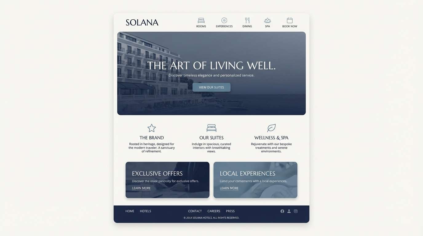
1) Midnight Harbor
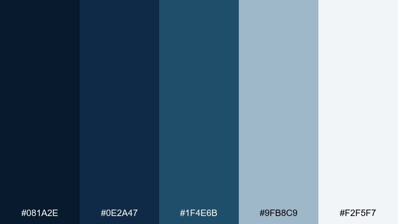
HEX: #081A2E #0E2A47 #1F4E6B #9FB8C9 #F2F5F7
Mood: moody, nautical, polished
Best for: hotel branding, premium websites, evening event visuals
Moody and cinematic like a harbor after sunset, these tones feel confident and upscale. Use the deep base for headers and hero sections, then lift readability with misty gray-blue and near-white. Brass or warm wood accents look especially refined against the cool navy range. Tip: keep body text on the lightest swatch and reserve the darkest for navigation and CTAs.
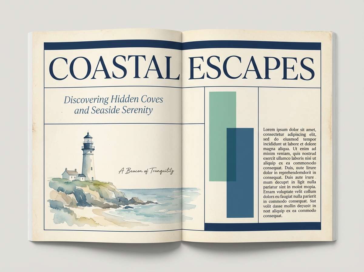
Image example of midnight harbor generated using media.io
Create palette-perfect visuals with Media.io. Powered by Wan 2.7 Image, it helps you generate and edit images with precise color control, consistent tones, and ready-to-use styles in your browser.

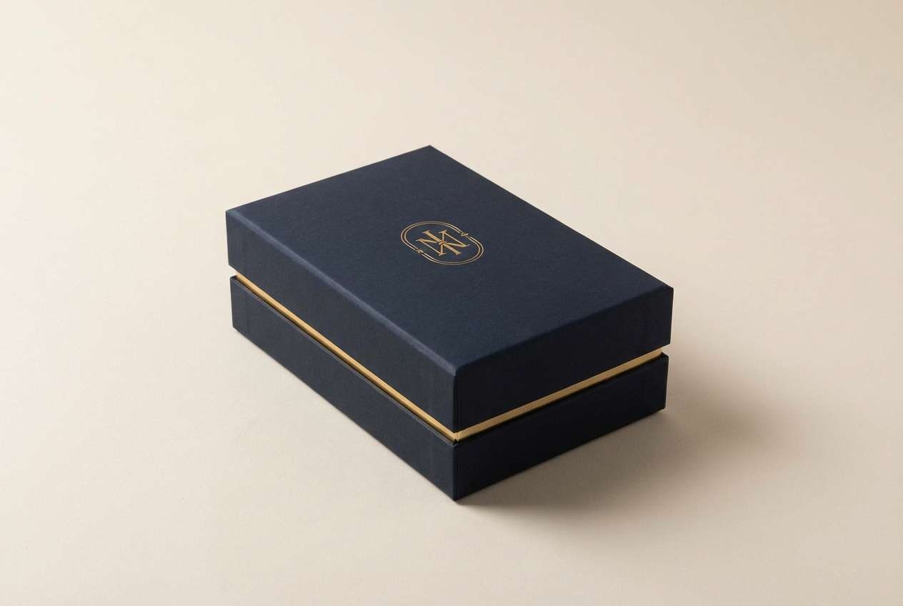
2) Gold-Trimmed Navy
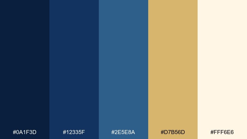
HEX: #0A1F3D #12335F #2E5E8A #D7B56D #FFF6E6
Mood: regal, warm, celebratory
Best for: packaging, invitations, luxury product ads
Regal and celebratory, it evokes velvet suits, warm candlelight, and subtle sparkle. Pair the deep blues with muted gold for borders, foil-stamp moments, or standout buttons. The creamy off-white keeps layouts airy while still feeling formal. Tip: use gold sparingly (5–10%) so it reads as a highlight, not a block.
Image example of gold-trimmed navy generated using media.io
3) Coastal Dusk
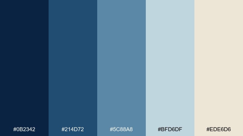
HEX: #0B2342 #214D72 #5C88A8 #BFD6DF #EDE6D6
Mood: calm, breezy, coastal
Best for: travel blogs, spa brands, lifestyle editorials
Calm and breezy like a shoreline sky fading into evening, the blues feel restorative rather than heavy. Balance the darker tones with soft sea-glass blue and clouded gray to keep pages light. The sandy neutral adds warmth for headings, dividers, or background panels. Tip: try a gradient from deep to pale blue for hero imagery overlays.
Image example of coastal dusk generated using media.io
4) Slate & Sand
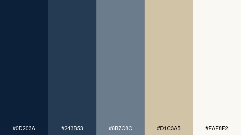
HEX: #0D203A #243B53 #6B7C8C #D1C3A5 #FAF8F2
Mood: grounded, modern, minimal
Best for: interior mood boards, architecture portfolios, corporate decks
Grounded and modern, it feels like slate stone, linen upholstery, and clean daylight. This navy blue color palette works beautifully when you want authority without harsh contrast. Pair the cool grays with sand-beige for warmth on slides, case studies, and portfolio captions. Tip: use the beige as a background block behind quotes to soften the layout.
Image example of slate & sand generated using media.io
5) Berry Ink
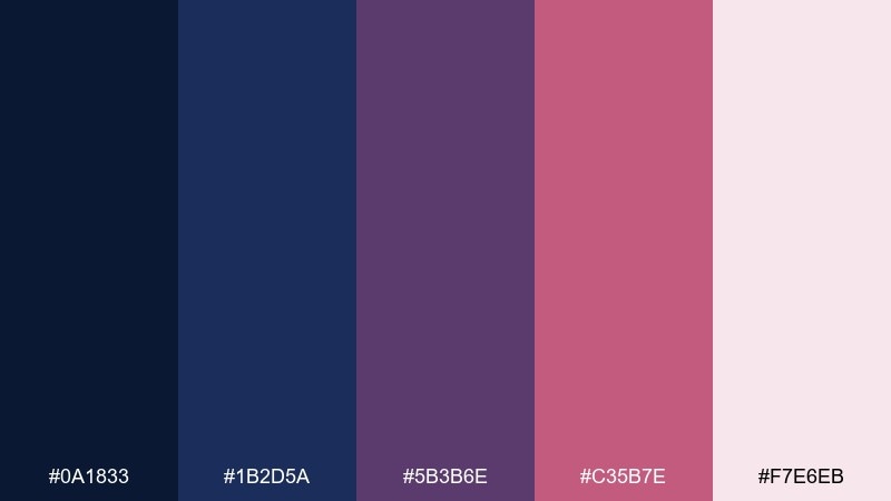
HEX: #0A1833 #1B2D5A #5B3B6E #C35B7E #F7E6EB
Mood: romantic, bold, creative
Best for: beauty brands, social posts, album artwork
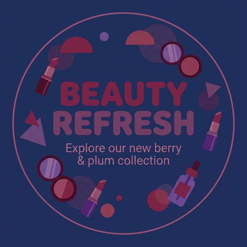
Romantic and bold, it brings to mind ink on textured paper with a pop of berry lipstick. Use the darkest blue for structure, then let plum and berry do the emotional storytelling in accents. The blush tint keeps the overall look friendly and shareable. Tip: reserve the berry swatch for one focal element per design (badge, CTA, or product name).
Image example of berry ink generated using media.io
6) Arctic Night
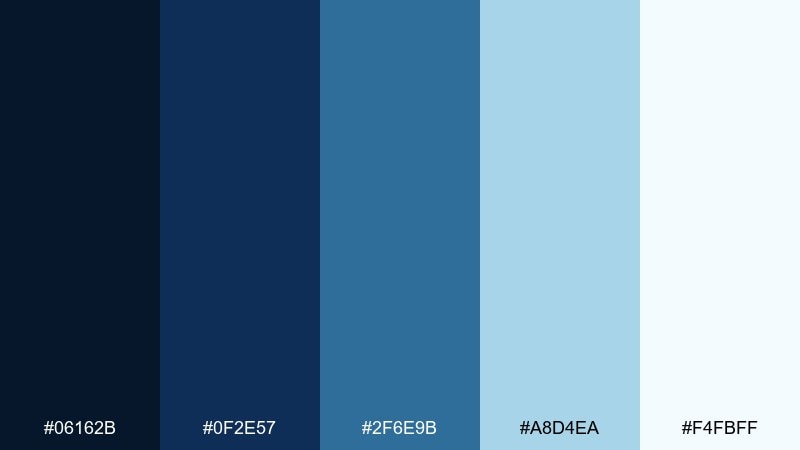
HEX: #06162B #0F2E57 #2F6E9B #A8D4EA #F4FBFF
Mood: crisp, high-contrast, techy
Best for: dashboard UI, fintech apps, data reports
Crisp and high-contrast, it evokes winter air, clear screens, and sharp focus. These navy blue color combinations are ideal for data-heavy UI where hierarchy matters. Let the pale icy blue carry charts and cards, while the deeper tones anchor navigation and sidebars. Tip: use the brightest tint only for success states or key metrics so it stays special.
Image example of arctic night generated using media.io
7) Vintage Library
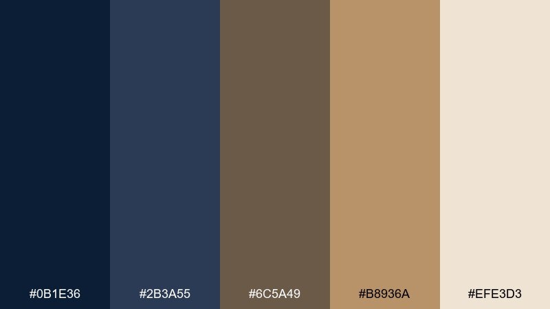
HEX: #0B1E36 #2B3A55 #6C5A49 #B8936A #EFE3D3
Mood: vintage, cozy, literary
Best for: book covers, cafes, heritage branding
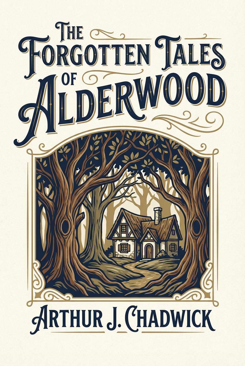
Vintage and cozy, it feels like leather bindings, wood shelves, and warm lamp glow. The navy adds seriousness, while the browns bring nostalgia and approachability. Creamy parchment is perfect for menus, cover typography, or packaging labels. Tip: choose a slightly textured background to amplify the heritage vibe without clutter.
Image example of vintage library generated using media.io
8) Sailor Stripe
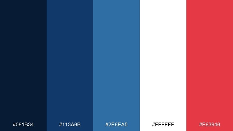
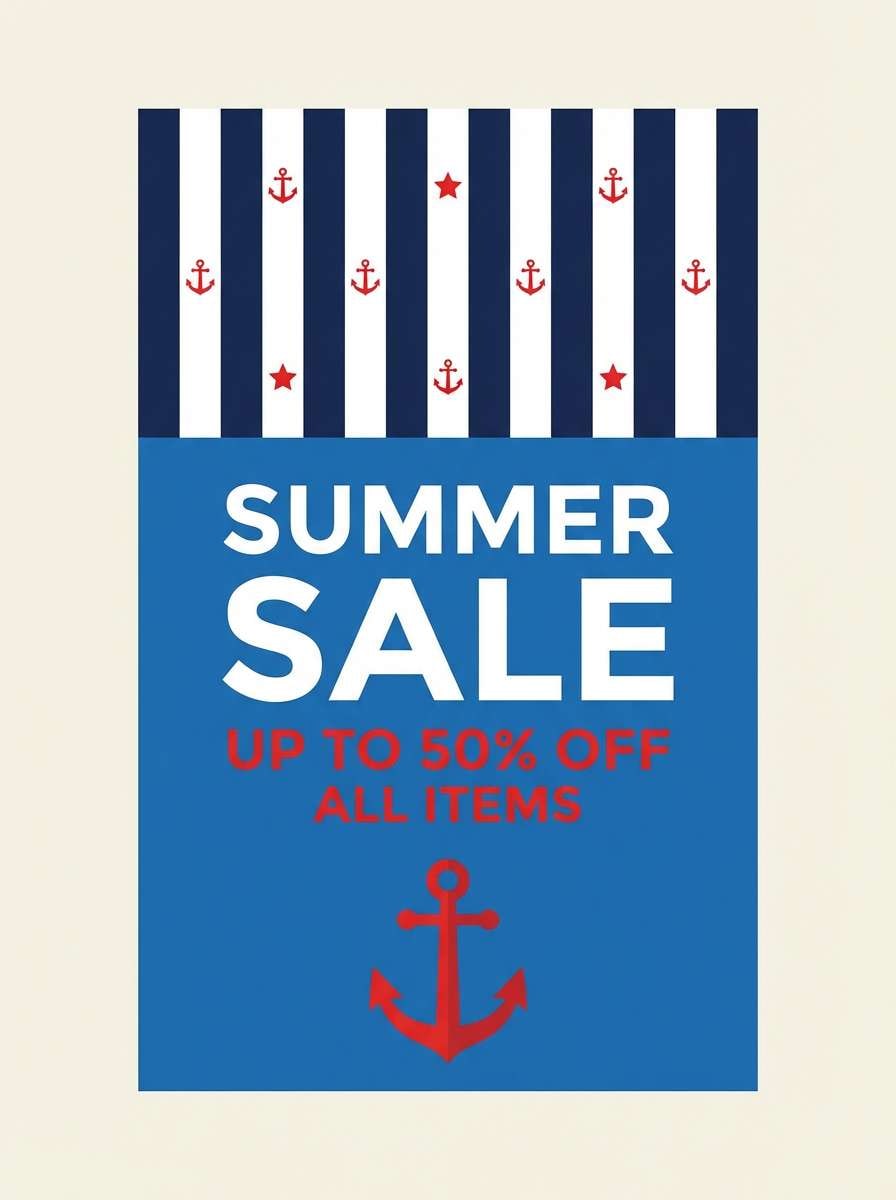
HEX: #081B34 #113A6B #2E6EA5 #FFFFFF #E63946
Mood: sporty, clean, nautical
Best for: sports branding, summer campaigns, poster design
Sporty and clean, it channels crisp stripes, fresh air, and a pop of signal red. Use white space to keep the blues feeling bright rather than heavy. The red accent is strongest in small doses—icons, underlines, or a single badge. Tip: set up a strict 70/25/5 balance (blue/white/red) for a sharp, consistent look.
Image example of sailor stripe generated using media.io
9) Neon Nightshift
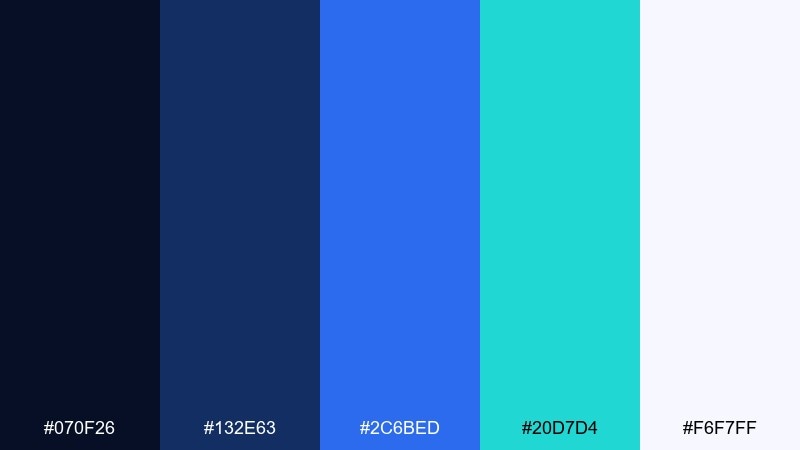
HEX: #070F26 #132E63 #2C6BED #20D7D4 #F6F7FF
Mood: energetic, futuristic, nightlife
Best for: music flyers, gaming brands, app splash screens
Energetic and futuristic, it reads like city lights against a late-night sky. Electric blue and teal bring motion and modernity without losing the grounded feel of the dark base. Keep typography simple and let the neon accents carry the personality. Tip: try glowing outlines or gradient buttons, but limit them to key actions to avoid visual noise.
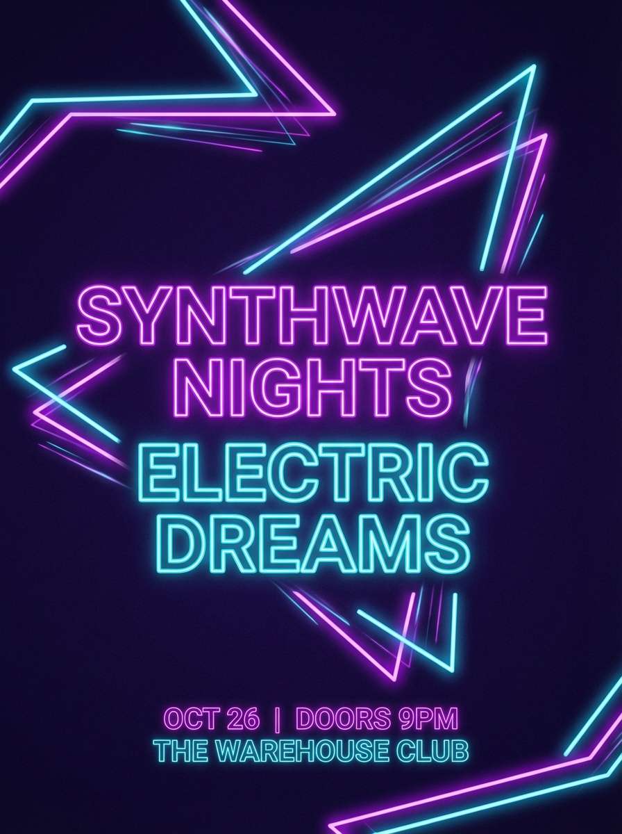
Image example of neon nightshift generated using media.io
10) Navy & Terracotta
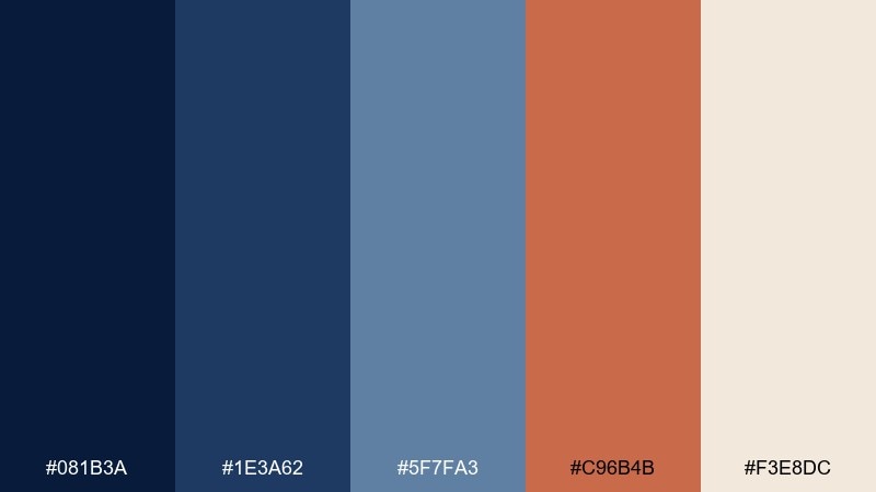
HEX: #081B3A #1E3A62 #5F7FA3 #C96B4B #F3E8DC
Mood: earthy, Mediterranean, welcoming
Best for: restaurant branding, home decor, lifestyle ads
Earthy and welcoming, it feels like terracotta rooftops under a deep evening sky. The warm clay accent prevents the blues from feeling too corporate and pairs nicely with natural textures. Use the light cream for menus, signage, and background space to keep everything readable. Tip: repeat terracotta in small touchpoints (icons, bullets, trims) for cohesion.
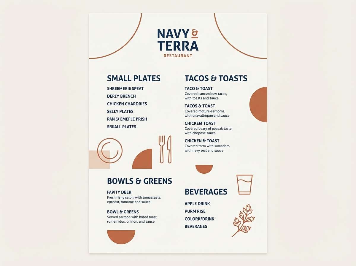
Image example of navy & terracotta generated using media.io
11) Stormy Denim
HEX: #0B1A2A #1B3550 #3E5F7A #7F9FB6 #D7E1E8
Mood: casual, trustworthy, cool
Best for: workwear brands, ecommerce, blog headers
Casual and trustworthy, these tones look like worn denim and overcast skies. Use the mid-blues for buttons and UI states to keep interactions friendly and familiar. The pale steel tint is great for section backgrounds and product grids. Tip: add subtle grain or fabric-like patterning to reinforce the denim feel without hurting contrast.
Image example of stormy denim generated using media.io
12) Peacock Depths
HEX: #061A2C #0E3B52 #0F6B6E #5FC4B6 #E9FFF9
Mood: lush, artistic, oceanic
Best for: wellness brands, packaging, boutique logos
Lush and oceanic, it suggests deep water, peacock feathers, and spa-like calm. The teal range adds personality while the darkest shade keeps the look premium. Pair with matte white, light stone neutrals, or brushed silver for a clean finish. Tip: use the bright aqua for micro-accents like icons, line separators, and hover states.
Image example of peacock depths generated using media.io
13) Rose Quartz Navy
HEX: #0A1A33 #1C2F57 #6E87A6 #E7B7C6 #FFF4F7
Mood: soft, elegant, romantic
Best for: wedding suites, beauty landing pages, feminine branding
Soft and elegant, it feels like rose quartz jewelry against a dark evening dress. This navy blue color palette is a strong choice for romantic designs that still need clear structure. Balance the blush tones with plenty of near-white to keep type crisp and photography bright. Tip: apply blush only to backgrounds and highlights, not long text, for better readability.
Image example of rose quartz navy generated using media.io
14) Olive Uniform
HEX: #071B2D #1F3455 #4C6A5A #A3B18A #F5F1E6
Mood: practical, outdoorsy, grounded
Best for: outdoor brands, uniforms, sustainability reports
Practical and grounded, it brings to mind field jackets, pine shade, and dependable materials. The olive tones soften the dark base and add a natural, eco-forward edge. Use the warm off-white for content-heavy layouts like reports and long-form pages. Tip: pair with kraft-paper textures or recycled stock to reinforce the outdoorsy message.
Image example of olive uniform generated using media.io
15) Champagne Evening
HEX: #071A35 #18385F #445D7A #E8D6B6 #FFF9EF
Mood: glam, warm, sophisticated
Best for: gala invites, upscale events, premium newsletters
Glam and sophisticated, it recalls champagne foam, tailored suits, and low-lit venues. The warm champagne tones keep the blues from feeling cold and make headlines feel inviting. Use the mid-blue for secondary type and let the deepest shade frame the composition. Tip: add thin champagne rules and borders to create a high-end editorial rhythm.
Image example of champagne evening generated using media.io
16) Cyber Navy UI
HEX: #050C1E #101E3B #2A3F7A #6E8CFF #EAF0FF
Mood: sleek, modern, product-led
Best for: SaaS UI, onboarding screens, dark-mode components
Sleek and product-led, it feels like a sharp dark-mode workspace with clear, cool highlights. Use the periwinkle accent for primary actions and active states while keeping surfaces in the deeper blues. The light tint helps cards and modals stand out without turning the UI stark white. Tip: keep shadows subtle and rely on spacing plus contrast for depth.
Image example of cyber navy ui generated using media.io
17) Quiet Minimal
HEX: #0B1730 #222B3F #6A7387 #DADFE6 #FFFFFF
Mood: minimal, quiet, professional
Best for: resume templates, corporate sites, presentation decks
Quiet and professional, it suggests crisp stationery and well-edited presentations. The near-black navy and charcoal create confident type hierarchy without looking harsh. Light gray and white keep the canvas clean for charts, tables, and long text. Tip: choose one dark tone for headings and stick to it across the whole system for consistency.
Image example of quiet minimal generated using media.io
18) Indigo Forest
HEX: #07162B #1A2D4F #2F4A3E #6D8F73 #EAF2EA
Mood: natural, calm, contemplative
Best for: botanical prints, eco packaging, retreat branding
Natural and contemplative, it looks like shadowy evergreens under an indigo sky. The green range adds organic balance to the deep base and works well with recycled materials. Use the pale minty tint for breathing room in labels and brochures. Tip: add botanical line art in the darkest shade for a refined, understated illustration style.
Image example of indigo forest generated using media.io
19) Marble & Navy
HEX: #071733 #1D325A #5B6F8F #C8D0DA #F7F7F8
Mood: clean, architectural, premium
Best for: real estate branding, portfolio sites, stationery
Clean and architectural, it evokes cool marble, polished metal, and sharp edges. The gray-blue steps make it easy to build depth across cards, sections, and print elements. Pair with simple sans-serif type and plenty of negative space for a high-end finish. Tip: keep photography cool-toned so it blends naturally with the stone-like neutrals.
Image example of marble & navy generated using media.io
20) Citrus Spark
HEX: #081634 #1A3C6D #4E7FB8 #FFC857 #F5FAFF
Mood: optimistic, sporty, modern
Best for: startup branding, promo banners, app badges
Optimistic and modern, it feels like bright sunlight cutting through deep blue sky. The citrus yellow adds instant energy and improves visibility for key actions. Use the paler blue and near-white to keep layouts fresh and reduce eye strain. Tip: turn the yellow into a consistent highlight style (underline, tag, or icon fill) to unify the system.
Image example of citrus spark generated using media.io

21) Brick & Blueprint
HEX: #081A33 #163A63 #3F6C9B #B55239 #F2EEE8
Mood: industrial, confident, craft
Best for: construction brands, workshop posters, maker logos
Industrial and confident, it suggests blueprint paper, brick walls, and hands-on craft. These navy blue color combinations pair especially well with textured materials and bold sans-serif type. Use the brick red for calls-to-action or key labels, and keep the off-white for breathing room. Tip: add simple line icons in the mid-blue to reinforce a technical, reliable feel.
Image example of brick & blueprint generated using media.io

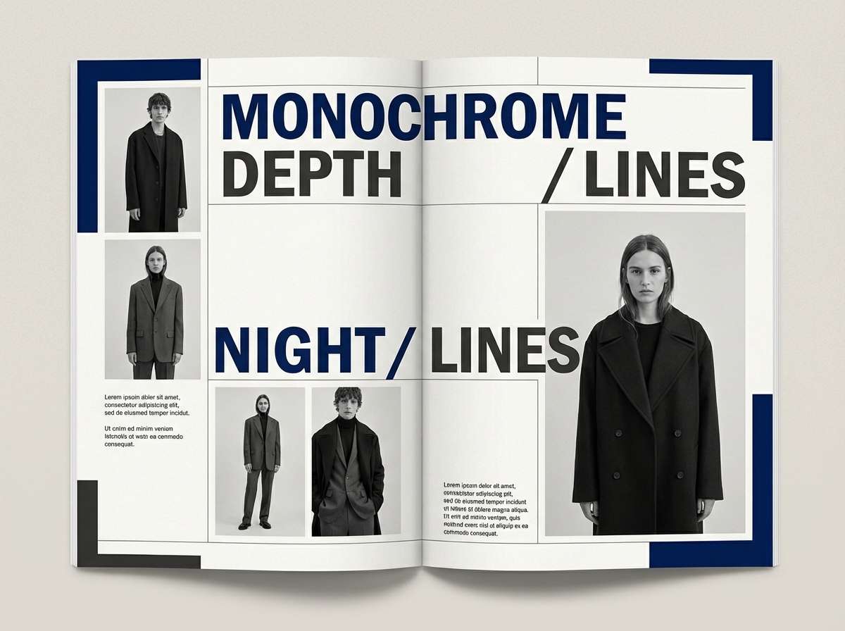
22) Inky Noir Contrast
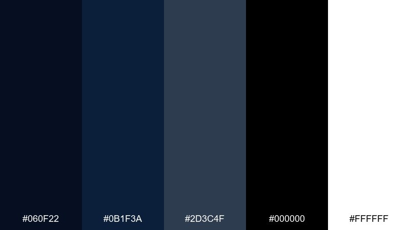
HEX: #060F22 #0B1F3A #2D3C4F #000000 #FFFFFF
Mood: dramatic, modern, high-contrast
Best for: fashion lookbooks, photography portfolios, bold UI
Dramatic and modern, it feels like inky shadows against crisp studio light. Use the black-and-white extremes for punch, and let the navy and charcoal soften transitions between sections. The result is a navy blue color palette that stays bold without looking flat. Tip: keep imagery monochrome or desaturated so the contrast reads intentional and premium.
Image example of inky noir contrast generated using media.io
What Colors Go Well with Navy Blue?
Navy blue pairs naturally with crisp neutrals like white, off-white, and cool gray for clean, professional layouts. If you want a softer feel, swap bright white for cream or parchment tones.
For warmth and sophistication, combine navy with metallics (muted gold, brass, champagne) or earthy accents like terracotta and tan. These add contrast without making the palette feel loud.
To go bold, try high-visibility accents such as citrus yellow, signal red, electric blue, or teal—best used sparingly for CTAs, icons, and key highlights.
How to Use a Navy Blue Color Palette in Real Designs
Start with role assignment: pick one darkest navy for navigation/headers, one mid-tone for interactive UI states, and one light neutral for backgrounds. This keeps hierarchy consistent across pages or slides.
Balance weight with whitespace. Navy can feel heavy when overused, so give it breathing room with light sections, generous spacing, and thin dividers instead of thick blocks.
For accessibility, test contrast on text and buttons. Use near-white for long-form copy and reserve saturated accents for small elements where you need attention, not paragraphs.
Create Navy Blue Palette Visuals with AI
Want to see a navy blue color scheme in action before you commit? Generate quick mockups—landing pages, posters, packaging, or UI screens—so you can validate mood and contrast in seconds.
With Media.io Text-to-Image, you can paste a prompt (and your chosen HEX inspiration) to produce consistent style directions, then iterate on typography, layout density, and accent color usage.
Use it to produce multiple variations (minimal, luxury, playful, techy) from the same navy base, so your team can compare options side by side.
Navy Blue Color Palette FAQs
-
What is the HEX code for navy blue?
Navy blue doesn’t have a single HEX value, but common “navy” bases are very dark blues like #081A2E, #0A1F3D, or #050C1E (all used in the palettes above). -
Does navy blue go with black?
Yes—navy and black can look modern and premium when you separate them with a light neutral (white/off-white) or a mid-gray-blue to avoid muddy transitions. -
What accent colors look best with navy blue?
Gold/champagne for luxury, terracotta/tan for warmth, teal for a fresh oceanic vibe, and citrus yellow or red for high-energy CTA moments. -
Is navy blue good for UI and dashboards?
Absolutely. Navy works well for dark-mode foundations because it provides depth without the harshness of pure black. Pair it with icy tints and a single bright accent for clear hierarchy. -
How do I keep navy from feeling too dark?
Use navy for structure (nav, headers, footers) and rely on light neutrals for content-heavy areas. Adding warm off-whites or sand tones also softens the overall feel. -
What’s a good navy blue palette for weddings or romantic branding?
Try a navy + blush combination like Rose Quartz Navy (#0A1A33 #1C2F57 #6E87A6 #E7B7C6 #FFF4F7) for elegant contrast that still feels soft. -
Can I generate navy blue palette mockups quickly?
Yes. Use Media.io’s text-to-image tool to generate posters, landing pages, packaging, or UI scenes from prompts, then iterate until the palette and layout feel right.
Next: White Black Color Palette
Navy blue is one of the most versatile “serious” colors: it feels premium like black, but softer, friendlier, and often easier to read in UI and print.
Below are 20+ navy blue color palette ideas with HEX codes—plus practical pairing tips for branding, interfaces, and interiors.
In this article
- Why Navy Blue Palettes Work So Well
-
- midnight harbor
- gold-trimmed navy
- coastal dusk
- slate & sand
- berry ink
- arctic night
- vintage library
- sailor stripe
- neon nightshift
- navy & terracotta
- stormy denim
- peacock depths
- rose quartz navy
- olive uniform
- champagne evening
- cyber navy ui
- quiet minimal
- indigo forest
- marble & navy
- citrus spark
- brick & blueprint
- inky noir contrast
- What Colors Go Well with Navy Blue?
- How to Use a Navy Blue Color Palette in Real Designs
- Create Navy Blue Palette Visuals with AI
Why Navy Blue Palettes Work So Well
Navy blue carries authority and trust (common in finance, SaaS, and government) while staying warmer and more human than pure black. That makes it ideal for brands that want to feel confident without looking harsh.
It also plays well with both cool and warm accents. You can push navy toward crisp, icy UI with pale blues—or toward elegant editorial vibes with champagne, tan, and metallic gold.
From a usability standpoint, navy is excellent for structure: navigation, headers, and section dividers. With the right light neutrals, it supports high contrast and comfortable reading.
20+ Navy Blue Color Palette Ideas (with HEX Codes)
1) Midnight Harbor
HEX: #081A2E #0E2A47 #1F4E6B #9FB8C9 #F2F5F7
Mood: moody, nautical, polished
Best for: hotel branding, premium websites, evening event visuals
Moody and cinematic like a harbor after sunset, these tones feel confident and upscale. Use the deep base for headers and hero sections, then lift readability with misty gray-blue and near-white. Brass or warm wood accents look especially refined against the cool navy range. Tip: keep body text on the lightest swatch and reserve the darkest for navigation and CTAs.
Image example of midnight harbor generated using media.io
Media.io is an online AI studio for creating and editing video, image, and audio in your browser.
2) Gold-Trimmed Navy
HEX: #0A1F3D #12335F #2E5E8A #D7B56D #FFF6E6
Mood: regal, warm, celebratory
Best for: packaging, invitations, luxury product ads
Regal and celebratory, it evokes velvet suits, warm candlelight, and subtle sparkle. Pair the deep blues with muted gold for borders, foil-stamp moments, or standout buttons. The creamy off-white keeps layouts airy while still feeling formal. Tip: use gold sparingly (5–10%) so it reads as a highlight, not a block.
Image example of gold-trimmed navy generated using media.io
3) Coastal Dusk
HEX: #0B2342 #214D72 #5C88A8 #BFD6DF #EDE6D6
Mood: calm, breezy, coastal
Best for: travel blogs, spa brands, lifestyle editorials
Calm and breezy like a shoreline sky fading into evening, the blues feel restorative rather than heavy. Balance the darker tones with soft sea-glass blue and clouded gray to keep pages light. The sandy neutral adds warmth for headings, dividers, or background panels. Tip: try a gradient from deep to pale blue for hero imagery overlays.
Image example of coastal dusk generated using media.io
4) Slate & Sand
HEX: #0D203A #243B53 #6B7C8C #D1C3A5 #FAF8F2
Mood: grounded, modern, minimal
Best for: interior mood boards, architecture portfolios, corporate decks
Grounded and modern, it feels like slate stone, linen upholstery, and clean daylight. This navy blue color palette works beautifully when you want authority without harsh contrast. Pair the cool grays with sand-beige for warmth on slides, case studies, and portfolio captions. Tip: use the beige as a background block behind quotes to soften the layout.
Image example of slate & sand generated using media.io
5) Berry Ink
HEX: #0A1833 #1B2D5A #5B3B6E #C35B7E #F7E6EB
Mood: romantic, bold, creative
Best for: beauty brands, social posts, album artwork
Romantic and bold, it brings to mind ink on textured paper with a pop of berry lipstick. Use the darkest blue for structure, then let plum and berry do the emotional storytelling in accents. The blush tint keeps the overall look friendly and shareable. Tip: reserve the berry swatch for one focal element per design (badge, CTA, or product name).
Image example of berry ink generated using media.io
6) Arctic Night
HEX: #06162B #0F2E57 #2F6E9B #A8D4EA #F4FBFF
Mood: crisp, high-contrast, techy
Best for: dashboard UI, fintech apps, data reports
Crisp and high-contrast, it evokes winter air, clear screens, and sharp focus. These navy blue color combinations are ideal for data-heavy UI where hierarchy matters. Let the pale icy blue carry charts and cards, while the deeper tones anchor navigation and sidebars. Tip: use the brightest tint only for success states or key metrics so it stays special.
Image example of arctic night generated using media.io
7) Vintage Library
HEX: #0B1E36 #2B3A55 #6C5A49 #B8936A #EFE3D3
Mood: vintage, cozy, literary
Best for: book covers, cafes, heritage branding
Vintage and cozy, it feels like leather bindings, wood shelves, and warm lamp glow. The navy adds seriousness, while the browns bring nostalgia and approachability. Creamy parchment is perfect for menus, cover typography, or packaging labels. Tip: choose a slightly textured background to amplify the heritage vibe without clutter.
Image example of vintage library generated using media.io
8) Sailor Stripe
HEX: #081B34 #113A6B #2E6EA5 #FFFFFF #E63946
Mood: sporty, clean, nautical
Best for: sports branding, summer campaigns, poster design
Sporty and clean, it channels crisp stripes, fresh air, and a pop of signal red. Use white space to keep the blues feeling bright rather than heavy. The red accent is strongest in small doses—icons, underlines, or a single badge. Tip: set up a strict 70/25/5 balance (blue/white/red) for a sharp, consistent look.
Image example of sailor stripe generated using media.io
9) Neon Nightshift
HEX: #070F26 #132E63 #2C6BED #20D7D4 #F6F7FF
Mood: energetic, futuristic, nightlife
Best for: music flyers, gaming brands, app splash screens
Energetic and futuristic, it reads like city lights against a late-night sky. Electric blue and teal bring motion and modernity without losing the grounded feel of the dark base. Keep typography simple and let the neon accents carry the personality. Tip: try glowing outlines or gradient buttons, but limit them to key actions to avoid visual noise.
Image example of neon nightshift generated using media.io
10) Navy & Terracotta
HEX: #081B3A #1E3A62 #5F7FA3 #C96B4B #F3E8DC
Mood: earthy, Mediterranean, welcoming
Best for: restaurant branding, home decor, lifestyle ads
Earthy and welcoming, it feels like terracotta rooftops under a deep evening sky. The warm clay accent prevents the blues from feeling too corporate and pairs nicely with natural textures. Use the light cream for menus, signage, and background space to keep everything readable. Tip: repeat terracotta in small touchpoints (icons, bullets, trims) for cohesion.
Image example of navy & terracotta generated using media.io
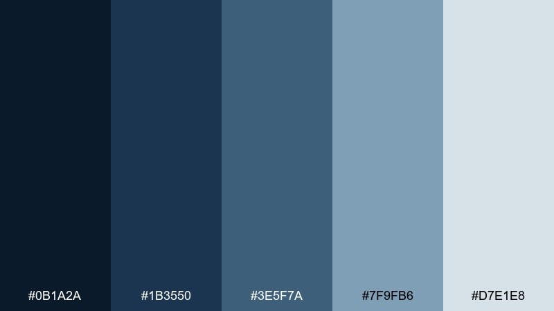
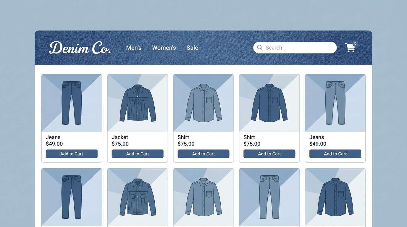
11) Stormy Denim
HEX: #0B1A2A #1B3550 #3E5F7A #7F9FB6 #D7E1E8
Mood: casual, trustworthy, cool
Best for: workwear brands, ecommerce, blog headers
Casual and trustworthy, these tones look like worn denim and overcast skies. Use the mid-blues for buttons and UI states to keep interactions friendly and familiar. The pale steel tint is great for section backgrounds and product grids. Tip: add subtle grain or fabric-like patterning to reinforce the denim feel without hurting contrast.
Image example of stormy denim generated using media.io
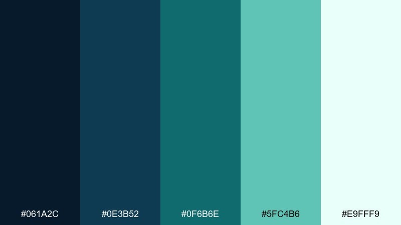
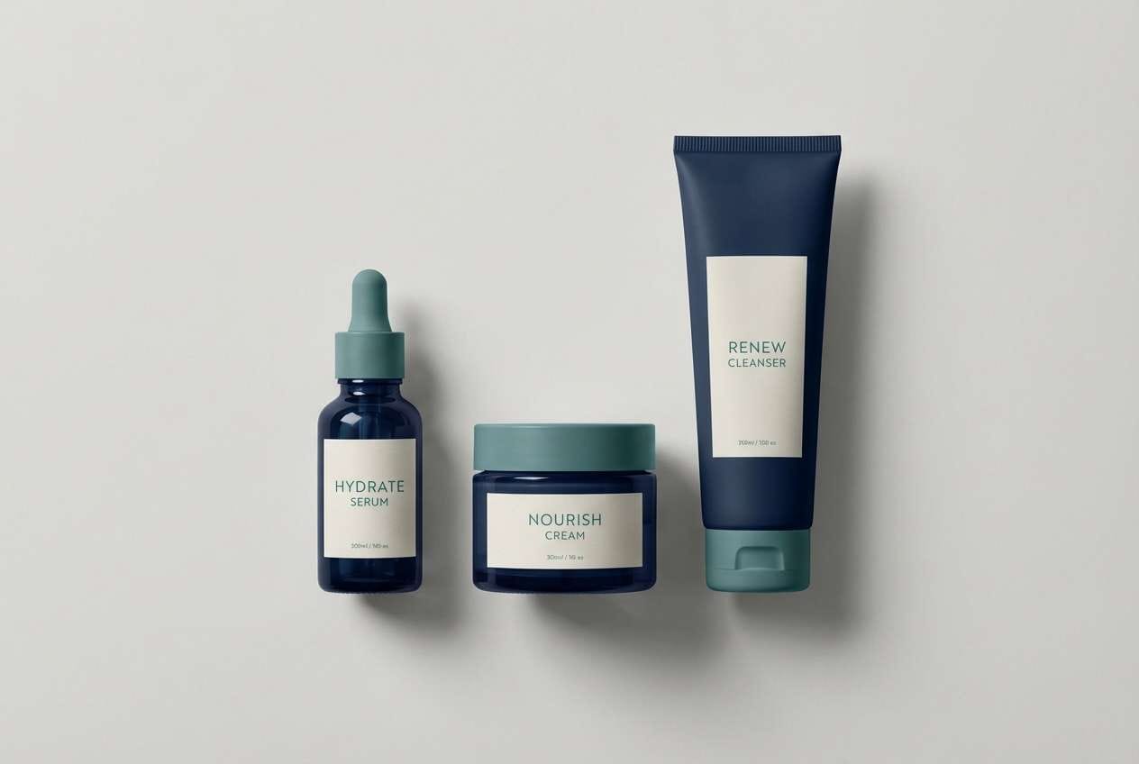
12) Peacock Depths
HEX: #061A2C #0E3B52 #0F6B6E #5FC4B6 #E9FFF9
Mood: lush, artistic, oceanic
Best for: wellness brands, packaging, boutique logos
Lush and oceanic, it suggests deep water, peacock feathers, and spa-like calm. The teal range adds personality while the darkest shade keeps the look premium. Pair with matte white, light stone neutrals, or brushed silver for a clean finish. Tip: use the bright aqua for micro-accents like icons, line separators, and hover states.
Image example of peacock depths generated using media.io
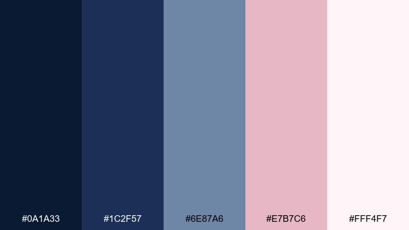
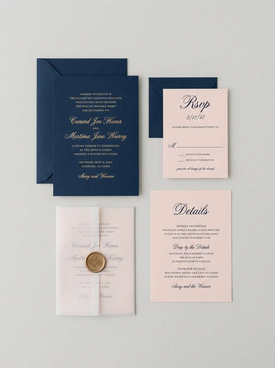
13) Rose Quartz Navy
HEX: #0A1A33 #1C2F57 #6E87A6 #E7B7C6 #FFF4F7
Mood: soft, elegant, romantic
Best for: wedding suites, beauty landing pages, feminine branding
Soft and elegant, it feels like rose quartz jewelry against a dark evening dress. This navy blue color palette is a strong choice for romantic designs that still need clear structure. Balance the blush tones with plenty of near-white to keep type crisp and photography bright. Tip: apply blush only to backgrounds and highlights, not long text, for better readability.
Image example of rose quartz navy generated using media.io
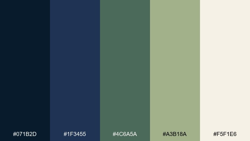
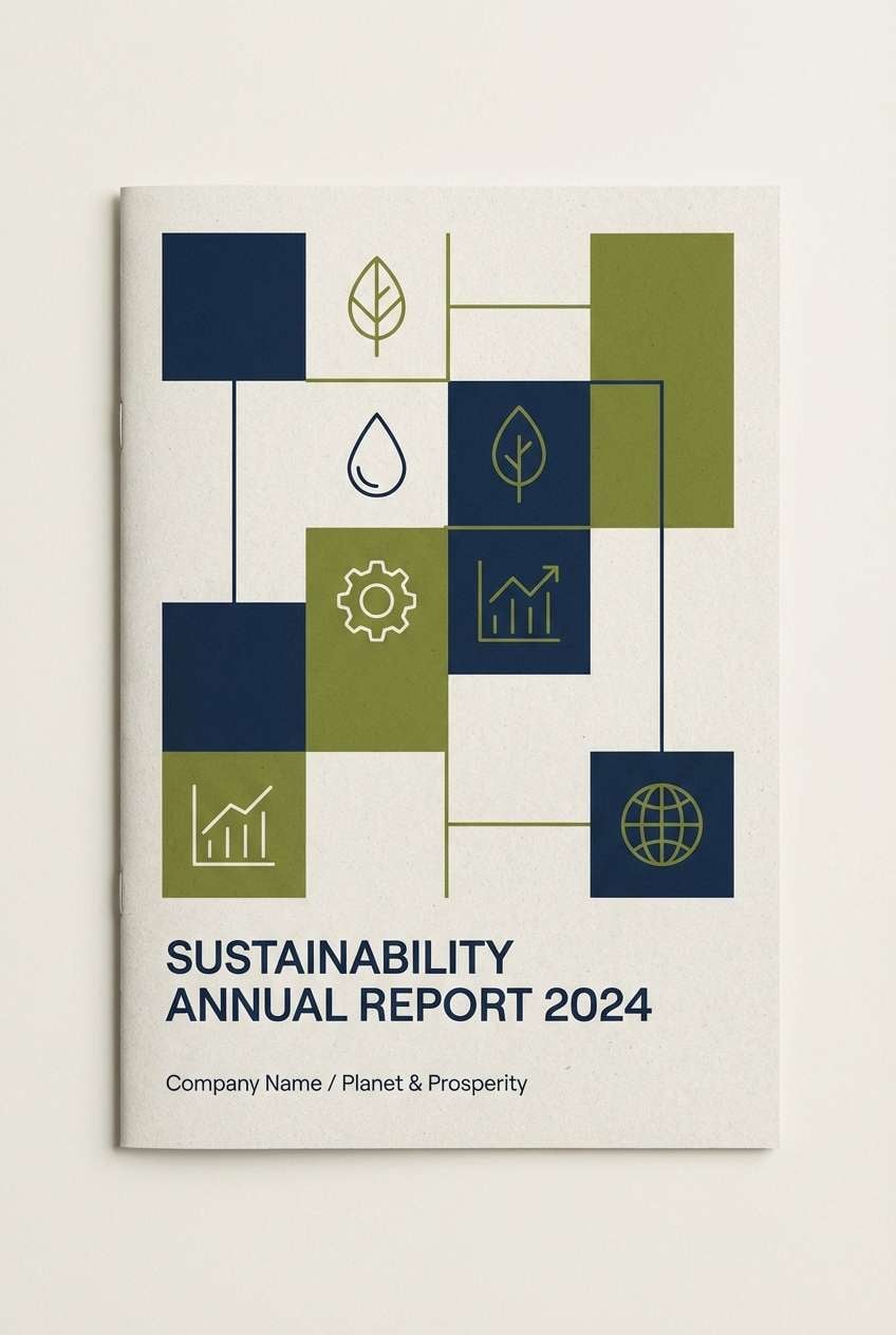
14) Olive Uniform
HEX: #071B2D #1F3455 #4C6A5A #A3B18A #F5F1E6
Mood: practical, outdoorsy, grounded
Best for: outdoor brands, uniforms, sustainability reports
Practical and grounded, it brings to mind field jackets, pine shade, and dependable materials. The olive tones soften the dark base and add a natural, eco-forward edge. Use the warm off-white for content-heavy layouts like reports and long-form pages. Tip: pair with kraft-paper textures or recycled stock to reinforce the outdoorsy message.
Image example of olive uniform generated using media.io
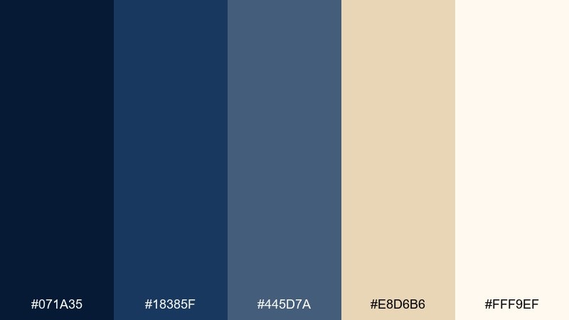
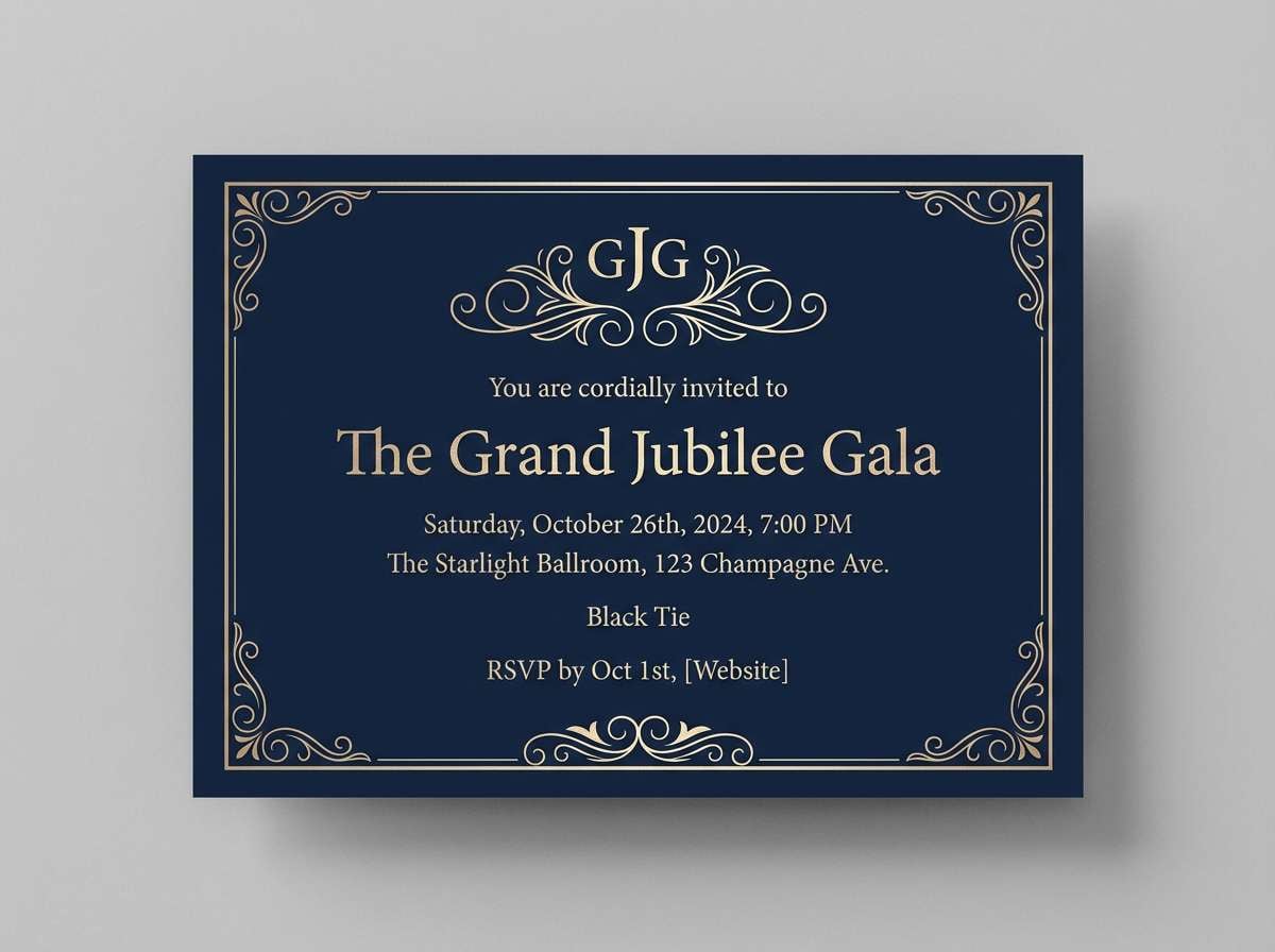
15) Champagne Evening
HEX: #071A35 #18385F #445D7A #E8D6B6 #FFF9EF
Mood: glam, warm, sophisticated
Best for: gala invites, upscale events, premium newsletters
Glam and sophisticated, it recalls champagne foam, tailored suits, and low-lit venues. The warm champagne tones keep the blues from feeling cold and make headlines feel inviting. Use the mid-blue for secondary type and let the deepest shade frame the composition. Tip: add thin champagne rules and borders to create a high-end editorial rhythm.
Image example of champagne evening generated using media.io
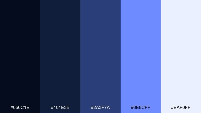
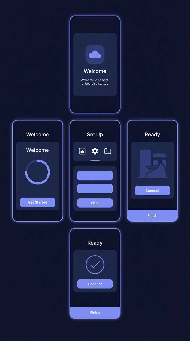
16) Cyber Navy UI
HEX: #050C1E #101E3B #2A3F7A #6E8CFF #EAF0FF
Mood: sleek, modern, product-led
Best for: SaaS UI, onboarding screens, dark-mode components
Sleek and product-led, it feels like a sharp dark-mode workspace with clear, cool highlights. Use the periwinkle accent for primary actions and active states while keeping surfaces in the deeper blues. The light tint helps cards and modals stand out without turning the UI stark white. Tip: keep shadows subtle and rely on spacing plus contrast for depth.
Image example of cyber navy ui generated using media.io
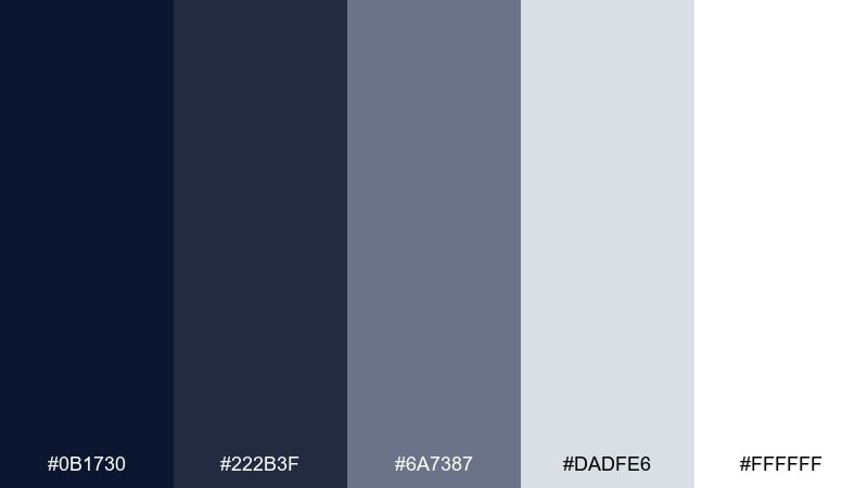
17) Quiet Minimal
HEX: #0B1730 #222B3F #6A7387 #DADFE6 #FFFFFF
Mood: minimal, quiet, professional
Best for: resume templates, corporate sites, presentation decks
Quiet and professional, it suggests crisp stationery and well-edited presentations. The near-black navy and charcoal create confident type hierarchy without looking harsh. Light gray and white keep the canvas clean for charts, tables, and long text. Tip: choose one dark tone for headings and stick to it across the whole system for consistency.
Image example of quiet minimal generated using media.io
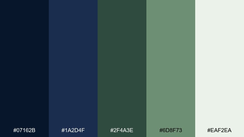
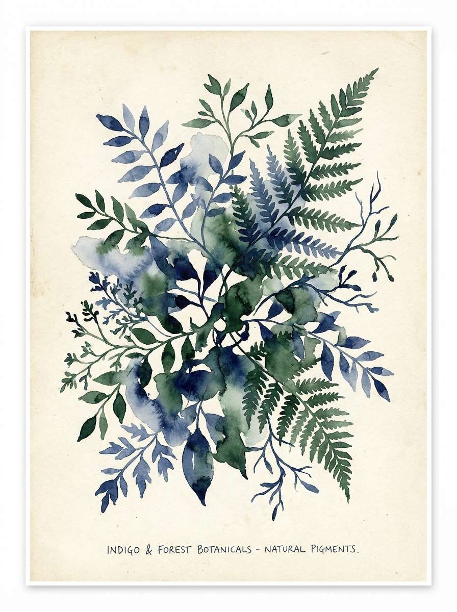
18) Indigo Forest
HEX: #07162B #1A2D4F #2F4A3E #6D8F73 #EAF2EA
Mood: natural, calm, contemplative
Best for: botanical prints, eco packaging, retreat branding
Natural and contemplative, it looks like shadowy evergreens under an indigo sky. The green range adds organic balance to the deep base and works well with recycled materials. Use the pale minty tint for breathing room in labels and brochures. Tip: add botanical line art in the darkest shade for a refined, understated illustration style.
Image example of indigo forest generated using media.io
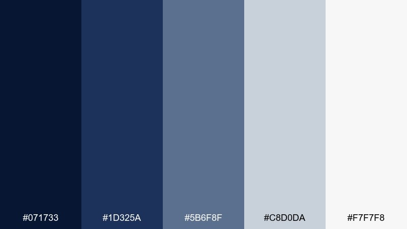
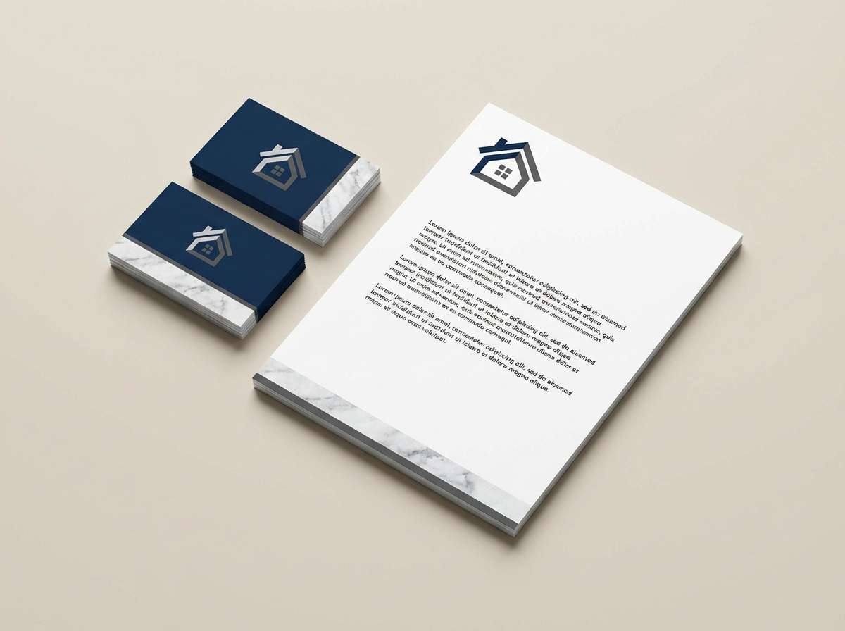
19) Marble & Navy
HEX: #071733 #1D325A #5B6F8F #C8D0DA #F7F7F8
Mood: clean, architectural, premium
Best for: real estate branding, portfolio sites, stationery
Clean and architectural, it evokes cool marble, polished metal, and sharp edges. The gray-blue steps make it easy to build depth across cards, sections, and print elements. Pair with simple sans-serif type and plenty of negative space for a high-end finish. Tip: keep photography cool-toned so it blends naturally with the stone-like neutrals.
Image example of marble & navy generated using media.io
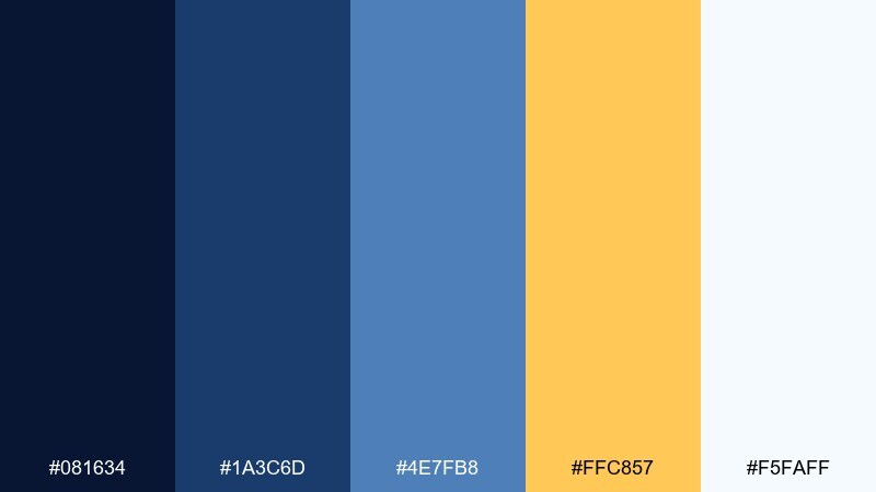
20) Citrus Spark
HEX: #081634 #1A3C6D #4E7FB8 #FFC857 #F5FAFF
Mood: optimistic, sporty, modern
Best for: startup branding, promo banners, app badges
Optimistic and modern, it feels like bright sunlight cutting through deep blue sky. The citrus yellow adds instant energy and improves visibility for key actions. Use the paler blue and near-white to keep layouts fresh and reduce eye strain. Tip: turn the yellow into a consistent highlight style (underline, tag, or icon fill) to unify the system.
Image example of citrus spark generated using media.io
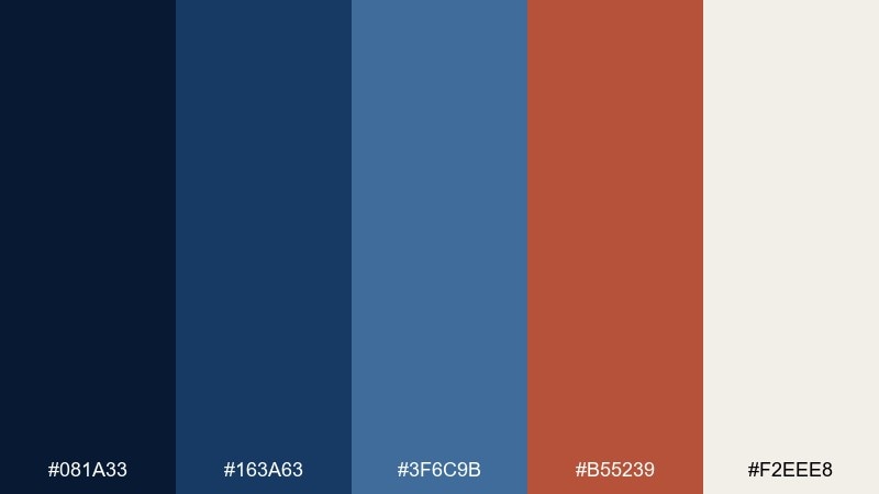
21) Brick & Blueprint
HEX: #081A33 #163A63 #3F6C9B #B55239 #F2EEE8
Mood: industrial, confident, craft
Best for: construction brands, workshop posters, maker logos
Industrial and confident, it suggests blueprint paper, brick walls, and hands-on craft. These navy blue color combinations pair especially well with textured materials and bold sans-serif type. Use the brick red for calls-to-action or key labels, and keep the off-white for breathing room. Tip: add simple line icons in the mid-blue to reinforce a technical, reliable feel.
Image example of brick & blueprint generated using media.io
22) Inky Noir Contrast
HEX: #060F22 #0B1F3A #2D3C4F #000000 #FFFFFF
Mood: dramatic, modern, high-contrast
Best for: fashion lookbooks, photography portfolios, bold UI
Dramatic and modern, it feels like inky shadows against crisp studio light. Use the black-and-white extremes for punch, and let the navy and charcoal soften transitions between sections. The result is a navy blue color palette that stays bold without looking flat. Tip: keep imagery monochrome or desaturated so the contrast reads intentional and premium.
Image example of inky noir contrast generated using media.io
What Colors Go Well with Navy Blue?
Navy blue pairs naturally with crisp neutrals like white, off-white, and cool gray for clean, professional layouts. If you want a softer feel, swap bright white for cream or parchment tones.
For warmth and sophistication, combine navy with metallics (muted gold, brass, champagne) or earthy accents like terracotta and tan. These add contrast without making the palette feel loud.
To go bold, try high-visibility accents such as citrus yellow, signal red, electric blue, or teal—best used sparingly for CTAs, icons, and key highlights.
How to Use a Navy Blue Color Palette in Real Designs
Start with role assignment: pick one darkest navy for navigation/headers, one mid-tone for interactive UI states, and one light neutral for backgrounds. This keeps hierarchy consistent across pages or slides.
Balance weight with whitespace. Navy can feel heavy when overused, so give it breathing room with light sections, generous spacing, and thin dividers instead of thick blocks.
For accessibility, test contrast on text and buttons. Use near-white for long-form copy and reserve saturated accents for small elements where you need attention, not paragraphs.
Create Navy Blue Palette Visuals with AI
Want to see a navy blue color scheme in action before you commit? Generate quick mockups—landing pages, posters, packaging, or UI screens—so you can validate mood and contrast in seconds.
With Media.io Text-to-Image, you can paste a prompt (and your chosen HEX inspiration) to produce consistent style directions, then iterate on typography, layout density, and accent color usage.
Use it to produce multiple variations (minimal, luxury, playful, techy) from the same navy base, so your team can compare options side by side.
Navy Blue Color Palette FAQs
-
What is the HEX code for navy blue?
Navy blue doesn’t have a single HEX value, but common “navy” bases are very dark blues like #081A2E, #0A1F3D, or #050C1E (all used in the palettes above). -
Does navy blue go with black?
Yes—navy and black can look modern and premium when you separate them with a light neutral (white/off-white) or a mid-gray-blue to avoid muddy transitions. -
What accent colors look best with navy blue?
Gold/champagne for luxury, terracotta/tan for warmth, teal for a fresh oceanic vibe, and citrus yellow or red for high-energy CTA moments. -
Is navy blue good for UI and dashboards?
Absolutely. Navy works well for dark-mode foundations because it provides depth without the harshness of pure black. Pair it with icy tints and a single bright accent for clear hierarchy. -
How do I keep navy from feeling too dark?
Use navy for structure (nav, headers, footers) and rely on light neutrals for content-heavy areas. Adding warm off-whites or sand tones also softens the overall feel. -
What’s a good navy blue palette for weddings or romantic branding?
Try a navy + blush combination like Rose Quartz Navy (#0A1A33 #1C2F57 #6E87A6 #E7B7C6 #FFF4F7) for elegant contrast that still feels soft. -
Can I generate navy blue palette mockups quickly?
Yes. Use Media.io’s text-to-image tool to generate posters, landing pages, packaging, or UI scenes from prompts, then iterate until the palette and layout feel right.
Next: Burgundy Color Palette


