

A white black color palette is the fastest way to make a design feel intentional—clean backgrounds, crisp type, and instantly readable hierarchy.
Below are 20 curated monochrome palettes with HEX codes, plus practical tips for contrast, balance, and adding just enough accent color when needed.
In this article
Why White Black Palettes Work So Well
White and black are visual fundamentals: white creates space and clarity, while black delivers structure, contrast, and instant focus. Together, they make typography and layout decisions feel more deliberate.
Monochrome palettes also reduce “color noise,” which helps users scan faster in UI and makes brand marks more memorable. Subtle grays add hierarchy without fighting for attention.
Because white-black schemes are naturally high-contrast, they perform well across screens and print—especially when you lean on near-black and soft whites to keep the look comfortable for long reads.
20+ White Black Color Palette Ideas (with HEX Codes)
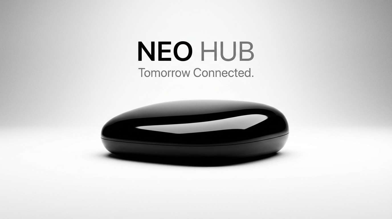
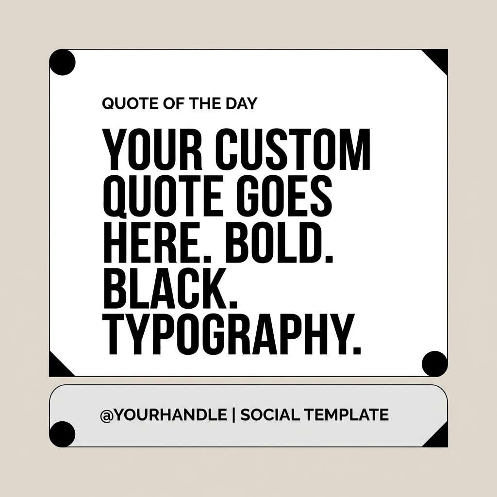
1) Gallery Minimal
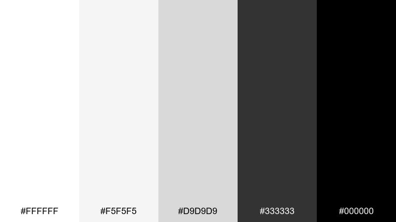
HEX: #ffffff #f5f5f5 #d9d9d9 #333333 #000000
Mood: clean, modern, high-contrast
Best for: portfolio websites and minimalist UI
Clean, gallery-like whites and deep blacks evoke framed prints and quiet museum walls. Use the light grays as breathing room so headlines feel intentional, not harsh. It works beautifully for portfolios, product pages, and typography-first layouts. Pair with a single accent (like cobalt or emerald) for calls to action, and keep body text at #333333 for comfort.
Image example of gallery minimal generated using media.io
Media.io is an online AI studio for creating and editing video, image, and audio in your browser.

2) Ink on Paper
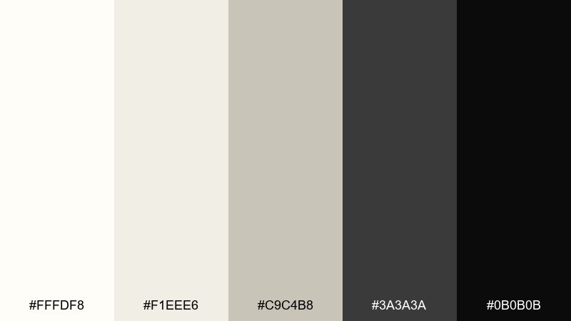
HEX: #fffdf8 #f1eee6 #c9c4b8 #3a3a3a #0b0b0b
Mood: editorial, tactile, timeless
Best for: magazine layouts and long-form blogs
Editorial warmth and crisp ink tones bring to mind book pages, margins, and well-set type. These white black color combinations feel refined when you let the off-white lead and reserve true black for headings and pull quotes. Ideal for magazines, blog templates, and brand storytelling pages. Add a thin rule line in #c9c4b8 to separate sections without visual noise.
Image example of ink on paper generated using media.io
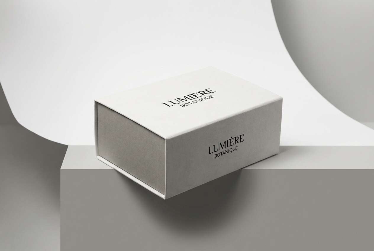
3) Noir Marble
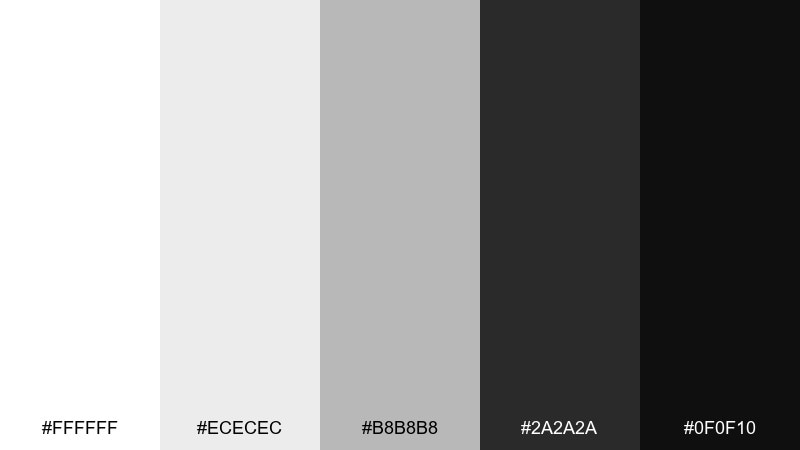
HEX: #ffffff #ececec #b8b8b8 #2a2a2a #0f0f10
Mood: luxurious, polished, dramatic
Best for: premium packaging and beauty branding
Polished contrast with cool grays reads like marble veining under gallery lights. Keep the brightest white for negative space and use #0f0f10 for logos to make finishes feel expensive. It's a strong fit for fragrance boxes, skincare labels, and premium landing pages. Try spot-UV on the darkest tone and matte stock for everything else to elevate the tactile feel.
Image example of noir marble generated using media.io
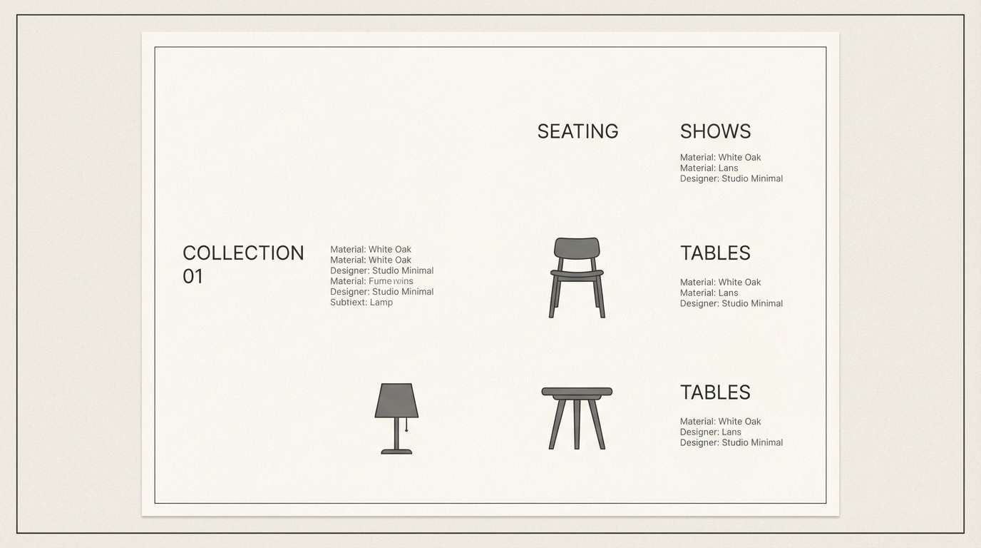
4) Scandinavian Contrast
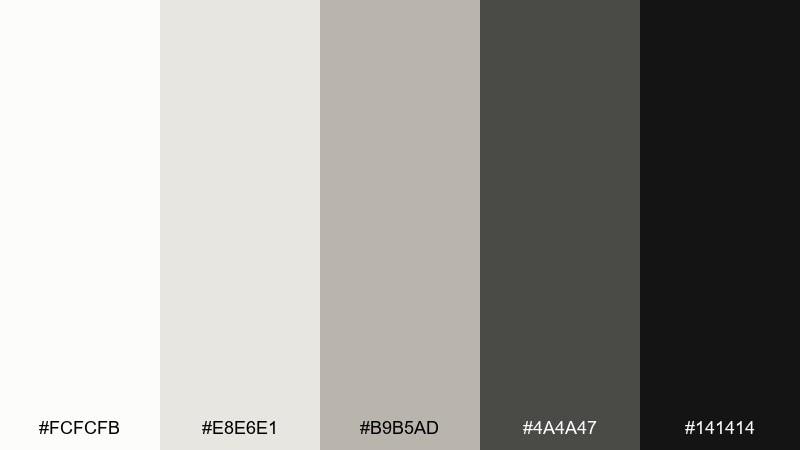
HEX: #fcfcfb #e8e6e1 #b9b5ad #4a4a47 #141414
Mood: calm, airy, design-forward
Best for: interiors, furniture lookbooks, and home brands
Calm neutrals and soft charcoal evoke sunlit rooms, linen textiles, and clean-lined furniture. A white black color palette like this shines when you keep blacks as accents—think hardware, frames, or thin typography. Use #e8e6e1 as the main background to avoid glare and make product photos feel natural. For balance, repeat #b9b5ad in secondary UI elements like tabs or spec tables.
Image example of scandinavian contrast generated using media.io
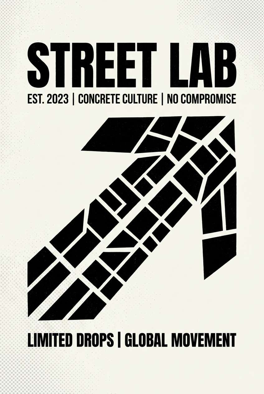
5) Streetwear Mono
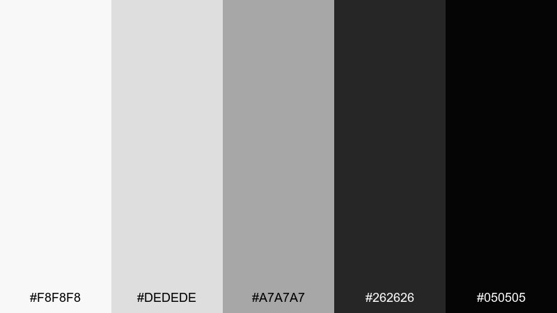
HEX: #f8f8f8 #dedede #a7a7a7 #262626 #050505
Mood: bold, urban, energetic
Best for: streetwear branding and merch graphics
Bold contrast and steely grays feel like fresh ink on heavyweight tees and concrete backdrops. Use the near-black for oversized logotypes and let mid-gray #a7a7a7 soften secondary marks. It's great for apparel tags, lookbook covers, and punchy social posts. For readability on dark layouts, invert with #f8f8f8 body text and keep highlights minimal.
Image example of streetwear mono generated using media.io
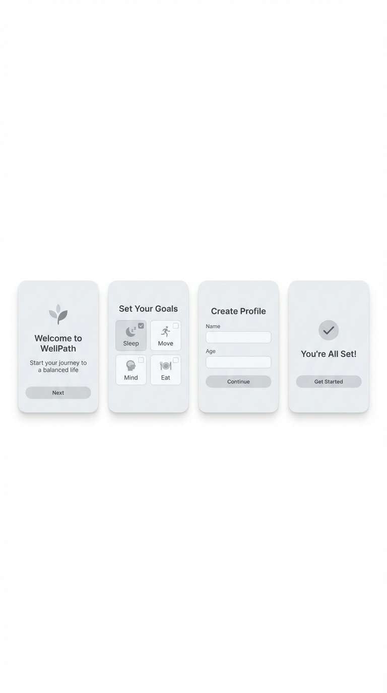
6) Soft Shadow
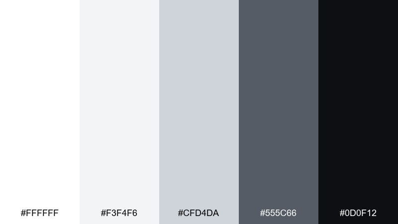
HEX: #ffffff #f3f4f6 #cfd4da #555c66 #0d0f12
Mood: gentle, approachable, modern
Best for: wellness apps and SaaS onboarding
Gentle shadows and cool neutrals suggest calm motion, soft cards, and quiet focus. The palette is perfect for UI where you need hierarchy without harsh edges. Use #f3f4f6 for surfaces, #cfd4da for borders, and reserve #0d0f12 for primary text only. Tip: keep buttons dark but slightly lifted with a #555c66 shadow for a friendly feel.
Image example of soft shadow generated using media.io
7) Chessboard Classic
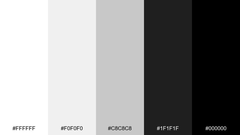
HEX: #ffffff #f0f0f0 #c8c8c8 #1f1f1f #000000
Mood: sharp, classic, confident
Best for: logos and identity systems
Sharp black and white blocks feel strategic and timeless, like a chessboard under bright light. Use the mid-gray as a neutral bridge in brand systems so everything doesn't compete at full contrast. This works for law firms, fashion marks, and modern tech logos. A practical move: test your logo in #1f1f1f first—if it reads there, it will read anywhere.
Image example of chessboard classic generated using media.io
8) Film Grain
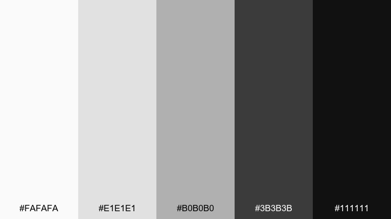
HEX: #fafafa #e1e1e1 #b0b0b0 #3b3b3b #111111
Mood: nostalgic, cinematic, textured
Best for: photography presets and creator portfolios
Nostalgic grays and inky blacks evoke film grain, contact sheets, and darkroom prints. Let #b0b0b0 handle captions and metadata so your images remain the hero. It's a great fit for photographer sites, case studies, and gallery archives. Add a subtle noise overlay at 3–5% to make the tones feel intentional rather than flat.
Image example of film grain generated using media.io
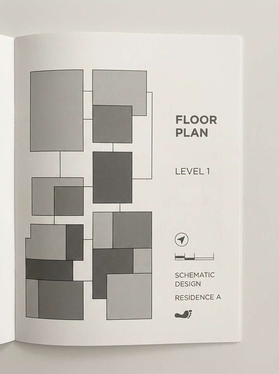
9) Concrete Loft
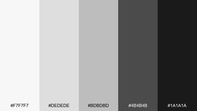
HEX: #f7f7f7 #dedede #bdbdbd #4b4b4b #1a1a1a
Mood: industrial, structured, grounded
Best for: architecture presentations and real estate brochures
Industrial grays and sturdy charcoal bring to mind concrete walls and steel details. Use the lighter tones for floorplan backgrounds and the darks for labels and section titles. It works well for architecture decks, real estate one-pagers, and wayfinding concepts. Keep line weights consistent and use #bdbdbd for secondary gridlines to avoid clutter.
Image example of concrete loft generated using media.io
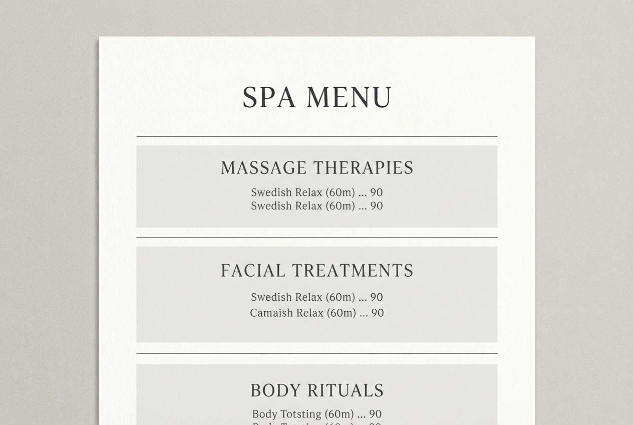
10) Zen Sumi
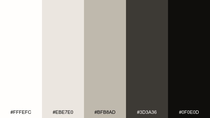
HEX: #fffefc #ebe7e0 #bfb8ad #3d3a36 #0f0e0d
Mood: serene, organic, meditative
Best for: spa menus and mindfulness brands
Serene neutrals and sumi-like blacks evoke brush strokes, rice paper, and quiet rituals. These white black color combinations feel best when you use the warm off-white as the canvas and keep black for sparing, confident marks. Ideal for spa menus, meditation landing pages, and artisan packaging. Usage tip: swap pure black for #0f0e0d on text-heavy pages to reduce visual fatigue.
Image example of zen sumi generated using media.io
11) High Gloss Mono

HEX: #ffffff #f2f2f2 #cfcfcf #2f2f2f #090909
Mood: sleek, premium, tech-forward
Best for: tech product ads and landing hero sections
Sleek whites and deep near-black read like glossy plastics and precision-machined metal. Use #2f2f2f for UI chrome and #090909 for key CTAs or product names. This set is strong for tech ads, startup hero sections, and hardware spec pages. Keep reflections controlled—one bright highlight is enough to sell the premium look.
Image example of high gloss mono generated using media.io
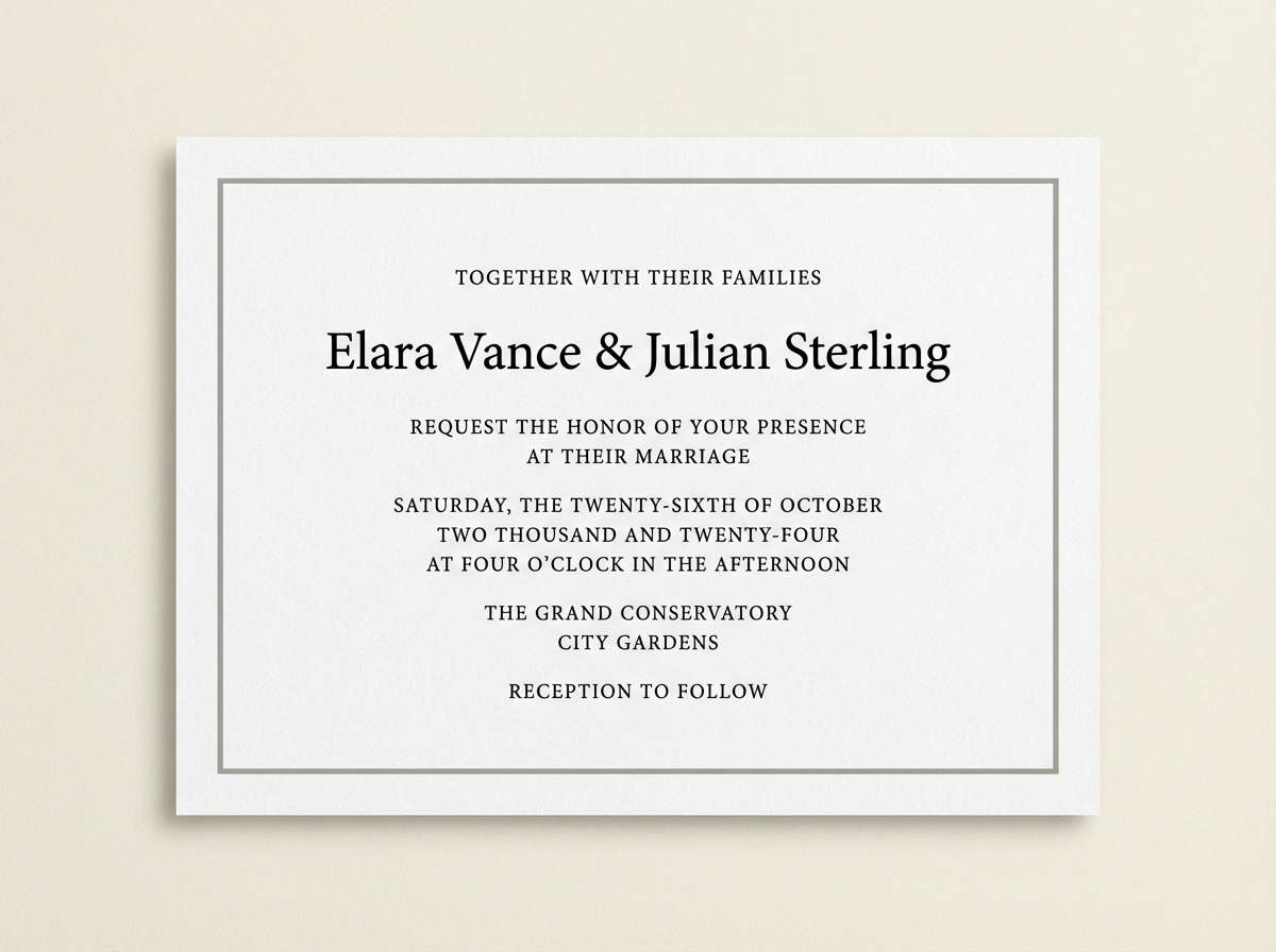
12) Black Tie Bridal
HEX: #ffffff #f6f1f1 #d8d2d2 #3a3a3a #0a0a0a
Mood: elegant, formal, romantic
Best for: wedding invitations and event stationery
Elegant neutrals with true black evoke tuxedos, silk ribbons, and candlelit receptions. Let #f6f1f1 soften the page so the design stays romantic rather than stark. Perfect for invitations, RSVP cards, and seating charts with classic typography. Tip: use #d8d2d2 for borders and envelopes so black type feels crisp without overwhelming the layout.
Image example of black tie bridal generated using media.io
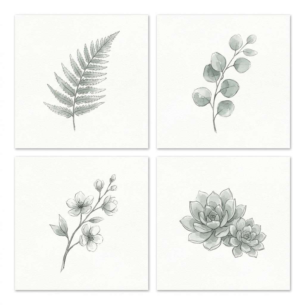
13) Monochrome Botanica
HEX: #ffffff #f0f2f0 #c8cec9 #4a4f4b #121513
Mood: fresh, calm, nature-inspired
Best for: botanical illustrations and eco labels
Fresh grayscale greens and inky charcoal suggest pressed leaves and botanical sketches. Use the pale tones for paper texture and keep the darkest shade for linework and labels. Great for eco packaging, garden brands, and calm editorial accents. A quick tip: watercolor washes in #c8cec9 help plants feel alive without adding a bright color.
Image example of monochrome botanica generated using media.io
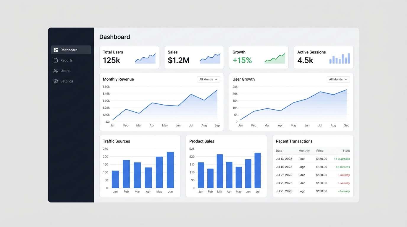
14) Data Dashboard
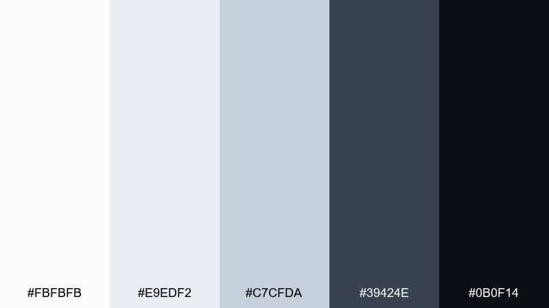
HEX: #fbfbfb #e9edf2 #c7cfda #39424e #0b0f14
Mood: focused, professional, structured
Best for: analytics dashboards and admin UI
Focused neutrals with a cool undertone feel like structured grids and clear data hierarchy. Use #e9edf2 for panels, #c7cfda for dividers, and #0b0f14 for key numbers to drive attention. It's ideal for dashboards, B2B portals, and tables-heavy screens. Keep charts simple—one dark series plus light background bars prevents visual overload.
Image example of data dashboard generated using media.io
15) Museum Label
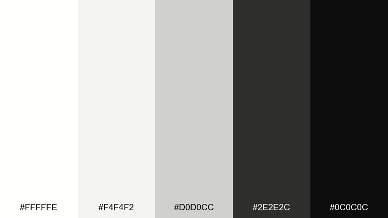
HEX: #fffffe #f4f4f2 #d0d0cc #2e2e2c #0c0c0c
Mood: curated, quiet, informative
Best for: signage, labels, and wayfinding systems
Curated neutrals feel like museum placards and thoughtful exhibit notes. Use the warmer grays to support long reading distances without glare, and keep #0c0c0c for the most critical information. This set works well for signage, labels, and instruction cards. Tip: use generous margins and let #d0d0cc carry subtle section headers for an elevated look.
Image example of museum label generated using media.io
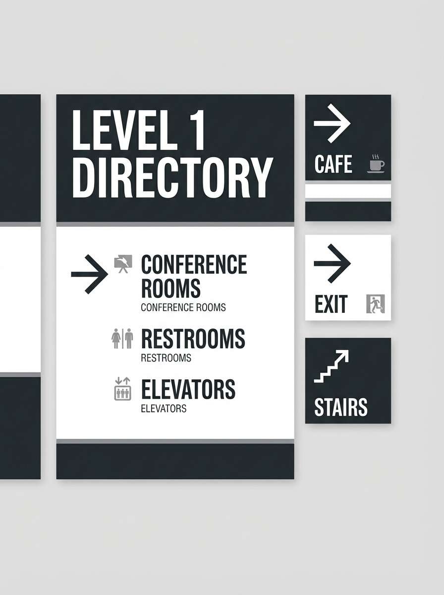
16) Night Typewriter
HEX: #fffeff #f1f1f3 #bdbdc4 #3a3a40 #101014
Mood: moody, literary, refined
Best for: book covers and stationery
Moody neutrals and deep graphite evoke late-night writing, ink ribbons, and crisp paper edges. A white black color palette like this is excellent for book covers and stationery because it lets typography carry the emotion. Use #bdbdc4 for texture blocks or author bios, and reserve #101014 for the title. Tip: add a subtle paper grain so the light tones don't feel sterile.
Image example of night typewriter generated using media.io
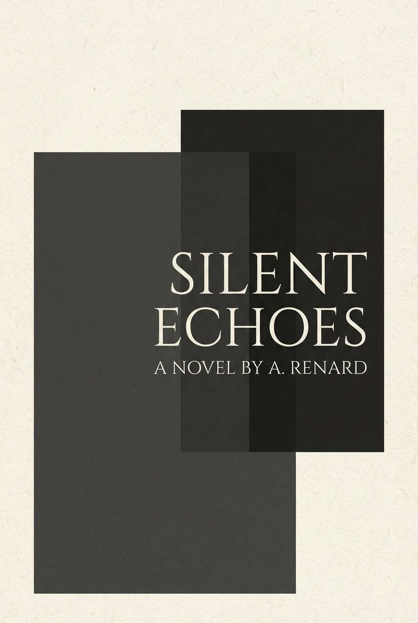
17) Retro Newsprint
HEX: #fffaf0 #efe3cf #c8b9a3 #4a423a #191512
Mood: vintage, warm, nostalgic
Best for: posters and café menus
Vintage warmth with dark espresso tones recalls aged newsprint and classic posters. Use #fffaf0 as the base and let #191512 anchor headlines for that old-school punch. Great for café menus, event posters, and retro packaging. Tip: limit the darkest tone to 10–15% of the layout and lean on #4a423a for most text to keep it inviting.
Image example of retro newsprint generated using media.io

18) Minimal Comic

HEX: #ffffff #f3f3f3 #c9c9c9 #2b2b2b #000000
Mood: playful, punchy, graphic
Best for: social media templates and creators
Playful contrast and clean grays feel like comic panels, bold captions, and quick punchlines. A white black color combination like this keeps posts readable even on small screens. Use #f3f3f3 for card backgrounds and #2b2b2b for outlines so pure black can stay reserved for key words. Tip: keep text blocks short and increase line height to prevent the design from feeling cramped.
Image example of minimal comic generated using media.io
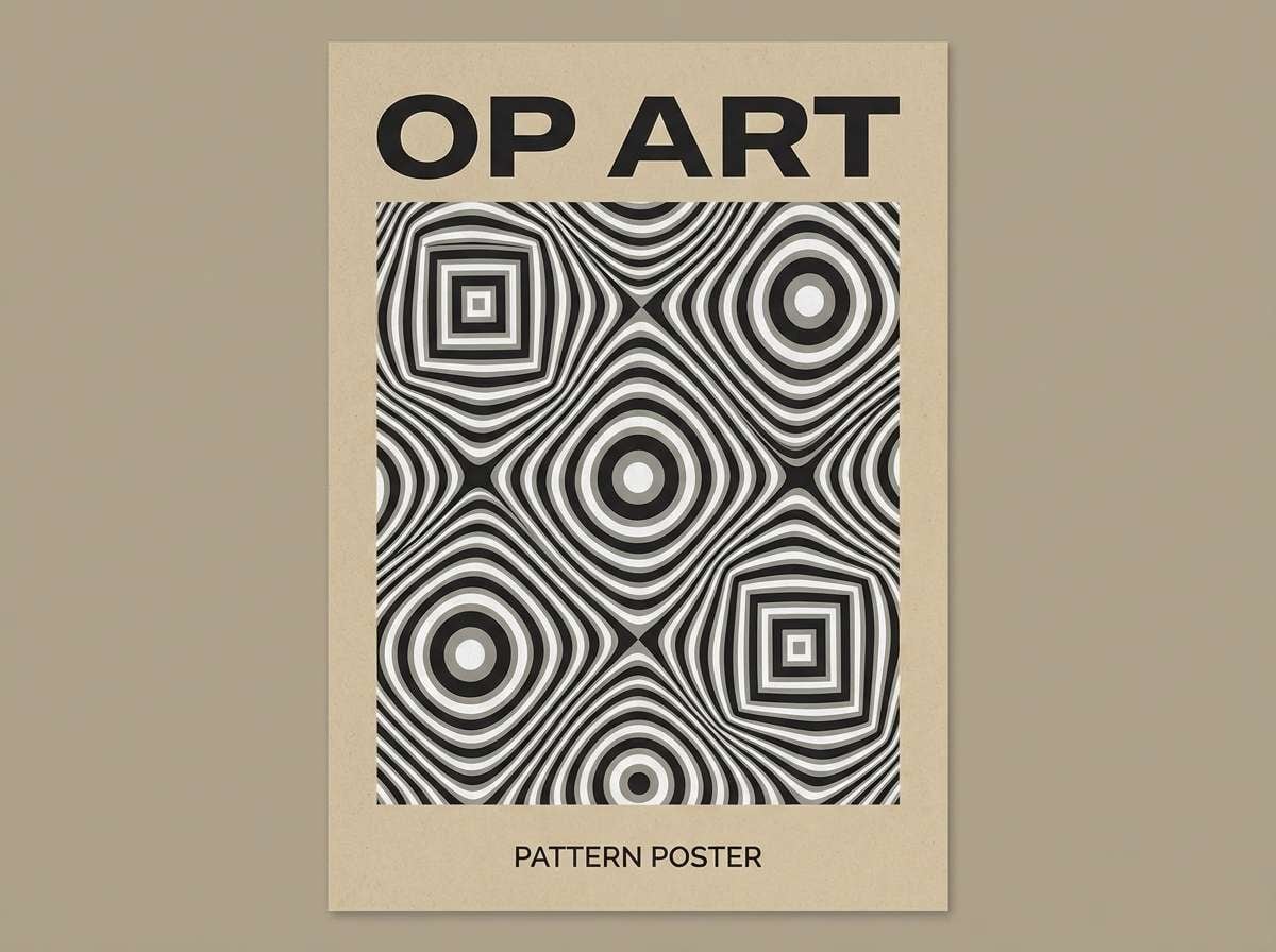
19) Op Art Lines

HEX: #ffffff #ededed #c4c4c4 #2a2a2a #070707
Mood: dynamic, artistic, high-impact
Best for: pattern design and album artwork
Dynamic contrast with stepped grays evokes optical illusions, rhythm, and movement. Use #c4c4c4 to build secondary stripes so the pattern doesn't become overwhelming. It's ideal for album covers, poster backgrounds, and modern pattern libraries. Tip: keep line weights consistent and leave a white margin so the design has a place to rest.
Image example of op art lines generated using media.io
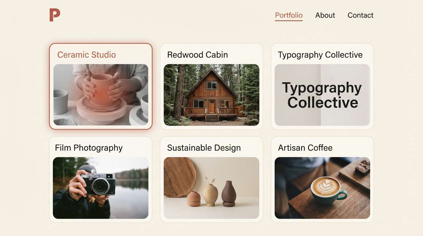
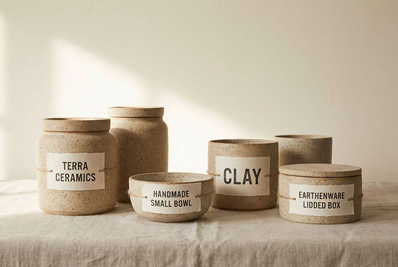
20) Ceramic Studio
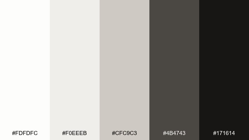
HEX: #fdfdfc #f0eeeb #cfc9c3 #4b4743 #171614
Mood: artisanal, warm, understated
Best for: handmade product pages and craft branding
Artisanal warm neutrals suggest clay dust, studio shelves, and matte glazes. Use #f0eeeb as a soft backdrop for product photos and keep #171614 for prices and primary buttons. This palette fits ceramics shops, handmade marketplaces, and maker portfolios. Tip: add texture with subtle grain in the background, but avoid heavy shadows so the work feels calm and honest.
Image example of ceramic studio generated using media.io
What Colors Go Well with White Black?
White and black pair well with almost any accent, but the best matches are saturated hues that stay readable against high contrast—think cobalt blue, emerald, red, or a bright cyan.
If you want a softer, more premium feel, choose muted accents like navy, forest green, burgundy, or warm tan. These keep the monochrome base calm while still adding personality.
For product UI and dashboards, one accent color plus a supporting tint (a lighter version of the same accent) is often enough to create clear states like hover, active, and selected.
How to Use a White Black Color Palette in Real Designs
Start with role-based neutrals: pick one background white/off-white, one surface gray for cards, one border gray, and one text near-black. This prevents “pure black on pure white” fatigue while keeping contrast strong.
Use black strategically: headlines, icons, and primary actions. Let mid-grays carry secondary UI (metadata, dividers, disabled states) so the design doesn’t feel shouty.
When adding an accent color, reserve it for one job—CTAs, highlights, or links. In monochrome systems, consistent accent usage is what makes the interface feel polished.
Create White Black Palette Visuals with AI
If you’re pitching a concept or building a moodboard, generating quick monochrome visuals can help you validate typography, spacing, and contrast before you commit to final design assets.
With Media.io, you can turn prompts into clean UI mockups, posters, packaging scenes, and brand sheets—then iterate fast by tweaking lighting, texture, or layout style.
Use the palette HEX codes above in your prompt (or describe the tones: off-white paper, warm gray dividers, near-black type) to keep outputs consistent across a whole set.
White Black Color Palette FAQs
-
Is a black-and-white palette too harsh for websites?
It can be if you use pure #000000 on pure #ffffff everywhere. For better comfort, use near-black (like #111111–#333333) for body text and an off-white or light gray background to reduce glare. -
What’s the best accent color for a white black color scheme?
Bold accents like cobalt, emerald, or red stand out cleanly, while muted accents like navy, forest green, and burgundy feel more premium. Choose one accent and apply it consistently to key actions (CTAs, links, selected states). -
How do I keep hierarchy clear in monochrome UI?
Assign roles to each gray: background, surface, border, secondary text, primary text. Then rely on size, weight, and spacing so you’re not forced to increase contrast for every element. -
Which black should I use for text: pure black or near-black?
Near-black is usually better for readability on screens, especially for long-form text. Save pure black for logos, strong headings, or small areas where you want maximum punch. -
Do white black palettes work for print designs?
Yes—monochrome prints are classic and cost-effective. Use warm grays or off-whites to mimic paper tone, and test proofs to ensure small text doesn’t fill in when using heavy blacks. -
How can I make a monochrome design feel less “flat”?
Add texture and depth with subtle grain, soft shadows, and tone-on-tone surfaces (light grays). You can also introduce contrast through typography (serif + sans) rather than adding more colors. -
Can I generate black-and-white mockups with AI using these HEX codes?
Yes. Include the HEX codes (or describe them as off-white paper, light gray dividers, charcoal text) in your prompt to keep the AI outputs consistent across multiple images.


