

Yellow and purple is a standout pairing: sunny warmth meets rich depth, giving you instant energy without sacrificing sophistication.
Below are 20 ready-to-use yellow purple color palette ideas (with HEX codes), plus practical tips for branding, UI, print, and event design.
In this article
Why Yellow Purple Palettes Work So Well
Yellow and purple sit across from each other on the color wheel, so the contrast naturally feels vibrant and attention-grabbing. That complementary relationship helps designs pop even with simple shapes and minimal layout.
Psychologically, yellow signals optimism and clarity, while purple leans imaginative, premium, and expressive. Together, they can read playful or luxurious depending on how light/dark and saturated/muted your tones are.
The trick is balance: let one color lead (usually purple for structure or yellow for highlights), then use neutrals to control intensity. This keeps your yellow purple color palette readable across UI, print, and branding.
20+ Yellow Purple Color Palette Ideas (with HEX Codes)
1) Sunlit Iris
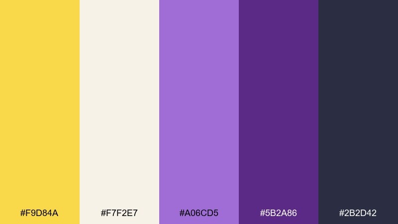
HEX: #f9d84a #f7f2e7 #a06cd5 #5b2a86 #2b2d42
Mood: cheerful, polished, confident
Best for: wellness brand identity and landing pages
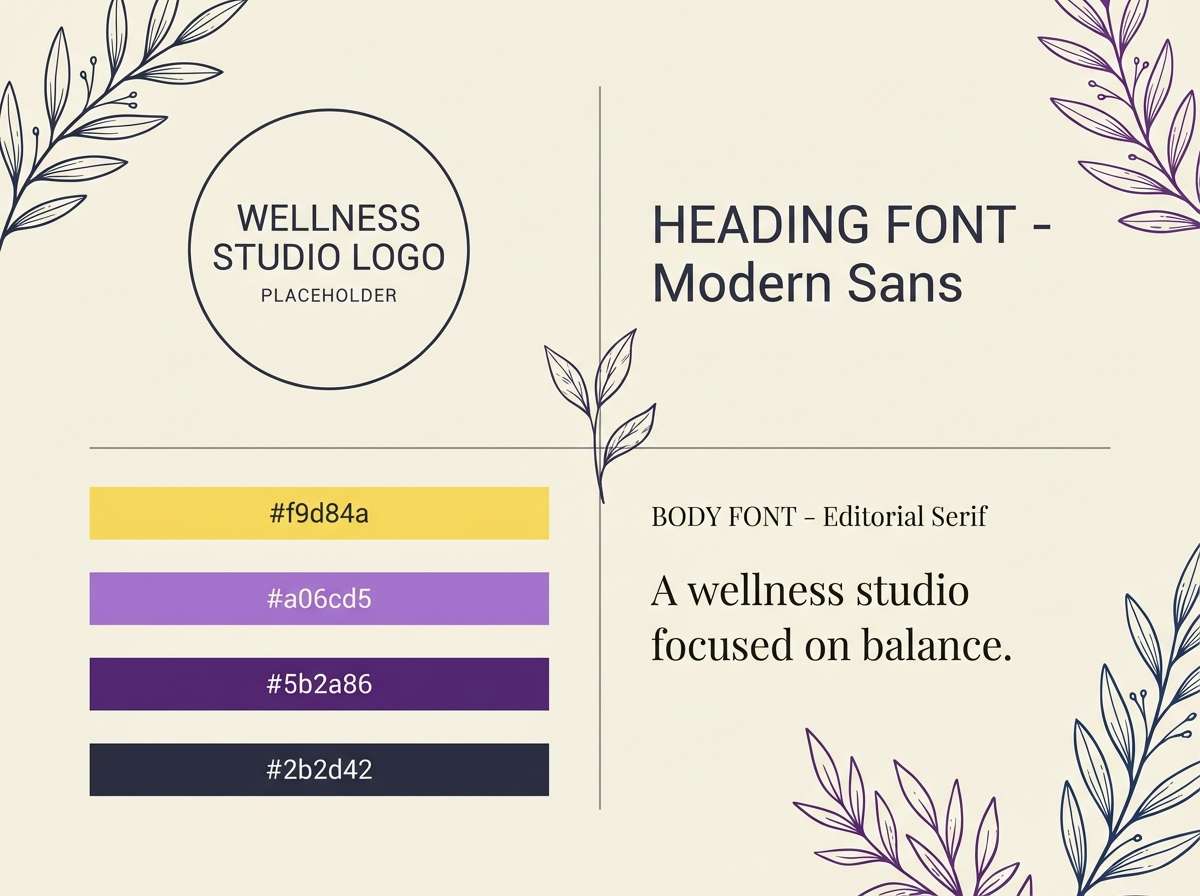
Cheerful sunshine against velvety iris tones feels optimistic yet grown-up. Use the deep indigo as your headline and button color, then let the yellow carry highlights and icons. For a crisp yellow purple color palette, keep the cream as your main background so the accent colors do not fight. Tip: reserve the brightest yellow for calls to action and add breathing room with generous spacing.
Image example of sunlit iris generated using media.io
Media.io is an online AI studio for creating and editing video, image, and audio in your browser.

2) Lavender Lemonade
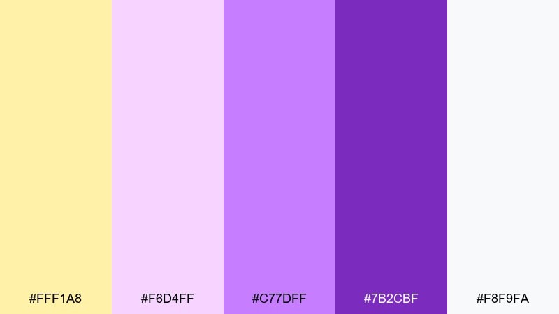
HEX: #fff1a8 #f6d4ff #c77dff #7b2cbf #f8f9fa
Mood: soft, sweet, airy
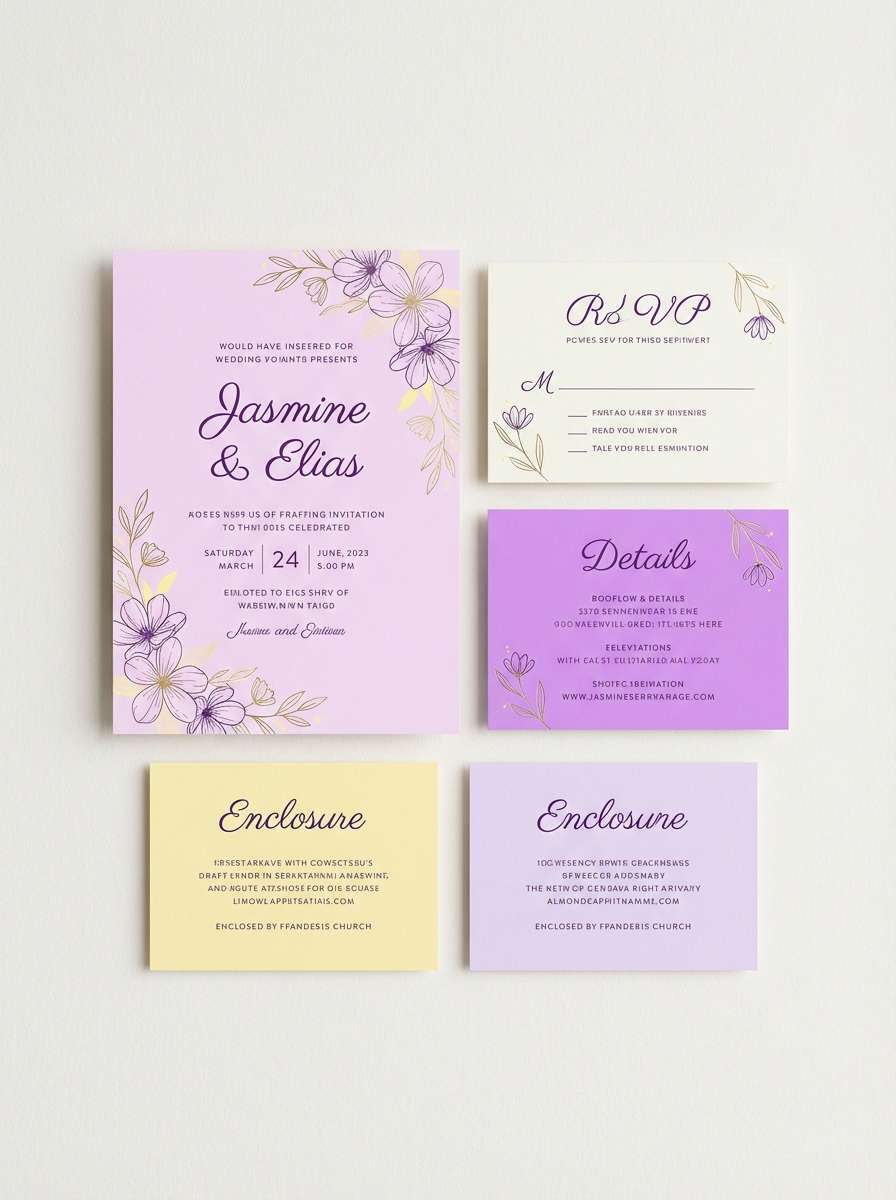
Best for: wedding invitations and bridal shower stationery
Soft lemonade and lavender frosting vibes make the look romantic without turning sugary. The pale yellow works beautifully as paper tone, while the violet shades handle names, borders, and monograms. Pair with delicate serif type and a light dusting of floral linework for a refined finish. Tip: keep contrast strong for readability by using the darkest purple for body text.
Image example of lavender lemonade generated using media.io
3) Mustard Royale
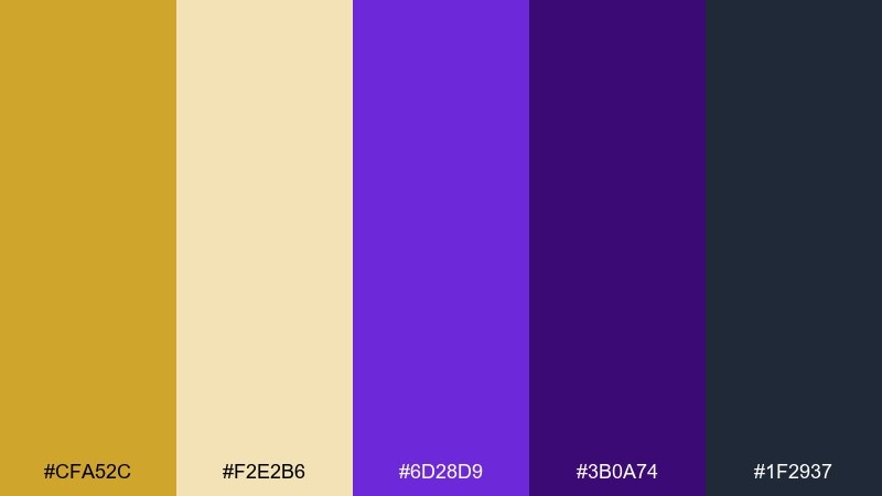
HEX: #cfa52c #f2e2b6 #6d28d9 #3b0a74 #1f2937
Mood: luxurious, moody, dramatic
Best for: premium spirits labels and boutique packaging
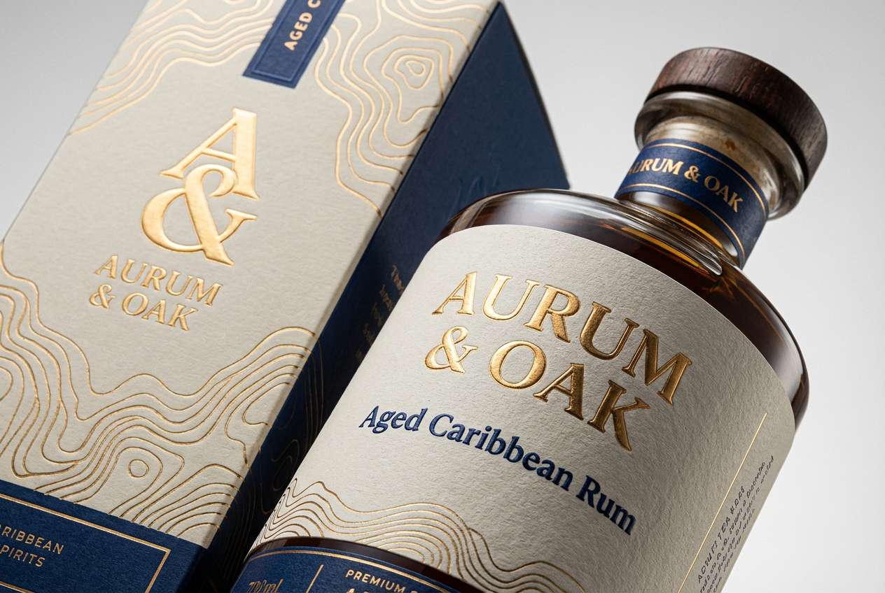
Aged mustard and royal purple read like velvet curtains and antique gold trim. Put the charcoal to work for text and legal copy, then use the deep purple for crests, seals, and premium cues. The lighter neutral keeps the design from feeling heavy on shelf. Tip: add subtle foil-like highlights with the mustard tone, but keep it to small areas for maximum impact.
Image example of mustard royale generated using media.io
4) Daffodil Amethyst
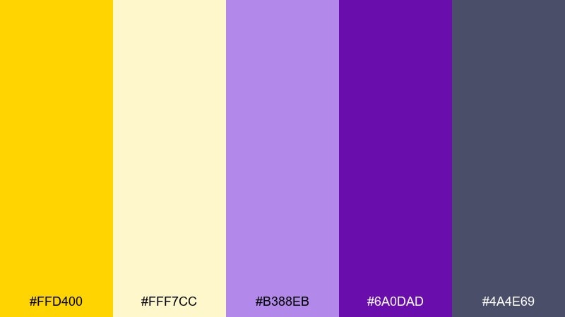
HEX: #ffd400 #fff7cc #b388eb #6a0dad #4a4e69
Mood: bright, springy, uplifting
Best for: seasonal social media templates and promos
Daffodil pop paired with amethyst feels like the first warm weekend of the year. Use the pale buttery tint as the canvas, then layer purple shapes for structure and hierarchy. It works especially well with playful rounded type and sticker-like icons. Tip: keep the brightest yellow for a single focal element so the post does not look noisy.
Image example of daffodil amethyst generated using media.io

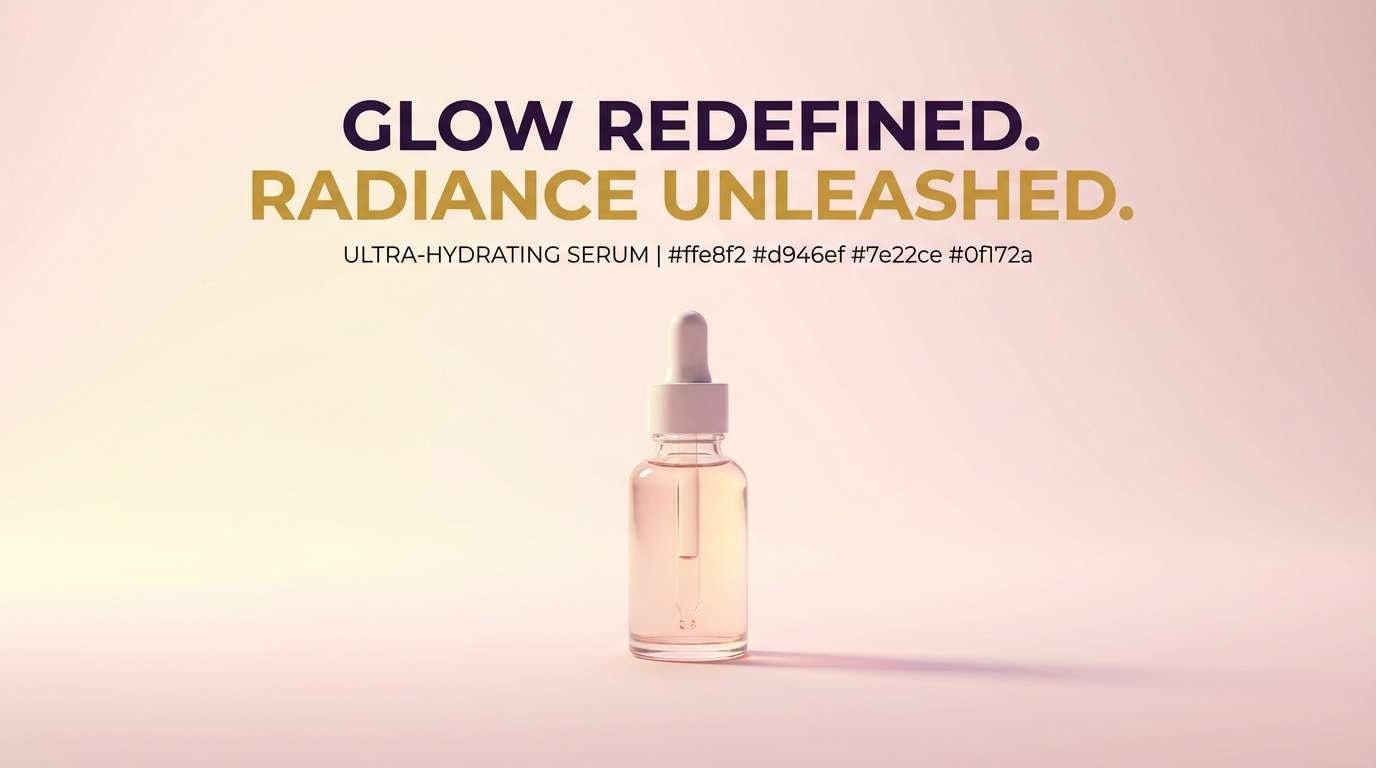
5) Citrus Orchid
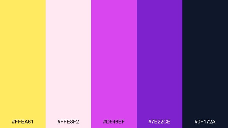
HEX: #ffea61 #ffe8f2 #d946ef #7e22ce #0f172a
Mood: playful, punchy, youthful
Best for: beauty product ads and cosmetics banners
Citrus sparkle with orchid pink-purple reads energetic, glossy, and trend-forward. Anchor layouts with the near-black for type, then let the magenta and purple carry gradients and glow effects. It shines in short-form ads where you want instant attention without looking harsh. Tip: use the pale blush as negative space around product shots to keep the banner feeling premium.
Image example of citrus orchid generated using media.io
6) Golden Grape
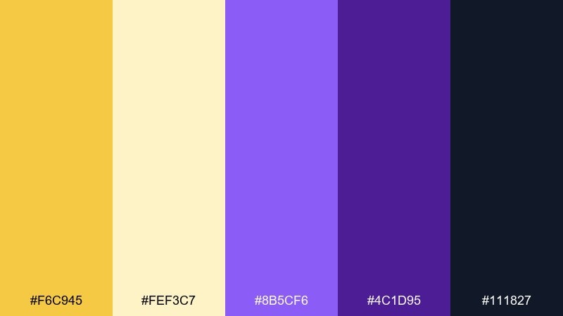
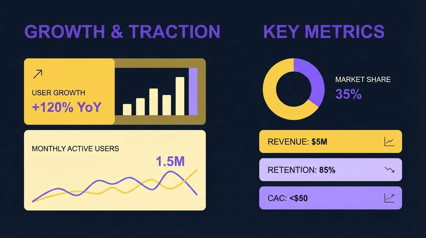
HEX: #f6c945 #fef3c7 #8b5cf6 #4c1d95 #111827
Mood: confident, modern, high-contrast
Best for: tech startup branding and pitch decks
Golden highlights against grape purple feels bold, modern, and a little futuristic. These yellow purple color combinations work best when you treat purple as the core brand color and use gold as the attention signal. Add the warm cream for slides and sections that need calm breathing space. Tip: limit gold to charts, numbers, and key bullets so your deck stays readable from a distance.
Image example of golden grape generated using media.io
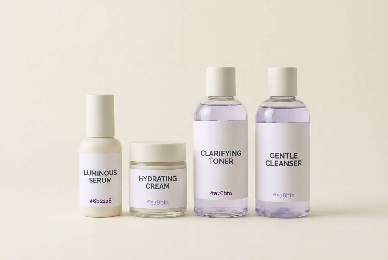
7) Buttercream Bloom
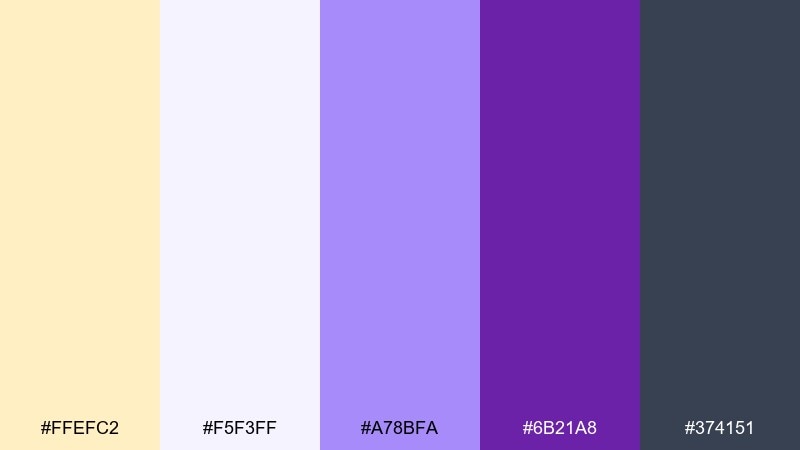
HEX: #ffefc2 #f5f3ff #a78bfa #6b21a8 #374151
Mood: gentle, cozy, calming
Best for: skincare packaging and self-care labels
Buttercream warmth mixed with soft violet feels comforting and approachable. Use the near-white lavender as your label background and save the deep purple for product names. The muted gray helps typography look modern rather than overly cute. Tip: add a small accent band of the pale yellow to separate variants within a product line.
Image example of buttercream bloom generated using media.io
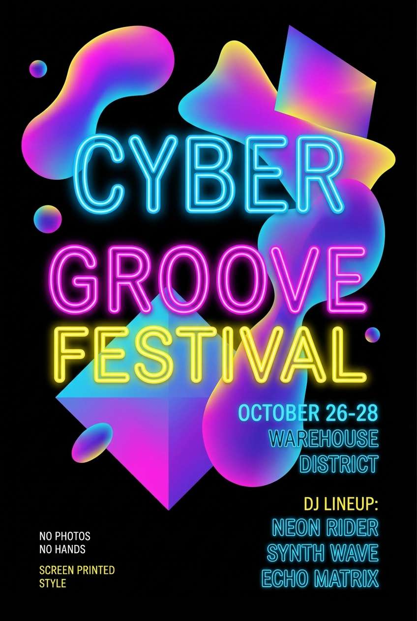
8) Neon Zest
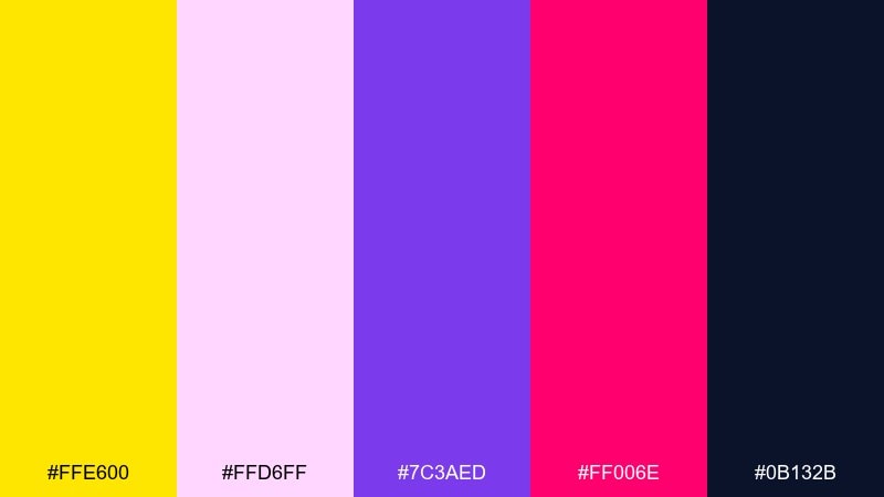
HEX: #ffe600 #ffd6ff #7c3aed #ff006e #0b132b
Mood: electric, nightlife, bold
Best for: music event posters and club flyers
Neon zest with hot pink and deep violet feels like street lights and bass drops. Keep the navy as the base so the bright accents glow instead of overwhelm. It pairs best with condensed sans fonts, sharp shapes, and high-energy textures. Tip: use the neon yellow only for the date and venue so it reads instantly from afar.
Image example of neon zest generated using media.io
9) Vintage Circus
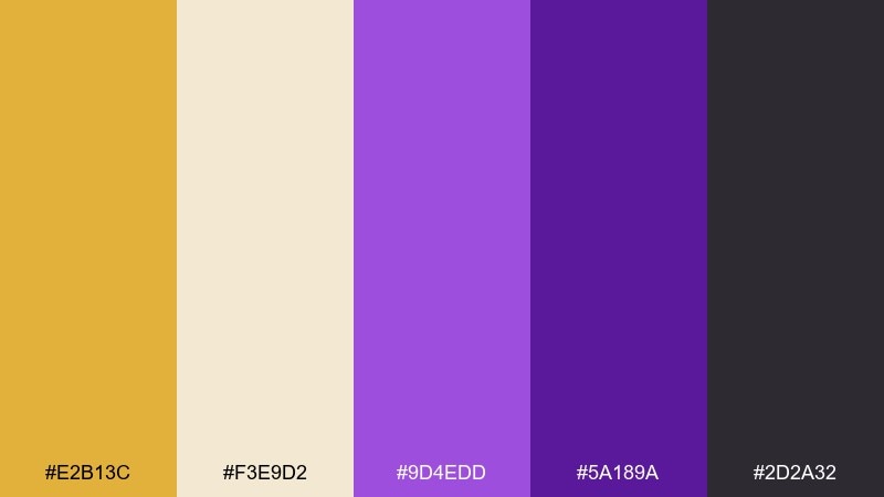
HEX: #e2b13c #f3e9d2 #9d4edd #5a189a #2d2a32
Mood: nostalgic, quirky, storybook
Best for: kids party invitations and playful prints
Warm vintage gold and purple feel like ticket stubs, velvet ropes, and old carousel music. Use the cream as the paper base and the darker purple for outlines and type. Add hand-drawn stars, stripes, or badges to lean into the whimsical vibe. Tip: keep body text in the charcoal shade so small details stay readable.
Image example of vintage circus generated using media.io

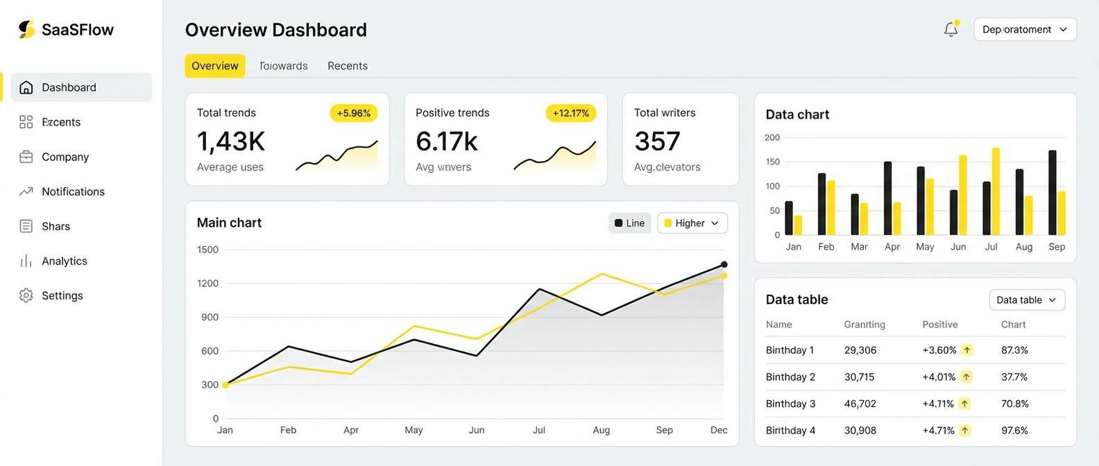
10) Desert Violet
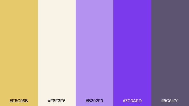
HEX: #e5c96b #f8f3e6 #b392f0 #7c3aed #5c5470
Mood: calm, sunbaked, modern
Best for: SaaS dashboard UI and data cards
Sunbaked sand with hazy violet reads calm and product-focused. This yellow purple color scheme is especially friendly for dashboards because the palette has clear levels for backgrounds, surfaces, and accents. Use the soft neutrals for panels and the brighter purple for active states and links. Tip: keep warning and success colors separate so the yellow stays a design accent, not an alert signal.
Image example of desert violet generated using media.io
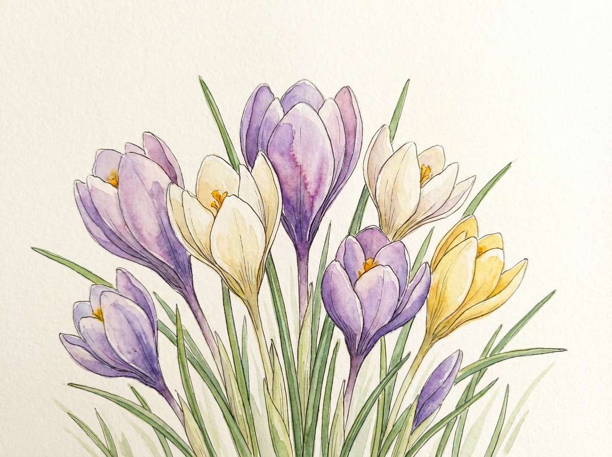
11) Spring Crocus
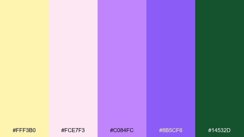
HEX: #fff3b0 #fce7f3 #c084fc #8b5cf6 #14532d
Mood: fresh, floral, optimistic
Best for: botanical illustrations and seasonal blog headers
Fresh crocus purples with tender spring light feels airy and garden-forward. The green is a smart grounding note for stems, leaves, and subtle navigational accents. Use the pale yellow and blush as layered washes to keep illustrations soft. Tip: paint shadows with diluted violet instead of gray to maintain a cohesive feel.
Image example of spring crocus generated using media.io
12) Royal Picnic
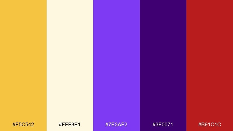
HEX: #f5c542 #fff8e1 #7e3af2 #3f0071 #b91c1c
Mood: festive, bold, playful
Best for: food festival posters and menu covers
Golden warmth with royal purple feels like a picnic blanket upgraded for a night market. Use the deep purple for the main type and the bright yellow for price tags, markers, and highlights. A small touch of red works best as a flavor cue for spicy items or special offers. Tip: keep the light cream as your dominant background so the layout stays clean and appetizing.
Image example of royal picnic generated using media.io

13) Soft Daybreak
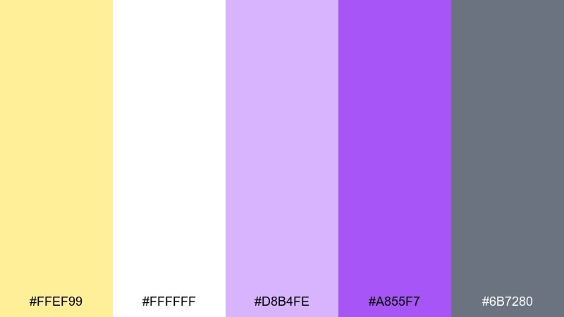
HEX: #ffef99 #ffffff #d8b4fe #a855f7 #6b7280
Mood: clean, friendly, approachable
Best for: newsletter templates and onboarding screens
Soft daybreak tones feel welcoming, simple, and easy on the eyes. Use white as the main space, then let lavender and violet create gentle hierarchy for headings and buttons. The gray keeps long-form copy readable and professional. Tip: avoid heavy borders and use tinted panels instead for a smoother, modern look.
Image example of soft daybreak generated using media.io
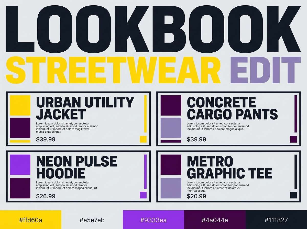
14) Urban Pop
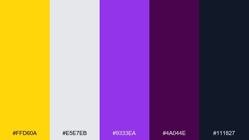
HEX: #ffd60a #e5e7eb #9333ea #4a044e #111827
Mood: street-smart, energetic, modern
Best for: streetwear lookbooks and launch graphics
High-impact yellow against deep purple feels like city signage and late-night energy. These yellow purple color combinations are strongest when you keep the layout minimal and let typography do the heavy lifting. Use gray for secondary panels and the near-black for dense copy and fine print. Tip: apply the yellow only to one or two elements per page, such as a price or a drop date, to avoid visual clutter.
Image example of urban pop generated using media.io
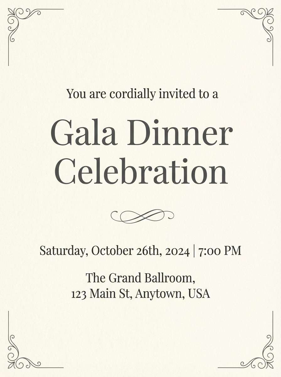
15) Evening Saffron
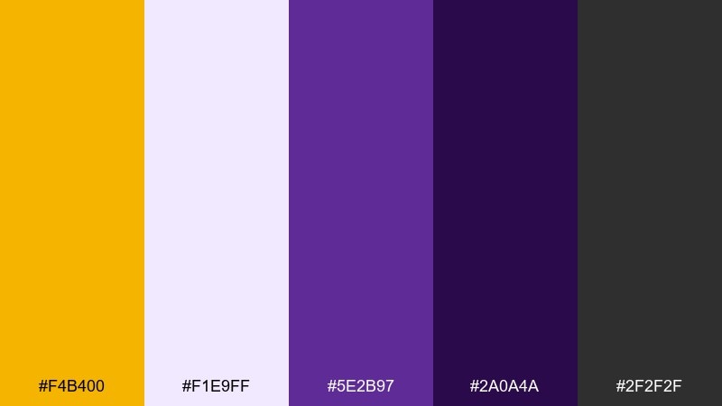
HEX: #f4b400 #f1e9ff #5e2b97 #2a0a4a #2f2f2f
Mood: elegant, intimate, cinematic
Best for: restaurant branding and dinner event invites
Evening saffron with deep violet feels like candlelight and velvet menus. Use the light lavender as the card stock tone and the darkest purple for headings and monograms. The charcoal works well for long addresses and small details without looking stark. Tip: add thin saffron rules or corner marks to create a premium frame effect.
Image example of evening saffron generated using media.io
16) Playroom Cheer
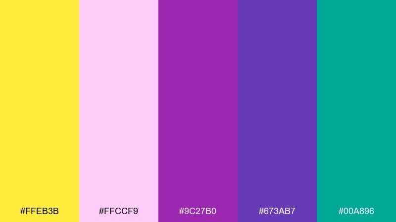
HEX: #ffeb3b #ffccf9 #9c27b0 #673ab7 #00a896
Mood: fun, friendly, kid-centric
Best for: educational posters and classroom materials
Playroom brights feel joyful, curious, and energetic. Use the yellow for headings and callouts, then balance with purple for structure and repeated elements like section tabs. The teal is great for checkmarks, learning cues, or simple icon sets. Tip: keep text blocks on light areas and avoid placing paragraphs over the brightest colors.
Image example of playroom cheer generated using media.io
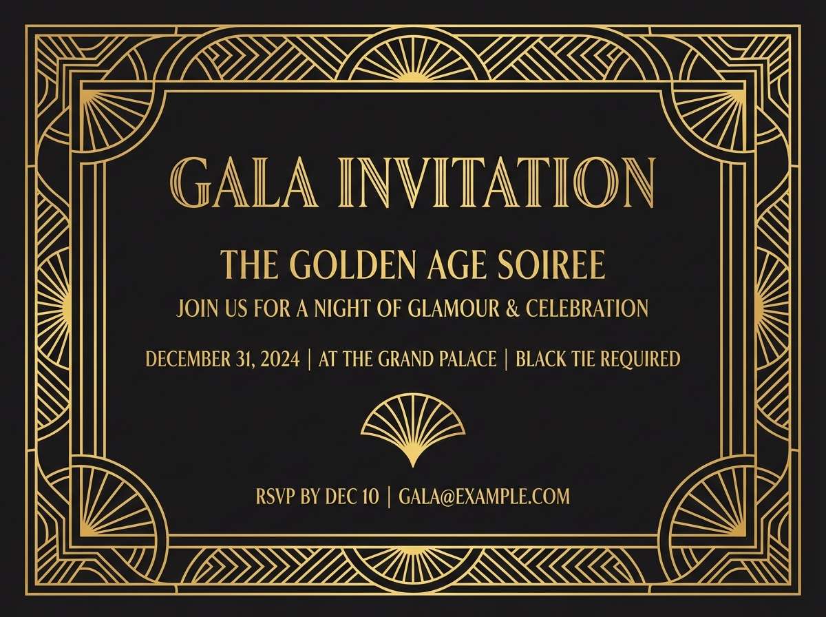
17) Art Deco Glam
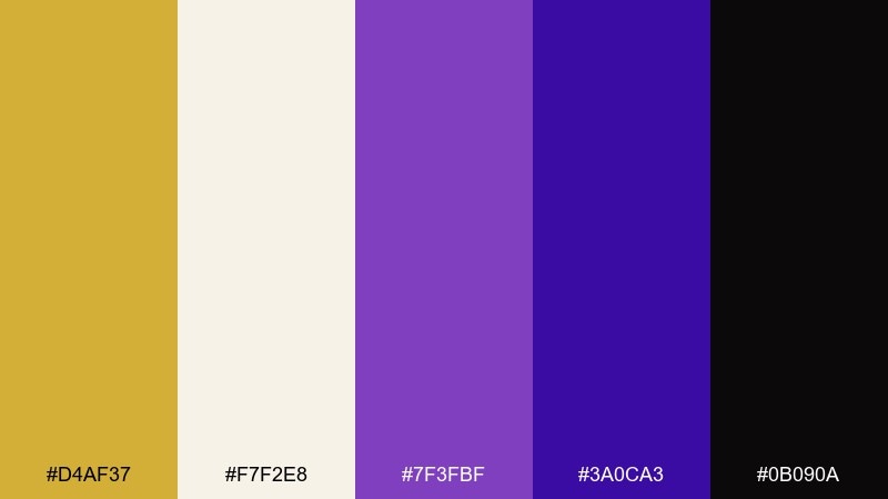
HEX: #d4af37 #f7f2e8 #7f3fbf #3a0ca3 #0b090a
Mood: glamorous, geometric, upscale
Best for: gala posters and luxury event branding
Deco gold with saturated purple feels glamorous, geometric, and unapologetically luxe. Use the black for dramatic negative space and the cream for readable type blocks. Purple works beautifully for fan motifs and bold frames, while gold should be reserved for thin lines and small highlights. Tip: stick to symmetrical layouts and sharp angles to land the Art Deco mood.
Image example of art deco glam generated using media.io
18) Countryside Bouquet

HEX: #f3d250 #fff4d6 #b565f2 #7b2cbf #3a5a40
Mood: warm, rustic, floral
Best for: farmers market signage and handmade goods labels
Golden fields and wildflower purple feel rustic, friendly, and handcrafted. The green adds an earthy anchor that works well for produce, herbs, and sustainable cues. For a yellow purple color palette that stays natural, keep the cream as the main base and use the purple for stamp-like marks. Tip: add texture through paper grain or subtle speckling rather than extra colors.
Image example of countryside bouquet generated using media.io
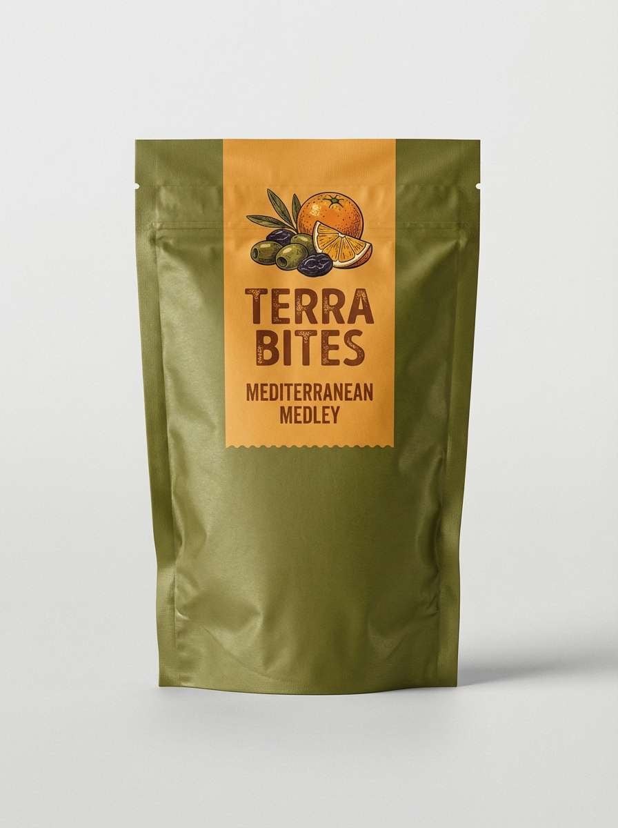
19) Cosmic Snack
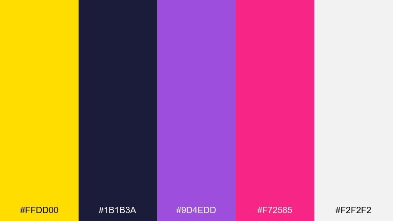
HEX: #ffdd00 #1b1b3a #9d4edd #f72585 #f2f2f2
Mood: bold, playful, sci-fi
Best for: snack packaging and limited-edition flavors
Cosmic navy with bright yellow and candy accents feels playful, sci-fi, and a little surreal. Use the navy as the packaging base so the yellow and hot pink hit like neon signage. Purple can carry stars, gradients, or flavor illustrations without stealing the spotlight. Tip: keep nutrition and ingredient text on the light gray panel for clean legibility.
Image example of cosmic snack generated using media.io
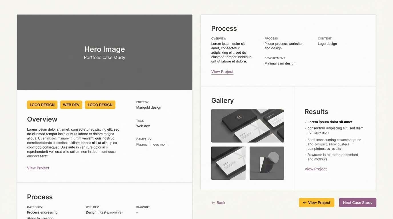
20) Minimal Studio
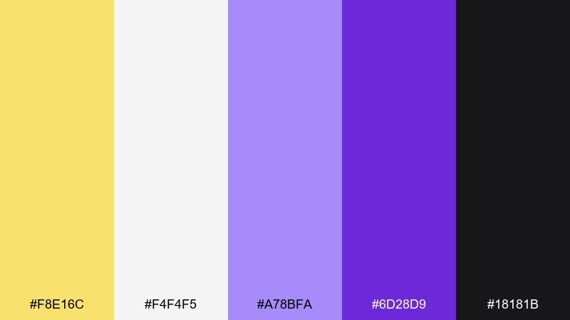
HEX: #f8e16c #f4f4f5 #a78bfa #6d28d9 #18181b
Mood: minimal, modern, studio-clean
Best for: portfolio websites and case study pages
Studio-clean neutrals with soft yellow and crisp violet feels modern and intentional. Use the light gray as the primary background, then add yellow sparingly for section markers and micro-interactions. Purple works best for links, tags, and small UI accents that need to stand out. Tip: keep imagery consistent by using cool, neutral photography so the accents do not clash.
Image example of minimal studio generated using media.io
What Colors Go Well with Yellow Purple?
Neutrals are the easiest match: white, cream, light gray, charcoal, and near-black keep yellow and purple from competing. They also help you control contrast for readability in UI and print.
For a more natural direction, add greens (sage, olive, forest) to echo stems and botanicals. For a louder, modern feel, try pink/magenta accents or a deep navy base to make the brights glow.
When in doubt, pick one “support color” and keep it subtle. A small third color is often enough to guide hierarchy without muddying the yellow purple relationship.
How to Use a Yellow Purple Color Palette in Real Designs
Decide which hue leads: use purple for structure (headlines, navigation, buttons) and yellow for emphasis (badges, icons, CTA highlights). This keeps the palette intentional rather than split down the middle.
In UI, reserve your brightest yellow for non-critical highlights so it doesn’t get confused with warnings. For print (packaging, invitations), lean on warm off-whites and textured backgrounds to soften high contrast.
Test accessibility early: purple-on-yellow can look striking but may fail contrast at small sizes. Use dark purple or charcoal for body text and keep yellow mostly as a background or accent.
Create Yellow Purple Palette Visuals with AI
Need to see your palette in context before you commit? Generate quick mockups like brand boards, poster layouts, UI cards, or packaging concepts using text prompts.
With Media.io text-to-image, you can iterate fast: keep the same prompt, swap HEX-driven color cues, and compare options side by side to find the best yellow and purple balance.
Once you like the direction, export your visuals for presentations, mood boards, or client reviews—then refine typography and spacing in your design tool of choice.
Yellow Purple Color Palette FAQs
-
Are yellow and purple complementary colors?
Yes. Yellow and purple sit opposite each other on the traditional color wheel, so they create strong contrast and high visual energy when paired. -
How do I keep a yellow purple palette from looking too loud?
Use a neutral (cream, white, light gray, charcoal) as the dominant base, then limit bright yellow to small accents while letting purple carry structure (headlines, frames, buttons). -
What shades of purple work best with pastel yellow?
Lavender, lilac, and soft violets pair best for a gentle look. Add a deeper purple only for text or anchors so contrast stays readable. -
Can I use yellow and purple in a professional brand?
Absolutely. Choose muted gold/mustard with deep violet or indigo, and keep layouts minimal. This combination can feel premium, modern, and confident. -
What’s the best text color on yellow backgrounds?
Deep purple, charcoal, or near-black usually reads best on yellow. Avoid light purples on bright yellow for small text because contrast can drop quickly. -
What third color pairs well with yellow and purple?
Great options include deep navy (adds depth), forest/sage green (natural balance), blush pink (playful), or cool gray (modern restraint). Pick one and keep it subtle. -
How can I preview yellow purple palettes for posters, packaging, or UI?
Generate quick concept visuals with Media.io text-to-image using prompts like “brand board,” “event poster,” or “dashboard UI,” then iterate by adjusting which color leads and how much neutral space you use.
Next: Brown Red Color Palette


