

Yellow and pink is one of the fastest ways to make a design feel optimistic, friendly, and memorable. Whether you lean pastel for weddings or neon for nightlife, this duo can shift mood without losing energy.
Below are 20+ yellow pink color palette ideas with HEX codes, plus practical tips for pairing, contrast, and real-world use in UI, branding, and print.
In this article
- Why Yellow Pink Palettes Work So Well
-
- lemonade blush
- cotton sunrise
- retro diner pop
- marigold rose
- peach highlighter
- desert bloom
- strawberry lemon tart
- ballet buttercream
- festival glow
- minimal warmth
- sakura lemon tea
- golden hour bouquet
- pink lemonade neon
- honeyed petals
- sunshine stationery
- candy party
- modern art block
- blush brass
- citrus rose gradient
- pale sorbet
- tropic blush punch
- rosy sunbeam
- What Colors Go Well with Yellow Pink?
- How to Use a Yellow Pink Color Palette in Real Designs
- Create Yellow Pink Palette Visuals with AI
Why Yellow Pink Palettes Work So Well
Yellow brings warmth and visibility, while pink adds charm and personality—together they create instant “happy” contrast that reads well across digital and print.
This pairing is also flexible: shift yellow toward buttercream for soft romance, or push it toward saturated golden tones for bold, modern punch. Pink can move from blush to fuchsia to control intensity.
The key is balance. A neutral (white, cream, charcoal, navy, or warm gray) keeps yellow and pink from competing, giving your layout hierarchy and readability.
20+ Yellow Pink Color Palette Ideas (with HEX Codes)
1) Lemonade Blush
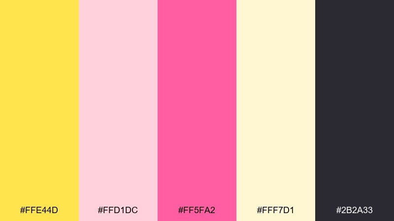
HEX: #FFE44D #FFD1DC #FF5FA2 #FFF7D1 #2B2A33
Mood: sunny, bubbly, upbeat
Best for: summer sale posters and social graphics
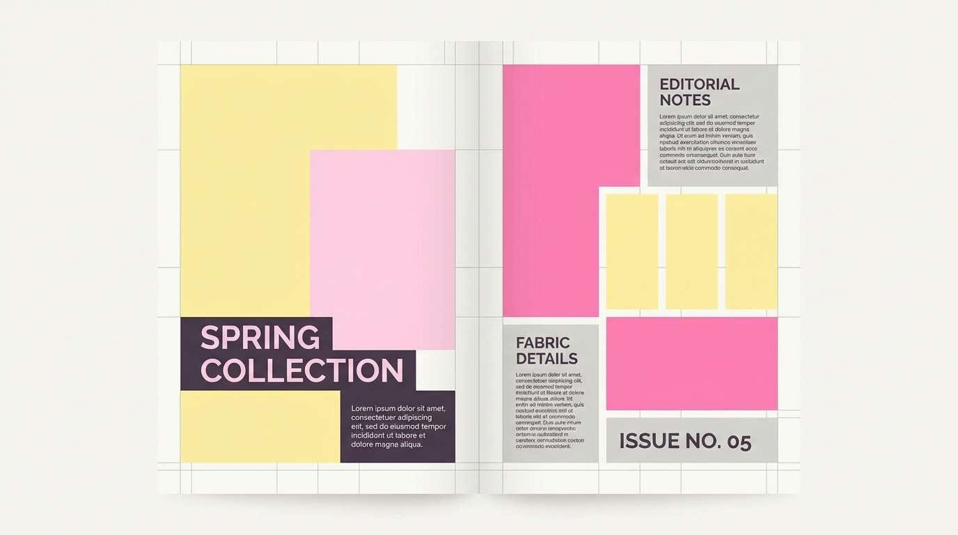
Bubbly sunshine meets a glossy blush, like a chilled lemonade stand at noon. These yellow pink color combinations pop hardest when you let the dark charcoal act as your anchor for type. Pair it with clean sans serif fonts and lots of white space to keep it modern, not childish. Usage tip: keep the hot pink to buttons, prices, or one key callout.
Image example of lemonade blush generated using media.io

Media.io is an online AI studio for creating and editing video, image, and audio in your browser.

2) Cotton Sunrise
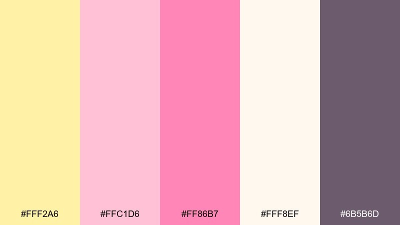
HEX: #FFF2A6 #FFC1D6 #FF86B7 #FFF8EF #6B5B6D
Mood: soft, romantic, airy
Best for: wedding invitations and save the dates
Soft and romantic like sunrise haze over pastel clouds. The creamy off-white keeps the pink tones delicate while the mauve adds readable contrast for names and dates. Pair with a thin serif, gold-ink style accents, or subtle floral line art. Usage tip: print a test card to confirm the pale yellow stays visible on your chosen paper stock.
Image example of cotton sunrise generated using media.io
3) Retro Diner Pop
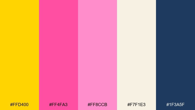
HEX: #FFD400 #FF4FA3 #FF8CCB #F7F1E3 #1F3A5F
Mood: retro, punchy, energetic
Best for: drink packaging and sticker labels
Punchy and retro, like neon signage and vinyl booths. The deep navy gives the bright tones structure so labels look premium instead of loud. Pair with chunky type, simple icons, and high-contrast blocks for a classic diner vibe. Usage tip: use the yellow for the main brand block and reserve the fuchsia for flavor or variant cues.
Image example of retro diner pop generated using media.io
4) Marigold Rose
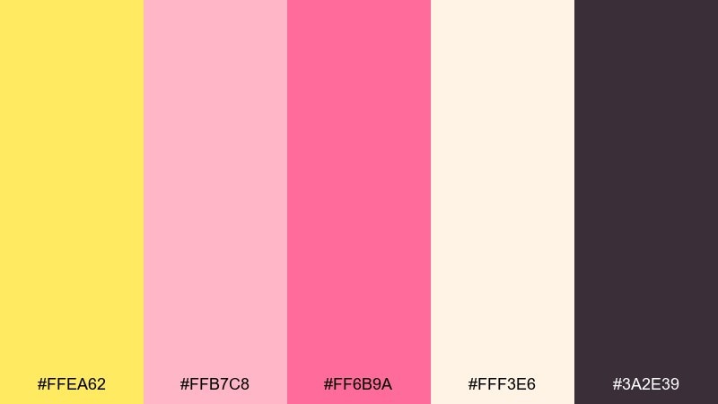
HEX: #FFEA62 #FFB7C8 #FF6B9A #FFF3E6 #3A2E39
Mood: warm, gentle, comforting
Best for: nursery decor and kids room prints
Warm and comforting, like soft toys under afternoon light. The creamy base keeps everything calm, while the berry pink adds a cheerful focal point for illustrations. Pair it with rounded shapes, simple animals, and plenty of negative space. Usage tip: keep the dark plum for titles only to avoid making the room feel heavy.
Image example of marigold rose generated using media.io
5) Peach Highlighter

HEX: #FFEF5A #FFC0D9 #FF4D8D #FFFFFF #222222
Mood: fresh, modern, attention-grabbing
Best for: app onboarding screens and CTA buttons
Fresh and modern, like highlighted notes on a clean page. This yellow pink color palette works best when the bright yellow is used as a short-lived accent, not a full-screen background. Pair it with generous whitespace and neutral UI grays so the pink calls to action feel intentional. Usage tip: confirm accessibility by keeping body text on white or near-black, not on yellow.
Image example of peach highlighter generated using media.io
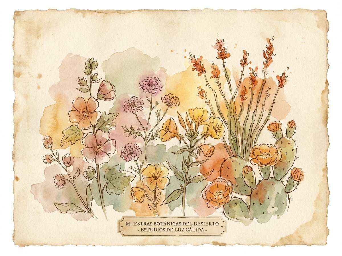
6) Desert Bloom
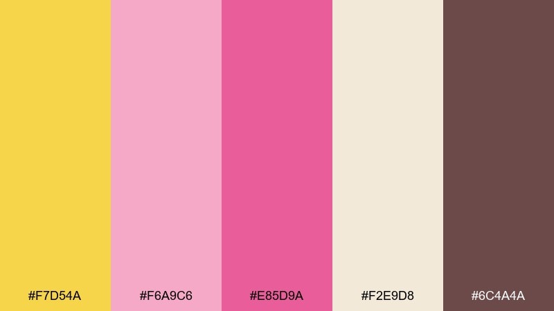
HEX: #F7D54A #F6A9C6 #E85D9A #F2E9D8 #6C4A4A
Mood: earthy, floral, calm
Best for: botanical art prints and journals
Earthy and floral, like desert blooms after a light rain. The sandy neutral softens the brights and makes the palette feel more handmade than glossy. Pair with watercolor textures, kraft paper, or subtle grain for a natural finish. Usage tip: use the brown for outlines and the pinks for petals to keep details legible.
Image example of desert bloom generated using media.io
7) Strawberry Lemon Tart
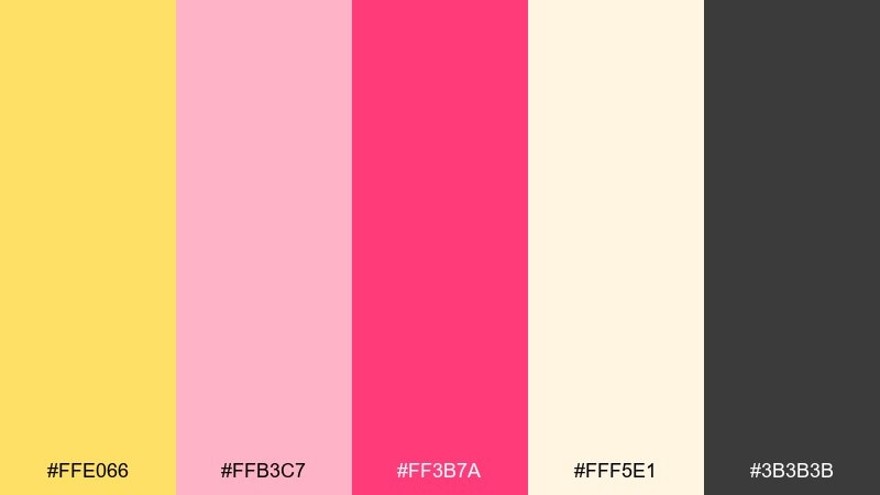
HEX: #FFE066 #FFB3C7 #FF3B7A #FFF5E1 #3B3B3B
Mood: sweet, appetizing, bright
Best for: bakery menus and pastry packaging
Sweet and appetizing, like a strawberry tart with a lemon glaze. The cream tone keeps the look edible and soft, while the hot berry pink adds irresistible emphasis for flavors. Pair with hand-drawn icons, dotted borders, and warm photography if you have it. Usage tip: use the dark gray for pricing and ingredients to stay readable on light backgrounds.
Image example of strawberry lemon tart generated using media.io
8) Ballet Buttercream
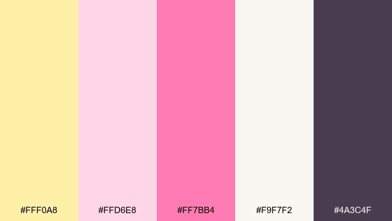
HEX: #FFF0A8 #FFD6E8 #FF7BB4 #F9F7F2 #4A3C4F
Mood: elegant, delicate, polished
Best for: fashion lookbooks and beauty editorials
Elegant and delicate, like satin ribbons and buttery studio lighting. The near-white base gives layouts a high-end feel, while the deeper plum adds sophisticated hierarchy. Pair with thin rules, minimal grids, and a single pop of pink for pull quotes. Usage tip: keep yellow to small highlights so it reads as warm light, not a marker tone.
Image example of ballet buttercream generated using media.io
9) Festival Glow
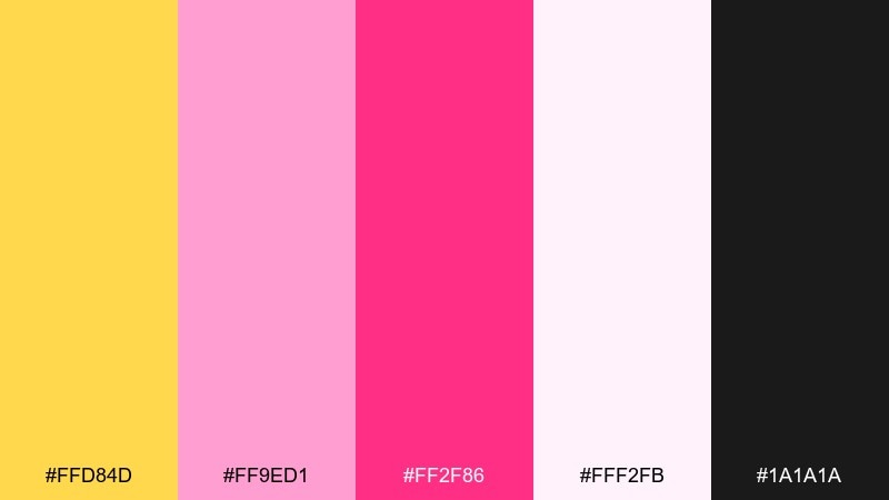
HEX: #FFD84D #FF9ED1 #FF2F86 #FFF2FB #1A1A1A
Mood: bold, electric, celebratory
Best for: event flyers and concert posters
Bold and electric, like stage lights cutting through warm night air. These yellow pink color combinations shine on dark backgrounds where the neon pink can headline and the yellow can spotlight dates. Pair with condensed type, simple geometric patterns, and strong contrast. Usage tip: restrict the lightest tint to spacing and highlights so the design stays punchy.
Image example of festival glow generated using media.io
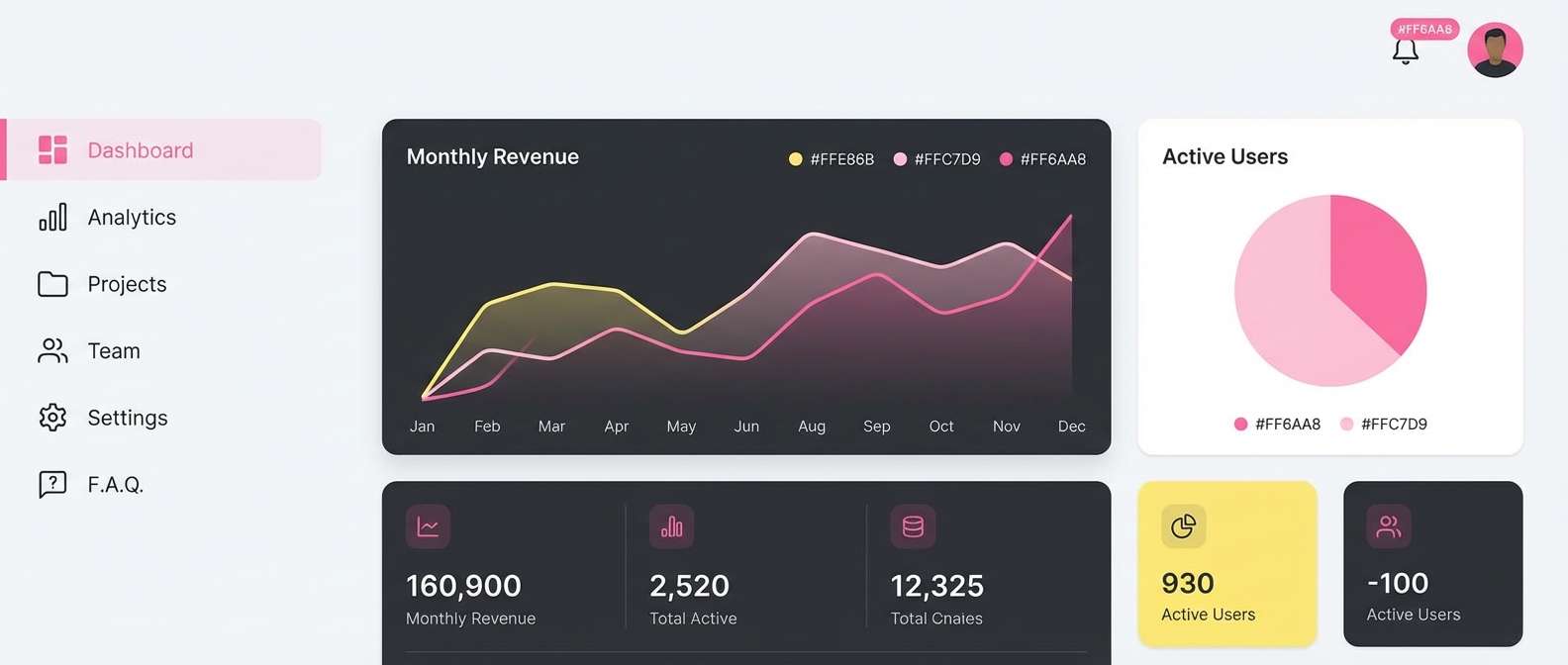
10) Minimal Warmth
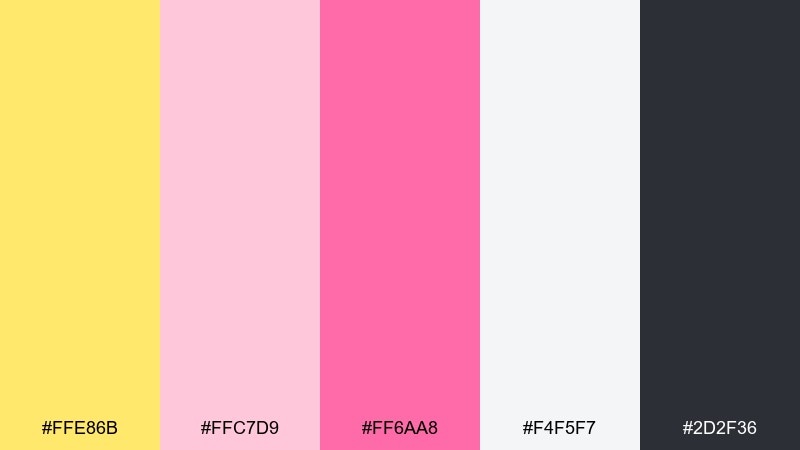
HEX: #FFE86B #FFC7D9 #FF6AA8 #F4F5F7 #2D2F36
Mood: clean, friendly, contemporary
Best for: SaaS dashboards and marketing pages
Clean and friendly, like warm daylight on a minimalist desk. The cool gray background keeps the bright accents from overwhelming a data-heavy interface. Pair with simple charts, soft shadows, and consistent spacing for a calm product feel. Usage tip: use yellow for notifications and pink for primary actions so users learn the system quickly.
Image example of minimal warmth generated using media.io
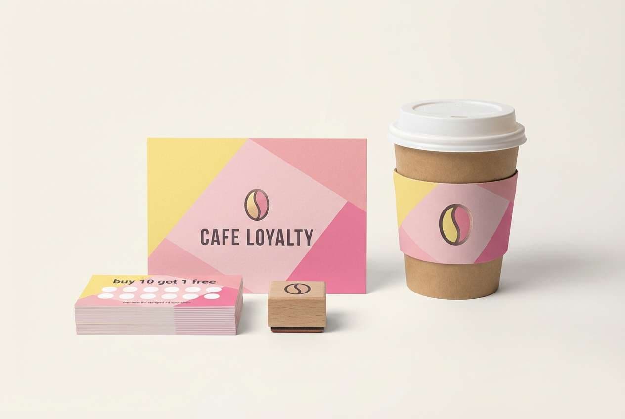
11) Sakura Lemon Tea
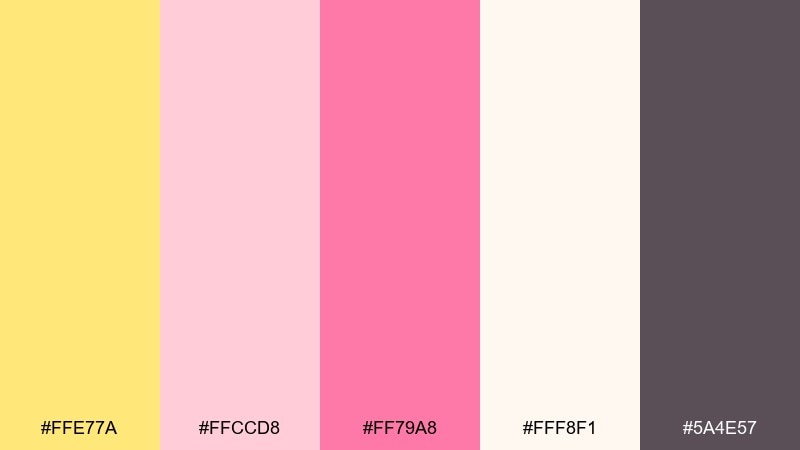
HEX: #FFE77A #FFCCD8 #FF79A8 #FFF8F1 #5A4E57
Mood: cozy, inviting, light
Best for: cafe branding and loyalty cards
Cozy and inviting, like lemon tea with a faint floral note. The soft neutrals give plenty of breathing room for logos and menu typography. Pair with line illustrations, stamped textures, or a subtle paper grain to feel artisanal. Usage tip: use the mid pink for highlights and reserve the deeper mauve for body text and small print.
Image example of sakura lemon tea generated using media.io
12) Golden Hour Bouquet
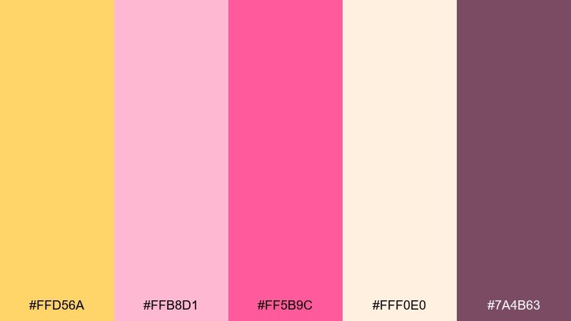
HEX: #FFD56A #FFB8D1 #FF5B9C #FFF0E0 #7A4B63
Mood: dreamy, romantic, glowing
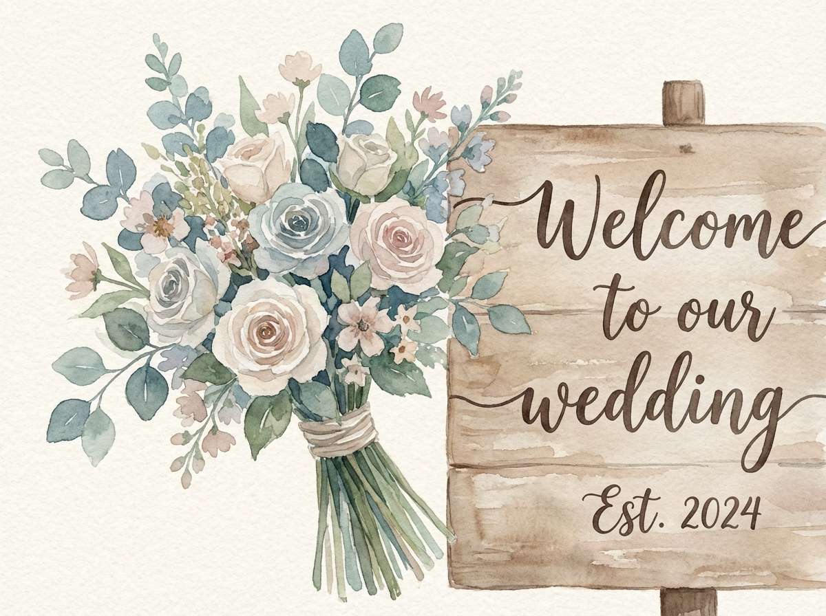
Best for: wedding floral illustrations and signage
Dreamy and glowing, like a bouquet caught in golden-hour light. The warm peachy base makes the pinks feel softer and more natural, perfect for florals and script text. Pair with muted greens or warm grays if you need extra balance. Usage tip: keep the brightest pink to small blossoms or monograms so the overall look stays elegant.
Image example of golden hour bouquet generated using media.io
13) Pink Lemonade Neon
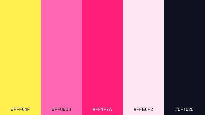
HEX: #FFF04F #FF66B3 #FF1F7A #FFE6F2 #0F1020
Mood: neon, youthful, high-energy
Best for: nightlife promos and DJ posters
Neon and youthful, like a glowing sign outside a late-night bar. The near-black base makes the yellow and pink feel like actual light, not just color. Pair with gradient overlays, big type, and minimal copy for maximum impact. Usage tip: add a soft blur glow behind the headline to sell the nightlife vibe without clutter.
Image example of pink lemonade neon generated using media.io

14) Honeyed Petals
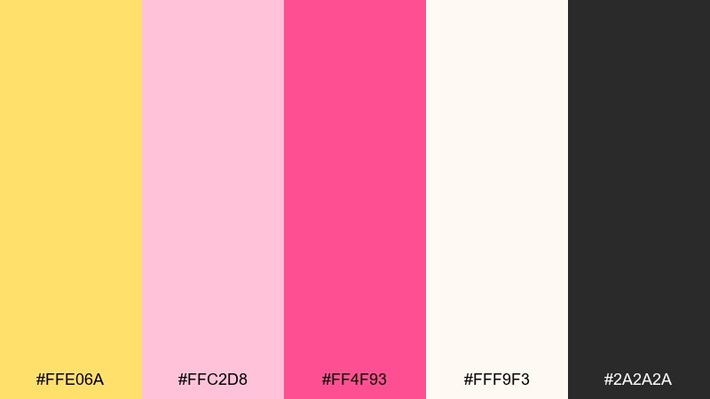
HEX: #FFE06A #FFC2D8 #FF4F93 #FFF9F3 #2A2A2A
Mood: sweet, clean, premium
Best for: skincare ads and product packaging
Sweet and clean, like honeyed petals in a bright bathroom. This yellow pink color palette feels premium when the off-white dominates and the saturated pink is used sparingly for brand marks. Pair with glossy finishes, minimal copy, and a hint of shadow for a modern beauty look. Usage tip: keep the yellow to subtle seals or corner accents so it reads as warmth, not highlighter.
Image example of honeyed petals generated using media.io
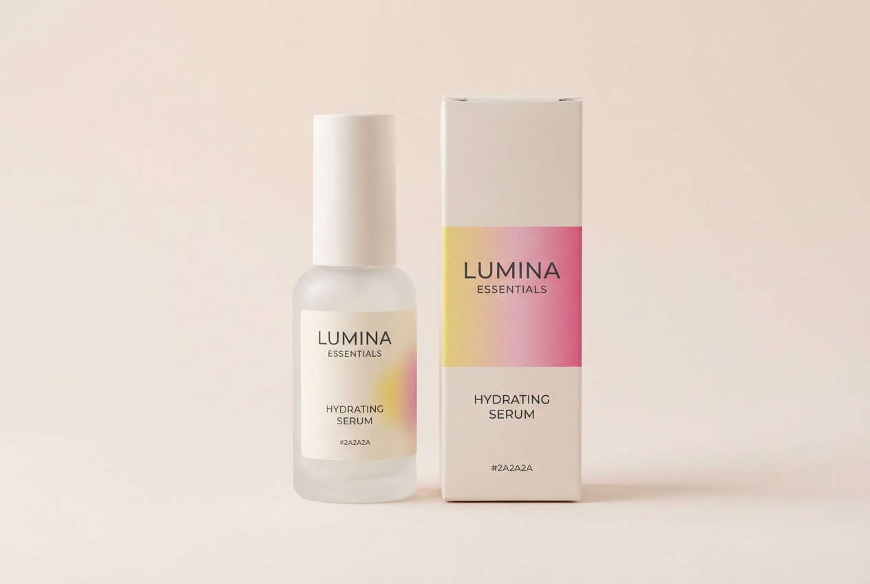
15) Sunshine Stationery
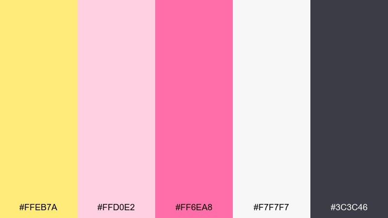
HEX: #FFEB7A #FFD0E2 #FF6EA8 #F7F7F7 #3C3C46
Mood: cheerful, tidy, creative
Best for: planner stickers and stationery sets
Cheerful and tidy, like a fresh notebook page with pastel sticky notes. The light gray keeps sticker sheets from looking overly sugary while still feeling fun. Pair with small icons, simple borders, and consistent label sizes for an organized set. Usage tip: use the deeper pink for category headers and the yellow for highlights or checkmarks.
Image example of sunshine stationery generated using media.io
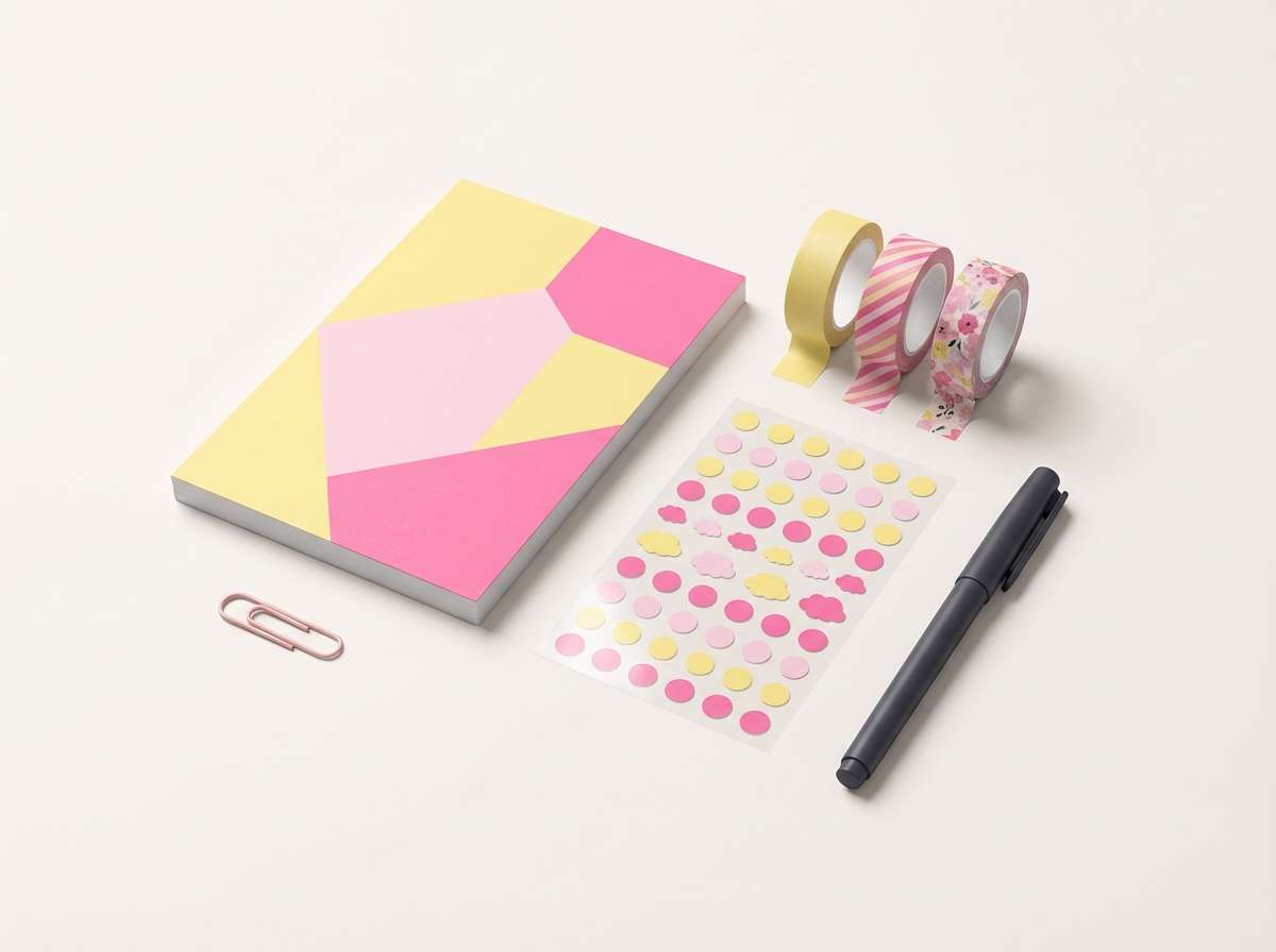
16) Candy Party
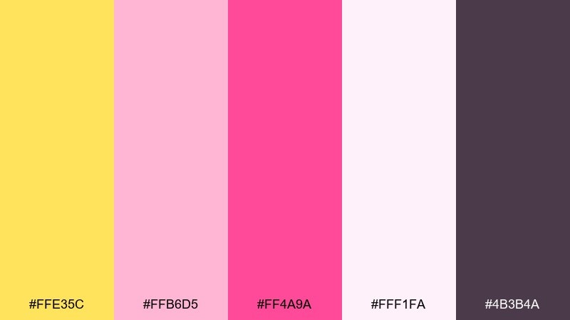
HEX: #FFE35C #FFB6D5 #FF4A9A #FFF1FA #4B3B4A
Mood: playful, cute, festive
Best for: kids party invitations and banners
Playful and cute, like a candy aisle in bright daylight. The soft blush tint keeps the hot pink from feeling too loud for kids-focused designs. Pair with rounded fonts, confetti shapes, and simple illustrations like balloons or cupcakes. Usage tip: put the event details on the lightest background and keep accents in bright pink for quick scanning.
Image example of candy party generated using media.io
17) Modern Art Block
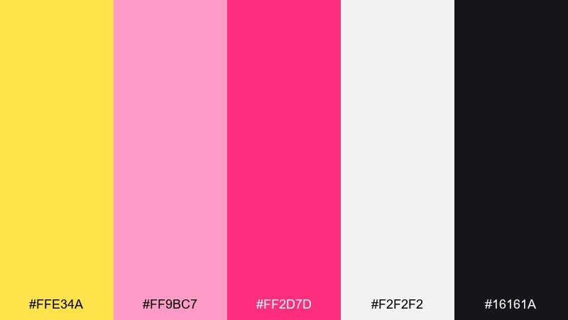
HEX: #FFE34A #FF9BC7 #FF2D7D #F2F2F2 #16161A
Mood: bold, graphic, gallery-ready
Best for: abstract posters and album covers
Bold and graphic, like cut-paper shapes pinned to a gallery wall. The high contrast black makes the brights look intentional and contemporary rather than playful. Pair with sharp geometry, asymmetry, and minimal text for a design-forward feel. Usage tip: keep one dominant color block and let the others act as smaller counterpoints.
Image example of modern art block generated using media.io
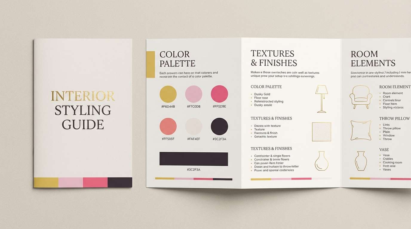
18) Blush Brass

HEX: #F6D44B #F7C0D8 #FF5D9E #FAF4EF #3C2F3A
Mood: elevated, warm, boutique
Best for: interior styling guides and boutique branding
Elevated and warm, like blush walls with brass hardware catching the light. Used as a yellow pink color scheme, it benefits from lots of cream space and a deep plum for headings and contrast. Pair with warm metals, natural wood, and tactile paper textures to lean into the boutique feel. Usage tip: keep the yellow as a thin line, icon, or highlight so it reads like brass rather than paint.
Image example of blush brass generated using media.io
19) Citrus Rose Gradient
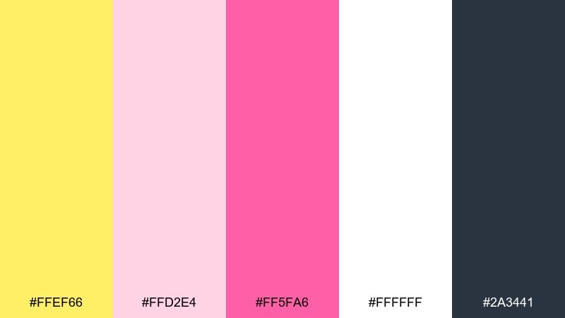
HEX: #FFEF66 #FFD2E4 #FF5FA6 #FFFFFF #2A3441
Mood: bright, smooth, tech-friendly
Best for: website hero sections and sign-up pages
Bright and smooth, like a soft gradient over a clear sky. The crisp white keeps the look tech-friendly, while the blue-gray reads professional for navigation and body copy. Pair with subtle gradients, rounded cards, and one strong primary button color. Usage tip: use pink for the main CTA and yellow as a small supporting accent for icons or badges.
Image example of citrus rose gradient generated using media.io

20) Pale Sorbet
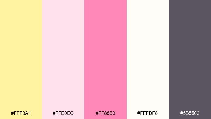
HEX: #FFF3A1 #FFE0EC #FF88B9 #FFFDF8 #5B5562
Mood: light, gentle, soothing
Best for: self-care blogs and wellness newsletters
Light and soothing, like sorbet melting on a warm plate. The airy tints make long-form reading comfortable while still feeling friendly and modern. Pair with calm photography, soft dividers, and minimal iconography for a wellness tone. Usage tip: keep headings in the darker gray and use the pink only for links and subtle emphasis.
Image example of pale sorbet generated using media.io
21) Tropic Blush Punch
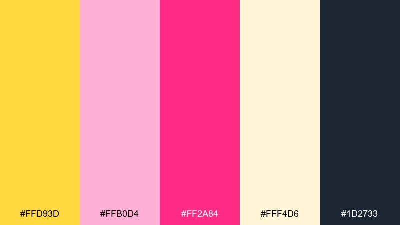
HEX: #FFD93D #FFB0D4 #FF2A84 #FFF4D6 #1D2733
Mood: tropical, confident, punchy
Best for: brand launches and bold campaign ads
Tropical and confident, like fruit punch served under palm shade. The deep blue-gray keeps the saturated pink from overpowering headlines and makes layouts feel more premium. Pair with big photography, chunky buttons, and short, energetic copy. Usage tip: if you need restraint, swap large yellow areas for the soft cream and keep yellow as a spotlight accent.
Image example of tropic blush punch generated using media.io

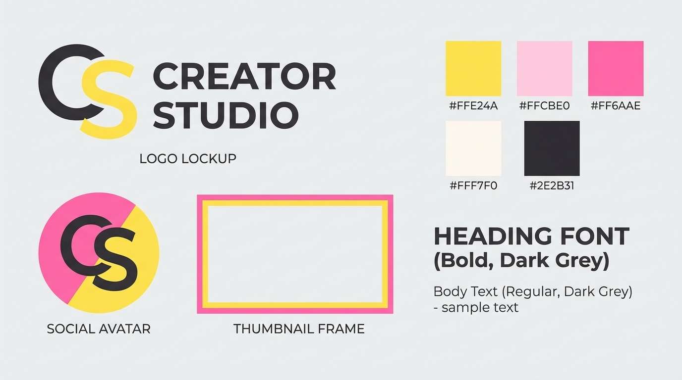
22) Rosy Sunbeam

HEX: #FFE24A #FFCBE0 #FF6AAE #FFF7F0 #2E2B31
Mood: cheerful, balanced, versatile
Best for: logos, thumbnails, and creator branding
Cheerful and balanced, like sunbeams on a bouquet of roses. As a yellow pink color combination, it stays versatile when you treat the cream as your primary background and push contrast with the near-black. Pair with a simple mark, rounded typography, and one accent color per asset for consistency. Usage tip: build a two-tone logo using black and pink, then bring yellow in for highlights only.
Image example of rosy sunbeam generated using media.io
What Colors Go Well with Yellow Pink?
Neutrals are the easiest stabilizers: creamy whites keep things airy, while charcoal and near-black make bright yellow and hot pink feel more “designed” and less playful.
For a more premium or editorial direction, pair yellow-pink with deep navy, blue-gray, or plum. These darker anchors create hierarchy for headings, navigation, and small text.
If you want a natural, floral vibe, introduce muted browns, sand, or soft sage greens. Keep the added color desaturated so yellow and pink stay the stars.
How to Use a Yellow Pink Color Palette in Real Designs
Start with a base (white/cream/light gray) that takes up most of the layout, then assign roles: yellow for highlights (badges, notifications, icons) and pink for primary emphasis (CTAs, active states, key labels).
Maintain readable contrast by placing body text on white, off-white, charcoal, or navy—avoid long paragraphs on yellow. For print, do a quick proof: pale yellows can disappear on uncoated or warm paper.
For consistency across a brand system, pick one “hero” pink and one “hero” yellow, then use tints for backgrounds and UI states. This keeps the palette bright without becoming noisy.
Create Yellow Pink Palette Visuals with AI
If you want to preview how a yellow pink color scheme looks in a real poster, landing page, invitation, or product mockup, generate a few concept visuals before you commit to production.
With Media.io’s text-to-image, you can paste a prompt like the examples above, iterate quickly, and test variations (pastel vs. neon, dark-mode vs. light-mode, print vs. UI) in minutes.
Once you have a direction, refine your prompts by specifying layout, typography style, background, and lighting—then export for moodboards, client decks, or A/B tests.
Yellow Pink Color Palette FAQs
-
What vibe does a yellow and pink color palette create?
Most yellow pink palettes feel optimistic, youthful, and welcoming. Pastel versions read soft and romantic, while high-saturation versions feel energetic and promotional. -
How do I keep yellow and pink from looking childish?
Add a strong anchor like charcoal, navy, or deep plum, and let a neutral background dominate. Also reduce how often you use the brightest yellow—use it as an accent rather than a fill. -
What are the best neutral colors to pair with yellow and pink?
White, cream, light gray, charcoal, and near-black are the most reliable. They improve readability and make saturated pinks look intentional and premium. -
Is yellow on white readable for text?
Usually no—yellow text on white (or white text on yellow) often fails contrast, especially for small sizes. Use dark text on light backgrounds, and keep yellow for badges, icons, or short highlights. -
What’s a good yellow pink palette for UI design?
Choose one pink for CTAs and one yellow for notifications, then use light neutrals for screens. Palettes like “Peach Highlighter,” “Minimal Warmth,” and “Citrus Rose Gradient” are built for clean UI hierarchy. -
Do yellow and pink work for print projects like invitations?
Yes—pastel yellow with blush and an off-white base is a classic invitation combination. Always test-print, because pale yellows can shift or look faint depending on paper stock and printer calibration. -
How can I generate mockups using a yellow pink color scheme?
Use an AI image generator and describe the design type (poster, landing page, packaging), layout, and style, then iterate. Media.io text-to-image makes it easy to produce multiple variations for moodboards and brand exploration.


