Yellow green sits right between sunshine and foliage, so it naturally communicates freshness, growth, and energy. Whether you’re designing a brand, UI, or packaging, this hue range can feel either soft and organic or bold and techy depending on contrast.
Below are 20 yellow green color palette ideas with HEX codes, plus practical guidance on pairing and using them across real design systems.
In this article
- Why Yellow Green Palettes Work So Well
-
- citrus meadow
- chartreuse minimal
- avocado linen
- lime soda pop
- spring herb garden
- golden pear glow
- mossy path
- neon lime contrast
- pistachio cream
- rainy bamboo
- vintage olive note
- kiwi sorbet
- sunleaf poster
- soft matcha ui
- tropic fern
- wasabi workspace
- acid lime streetwear
- pear blossom watercolor
- lemongrass packaging
- solar lime gradient
- What Colors Go Well with Yellow Green?
- How to Use a Yellow Green Color Palette in Real Designs
- Create Yellow Green Palette Visuals with AI
Why Yellow Green Palettes Work So Well
Yellow green palettes feel instantly “alive” because they combine the optimism of yellow with the stability of green. That balance makes them flexible: they can read as playful and youthful, or calm and eco-minded.
They also perform well in modern digital design because they cut through busy feeds and interfaces. A single chartreuse or lime accent can guide attention to CTAs, active states, and highlights without requiring heavy layout changes.
In print and packaging, yellow green can signal freshness (food, tea, wellness) while still offering enough depth for premium cues when paired with cream, charcoal, or muted metals.
20+ Yellow Green Color Palette Ideas (with HEX Codes)
1) Citrus Meadow
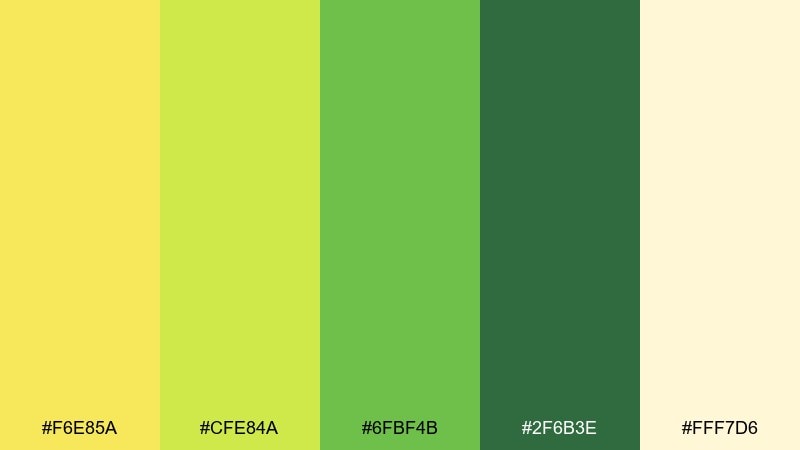
HEX: #F6E85A #CFE84A #6FBF4B #2F6B3E #FFF7D6
Mood: sunny, natural, upbeat
Best for: brand identity moodboards and wellness branding
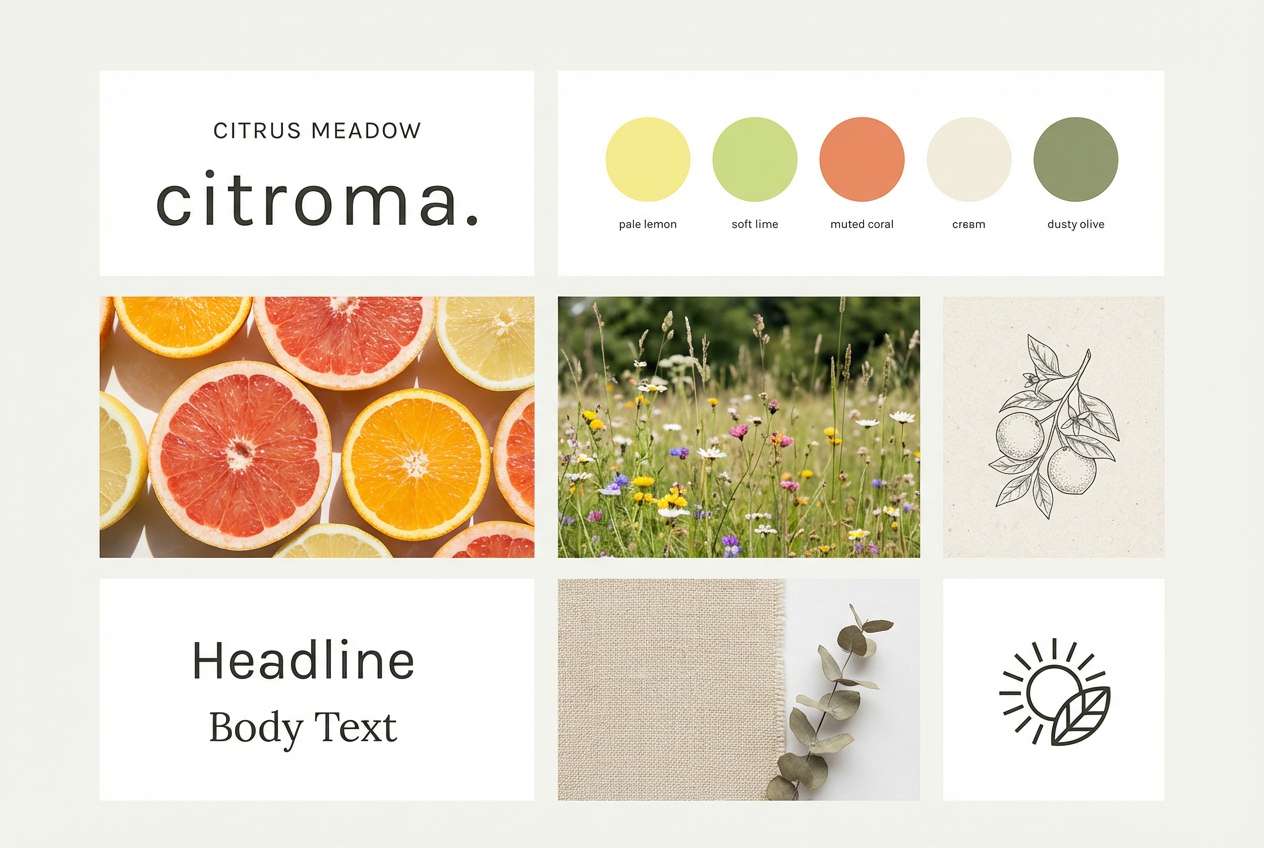
Sunny and meadow-fresh, these tones feel like citrus zest over soft spring grass. Use the pale cream as breathing room, then let the lime and leaf greens carry headlines and key shapes. Pair with warm neutrals or a muted clay accent to keep it grounded. Tip: reserve the brightest yellow for highlights and icons so the layout stays readable.
Image example of citrus meadow generated using media.io
Media.io is an online AI studio for creating and editing video, image, and audio in your browser.

2) Chartreuse Minimal
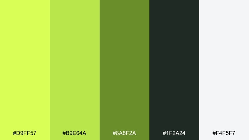
HEX: #D9FF57 #B9E64A #6A8F2A #1F2A24 #F4F5F7
Mood: clean, modern, confident
Best for: minimal website UI and landing pages
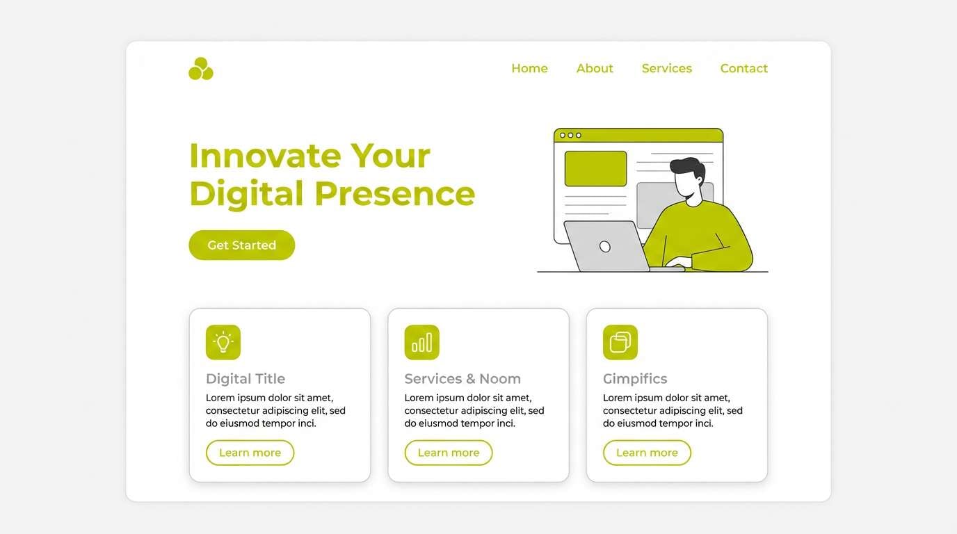
Crisp and modern, this mix reads like fresh highlighter ink on a tidy desk. For a yellow green color scheme that still feels refined, lean on charcoal for type and keep the off-white dominant. The mid greens work well for buttons, toggles, and active states without shouting. Tip: test contrast early and bump text weight when the chartreuse sits behind small labels.
Image example of chartreuse minimal generated using media.io
3) Avocado Linen
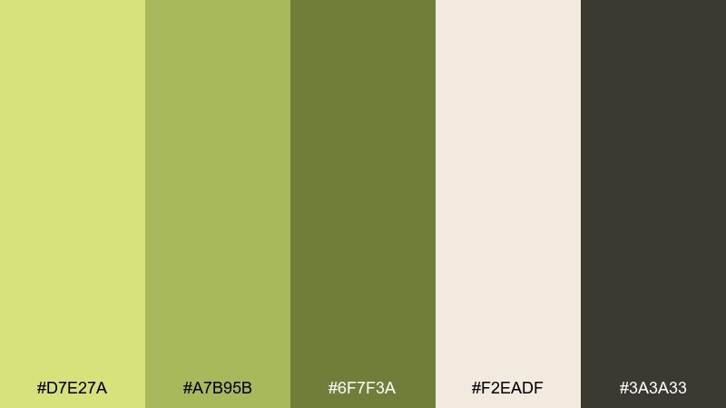
HEX: #D7E27A #A7B95B #6F7F3A #F2EADF #3A3A33
Mood: cozy, earthy, organic
Best for: wedding invitations and rustic stationery
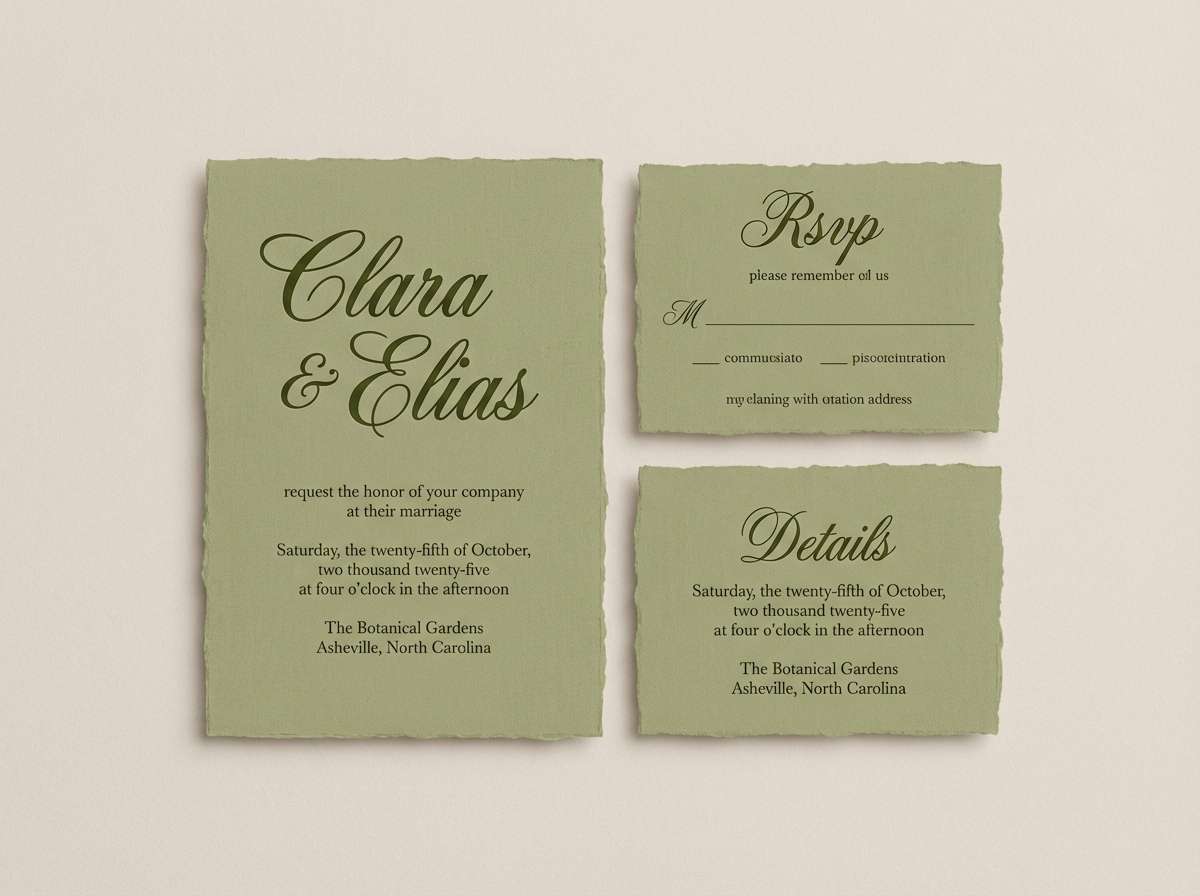
Soft and earthy, it evokes avocado leaves laid over warm linen fabric. Let the linen tone be the paper base, then bring in olive greens for borders, monograms, and RSVP details. Pair with matte black or deep brown ink to keep everything crisp and timeless. Tip: use the lightest green for subtle background patterns so the typography stays the star.
Image example of avocado linen generated using media.io
4) Lime Soda Pop
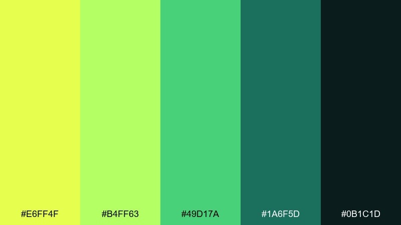
HEX: #E6FF4F #B4FF63 #49D17A #1A6F5D #0B1C1D
Mood: playful, energetic, bold
Best for: beverage can packaging and launch ads
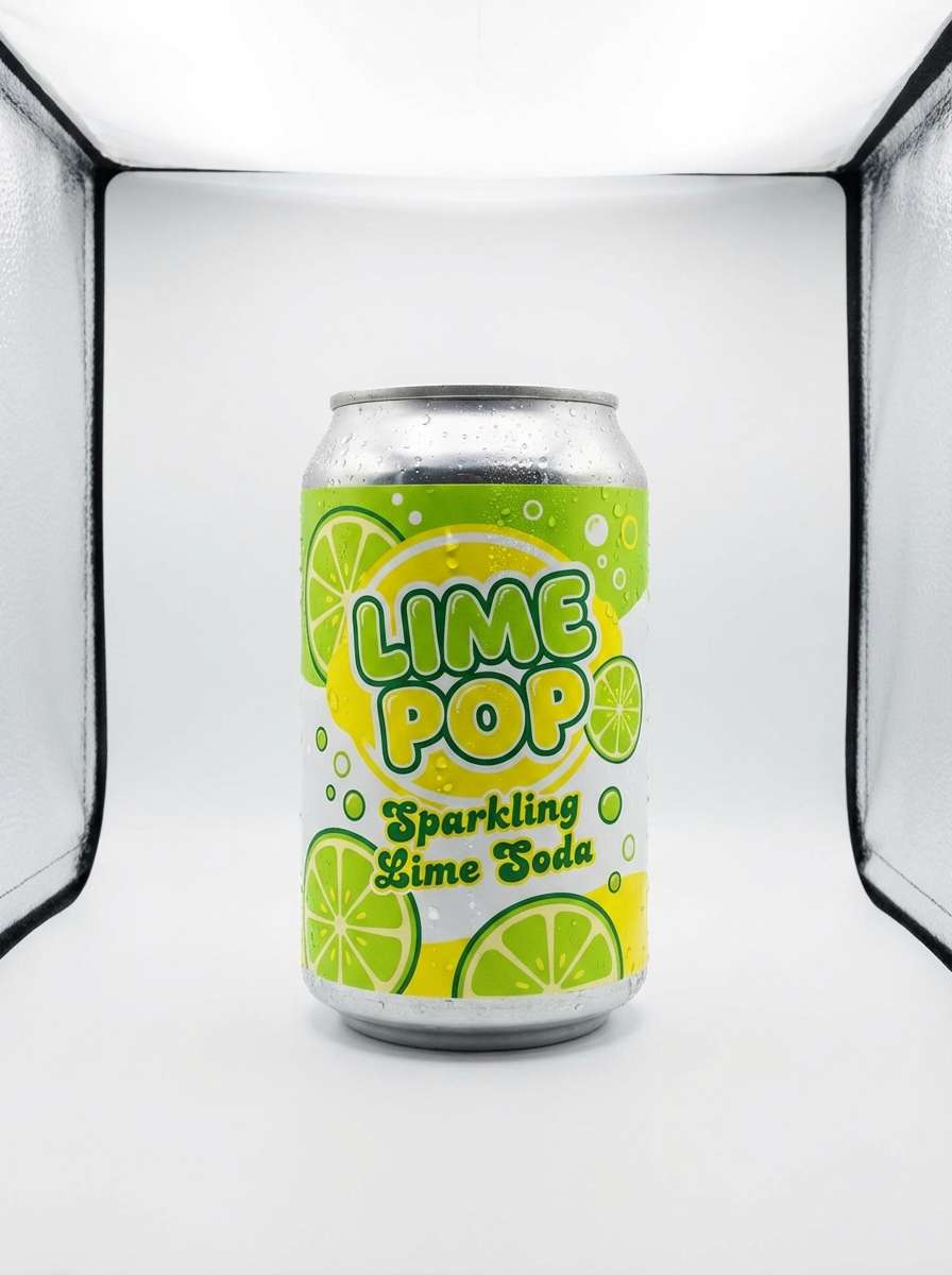
Bubbly and electric, these hues feel like a cold lime soda with a neon twist. Use the bright lime for the hero label color, then anchor it with deep teal and near-black for contrast. Pair with simple sans-serif type and lots of negative space to avoid a chaotic look. Tip: keep gradients subtle and let one punchy solid carry brand recognition.
Image example of lime soda pop generated using media.io
5) Spring Herb Garden
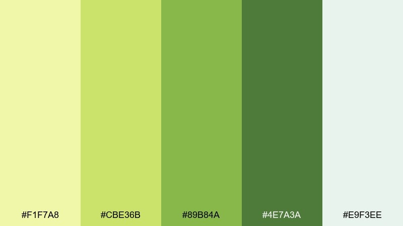
HEX: #F1F7A8 #CBE36B #89B84A #4E7A3A #E9F3EE
Mood: fresh, botanical, calming
Best for: botanical spring illustrations and blog headers
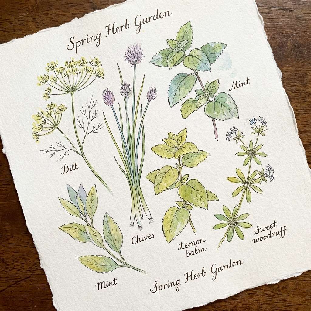
Fresh and botanical, it brings to mind crushed herbs, new shoots, and morning dew. The pale minty neutral keeps compositions airy while the deeper greens add depth to stems and shadows. Pair with hand-drawn linework and soft paper textures for a natural feel. Tip: pick one darker green for outlines so the lighter tones can glow without muddying.
Image example of spring herb garden generated using media.io
6) Golden Pear Glow
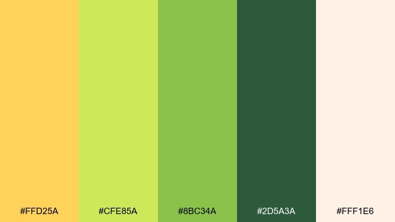
HEX: #FFD25A #CFE85A #8BC34A #2D5A3A #FFF1E6
Mood: warm, inviting, premium
Best for: skincare labels and clean product branding
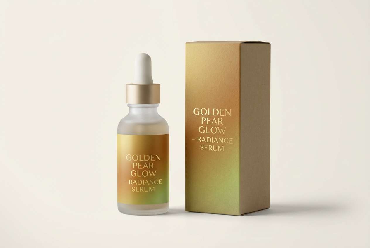
Warm and softly luminous, it feels like ripe pear skin catching late-afternoon light. This yellow green color palette works beautifully for premium labels when you keep the cream background dominant and use the deep green sparingly for ingredient blocks. Pair with minimal gold foil details or warm gray typography for an elevated finish. Tip: print a test swatch, since the bright yellow can shift under different lighting on textured stocks.
Image example of golden pear glow generated using media.io
7) Mossy Path
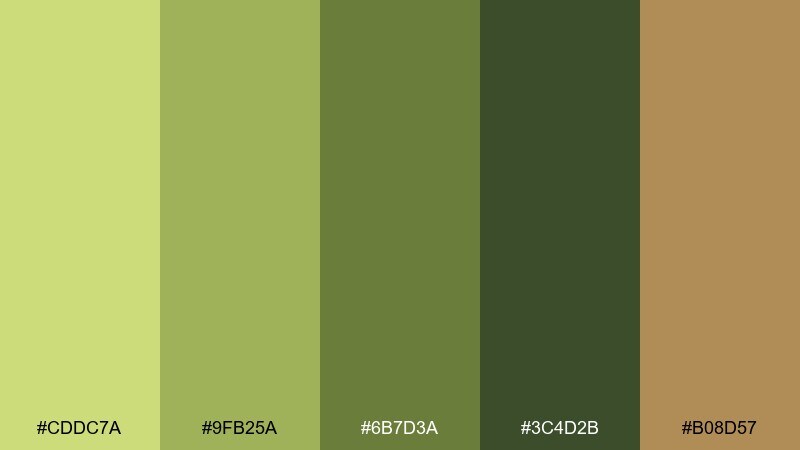
HEX: #CDDC7A #9FB25A #6B7D3A #3C4D2B #B08D57
Mood: grounded, outdoorsy, rugged
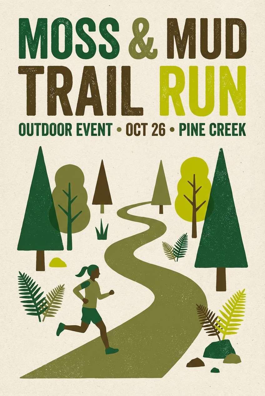
Best for: outdoor brand posters and trail events
Grounded and outdoorsy, it reads like moss on stone and sunlit dirt trails. Use the earth-brown as a supporting accent for badges, icons, and small graphic marks. Pair with kraft-like textures or a clean off-white to keep the greens from feeling too heavy. Tip: keep type in the deepest green for a natural look with strong legibility.
Image example of mossy path generated using media.io
8) Neon Lime Contrast
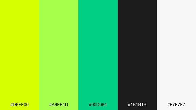
HEX: #D6FF00 #A6FF4D #00D084 #1B1B1B #F7F7F7
Mood: edgy, high-contrast, techy
Best for: gaming banners and tech announcements
Edgy and high-contrast, it feels like neon signage cutting through a night street. These yellow green color combinations pop hardest when you let black carry the background and keep the light gray for spacing. Pair with bold geometric shapes and sharp sans typography to lean into a tech aesthetic. Tip: restrict neon to one or two focal elements per layout to avoid eye fatigue.
Image example of neon lime contrast generated using media.io

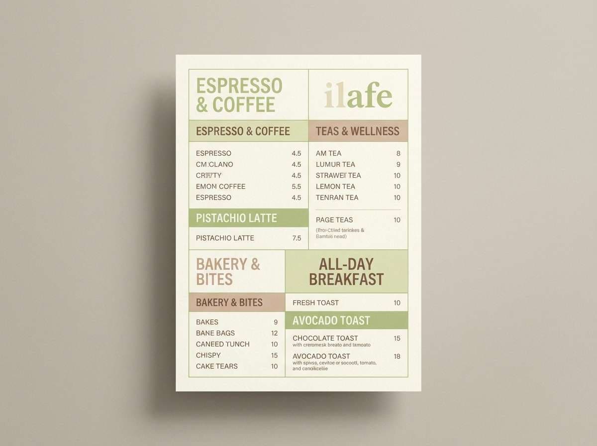
9) Pistachio Cream
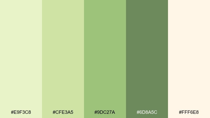
HEX: #E9F3C8 #CFE3A5 #9DC27A #6D8A5C #FFF6E8
Mood: soft, friendly, airy
Best for: cafe menus and lifestyle blog graphics
Soft and creamy, it suggests pistachio gelato with a light vanilla swirl. Use the warm cream as the base and bring in the mid greens for section headers and price highlights. Pair with gentle rounded type and subtle dividers for an approachable feel. Tip: keep photos slightly warm-toned so the greens look fresh instead of gray.
Image example of pistachio cream generated using media.io
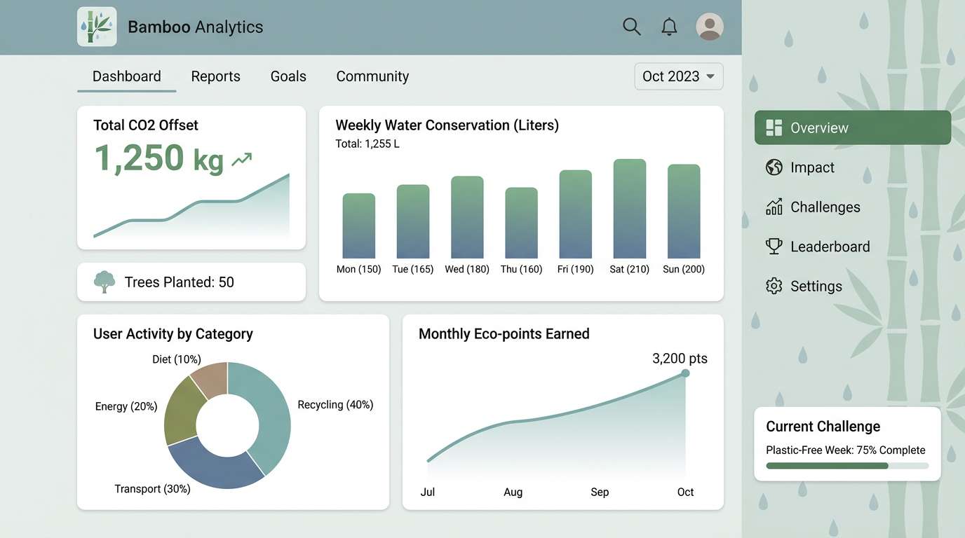
10) Rainy Bamboo
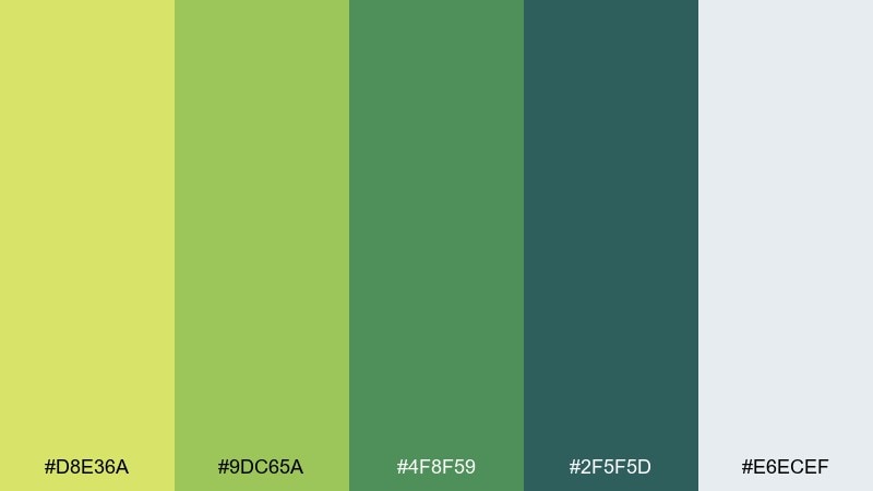
HEX: #D8E36A #9DC65A #4F8F59 #2F5F5D #E6ECEF
Mood: cool, balanced, mindful
Best for: eco app dashboards and analytics UI
Cool and balanced, it feels like bamboo leaves after rain with a misty sky overhead. Let the blue-gray act as the canvas, then use the greens to signal success states, progress, and navigation. Pair with simple iconography and consistent spacing so the palette stays calm and organized. Tip: assign one green to actions and another to data visuals to reduce cognitive load.
Image example of rainy bamboo generated using media.io
11) Vintage Olive Note
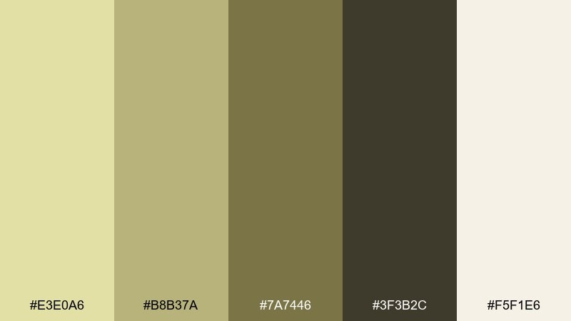
HEX: #E3E0A6 #B8B37A #7A7446 #3F3B2C #F5F1E6
Mood: nostalgic, muted, editorial
Best for: magazine layouts and long-form articles
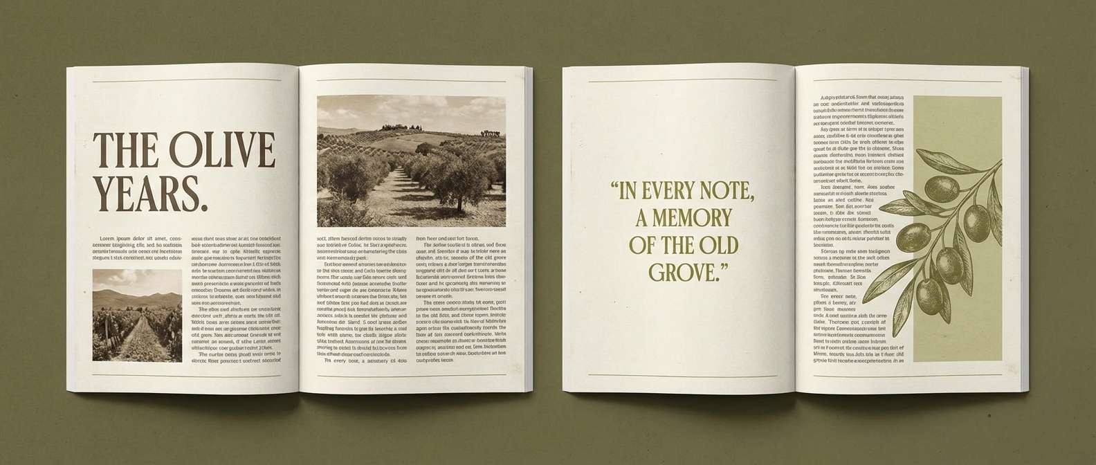
Muted and nostalgic, it brings to mind old field journals and worn olive canvas. Use the warm off-white for body text pages and reserve the darker olives for headings and pull quotes. Pair with classic serif typography and thin rules for an editorial finish. Tip: keep accent color use minimal so the palette stays sophisticated rather than dull.
Image example of vintage olive note generated using media.io
12) Kiwi Sorbet
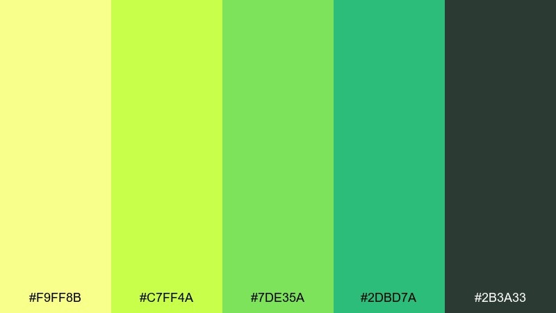
HEX: #F9FF8B #C7FF4A #7DE35A #2DBD7A #2B3A33
Mood: bright, youthful, fun
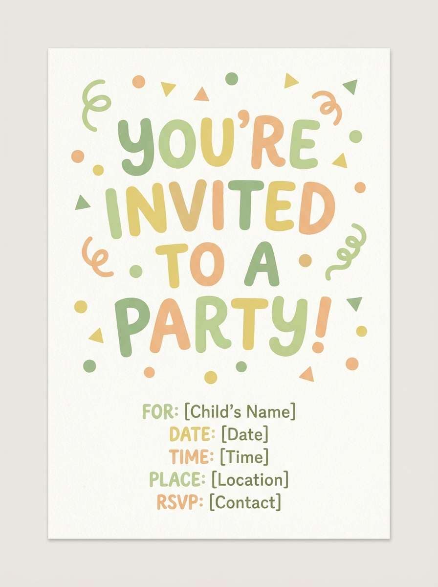
Best for: kids party invitations and playful promos
Bright and cheerful, it feels like kiwi sorbet on a hot day. Keep the darker green for text and outlines, then let the two lightest tones do the heavy lifting in shapes and backgrounds. Pair with bubbly icons, rounded corners, and simple patterns like dots or stripes. Tip: avoid tiny type on the light kiwi green and use a solid dark block when needed.
Image example of kiwi sorbet generated using media.io
13) Sunleaf Poster
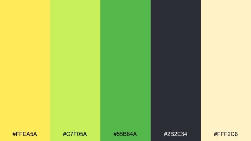
HEX: #FFEA5A #C7F05A #55B84A #2B2E34 #FFF2C6
Mood: optimistic, punchy, graphic
Best for: social media promos and campaign posts
Optimistic and graphic, it looks like sunlit leaves cut into bold paper shapes. Use the pale butter tone to soften the composition, then set headlines in the charcoal for strong contrast. Pair with big blocks of color and simple silhouettes to create scroll-stopping posts. Tip: keep the yellow as the spotlight and let greens support secondary elements like stickers and tags.
Image example of sunleaf poster generated using media.io

14) Soft Matcha UI
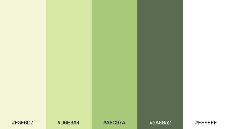
HEX: #F3F6D7 #D6E8A4 #A8C97A #5A6B52 #FFFFFF
Mood: gentle, cozy, minimal
Best for: finance app UI kits and onboarding screens
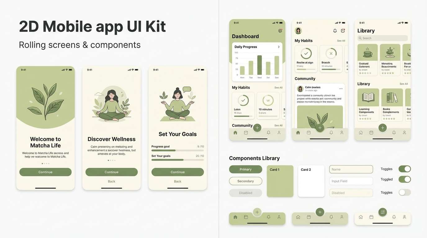
Gentle and cozy, it recalls a warm matcha latte with a creamy foam top. Use white and pale matcha for backgrounds, then apply the mid greens for cards, tabs, and progress steps. Pair with calm illustrations and generous padding to keep the interface feeling premium. Tip: set primary buttons in the darkest green and keep secondary actions outlined for clarity.
Image example of soft matcha ui generated using media.io
15) Tropic Fern
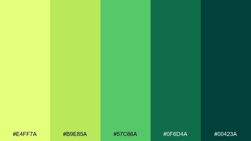
HEX: #E4FF7A #B9E85A #57C86A #0F6D4A #00423A
Mood: lush, adventurous, fresh
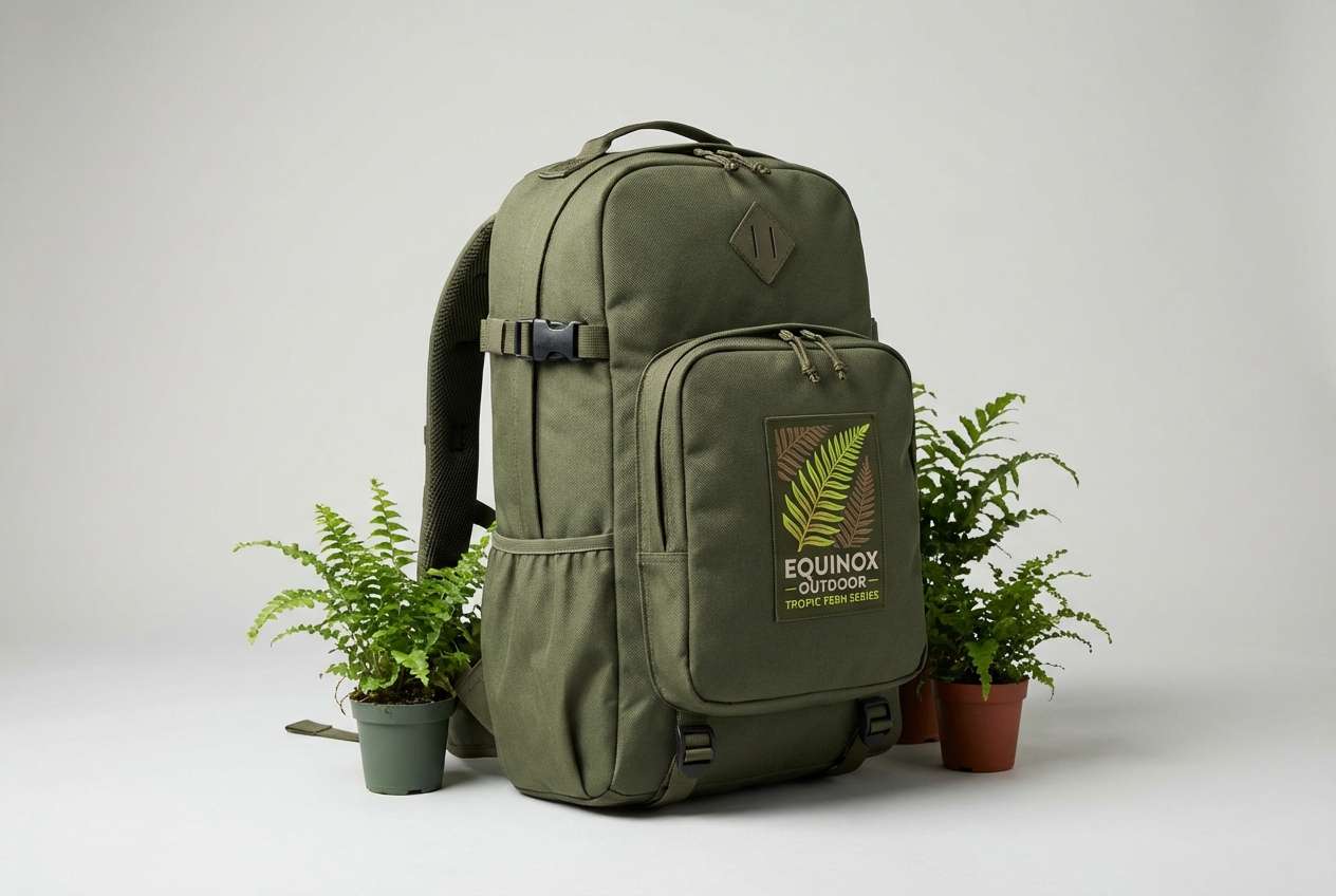
Best for: outdoor gear ads and travel branding
Lush and adventurous, these greens feel like tropical fern fronds in humid air. Let the bright lime act as a punchy accent for logos and callouts, while the deep teals anchor the brand system. Pair with clean photography and simple copy to avoid competing with the saturation. Tip: keep backgrounds dark when you want the lime to glow, and light when you need a calmer read.
Image example of tropic fern generated using media.io
16) Wasabi Workspace
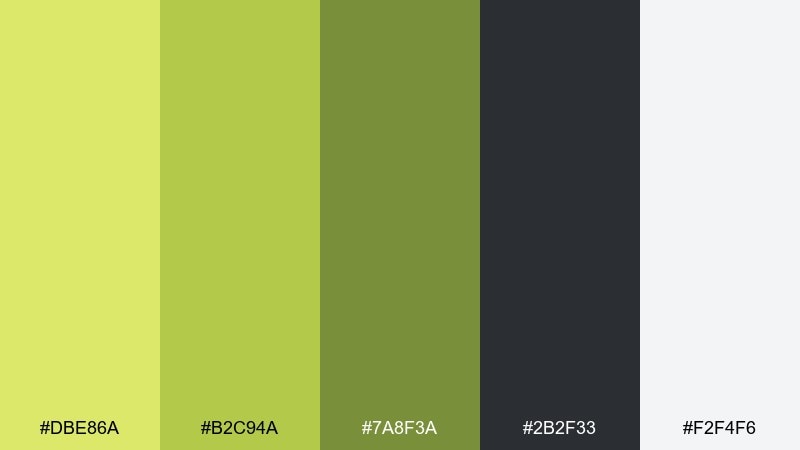
HEX: #DBE86A #B2C94A #7A8F3A #2B2F33 #F2F4F6
Mood: focused, professional, modern
Best for: office presentation templates and slide decks
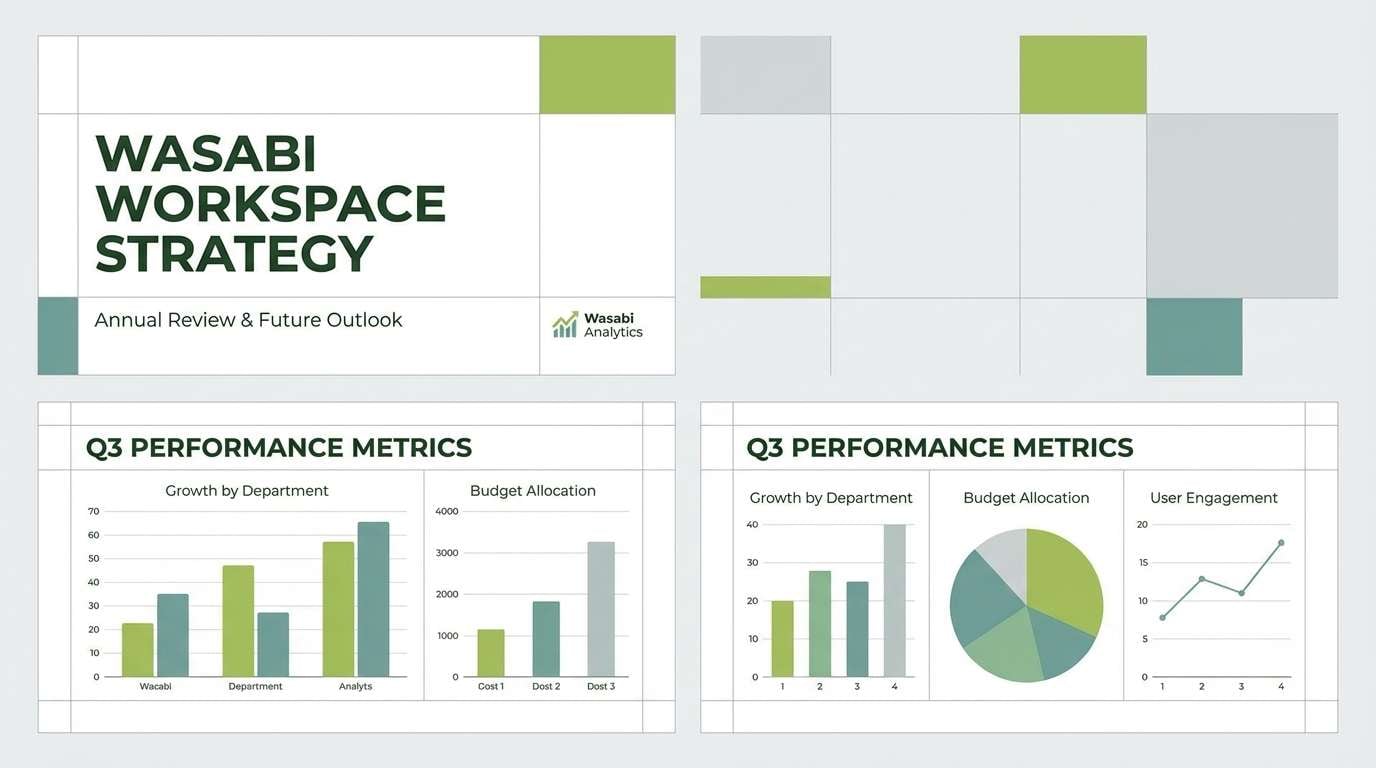
Focused and professional, it feels like a tidy workspace with a spicy wasabi edge. Use the cool gray as the slide base, then apply the greens to charts, section dividers, and key metrics. Pair with a single bold sans-serif family and consistent icon stroke weights. Tip: keep the brightest green for emphasis only, especially on data-heavy slides.
Image example of wasabi workspace generated using media.io
17) Acid Lime Streetwear
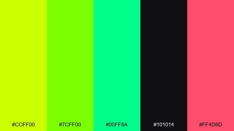
HEX: #CCFF00 #7CFF00 #00FF8A #101014 #FF4D6D
Mood: loud, trendy, rebellious
Best for: streetwear posters and lookbook covers
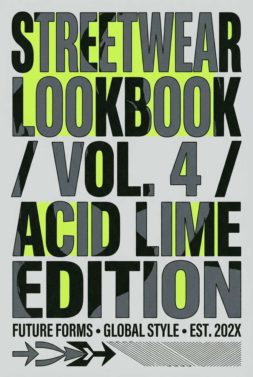
Loud and trendy, it screams night market neon with an unexpected pink hit. Yellow green color combinations like this work best with lots of black space and oversized typography. Pair with sharp angled shapes and minimal copy to keep the energy controlled. Tip: treat the pink as a tiny signature accent for tags, prices, or a single icon.
Image example of acid lime streetwear generated using media.io
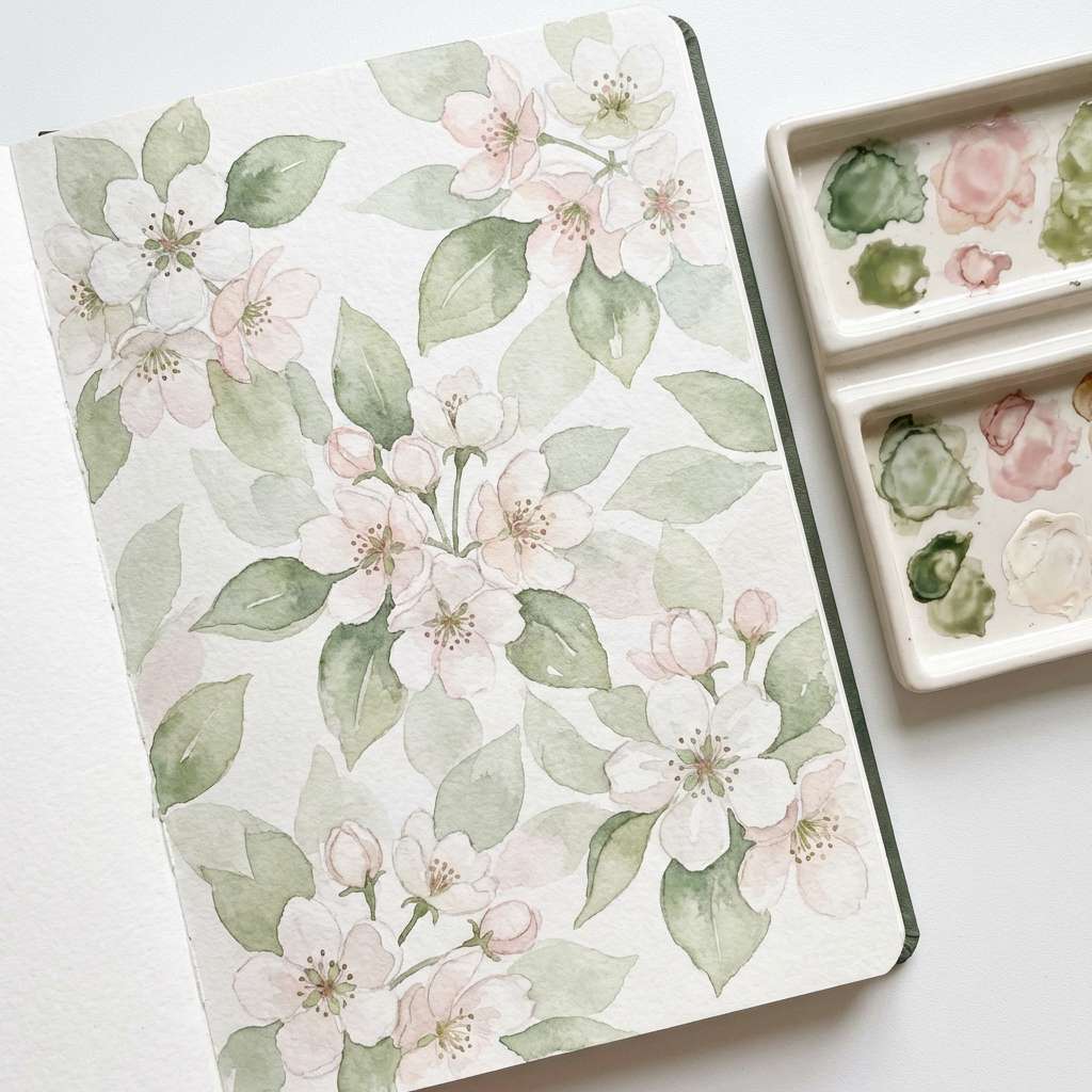
18) Pear Blossom Watercolor
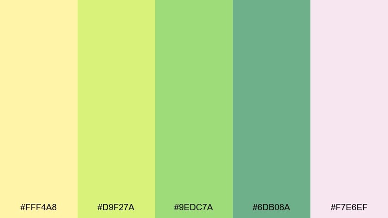
HEX: #FFF4A8 #D9F27A #9EDC7A #6DB08A #F7E6EF
Mood: romantic, airy, delicate
Best for: spring floral patterns and stationery accents
Romantic and airy, it feels like pear blossoms drifting across a pastel sky. Use the blush pink as a soft counterpoint so the greens stay sweet instead of sporty. Pair with loose watercolor edges and plenty of white space for a light, breathable look. Tip: keep one mid green for leaves and switch only the highlights to avoid a busy pattern.
Image example of pear blossom watercolor generated using media.io
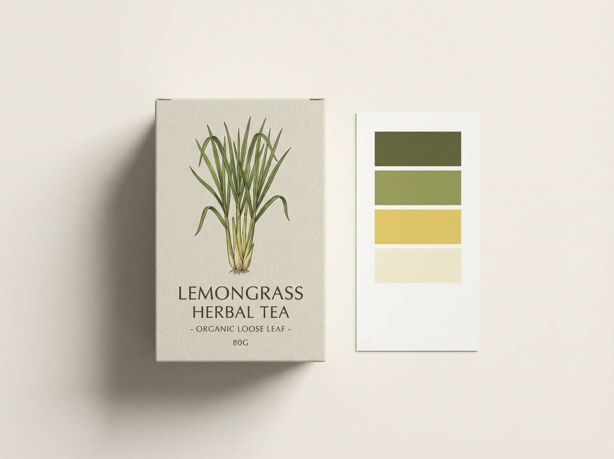
19) Lemongrass Packaging
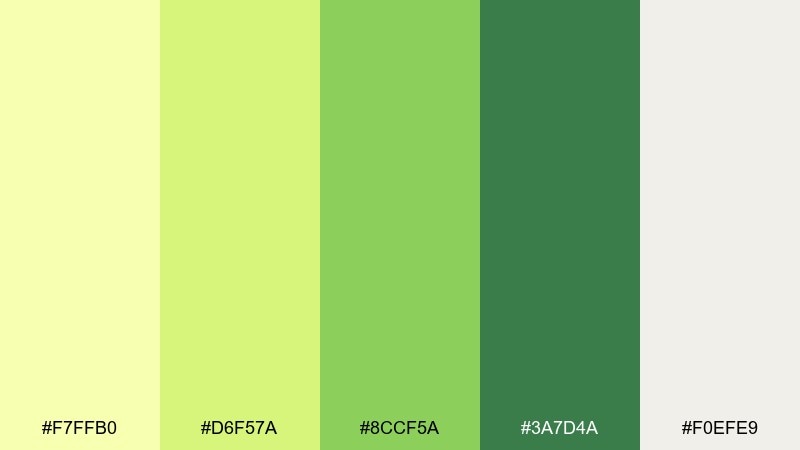
HEX: #F7FFB0 #D6F57A #8CCF5A #3A7D4A #F0EFE9
Mood: clean, herbal, trustworthy
Best for: tea boxes and natural food packaging
Clean and herbal, it evokes lemongrass bundles and a calm pantry shelf. Use the warm light neutral as the main box color, then place the deeper green on panels for ingredients and certifications. Pair with simple botanical line drawings to communicate freshness without clutter. Tip: keep the darkest green for small text so it stays readable on textured packaging stocks.
Image example of lemongrass packaging generated using media.io
20) Solar Lime Gradient
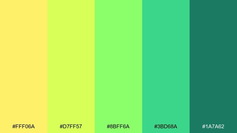
HEX: #FFF06A #D7FF57 #8BFF6A #3BD68A #1A7A62
Mood: fresh, bright, optimistic
Best for: website backgrounds, CTAs, and gradient UI accents
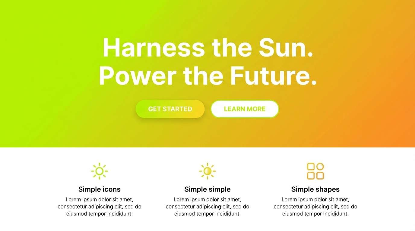
Fresh and optimistic, it looks like sunlight dissolving into lime and mint. Use gradients for hero sections and big shapes, then rely on the darker teal-green for text and navigation. Pair with crisp white and a neutral gray for a modern, polished interface. Tip: keep gradients behind large areas only and avoid placing small text directly on the brightest band.
Image example of solar lime gradient generated using media.io
What Colors Go Well with Yellow Green?
Yellow green pairs best with deep anchors and soft neutrals. Charcoal, near-black, deep forest green, and dark teal make yellow green feel sharper and more readable—especially for UI text and buttons.
For a calmer, natural look, combine it with cream, warm off-white, kraft beige, or light gray-blue. These backgrounds reduce visual noise and help the brighter greens feel intentional instead of overwhelming.
If you want extra pop, small doses of blush pink, clay, or warm gold can act as a signature accent. Keep that accent limited so yellow green remains the lead hue.
How to Use a Yellow Green Color Palette in Real Designs
Start by deciding what role yellow green will play: primary brand color, supporting UI accent, or seasonal campaign highlight. In most systems, it works best as an accent (CTAs, highlights, badges) with a neutral base and a dark text color.
In UI, test contrast early: yellow green backgrounds can reduce legibility for small type. Use deeper greens or charcoal for text, increase font weight, and reserve the brightest tones for larger shapes and icon moments.
For print and packaging, do a proof on the actual stock—bright yellows can shift under warm lighting or textured paper. Use cream/neutral panels for ingredients and fine print to keep everything crisp.
Create Yellow Green Palette Visuals with AI
If you already have HEX codes, you can turn them into fast moodboards, UI mockups, poster concepts, or packaging scenes. The key is to describe the layout (grid, hero, label, editorial spread) and where the yellow green accent should appear.
Use one palette per concept first, then iterate by swapping only one color at a time (for example, changing the background neutral). This keeps results consistent and helps you spot what improves readability and brand feel.
With Media.io’s text-to-image tool, you can generate visual examples quickly from prompts like the ones shown above, then refine typography and composition in seconds.
Yellow Green Color Palette FAQs
-
What is the difference between yellow green, lime, and chartreuse?
Yellow green is a broad range that sits between yellow and green. Lime usually leans brighter and more neon, while chartreuse often refers to a vivid yellow-green that feels like a highlighter tone (and can vary slightly warmer or greener depending on the shade). -
Is yellow green a good choice for brand identity?
Yes—yellow green can communicate freshness, energy, growth, and eco cues. It’s especially strong for wellness, food/beverage, outdoor, and tech brands, as long as you balance it with neutrals and a dark anchor for legibility. -
What colors pair best with yellow green in UI design?
Charcoal/near-black for text, white or off-white for backgrounds, and deep teal or forest green for structure. If you add an accent, keep it small (e.g., blush pink or warm gold) so the interface doesn’t feel noisy. -
How do I keep yellow green readable for buttons and labels?
Use dark text (charcoal, deep green) on yellow-green fills, increase font weight for small labels, and avoid placing thin text over the brightest yellow bands. Always check contrast ratios before shipping. -
Does yellow green print accurately on packaging?
It can shift more than muted colors, especially on textured or recycled stocks. Run a physical proof and consider using cream/off-white panels for small text while keeping the brightest yellow green for larger brand elements. -
What mood does a yellow green color palette create?
Depending on saturation and contrast, it can feel sunny and upbeat (citrus tones), clean and modern (minimal chartreuse), grounded and outdoorsy (olive/moss), or edgy and techy (neon lime on black). -
Can I generate yellow green palette mockups with AI?
Yes. Use a prompt that specifies the design type (UI hero, packaging mockup, poster, watercolor pattern), then describe where the yellow green should be used (CTA, label, headline, accents) for more consistent results.
Next: White Gold Color Palette


