

White gold sits in that sweet spot between crisp whites and warm metallic neutrals, making designs feel brighter, cleaner, and more premium without looking overly shiny.
Below are curated white gold color palette ideas with HEX codes for branding, UI, packaging, weddings, and editorial layouts—plus AI-ready prompts to generate matching visuals.
In this article
- Why White Gold Palettes Work So Well
-
- gilded porcelain
- champagne marble
- pearl satin
- modern heirloom
- winter brunch
- minimal boutique
- warm gallery wall
- bridal suite
- sunlit linen
- art deco quiet
- coastal pearl
- sage and shine
- noir highlight
- rosy metallic
- terracotta glint
- iced mocha
- nordic glow
- dusty blue luxe
- plum velvet spark
- citrus accent gold
- antique pearl script
- evergreen candlelight
- gallery rsvp
- What Colors Go Well with White Gold?
- How to Use a White Gold Color Palette in Real Designs
- Create White Gold Palette Visuals with AI
Why White Gold Palettes Work So Well
White gold palettes combine bright, clean highlights with warm champagne and beige undertones, which instantly reads as “luxury” without relying on loud color. That balance makes them versatile for both modern minimalism and classic, editorial styling.
They also provide reliable contrast options: pair airy ivories with charcoal, navy, or deep gray for type and navigation, and you get a polished look that stays readable across print and screens.
Because the warmth is subtle, white gold tones flatter product photography, skin tones, and natural textures—helping your design feel cohesive even when imagery changes.
20+ White Gold Color Palette Ideas (with HEX Codes)
1) Gilded Porcelain
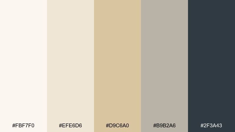
HEX: #fbf7f0 #efe6d6 #d9c6a0 #b9b2a6 #2f3a43
Mood: polished, airy, refined
Best for: luxury branding and minimalist packaging
Polished and airy like porcelain kissed with a soft metallic glaze, these tones feel clean yet expensive. Use the ivory and champagne shades as your base, then let the deep slate add contrast for logos and type. It works beautifully on matte paper stocks and premium labels. Tip: keep metallic accents under 10 percent so the design stays modern, not flashy.
Image example of gilded porcelain generated using media.io
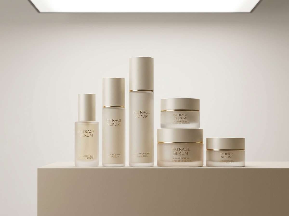
Media.io is an online AI studio for creating and editing video, image, and audio in your browser.

2) Champagne Marble
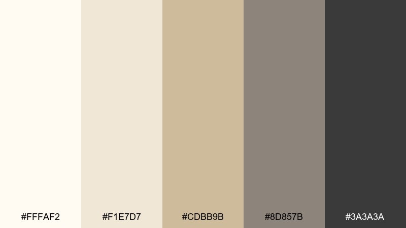
HEX: #fffaf2 #f1e7d7 #cdbb9b #8d857b #3a3a3a
Mood: elegant, grounded, timeless
Best for: interior mood boards and product lookbooks
Elegant and grounded like champagne marble in morning light, this mix balances creamy warmth with stone-gray structure. Pair the light neutrals with charcoal for captions, pricing, and editorial layouts. It shines in lookbooks where you need luxury cues without loud color. Tip: add fine-line dividers in the taupe to keep pages feeling curated.
Image example of champagne marble generated using media.io
3) Pearl Satin
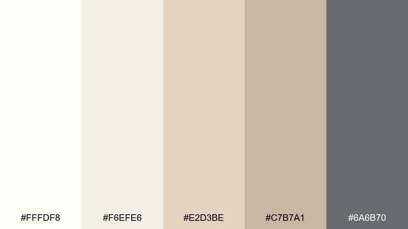
HEX: #fffdf8 #f6efe6 #e2d3be #c7b7a1 #6a6b70
Mood: soft, romantic, luminous
Best for: wedding invitations and stationery suites
Soft and luminous like pearl satin draped over candlelight, these shades read romantic without turning sugary. Let the warm beige and antique gold lead, then use the cool gray for text to keep readability high. It pairs well with script fonts, deckled edges, and subtle embossing. Tip: print the darkest tone in a slightly softened ink to preserve the gentle feel.
Image example of pearl satin generated using media.io
4) Modern Heirloom
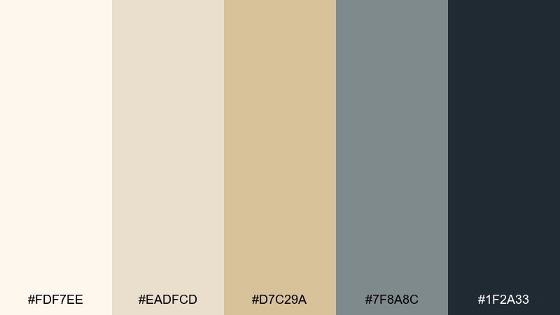
HEX: #fdf7ee #eadfcd #d7c29a #7f8a8c #1f2a33
Mood: heritage, modern, confident
Best for: premium logos and brand systems
Heritage with a modern edge, like an heirloom piece styled in a contemporary home. This white gold color palette keeps the base warm and inviting, while the blue-gray and inky navy provide instant authority. Use the darker tones for wordmarks, navigation, and headline hierarchy. Tip: set generous whitespace so the metallic-leaning neutrals can breathe.
Image example of modern heirloom generated using media.io
5) Winter Brunch
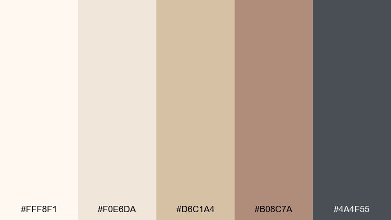
HEX: #fff8f1 #f0e6da #d6c1a4 #b08c7a #4a4f55
Mood: cozy, social, understated
Best for: cafe menus and lifestyle content
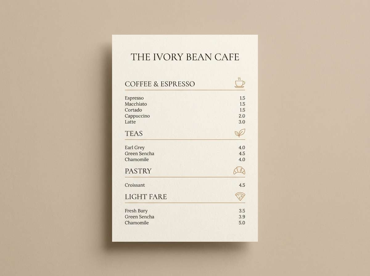
Cozy and social like a bright winter brunch with linen napkins and warm pastries. The creamy base makes photos feel lighter, while the cinnamon-tan brings appetite appeal and the gray anchors text. Use it for menus, recipe cards, and lifestyle posts that need warmth without clutter. Tip: keep the tan as an accent color for callouts and pricing.
Image example of winter brunch generated using media.io
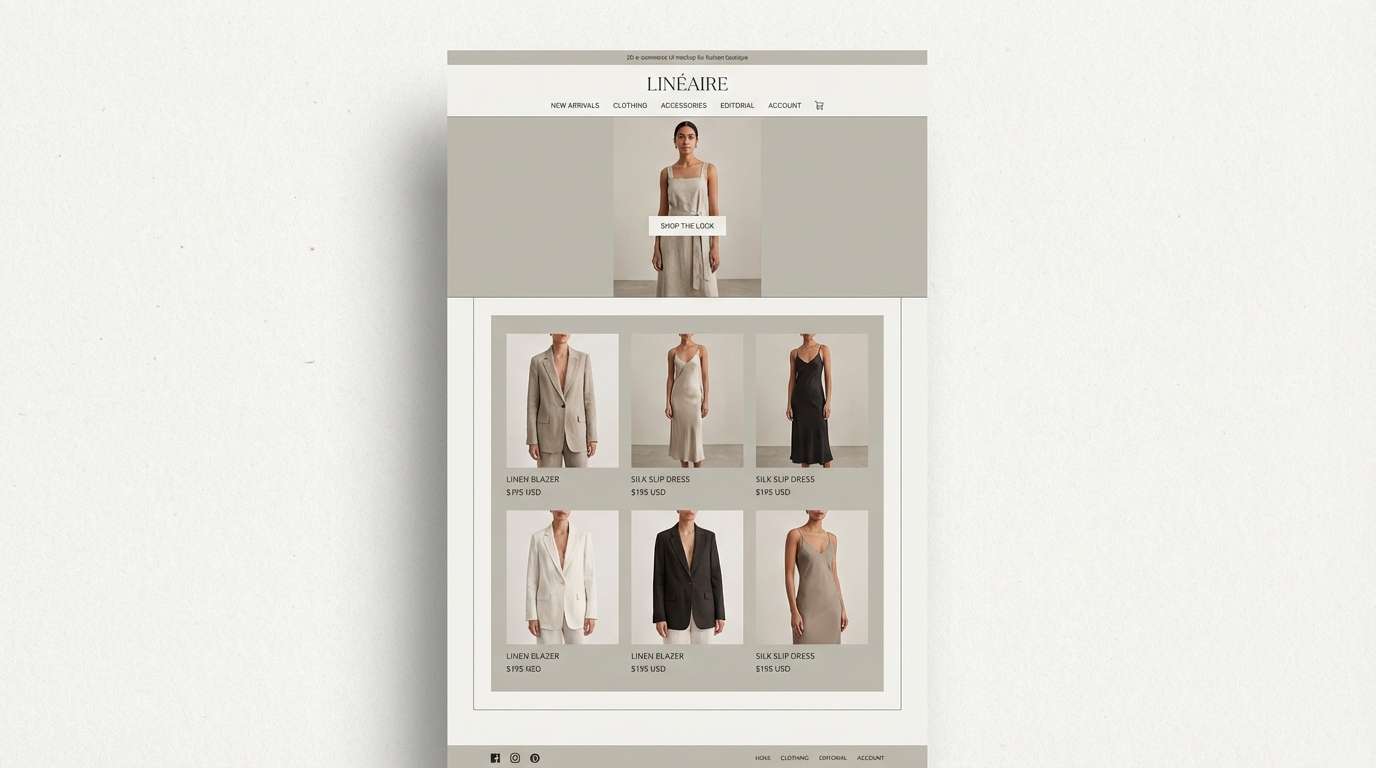
6) Minimal Boutique
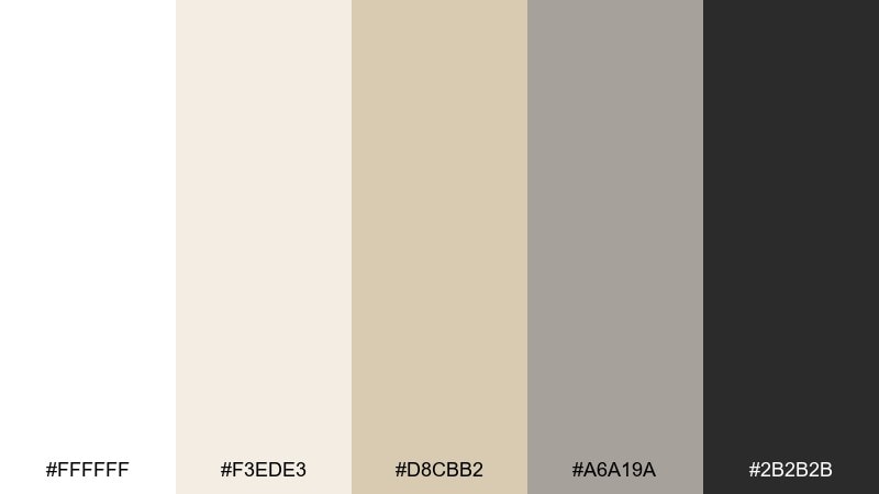
HEX: #ffffff #f3ede3 #d8cbb2 #a6a19a #2b2b2b
Mood: clean, upscale, calm
Best for: ecommerce UI and storefront banners
Clean and upscale, like a boutique with perfect lighting and quiet confidence. The bright white and soft greige keep product imagery true, while charcoal improves contrast for CTA buttons and pricing. Pair with thin borders and subtle shadows for a refined interface. Tip: use the beige tone for hover states to create gentle interaction cues.
Image example of minimal boutique generated using media.io
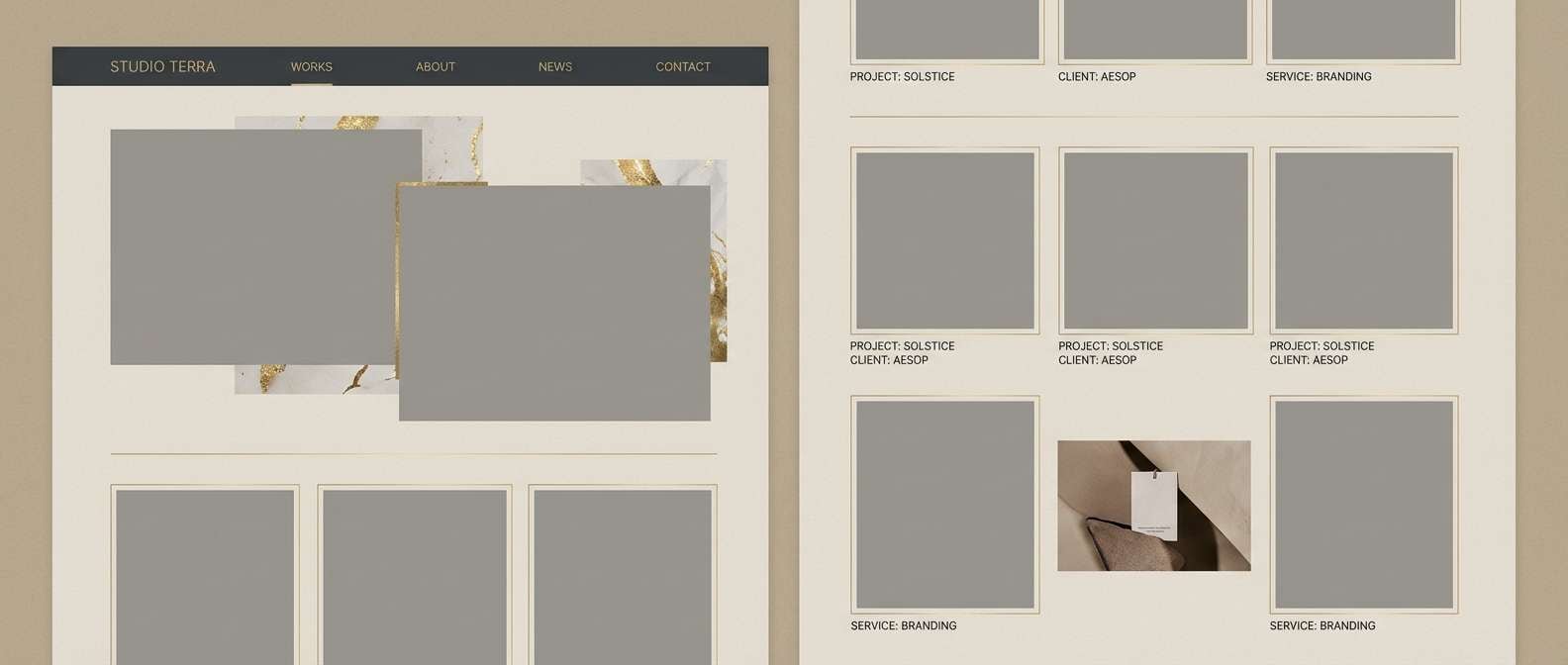
7) Warm Gallery Wall
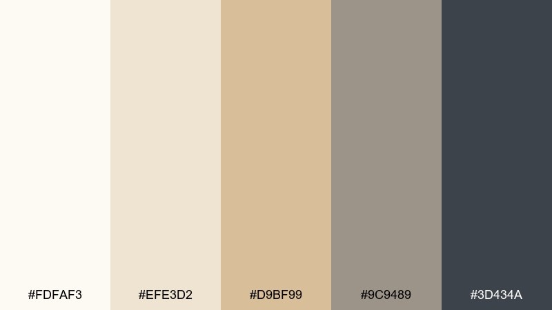
HEX: #fdfaf3 #efe3d2 #d9bf99 #9c9489 #3d434a
Mood: curated, artistic, welcoming
Best for: portfolio sites and studio presentations
Curated and artistic like a warm gallery wall under track lights. The creamy whites keep layouts spacious, and the muted gold-beige gives just enough richness for section headers. Add the deep gray-blue for captions, links, and navigation so the work stays the hero. Tip: choose one accent per page to avoid competing with artwork.
Image example of warm gallery wall generated using media.io
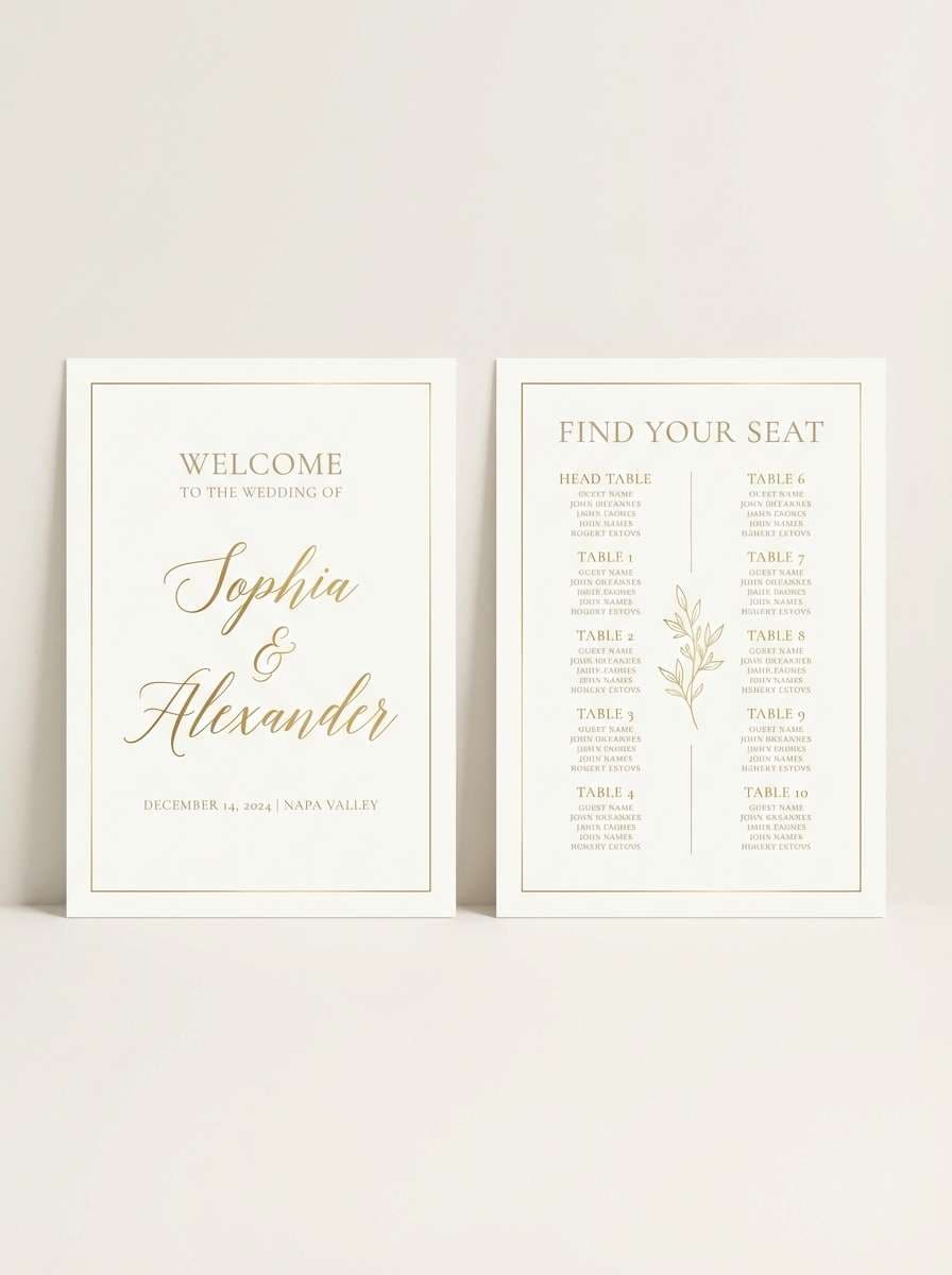
8) Bridal Suite
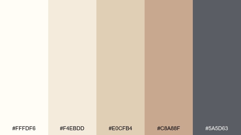
HEX: #fffdf6 #f4ebdd #e0cfb4 #c8a88f #5a5d63
Mood: dreamy, delicate, elevated
Best for: bridal brand kits and event signage
Dreamy and delicate, like a bridal suite filled with soft daylight and sheer fabric. The warm neutrals feel flattering on skin tones and make metallic details look intentional. Use the deeper gray for directional signage and schedules so everything remains legible at a distance. Tip: pair with vellum overlays or subtle texture to enhance the luxe mood.
Image example of bridal suite generated using media.io
9) Sunlit Linen
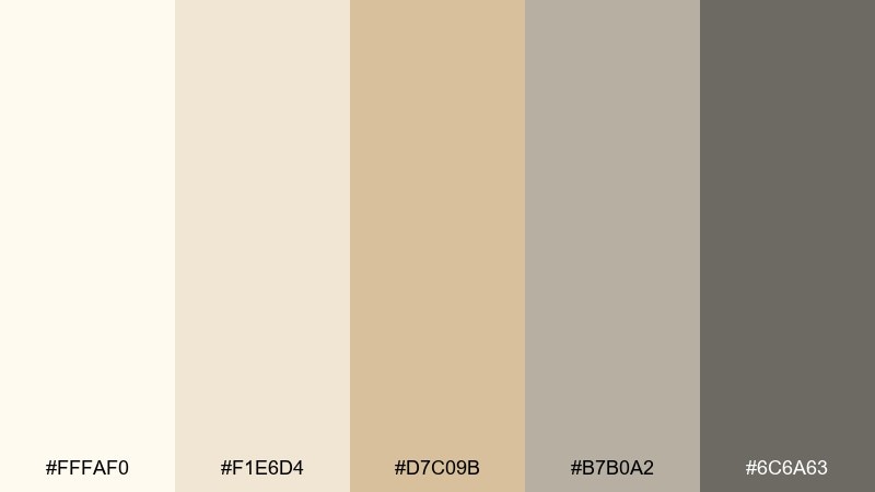
HEX: #fffaf0 #f1e6d4 #d7c09b #b7b0a2 #6c6a63
Mood: natural, airy, relaxed
Best for: home decor styling and lifestyle blogs
Natural and airy like sunlit linen on a calm afternoon. These tones work best with organic textures such as rattan, oak, and handmade ceramics. Use the deeper taupe for headings and the muted gray for supporting text to keep pages soft but readable. Tip: bring in one real texture, like paper grain, to avoid a flat look.
Image example of sunlit linen generated using media.io
10) Art Deco Quiet
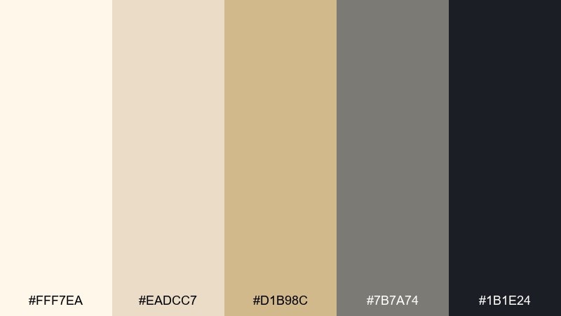
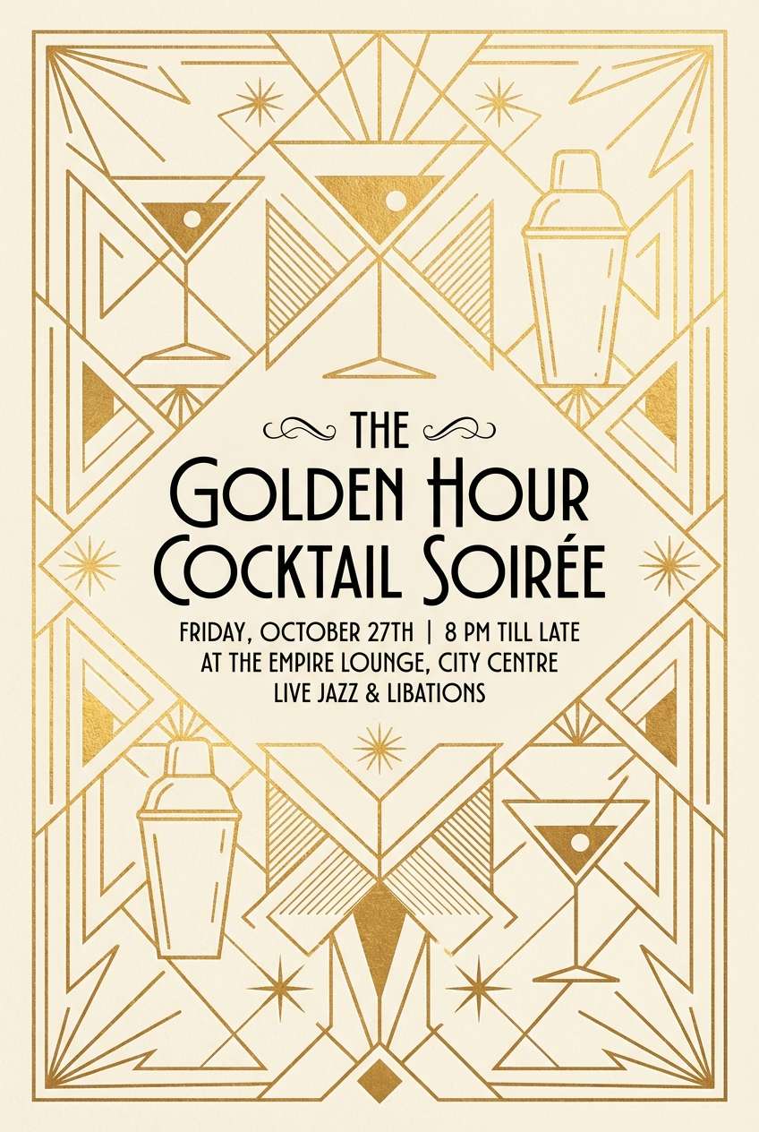
HEX: #fff7ea #eadcc7 #d1b98c #7b7a74 #1b1e24
Mood: sleek, vintage, dramatic
Best for: cocktail posters and nightlife branding
Sleek and dramatic, like quiet Art Deco glamour without the noise. The warm metallic beige brings the vintage vibe, while black and graphite deliver high-contrast impact. Use geometric lines and symmetrical layouts for instant era cues. Tip: reserve the darkest shade for typography and keep backgrounds in the lightest tones for clarity.
Image example of art deco quiet generated using media.io
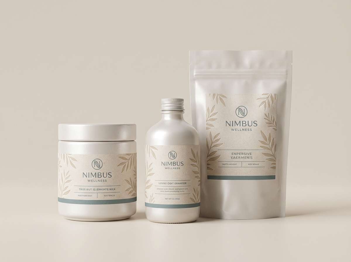
11) Coastal Pearl
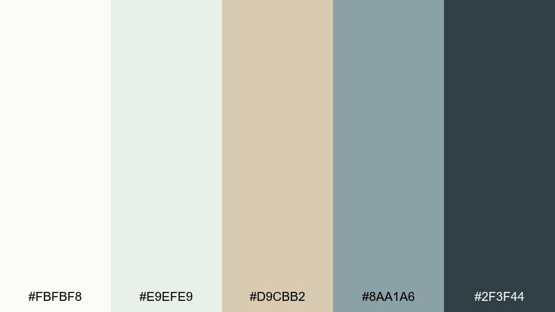
HEX: #fbfbf8 #e9efe9 #d9cbb2 #8aa1a6 #2f3f44
Mood: fresh, breezy, clean
Best for: spa websites and wellness packaging
Fresh and breezy like sea air hitting pearl-toned sand. The pale mint-gray keeps things clean and modern, while the warm beige stops it from feeling cold. Pair with soft photography, rounded corners, and plenty of negative space for a spa-ready vibe. Tip: use the teal-gray for icons and subtle section dividers.
Image example of coastal pearl generated using media.io
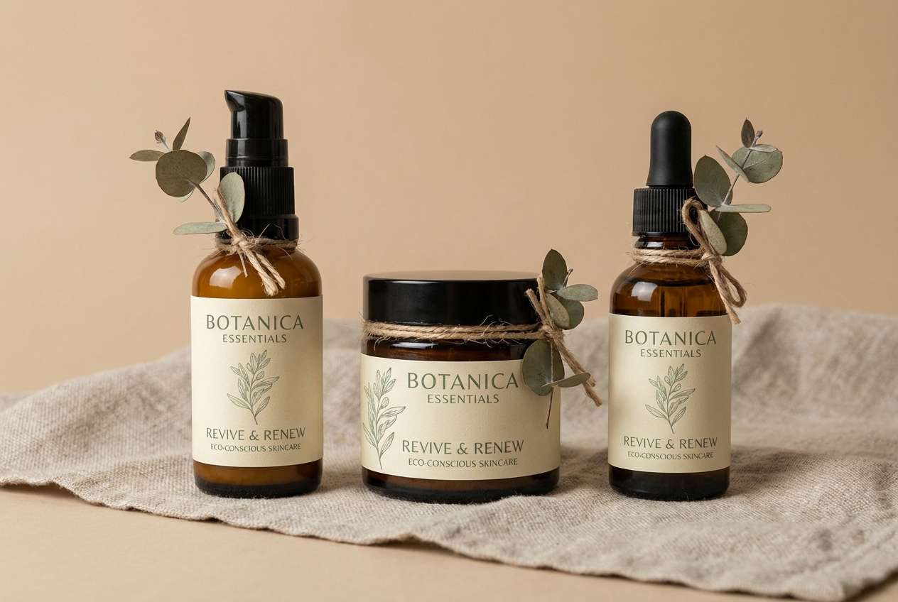
12) Sage and Shine
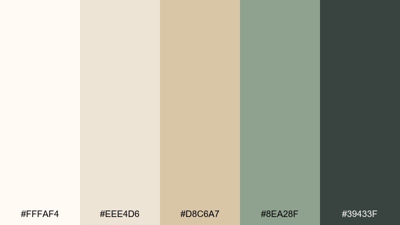
HEX: #fffaf4 #eee4d6 #d8c6a7 #8ea28f #39433f
Mood: calm, botanical, balanced
Best for: natural skincare labels and eco branding
Calm and botanical like a sage sprig resting on warm stone. The soft gold-beige tones bring polish, and the muted green makes the palette feel grounded and eco-minded. It pairs nicely with kraft textures, serif typography, and minimal illustrations. Tip: keep green for stamps and highlights so the neutrals remain the main stage.
Image example of sage and shine generated using media.io
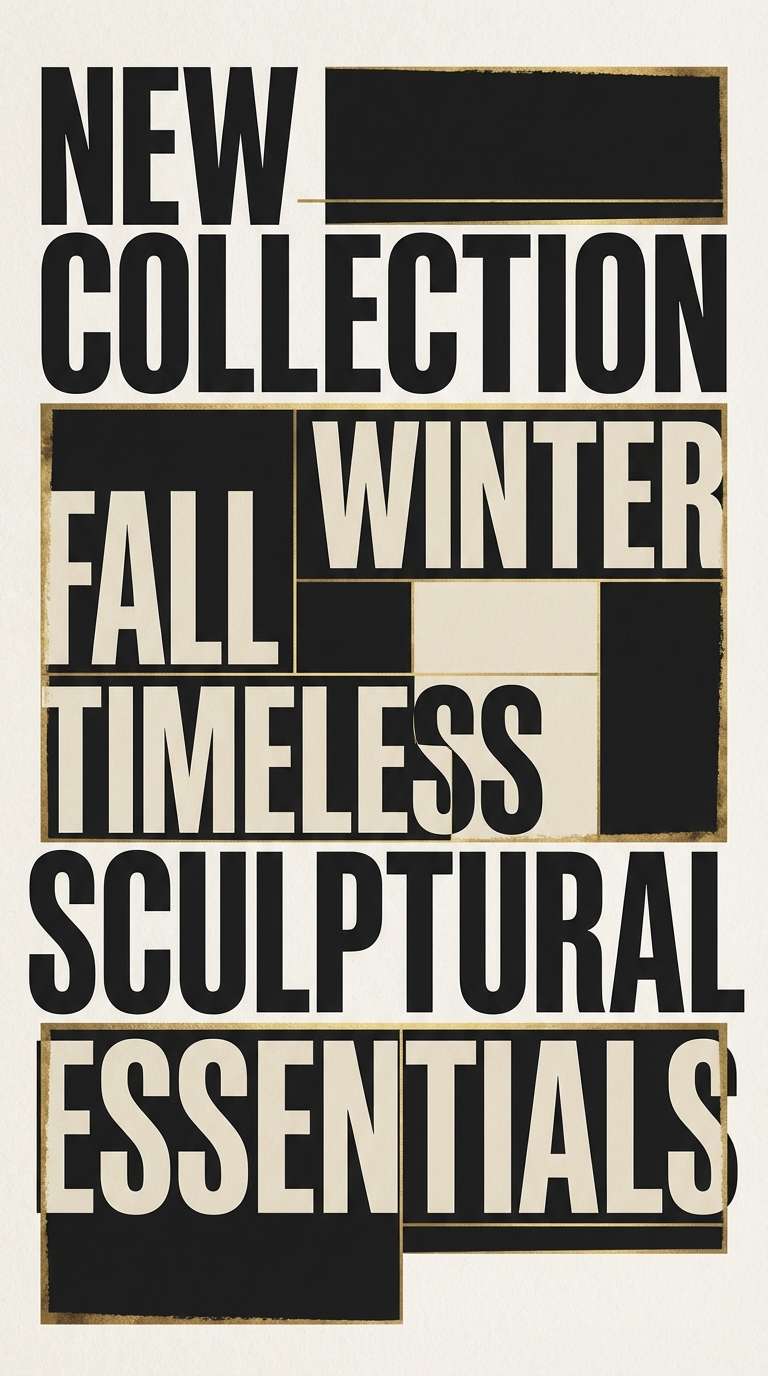
13) Noir Highlight
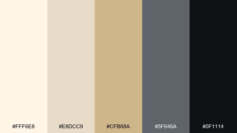
HEX: #fff6e8 #e8dcc9 #cfb68a #5f646a #0f1114
Mood: bold, editorial, luxe
Best for: fashion campaigns and headline graphics
Bold and editorial, like a runway spotlight cutting through a dark room. The creamy off-white and antique gold soften the black so it feels premium rather than harsh. Use the near-black for massive headlines and the warm neutrals for background panels and spacing. Tip: add a single gold accent rule to guide the eye across the layout.
Image example of noir highlight generated using media.io
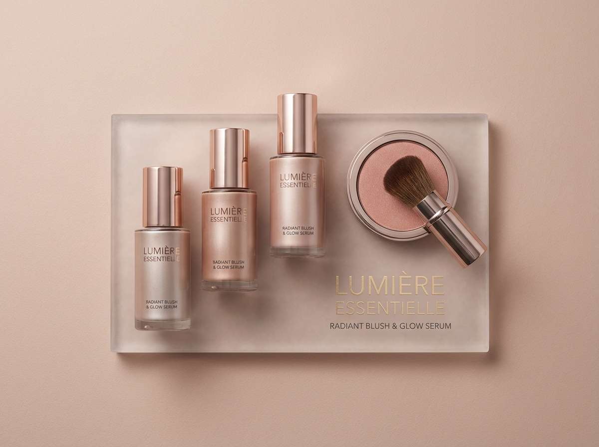
14) Rosy Metallic
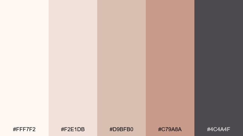
HEX: #fff7f2 #f2e1db #d9bfb0 #c79a8a #4c4a4f
Mood: romantic, modern, soft-glam
Best for: beauty branding and social templates
Romantic and modern, like rose-toned metal under soft studio light. The blush-beige shades feel flattering and work well with minimal product photography. Pair with charcoal text and simple sans-serif type to avoid looking overly sweet. Tip: use the rosier tone as a gradient endpoint for subtle depth in backgrounds.
Image example of rosy metallic generated using media.io
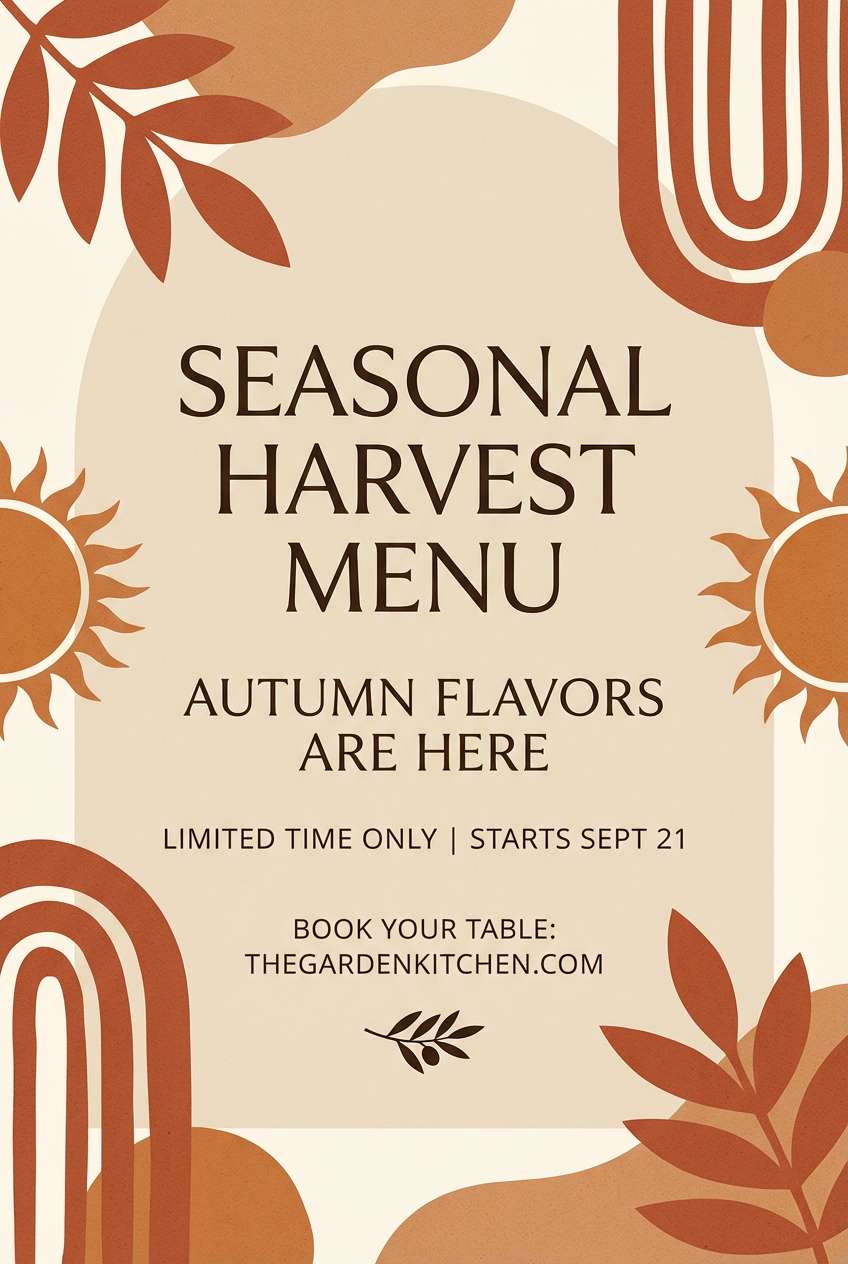
15) Terracotta Glint
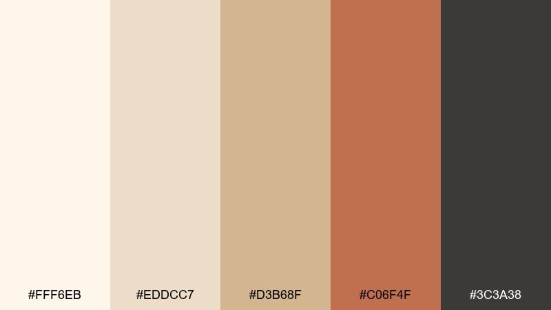
HEX: #fff6eb #eddcc7 #d3b68f #c06f4f #3c3a38
Mood: sunbaked, earthy, stylish
Best for: restaurant branding and seasonal promos
Sunbaked and earthy, like terracotta warmed by late afternoon light. The warm neutrals keep it upscale, while the clay accent adds appetite and personality. Use the terracotta for badges, highlights, and illustrations, and keep body text in deep gray. Tip: pair with textured paper or subtle grain for an artisanal finish.
Image example of terracotta glint generated using media.io
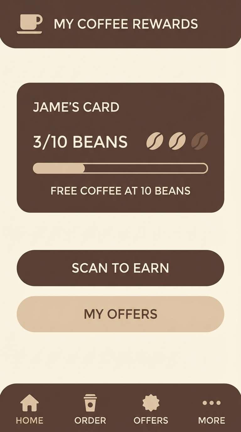
16) Iced Mocha
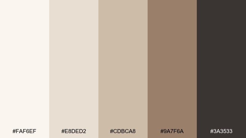
HEX: #faf6ef #e8ded2 #cdbca8 #9a7f6a #3a3533
Mood: cozy, mature, grounded
Best for: coffee brands and cozy UI themes
Cozy and mature like an iced mocha in a ceramic cup. The gradient from cream to cocoa makes it easy to build hierarchy in cards, banners, and hero sections. Pair with warm product photos and minimal icons to keep it contemporary. Tip: use the mid-beige for secondary buttons so CTAs still stand out.
Image example of iced mocha generated using media.io
17) Nordic Glow
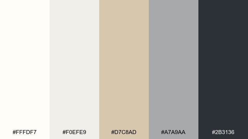
HEX: #fffdf7 #f0efe9 #d7c8ad #a7a9aa #2b3136
Mood: cool, modern, understated
Best for: SaaS dashboards and tech branding
Cool and modern like Nordic interiors with a warm metallic hint. The crisp off-white and misty gray keep interfaces clean, while the gold-beige adds a human touch. Use the dark blue-gray for navigation and charts to maintain strong contrast. Tip: apply the beige sparingly to status chips and selected states.
Image example of nordic glow generated using media.io
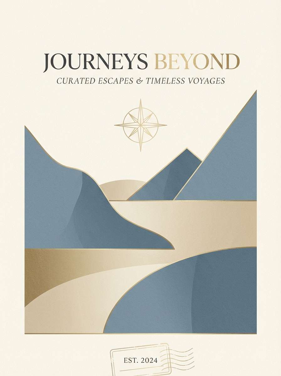
18) Dusty Blue Luxe
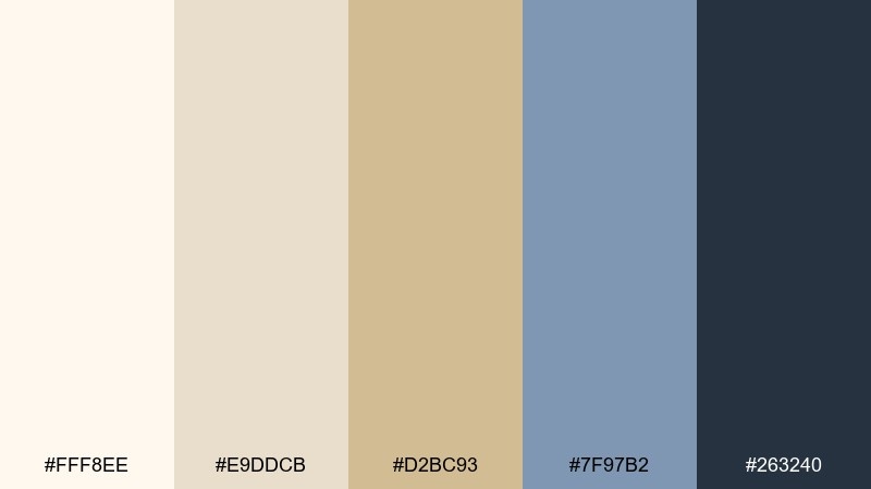
HEX: #fff8ee #e9ddcb #d2bc93 #7f97b2 #263240
Mood: serene, elevated, contemporary
Best for: hotel branding and travel brochures
Serene and elevated like a five-star suite with dusty blue textiles and warm metal details. The blue brings calm sophistication, and the creamy neutrals keep layouts bright. Pair with minimalist photography and refined serif headlines for a boutique feel. Tip: use the navy for body text and the dusty blue for section headings.
Image example of dusty blue luxe generated using media.io
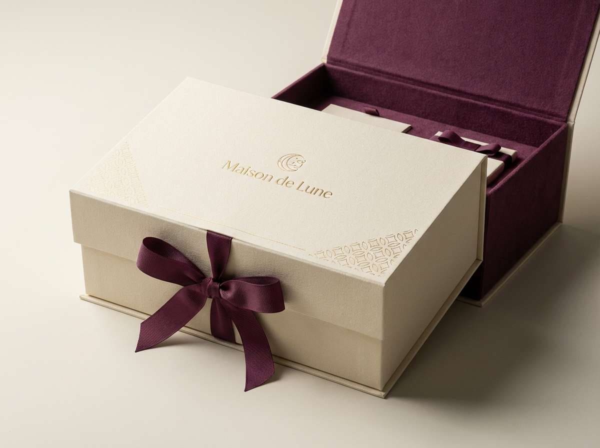
19) Plum Velvet Spark
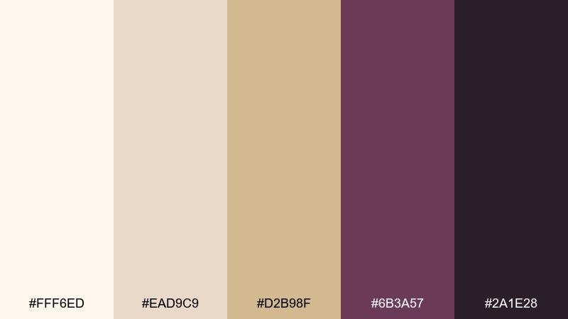
HEX: #fff6ed #ead9c9 #d2b98f #6b3a57 #2a1e28
Mood: moody, artistic, luxurious
Best for: beauty launches and premium gift boxes
Moody and luxurious like plum velvet catching a small shimmer of light. The deep berry tones make the warm neutrals feel richer and more dramatic. Use plum for hero elements, ribbons, or key graphics, then keep supporting surfaces in cream for balance. Tip: add subtle patterning in the mid-beige to elevate gift packaging.
Image example of plum velvet spark generated using media.io
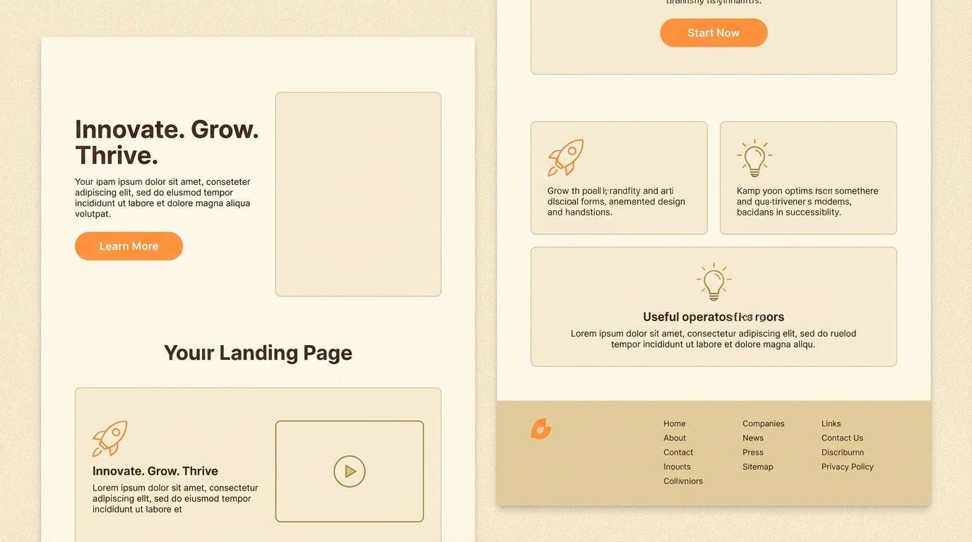
20) Citrus Accent Gold
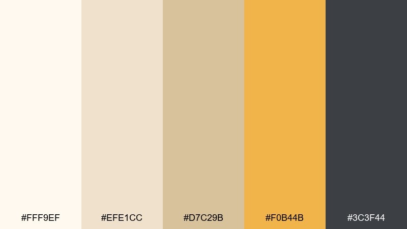
HEX: #fff9ef #efe1cc #d7c29b #f0b44b #3c3f44
Mood: bright, optimistic, modern
Best for: startup landing pages and promo banners
Bright and optimistic like a citrus twist over a sparkling drink. The warm neutrals keep it polished, and the golden orange adds a modern, energetic punch for CTAs. Pair with bold sans-serif type and simple iconography for high clarity. Tip: use the citrus tone only on interactive elements to guide clicks.
Image example of citrus accent gold generated using media.io
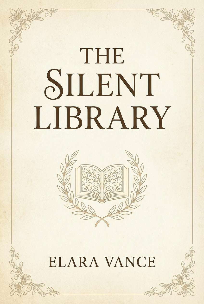
21) Antique Pearl Script
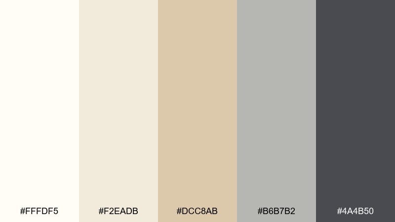
HEX: #fffdf5 #f2eadb #dcc8ab #b6b7b2 #4a4b50
Mood: classic, gentle, editorial
Best for: book covers and stationery brands
Classic and gentle like an antique letter pressed onto pearl paper. The muted gold-beige adds warmth, while the soft gray keeps the overall tone calm and readable. It pairs beautifully with serif typography, monograms, and thin ornamental lines. Tip: keep contrast moderate for a timeless, literary feel rather than a harsh modern look.
Image example of antique pearl script generated using media.io
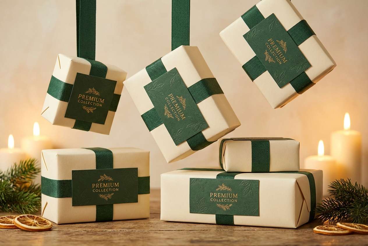
22) Evergreen Candlelight
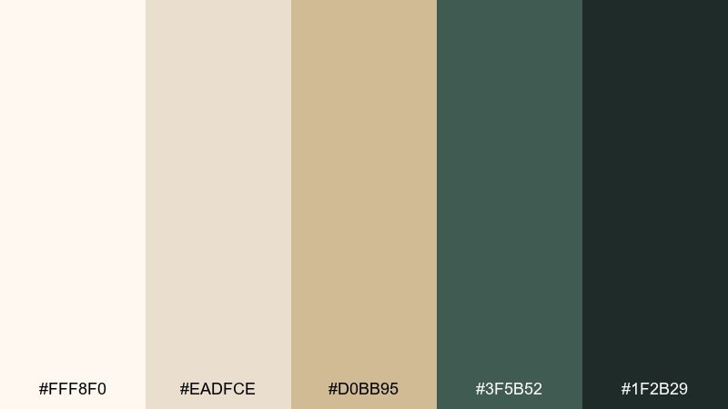
HEX: #fff8f0 #eadfce #d0bb95 #3f5b52 #1f2b29
Mood: festive, cozy, sophisticated
Best for: holiday campaigns and premium seasonal packaging
Festive and cozy like evergreen branches lit by candlelight. The deep greens add richness to the warm neutrals, creating an upscale seasonal mood without relying on bright reds. Use green for headers and decorative accents, then keep backgrounds light for breathing room. Tip: a small gold-beige border can make layouts feel gift-ready.
Image example of evergreen candlelight generated using media.io
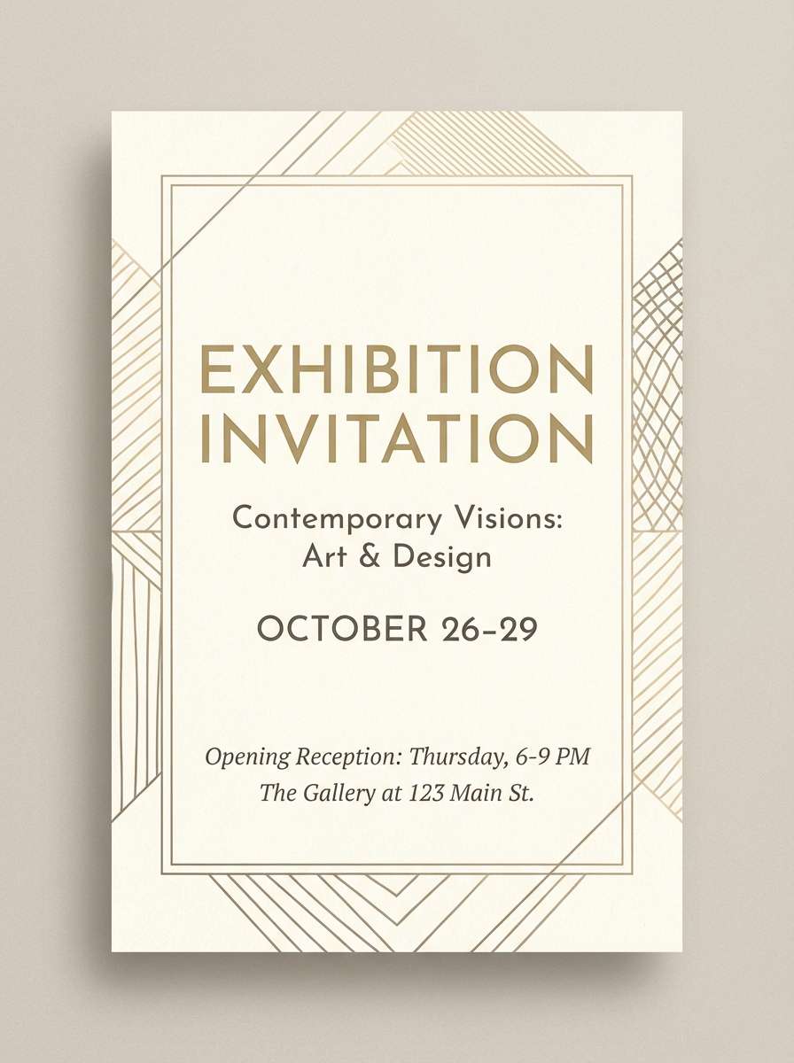
23) Gallery RSVP
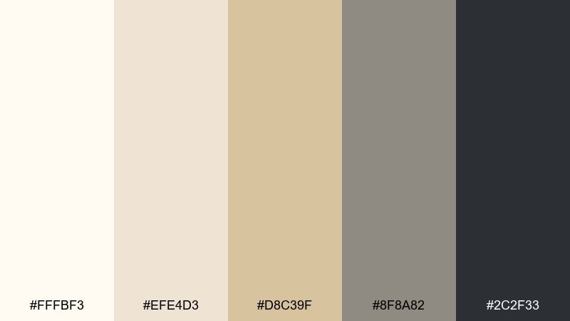
HEX: #fffbf3 #efe4d3 #d8c39f #8f8a82 #2c2f33
Mood: smart, restrained, cultured
Best for: event invitations and exhibition flyers
Smart and restrained like a quiet gallery opening with crisp signage. The neutrals feel elevated, and the gray range gives you dependable type hierarchy from headline to fine print. If you need white gold color combinations that stay readable, lean on the charcoal for body text and keep gold-beige as a frame. Tip: use a single geometric motif to echo the exhibition theme without adding clutter.
Image example of gallery rsvp generated using media.io
What Colors Go Well with White Gold?
White gold pairs naturally with deep neutrals—charcoal, near-black, slate, and navy—because they sharpen contrast and make warm metallic-beige highlights look intentional rather than “yellow.”
For a softer direction, add muted botanicals like sage, eucalyptus, or dusty teal; these cool accents keep the palette calm and spa-like. For romance, blush, rose-beige, and plum create a luxe, evening-ready mood.
If you want more energy, a controlled accent like citrus-gold or terracotta works best when used sparingly (buttons, badges, small shapes) so the white gold base stays premium and clean.
How to Use a White Gold Color Palette in Real Designs
Start with a light neutral as the background (ivory/off-white), then pick one mid-tone champagne or beige for surfaces (cards, sections, packaging panels). Reserve the darkest color for typography and UI navigation to protect readability.
To avoid a flat look, introduce texture instead of more color: paper grain, soft shadows, emboss/foil cues, or subtle gradients between neighboring beige tones. White gold palettes look best when the design breathes—more whitespace, fewer competing accents.
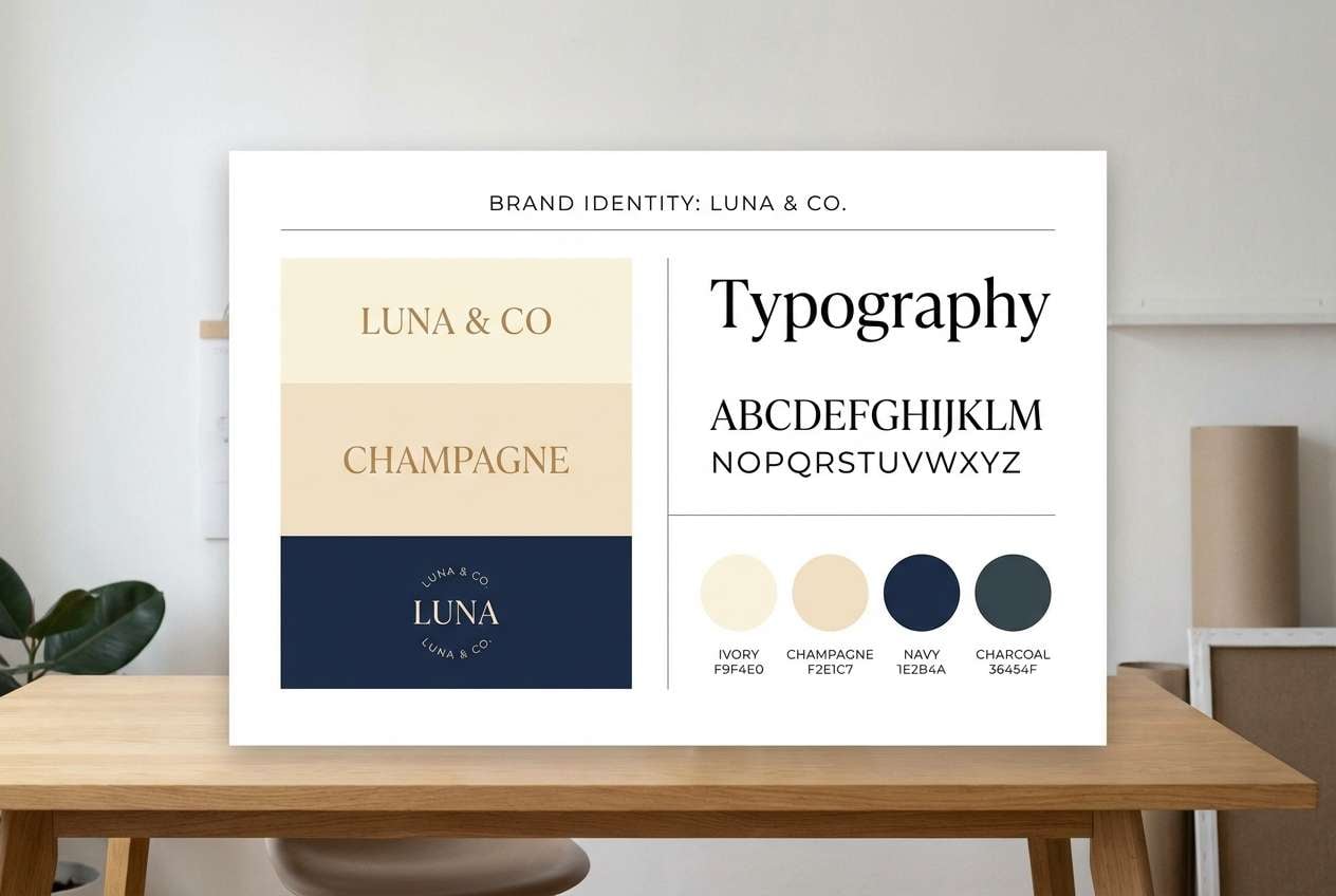
For branding systems, define roles: background, surface, border, text, and accent. Keeping these roles consistent across web, print, and social templates is what makes “luxury neutrals” feel truly expensive.
Create White Gold Palette Visuals with AI
If you’re building a mood board, brand kit, or UI concept, generating matching images can help you validate how your white gold tones look in realistic lighting and materials (paper, marble, satin, foil).
Use the prompts above as a starting point, then swap nouns (skincare, stationery, dashboard) to fit your project while keeping the same color direction and composition style.
White Gold Color Palette FAQs
-
What is a white gold color palette?
A white gold palette is built from off-whites and ivories with warm champagne/beige “metallic” neutrals, usually anchored by a dark gray, charcoal, or navy for contrast. -
Is white gold warm or cool?
White gold is typically warm-leaning because it carries beige/champagne undertones, but it can look cooler when paired with blue-grays or minty grays. -
What text color works best on white gold backgrounds?
Charcoal, deep slate, and inky navy are the safest choices for legibility. Pure black can work, but a softened near-black often looks more premium with warm neutrals. -
How do I keep white gold designs from looking “yellow”?
Use a clean off-white as the main background, keep the gold-beige as an accent or mid-tone, and add a cool counterbalance (blue-gray or gray-green) or a dark neutral for structure. -
What accent colors pair nicely with white gold?
Muted sage/green, dusty blue, blush/rose, plum, terracotta, and a small hit of citrus-gold all pair well—choose one accent family so the palette stays refined. -
Is a white gold color palette good for UI design?
Yes. It’s great for clean interfaces because light neutrals keep screens airy while dark gray/blue-gray provides strong hierarchy. Use the warm beige as a selected/hover state rather than a full background. -
How can I generate on-brand images for my white gold palette quickly?
Use an AI text-to-image tool with prompts that mention warm ivory, champagne/beige, subtle gold foil, soft diffused lighting, and a clean background; then iterate by changing the product or layout type.
Next: Gray Tan Color Palette


