

Yellow and gray is one of the easiest modern pairings to design with: yellow brings energy and friendliness, while gray adds structure, balance, and a premium “tech-neutral” feel.
Below are 20 yellow gray color palettes with HEX codes, plus practical tips for UI, branding, print, and interiors—so you can pick a vibe and apply it immediately.
In this article
Why Yellow Gray Palettes Work So Well
Yellow is naturally attention-grabbing, which makes it perfect for highlights—buttons, badges, icons, or small decor accents. Gray, on the other hand, gives you a calm foundation that won’t fight your content.
Together, they create a clean hierarchy: gray handles readability and layout structure, while yellow guides the eye to what matters most. This is especially useful in UI design, posters, and dashboards where clarity is everything.
Yellow gray palettes also scale well from minimalist to bold. You can keep things airy with light grays and soft yellows, or go high-contrast with charcoal, near-black, and vivid yellow for maximum impact.
20+ Yellow Gray Color Palette Ideas (with HEX Codes)
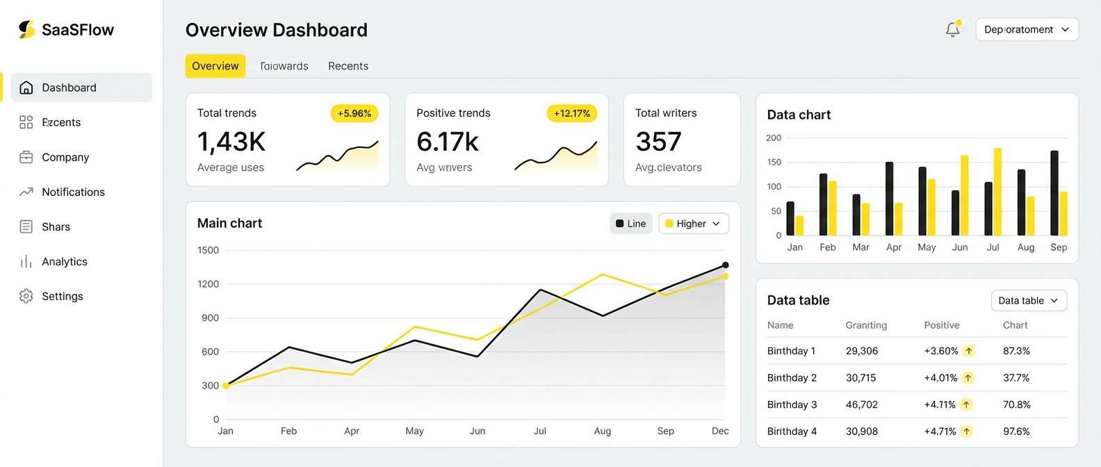
1) Sunlit Concrete
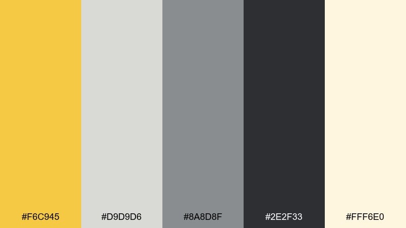
HEX: #F6C945 #D9D9D6 #8A8D8F #2E2F33 #FFF6E0
Mood: bright, modern, grounded
Best for: SaaS dashboard UI
Bright and airy like morning light bouncing off city sidewalks, these tones feel confident without shouting. Use the soft off-white as your main canvas, then reserve the yellow for key actions and highlights. Medium grays keep tables and charts readable, while the near-black adds crisp hierarchy. Tip: keep yellow to small UI elements so it stays punchy and accessible.
Image example of sunlit concrete generated using media.io
Media.io is an online AI studio for creating and editing video, image, and audio in your browser.

2) Mustard Slate
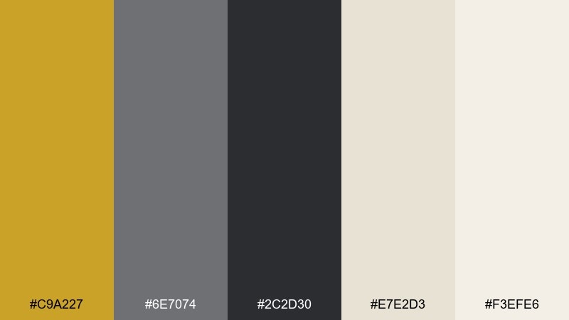
HEX: #C9A227 #6E7074 #2C2D30 #E7E2D3 #F3EFE6
Mood: rich, cozy, refined
Best for: brand identity for a boutique coffee shop
Warm and a little vintage, it reads like toasted grains, dark roast, and slate chalkboards. This yellow gray color combination shines in logos, labels, and menu headers where you want craft energy with a premium feel. Pair it with textured paper stocks and a simple serif to lean into the artisanal vibe. Tip: print the mustard as a spot accent and let the slate lead for readability.
Image example of mustard slate generated using media.io
3) Lemon Fog
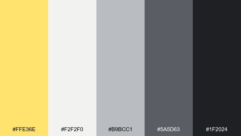
HEX: #FFE36E #F2F2F0 #B9BCC1 #5A5D63 #1F2024
Mood: soft, fresh, calm
Best for: mobile app onboarding screens
Gentle and optimistic, it feels like lemon tea on a foggy morning. The pale neutrals keep screens light, while the darker grays give you clean text contrast. Use the yellow for progress indicators, friendly icons, and micro-animations. Tip: soften the look with rounded components and generous spacing.
Image example of lemon fog generated using media.io
4) Taxi on Asphalt
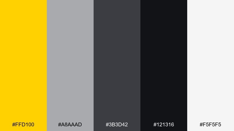
HEX: #FFD100 #A8AAAD #3B3D42 #121316 #F5F5F5
Mood: bold, urban, energetic
Best for: tech meetup poster
High-impact and street-smart, it evokes neon reflections and late-night city rides. This yellow gray color palette works best when you lean into sharp contrast: black for type, bright yellow for the headline, and gray for secondary info. Keep the layout minimal so the palette does the heavy lifting. Tip: use gray blocks behind smaller text to improve legibility on bright backgrounds.
Image example of taxi on asphalt generated using media.io

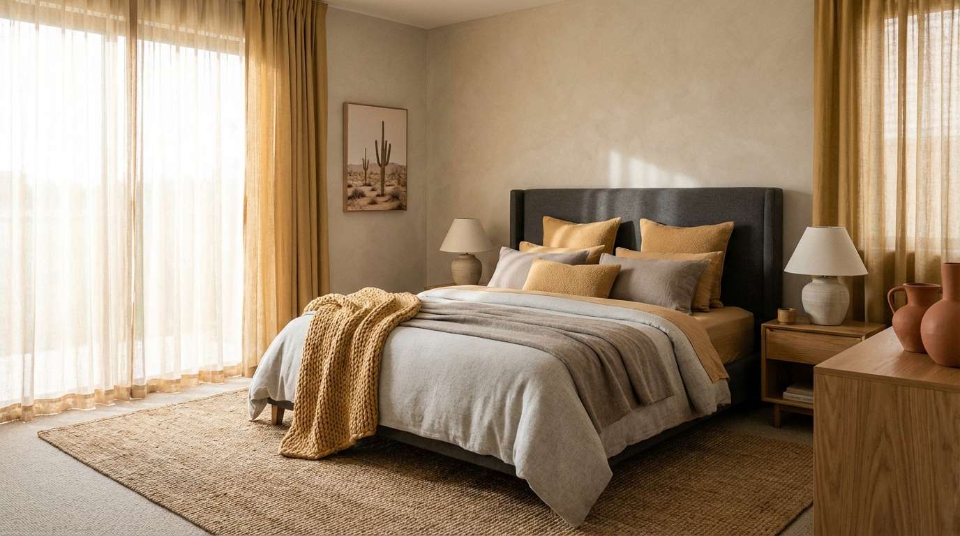
5) Golden Dune
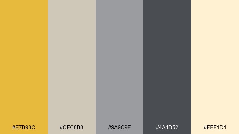
HEX: #E7B93C #CFC8B8 #9A9C9F #4A4D52 #FFF1D1
Mood: warm, relaxed, natural
Best for: cozy bedroom interior palette guide
Sun-warmed and earthy, it brings to mind dunes, linen, and soft afternoon light. Use the creamy off-white on walls and bedding, then layer in grays through textiles and furniture for balance. The golden tone is perfect for a throw, lamp shade, or art accent that adds warmth without feeling loud. Tip: choose matte finishes so the neutrals stay calm and inviting.
Image example of golden dune generated using media.io
6) Soft Mica
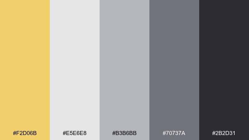
HEX: #F2D06B #E5E6E8 #B3B6BB #70737A #2B2D31
Mood: clean, gentle, premium
Best for: skincare packaging design
Silky and understated, it feels like mineral shimmer and spa towels. The light grays create a clinical-clean base, while the yellow adds a subtle glow for highlights and seals. Pair with simple sans-serif type and plenty of white space for a modern, dermatologist-approved look. Tip: keep the darkest shade for small copy only, like ingredients and instructions.
Image example of soft mica generated using media.io
7) Industrial Honey
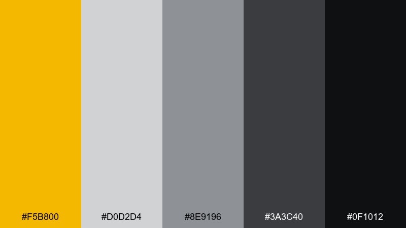
HEX: #F5B800 #D0D2D4 #8E9196 #3A3C40 #0F1012
Mood: sleek, structured, confident
Best for: e-commerce homepage UI
Crisp and engineered, it resembles polished metal with a hit of honeyed light. This yellow gray color scheme is ideal for e-commerce where you need trust and speed: neutral grays for product grids, near-black for type, and yellow for calls to action. Pair it with clean product photography and consistent spacing to avoid visual noise. Tip: test hover states with a lighter yellow tint to keep the interface cohesive.
Image example of industrial honey generated using media.io
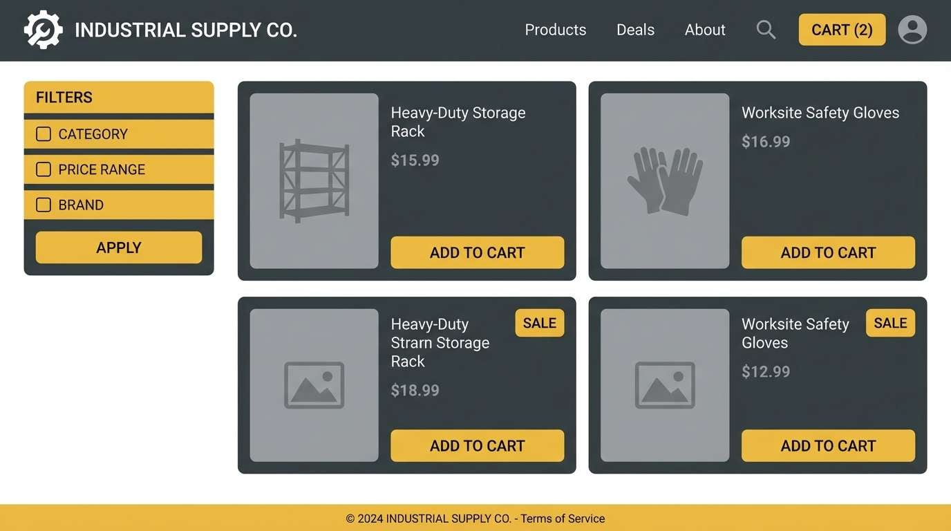
8) Retro Schoolbus
HEX: #FFCC00 #7A7D81 #4B4E53 #1C1D20 #FFF8D8
Mood: playful, bold, nostalgic
Best for: sports team flyer
Energetic and throwback, it channels gym floors, school buses, and classic uniforms. The bright yellow is made for team names and key dates, while charcoal tones keep the layout strong and readable. Pair with blocky type and simple iconography to match the retro vibe. Tip: use the pale cream as breathing room so the flyer does not feel too heavy.
Image example of retro schoolbus generated using media.io

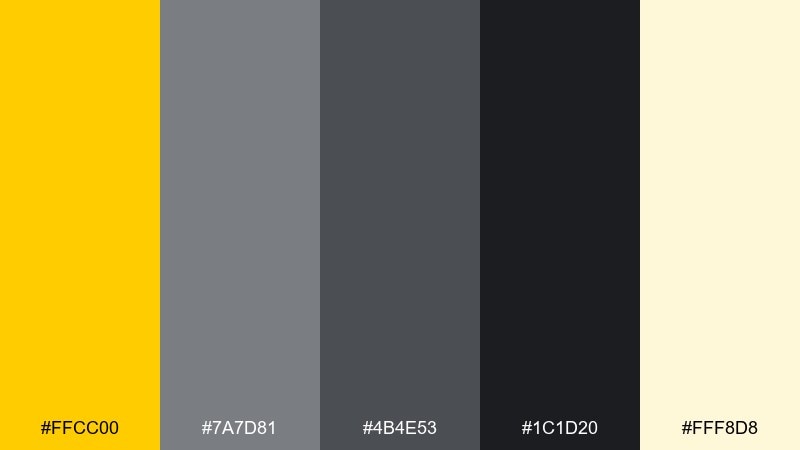
9) Spring Haze
HEX: #F9D77A #E9E7E1 #BFC2C7 #6B6E75 #2E3035
Mood: romantic, airy, gentle
Best for: botanical wedding invitation set
Light and dreamy, it evokes spring blossoms under a hazy sky. Use the warm yellow as a delicate accent for monograms or small borders, while the soft neutrals carry the background. Pair with watercolor florals and a graceful script to keep it timeless. Tip: print the gray text slightly darker than you expect so it stays readable on textured paper.
Image example of spring haze generated using media.io
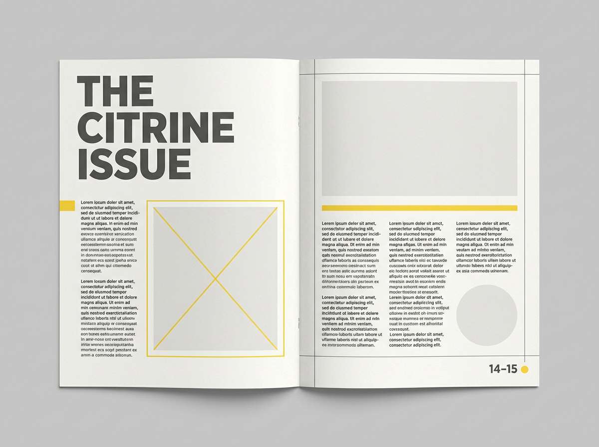
10) Citrine Graphite
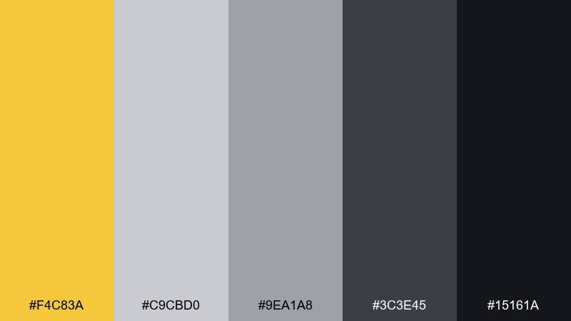
HEX: #F4C83A #C9CBD0 #9EA1A8 #3C3E45 #15161A
Mood: sharp, editorial, contemporary
Best for: magazine feature layout
Polished and modern, it feels like glossy print, graphite pencil, and a citrine highlight. Use black and deep gray for headlines and pull quotes, then let yellow guide the eye to section markers or data points. Pair with strong photography and a grid-based layout to keep it premium. Tip: limit yellow to 5 to 10 percent of the page to avoid overpowering the editorial tone.
Image example of citrine graphite generated using media.io
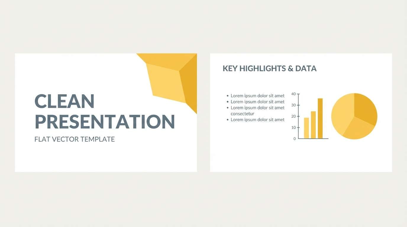
11) Harvest Steel
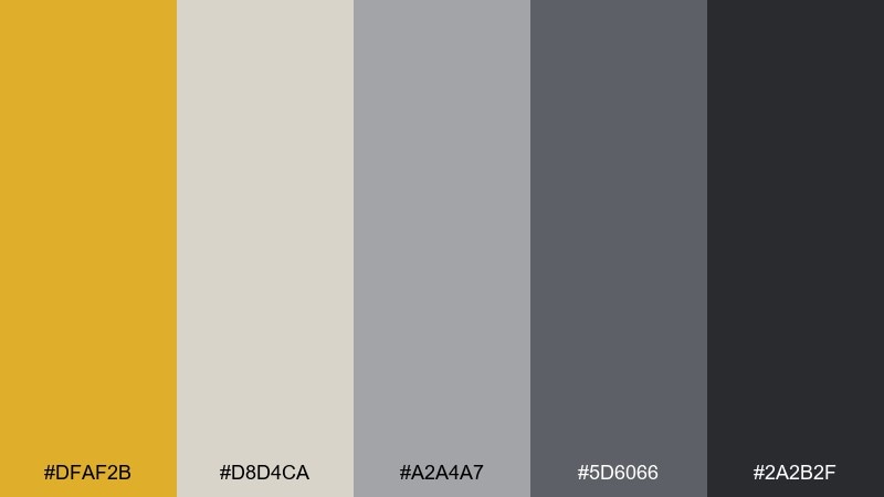
HEX: #DFAF2B #D8D4CA #A2A4A7 #5D6066 #2A2B2F
Mood: steady, warm, professional
Best for: presentation slide deck template
Balanced and business-ready, it reads like harvest gold paired with brushed steel. Use the warm yellow for section dividers and key numbers, while the grays handle charts, captions, and footnotes. Pair with simple icons and consistent spacing for a confident, executive-friendly look. Tip: keep slide backgrounds light and use the darkest gray only for titles.
Image example of harvest steel generated using media.io
12) Urban Marigold
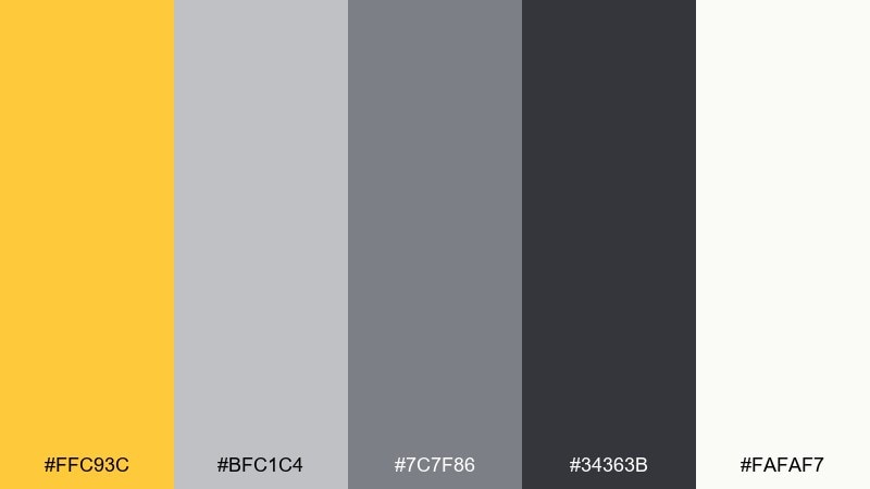
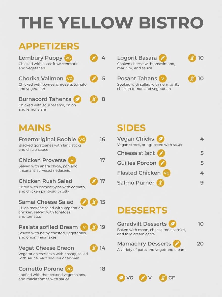
HEX: #FFC93C #BFC1C4 #7C7F86 #34363B #FAFAF7
Mood: lively, modern, approachable
Best for: restaurant menu design
Lively like marigolds against concrete, it feels friendly, contemporary, and easy to scan. For a yellow gray color palette on menus, use the near-black for dish names, mid-gray for descriptions, and yellow to highlight specials or spicy markers. Pair it with clean section rules and plenty of whitespace for a premium-casual vibe. Tip: avoid yellow body text and keep it to labels and icons for clarity.
Image example of urban marigold generated using media.io
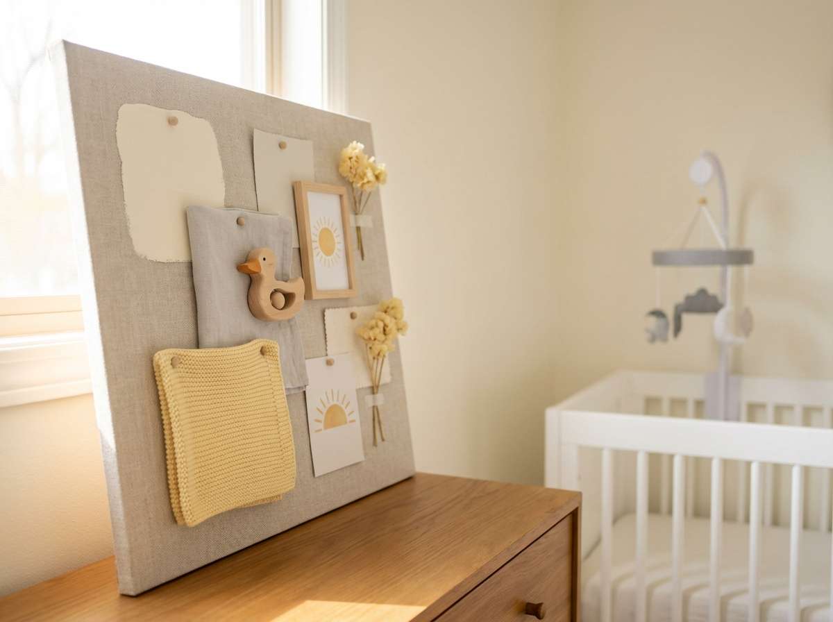
13) Butterstone
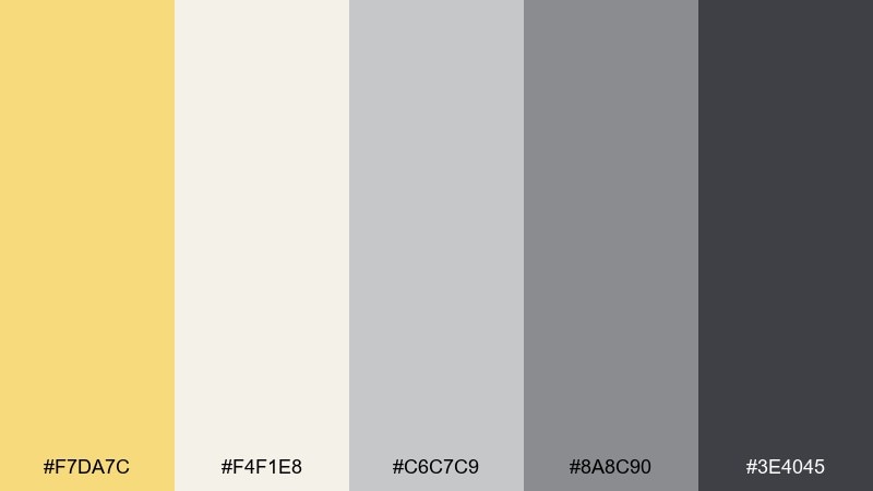
HEX: #F7DA7C #F4F1E8 #C6C7C9 #8A8C90 #3E4045
Mood: soft, comforting, family-friendly
Best for: nursery interior moodboard
Comforting and mellow, it brings to mind butter cookies, soft blankets, and quiet naps. Use the light cream for walls and larger furniture, then add gray through rugs, storage, and curtains for calm structure. The yellow works beautifully in small decor pieces like art prints or plush toys. Tip: choose warm light bulbs so the palette stays cozy instead of cool.
Image example of butterstone generated using media.io
14) Brass Pebble
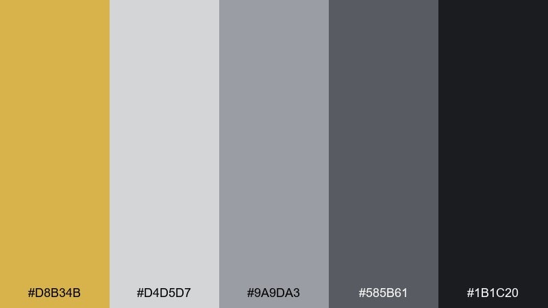
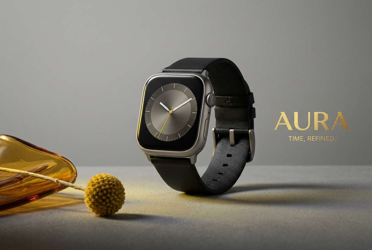
HEX: #D8B34B #D4D5D7 #9A9DA3 #585B61 #1B1C20
Mood: sleek, techy, premium
Best for: smartwatch product ad
Sleek and understated, it feels like brushed brass against smooth pebbled stone. Let the grays dominate the background to keep the product looking premium, then use the warm yellow as a brand accent for callouts or feature badges. Pair with sharp lighting and minimal copy so the ad stays modern. Tip: avoid over-saturating the yellow in print, and use it as a controlled highlight.
Image example of brass pebble generated using media.io
15) Neon Safety
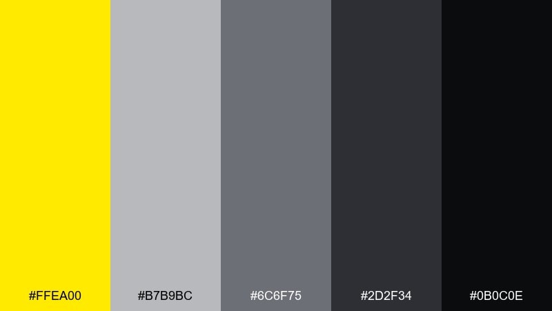
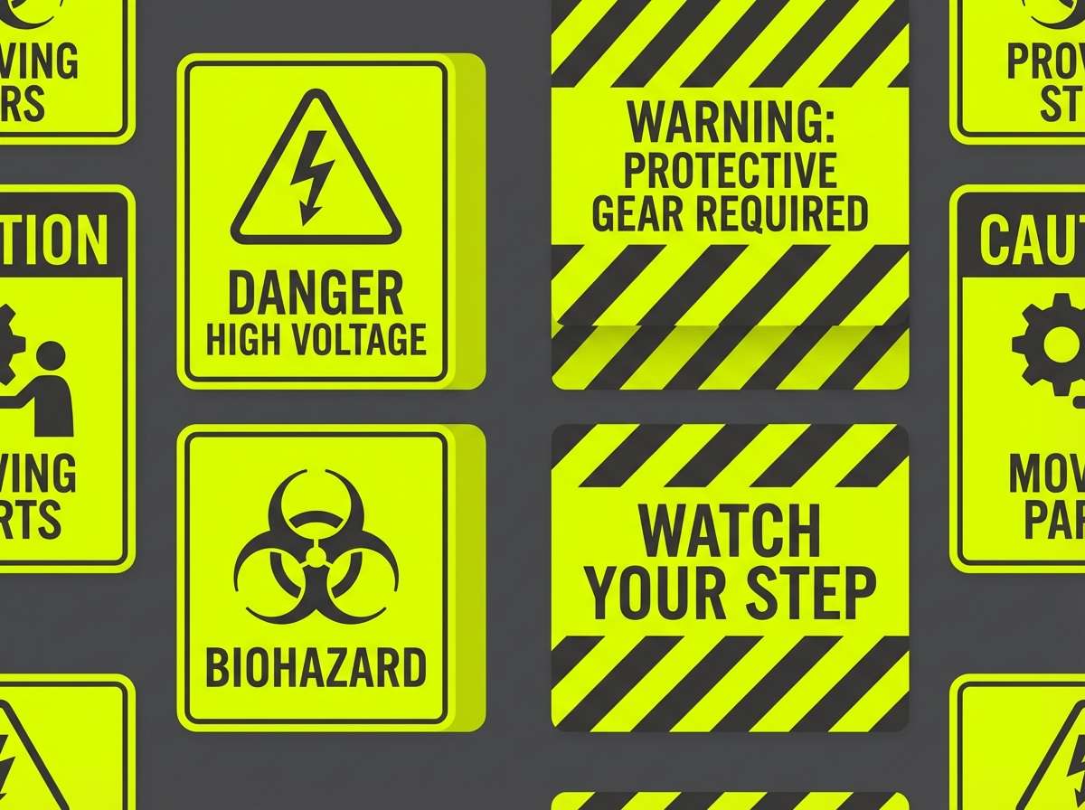
HEX: #FFEA00 #B7B9BC #6C6F75 #2D2F34 #0B0C0E
Mood: alert, high-contrast, utilitarian
Best for: construction safety signage set
Direct and attention-grabbing, it evokes high-vis vests and freshly painted hazard lines. Yellow gray color combinations like this work best when contrast is the priority: black for icons, yellow for warnings, and neutral grays for supporting info. Pair with bold sans-serif type and simple shapes to keep messages clear at a distance. Tip: leave generous margins so the signage remains readable in busy environments.
Image example of neon safety generated using media.io
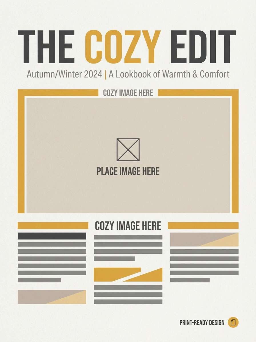
16) Cozy Wool
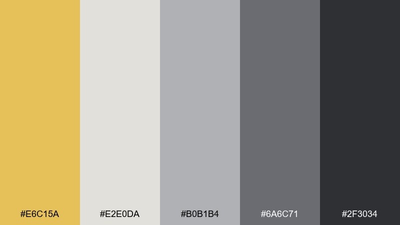
HEX: #E6C15A #E2E0DA #B0B1B4 #6A6C71 #2F3034
Mood: warm, calm, tactile
Best for: knitwear lookbook cover
Tactile and inviting, it feels like wool sweaters and warm café light. Use the soft neutrals to keep photography front and center, then add yellow as a seasonal accent in titles or small graphic lines. Pair with editorial typography and spacious margins for a premium lookbook feel. Tip: keep contrast high on cover text so it reads well in thumbnails.
Image example of cozy wool generated using media.io
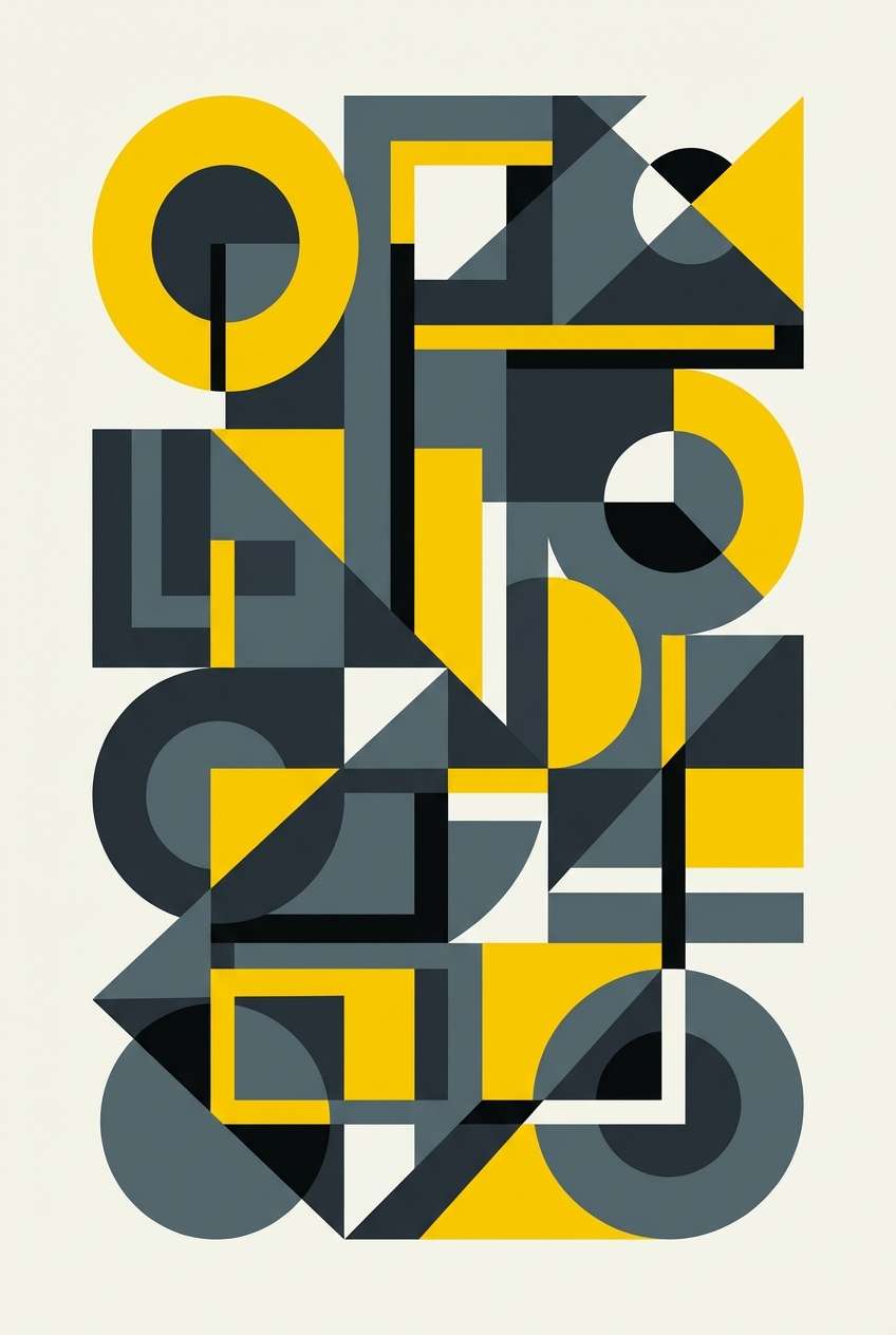
17) Modern Bauhaus
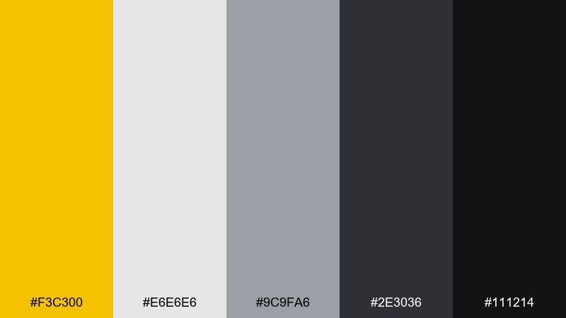
HEX: #F3C300 #E6E6E6 #9C9FA6 #2E3036 #111214
Mood: graphic, clean, modernist
Best for: geometric wall art print
Graphic and disciplined, it recalls modernist posters and clean geometry. Use yellow for bold shapes, then anchor the composition with charcoal and balanced mid-grays. Pair with simple circles, lines, and asymmetric layouts to get that gallery-ready feel. Tip: leave a generous border so the print looks intentional when framed.
Image example of modern bauhaus generated using media.io
18) Desert Road

HEX: #EAC24A #D6D2C7 #9B9DA1 #4E5056 #1E1F23
Mood: cinematic, sunbaked, adventurous
Best for: travel blog hero banner
Cinematic and sunbaked, it feels like a long road stretching into heat haze. Let the sandy off-white and light grays form the background, then use yellow as a highlight for buttons or category tags. Pair with wide landscape imagery and minimal text for a modern travel vibe. Tip: apply a subtle gray overlay to photos so white headlines stay readable.
Image example of desert road generated using media.io

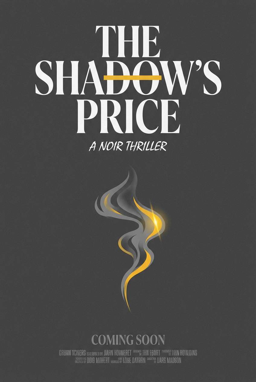
19) Saffron Smoke
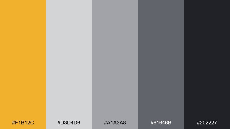
HEX: #F1B12C #D3D4D6 #A1A3A8 #61646B #202227
Mood: moody, dramatic, stylish
Best for: noir thriller film poster
Moody and stylish, it suggests smoky light, street lamps, and a saffron glow in the dark. Use the near-black for the base and type, then let yellow cut through as a focal point for the title or a single graphic element. Pair with grainy textures and strong contrast photography for a cinematic finish. Tip: keep supporting text in light gray so it stays legible without stealing attention.
Image example of saffron smoke generated using media.io
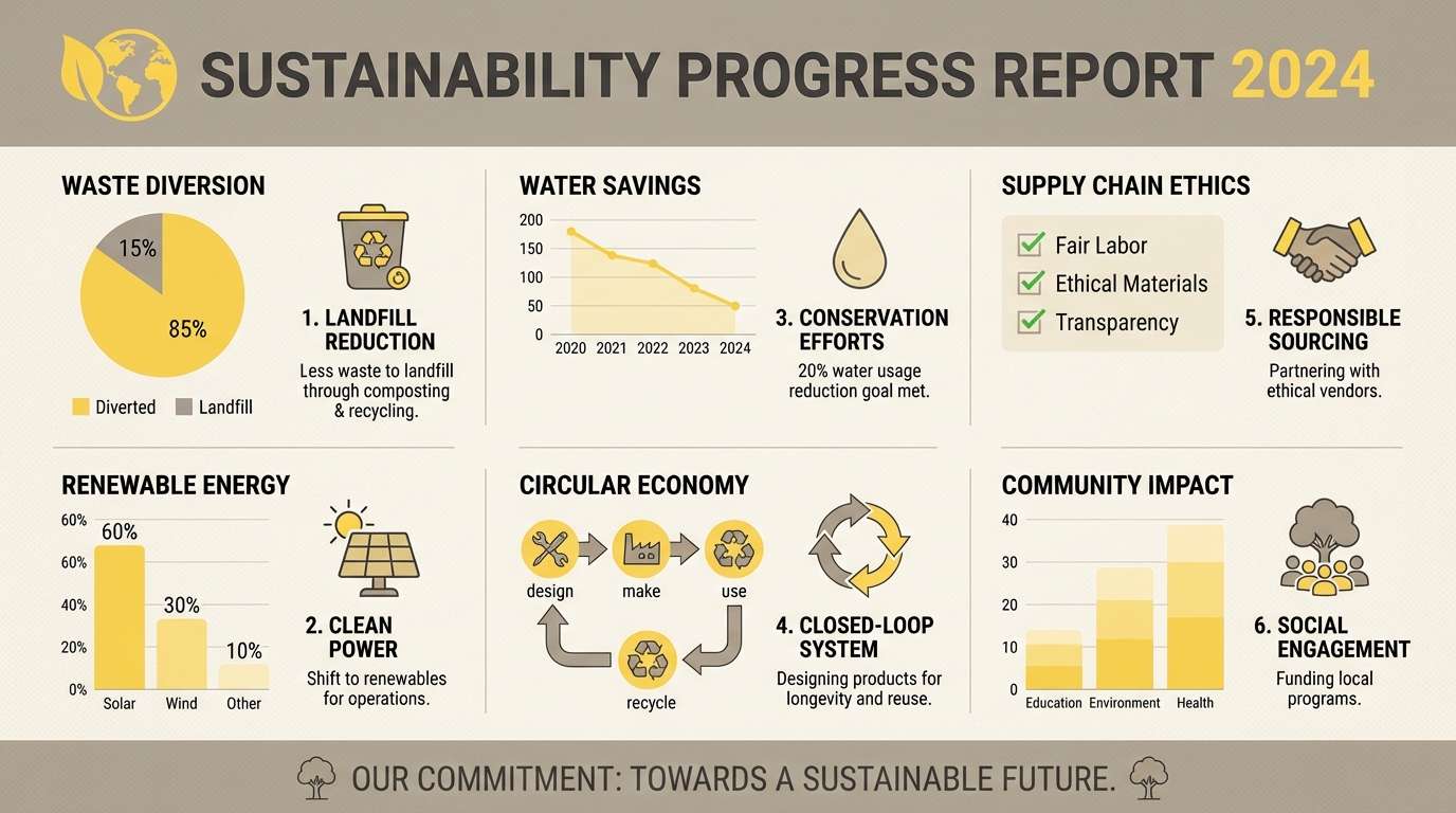
20) Yellowed Newspaper
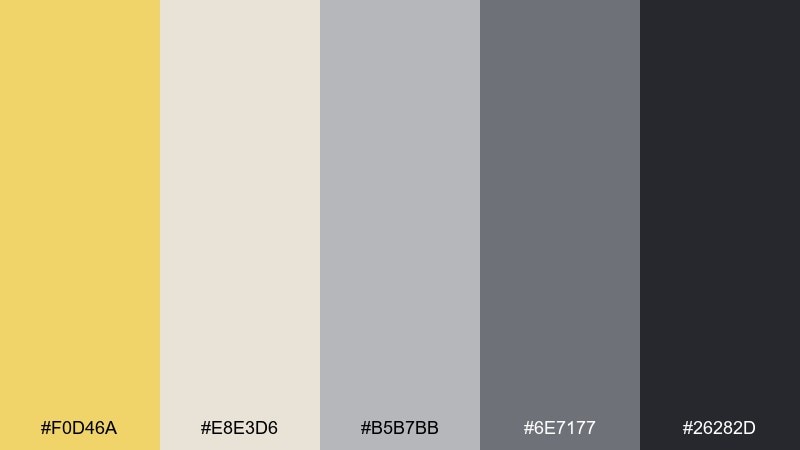
HEX: #F0D46A #E8E3D6 #B5B7BB #6E7177 #26282D
Mood: thoughtful, vintage, trustworthy
Best for: sustainability report infographic
Thoughtful and slightly vintage, it feels like archived paper and ink. Use the light beige as your page base, then organize sections with cool grays for structure and charts. The yellow makes a great accent for key metrics, callouts, and progress bars without feeling overly corporate. Tip: stick to two data colors max and let gray do most of the chart work.
Image example of yellowed newspaper generated using media.io
What Colors Go Well with Yellow Gray?
Yellow and gray pair well with crisp neutrals like white and near-black, because they strengthen contrast and keep layouts readable. In UI, this helps you reserve yellow for CTAs while grays handle surfaces, dividers, and secondary text.
For a warmer direction, add beige, cream, or tan to soften the palette and make it feel more interior-friendly. For a cooler, modern direction, add blue-gray or steel tones to push a clean, tech-forward vibe.
If you want a standout accent beyond yellow, try a controlled pop (teal, cobalt, or blush) in small doses—icons, tags, or chart highlights—so the yellow remains the primary attention color.
How to Use a Yellow Gray Color Palette in Real Designs
Start with roles, not just colors: pick a light neutral for background, a mid-gray for surfaces, a dark gray/near-black for text, and keep yellow as the “action” color. This simple mapping makes designs feel consistent across pages and components.
For accessibility, avoid yellow for long body text and ensure enough contrast for buttons and labels. A common approach is dark text on light surfaces, with yellow used for icons, highlights, and filled buttons that still meet contrast requirements when paired with dark type.
In print and interiors, use gray as the “quiet base” (walls, large blocks, negative space) and place yellow where you want warmth and focus (headlines, signage, throw pillows, lighting accents).
Create Yellow Gray Palette Visuals with AI
Once you’ve picked a palette, the fastest way to validate it is to see it in context—like a dashboard, poster, packaging, or room scene. That’s where AI mockups help: you can iterate layouts and lighting without rebuilding from scratch.
Use your HEX codes as guidance, then describe the design type, mood, and composition (for example: “minimal onboarding screens,” “editorial grid,” or “warm bedroom interior”). Generate a few variants and keep the one with the cleanest hierarchy and contrast.
Media.io makes it simple to turn these palette ideas into visuals you can share with clients or teammates.
Yellow Gray Color Palette FAQs
-
Is yellow and gray a good color combination for UI?
Yes. Gray provides neutral surfaces and readable typography, while yellow works well for CTAs, status badges, and key highlights—just keep yellow usage limited so it stays attention-grabbing. -
What shade of gray works best with yellow?
Charcoal and near-black create the strongest contrast for bold designs, while mid-grays and light warm grays feel softer and more modern for minimal interfaces and interiors. -
Should I use yellow for text?
Generally, avoid yellow for body text because contrast can be weak on light backgrounds. Use yellow for icons, labels, borders, or button fills, and keep text dark for readability. -
How much yellow should I use in a yellow gray palette?
A good starting point is 5–15% yellow as an accent, with grays and off-whites doing most of the heavy lifting. Increase yellow only when you need a louder, poster-like impact. -
What accent colors pair well with yellow and gray?
Teal, navy, cobalt, and blush can work as small accent pops. Keep them limited (for tags or data highlights) so the palette doesn’t lose its clean, modern focus. -
Is mustard yellow better than bright yellow with gray?
Mustard feels warmer and more vintage/premium in branding and print, while bright yellow feels energetic and techy—great for alerts, events, and high-contrast UI. -
How do I make a yellow gray design feel less “industrial”?
Use warmer off-whites (cream/beige), softer mid-grays, rounded shapes, and more whitespace. In interiors, add natural textures like wood, linen, and matte finishes to warm it up.
Next: Black Pink Color Palette


