

Black and pink is a high-impact pairing that can feel luxe, playful, edgy, or romantic depending on the shade choices. With the right balance, you get bold contrast without sacrificing readability.
Below are 20 curated black pink color palette ideas (with HEX codes), plus practical tips for branding, UI, posters, and packaging.
In this article
- Why Black Pink Palettes Work So Well
-
- noir blush
- neon rose circuit
- dusty rose ink
- rose gold night
- sakura shadow
- raspberry velvet
- punk ballet
- mauve smoke
- fuchsia asphalt
- blush and charcoal
- bubblegum noir
- orchid eclipse
- pink quartz night
- candy ink
- rosewood graphite
- flamingo nightfall
- soft petal onyx
- cyber magenta
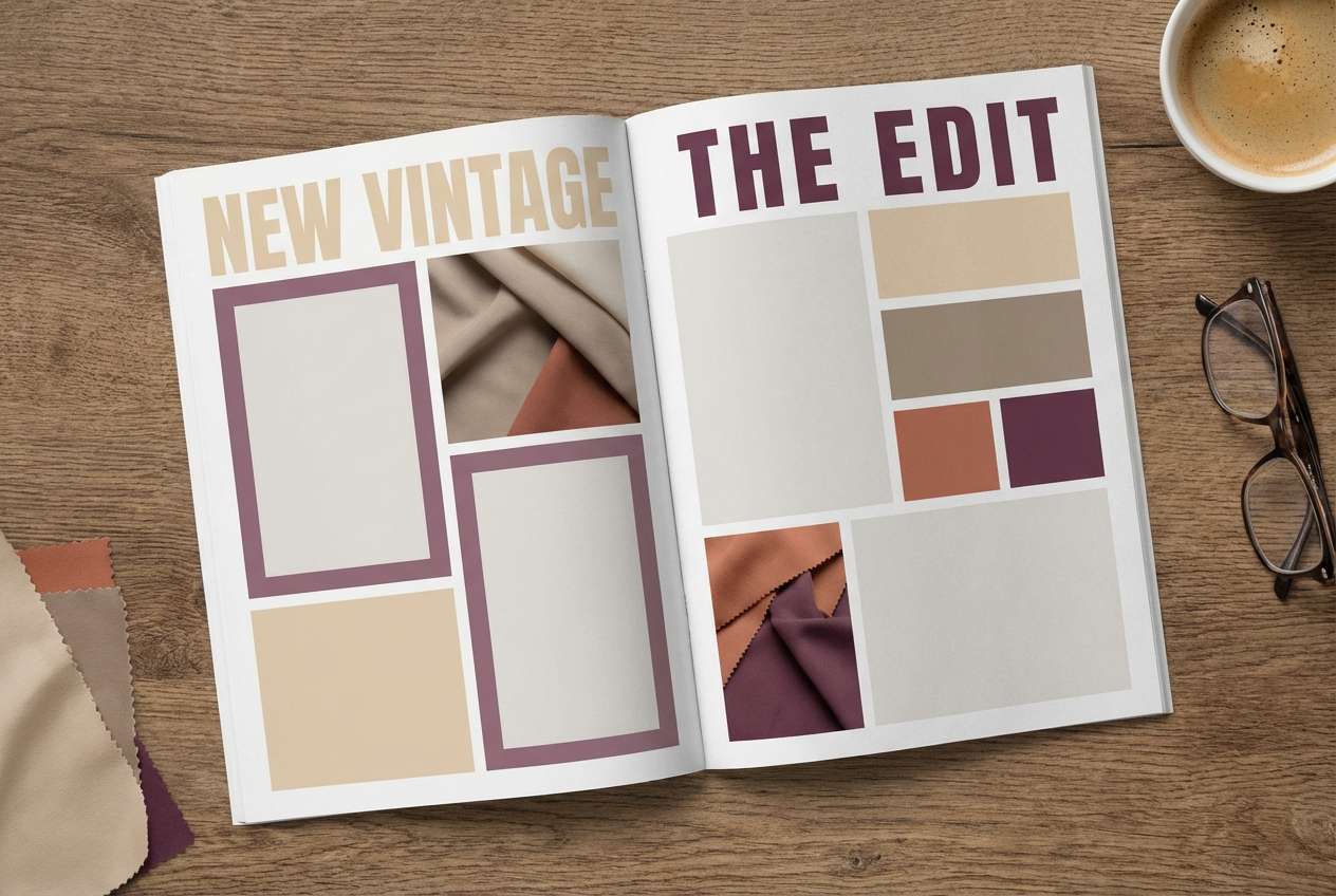
- vintage rose noir
- peony night sky
- What Colors Go Well with Black Pink?
- How to Use a Black Pink Color Palette in Real Designs
- Create Black Pink Palette Visuals with AI
Why Black Pink Palettes Work So Well
Black brings structure, legibility, and instant contrast, while pink adds emotion and personality—ranging from soft blush to neon magenta. Together, they create a clear visual hierarchy that’s easy to control.
This pairing also adapts across styles: swap in warm rose tones for premium packaging, or push into neon pinks for tech and entertainment graphics. Because black anchors the palette, even saturated pink accents can feel intentional instead of overwhelming.
In UI and branding, black-pink schemes naturally guide attention: keep surfaces neutral and deploy bright pink for CTAs, prices, badges, or key metrics. Done right, the design feels both modern and memorable.
20+ Black Pink Color Palette Ideas (with HEX Codes)
1) Noir Blush
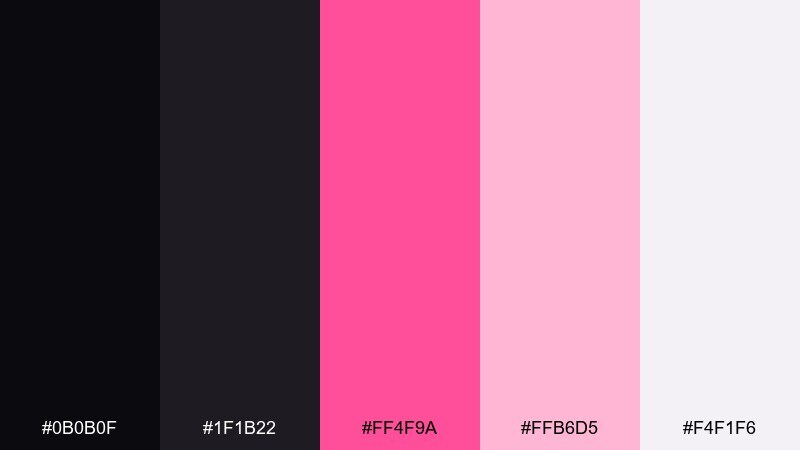
HEX: #0b0b0f #1f1b22 #ff4f9a #ffb6d5 #f4f1f6
Mood: luxury, modern, dramatic
Best for: beauty branding and premium editorial layouts
Polished and moody like a night-out look with a soft blush highlight. The deep near-black bases keep layouts crisp, while the hot pink delivers instant focus for calls to action. Use the pale blush as breathing room for type-heavy sections and pair it with glossy photography or metallic accents. Tip: reserve the brightest pink for one primary element per section to maintain a premium feel.
Image example of noir blush generated using media.io
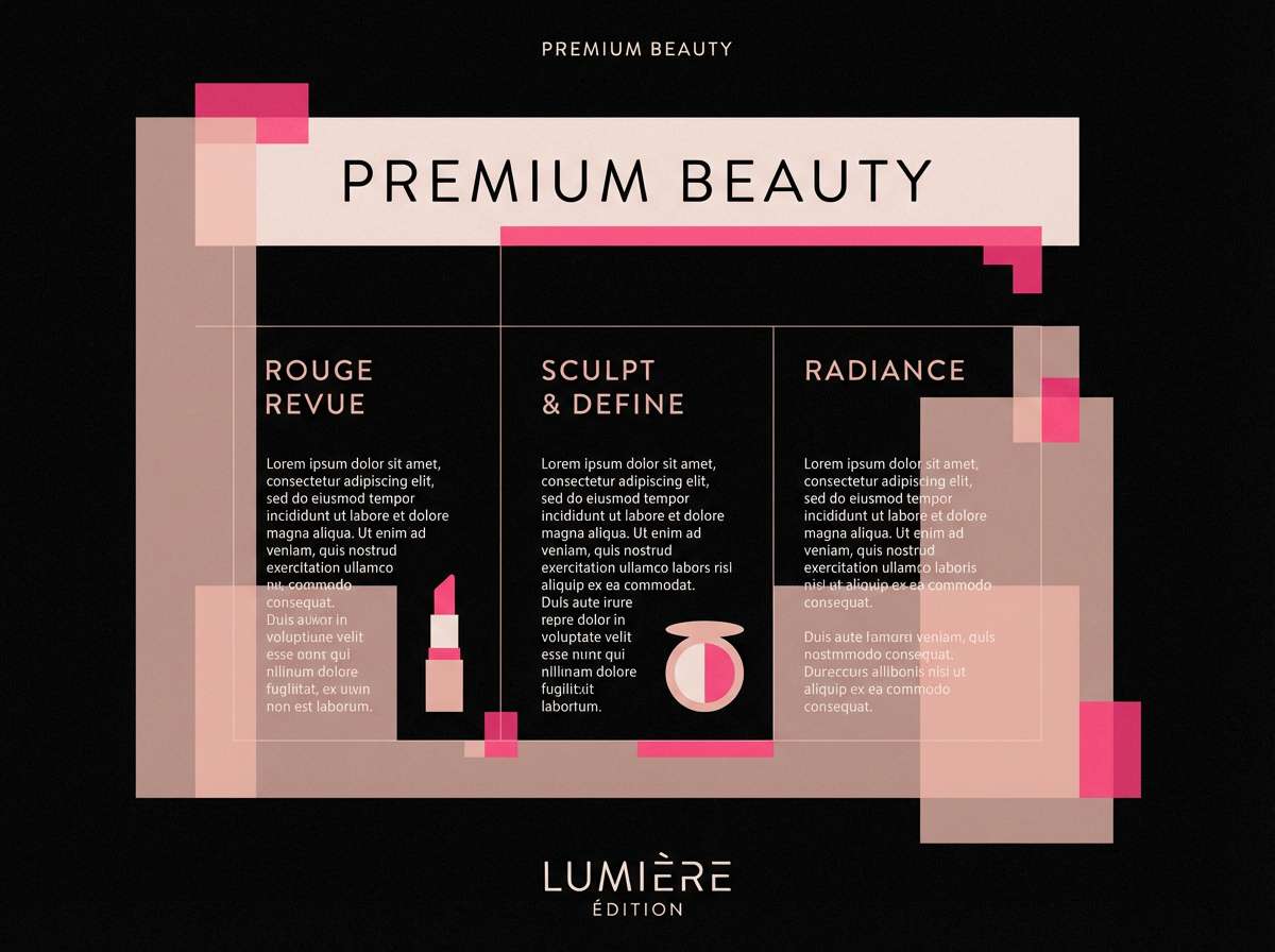
Media.io is an online AI studio for creating and editing video, image, and audio in your browser.

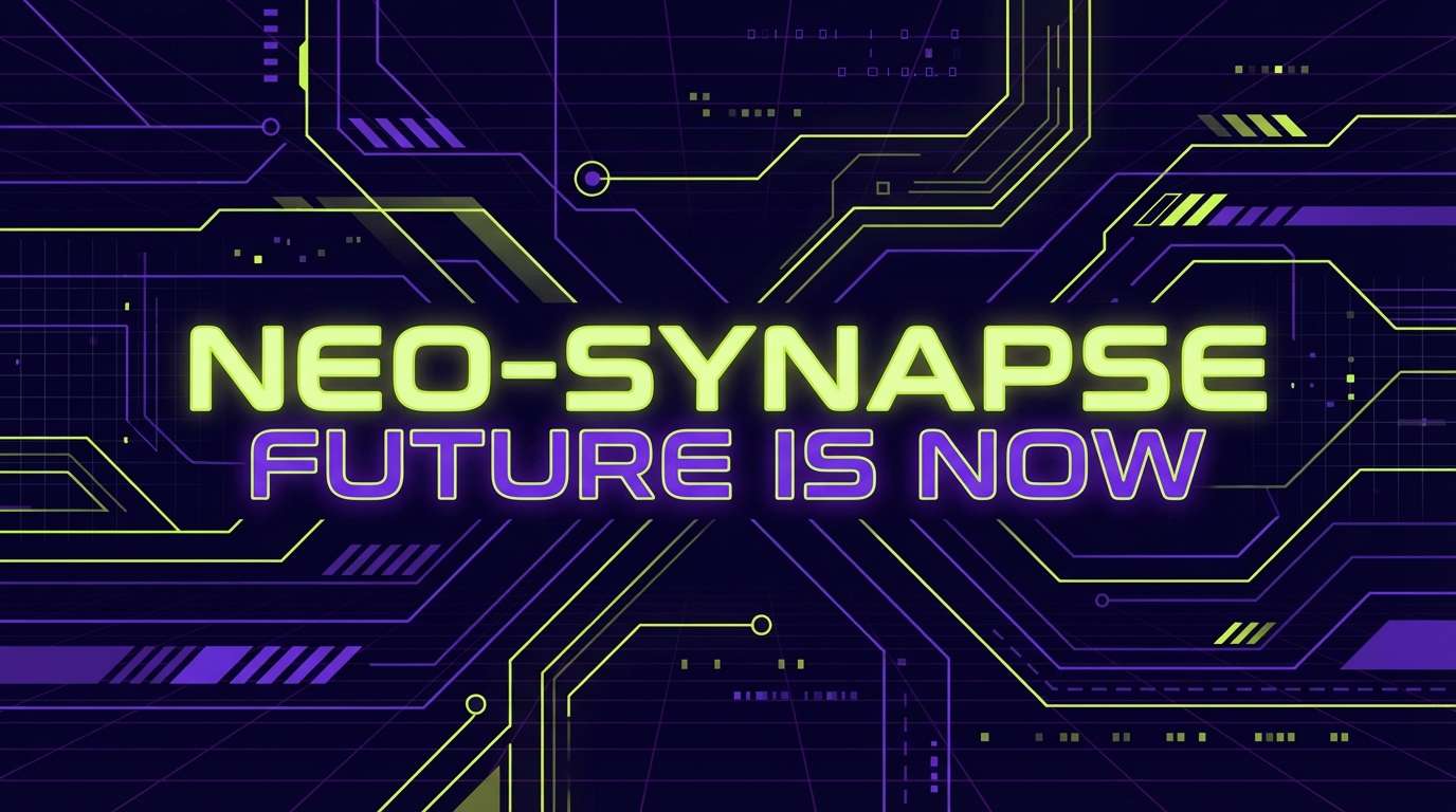
2) Neon Rose Circuit
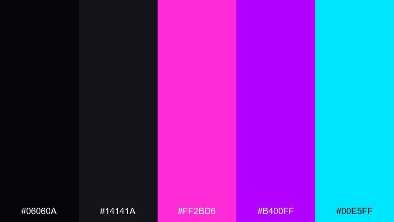
HEX: #06060a #14141a #ff2bd6 #b400ff #00e5ff
Mood: electric, futuristic, high-contrast
Best for: gaming overlays and streaming channel graphics
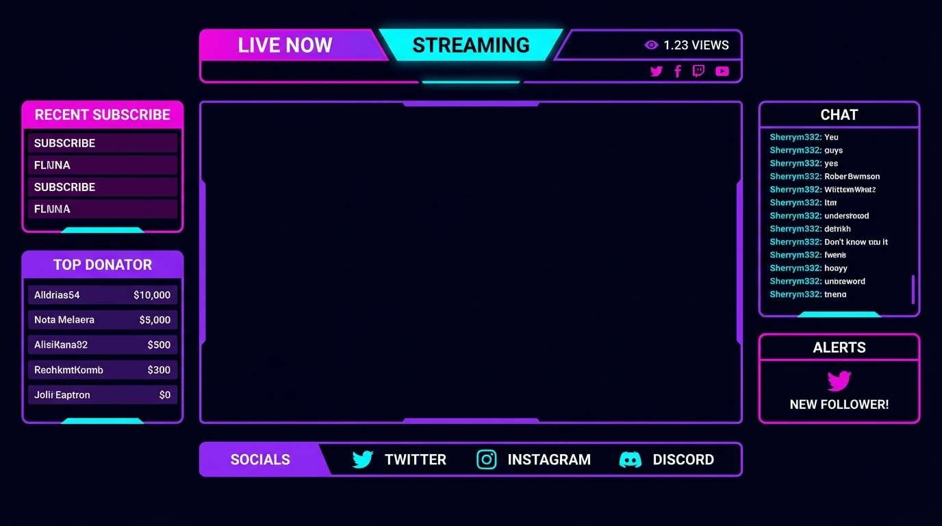
Electric and playful, like neon signage reflected on wet asphalt. The dark foundation makes the magenta and violet pop hard, while the icy cyan adds a techy edge for secondary highlights. Keep text in light tones for readability and use gradients sparingly so the neon stays sharp. Tip: apply the cyan only to icons or tiny badges to avoid competing with the pink.
Image example of neon rose circuit generated using media.io
3) Dusty Rose Ink
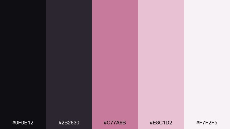
HEX: #0f0e12 #2b2630 #c77a9b #e8c1d2 #f7f2f5
Mood: romantic, soft, refined
Best for: wedding invitations and stationery suites
Gentle and romantic, like rose petals pressed into a journal. The charcoal tones add structure for typography, while dusty pink and blush bring warmth without feeling sugary. Use the lightest tint for margins and negative space, and pair with serif fonts or fine line florals. Tip: print the darkest tone for body text to keep the invitation elegant and readable.
Image example of dusty rose ink generated using media.io
4) Rose Gold Night
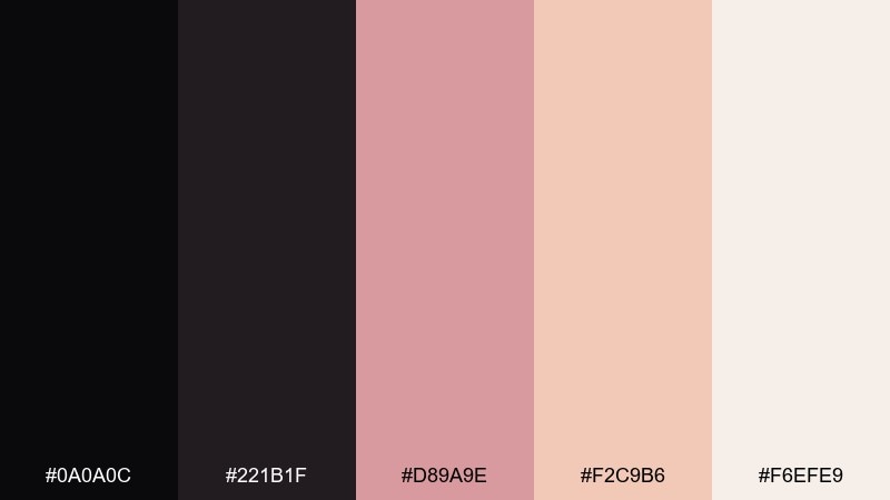
HEX: #0a0a0c #221b1f #d89a9e #f2c9b6 #f6efe9
Mood: glam, warm, sophisticated
Best for: skincare packaging and gift sets
Glamorous and warm, like rose-gold jewelry against a black velvet tray. The soft peachy pinks read as upscale and soothing, while the dark tones anchor logos and ingredient text. This black pink color palette works beautifully with matte black finishes and subtle foil stamping. Tip: use the mid rose tone for brand marks and keep product details in the near-black for clarity.
Image example of rose gold night generated using media.io
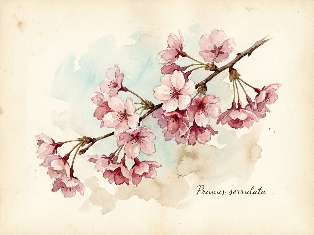
5) Sakura Shadow
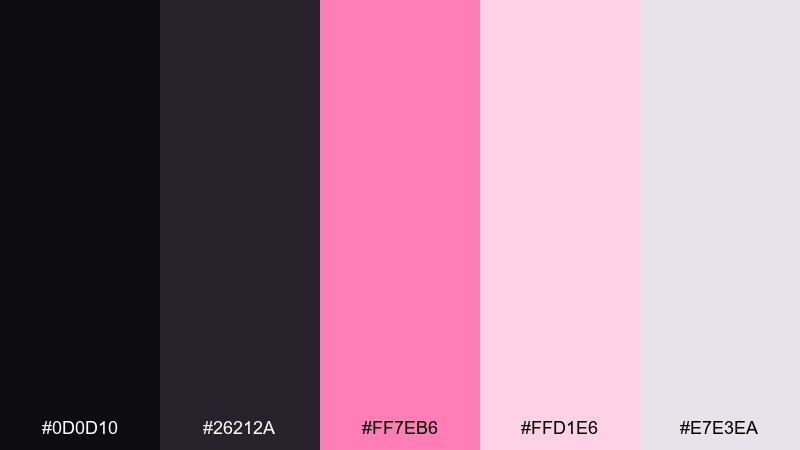
HEX: #0d0d10 #26212a #ff7eb6 #ffd1e6 #e7e3ea
Mood: airy, springlike, dreamy
Best for: botanical illustrations and seasonal campaigns
Dreamy and light, like cherry blossoms drifting at dusk. The soft blushes keep the palette delicate, while the shadowy plum-black adds contrast for stems, outlines, or headlines. Pair it with watercolor textures and plenty of white space to keep the look fresh. Tip: let the deeper tone appear only in thin linework so the petals stay luminous.
Image example of sakura shadow generated using media.io
6) Raspberry Velvet
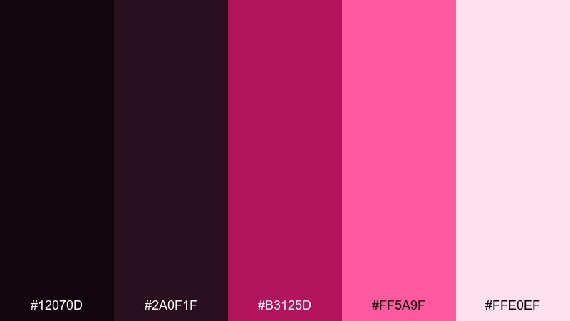
HEX: #12070d #2a0f1f #b3125d #ff5a9f #ffe0ef
Mood: sensual, bold, nightlife
Best for: concert posters and club event promos
Sultry and bold, like velvet curtains under pink spotlights. The wine-dark shades feel rich and intimate, while the bright raspberry brings energy for headlines and dates. For black pink color combinations that stay readable, keep body copy in the pale tint and reserve the hot pink for the key info. Tip: add a subtle grain texture to the dark background to avoid flat, muddy blacks in print.
Image example of raspberry velvet generated using media.io

7) Punk Ballet
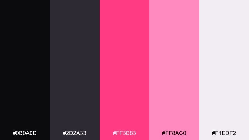
HEX: #0b0a0d #2d2a33 #ff3b83 #ff8ac0 #f1edf2
Mood: edgy, playful, fashion-forward
Best for: fashion lookbooks and social ads
Edgy and playful, like a tutu paired with leather boots. The charcoal neutrals keep layouts editorial, while the pinks add attitude for buttons, prices, or captions. Pair with bold sans-serif type and high-contrast photography for a modern fashion vibe. Tip: use the softer pink as a background block behind product names to improve scanability.
Image example of punk ballet generated using media.io
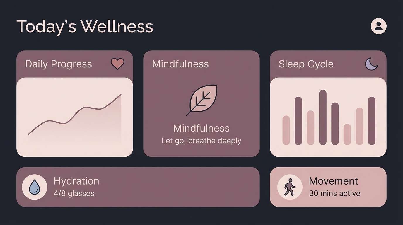
8) Mauve Smoke
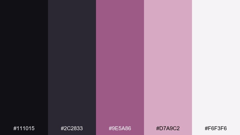
HEX: #111015 #2c2833 #9e5a86 #d7a9c2 #f6f3f6
Mood: calm, mature, understated
Best for: wellness apps and mindful brands
Calm and mature, like incense smoke curling through mauve light. The muted mid-tone keeps things grounded, while blush tints soften forms and panels. It suits long-form content, dashboards, and gentle product storytelling where contrast must be controlled. Tip: keep primary buttons in the mauve and use the brightest elements only for notifications.
Image example of mauve smoke generated using media.io
9) Fuchsia Asphalt
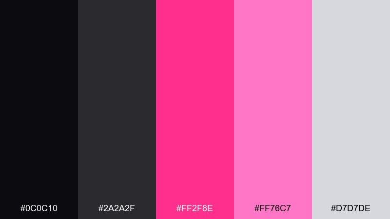
HEX: #0c0c10 #2a2a2f #ff2f8e #ff76c7 #d7d7de
Mood: urban, sharp, energetic
Best for: streetwear branding and tag-style graphics
Urban and punchy, like fuchsia paint on dark pavement. The gray-lilac neutral helps balance the hot pink so layouts do not feel overly loud. Use the bright fuchsia for logos and stickers, and keep the softer pink for supporting shapes. Tip: try a monochrome photo overlay with one fuchsia accent to make the design feel intentional, not chaotic.
Image example of fuchsia asphalt generated using media.io
10) Blush and Charcoal
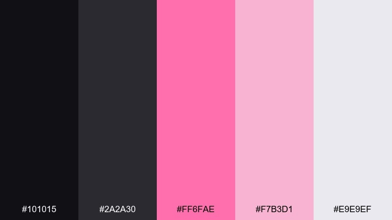
HEX: #101015 #2a2a30 #ff6fae #f7b3d1 #e9e9ef
Mood: clean, friendly, modern
Best for: social media templates and creator kits
Clean and friendly, like a modern studio with a blush accent wall. The charcoal base makes text pop, while the lighter pinks keep posts approachable and airy. Use the near-white tint for backgrounds and reserve the brighter pink for highlights, icons, or price tags. Tip: keep consistent spacing and use charcoal for headlines to avoid washed-out contrast.
Image example of blush and charcoal generated using media.io
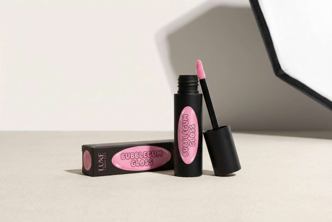
11) Bubblegum Noir
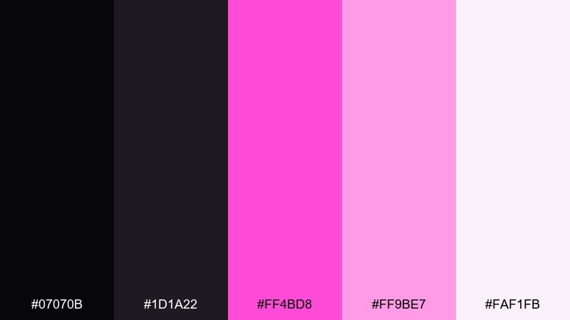
HEX: #07070b #1d1a22 #ff4bd8 #ff9be7 #faf1fb
Mood: playful, glossy, pop
Best for: cosmetics ads and playful product launches
Playful and glossy, like bubblegum lip gloss in a dark boutique. The vivid magenta grabs attention fast, while the pale lavender-pink keeps the look sweet and modern. Pair with rounded type and simple shapes so the color can do the heavy lifting. Tip: add a single dark outline around bright elements to keep them crisp on light backgrounds.
Image example of bubblegum noir generated using media.io
12) Orchid Eclipse
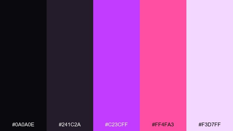
HEX: #0a0a0e #241c2a #c23cff #ff4fa3 #f3d7ff
Mood: artsy, cosmic, bold
Best for: album covers and music promo art
Artsy and cosmic, like an eclipse ringed with orchid light. The purple-magenta shift adds depth to the pink, making it feel more experimental than sweet. For black pink color combinations with a creative edge, use the darkest tones for negative space and let the neon accents frame the title. Tip: keep typography minimal and centered so the gradient hues feel intentional.
Image example of orchid eclipse generated using media.io
13) Pink Quartz Night
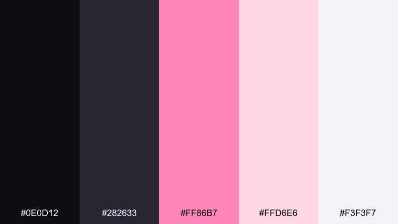
HEX: #0e0d12 #282633 #ff86b7 #ffd6e6 #f3f3f7
Mood: soft, polished, contemporary
Best for: interior mood boards and lifestyle blogs
Soft and polished, like pink quartz on a dark marble counter. The gentle blush tints keep the look airy, while the deep slate tones add contrast for titles and dividers. This black pink color palette shines in mood boards, blog headers, and clean lifestyle layouts with minimal clutter. Tip: use the lightest tint as the main canvas and bring in the darker tones through thin lines and captions.
Image example of pink quartz night generated using media.io
14) Candy Ink
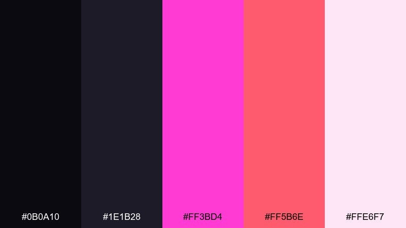
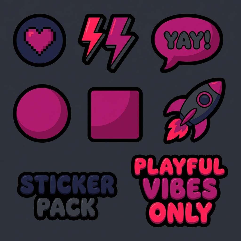
HEX: #0b0a10 #1e1b28 #ff3bd4 #ff5b6e #ffe6f7
Mood: fun, bold, youthful
Best for: merch graphics and sticker packs
Fun and bold, like candy wrappers on a dark desk. The magenta and warm pink-red create lively contrast that reads well from a distance. Use the pale tint as a highlight around icons and keep the background deep for maximum punch. Tip: add thick outlines and simple shapes so the colors stay legible on small stickers.
Image example of candy ink generated using media.io
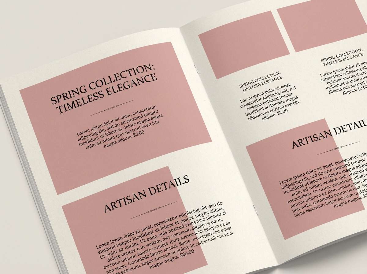
15) Rosewood Graphite
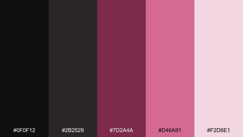
HEX: #0f0f12 #2b2529 #7d2a4a #d46a91 #f2d6e1
Mood: vintage, grounded, elegant
Best for: boutique cafés and artisanal packaging
Vintage and grounded, like rosewood furniture with graphite shadows. The muted berry tones feel artisanal and pair well with kraft textures, serif logos, and stamped labels. Use the darkest shade for brand marks and the dusty rose for secondary patterns or borders. Tip: keep saturation low in background areas so the rosewood accent feels intentional, not heavy.
Image example of rosewood graphite generated using media.io
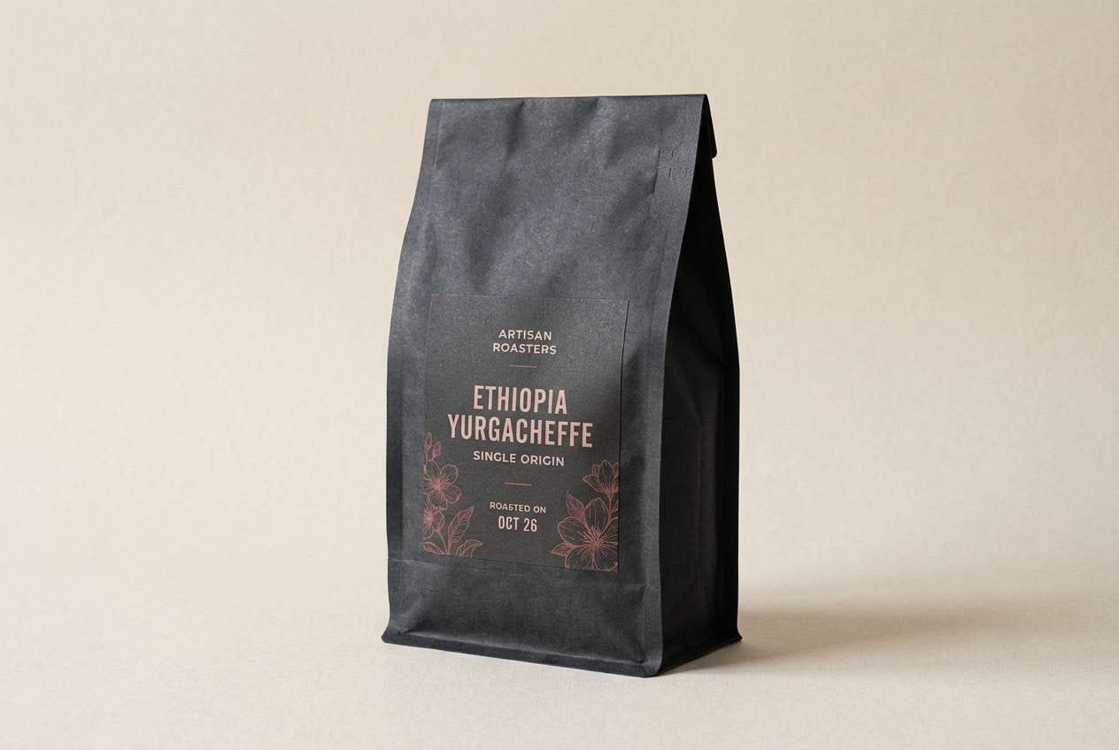
16) Flamingo Nightfall
HEX: #09090c #20161a #ff4f7a #ff9bb3 #fff0f3
Mood: festive, warm, energetic
Best for: party flyers and nightlife promos
Festive and warm, like flamingo lights against a midnight wall. The bright coral-pink brings a friendly energy that still feels modern when anchored by near-black. Pair with bold type, simple geometric shapes, and high-contrast spacing for quick readability. Tip: put the event date in the lightest tint so it stays clear even over saturated accents.
Image example of flamingo nightfall generated using media.io

17) Soft Petal Onyx
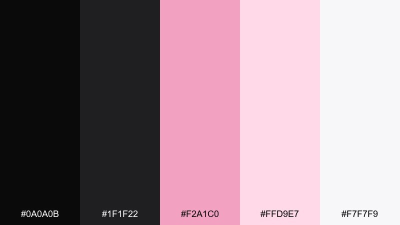
HEX: #0a0a0b #1f1f22 #f2a1c0 #ffd9e7 #f7f7f9
Mood: minimal, gentle, airy
Best for: portfolio sites and minimalist landing pages
Minimal and gentle, like pale petals on polished onyx. The high-key tints give you lots of white space, while the dark tones ensure typography stays sharp. Use the blush as a subtle hover state and keep the deeper shades for headings and navigation. Tip: limit the pink to micro-interactions so the page feels calm and intentional.
Image example of soft petal onyx generated using media.io
18) Cyber Magenta
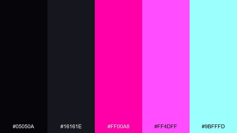
HEX: #05050a #16161e #ff00a8 #ff4dff #9bfffd
Mood: techy, bold, futuristic
Best for: tech conference landing pages and hero banners
Techy and bold, like laser magenta cutting through a dark server room. The neon pairing is intense, so balance it with generous negative space and crisp typography. Use the icy accent as a tiny highlight for links or badges, and keep the rest grounded in deep tones. Tip: set primary CTAs in magenta and keep secondary actions neutral to guide attention cleanly.
Image example of cyber magenta generated using media.io
19) Vintage Rose Noir
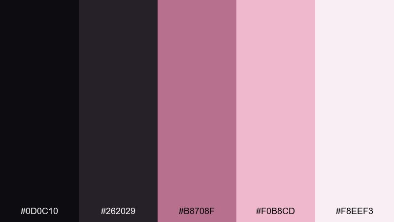
HEX: #0d0c10 #262029 #b8708f #f0b8cd #f8eef3
Mood: nostalgic, chic, boutique
Best for: vintage boutiques and lookbook catalog pages
Nostalgic and chic, like a vintage perfume bottle on a dark vanity. The muted rose tones feel classic rather than candy-sweet, making them ideal for boutiques and curated collections. Use the near-black for headings and the mid rose for section dividers or price highlights. Tip: add subtle paper texture to the light backgrounds to amplify the retro mood.
Image example of vintage rose noir generated using media.io
20) Peony Night Sky
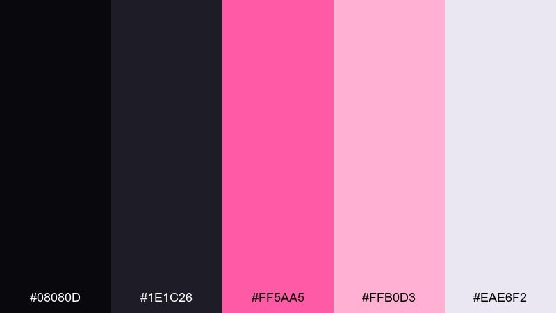
HEX: #08080d #1e1c26 #ff5aa5 #ffb0d3 #eae6f2
Mood: dreamy, modern, romantic
Best for: brand identity systems and UI dashboards
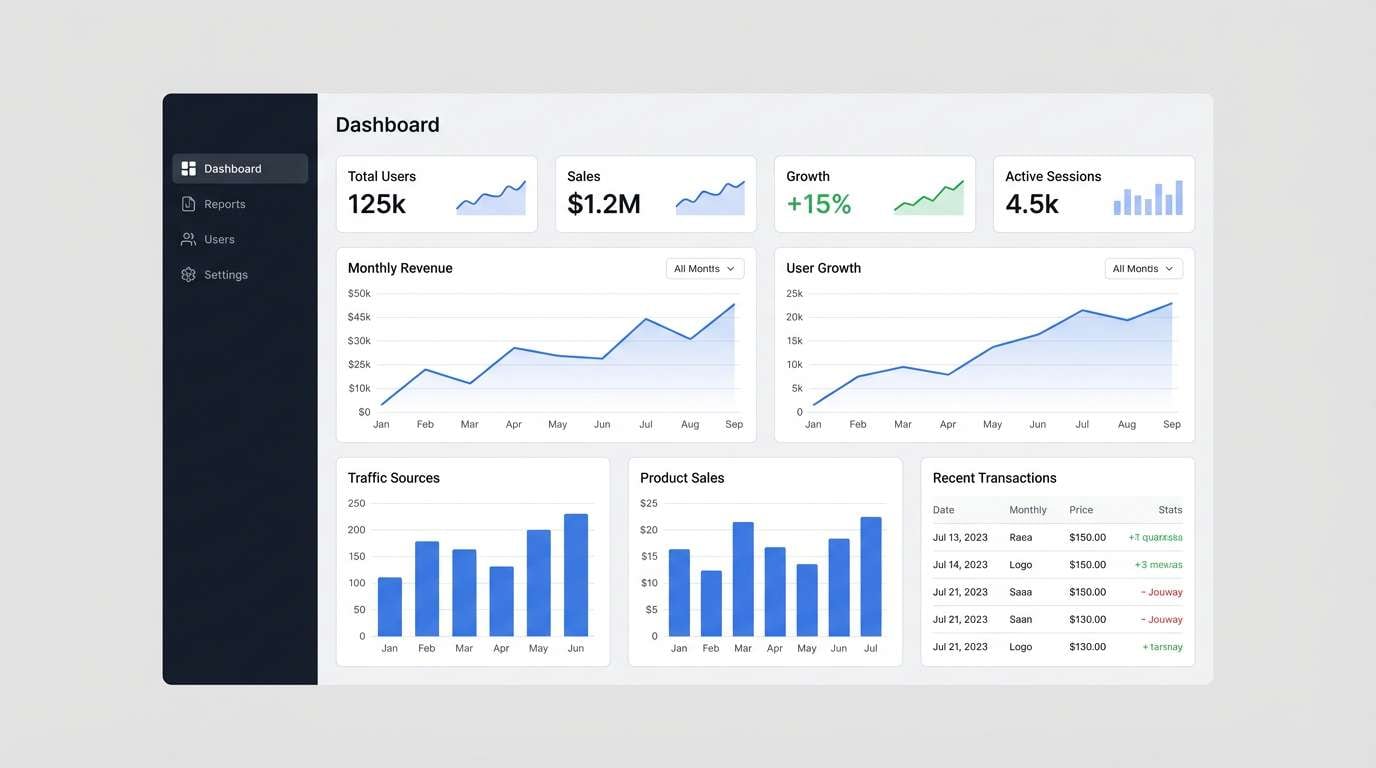
Dreamy and modern, like peonies under a midnight sky. The contrast makes a reliable black pink color scheme for dashboards, identity systems, and presentation decks that need both softness and structure. Pair the brighter pink with icons and active states, and use the lavender-gray as a calming surface color. Tip: keep charts and data marks mostly neutral, then use the hot pink for a single key metric.
Image example of peony night sky generated using media.io
What Colors Go Well with Black Pink?
Neutrals are the easiest win: white, ivory, cool gray, and silver keep black-pink layouts clean and readable. They also help prevent bright pink accents from feeling too busy.
For a richer look, add purples (orchid, plum) or berry tones to bridge black and pink smoothly. These hues deepen the palette while keeping it cohesive and modern.
If you want a techy or sporty edge, introduce small pops of cyan, teal, or mint—used sparingly as a secondary highlight. It creates a crisp contrast without stealing focus from the pink.
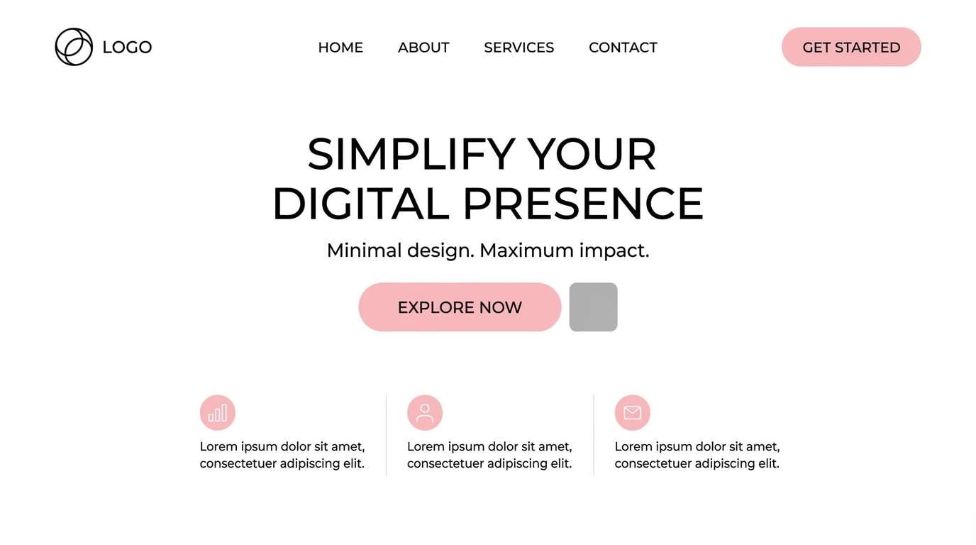
How to Use a Black Pink Color Palette in Real Designs
Start with roles, not swatches: assign near-black for text and primary surfaces, light tints for backgrounds, and the brightest pink for primary actions (CTA buttons, key prices, or “active” states). This keeps your hierarchy consistent across pages.
Control saturation and area: hot pink works best in small doses, especially on dark backgrounds. Use softer blush tones for large panels, cards, or print backgrounds to reduce visual fatigue.
For accessibility, check contrast on body text and UI labels—pink-on-black is often fine, but light pink on white can be too low-contrast. When in doubt, keep text neutral and reserve pink for accents and icons.
Create Black Pink Palette Visuals with AI
Want to see these black pink tones applied to a landing page, poster, product mockup, or social template? Generate concept visuals quickly by describing your layout, style, and lighting, then iterating until the mood matches your brand.
To keep results consistent, include your design type (UI, packaging, flyer), a few color cues (near-black base, blush panels, hot pink accents), and a clear composition (grid, centered title, minimal shapes). You can also reuse prompts from the examples above as a starting point.
Black Pink Color Palette FAQs
-
What does a black and pink color palette communicate?
Most commonly it signals bold confidence and modern contrast—black adds authority and structure, while pink adds warmth, attitude, or playfulness depending on the shade (blush vs. neon magenta). -
Which pink works best with black for a luxury look?
Muted roses, dusty pinks, and peachy rose-gold tones tend to feel premium. Pair them with near-black (not pure #000) and plenty of negative space for a refined finish. -
How do I keep black-pink designs from looking harsh?
Use soft tints (blush/near-white) as breathing room, and avoid filling large areas with neon pink. You can also choose charcoal or plum-black instead of pure black to soften the contrast. -
Is black and pink a good UI color scheme?
Yes—if you assign clear roles: dark neutrals for surfaces, light neutrals for text, and pink as an accent for CTAs, active states, and highlights. Always verify contrast for accessibility. -
What colors can I add to black and pink besides neutrals?
Purple (orchid/plum) blends naturally with pink for a creative feel, while small cyan/teal accents add a futuristic tech vibe. Keep any third color limited to secondary elements to avoid competing focal points. -
What are common mistakes with black pink palettes in branding?
Overusing the brightest pink, relying on low-contrast light pink text, and mixing too many pink hues at once. A tighter palette with one “hero” pink usually looks more intentional. -
How can I preview a black pink palette on posters or packaging fast?
Use AI mockups: describe the product/poster, materials (matte black, foil accents), and where pink should appear (logo, label, CTA). Generate a few variations and refine the prompt until the hierarchy looks right.
Next: Red Green Color Palette


