

A galaxy color palette blends deep-space navy, cosmic violet, and neon-like accents to create visuals that feel vast, high-contrast, and modern.
Whether you’re designing a poster, UI, or brand system, these galaxy colors help you balance mystery (dark bases) with clarity (bright highlights) and a premium “glow” effect.
In this article
Why Galaxy Palettes Work So Well
Galaxy palettes are built on dark, low-light foundations (navy, ink, charcoal) that instantly add depth and make designs feel cinematic. Those deep bases create “space” for typography, imagery, and UI components to breathe.
They also shine because accents can be pushed brighter without looking random. Neon cyan, hot magenta, and star-gold read as light sources—so contrast feels natural, not harsh.
Finally, galaxy color schemes are flexible: you can go minimal and editorial with cool grays, or futuristic and energetic with electric gradients. The same universe-inspired DNA supports many brand personalities.
20+ Galaxy Color Palette Ideas (with HEX Codes)
1) Nebula Drift
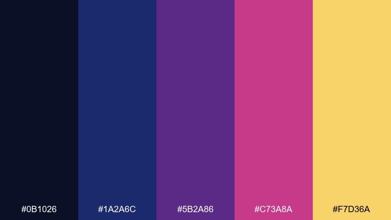
HEX: #0b1026 #1a2a6c #5b2a86 #c73a8a #f7d36a
Mood: mysterious, luminous, cinematic
Best for: movie poster design
Mysterious and luminous, it feels like a slow swirl of nebula gas lit by distant stars. Use it for bold headlines on dark backgrounds where the violet and magenta can glow. Pair with a clean sans serif and plenty of negative space to keep it premium. Tip: reserve the gold as a sparing highlight for credits or callouts.
Image example of nebula drift generated using media.io
Media.io is an online AI studio for creating and editing video, image, and audio in your browser.

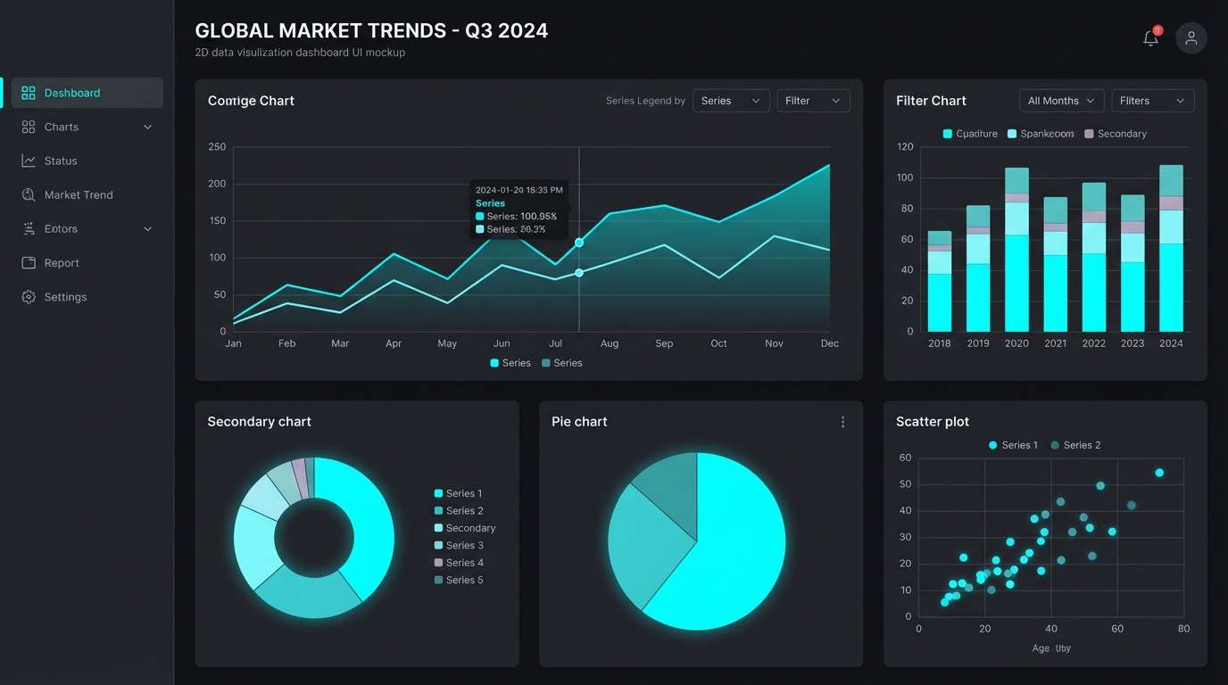
2) Midnight Orbit
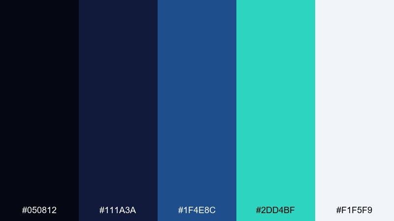
HEX: #050812 #111a3a #1f4e8c #2dd4bf #f1f5f9
Mood: sleek, technical, modern
Best for: 2D SaaS dashboard UI
Sleek midnight tones meet a crisp teal that reads like instrument lights in a cockpit. It works beautifully for analytics screens, navigation bars, and data-heavy panels where clarity matters. Pair the teal with off-white text for accessibility, and let the deep blues carry the structure. Tip: keep teal for primary actions only to avoid visual noise.
Image example of midnight orbit generated using media.io

3) Aurora Dust
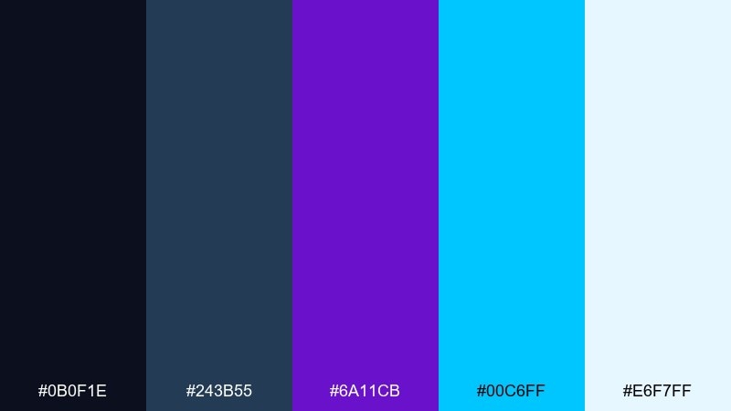
HEX: #0b0f1e #243b55 #6a11cb #00c6ff #e6f7ff
Mood: electric, airy, futuristic
Best for: streaming thumbnail graphics
Electric and airy, it evokes aurora ribbons cutting through a cold night sky. This galaxy color palette is ideal when you need punchy contrast at small sizes, like thumbnails and cover art. Pair the cyan with a thick type weight and keep backgrounds mostly navy for legibility. Tip: add a soft outer glow to cyan elements to mimic light bloom without muddying edges.
Image example of aurora dust generated using media.io
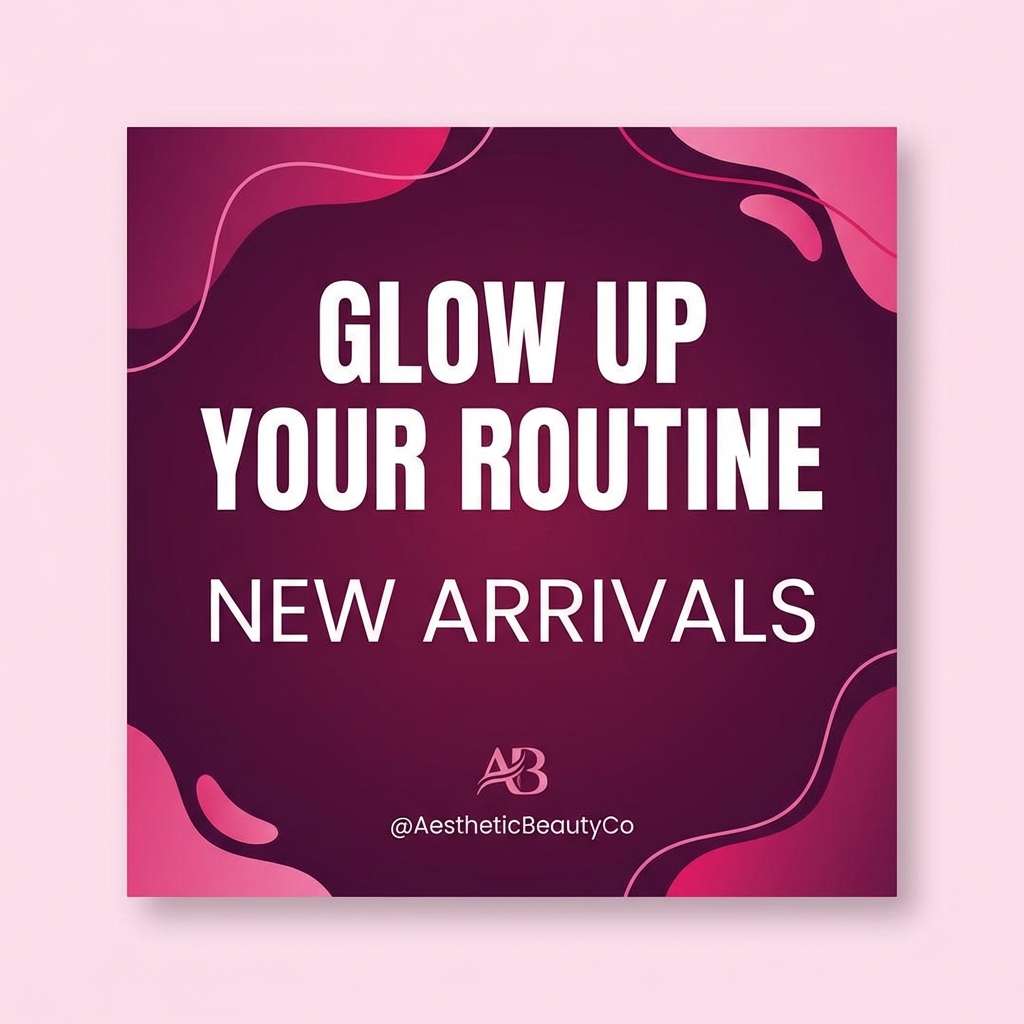
4) Cosmic Plum
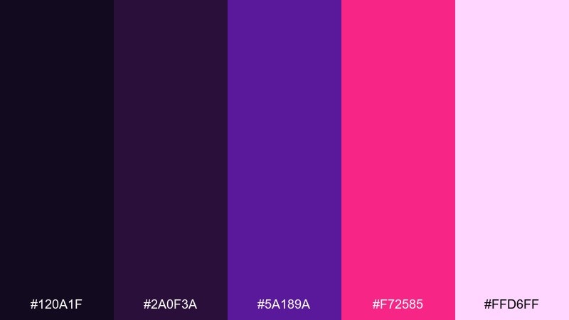
HEX: #120a1f #2a0f3a #5a189a #f72585 #ffd6ff
Mood: dramatic, romantic, nocturnal
Best for: beauty brand social posts
Dramatic plum and hot pink feel like starlight reflecting on velvet fabric. Use it for beauty launches, nightlife promos, or any visual that needs a confident edge. Pair with minimal product photography or simple shapes so the saturated pink does not overwhelm. Tip: keep the light lavender only for text blocks and highlights to maintain contrast.
Image example of cosmic plum generated using media.io
5) Starlit Teal
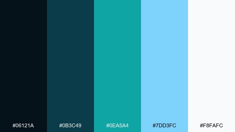
HEX: #06121a #0b3c49 #0ea5a4 #7dd3fc #f8fafc
Mood: fresh, crisp, oceanic
Best for: tech startup branding
Fresh teal and cool sky tints suggest starlight scattered over deep water. It fits tech branding that wants to feel trustworthy yet energetic, especially for logos, icons, and web headers. Pair with charcoal neutrals and consistent line icons to keep the system cohesive. Tip: test teal on dark backgrounds for WCAG contrast before locking button styles.
Image example of starlit teal generated using media.io
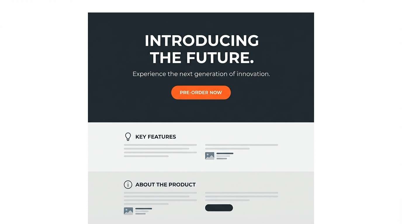
6) Meteor Glow
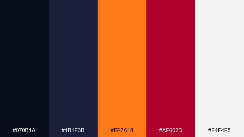
HEX: #070b1a #1b1f3b #ff7a18 #af002d #f4f4f5
Mood: fiery, energetic, high-contrast
Best for: product launch landing page
Fiery orange and deep wine feel like a meteor streaking across a black sky. These galaxy color combinations are perfect for launch pages that need urgency and clear conversion focus. Pair the warm accents with restrained typography and a simple grid so the page stays readable. Tip: use orange for primary CTAs and keep red for secondary badges or limited-time labels.
Image example of meteor glow generated using media.io
7) Deep Space Ink
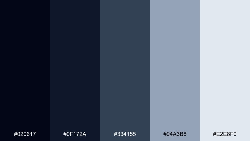
HEX: #020617 #0f172a #334155 #94a3b8 #e2e8f0
Mood: calm, minimal, professional
Best for: editorial website redesign
Calm ink blues and cool grays read like quiet space with just enough structure to feel editorial. It suits long-form layouts, navigation-heavy sites, and content platforms that prioritize readability. Pair with a warm serif for headlines to soften the coldness without changing the palette. Tip: keep body text on the lightest gray to reduce glare compared with pure white.
Image example of deep space ink generated using media.io
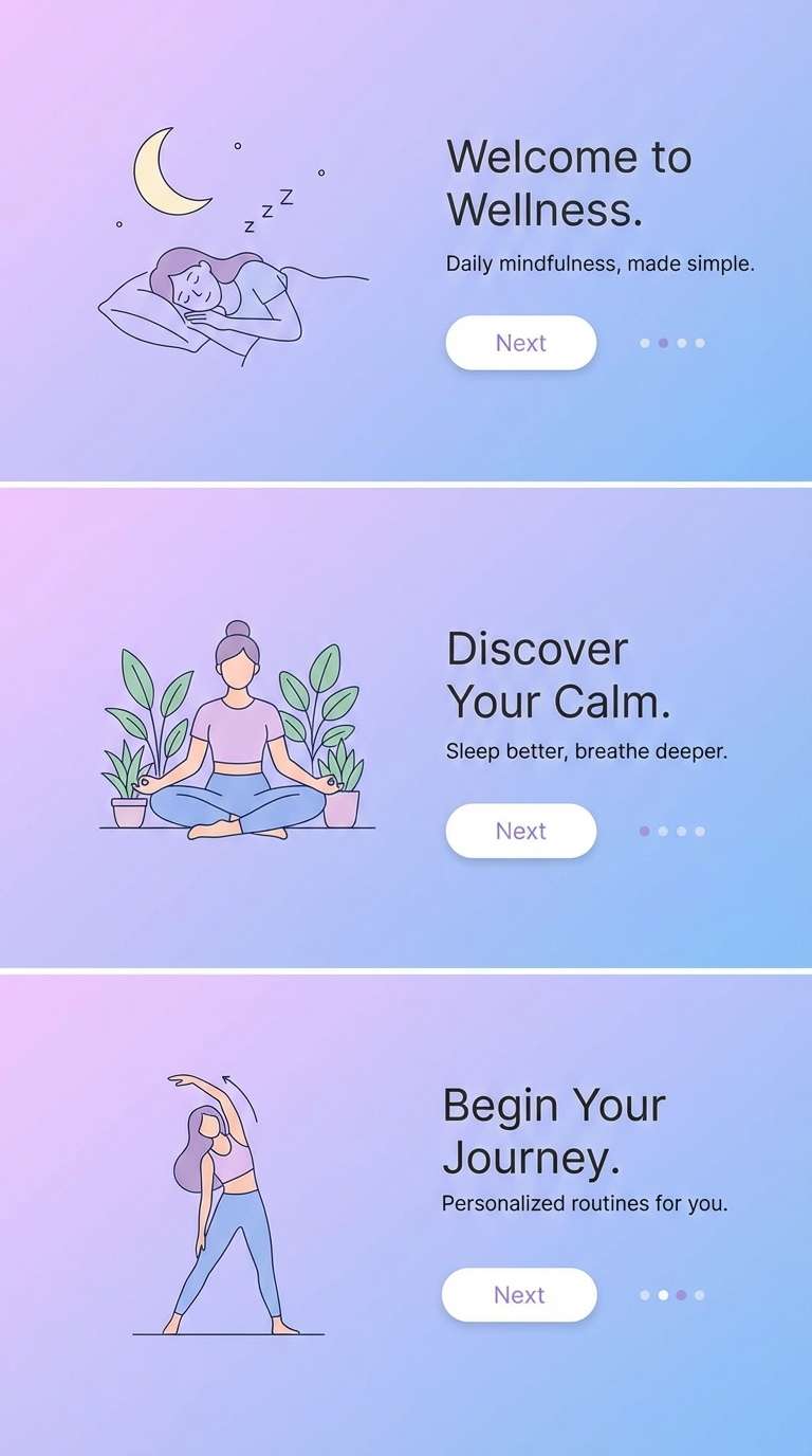
8) Lunar Lavender
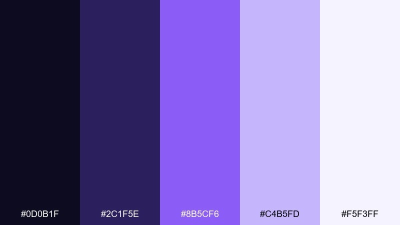
HEX: #0d0b1f #2c1f5e #8b5cf6 #c4b5fd #f5f3ff
Mood: soft, dreamy, soothing
Best for: wellness app onboarding screens
Soft lavender gradients feel like moonlight diffused through thin clouds. It works well for calming onboarding flows, meditation timers, and gentle success states. Pair with rounded UI components and ample spacing to reinforce the soothing tone. Tip: keep the deepest purple for headings and use the pale lavender for backgrounds to avoid banding.
Image example of lunar lavender generated using media.io
9) Supernova Punch
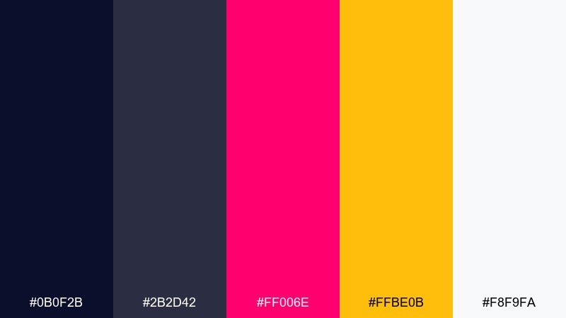
HEX: #0b0f2b #2b2d42 #ff006e #ffbe0b #f8f9fa
Mood: bold, playful, attention-grabbing
Best for: event flyer design
Bold pink and solar yellow explode like a supernova against deep navy. Use it for event flyers and promotions that need instant visibility from a distance. Pair with condensed type and simple geometric blocks to keep the energy controlled. Tip: limit yellow to one focal zone so it does not compete with pink for attention.
Image example of supernova punch generated using media.io
10) Eclipse Bronze
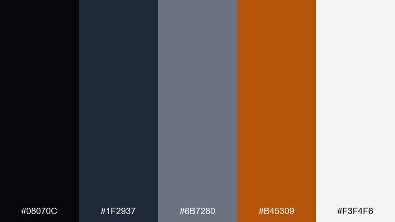
HEX: #08070c #1f2937 #6b7280 #b45309 #f3f4f6
Mood: moody, refined, premium
Best for: luxury packaging mockup
Moody charcoal with bronze warmth feels like an eclipse halo over a dark horizon. This galaxy color scheme is a strong fit for premium packaging, especially cosmetics or spirits that need a restrained glow. Pair with embossed typography and matte finishes to make bronze accents feel intentional. Tip: print-test the bronze as foil or spot UV to avoid it looking flat.
Image example of eclipse bronze generated using media.io
11) Saturn Silk
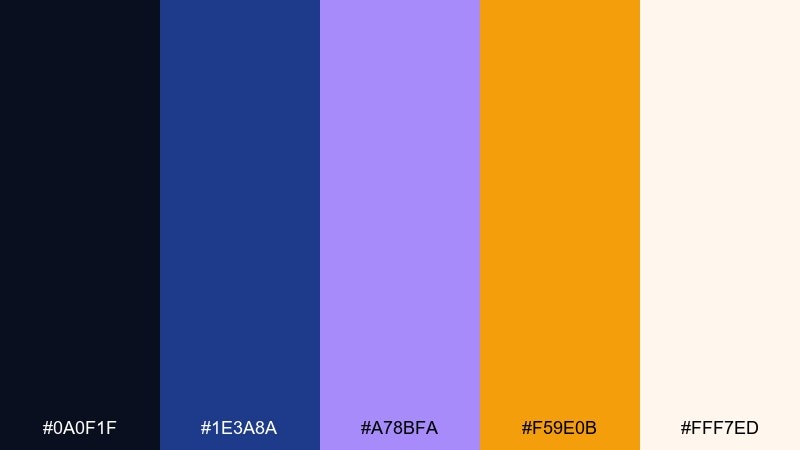
HEX: #0a0f1f #1e3a8a #a78bfa #f59e0b #fff7ed
Mood: elegant, cosmic, balanced
Best for: wedding invitation suite
Elegant indigo and soft lilac feel like Saturn rings brushed with warm light. It suits modern invitation suites where you want romance without going overly pastel. Pair with thin serif headings and simple line art for a refined look. Tip: keep amber to tiny accents such as separators, monograms, or RSVP highlights.
Image example of saturn silk generated using media.io
12) Comet Trail
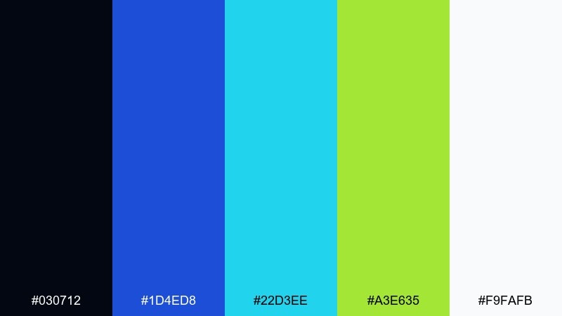
HEX: #030712 #1d4ed8 #22d3ee #a3e635 #f9fafb
Mood: bright, kinetic, techy
Best for: esports team banner
Bright blue and cyan streak like a comet trail, with lime adding extra speed. It works for esports branding, streaming overlays, and competitive banners where contrast has to hit fast. Pair with sharp angles and outlined type to match the energetic feel. Tip: use lime only for key stats or taglines so it stays special.
Image example of comet trail generated using media.io

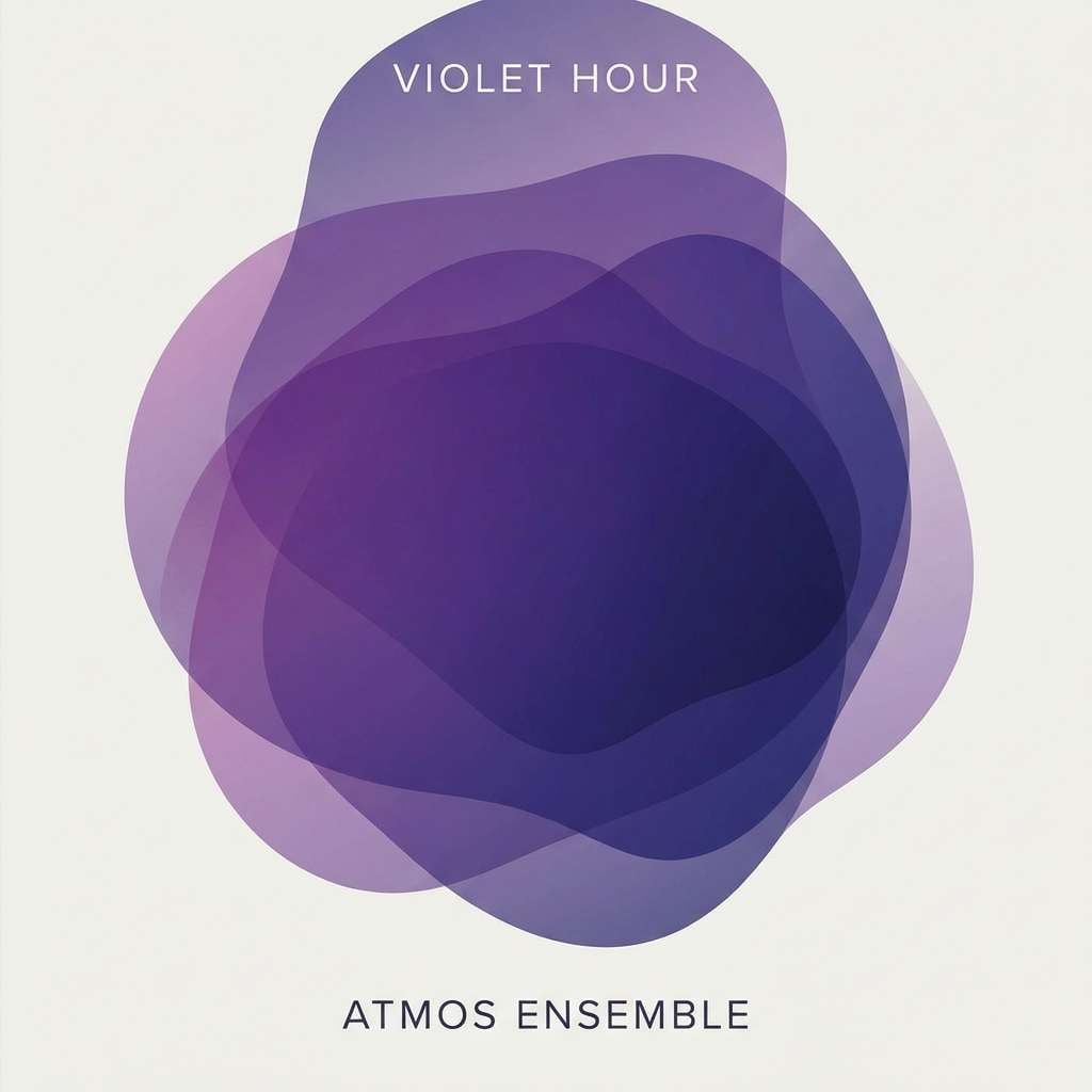
13) Void Violet
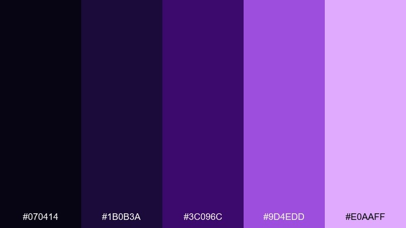
HEX: #070414 #1b0b3a #3c096c #9d4edd #e0aaff
Mood: enigmatic, artistic, deep
Best for: album cover art
Enigmatic violet layers feel like a dark void with a soft inner glow. It is great for album art, book covers, and personal brands that lean expressive and moody. Pair with monochrome photography or abstract shapes so the purples stay the hero. Tip: keep the light lilac for artist names and small text to protect readability.
Image example of void violet generated using media.io
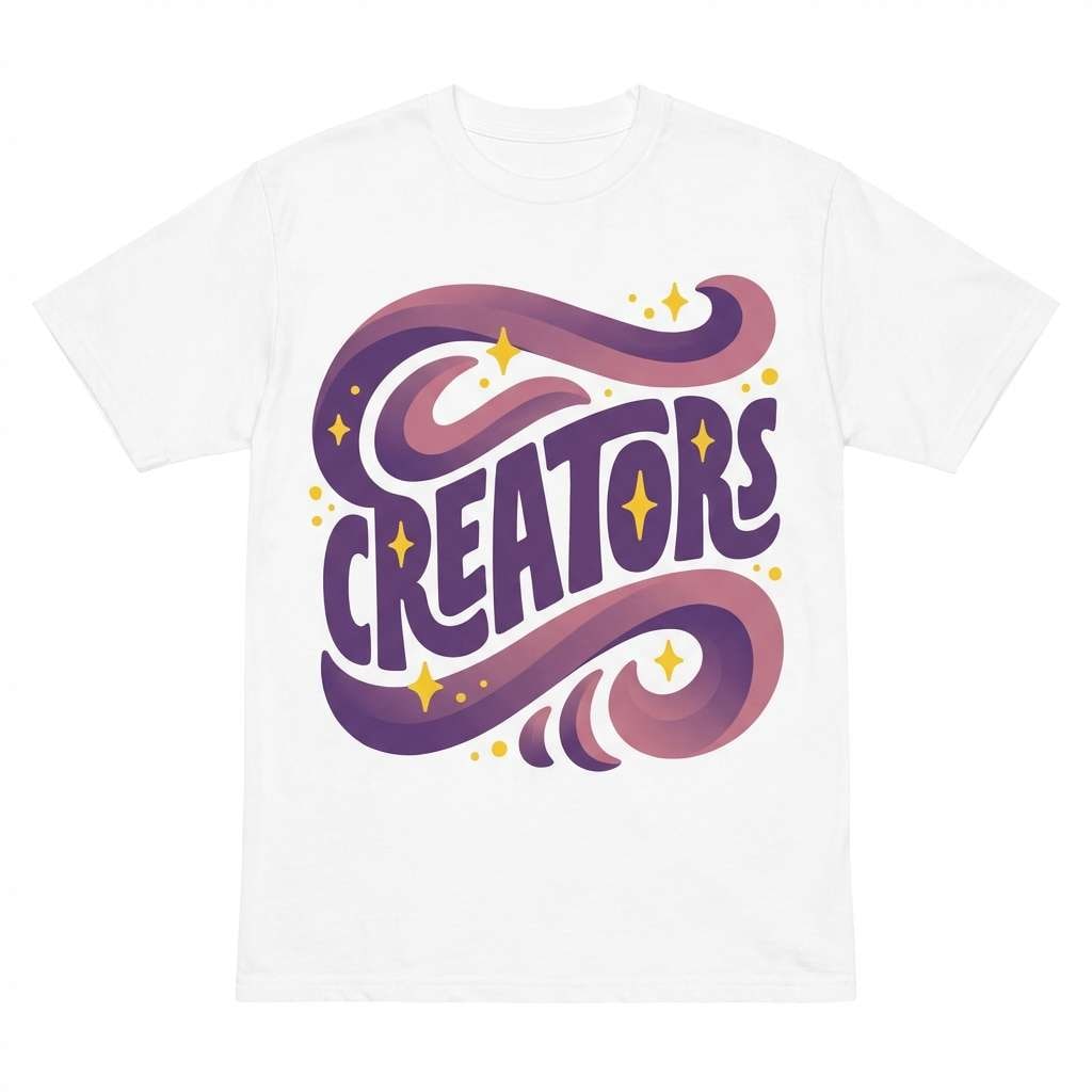
14) Galaxy Grape
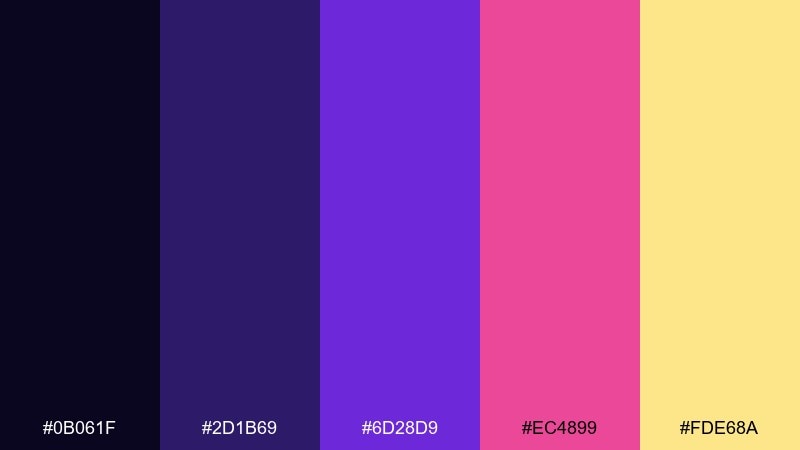
HEX: #0b061f #2d1b69 #6d28d9 #ec4899 #fde68a
Mood: vivid, trendy, expressive
Best for: creator merch design
Vivid grape and candy pink look like cosmic clouds lit from within. This galaxy color palette shines on merch where you want high saturation that still feels coordinated. Pair with black tees or deep navy fabric, then use the soft yellow for small icons or stitching details. Tip: avoid large yellow fills and use it as a spark to keep the look modern.
Image example of galaxy grape generated using media.io
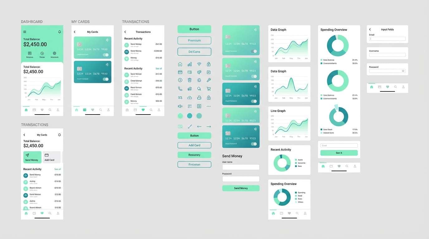
15) Photon Mint
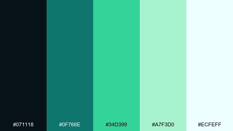
HEX: #071118 #0f766e #34d399 #a7f3d0 #ecfeff
Mood: clean, optimistic, airy
Best for: fintech app UI kit
Clean mint and deep teal feel like photons flickering through glass. It fits fintech interfaces that need a friendly tone without losing trust and clarity. Pair with neutral grays for charts and use the bright mint for positive states like growth and success. Tip: keep the lightest tint for card backgrounds to avoid harsh contrast on dark text.
Image example of photon mint generated using media.io
16) Asteroid Sand
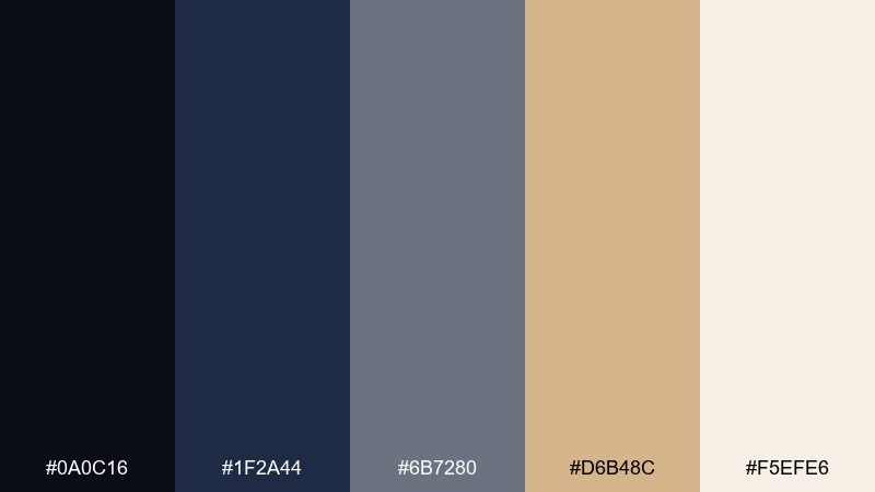
HEX: #0a0c16 #1f2a44 #6b7280 #d6b48c #f5efe6
Mood: earthy, grounded, understated
Best for: architecture portfolio website
Grounded sand and slate feel like dust on an asteroid surface under low light. It works for architecture portfolios where you want images to lead and the interface to stay quiet. Pair with plenty of whitespace and a restrained grid to spotlight materials and forms. Tip: use the sand tone for hover states and section dividers rather than big blocks.
Image example of asteroid sand generated using media.io
17) Interstellar Rose
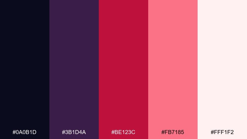
HEX: #0a0b1d #3b1d4a #be123c #fb7185 #fff1f2
Mood: warm, emotive, modern
Best for: nonprofit campaign poster
Warm rose tones on a dark base feel like a heartfelt signal in an endless night. Use it for cause-driven campaigns where you need empathy without losing impact. Pair with documentary-style imagery or simple illustrations, then keep typography clean and direct. Tip: make the deepest burgundy your text anchor and use blush for background panels.
Image example of interstellar rose generated using media.io

18) Quasar Cyan
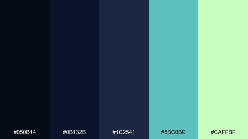
HEX: #050b14 #0b132b #1c2541 #5bc0be #caffbf
Mood: cool, sci-fi, precise
Best for: data visualization theme
Cool cyan accents against layered blues feel like a quasar beam cutting through darkness. It is well suited to dashboards, charts, and data storytelling where color needs to separate categories clearly. Pair with consistent line weights and muted gridlines so the cyan stays readable. Tip: map cyan to the primary series and use the pale green only for highlights or thresholds.
Image example of quasar cyan generated using media.io
19) Dark Matter Mocha
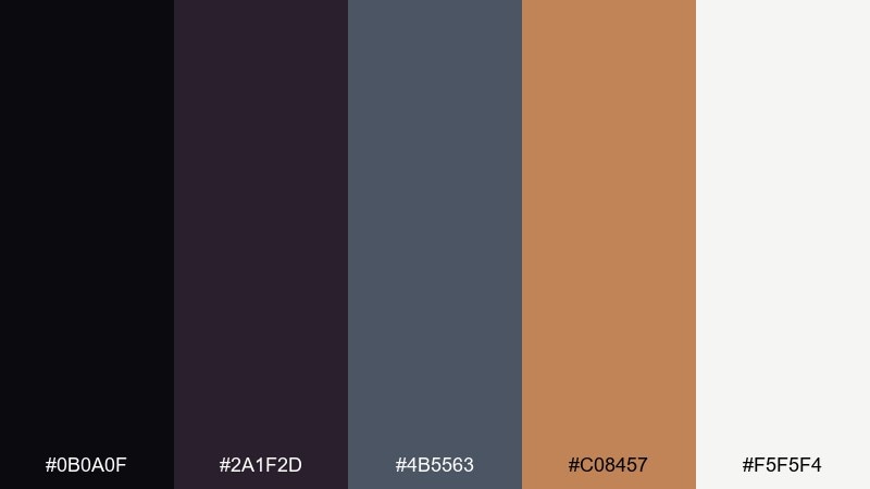
HEX: #0b0a0f #2a1f2d #4b5563 #c08457 #f5f5f4
Mood: cozy, cinematic, grounded
Best for: coffee product ad
Cozy mocha and warm caramel feel like a late-night café with a cinematic shadowy edge. These galaxy color combinations work well for product ads that want warmth without going overly rustic. Pair with soft studio lighting and minimal props, letting the caramel tone signal sweetness. Tip: keep the near-black as the background so the packaging and text pop cleanly.
Image example of dark matter mocha generated using media.io
20) Celestial Ice
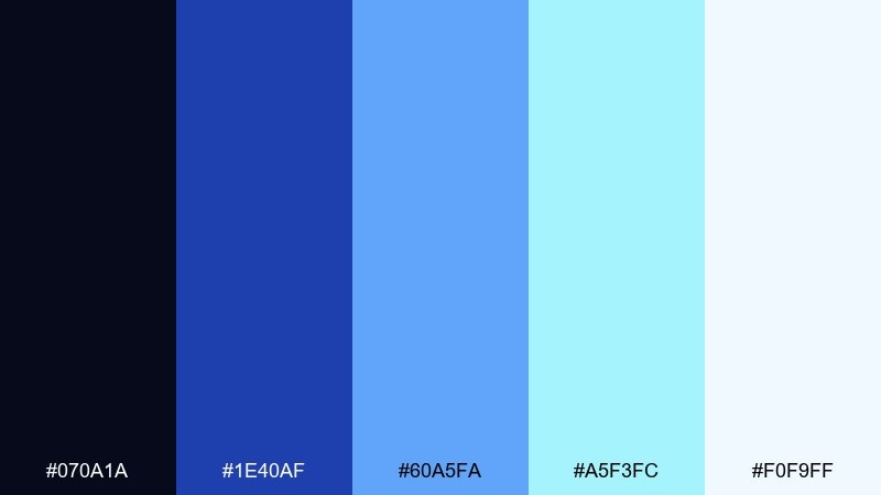
HEX: #070a1a #1e40af #60a5fa #a5f3fc #f0f9ff
Mood: bright, crisp, uplifting
Best for: conference slide deck theme
Crisp blues and icy tints feel like a clear winter sky sprinkled with stars. It is a strong choice for slide decks where you want clean contrast, sharp charts, and readable headings. Pair with simple icons and consistent spacing to keep the visuals professional. Tip: use the light cyan for section dividers and reserve the deeper blue for titles and key metrics.
Image example of celestial ice generated using media.io
What Colors Go Well with Galaxy?
Galaxy palettes pair best with deep neutrals (near-black, ink navy, charcoal) because they amplify “starlight” accents like cyan, magenta, and gold. If you need a calmer look, lean on cool grays and off-whites instead of pure white.
For contrast, use one bright accent as your primary highlight (for CTAs, key icons, or chart series), then keep any second accent strictly secondary. This prevents neon colors from competing and keeps the design readable.
If you want a premium twist, add a warm metallic-style tone (gold/bronze/amber) as a micro-accent. It creates a cinematic finish without breaking the space vibe.
How to Use a Galaxy Color Palette in Real Designs
Start by assigning roles: dark base for backgrounds, mid-tone blues/purples for surfaces, and a single high-energy color for actions or focal points. In UI, this often means navy panels with teal or cyan as the primary button and active states.
For posters and branding, use gradients sparingly and reserve the brightest hues for headlines or shapes that represent “light.” Keeping plenty of negative space helps galaxy colors feel modern instead of cluttered.
Always test legibility: neon-on-dark can look great but still fail contrast if the neon is too thin or used at small sizes. Consider thicker type weights and slightly off-white text to reduce glare.
Create Galaxy Palette Visuals with AI
If you already have HEX codes, you can quickly turn them into poster layouts, UI mockups, merch graphics, or slide themes by describing the composition and lighting style. Galaxy aesthetics work especially well with abstract gradients, geometric shapes, and glow effects.
In your prompt, specify the format (e.g., “dashboard UI,” “event flyer,” “album cover”), the vibe (cinematic, futuristic, minimal), and where accents should appear (CTA button, title, icons). This keeps the palette cohesive across outputs.
Use Media.io to generate multiple variations fast, then refine by adjusting one variable at a time (typography style, contrast level, or accent dominance) until the look matches your brand.
Galaxy Color Palette FAQs
-
What is a galaxy color palette?
A galaxy color palette is a set of colors inspired by space visuals—typically deep navy/black bases with purples, blues, and bright accents (cyan, magenta, gold) that mimic nebula glow and starlight. -
Which galaxy colors are best for dark UI design?
Start with near-black or ink navy backgrounds, then use mid-tone blues for surfaces and a single bright accent (teal/cyan) for primary actions. Off-white text usually reads cleaner than pure white. -
How do I keep neon accents from looking overwhelming?
Limit neon to one primary accent role (CTA, key icon, or highlight). Use it in small areas, increase spacing, and avoid pairing multiple neon hues at equal intensity on the same screen. -
Do galaxy palettes work for branding?
Yes—galaxy schemes can feel premium, futuristic, or cinematic. For brand systems, keep a stable dark base, define one signature accent, and add a light neutral for typography and layouts. -
What’s a good “space” neutral to use instead of pure black?
Try very dark blues or charcoals (like #020617 or #0b1026). They preserve the deep-space mood while giving shadows more depth than flat black. -
How can I apply galaxy colors to posters or flyers?
Use the darkest tone as the background, create a controlled gradient zone for atmosphere, then place bright accents on the title or one focal shape. Keep supporting text in off-white for readability. -
Can I generate galaxy-themed visuals from a palette with AI?
Yes—include the design type (poster/UI/album cover), the mood (cinematic/futuristic/minimal), and where glow accents should appear. Then iterate by changing only one element per prompt to keep results consistent.
Next: Dark Color Palette


