

Yellow brown color palettes blend sunlit golds with cocoa and wood-toned neutrals, creating a look that feels warm, trustworthy, and grounded.
From rustic branding to modern UI and cozy interiors, these earthy hues are easy to balance, easy to read, and naturally inviting when paired with clean typography and light backgrounds.
In this article
Why Yellow Brown Palettes Work So Well
Yellow brown tones feel familiar because they echo natural materials we already trust: wheat, honey, leather, oak, clay, and coffee. That connection makes designs feel approachable and “real,” even in digital spaces.
They also give you built-in hierarchy. Light golden creams can act as soft backgrounds, mid caramels carry UI elements or shapes, and deep browns provide readable contrast for headlines and body text.
Most importantly, yellow brown palettes are flexible: they can look rustic and handcrafted, premium and editorial, or clean and modern depending on the neutrals, spacing, and accent colors you add.
20+ Yellow Brown Color Palette Ideas (with HEX Codes)
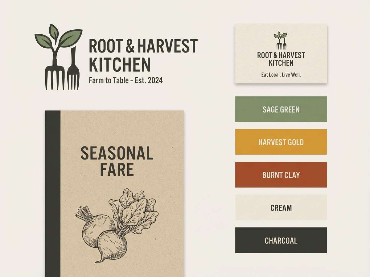
1) Golden Harvest
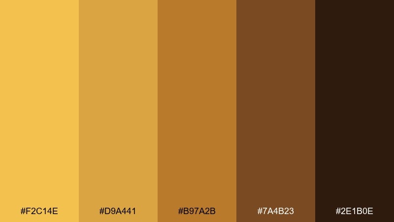
HEX: #F2C14E #D9A441 #B97A2B #7A4B23 #2E1B0E
Mood: sunny, grounded, rustic
Best for: farm-to-table restaurant branding
Sunny fields and worn wood textures come to mind, with bright grain tones settling into deep roasted browns. It works beautifully for restaurant logos, menus, and loyalty cards where warmth needs to feel authentic. Pair it with off-white paper textures and a simple slab serif to keep the look artisanal, not kitschy. Usage tip: reserve the darkest brown for type so the yellows stay clean and readable.
Image example of golden harvest generated using media.io
Media.io is an online AI studio for creating and editing video, image, and audio in your browser.

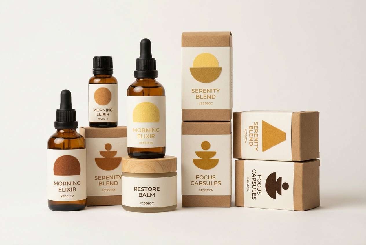
2) Desert Honey
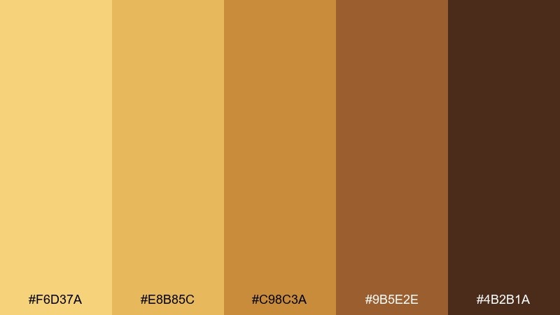
HEX: #F6D37A #E8B85C #C98C3A #9B5E2E #4B2B1A
Mood: warm, airy, sunlit
Best for: wellness product packaging
Soft desert light and honeyed glow set a calm, optimistic tone without feeling too sweet. These tones shine on minimalist packaging, especially for lotions, soaps, and natural supplements. Add a crisp white label and a small black accent for clarity and premium contrast. Usage tip: use the mid caramel shade for key icons so they stay visible on pale backgrounds.
Image example of desert honey generated using media.io
3) Maple Latte
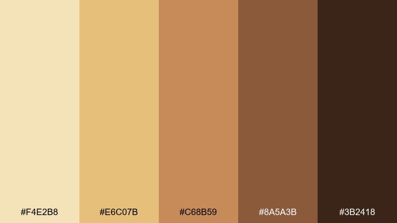
HEX: #F4E2B8 #E6C07B #C68B59 #8A5A3B #3B2418
Mood: cozy, creamy, inviting
Best for: cafe menu and signage
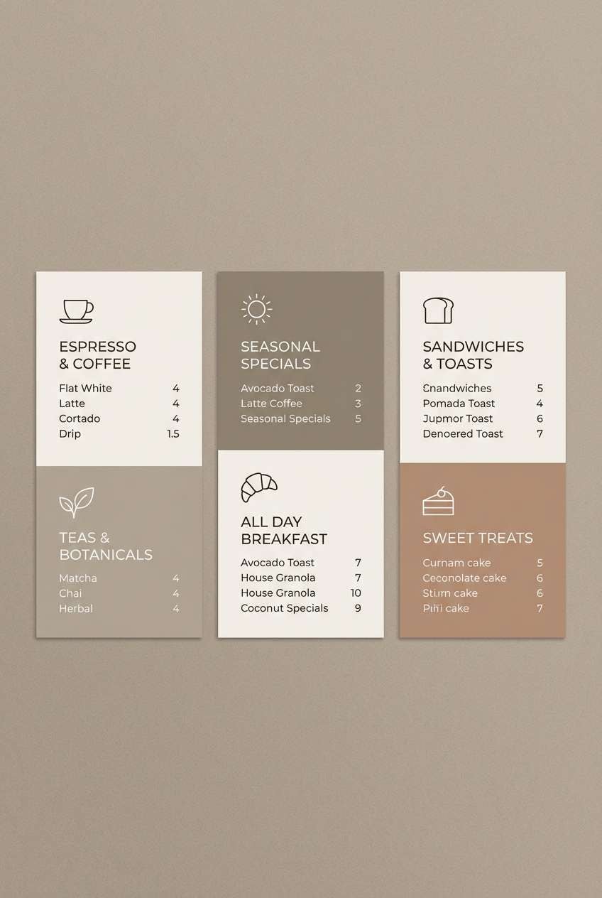
Cozy steam, maple sweetness, and a toasted finish give this mix an easygoing café vibe. As a yellow brown color palette, it supports menus, chalkboard-style signage, and loyalty stamps without overpowering food photography. Pair it with charcoal text and a small pop of sage green for a modern touch. Usage tip: keep the light cream as the main background to avoid a heavy, sepia look.
Image example of maple latte generated using media.io
4) Sunbaked Clay
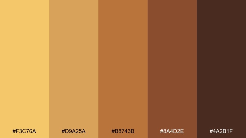
HEX: #F3C76A #D9A25A #B8743B #8A4D2E #4A2B1F
Mood: earthy, handcrafted, bold
Best for: artisan ceramics product ads
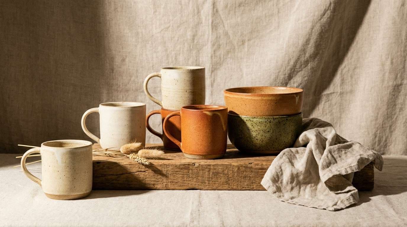
Sunbaked clay and kiln warmth make these tones feel tactile and handmade. They are a strong match for product ads featuring ceramics, leather goods, or woodworking. Combine with matte textures and simple layouts so the color story stays the hero. Usage tip: let the ochre act as a highlight on edges and rims, not a full background wash.
Image example of sunbaked clay generated using media.io
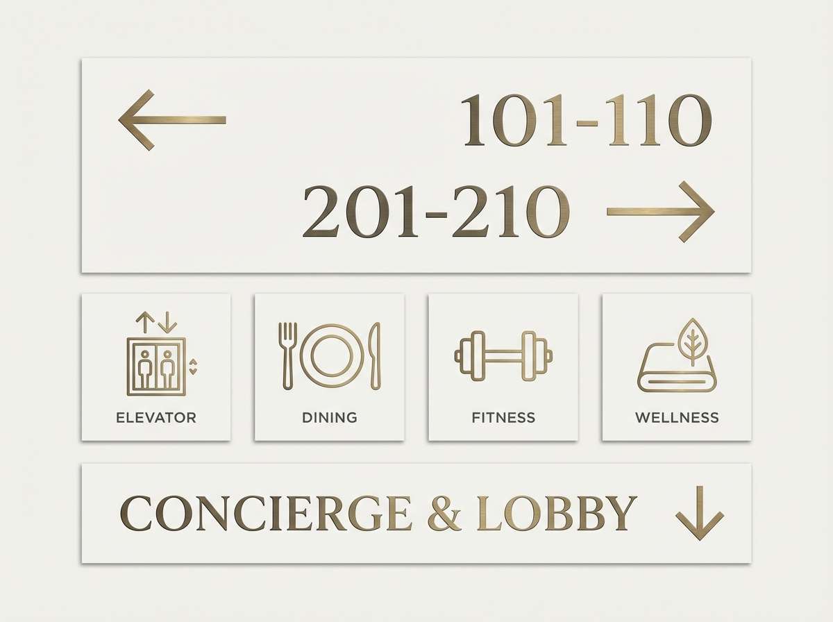
5) Antique Brass
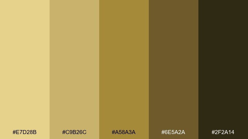
HEX: #E7D28B #C9B26C #A58A3A #6E5A2A #2F2A14
Mood: vintage, refined, moody
Best for: boutique hotel wayfinding
Aged metal and low lamplight create a refined, old-world mood that still reads modern. This set suits hotel signage, elevator plates, and printed directories where sophistication matters. Pair it with deep green or ink navy for extra richness and a subtle luxury cue. Usage tip: keep the darkest shade for icons and arrows so navigation remains crisp.
Image example of antique brass generated using media.io
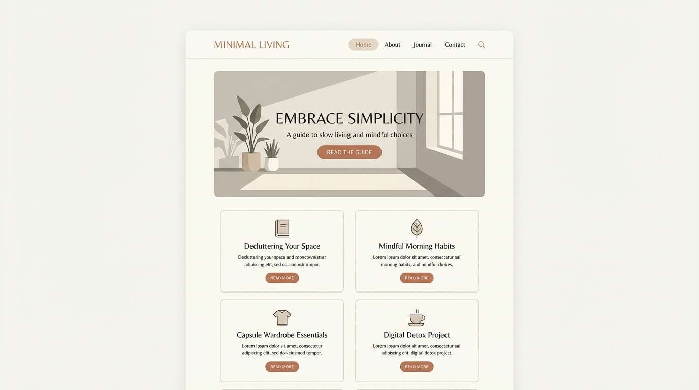
6) Wheatfield Neutrals
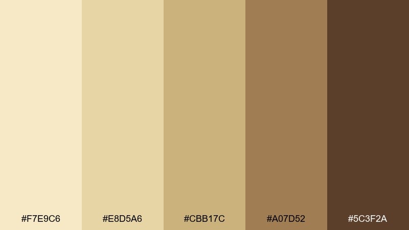
HEX: #F7E9C6 #E8D5A6 #CBB17C #A07D52 #5C3F2A
Mood: soft, natural, calming
Best for: minimalist lifestyle blog UI
Soft wheat and gentle tan shades feel calm, clean, and quietly organic. They are ideal for a reading-first layout like a lifestyle blog, newsletter, or recipe archive. Add a cool gray and plenty of white space to keep the interface from turning yellow. Usage tip: use the mid tan for secondary buttons while reserving the darkest brown for links and headings.
Image example of wheatfield neutrals generated using media.io
7) Amber Cabin
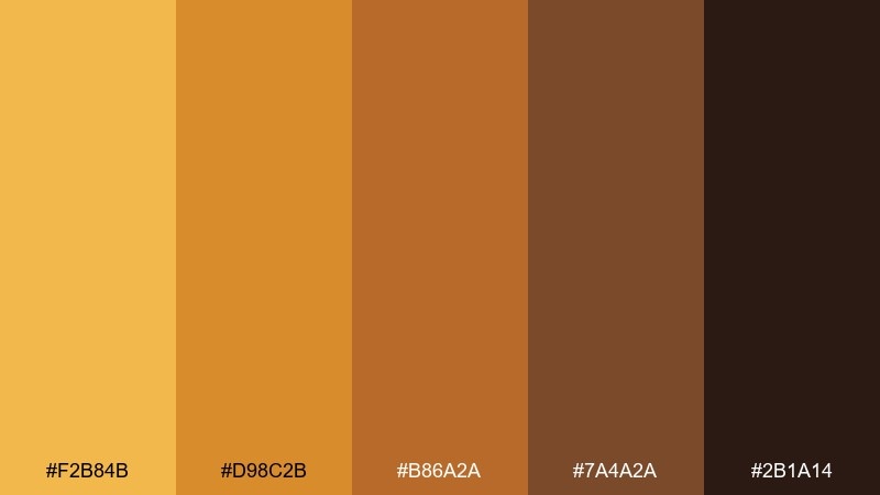
HEX: #F2B84B #D98C2B #B86A2A #7A4A2A #2B1A14
Mood: campfire, cozy, adventurous
Best for: outdoor gear landing page
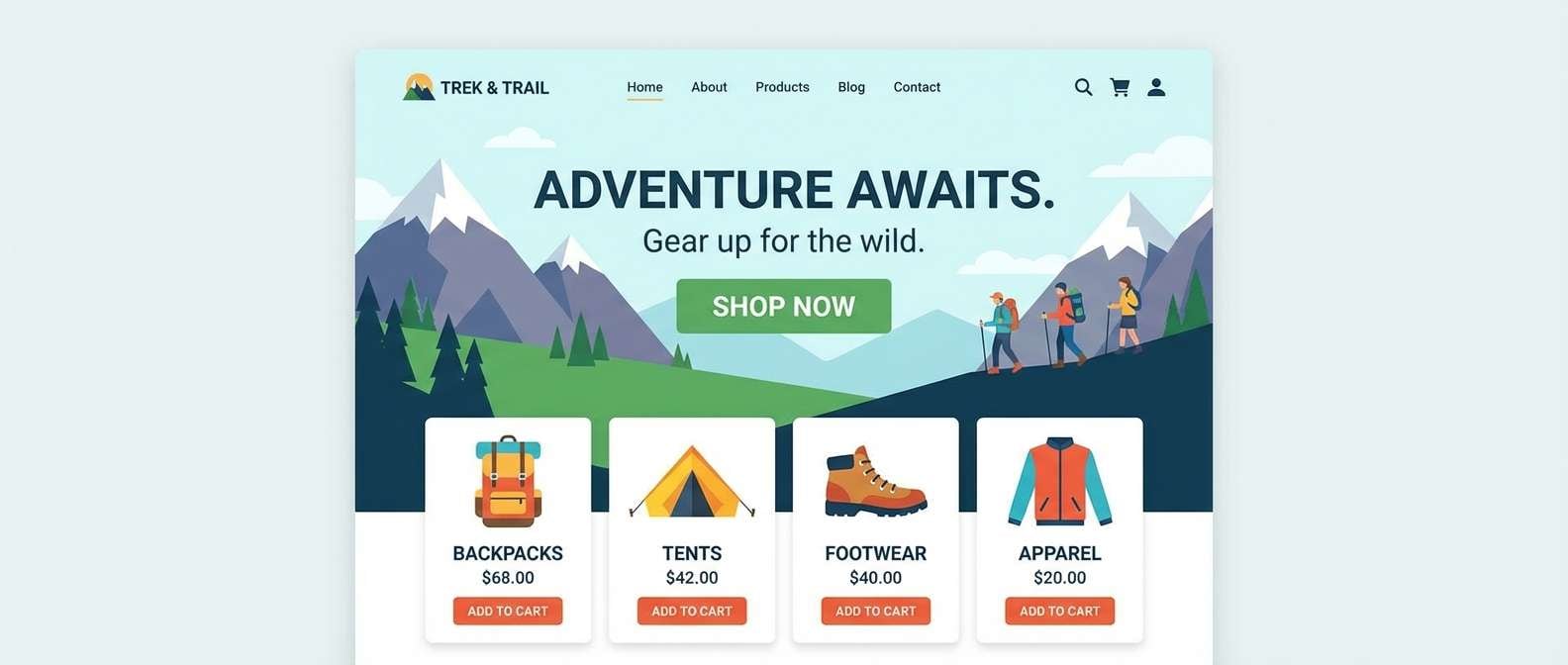
Campfire amber and worn leather browns bring instant cabin comfort with a hint of adventure. These yellow brown color combinations work especially well for outdoor brands that want warmth without losing grit. Pair them with slate gray UI elements and clear white type blocks for strong hierarchy. Usage tip: keep the bright amber to small accents like badges, ratings, and callouts so it feels premium.
Image example of amber cabin generated using media.io
8) Saffron Saddle
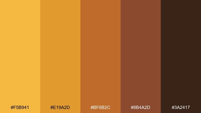
HEX: #F5B941 #E19A2D #BF6B2C #8B4A2D #3A2417
Mood: bold, sporty, confident
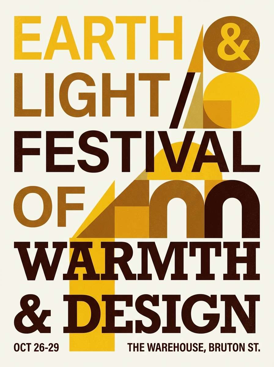
Best for: event poster design
Bright saffron energy meets saddle browns for a sporty, confident punch. It is a great fit for posters and flyers promoting local markets, music nights, or pop-up events. Pair it with a clean sans serif and generous negative space so the warm tones do not feel cramped. Usage tip: keep the strongest yellow for the headline or date, not for body copy.
Image example of saffron saddle generated using media.io
9) Honeyed Walnut

HEX: #F6D78B #D9B06A #B7803F #7B532C #3A2415
Mood: comforting, classic, upscale
Best for: furniture catalog editorial
Honeyed highlights over walnut depth feel classic and quietly upscale. This mix supports editorial layouts for furniture catalogs, lookbooks, and showroom brochures. Pair it with warm gray photography frames and minimal rules to keep the page airy. Usage tip: set captions in the medium brown rather than pure black for a softer, premium feel.
Image example of honeyed walnut generated using media.io
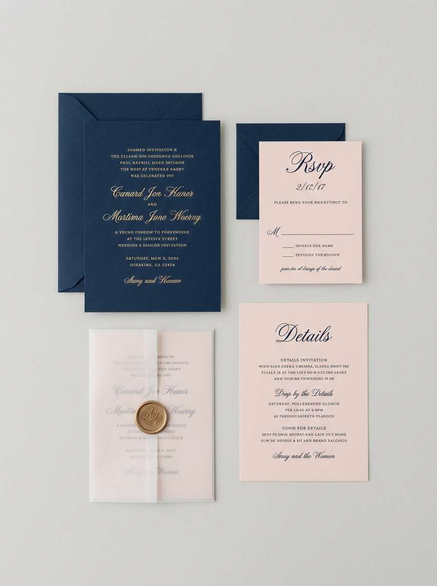
10) Canyon Paper
HEX: #F3E4C7 #E1C7A3 #C29B6A #8B6A44 #3D2A1C
Mood: muted, earthy, timeless
Best for: wedding invitation suite
Muted canyon neutrals feel like handmade paper and sun-faded sandstone. They are beautiful for wedding invitations, save-the-dates, and day-of stationery that leans natural and understated. Pair with a dusty rose accent or eucalyptus green for a romantic counterpoint. Usage tip: use the lightest cream as the print field to preserve legibility for fine scripts.
Image example of canyon paper generated using media.io
11) Marigold Mocha
HEX: #F2A93B #D9862B #A85E2A #6E3C2A #2B1B18
Mood: spicy, energetic, rich
Best for: coffee brand social ads
Spicy marigold and mocha depth create a rich, energetic feel that suits bold messaging. Use it for coffee promotions, seasonal campaigns, and social ad creatives where warmth should look appetizing. Pair with cream typography blocks and a touch of deep teal for modern contrast. Usage tip: keep backgrounds darker and let marigold appear as stickers, price tags, or highlights.
Image example of marigold mocha generated using media.io
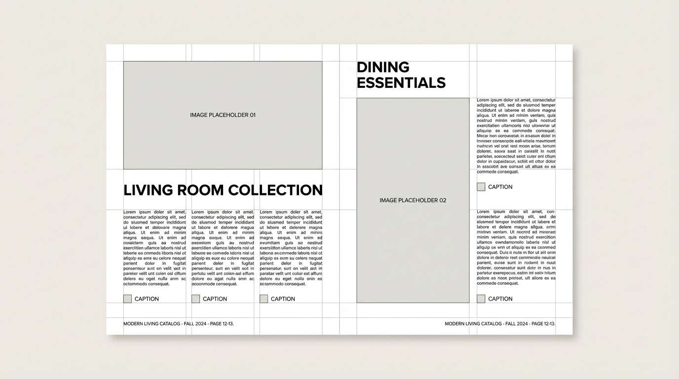
12) Rustic Linen
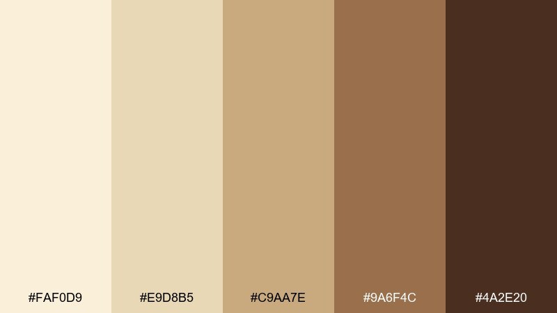
HEX: #FAF0D9 #E9D8B5 #C9AA7E #9A6F4C #4A2E20
Mood: light, organic, homey
Best for: kitchen and dining interiors moodboard
Light linen tones and soft browns evoke a breezy, lived-in kitchen with natural textiles. They work well on an interior moodboard for dining spaces, breakfast nooks, and warm modern farmhouse rooms. Pair with matte black hardware and pale oak to keep it current. Usage tip: repeat the medium tan in rugs and wood accents to unify the room.
Image example of rustic linen generated using media.io
13) Burnished Ochre
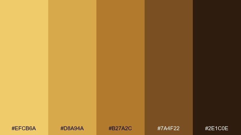
HEX: #EFCB6A #D8A94A #B27A2C #7A4F22 #2E1C0E
Mood: heritage, warm, textured
Best for: museum exhibit graphics
Burnished ochre and deep brown feel like aged maps and archival prints. This set is ideal for exhibit panels, labels, and interpretive signage where a heritage mood supports the story. Pair with off-white backgrounds and restrained line icons for clarity. Usage tip: use the darkest shade for body text to maintain contrast under gallery lighting.
Image example of burnished ochre generated using media.io
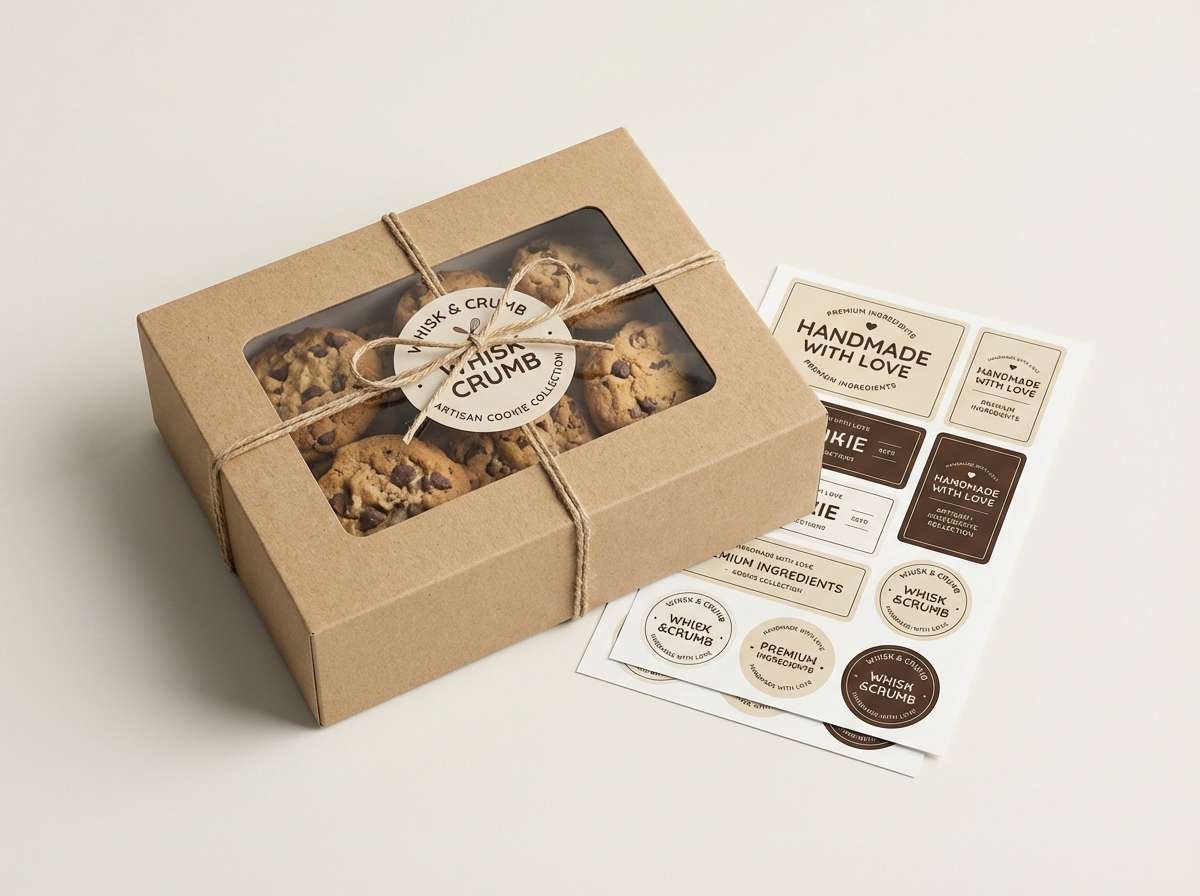
14) Buttered Toffee
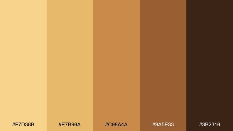
HEX: #F7D38B #E7B96A #C98A4A #9A5E33 #3B2316
Mood: sweet, friendly, nostalgic
Best for: bakery packaging and labels
Buttered toffee warmth feels friendly and nostalgic, like fresh pastries in a paper bag. These yellow brown color combinations are a natural fit for bakery labels, cookie tins, and seasonal gift boxes. Pair with a creamy background and a small accent of cranberry red for appetite appeal. Usage tip: print the darkest brown for fine lines and ingredients so text stays sharp on textured paper.
Image example of buttered toffee generated using media.io
15) Dune Spice
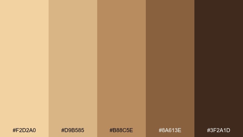
HEX: #F2D2A0 #D9B585 #B88C5E #8A613E #3F2A1D
Mood: calm, sun-warmed, modern
Best for: skincare e-commerce UI
Sun-warmed dune neutrals feel calm and modern, with just enough spice to avoid flat beige. They are great for skincare shops and boutique e-commerce where trust and softness matter. Pair with a cool off-black for text and a pale blush for subtle calls to action. Usage tip: keep product cards white or very light so images do not look tinted.
Image example of dune spice generated using media.io
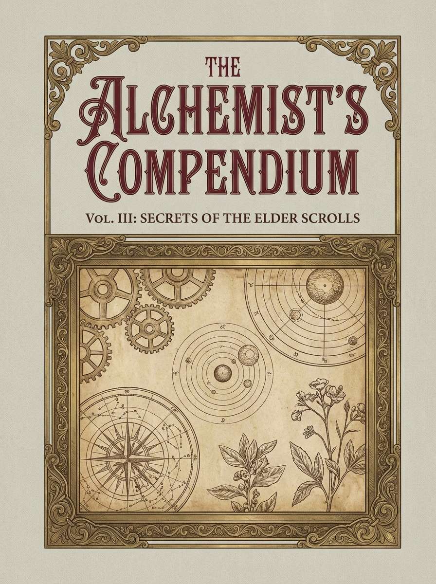
16) Vintage Ledger
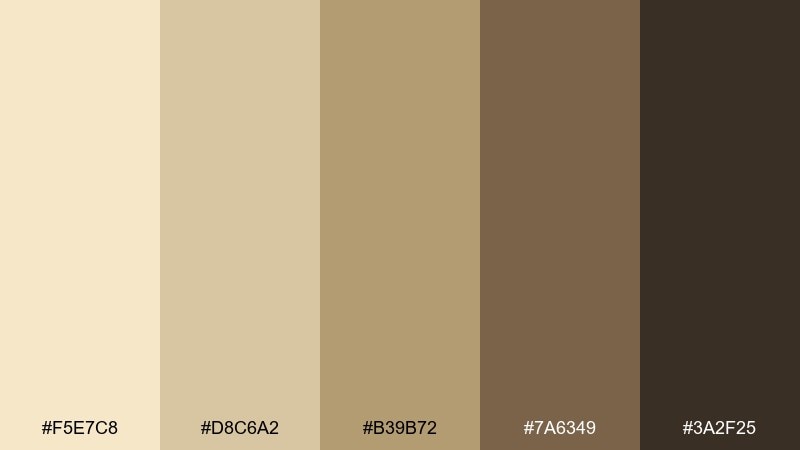
HEX: #F5E7C8 #D8C6A2 #B39B72 #7A6349 #3A2F25
Mood: academic, archival, understated
Best for: book cover and spine design
Faded parchment and inked browns evoke old ledgers, library stacks, and quiet study rooms. This is a strong choice for book covers, spines, and series branding that needs an archival mood. Pair with a deep forest accent and textured grain for a tactile finish. Usage tip: use the darkest tone for title typography and keep the rest as subtle blocks behind it.
Image example of vintage ledger generated using media.io
17) Autumn Carton
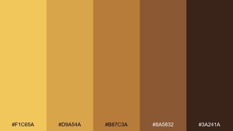
HEX: #F1C65A #D9A54A #B87C3A #8A5832 #3A241A
Mood: playful, autumnal, bold
Best for: subscription box design
Autumn brightness with sturdy browns feels playful, like a seasonal box reveal. It fits subscription packaging, insert cards, and unboxing graphics that need clear hierarchy. Pair with white space and a single contrasting accent like cobalt for a modern twist. Usage tip: use the mid brown for outlines and dielines so the carton structure reads cleanly.
Image example of autumn carton generated using media.io
18) Prairie Picnic
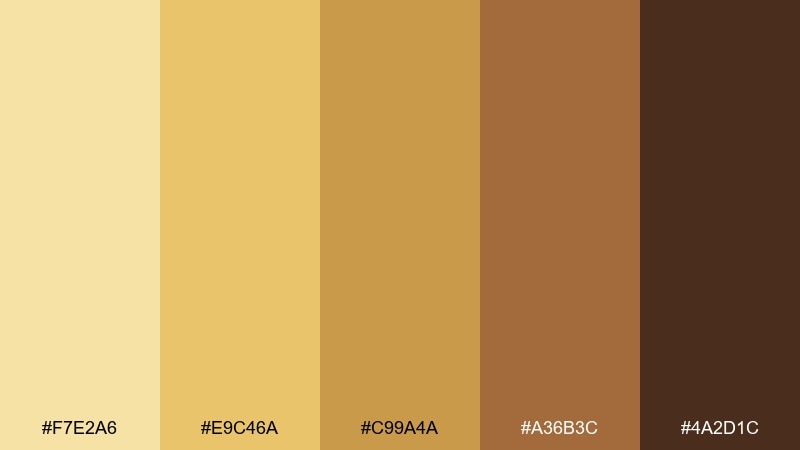
HEX: #F7E2A6 #E9C46A #C99A4A #A36B3C #4A2D1C
Mood: cheerful, wholesome, sunny
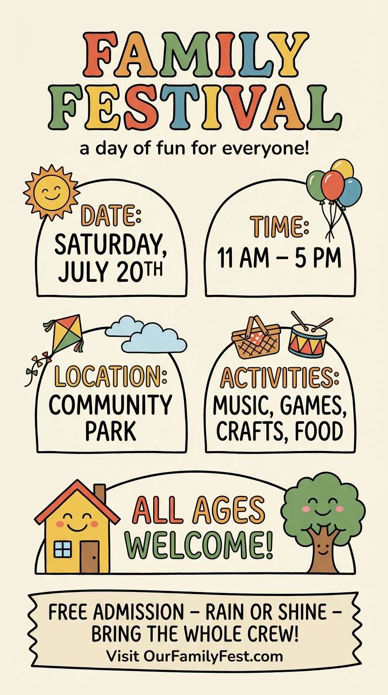
Best for: family festival flyer
Cheerful prairie sunshine and caramel browns feel wholesome and welcoming. This set is great for a family festival flyer, community market signage, or school event materials. Pair it with a friendly rounded sans and simple illustrated icons to keep things accessible. Usage tip: keep body text dark and save the brightest yellow for callouts like dates and locations.
Image example of prairie picnic generated using media.io
19) Sepia Sunrise
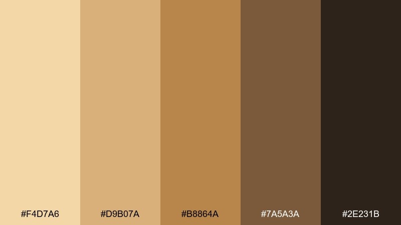
HEX: #F4D7A6 #D9B07A #B8864A #7A5A3A #2E231B
Mood: soft, nostalgic, cinematic
Best for: photo portfolio website theme
Sepia warmth and sunrise softness create a nostalgic, cinematic mood that flatters portraits and travel stories. These tones work well for a photo portfolio theme when you want the UI to feel gentle, not stark. Pair with a clean white and a restrained accent like muted teal to keep it contemporary. Usage tip: use the lightest shade for page backgrounds and keep filters minimal so photos retain true color.
Image example of sepia sunrise generated using media.io
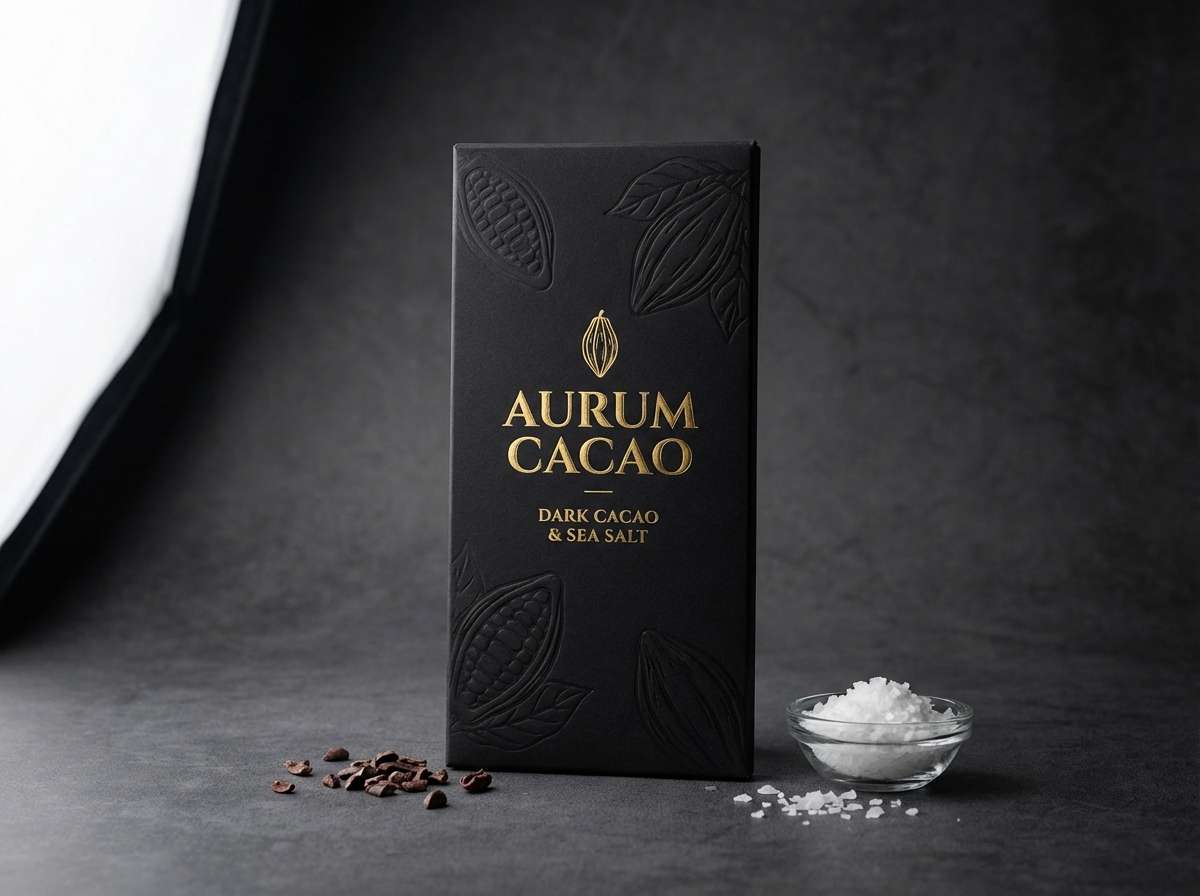
20) Cocoa Sunbeam
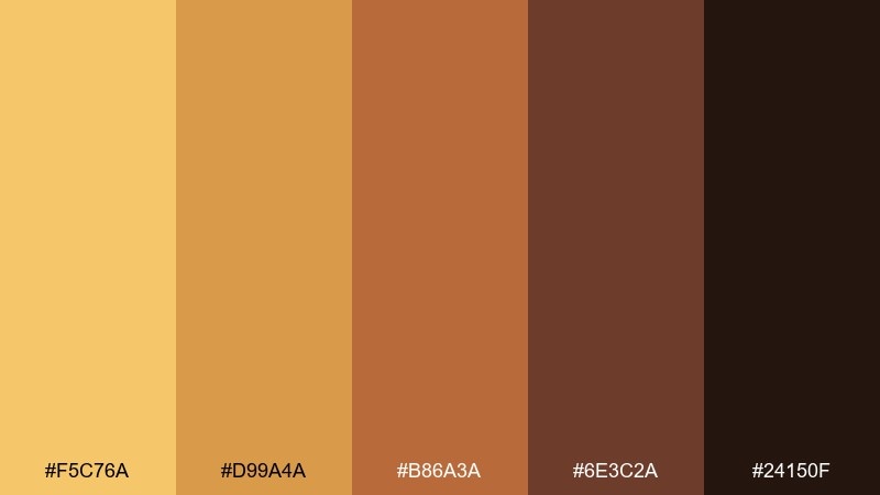
HEX: #F5C76A #D99A4A #B86A3A #6E3C2A #24150F
Mood: rich, dramatic, inviting
Best for: chocolate product ad
A sunbeam of gold cutting through cocoa depth feels rich and dramatic, perfect for indulgent storytelling. Use it for chocolate ads, seasonal gift campaigns, or premium confectionery packaging. Pair with matte black and a touch of cream to heighten contrast and make highlights glow. Usage tip: place the golden tone near the product edge as a rim light cue while keeping the rest deep and velvety.
Image example of cocoa sunbeam generated using media.io
What Colors Go Well with Yellow Brown?
Yellow brown pairs beautifully with crisp neutrals like warm white, ivory, and soft stone gray, which help the palette feel clean instead of heavy. For typography, deep espresso or near-black keeps contrast strong without clashing.
For modern contrast, try cool accents such as teal, slate blue, ink navy, or eucalyptus green. These hues sit opposite the warmth and make the gold tones look brighter and more intentional.
If you want a softer, lifestyle-friendly look, add muted pinks (dusty rose or blush) or clay terracotta accents. They stay in the earthy family while giving you a gentle highlight color.
How to Use a Yellow Brown Color Palette in Real Designs
Start by assigning roles: use the lightest cream for backgrounds, mid tans/caramels for surfaces and cards, and reserve the darkest brown for headings, icons, and body text. This keeps the palette readable and structured.
To avoid a “sepia filter” effect, introduce white space and at least one cool counterbalance (like teal or blue-gray). In UI, keep product/image areas neutral so photos don’t pick up a yellow cast.
For print and packaging, lean on texture: uncoated paper, subtle grain, matte finishes, and minimal linework make yellow brown tones feel premium and tactile rather than flat.
Create Yellow Brown Palette Visuals with AI
Need on-brand mockups fast? You can generate posters, packaging, UI screens, and moodboards in the same yellow brown tone range by describing your subject and adding your preferred palette cues.
Use your HEX codes as a reference, then refine with prompts like “warm neutral lighting,” “matte paper texture,” or “minimalist layout” to control how golden or cocoa-heavy the final image feels.
When you find a look you like, iterate: keep the same prompt structure and swap one accent color (teal, navy, blush) to test contrast options across ads, landing pages, and social posts.
Yellow Brown Color Palette FAQs
-
What is a yellow brown color palette?
A yellow brown color palette mixes warm yellows (mustard, saffron, amber, ochre) with brown neutrals (tan, caramel, walnut, cocoa) to create an earthy, grounded scheme that’s easy to apply to branding, UI, and interiors. -
Are yellow brown palettes good for modern brands?
Yes—pair warm yellows and browns with lots of white space, clean sans-serif type, and a cool accent (teal, slate blue, or ink navy) to make the look feel contemporary rather than vintage. -
How do I keep a yellow brown scheme from looking “muddy”?
Increase contrast and clarity: use a light cream background, limit mid-tone browns, and reserve the darkest brown for text/icons. Adding a cool accent color also prevents everything from blending together. -
What text color works best on yellow brown backgrounds?
Deep espresso or near-black typically reads best. On darker cocoa tones, use warm white/cream for text, and avoid pure bright yellow for long paragraphs because it reduces readability. -
What accent colors complement yellow brown?
Teal, muted turquoise, navy, forest green, and blue-gray are strong complements. For a softer vibe, dusty rose or blush can work as a gentle accent without breaking the earthy mood. -
Is yellow brown a good choice for packaging?
It’s one of the most reliable packaging families for “natural,” “artisan,” and “premium” cues. Use matte finishes, uncoated papers, and minimal typography, then highlight key info with a brighter amber or marigold. -
Can I generate yellow brown palette mockups with AI?
Yes—describe the design (packaging, poster, UI, moodboard) and specify warm neutral lighting or textured materials. Then iterate by changing one accent color to explore different brand moods quickly.


