

A yellow blue color palette is one of the easiest ways to get instant contrast that still feels friendly. Yellow brings warmth and attention, while blue adds calm structure and trust.
Below are 20 fresh yellow and blue palette ideas (with HEX codes) you can use for branding, UI, posters, packaging, and print—plus quick tips for readability and accessibility.
In this article
- Why Yellow Blue Palettes Work So Well
-
- sunlit harbor
- lemon denim
- riviera postcard
- golden hour sky
- citrus nautical
- buttercup blueprint
- saffron surf
- canary ink
- daffodil slate
- mango cobalt pop
- warm sand & sea
- school bus & oxford
- honeyed cerulean
- pastel picnic
- solar tech
- sunflower porcelain
- misty marina
- retro primary punch
- blue hour sunbeam
- coastal minimal
- What Colors Go Well with Yellow Blue?
- How to Use a Yellow Blue Color Palette in Real Designs
- Create Yellow Blue Palette Visuals with AI
Why Yellow Blue Palettes Work So Well
Yellow and blue naturally balance each other: yellow feels energetic and optimistic, while blue feels steady and dependable. Together, they create a clear visual hierarchy—perfect for designs that need both friendliness and structure.
From a usability standpoint, many yellow/blue pairings deliver strong separation between accents and foundations. That makes it easier to highlight calls to action, labels, and important UI states without overwhelming the page.
In print and branding, this duo is also flexible: it can read coastal and casual, premium and nautical, or modern and tech-forward depending on the shade choices and neutrals you add.
20+ Yellow Blue Color Palette Ideas (with HEX Codes)
1) Sunlit Harbor
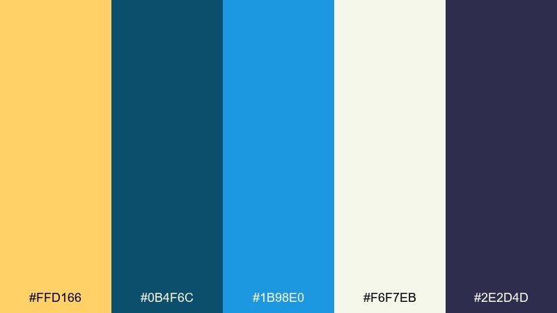
HEX: #FFD166 #0B4F6C #1B98E0 #F6F7EB #2E2D4D
Mood: coastal, optimistic, crisp
Best for: travel website hero banner
Coastal and optimistic, it feels like sunlight on a pier with deep water in the distance. Use the bright yellow for calls to action and keep the darker navy for headlines to lock in readability. Pair it with plenty of white space and light neutrals to avoid visual noise. Tip: reserve the vivid blue for hover states so the interface still feels calm.
Image example of sunlit harbor generated using media.io
Media.io is an online AI studio for creating and editing video, image, and audio in your browser.

2) Lemon Denim
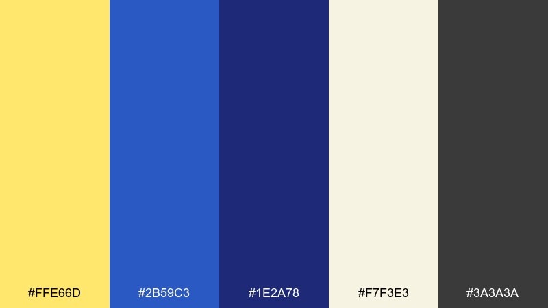
HEX: #FFE66D #2B59C3 #1E2A78 #F7F3E3 #3A3A3A
Mood: casual, youthful, confident
Best for: streetwear brand lookbook
Casual and youthful, it brings to mind sun-faded tees with dark denim and clean stitching. These yellow blue color combinations work well for bold type, badges, and price callouts without feeling too loud. Balance the contrast with off-white backgrounds and charcoal text for a more editorial finish. Tip: keep yellow on smaller elements so the deep blues stay in control.
Image example of lemon denim generated using media.io
3) Riviera Postcard
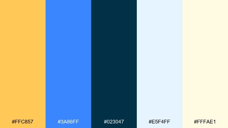
HEX: #FFC857 #3A86FF #023047 #E5F4FF #FFFAE1
Mood: sunny, retro, breezy
Best for: summer event flyer
Sunny and a little retro, it evokes postcard skies, beach umbrellas, and bold travel stamps. The light blue works as an airy backdrop while the navy gives your typography a confident anchor. Pair with simple geometric shapes and a single display font to keep it playful, not busy. Tip: add a thin navy border to frame the flyer and improve legibility.
Image example of riviera postcard generated using media.io
4) Golden Hour Sky
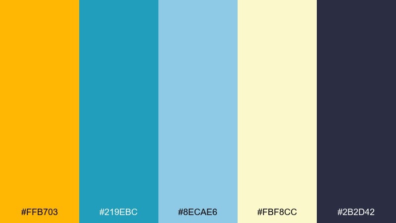
HEX: #FFB703 #219EBC #8ECAE6 #FBF8CC #2B2D42
Mood: warm, airy, uplifting
Best for: wellness app UI
Warm and airy, it feels like late-afternoon light drifting into a clear sky. Use the pale blues for panels and cards, then pull the golden tone into progress rings and key actions. Pair it with simple line icons and generous spacing for a soothing experience. Tip: keep body text in the charcoal shade to meet contrast needs on light blue surfaces.
Image example of golden hour sky generated using media.io
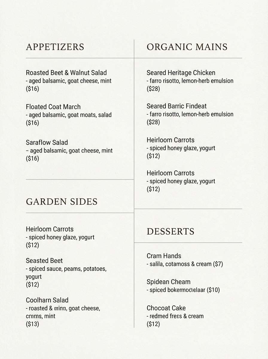
5) Citrus Nautical
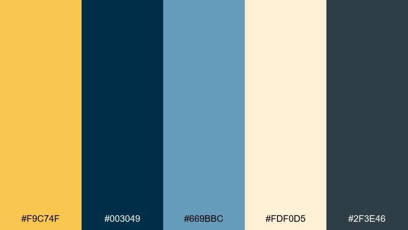
HEX: #F9C74F #003049 #669BBC #FDF0D5 #2F3E46
Mood: classic, maritime, grounded
Best for: restaurant menu design
Classic and maritime, it suggests brass details, navy aprons, and citrus garnishes on the bar. The creamy neutral keeps the page feeling premium while the yellow highlights specials and section titles. Pair it with serif headers and minimal divider lines for a polished menu. Tip: limit the mid-blue to small icons or bullets so the navy remains the main anchor.
Image example of citrus nautical generated using media.io
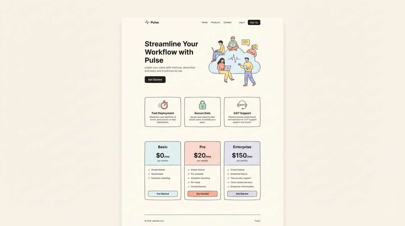
6) Buttercup Blueprint
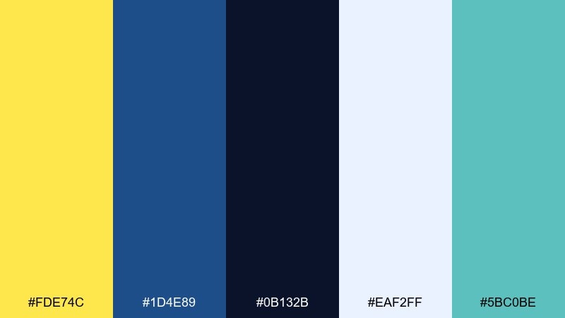
HEX: #FDE74C #1D4E89 #0B132B #EAF2FF #5BC0BE
Mood: energetic, technical, modern
Best for: SaaS landing page
Energetic and technical, it looks like bright sticky notes over a blueprint grid. This yellow blue color palette is ideal for feature callouts, icons, and trust badges where you want clarity fast. Pair it with cool whites and subtle shadows for a product-led feel. Tip: use the teal sparingly as a secondary accent so the primary contrast stays consistent.
Image example of buttercup blueprint generated using media.io
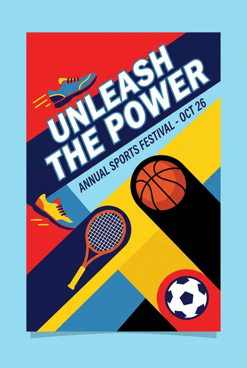
7) Saffron Surf
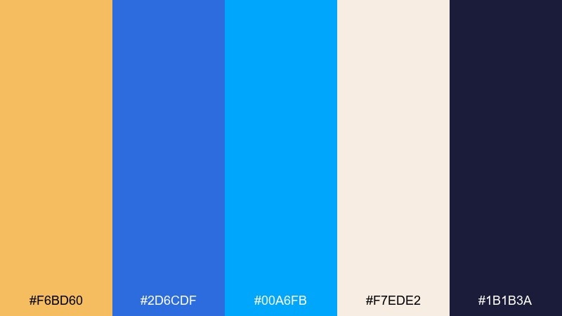
HEX: #F6BD60 #2D6CDF #00A6FB #F7EDE2 #1B1B3A
Mood: sporty, bright, upbeat
Best for: sports poster
Sporty and upbeat, it brings the energy of surfboards, jerseys, and sun-warmed sand. The electric blues give motion and impact, while the warm saffron keeps the look friendly. Pair with bold condensed type and high-contrast shapes for instant readability from a distance. Tip: set the background in off-white and let the darker indigo handle all small text.
Image example of saffron surf generated using media.io
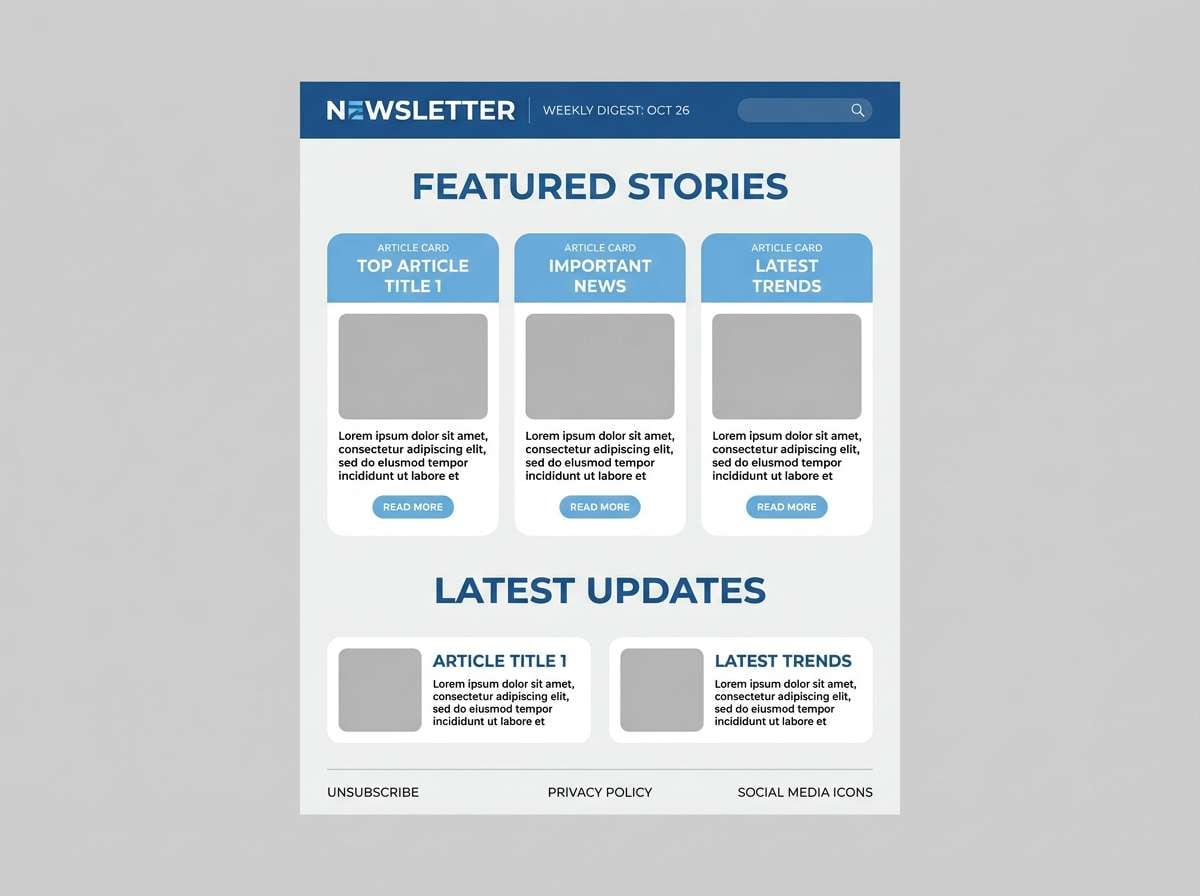
8) Canary Ink
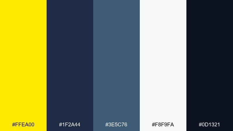
HEX: #FFEA00 #1F2A44 #3E5C76 #F8F9FA #0D1321
Mood: high-contrast, editorial, sleek
Best for: news newsletter template
High-contrast and editorial, it feels like bright highlighter on a dark ink page. Use the canary tone for tags, breaking labels, and key links so scanning stays effortless. Pair with clean sans-serif type and strict spacing to keep the layout sharp. Tip: avoid large yellow blocks; a small accent is enough to guide attention.
Image example of canary ink generated using media.io
9) Daffodil Slate
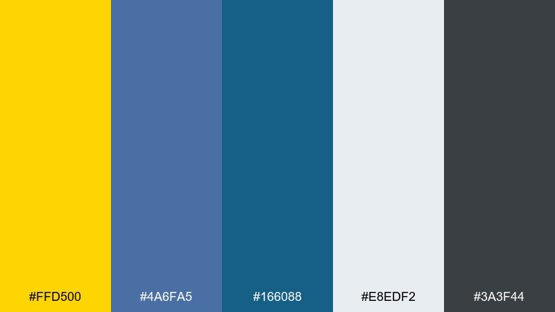
HEX: #FFD500 #4A6FA5 #166088 #E8EDF2 #3A3F44
Mood: practical, calm, dependable
Best for: corporate presentation deck
Practical and calm, it suggests a confident workspace with a pop of optimism. The slate tones keep charts and tables easy to read, while the daffodil accent highlights takeaways. Pair it with simple data visualizations and restrained iconography for a polished deck. Tip: use the darkest gray for body copy and reserve blue for headings and chart series.
Image example of daffodil slate generated using media.io
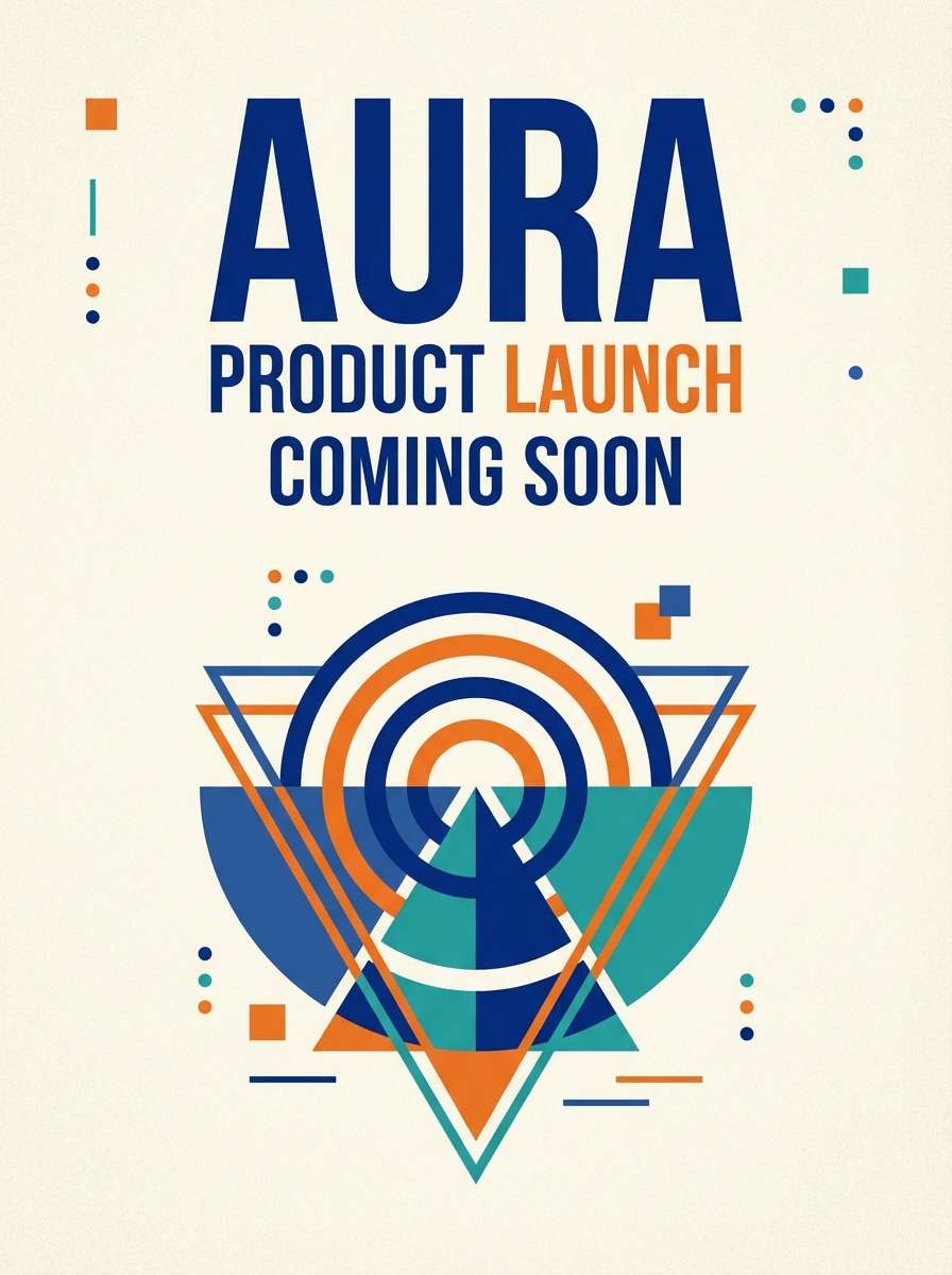
10) Mango Cobalt Pop
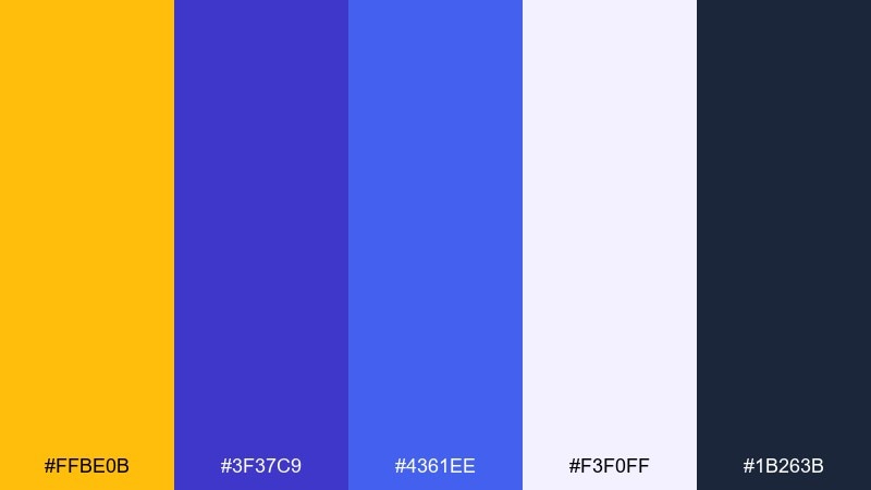
HEX: #FFBE0B #3F37C9 #4361EE #F3F0FF #1B263B
Mood: bold, playful, high-impact
Best for: product launch ad
Bold and playful, it feels like neon signage against a night sky. Yellow blue color combinations like these are great for launch ads where you need immediate contrast and a modern edge. Pair with large type, simple shapes, and plenty of negative space so the colors do the talking. Tip: keep shadows subtle and rely on the deep navy for structure.
Image example of mango cobalt pop generated using media.io
11) Warm Sand & Sea
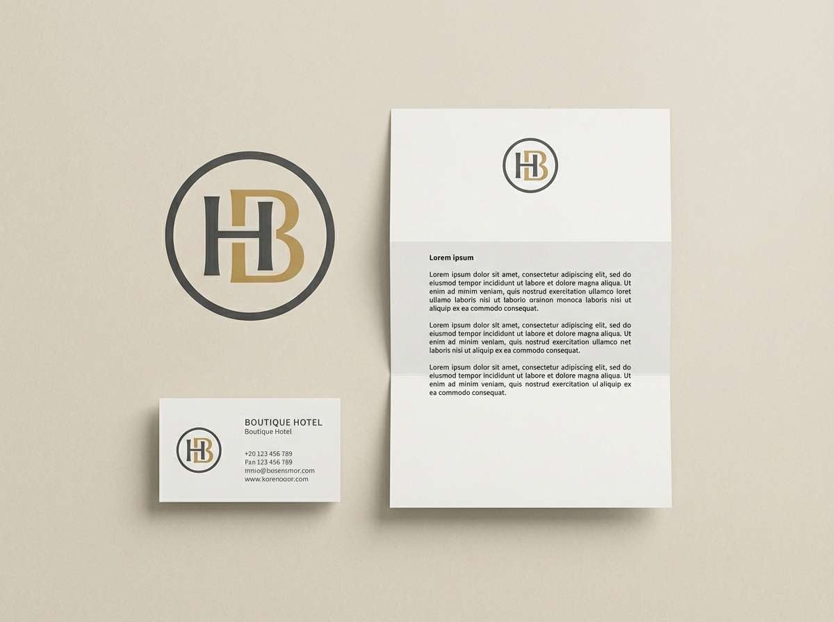
HEX: #F4D35E #2E86AB #0A2342 #FFFBEA #7A7A7A
Mood: relaxed, natural, inviting
Best for: boutique hotel branding
Relaxed and inviting, it recalls sunlit sand, sea glass, and deep evening water. The warm yellow reads as hospitality and welcome, while the navy adds a premium tone for logos and stationery. Pair it with textured paper or subtle grain to lean into the boutique feel. Tip: use the gray for secondary copy so the palette stays soft and balanced.
Image example of warm sand & sea generated using media.io
12) School Bus & Oxford
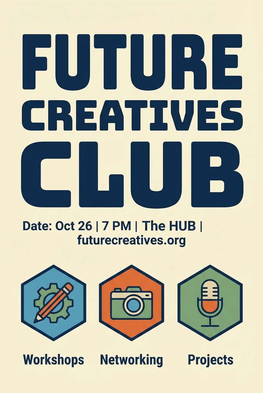
HEX: #FFD60A #001D3D #003566 #E9ECEF #212529
Mood: authoritative, sporty, timeless
Best for: university club poster
Authoritative and timeless, it channels varsity banners and crisp campus signage. The strong navy makes headings feel official, while the bright yellow boosts visibility for dates and locations. Pair with blocky sans-serif fonts and a simple grid for a confident layout. Tip: avoid thin lines in yellow; use thicker strokes so it stays readable from afar.
Image example of school bus & oxford generated using media.io
13) Honeyed Cerulean
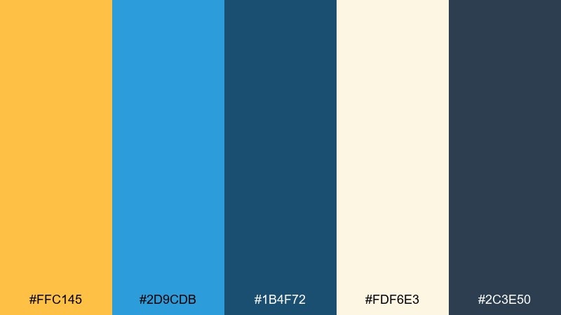
HEX: #FFC145 #2D9CDB #1B4F72 #FDF6E3 #2C3E50
Mood: friendly, bright, polished
Best for: ecommerce category page
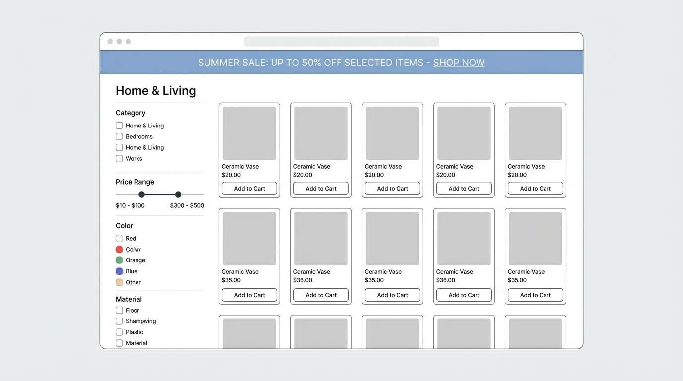
Friendly and polished, it feels like honey drizzle over clean ceramic with a bright splash of sky. The cerulean is perfect for links, filters, and navigation states, while the honey tone draws attention to deals. Pair it with warm off-white backgrounds to keep product photos looking natural. Tip: use the deep blue for price text to maintain contrast on pale sections.
Image example of honeyed cerulean generated using media.io
14) Pastel Picnic
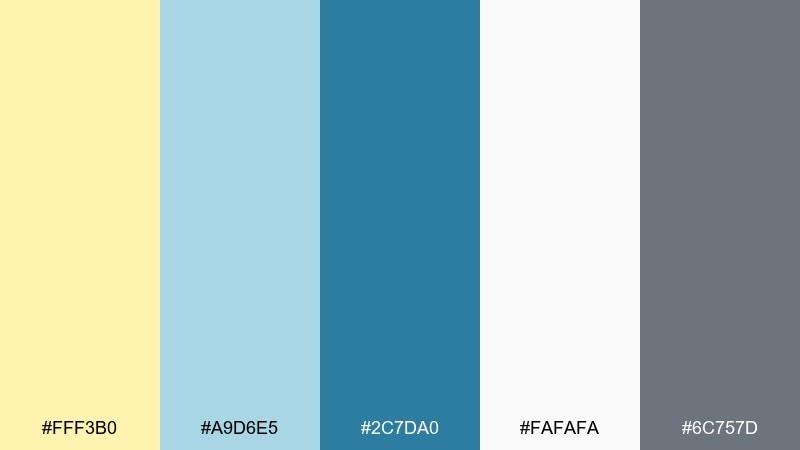
HEX: #FFF3B0 #A9D6E5 #2C7DA0 #FAFAFA #6C757D
Mood: soft, airy, approachable
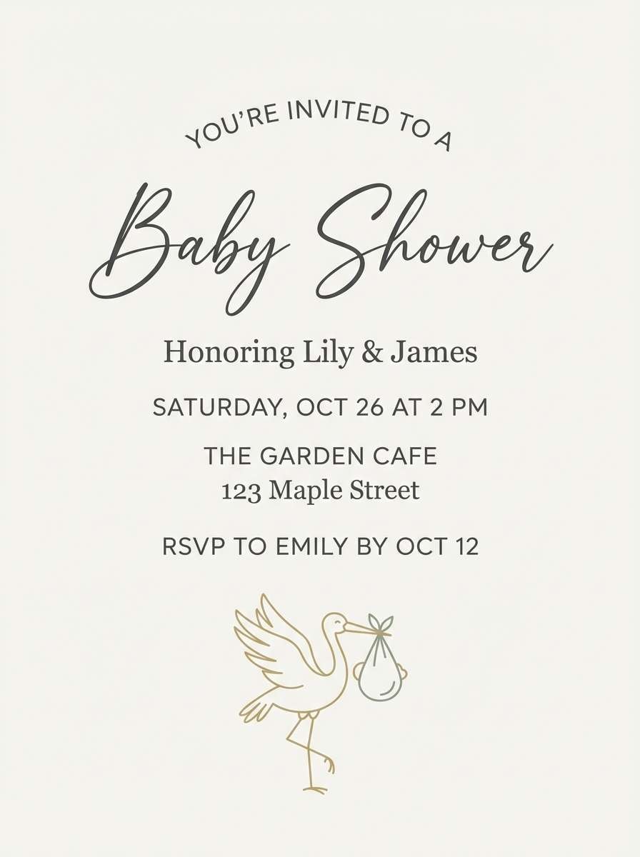
Best for: baby shower invitation
Soft and airy, it evokes a picnic blanket, light sky, and gentle afternoon sun. Use the pastel yellow for borders and small motifs, then lean on the mid-blue for names and key details. Pair with delicate line art and rounded typography for a warm, welcoming tone. Tip: keep the gray for secondary info so the main text remains crisp.
Image example of pastel picnic generated using media.io
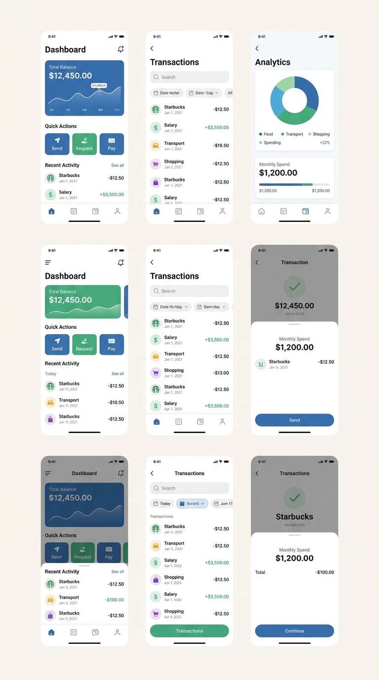
15) Solar Tech
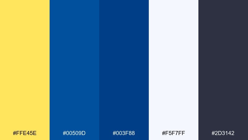
HEX: #FFE45E #00509D #003F88 #F5F7FF #2D3142
Mood: clean, futuristic, confident
Best for: fintech mobile app UI
Clean and futuristic, it brings to mind bright status lights against a deep control panel. A yellow blue color palette like this suits fintech screens where clarity and trust matter. Pair it with cool whites, thin dividers, and consistent icon weights for a tidy system. Tip: use the yellow only for success states and primary actions to keep the UI disciplined.
Image example of solar tech generated using media.io
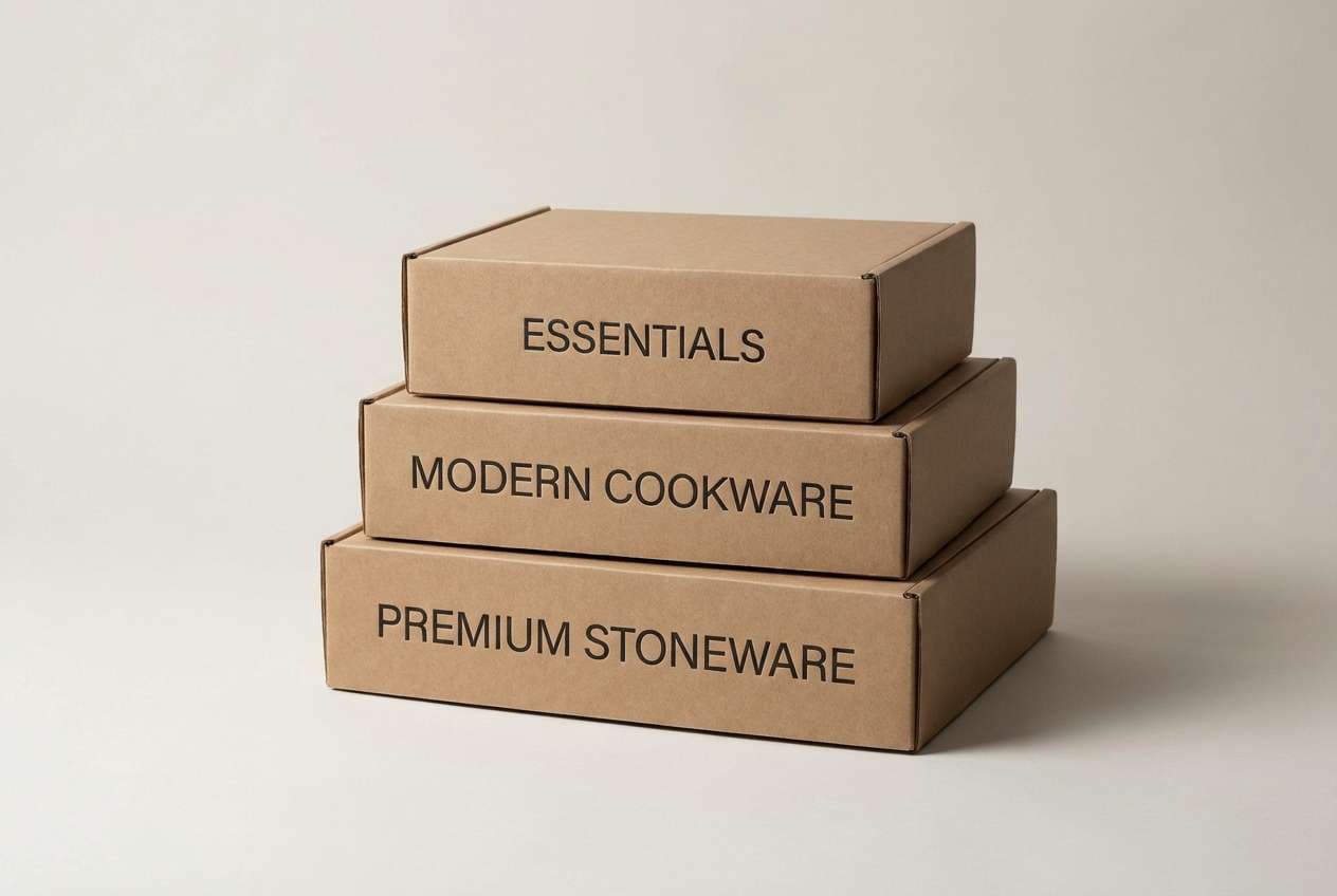
16) Sunflower Porcelain
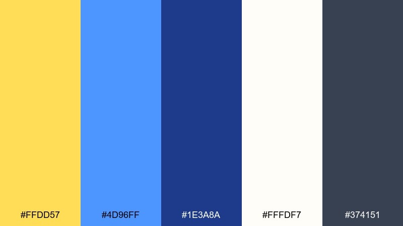
HEX: #FFDD57 #4D96FF #1E3A8A #FFFDF7 #374151
Mood: fresh, tidy, modern-classic
Best for: kitchenware packaging
Fresh and tidy, it feels like bright sunflowers beside glossy porcelain. Use the white and soft yellow for clean packaging space, and bring in the stronger blues for labels and product names. Pair with minimal patterns and clear hierarchy so it reads premium, not busy. Tip: keep barcodes and legal text in the dark gray to avoid harsh contrast blocks.
Image example of sunflower porcelain generated using media.io
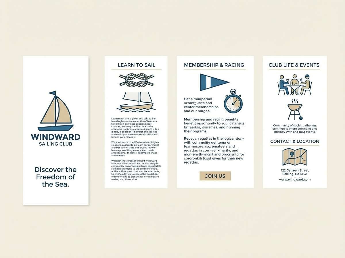
17) Misty Marina
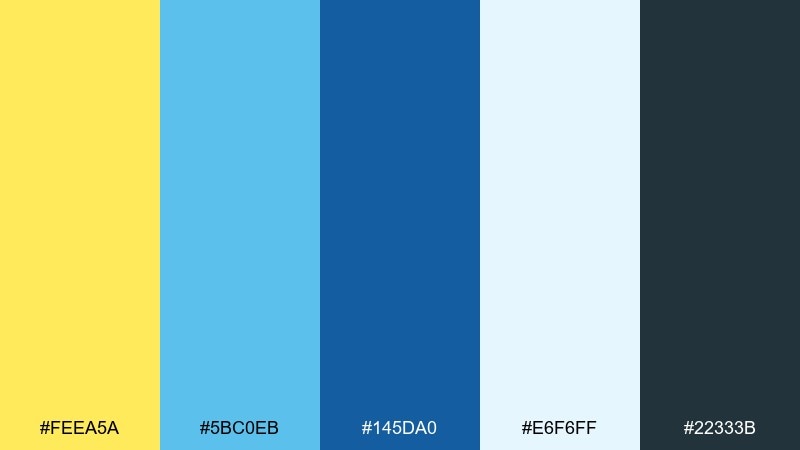
HEX: #FEEA5A #5BC0EB #145DA0 #E6F6FF #22333B
Mood: cool, breezy, refreshing
Best for: sailing club brochure
Cool and breezy, it suggests early-morning mist over docks and clear water beyond. The pale blue is ideal for large brochure panels, while the deeper blue keeps headlines and captions legible. Pair it with plenty of whitespace and simple nautical icons for an easy read. Tip: use the yellow as a navigation cue for sections and page numbers.
Image example of misty marina generated using media.io
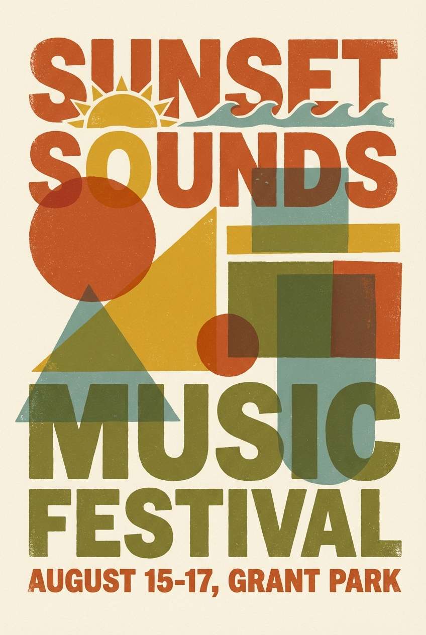
18) Retro Primary Punch
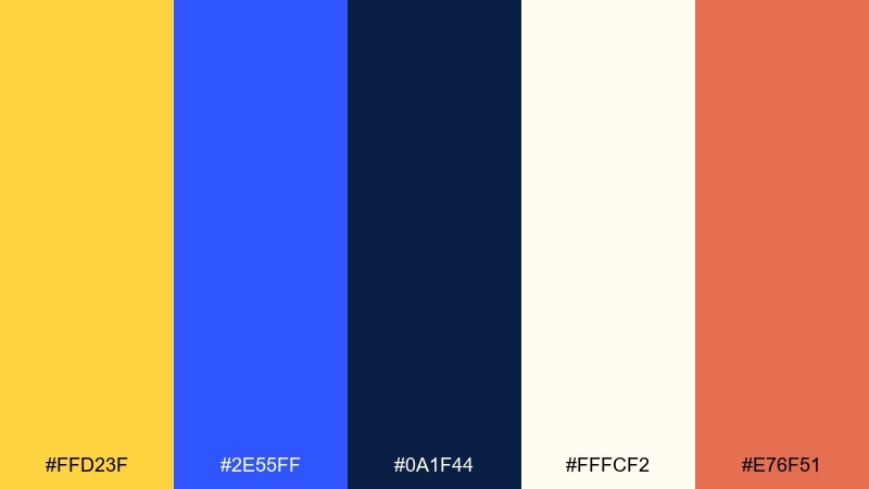
HEX: #FFD23F #2E55FF #0A1F44 #FFFCF2 #E76F51
Mood: retro, punchy, playful
Best for: music festival poster
Retro and punchy, it feels like screen-printed posters and late-night neon. Yellow blue color combinations shine here when you want loud hierarchy and quick wayfinding for stages and times. Pair with chunky type, halftone textures, and a limited set of shapes to keep it cohesive. Tip: use the orange as a third accent only for headliners so it stays special.
Image example of retro primary punch generated using media.io
19) Blue Hour Sunbeam
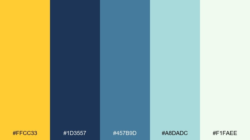
HEX: #FFCC33 #1D3557 #457B9D #A8DADC #F1FAEE
Mood: cinematic, calm, thoughtful
Best for: book cover design
Cinematic and calm, it evokes the moment right after sunset when one last warm beam cuts through cool air. Use the deep blue for the title and author name, then add the yellow as a small focal element or emblem. Pair with soft gradients and understated illustration for a literary feel. Tip: keep the light mint for background space so the cover does not feel heavy.
Image example of blue hour sunbeam generated using media.io
20) Coastal Minimal
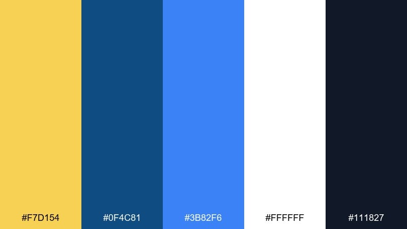
HEX: #F7D154 #0F4C81 #3B82F6 #FFFFFF #111827
Mood: minimal, modern, bright
Best for: startup logo and brand kit
Minimal and modern, it feels like a clean white studio with a sharp splash of sun and sea. The navy and near-black provide a strong foundation for logos, while the brighter blue can power links and social assets. Pair with geometric marks and plenty of clear space for a confident, scalable identity. Tip: test the yellow in small sizes to ensure it stays distinct against white.
Image example of coastal minimal generated using media.io
What Colors Go Well with Yellow Blue?
Neutrals are the easiest third color: white, cream, and light gray keep yellow and blue feeling clean, while charcoal or near-black improves text contrast on pale blues and warm yellows.
For a richer look, add deep navy or indigo as a “structure” color, then use yellow as the accent. This approach is common in UI design because it keeps CTAs bright without making the whole interface loud.
If you want extra personality, small hits of coral/orange, teal, or mint can work well—just keep them limited so the yellow-blue relationship stays the star.
How to Use a Yellow Blue Color Palette in Real Designs
Start by assigning roles: pick one blue as the primary base (headers, nav, body text), then reserve yellow for attention moments (buttons, badges, key numbers). This prevents yellow from overpowering the layout.
For accessibility, avoid yellow text on white or light backgrounds. Instead, use yellow as a background or highlight with dark text on top, and test key pairs to ensure your small text meets contrast guidelines.
In print, watch saturation: bright yellows can shift depending on paper and ink. Use a slightly deeper navy for type and consider warm off-whites to keep the palette from feeling cold.
Create Yellow Blue Palette Visuals with AI
If you’re presenting a brand concept or building a moodboard, generating quick visuals helps you validate the palette before committing to a full design system. It’s also an easy way to test how yellow reads at small sizes and how blues behave in large backgrounds.
With Media.io, you can turn a palette idea into posters, UI mockups, packaging, or hero banners in minutes—then iterate on style, lighting, and layout while keeping the same color direction.
Yellow Blue Color Palette FAQs
-
What does a yellow and blue color palette communicate?
Most yellow-blue palettes balance optimism (yellow) with trust and calm (blue), which makes them popular for branding, UI, and signage where you want attention without losing clarity. -
Are yellow and blue complementary colors?
Not exactly. Yellow’s direct complement is purple, while blue’s complement is orange. But many yellow-and-blue pairs still feel highly contrasted because they differ strongly in brightness and temperature. -
What’s the best background color for yellow and blue designs?
White, off-white, and very light blue are safe backgrounds for a clean look. For dark themes, use navy/indigo backgrounds and keep yellow as a small accent to avoid visual fatigue. -
How can I make yellow text readable?
Avoid using yellow for small body text. If you must use yellow, place it on a very dark blue/navy background and increase font weight/size; otherwise use dark text on a yellow background. -
What shades of blue work best with “gold” or “mustard” yellow?
Deep navy, slate blue, and indigo pair especially well with gold/mustard tones because they feel premium and keep the contrast strong for headlines and logos. -
How do I keep a yellow-blue UI from feeling too loud?
Use blue (or near-black) for most structure and typography, add generous whitespace, and limit yellow to primary actions, highlights, and key status elements. -
Can I add a third accent color to a yellow and blue palette?
Yes—teal, coral/orange, or mint can work well. Keep the third color minimal (often under 10–15% of the layout) so the design doesn’t become chaotic.


