

Purple and green is a surprisingly versatile duo: purple brings imagination and depth, while green adds freshness and stability. Together, they can feel botanical and calm, or neon and futuristic—depending on saturation and contrast.
Below are 20 purple green color palette ideas with HEX codes, plus practical tips for branding, interiors, and digital design so you can keep the look balanced and readable.
In this article
- Why Purple Green Palettes Work So Well
-
- orchid fern breeze
- amethyst meadow
- plum pine contrast
- lavender sage calm
- violet lime pop
- grape eucalyptus modern
- mulberry moss vintage
- iris jungle night
- periwinkle olive studio
- eggplant mint minimal
- mauve basil brunch
- royal purple emerald luxe
- heather spruce cabin
- lilac seaweed coastal
- purple clover garden
- deep violet chartreuse edge
- dusty purple green tea
- neon orchid green circuit
- purple artichoke editorial
- twilight purple forest floor
- What Colors Go Well with Purple Green?
- How to Use a Purple Green Color Palette in Real Designs
- Create Purple Green Palette Visuals with AI
Why Purple Green Palettes Work So Well
Purple and green naturally complement each other: one feels creative and expressive, the other grounded and alive. This tension creates designs that feel memorable without relying on overly loud color stacks.
They’re also flexible across styles. Desaturated lavender and sage read soft and spa-like, while jewel purples and emerald greens feel premium and confident.
With the right neutral (warm off-white, taupe, charcoal, or navy), a purple green color scheme stays readable in UI and polished in print—especially when you assign one color as the lead and the other as an accent.
20+ Purple Green Color Palette Ideas (with HEX Codes)
1) Orchid Fern Breeze
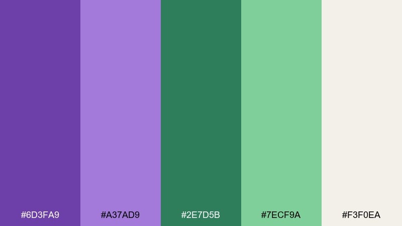
HEX: #6D3FA9 #A37AD9 #2E7D5B #7ECF9A #F3F0EA
Mood: airy, botanical, optimistic
Best for: wellness branding and clean lifestyle landing pages
Airy orchid tones and fresh fern greens evoke a calm studio filled with plants and morning light. Use the deeper purple for headlines and the forest green for key UI actions to keep contrast readable. Pair with warm off-white to avoid a cold look and let the pastels feel intentional. Tip: keep gradients subtle and reserve the mint for small highlights.
Image example of orchid fern breeze generated using media.io
Media.io is an online AI studio for creating and editing video, image, and audio in your browser.

2) Amethyst Meadow
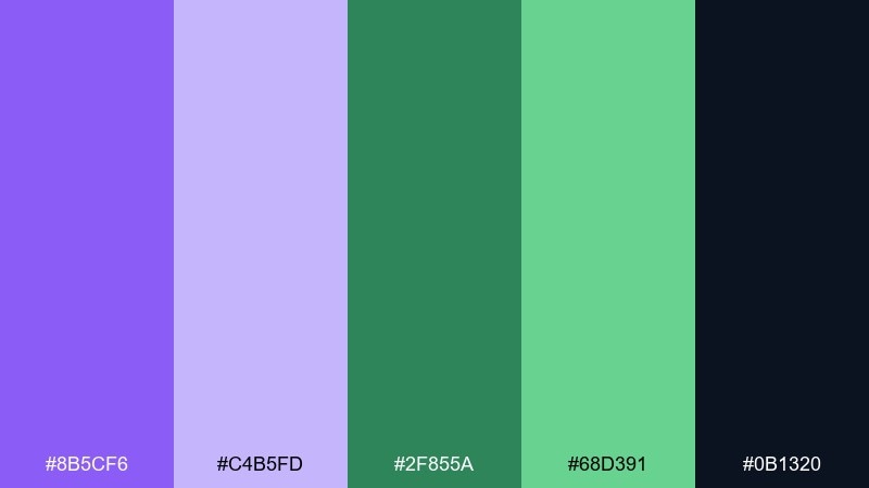
HEX: #8B5CF6 #C4B5FD #2F855A #68D391 #0B1320
Mood: fresh, high-contrast, modern
Best for: social graphics and bold campaign headers
Bright amethyst against meadow green feels like spring growth with a neon edge. Let the midnight navy act as your anchor so the saturated hues do not fight for attention. The lighter lavender works best for backgrounds or soft containers, while the mint green is ideal for badges and quick CTAs. Tip: keep typography simple and heavy to balance the energy.
Image example of amethyst meadow generated using media.io

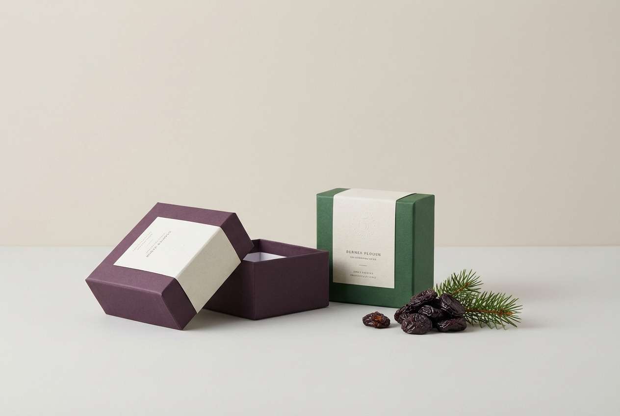
3) Plum Pine Contrast
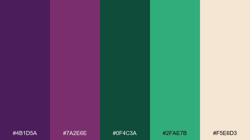
HEX: #4B1D5A #7A2E6E #0F4C3A #2FAE7B #F5E6D3
Mood: moody, natural, premium
Best for: craft packaging and boutique product labels
Deep plum and pine read like a candlelit forest with a glass of red wine. Use the pine as the dominant base, then add plum for a luxurious accent on logos and borders. The bright green is a strong pop, so keep it for small seals or flavor notes. Tip: print on warm cream stock to preserve the handcrafted feel.
Image example of plum pine contrast generated using media.io
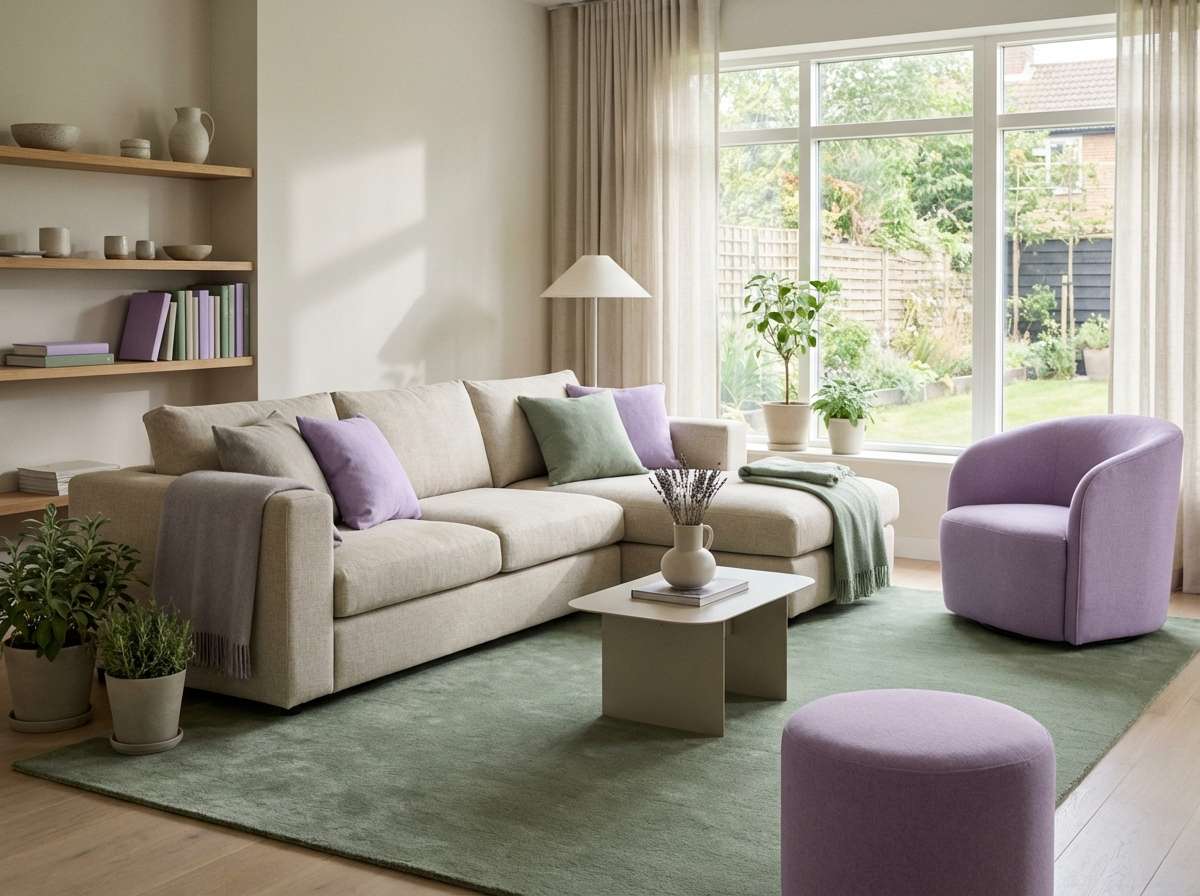
4) Lavender Sage Calm
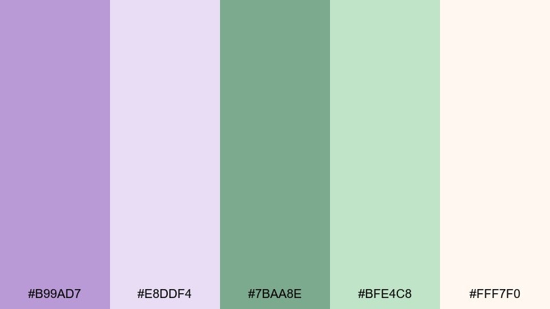
HEX: #B99AD7 #E8DDF4 #7BAA8E #BFE4C8 #FFF7F0
Mood: soft, calming, airy
Best for: spa interiors and gentle editorial layouts
Soft lavender and sage feel like fresh linens and steam drifting through a quiet bathhouse. Build most of the space with the off-white and pale lavender to keep the room bright. Bring in sage for furniture, plants, or UI buttons, and save the deeper sage for small contrast points. Tip: add natural textures like wood or paper to prevent the pastels from looking flat.
Image example of lavender sage calm generated using media.io
5) Violet Lime Pop
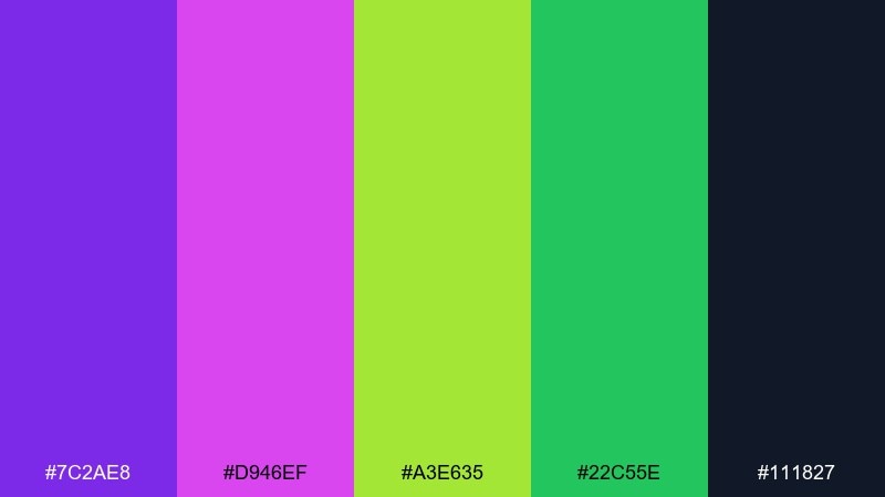
HEX: #7C2AE8 #D946EF #A3E635 #22C55E #111827
Mood: electric, playful, attention-grabbing
Best for: posters, event promos, and creator merch
Violet and lime hit like club lights on a dark wall, bold and unapologetic. Use the charcoal as your main background to keep the neon tones crisp instead of chaotic. Hot pink works best as a secondary accent, while lime becomes the hero for key calls-to-action. Tip: limit gradients and rely on sharp shapes for a clean pop-art look.
Image example of violet lime pop generated using media.io
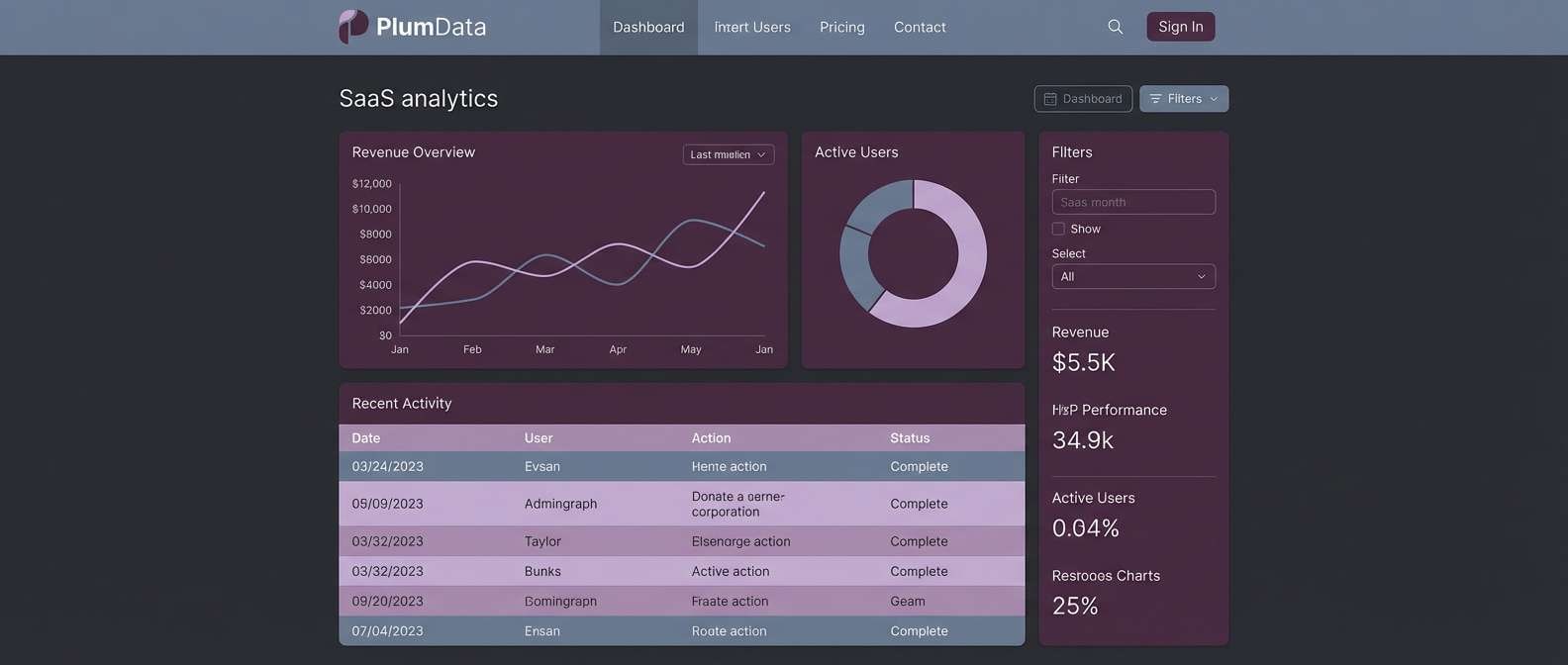
6) Grape Eucalyptus Modern
HEX: #5A2A82 #9B5DE5 #2D6A4F #52B788 #E9ECEF
Mood: clean, balanced, contemporary
Best for: SaaS dashboards and product UI
Crisp grape and eucalyptus tones feel like a smart workspace with tidy margins and clear hierarchy. This purple green color palette works best when purple leads the navigation and eucalyptus supports success states and progress indicators. The pale gray keeps screens breathable and helps both accents stay legible. Tip: use the mint green for hover states and the deeper green for confirmations to avoid visual noise.
Image example of grape eucalyptus modern generated using media.io
7) Mulberry Moss Vintage
HEX: #6B2149 #B56576 #3A5A40 #A3B18A #F2E9E4
Mood: vintage, cozy, romantic
Best for: wedding stationery and artisan invitations
Mulberry and moss look like pressed flowers in an old book, warm and nostalgic. Let cream dominate the page, then layer the dusty rose and mulberry for typography and flourishes. The deeper moss is ideal for monograms and borders, while the soft green adds a gentle botanical touch. Tip: use letterpress-style textures or fine linework to enhance the heirloom vibe.
Image example of mulberry moss vintage generated using media.io
8) Iris Jungle Night
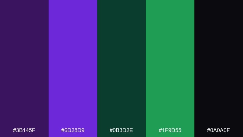
HEX: #3B145F #6D28D9 #0B3D2E #1F9D55 #0A0A0F
Mood: dramatic, nocturnal, cinematic
Best for: streaming banners and gaming channel art
Iris purple against jungle greens feels like neon signage glowing through dense leaves at night. Use near-black as the stage so the accents read luminous and premium. Keep the bright green for small interactive elements or highlights, and let the deep teal-green handle larger blocks. Tip: add subtle noise or grain to soften banding on dark gradients.
Image example of iris jungle night generated using media.io
9) Periwinkle Olive Studio
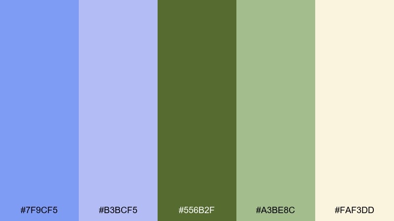
HEX: #7F9CF5 #B3BCF5 #556B2F #A3BE8C #FAF3DD
Mood: artsy, grounded, approachable
Best for: editorial illustrations and portfolio sites
Periwinkle and olive evoke a paint-splattered studio with greenery by the window. Use the creamy base for generous whitespace and let periwinkle carry headings and links. Olive works best for navigation or framing elements, while the soft green supports secondary blocks. Tip: mix in hand-drawn icons to keep the palette feeling creative rather than corporate.
Image example of periwinkle olive studio generated using media.io
10) Eggplant Mint Minimal
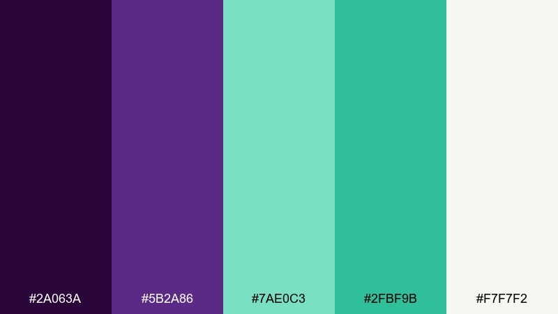
HEX: #2A063A #5B2A86 #7AE0C3 #2FBF9B #F7F7F2
Mood: minimal, crisp, tech-forward
Best for: app onboarding screens and fintech UI
Eggplant and mint feel sleek like glass UI panels and tidy data cards. Use the off-white to keep onboarding steps bright, then apply eggplant for primary text and structure. Mint should be your accent for progress, toggles, and success states, with teal-green for stronger CTAs. Tip: keep shadows soft and spacing generous to maintain the minimal rhythm.
Image example of eggplant mint minimal generated using media.io

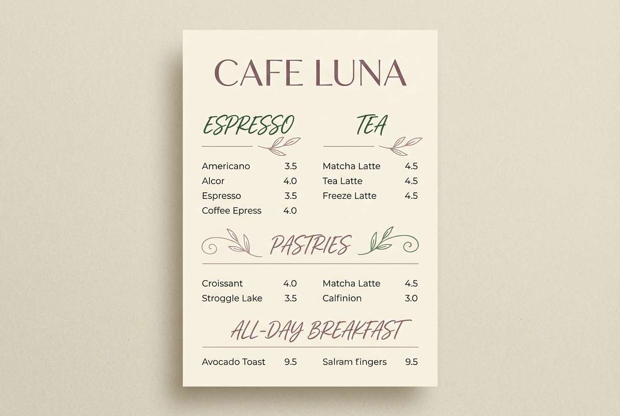
11) Mauve Basil Brunch
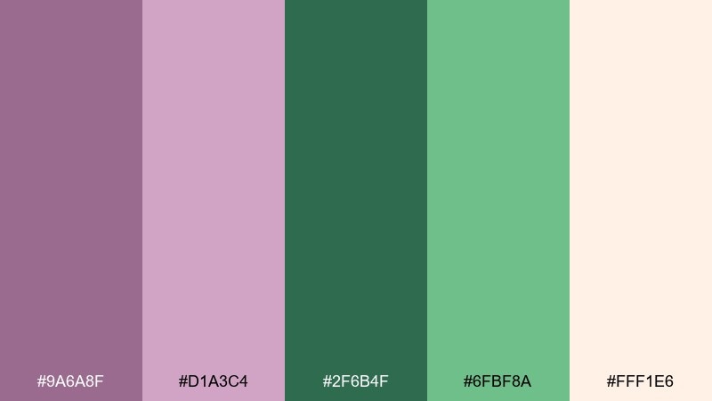
HEX: #9A6A8F #D1A3C4 #2F6B4F #6FBF8A #FFF1E6
Mood: warm, inviting, food-friendly
Best for: cafe menus and small restaurant branding
Mauve and basil green bring to mind berry jam, herbs, and sunlit brunch tables. Use the peachy cream as your background for an appetizing warmth. The dark basil is perfect for menu sections and prices, while the soft mauve supports highlights and callouts. Tip: pair with a serif headline font for a crafted, neighborhood feel.
Image example of mauve basil brunch generated using media.io
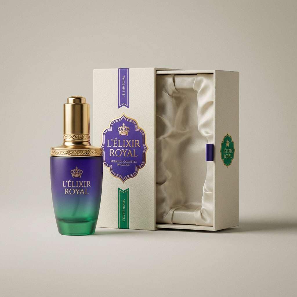
12) Royal Purple Emerald Luxe
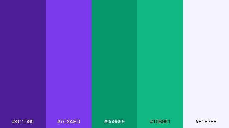
HEX: #4C1D95 #7C3AED #059669 #10B981 #F5F3FF
Mood: luxurious, jewel-toned, confident
Best for: premium product ads and beauty launches
Jewel purple and emerald green feel like velvet drapes and polished gemstones. This purple green color combination shines when you keep the background light and let the accents appear in sharp, intentional placements. Use emerald for trust cues like guarantees and benefits, while royal purple carries the brand signature. Tip: add metallic foil touches in print for an upscale finish.
Image example of royal purple emerald luxe generated using media.io
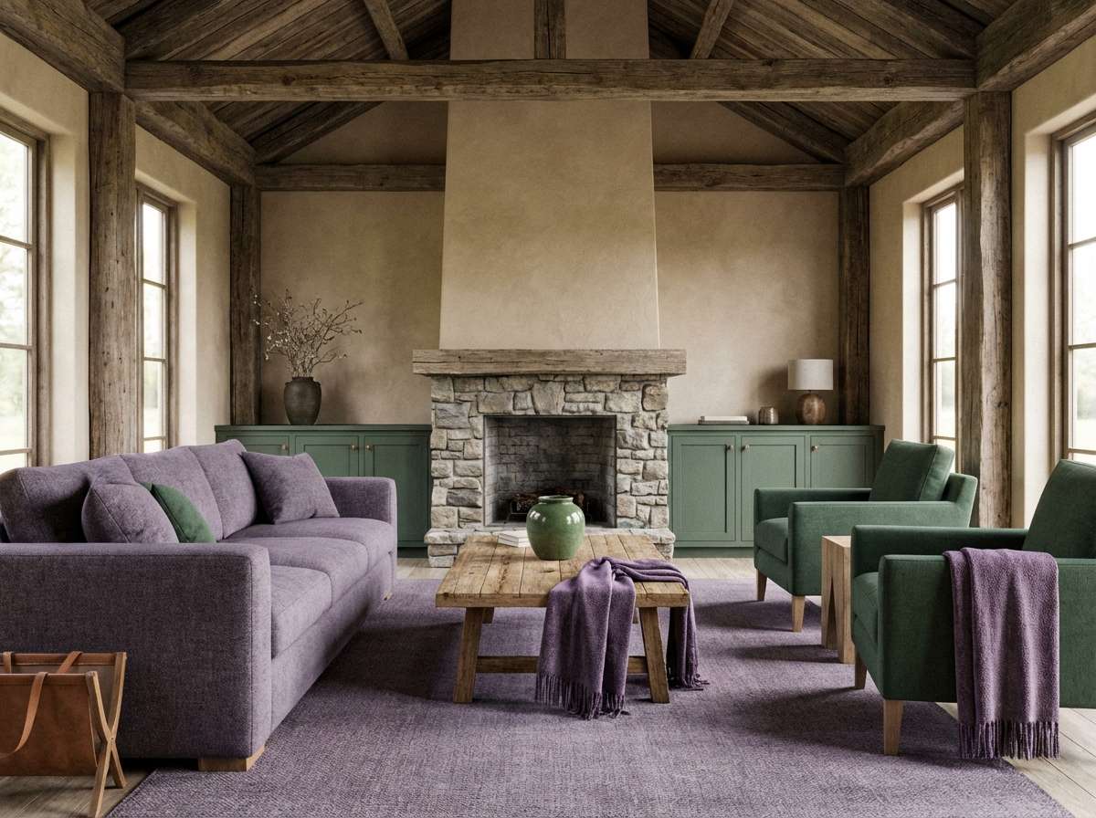
13) Heather Spruce Cabin
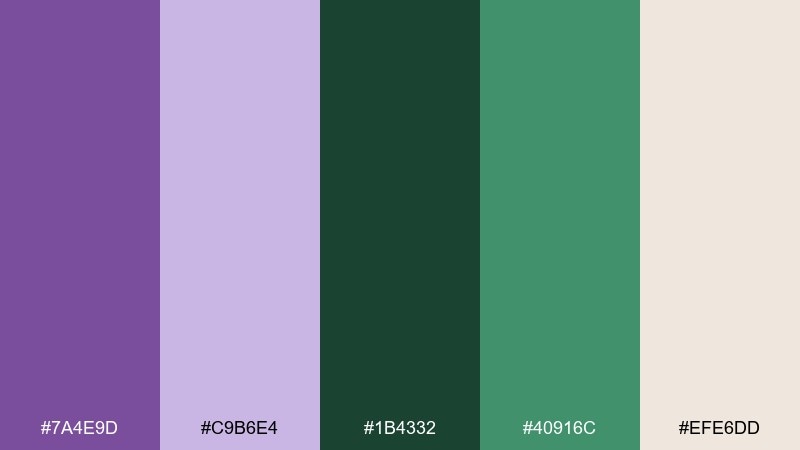
HEX: #7A4E9D #C9B6E4 #1B4332 #40916C #EFE6DD
Mood: cozy, outdoorsy, grounded
Best for: cabin interiors and rustic lifestyle brands
Heather purple and spruce green recall wool blankets, pine needles, and a quiet cabin evening. Use the warm beige as your main field to keep everything soft and welcoming. Spruce works well for large surfaces like cabinetry or hero blocks, with heather as a gentle accent in textiles and secondary graphics. Tip: introduce natural wood tones to bridge the cool greens and purples.
Image example of heather spruce cabin generated using media.io
14) Lilac Seaweed Coastal
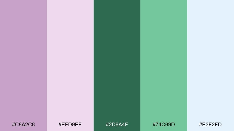
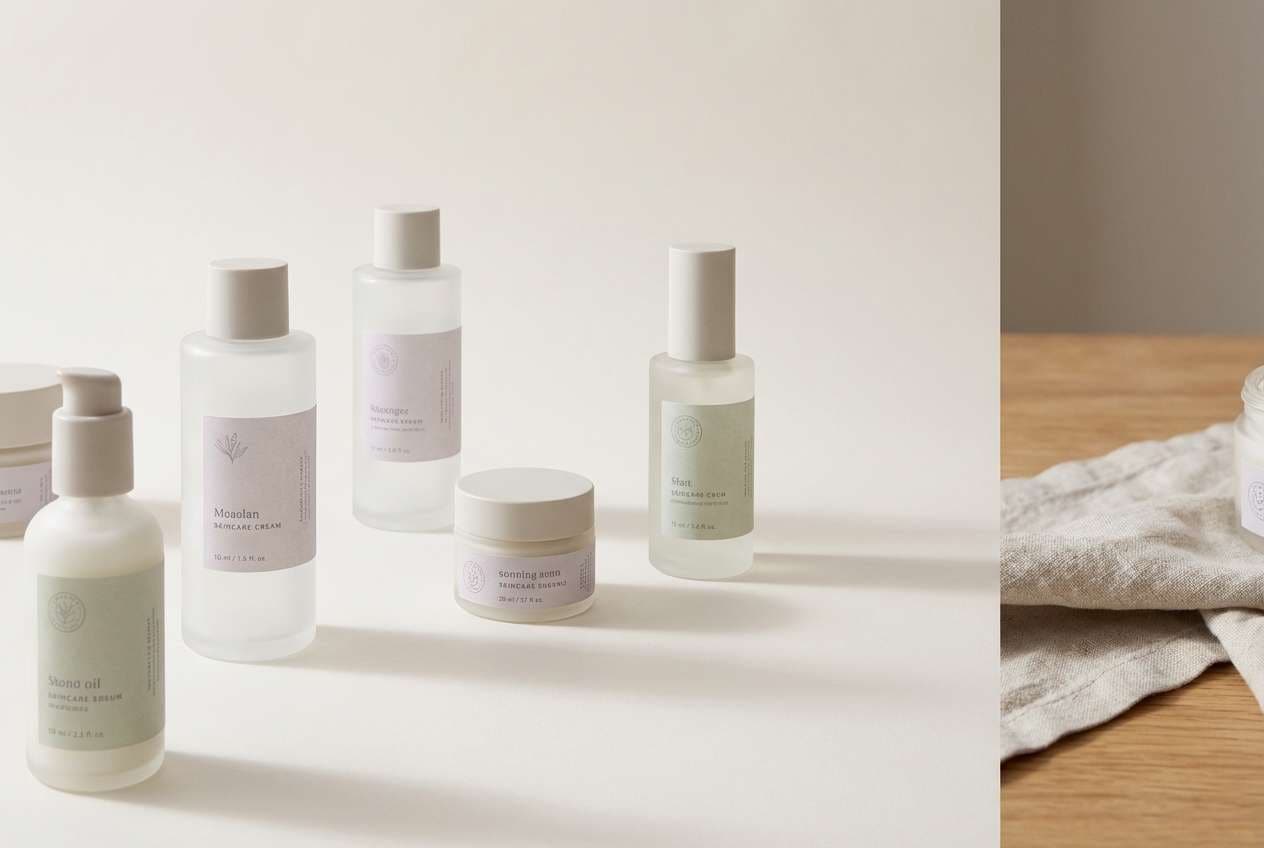
HEX: #C8A2C8 #EFD9EF #2D6A4F #74C69D #E3F2FD
Mood: coastal, light, refreshing
Best for: skincare packaging and airy web hero sections
Lilac and seaweed green feel like sea glass, salt air, and pastel sunsets. Use the pale blue as a background wash for a clean coastal mood. Keep the deeper green for product names or strong CTAs, and let lilac soften secondary areas. Tip: pair with minimal line icons and lots of negative space for a spa-clean finish.
Image example of lilac seaweed coastal generated using media.io
15) Purple Clover Garden
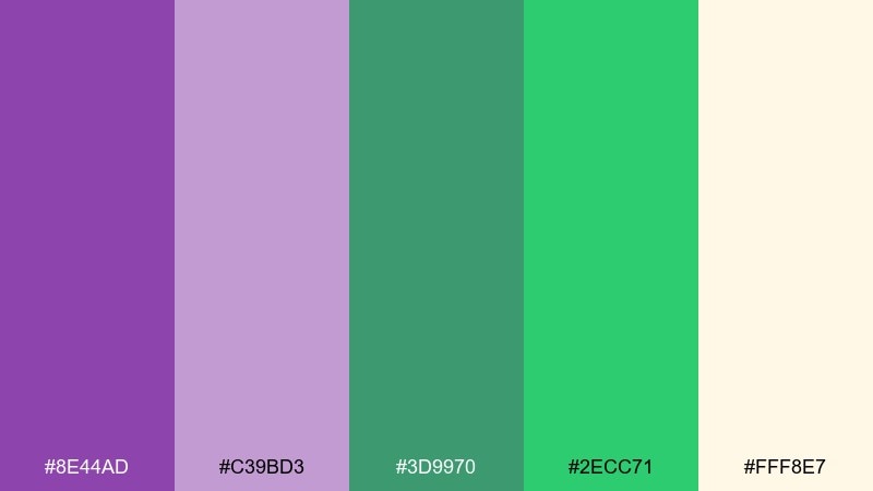
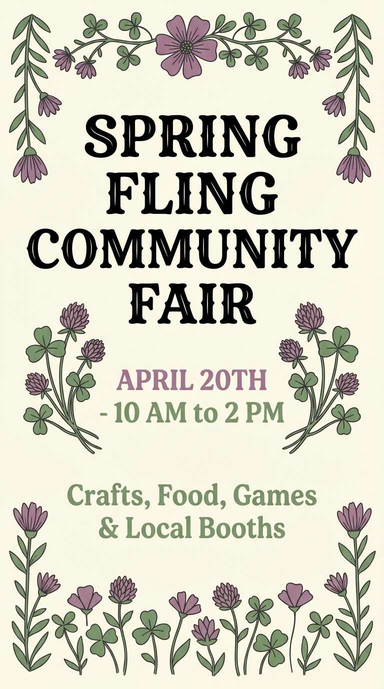
HEX: #8E44AD #C39BD3 #3D9970 #2ECC71 #FFF8E7
Mood: cheerful, garden-fresh, friendly
Best for: spring flyers and community event posters
Clover greens and friendly purples evoke a backyard garden in full bloom. Use the creamy base to keep the design bright and readable. The deeper purple is great for headlines, while the vivid green draws attention to dates, buttons, or sign-up details. Tip: add simple floral illustrations to reinforce the seasonal vibe without clutter.
Image example of purple clover garden generated using media.io
16) Deep Violet Chartreuse Edge
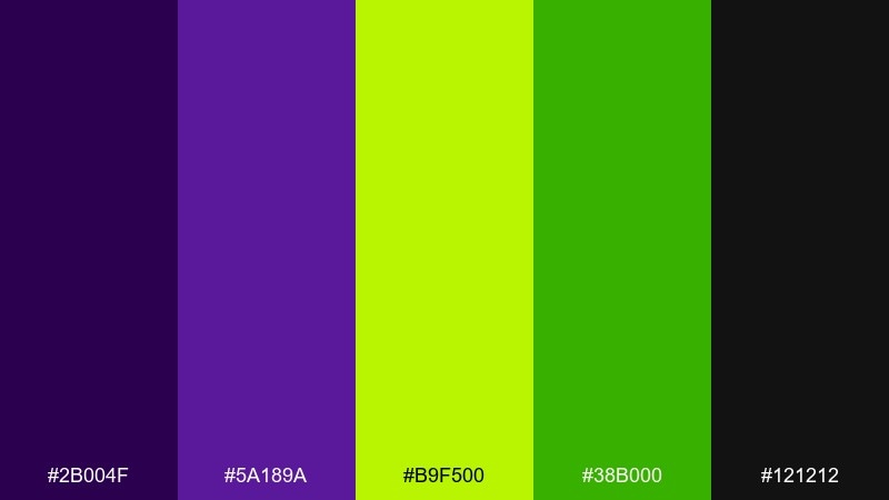
HEX: #2B004F #5A189A #B9F500 #38B000 #121212
Mood: edgy, futuristic, high-impact
Best for: tech hero banners and nightlife promos
Deep violet with chartreuse feels like a laser cut through a dark stage, sharp and futuristic. Keep black as the dominant base to avoid eye fatigue and let the neon act as a controlled accent. Use chartreuse for highlights and status indicators, and reserve the green for supporting elements like tags or small shapes. Tip: stick to two font weights to keep the design aggressive but clean.
Image example of deep violet chartreuse edge generated using media.io
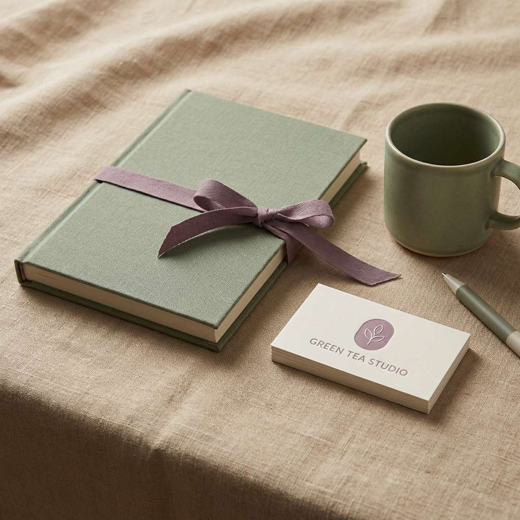
17) Dusty Purple Green Tea
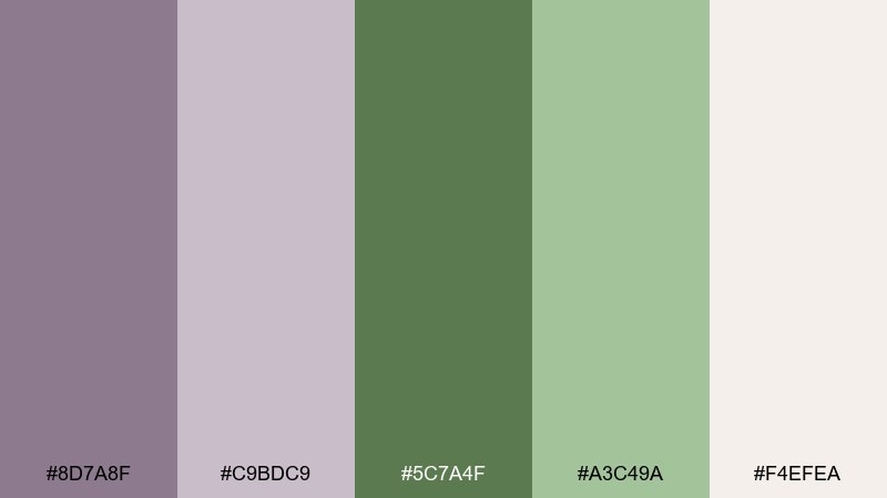
HEX: #8D7A8F #C9BDC9 #5C7A4F #A3C49A #F4EFEA
Mood: soft, mindful, understated
Best for: journals, stationery, and minimal packaging
Dusty purple and green tea tones suggest calm rituals, paper textures, and slow mornings. Use the warm off-white as your primary background to keep the look quiet and refined. The darker green is strong enough for typography, while the pale green works for subtle panels and borders. Tip: add a single deep purple stamp or seal to create a focal point.
Image example of dusty purple green tea generated using media.io
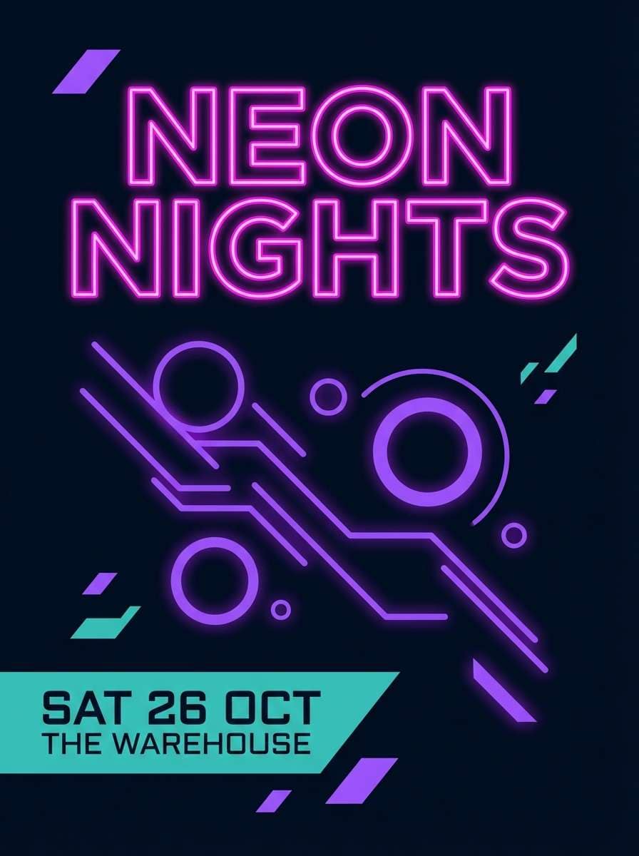
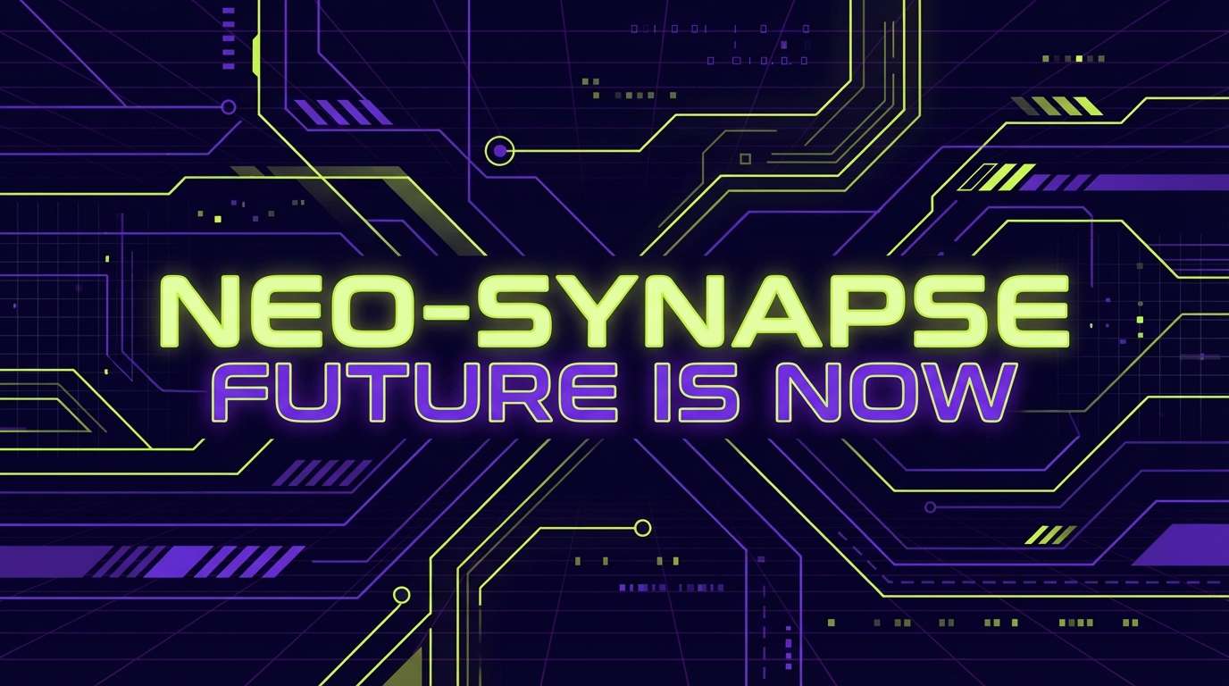
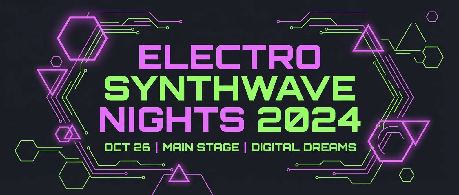
18) Neon Orchid Green Circuit
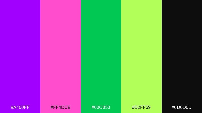
HEX: #A100FF #FF4DCE #00C853 #B2FF59 #0D0D0D
Mood: cyber, energetic, youth-focused
Best for: music event posters and streaming thumbnails
Neon orchid and circuit greens feel like synth beats, LED panels, and late-night energy. Let the near-black do most of the work so the neon stays crisp rather than overwhelming. Use hot pink for artist names and the bright greens for dates and ticket info to create instant hierarchy. Tip: keep shapes geometric and avoid overly detailed imagery for maximum punch.
Image example of neon orchid green circuit generated using media.io
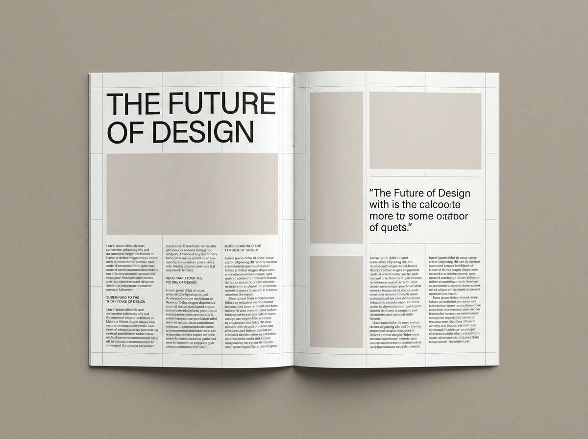
19) Purple Artichoke Editorial
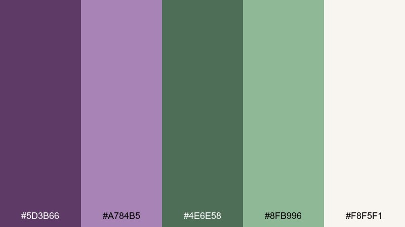
HEX: #5D3B66 #A784B5 #4E6E58 #8FB996 #F8F5F1
Mood: thoughtful, muted, editorial
Best for: magazine layouts and long-form blog design
Muted purple and artichoke green feel like an indie magazine printed on soft matte paper. Use the off-white as your main page color and keep body text dark for readability. The dusty purple is ideal for pull quotes and section headers, while the greens support charts, callouts, and small icons. Tip: stay consistent with spacing and grid lines to keep the palette feeling deliberate.
Image example of purple artichoke editorial generated using media.io
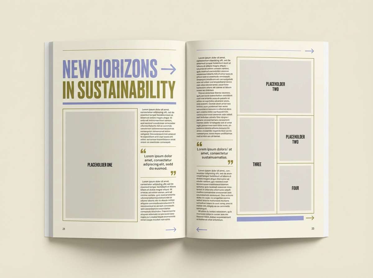
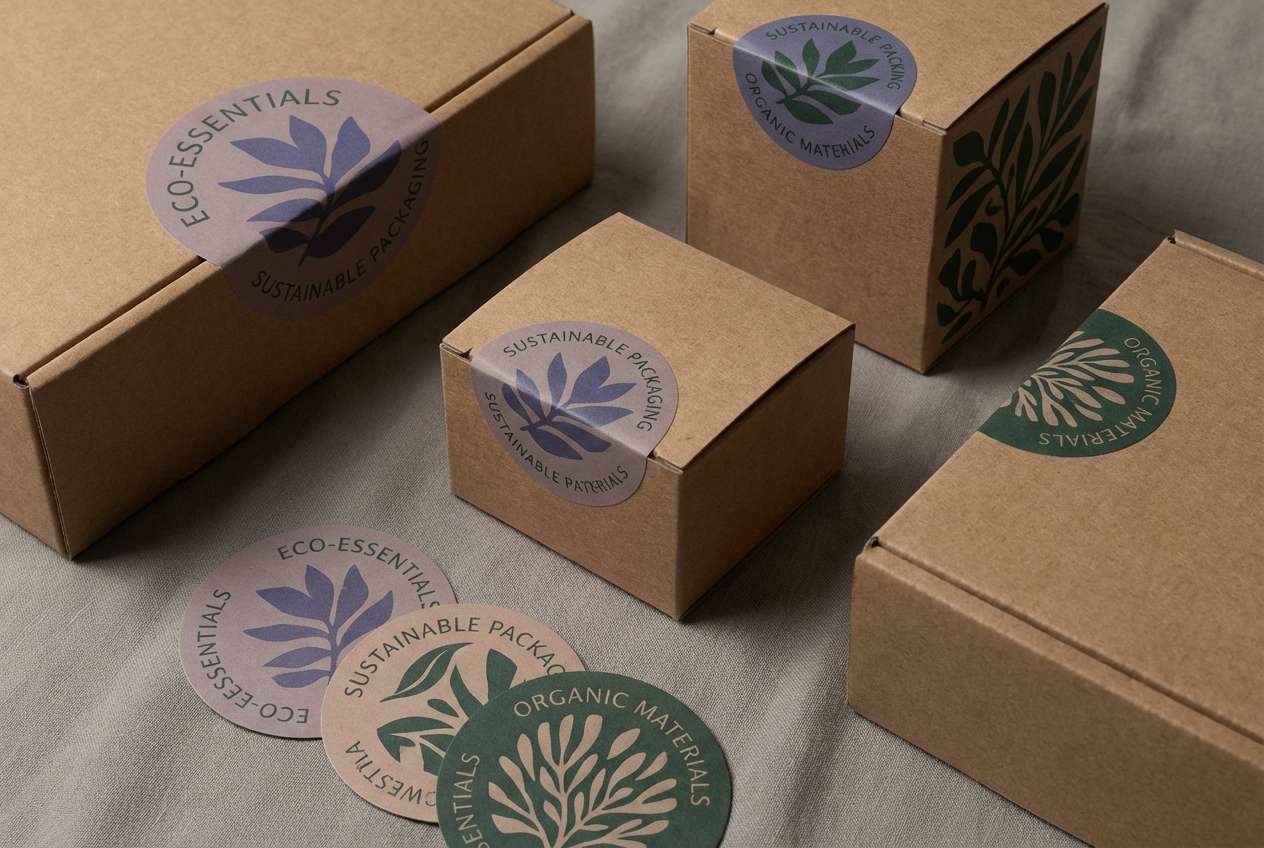
20) Twilight Purple Forest Floor
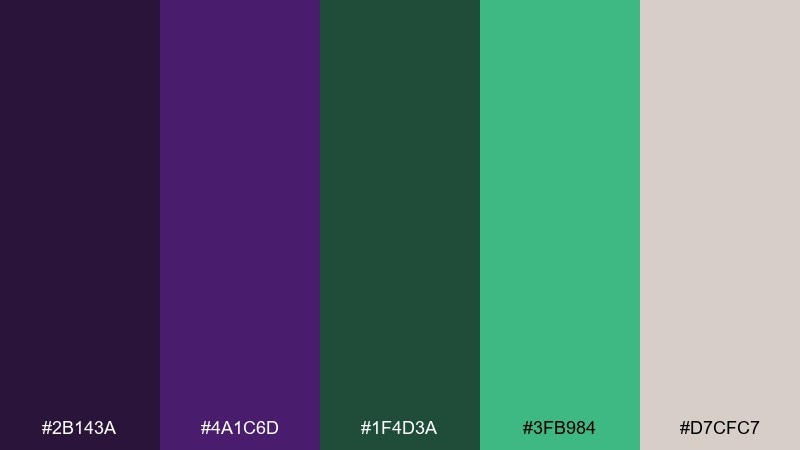
HEX: #2B143A #4A1C6D #1F4D3A #3FB984 #D7CFC7
Mood: earthy, twilight, sophisticated
Best for: eco packaging and sustainable brand identities
Twilight purples and forest-floor greens evoke dusk hikes, rich soil, and quiet confidence. Use the taupe-gray as your label base to keep it natural and premium. Bring in the bright green sparingly for certifications or key benefits, and let the dark green handle structure and legibility. Tip: choose uncoated paper and minimal inks to support a sustainability story.
Image example of twilight purple forest floor generated using media.io
What Colors Go Well with Purple Green?
Neutrals are the easiest glue for purple and green: warm off-white, cream, light gray, taupe, charcoal, and near-black help control intensity and keep layouts readable. For digital products, navy is a strong “anchor” that makes both accents feel intentional.
If you want extra richness, add jewel companions like teal, deep blue, or burgundy in small amounts. For a softer look, blend in muted companions such as blush, sand, or pale blue—then keep your main purple/green roles clear so the palette doesn’t get noisy.
For accessibility, prioritize contrast with your text and CTAs: use darker purples/greens on light backgrounds, or neon accents on charcoal/black backgrounds with ample spacing.
How to Use a Purple Green Color Palette in Real Designs
Start with a ratio: pick one as the primary (often purple for brand voice or headers) and the other as the support (often green for success, confirmation, or nature cues). Then choose a neutral background that keeps the interface or print piece calm.
In UI, reserve the brightest green for actions (buttons, toggles, badges) and keep purple for navigation, links, and headlines. In interiors, use softer versions (lavender, sage) for large areas, and save deeper tones (eggplant, spruce) for accents like textiles, cabinetry, or feature walls.
For marketing graphics, lean into contrast: pair a dark base with high-chroma purple/green highlights, and keep typography simple so the color carries the mood without overwhelming the message.
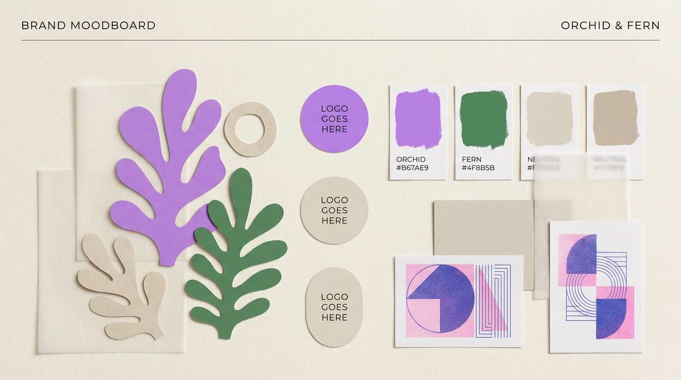
Create Purple Green Palette Visuals with AI
If you’re pitching a brand direction or building a moodboard, generating quick purple-and-green visuals can help stakeholders “see” the palette in context (packaging, posters, UI, or interiors) before you commit to production.
With Media.io’s text-to-image, you can reuse the prompts above, swap ratios for different formats, and iterate fast—try changing “minimal” to “luxury,” or “vector” to “realistic studio shot” to match your design goal.
Export the results, then sample colors to refine your final HEX set and contrast pairs for headings, backgrounds, and CTAs.
Purple Green Color Palette FAQs
-
Is purple and green a good color combination for branding?
Yes—purple signals creativity and premium energy, while green suggests growth, wellness, and trust. Use a neutral base (cream, light gray, charcoal) and assign clear roles (one primary, one accent) to keep the brand system consistent. -
How do I keep a purple green color scheme from looking too loud?
Lower saturation on one side (e.g., lavender + sage), add more neutral space, and limit bright greens to small UI elements or highlights. A dark anchor (navy/charcoal) can also calm high-chroma pairings. -
What neutral works best with purple and green?
Warm off-white/cream is the most forgiving for print and interiors, while light gray works well for dashboards and modern web design. For bold posters, charcoal or near-black makes purple/green accents look crisp and luminous. -
Which purple and green shades feel most “luxury”?
Look for jewel tones: royal purple, deep violet, emerald, and rich pine. Pair them with a clean light background or a very dark base, and keep accents sharp rather than overly blended. -
Can I use purple and green for UI without hurting accessibility?
Yes—choose darker tones for text and ensure button labels meet contrast guidelines against their backgrounds. Avoid placing mid-tone green text on mid-tone purple (or vice versa); use neutrals for body text and reserve color for states and emphasis. -
What are common use cases for a purple and green palette?
Wellness and skincare, eco and sustainable packaging, fintech/app onboarding, gaming/streaming banners, event posters, and wedding stationery—this pair adapts easily from calm to high-impact. -
How can I quickly preview these palettes in real scenes?
Generate mock visuals (posters, packaging, room renders, UI frames) with an AI image tool, then refine your final HEX codes based on what reads best at real sizes and on your target background.


