

White and red is a timeless pairing: white keeps layouts clean and readable, while red adds instant energy and focus. Together, they create high-contrast designs that feel both modern and memorable.
Below are 20 curated white red color palettes (with HEX codes) you can use for branding, UI, print, events, and seasonal campaigns—plus tips for choosing supporting colors and generating visuals fast.
In this article
- Why White Red Palettes Work So Well
-
- snowdrop scarlet
- frosted cherry
- minimal rouge
- poppy linen
- cranberry cream
- rose quartz milk
- burgundy pearl
- strawberry shortcake
- nordic red accent
- candy cane classic
- terracotta chalk
- garnet porcelain
- blush crimson studio
- ruby concrete
- wine cotton
- coral paper
- cherry blossom contrast
- red thread neutral
- scarlet typography
- velvet red minimal
- What Colors Go Well with White Red?
- How to Use a White Red Color Palette in Real Designs
- Create White Red Palette Visuals with AI
Why White Red Palettes Work So Well
White creates space, clarity, and a “clean slate” feeling that makes content easier to scan. Red naturally draws attention, so even small accents can guide the eye to the most important elements.
This combo also scales across styles—from minimalist tech interfaces to festive holiday graphics—because you can dial red up for impact or keep it subtle for a premium, editorial look.
Practically, white red palettes reproduce well across digital and print when you manage saturation and contrast. With the right off-whites and deeper reds, you can keep the design bold without feeling harsh.
20+ White Red Color Palette Ideas (with HEX Codes)
1) Snowdrop Scarlet
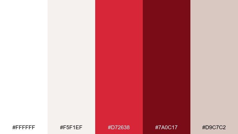
HEX: #ffffff #f5f1ef #d72638 #7a0c17 #d9c7c2
Mood: clean, crisp, confident
Best for: brand identity and stationery
Crisp whites feel like fresh paper, while scarlet brings a sharp, confident punch. Use it for logos, letterheads, and minimal packaging where you want one hero accent to carry the look. Pair the deep wine shade with thin rules or small typography to avoid overpowering the page. Tip: reserve the brightest red for calls to action and keep the rest in soft off-whites for balance.
Image example of snowdrop scarlet generated using media.io
Media.io is an online AI studio for creating and editing video, image, and audio in your browser.

2) Frosted Cherry
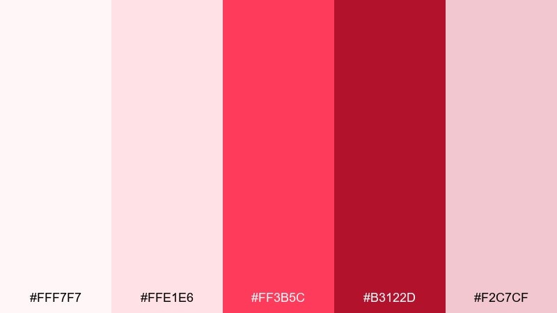
HEX: #fff7f7 #ffe1e6 #ff3b5c #b3122d #f2c7cf
Mood: romantic, glossy, playful
Best for: wedding invitations and bridal events
Soft blush and frosted pinks evoke rose petals and sparkling desserts. The brighter cherry tone is perfect for names, monograms, and small ornamental details without feeling heavy. Keep most of the layout airy with lots of negative space, then echo the darker red in a thin border for structure. Tip: print the blush tones on textured stock and use the bold red for a single focal line.
Image example of frosted cherry generated using media.io
3) Minimal Rouge
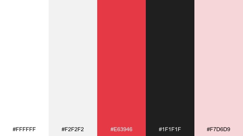
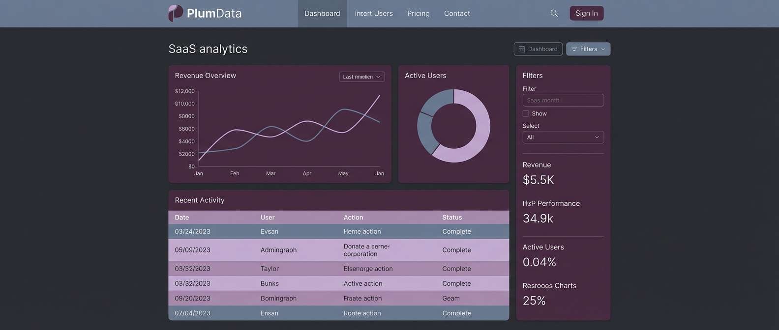
HEX: #ffffff #f2f2f2 #e63946 #1f1f1f #f7d6d9
Mood: modern, editorial, high-contrast
Best for: dashboard UI and SaaS landing pages
Bright red against paper-white feels like a bold headline in a modern magazine. This white red color palette works best when the interface stays mostly neutral and red is used for key actions, alerts, or highlights. Bring in charcoal for text and icon strokes to keep readability sharp. Tip: limit red to one primary button style and use pink-tint surfaces for gentle states like hover or selected.
Image example of minimal rouge generated using media.io
4) Poppy Linen
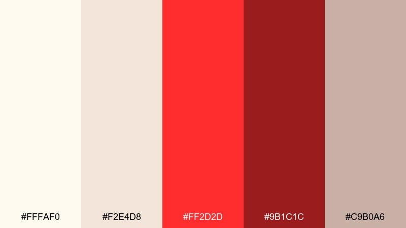
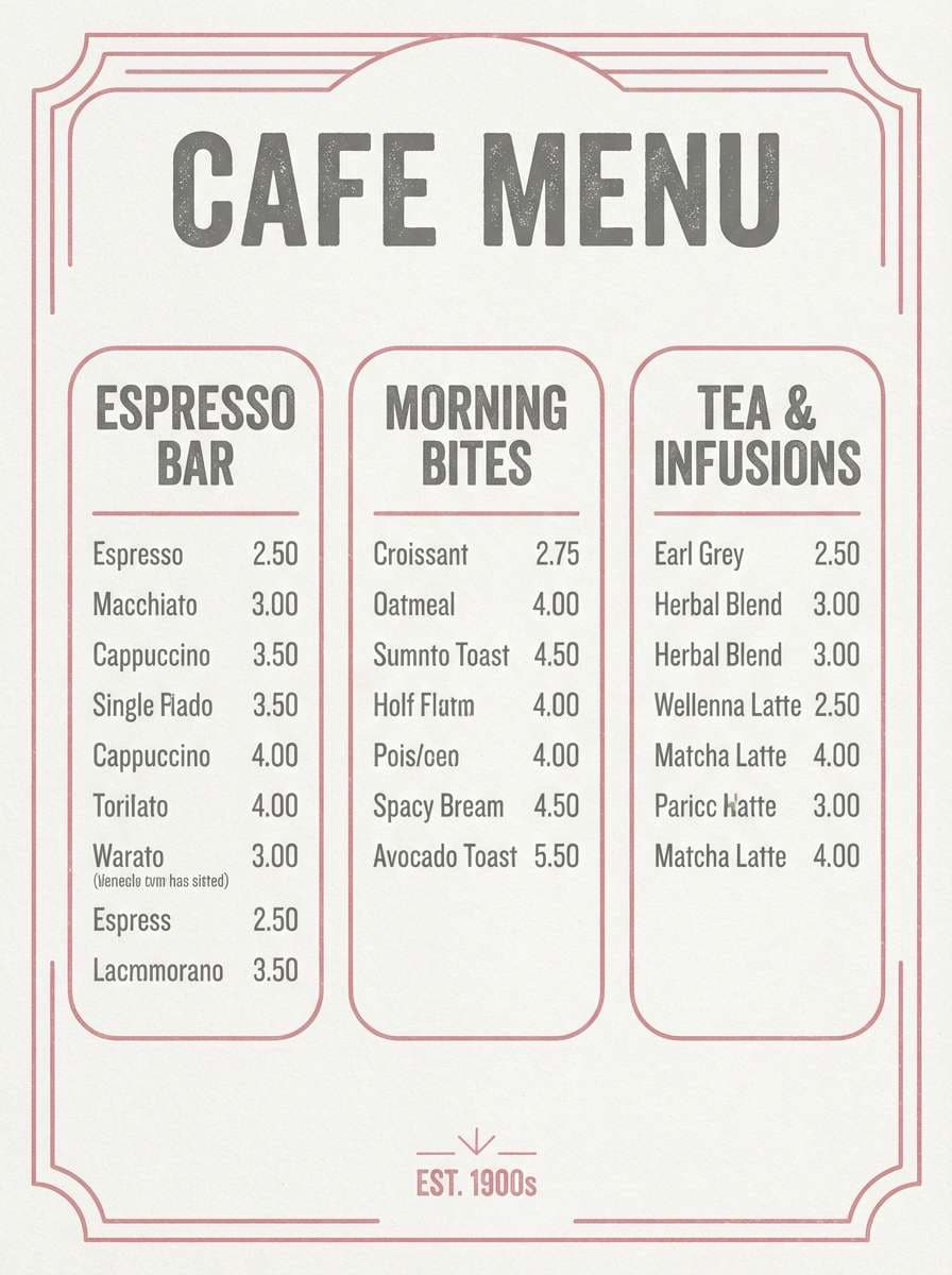
HEX: #fffaf0 #f2e4d8 #ff2d2d #9b1c1c #c9b0a6
Mood: warm, rustic, welcoming
Best for: restaurant menus and cafe posters
Creamy linen neutrals and poppy red feel like a cozy bistro with a hand-painted sign. Use the warm off-whites for large blocks of text and the bright red for section headers or price highlights. The deeper red adds weight for dividers and footers so the layout stays grounded. Tip: keep the background slightly warm rather than pure white to make the red look richer in print.
Image example of poppy linen generated using media.io
5) Cranberry Cream
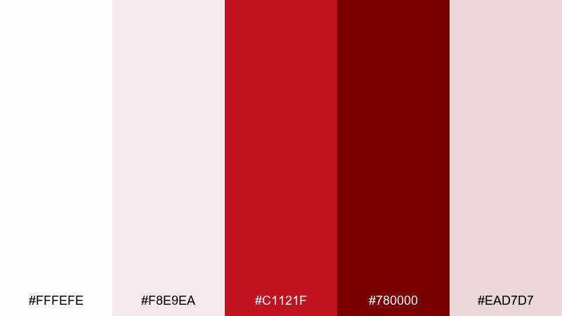
HEX: #fffefe #f8e9ea #c1121f #780000 #ead7d7
Mood: premium, cozy, indulgent
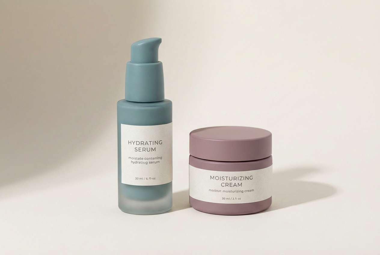
Best for: skincare packaging and product ads
Creamy whites with cranberry reds suggest richness, comfort, and a hint of luxury. Use the soft pink-tinted neutral as the main label field, then set product names in the darker red for a premium feel. The deepest shade works well for seals, small badges, or ingredient callouts. Tip: add a matte finish to the creams and a spot gloss on the red typography to boost contrast.
Image example of cranberry cream generated using media.io
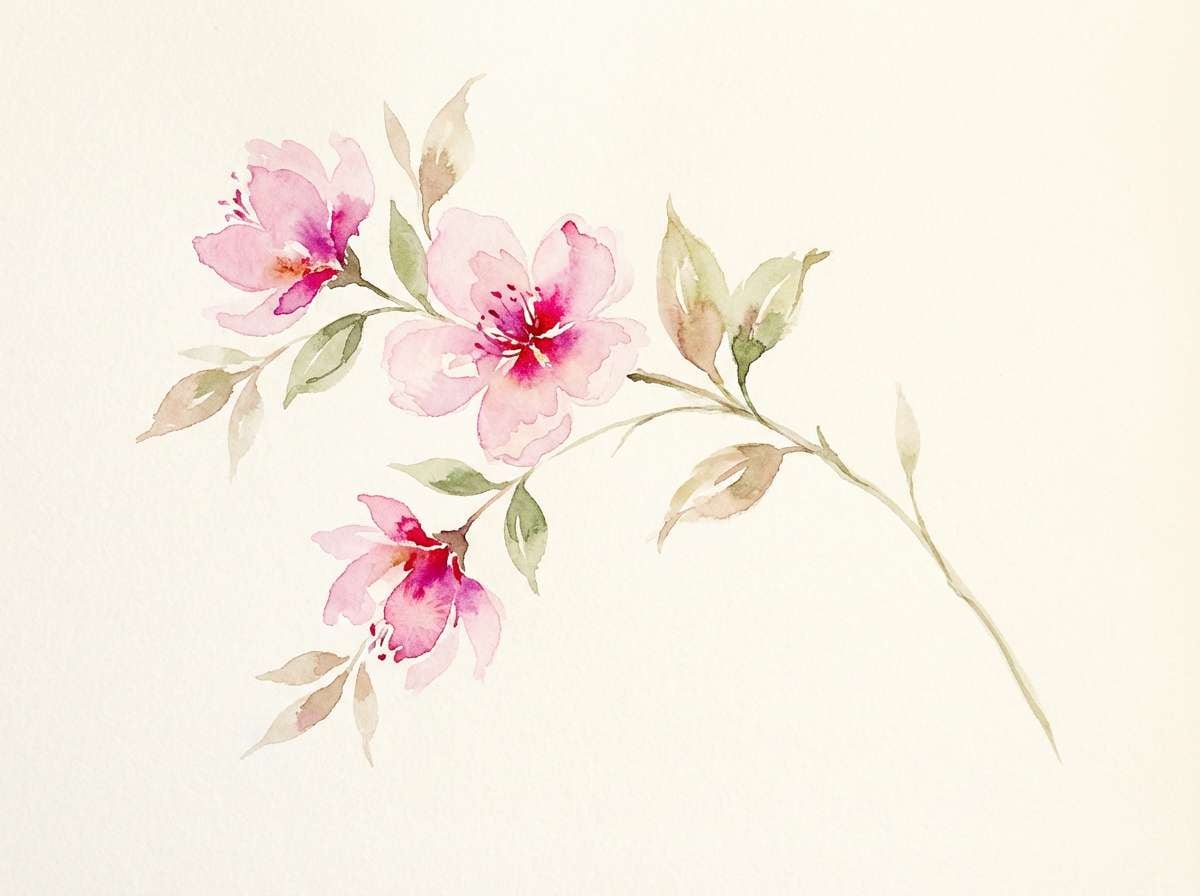
6) Rose Quartz Milk
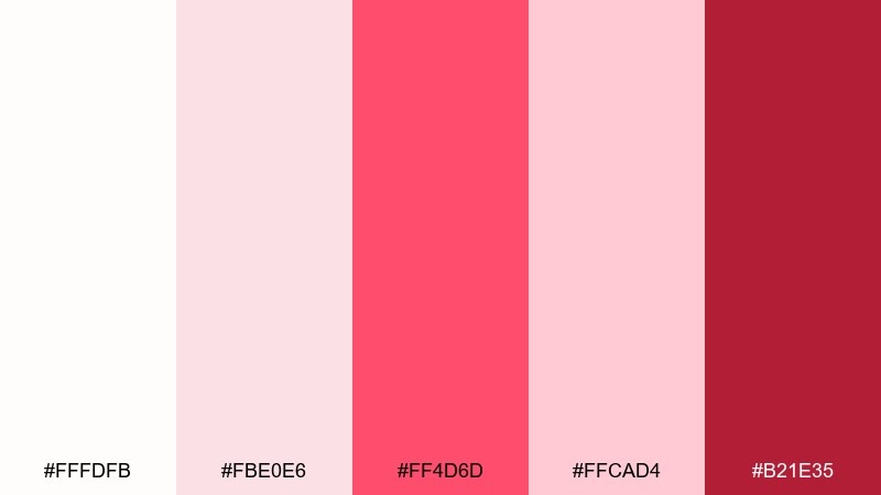
HEX: #fffdfb #fbe0e6 #ff4d6d #ffcad4 #b21e35
Mood: soft, airy, uplifting
Best for: spring illustrations and social graphics
Milky whites and rose tones feel like early spring light and fresh blossoms. The brighter pink-red reads beautifully in small highlights like petals, ribbons, or sticker-style labels. Keep the pale pink as a wash behind text so the composition stays gentle. Tip: use the deep berry tone sparingly for focal points, like a single flower center or headline.
Image example of rose quartz milk generated using media.io
7) Burgundy Pearl
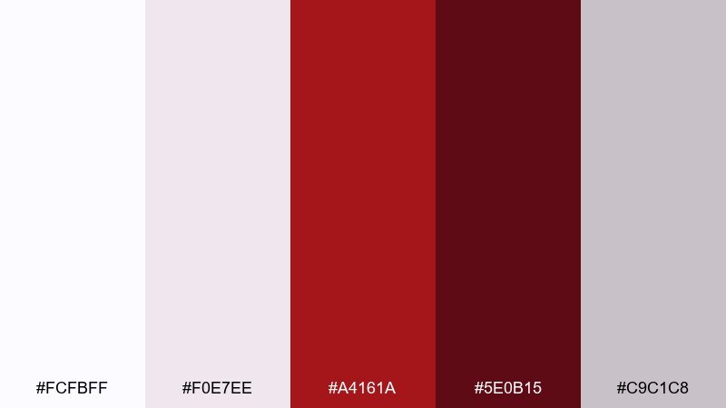
HEX: #fcfbff #f0e7ee #a4161a #5e0b15 #c9c1c8
Mood: elegant, dramatic, refined
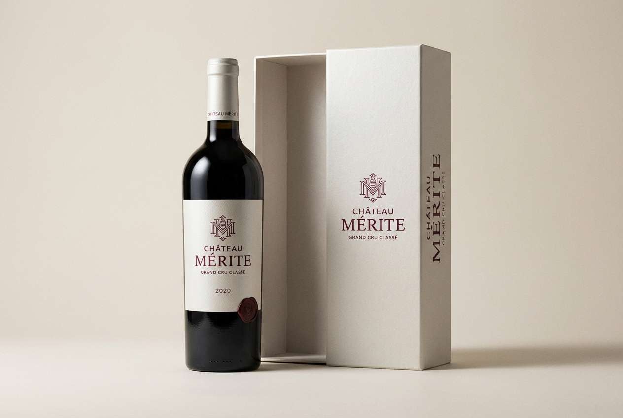
Best for: wine labels and premium gift boxes
Pearl-like neutrals paired with burgundy create a classic, candlelit sophistication. Use the light tones for negative space and tactile finishes, then let burgundy carry the logo and main label text. The darkest shade is perfect for foil stamps, small borders, and capsule details. Tip: keep typography slightly condensed so the deep reds feel intentional rather than heavy.
Image example of burgundy pearl generated using media.io
8) Strawberry Shortcake
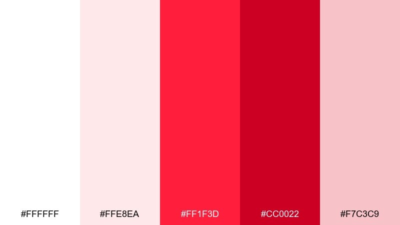
HEX: #ffffff #ffe8ea #ff1f3d #cc0022 #f7c3c9
Mood: cheerful, sweet, energetic
Best for: holiday posts and promo banners
Bright strawberry reds on creamy tints feel like festive treats and playful confetti. These white red color combinations shine in social ads when you need instant contrast for prices and limited-time messaging. Use the pale pink for large background shapes and keep the strongest red for one headline and one button. Tip: add thin white outlines around red text when it sits on pink to keep it crisp on mobile.
Image example of strawberry shortcake generated using media.io

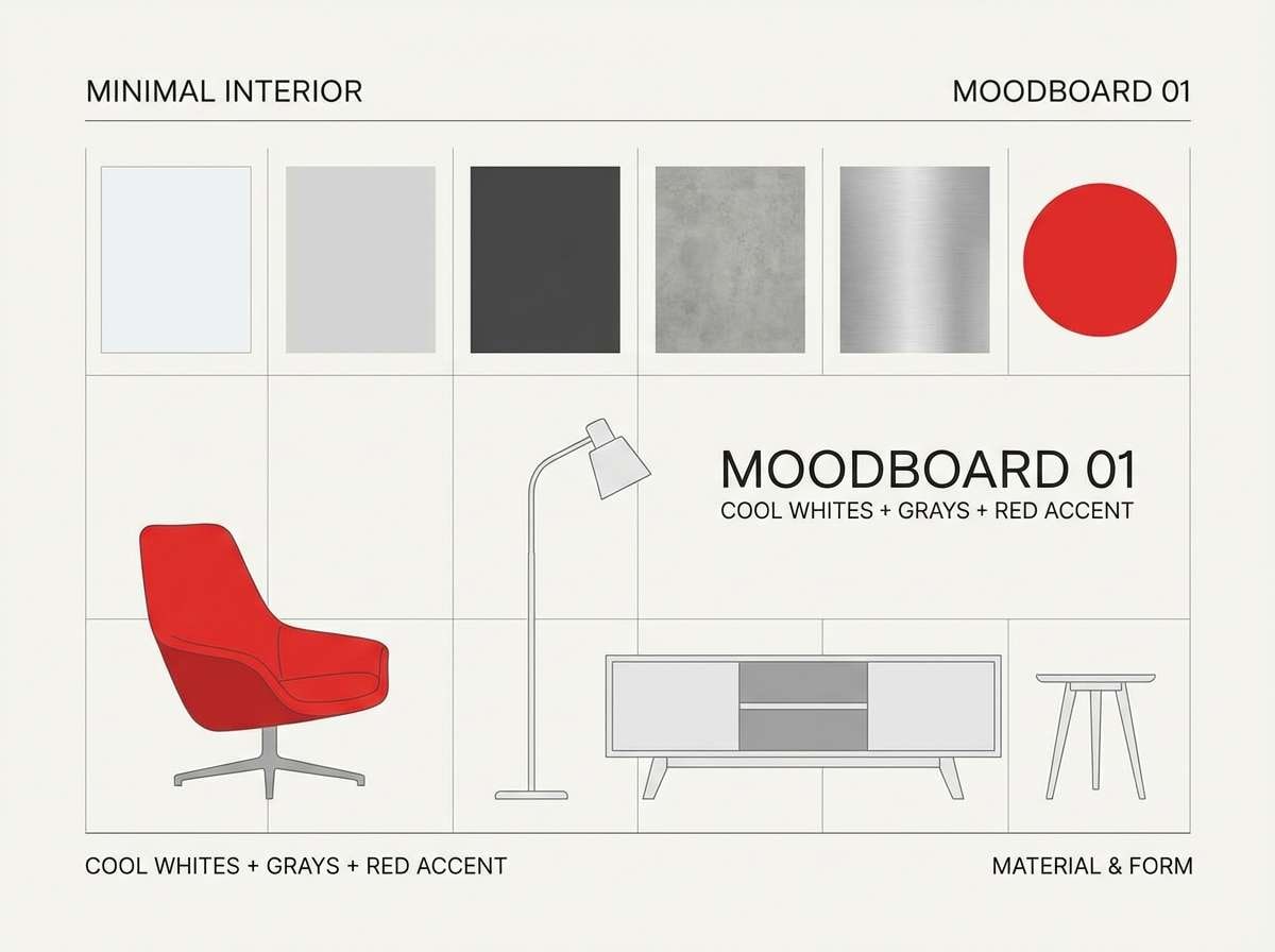
9) Nordic Red Accent
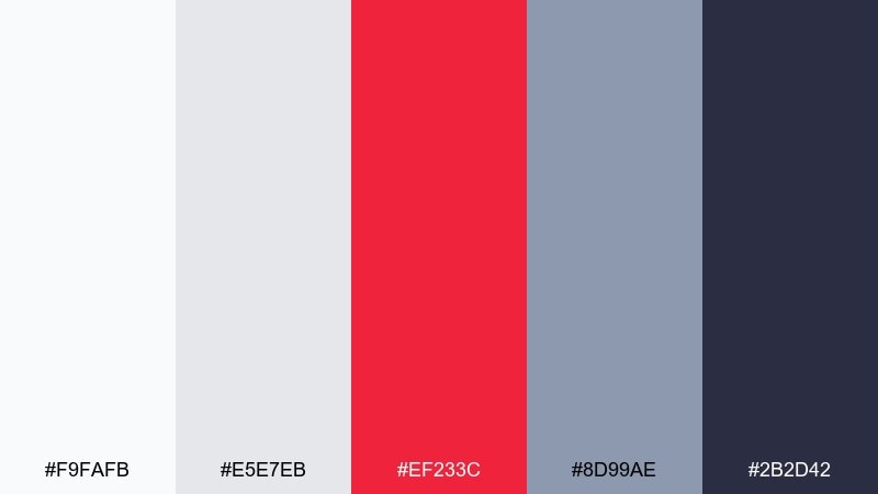
HEX: #f9fafb #e5e7eb #ef233c #8d99ae #2b2d42
Mood: cool, structured, contemporary
Best for: interior moodboards and modern presentations
Cool whites and blue-grays feel like a Scandinavian room with one striking red accent chair. Use the grays for calm structure in charts and layouts, then drop in red for emphasis and directional cues. The deep navy anchors headers and keeps the overall look mature. Tip: treat red as a 10 percent accent so the palette stays airy and modern.
Image example of nordic red accent generated using media.io
10) Candy Cane Classic
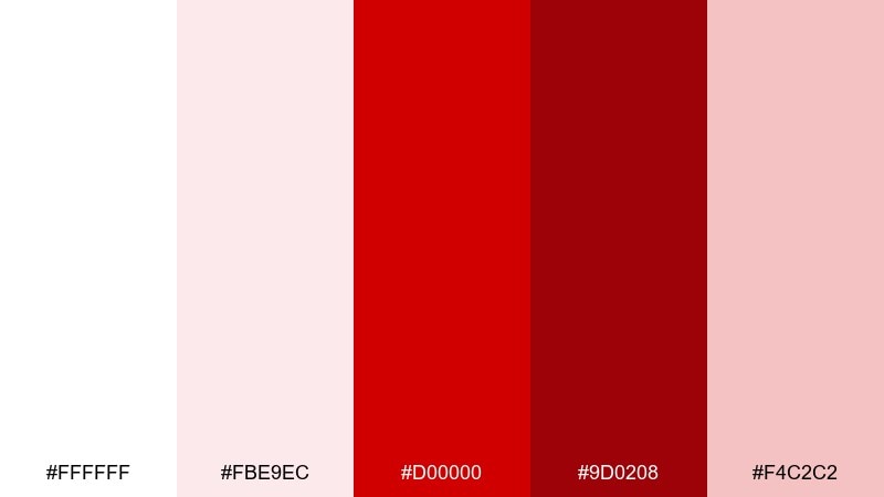
HEX: #ffffff #fbe9ec #d00000 #9d0208 #f4c2c2
Mood: festive, nostalgic, bold
Best for: gift wrap patterns and seasonal branding
Bright whites with classic reds instantly recall candy canes, winter markets, and holiday lights. Use the vivid red for stripes or icons and the deeper red for secondary pattern layers so the design has depth. The soft pink helps transitions feel smoother, especially in repeating motifs. Tip: keep pattern spacing generous so the red does not visually buzz at a distance.
Image example of candy cane classic generated using media.io

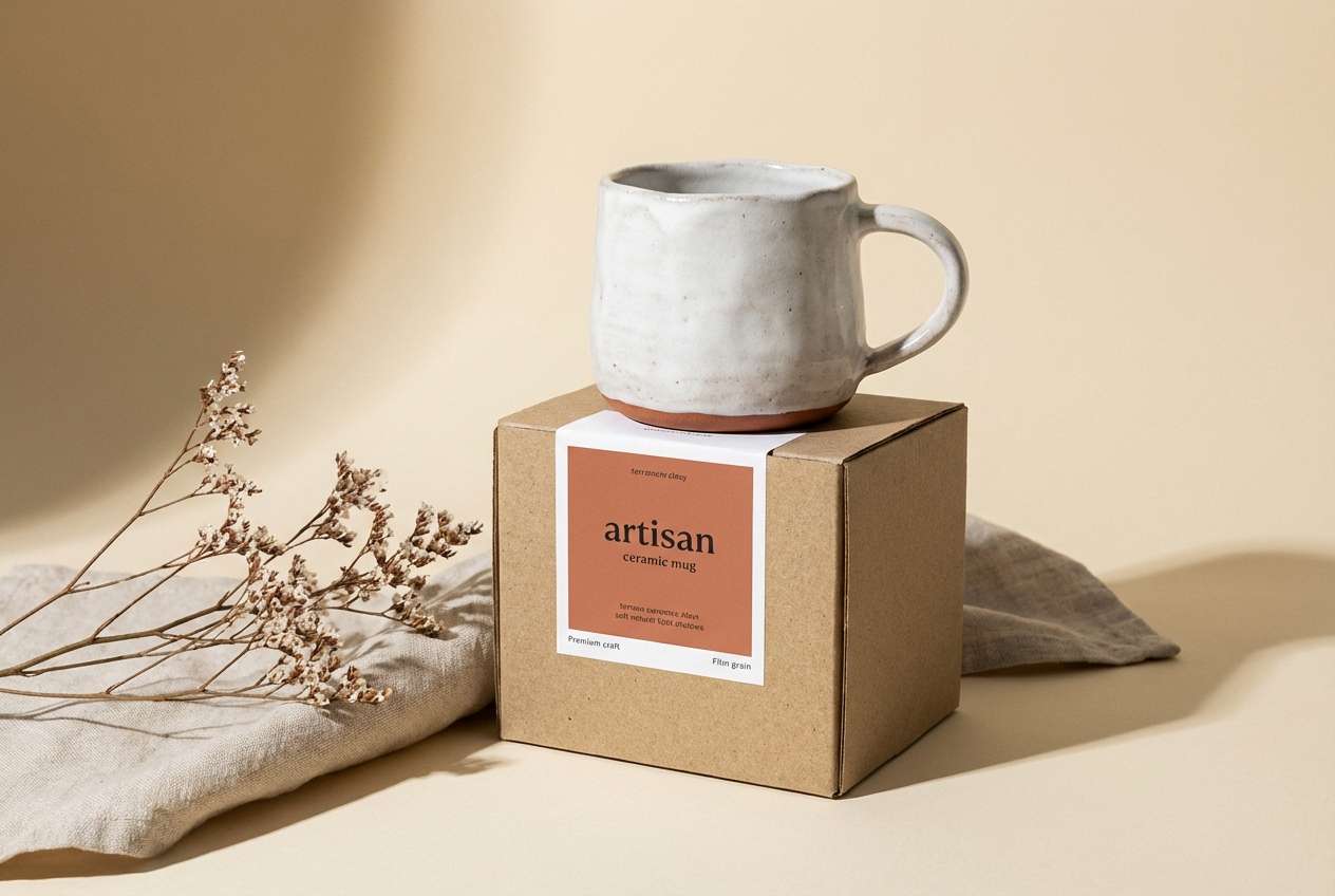
11) Terracotta Chalk
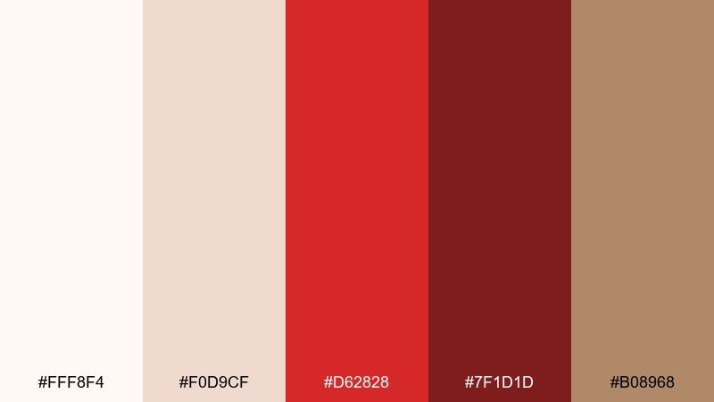
HEX: #fff8f4 #f0d9cf #d62828 #7f1d1d #b08968
Mood: earthy, handmade, cozy
Best for: artisan ceramics and craft packaging
Chalky whites with terracotta reds feel like kiln-fired clay and warm studio shelves. Use the beige-tan as a grounding neutral, then add the brighter red for stamps, labels, or small illustrated marks. The deep maroon is great for body text on light backgrounds when you want softer contrast than black. Tip: try uncoated paper and slightly imperfect linework to match the handmade mood.
Image example of terracotta chalk generated using media.io
12) Garnet Porcelain
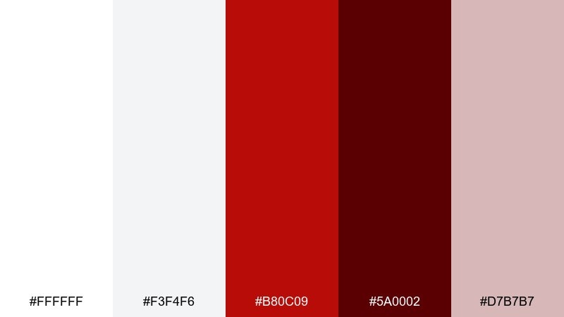
HEX: #ffffff #f3f4f6 #b80c09 #5a0002 #d7b7b7
Mood: classic, polished, assertive
Best for: editorial layouts and book covers
Porcelain whites with garnet reds evoke classic publishing and bold cover typography. This white red color palette is strong for long-form layouts when the page stays light and the red is reserved for section openers. Use the near-black wine shade for subtitles and pull quotes to maintain hierarchy without harsh contrast. Tip: pair with generous margins and a serif headline to lean into the editorial feel.
Image example of garnet porcelain generated using media.io
13) Blush Crimson Studio
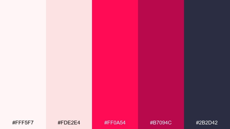
HEX: #fff5f7 #fde2e4 #ff0a54 #b7094c #2b2d42
Mood: creative, punchy, stylish
Best for: app onboarding and marketing screens
Blush gradients with a vivid crimson pop feel like neon ink on soft paper. Use the darkest navy for body copy and navigation so the brighter tones can stay playful without sacrificing accessibility. The hot red works best as a single primary button color across screens. Tip: add generous padding around red elements so they feel premium rather than loud.
Image example of blush crimson studio generated using media.io
14) Ruby Concrete
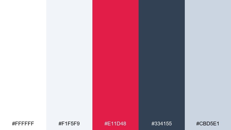
HEX: #ffffff #f1f5f9 #e11d48 #334155 #cbd5e1
Mood: urban, sporty, direct
Best for: event flyers and announcements
Cool whites and slate tones feel like concrete and steel, with ruby red acting as the loudspeaker. A white red color scheme like this is ideal for clear event hierarchy: headline, date, and a strong callout badge. Use slate for body text blocks and rules, then keep ruby for only the highest-priority information. Tip: test contrast at small sizes so the red remains readable on light gray panels.
Image example of ruby concrete generated using media.io

15) Wine Cotton
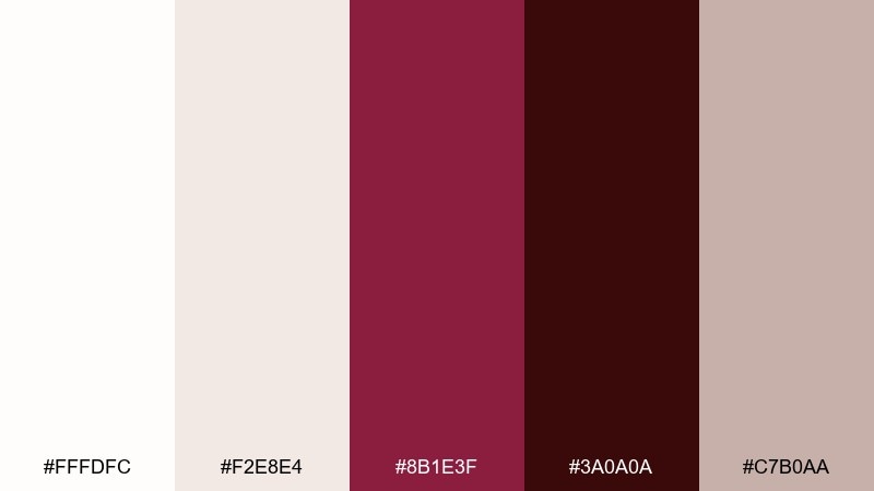
HEX: #fffdfc #f2e8e4 #8b1e3f #3a0a0a #c7b0aa
Mood: moody, intimate, timeless
Best for: fashion lookbooks and boutique branding
Soft cotton neutrals with wine reds feel like velvet curtains and curated wardrobes. Use the light tones as breathing room for photography borders and captions, then bring wine in for section dividers and cover titles. The darkest shade reads beautifully for small text where black would look too harsh. Tip: add a subtle beige background rather than pure white to keep the mood warm.
Image example of wine cotton generated using media.io
16) Coral Paper
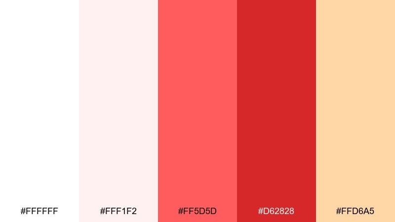
HEX: #ffffff #fff1f2 #ff5d5d #d62828 #ffd6a5
Mood: friendly, bright, approachable
Best for: bakery product ads and small business promos
Coral reds against soft whites feel like fresh frosting with a warm glow. Use coral for cheerful headlines and the deeper red for price tags or key product names. The peach accent adds warmth and works well for secondary badges or background shapes. Tip: keep photography or product renders minimal so the warm tones do not compete.
Image example of coral paper generated using media.io
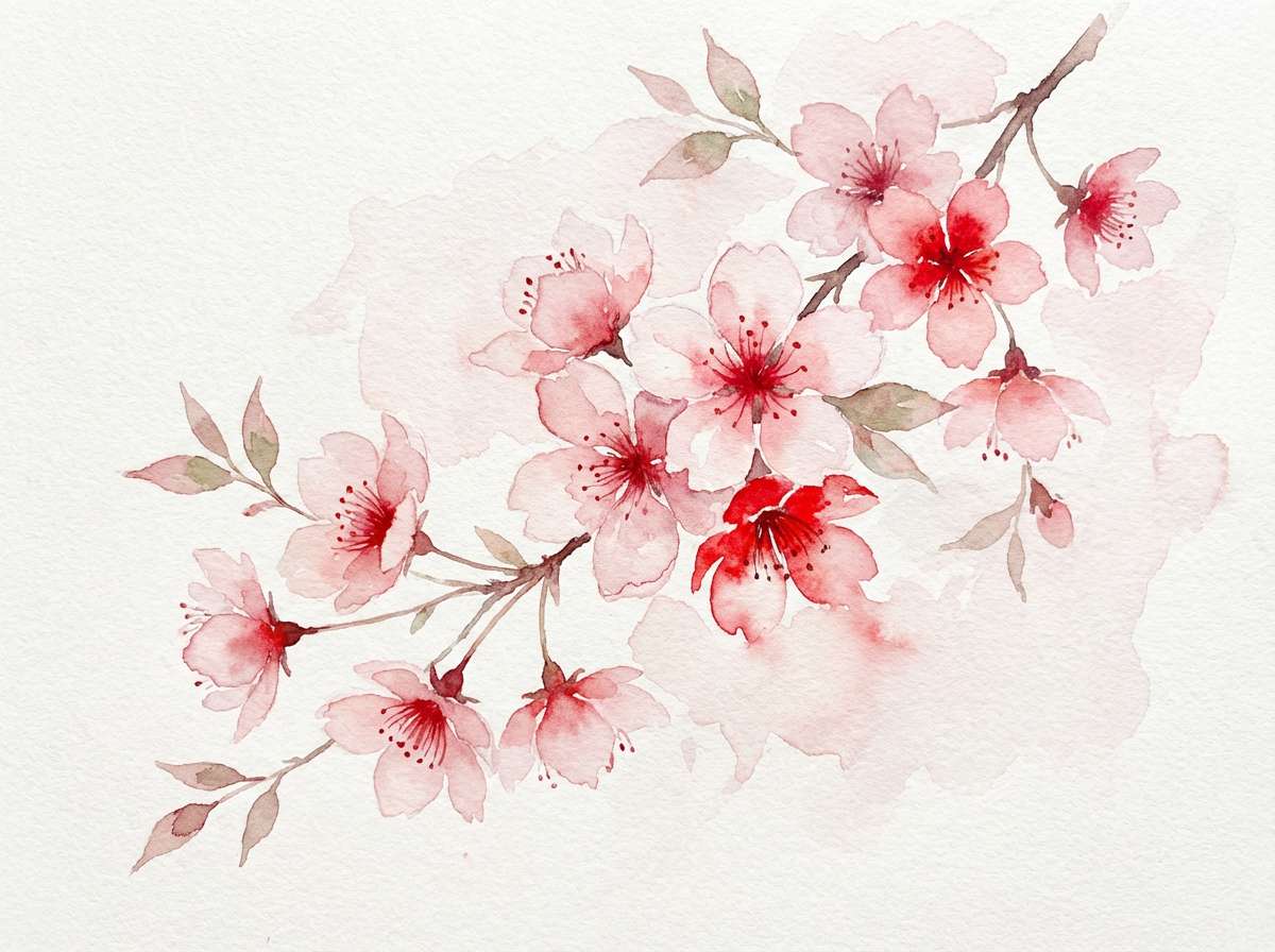
17) Cherry Blossom Contrast
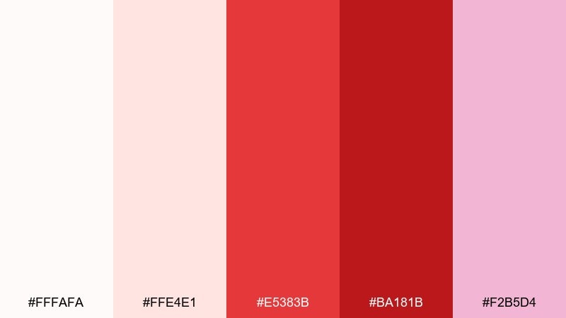
HEX: #fffafa #ffe4e1 #e5383b #ba181b #f2b5d4
Mood: romantic, vivid, floral
Best for: botanical prints and spring invitations
Cherry blossom pinks with vivid reds feel like petals against a bright sky. Use the soft blush for watercolor washes, then reserve the stronger reds for flower centers and typography accents. The extra pink tone adds a gentle gradient option for ribbons or border flourishes. Tip: keep red in small areas so the floral mood stays light and airy.
Image example of cherry blossom contrast generated using media.io
18) Red Thread Neutral
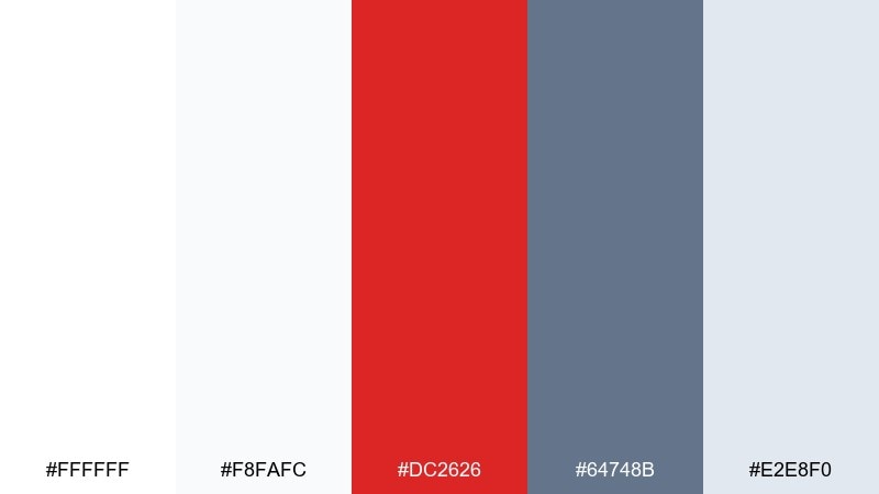
HEX: #ffffff #f8fafc #dc2626 #64748b #e2e8f0
Mood: professional, calm, clear
Best for: corporate slide decks and reports
Clean whites and soft grays feel dependable, like a well-edited report with one red thread of emphasis. Use gray-blue for charts, footnotes, and dividers, then apply the red to key numbers and section markers. The light gray makes a reliable background for tables without looking dull. Tip: keep red consistent as a single highlight color across all slides to build recognition.
Image example of red thread neutral generated using media.io
19) Scarlet Typography
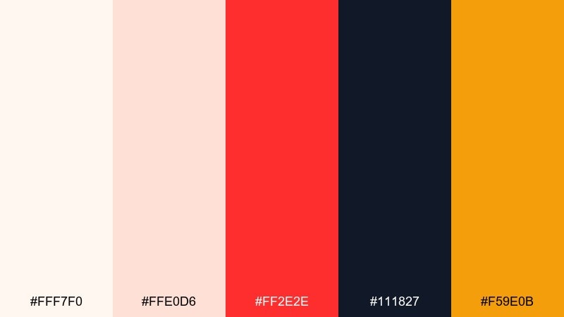
HEX: #fff7f0 #ffe0d6 #ff2e2e #111827 #f59e0b
Mood: bold, artsy, high-energy
Best for: typography posters and album art
Scarlet and warm neutrals feel like screen-printed ink on textured paper. White red color combinations like these are ideal for typographic impact, especially when paired with near-black for strong letterforms. Use the amber tone as a small accent for dates, stickers, or corner marks to add rhythm. Tip: set the main headline in black or near-black and let red carry the supporting words.
Image example of scarlet typography generated using media.io
20) Velvet Red Minimal
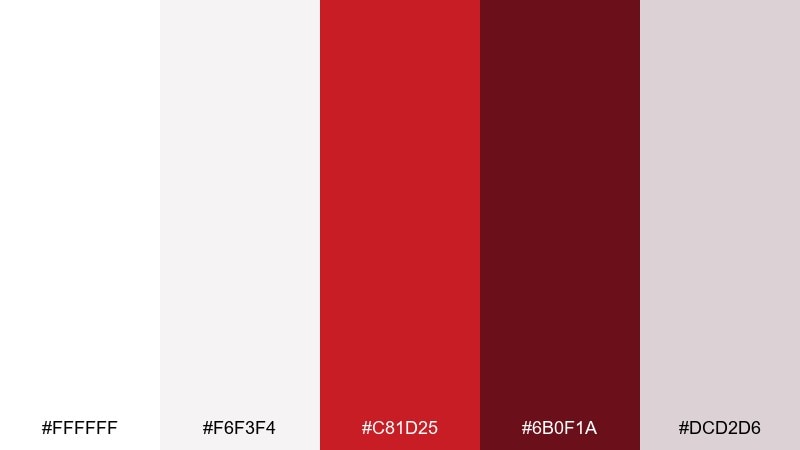
HEX: #ffffff #f6f3f4 #c81d25 #6b0f1a #dcd2d6
Mood: sleek, luxurious, minimal
Best for: wide website hero banners and product launches
Velvet reds against soft whites feel cinematic and premium, like a spotlight on a signature item. Use the pale neutral for spacious layouts, then place velvet red in one strong bar, button, or headline for instant focus. The deeper shade is perfect for secondary text, fine rules, or small badges. Tip: combine with subtle gradients and plenty of empty space to keep the hero section feeling high-end.
Image example of velvet red minimal generated using media.io
What Colors Go Well with White Red?
Neutrals are the easiest match: charcoal, slate, warm grays, and soft beige help control the intensity of red while keeping the overall design polished. If you want a crisp, modern feel, pair white red with cool grays and near-black typography.
For warmer, lifestyle aesthetics, try blush, peach, tan, or creamy off-whites—these soften contrast and make reds look richer in print. For a sharper editorial or sporty tone, add navy or deep blue-gray to anchor headings and long-form text.
If you need a third accent color, use it sparingly: gold/amber for premium highlights, or pale pink for gentle backgrounds and hover states. The goal is to keep red as the “signal” color so it stays meaningful.
How to Use a White Red Color Palette in Real Designs
Start with a white (or off-white) base for layouts, then decide where red earns attention: primary buttons, sale badges, warnings, or key headings. A good rule is to keep red to a small percentage of the overall composition so it doesn’t fatigue the eye.
Choose one main red and one darker red for hierarchy. The bright red handles calls-to-action; the deeper red supports dividers, labels, or premium typography where pure black might feel too stark.
Finally, check contrast across devices and print. Reds can shift in saturation, so test small text sizes, ensure accessible button contrast, and consider using warm whites in print to avoid a harsh, clinical look.
Create White Red Palette Visuals with AI
If you already have HEX codes, you can turn them into on-brand visuals quickly by generating mockups that match your use case—UI screens, packaging, posters, invitations, or patterns.
Use prompts that describe the layout style (minimal, editorial, festive), the medium (vector, studio photo, watercolor), and where the red should appear (buttons, stripes, seals). This helps the AI keep red as an accent instead of flooding the whole design.
With Media.io, you can iterate variations fast—swap red shades, adjust background warmth, and produce multiple aspect ratios for social, web, and print.
White Red Color Palette FAQs
-
What does a white red color palette communicate?
It typically signals clarity and confidence: white feels clean and open, while red adds urgency, passion, or emphasis. The exact message depends on the red shade—scarlet feels bold, burgundy feels premium, and coral feels friendly. -
How do I keep red from overpowering a mostly white design?
Limit red to a few high-priority elements (one button style, one badge style, or key headings) and rely on off-whites and grays for the rest. Adding a darker red for secondary hierarchy also reduces the need for large bright-red areas. -
Which text color works best with white and red?
Charcoal or near-black is usually best for body text because it stays readable and doesn’t compete with red. Dark navy or deep wine can also work if you want softer contrast than pure black. -
Are white and red good brand colors?
Yes—this combo is memorable and scales well across packaging, websites, and ads. To make it feel distinctive, choose a signature red (cool ruby vs. warm poppy) and a specific white (pure white vs. cream). -
What are good supporting colors for a white red palette?
Great supports include warm beige, blush pink, slate gray, navy, and small touches of gold/amber. Pick supports based on your tone: cool grays for modern tech, creams for lifestyle, and navy for editorial structure. -
Does red print differently than it looks on screen?
Often, yes—reds can appear darker or less saturated in print depending on paper and ink profiles. Use proofs when possible, avoid ultra-neon reds for small text, and consider warmer off-white paper to make red look richer. -
How can I generate white red palette mockups quickly?
Use an AI text-to-image tool and describe the design type (packaging, UI, poster), the style (minimal, premium, festive), and where red should be used (CTA buttons, stripes, seals). Then iterate by swapping HEX-inspired red shades until it matches your brand.
Next: Gray Red Color Palette


