

A gray red color palette is the sweet spot between calm structure and bold emotion. The grays bring balance and clarity, while the red adds focus, warmth, and momentum.
Whether you’re designing a brand, UI, interior mood board, or print piece, gray-and-red combinations help you build hierarchy fast without looking chaotic.
In this article
Why Gray Red Palettes Work So Well
Gray is a natural “layout color”: it supports typography, grids, and imagery without stealing attention. Red does the opposite—in the best way—by instantly signaling importance, emotion, and action.
Together, they create reliable contrast and clear hierarchy. You can keep most of the design neutral and use red only where you want eyes to land (buttons, badges, headlines, or key product details).
Gray also changes the personality of red. Pair scarlet with cool steel for a modern feel, or match a wine red with warm concrete grays for something more artisanal and cozy.
20+ Gray Red Color Palette Ideas (with HEX Codes)
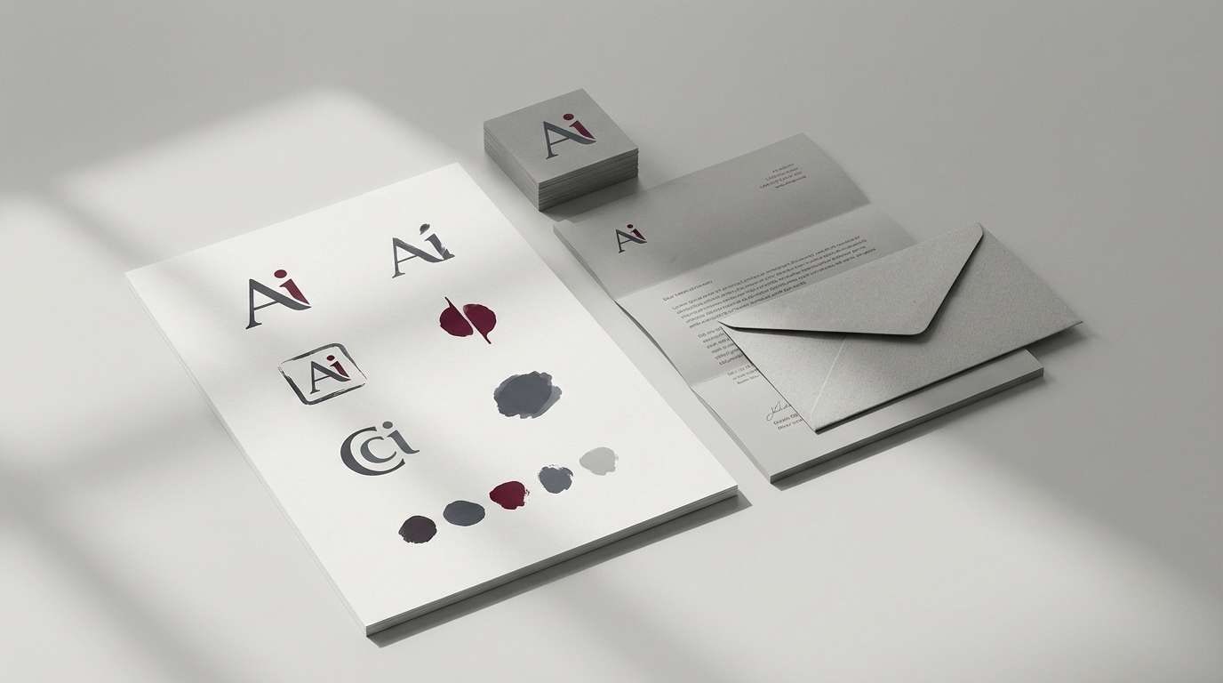
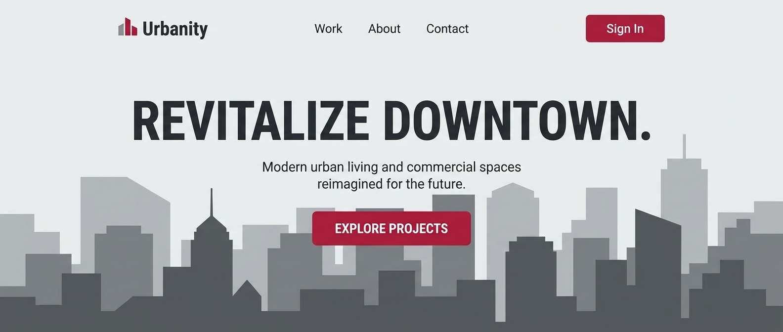
1) Ash Crimson
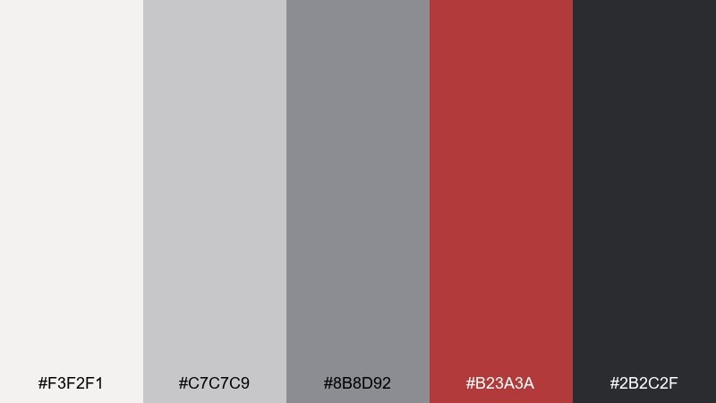
HEX: #f3f2f1 #c7c7c9 #8b8d92 #b23a3a #2b2c2f
Mood: clean, bold, metropolitan
Best for: brand identity and logo systems
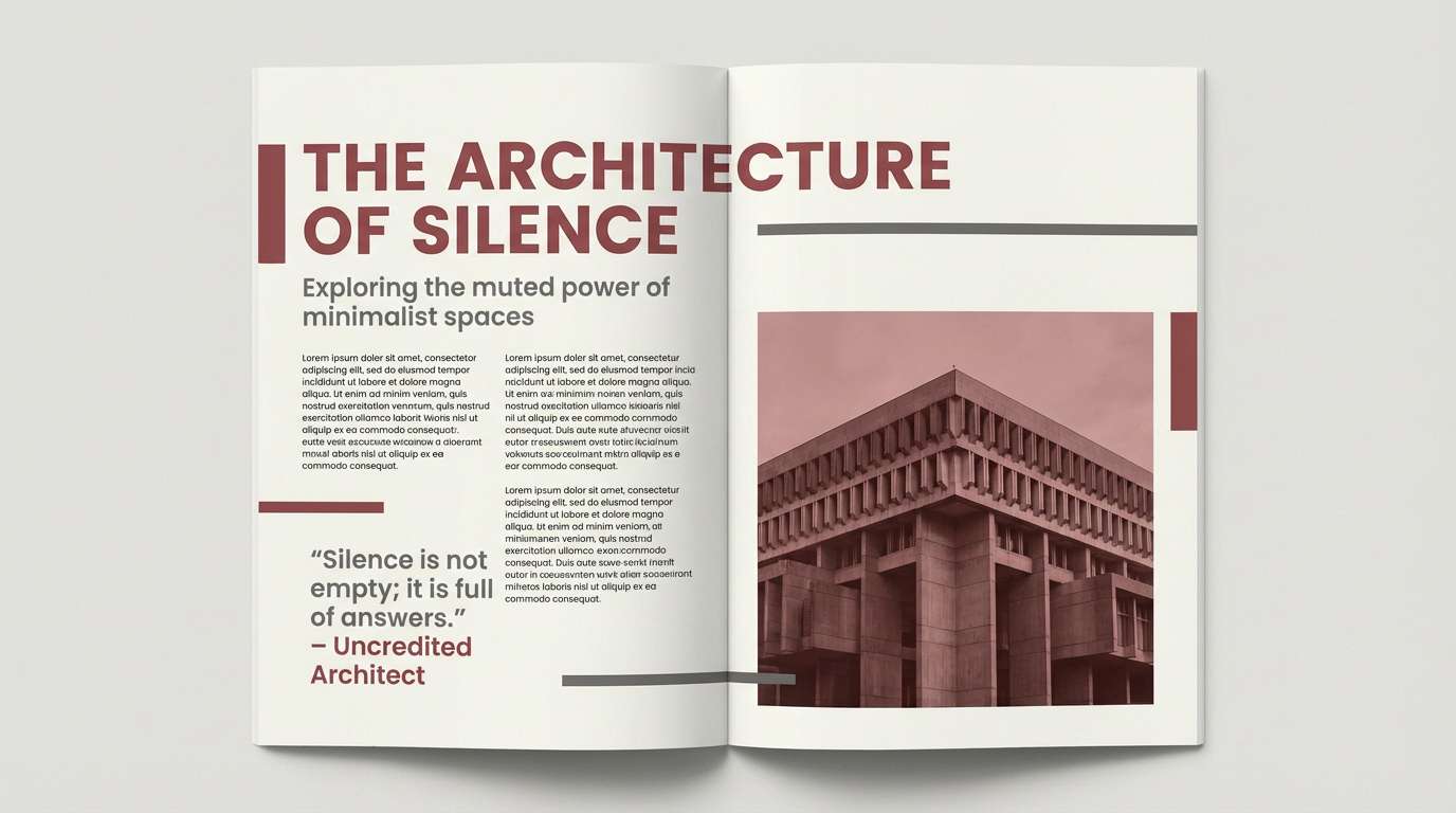
Clean ash tones meet a confident crimson, like concrete and neon signage at dusk. This gray red color palette stays professional while still feeling energetic, especially for tech, architecture, and modern retail. Pair it with plenty of white space and a strong sans serif to keep the look crisp. Usage tip: reserve the red for key marks and calls to action, and let the grays handle the layout.
Image example of ash crimson generated using media.io
Media.io is an online AI studio for creating and editing video, image, and audio in your browser.

2) Slate Rose
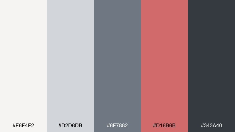
HEX: #f6f4f2 #d2d6db #6f7882 #d16b6b #343a40
Mood: soft, refined, editorial
Best for: wedding invitations and stationery
Soft slate and muted rose feel like pressed petals on cool stone. The tones read romantic without turning sugary, making them great for invitations, vow cards, and ceremony programs. Pair with warm ivory paper textures and delicate line art for an elevated finish. Usage tip: keep body copy in deep charcoal and use rose only for names, monograms, or dividers.
Image example of slate rose generated using media.io

3) Graphite Garnet
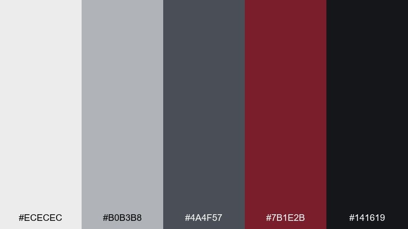
HEX: #ececec #b0b3b8 #4a4f57 #7b1e2b #141619
Mood: dramatic, premium, nocturnal
Best for: luxury packaging and labels
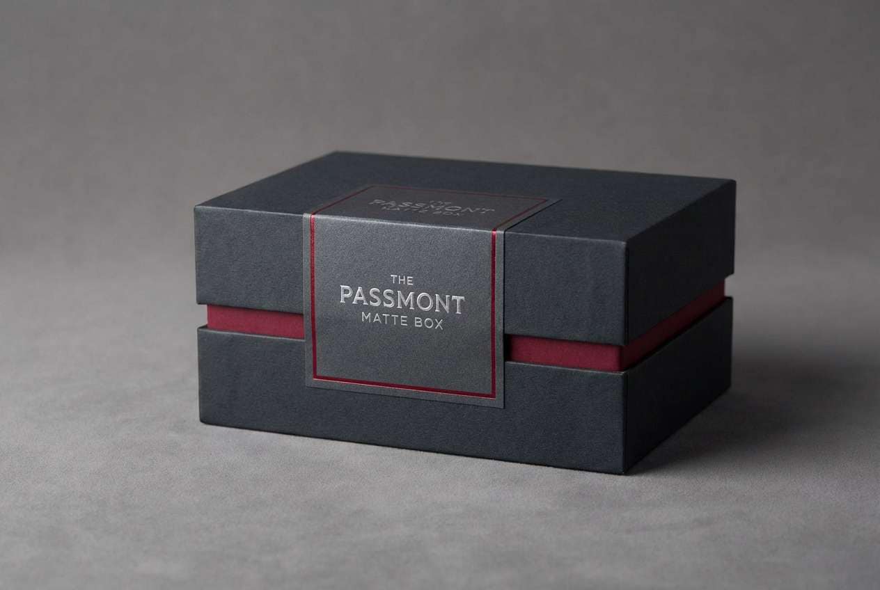
Dark graphite and garnet evoke velvet booths, candlelight, and late-night cocktails. These gray red color combinations feel premium on matte finishes, foil stamps, and minimalist labels. Pair with a warm off-white for readability and a restrained accent pattern for texture. Usage tip: print garnet as a spot color on black or near-black to keep it rich, not muddy.
Image example of graphite garnet generated using media.io
4) Foggy Brick
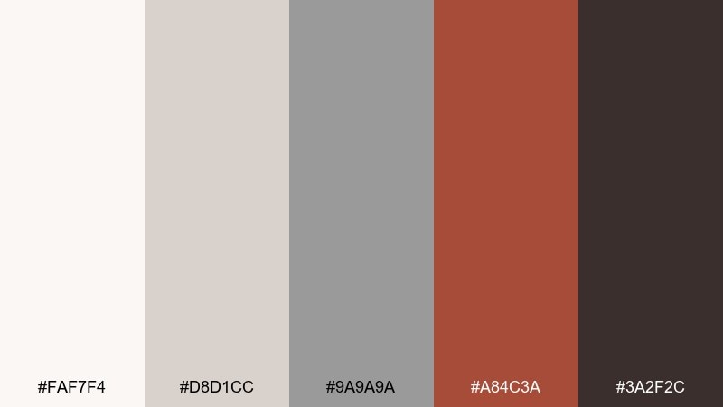
HEX: #faf7f4 #d8d1cc #9a9a9a #a84c3a #3a2f2c
Mood: grounded, warm, architectural
Best for: interior mood boards and decor planning
Foggy neutrals with brick red accents feel like a renovated loft with exposed masonry. It works beautifully for interior boards, paint planning, and material selections where you want warmth without going full terracotta. Pair with natural wood, black metal hardware, and linen textures for a lived-in look. Usage tip: use brick on one focal element, then echo it in smaller accessories to avoid visual heaviness.
Image example of foggy brick generated using media.io
5) Pewter Cherry
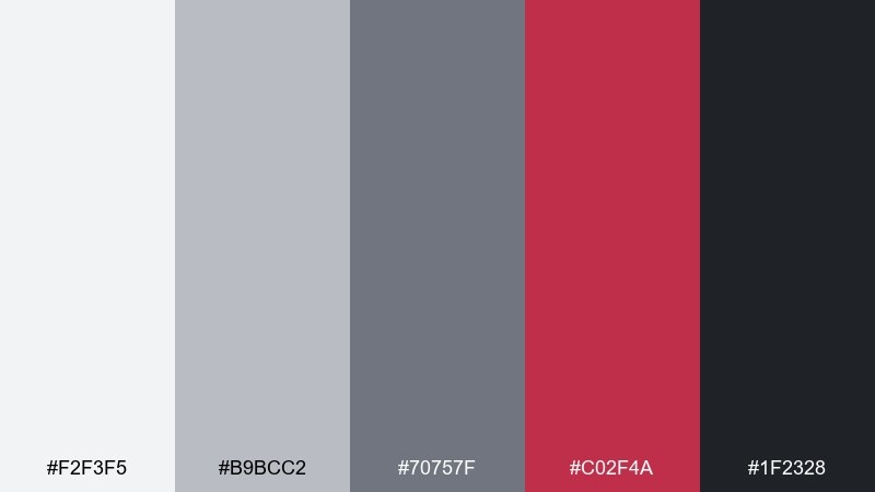
HEX: #f2f3f5 #b9bcc2 #70757f #c02f4a #1f2328
Mood: sleek, punchy, modern
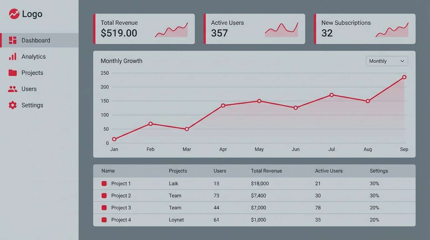
Best for: SaaS dashboards and UI accents
Sleek pewter grays with a cherry pop feel like a polished interface with just the right urgency. The neutral foundation supports data-heavy layouts, while cherry helps highlight states like alerts, active tabs, or progress. Pair with generous spacing and subtle borders so the contrast stays comfortable. Usage tip: limit cherry to one primary action style and keep secondary actions in gray.
Image example of pewter cherry generated using media.io
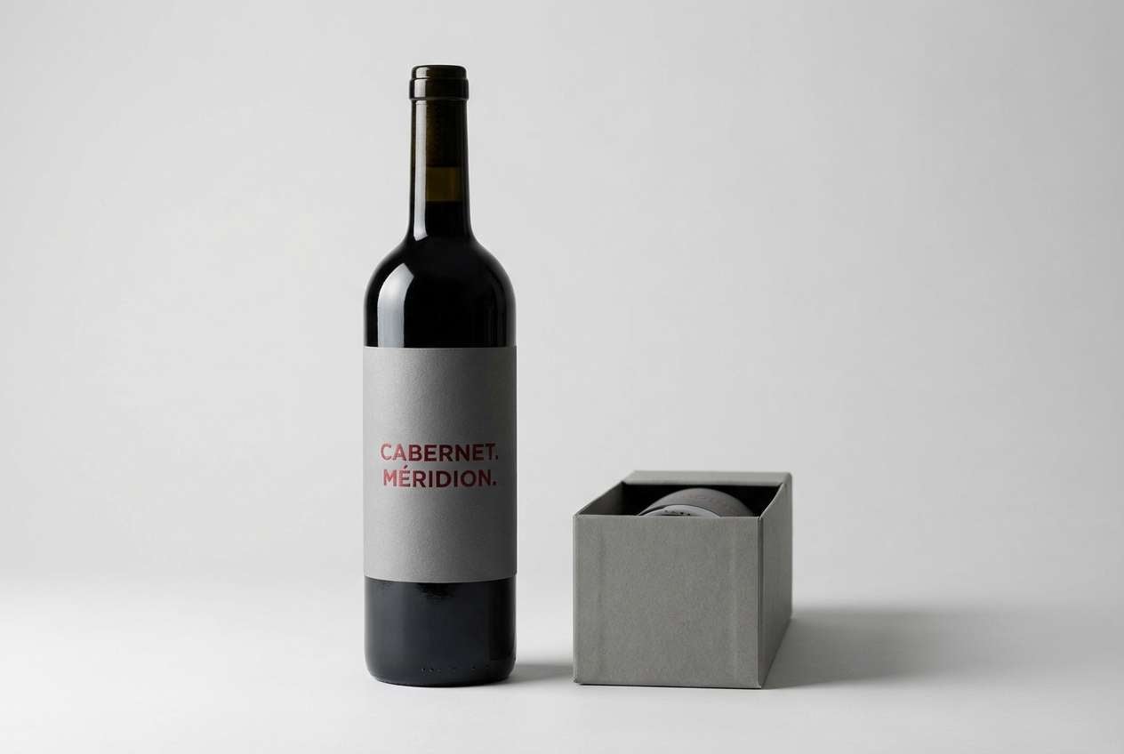
6) Concrete Cabernet
HEX: #f7f5f2 #c9c6c2 #7a7773 #6b1f2b #262524
Mood: moody, rustic, upscale
Best for: wine labels and gourmet packaging
Concrete gray and cabernet red suggest cellar walls, oak barrels, and deep berry notes. The palette feels artisanal and upscale, perfect for wine, specialty coffee, or small-batch food packaging. Pair with cream paper and classic serif typography to lean into heritage. Usage tip: use cabernet for the brand mark and keep varietal text in dark gray for easy scanning.
Image example of concrete cabernet generated using media.io
7) Steel Blush
HEX: #ffffff #d9dee5 #8a94a3 #e39a9a #2e3440
Mood: airy, gentle, contemporary
Best for: beauty brands and minimal lookbooks
Airy steel grays and blush red feel like soft lighting on polished metal. These tones fit skincare, cosmetics, and lookbooks where you want calm confidence rather than loud contrast. Pair with minimal photography, thin rules, and roomy margins for a high-end feel. Usage tip: keep blush as a tint behind headlines or badges instead of using it as body text.
Image example of steel blush generated using media.io
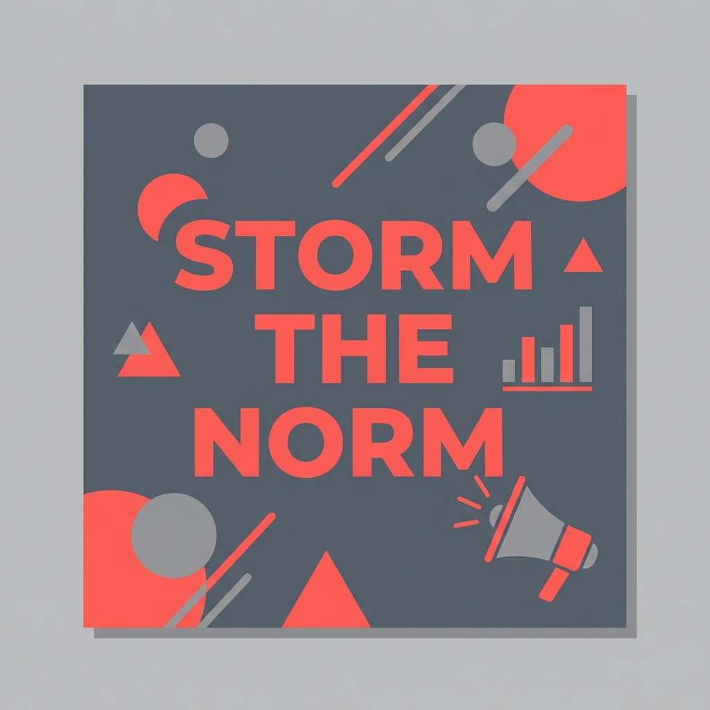
8) Stormy Coral
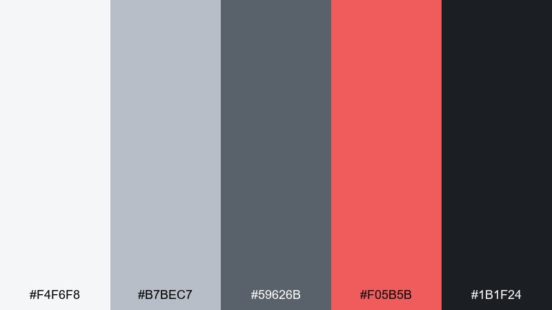
HEX: #f4f6f8 #b7bec7 #59626b #f05b5b #1b1f24
Mood: energetic, sharp, high-contrast
Best for: campaign graphics and social templates
Stormy grays with coral red bring the feeling of a breaking news banner or a fast-moving campaign launch. The gray red color scheme works well for bold headlines, countdown posts, and crisp icon sets. Pair with heavy weights and simple shapes so the coral stays clean, not chaotic. Usage tip: use coral for one focal element per layout, then let mid-gray handle supporting information.
Image example of stormy coral generated using media.io
9) Smoke Marsala
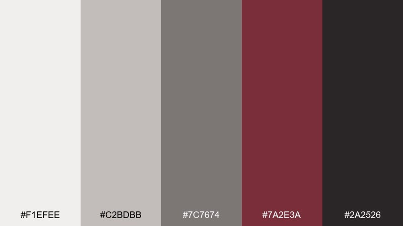
HEX: #f1efee #c2bdbb #7c7674 #7a2e3a #2a2526
Mood: mature, cozy, literary
Best for: magazine features and editorial layouts
Smoky neutrals with marsala red feel like worn leather, paper grain, and a quiet reading nook. The mix suits editorial spreads where you need depth, hierarchy, and a subtle accent for pull quotes. Pair with warm photography and a serif headline style for a timeless mood. Usage tip: set long-form text in mid-dark gray to reduce glare while keeping contrast accessible.
Image example of smoke marsala generated using media.io
10) Silver Poppy
HEX: #f8f8f8 #d0d3d6 #888f97 #d63b3b #24272b
Mood: fresh, confident, clear
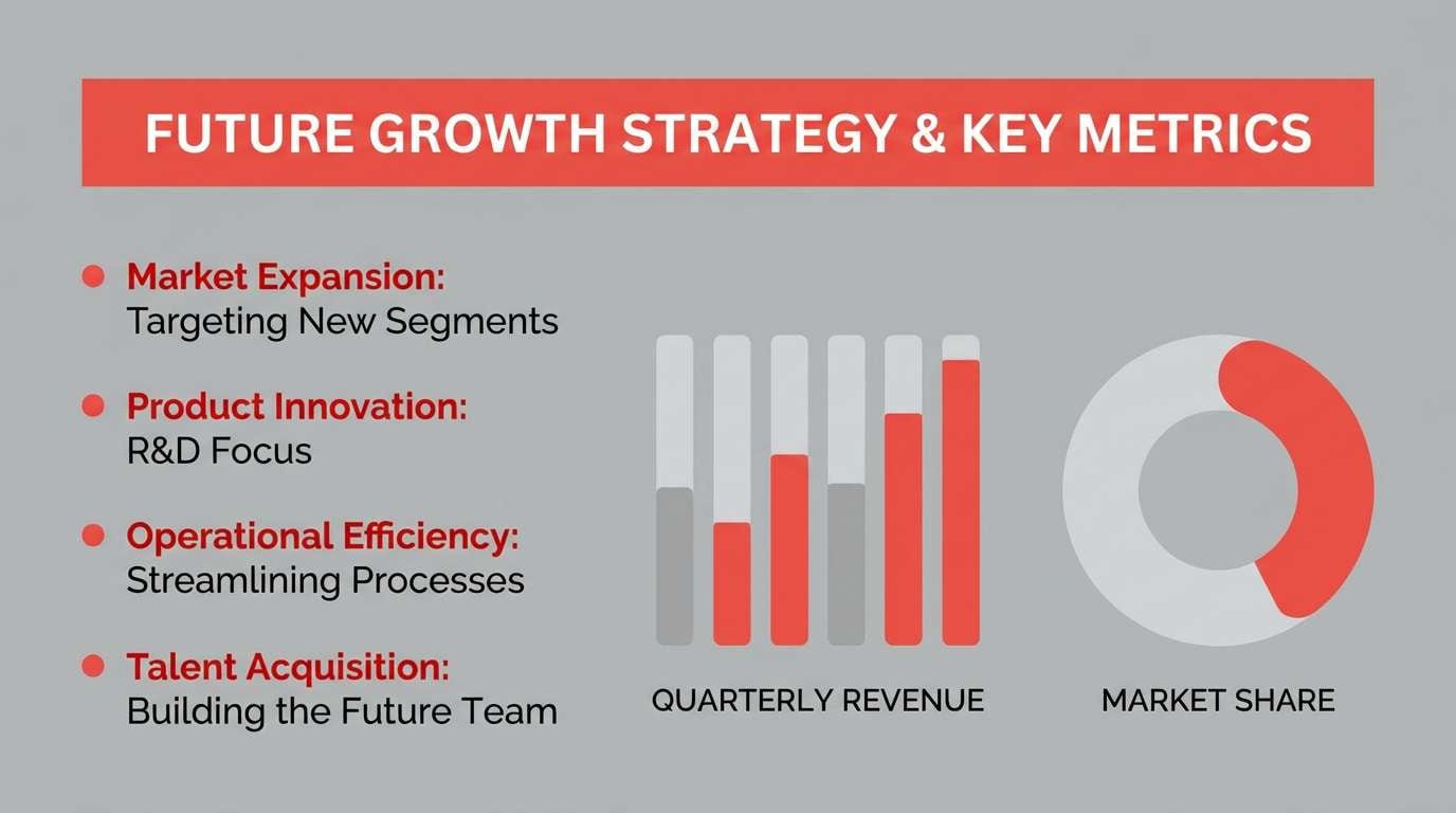
Best for: presentation decks and pitch templates
Silver grays with poppy red feel like a crisp keynote with confident emphasis. A gray red color combination like this keeps slides readable while still making key numbers and section headers stand out. Pair with simple charts, thin dividers, and lots of whitespace to avoid visual noise. Usage tip: use poppy only for highlights and keep diagrams mostly neutral for consistency.
Image example of silver poppy generated using media.io
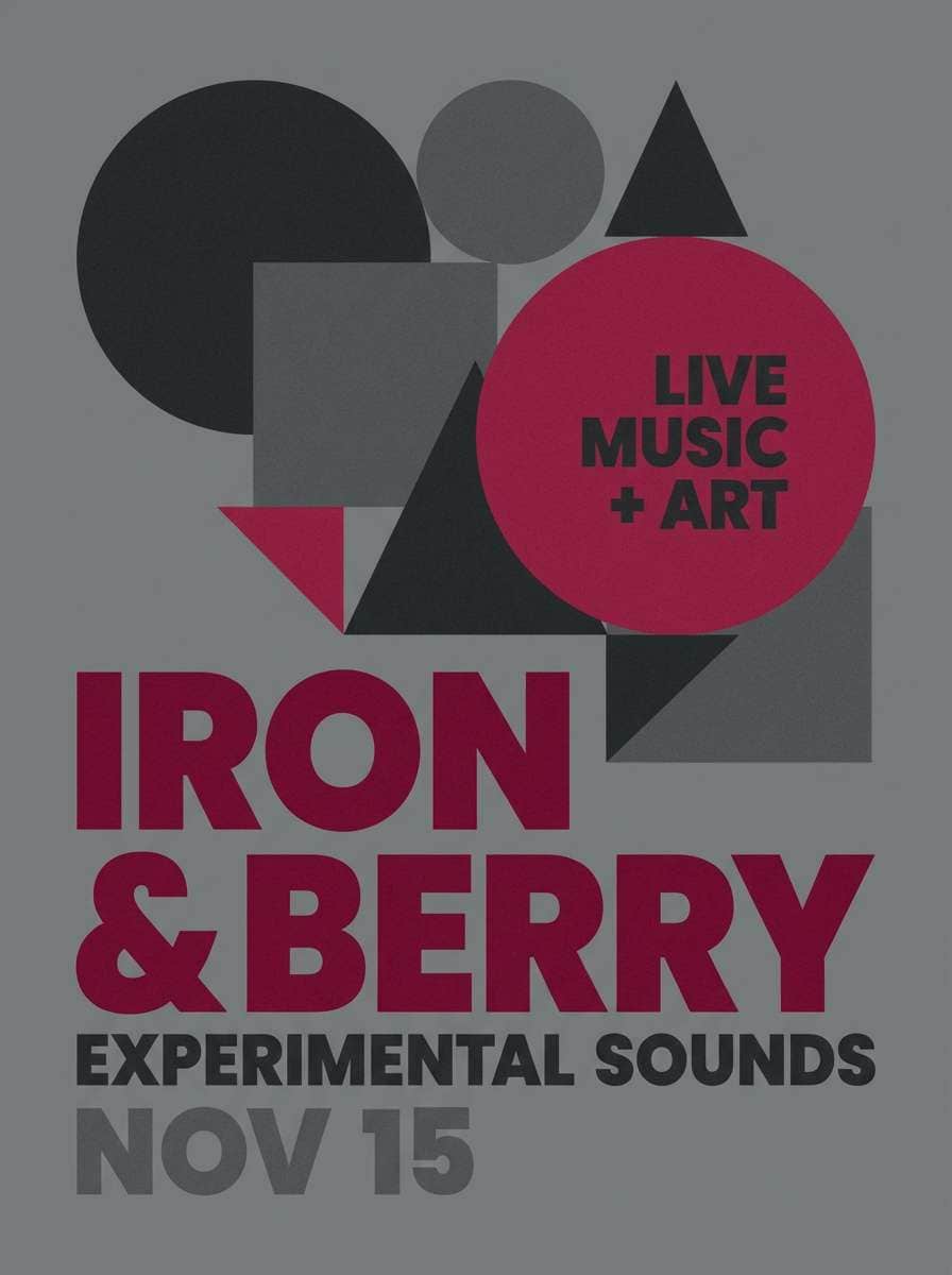
11) Ironberry
HEX: #e9eaec #b3b5ba #5b5f66 #8f1d2c #1a1b1e
Mood: tough, sporty, focused
Best for: sports branding and event promos
Iron grays with deep berry red evoke stadium lights and serious training energy. The contrast is strong enough for jerseys, signage, and event posters where legibility matters at a distance. Pair with condensed type and high-impact photography for a bold, competitive vibe. Usage tip: keep backgrounds dark and use the light gray as a buffer around text to improve readability.
Image example of ironberry generated using media.io
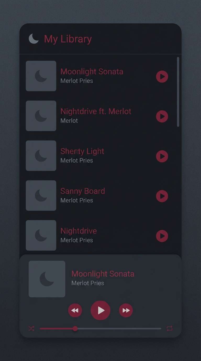
12) Moonlit Merlot
HEX: #f5f4f7 #c8c4cf #6b6773 #5a1f33 #201a1f
Mood: mysterious, elegant, night-out
Best for: music app UI and nightlife branding
Moonlit grays with merlot red feel like velvet curtains and a low-lit playlist bar. The darker neutrals create a smooth backdrop for album art, while merlot adds a luxurious accent for active states. Pair with subtle gradients and rounded components to keep the interface inviting. Usage tip: reserve merlot for selection and progress indicators so users always know where to focus.
Image example of moonlit merlot generated using media.io
13) Downtown Ruby
HEX: #f7f7f6 #cfd2d6 #7b8088 #c1122e #2a2e34
Mood: urban, crisp, attention-grabbing
Best for: website headers and hero sections
Crisp downtown grays with ruby red feel like street signs against glass buildings. This gray red color palette is ideal for strong hero banners, navigation states, and bold typographic statements. Pair with clean grids and a restrained icon style to keep the look modern. Usage tip: place ruby on one primary button and reinforce it with small hover or underline details.
Image example of downtown ruby generated using media.io
14) Dusty Cranberry
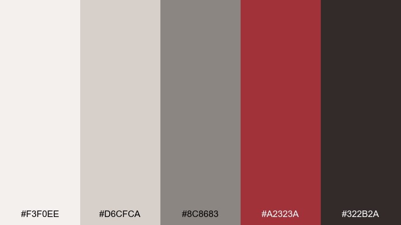
HEX: #f3f0ee #d6cfca #8c8683 #a2323a #322b2a
Mood: cozy, handmade, nostalgic
Best for: seasonal crafts and small business branding
Dusty grays and cranberry red feel like knit scarves, kraft paper, and handwritten notes. These gray red color combinations suit candles, soaps, and artisan goods where warmth matters more than shine. Pair with off-white stock, textured backgrounds, and a friendly serif to keep it welcoming. Usage tip: use cranberry as a stamp-like accent and keep most surfaces light for a boutique feel.
Image example of dusty cranberry generated using media.io
15) Granite Pepper
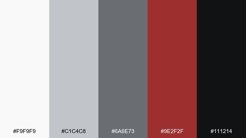
HEX: #f9f9f9 #c1c4c8 #6a6e73 #9e2f2f #111214
Mood: minimal, assertive, graphic
Best for: typographic posters and announcements
Granite and peppery darks with a restrained red accent feel sharp and modern. The neutrals create strong structure for big type, while the red acts like a precise underline or stamp. Pair with a single font family and tight spacing for a design-forward look. Usage tip: use red sparingly as a punctuation mark, not a fill color for large blocks.
Image example of granite pepper generated using media.io
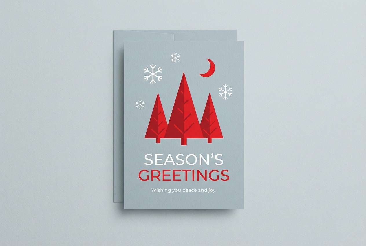
16) Winter Scarlet
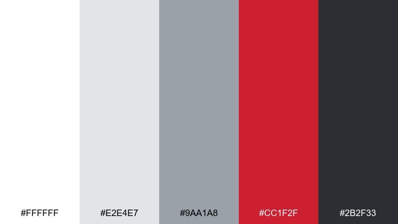
HEX: #ffffff #e2e4e7 #9aa1a8 #cc1f2f #2b2f33
Mood: festive, crisp, wintry
Best for: holiday cards and seasonal email banners
Icy grays with scarlet red feel like fresh snow and a bright ribbon. The palette reads festive without leaning into green, making it perfect for modern holiday campaigns. Pair with minimal illustrations, thin line icons, and a touch of sparkle texture if needed. Usage tip: keep scarlet for greetings and key dates, and let light gray carry background shapes.
Image example of winter scarlet generated using media.io
17) Urban Wine
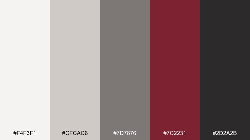
HEX: #f4f3f1 #cfcac6 #7d7876 #7c2231 #2d2a2b
Mood: cozy, sophisticated, culinary
Best for: restaurant menus and cafe branding
Urban neutrals with wine red evoke dim bistros, chalkboard menus, and a warm glass on the table. The grays keep layouts tidy, while wine red adds appetite appeal and a sense of craft. Pair with cream stock, textured paper, and classic typography for a refined menu system. Usage tip: use the red for section headers and small icons, not for long ingredient lists.
Image example of urban wine generated using media.io
18) Soft Ember

HEX: #f7f3f1 #d7d1cf #9b9493 #c84a3b #3a3332
Mood: gentle, earthy, comforting
Best for: botanical illustrations and wellness content
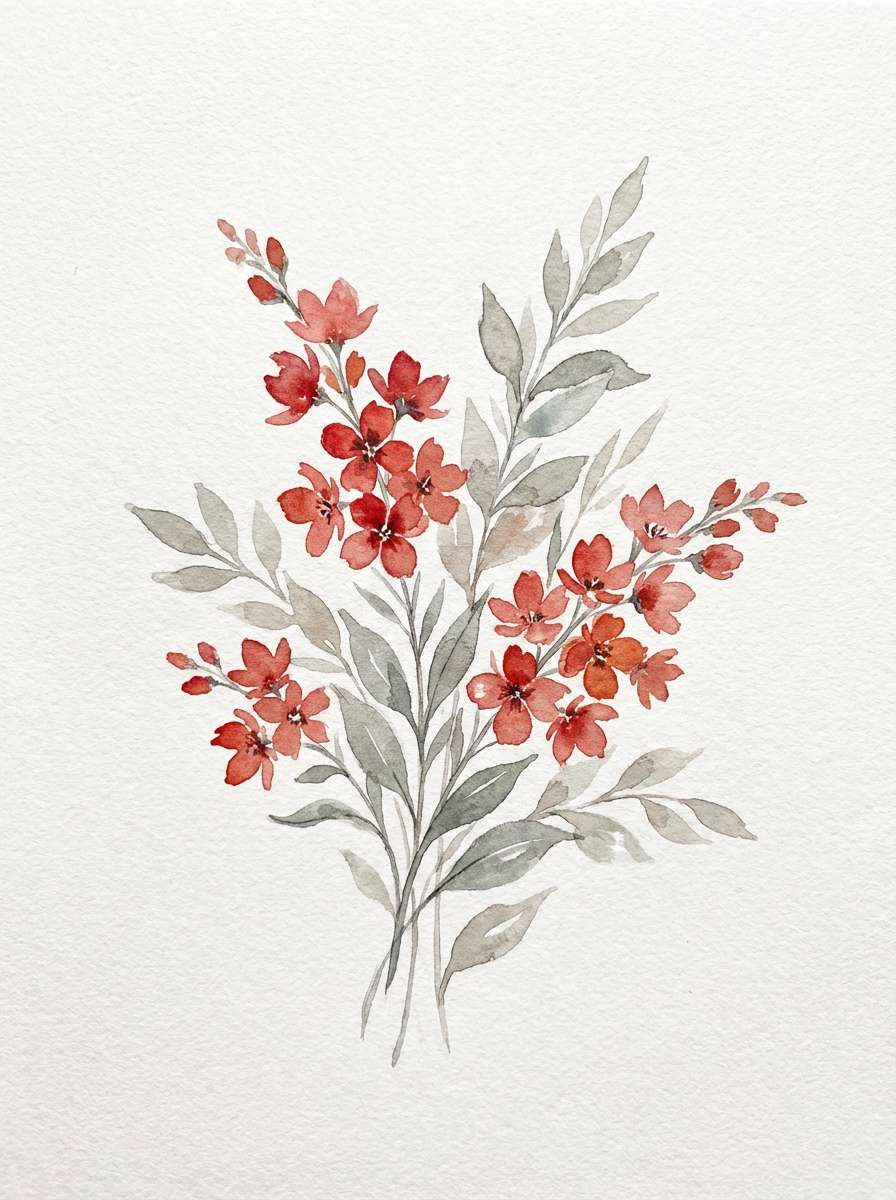
Soft ember red with calm grays feels like dried petals, clay, and morning tea steam. The warmth is inviting for wellness posts, journaling pages, and botanical visuals. Pair with hand-drawn linework and subtle paper textures to keep it organic. Usage tip: paint the ember as a watercolor wash and outline details in warm gray instead of pure black.
Image example of soft ember generated using media.io
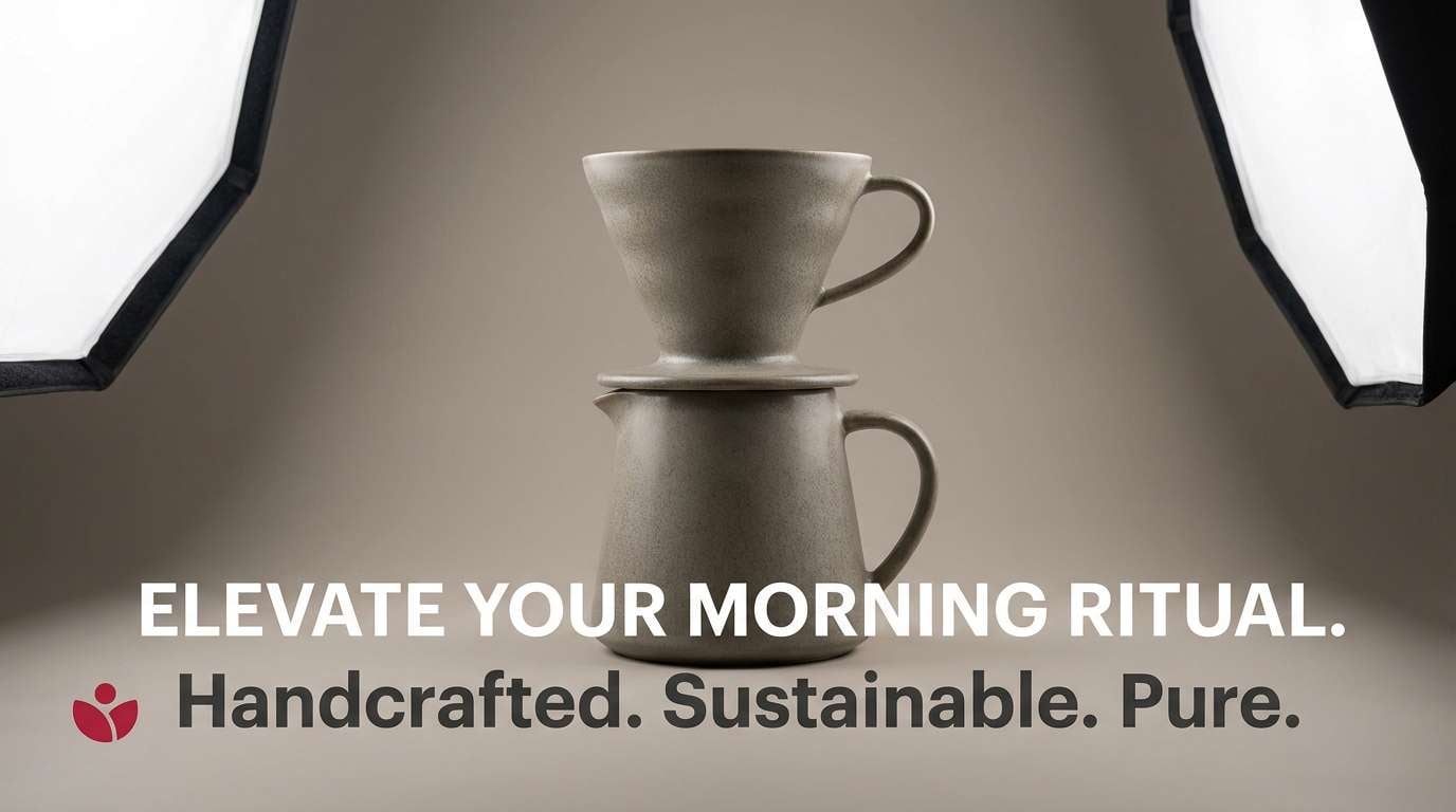
19) Modern Carmine
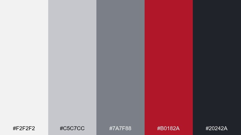
HEX: #f2f2f2 #c5c7cc #7a7f88 #b0182a #20242a
Mood: confident, modern, high-impact
Best for: product ads and landing page sections
Modern grays with carmine red feel like a clean studio ad with a powerful focal point. The neutral range supports product photography and specs, while the red pushes urgency for promos and limited drops. Pair with crisp shadows, simple shapes, and clear hierarchy for conversion-friendly layouts. Usage tip: use carmine for price tags and primary buttons, and keep supporting UI in mid-gray.
Image example of modern carmine generated using media.io
20) Quarry Redbud
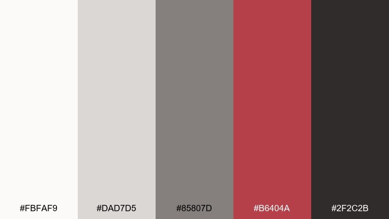
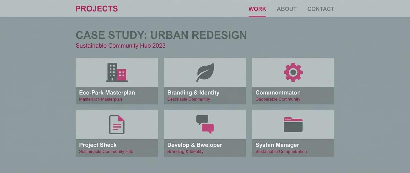
HEX: #fbfaf9 #dad7d5 #85807d #b6404a #2f2c2b
Mood: natural, balanced, understated
Best for: portfolio sites and case study pages
Quarry-like grays with redbud warmth feel calm, grounded, and quietly creative. The tones suit portfolios and case studies where you want a neutral frame for work samples with a tasteful accent. Pair with warm whites, generous spacing, and a muted photo treatment for cohesion. Usage tip: repeat the redbud only in small UI elements like links and section markers to keep attention on the projects.
Image example of quarry redbud generated using media.io
What Colors Go Well with Gray Red?
Neutrals are the easiest add-ons: white, off-white, and near-black extend your gray range and give you clean space for typography. Creamier whites warm up brick, wine, and garnet reds, while bright white keeps scarlet and ruby looking modern.
For a softer, lifestyle feel, pair gray red tones with warm beiges, light taupes, or blush tints. For a sharper, tech-forward look, cool blues (slate, steel, or icy blue) blend naturally with gray and keep the red feeling crisp.
If you want a premium accent, a small touch of gold (foil, icons, or micro-details) can elevate darker reds like cabernet or merlot. Keep it minimal so it reads as refinement, not clutter.
How to Use a Gray Red Color Palette in Real Designs
Use grays for your foundation: backgrounds, cards, dividers, and long-form text. Then treat red as an attention tool—CTAs, highlights, error states, price tags, or a single focal element in a print layout.
Control the ratio. A practical rule is 80–90% neutrals and 10–20% red accents, especially in UI and presentations. This keeps the design readable and prevents the red from feeling aggressive.
Choose the right red for the job: bright reds (scarlet, poppy) for urgency and energy; deeper reds (garnet, merlot) for luxury and mood; muted reds (rose, blush) for calm editorial and lifestyle work.
Create Gray Red Palette Visuals with AI
If you’re presenting a concept, showing the palette in context matters as much as the HEX codes. Generating quick mockups (posters, packaging, UI, invitations) helps stakeholders “feel” the direction faster.
With Media.io, you can turn a simple prompt into on-brand visuals in minutes, then iterate by adjusting lighting, materials, typography vibe, or the red accent intensity while keeping the gray structure consistent.
Start with one of the prompts above, swap the scene to match your project, and keep your chosen HEX set nearby so your outputs stay cohesive across pages and assets.
Gray Red Color Palette FAQs
-
What does a gray and red color palette communicate?
It communicates balance plus urgency: gray feels stable, professional, and structured, while red adds energy, emotion, and clear focal points. Together they’re great for modern brands and high-contrast layouts. -
How do I keep gray red designs from feeling too harsh?
Use softer grays (light ash, fog, or warm concrete), reduce saturation of the red (rose, cranberry, marsala), and increase white space. Reserve bright reds for small accents instead of large fills. -
Which gray works best with bright reds like scarlet or ruby?
Cool mid-to-dark grays (steel, slate, charcoal) keep bright reds looking crisp and contemporary. If your gray is too warm, the red can appear less clean and more earthy. -
Can I use gray and red for UI design without hurting readability?
Yes—use gray for most surfaces and text, and apply red only for primary actions, key states, or alerts. Make sure body text stays in dark gray or near-black and check contrast for accessibility. -
What’s a good accent color to add to gray red palettes?
Off-white/ivory is the safest third color. For a cooler vibe, add a muted blue. For a premium touch, add small gold details (icons, lines, or foil effects) especially with deeper reds. -
Which gray red palette is best for luxury packaging?
Try darker, richer combinations like Graphite Garnet or Moonlit Merlot. They look especially premium on matte materials, with restrained typography and a single high-quality accent (foil, emboss, or spot color). -
How can I quickly visualize a gray red palette in real scenes?
Use an AI image generator to create mockups like stationery, packaging, posters, or UI screens. Start from a prompt style you like, then iterate while keeping your chosen HEX colors consistent.
Next: Gold Color Palette


