

White and purple is a timeless combo: white keeps layouts airy and readable, while purple adds personality—from gentle lilac to deep, dramatic plum.
Below are 20 curated white purple color palette ideas (with HEX codes), plus practical tips for branding, UI, invitations, and more.
In this article
- Why White Purple Palettes Work So Well
-
- lavender milk
- orchid frost
- grape sorbet
- amethyst snow
- lilac whisper
- plum linen
- violet marble
- wisteria dawn
- iris minimal
- berry macaron
- purple haze studio
- royal velvet white
- heather cloud
- moonlit lavender
- eggplant accent
- pastel violet party
- lilac botanical
- modern orchid ui
- purple wedding suite
- cosmic lilac night
- What Colors Go Well with White Purple?
- How to Use a White Purple Color Palette in Real Designs
- Create White Purple Palette Visuals with AI
Why White Purple Palettes Work So Well
White creates instant breathing room, helping typography, icons, and product imagery feel cleaner and more premium. Purple then delivers the “emotion layer,” ranging from calming lavender to bold royal violet.
Because purple naturally reads as creative and elevated, it’s a strong choice for modern branding, beauty, wellness, and event design. Paired with white, it stays balanced and avoids feeling heavy.
In UI, white-purple schemes are especially effective for hierarchy: white for structure, soft tints for sections, and deep purples for buttons and headings—making interfaces feel both friendly and confident.
20+ White Purple Color Palette Ideas (with HEX Codes)
1) Lavender Milk
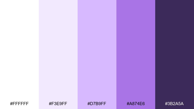
HEX: #ffffff #f3e9ff #d7b9ff #a874e6 #3b2a5a
Mood: soft, clean, comforting
Best for: skincare packaging and clean beauty ads
Soft and comforting like steamed milk with a lavender swirl, these tones feel gentle but polished. The white purple color combination works beautifully on labels, tubes, and minimal product ads where clarity matters. Pair it with matte whites and a single deep-plum headline for contrast. Usage tip: keep body text in the darkest shade and reserve lavender for highlights and ingredient callouts.
Image example of lavender milk generated using media.io
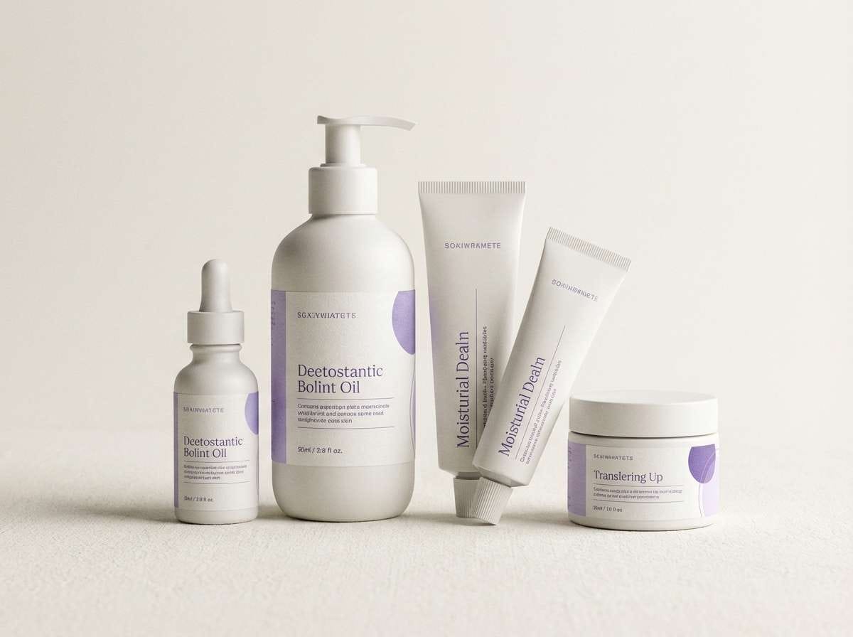
Media.io is an online AI studio for creating and editing video, image, and audio in your browser.

2) Orchid Frost
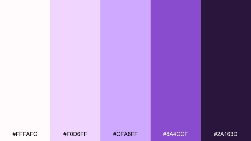
HEX: #fffafc #f0d6ff #cfa8ff #8a4ccf #2a163d
Mood: elegant, airy, romantic
Best for: wedding invitations and save-the-dates
Elegant and airy like orchids kissed by morning frost, this mix reads romantic without feeling sugary. Use the pale tints for spacious layouts and let the richer purple anchor names, dates, and monograms. It pairs well with pearl textures, thin line art, and subtle foil effects. Usage tip: print the darkest shade for legibility and keep the mid-purple as your accent layer.
Image example of orchid frost generated using media.io
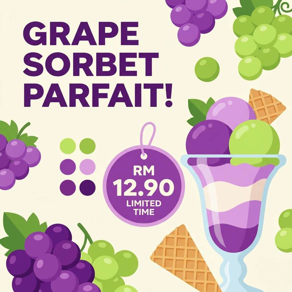
3) Grape Sorbet
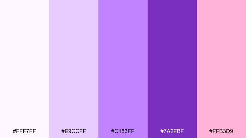
HEX: #fff7ff #e9ccff #c183ff #7a2fbf #ffb3d9
Mood: playful, sweet, upbeat
Best for: dessert promos and social media graphics
Playful and sweet like a chilled scoop of sorbet, these colors pop with friendly energy. The warm pink accent keeps the purples from turning too formal and makes call-to-action buttons stand out. Pair with rounded sans fonts and simple sticker-style icons for a trendy feel. Usage tip: limit the hot pink to one focal element per layout to avoid visual noise.
Image example of grape sorbet generated using media.io
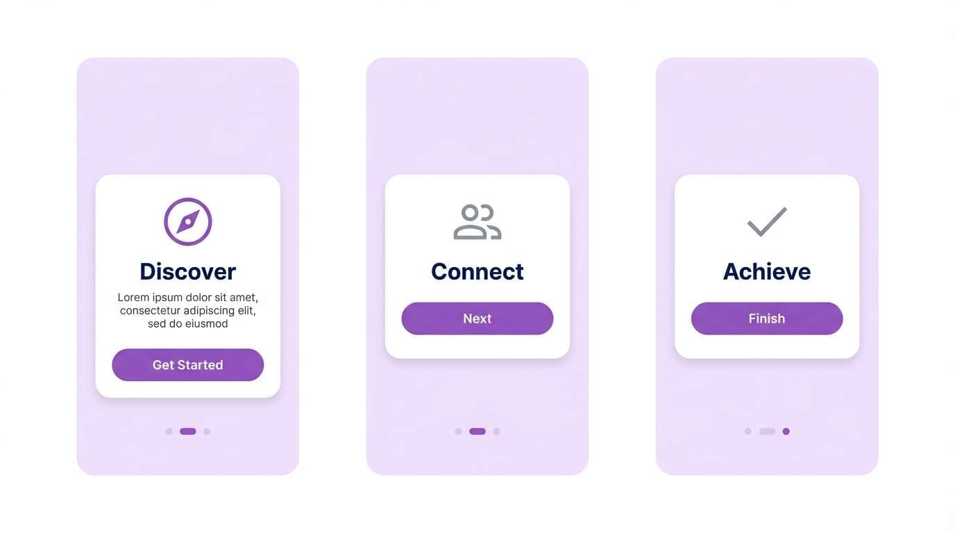
4) Amethyst Snow
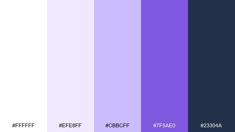
HEX: #ffffff #efe8ff #cbbcff #7f5ae0 #23304a
Mood: crisp, modern, confident
Best for: app onboarding and feature highlights
Crisp and modern like amethyst crystals on fresh snow, this set feels tech-forward and calm. As a white purple color palette, it shines in onboarding screens where whitespace and clear hierarchy improve comprehension. Pair the navy tone with purple buttons for strong contrast and accessible UI states. Usage tip: use the lightest lavender as a section background to separate steps without adding dividers.
Image example of amethyst snow generated using media.io
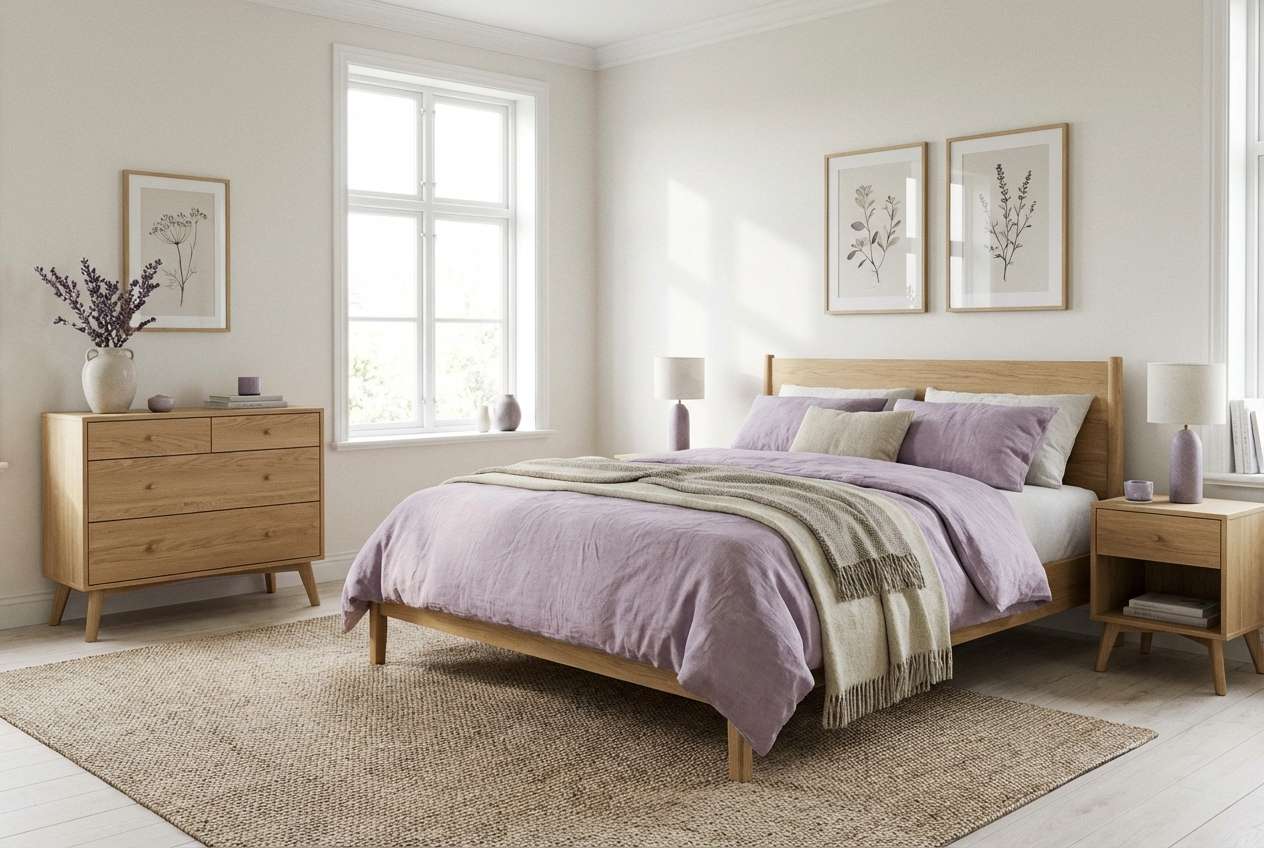
5) Lilac Whisper
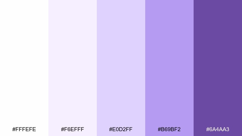
HEX: #fffefe #f6efff #e0d2ff #b69bf2 #6a4aa3
Mood: serene, cozy, gentle
Best for: bedroom decor and soft interior moodboards
Serene and cozy like lilac curtains in filtered sunlight, these tones bring quiet comfort to a space. Use the off-white as your main wall or textile base, then layer lilac through throws, bedding, and art prints. It pairs nicely with light oak, brushed nickel, and creamy ceramics. Usage tip: repeat the mid-lilac twice in the room to make the palette feel intentional.
Image example of lilac whisper generated using media.io
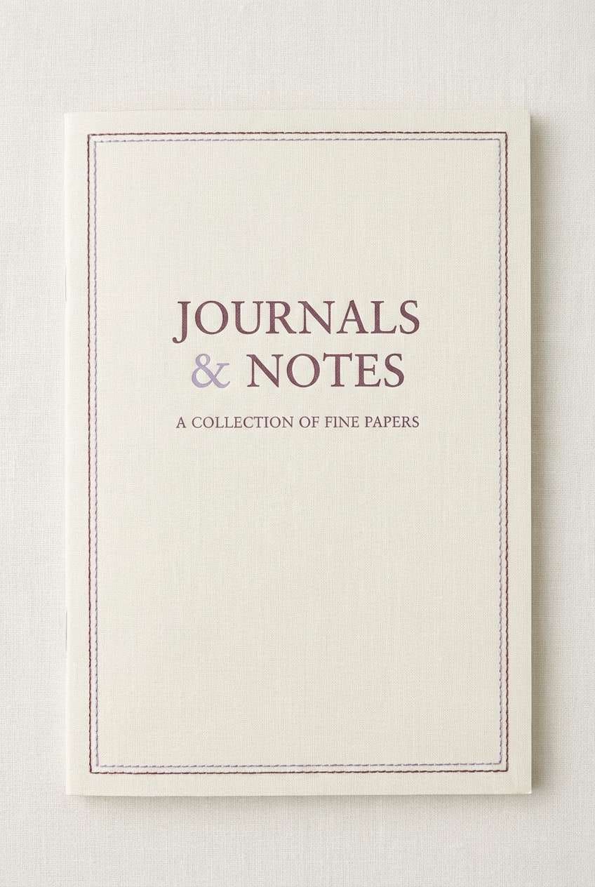
6) Plum Linen
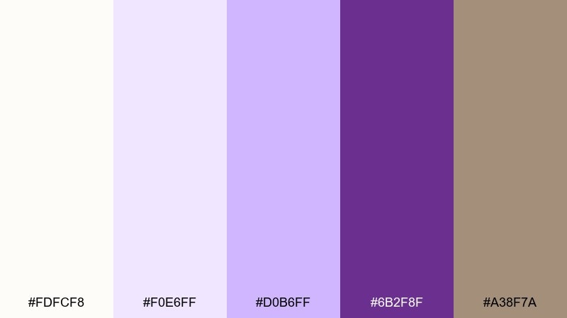
HEX: #fdfcf8 #f0e6ff #d0b6ff #6b2f8f #a38f7a
Mood: grounded, artisanal, warm
Best for: notebook covers and boutique stationery
Grounded and artisanal like plum ink on natural linen, this mix feels handmade yet refined. The taupe note adds warmth, making the purples look less icy and more tactile. Pair with textured paper effects, serif headings, and minimal geometric borders. Usage tip: keep the plum for titles only and let the lighter tones carry large background areas.
Image example of plum linen generated using media.io
7) Violet Marble
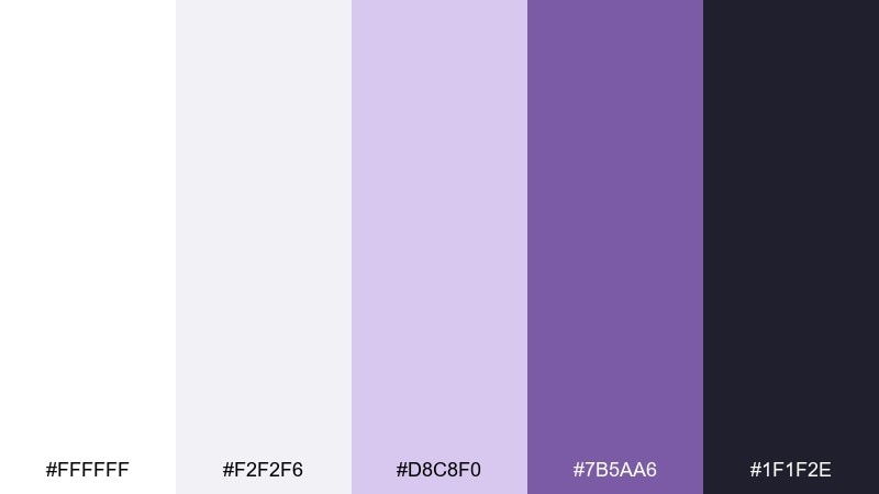
HEX: #ffffff #f2f2f6 #d8c8f0 #7b5aa6 #1f1f2e
Mood: sleek, editorial, premium
Best for: brand identity boards and logo presentations
Sleek and premium like violet veining in polished marble, these shades feel upscale and controlled. Use the near-black as your typography base and bring in lavender for secondary marks, stamps, and separators. It pairs well with minimalist photography, lots of negative space, and thin grid systems. Usage tip: keep accent purple to under 15 percent of the layout for a luxury finish.
Image example of violet marble generated using media.io
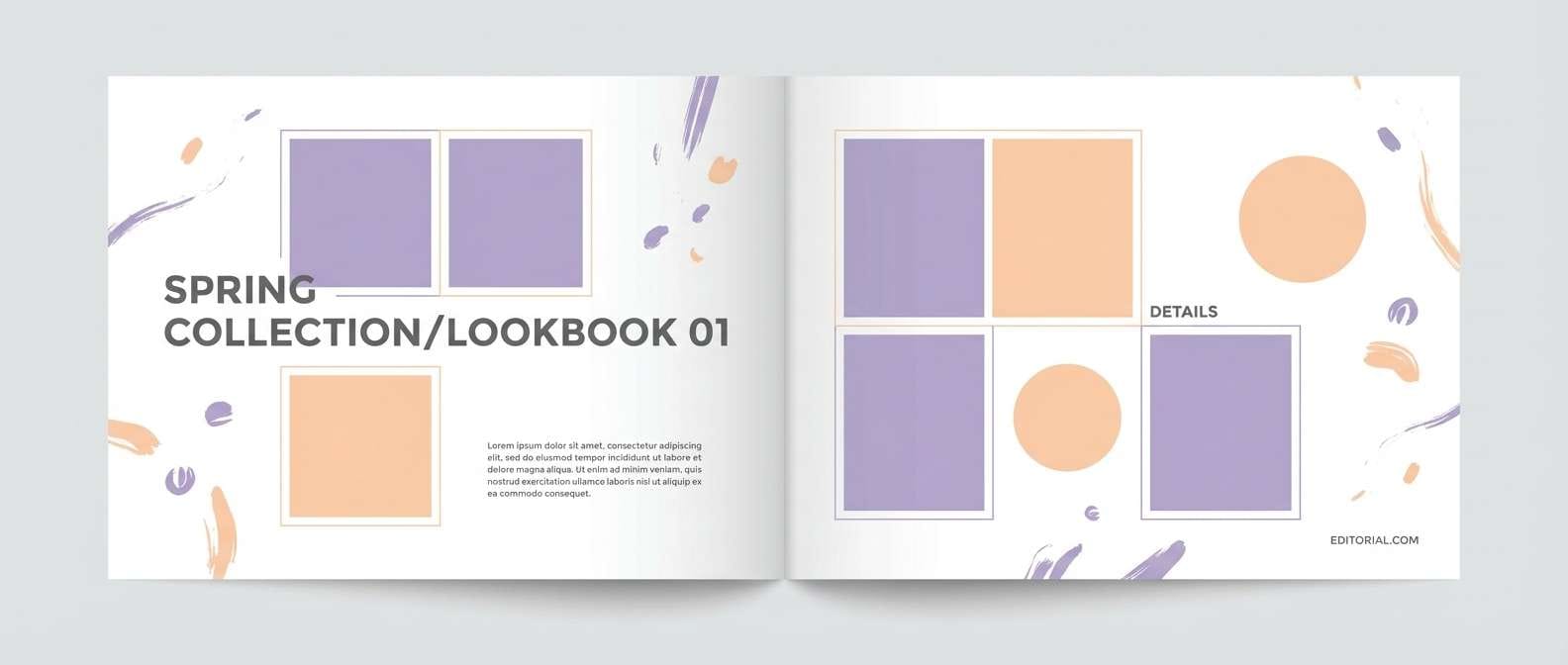
8) Wisteria Dawn
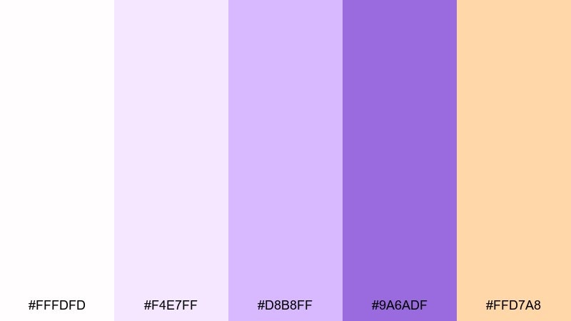
HEX: #fffdfd #f4e7ff #d8b8ff #9a6adf #ffd7a8
Mood: fresh, optimistic, airy
Best for: spring fashion lookbooks and lifestyle editorials
Fresh and optimistic like wisteria blooms at sunrise, this set feels light, modern, and inviting. These white purple color combinations are great for airy spreads where soft lavender meets a warm peach highlight. Pair with high-key photography, thin captions, and plenty of white margins. Usage tip: use peach only for tags and page numbers to keep the palette crisp.
Image example of wisteria dawn generated using media.io
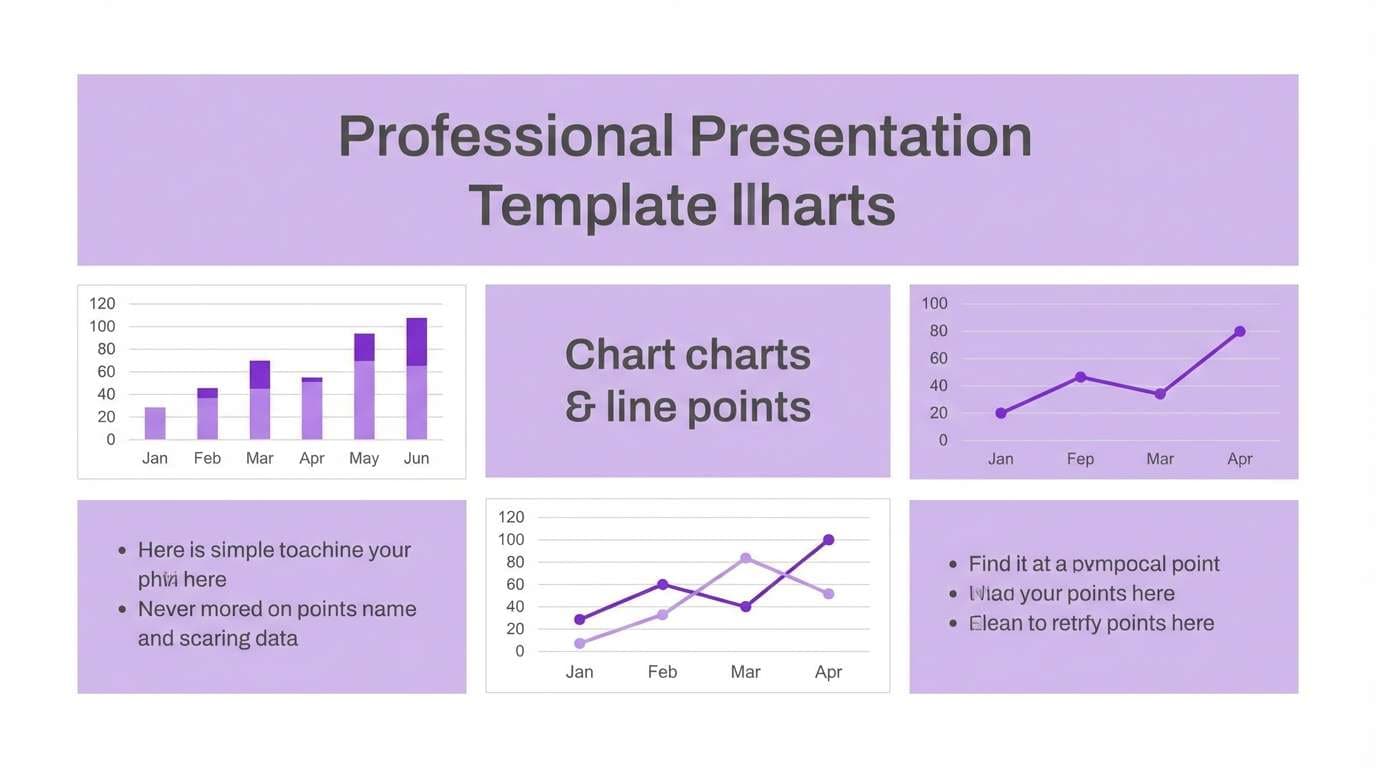
9) Iris Minimal
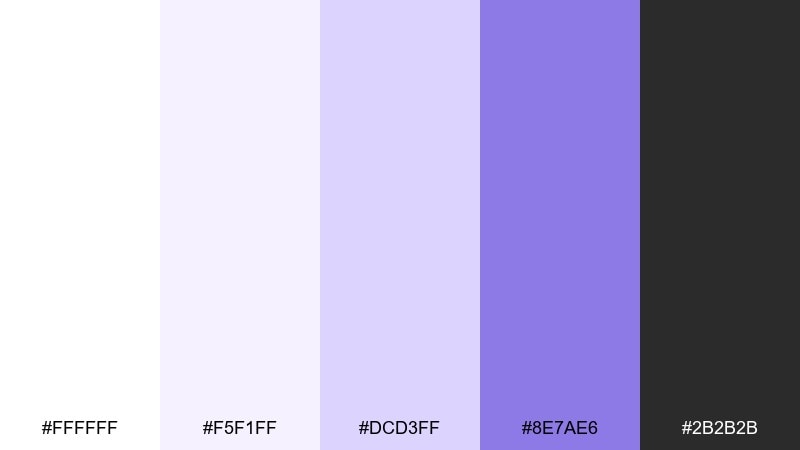
HEX: #ffffff #f5f1ff #dcd3ff #8e7ae6 #2b2b2b
Mood: minimal, smart, balanced
Best for: business slides and modern pitch decks
Minimal and smart like an iris sketch on white paper, this palette keeps ideas feeling clear. The charcoal tone adds readability while the purple accent brings a modern, creative edge. Pair with simple charts, monochrome icons, and consistent spacing. Usage tip: reserve the brightest purple for key metrics and section headers only.
Image example of iris minimal generated using media.io
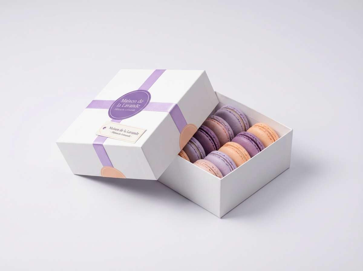
10) Berry Macaron
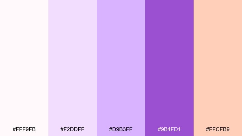
HEX: #fff9fb #f2ddff #d9b3ff #9b4fd1 #ffcfb9
Mood: cute, indulgent, bright
Best for: macaron boxes and bakery product labels
Cute and indulgent like a berry macaron display, these tones feel sweet but still polished. The peachy note warms up the purples and makes packaging look more appetizing. Pair with playful illustrations, scalloped edges, and a clean white base to keep it modern. Usage tip: put flavor names on white panels so the colors frame the information instead of competing with it.
Image example of berry macaron generated using media.io
11) Purple Haze Studio
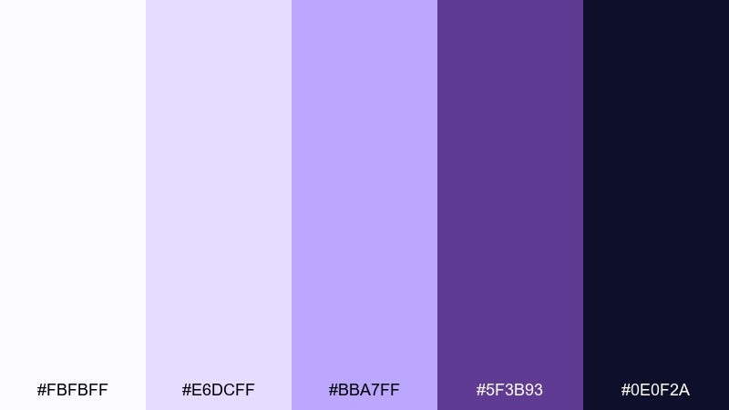
HEX: #fbfbff #e6dcff #bba7ff #5f3b93 #0e0f2a
Mood: moody, creative, cinematic
Best for: album covers and music posters
Moody and cinematic like a purple haze under stage lights, this set is built for bold artwork. Deep indigo and saturated violet give you strong contrast for type-heavy compositions. Pair with grain textures, neon linework, and high-impact condensed fonts. Usage tip: keep the lightest tint for small glow effects and highlights rather than large backgrounds.
Image example of purple haze studio generated using media.io

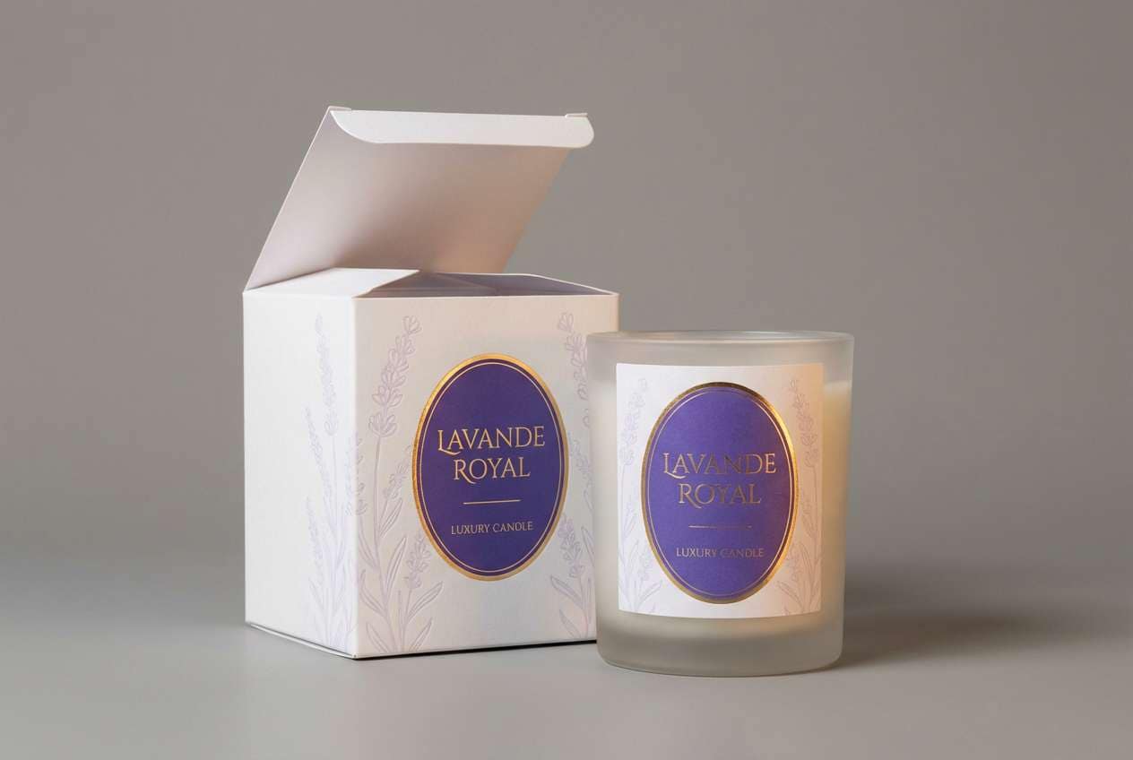
12) Royal Velvet White
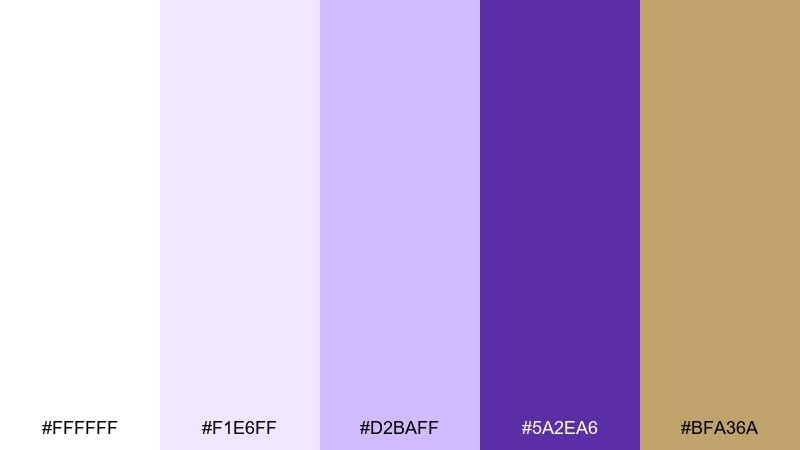
HEX: #ffffff #f1e6ff #d2baff #5a2ea6 #bfa36a
Mood: luxurious, regal, refined
Best for: luxury candle branding and product ads
Luxurious and regal like velvet draped over bright white silk, these tones feel immediately premium. A white purple color palette like this pairs perfectly with warm gold details for a high-end look without clutter. Use the deep royal shade for logos and the light lavenders for subtle patterning or box interiors. Usage tip: keep metallic accents thin and consistent so the purple remains the hero.
Image example of royal velvet white generated using media.io
13) Heather Cloud
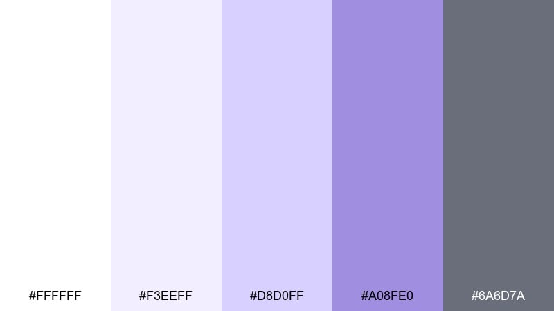
HEX: #ffffff #f3eeff #d8d0ff #a08fe0 #6a6d7a
Mood: calm, friendly, approachable
Best for: wellness newsletters and blog headers
Calm and friendly like heather drifting through soft clouds, this mix feels reassuring and light. The gray-violet anchor keeps long-form layouts readable while the lavender tints soften the overall page. Pair with natural photography, rounded corners, and generous line spacing. Usage tip: use the mid tone for buttons and links to maintain contrast without shouting.
Image example of heather cloud generated using media.io
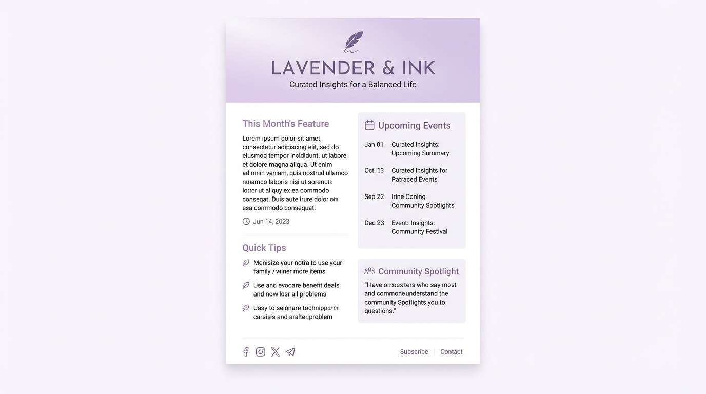
14) Moonlit Lavender
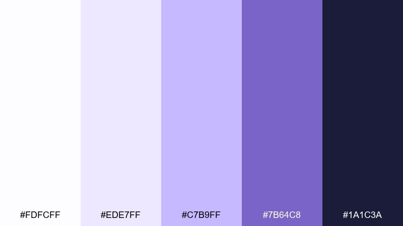
HEX: #fdfcff #ede7ff #c7b9ff #7b64c8 #1a1c3a
Mood: quiet, dreamy, focused
Best for: meditation apps and sleep trackers
Quiet and dreamy like moonlight over lavender fields, these shades feel restful and focused. The deep midnight tone gives your UI strong contrast for accessibility, while pale lavender keeps screens gentle at night. Pair with soft gradients, minimal icons, and slow micro-animations. Usage tip: set the darkest shade as the primary text color and avoid pure black for a calmer feel.
Image example of moonlit lavender generated using media.io
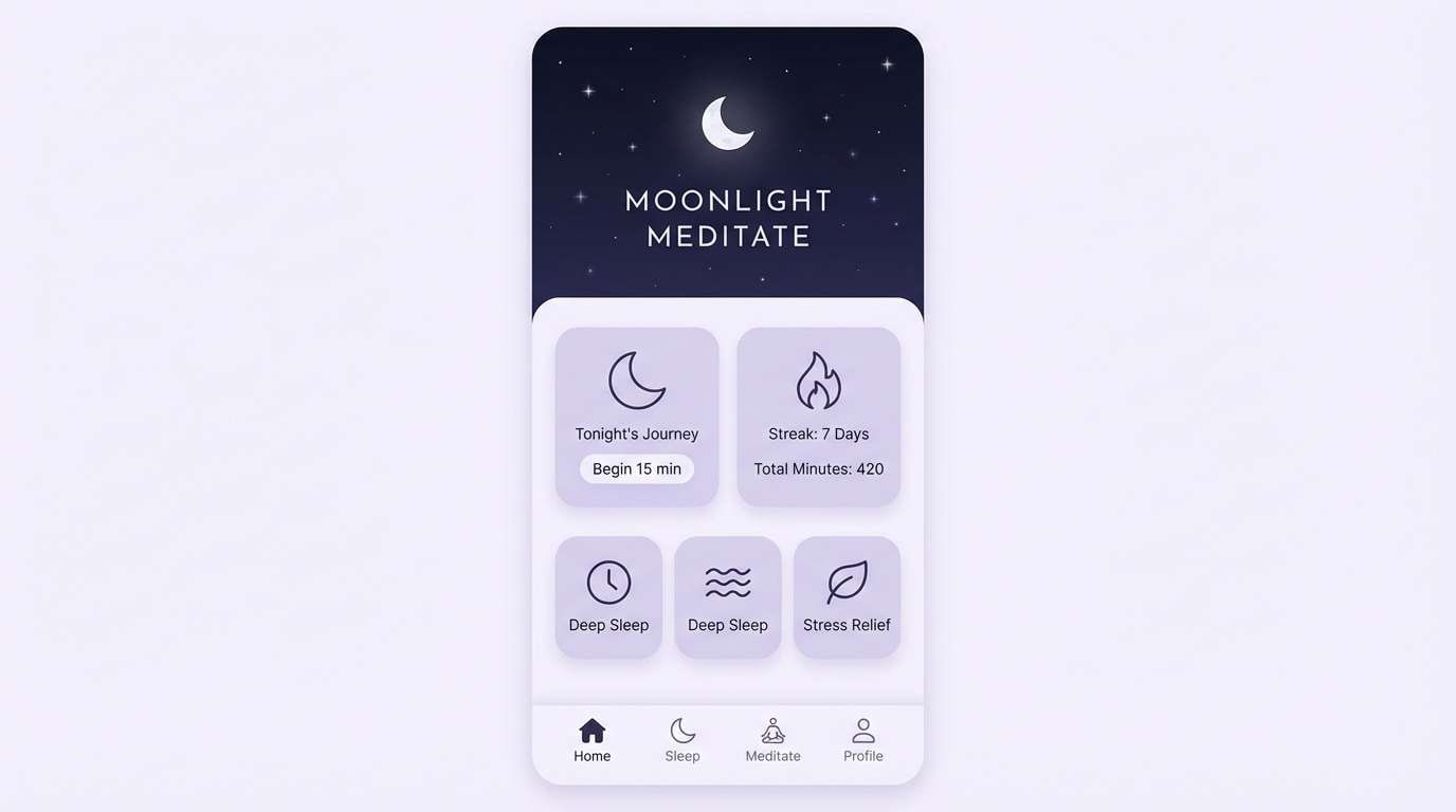
15) Eggplant Accent
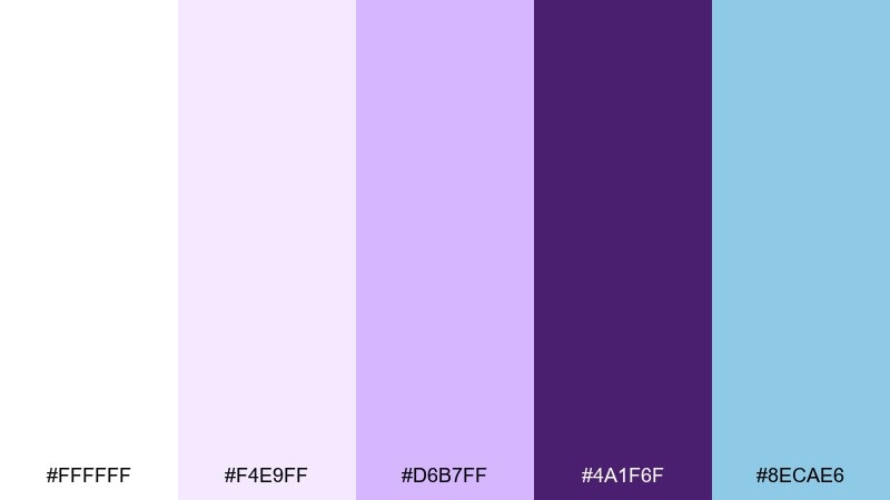
HEX: #ffffff #f4e9ff #d6b7ff #4a1f6f #8ecae6
Mood: bold, crisp, contemporary
Best for: startup landing pages and SaaS marketing
Bold and crisp like eggplant ink against bright paper, this set feels contemporary and decisive. The cool blue accent adds clarity and keeps the purple from feeling too whimsical. Pair with strong headings, plenty of whitespace, and simple product screenshots. Usage tip: use the eggplant as your primary CTA and the blue for secondary actions to guide attention.
Image example of eggplant accent generated using media.io
16) Pastel Violet Party
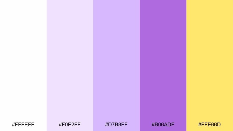
HEX: #fffefe #f0e2ff #d7b8ff #b06adf #ffe66d
Mood: fun, youthful, energetic
Best for: event posters and party flyers
Fun and youthful like confetti under violet lights, this palette brings instant energy. These white purple color combinations look especially fresh when the sunny yellow is used as a spotlight for dates and ticket info. Pair with chunky type, playful shapes, and clean spacing so the bright accent can breathe. Usage tip: keep the background near-white and let yellow act as a high-contrast badge.
Image example of pastel violet party generated using media.io

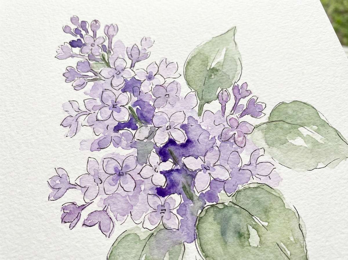
17) Lilac Botanical
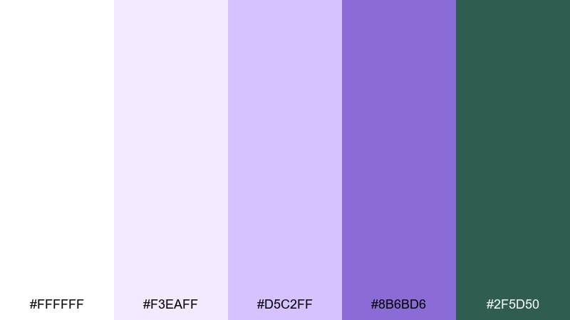
HEX: #ffffff #f3eaff #d5c2ff #8b6bd6 #2f5d50
Mood: fresh, natural, calming
Best for: floral greeting cards and spring illustrations
Fresh and natural like lilac petals in a garden sketchbook, these tones feel calm and organic. The muted green adds a botanical counterpoint that keeps the purple grounded. Pair with watercolor textures, fine ink outlines, and lots of white space around the florals. Usage tip: paint the lightest lavender as a wash first, then layer the darker violet for depth.
Image example of lilac botanical generated using media.io
18) Modern Orchid UI
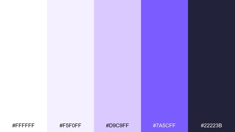
HEX: #ffffff #f5f0ff #d9c9ff #7a5cff #22223b
Mood: sleek, friendly, modern
Best for: ecommerce app product pages
Sleek and friendly like modern orchid lighting, these shades feel clean while still expressive. Use the deep purple for primary actions and the near-black for headings to maintain strong contrast. Pair with soft card shadows, thin dividers, and product photos on white backgrounds. Usage tip: apply the light lavender to filters and chips so they look selectable without overwhelming the page.
Image example of modern orchid ui generated using media.io
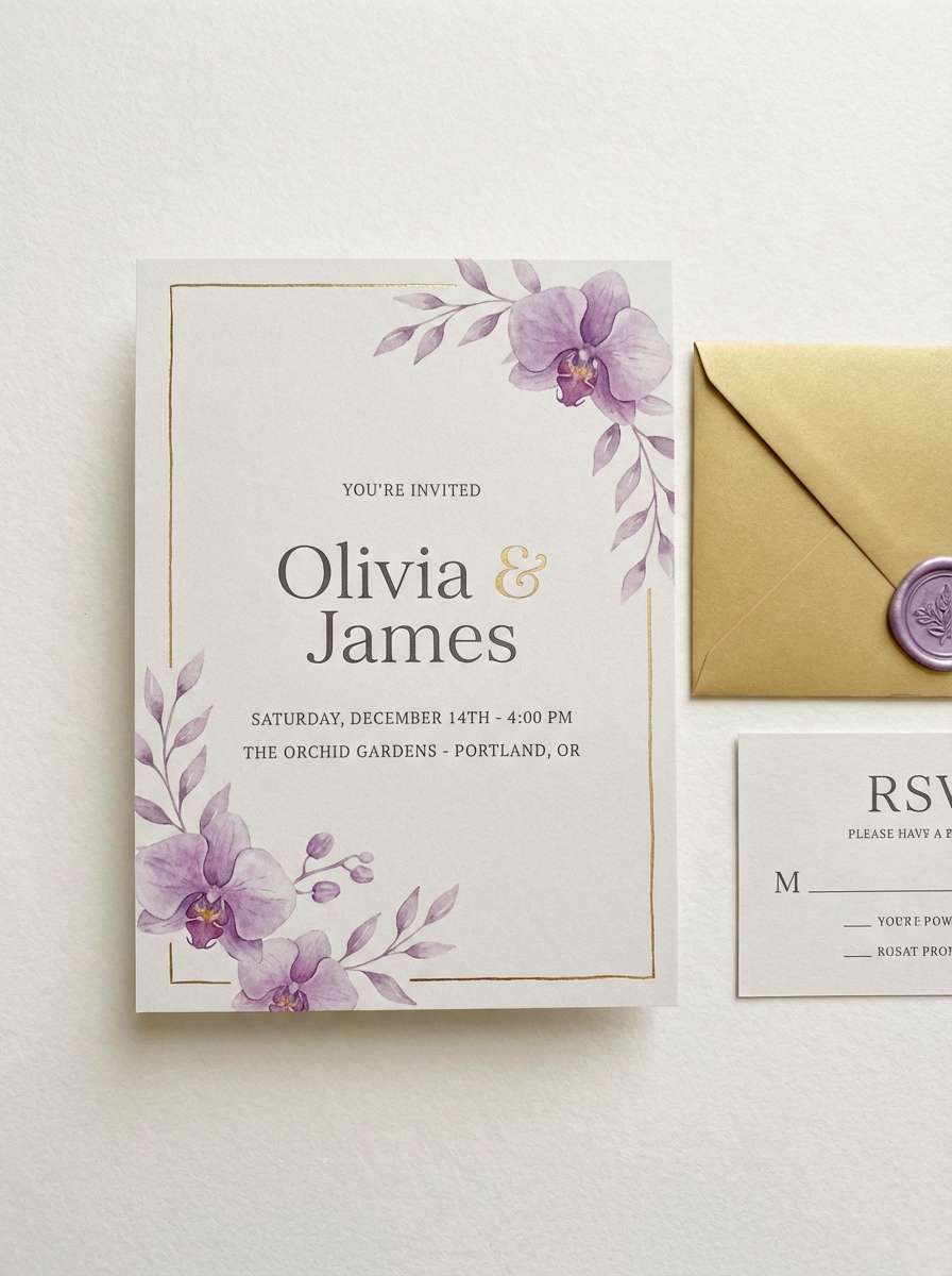
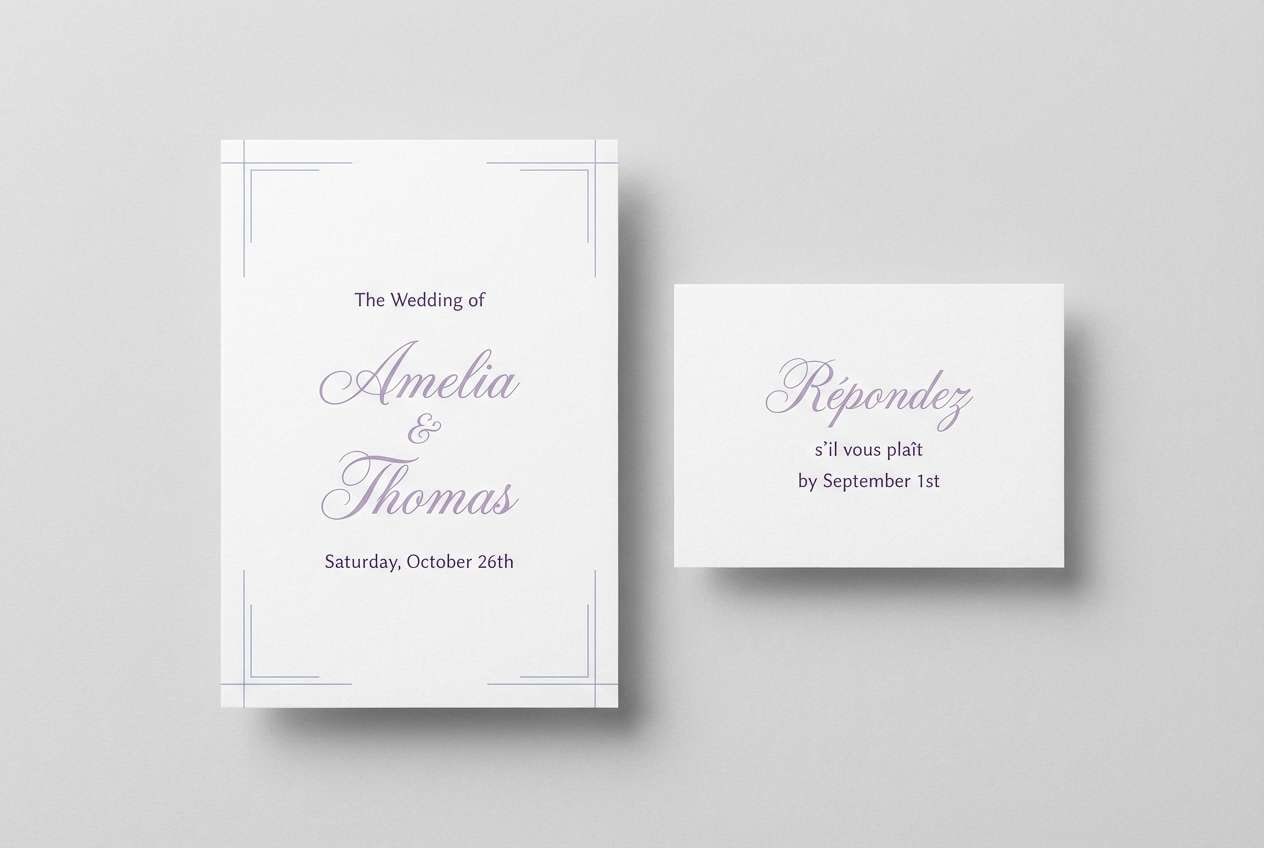
19) Purple Wedding Suite
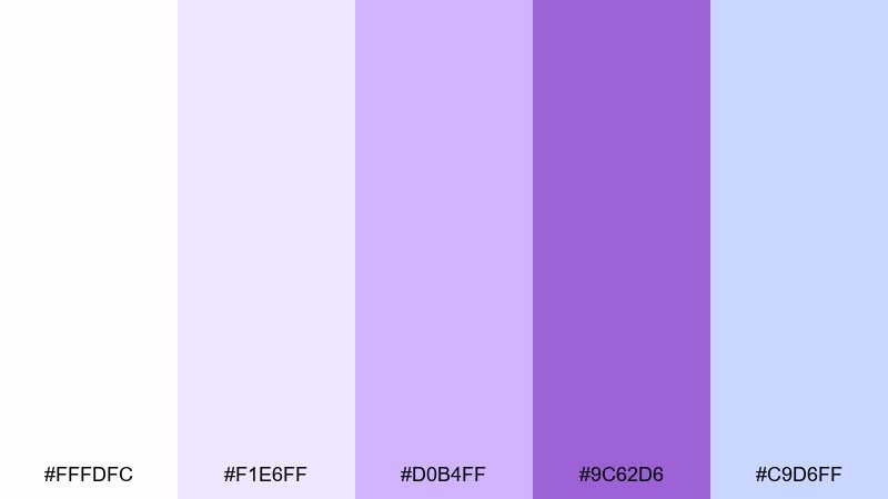
HEX: #fffdfc #f1e6ff #d0b4ff #9c62d6 #c9d6ff
Mood: romantic, polished, timeless
Best for: full wedding stationery suites
Romantic and polished like pressed petals tucked into a letter, this mix feels timeless and airy. The soft blue-lilac note keeps the purple feeling modern and adds depth to borders, monograms, and RSVP cards. Pair with classic serif fonts, fine rules, and plenty of breathing room around text. Usage tip: repeat the same accent shade across every card to unify the suite.
Image example of purple wedding suite generated using media.io
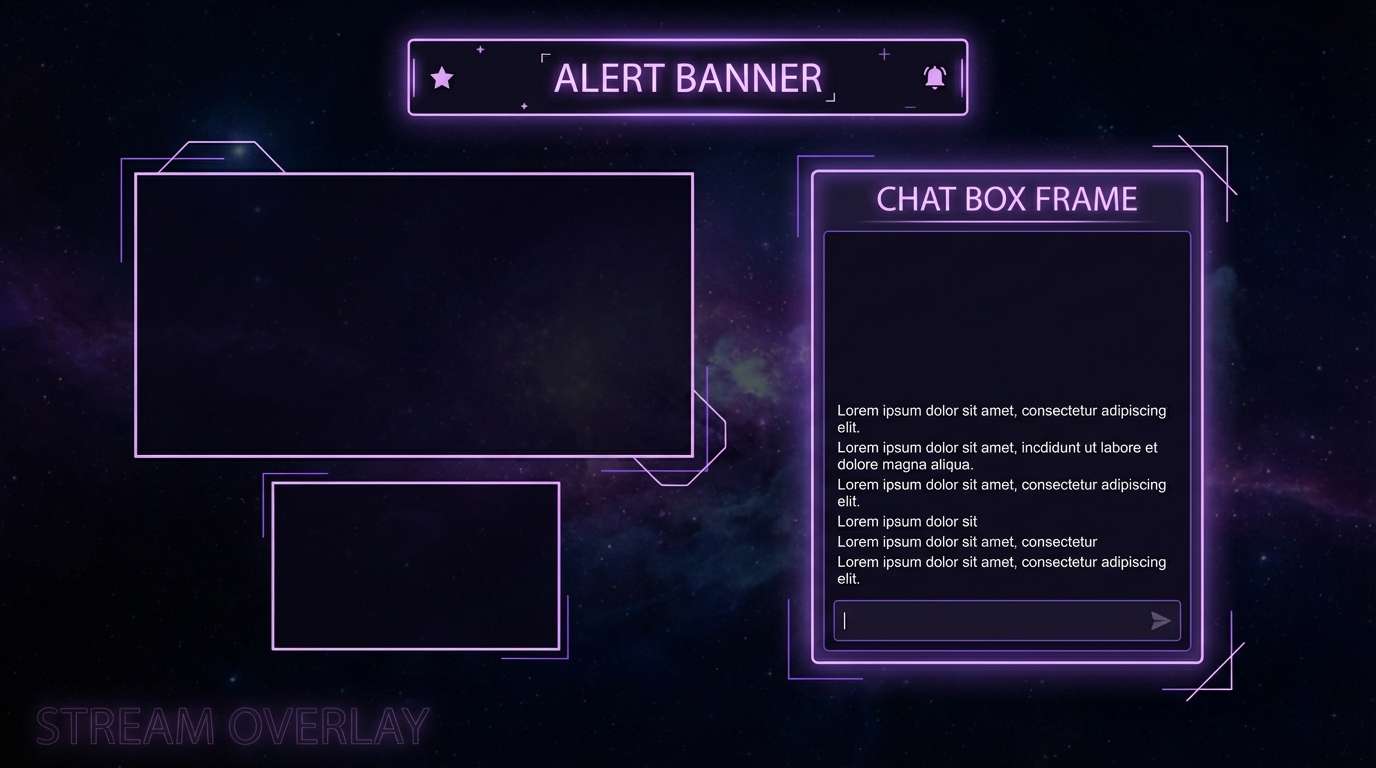
20) Cosmic Lilac Night
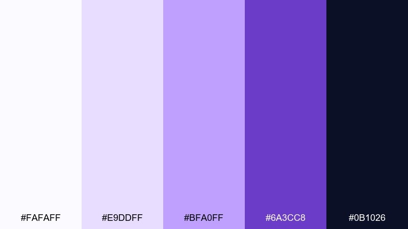
HEX: #fafaff #e9ddff #bfa0ff #6a3cc8 #0b1026
Mood: mysterious, futuristic, high-contrast
Best for: stream overlays and gaming UI themes
Mysterious and futuristic like lilac nebulae against a night sky, these shades bring drama with control. Use the near-black background to make lavender highlights glow, especially for status labels and alert states. Pair with geometric patterns, subtle star-like noise, and bold condensed headings. Usage tip: keep large surfaces dark and use the lightest tint only for key UI elements to reduce glare.
Image example of cosmic lilac night generated using media.io
What Colors Go Well with White Purple?
Neutrals are the easiest match: soft grays, charcoal, and warm taupe keep a white-and-purple palette grounded and readable. They also make lilac and lavender feel more sophisticated.
Warm accents (gold, peach, blush) add a premium or romantic lift, while cool accents (navy, muted teal, sky blue) make purple feel sharper and more contemporary.
If you want extra freshness, try botanical green as a counterpoint—especially with pastel purples and lots of white space.
How to Use a White Purple Color Palette in Real Designs
Start with white as your dominant background (often 60–80%). Then choose one purple as your primary accent for buttons, headings, or key highlights, and keep the other tints for soft sections and cards.
For print (invites, packaging), prioritize legibility: place body text on white or very pale lavender, and use deep purple for names, dates, and important details. Consider subtle texture (paper grain, marble, linen) to add depth without adding more colors.
For UI, check contrast early. Deep purple + white usually passes well for primary actions, while mid-lavenders are best reserved for borders, chips, and background panels.
Create White Purple Palette Visuals with AI
If you already have HEX codes, you can turn them into real-looking mockups (packaging, posters, UI screens) by describing the scene and specifying your white-purple vibe—soft and clean, romantic and airy, or bold and cosmic.
Media.io’s text-to-image makes it easy to explore variations quickly: swap a lavender tint, change the accent (gold vs. navy), or try different styles like watercolor, vector, or realistic studio lighting.
White Purple Color Palette FAQs
-
What does a white and purple color palette communicate?
It usually signals cleanliness and clarity (white) combined with creativity, elegance, or calm (purple). Lighter lavenders feel soothing and approachable, while deep violets feel premium and confident. -
Is white and purple a good choice for branding?
Yes—especially for beauty, wellness, boutique retail, creative services, and premium products. Use white for space and readability, then apply purple strategically to logos, CTAs, and signature brand elements. -
Which purple shades work best with white: lavender, lilac, or violet?
Lavender and lilac are best for soft, friendly designs and pastel aesthetics. Violet and eggplant work better for bold contrast, luxury, and high-impact typography on white. -
What accent colors pair well with white and purple?
Gold and champagne add a luxurious feel; peach or blush adds warmth and romance; navy adds structure and contrast for UI; muted green adds a natural, botanical balance. -
How do I keep a white-purple UI accessible?
Use a deep purple (or near-black/charcoal) for text and primary buttons, and reserve pale lavender for backgrounds. Always verify contrast for text, icons, and interactive states (hover/disabled). -
Can I use white and purple for wedding invitations?
Absolutely. White creates an airy base for typography, while orchid and lavender tones add romance. For print clarity, set key details in the darkest purple and keep mid-tones as decorative accents. -
How can I generate white-purple design mockups quickly?
Use an AI image generator like Media.io: describe the design type (packaging, poster, UI), the style (minimal, watercolor, luxury), and the white-purple mood, then iterate by adjusting one color or lighting detail at a time.


