


 ChatGPT
 Perplexity
 Gemini
 Claude
 Grok
Grok
Gold and navy blue is a classic pairing that instantly signals confidence, depth, and polish. Navy brings structure and readability, while gold adds warmth and a premium “highlight” effect.
Below you’ll find 20+ gold navy blue color palette ideas (with HEX codes) for branding, UI, interiors, and weddings—plus practical tips to keep the look balanced and modern.
In this article
- Why Gold Navy Blue Palettes Work So Well
-
- regal harbor
- gilded midnight
- nautical gala
- art deco lounge
- museum plaque
- coastal officer
- vintage library
- modern finance
- celestial wedding
- night market luxe
- minimal crest
- sapphire ballroom
- heritage sports
- boutique hotel
- astronomy editorial
- crown bar
- festive ornaments
- maritime poster
- premium skincare box
- university banner
- sunset on brass
- What Colors Go Well with Gold Navy Blue?
- How to Use a Gold Navy Blue Color Palette in Real Designs
- Create Gold Navy Blue Palette Visuals with AI
Why Gold Navy Blue Palettes Work So Well
Navy blue is a dependable “foundation” color: it reads professional, stabilizes busy layouts, and stays legible across print and digital. Gold, on the other hand, behaves like a spotlight—perfect for guiding attention to what matters.
Together, they create high contrast without feeling harsh. Navy’s cool depth balances gold’s warm energy, so the result can feel luxurious, academic, nautical, or modern depending on the supporting neutrals you add.
This duo also scales well: navy can dominate backgrounds and typography, while gold can stay minimal as rules, icons, badges, and trim—giving you a premium look without visual clutter.
20+ Gold Navy Blue Color Palette Ideas (with HEX Codes)
1) Regal Harbor
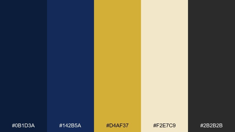
HEX: #0B1D3A #142B5A #D4AF37 #F2E7C9 #2B2B2B
Mood: regal, nautical, polished
Best for: luxury brand identity and stationery
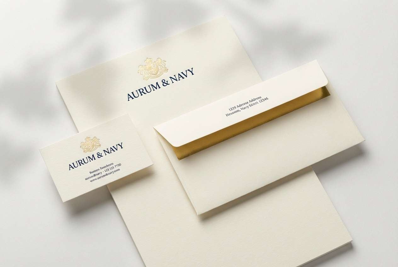
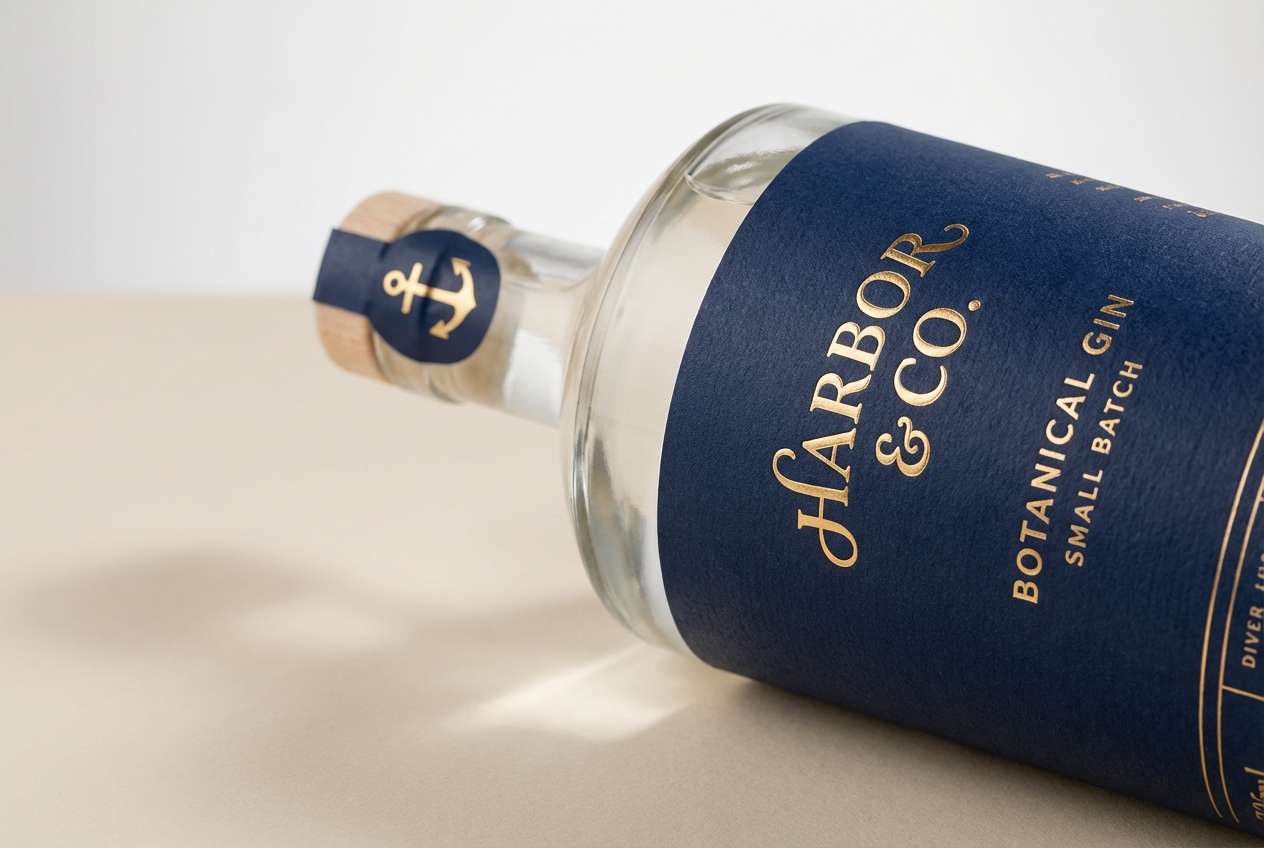
Regal and maritime, it feels like a yacht club at dusk with brass railings catching the last light. This gold navy blue color palette shines on logos, monograms, and upscale stationery where contrast needs to feel intentional. Pair it with textured cream stock and a subtle embossed mark for extra depth. Usage tip: keep gold as the accent layer (around 10 to 15 percent) so the navy remains the hero.
Image example of regal harbor generated using media.io
Create palette-perfect visuals with Media.io. Powered by Wan 2.7 Image, it helps you generate and edit images with precise color control, consistent tones, and ready-to-use styles in your browser.

2) Gilded Midnight
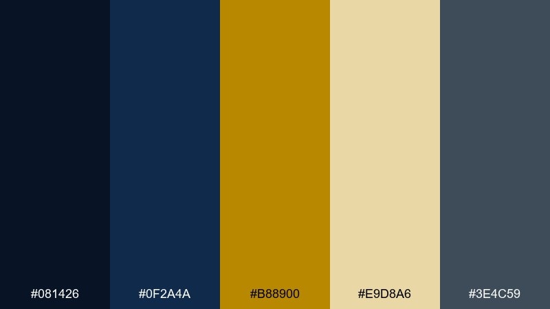
HEX: #081426 #0F2A4A #B88900 #E9D8A6 #3E4C59
Mood: dramatic, luxe, nocturnal
Best for: premium product ads and hero banners
Moody and cinematic, it reads like midnight velvet with a warm glint of metal. Use the deep blues for full-bleed backdrops, then bring in gold for callouts, pricing, or a single emblem. Neutral gray-blue keeps typography calm and prevents the look from getting too loud. Usage tip: add a faint grain or vignette on the darkest shade to avoid flat digital blacks.
Image example of gilded midnight generated using media.io
3) Nautical Gala
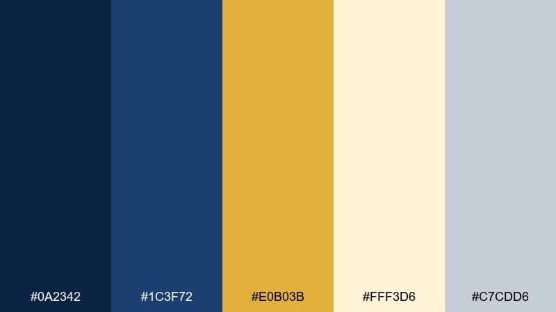
HEX: #0A2342 #1C3F72 #E0B03B #FFF3D6 #C7CDD6
Mood: celebratory, coastal, bright
Best for: wedding suites and formal invitations
Festive and breezy, it evokes a seaside reception with linen tablecloths and gold-rimmed glassware. These gold navy blue color combinations work beautifully for invitations, menus, and seating charts where legibility matters. Pair the soft ivory with minimal line art, and reserve the brighter gold for names or borders. Usage tip: print navy text in a slightly softened tone to prevent heavy ink buildup on thicker papers.
Image example of nautical gala generated using media.io
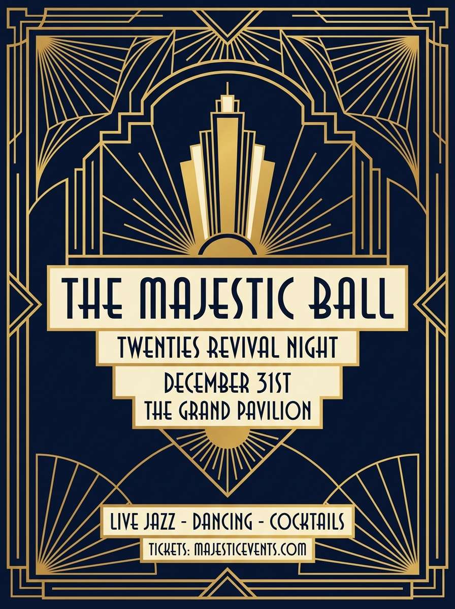
4) Art Deco Lounge
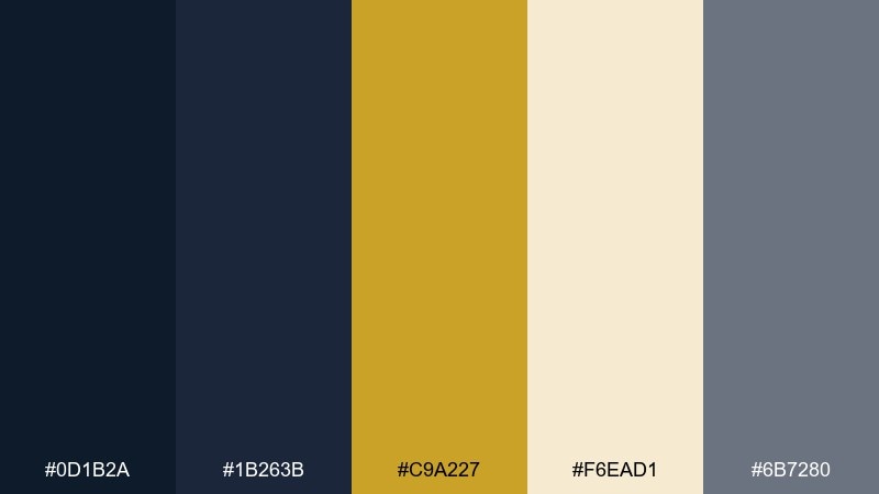
HEX: #0D1B2A #1B263B #C9A227 #F6EAD1 #6B7280
Mood: art deco, glamorous, structured
Best for: event posters and cocktail menus
Glamorous and geometric, it suggests a jazz lounge with polished brass and deep-blue drapery. Use the darker tones for bold blocks and frames, then let gold lines create deco symmetry. The warm cream keeps the design readable while still feeling upscale. Usage tip: mimic foil by using a subtle gradient on the gold rather than a flat fill.
Image example of art deco lounge generated using media.io
5) Museum Plaque
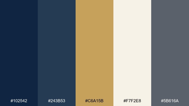
HEX: #102542 #243B53 #C6A15B #F7F2E8 #5B616A
Mood: heritage, academic, calm
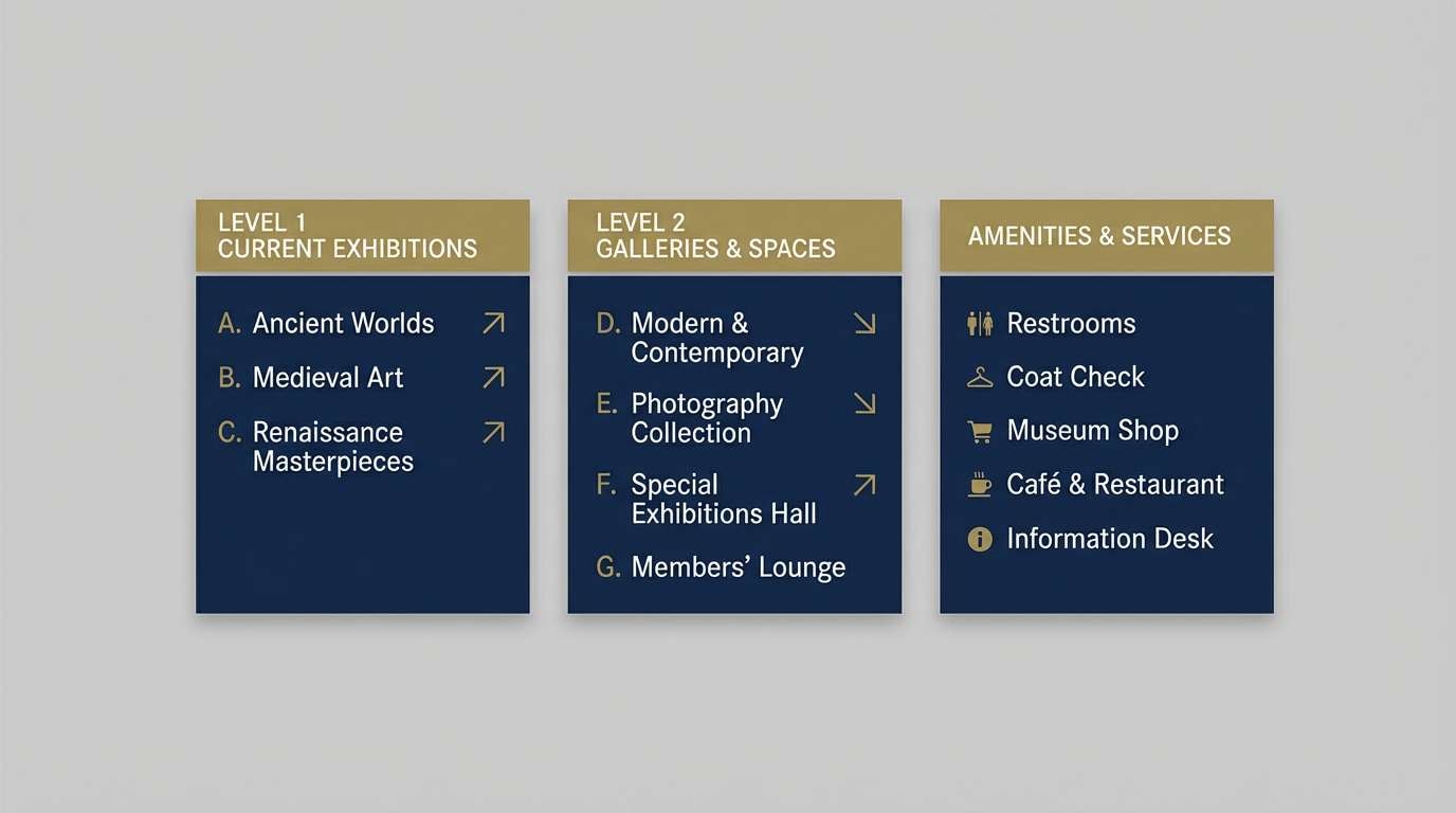
Best for: exhibition signage and wayfinding
Quietly prestigious, it feels like gallery walls, brass labels, and soft lighting. The muted gold reads more like aged metal, making it ideal for informational layouts and long-form copy. Pair it with clean serif headings and plenty of negative space for a curated look. Usage tip: keep contrast high on directional signs by using the lightest neutral behind small type.
Image example of museum plaque generated using media.io
6) Coastal Officer
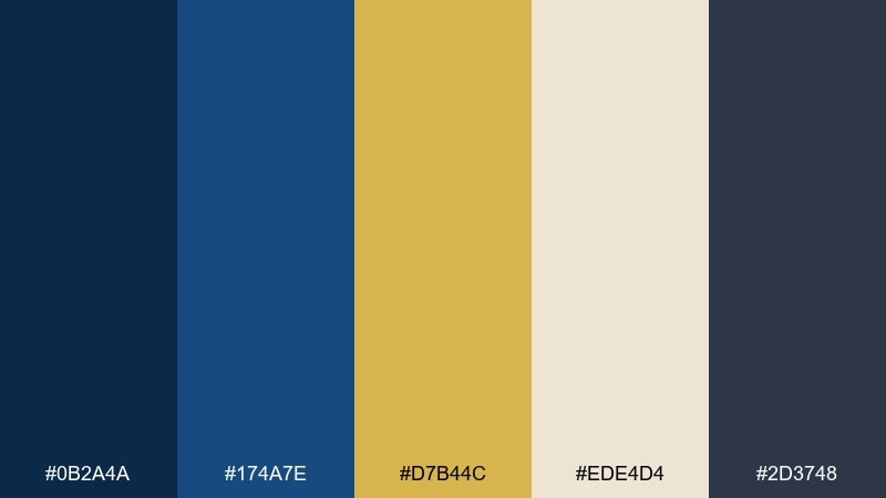
HEX: #0B2A4A #174A7E #D7B44C #EDE4D4 #2D3748
Mood: confident, crisp, maritime
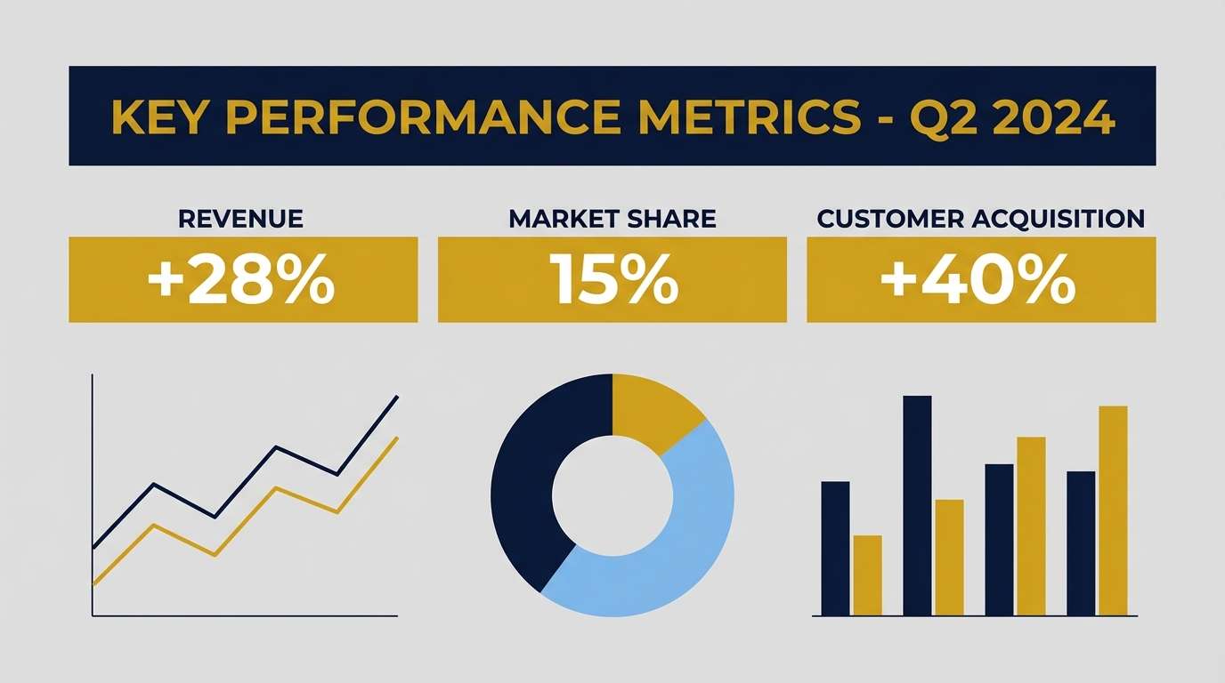
Best for: corporate presentations and reports
Crisp and authoritative, it channels tailored uniforms and sunlit brass buttons. Strong navy anchors slides and charts, while gold highlights key metrics without screaming for attention. Pair the lighter neutral with subtle gridlines to keep pages airy. Usage tip: use gold for one highlight style only, like totals or callouts, to keep visual hierarchy consistent.
Image example of coastal officer generated using media.io
7) Vintage Library
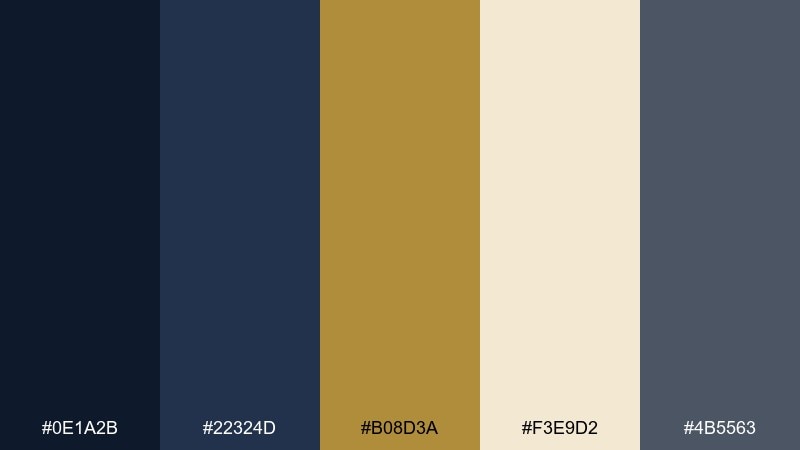
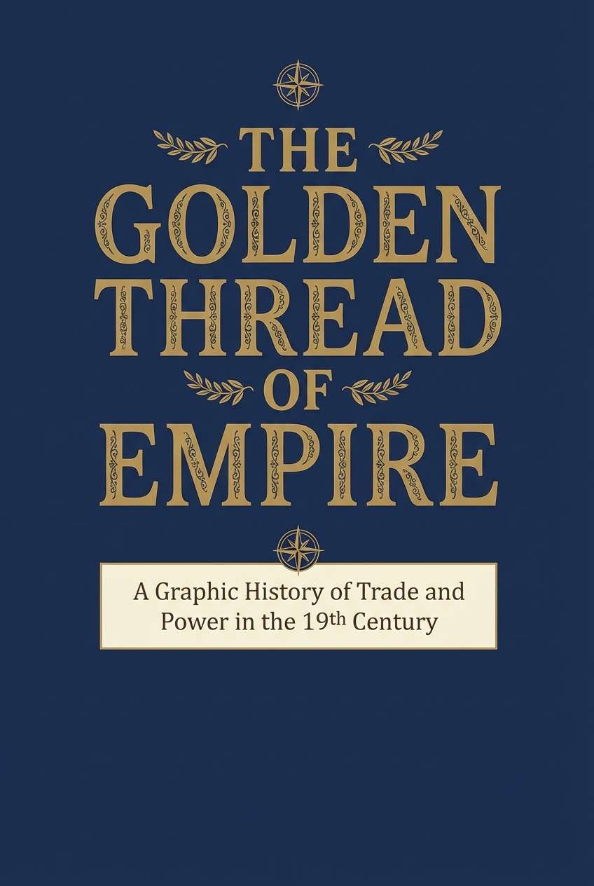
HEX: #0E1A2B #22324D #B08D3A #F3E9D2 #4B5563
Mood: scholarly, warm, classic
Best for: book covers and editorial titles
Scholarly and warm, it recalls leather spines, lamp light, and quiet reading rooms. The softened gold feels antique, perfect for titles, chapter dividers, and subtle ornament. Pair it with off-white paper tones and a restrained serif to keep the look timeless. Usage tip: add a thin rule line in gold to separate sections without heavy boxes.
Image example of vintage library generated using media.io
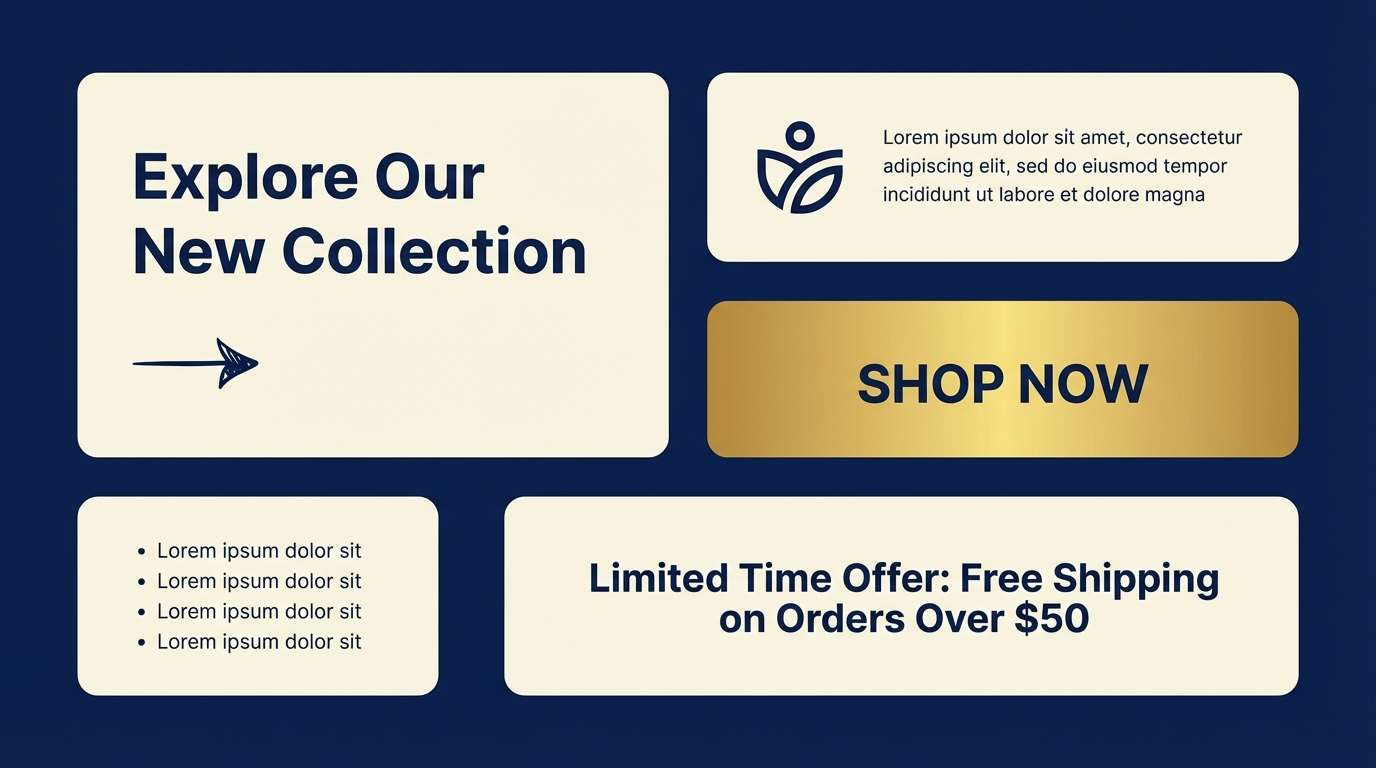
8) Modern Finance
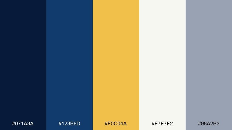
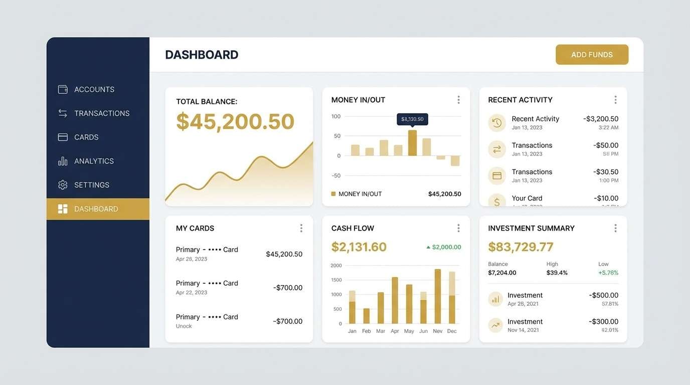
HEX: #071A3A #123B6D #F0C04A #F7F7F2 #98A2B3
Mood: modern, trustworthy, sharp
Best for: fintech dashboard UI
Sharp and trustworthy, it feels like a modern trading floor with clean screens and precise numbers. As a gold navy blue color scheme, it excels when navy sets the structure and gold signals status states like success, featured, or premium. Pair it with roomy spacing and cool grays so the interface stays calm. Usage tip: reserve gold for one UI role (badges or primary CTA) to avoid competing highlights.
Image example of modern finance generated using media.io
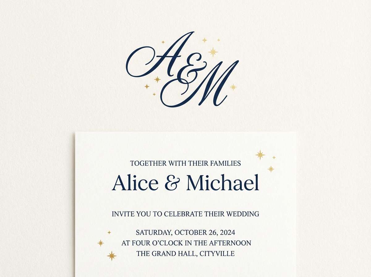
9) Celestial Wedding
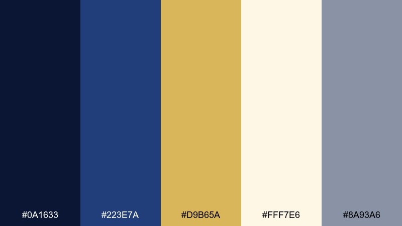
HEX: #0A1633 #223E7A #D9B65A #FFF7E6 #8A93A6
Mood: romantic, starry, elegant
Best for: wedding invitations and monograms
Romantic and star-kissed, it brings to mind constellations over a deep evening sky. Use navy for the base and sprinkle gold into monograms, border lines, or tiny star motifs. Pair it with a warm ivory to keep the suite soft rather than stark. Usage tip: test gold ink or foil at small sizes so fine details do not fill in during printing.
Image example of celestial wedding generated using media.io
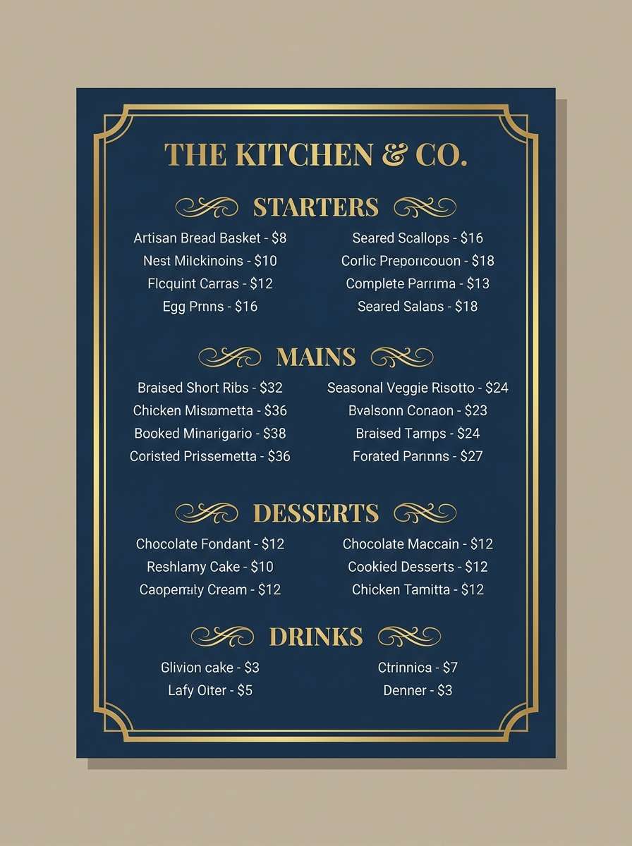
10) Night Market Luxe
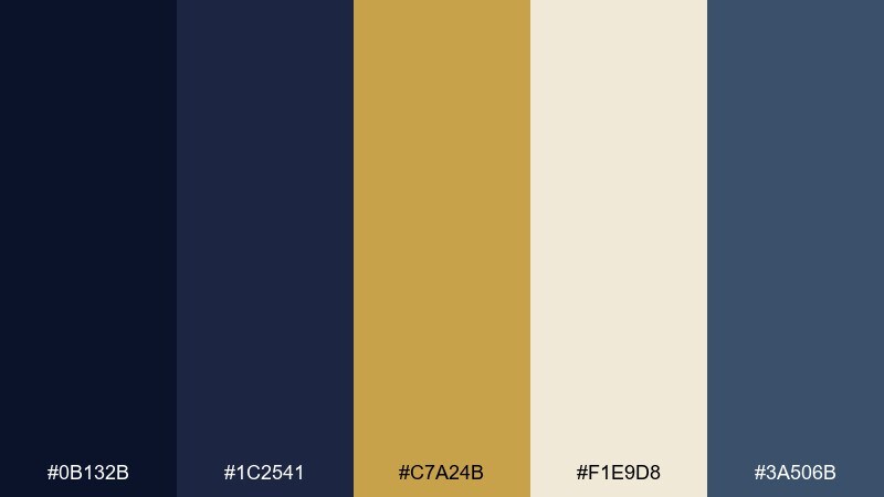
HEX: #0B132B #1C2541 #C7A24B #F1E9D8 #3A506B
Mood: urban, rich, atmospheric
Best for: restaurant menus and signage
Atmospheric and urban, it suggests night stalls, warm lantern light, and deep shadows. The gold reads like signage glow, while the layered blues create depth for menus and brand marks. Pair it with warm neutrals and minimal iconography to keep the layout sophisticated. Usage tip: use the medium blue for secondary text so your darkest shade stays reserved for headers and anchors.
Image example of night market luxe generated using media.io
11) Minimal Crest
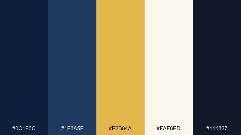
HEX: #0C1F3C #1F3A5F #E2B84A #FAF6ED #111827
Mood: minimal, bold, emblematic
Best for: logo systems and badges
Bold and minimal, it feels like a clean crest stamped into thick paper. These gold navy blue color combination choices are ideal for badge marks, club identities, and premium labels where contrast must read instantly. Pair it with a single geometric sans and lots of breathing room around the emblem. Usage tip: keep the gold slightly warmer than your background whites so it stays distinct on screens.
Image example of minimal crest generated using media.io
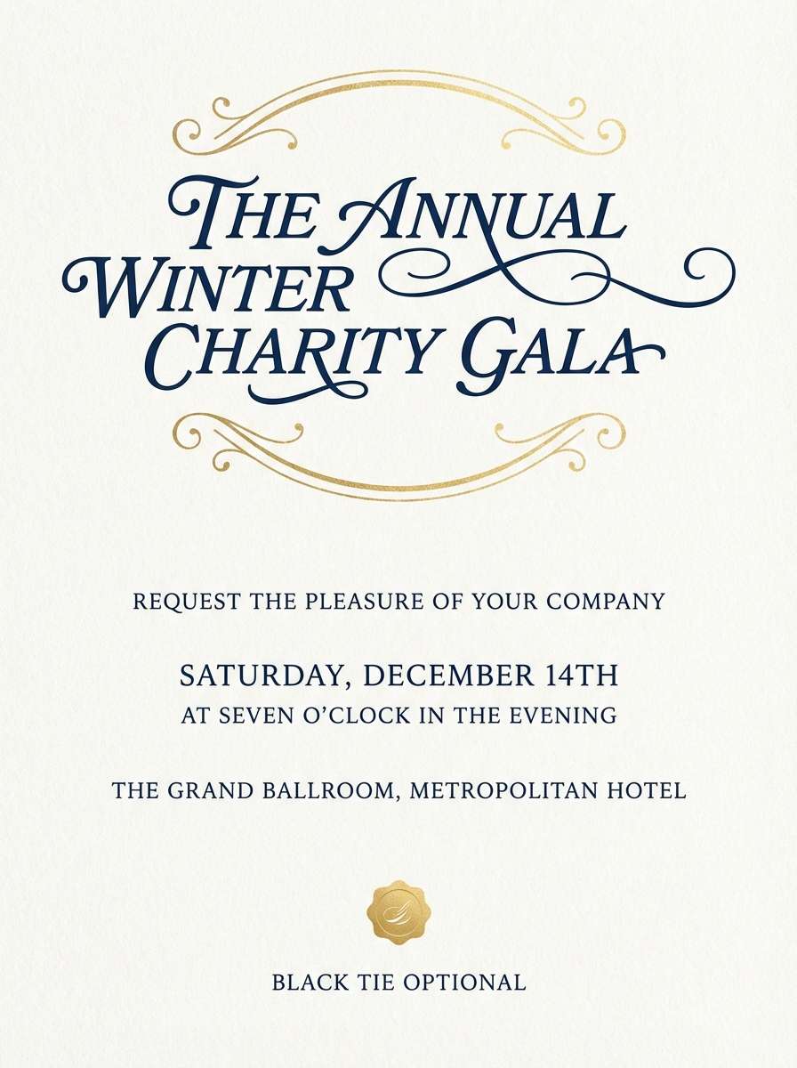
12) Sapphire Ballroom
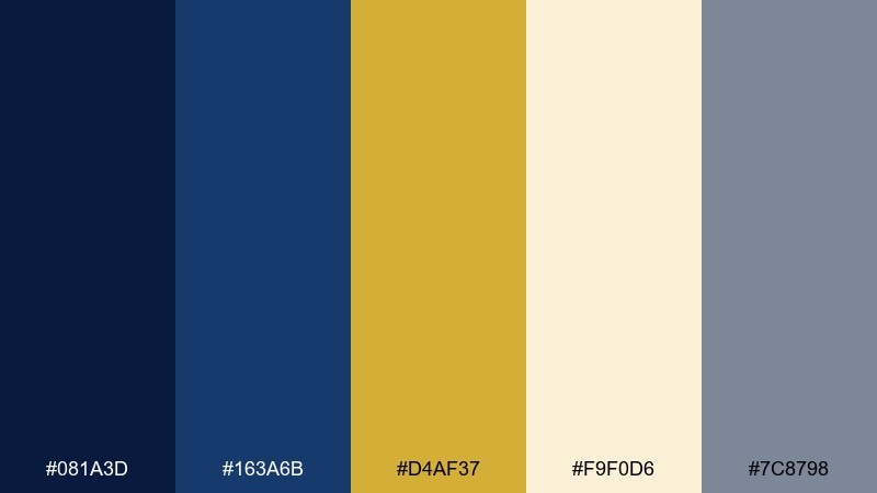
HEX: #081A3D #163A6B #D4AF37 #F9F0D6 #7C8798
Mood: formal, luminous, upscale
Best for: gala invitations and formal event branding
Formal and luminous, it evokes a ballroom with sapphire lighting and polished gold details. The gold navy blue color palette reads instantly upscale for gala invites, sponsor walls, and RSVP pages. Pair it with elegant high-contrast type and a soft cream background to keep it welcoming. Usage tip: use the gray-blue as your body text color to reduce harsh contrast against light sections.
Image example of sapphire ballroom generated using media.io
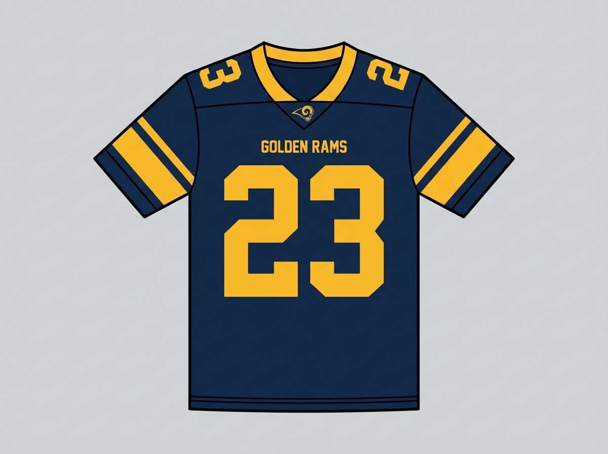
13) Heritage Sports

HEX: #0B1B3F #214E8A #F2C14E #F5F1E8 #2E2E2E
Mood: energetic, classic, competitive
Best for: team branding and merch graphics
Energetic and classic, it feels like a storied stadium under bright lights. Use navy for the main identity, then bring gold into stripes, numbers, or sponsor highlights. Pair it with strong block lettering and simple shapes for fast readability at distance. Usage tip: test the gold on fabric prints since warm yellows can shift depending on material.
Image example of heritage sports generated using media.io
14) Boutique Hotel
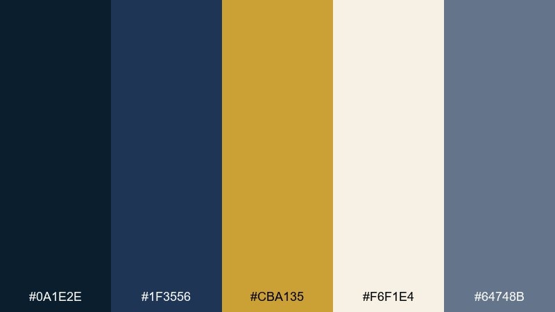
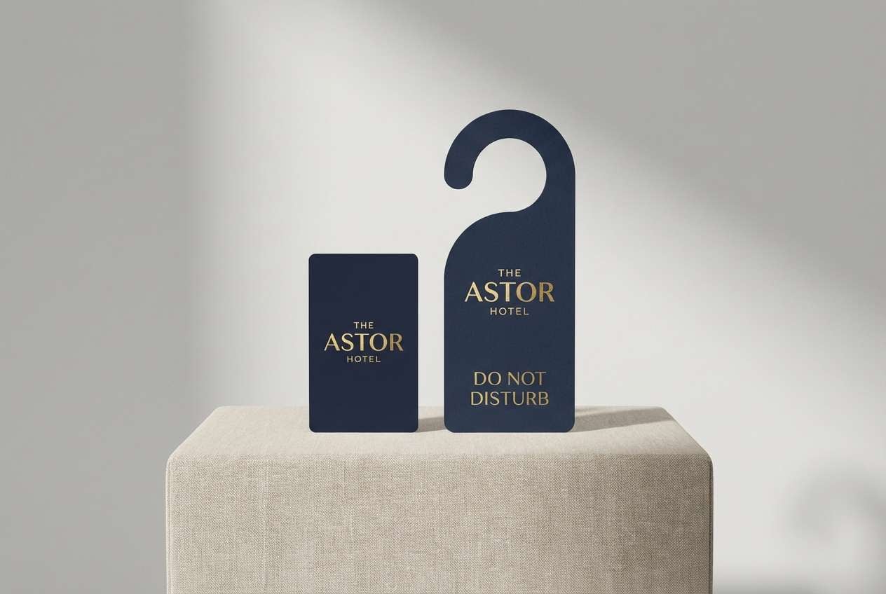
HEX: #0A1E2E #1F3556 #CBA135 #F6F1E4 #64748B
Mood: welcoming, refined, boutique
Best for: hospitality branding and room key cards
Refined and welcoming, it suggests lobby lighting, velvet sofas, and warm brass fixtures. The mid navy works well for large surfaces, while the creamy neutral keeps layouts relaxed and breathable. Pair it with minimalist icons and a modern serif to land that boutique feel. Usage tip: carry the gold into small touchpoints only, like key card edges or a single stamp detail.
Image example of boutique hotel generated using media.io
15) Astronomy Editorial
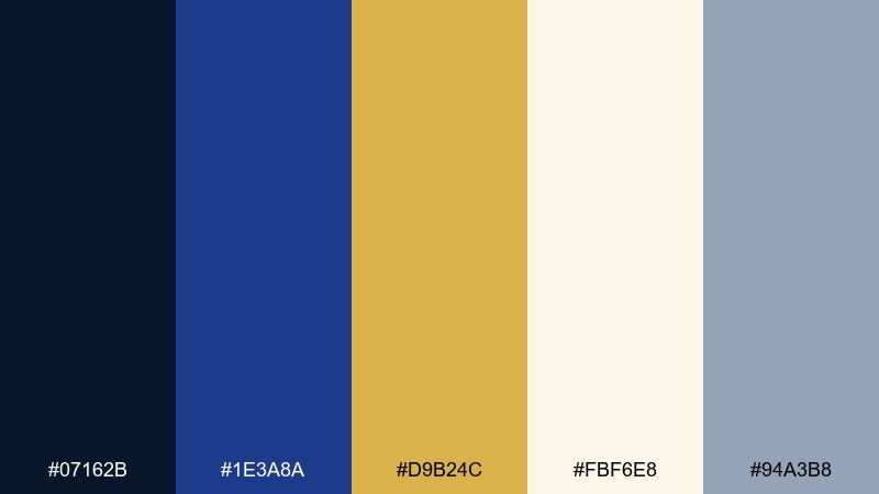
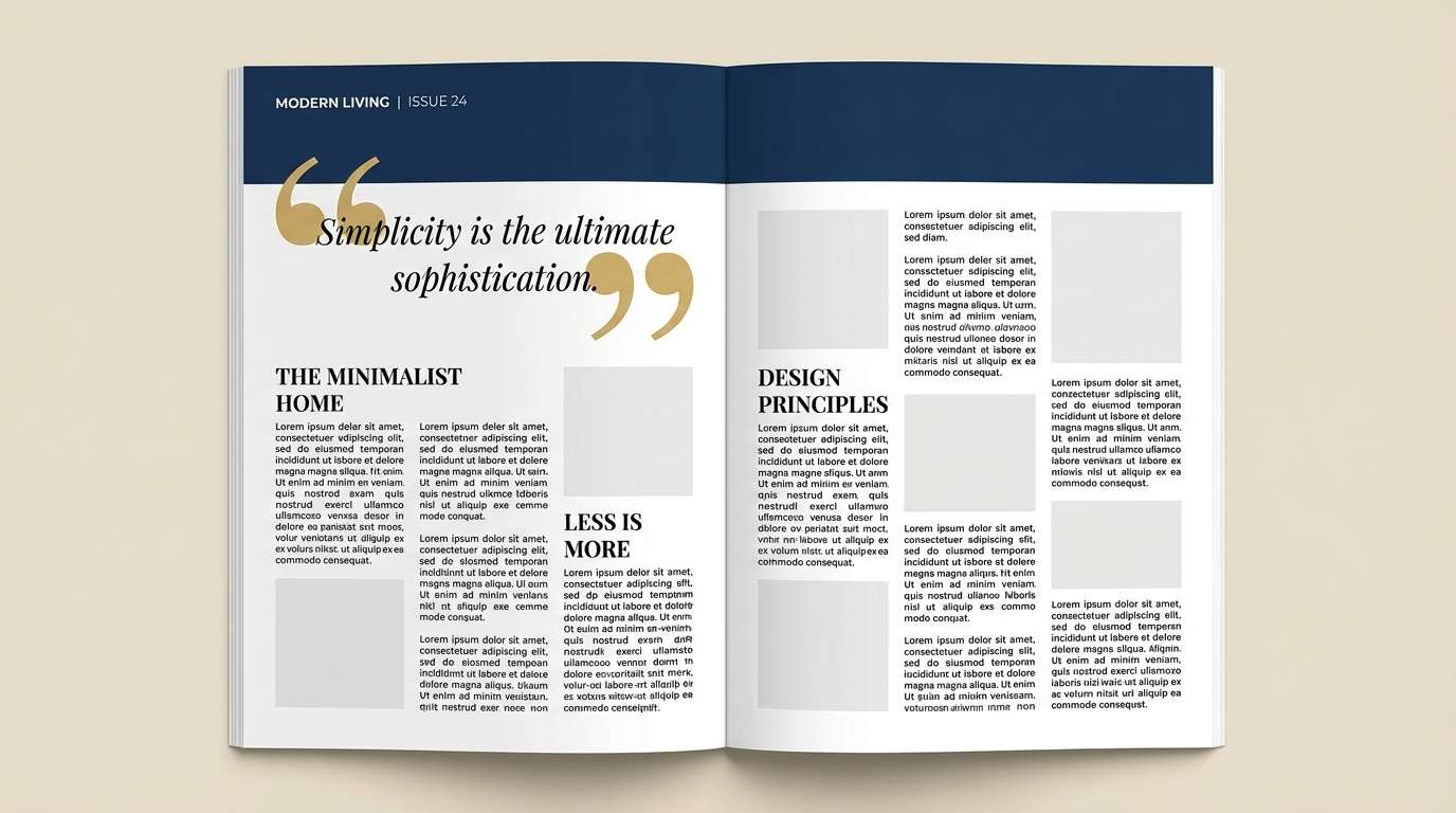
HEX: #07162B #1E3A8A #D9B24C #FBF6E8 #94A3B8
Mood: intellectual, crisp, contemporary
Best for: magazine spreads and editorial layouts
Intellectual and crisp, it feels like star charts printed on premium stock. Deep navy sections create strong rhythm across a spread, while gold can be used for pull quotes and section markers. Pair it with generous margins and a clean sans to keep the layout contemporary. Usage tip: use the lightest neutral for article backgrounds to reduce eye strain in long reads.
Image example of astronomy editorial generated using media.io
16) Crown Bar
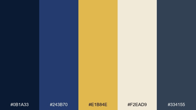
HEX: #0B1A33 #243B70 #E1B84E #F2EAD9 #334155
Mood: opulent, intimate, stylish
Best for: cocktail packaging and bar branding
Opulent and intimate, it evokes a dim bar with polished brass and blue leather booths. The rich contrast suits labels, seal stickers, and small-format brand marks where detail matters. Pair it with tactile finishes like matte navy and spot-gloss accents for depth. Usage tip: keep the gold confined to borders and emblems so the design still reads premium in grayscale.
Image example of crown bar generated using media.io
17) Festive Ornaments
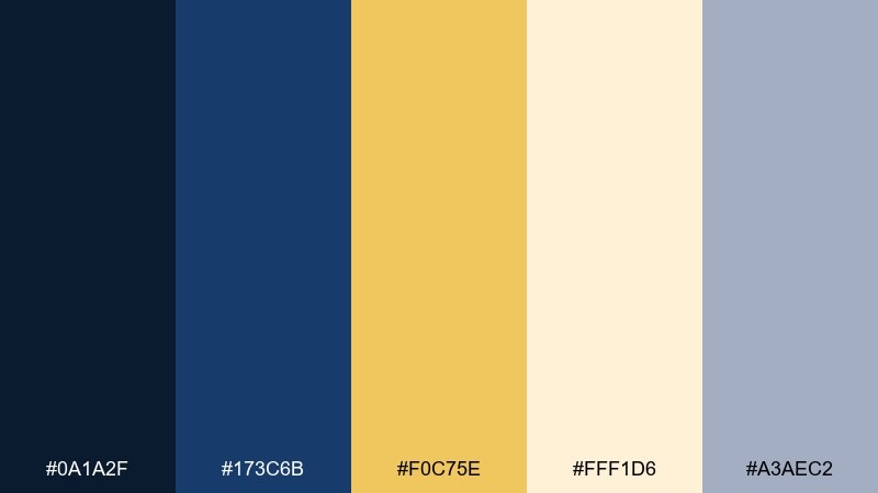
HEX: #0A1A2F #173C6B #F0C75E #FFF1D6 #A3AEC2
Mood: festive, warm, charming
Best for: holiday social posts and email headers
Festive and warm, it brings to mind ornaments, ribbon, and soft winter lights against a midnight sky. The buttery gold feels cheerful rather than flashy, making it great for seasonal campaigns that still need to look polished. Pair it with simple shapes and plenty of light space so the design stays modern. Usage tip: use the pale cream for backgrounds to keep gold accents bright and readable on mobile.
Image example of festive ornaments generated using media.io

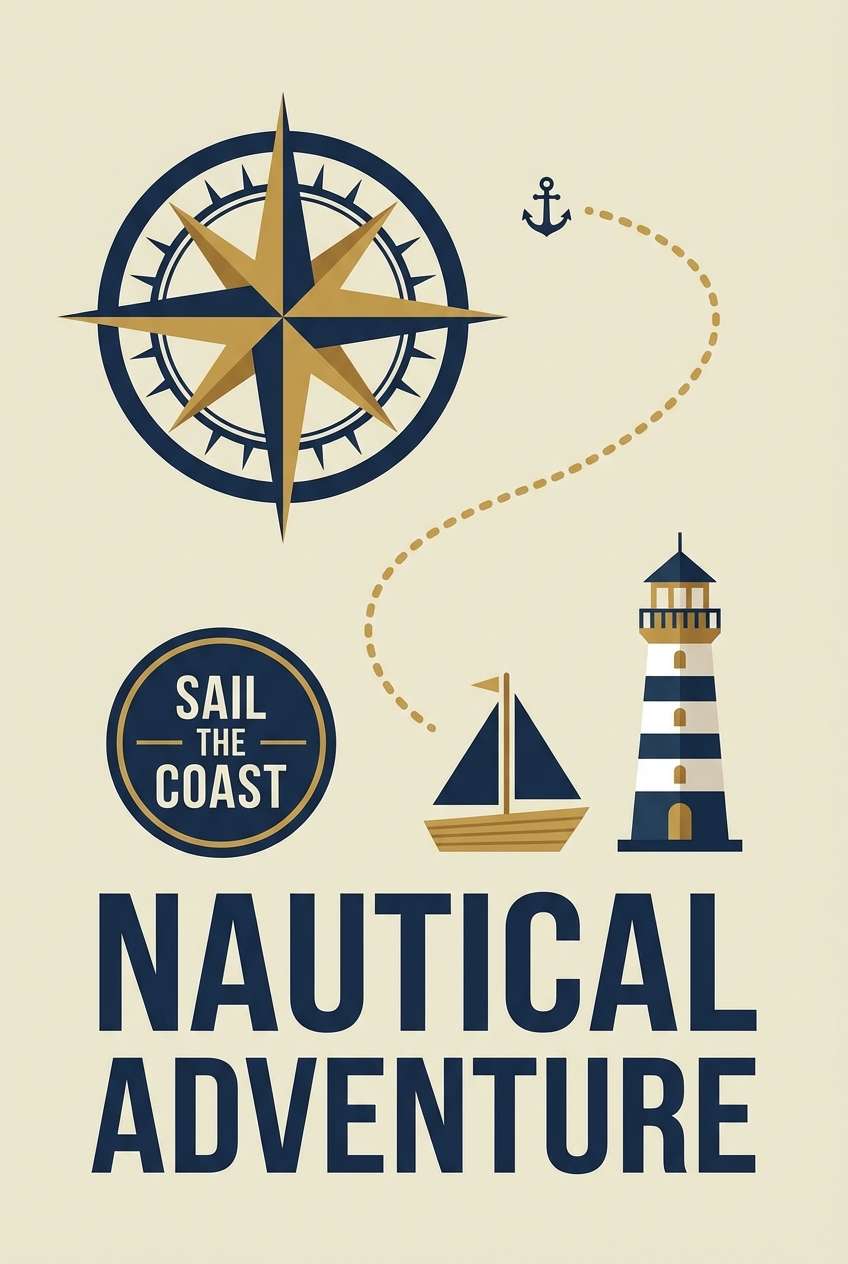
18) Maritime Poster
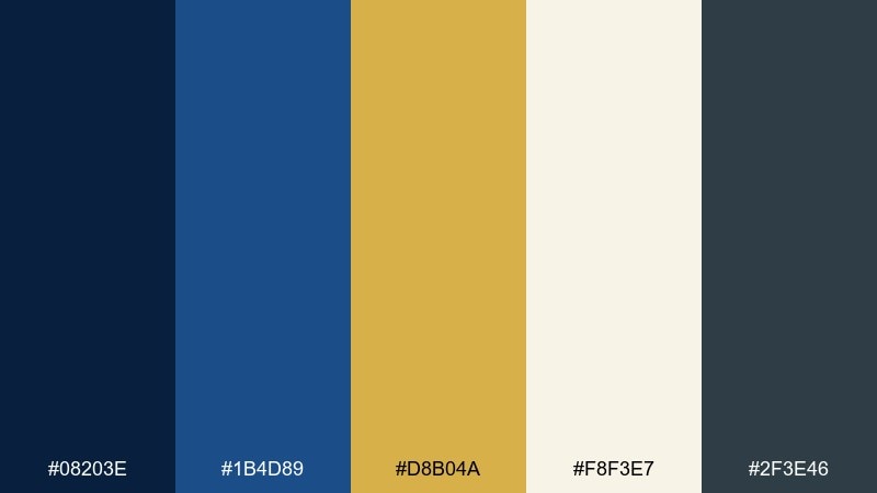
HEX: #08203E #1B4D89 #D8B04A #F8F3E7 #2F3E46
Mood: adventurous, clean, graphic
Best for: travel posters and tourism flyers
Adventurous and clean, it feels like open water, crisp uniforms, and sunlit hardware. Use the brighter blue for illustration highlights and the deeper navy for type blocks and silhouettes. Pair it with cream paper tones to mimic a vintage print finish without going sepia. Usage tip: limit gold to directional cues like badges or route lines for a focused hierarchy.
Image example of maritime poster generated using media.io
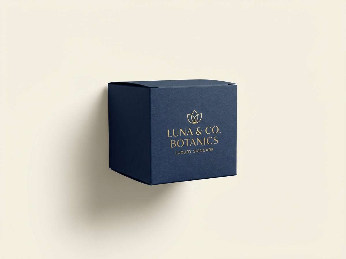
19) Premium Skincare Box
HEX: #081832 #203A63 #D4B15A #F6F0E2 #B6BFCC
Mood: clean, premium, soothing
Best for: cosmetic packaging and ecommerce imagery
Clean and premium, it suggests a quiet spa with navy tiles and warm metallic fixtures. Deep blues give the box a luxury base, while soft neutrals keep skincare messaging approachable. Pair it with minimal typography and a single gold line to signal premium without clutter. Usage tip: if you use foil, keep the gold on thicker strokes so it stays crisp after folding.
Image example of premium skincare box generated using media.io
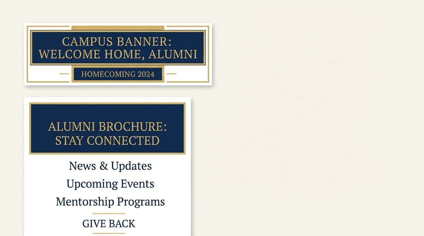
20) University Banner
HEX: #071B45 #1D3E7A #F2C14E #F4EFE6 #1F2937
Mood: proud, institutional, timeless
Best for: campus banners and alumni materials
Proud and timeless, it feels like a historic quad with banners fluttering above stone pathways. These gold navy blue color combinations are a natural fit for institutional branding, alumni newsletters, and recruitment landing pages. Pair the gold with strong navy blocks for clear hierarchy, and use the warm neutral to soften large text areas. Usage tip: standardize one gold tone across print and web so materials look consistent across departments.
Image example of university banner generated using media.io
21) Sunset on Brass
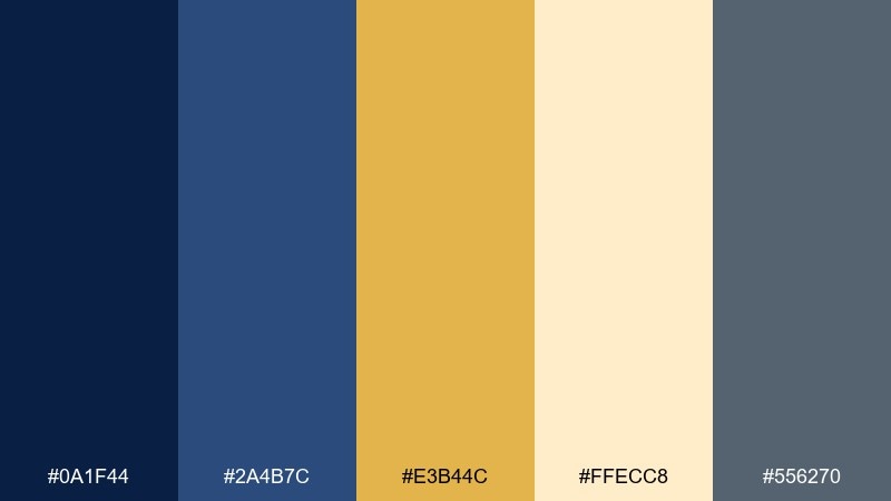
HEX: #0A1F44 #2A4B7C #E3B44C #FFECC8 #556270
Mood: optimistic, warm, refined
Best for: landing pages and call-to-action sections
Optimistic and warm, it looks like late sun reflecting off brass while the sky deepens into navy. The contrast is strong enough for modern web layouts, with gold pulling focus to CTAs and key benefits. Pair it with rounded UI elements and soft shadows for a friendly, premium feel. Usage tip: place gold buttons on navy, not on cream, to preserve accessibility contrast.
Image example of sunset on brass generated using media.io
What Colors Go Well with Gold Navy Blue?
Warm neutrals like ivory, cream, and parchment pair naturally with gold and navy because they soften contrast and keep the palette feeling expensive rather than harsh. They’re especially useful for backgrounds, long-form text areas, and print pieces.
Cool supporting tones—slate, blue-gray, steel, or muted denim—help navy feel layered and contemporary. They also give you additional UI and typography options when gold is reserved for highlights.
For a bolder direction, add a controlled accent like burgundy, emerald, or a muted teal. Keep that third accent minimal so gold remains the primary “spark” and the overall hierarchy stays clear.
How to Use a Gold Navy Blue Color Palette in Real Designs
Start by choosing a navy as your primary base (navigation, headers, key shapes) and treat gold as an accent for emphasis (icons, dividers, badges, and CTAs). This keeps the look premium and prevents gold from turning into “yellow noise.”
In print, gold often looks best as foil or a slightly muted metallic ink; on screens, simulate metallic depth with subtle gradients and careful contrast against navy. Always test at small sizes—thin gold strokes can disappear or look jagged.
To keep designs readable, let off-white/cream carry most negative space and body text areas. Then use a gray-blue for secondary text so you’re not forcing pure navy on pure white everywhere.
Create Gold Navy Blue Palette Visuals with AI
If you want to preview how a navy and gold palette will look on invitations, brand stationery, UI mockups, or packaging, generating quick concept images can save hours of manual layout work.
With Media.io’s text-to-image tool, you can keep the same palette while swapping styles (minimal, art deco, editorial, product ad) to compare directions before you commit to final assets.
Use one palette’s prompt as a starting point, then iterate by changing the subject (logo sheet, menu, landing page hero) while preserving the same navy-and-gold balance.
Gold Navy Blue Color Palette FAQs
-
Why does navy and gold look so luxurious?
Navy creates a deep, stable backdrop associated with formality and trust, while gold functions as a warm highlight that mimics metallic finishes. The high contrast feels intentional and premium, especially when gold is used sparingly. -
What are good HEX codes for navy and gold?
Popular navy choices include #0B1D3A and #071B45, while classic gold accents include #D4AF37 and #F2C14E. Pair them with a soft neutral like #F6F1E4 or #FFF7E6 for balance. -
How much gold should I use in a navy-and-gold design?
A strong rule is to treat gold as an accent (often around 10–15% of the composition). Let navy and neutrals carry most of the layout so gold keeps its “special” emphasis role. -
Which background is better for gold: navy or cream?
Gold typically reads strongest on navy, especially for buttons, borders, and icons. On cream backgrounds, gold can lose contrast, so consider using navy for text and reserve gold for thicker, more visible elements. -
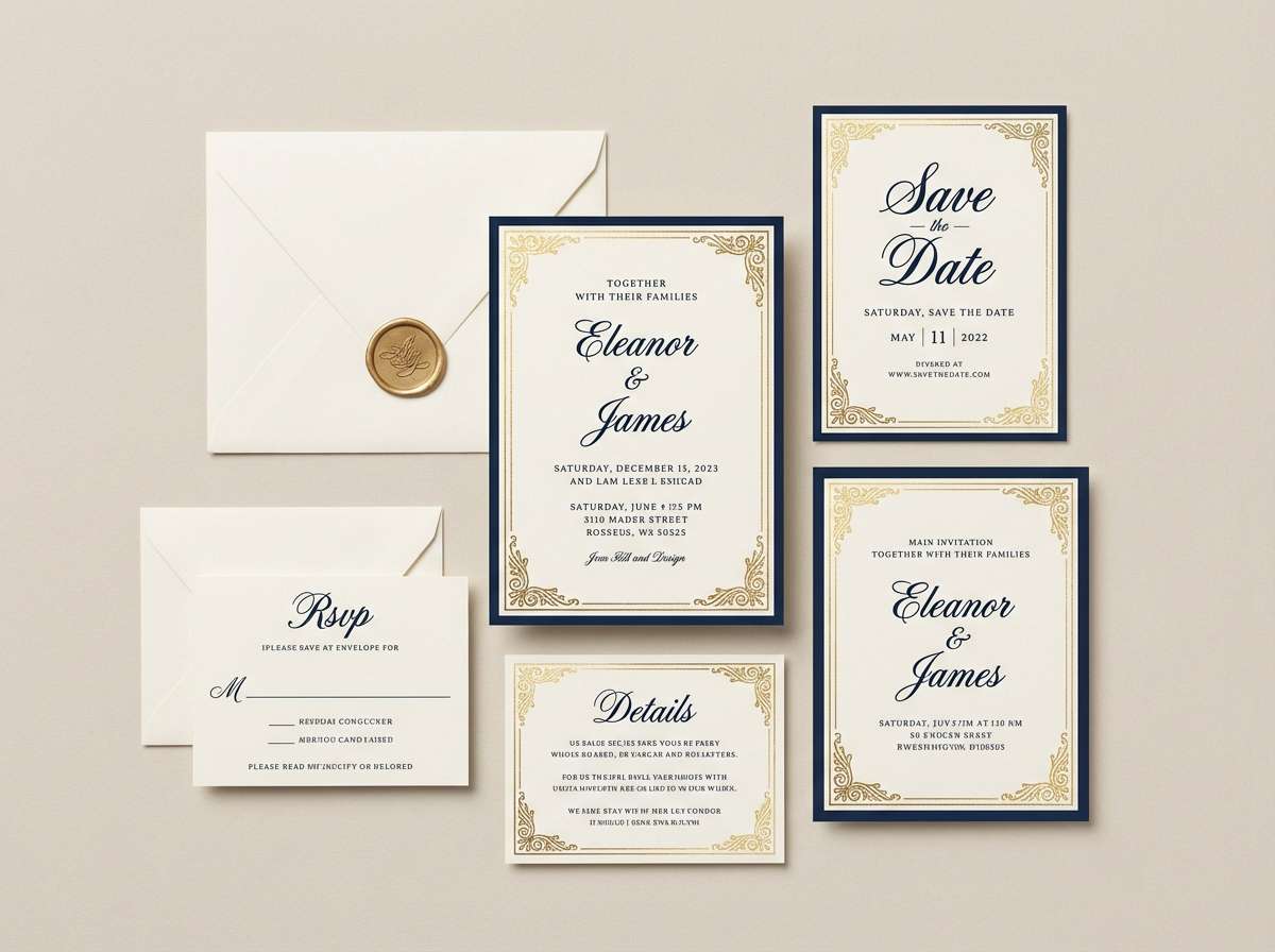
Is gold and navy blue a good choice for wedding colors?
Yes—navy provides elegant depth for typography and formal layouts, while gold adds celebratory sparkle for monograms, borders, and details. Add ivory to keep the suite soft and romantic rather than overly dark. -
How do I make digital gold look like foil?
Instead of a flat fill, use a subtle gradient and a slight highlight/shadow to suggest reflectivity. Keep it restrained so it doesn’t look plastic, and always preview on multiple screens for color shifts. -
What fonts pair well with a gold navy blue palette?
High-contrast serifs work well for formal, editorial, and invitation styles, while geometric sans-serifs suit modern UI and fintech looks. Many designs use a serif for headings and a clean sans for body text to balance tradition and clarity.
Next: Gothic Color Palette


