

White and pink is one of the most versatile pairings in modern design: clean enough for UI, soft enough for weddings, and polished enough for premium packaging.
Below you’ll find curated white pink color palette ideas with HEX codes, plus practical tips for using blush, rose, and berry tones without losing contrast or readability.
In this article
- Why White Pink Palettes Work So Well
-
- cotton candy minimal
- blush porcelain
- rosewater meringue
- petal powder room
- sakura milk tea
- pink macaron studio
- ballet slipper neutral
- frosted peony
- modern spa blush
- cherry blossom skyline
- soft valentine editorial
- rose quartz ui
- bridal bouquet whites
- strawberry cream pop
- powder pink concrete
- cloudy flamingo
- minimalist rose logo
- baby pink nursery
- peony letterpress
- winter blush evening
- What Colors Go Well with White Pink?
- How to Use a White Pink Color Palette in Real Designs
- Create White Pink Palette Visuals with AI
Why White Pink Palettes Work So Well
White creates breathing room and clarity, while pink adds warmth, personality, and emotional tone. Together, they can read minimal and modern or romantic and decorative, depending on saturation and contrast.
Another reason white pink palettes are so effective is their built-in hierarchy: whites and near-whites make ideal surfaces, and deeper roses naturally become accents for buttons, headlines, or callouts.
The key is control—too many mid pinks can feel flat. Keeping plenty of white and reserving the darkest shade for micro-contrast makes the entire system feel intentional.
20+ White Pink Color Palette Ideas (with HEX Codes)
1) Cotton Candy Minimal
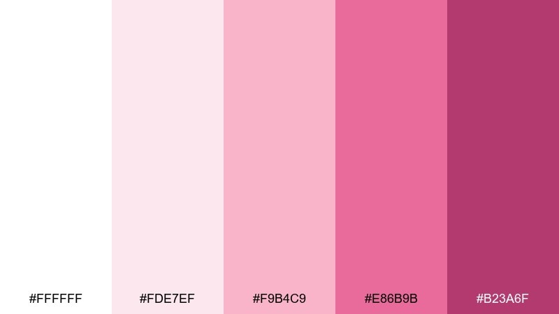
HEX: #ffffff #fde7ef #f9b4c9 #e86b9b #b23a6f
Mood: airy, playful, clean
Best for: social media graphics
Airy and sweet like spun sugar on a bright day, these tones keep things light while still feeling expressive. Use the soft blush as your base and reserve the deeper rose for headlines and buttons. Pair with warm gray typography and plenty of whitespace to avoid looking overly cute. Tip: keep gradients subtle and let one bold accent do the heavy lifting.
Image example of cotton candy minimal generated using media.io
Media.io is an online AI studio for creating and editing video, image, and audio in your browser.

2) Blush Porcelain
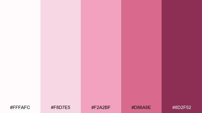
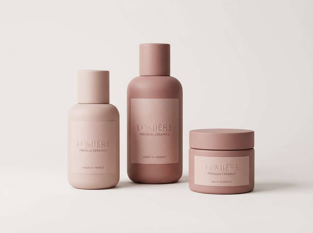
HEX: #fffafc #f8d7e5 #f2a2bf #d86a8e #8d2f52
Mood: refined, delicate, premium
Best for: ceramic brand packaging
Refined and delicate like glazed porcelain, this mix reads premium without shouting. The off-white keeps labels crisp, while dusty rose adds an elegant brand signature. Pair with black or deep plum type and a matte finish for a boutique feel. Tip: use the darkest shade for small details like batch numbers and seals.
Image example of blush porcelain generated using media.io
3) Rosewater Meringue
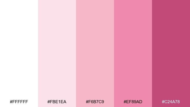
HEX: #ffffff #fbe1ea #f6b7c9 #ef89ad #c24a78
Mood: romantic, soft, luminous
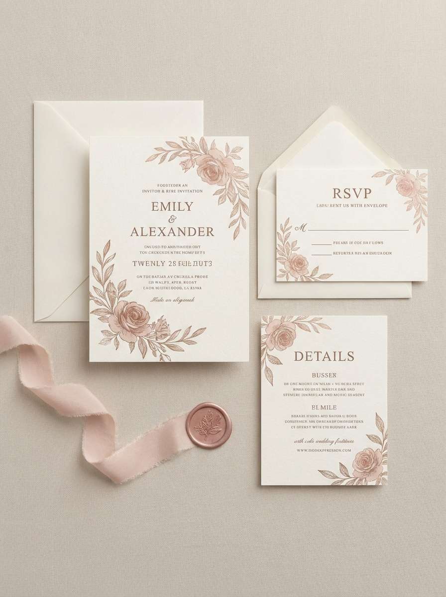
Best for: wedding invitation suite
Romantic and luminous like rosewater foam, the whites here make every blush detail feel intentional. This white pink color palette works beautifully for invitations, menus, and place cards when you want softness with clear contrast. Pair with warm metallic accents like champagne foil and choose a serif for names to elevate the mood. Tip: keep backgrounds mostly white and let the pinks frame key information.
Image example of rosewater meringue generated using media.io
4) Petal Powder Room
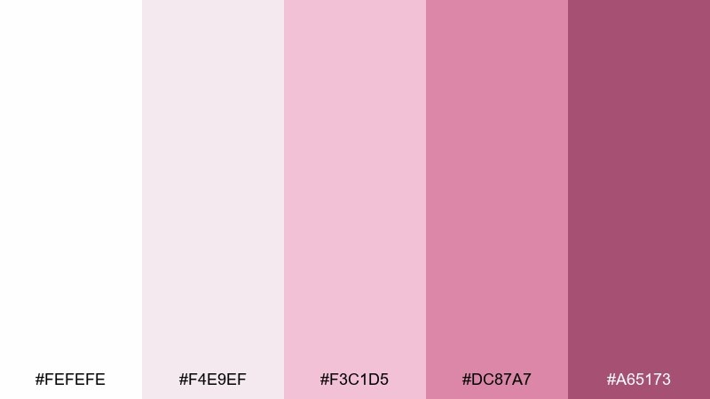
HEX: #fefefe #f4e9ef #f3c1d5 #dc87a7 #a65173
Mood: cozy, chic, spa-like
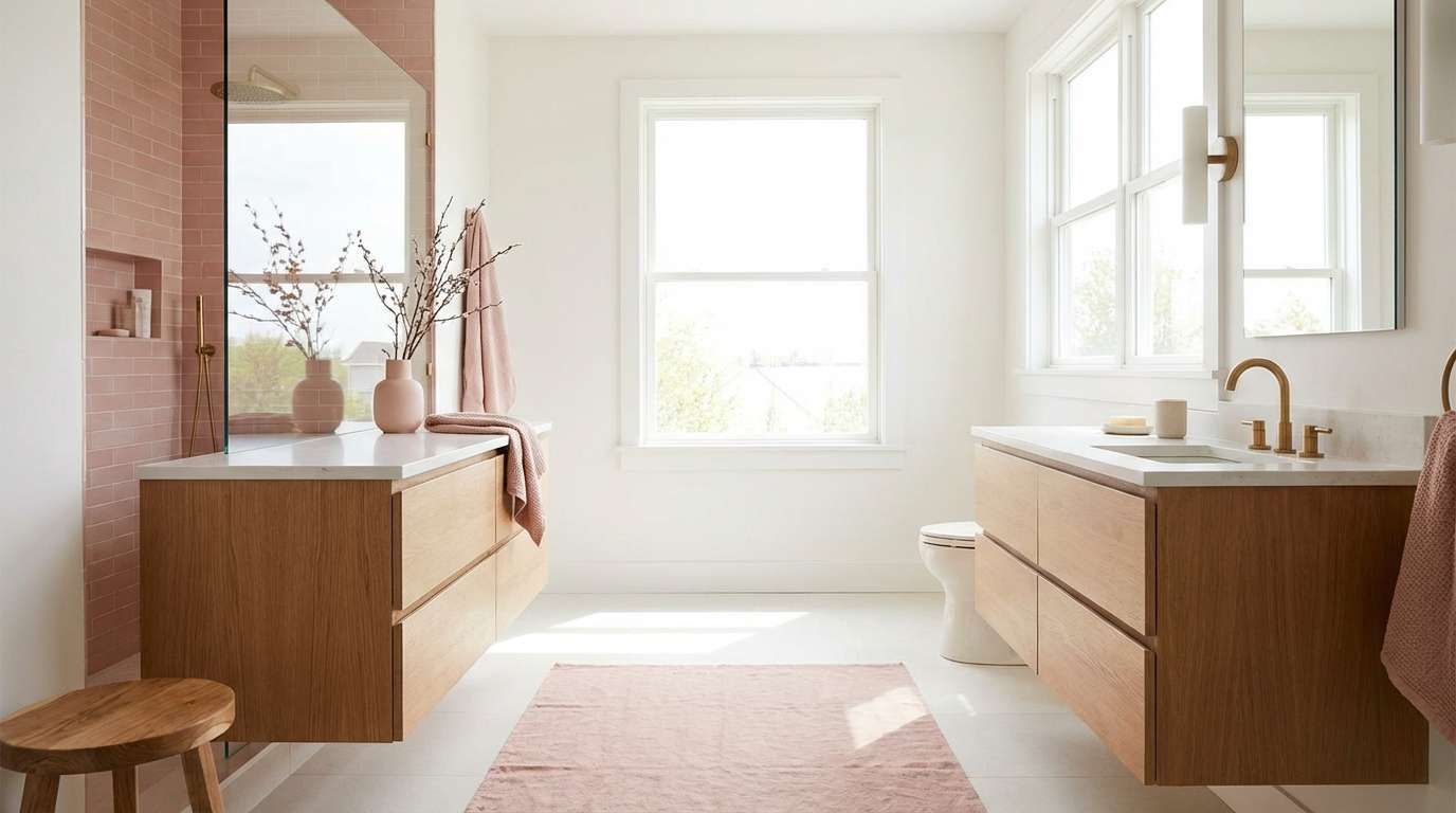
Best for: bathroom interior styling
Cozy and chic like fresh petals on stone, these tones feel instantly spa-like. Use the pale mauve as a wall-adjacent neutral and bring in the richer pink through towels, art, or a vanity runner. Pair with brushed nickel, pale oak, or terrazzo for a modern finish. Tip: repeat the darkest shade in two small places to make the room feel designed, not themed.
Image example of petal powder room generated using media.io
5) Sakura Milk Tea
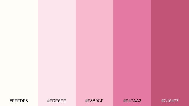
HEX: #fffdf8 #fde5ee #f8b9cf #e47aa3 #c15477
Mood: warm, sweet, inviting
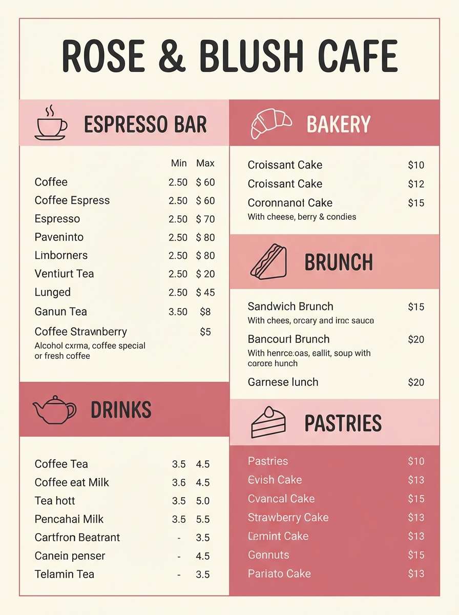
Best for: cafe menu design
Warm and inviting like sakura milk tea, the pinks lean slightly creamy rather than icy. Use the lightest blush for panels and the mid pink for section headers to guide the eye. Pair with cocoa brown line icons and a generous grid to keep the menu readable. Tip: limit the strongest shade to price highlights so it feels intentional.
Image example of sakura milk tea generated using media.io
6) Pink Macaron Studio
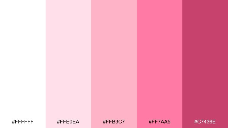
HEX: #ffffff #ffe0ea #ffb3c7 #ff7aa5 #c7436e
Mood: bold, glossy, energetic
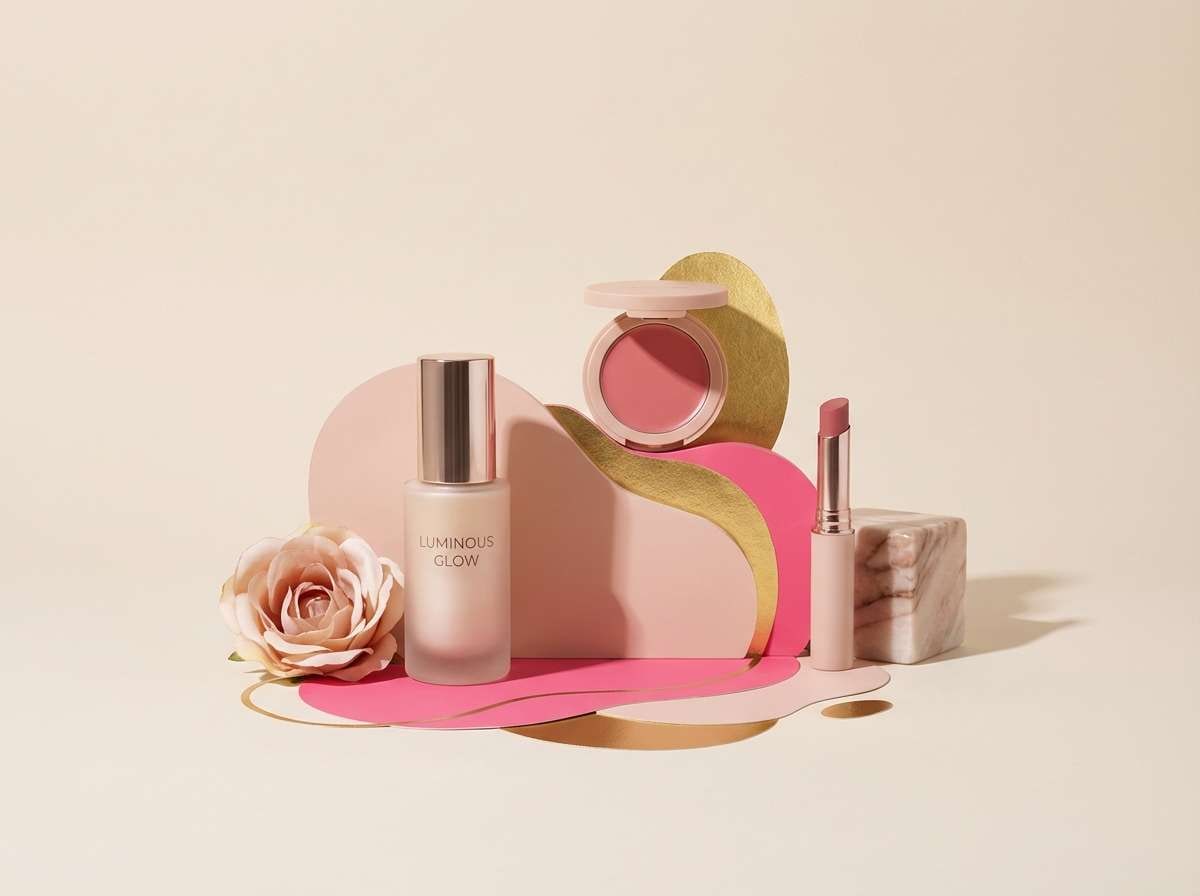
Best for: beauty product ad
Bold and glossy like a fresh macaron box, these tones bring instant energy. White keeps the layout modern, while hot pink delivers punch for callouts and discount tags. For standout white pink color combinations, add a tiny touch of charcoal text and keep everything else warm and rosy. Tip: use the strongest pink only once per frame so the ad stays premium.
Image example of pink macaron studio generated using media.io
7) Ballet Slipper Neutral
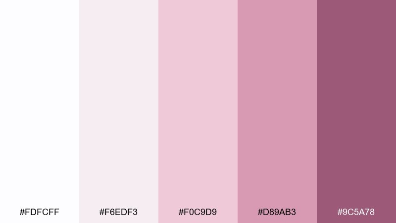
HEX: #fdfcff #f6edf3 #f0c9d9 #d89ab3 #9c5a78
Mood: graceful, calm, understated
Best for: fashion lookbook
Graceful and calm like satin slippers, this palette leans neutral with a gentle rosy tint. Use the soft mauves as background blocks behind imagery to unify a spread without overpowering photos. Pair with black, espresso, or muted olive for a more editorial edge. Tip: keep captions in the darker plum to maintain readability over pale tones.
Image example of ballet slipper neutral generated using media.io
8) Frosted Peony
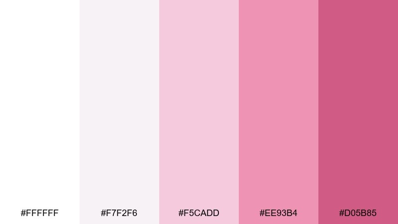
HEX: #ffffff #f7f2f6 #f5cadd #ee93b4 #d05b85
Mood: fresh, floral, gentle
Best for: spring botanical illustration
Fresh and gentle like peony petals brushed with morning frost, these pinks feel naturally botanical. Use the near-white for paper texture and let the mid pinks define petals and soft shadows. Pair with sage green accents if you want a more garden-forward composition. Tip: keep outlines minimal and rely on layered washes for depth.
Image example of frosted peony generated using media.io
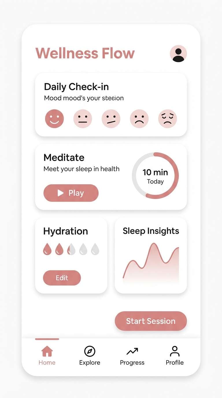
9) Modern Spa Blush
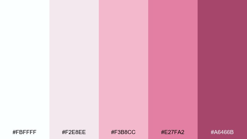
HEX: #fbffff #f2e8ee #f3b8cc #e27fa2 #a6466b
Mood: calm, clean, restorative
Best for: wellness app UI
Calm and restorative like a quiet spa lounge, the whites here keep screens feeling breathable. This white pink color scheme is especially strong for wellness onboarding, habit trackers, and gentle progress states. Pair with cool gray dividers and use the deeper rose only for primary actions. Tip: test contrast for accessibility and avoid placing light pink text on white.
Image example of modern spa blush generated using media.io
10) Cherry Blossom Skyline
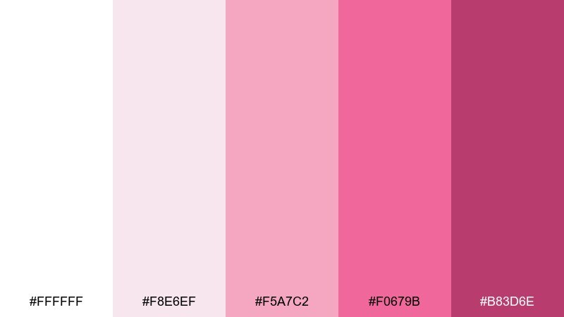
HEX: #ffffff #f8e6ef #f5a7c2 #f0679b #b83d6e
Mood: bright, modern, celebratory
Best for: event poster
Bright and celebratory like blossoms against a city skyline, this set balances punchy pink with plenty of white. Use the vivid pink for a single hero element, then support it with softer blush blocks for schedule and venue details. Pair with geometric shapes and a condensed sans for a modern, high-energy look. Tip: add a thin white border around hot pink text areas to keep them crisp in print.
Image example of cherry blossom skyline generated using media.io

11) Soft Valentine Editorial
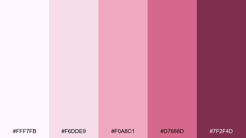
HEX: #fff7fb #f6dde9 #f0a8c1 #d7688d #7f2f4d
Mood: romantic, moody, stylish
Best for: magazine editorial layout
Romantic with a moody edge, these tones feel like perfume ads and late-night editorials. Use the near-white for margins and the deep berry for pull quotes and section titles. Pair with black-and-white photography and a high-contrast serif to sharpen the vibe. Tip: keep pinks slightly desaturated in large areas so pages stay sophisticated.
Image example of soft valentine editorial generated using media.io
12) Rose Quartz UI
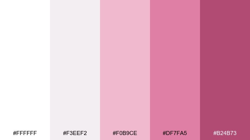
HEX: #ffffff #f3eef2 #f0b9ce #df7fa5 #b24b73
Mood: friendly, modern, polished
Best for: dashboard UI mockup
Friendly and polished like rose quartz in soft light, these shades make interfaces feel approachable. Use the lightest tones for surfaces and cards, then apply the mid pink for charts and active states. Pair with slate gray text and thin dividers for a clean, modern rhythm. Tip: reserve the darkest shade for alerts or key KPIs to create hierarchy fast.
Image example of rose quartz ui generated using media.io

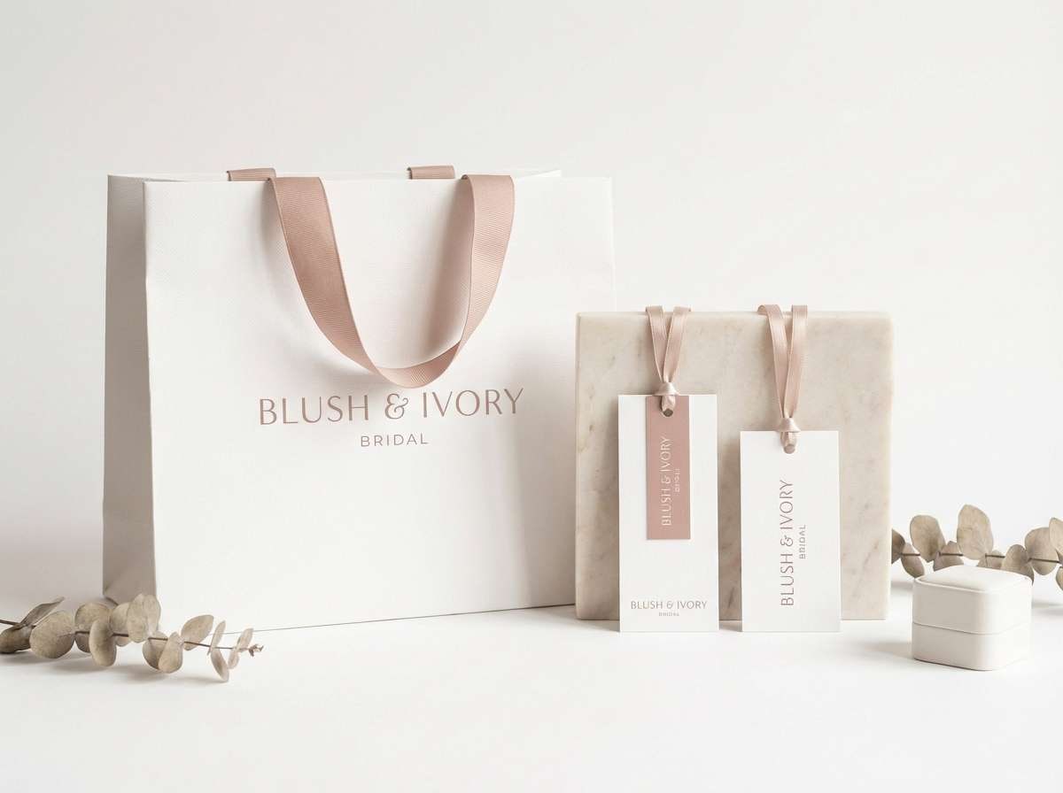
13) Bridal Bouquet Whites
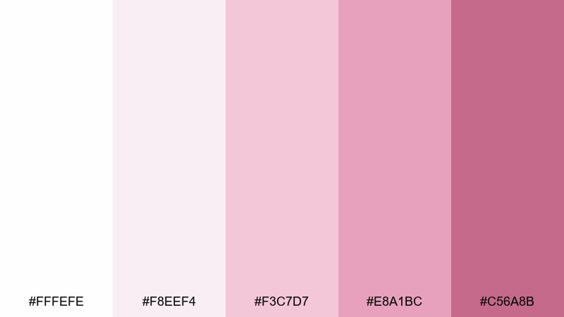
HEX: #fffefe #f8eef4 #f3c7d7 #e8a1bc #c56a8b
Mood: pure, airy, romantic
Best for: bridal boutique branding
Pure and airy like a bouquet of ranunculus, the whites here feel bridal without going sterile. Use blush as a gentle signature on tags, tissue paper, and gift cards. Pair with soft gold foiling and minimal iconography for a couture touch. Tip: keep the darkest pink only for tiny marks like monograms and ribbon details.
Image example of bridal bouquet whites generated using media.io
14) Strawberry Cream Pop
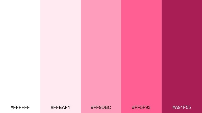
HEX: #ffffff #ffeaf1 #ff9dbc #ff5f93 #a91f55
Mood: fun, punchy, youthful
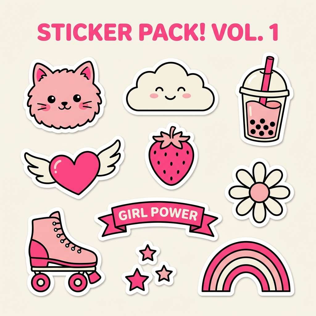
Best for: playful sticker pack
Fun and punchy like strawberry cream candy, these pinks are made for playful graphics. The bright tones shine as icons and stickers, while white keeps edges clean and printable. For eye-catching white pink color combinations, add a tiny amount of navy or deep berry for outlines and contrast. Tip: test your mid pink as a fill color to avoid banding on matte stickers.
Image example of strawberry cream pop generated using media.io
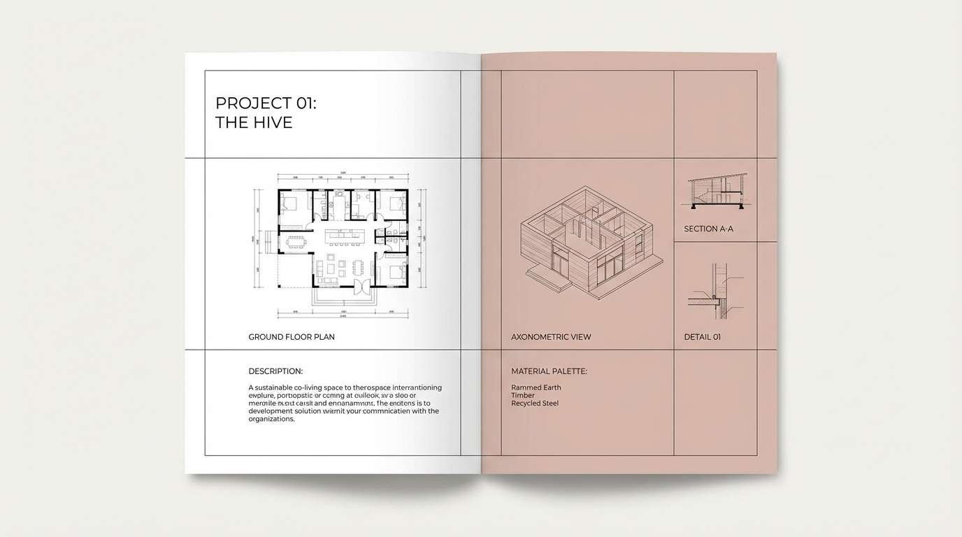
15) Powder Pink Concrete
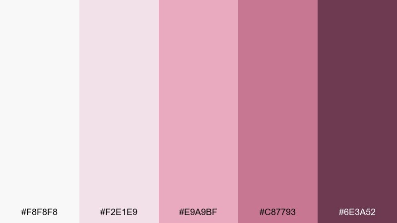
HEX: #f8f8f8 #f2e1e9 #e9a9bf #c87793 #6e3a52
Mood: urban, muted, contemporary
Best for: architecture portfolio
Urban and muted like powder pigment on concrete, this set feels contemporary and grounded. Use the pale grays and pink-tinted neutrals for page backgrounds and section dividers. Pair with charcoal text and crisp line drawings to keep the work front and center. Tip: make the deep plum a consistent navigation accent for a cohesive portfolio system.
Image example of powder pink concrete generated using media.io
16) Cloudy Flamingo
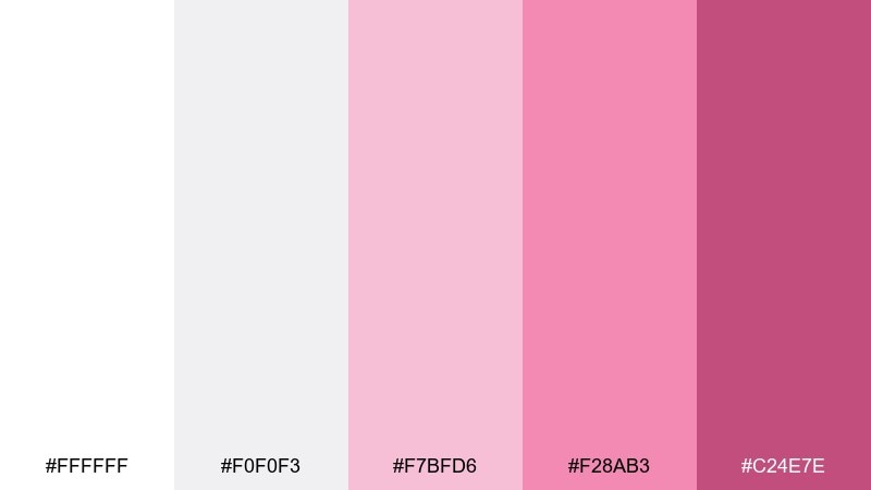
HEX: #ffffff #f0f0f3 #f7bfd6 #f28ab3 #c24e7e
Mood: dreamy, light, optimistic
Best for: skincare packaging
Dreamy and optimistic like flamingo feathers in soft cloud light, these pinks feel fresh rather than sugary. Use the cool-tinted whites to signal cleanliness and the mid pink for product differentiation across a line. Pair with minimalist sans-serif type and a satin label finish for a modern skincare look. Tip: keep the brightest shade for a single brand stamp to avoid visual noise.
Image example of cloudy flamingo generated using media.io
17) Minimalist Rose Logo
HEX: #ffffff #f9f3f6 #f4c2d6 #e37ea5 #9e3f69
Mood: clean, confident, brand-ready
Best for: logo design and brand marks
Clean and confident like a single rose drawn with restraint, this mix is built for brand marks. This white pink color palette keeps logos crisp on light backgrounds while offering deeper tones for stamps and social avatars. Pair with black for typography and use the mid pink as a subtle highlight on icons. Tip: create a one-color version in the darkest shade for embossing and small-scale use.
Image example of minimalist rose logo generated using media.io
18) Baby Pink Nursery
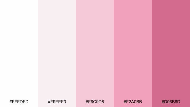
HEX: #fffdfd #f9eef3 #f6c9d8 #f2a0bb #d06b8d
Mood: gentle, cozy, comforting
Best for: nursery wall art
Gentle and comforting like a soft blanket, these pinks keep a nursery feeling calm. Use the palest tones for big shapes and backgrounds, then add the deeper pink for small hearts, stars, or name lettering. Pair with light wood frames and a touch of warm beige to keep it neutral-friendly. Tip: stick to rounded shapes and plenty of negative space for a soothing look.
Image example of baby pink nursery generated using media.io
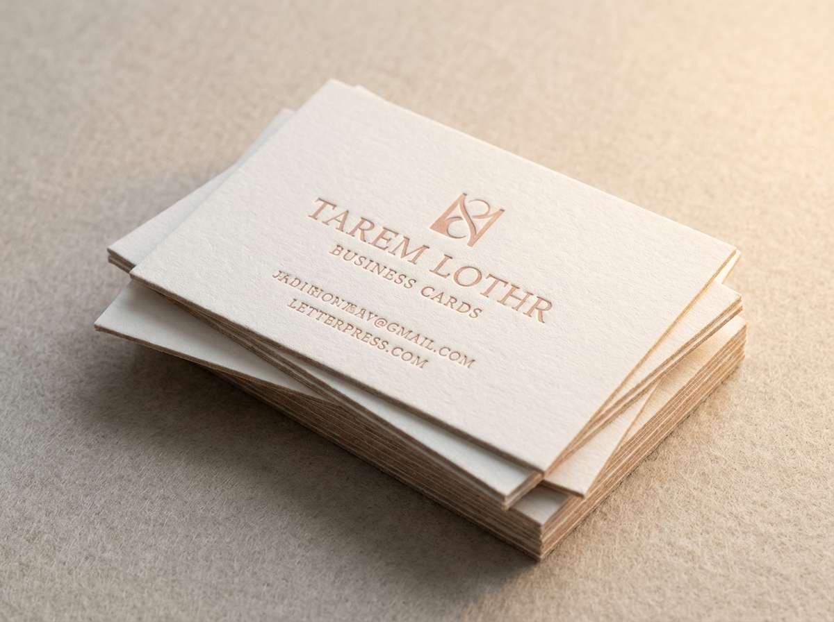
19) Peony Letterpress
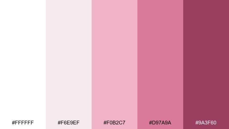
HEX: #ffffff #f6e9ef #f0b2c7 #d97a9a #9a3f60
Mood: classic, tactile, elegant
Best for: letterpress business cards
Classic and tactile like letterpress cotton stock, this set feels understated yet special. Use warm white as the main card color and print in the mid-to-deep rose for sharp readability. Pair with blind deboss patterns or a thin border to elevate the craftsmanship vibe. Tip: keep the darkest shade for names and titles, and let the lighter pinks live in subtle motifs.
Image example of peony letterpress generated using media.io
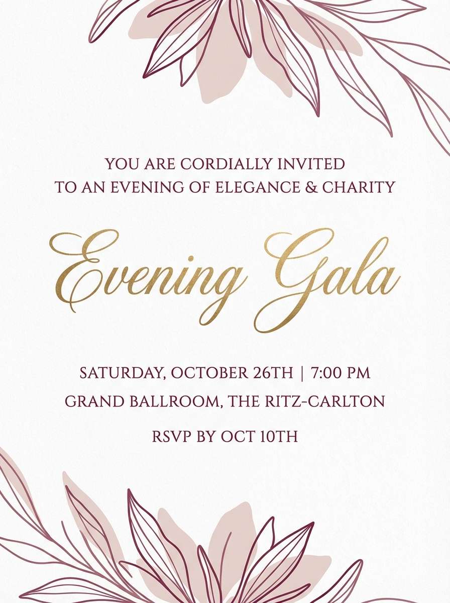
20) Winter Blush Evening
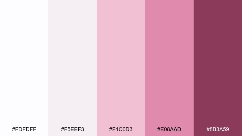
HEX: #fdfdff #f5eef3 #f1c0d3 #e08aad #8b3a59
Mood: glam, cool, sophisticated
Best for: evening gala invitation
Glam and cool like winter light on satin, these tones feel sophisticated rather than pastel. Use the frosty whites as the backdrop and bring in deep berry for the event name to add drama. Pair with silver accents and a modern serif to keep it upscale. Tip: add a thin blush rule line to separate sections without cluttering the layout.
Image example of winter blush evening generated using media.io
What Colors Go Well with White Pink?
Neutrals are the easiest win: warm gray, greige, taupe, and charcoal help pink feel more modern and keep layouts readable. In branding and UI, slate gray text on white with rose accents is a reliable, polished combo.
For richer contrast, add deep berry, plum, or burgundy—these shades make blush look more intentional and upscale. If you want a fresh, botanical direction, pair white pink with muted greens like sage or eucalyptus.
Metallics also complement white and pink beautifully: champagne gold warms the palette, while silver and nickel keep it cool and sleek for premium invitations or beauty packaging.
How to Use a White Pink Color Palette in Real Designs
Start with white (or an off-white) as your primary background, then assign one blush to surfaces (cards, sections, panels) and one deeper rose to actions (buttons, links, price tags). This prevents “all-pink” flattening and creates instant hierarchy.
For print, test your lightest blush on the actual paper stock—some pale pinks disappear on warm whites. For screens, avoid light pink text on white; use dark plum or charcoal for type and reserve pink for fills, borders, and icons.
When you need a premium feel, use fewer pink tones at once and repeat the darkest shade in small, consistent places (labels, dividers, stamps). Repetition makes the system feel designed, not themed.
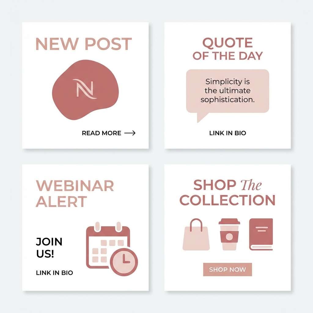
Create White Pink Palette Visuals with AI
If you’re building moodboards, mockups, or social graphics, AI can help you visualize white and pink tones quickly before committing to final assets. The best results come from describing lighting (soft, diffused), surface style (matte paper, satin label), and layout (minimal, lots of whitespace).
Try generating a few variations of the same prompt by swapping just one adjective—like “airy” vs. “premium”—then lock your final palette once the mood matches your brand. You can also keep the same prompt and only change the --ar ratio to fit different placements.
White Pink Color Palette FAQs
-
What does a white and pink color palette communicate?
White signals cleanliness and simplicity, while pink adds warmth and emotion. Together they commonly communicate softness, care, romance, and modern minimalism, depending on how saturated the pinks are. -
How do I keep white pink designs from looking too “cute”?
Use more whitespace, desaturate large pink areas, and introduce a grounded neutral like charcoal or warm gray for typography. Reserve your brightest pink for one focal point (CTA, badge, or headline). -
Which text colors work best on blush backgrounds?
Charcoal, deep plum, espresso brown, or near-black usually provide the best readability. Avoid using light pink text on white or blush because contrast often fails accessibility checks. -
Is white pink a good palette for UI and apps?
Yes—white keeps screens breathable, and pink works well for highlights, active states, and gentle status indicators. Just ensure sufficient contrast for buttons, links, and small text, especially on light pink surfaces. -
What accent colors pair well with white and pink?
Sage green for a botanical feel, navy for sharper contrast, and metallic champagne gold for an elevated, wedding or luxury vibe. Choose one accent and keep it consistent across components. -
How many pink shades should I use in one design system?
Typically 2–3 pinks are enough: a very light blush for surfaces, a mid pink for secondary accents, and a deep rose/berry for primary actions or emphasis. Too many similar mid tones can reduce hierarchy. -
What finishes look best for white pink packaging?
Matte or soft-touch whites with satin blush labels feel premium and modern. Small foil or embossed details in the darkest rose shade can add craftsmanship without overwhelming the minimal look.


