

A pink yellow orange color palette is the shortcut to instant warmth: it reads like sunlight, ripe fruit, and a friendly blush all at once. That’s why it’s so popular for modern branding, web UI, and seasonal campaigns.
Below are 20 curated pink-yellow-orange palettes with HEX codes, plus practical tips for pairing, contrast, and real design use.
In this article
Why Pink Yellow Orange Palettes Work So Well
Pink, yellow, and orange sit close on the warm side of the color wheel, so they blend naturally into gradients and layered accents. That harmony creates energy without the harsh clash you can get from opposite (complementary) colors.
Emotionally, these hues signal optimism and approachability: pink feels friendly, yellow feels uplifting, and orange feels active. Together they’re ideal for brands that want to look modern, social, and human.
The key to making them “wearable” in real layouts is contrast control—add a deep neutral (charcoal, navy, cocoa, slate) so text stays readable and the warm colors can stay bold.
20+ Pink Yellow Orange Color Palette Ideas (with HEX Codes)
1) Sunset Sorbet
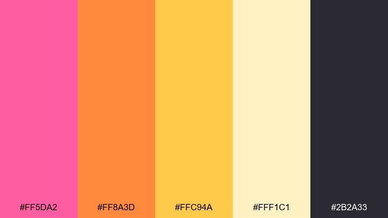
HEX: #FF5DA2 #FF8A3D #FFC94A #FFF1C1 #2B2A33
Mood: playful, sunny, upbeat
Best for: summer event posters and social graphics
Playful and sunny like melting sorbet at golden hour, these tones feel instantly upbeat. Use the deep charcoal for type so the bright hues can stay loud without hurting readability. It shines on posters, social tiles, and promo banners where you want a friendly punch. Usage tip: keep the pale cream as the main background and reserve hot pink for calls to action.
Image example of sunset sorbet generated using media.io

Media.io is an online AI studio for creating and editing video, image, and audio in your browser.

2) Citrus Blush
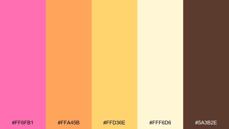
HEX: #FF6FB1 #FFA45B #FFD36E #FFF6D6 #5A3B2E
Mood: fresh, friendly, inviting
Best for: bakery branding and packaging
Fresh and inviting, it reads like citrus zest over a blush glaze. The cocoa-brown anchor keeps the warm hues from drifting into neon. It works beautifully for bakery branding, labels, and small-format packaging where warmth sells the story. Usage tip: print the yellow slightly muted and let the pink carry the brand accent.
Image example of citrus blush generated using media.io
3) Peachy Pop
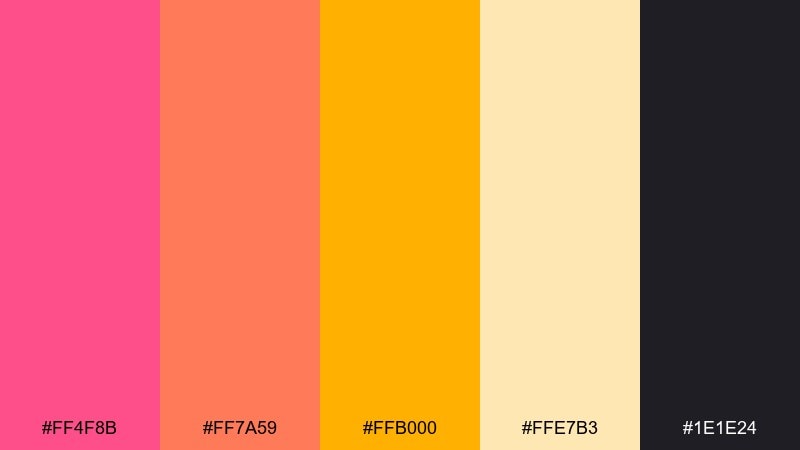
HEX: #FF4F8B #FF7A59 #FFB000 #FFE7B3 #1E1E24
Mood: bold, energetic, youthful
Best for: app onboarding UI and CTA buttons
Bold and energetic, it feels like a pop track with a bright chorus. The near-black adds crisp contrast for icons, headers, and microcopy. Use it in onboarding, promos, or feature callouts where you want quick scanning. Usage tip: limit the strongest pink to one primary action per screen to avoid visual fatigue.
Image example of peachy pop generated using media.io
4) Tropical Sherbet
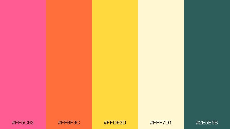
HEX: #FF5C93 #FF6F3C #FFD93D #FFF7D1 #2E5E5B
Mood: tropical, lively, vacation-ready
Best for: travel promos and resort ads
Tropical and lively, it evokes poolside towels, mango slices, and a rosy sunset. These are classic pink yellow orange color combinations, so balance them with the cool teal to keep the layout feeling modern. Great for travel promos, resort ads, and bold hero sections. Usage tip: set teal as the secondary background for pricing panels and let the warm colors headline.
Image example of tropical sherbet generated using media.io
5) Marigold Rose
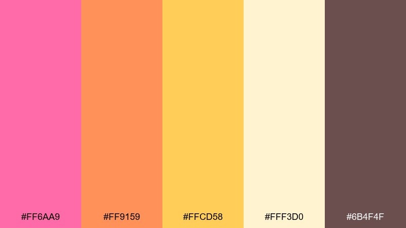
HEX: #FF6AA9 #FF9159 #FFCD58 #FFF3D0 #6B4F4F
Mood: romantic, warm, polished
Best for: wedding invitations and stationery
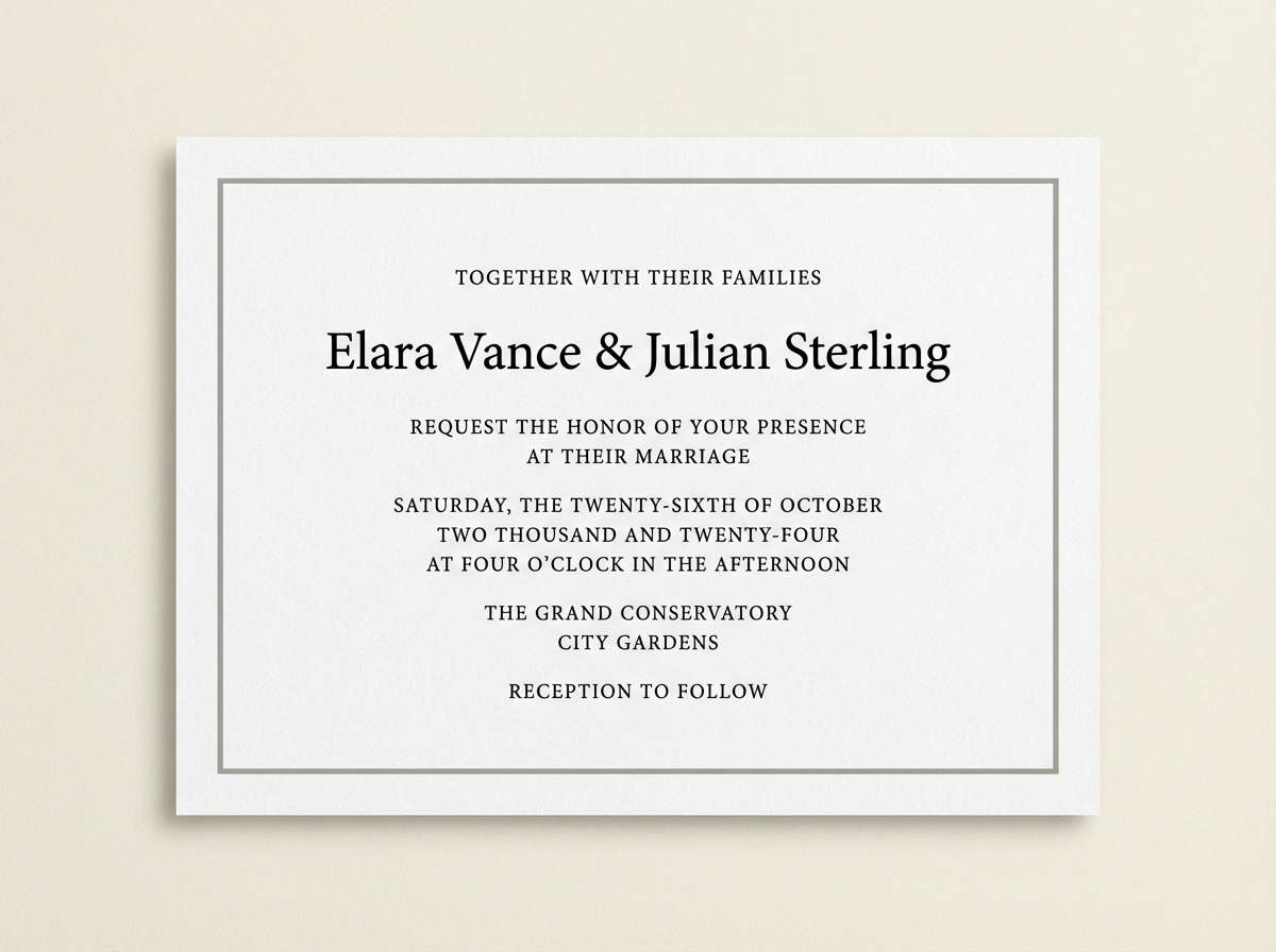
Romantic and warm, it brings to mind marigolds tucked into soft rose bouquets. The mauve-brown neutral adds a refined, print-friendly base for type and borders. It suits wedding invitations, save-the-dates, and elegant stationery where you want color without loudness. Usage tip: foil or emboss the neutral for headings while keeping the florals in the brighter accents.
Image example of marigold rose generated using media.io
6) Coral Lemonade
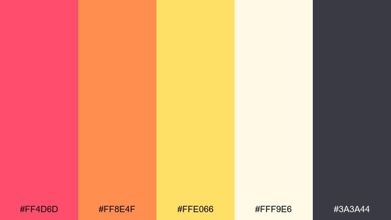
HEX: #FF4D6D #FF8E4F #FFE066 #FFF9E6 #3A3A44
Mood: refreshing, bright, clean
Best for: DTC product ads and landing pages
Refreshing and bright, it feels like a cold lemonade with a coral twist. Use the soft off-white as your breathing room so the warm hues read clean on screens. Perfect for DTC ads, landing pages, and promo banners that need clarity and punch. Usage tip: keep buttons orange, and reserve the coral for badges or limited-time labels.
Image example of coral lemonade generated using media.io
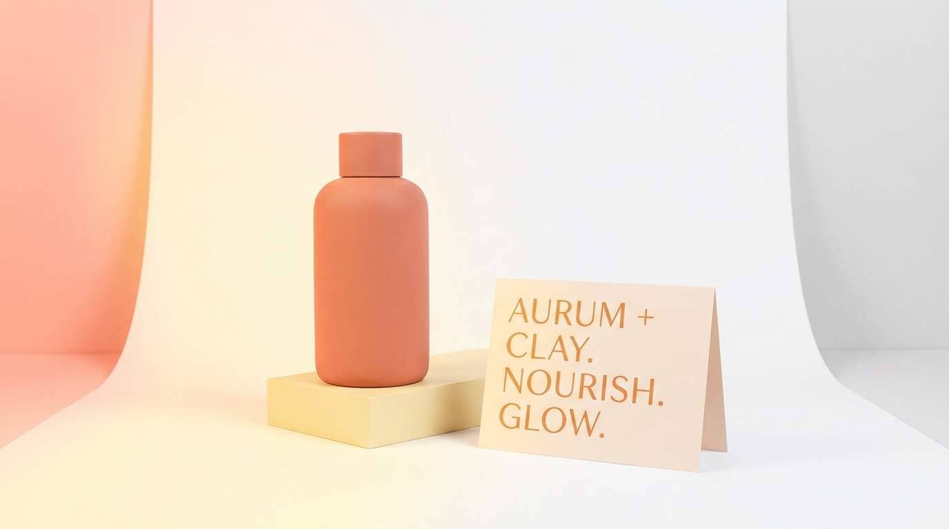
7) Apricot Bloom
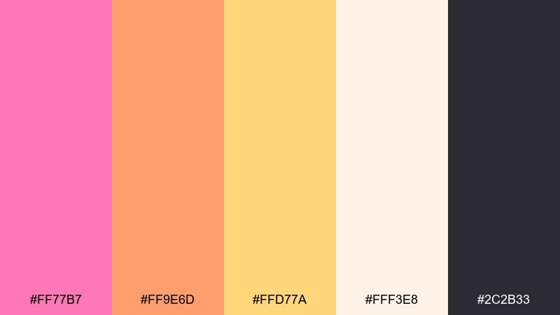
HEX: #FF77B7 #FF9E6D #FFD77A #FFF3E8 #2C2B33
Mood: soft, airy, optimistic
Best for: beauty brand moodboards and lookbooks
Soft and airy, it suggests apricot blossoms and a light, optimistic glow. This pink yellow orange color palette stays wearable thanks to the gentle tints and the dark ink tone for structure. Use it for beauty moodboards, lookbooks, and seasonal collections where softness matters. Usage tip: treat the yellow as a highlight only, so skin tones and product shots remain the focus.
Image example of apricot bloom generated using media.io
8) Flamingo Sunrise
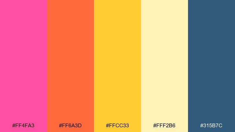
HEX: #FF4FA3 #FF6A3D #FFCC33 #FFF2B6 #315B7C
Mood: cheerful, coastal, energetic
Best for: summer email headers and hero banners
Cheerful and coastal, it recalls flamingos, surf wax, and a bright sunrise over water. The denim blue adds a calm counterpoint and keeps the warm tones from feeling too sugary. Ideal for summer email headers, hero banners, and campaign graphics. Usage tip: set blue for navigation and links, then let the warm trio drive the hero message.
Image example of flamingo sunrise generated using media.io
9) Melon Flare
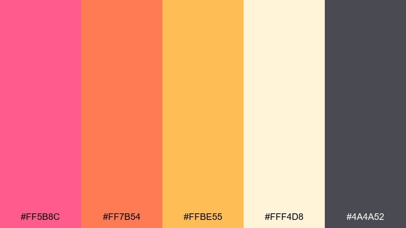
HEX: #FF5B8C #FF7B54 #FFBE55 #FFF4D8 #4A4A52
Mood: fun, casual, approachable
Best for: food menu design and cafe boards
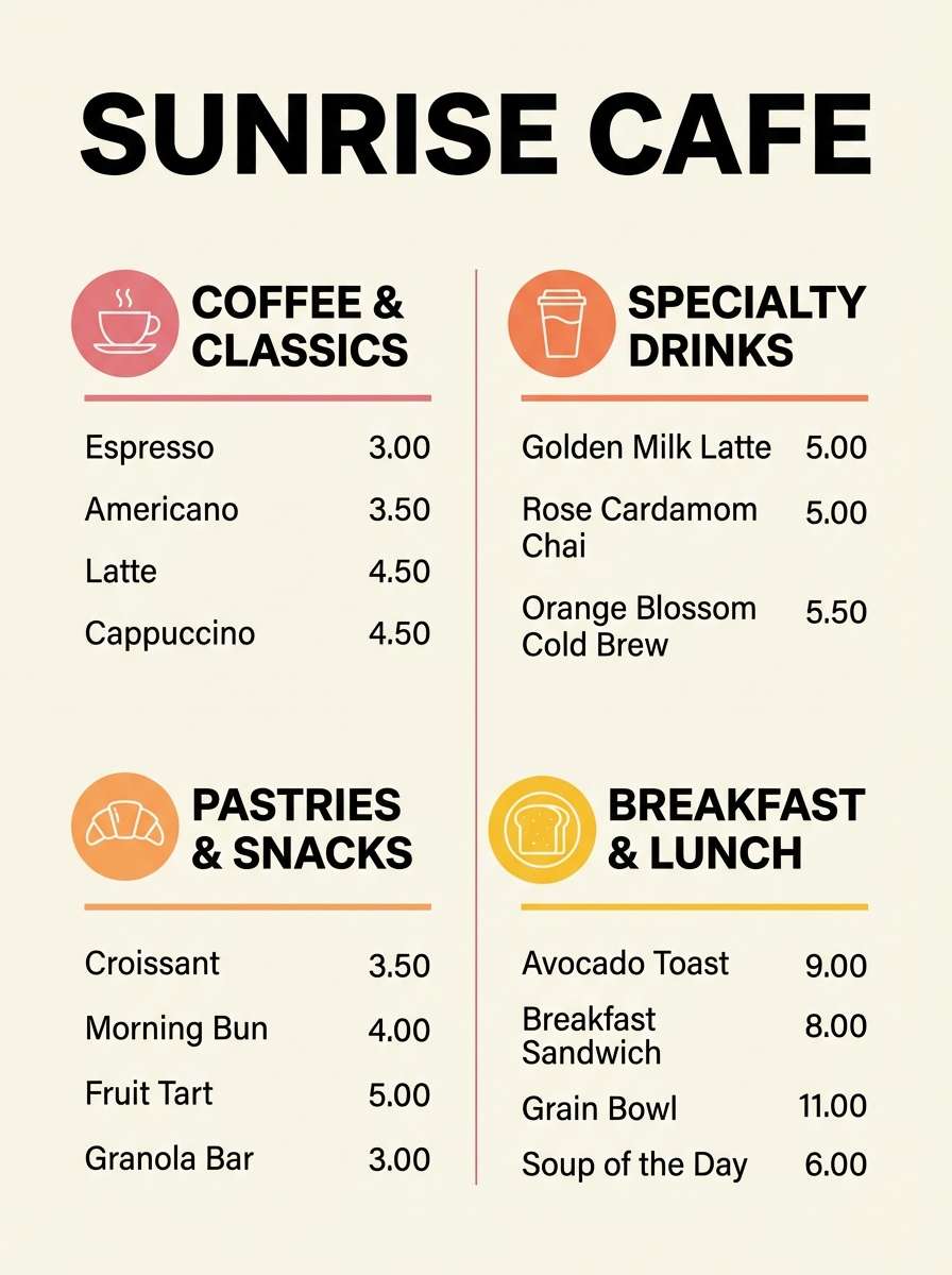
Fun and casual, it feels like a sliced melon platter on a sunny table. The warm neutrals keep the palette approachable for menus and pricing. Use it on cafe boards, food menus, and promo cards where you want appetite appeal without neon. Usage tip: set body text in the deep gray and reserve the pink for section headers.
Image example of melon flare generated using media.io
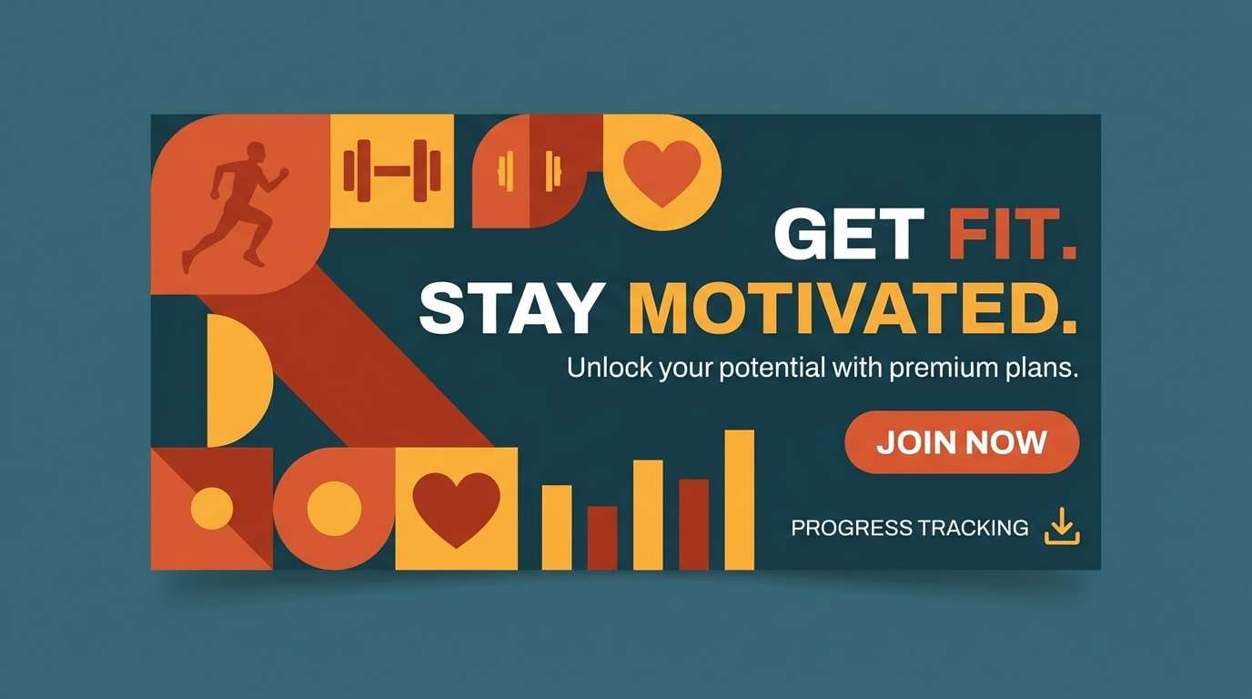
10) Papaya Punch
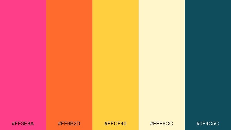
HEX: #FF3E8A #FF6B2D #FFCF40 #FFF6CC #0F4C5C
Mood: punchy, sporty, high-contrast
Best for: fitness promo creatives and app badges
Punchy and sporty, it brings the vibe of papaya punch and bright gym signage. The deep teal gives you strong contrast for icons and small text. Great for fitness promos, app badges, and limited-time offers that need to pop in a feed. Usage tip: use the yellow for highlights and progress states, not large text blocks.
Image example of papaya punch generated using media.io
11) Soft Carnival
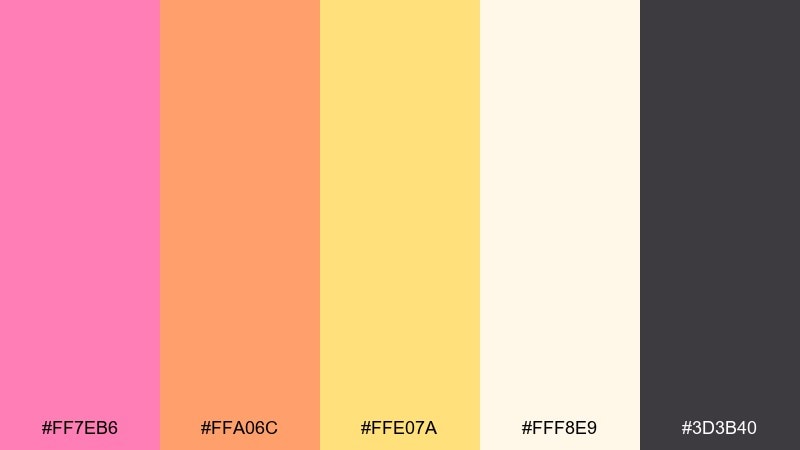
HEX: #FF7EB6 #FFA06C #FFE07A #FFF8E9 #3D3B40
Mood: whimsical, light, family-friendly
Best for: kids party invitations and stickers
Whimsical and light, it suggests carousel lights and cotton candy without going too loud. The creamy base helps everything feel gentle and print-ready. It fits kids party invitations, sticker sheets, and playful merch tags. Usage tip: outline illustrations in the charcoal to keep details crisp at small sizes.
Image example of soft carnival generated using media.io
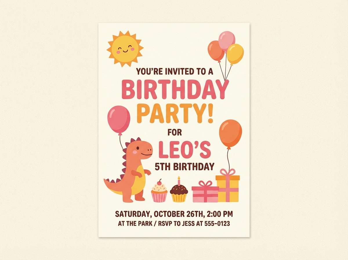
12) Warm Confetti
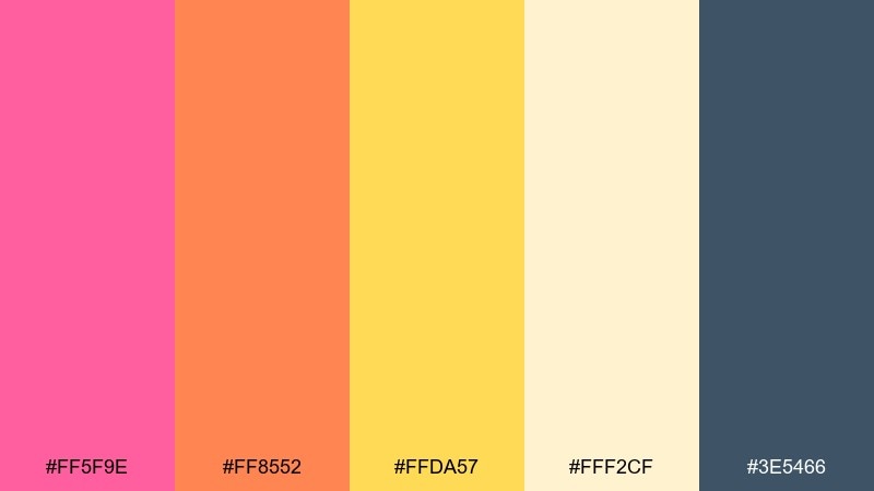
HEX: #FF5F9E #FF8552 #FFDA57 #FFF2CF #3E5466
Mood: celebratory, bright, modern
Best for: brand announcements and launch graphics
Celebratory and bright, it reads like confetti caught in warm light. The slate blue keeps the palette modern and adds an unexpected edge. Use it for brand announcements, launch graphics, and milestone posts that need instant excitement. Usage tip: keep confetti shapes sparse and let the colors do the talking.
Image example of warm confetti generated using media.io

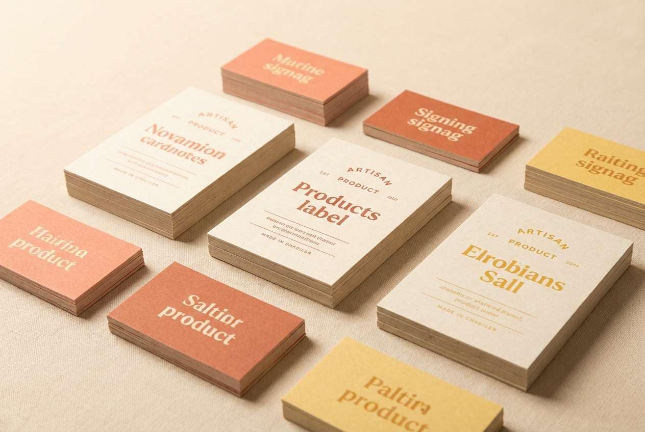
13) Summer Market
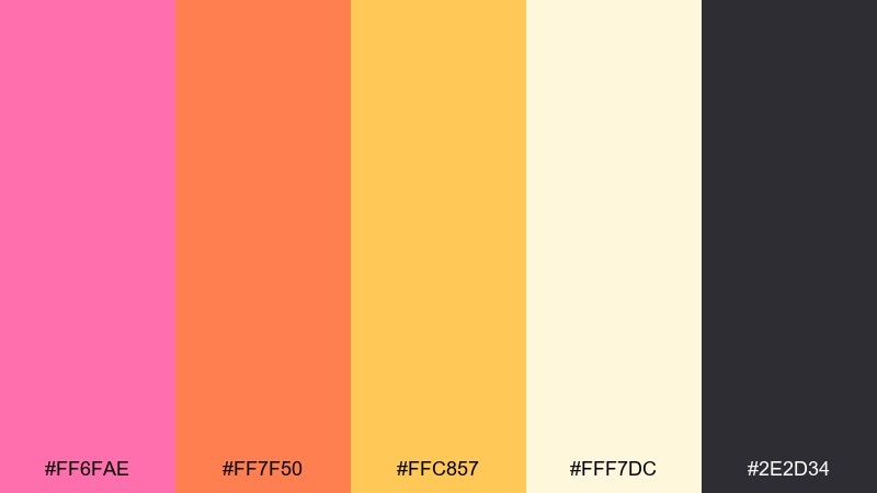
HEX: #FF6FAE #FF7F50 #FFC857 #FFF7DC #2E2D34
Mood: handmade, sunny, welcoming
Best for: artisan label design and market signage
Handmade and sunny, it evokes fruit crates, paper bags, and a busy open-air market. The warm midtones feel friendly on kraft or off-white stocks. Use it for artisan labels, stall signage, and simple packaging that leans natural. Usage tip: pair with a slightly textured background and keep the type bold for distance readability.
Image example of summer market generated using media.io
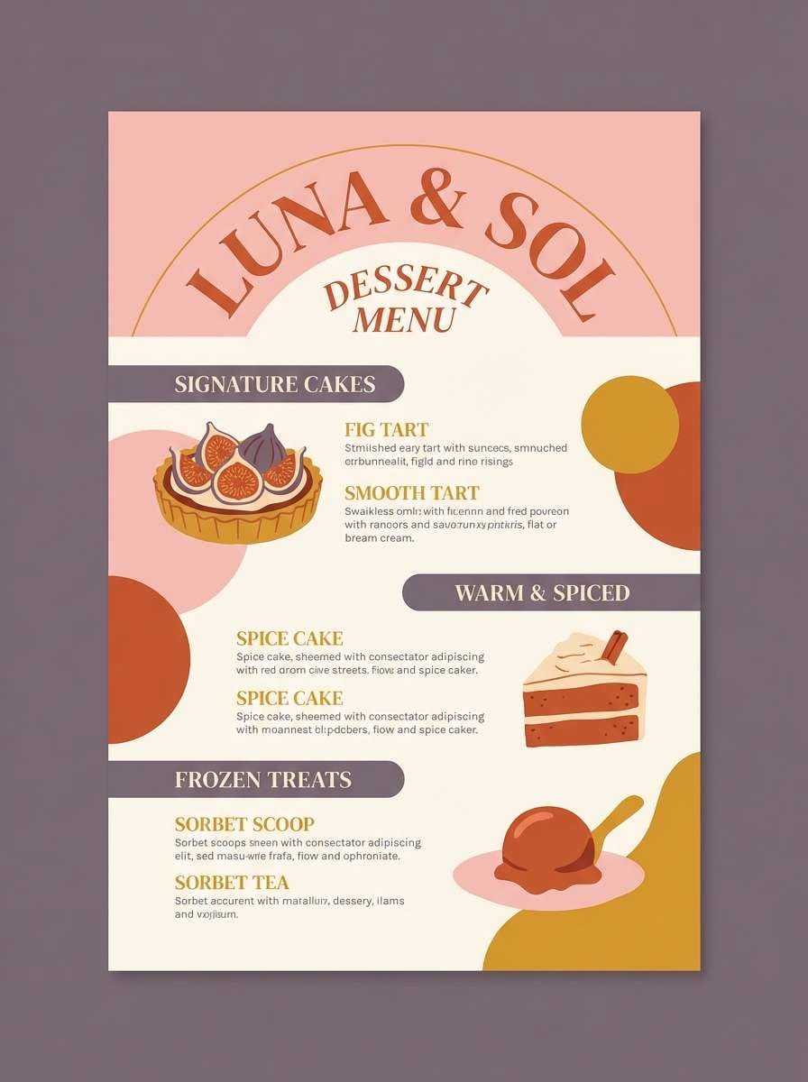
14) Dessert Terrace
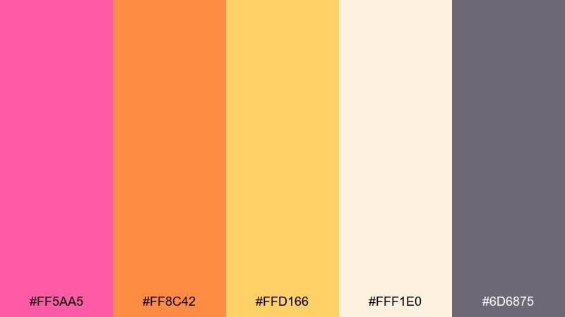
HEX: #FF5AA5 #FF8C42 #FFD166 #FFF1E0 #6D6875
Mood: cozy, indulgent, stylish
Best for: restaurant promos and dessert menus
Cozy and indulgent, it feels like pastries on a terrace at sunset. The muted plum-gray adds sophistication so the warm colors look styled, not childish. These pink yellow orange color combinations work especially well for dessert menus, restaurant promos, and food photography frames. Usage tip: keep the plum-gray for headings and borders, and use orange for price highlights.
Image example of dessert terrace generated using media.io
15) Retro Postcard
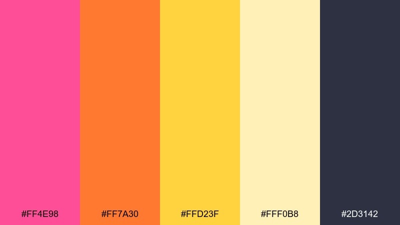
HEX: #FF4E98 #FF7A30 #FFD23F #FFF0B8 #2D3142
Mood: nostalgic, graphic, punchy
Best for: merch prints and postcard designs
Nostalgic and graphic, it looks like a sun-faded postcard with bold ink. The deep navy keeps everything grounded and gives you that vintage print contrast. Great for merch prints, postcards, and retro-inspired branding systems. Usage tip: use halftone textures or thick outlines to lean into the throwback feel.
Image example of retro postcard generated using media.io

16) Sunlit Studio
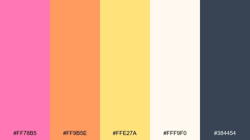
HEX: #FF78B5 #FF9B5E #FFE27A #FFF9F0 #384454
Mood: clean, creative, airy
Best for: portfolio websites and case study pages
Clean and creative, it feels like sunlight washing over a tidy studio desk. The off-white background tone keeps layouts airy, while the slate blue offers professional contrast. Use it for portfolio sites, case studies, and presentation decks that need warmth without clutter. Usage tip: treat pink as the accent for links and icons, and keep the rest of the UI neutral-forward.
Image example of sunlit studio generated using media.io
17) Festival Ribbon
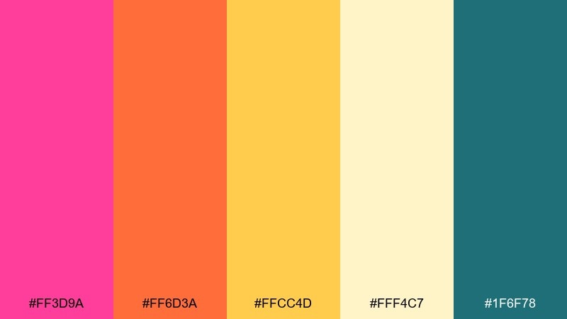
HEX: #FF3D9A #FF6D3A #FFCC4D #FFF4C7 #1F6F78
Mood: festive, bold, high-energy
Best for: concert posters and ticket graphics
Festive and high-energy, it suggests ribbon streamers and stage lights. The cool teal sharpens the warm hues and gives you a strong secondary brand color. Ideal for concert posters, ticket graphics, and countdown assets. Usage tip: place yellow behind dark type for high contrast, and save pink for the headline wordmark.
Image example of festival ribbon generated using media.io

18) Beach Kiosk
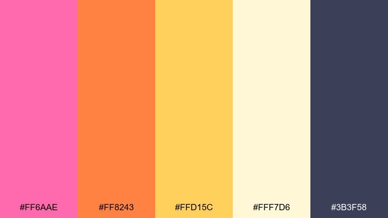
HEX: #FF6AAE #FF8243 #FFD15C #FFF7D6 #3B3F58
Mood: laid-back, sunny, approachable
Best for: small business logos and signage
Laid-back and sunny, it feels like a beach kiosk selling smoothies and snacks. The inky indigo keeps your logo and signage readable in bright environments. Use it for small business branding, storefront signs, and simple web headers. Usage tip: build your logo in indigo and add a single warm color as a seasonal swap-in accent.
Image example of beach kiosk generated using media.io
19) Neon Gelato
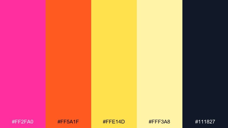
HEX: #FF2FA0 #FF5A1F #FFE14D #FFF3A8 #111827
Mood: electric, trendy, nightlife-ready
Best for: club flyers and bold promo ads
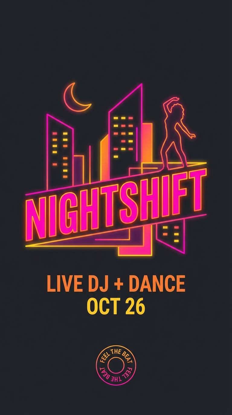
Electric and trendy, it reads like neon gelato under city lights. The near-black lets the warm hues glow without muddying. Use it for club flyers, bold promo ads, and punchy campaign art. Usage tip: keep the background dark and use the pale yellow for small glow highlights instead of large fills.
Image example of neon gelato generated using media.io
20) Cozy Sunrise
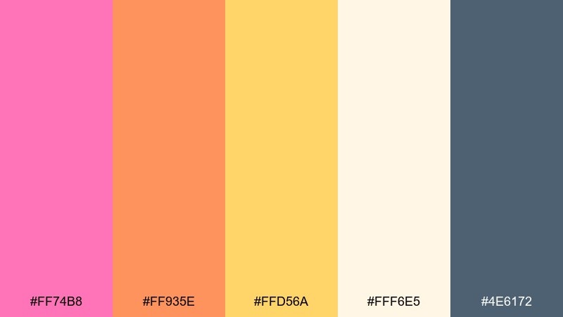
HEX: #FF74B8 #FF935E #FFD56A #FFF6E5 #4E6172
Mood: comforting, optimistic, balanced
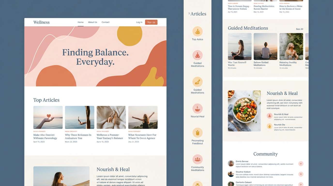
Best for: wellness brand websites and newsletters
Comforting and optimistic, it feels like a cozy sunrise through sheer curtains. As a pink yellow orange color scheme, it stays balanced thanks to the calm blue-gray that softens the warmth. Use it for wellness websites, newsletters, and gentle product storytelling. Usage tip: make the cream your default canvas, then add warm accents in small, repeatable UI components like tags and icons.
Image example of cozy sunrise generated using media.io
What Colors Go Well with Pink Yellow Orange?
Deep neutrals are the easiest match: charcoal, near-black, cocoa brown, slate, and inky navy make warm palettes readable and premium. They also help prevent pink/yellow/orange from feeling too “candy” when used at scale.
Cool counterbalances—teal, denim blue, and blue-gray—add modern contrast while keeping the vibe summery. If you want a softer look, choose warm off-whites and creams instead of pure white to keep the palette cohesive.
For prints and packaging, muted mauves and dusty roses can bridge the gap between hot pink accents and golden yellows, creating a more elegant, less neon finish.
How to Use a Pink Yellow Orange Color Palette in Real Designs
Start with a hierarchy: pick one warm color as the “hero” (often orange for CTAs or pink for brand accents), keep yellow as a highlight, and let cream/off-white carry most of the background area.
Always test contrast for accessibility—yellow especially needs a dark text color behind it. When in doubt, place type in charcoal/navy and reserve the brightest hues for shapes, buttons, badges, and small UI elements.
For cohesive visuals, use gradients (pink→orange→yellow) in backgrounds or illustrations, then ground the composition with a single cool accent (teal/blue) or a deep neutral for navigation and headings.
Create Pink Yellow Orange Palette Visuals with AI
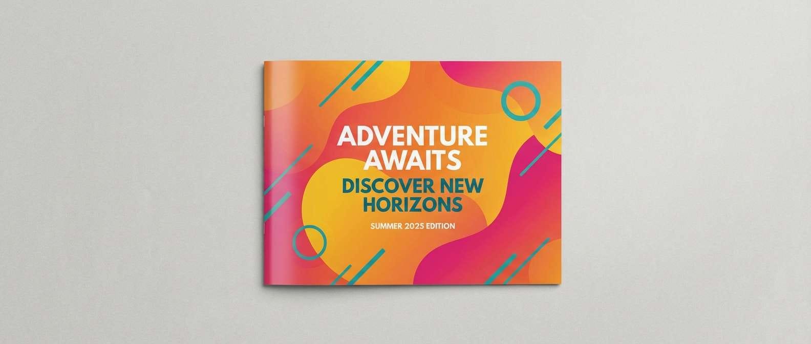
If you already have HEX codes, the fastest way to explore real-world applications is to generate mockups: posters, packaging, UI screens, and social tiles. Seeing the palette in context helps you tune contrast, saturation, and where each color should dominate.
With Media.io’s text-to-image tool, you can paste a prompt that describes the layout style and call out your palette direction (warm pink/orange/yellow with a dark neutral or teal). Generate a few variations, then keep the strongest composition as your reference.
Once you find a direction you like, repeat the same prompt structure for a full system (hero, story, ad, thumbnail) so your pink yellow orange color scheme stays consistent across channels.
Pink Yellow Orange Color Palette FAQs
-
What vibe does a pink yellow orange color palette create?
It typically feels warm, upbeat, youthful, and optimistic—like sunrise, citrus, or summer branding. Adding a deep neutral or cool teal can make it feel more modern and less “candy.” -
How do I keep pink, yellow, and orange from looking too neon?
Use at least one grounding color (charcoal, navy, cocoa, slate) and give the palette plenty of light breathing room (cream/off-white). Also reduce saturation for large background areas and keep the most intense hue as an accent. -
What’s the best text color for yellow in these palettes?
Dark neutrals (charcoal, near-black, deep navy, dark cocoa) usually provide the best readability on yellow. Avoid white text on bright yellow unless the yellow is significantly darkened. -
Which color should be the CTA button: pink or orange?
Orange is often the safest CTA because it reads as action-driven and keeps contrast strong on light backgrounds. Use pink for secondary CTAs, badges, or brand highlights to avoid overloading the interface. -
What colors pair well as a “fourth” accent with pink yellow orange?
Teal, denim blue, or blue-gray are excellent counterbalances that keep the system fresh and contemporary. For a more elegant feel, try muted mauve or dusty rose as a bridge tone. -
Are pink yellow orange palettes good for print?
Yes—especially for posters, invitations, menus, and packaging. For better print consistency, consider slightly muting the yellows and oranges and rely on a dark neutral for type and fine details. -
How can I quickly visualize these palettes in real designs?
Generate mockups (UI screens, flyers, packaging, social posts) using an AI image tool, then iterate on contrast and saturation. Media.io’s text-to-image workflow is ideal for creating multiple variations from one prompt.
Next: Mauve Color Palette


