

A white orange palette pairs breathable neutrals with a high-energy accent, making layouts feel clean while still drawing the eye. It’s a go-to combination for modern brands that want warmth without visual clutter.
From soft apricot creams to bold tangerine highlights, the right white-and-orange mix can guide attention, improve hierarchy, and keep designs feeling optimistic across print and digital.
In this article
- Why White Orange Palettes Work So Well
-
- citrus linen
- apricot cloud
- terracotta frost
- saffron studio
- pumpkin porcelain
- coral whisper
- tangerine minimal
- sunset cream
- papaya marble
- amber oat
- persimmon pearl
- burnt orange snow
- mango milk
- copper canvas
- orange blossom white
- clay and cotton
- neon citrus clean
- autumn sherbet
- rusty whitewash
- orange zest ivory
- clementine sketch
- seville morning
- ember and milkglass
- What Colors Go Well with White Orange?
- How to Use a White Orange Color Palette in Real Designs
- Create White Orange Palette Visuals with AI
Why White Orange Palettes Work So Well
White creates instant clarity and space, while orange adds a confident focal point. Together, they produce a warm, modern contrast that feels friendly rather than aggressive.
This pairing is especially effective for guiding attention: the eye naturally lands on orange elements, so CTAs, badges, and key icons become easier to spot against a clean white base.
Because orange can shift from soft peach to vivid neon, you can tune the same “white + orange” concept to fit different tones—from calm and premium to bold and sporty—without changing the overall system.
20+ White Orange Color Palette Ideas (with HEX Codes)
1) Citrus Linen

HEX: #ffffff #f7f1e6 #ffd8a8 #ff9f1c #2b2d42
Mood: fresh, clean, sunny
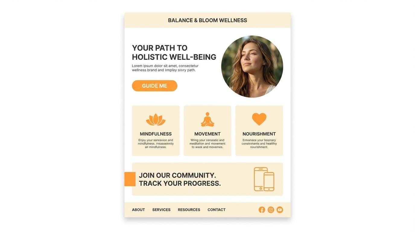
Best for: landing page UI for a wellness brand
Fresh and sunlit like linen curtains in a bright kitchen, these tones feel crisp without going cold. Use the orange as a focused accent for buttons and highlights, while the whites keep layouts breathable. Pair with deep charcoal text for contrast and accessibility. Tip: reserve the strongest orange for one primary call to action per screen.
Image example of citrus linen generated using media.io
Media.io is an online AI studio for creating and editing video, image, and audio in your browser.

2) Apricot Cloud
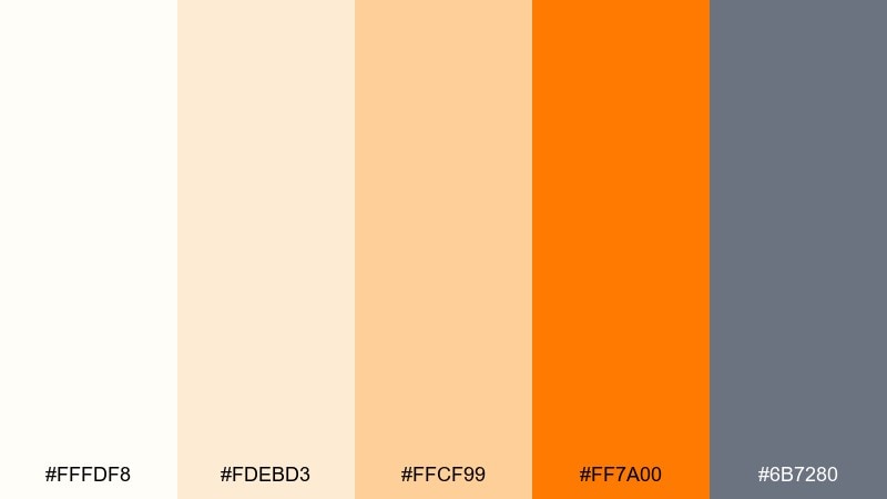
HEX: #fffdf8 #fdebd3 #ffcf99 #ff7a00 #6b7280
Mood: light, airy, optimistic
Best for: bakery packaging and labels
Light and airy like apricot mousse, this mix reads sweet, friendly, and modern. It supports white orange color combinations that feel edible without looking childish when you keep the gray for type. Pair the bright orange with the warm cream for logos, seals, and small pattern details. Tip: print-test the orange on uncoated stock to avoid oversaturation.
Image example of apricot cloud generated using media.io

3) Terracotta Frost
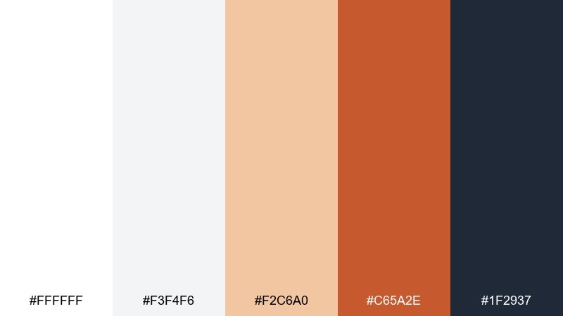
HEX: #ffffff #f3f4f6 #f2c6a0 #c65a2e #1f2937
Mood: grounded, cozy, refined
Best for: living room interior styling
Grounded and cozy like terracotta pottery against winter light, these tones balance warmth and restraint. Use the off-white and cool gray on large surfaces, then bring in terracotta through textiles, art, or a single statement chair. Pair with deep slate for metal finishes and picture frames. Tip: repeat the terracotta in at least two small decor pieces so it feels intentional.
Image example of terracotta frost generated using media.io

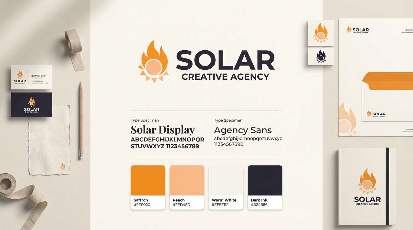
4) Saffron Studio
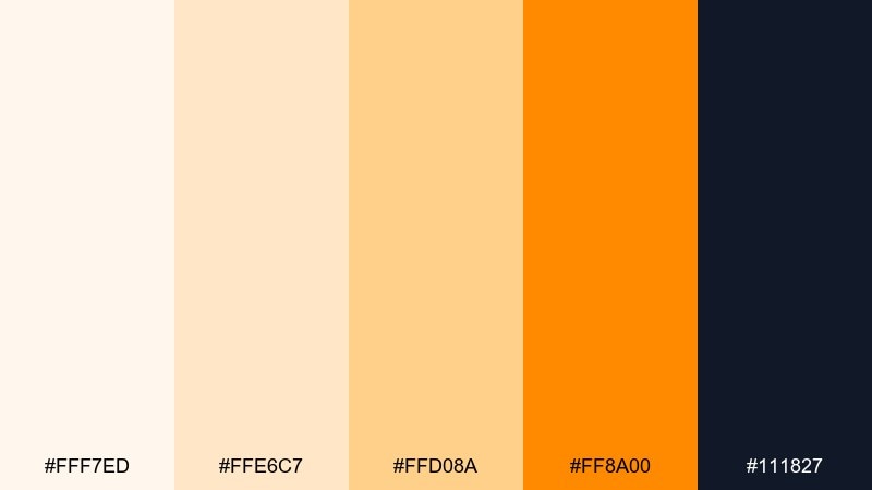
HEX: #fff7ed #ffe6c7 #ffd08a #ff8a00 #111827
Mood: creative, bold, focused
Best for: creative agency brand kit
Creative and punchy like studio lights on a moodboard, the saffron notes bring instant energy. As a white orange color scheme, it works best when the darkest shade anchors typography and grids. Pair the mid peach with plenty of negative space to keep the system from feeling loud. Tip: define one accent tier for links and one for CTAs to prevent color confusion.
Image example of saffron studio generated using media.io
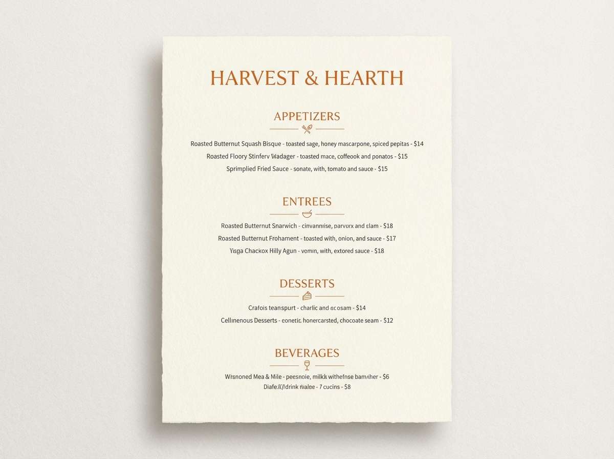
5) Pumpkin Porcelain
HEX: #ffffff #f9efe5 #ffb46a #e86a00 #3f3d56
Mood: warm, polished, inviting
Best for: restaurant menu design
Warm and polished like pumpkin glaze on porcelain, this set feels inviting and upscale. Keep backgrounds creamy, then use the deep orange for headers, section dividers, and callouts. Pair with the indigo-gray for body text to maintain readability under warm lighting. Tip: use the peach tone for subtle icons so the menu stays elegant.
Image example of pumpkin porcelain generated using media.io
6) Coral Whisper
HEX: #fffefe #ffe9e0 #ffc1a6 #ff6b2d #374151
Mood: romantic, soft, lively
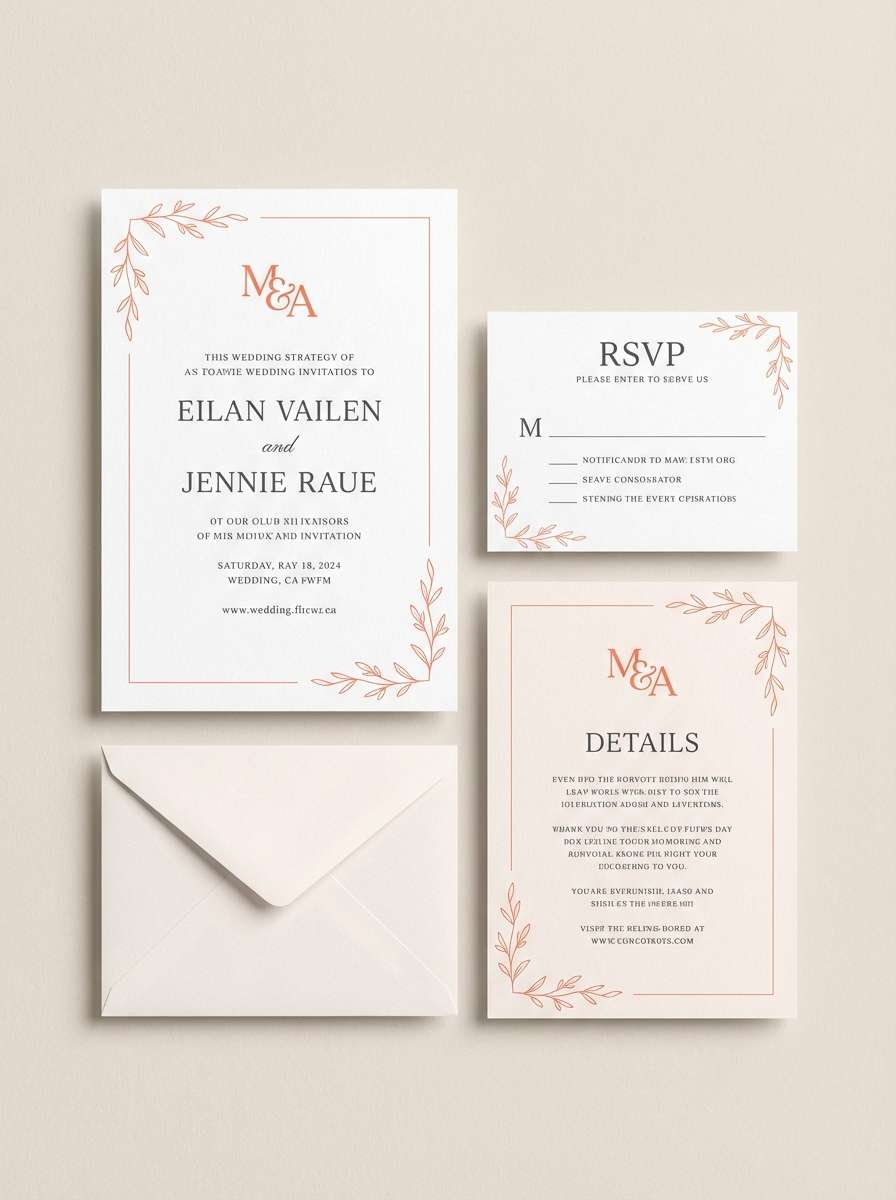
Best for: wedding invitation suite
Romantic and softly glowing like sunset on silk, the coral accents feel lively but still delicate. This white orange color palette shines on invitations when you keep type in a calm gray and use orange only for monograms or borders. Pair with textured paper or subtle embossing for a premium finish. Tip: avoid full-bleed orange; let it act as a refined highlight.
Image example of coral whisper generated using media.io
7) Tangerine Minimal
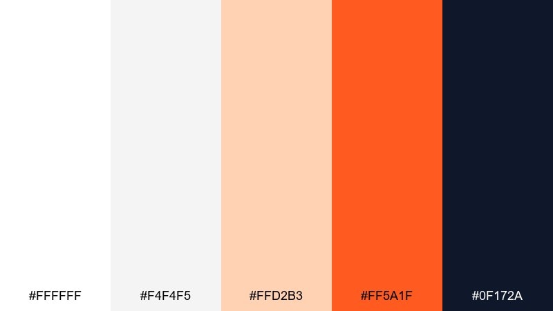
HEX: #ffffff #f4f4f5 #ffd2b3 #ff5a1f #0f172a
Mood: minimal, high-contrast, modern
Best for: dashboard UI for analytics
Minimal and high-contrast like a clean studio wall with a bright poster, these tones feel modern and decisive. Use the navy for navigation and charts, keep panels white, and deploy tangerine as a single attention color. Pair the pale peach for hover states or secondary tags to create hierarchy. Tip: test the orange against color-blind simulations for chart legibility.
Image example of tangerine minimal generated using media.io

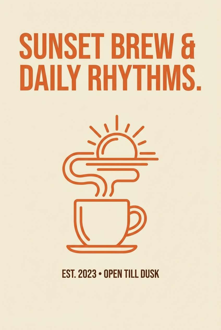
8) Sunset Cream
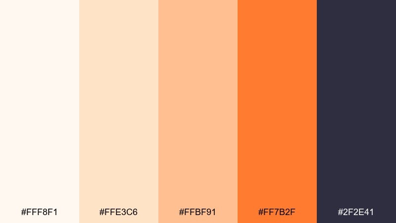
HEX: #fff8f1 #ffe3c6 #ffbf91 #ff7b2f #2f2e41
Mood: cozy, friendly, relaxed
Best for: coffee shop wall poster
Cozy and friendly like a late-afternoon latte, these warm creams make spaces feel welcoming. The mid orange works beautifully for headlines and simple illustrations, while the deep gray keeps text crisp. Pair with natural materials like oak, rattan, and matte black fixtures. Tip: use larger type sizes on warm backgrounds to maintain sharp readability.
Image example of sunset cream generated using media.io
9) Papaya Marble
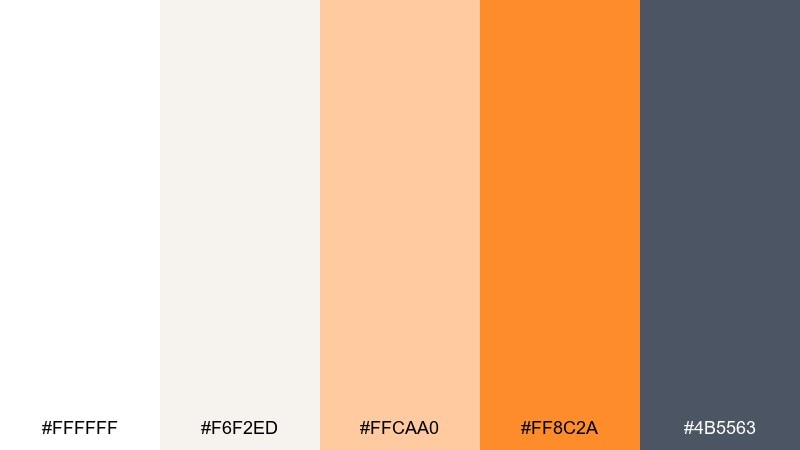
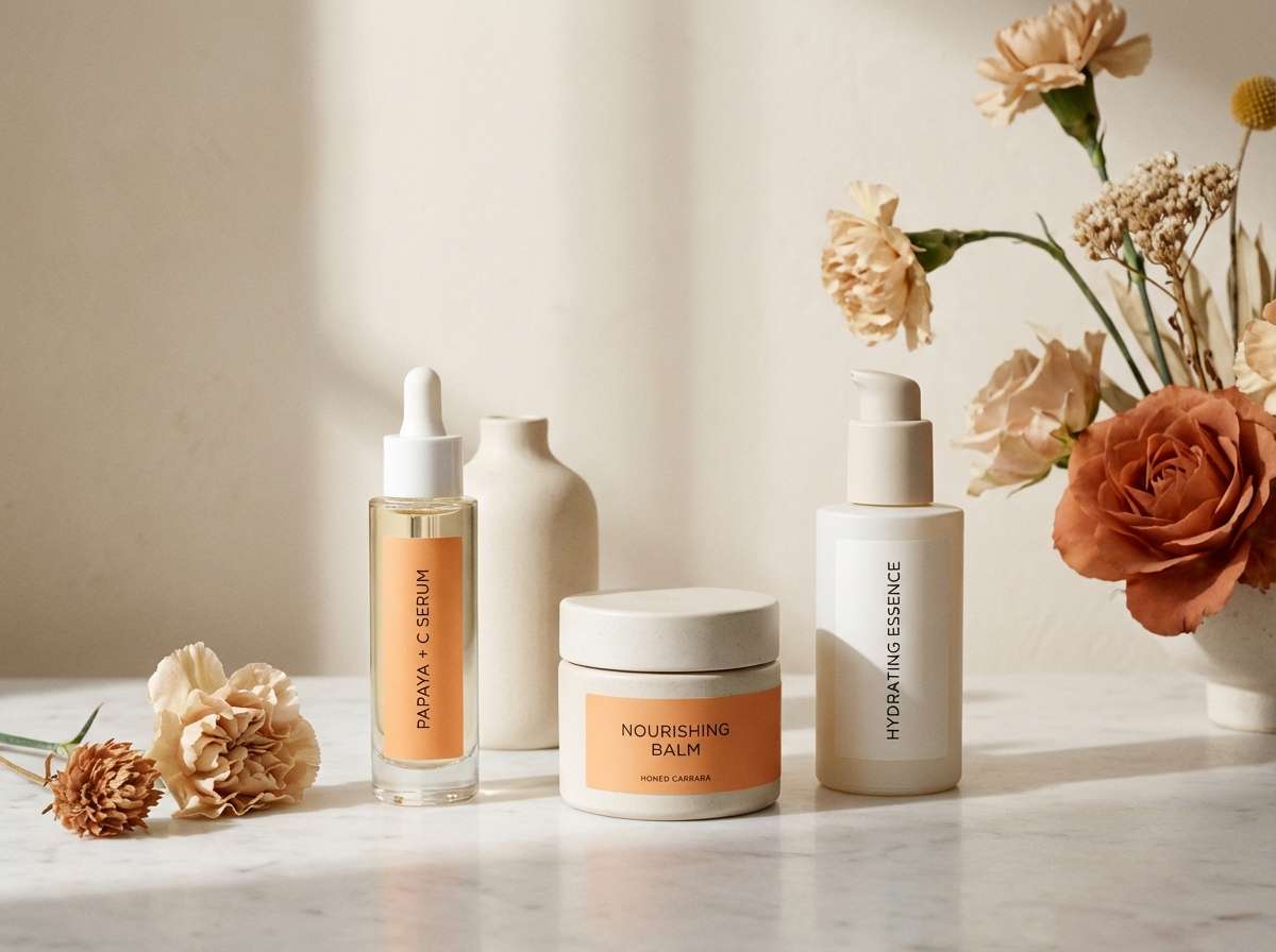
HEX: #ffffff #f6f2ed #ffcaa0 #ff8c2a #4b5563
Mood: clean, premium, spa-like
Best for: skincare product ad
Clean and premium like papaya slices on pale marble, this mix reads fresh and spa-like. Use the near-white and stone neutral for backgrounds, then let orange lead the product name or key benefit. Pair with cool gray for ingredient lists and fine print. Tip: keep orange highlights under ten percent of the layout for a luxe feel.
Image example of papaya marble generated using media.io
10) Amber Oat
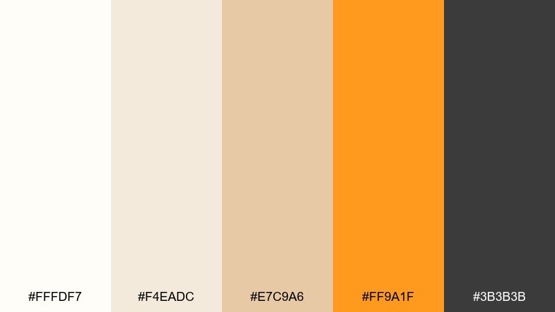
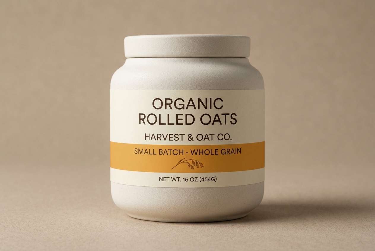
HEX: #fffdf7 #f4eadc #e7c9a6 #ff9a1f #3b3b3b
Mood: natural, wholesome, calm
Best for: organic food label design
Natural and wholesome like oats with a drizzle of honey, these tones feel calm and trustworthy. Use the oat neutrals for the main label field, then add amber for seals, flavor bands, or nutrition callouts. Pair with dark gray for type to keep it clean and legible on kraft-style materials. Tip: add a subtle grain texture only in the lightest shades to avoid visual noise.
Image example of amber oat generated using media.io
11) Persimmon Pearl

HEX: #ffffff #fdf0e6 #ffc7b0 #ff6a3d #222222
Mood: playful, chic, confident
Best for: beauty brand social post templates
Playful and chic like glossy persimmon against pearl paper, the contrast feels confident and trendy. Use white as the canvas, peach for blocks and stickers, and persimmon for bold captions or price tags. Pair with near-black for crisp text and to keep the look editorial. Tip: stick to one punchy orange element per post so the feed feels cohesive.
Image example of persimmon pearl generated using media.io

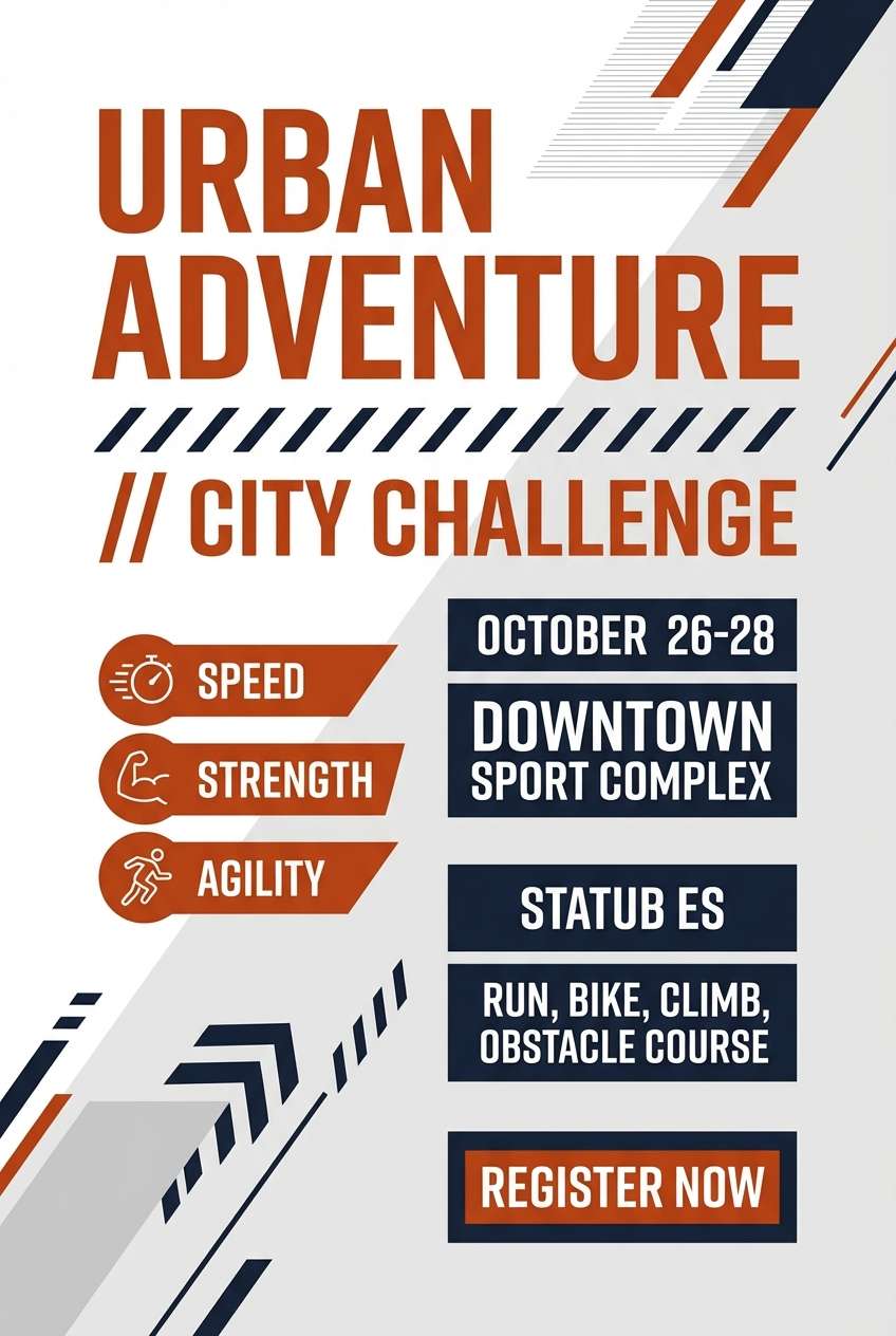
12) Burnt Orange Snow
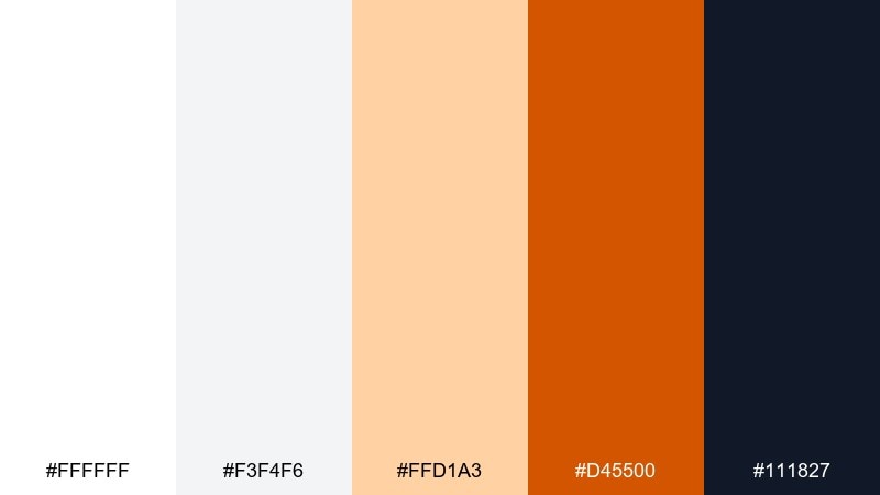
HEX: #ffffff #f3f4f6 #ffd1a3 #d45500 #111827
Mood: crisp, bold, winter-warm
Best for: sports event flyer
Crisp like snow with a warm ember glow, the burnt orange hits hard without losing clarity. White orange color combinations like this work well for sports flyers when you keep the layout high-contrast and the typography oversized. Pair the navy-black with grayscale blocks for schedules and sponsor lines. Tip: reserve the burnt shade for the headline and one key badge to keep impact strong.
Image example of burnt orange snow generated using media.io
13) Mango Milk
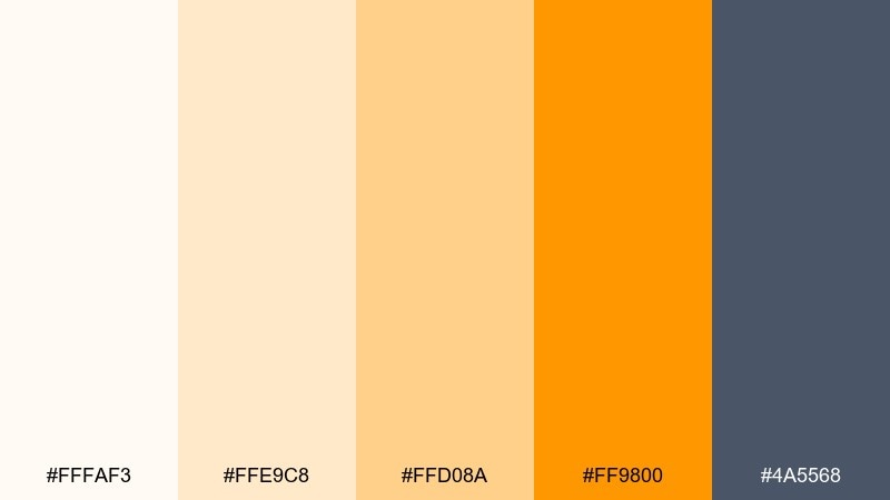
HEX: #fffaf3 #ffe9c8 #ffd08a #ff9800 #4a5568
Mood: cheerful, creamy, approachable
Best for: mobile app onboarding screens
Cheerful and creamy like mango blended into milk, this palette feels approachable and upbeat. Keep screens mostly off-white, use mango for progress indicators and friendly illustrations, and let the gray carry paragraph text. Pair with subtle shadows and rounded components for a soft, modern UI. Tip: use the lighter peach as a background for cards so the orange still pops.
Image example of mango milk generated using media.io
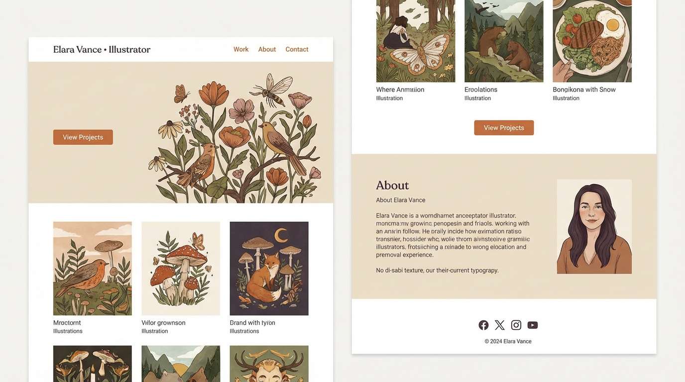
14) Copper Canvas
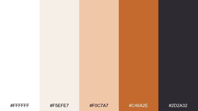
HEX: #ffffff #f5efe7 #f0c7a7 #c46a2e #2d2a32
Mood: artful, warm, handcrafted
Best for: portfolio website for an illustrator
Artful and warm like copper ink on textured paper, these shades feel handcrafted and confident. Use white for negative space, then bring copper into headers, section markers, and hover states. Pair with the deep plum-gray for body text and to frame artwork without competing. Tip: keep imagery slightly desaturated so the copper accents remain the star.
Image example of copper canvas generated using media.io
15) Orange Blossom White
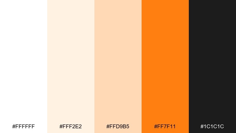
HEX: #ffffff #fff2e2 #ffd9b5 #ff7f11 #1c1c1c
Mood: bright, uplifting, modern-classic
Best for: brand identity for a boutique candle line
Bright and uplifting like orange blossoms in clean air, the contrast feels modern-classic. A white orange color palette like this suits candle branding when you let white dominate and use orange for scent names or small seals. Pair with near-black for typography and thin linework to keep it premium. Tip: foil-stamp the orange on matte paper for a subtle luxury effect.
Image example of orange blossom white generated using media.io
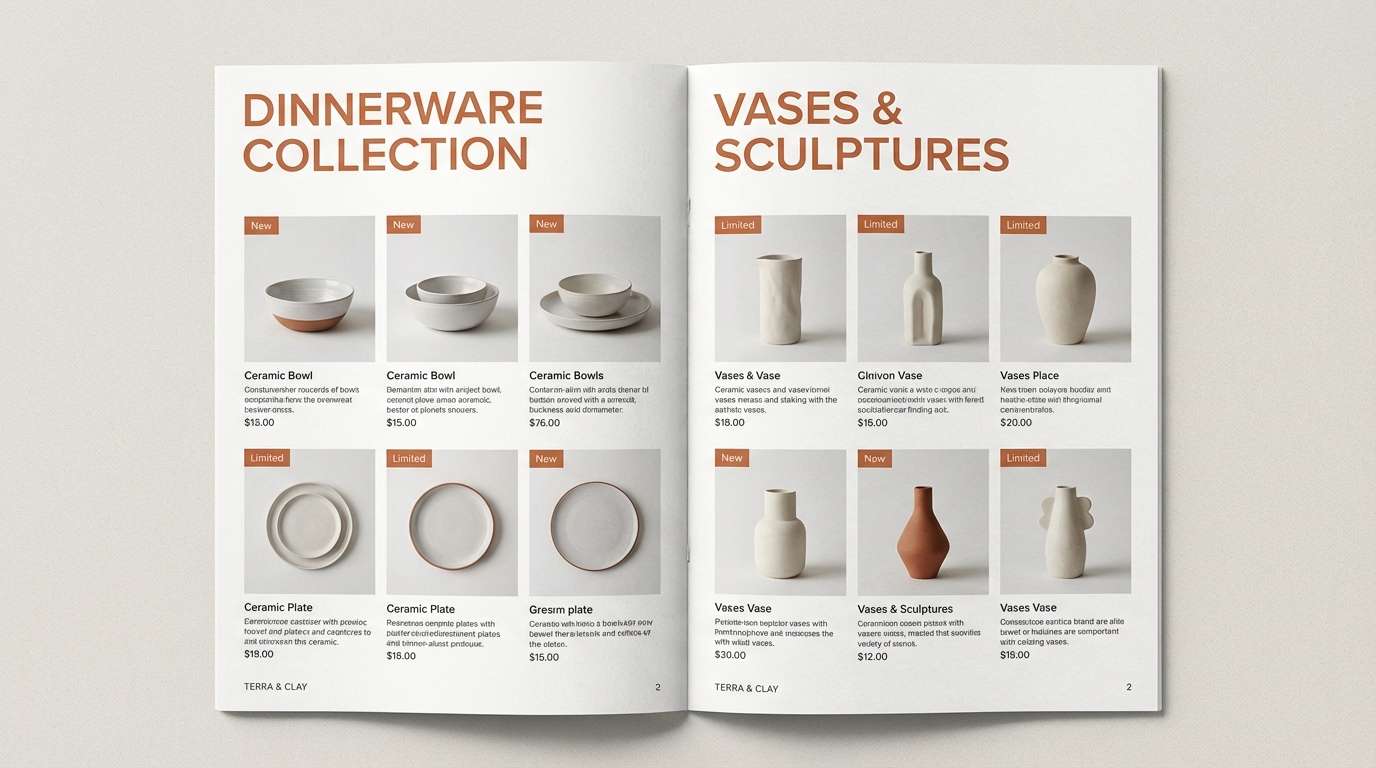
16) Clay and Cotton
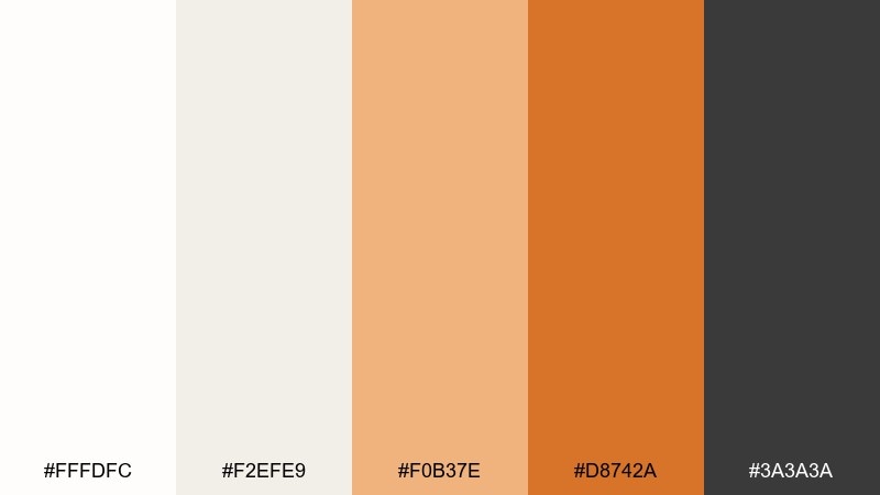
HEX: #fffdfc #f2efe9 #f0b37e #d8742a #3a3a3a
Mood: earthy, soft, timeless
Best for: ceramics product catalog
Earthy and soft like clay dust on cotton fabric, this set feels timeless and calm. Use the cotton whites for product photography pages, then echo the clay tones in headings, price tags, and section tabs. Pair with dark gray for consistent readability across print. Tip: keep the saturated orange for only one level of emphasis so the catalog stays quiet and refined.
Image example of clay and cotton generated using media.io
17) Neon Citrus Clean
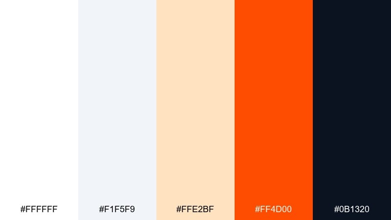
HEX: #ffffff #f1f5f9 #ffe2bf #ff4d00 #0b1320
Mood: energetic, sharp, techy
Best for: tech product launch hero banner
Energetic and sharp like a neon sign in a white gallery, this mix feels techy and fast. Use the cool off-white for space, then hit with neon orange for the main CTA and one highlight line. Pair with near-black for headline weight and crisp icons. Tip: add a subtle gradient only within the orange button to give depth without clutter.
Image example of neon citrus clean generated using media.io

18) Autumn Sherbet
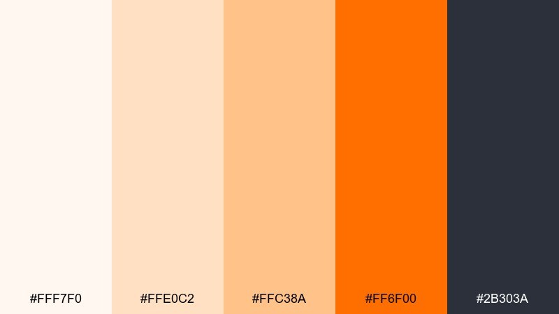
HEX: #fff7f0 #ffe0c2 #ffc38a #ff6f00 #2b303a
Mood: cozy, playful, seasonal
Best for: fall festival poster
Cozy and playful like sherbet at a fall fair, these oranges feel seasonal without turning heavy. Use the warm whites as the base, then layer brighter orange for illustrations, icons, and headline blocks. Pair with deep gray for schedules and venue details so the information stays readable. Tip: repeat the light peach as a background shape to keep the poster balanced.
Image example of autumn sherbet generated using media.io

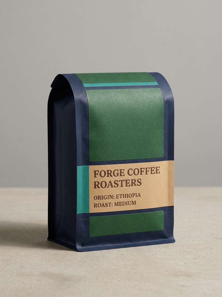
19) Rusty Whitewash
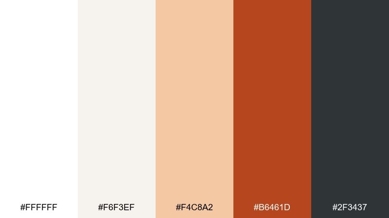
HEX: #ffffff #f6f3ef #f4c8a2 #b6461d #2f3437
Mood: rustic, moody, authentic
Best for: craft coffee packaging
Rustic and moody like weathered paint on a brick wall, this palette feels authentic and grounded. Use the whitewash neutrals for the main label, then apply rusty orange to stamps, roast notes, and small illustrations. Pair with dark graphite for type and thin borders to keep it sharp on shelves. Tip: add a single textured pattern in the lightest shade to suggest craft without looking messy.
Image example of rusty whitewash generated using media.io
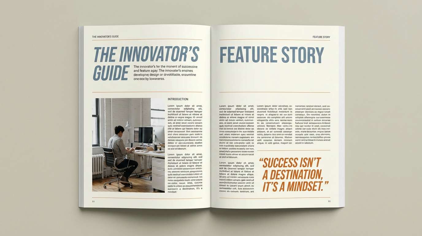
20) Orange Zest Ivory

HEX: #fffffb #fff1dc #ffd2a6 #ff8500 #3d405b
Mood: bright, elegant, optimistic
Best for: editorial magazine feature layout
Bright and elegant like zest grated over ivory pastry, these tones feel optimistic and polished. White orange color combinations here work best when orange is used for pull quotes, rules, and small infographics. Pair with the blue-gray for headings to add a contemporary twist without clashing. Tip: keep images warm-toned so the orange accents feel naturally integrated.
Image example of orange zest ivory generated using media.io
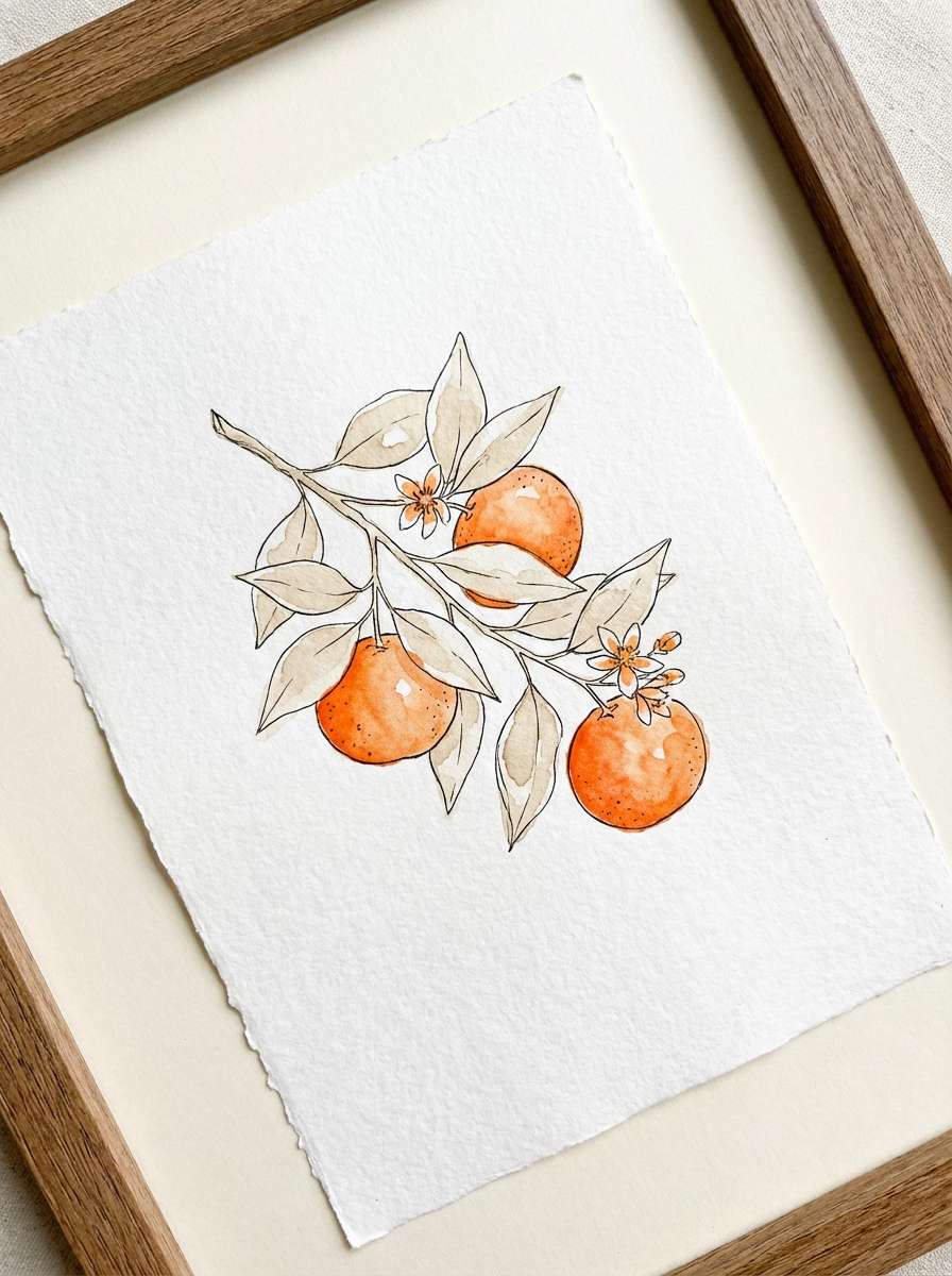
21) Clementine Sketch
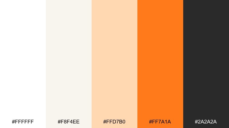
HEX: #ffffff #f8f4ee #ffd7b0 #ff7a1a #2a2a2a
Mood: artsy, light, handmade
Best for: botanical illustration print
Artsy and light like a clementine sketch in a sunlit notebook, this mix feels handmade and cheerful. Let the paper-white dominate, then add orange in petals, fruit, or small label details for warmth. Pair with soft neutrals to keep the illustration airy and giftable. Tip: use the darkest tone sparingly for linework so the print stays delicate.
Image example of clementine sketch generated using media.io
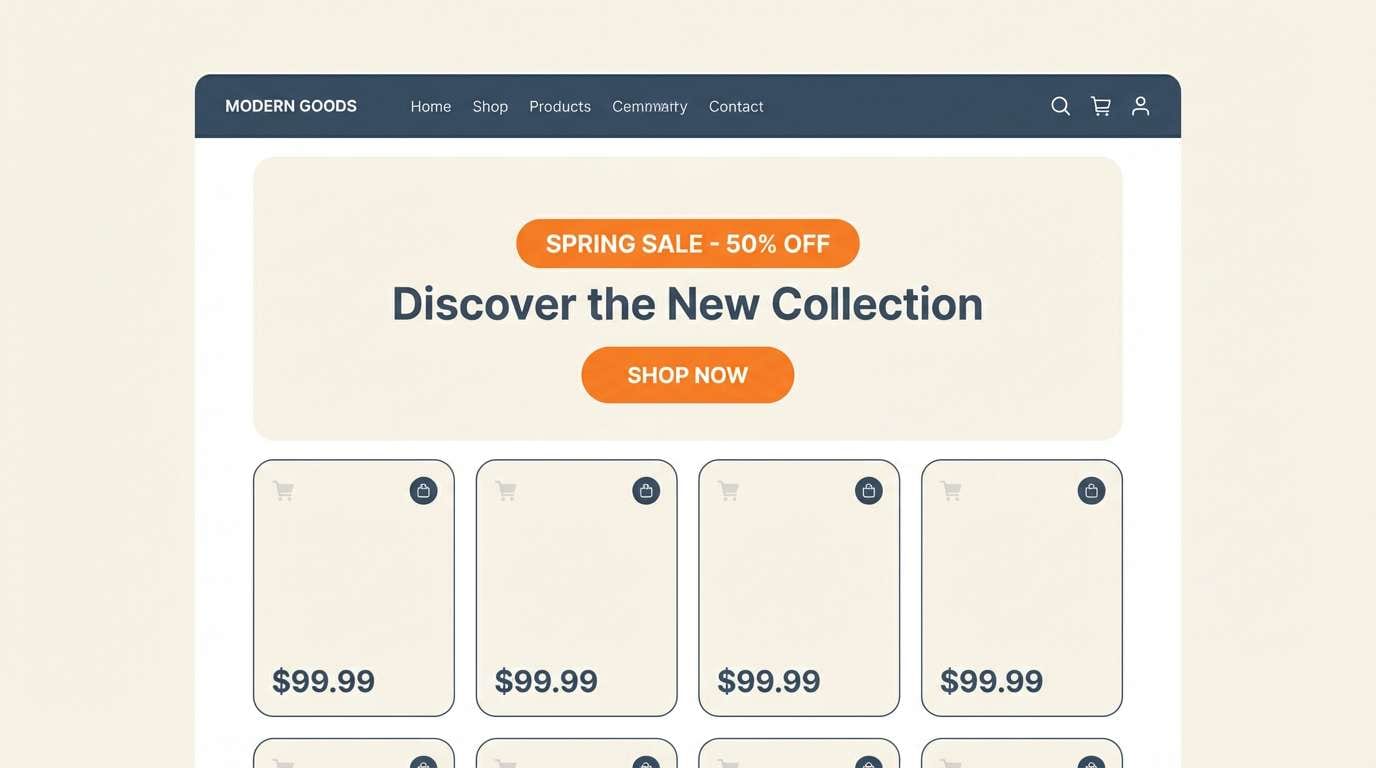
22) Seville Morning
HEX: #fffdfb #ffe8cf #ffc58e #ff6a00 #233142
Mood: sunny, confident, contemporary
Best for: ecommerce homepage hero
Sunny and confident like a Seville morning, these tones feel contemporary and welcoming. The warm whites make product photography pop, while the orange gives you a clear highlight color for offers and badges. Pair with deep blue-gray for navigation and trust signals like shipping and returns. Tip: keep promo badges consistent in shape so the orange reads as a system, not a one-off.
Image example of seville morning generated using media.io
23) Ember and Milkglass
HEX: #ffffff #f5f6f7 #ffd0a0 #ff5400 #1f2933
Mood: bold, sleek, high-impact
Best for: product announcement email header
Bold and sleek like ember light through milkglass, the contrast feels high-impact and modern. A strong white orange color combination works well in email headers when the orange is confined to one banner or button line. Pair with dark slate for the headline so it stays readable across devices. Tip: add extra padding around the orange area to prevent cramped rendering on mobile.
Image example of ember and milkglass generated using media.io

What Colors Go Well with White Orange?
White and orange pair naturally with deep neutrals like charcoal, slate, and navy, which help stabilize the warmth and keep typography accessible. This is why many of the palettes above include near-black tones for text and UI structure.
For softer looks, add warm beiges, creams, oat tones, or light stone grays to create gentle depth without losing that “clean” feeling. These neutrals also help orange feel more premium and less loud.
If you want a modern twist, try a blue-gray or muted indigo alongside white and orange; it adds contrast that feels contemporary, especially in editorial layouts, dashboards, and ecommerce navigation.
How to Use a White Orange Color Palette in Real Designs
Start with white (or warm off-white) as the dominant background, then assign orange a job: CTA, promo badge, price tag, or key icon. When orange has a clear role, the design reads intentional and easier to scan.
Build hierarchy with steps: use a pale peach for secondary highlights (hover states, tags, subtle panels) and reserve the strongest orange for one primary emphasis per screen or page. This prevents “everything looks clickable” fatigue in UI.
For print, test orange on the real material—uncoated stocks can shift saturation and warmth. Pair with a stable dark neutral for body text so menus, labels, and flyers stay readable under different lighting.
Create White Orange Palette Visuals with AI
If you already have HEX codes, you can quickly turn them into realistic mockups—packaging, posters, UI screens, and brand kits—by describing your layout and materials. A consistent prompt style makes it easier to produce a cohesive set of visuals.
Use the palette name, the mood, and one concrete scenario (like “dashboard UI” or “skincare ad on marble”) to guide the generator. Then iterate by adjusting lighting, texture, and how much orange appears in the composition.
With Media.io, you can generate on-brand examples fast and keep experimenting until the white/orange balance feels right for your product and audience.
White Orange Color Palette FAQs
-
What does a white and orange color palette communicate?
It usually communicates clarity and optimism: white suggests cleanliness and simplicity, while orange adds warmth, friendliness, and attention-grabbing energy. -
How do I keep orange from feeling too loud on a white background?
Limit saturated orange to small, high-priority elements (like a single primary CTA) and use softer peach/apricot tones for secondary highlights and backgrounds. -
What’s the best text color for white-orange designs?
Deep charcoal, slate, or near-black typically works best for readability. They balance orange’s warmth and provide strong contrast on white and cream surfaces. -
Are white and orange accessible for UI buttons?
They can be, but contrast depends on the exact orange. Test CTA buttons with white text vs. dark text and verify contrast ratios; vivid oranges often need dark text for accessibility. -
Which industries commonly use white-orange palettes?
Wellness, food and beverage, ecommerce, tech launches, and event marketing often use white-orange schemes because they feel modern, clean, and high-conversion. -
What neutrals pair best with white and orange for a premium look?
Warm creams, oat/beige tones, and light stone grays add softness, while charcoal or blue-gray adds structure. Keeping orange under ~10% of the layout also helps maintain a luxe feel. -
How can I generate mockups using these HEX codes?
Use an AI text-to-image tool and describe the design context (e.g., “skincare ad on marble” or “landing page UI”), then specify where orange appears (CTA, label band, headline) for controlled results.


