

A white beige color palette is the easiest way to make designs feel bright, warm, and modern—without relying on loud colors. It’s a go-to for minimal branding, calming interiors, and clean UI where content needs room to breathe.
Below are 20 curated beige and white palettes (with HEX codes) plus practical use ideas and AI prompts you can reuse to generate matching visuals in seconds.
In this article
- Why White Beige Palettes Work So Well
-
- linen morning
- oat milk minimal
- sandstone studio
- ivory gallery
- cashmere warmth
- driftwood neutral
- creamy clay
- porcelain sage
- biscotti brunch
- desert blush
- pebble and pearl
- vanilla modern
- wheatfield sun
- bone and denim
- almond noir
- soft terracotta
- scandinavian white
- antique lace
- pebble rosegold
- quiet luxury
- What Colors Go Well with White Beige?
- How to Use a White Beige Color Palette in Real Designs
- Create White Beige Palette Visuals with AI
Why White Beige Palettes Work So Well
White beige palettes sit in a “soft neutral” range that feels clean like white, but more human and inviting. That makes them ideal for modern minimal designs that still need warmth.
They also play nicely with photography and typography: light backgrounds improve focus, while the deeper beige/taupe steps add hierarchy for headings, cards, and UI components.
Finally, beige and white combinations are flexible across industries—wellness, hospitality, fashion, real estate, and product packaging—because they signal calm, quality, and trust.
20+ White Beige Color Palette Ideas (with HEX Codes)
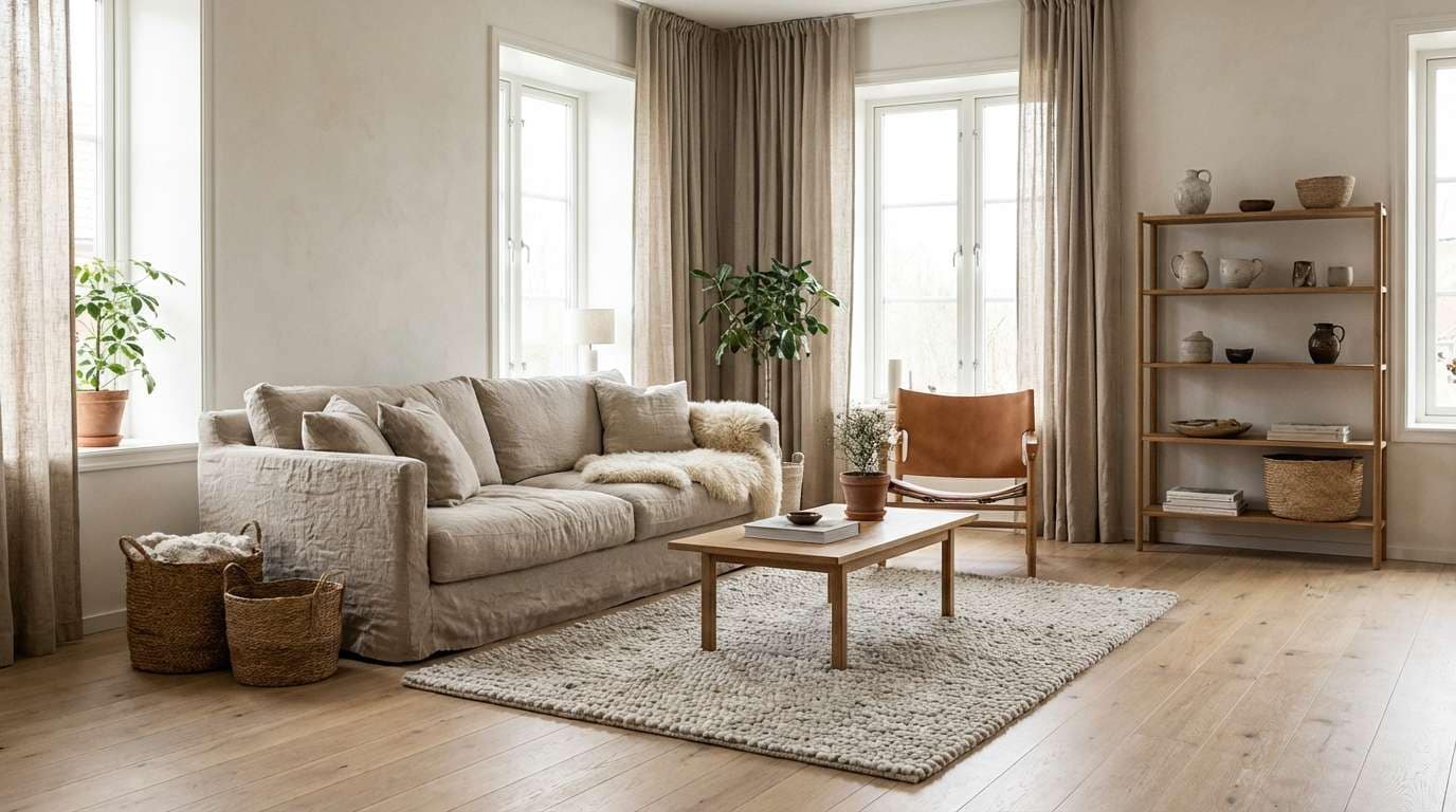
1) Linen Morning
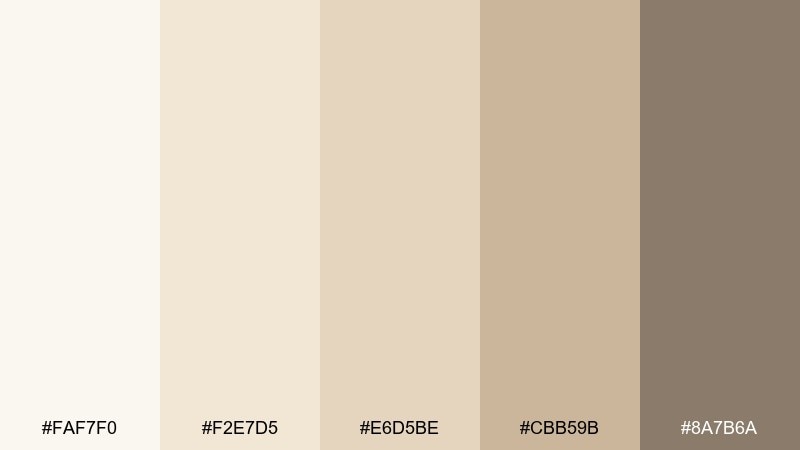
HEX: #FAF7F0 #F2E7D5 #E6D5BE #CBB59B #8A7B6A
Mood: airy, calm, organic
Best for: scandinavian interior mood boards
Airy linen whites and sun-warmed beige feel like fresh sheets and quiet daylight. Use it for living rooms, bedding lookbooks, or minimalist decor planning where you want warmth without yellow. Pair with matte black hardware or pale oak to keep the space crisp. Usage tip: make the deepest taupe your anchor tone for trim, text, or furniture legs.
Image example of linen morning generated using media.io
Media.io is an online AI studio for creating and editing video, image, and audio in your browser.

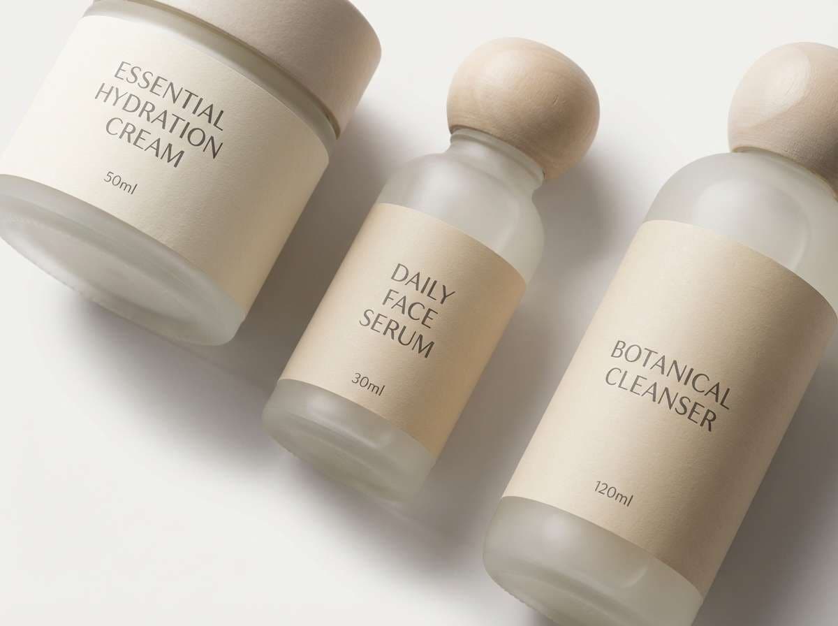
2) Oat Milk Minimal
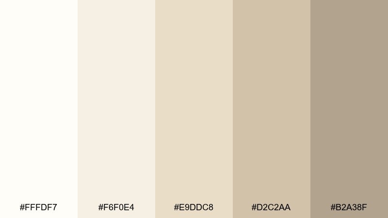
HEX: #FFFDF7 #F6F0E4 #E9DDC8 #D2C2AA #B2A38F
Mood: clean, creamy, minimal
Best for: skincare packaging and labels
Creamy oat tones read polished and soothing, like a quiet spa shelf. These shades work beautifully for skincare, wellness, and boutique apothecary packaging where clarity matters. Add a soft gray-brown for body text and a warm off-white for negative space. Usage tip: print the mid-beige as a subtle label background to keep ingredients highly legible.
Image example of oat milk minimal generated using media.io
3) Sandstone Studio
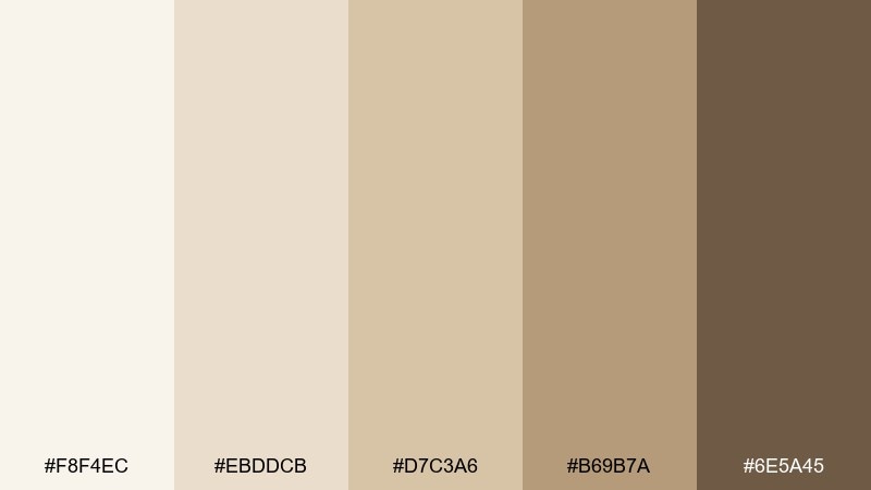
HEX: #F8F4EC #EBDDCB #D7C3A6 #B69B7A #6E5A45
Mood: grounded, creative, warm
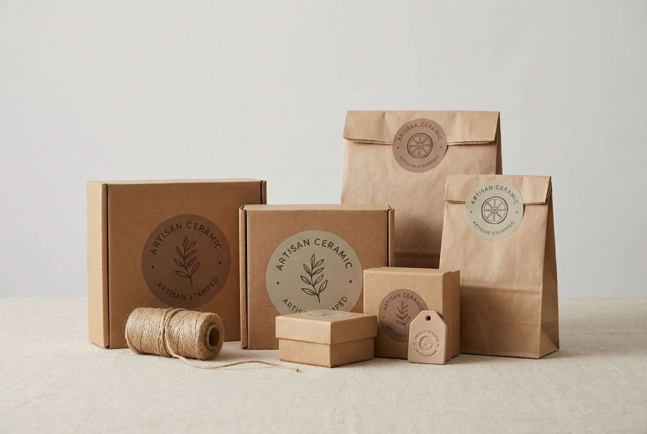
Best for: brand identity for makers and ceramics
Sun-baked sandstone and studio clay vibes give this set a handcrafted feel. As a white beige color scheme, it suits pottery brands, artisan logos, and textured packaging that should look approachable yet premium. Pair it with uncoated paper, embossed marks, and a deep cocoa for headlines. Usage tip: use the darker brown sparingly as a signature stamp color to keep the overall look light.
Image example of sandstone studio generated using media.io
4) Ivory Gallery
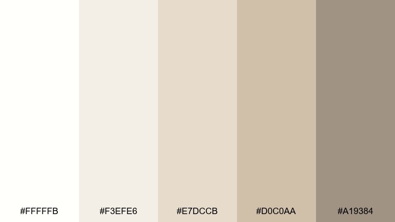
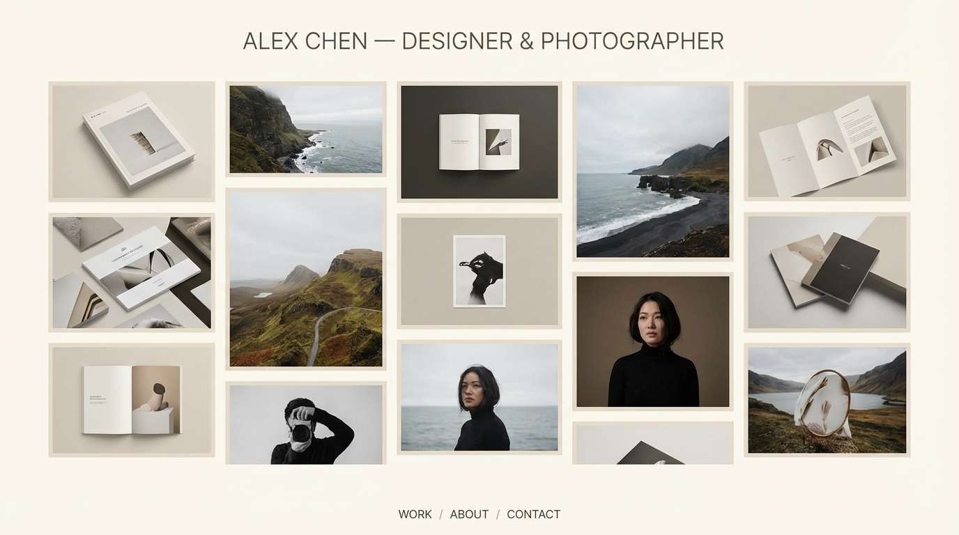
HEX: #FFFFFB #F3EFE6 #E7DCCB #D0C0AA #A19384
Mood: refined, quiet, gallery-clean
Best for: portfolio websites and case studies
Soft ivory and gentle taupe feel like a calm gallery wall that lets work take the spotlight. Use it for portfolios, architecture sites, and elegant case studies where imagery should breathe. Pair with charcoal typography and a single accent color for links. Usage tip: keep backgrounds in the lightest two tones and reserve mid-beige for cards and separators.
Image example of ivory gallery generated using media.io
5) Cashmere Warmth
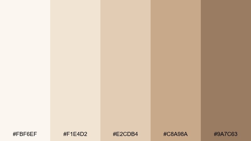
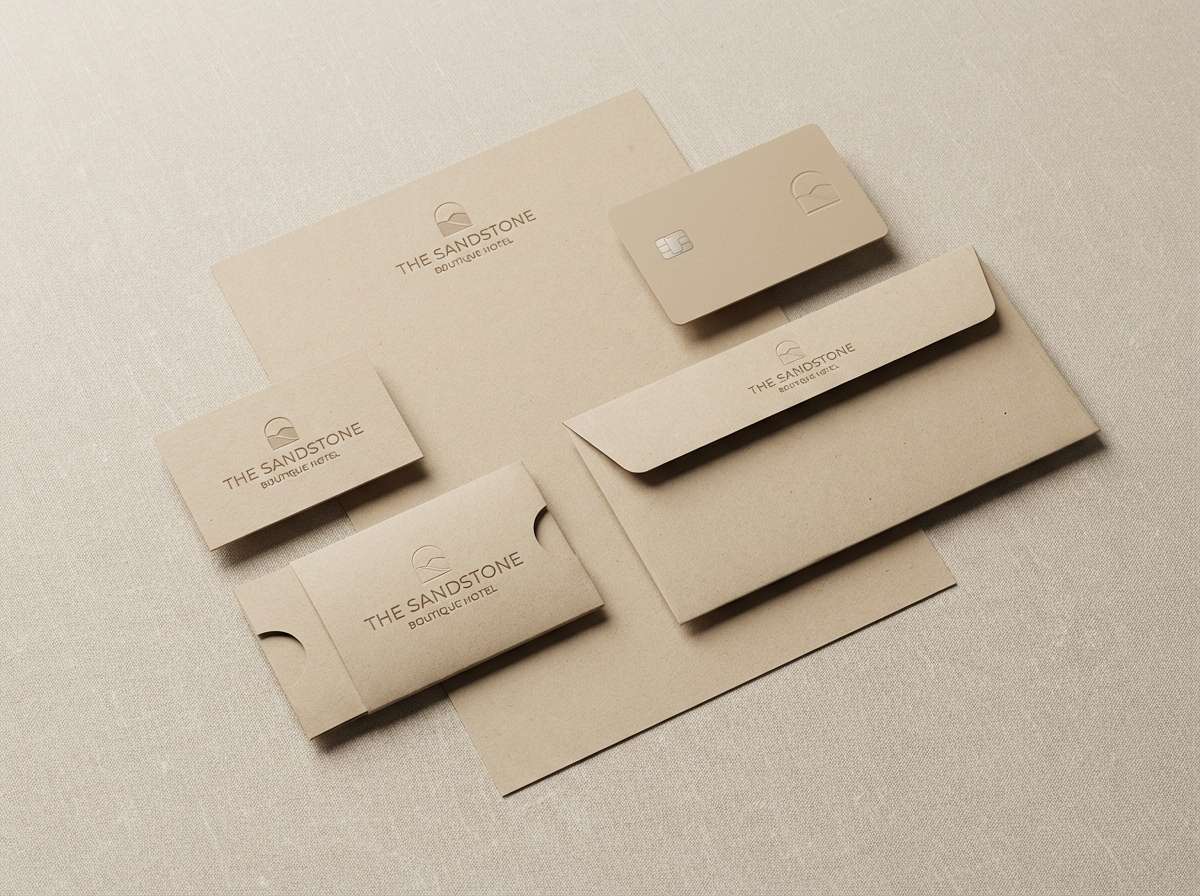
HEX: #FBF6EF #F1E4D2 #E2CDB4 #C8A98A #9A7C63
Mood: cozy, luxe, inviting
Best for: boutique hotel branding
Cozy cashmere neutrals evoke warm throws, soft lighting, and unhurried comfort. This white beige color palette fits boutique hotels, wellness retreats, and premium hospitality touchpoints like key cards and stationery. Pair with brass accents, walnut wood, and deep forest green for a richer feel. Usage tip: use the warm mid-beige for icons and wayfinding so signage stays readable without looking harsh.
Image example of cashmere warmth generated using media.io
6) Driftwood Neutral
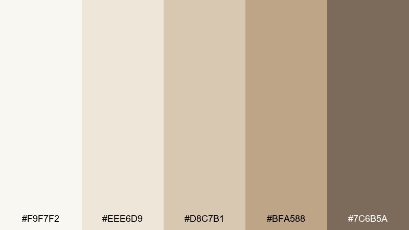
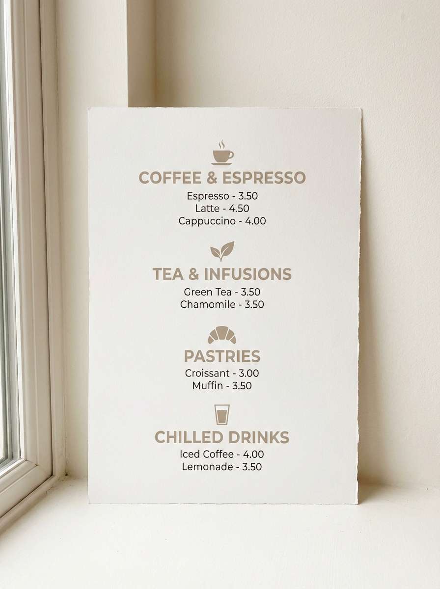
HEX: #F9F7F2 #EEE6D9 #D8C7B1 #BFA588 #7C6B5A
Mood: coastal, weathered, natural
Best for: cafe menus and signage
Weathered driftwood tones bring a relaxed, coastal calm without leaning blue. They work well for cafe menus, bakery signage, and lifestyle brands that want an earthy, friendly voice. Pair with muted navy or olive for contrast and a handmade feel. Usage tip: print menus on warm white stock and use the darkest taupe for section headers.
Image example of driftwood neutral generated using media.io
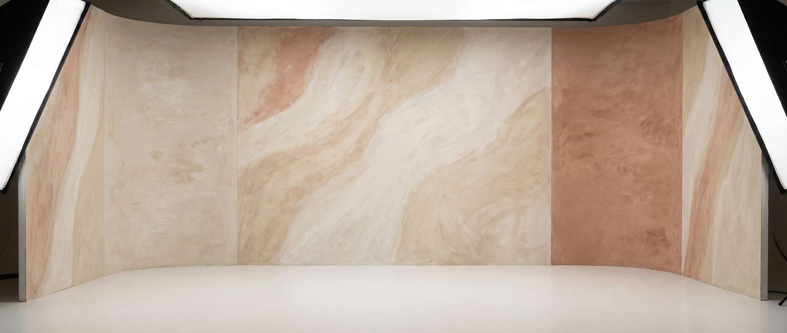
7) Creamy Clay
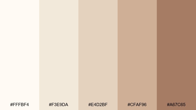
HEX: #FFFBF4 #F3E9DA #E4D2BF #CFAF96 #A67C65
Mood: soft, earthy, comforting
Best for: product photography backdrops
Cream and clay shades feel tactile, like handmade pottery and smooth plaster walls. Use them for product photography backdrops, lifestyle flat lays, or content templates that need gentle warmth. Pair with terracotta props or muted green plants for a grounded look. Usage tip: keep shadows soft and let the mid-clay tone carry most of the surface area.
Image example of creamy clay generated using media.io
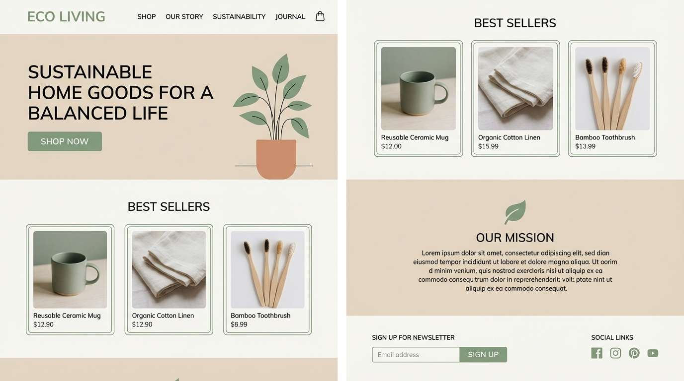
8) Porcelain Sage
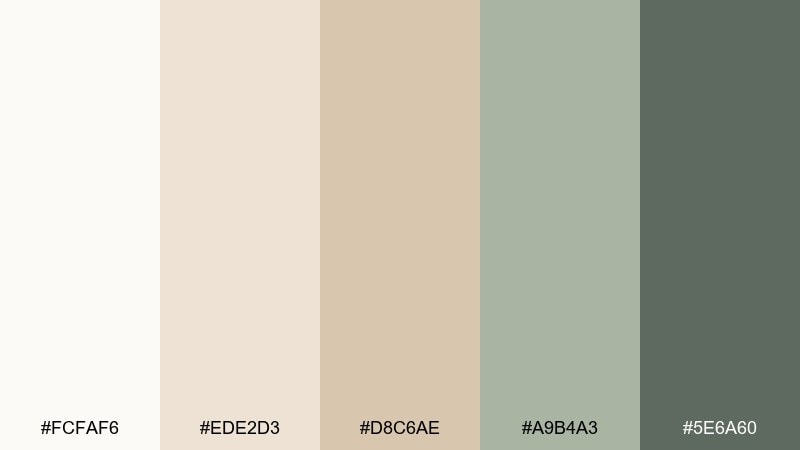
HEX: #FCFAF6 #EDE2D3 #D8C6AE #A9B4A3 #5E6A60
Mood: fresh, balanced, botanical
Best for: eco brand landing pages
Porcelain whites with a hint of sage feel clean, botanical, and quietly modern. If you want white beige color combinations that stay calm but not flat, this mix adds a nature note without overpowering the neutrals. Pair with recycled-paper textures, line illustrations, and dark green for CTAs. Usage tip: use sage as a soft highlight color for badges and secondary buttons.
Image example of porcelain sage generated using media.io
9) Biscotti Brunch
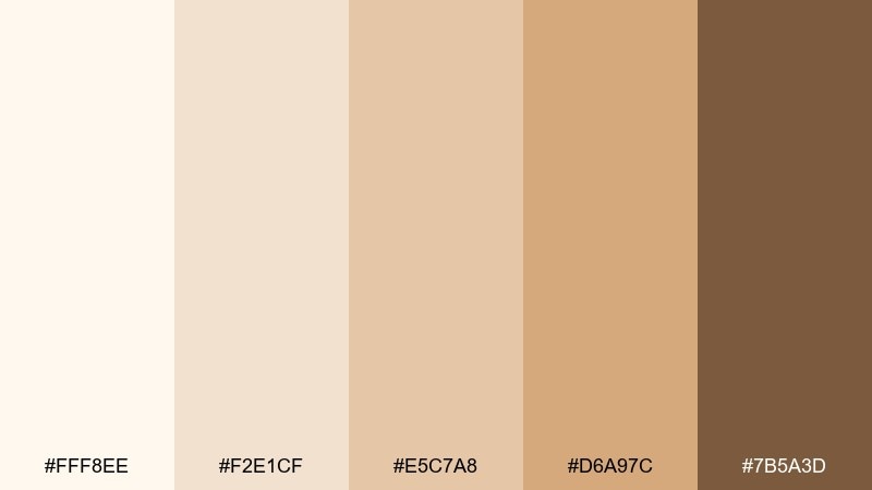
HEX: #FFF8EE #F2E1CF #E5C7A8 #D6A97C #7B5A3D
Mood: sweet, sunlit, welcoming
Best for: bakery branding and social posts
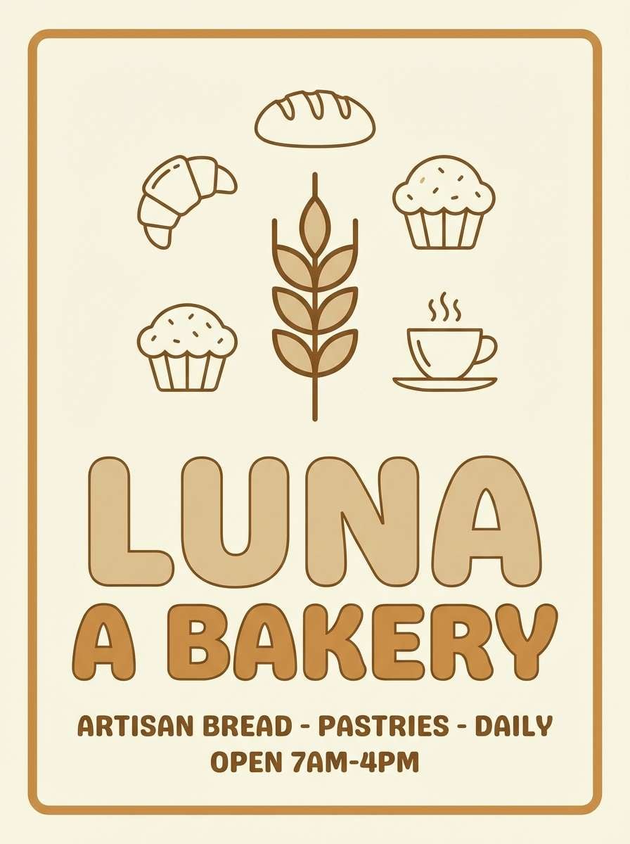
Buttery biscotti tones evoke warm ovens, morning light, and friendly service. They shine in bakery branding, cafe social posts, and food labels where warmth sells the taste. Pair with creamy whites for background space and cocoa brown for type. Usage tip: use the golden tan as a consistent highlight bar behind prices or promo text.
Image example of biscotti brunch generated using media.io
10) Desert Blush
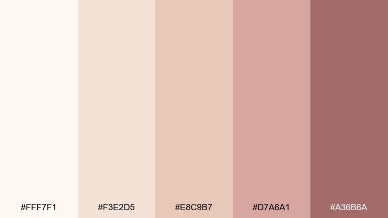
HEX: #FFF7F1 #F3E2D5 #E8C9B7 #D7A6A1 #A36B6A
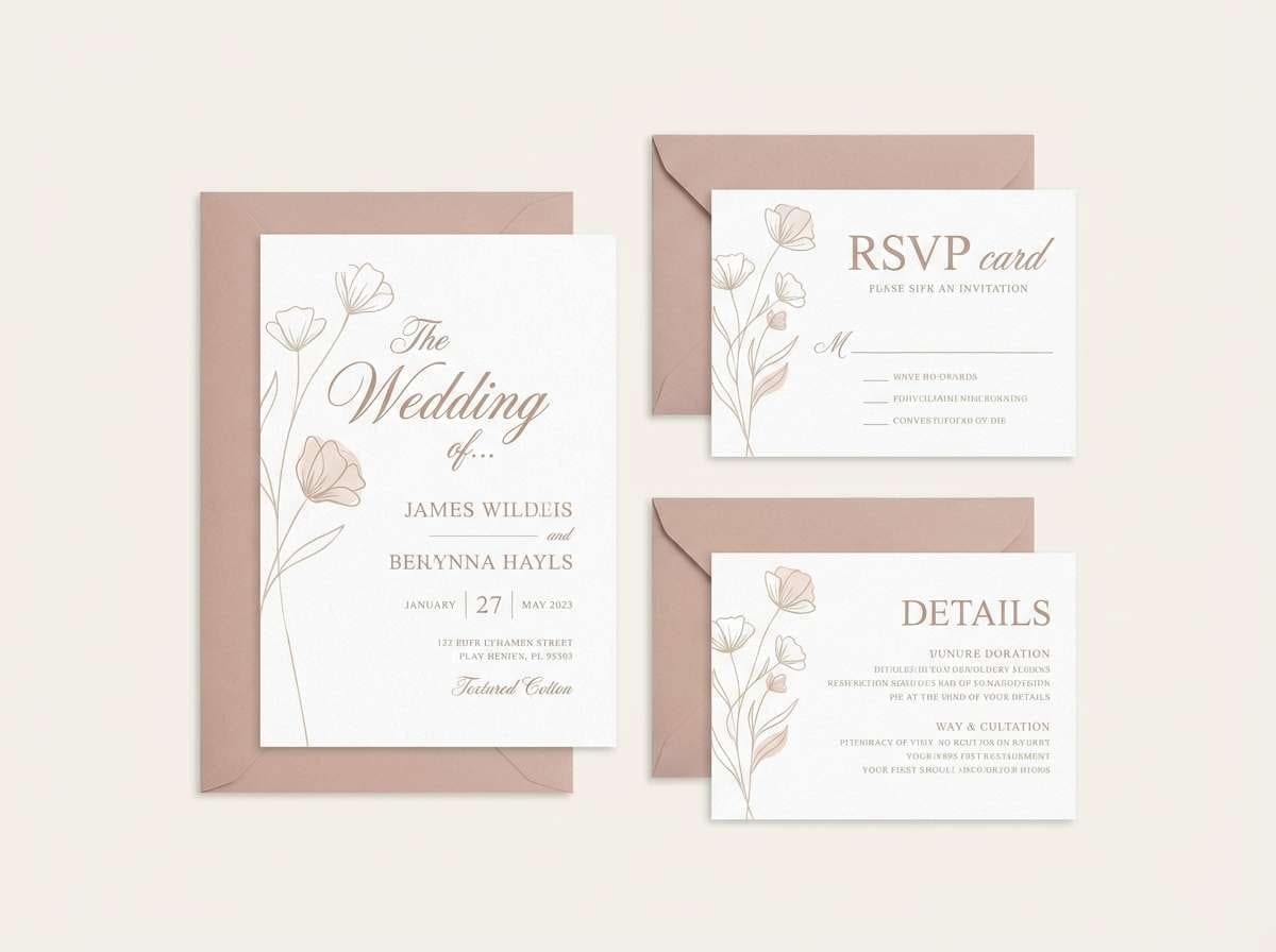
Mood: romantic, soft, modern
Best for: wedding stationery sets
Desert blush and creamy neutrals feel romantic without turning sugary. Use it for wedding stationery, bridal boutiques, and event suites that need warmth plus a gentle rosy accent. Pair with thin serif typography, vellum overlays, and a touch of metallic foil. Usage tip: keep blush to small details like monograms and divider lines so the suite stays timeless.
Image example of desert blush generated using media.io
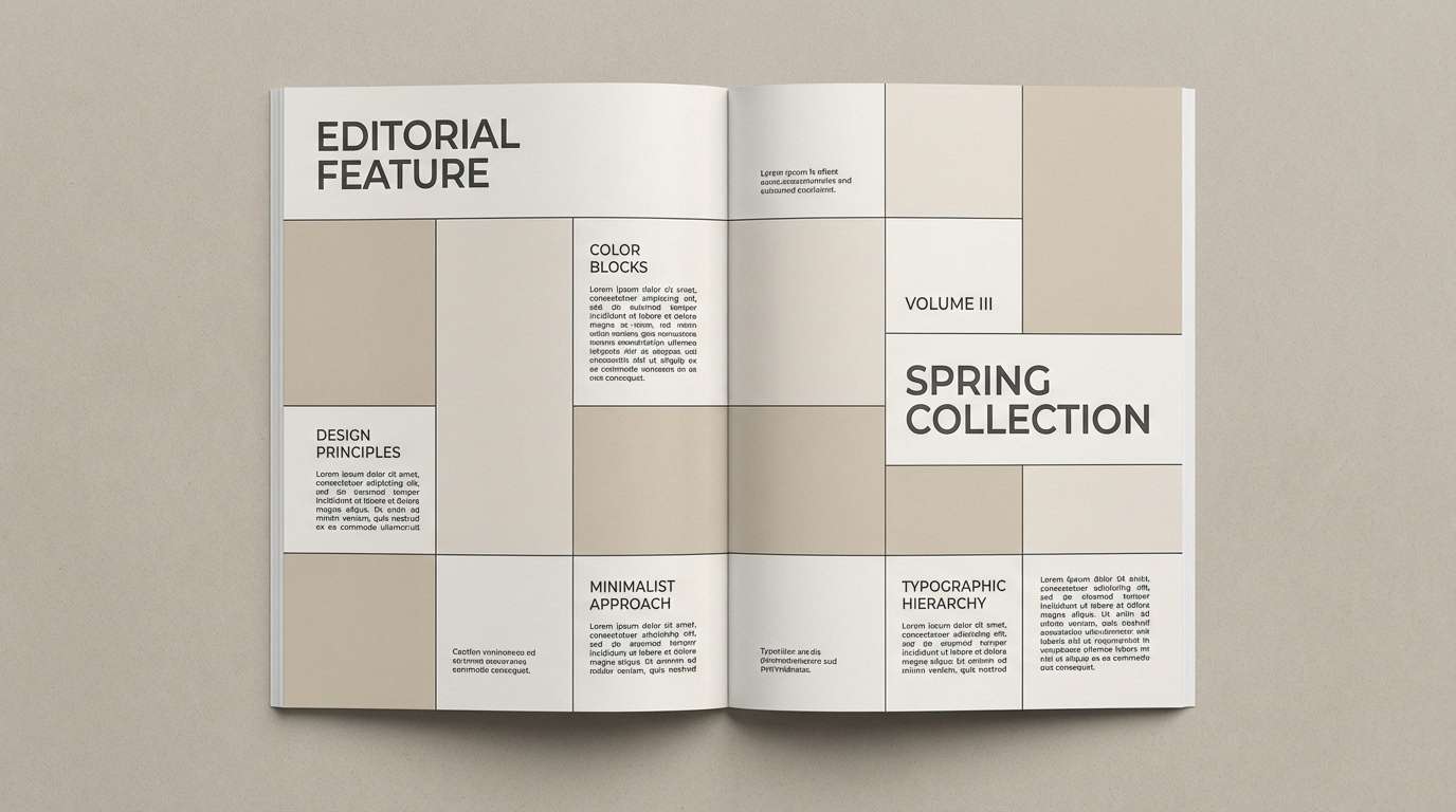
11) Pebble and Pearl
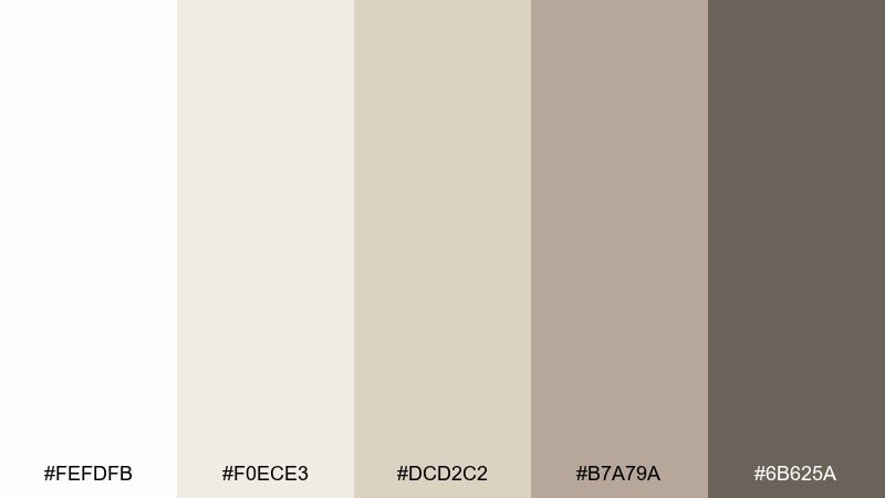
HEX: #FEFDFB #F0ECE3 #DCD2C2 #B7A79A #6B625A
Mood: quiet, balanced, editorial
Best for: magazine layouts and lookbooks
Pearl whites and pebble grays create an editorial calm that feels intentional and premium. They work well for magazine layouts, lookbooks, and long-form articles where readability is the priority. Pair with crisp black type and occasional warm beige callouts. Usage tip: choose one mid-tone for rules and captions to keep the grid consistent across pages.
Image example of pebble and pearl generated using media.io
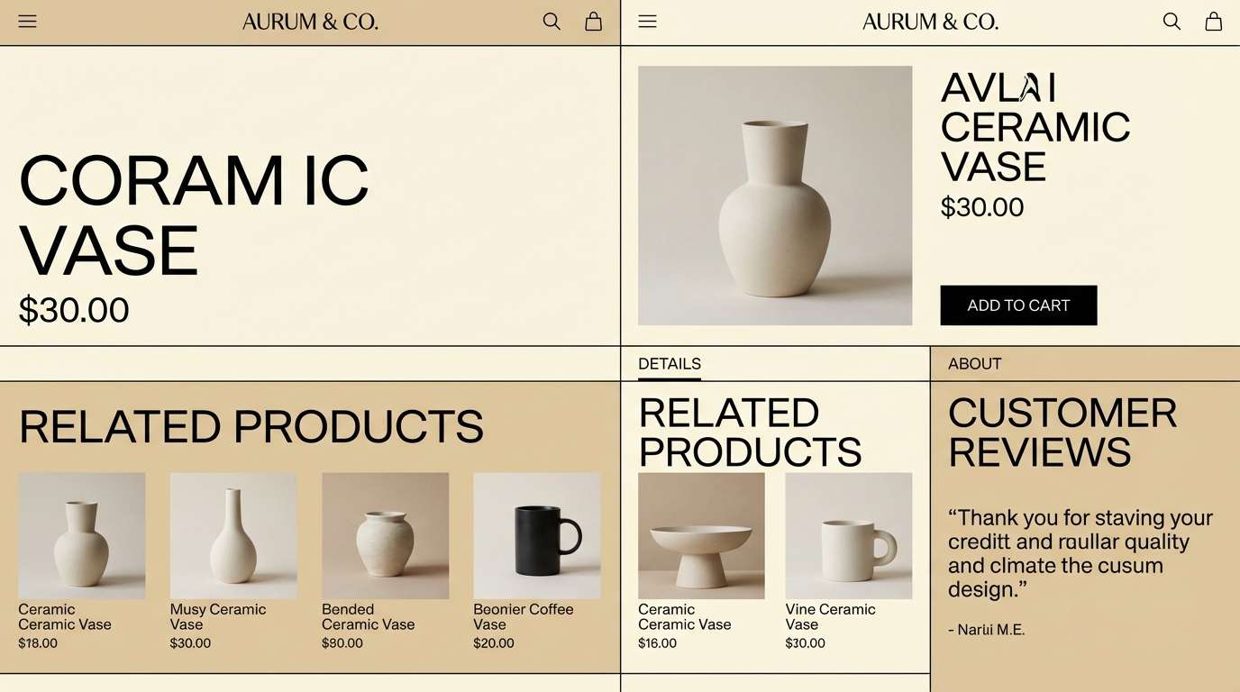
12) Vanilla Modern
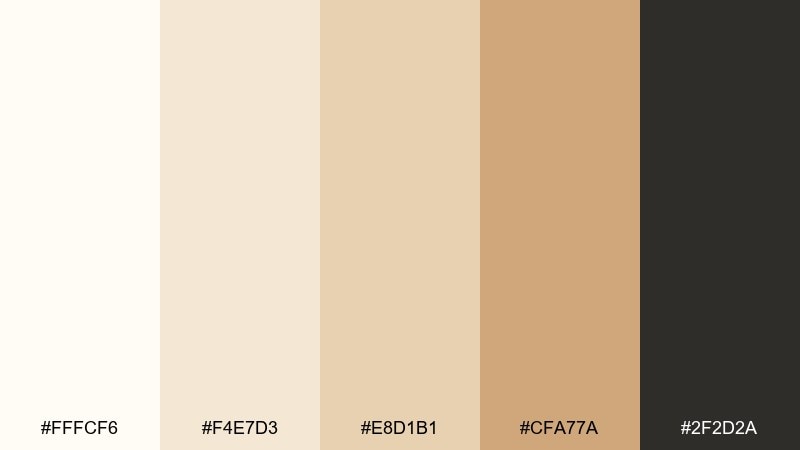
HEX: #FFFCF6 #F4E7D3 #E8D1B1 #CFA77A #2F2D2A
Mood: modern, confident, high-contrast
Best for: luxury ecommerce UI
Vanilla cream with a sharp inky accent feels modern, tailored, and a bit bold. This white beige color palette is ideal for luxury ecommerce, where clean product pages need strong hierarchy. Pair with plenty of whitespace and use the near-black for navigation and key pricing. Usage tip: keep buttons in the caramel tone and reserve the dark accent for hover states and headings.
Image example of vanilla modern generated using media.io
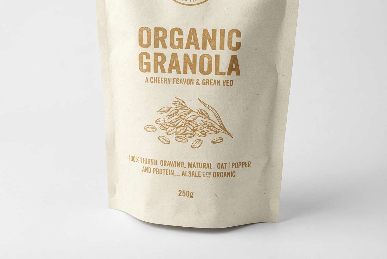
13) Wheatfield Sun
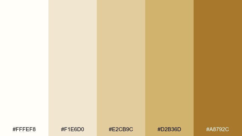
HEX: #FFFEF8 #F1E6D0 #E2CB9C #D2B36D #A8792C
Mood: sunny, rustic, optimistic
Best for: organic food packaging
Golden wheat and warm cream feel sunny and wholesome, like fields at late afternoon. Use this set for organic food packaging, farmers market brands, or nutrition labels that should look approachable. Pair with green or deep brown to reinforce the natural message. Usage tip: keep the brightest cream for negative space so the golden tones read as accents, not background noise.
Image example of wheatfield sun generated using media.io
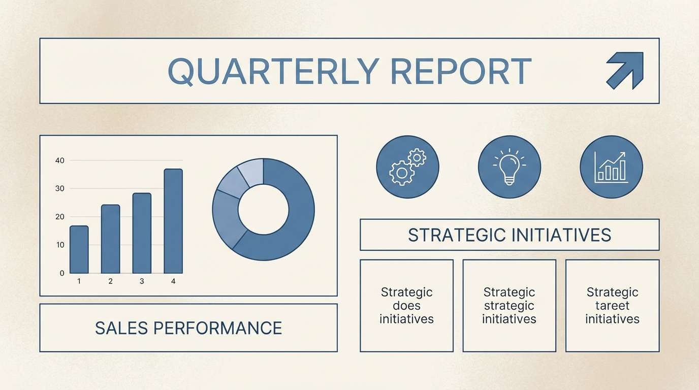
14) Bone and Denim
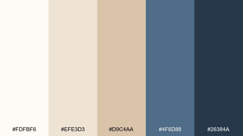
HEX: #FDFBF6 #EFE3D3 #D9C4AA #4F6D88 #26384A
Mood: cool, tailored, contemporary
Best for: startup pitch decks
Bone whites with denim blues feel crisp, confident, and modern. Use it for pitch decks, SaaS one-pagers, or presentation templates that need a trustworthy accent color. Pair with clean charts, simple icons, and consistent spacing to keep the message sharp. Usage tip: use denim for headings and data highlights, and keep slides mostly in bone and beige for breathability.
Image example of bone and denim generated using media.io
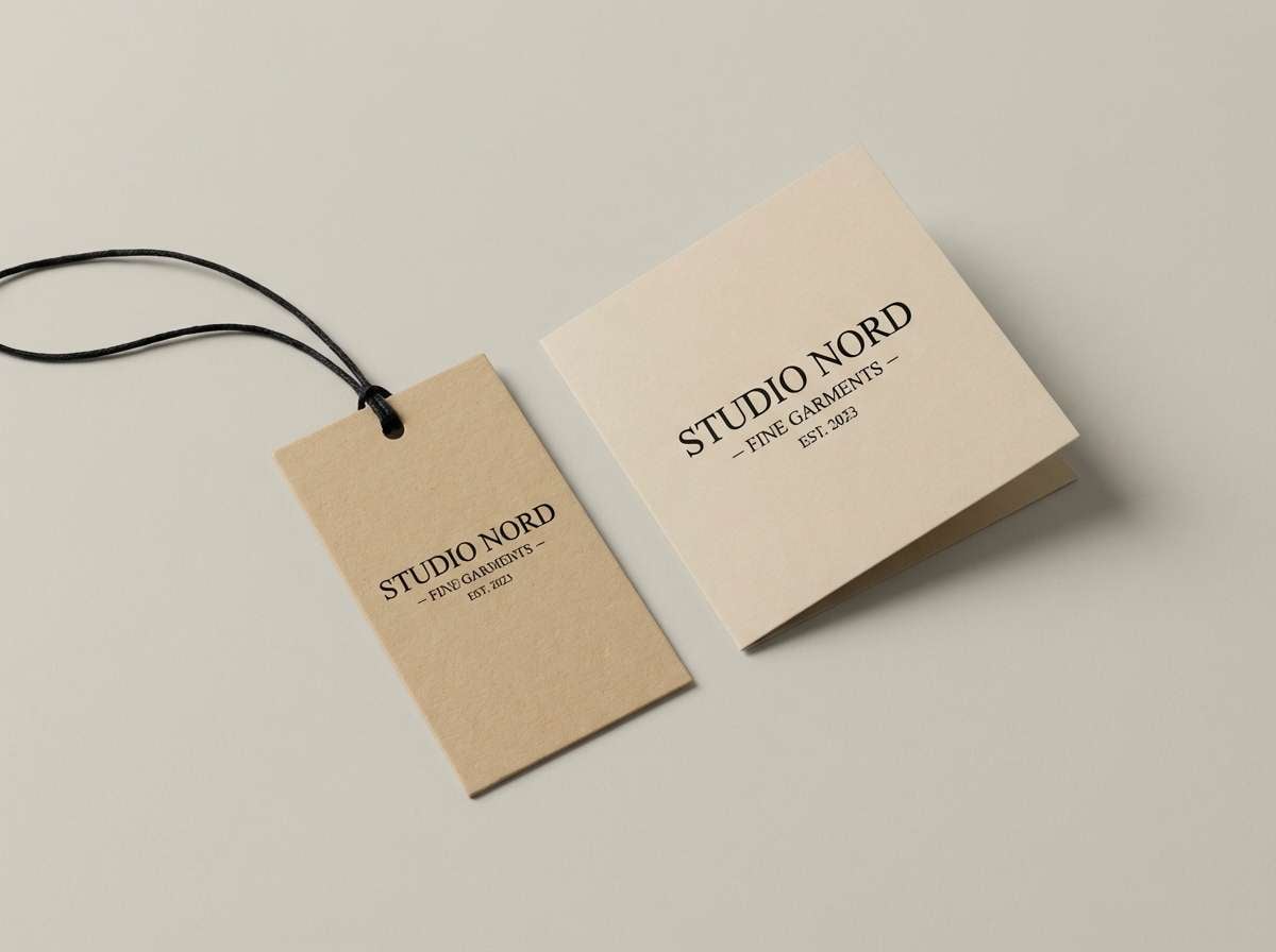
15) Almond Noir
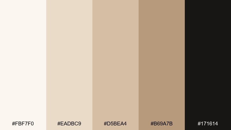
HEX: #FBF7F0 #EADBC9 #D5BEA4 #B69A7B #171614
Mood: dramatic, upscale, minimal
Best for: fashion brand logos and tags
Almond neutrals against near-black create a dramatic, runway-ready contrast. This set works for fashion logos, hang tags, and lookbook covers where you want quiet luxury with edge. Pair with high-contrast photography and minimal typography to keep it sleek. Usage tip: let noir handle small elements like logos and thin rules, while beige stays dominant for a softer premium feel.
Image example of almond noir generated using media.io
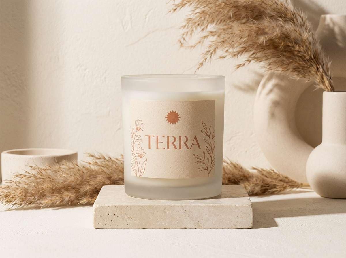
16) Soft Terracotta
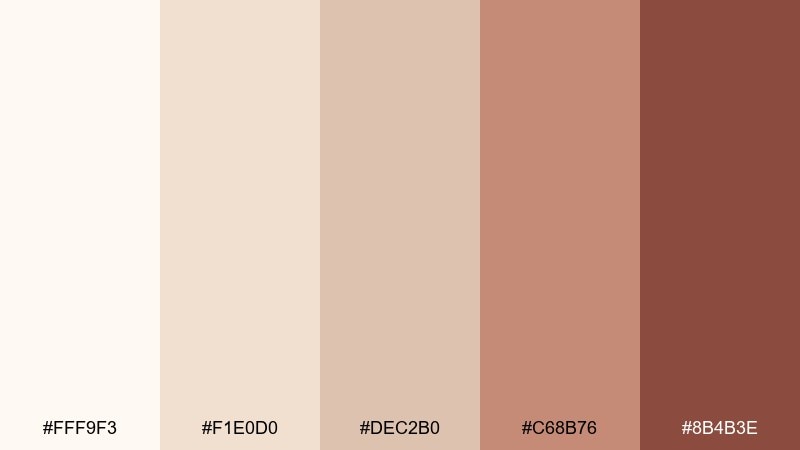
HEX: #FFF9F3 #F1E0D0 #DEC2B0 #C68B76 #8B4B3E
Mood: warm, earthy, artisan
Best for: home decor product ads
Soft terracotta layered over creamy neutrals feels earthy, artisan, and lived-in. Use it for home decor ads, candle labels, or ceramics campaigns that should look warm and tactile. Pair with linen textures, clay props, and muted olive to deepen the palette. Usage tip: keep terracotta to one hero element, like a product label band or headline highlight.
Image example of soft terracotta generated using media.io
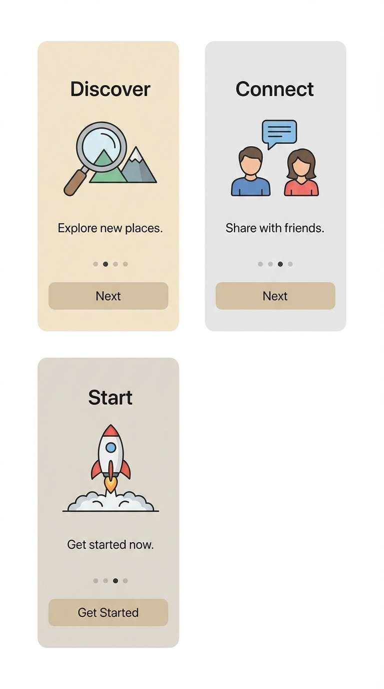
17) Scandinavian White
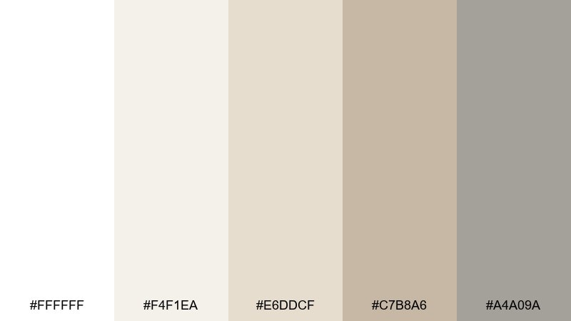
HEX: #FFFFFF #F4F1EA #E6DDCF #C7B8A6 #A4A09A
Mood: bright, simple, timeless
Best for: app onboarding screens
Bright whites with gentle beige-gray steps feel clean, friendly, and easy to trust. For a white beige color combination that stays ultra-light, these tones support illustrations and icons without stealing attention. Pair with one saturated accent, like cobalt or coral, to guide the user through steps. Usage tip: keep contrast accessible by using the deeper gray-beige for body copy and form labels.
Image example of scandinavian white generated using media.io
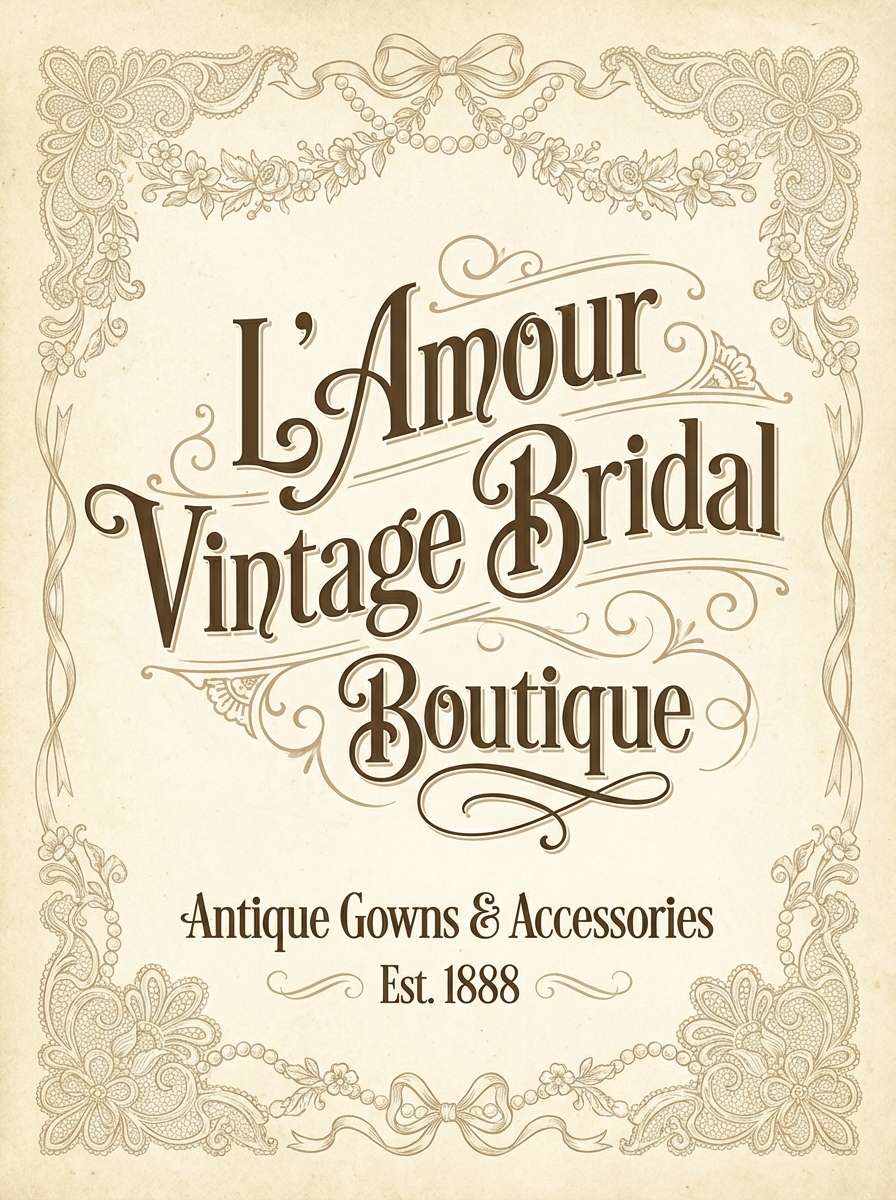
18) Antique Lace
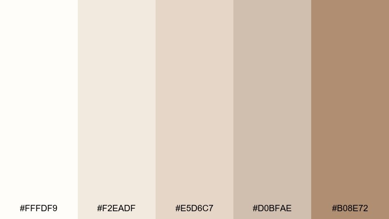
HEX: #FFFDF9 #F2EADF #E5D6C7 #D0BFAE #B08E72
Mood: vintage, delicate, romantic
Best for: bridal boutique posters
Antique lace creams and mellow beige feel nostalgic, delicate, and softly romantic. Use it for bridal boutique posters, vintage-inspired events, or heritage product lines. Pair with thin gold lines, serif type, and subtle paper grain for a classic finish. Usage tip: keep backgrounds in the lightest cream and use the warm tan for small ornamental details.
Image example of antique lace generated using media.io
19) Pebble Rosegold
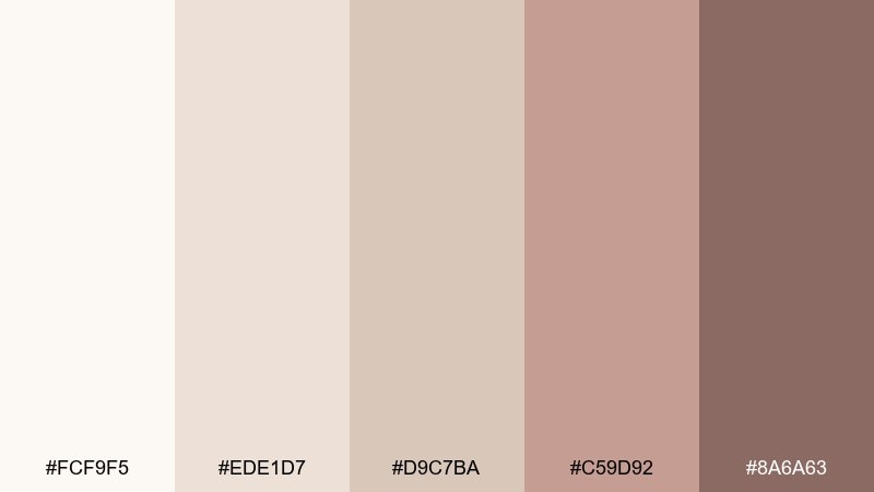
HEX: #FCF9F5 #EDE1D7 #D9C7BA #C59D92 #8A6A63
Mood: soft glam, warm, modern
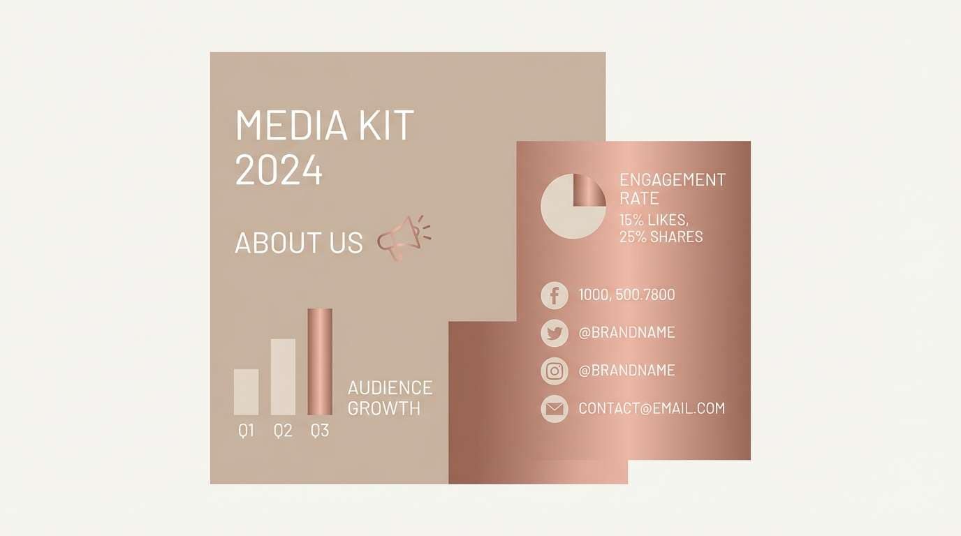
Best for: beauty influencer media kits
Warm pebble neutrals with a rosy metallic vibe feel modern, polished, and social-ready. These tones are great for media kits, beauty one-sheets, and creator branding where you want softness with structure. Pair with clean sans-serif type and a deep brown for readability. Usage tip: use the rose tone for section headers and icons so the layout feels cohesive across pages.
Image example of pebble rosegold generated using media.io
20) Quiet Luxury
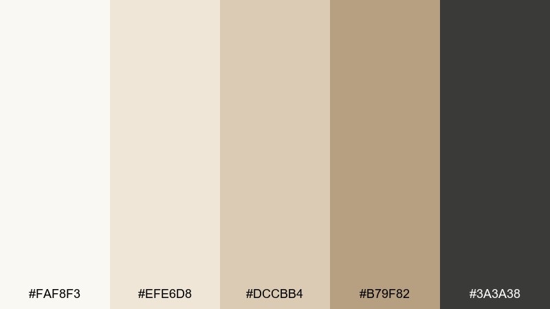
HEX: #FAF8F3 #EFE6D8 #DCCBB4 #B79F82 #3A3A38
Mood: premium, understated, elegant
Best for: real estate branding and brochures
Understated beige with a grounded graphite feels premium and confident, like a high-end brochure you keep. This white beige color palette works for real estate branding, architecture brochures, and upscale service brands that rely on trust. Pair with crisp photography, ample margins, and subtle linework to elevate the layout. Usage tip: use graphite for headings and keep body text slightly lighter to avoid harsh contrast on warm paper.
Image example of quiet luxury generated using media.io

What Colors Go Well with White Beige?
White beige pairs naturally with deep neutrals like charcoal, espresso brown, and near-black for readable contrast. This is especially effective for luxury ecommerce, editorial layouts, and brand systems that need strong hierarchy.
For a softer, nature-led feel, add muted greens (sage, olive, forest) or dusty blues (denim, slate). These accents keep the palette calm while giving you clear CTA and highlight colors.
If you want warmth and personality, try terracotta, blush, or wheat-gold as a controlled accent. Keep the accent limited to buttons, icons, or small graphic elements so the beige remains the main mood-setter.
How to Use a White Beige Color Palette in Real Designs
Start with a “light-first” system: use the palest off-white as your main background, then reserve the mid-beiges for cards, sections, or image frames. This keeps the layout bright while still giving structure.
Choose one dark anchor (taupe, cocoa, graphite, or noir) for text and key UI elements. It prevents the design from feeling washed out and improves accessibility compared to using light beige text.
When printing, pick warm white paper stock and avoid overly glossy finishes if you want a premium neutral look. Beige tones often look best with matte, uncoated, or lightly textured materials.
Create White Beige Palette Visuals with AI
If you already have HEX codes but need matching visuals (rooms, packaging, UI mockups, posters), AI image generation is a fast way to test style direction. You can keep the same palette and iterate on lighting, materials, and composition.
Use the included prompts as templates: swap product type, add your brand keywords, and keep the aspect ratio tag to generate consistent assets across platforms.
With Media.io, you can generate, refine, and download white beige palette visuals directly in your browser—no design software required.
White Beige Color Palette FAQs
-
What is a white beige color palette?
A white beige color palette is a set of soft neutrals built around warm whites, creams, ivories, and beige-to-taupe shades. It’s commonly used to create bright, calm, modern visuals with gentle warmth. -
Is beige a warm or cool color?
Beige is usually warm (yellow, tan, sand undertones), but it can lean cool when it includes gray or greige undertones. Always check it next to pure white and a true gray to see the direction. -
What accent colors work best with white and beige?
Great accents include charcoal/black for contrast, sage/olive for a botanical feel, denim/slate blue for a tailored look, and terracotta/blush for warmth. Choose one main accent and keep it consistent across UI or print elements. -
How do I keep a beige and white design from looking flat?
Add depth using one darker anchor tone (taupe, cocoa, graphite), texture (paper grain, linen, plaster), and clear spacing. Small shifts in value (light-to-mid beige steps) help separate sections without harsh borders. -
Are white beige palettes good for UI and accessibility?
Yes—if you maintain sufficient contrast for text and interactive elements. Use a darker neutral for body text and labels, and reserve very light beiges for backgrounds and large surfaces. -
What are common use cases for white beige palettes?
They’re popular in skincare and wellness branding, boutique hospitality, real estate brochures, minimal ecommerce, portfolios, and product photography backdrops—anywhere you want clean sophistication and warmth. -
How can I generate images that match my white beige palette?
Use an AI text-to-image tool and describe materials (linen, plaster, uncoated paper), lighting (soft daylight, diffused studio light), and the neutral mood. Start from the prompts in this article and iterate by changing the subject (UI, packaging, interiors) while keeping the same tone.
Next: Gold Red Color Palette


