

A gray tan color palette (often called greige) blends warm sand with cool stone, creating a neutral look that feels modern, calm, and easy to live with.
Whether you’re styling an interior, building a brand system, or designing UI, gray tan tones give you flexibility: soft enough for backgrounds, but structured enough for readable contrast.
In this article
Why Gray Tan Palettes Work So Well
Gray tan sits in the sweet spot between warm beige and cool gray, so it adapts to different lighting and materials without swinging too yellow or too icy. That balance makes it a reliable “base neutral” for both interiors and digital design.
Because these tones are naturally low-saturation, they help content feel calmer and more premium. Photos look consistent, typography stays readable, and accents (like navy, green, or honey) can stand out without clashing.
Gray tan also scales beautifully: you can use whisper-light off-whites for spacious backgrounds, mid greiges for surfaces and cards, and deep charcoals for hierarchy and structure—all while staying in the same family.
20+ Gray Tan Color Palette Ideas (with HEX Codes)
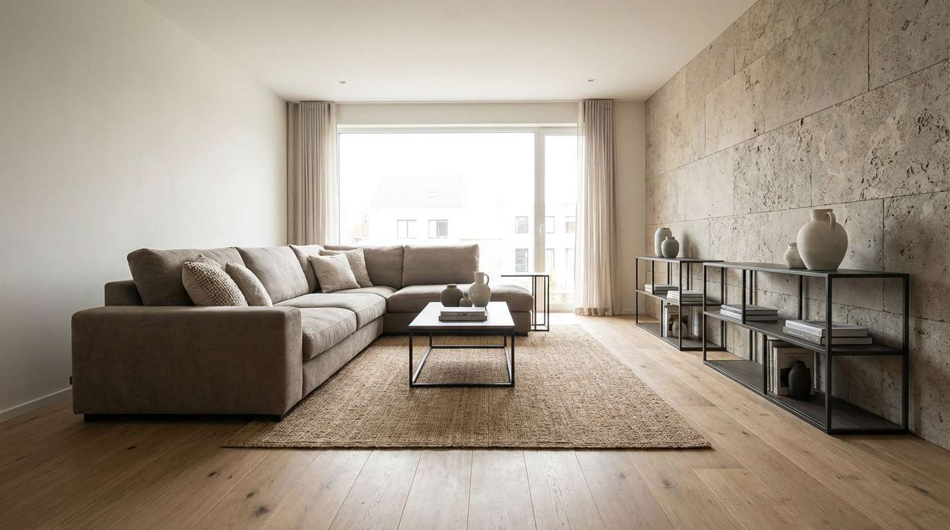
1) Stone Canvas
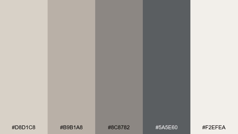
HEX: #D8D1C8 #B9B1A8 #8C8782 #5A5E60 #F2EFEA
Mood: calm, airy, grounded
Best for: modern living rooms and open-plan interiors
Calm and airy like sunlit limestone and soft woven textiles, these tones feel instantly settled. Use the light cream as your wall or base, then layer mid greige on larger furniture for a quiet foundation. Charcoal adds structure in metal finishes, frames, or a statement rug, while the warm taupes keep everything inviting. Tip: repeat the darkest shade in two small spots (like lamp + hardware) to avoid a heavy block of contrast.
Image example of stone canvas generated using media.io
Media.io is an online AI studio for creating and editing video, image, and audio in your browser.

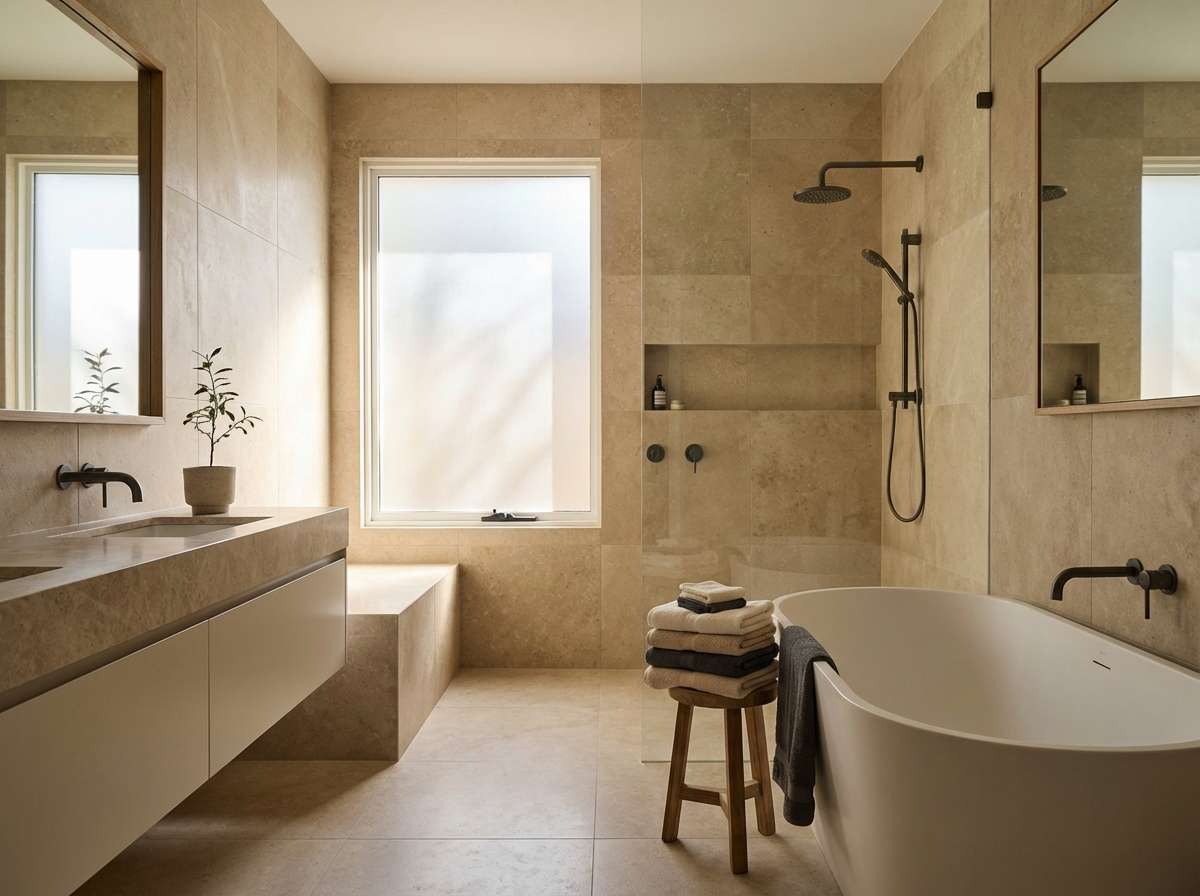
2) Desert Fog
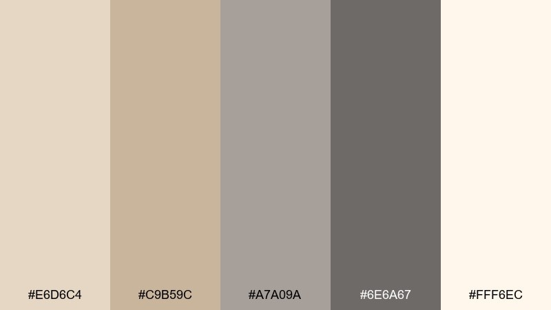
HEX: #E6D6C4 #C9B59C #A7A09A #6E6A67 #FFF6EC
Mood: warm, hazy, serene
Best for: spa bathrooms and wellness branding
Warm and hazy like early-morning dunes, this mix reads soothing without turning yellow. Pair the sandy neutrals with matte stone textures and brushed nickel for a modern spa feel. The deeper gray grounds mirrors, typography, or a single accent stripe. Tip: keep grout, borders, and body text in the darker shades so the creamy highlight stays clean and calm.
Image example of desert fog generated using media.io
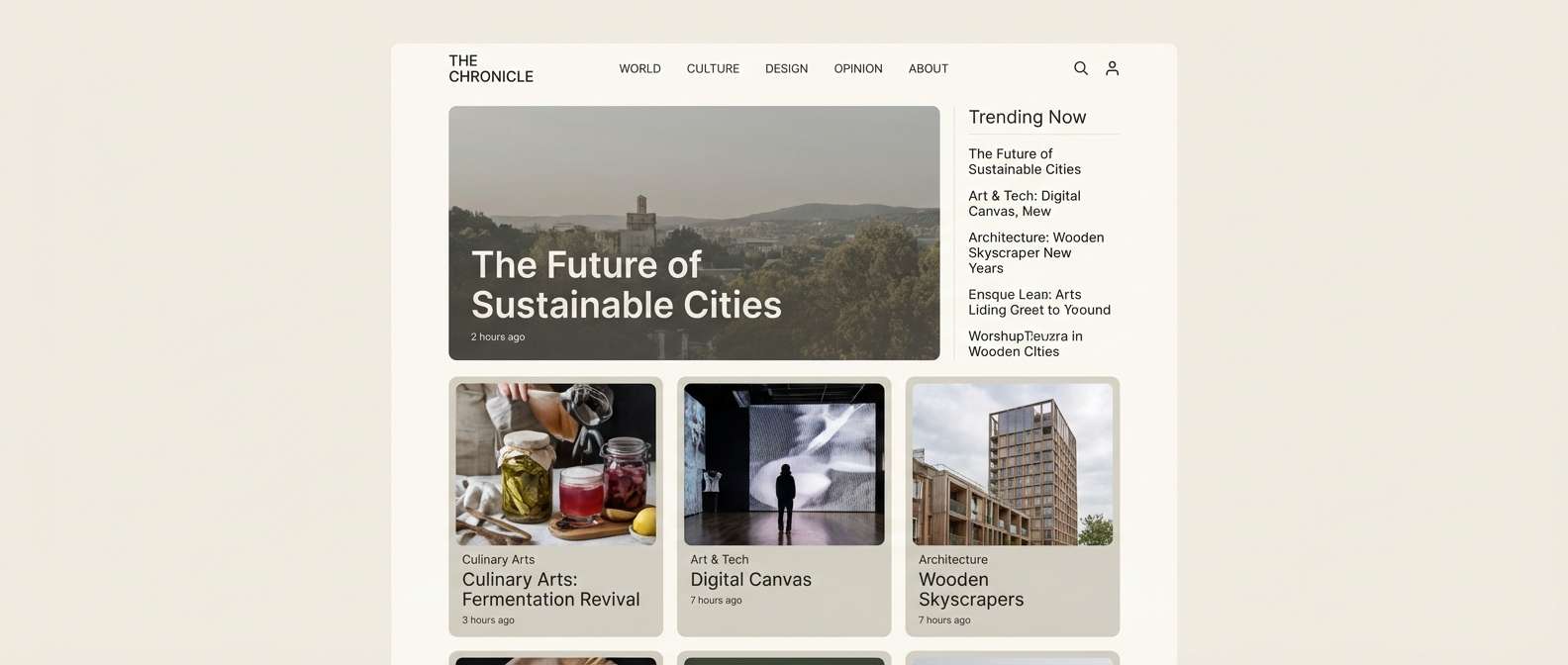
3) Linen & Graphite
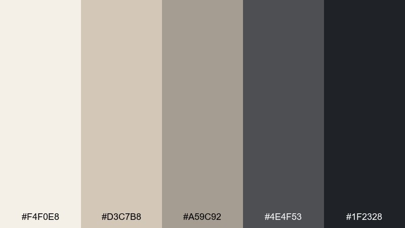
HEX: #F4F0E8 #D3C7B8 #A59C92 #4E4F53 #1F2328
Mood: tailored, crisp, modern
Best for: premium websites and editorial-style layouts
Tailored and crisp like pressed linen beside a sharp pencil sketch, this set feels refined and contemporary. It works beautifully as a gray tan color scheme for pages that need plenty of whitespace but still want warmth. Use the two darkest tones for navigation, headings, and dividers, then let the mid neutrals soften large blocks. Tip: reserve the near-black for only one element per screen (like buttons) to keep the hierarchy clear.
Image example of linen & graphite generated using media.io
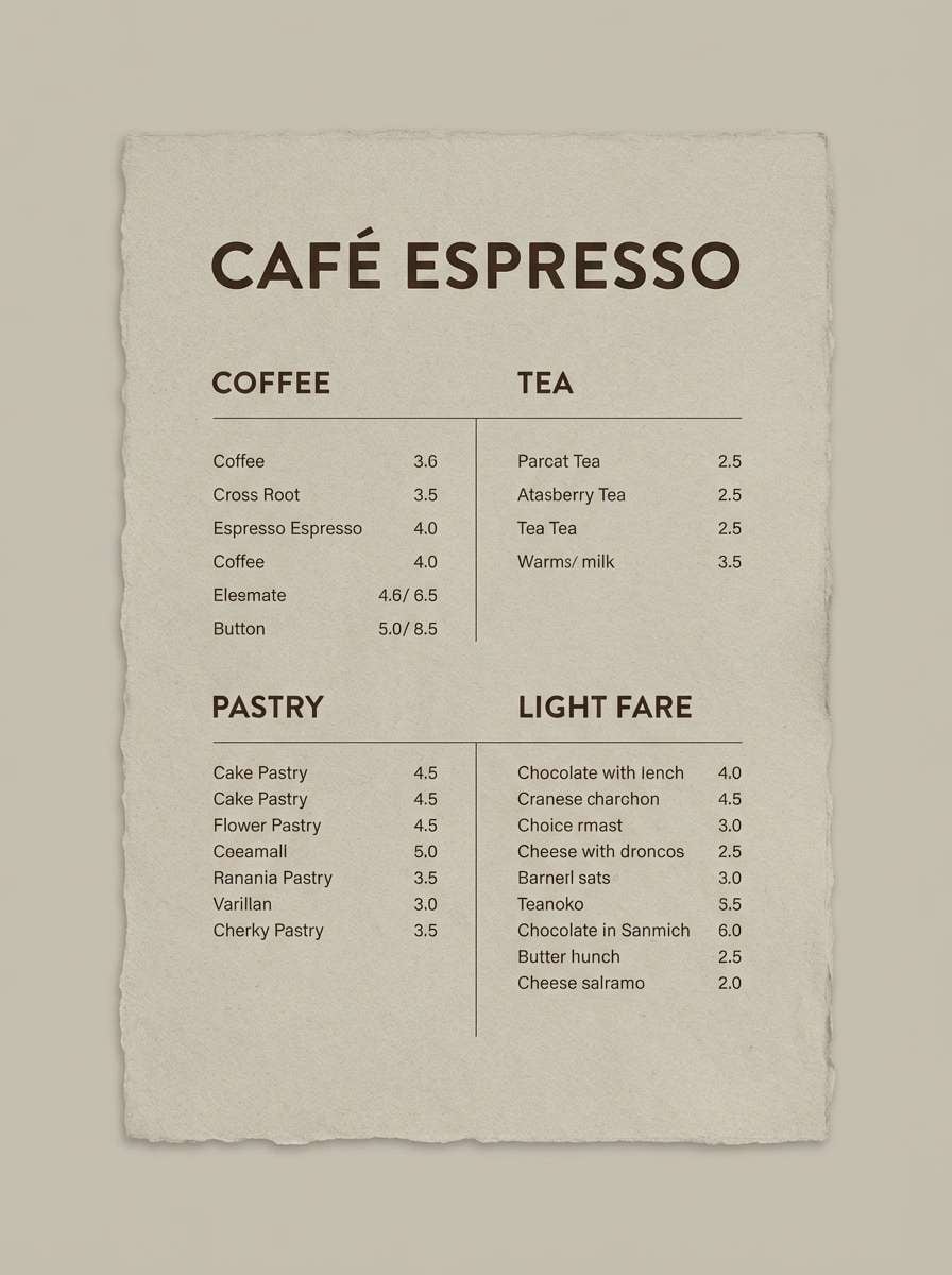
4) Pebble Latte
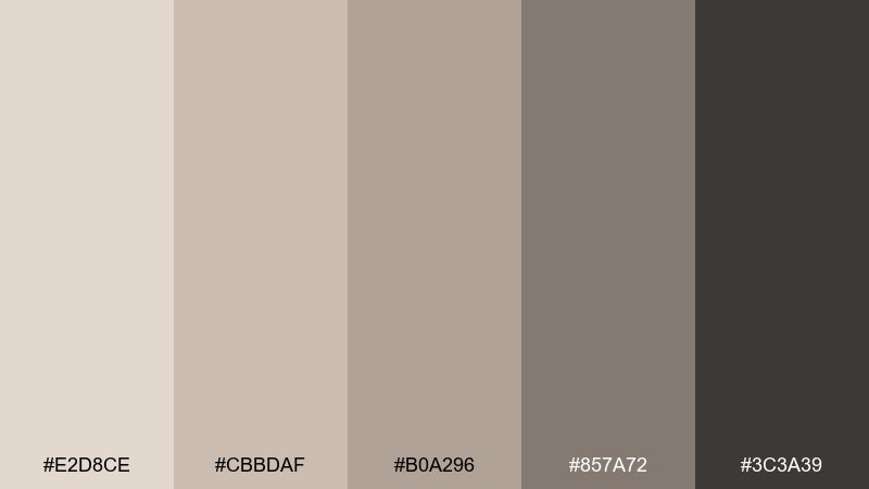
HEX: #E2D8CE #CBBDAF #B0A296 #857A72 #3C3A39
Mood: cozy, soft, café-like
Best for: coffee shops and menu design
Cozy and soft like a latte on a stone coaster, these neutrals feel approachable and warm. Use the lightest shades for backgrounds and paper stock, then bring in the deeper taupes for typography and section headers. The dark espresso tone is ideal for logo marks and price emphasis without looking harsh. Tip: add texture (kraft paper, speckled print, or grain) so the palette feels richer without adding more colors.
Image example of pebble latte generated using media.io
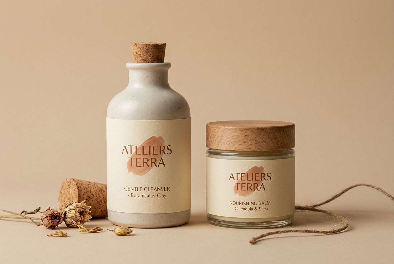
5) Clay Studio
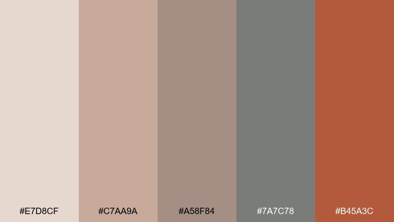
HEX: #E7D8CF #C7AA9A #A58F84 #7A7C78 #B45A3C
Mood: artisanal, earthy, creative
Best for: ceramics brands and handmade product packaging
Artisanal and earthy like wet clay drying on a studio shelf, this mix blends warm neutrals with a baked-terracotta spark. Let the soft blush-beige lead on boxes or labels, then use the clay red as a seal, stripe, or hero icon. The cool gray keeps the warmth from feeling too rustic and pairs nicely with black ink or stamped textures. Tip: print the accent on uncoated stock to get that authentic, handmade finish.
Image example of clay studio generated using media.io
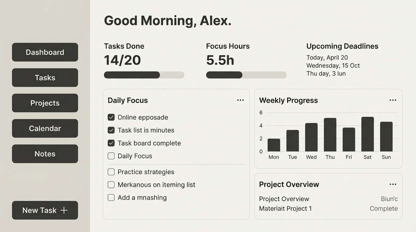
6) Warm Minimal UI
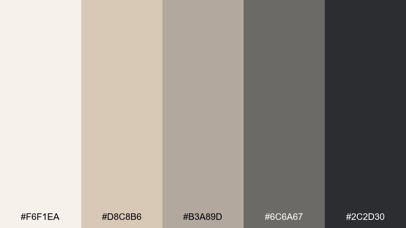
HEX: #F6F1EA #D8C8B6 #B3A89D #6C6A67 #2C2D30
Mood: minimal, friendly, polished
Best for: dashboard UI and productivity apps
Minimal and friendly like a clean desk with warm daylight, these neutrals make interfaces feel calmer. A gray tan color palette like this is great for productivity tools because it reduces glare while keeping contrast readable. Use the near-black for primary actions and the mid greige for secondary text, borders, and chips. Tip: add a single colored status system (green, amber, red) and keep everything else within these neutrals for consistency.
Image example of warm minimal ui generated using media.io
7) Sandstone Editorial
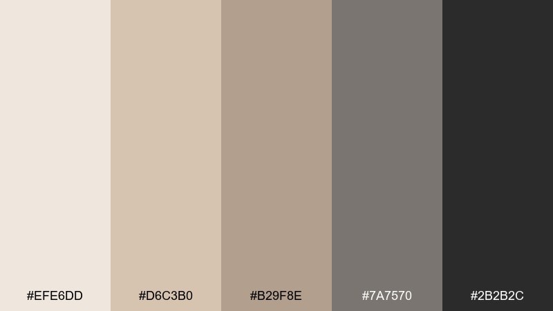
HEX: #EFE6DD #D6C3B0 #B29F8E #7A7570 #2B2B2C
Mood: elegant, mature, story-driven
Best for: magazine spreads and lookbooks
Elegant and story-driven like weathered sandstone in a gallery, this palette feels timeless on the page. The soft creams keep photos bright, while the mid tans add warmth to captions and pull quotes. Use the dark tones for body text and grid lines to maintain a premium editorial rhythm. Tip: keep margins generous so the warmer shades read intentional rather than muddy.
Image example of sandstone editorial generated using media.io
8) Taupe Botanica
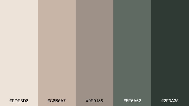
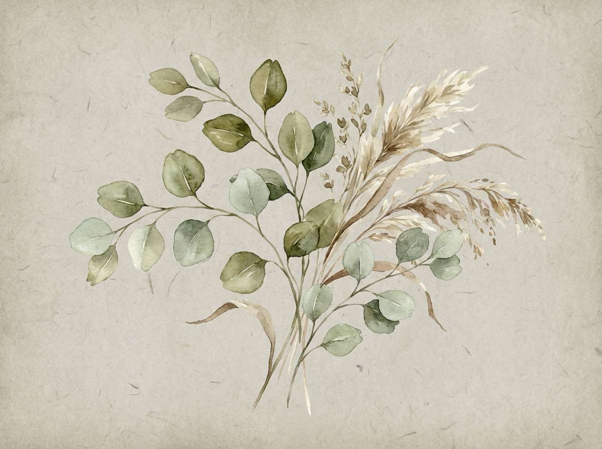
HEX: #EDE3D8 #C8B5A7 #9E9188 #5E6A62 #2F3A35
Mood: botanical, calm, natural
Best for: wellness labels and botanical illustrations
Botanical and calm like dried grasses against a linen notebook, these tones feel organic and composed. The muted greens bring a natural cue without overpowering the warm neutrals. Pair with serif typography, line drawings, and textured paper for an apothecary vibe. Tip: use the darkest green for ingredient lists to keep readability high on light packaging.
Image example of taupe botanica generated using media.io
9) Driftwood Branding
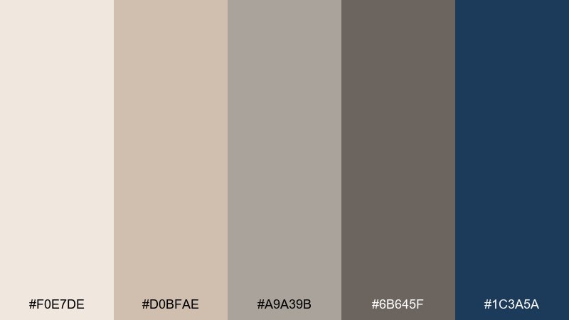
HEX: #F0E7DE #D0BFAE #A9A39B #6B645F #1C3A5A
Mood: coastal, trustworthy, refined
Best for: brand identity systems and corporate stationery
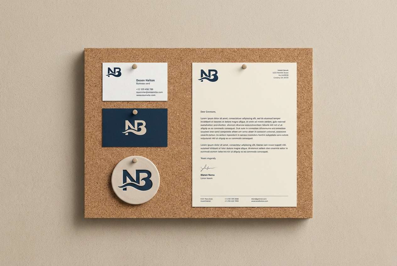
Coastal and trustworthy like driftwood beside deep water, this mix balances warmth with a confident blue anchor. It is one of those gray tan color combinations that can look both friendly and professional when used in a brand system. Keep the neutrals dominant for stationery, then use the navy for logos, links, and signature elements. Tip: set strict rules for the blue so it stays a premium accent rather than turning the whole look nautical.
Image example of driftwood branding generated using media.io
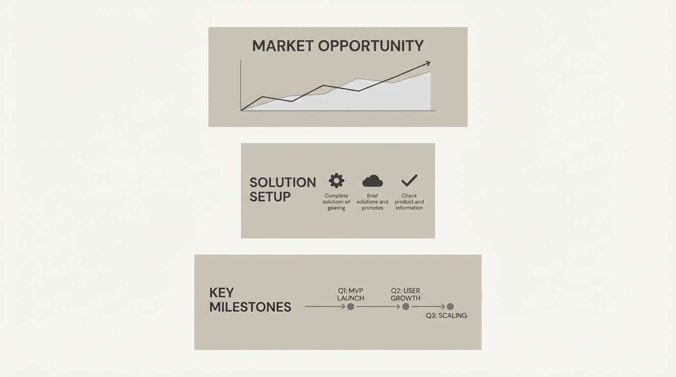
10) Urban Dune
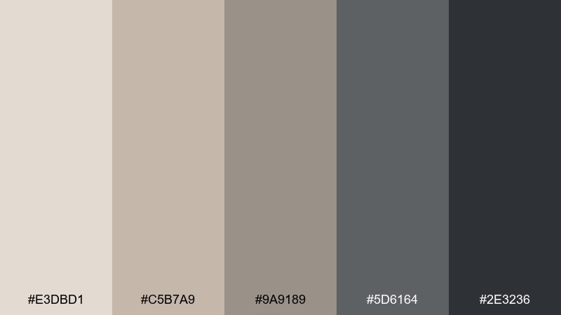
HEX: #E3DBD1 #C5B7A9 #9A9189 #5D6164 #2E3236
Mood: urban, balanced, understated
Best for: architectural presentations and pitch decks
Urban and understated like concrete warmed by late-afternoon sun, these tones feel composed and professional. The mid neutrals work well for diagrams, tables, and slide backgrounds that should not fight your content. Add the deeper grays for titles and key metrics to keep contrast crisp. Tip: introduce one bright highlight color only for calls to action so the deck stays clean.
Image example of urban dune generated using media.io
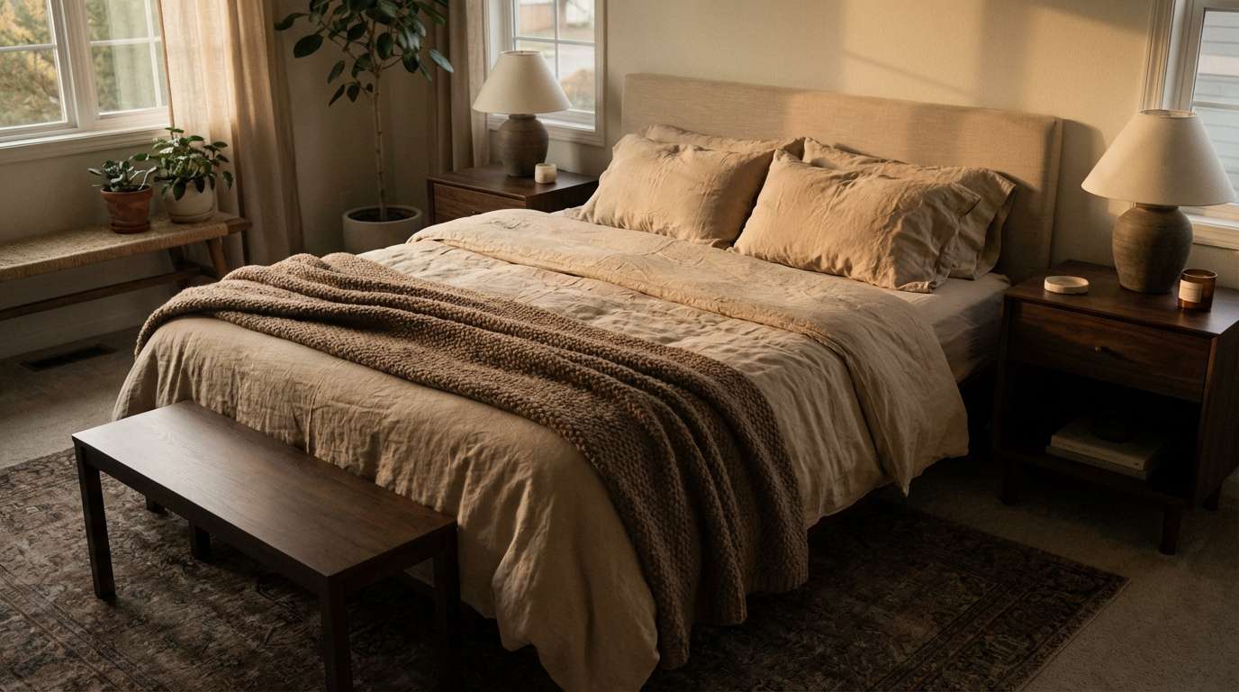
11) Mocha Mist
HEX: #EFE2D7 #CDB4A4 #A48D84 #6A5D57 #3A2F2B
Mood: rich, cozy, intimate
Best for: bedrooms, cafés, and lifestyle photography styling
Rich and cozy like cocoa steam in soft morning light, this palette leans warm without becoming heavy. Use the creamy beige for bedding or backdrop surfaces, then add mocha tones in throws, wood, and ceramics. The deep brown is perfect for leather accents and thin type that needs to feel classic. Tip: mix matte and satin finishes to keep the darker shades from flattening the scene.
Image example of mocha mist generated using media.io
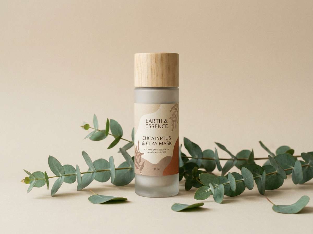
12) Eucalyptus Neutral
HEX: #F3EEE7 #D1C2B1 #A7A097 #6F7C73 #334039
Mood: fresh, muted, restorative
Best for: natural skincare ads and eco product pages
Fresh and restorative like eucalyptus sprigs on warm paper, these shades feel clean and grounded. The softened greens add a gentle health cue while the tans keep the look approachable. Pair with minimal photography, recycled textures, and plenty of breathing room. Tip: use the darkest green for buttons and ensure the contrast stays accessible on the light base.
Image example of eucalyptus neutral generated using media.io
13) Concrete & Honey
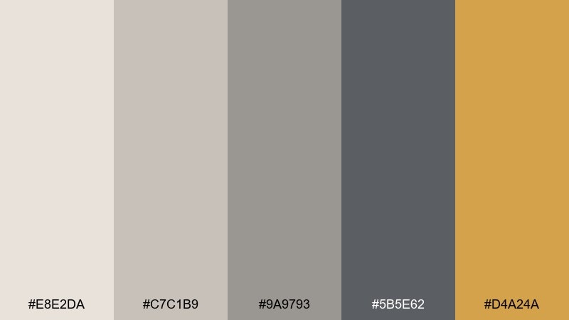
HEX: #E8E2DA #C7C1B9 #9A9793 #5B5E62 #D4A24A
Mood: industrial, bright, optimistic
Best for: startup branding and call-to-action design
Industrial but upbeat like sunlight on concrete, this set gets its energy from a honey accent. Among gray tan color combinations, the golden tone is a strong choice for highlights because it reads warm and modern rather than loud. Keep the neutrals for backgrounds and UI surfaces, then use honey for badges, icons, or one primary button. Tip: limit the accent to about 10 percent of the layout to keep it punchy.
Image example of concrete & honey generated using media.io
14) Dusty Ranch
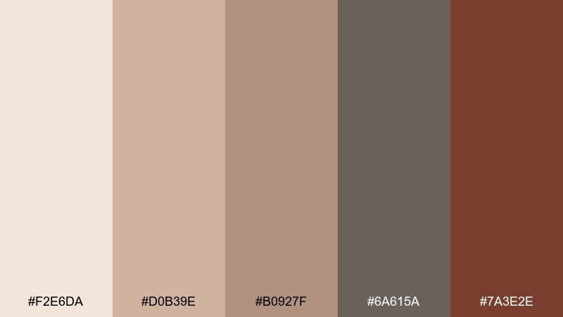
HEX: #F2E6DA #D0B39E #B0927F #6A615A #7A3E2E
Mood: rustic, sunbaked, welcoming
Best for: western-inspired events and rustic invitations
Rustic and sunbaked like a quiet ranch road, these shades bring warmth with a grounded, earthy edge. The terracotta-brown works well for monograms and border details, while the lighter tans keep the layout breathable. Pair with textured paper effects, simple line icons, and a classic serif. Tip: avoid pure black ink here; the deep gray-brown feels more authentic and softer to read.
Image example of dusty ranch generated using media.io

15) Winter Suede
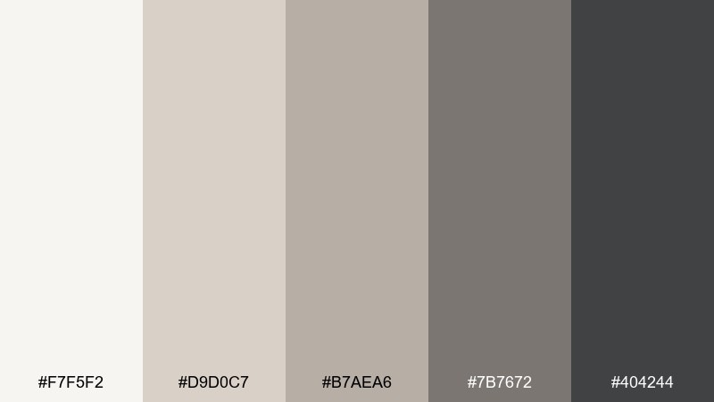
HEX: #F7F5F2 #D9D0C7 #B7AEA6 #7B7672 #404244
Mood: cool, soft, quiet luxury
Best for: fashion lookbooks and minimal e-commerce
Cool and soft like suede in winter light, this palette feels expensive and restrained. Use the pale tones for product pages so materials and silhouettes stand out naturally. The mid grays are ideal for size selectors and subtle UI outlines, while the dark slate makes typography sharp without looking stark. Tip: use large, high-resolution imagery and keep spacing generous to match the quiet-luxury mood.
Image example of winter suede generated using media.io
16) Copper Sand Accent
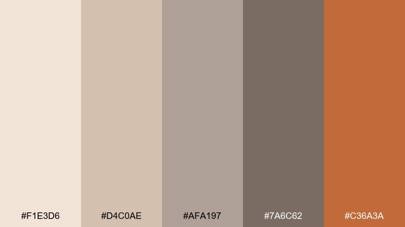
HEX: #F1E3D6 #D4C0AE #AFA197 #7A6C62 #C36A3A
Mood: warm, luminous, craft-forward
Best for: home decor ads and seasonal promos
Warm and luminous like copper catching sunset over sand, this mix feels inviting and handcrafted. The copper accent works best in small, intentional hits such as seals, headings, or decorative lines. Pair with natural materials like oak, rattan, and brushed metals to amplify the glow. Tip: keep shadows soft and avoid high saturation elsewhere so the copper stays the hero.
Image example of copper sand accent generated using media.io
17) Gallery Greige
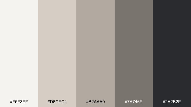
HEX: #F5F3EF #D6CEC4 #B2AAA0 #7A746E #2A2B2E
Mood: clean, curated, gallery-like
Best for: portfolio websites and creative studios
Clean and curated like a quiet gallery wall, these neutrals give work room to breathe. A gray tan color palette like this excels when you want images to feel consistent across a portfolio, even with mixed lighting. Use the darkest tone for navigation and captions, and keep backgrounds in the softest off-whites for a premium look. Tip: add a subtle warm gray border around images to unify thumbnails without heavy frames.
Image example of gallery greige generated using media.io
18) Cocoa Chalk
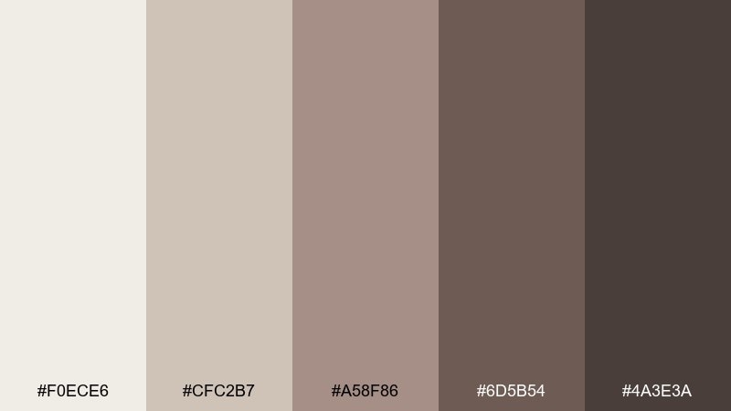
HEX: #F0ECE6 #CFC2B7 #A58F86 #6D5B54 #4A3E3A
Mood: vintage, academic, warm
Best for: book covers and stationery sets
Vintage and academic like chalk dust on a cocoa-brown board, these tones feel thoughtful and tactile. They shine on paper goods, journals, and cover designs where texture matters as much as color. Use the light shades for background and margins, then build hierarchy with the deeper browns for titles and ornaments. Tip: add subtle speckle or embossing so the mid tones do not blend together in print.
Image example of cocoa chalk generated using media.io
19) Seaside Taupe
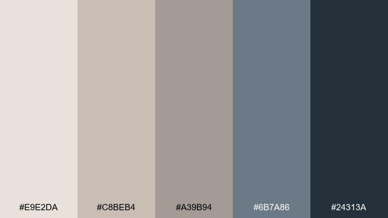
HEX: #E9E2DA #C8BEB4 #A39B94 #6B7A86 #24313A
Mood: breezy, quiet, coastal modern
Best for: travel branding and airy landing pages
Breezy and quiet like fog rolling over a calm shoreline, this palette mixes warm neutrals with cool sea-slate. The blues are muted enough to stay sophisticated, making them perfect for links, icons, and subtle gradients. Keep the tans as your main canvas and let the cool tones provide depth in headers and footers. Tip: use large typography and gentle line icons to match the airy, coastal pace.
Image example of seaside taupe generated using media.io
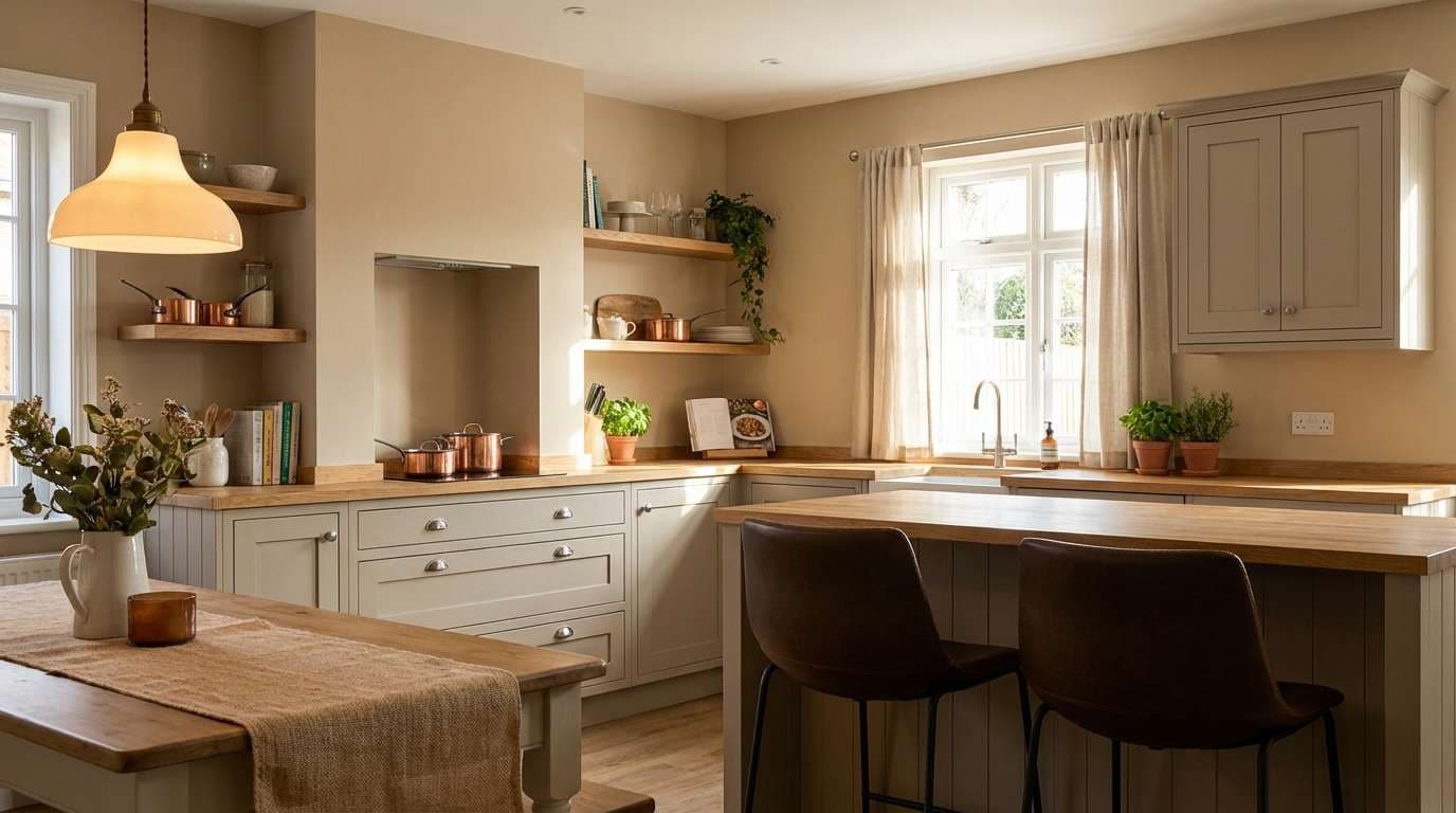
20) Hearthstone Cozy
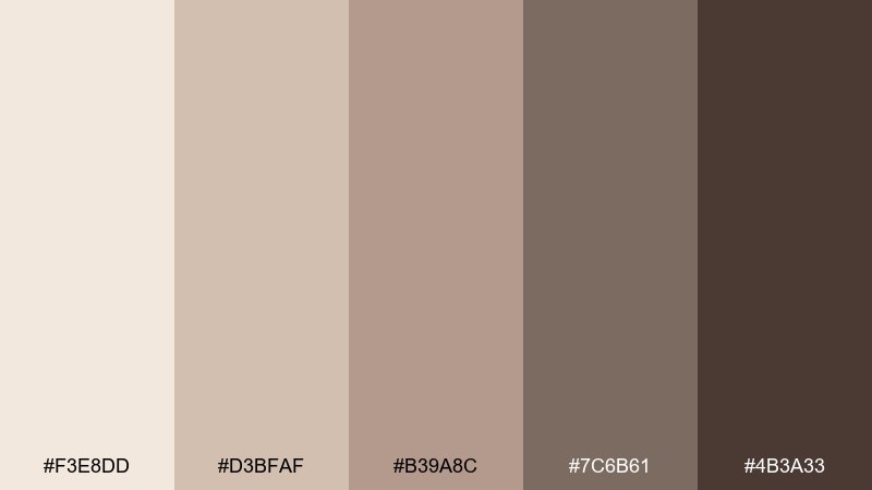
HEX: #F3E8DD #D3BFAF #B39A8C #7C6B61 #4B3A33
Mood: cozy, nostalgic, grounded
Best for: kitchen interiors and comfort-food packaging
Cozy and nostalgic like a hearth in a stone cottage, these shades feel comforting and familiar. Use the creamy tan for walls or label backgrounds, then bring in deeper browns for typography and illustrated details. The mid tones suit wood cabinets, kraft paper, and natural fibers without feeling too rustic. Tip: add a small pop of off-white space around logos so darker elements do not crowd the design.
Image example of hearthstone cozy generated using media.io
What Colors Go Well with Gray Tan?
Gray tan pairs naturally with soft whites, charcoal, and warm wood tones, which keeps the overall look cohesive and grounded. These combinations are ideal when you want a neutral color scheme that still feels layered and intentional.
For accents, muted blues (navy, slate, dusty denim) add trustworthy contrast, while botanical greens (eucalyptus, olive, deep forest) bring a calm, natural cue. If you want more energy, small touches of honey or terracotta can warm the palette without overpowering it.
In digital work, choose one accent color and keep most UI surfaces within the greige range to reduce visual noise. This makes buttons, links, and status colors easier to recognize at a glance.
How to Use a Gray Tan Color Palette in Real Designs
Start with a light base (off-white or cream) for the largest areas, then add a mid greige for secondary surfaces like cards, furniture upholstery, or background panels. This creates depth without introducing new hues.
Use the darkest tone strategically for structure: headings, key metrics, nav bars, hardware, or frames. Repeating that dark shade in a couple of small places helps balance the composition and avoids a single heavy “contrast block.”
To keep gray tan from feeling flat, vary texture and finish—matte paint, linen, stone, brushed metal, or subtle grain. You’ll get richness while staying inside a minimal, modern palette.
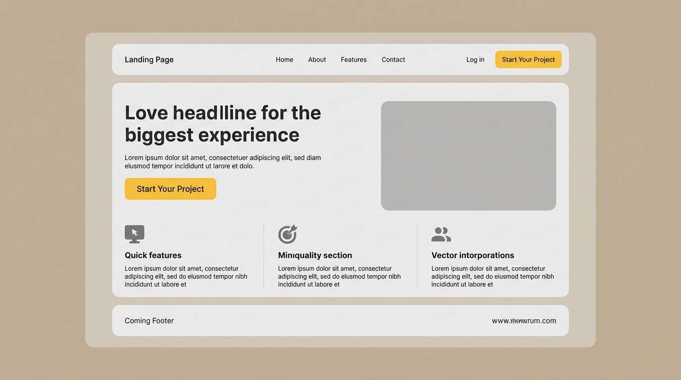
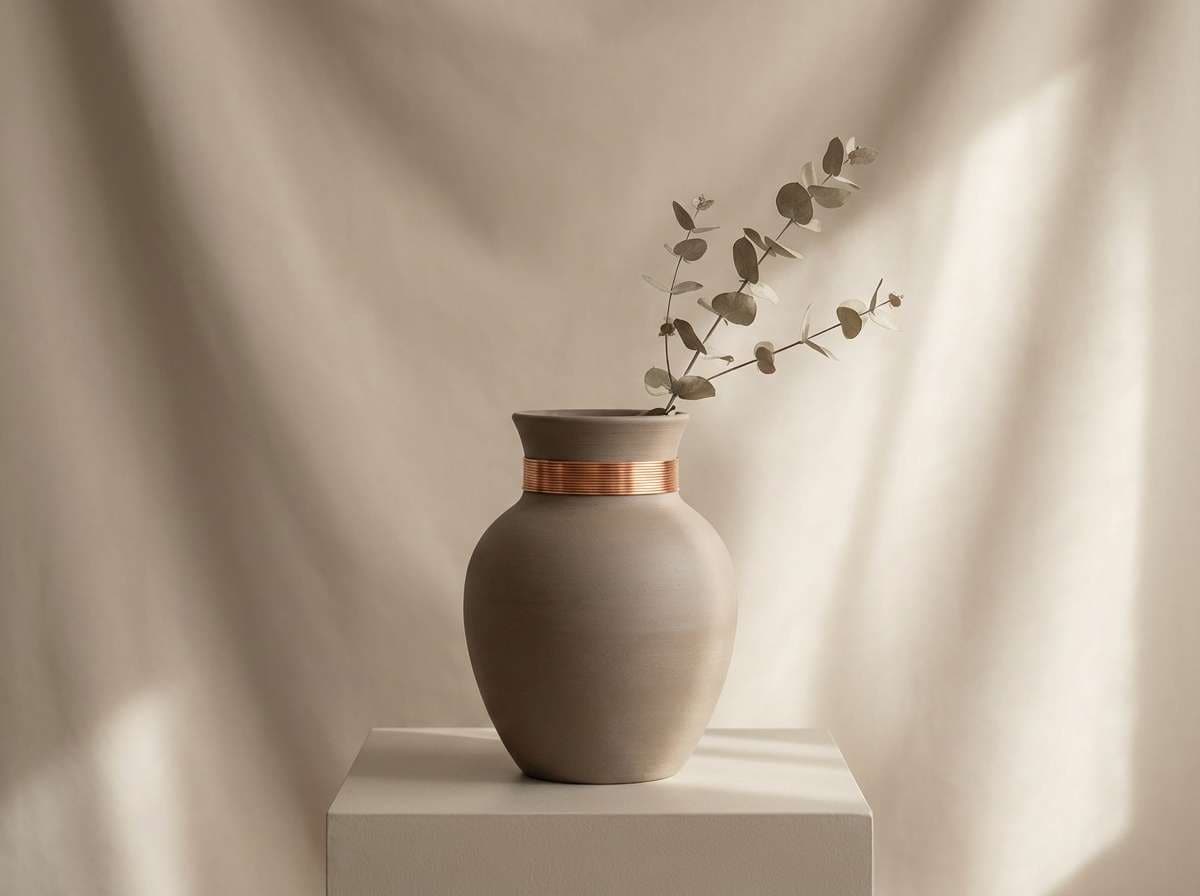
Create Gray Tan Palette Visuals with AI
If you’re presenting a concept, it helps to show gray tan tones in context—rooms, product shots, UI screens, or branding mockups. Visual examples make stakeholders feel the mood immediately.
With Media.io Text to Image, you can generate on-style scenes (like cozy interiors, editorial layouts, or packaging renders) and refine them fast by adjusting prompts, lighting, and aspect ratios.
Use your palette HEX codes as a guide, then describe materials and lighting (linen, concrete, oak, diffused daylight) to keep the output true to your intended greige palette.
Gray Tan Color Palette FAQs
-
What is a gray tan color (and is it the same as greige)?
Gray tan is a balanced neutral that sits between beige/tan warmth and gray coolness. “Greige” is commonly used to describe the same family, especially in interiors and paint colors. -
Does gray tan work better with warm or cool lighting?
It works in both, but the undertone will shift: warm lighting makes it read more sandy/beige, while cool lighting pushes it toward stone/gray. Test your lightest and mid tones in the real environment before committing. -
What accent colors look best with gray tan palettes?
Muted navy and slate blue add crisp contrast, eucalyptus/olive greens add a natural feel, and small terracotta or honey accents add warmth and energy without breaking the neutral vibe. -
How do I keep a gray tan palette from looking muddy?
Increase separation between values (very light base + clear mid + deep dark), keep margins/whitespace generous, and avoid using too many mid tones at once. Texture can add richness without adding extra colors. -
Is a gray tan palette good for UI design and accessibility?
Yes, as long as you check contrast. Use near-black or deep charcoal for primary text and critical UI elements, and reserve light neutrals for backgrounds to maintain readable contrast ratios. -
What’s a simple rule for using neutrals in a brand system?
Let neutrals dominate (around 80–90% of surfaces), then keep one accent color tightly controlled for key elements like links, logos, badges, or primary buttons. -
Can I generate realistic gray tan interiors or product mockups with AI?
Yes. Describe materials (linen, limestone, oak, brushed metal), lighting (soft daylight, diffused shadows), and composition (clean, minimal) to keep AI images aligned with gray tan tones.


