

White is more than “no color.” In design, it’s a powerful base that makes typography sharper, layouts cleaner, and accents feel intentional.
Below are 20+ white color palette ideas with HEX codes you can copy, plus practical tips for contrast, readability, and real-world usage.
In this article
Why White Palettes Work So Well
White palettes create instant clarity. They reduce visual noise, give content room to breathe, and help users focus on what matters—headlines, products, data, or calls to action.
They also make color accents feel stronger. Even a small amount of teal, lilac, terracotta, or neon can read as deliberate emphasis when it sits on a clean white foundation.
Finally, whites are flexible across mediums. With smart contrast choices, they translate well from UI to print, branding to interiors, without forcing a trendy look.
20+ White Color Palette Ideas (with HEX Codes)
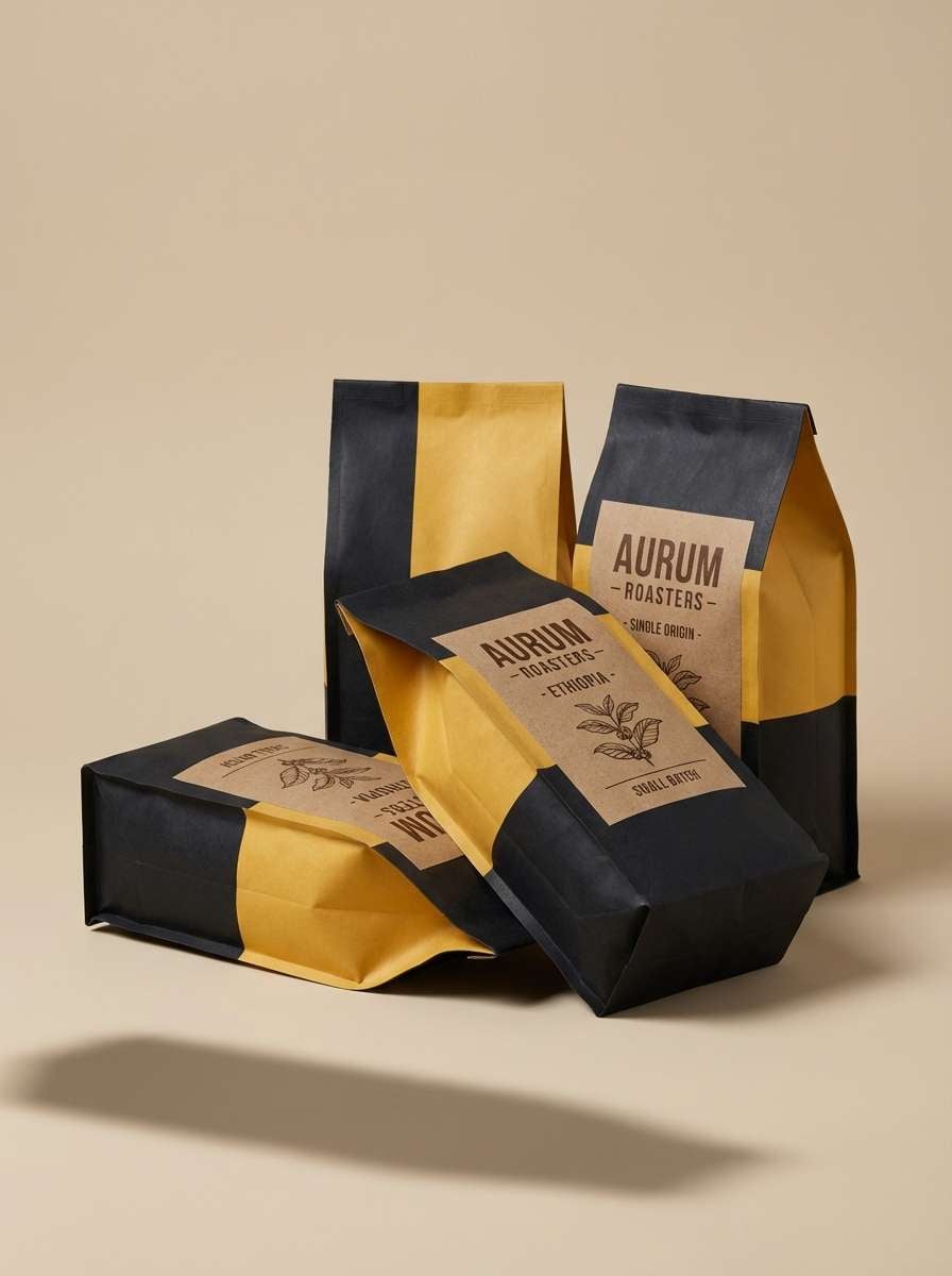
1) Snow Studio
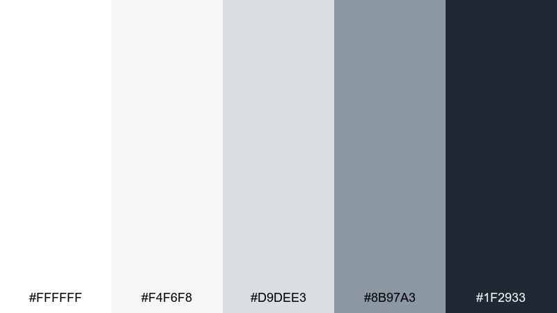
HEX: #ffffff #f4f6f8 #d9dee3 #8b97a3 #1f2933
Mood: crisp, modern, airy
Best for: saas dashboard ui
Crisp whites and cool grays evoke a bright studio with clean light and sharp edges. Use it for dashboards where spacing, hierarchy, and readability need to feel effortless. Pair slate text with subtle dividers and reserve the deep charcoal for primary CTAs and key metrics. Tip: keep shadows soft and consistent so cards feel elevated without looking heavy.
Image example of snow studio generated using media.io

Media.io is an online AI studio for creating and editing video, image, and audio in your browser.

2) Ivory Linen
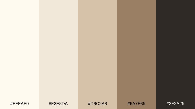
HEX: #fffaf0 #f2e8da #d6c2a8 #9a7f65 #2f2a25
Mood: warm, natural, relaxed
Best for: lifestyle blog header design
Warm ivory and linen tones feel like sunlit fabric and handmade paper. They work beautifully for blog headers, mood boards, and hero sections that need calm warmth without looking yellow. Pair the mocha brown for headlines and use the tan as a gentle accent for buttons or tags. Tip: choose slightly textured backgrounds to make the neutrals feel intentional rather than flat.
Image example of ivory linen generated using media.io
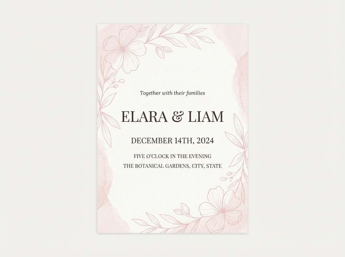
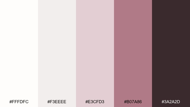
3) Alabaster Blush
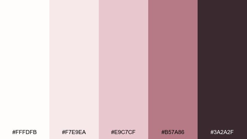
HEX: #fffdfb #f7e9ea #e9c7cf #b57a86 #3a2a2f
Mood: romantic, soft, polished
Best for: wedding invitation design
Delicate blush over alabaster reads like petals on fine stationery. It fits invitations and save-the-dates where elegance matters more than bold contrast. Pair the deep rose-brown for names and dates, and keep blush accents to borders, monograms, or small motifs. Tip: print designs look richer when you use the darkest tone sparingly but consistently for type.
Image example of alabaster blush generated using media.io
4) Porcelain Blue
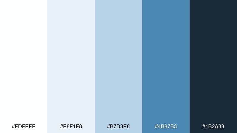
HEX: #fdfefe #e8f1f8 #b7d3e8 #4b87b3 #1b2a38
Mood: clinical, calm, trustworthy
Best for: healthcare app ui
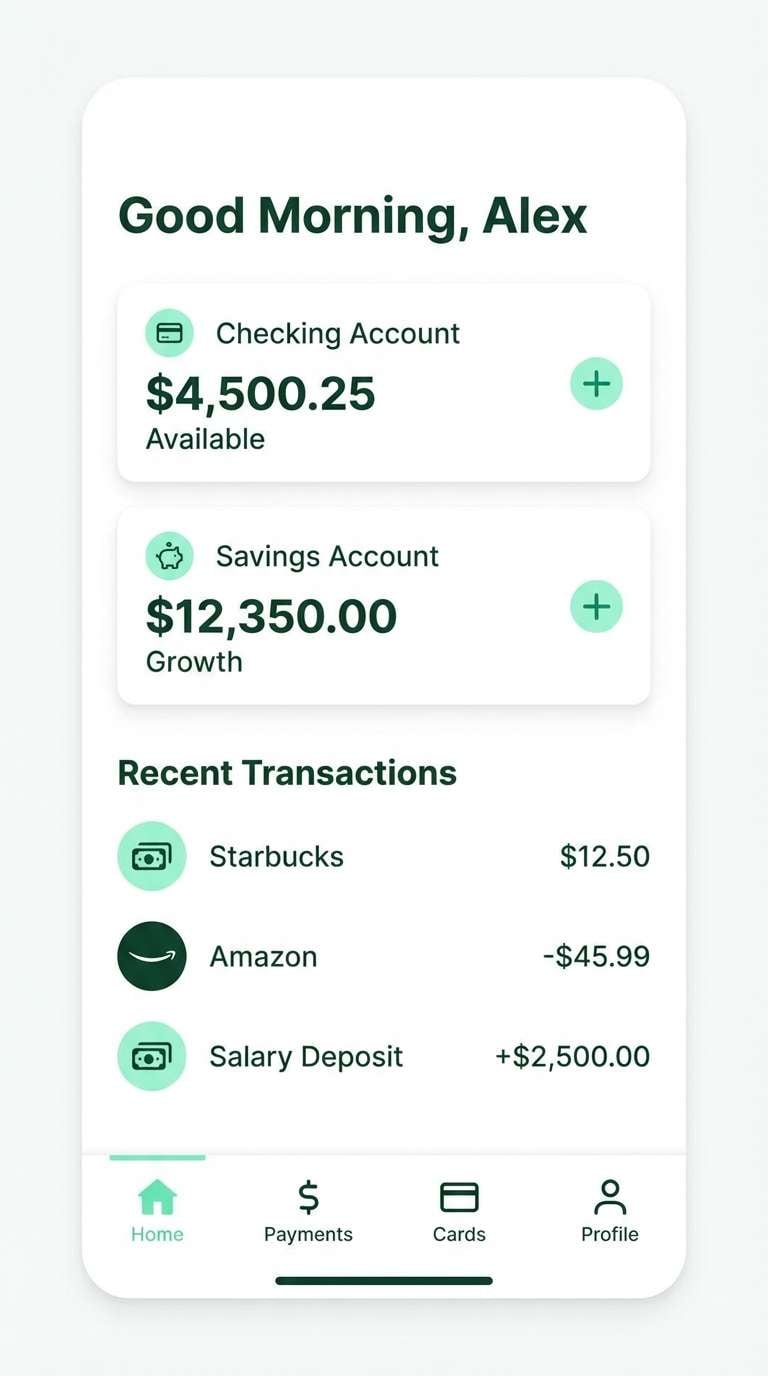
Cool porcelain and clean blues suggest clarity, care, and order. Use it for healthcare interfaces where calm feedback states and legible data are essential. Pair navy for critical labels and use the mid-blue for links, toggles, and info banners. Tip: keep error and success colors separate from this set so alerts stay unmistakable.
Image example of porcelain blue generated using media.io
5) Chalk Charcoal
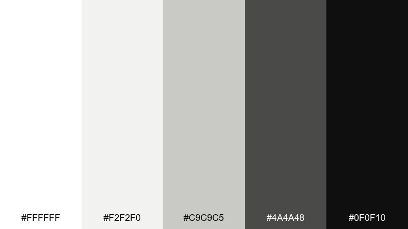
HEX: #ffffff #f2f2f0 #c9c9c5 #4a4a48 #0f0f10
Mood: minimal, bold, editorial
Best for: logo and wordmark design
High-contrast neutrals feel like chalk on a blackboard: simple, graphic, and confident. It suits logos, wordmarks, and brand systems that rely on typography and spacing. Use charcoal for the mark, keep near-black for premium emphasis, and let soft gray carry secondary layouts. Tip: test the logo at tiny sizes to ensure the mid-gray does not muddy edges.
Image example of chalk charcoal generated using media.io
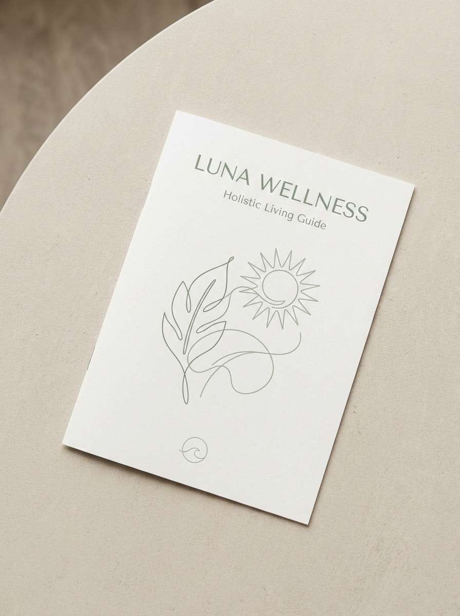
6) Pearl Sage Calm
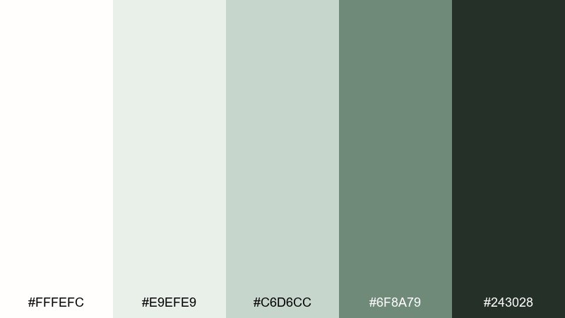
HEX: #fffefc #e9efe9 #c6d6cc #6f8a79 #243028
Mood: fresh, restorative, spa-like
Best for: wellness brand brochure
Pearly whites and sage greens evoke quiet mornings, steam, and eucalyptus. This white color palette is ideal for wellness brochures where you want softness without losing structure. Pair the deep forest for section headers and use sage as a calming accent for icons, rules, and callouts. Tip: leave generous margins so the palette can breathe and feel premium.
Image example of pearl sage calm generated using media.io
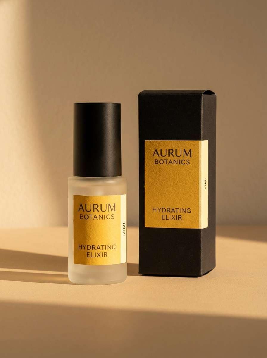
7) Frosted Lilac
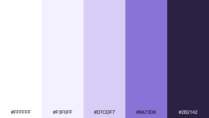
HEX: #ffffff #f3f0ff #d7cdf7 #8a73d6 #2b2142
Mood: dreamy, clean, feminine
Best for: beauty product packaging
Soft lilac on bright neutrals feels like frosted glass and gentle fragrance. Use it for beauty packaging where you want a modern, delicate look rather than sugary pastels. Pair deep violet for ingredient text and use the mid-purple for brand marks or seals. Tip: keep the label mostly light and use violet only where legibility is critical.
Image example of frosted lilac generated using media.io
8) Coconut Sand
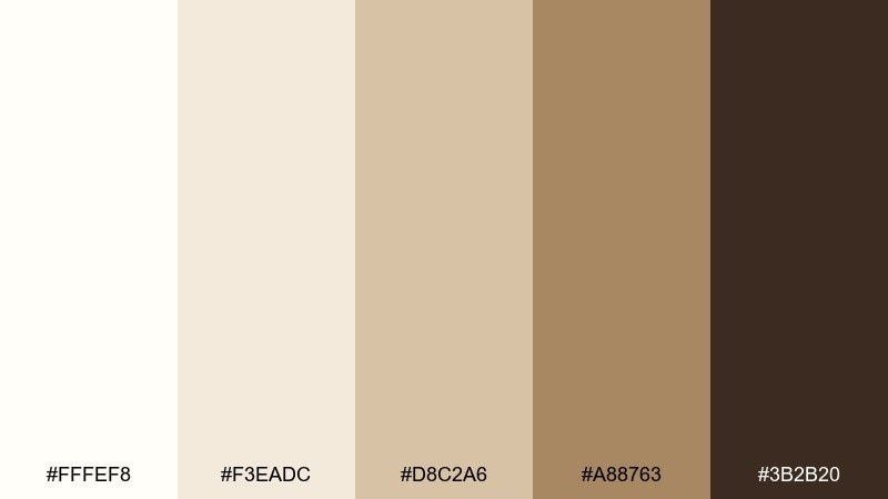
HEX: #fffef8 #f3eadc #d8c2a6 #a88763 #3b2b20
Mood: coastal, cozy, sun-warmed
Best for: living room interior palette
Creamy whites and sandy beiges bring to mind driftwood, woven rugs, and relaxed afternoons. It works well for living rooms, cafes, and hospitality spaces that need warmth without clutter. Pair the deeper cocoa for wood tones or metal finishes, and keep the lightest shade on walls or large textiles. Tip: add one matte black accent to sharpen edges and prevent the room from feeling washed out.
Image example of coconut sand generated using media.io
9) Glacier Teal
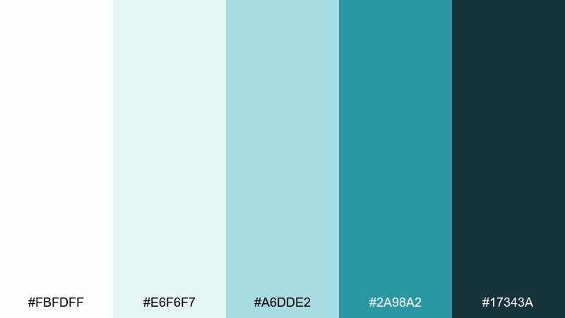
HEX: #fbfdff #e6f6f7 #a6dde2 #2a98a2 #17343a
Mood: fresh, energetic, techy
Best for: startup pitch deck slides
Icy whites with teal energy feel like clean water and sharp momentum. Use it in pitch decks where charts and product screenshots need a modern, optimistic frame. Pair the deep blue-green for headings and use teal for key numbers, arrows, and highlights. Tip: keep teal accents under 15 percent of each slide to avoid visual noise.
Image example of glacier teal generated using media.io
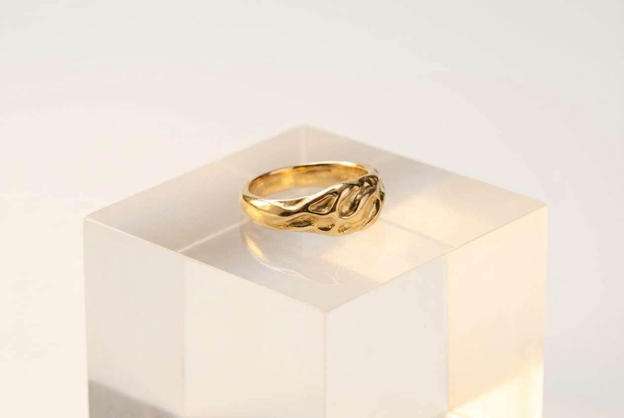
10) Milk Glass Gold
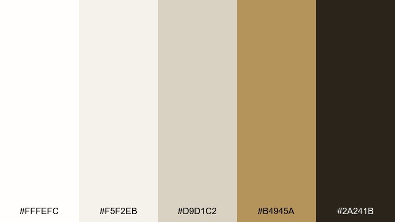
HEX: #fffefc #f5f2eb #d9d1c2 #b4945a #2a241b
Mood: luxurious, soft, timeless
Best for: jewelry product ad
Milky neutrals with brushed gold feel like vintage glass and warm spotlighting. It suits jewelry ads, premium landing pages, and boutique packaging that needs understated shine. Pair gold for small accents like borders or price tags, and anchor the layout with espresso text for clarity. Tip: use plenty of negative space so metallic elements look intentional, not decorative.
Image example of milk glass gold generated using media.io
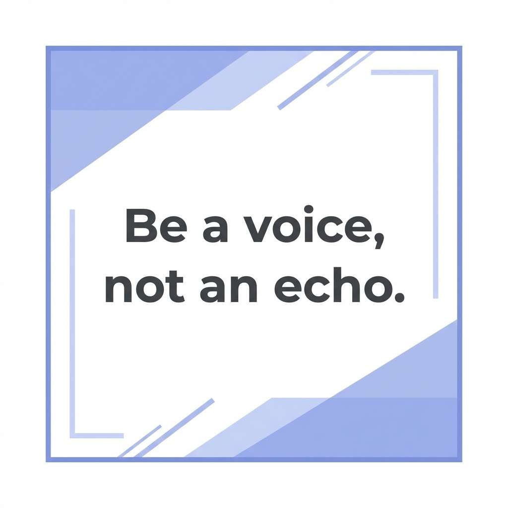
11) Cotton Note
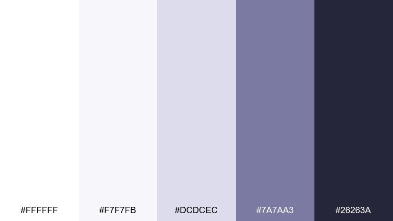
HEX: #ffffff #f7f7fb #dcdcec #7a7aa3 #26263a
Mood: gentle, tidy, contemporary
Best for: social media quote post
Soft cotton whites with muted periwinkle feel calm and thoughtful, like a quiet notebook page. Use it for quote posts, announcements, and simple carousels where typography should lead. Pair the deep ink for the main message and use the mid tone for author names or dividers. Tip: increase line spacing slightly to keep the design airy on small screens.
Image example of cotton note generated using media.io
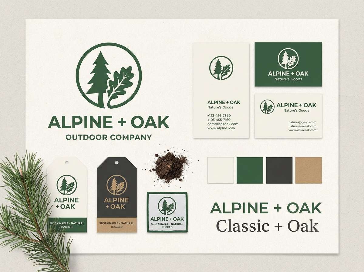
12) Nordic Pine
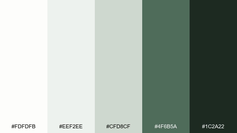
HEX: #fdfdfb #eef2ee #cfd8cf #4f6b5a #1c2a22
Mood: grounded, outdoorsy, refined
Best for: outdoor brand identity
Cool off-whites and pine greens feel like fog over evergreens and clean mountain air. It works for outdoor brands that want to look premium without going too rugged. Pair the darkest green for logos and labels, and keep the lightest tones for packaging bases and web backgrounds. Tip: add subtle grain or paper texture to enhance the natural character.
Image example of nordic pine generated using media.io
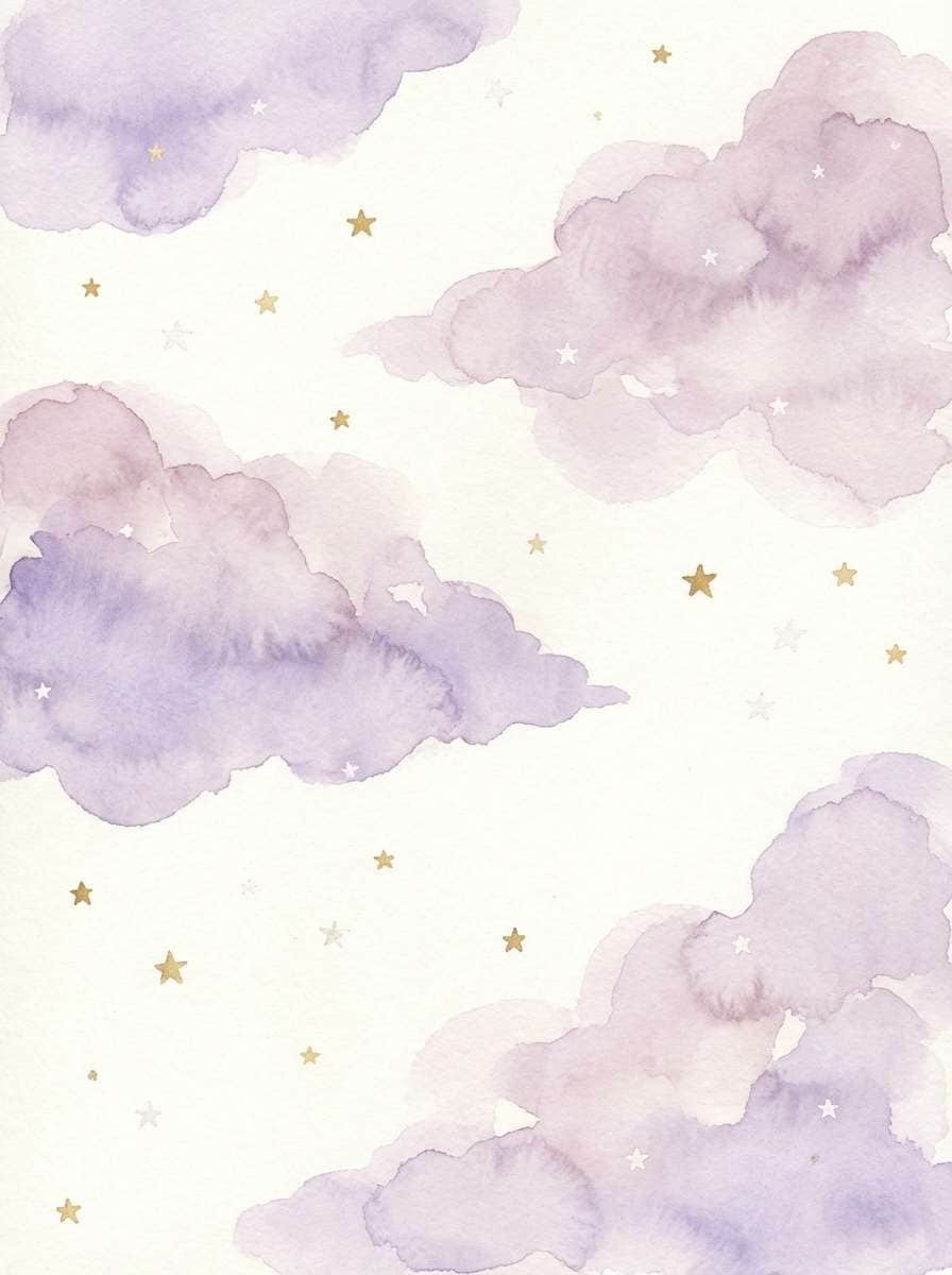
13) Cloudy Lavender
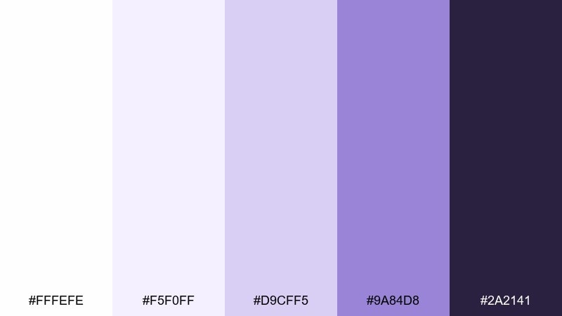
HEX: #fffefe #f5f0ff #d9cff5 #9a84d8 #2a2141
Mood: soothing, whimsical, light
Best for: nursery wall art print
Pale lavender drifting over clean neutrals feels like soft clouds at bedtime. It is perfect for nursery prints, gentle greeting cards, and calming bedroom accents. Pair the deeper purple for small details like stars or names, and keep the rest airy so the art stays restful. Tip: if printing, choose a slightly warm paper stock to avoid a cold cast.
Image example of cloudy lavender generated using media.io
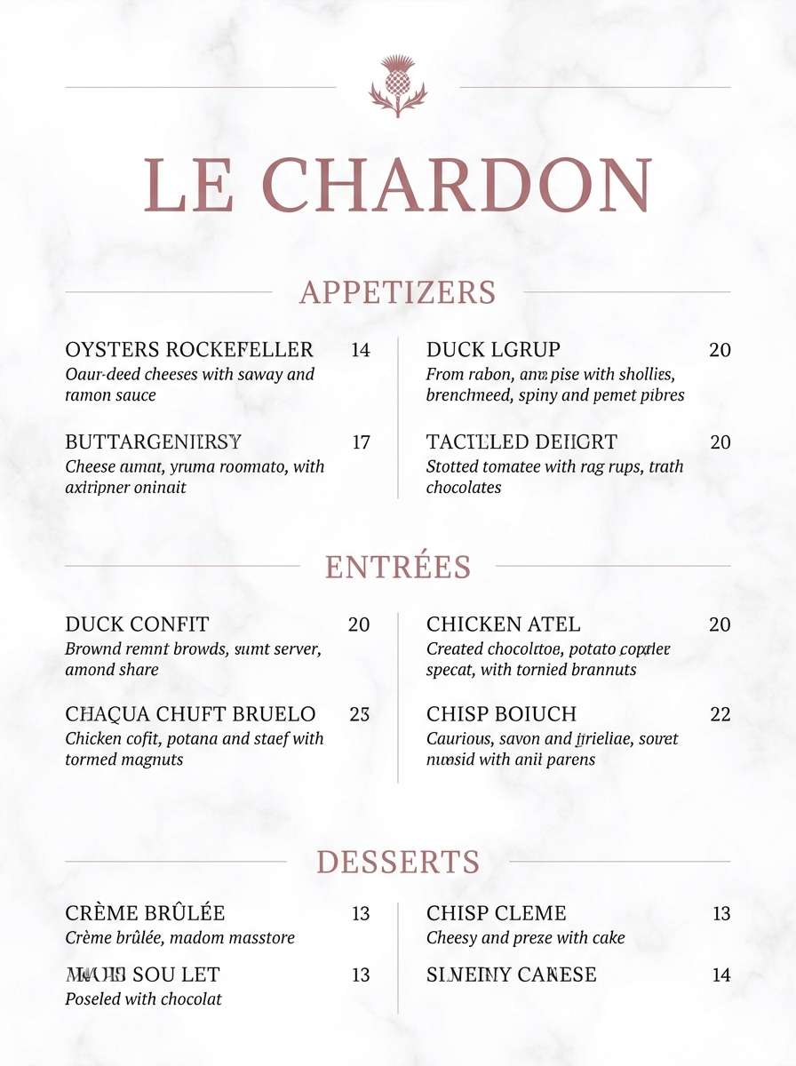
14) Marble Rose
HEX: #fffdfc #f3eeee #e3cfd3 #b07a86 #3a2a2d
Mood: elegant, romantic, upscale
Best for: restaurant menu design
Marble-like whites with dusty rose accents feel refined and date-night ready. Use it for menus where you want softness, but still need clear scanning of sections and prices. Pair the dark wine-brown for dish names and use rose for section titles or subtle separators. Tip: keep backgrounds very light so food photography or icons do not clash with the text.
Image example of marble rose generated using media.io
15) Winter Citrus
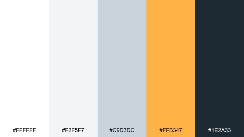
HEX: #ffffff #f2f5f7 #c9d3dc #ffb347 #1e2a33
Mood: bright, clean, optimistic
Best for: event flyer design
Cool winter neutrals with a punch of citrus orange feel like sunlight on fresh snow. It is great for flyers and announcements that need a clean base with a single energetic accent. Pair charcoal for body copy and use orange for dates, tickets, or one standout graphic element. Tip: limit orange to one or two areas per layout so it reads as intentional emphasis.
Image example of winter citrus generated using media.io

16) Paperback Ink
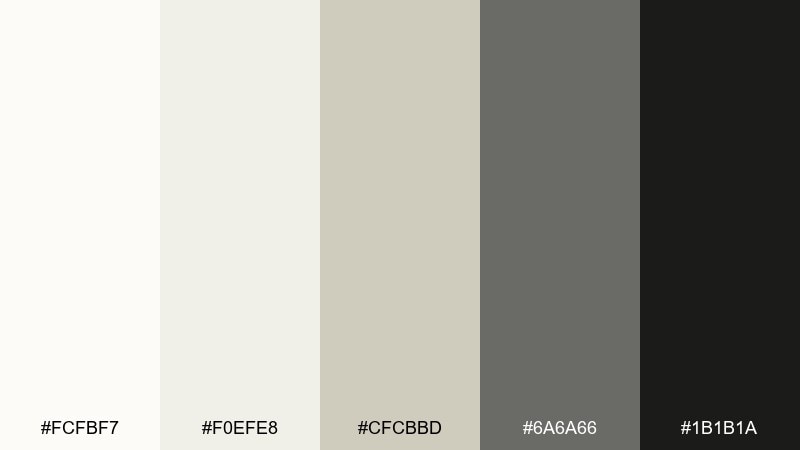
HEX: #fcfbf7 #f0efe8 #cfcbbd #6a6a66 #1b1b1a
Mood: literary, classic, understated
Best for: editorial magazine layout
Creamy paper tones and inky neutrals evoke dog-eared novels and quiet coffee shops. Use it for editorial layouts where typography and grid rhythm do most of the storytelling. Pair near-black for headlines and keep the mid-gray for captions, folios, and rules. Tip: choose one serif and one sans font, then stick to a tight type scale for consistency.
Image example of paperback ink generated using media.io
17) Ceramic Terracotta

HEX: #fffdfa #f2efe7 #d7c9b8 #c56b4a #2d2622
Mood: artisan, earthy, welcoming
Best for: home decor catalog
Soft ceramic neutrals with terracotta warmth feel handmade and grounded. It suits home decor catalogs, product sheets, and interior mood boards where materials should look tactile. Pair the clay tone for callouts and section dividers, while using espresso for product names and specs. Tip: keep photos warm and natural so the terracotta reads rich instead of orange.
Image example of ceramic terracotta generated using media.io
18) Snowfall Neon
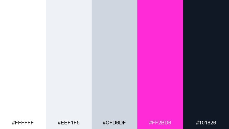
HEX: #ffffff #eef1f5 #cfd6df #ff2bd6 #101826
Mood: bold, playful, futuristic
Best for: music event poster
Bright snowfall whites with neon magenta feel like club lights cutting through winter air. These white color combinations are ideal for posters that need maximum contrast and a modern punch. Pair the deep navy for the main background blocks and reserve magenta for the artist name, date, and one striking shape. Tip: use large type and simple geometry so the neon accent stays readable from a distance.
Image example of snowfall neon generated using media.io

19) Vanilla Mocha
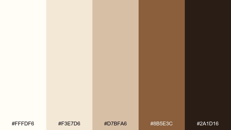
HEX: #fffdf6 #f3e7d6 #d7bfa6 #8b5e3c #2a1d16
Mood: cozy, friendly, appetizing
Best for: coffee shop packaging
Vanilla cream and mocha browns feel like warm foam, roasted beans, and paper cups. It works well for coffee packaging and labels where you want instant comfort and clear shelf readability. Pair the dark roast tone for flavor names and use the tan for badges or roast indicators. Tip: keep the lightest shade as the main label base to avoid a muddy look in print.
Image example of vanilla mocha generated using media.io
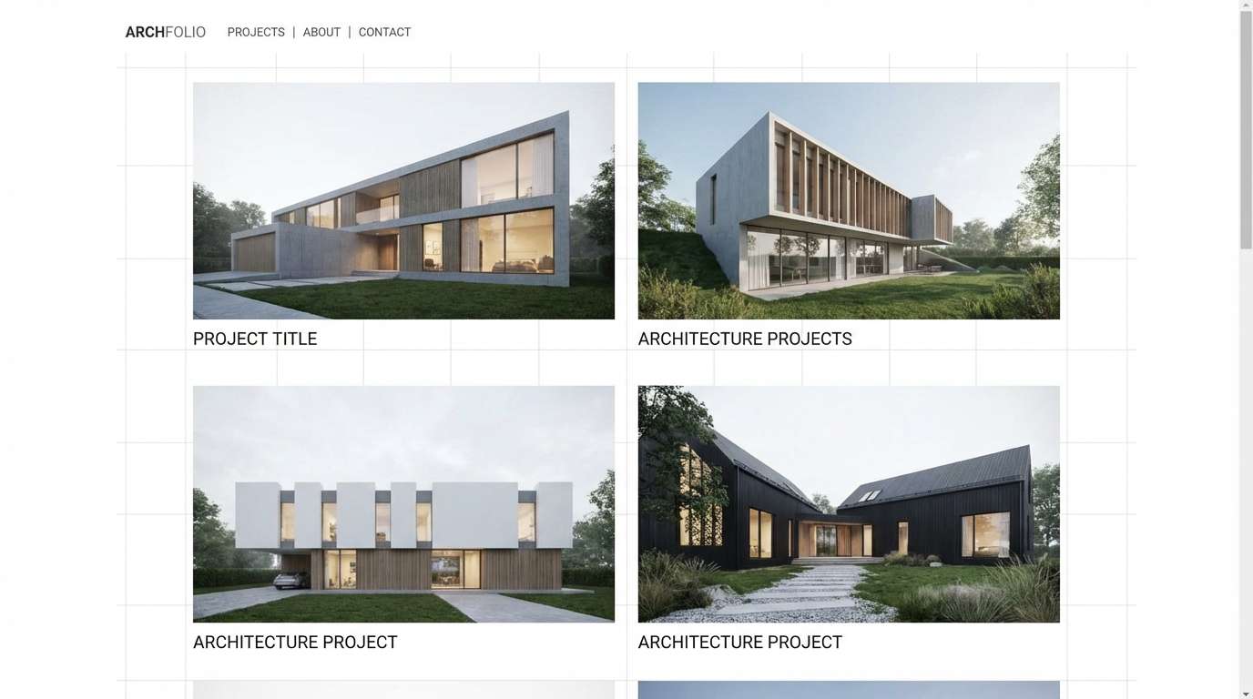
20) Quiet Quartz
HEX: #ffffff #f3f4f6 #d1d5db #9aa3af #111827
Mood: professional, neutral, architectural
Best for: architecture portfolio website
Quiet whites and quartz grays feel structured, precise, and gallery-clean. Use it for portfolio sites where photography and project drawings should be the main focus. Pair near-black for navigation and captions, and use the mid grays for grids, lines, and subtle hover states. Tip: keep backgrounds consistent across pages to make projects feel cohesive.
Image example of quiet quartz generated using media.io
21) Opal Mint
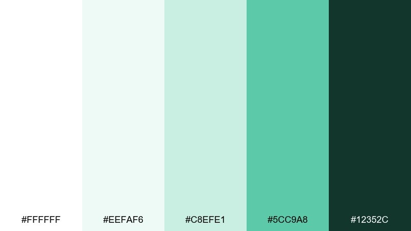
HEX: #ffffff #eefaf6 #c8efe1 #5cc9a8 #12352c
Mood: clean, refreshing, upbeat
Best for: mobile banking ui
Opal whites with mint highlights feel hygienic and reassuring, like a fresh start. It suits banking and fintech screens where trust and clarity are non-negotiable. Pair the deep green for balances and titles, and use mint for positive states, progress, and confirmation messages. Tip: avoid using mint for body text; keep it for accents so accessibility stays strong.
Image example of opal mint generated using media.io
What Colors Go Well with White?
White pairs well with almost any hue, which is why it’s a go-to for modern UI and branding. Deep neutrals (charcoal, ink, navy) are the safest partners for readable typography and strong hierarchy.
For a softer look, combine white with warm beiges, linen tones, or gentle blush for an inviting, editorial feel. For energy, add one saturated accent (teal, citrus orange, neon magenta) and keep everything else quiet.
If you’re unsure, pick one accent color, one text color, and let white (plus an off-white) do the rest. The more restrained the palette, the more “designed” it looks.
How to Use a White Color Palette in Real Designs
Start by choosing your “white.” Pure #ffffff can feel sharp on screens, while off-whites (ivory, milk glass, paper tones) feel warmer and reduce glare—especially for long reading.
Build contrast intentionally: use dark tones for body text and key UI elements, mid-grays for dividers and secondary labels, and reserve your accent for actions, highlights, and small brand moments.
Add depth without clutter by relying on spacing, subtle shadows, and texture. In print or interiors, a slight grain or material finish can keep white from feeling flat or unfinished.
Create White Palette Visuals with AI
If you want to see these white color combinations in action, generate quick mockups with AI. You can test how a palette looks on posters, packaging, app screens, or interior scenes before committing to a full design.
Reuse the prompts above as a starting point, then swap in your brand keywords, layout type, and aspect ratio to match your project. This makes it easy to compare multiple white tones and accent strengths side by side.
Once you find a direction, keep your system consistent: background white(s), text dark(s), one main accent, and a small set of supporting neutrals.
White Color Palette FAQs
-
Is white a good base color for branding?
Yes. White creates a clean, premium foundation that helps typography, photography, and accent colors stand out. The key is to pair it with a consistent dark text color and one or two brand accents. -
What’s the difference between pure white and off-white in design?
Pure white (#ffffff) looks crisp and modern but can feel harsh on large screen areas. Off-whites (ivory, milk, paper tones) reduce glare and add warmth or softness while still reading as “white.” -
What text color works best on a white background?
Near-black or deep charcoal usually reads best (for example #111827, #1f2933, or #0f0f10). Mid-grays can work for secondary text, but avoid light gray body text because it often fails readability and accessibility. -
How do I keep a white palette from looking boring?
Use contrast, spacing, and texture. Add one strong accent color (like teal, orange, or magenta), introduce subtle shadows or dividers, and consider a gentle paper grain or tinted off-white background. -
Which accent colors pair best with white for UI design?
Teal, blue, mint, and violet are popular because they feel modern and clear on white. For high attention (CTAs or highlights), a single bright accent like citrus orange or neon magenta can work well when used sparingly. -
How many colors should a white-based palette include?
A practical system is 1–2 whites/off-whites, 1–2 grays for UI structure, 1 dark for text, and 1 accent. This keeps layouts cohesive while still giving you enough flexibility for states and hierarchy. -
Can I use a white palette for print projects like menus or invitations?
Absolutely. Choose an off-white that suits the paper stock, keep the darkest ink tone consistent for type, and use a restrained accent (blush, gold, or rose) to add elegance without losing clarity.
Next: Plum Color Palette


