

Gray light blue sits in that sweet spot between modern neutral and gentle color. It reads clean and professional, yet still feels calm, approachable, and fresh across digital and print projects.
Below are 20 curated gray light blue color palette ideas with HEX codes, plus practical examples you can generate with Media.io for UI, branding, interiors, and more.
In this article
Why Gray Light Blue Palettes Work So Well
Gray light blue palettes feel instantly “designed” because they combine the neutrality of gray with the clarity of blue. That balance makes layouts look tidy, spacious, and trustworthy without feeling sterile.
They also support strong hierarchy. Soft, airy tints work well for backgrounds and cards, while deeper blue-grays create dependable contrast for headings, navigation, and calls to action.
Finally, these cool-toned combinations play nicely with materials and media: they print cleanly, photograph well, and pair with warm accents (wood, beige, brass) when you need more personality.
20+ Gray Light Blue Color Palette Ideas (with HEX Codes)
1) Harbor Mist
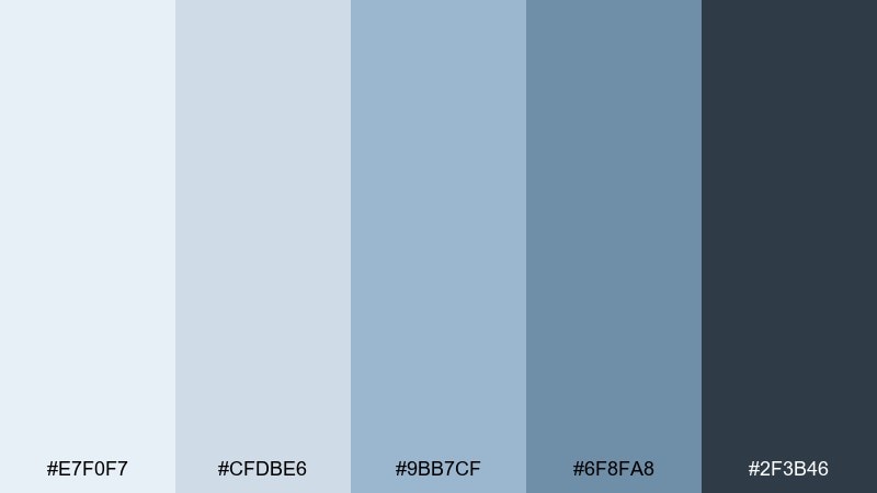
HEX: #E7F0F7 #CFDBE6 #9BB7CF #6F8FA8 #2F3B46
Mood: calm and airy
Best for: coastal home decor moodboard
Calm and airy like fog rolling over a quiet marina, these tones feel fresh without turning icy. The mix balances soft gray light blue with a deep charcoal anchor for contrast. It works beautifully for coastal interiors, lifestyle branding, and presentation decks where you want clarity. Pair with bleached wood, linen textures, and a small brass accent, and keep the darkest tone for headings or trim to avoid a washed look. This gray light blue color palette also holds up well in large, open backgrounds.
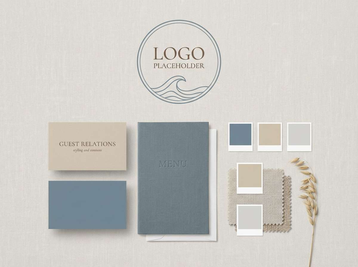
Image example of harbor mist generated using media.io
Media.io is an online AI studio for creating and editing video, image, and audio in your browser.

2) Frosted Denim
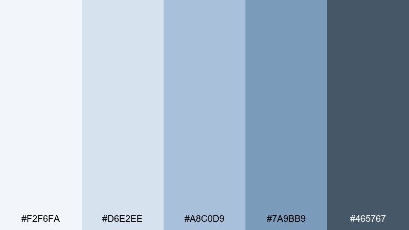
HEX: #F2F6FA #D6E2EE #A8C0D9 #7A9BB9 #465767
Mood: cool and modern
Best for: fashion lookbook layout
Cool and modern like winter light on denim, this set feels crisp and editorial. The mid blues add structure while the deep slate keeps typography sharp. Use it in lookbooks, brand guidelines, or landing pages that need a refined, minimal vibe. Pair with off-white space and a single black ink accent, and reserve the darkest tone for captions and page numbers.
Image example of frosted denim generated using media.io
3) Quiet Concrete
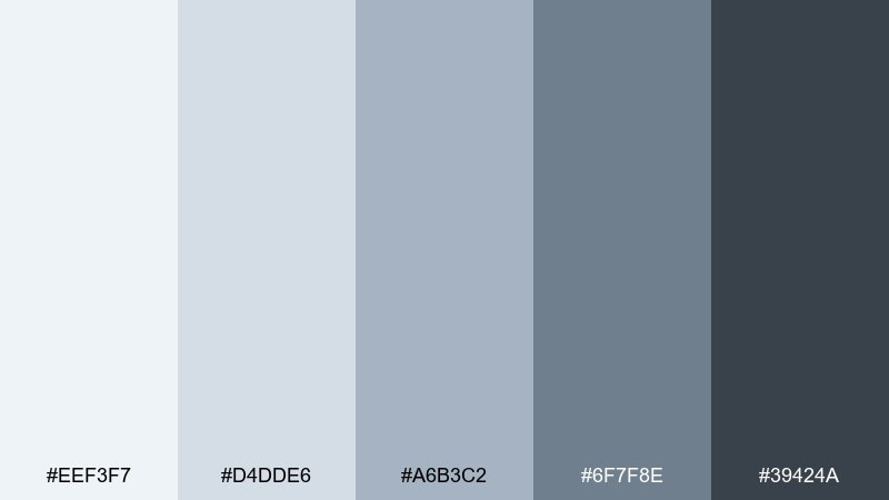
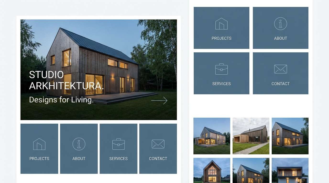
HEX: #EEF3F7 #D4DDE6 #A6B3C2 #6F7F8E #39424A
Mood: industrial and steady
Best for: architecture portfolio website
Industrial and steady like a clean concrete wall after rain, these neutrals stay grounded and professional. The mid grays keep the palette mature, while the light blue cast prevents it from feeling dull. It fits architecture portfolios, consulting sites, and proposal documents where trust matters. Pair with warm oak photography or copper line icons, and keep the lightest tone for generous margins to enhance readability.
Image example of quiet concrete generated using media.io
4) Iceberg Studio
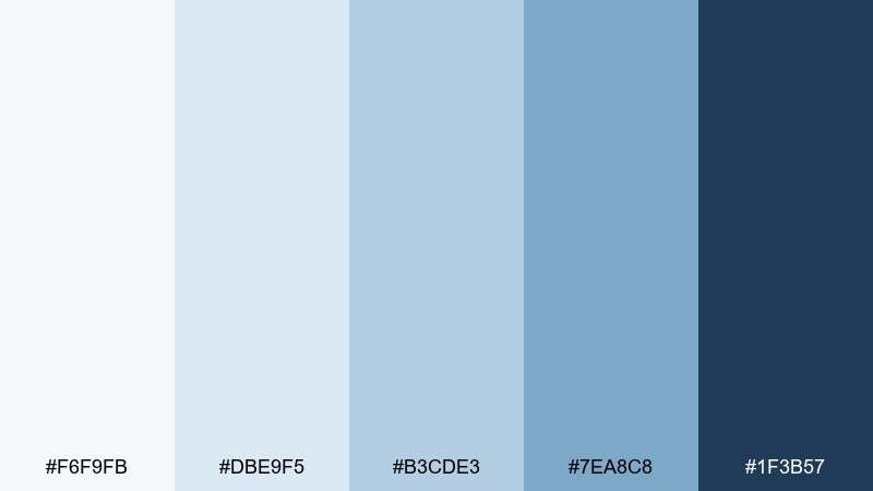
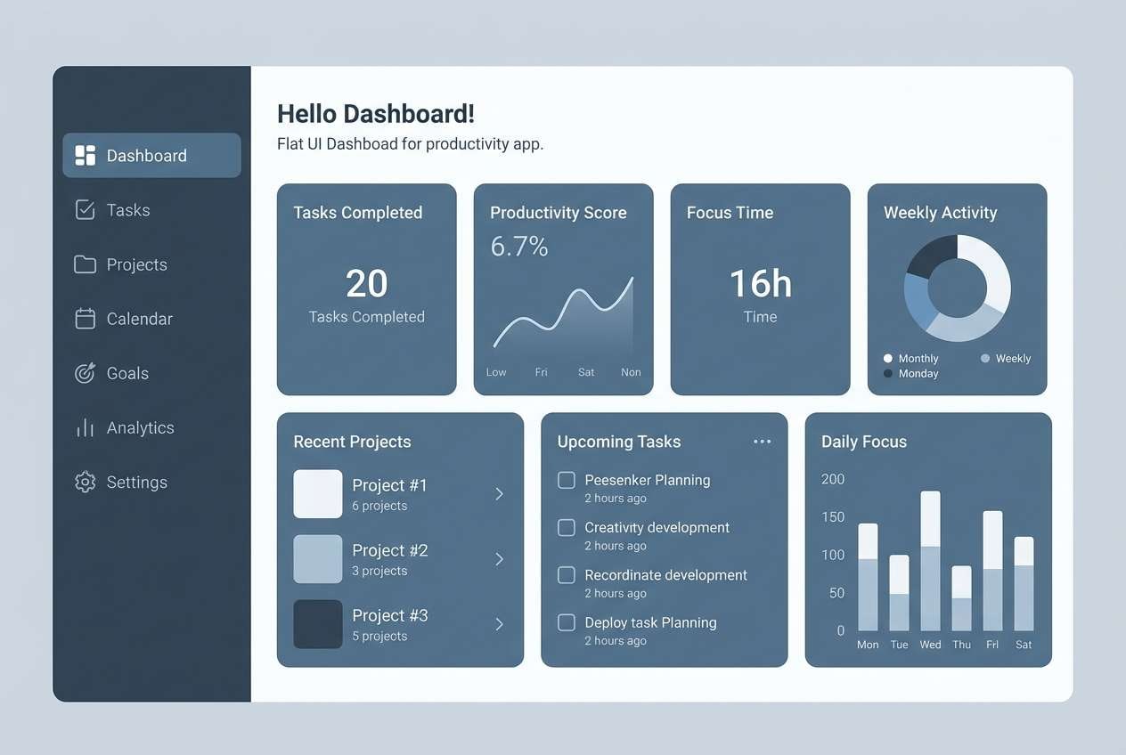
HEX: #F6F9FB #DBE9F5 #B3CDE3 #7EA8C8 #1F3B57
Mood: bright and focused
Best for: productivity app UI
Bright and focused like an iceberg edge under sunlight, this mix is clean with confident depth. The navy base brings contrast, while the soft blues keep screens feeling breathable. Use it for dashboards, analytics tools, or SaaS onboarding where hierarchy must be obvious. Pair with simple line charts and rounded cards, and use the darkest tone sparingly for primary buttons to keep the interface light.
Image example of iceberg studio generated using media.io
5) Silver Tide
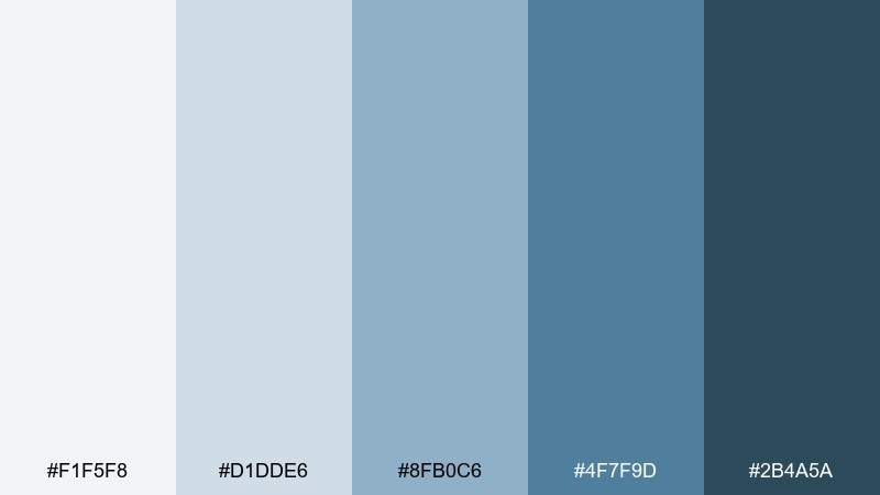
HEX: #F1F5F8 #D1DDE6 #8FB0C6 #4F7F9D #2B4A5A
Mood: fresh and coastal
Best for: hotel branding palette
Fresh and coastal like sunlight on rippled water, these tones feel welcoming and upscale. The teal-leaning blues add personality while the slate base keeps it premium. It suits boutique hotel branding, spa menus, and signage where calm is part of the promise. Pair with sand, stone textures, and minimal iconography, and test legibility on printed materials by using the deeper tones for text blocks.
Image example of silver tide generated using media.io
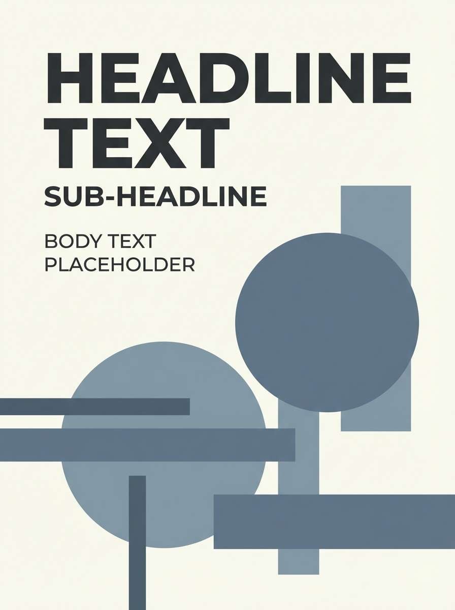
6) Rainy Loft
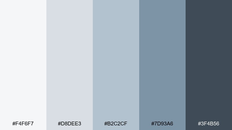
HEX: #F4F6F7 #D8DEE3 #B2C2CF #7D93A6 #3F4B56
Mood: soft and urban
Best for: minimal poster design
Soft and urban like a rainy window in a loft, this set stays understated but stylish. The gray foundation makes it easy to layer type and simple shapes without visual noise. It works for minimalist posters, gallery cards, and conference collateral where you want quiet confidence. Pair with a single bold geometric element and keep contrast high by placing small text on the lightest swatch only.
Image example of rainy loft generated using media.io
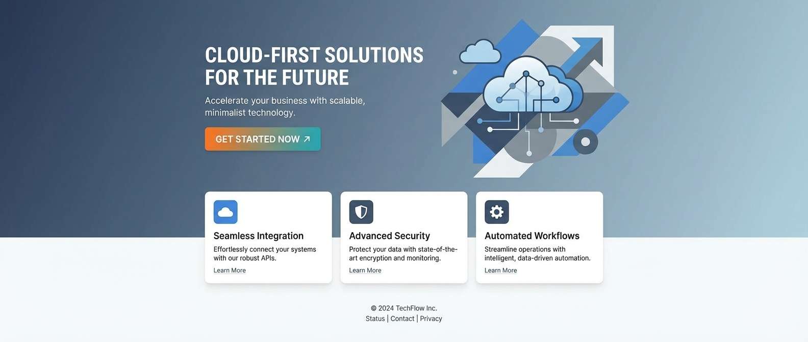
7) Glacier Pop
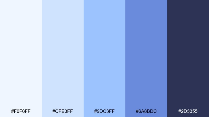
HEX: #F0F6FF #CFE3FF #9DC3FF #6A8BDC #2D3355
Mood: energized and clean
Best for: tech startup landing page
Energized and clean like sharp glacier light, these blues feel modern with a lively punch. The brighter notes make CTAs pop while the inky indigo keeps the layout grounded. Try it when you need gray light blue color combinations that still feel bold for startups, feature pages, or product updates. Pair with white space and subtle gradients, and keep the vivid blue for one primary action to prevent the page from feeling busy.
Image example of glacier pop generated using media.io
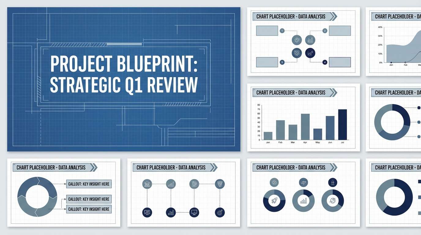
8) Chalk Blueprints
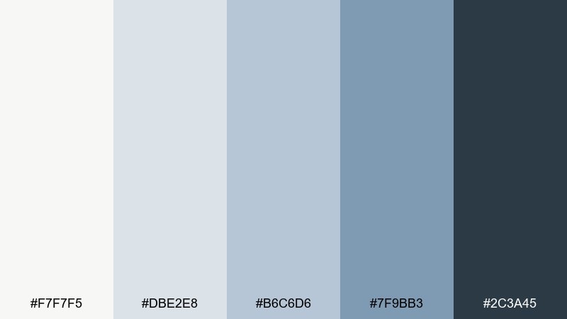
HEX: #F7F7F5 #DBE2E8 #B6C6D6 #7F9BB3 #2C3A45
Mood: technical and tidy
Best for: engineering slide deck
Technical and tidy like chalk lines on a blueprint, these colors feel organized and dependable. The soft off-white prevents glare while the deeper blue-gray supports clear charts. Use it for engineering decks, documentation, and diagrams that need a calm, structured rhythm. Pair with thin rules, mono icons, and limited highlights, and keep data colors consistent by mapping one accent to each chart type.
Image example of chalk blueprints generated using media.io
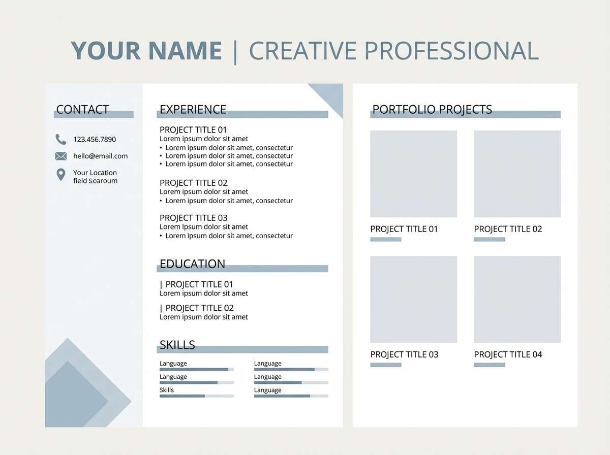
9) Blue Ash Minimal
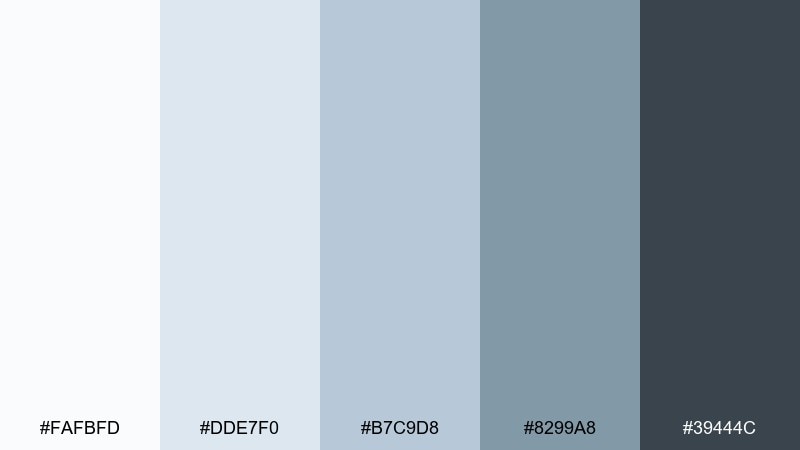
HEX: #FAFBFD #DDE7F0 #B7C9D8 #8299A8 #39444C
Mood: quiet and minimal
Best for: resume and portfolio template
Quiet and minimal like pale ash under morning sky, these tones read clean and professional. The palette gives you gentle section separation without heavy borders. It is ideal for resumes, portfolio PDFs, and personal sites where content should lead. Pair with a single modern sans font and use the darker slate only for headings, keeping body text on near-white for comfort.
Image example of blue ash minimal generated using media.io
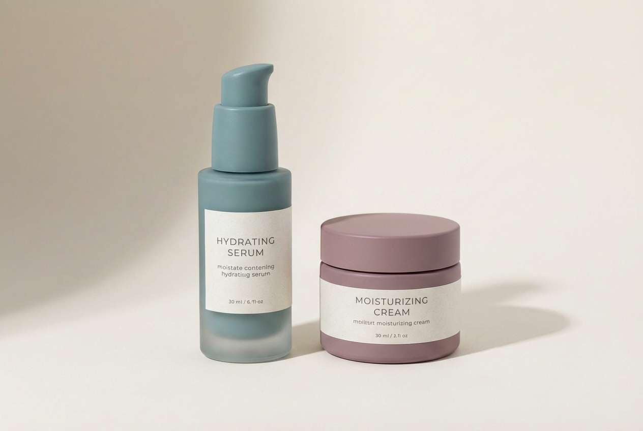
10) Harbor Glass
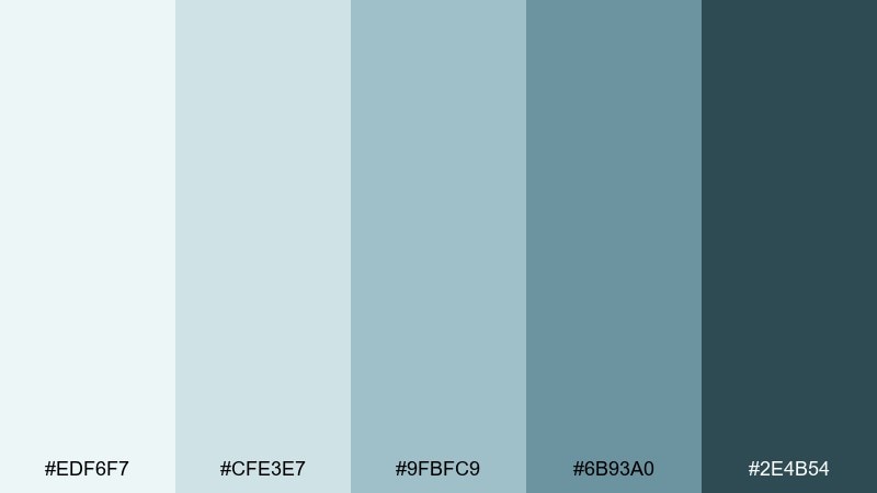
HEX: #EDF6F7 #CFE3E7 #9FBFC9 #6B93A0 #2E4B54
Mood: spa-like and refreshing
Best for: skincare packaging design
Spa-like and refreshing like sea glass on a bright shore, this mix feels clean and restorative. The aqua-leaning tones bring softness while the deep blue-green adds premium contrast. Use it for skincare labels, wellness product pages, or salon signage. Pair with matte white packaging and minimal line illustrations, and print a small color proof so the lightest swatch does not disappear on coated stock.
Image example of harbor glass generated using media.io
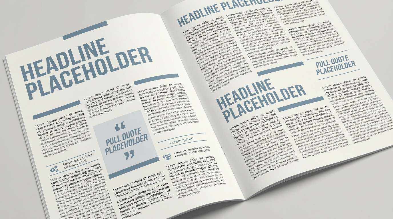
11) Moonlit Slate
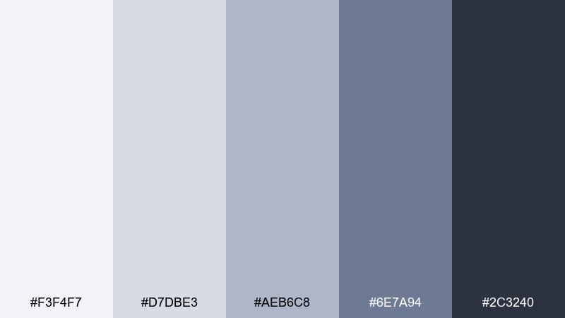
HEX: #F3F4F7 #D7DBE3 #AEB6C8 #6E7A94 #2C3240
Mood: moody and refined
Best for: editorial magazine layout
Moody and refined like moonlight on slate, these hues create depth without heaviness. The cool lavender-gray undertone adds sophistication for long-form design. It fits magazines, reports, and case studies where you want a modern, serious tone. Pair with high-contrast black-and-white photography and use the mid tone for pull quotes to guide the reader.
Image example of moonlit slate generated using media.io
12) Soft Stormfront
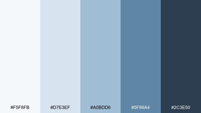
HEX: #F5F8FB #D7E3EF #A0BDD6 #5F86A4 #2C3E50
Mood: stormy and composed
Best for: corporate brand refresh
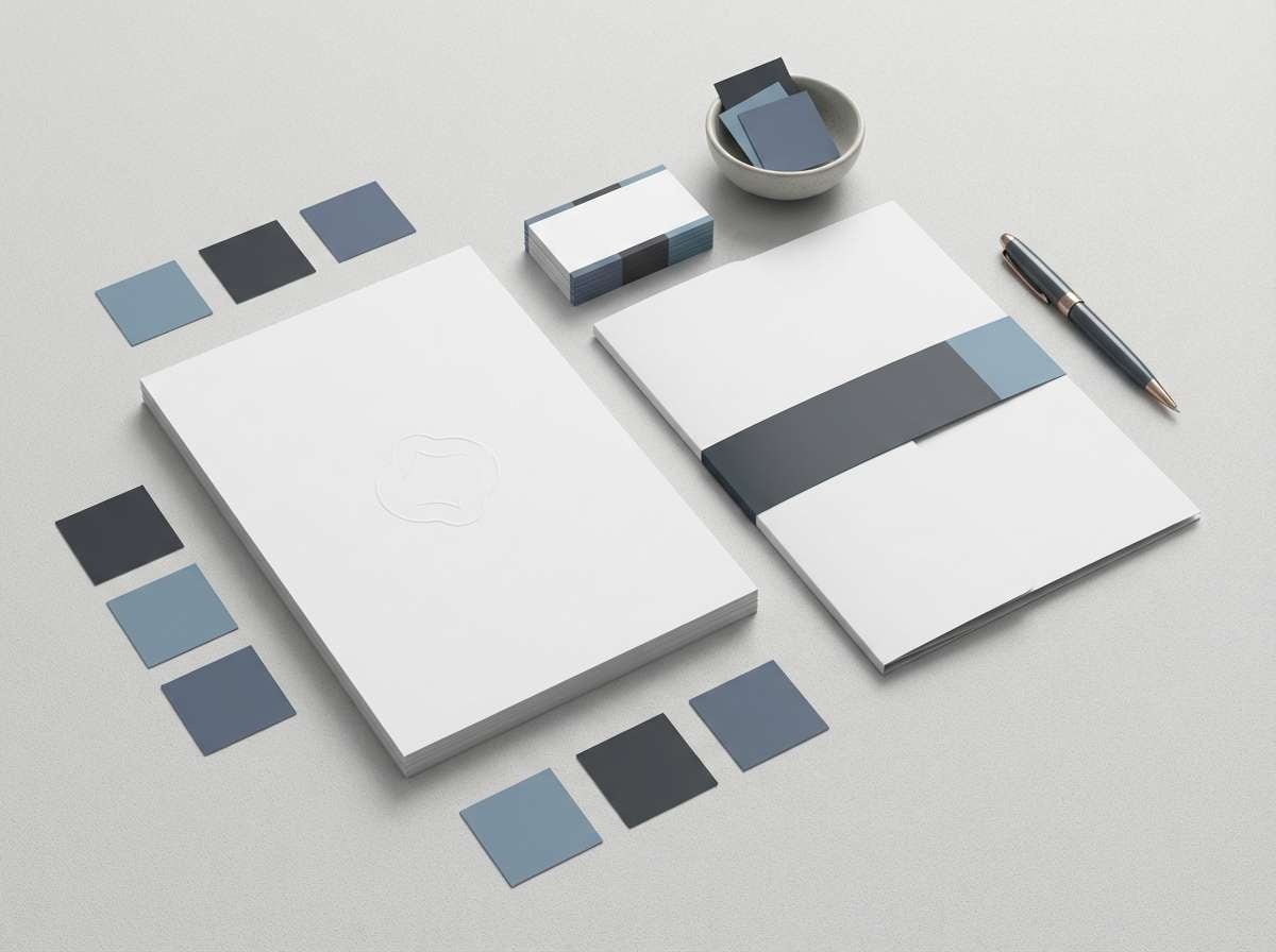
Stormy and composed like distant thunderclouds, these shades feel confident and reassuring. The progression from misty highlights to deep blue-gray makes hierarchy easy across print and web. Use it for corporate rebrands, proposal templates, and LinkedIn visuals that need polish. Pair with warm neutrals like oatmeal and a subtle gold accent, and keep the deepest swatch for logos or navigation to maintain clarity.
Image example of soft stormfront generated using media.io
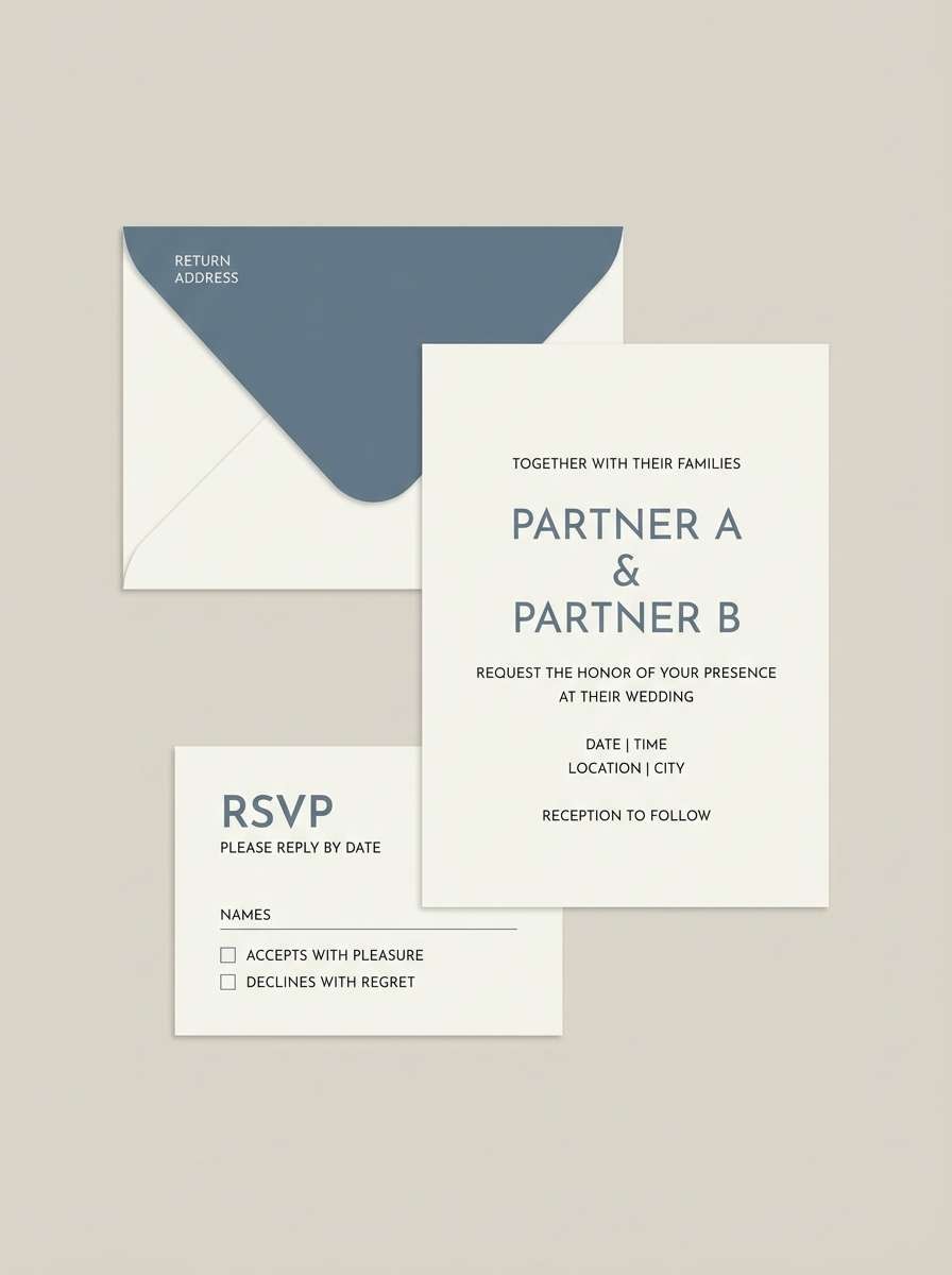
13) Pebble and Powder
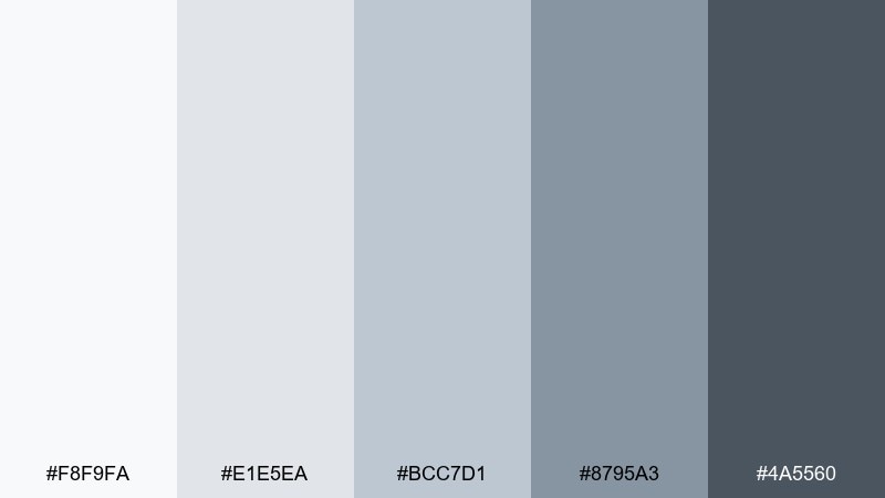
HEX: #F8F9FA #E1E5EA #BCC7D1 #8795A3 #4A5560
Mood: gentle and balanced
Best for: wedding invitation set
Gentle and balanced like powdery stone and pale sky, this mix feels timeless and elegant. The neutral middle tones keep typography readable while the deep charcoal adds formality. It works for wedding stationery, baby announcements, and formal event suites. Pair with deckled edges or subtle embossing, and use the darkest tone for names only so the overall design stays airy.
Image example of pebble and powder generated using media.io
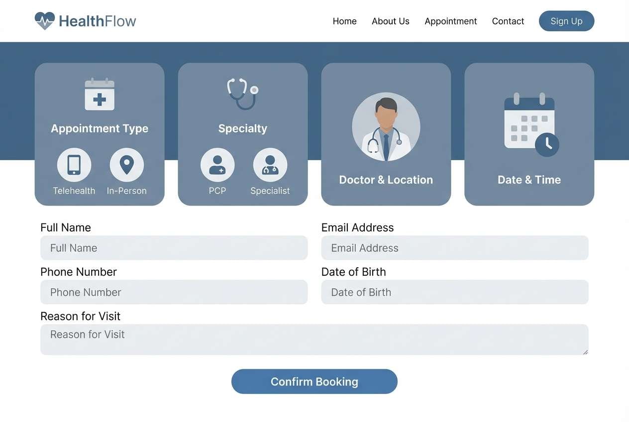
14) Clinic Calm
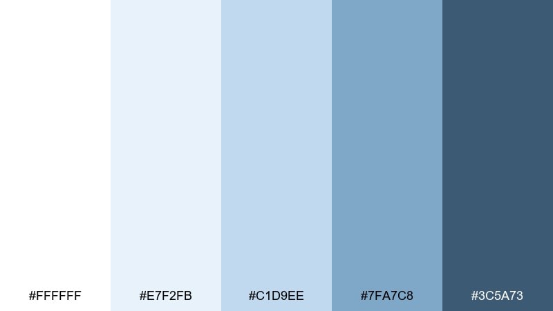
HEX: #FFFFFF #E7F2FB #C1D9EE #7FA7C8 #3C5A73
Mood: clean and reassuring
Best for: healthcare website UI
Clean and reassuring like a bright clinic lobby, these colors communicate clarity and care. The white and pale blue provide a hygienic feel, while the deeper tones add accessible contrast for UI states. It is a strong choice for healthcare sites, appointment portals, and patient education materials. Pair with rounded components and simple icons, and check contrast on buttons so key actions remain readable for all users.
Image example of clinic calm generated using media.io
15) Coastal Dusk
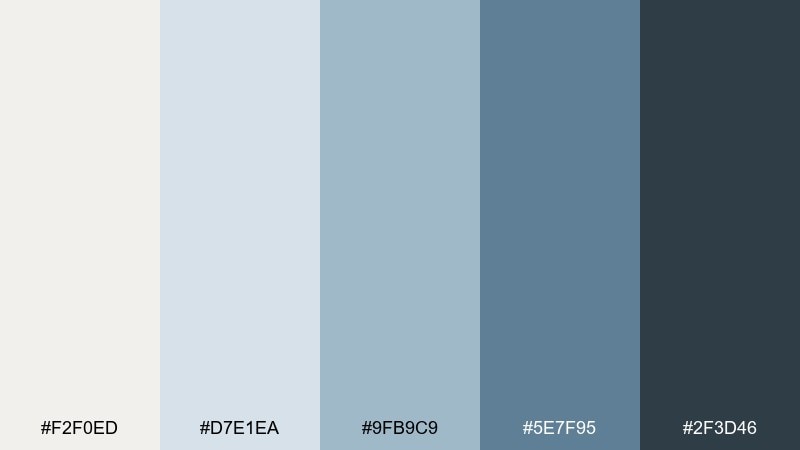
HEX: #F2F0ED #D7E1EA #9FB9C9 #5E7F95 #2F3D46
Mood: warmly cool and relaxed
Best for: living room paint plan
Warmly cool and relaxed like dusk settling over the water, this palette feels lived-in rather than stark. The slightly creamy neutral keeps the blues from reading too cold. Use it for living room paint plans, cabinetry, and soft furnishings where you want calm with depth. Pair with woven textures and muted terracotta accents, and sample the mid tone on multiple walls since it shifts with daylight.
Image example of coastal dusk generated using media.io
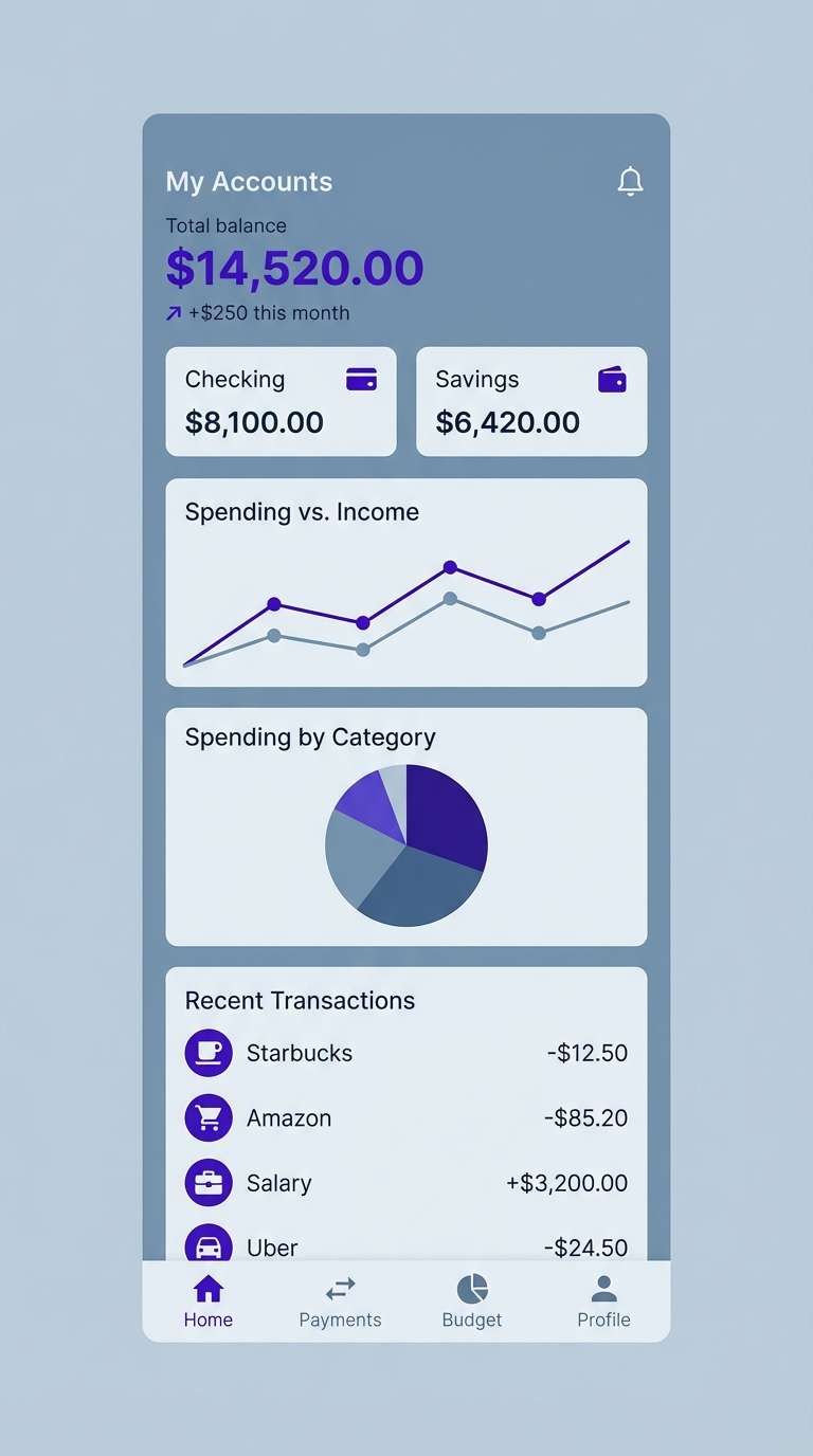
16) Skyline Accent
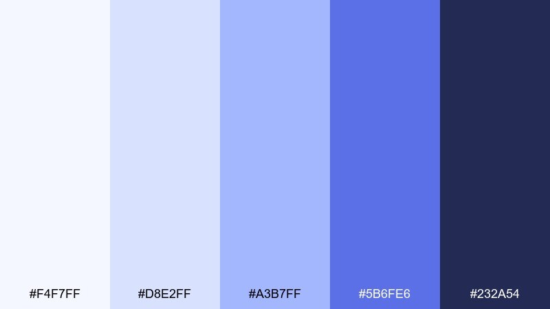
HEX: #F4F7FF #D8E2FF #A3B7FF #5B6FE6 #232A54
Mood: sleek and high-contrast
Best for: fintech mobile app UI
Sleek and high-contrast like city lights against evening haze, these blues bring energy without neon. The brighter indigo is perfect for interactive states, while the deep base reads secure and trustworthy. Use this gray light blue color palette for fintech, dashboards, or account portals where clarity and confidence matter. Pair with subtle dividers and plenty of whitespace, and limit the vivid accent to primary actions and key KPIs.
Image example of skyline accent generated using media.io
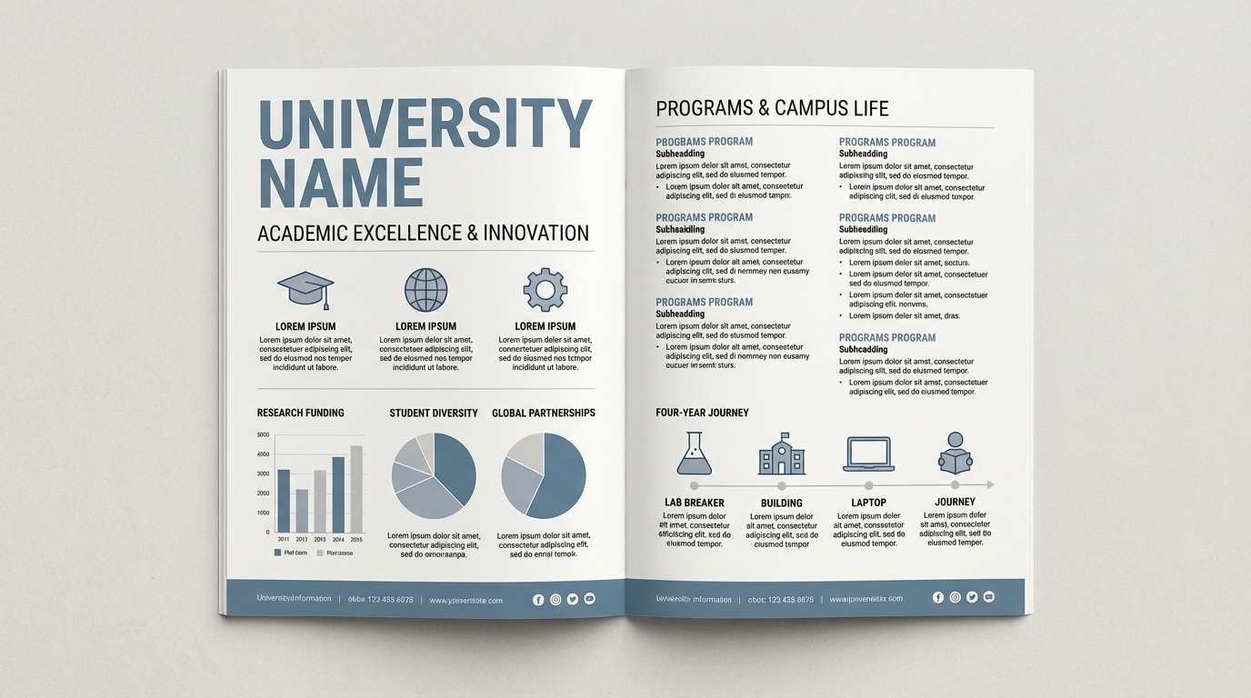
17) Archive Bluegray
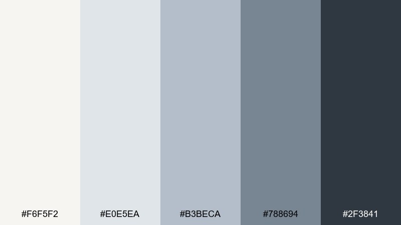
HEX: #F6F5F2 #E0E5EA #B3BECA #788694 #2F3841
Mood: classic and academic
Best for: university brochure design
Classic and academic like an old library with cool daylight, these tones feel serious and polished. The warm off-white base keeps pages friendly while the blue-grays add authority. Use it for university brochures, research reports, and departmental websites. Pair with serif headlines and simple infographics, and keep the darkest tone for section headers to maintain a clear reading rhythm.
Image example of archive bluegray generated using media.io
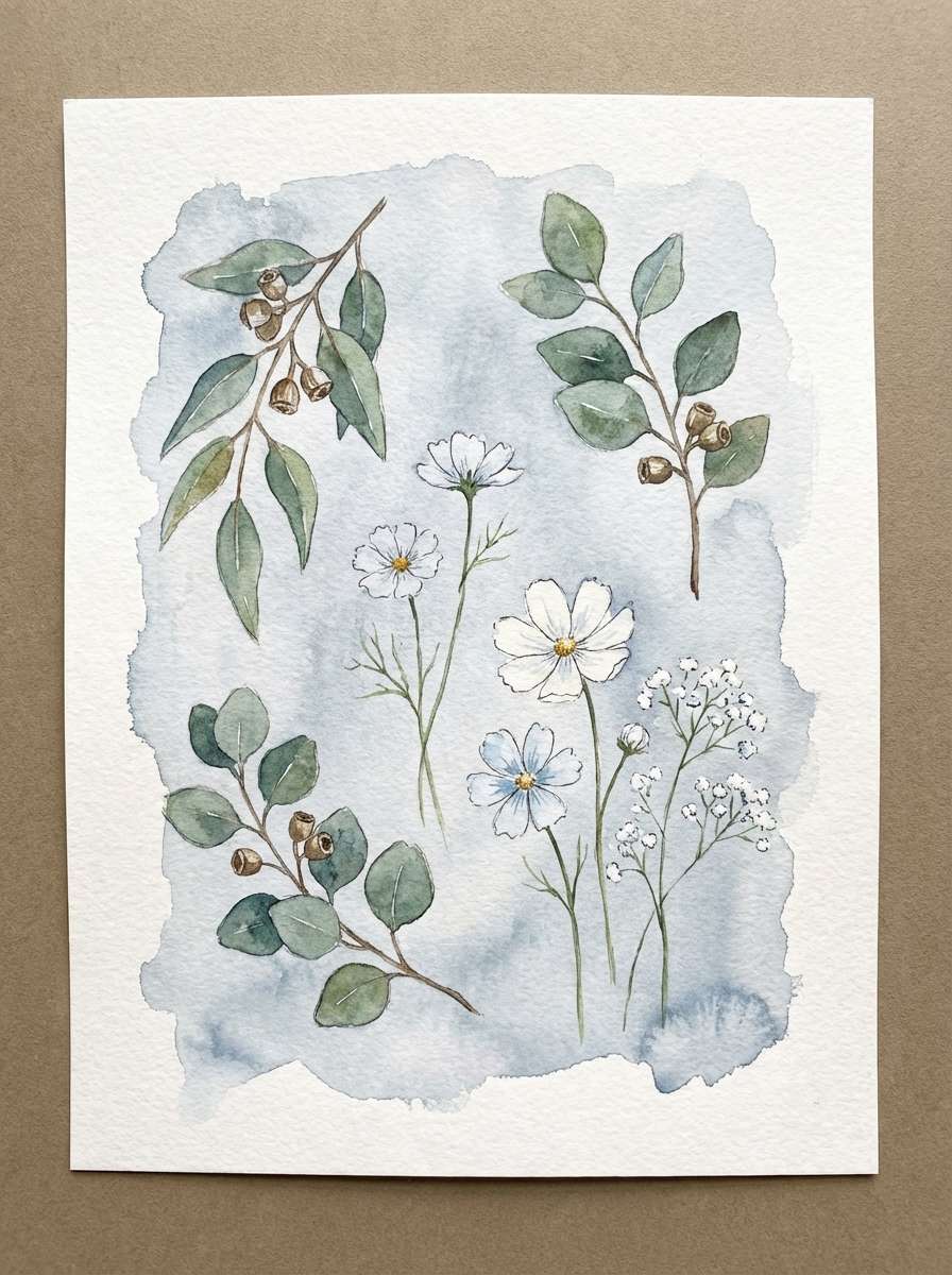
18) Winter Botanical
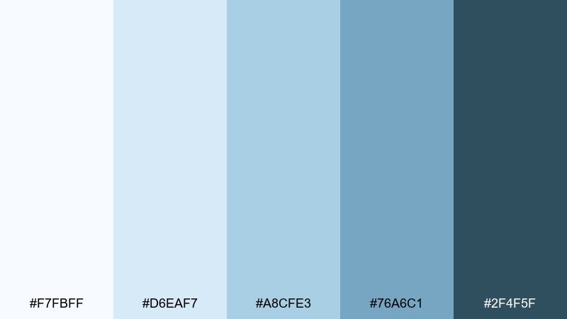
HEX: #F7FBFF #D6EAF7 #A8CFE3 #76A6C1 #2F4F5F
Mood: fresh and botanical
Best for: watercolor plant illustration set
Fresh and botanical like eucalyptus in winter, this palette feels clean and naturally soothing. The soft blues make a gentle backdrop for delicate greens and ink outlines. Use it for watercolor illustration sets, stationery, and calming social templates. Pair with muted sage and paper grain textures, and keep the deepest tone for stems or shadows to add dimension without harsh edges.
Image example of winter botanical generated using media.io
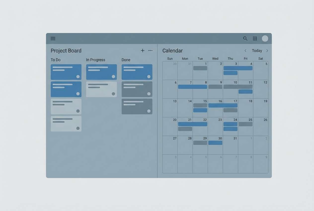
19) Workweek Serenity
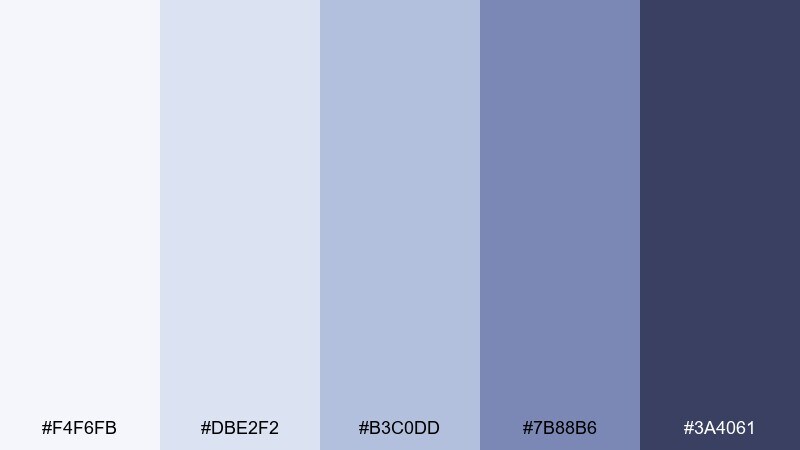
HEX: #F4F6FB #DBE2F2 #B3C0DD #7B88B6 #3A4061
Mood: focused and calm
Best for: project management UI
Focused and calm like a quiet Monday morning, these cool tones reduce visual fatigue. The lavender-blue shift helps separate components while staying professional. Try it for project management tools, calendars, and team dashboards that need long-session comfort. Pair with soft shadows and consistent icon strokes, and use the mid tone for selected states so users can scan quickly.
Image example of workweek serenity generated using media.io
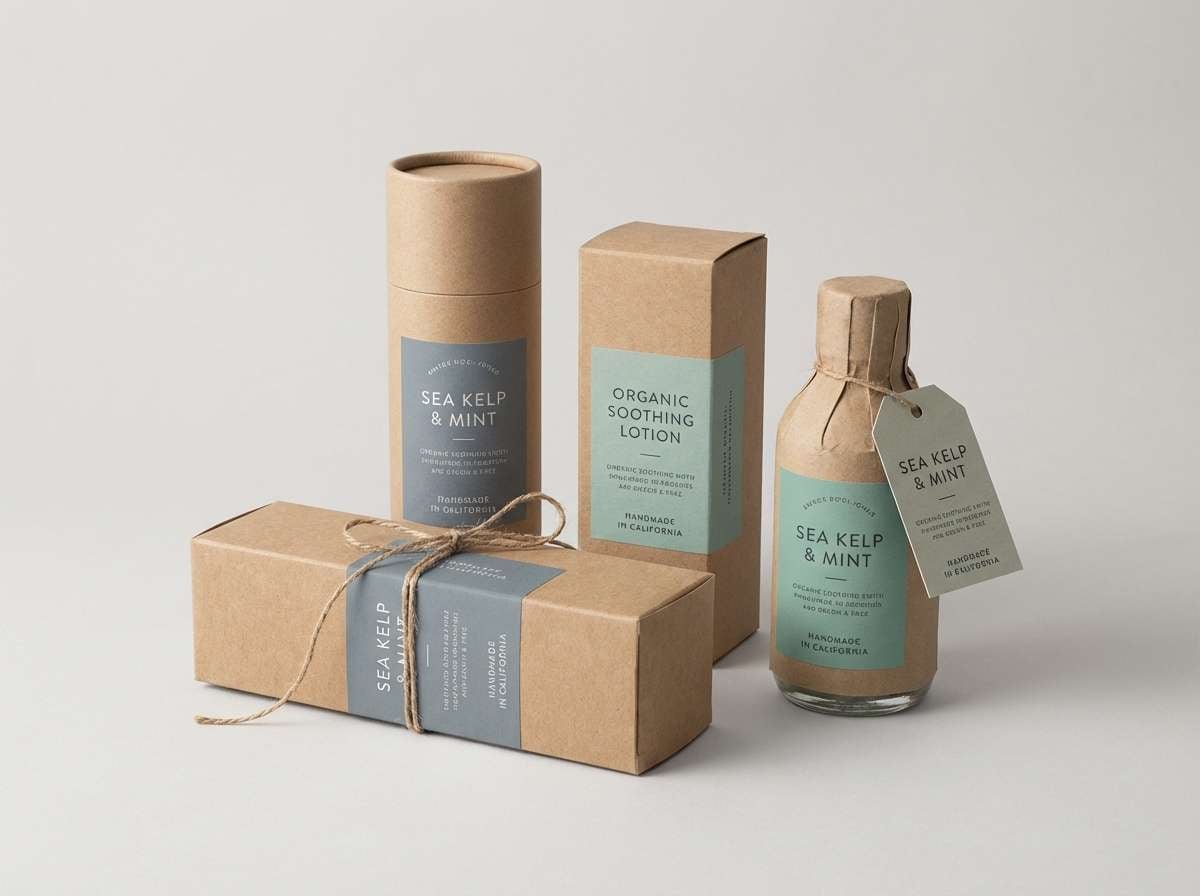
20) Granite Seafoam
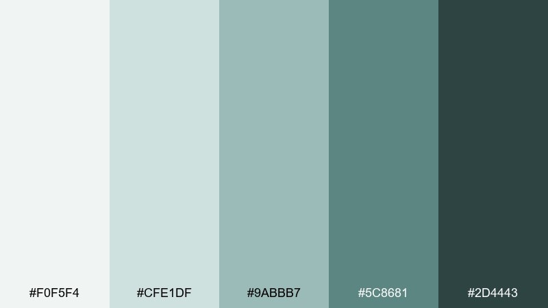
HEX: #F0F5F4 #CFE1DF #9ABBB7 #5C8681 #2D4443
Mood: earthy and cool
Best for: eco product label design
Earthy and cool like seafoam against granite, this mix feels natural and understated. The muted blue-green notes add an organic twist while still sitting comfortably in a gray-leaning family. Use it for eco labels, refill packaging, and sustainable brand systems where calm credibility matters. Pair with kraft paper textures and minimal typography, and keep the darkest tone for small print so it stays readable on matte materials.
Image example of granite seafoam generated using media.io
What Colors Go Well with Gray Light Blue?
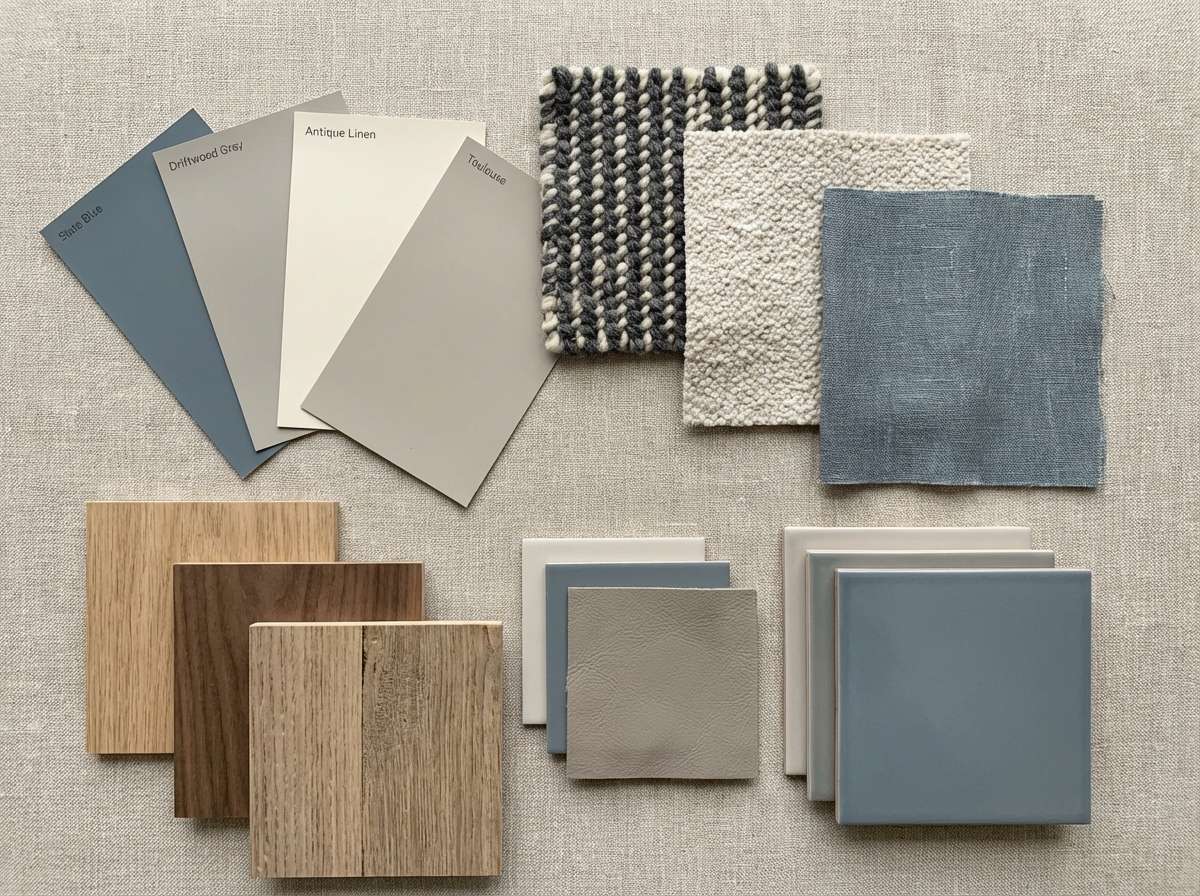
Warm neutrals are an easy match for gray light blue: ivory, oatmeal, sand, and warm beige keep the scheme from feeling too cold. For interiors and packaging, wood tones (oak, walnut) add instant softness and realism.
For contrast in UI and branding, pair gray light blue with deep navy, charcoal, or near-black for typography and key components. If you want an accent color, muted brass/gold, terracotta, or dusty coral adds a modern complementary lift without overpowering the calm base.
To keep the palette cohesive, use one strong accent at a time and let the light blue-grays do the heavy lifting as backgrounds, panels, and supporting fills.
How to Use a Gray Light Blue Color Palette in Real Designs
Start by assigning roles: use the lightest swatch for background, a slightly darker tint for cards/sections, a mid tone for borders or charts, and the darkest tone for headlines and icons. This keeps hierarchy consistent even when layouts get busy.
In print, test your lightest swatch on the actual paper stock—very pale blue-grays can disappear on coated or bright white paper. In digital, check contrast for accessibility, especially for buttons and form labels.
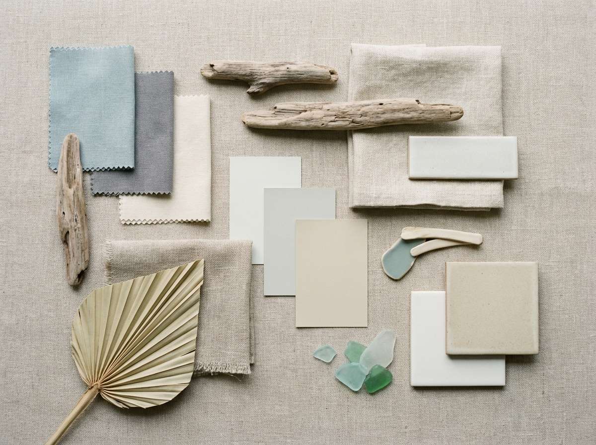
Finally, add texture or imagery that supports the mood: linen and driftwood for coastal, concrete and steel for industrial, or matte white packaging for clean wellness branding.
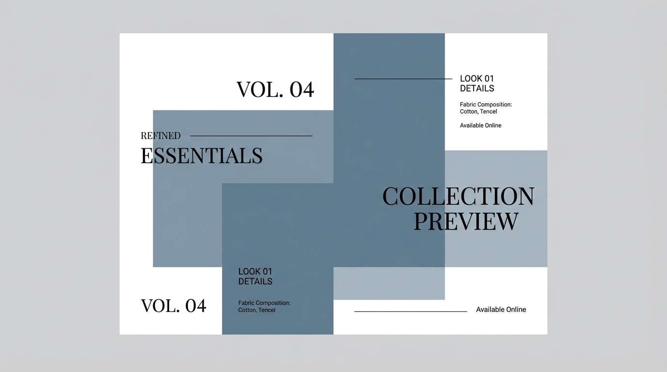
Create Gray Light Blue Palette Visuals with AI
If you have HEX codes but need on-brand visuals fast, generate mockups and moodboards with AI. With Media.io, you can turn a palette concept into landing page comps, packaging scenes, interior boards, or social templates in minutes.
Use one of the prompts above as a starting point, then adjust subject, lighting, and format (like 16:9 for slides or 9:16 for mobile). Keeping the prompt specific helps the blue-gray tones stay consistent across variations.
Gray Light Blue Color Palette FAQs
-
What does a gray light blue color palette communicate in branding?
It typically signals calm, clarity, and trust. The gray keeps things professional and grounded, while the light blue adds friendliness and a clean, modern feel—great for SaaS, healthcare, finance, and lifestyle brands. -
Is gray light blue a good choice for UI backgrounds?
Yes. Light blue-grays reduce glare compared to pure white, help cards and sections separate subtly, and still feel neutral enough to support colorful data visualizations or imagery. -
Which text colors work best on gray light blue?
Deep slate, charcoal, and navy are the safest for readability. For small body text, avoid mid tones and use the darkest swatch (or near-black) to maintain strong contrast. -
How do I add warmth to a cool gray light blue scheme?
Add warm neutrals (ivory, cream, sand), natural wood tones, or a restrained accent like terracotta or muted gold. This keeps the palette balanced without losing the calm, cool identity. -
What’s the easiest way to pick an accent color for blue-gray tones?
Choose one accent that clearly differs in temperature or saturation: dusty coral/terracotta for warmth, muted teal/seafoam for a tonal shift, or indigo for high-contrast UI states. Use it sparingly for CTAs and highlights. -
Do gray light blue palettes print well?
They usually print cleanly, but very pale swatches can look washed out depending on paper and coating. Print a small proof and consider nudging the lightest color slightly darker for invitations, brochures, or packaging. -
Can I generate palette-based mockups with AI?
Yes. You can use Media.io’s text-to-image tool to create consistent, palette-led moodboards and mockups by specifying the scene (e.g., “dashboard UI” or “skincare packaging”), lighting, and the overall blue-gray color theme.
Next: Retro 80s Color Palette


