

White and blue is a modern classic: white keeps layouts clean and breathable, while blue adds trust, focus, and structure.
Below are 20 curated white blue color palette ideas with HEX codes—made for branding, UI, interiors, and print—plus AI prompts you can reuse to generate matching visuals.
In this article
Why White Blue Palettes Work So Well
White blue palettes feel instantly “designed” because they balance clarity and confidence. White creates space for content, while blue naturally guides attention toward navigation, data, or calls to action.
They’re also flexible across mediums: on screens, pale blues reduce glare and keep interfaces calm; in print, deeper navies and royal blues add contrast without looking harsh or messy.
Most importantly, blue supports trust and legibility. When you choose a strong dark blue for hierarchy and keep lighter tints for surfaces, you get a clean system that scales from a landing page to a full brand kit.
20+ White Blue Color Palette Ideas (with HEX Codes)
1) Arctic Linen
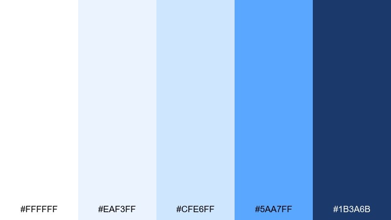
HEX: #ffffff #eaf3ff #cfe6ff #5aa7ff #1b3a6b
Mood: crisp, clean, calm
Best for: analytics dashboards and data-heavy UI
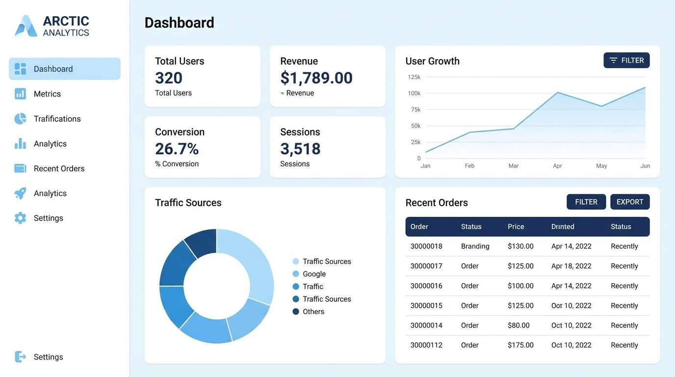
Crisp and airy, these icy whites and clear blues feel like fresh snowfall under a bright winter sky. The light tints keep screens readable while the deeper navy gives charts and navigation real structure. Pair it with cool grays or a single warm accent like amber for alerts. Usage tip: reserve the darkest blue for primary actions to maintain hierarchy.
Image example of arctic linen generated using media.io
Media.io is an online AI studio for creating and editing video, image, and audio in your browser.

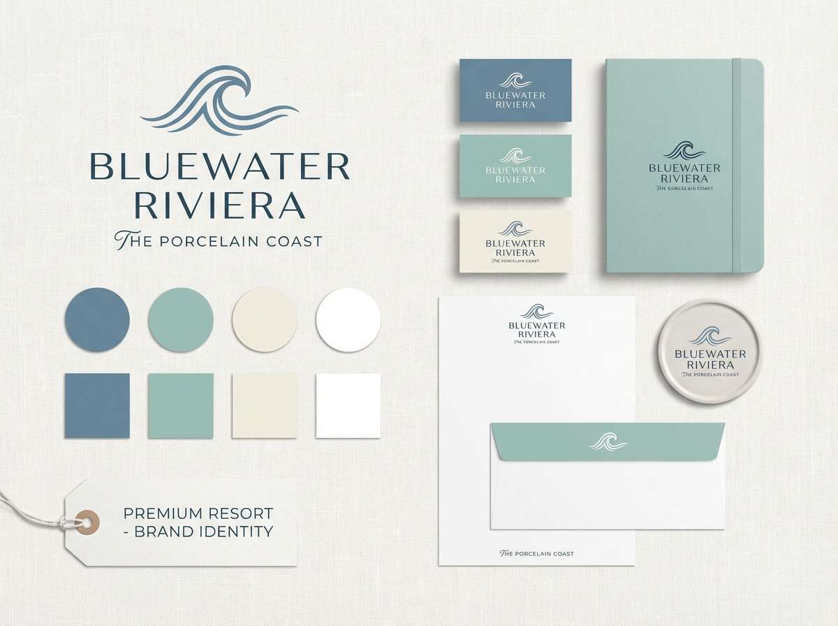
2) Coastal Porcelain
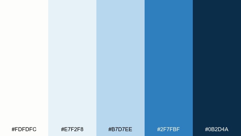
HEX: #fdfdfc #e7f2f8 #b7d7ee #2f7fbf #0b2d4a
Mood: breezy, polished, coastal
Best for: resort branding and hospitality websites
Breezy and refined, this mix evokes glazed porcelain, sea mist, and deep harbor water. The contrast between airy pastels and the inky anchor tone makes logos and headers pop without feeling heavy. For a versatile white blue color palette, add sand, driftwood brown, or brushed brass in supporting elements. Usage tip: use the mid-blue for secondary buttons and the darkest tone for brand marks.
Image example of coastal porcelain generated using media.io
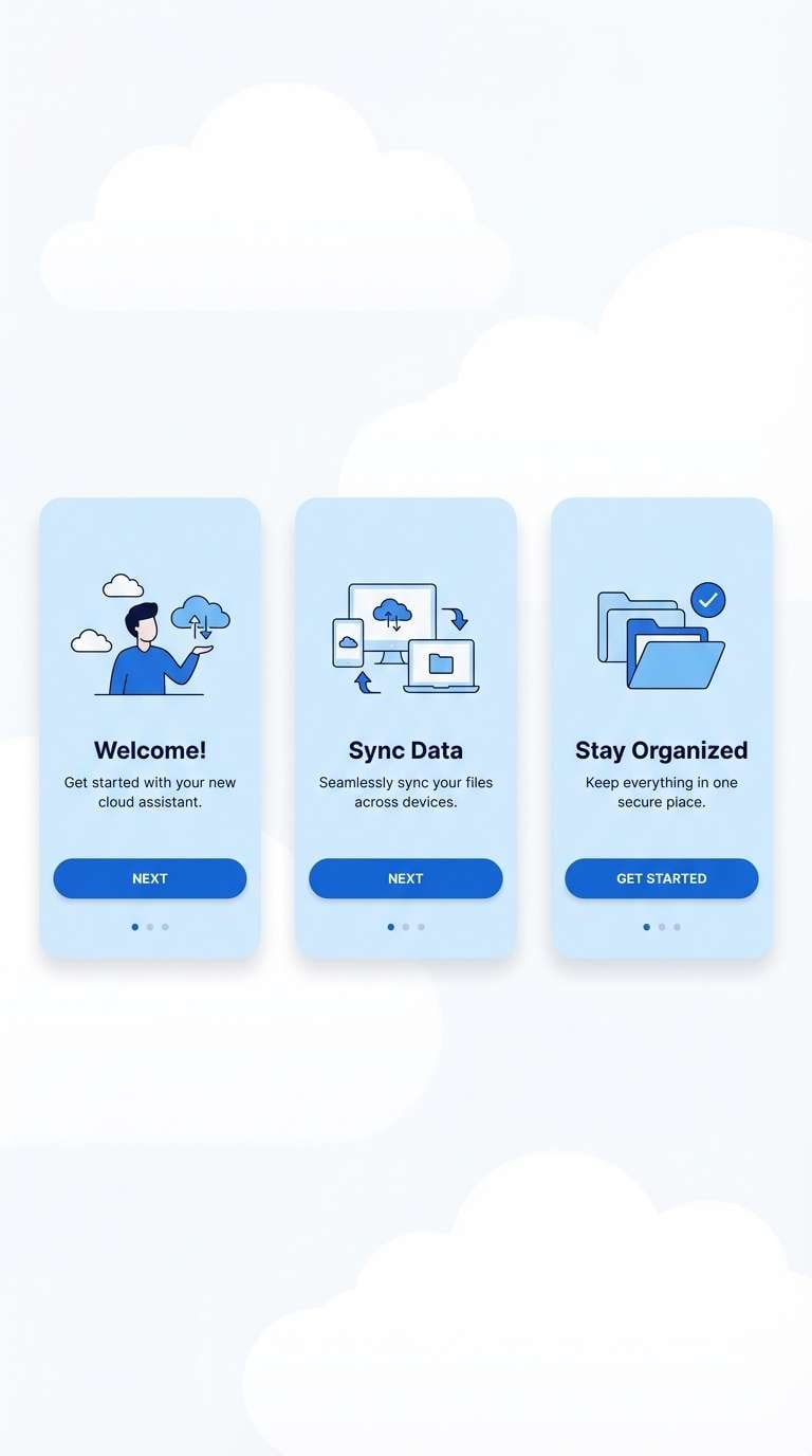
3) Cloudy Marina
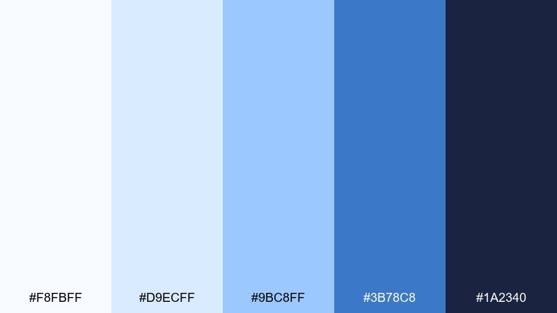
HEX: #f8fbff #d9ecff #9bc8ff #3b78c8 #1a2340
Mood: fresh, modern, optimistic
Best for: app onboarding and feature walkthroughs
Fresh and optimistic, these tones feel like clouds breaking over a bright marina. The pale layers create soft depth for onboarding screens, while the saturated blue keeps calls to action confident. Pair with charcoal typography and subtle line icons to keep the look sharp. Usage tip: keep gradients minimal and let the mid-blue carry the emphasis.
Image example of cloudy marina generated using media.io
4) Frosted Denim
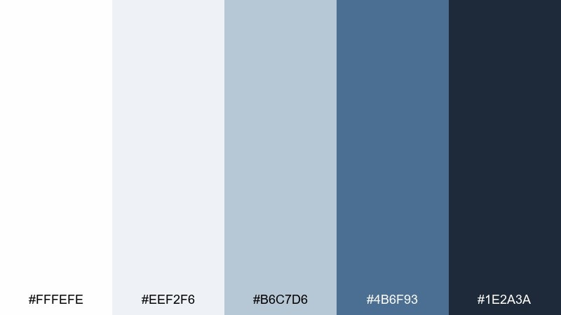
HEX: #fffefe #eef2f6 #b6c7d6 #4b6f93 #1e2a3a
Mood: grounded, understated, classic
Best for: apparel lookbooks and lifestyle editorials
Understated and grounded, these hues recall washed denim, soft cotton, and cool evening shadows. The muted blues read mature and wearable, making product photography and editorial layouts feel cohesive. Pair with off-black text, warm tan leather, or silver accents for a timeless finish. Usage tip: use the mid slate-blue for captions and dividers to avoid harsh contrast.
Image example of frosted denim generated using media.io
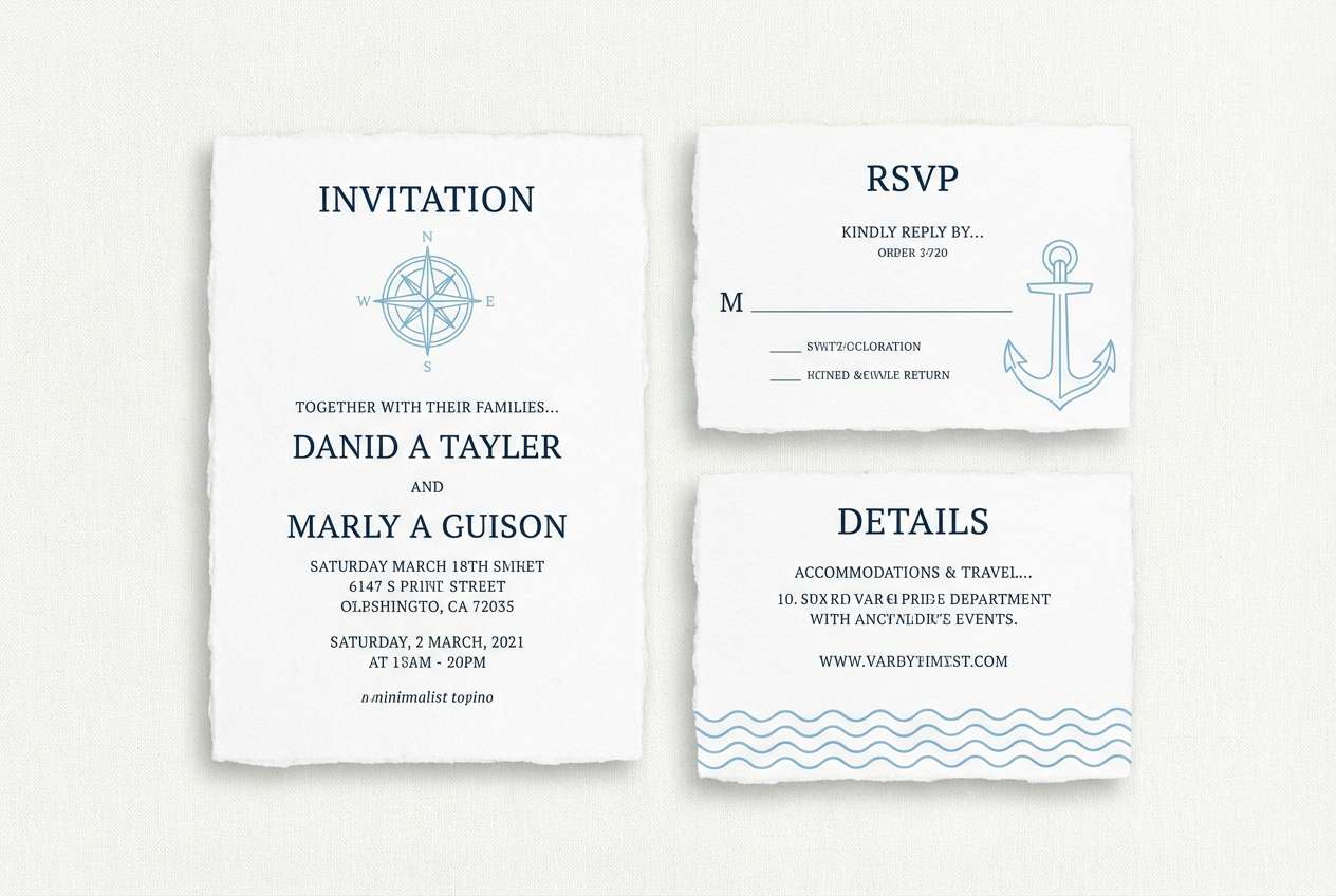
5) Sailcloth Sky
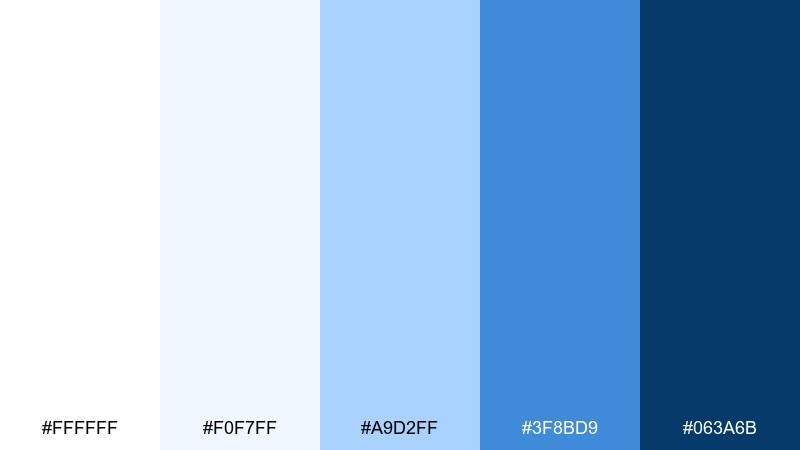
HEX: #ffffff #f0f7ff #a9d2ff #3f8bd9 #063a6b
Mood: bright, nautical, celebratory
Best for: wedding invitations and summer event suites
Bright and celebratory, the palette feels like sailcloth in sun with a clear sky overhead. Light blues keep the paper look airy, while the deep blue adds formality for names and key details. Pair with crisp black typography or metallic foil for an elevated invitation suite. Usage tip: keep the darkest blue for headers so body copy stays soft and readable.
Image example of sailcloth sky generated using media.io
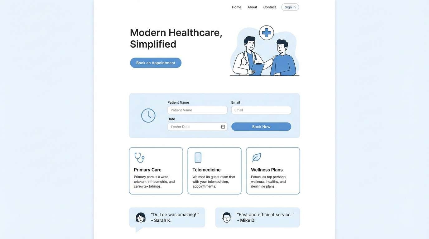
6) Minimal Clinic
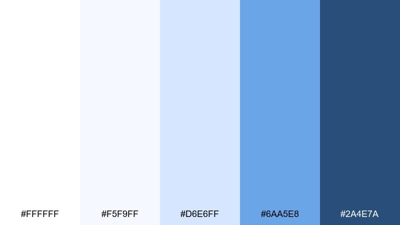
HEX: #ffffff #f5f9ff #d6e6ff #6aa5e8 #2a4e7a
Mood: reassuring, hygienic, friendly
Best for: healthcare landing pages and patient portals
Reassuring and hygienic, these clean tints suggest daylight, clarity, and calm routines. The gentle mid-blue communicates trust without feeling corporate, and the darker steel-blue supports clear navigation. This white blue color combination works best with generous whitespace, rounded cards, and simple iconography. Usage tip: limit saturation to key buttons so forms feel less intimidating.
Image example of minimal clinic generated using media.io
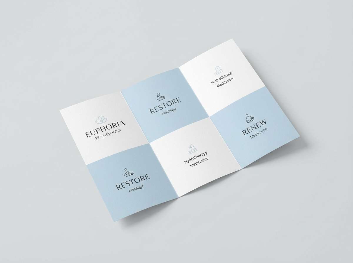
7) Nordic Spa
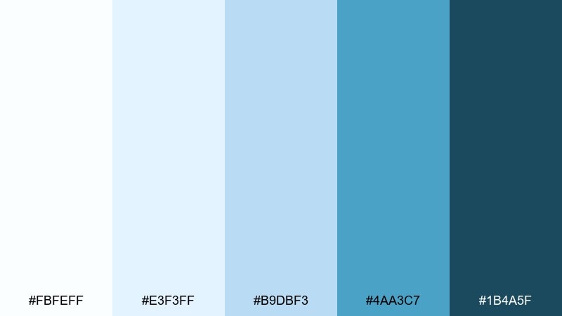
HEX: #fbfeff #e3f3ff #b9dbf3 #4aa3c7 #1b4a5f
Mood: serene, airy, restorative
Best for: spa brochures and wellness brand collateral
Serene and restorative, these tones evoke steam, mineral water, and cool stone. The sea-glass blue is gentle enough for large background blocks, while the deeper teal-blue adds a grounded finish. Pair with soft neutrals, eucalyptus green, and minimal photography for a calm rhythm. Usage tip: use the lightest blue behind quotes and benefits to create a quiet focus.
Image example of nordic spa generated using media.io
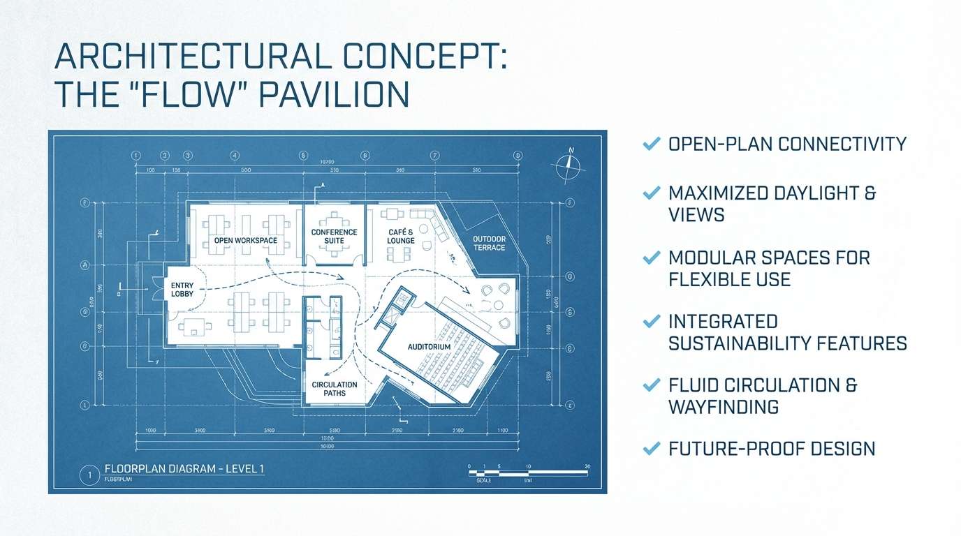
8) Blueprint Chalk
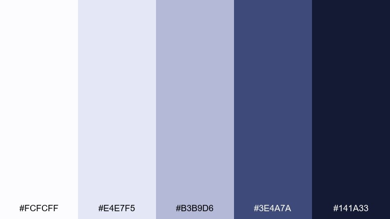
HEX: #fcfcff #e4e7f5 #b3b9d6 #3e4a7a #141a33
Mood: smart, technical, structured
Best for: architecture decks and technical presentations
Smart and technical, this set feels like chalk dust on blueprint paper. The cool violet-blue undertones keep slides sophisticated, while the near-black navy anchors diagrams and callouts. Pair with thin line illustrations and plenty of margins to keep complex content digestible. Usage tip: use the mid tone for grid lines and the darkest for labels only.
Image example of blueprint chalk generated using media.io
9) Ice Iris
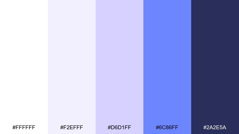
HEX: #ffffff #f2efff #d6d1ff #6c86ff #2a2e5a
Mood: dreamy, playful, gentle
Best for: kids stationery and light illustration projects
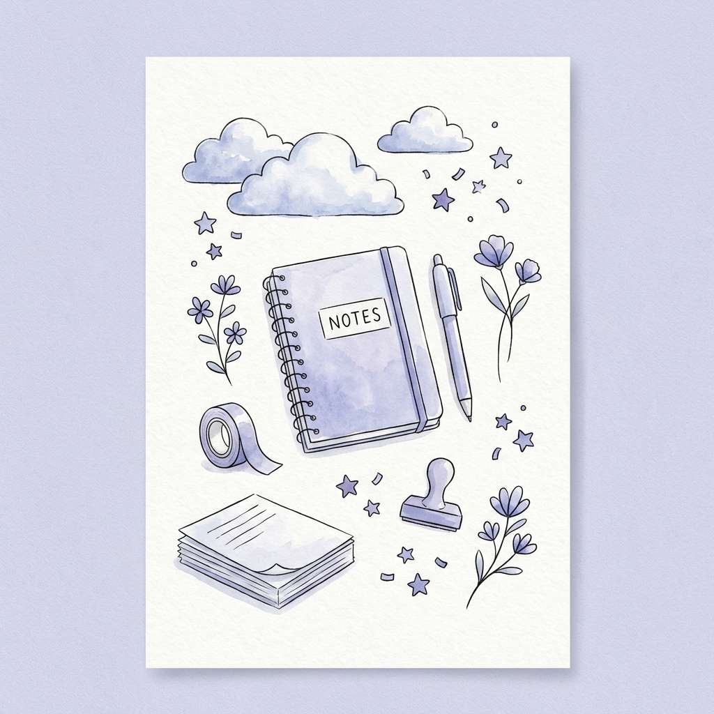
Dreamy and playful, these shades read like frosted petals and soft twilight. The lilac-leaning tints add charm without losing the crispness of a clean base. Pair with rounded type, simple doodles, and a touch of butter yellow for warmth. Usage tip: keep the brightest periwinkle for small highlights so it stays sweet, not loud.
Image example of ice iris generated using media.io
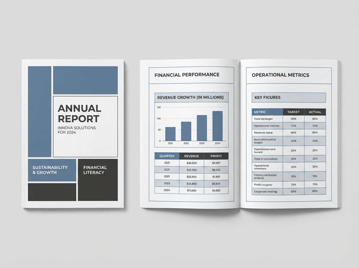
10) Glacier Slate
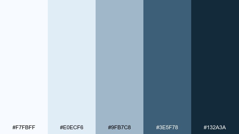
HEX: #f7fbff #e0ecf6 #9fb7c8 #3e5f78 #132a3a
Mood: serious, calm, dependable
Best for: annual reports and finance documents
Serious and dependable, these cool slates feel like a calm morning over still water. The middle grayed-blue tones bring authority to charts and tables without overwhelming the page. Pair with clean sans serif typography and subtle rules to support scanning. Usage tip: use the palest tint for table rows so data stays the hero.
Image example of glacier slate generated using media.io
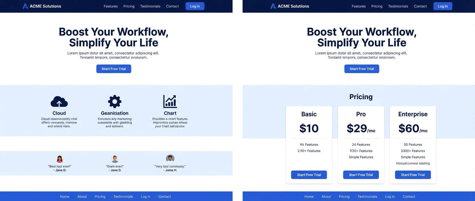
11) Cobalt Paper
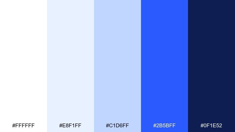
HEX: #ffffff #e8f1ff #c1d6ff #2b5bff #0f1e52
Mood: bold, digital, high-contrast
Best for: saas landing pages and conversion sections
Bold and digital, these hues look like bright ink on fresh paper. The cobalt punch is ideal for CTAs, while the softer tints keep sections spacious and modern. A white blue color palette like this pairs well with graphite text, subtle shadows, and simple gradients used sparingly. Usage tip: set cobalt as the only saturated color to protect conversion focus.
Image example of cobalt paper generated using media.io
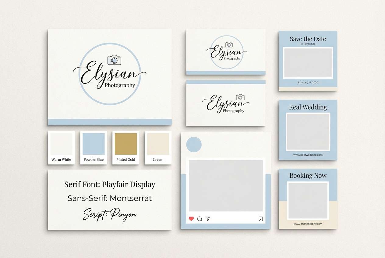
12) Powder Blue Wedding
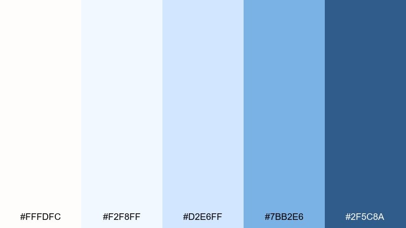
HEX: #fffdfc #f2f8ff #d2e6ff #7bb2e6 #2f5c8a
Mood: romantic, soft, airy
Best for: wedding photography branding and galleries
Romantic and airy, these powder blues feel like morning light through sheer curtains. The soft mid-blue gives enough contrast for navigation while keeping an elegant, editorial mood. Pair with warm ivory, muted blush accents, and delicate serif fonts for a timeless feel. Usage tip: apply the palest tint behind image grids to reduce visual noise.
Image example of powder blue wedding generated using media.io
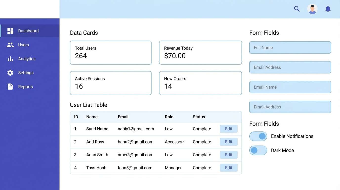
13) Tech On White
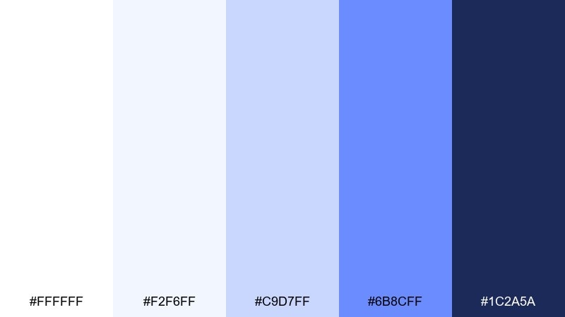
HEX: #ffffff #f2f6ff #c9d7ff #6b8cff #1c2a5a
Mood: sleek, efficient, modern
Best for: productivity tools and admin panels
Sleek and efficient, this mix feels like polished glass and crisp system panels. The mid-blue is perfect for interactive states, while the deep indigo anchors sidebars and headers. Pair with neutral grays and consistent spacing to keep the interface fast to read. Usage tip: use the lightest blue as a hover wash to add feedback without clutter.
Image example of tech on white generated using media.io
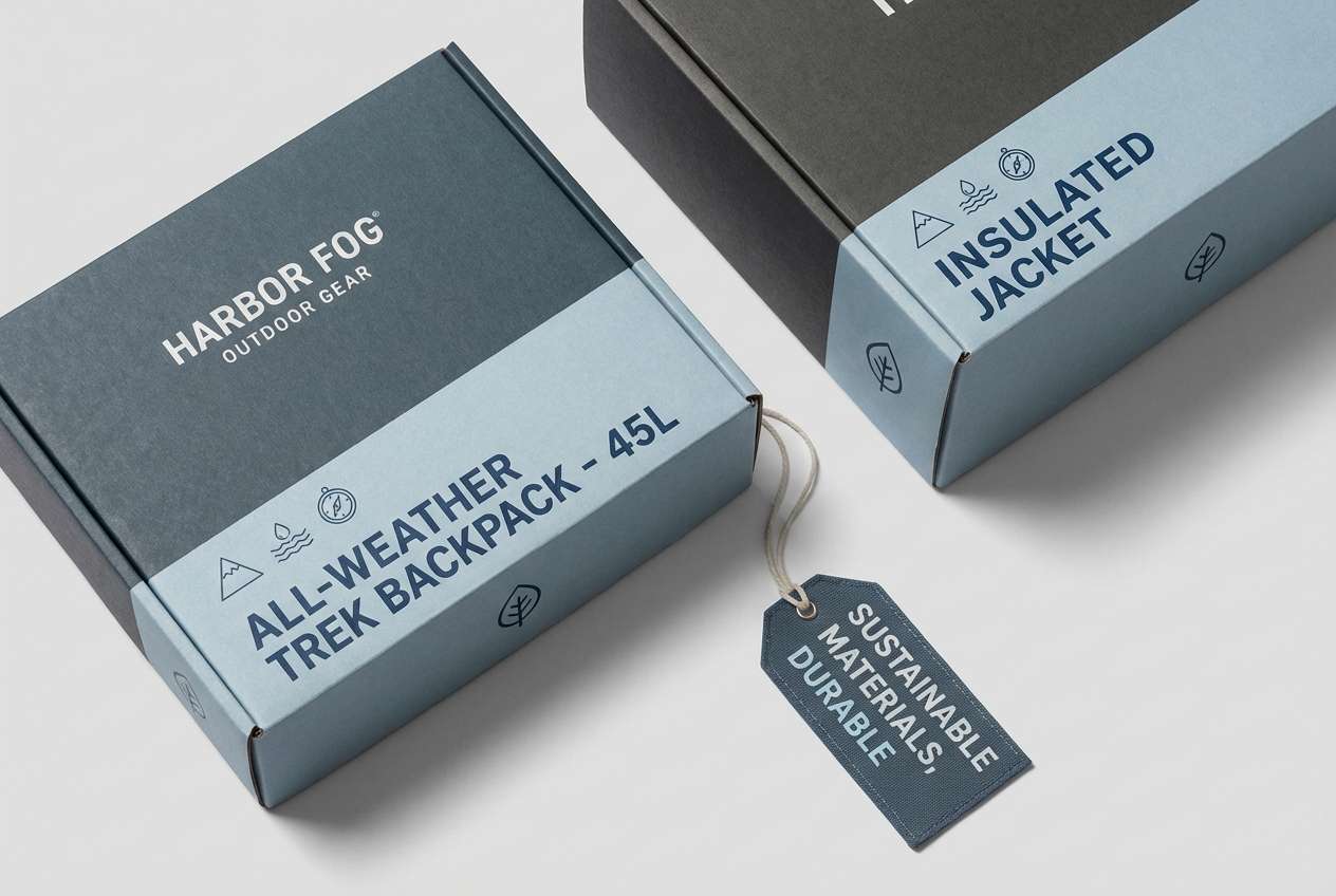
14) Harbor Fog
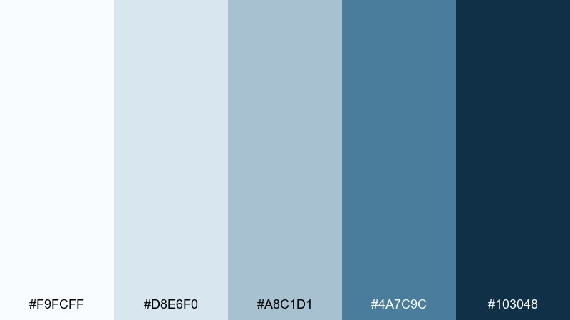
HEX: #f9fcff #d8e6f0 #a8c1d1 #4a7c9c #103048
Mood: moody, coastal, mature
Best for: outdoor gear packaging and hang tags
Moody and coastal, these blues suggest fog rolling in over a quiet pier. The grayed midtones give a rugged, trustworthy feel that suits technical products and clear labeling. Pair with kraft textures, matte black, or safety orange for a utilitarian edge. Usage tip: print the darkest tone for small text to keep legibility on textured stock.
Image example of harbor fog generated using media.io
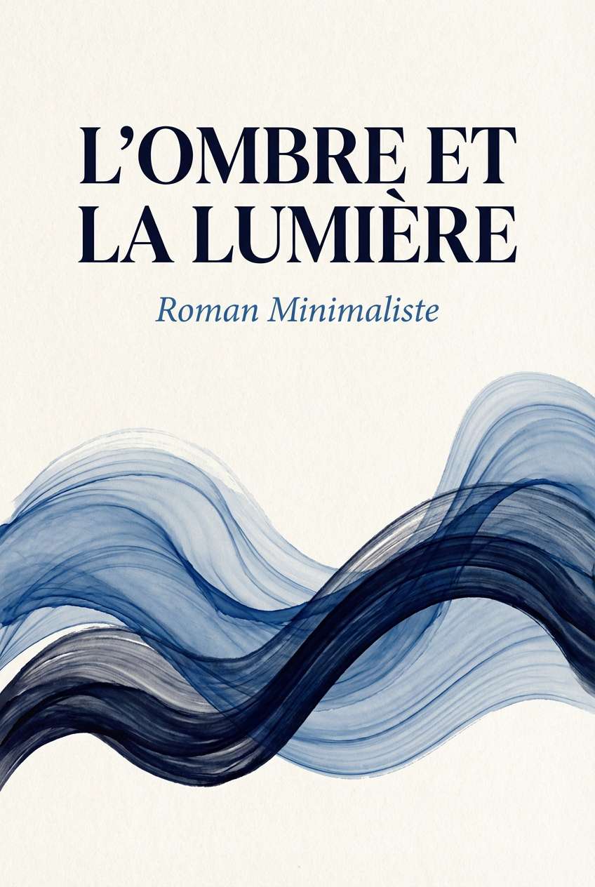
15) French Blue Ink
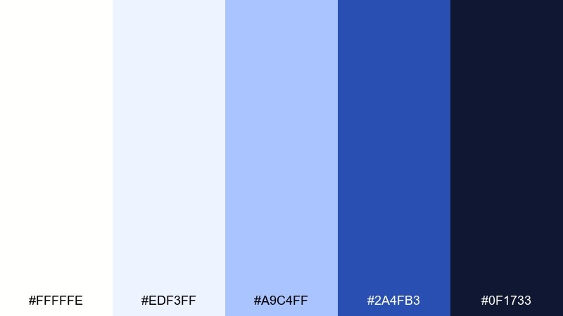
HEX: #fffffe #edf3ff #a9c4ff #2a4fb3 #0f1733
Mood: literary, elegant, confident
Best for: book covers and editorial graphics
Literary and elegant, these tones feel like fountain pen ink on thick cotton paper. The strong royal blue creates a striking focal point while the pale tints keep the layout airy and premium. White blue color combinations like this pair beautifully with cream stock, gold foil, and classic serif type. Usage tip: keep the darkest navy for the title to maintain instant readability at thumbnail size.
Image example of french blue ink generated using media.io
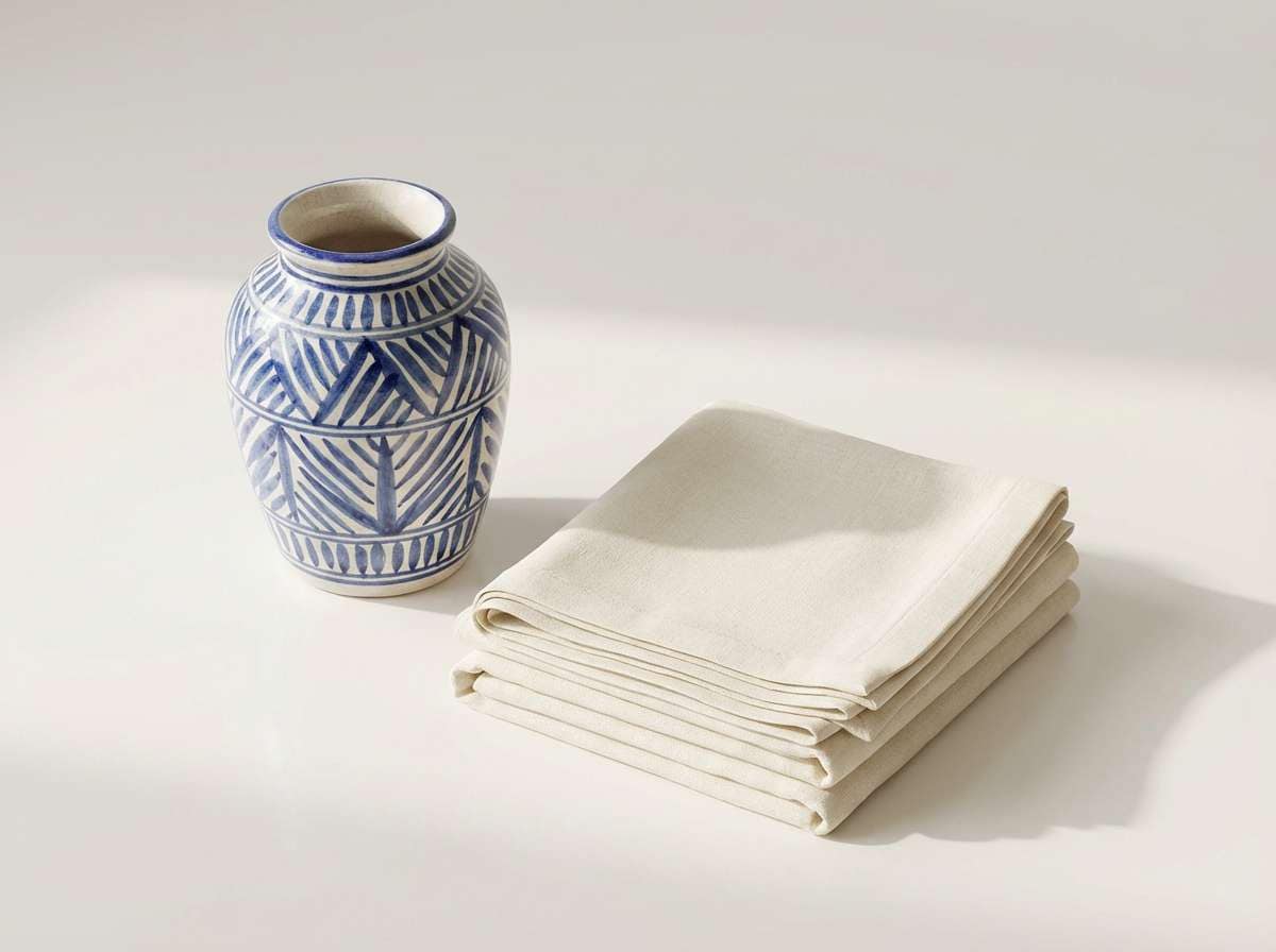
16) Ceramic Blue
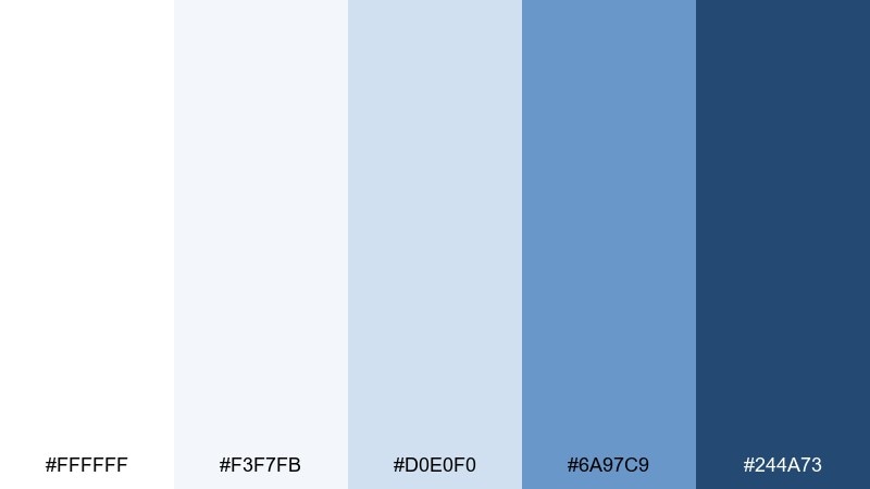
HEX: #ffffff #f3f7fb #d0e0f0 #6a97c9 #244a73
Mood: homey, neat, comforting
Best for: home decor product ads and catalogs
Homey and neat, the colors recall glazed ceramic, tidy shelves, and daylight in a calm kitchen. The soft blues flatter product photos and keep supporting text feeling lightweight. Pair with warm wood, linen textures, and a small touch of terracotta for balance. Usage tip: use the pale tint behind price tags so they stand out without shouting.
Image example of ceramic blue generated using media.io
17) Snowy Atlantic
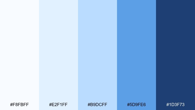
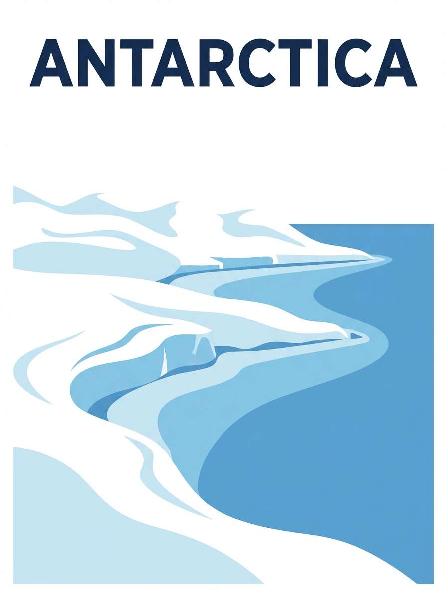
HEX: #f8fbff #e2f1ff #b9dcff #5d9fe6 #1d3f73
Mood: fresh, adventurous, open
Best for: travel posters and destination campaigns
Fresh and open, these shades conjure snowy shorelines and bright Atlantic waves. The lively blue works well for bold headings, while the lighter tints keep backgrounds clean and expansive. Pair with minimal photography blocks, simple map lines, and a pop of coral for wayfinding. Usage tip: use the medium blue for secondary text so the navy stays reserved for titles.
Image example of snowy atlantic generated using media.io
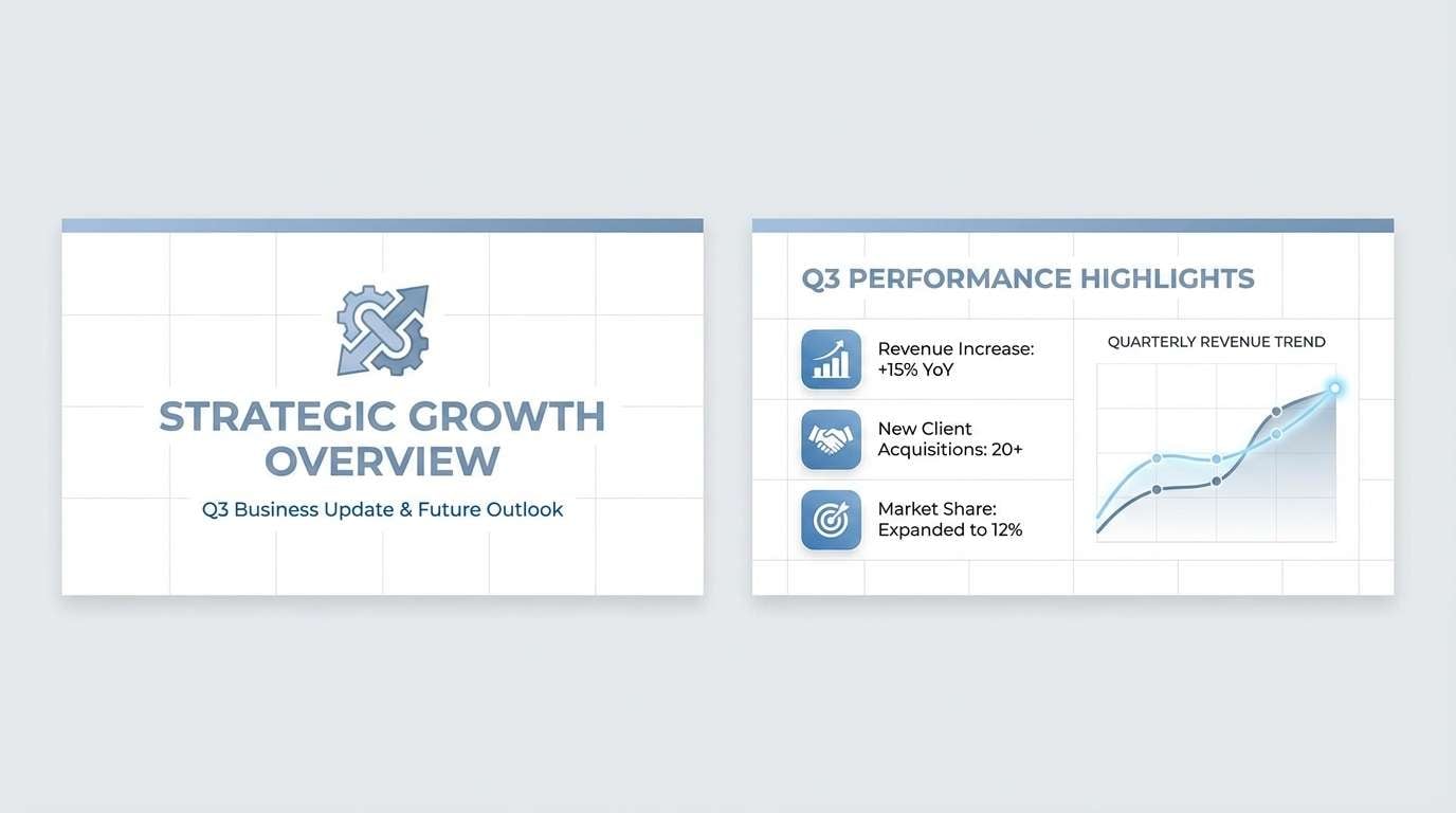
18) Soft Steel Blue
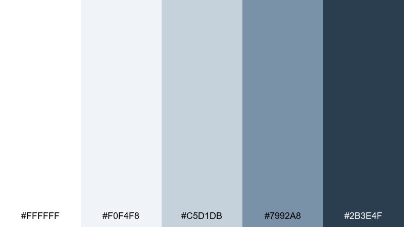
HEX: #ffffff #f0f4f8 #c5d1db #7992a8 #2b3e4f
Mood: professional, balanced, low-noise
Best for: corporate slide templates and reports
Professional and low-noise, these steel blues feel like a well-tailored suit in bright daylight. The muted range keeps long decks comfortable to read while still looking modern and purposeful. Pair with monochrome icons, clean grids, and a single accent color for key metrics. Usage tip: use the mid steel tone for charts to avoid over-saturated visuals in presentations.
Image example of soft steel blue generated using media.io
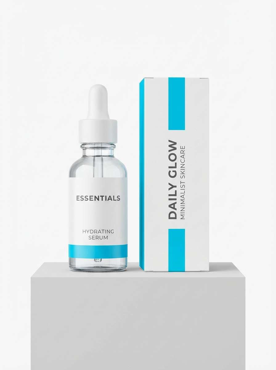
19) Bright Cyan Breeze
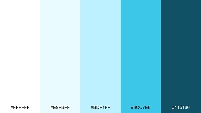
HEX: #ffffff #e9fbff #bdf1ff #3cc7e8 #115166
Mood: energetic, fresh, clean
Best for: skincare packaging and product launches
Energetic and clean, this set feels like a cool splash of water and fresh air. The bright cyan adds a modern, clinical glow, while the deeper teal keeps labels readable and premium. Pair with minimalist sans type and plenty of white to maintain a hygienic look. Usage tip: use cyan as a single band or cap color to avoid overpowering the product name.
Image example of bright cyan breeze generated using media.io
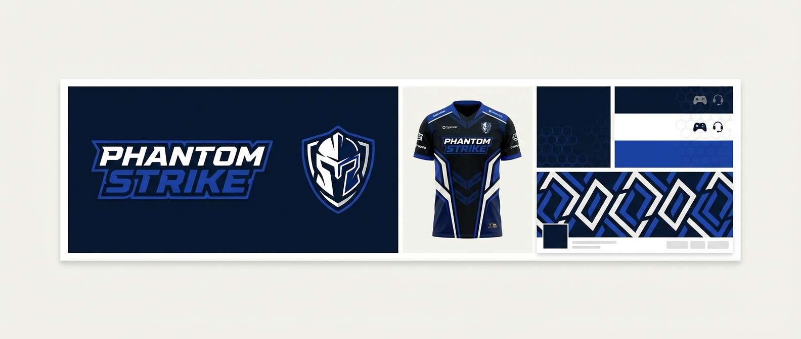
20) Royal Navy Trim
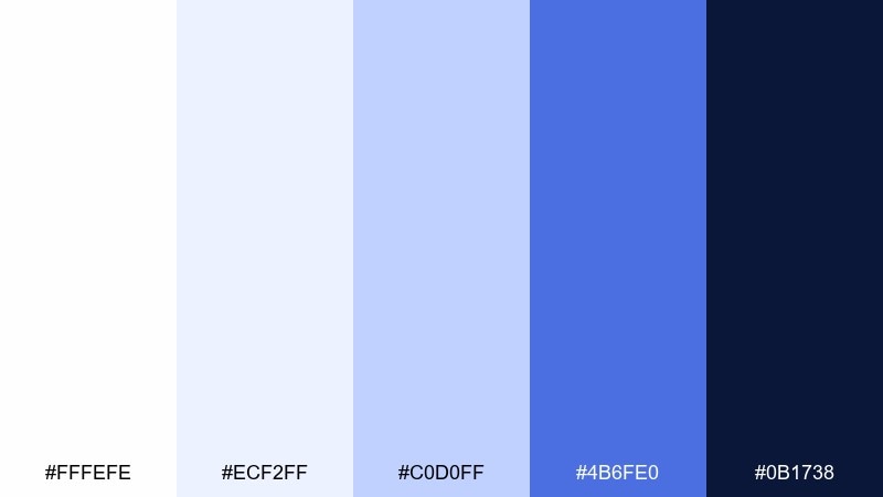
HEX: #fffefe #ecf2ff #c0d0ff #4b6fe0 #0b1738
Mood: confident, sporty, bold
Best for: esports branding and team graphics
Confident and sporty, these hues feel like stadium lights on crisp uniforms. The electric royal blue brings energy to highlights, while the deep navy keeps the brand grounded and aggressive. Pair with sharp geometric shapes, white space, and a small neon accent if you want extra punch. Usage tip: use navy as the main background so the brighter blues read as true accents.
Image example of royal navy trim generated using media.io
What Colors Go Well with White Blue?
Neutrals are the easiest match: cool grays, charcoal, and soft black keep typography crisp, while warm whites or ivory make the palette feel more premium and less sterile.
For accents, warm complementary colors work especially well—think amber, coral, or terracotta—to create instant focal points against blue UI elements or brand headers.
If you want a calm, nature-forward look, add muted greens like eucalyptus, sage, or blue-green teal. They blend smoothly with pale blues while still expanding the palette’s range.
How to Use a White Blue Color Palette in Real Designs
Start with white as your primary background, then use pale blues for surfaces (cards, sections, table rows). This keeps pages readable and gives subtle depth without relying on heavy shadows.
Assign one “hero” blue for interactive elements (primary buttons, links, active states) and one deep navy for hierarchy (headings, navigation, chart axes). Consistent roles make the palette feel intentional.
In print, test contrast early: blues can darken on uncoated stock. Use the darkest tone for small text and keep lighter tints for large blocks to avoid banding or muddiness.
Create White Blue Palette Visuals with AI
If you already have HEX codes, you can generate consistent visuals by describing the design type (UI, poster, packaging) and calling out how the whites and blues should be used (backgrounds, buttons, typography).
For the fastest workflow, reuse the prompts under each palette above—then tweak the subject, aspect ratio, and style (flat UI, studio product shot, editorial layout) to fit your project.
When you find a look you like, keep the prompt structure the same and only swap the palette name/HEX direction. That’s how you maintain a cohesive set across a whole brand system.
White Blue Color Palette FAQs
-
What does a white and blue color palette communicate?
White and blue commonly signals cleanliness, trust, clarity, and professionalism. It’s widely used in UI, healthcare, finance, and tech because it stays readable while feeling calm and reliable. -
Which blue works best with pure white (#FFFFFF)?
It depends on contrast needs: navy/indigo works best for text and navigation, while mid blues (sky/cobalt) are great for CTAs. Use very light tints for backgrounds so the interface doesn’t feel cold. -
How do I keep a white blue palette from looking sterile?
Add one warm accent (amber, coral, terracotta), switch from pure white to a warm white/ivory, or introduce subtle textures (paper grain, soft shadows, or warm photography). -
What are good accent colors for navy and white?
Amber/orange for high energy and clear alerts, blush/coral for friendly branding, and brass/gold for premium editorial or hospitality designs. Even a small accent used consistently can lift the whole system. -
Is white text on blue accessible?
Often yes with deep blues (navy/indigo), but not always with mid or light blues. Check contrast ratios and, when needed, darken the button background or use dark text on lighter blues. -
Can I use white blue palettes for print design?
Yes—just proof your blues on the final paper stock. Uncoated papers can dull saturated blues, so reserve very light tints for large areas and use deeper tones for small text and fine lines. -
How can I generate matching images for my palette quickly?
Use Media.io text-to-image with a prompt that specifies the design type plus your palette usage (white background, pale blue sections, navy typography, etc.). Reusing the same prompt structure helps you keep a cohesive visual style.


