Blue and dark red is a classic high-contrast pairing that feels both confident and emotional. It’s a go-to combo for modern UI, premium branding, and striking print layouts.
Below you’ll find 20 curated blue dark red color palette ideas with HEX codes, plus practical guidance for balancing cool blues with warm reds so your designs look intentional (not heavy).
In this article
- Why Blue Dark Red Palettes Work So Well
-
- midnight cabernet
- harbor ember
- blueprint garnet
- opera house navy
- crimson tide minimal
- dusty rose harbor
- night market velvet
- cobalt merlot horizon
- vintage varsity
- winter berries & denim
- modern atlas dashboard
- gallery noir & carmine
- rosewood tech
- classic bookish blend
- red velvet wedding suite
- neon nightlife accent
- maritime brick
- deep space pomegranate
- slate, wine, and cream
- stormy romance
- What Colors Go Well with Blue Dark Red?
- How to Use a Blue Dark Red Color Palette in Real Designs
- Create Blue Dark Red Palette Visuals with AI
Why Blue Dark Red Palettes Work So Well
Blue brings structure, calm, and trust—qualities that naturally support product design, finance, and professional branding. Dark red adds warmth, passion, and a sense of premium intensity, giving blue-heavy layouts a stronger emotional hook.
Together, they create a balanced “cool vs. warm” tension that looks intentional in everything from minimal websites to dramatic posters. The contrast also builds clear visual hierarchy, making CTAs, highlights, and key messages easier to spot.
The key is proportion: let blues and neutrals do the heavy lifting, then use dark red as a focused accent. This keeps the palette elegant instead of overwhelming.
20+ Blue Dark Red Color Palette Ideas (with HEX Codes)
1) Midnight Cabernet
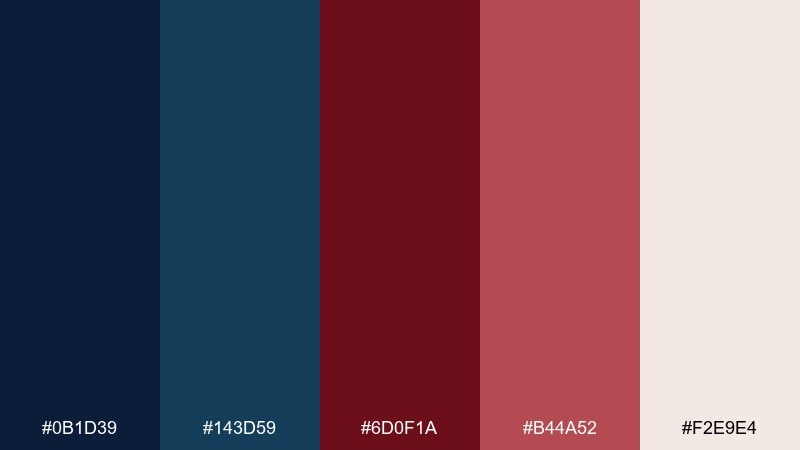
HEX: #0B1D39 #143D59 #6D0F1A #B44A52 #F2E9E4
Mood: moody, elegant, premium
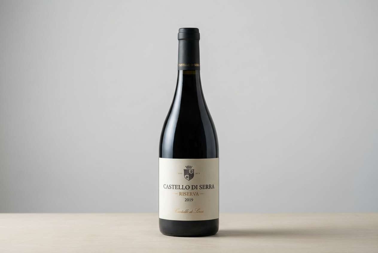
Best for: wine labels, luxury branding, upscale packaging
Moody and velvety, like a candlelit lounge with polished wood and a dark red pour. The deep blues build trust while the cabernet red adds indulgent warmth. Use the ivory as breathing room for logos and small text, and keep the dusty red for highlights. Tip: reserve the darkest navy for backgrounds to make metallic foils or light type pop.
Image example of midnight cabernet generated using media.io
Media.io is an online AI studio for creating and editing video, image, and audio in your browser.

2) Harbor Ember
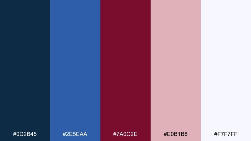
HEX: #0D2B45 #2E5EAA #7A0C2E #E0B1B8 #F7F7FF
Mood: coastal, spirited, contemporary
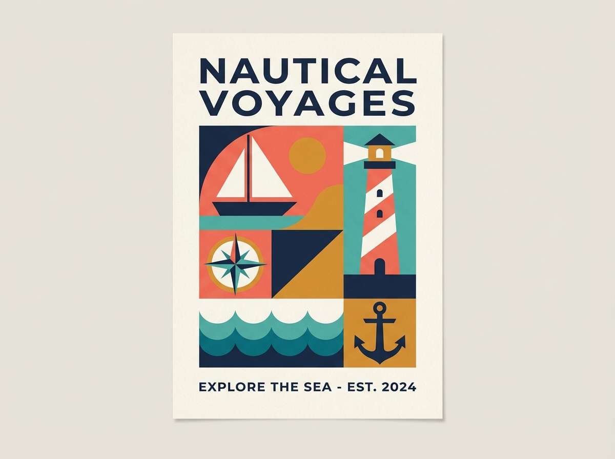
Best for: travel posters, event flyers, social graphics
Breezy and adventurous, like a harbor at dusk with city lights flickering into red. The bright blue keeps it energetic, while the maroon anchors the composition. Pair it with bold sans-serif type and plenty of white space for a modern print feel. Tip: use the blush tone for secondary panels to soften contrast without losing punch.
Image example of harbor ember generated using media.io
3) Blueprint Garnet
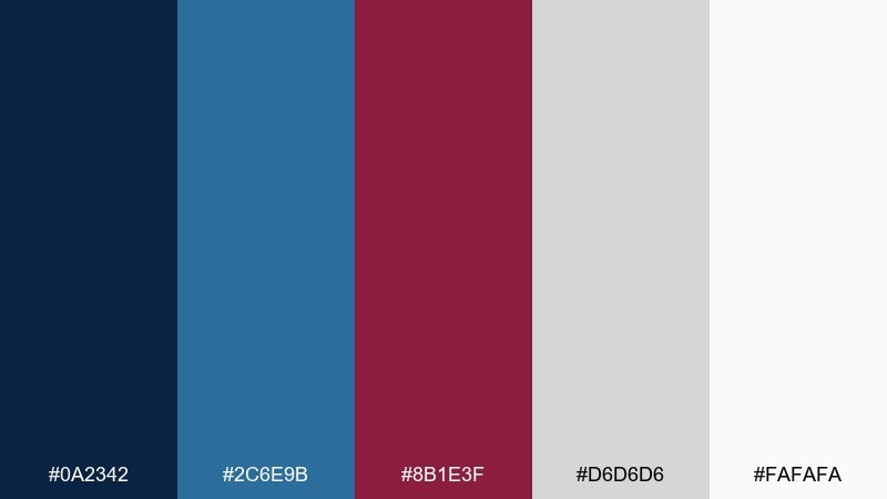
HEX: #0A2342 #2C6E9B #8B1E3F #D6D6D6 #FAFAFA
Mood: smart, structured, confident
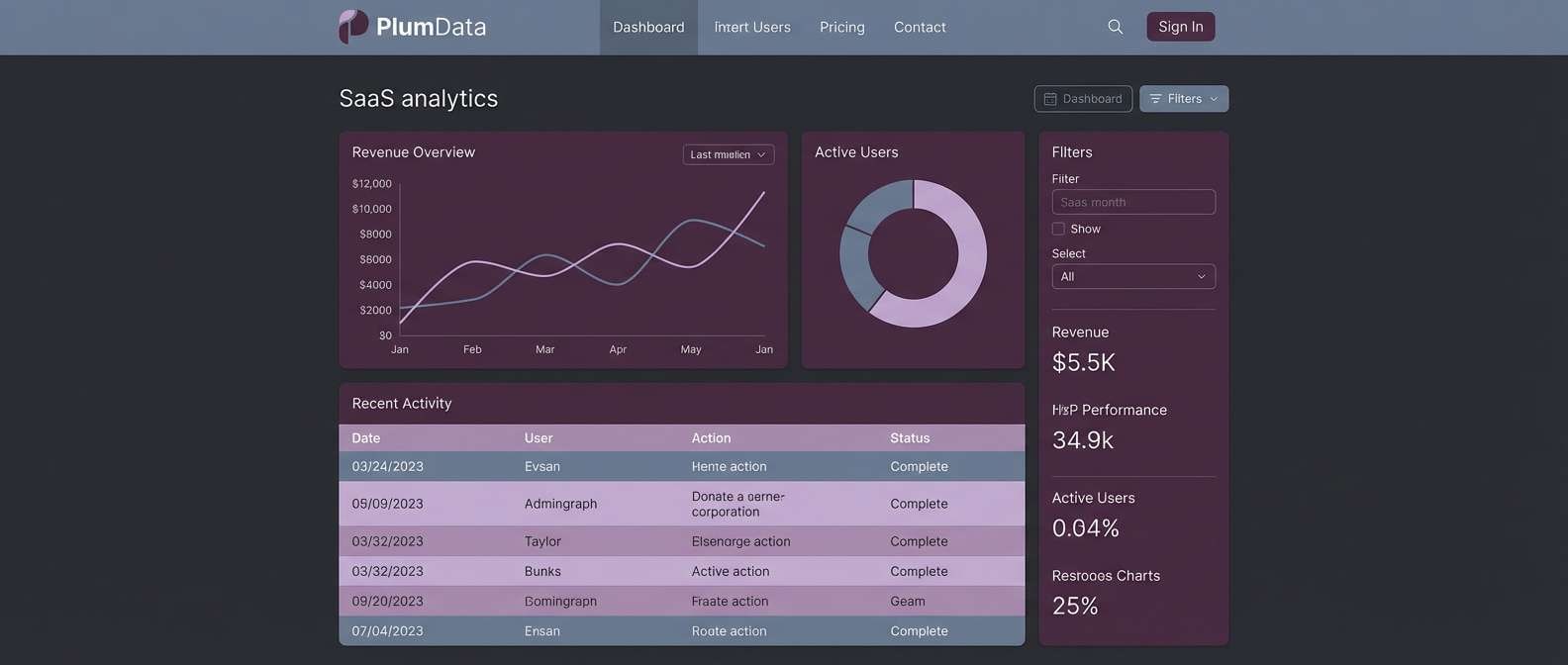
Best for: saas landing pages, dashboards, product UI
Clean and technical, like a blueprint warmed up by a garnet accent. These blue dark red color combinations work best when the neutrals handle most surfaces and the red is saved for key actions. Pair with thin line icons and subtle shadows to keep the interface crisp. Tip: keep error states in the red family, but shift confirmations toward the brighter blue for clarity.
Image example of blueprint garnet generated using media.io
4) Opera House Navy
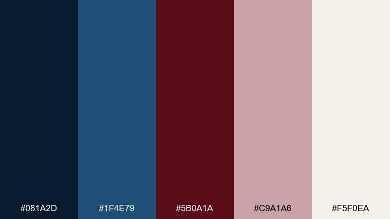
HEX: #081A2D #1F4E79 #5B0A1A #C9A1A6 #F5F0EA
Mood: dramatic, classic, refined
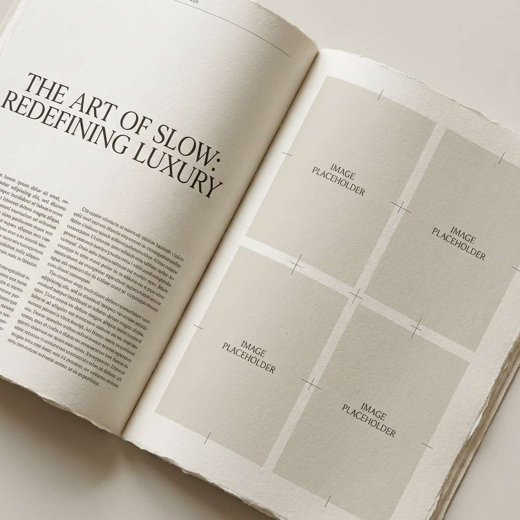
Best for: editorial spreads, theatre programs, premium brochures
Dramatic and refined, like velvet seats against a midnight stage curtain. The navy and deep red feel timeless together, especially with warm paper-like neutrals. Pair with serif headlines and generous margins for an editorial look. Tip: use the pale rose as a tint behind pull quotes to add softness without losing sophistication.
Image example of opera house navy generated using media.io
5) Crimson Tide Minimal
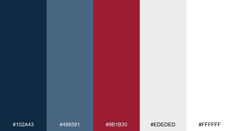
HEX: #102A43 #486581 #9B1B30 #EDEDED #FFFFFF
Mood: minimal, modern, high-contrast
Best for: web headers, minimalist posters, portfolios
Minimal and punchy, like a crisp shoreline photo with one bold red detail. The blue grays keep layouts calm, and the crimson creates instant hierarchy. Pair with black or near-black typography and a single geometric motif for a modern feel. Tip: limit the red to under 10 percent of the canvas to preserve the minimalist vibe.
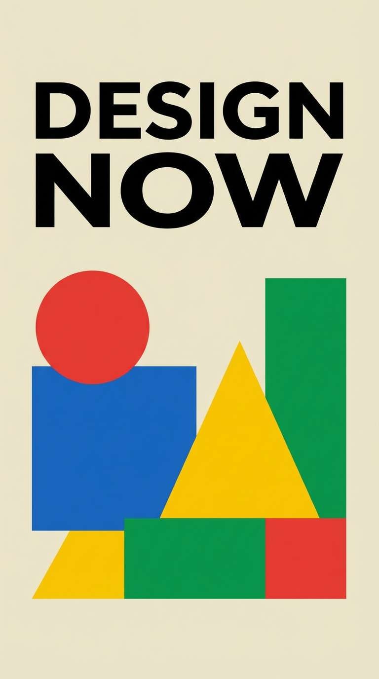
Image example of crimson tide minimal generated using media.io
6) Dusty Rose Harbor

HEX: #122B3E #2A6F97 #6A1B2B #E7C8C8 #F8F4F1
Mood: soft, romantic, approachable
Best for: lifestyle branding, beauty packaging, boutique websites
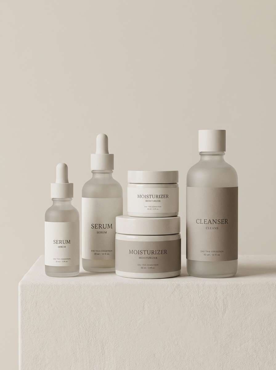
Soft and romantic, like sea air mixing with rose petals at twilight. The muted blues keep it grounded while the dusty reds lean gentle rather than loud. Pair with warm neutrals and delicate typography for skincare, candles, or boutique branding. Tip: add texture with subtle gradients in the blush tones to avoid a flat look.
Image example of dusty rose harbor generated using media.io
7) Night Market Velvet
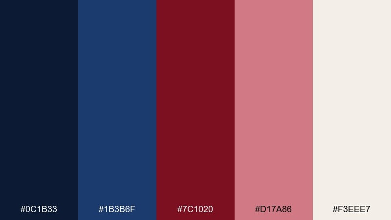
HEX: #0C1B33 #1B3B6F #7C1020 #D17A86 #F3EEE7
Mood: vibrant, cinematic, sensual
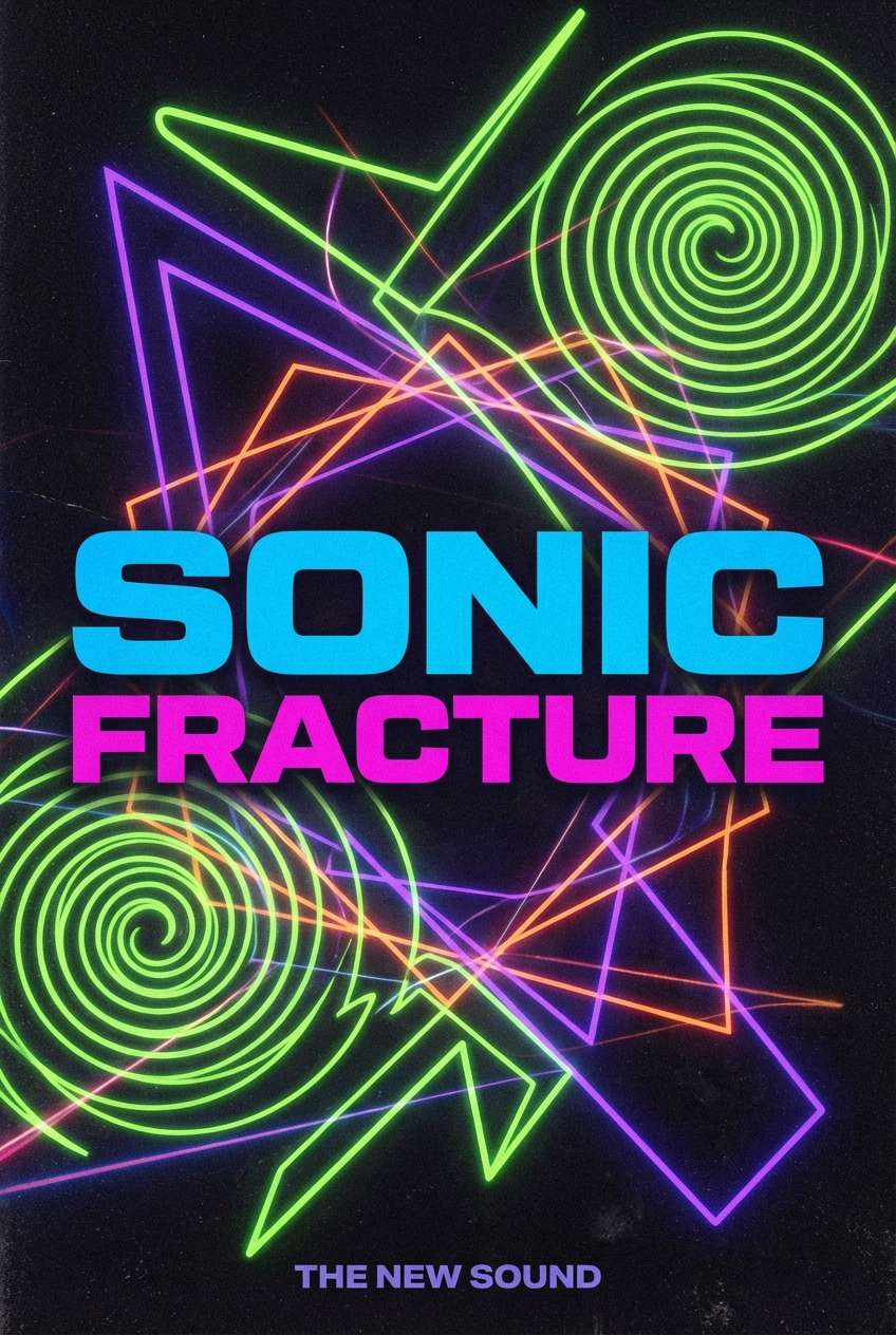
Best for: album covers, nightlife promos, fashion lookbooks
Cinematic and vibrant, like neon reflections on wet pavement with a velvet red glow. This blue dark red color palette shines when you push contrast: dark navy backgrounds, bright blue edges, and red focal points. Pair it with glossy gradients or grain for a modern music or fashion feel. Tip: use the pink-rose as a highlight tint for secondary text and badges.
Image example of night market velvet generated using media.io
8) Cobalt Merlot Horizon
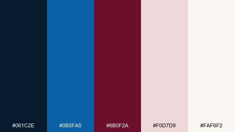
HEX: #061C2E #0B5FA5 #6B0F2A #F0D7D9 #FAF6F2
Mood: bold, expansive, optimistic
Best for: homepage hero sections, banners, marketing pages
Bold and expansive, like a clean horizon line with a merlot sun dipping into blue. The cobalt feels modern and energetic, while the deep red gives the design a confident center of gravity. Pair with large hero imagery and simple shapes to keep the palette from feeling busy. Tip: use the pale blush for section backgrounds so CTAs in cobalt stay crisp.
Image example of cobalt merlot horizon generated using media.io

9) Vintage Varsity
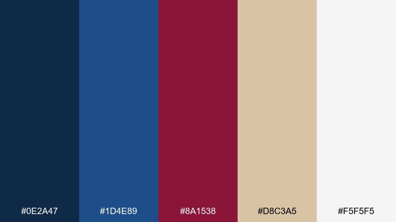
HEX: #0E2A47 #1D4E89 #8A1538 #D8C3A5 #F5F5F5
Mood: sporty, nostalgic, friendly
Best for: team branding, merch, sports posters
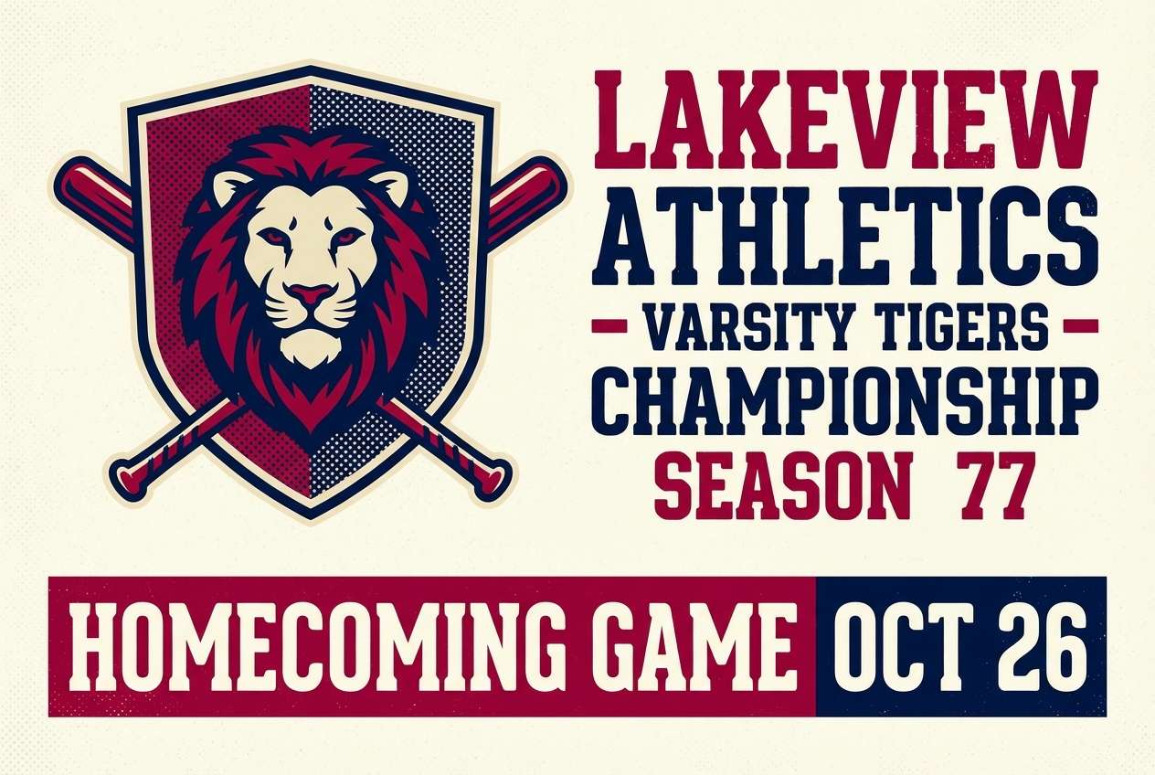
Sporty and nostalgic, like a well-worn letterman jacket with stitched patches. The blues read dependable and athletic, and the burgundy red brings heritage energy. Pair with blocky type, badge marks, and textured paper backgrounds for a classic varsity feel. Tip: use the tan as a vintage neutral for outlines, stripes, and secondary text.
Image example of vintage varsity generated using media.io
10) Winter Berries & Denim
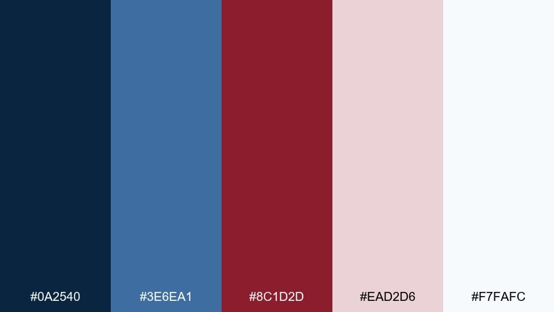
HEX: #0A2540 #3E6EA1 #8C1D2D #EAD2D6 #F7FAFC
Mood: fresh, cozy, seasonal
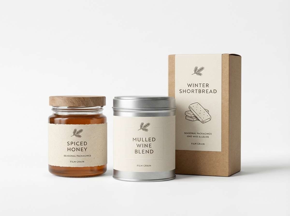
Best for: holiday campaigns, email headers, seasonal packaging
Fresh and cozy, like denim layers with winter berries on a pale snowy table. The lighter blue adds lift, while the berry red keeps everything warm and inviting. Pair with soft photography and rounded UI elements for friendly seasonal marketing. Tip: let the near-white carry most backgrounds so the berry red stays rich, not heavy.
Image example of winter berries & denim generated using media.io
11) Modern Atlas Dashboard
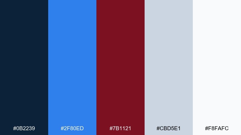
HEX: #0B2239 #2F80ED #7B1121 #CBD5E1 #F8FAFC
Mood: professional, data-driven, clear
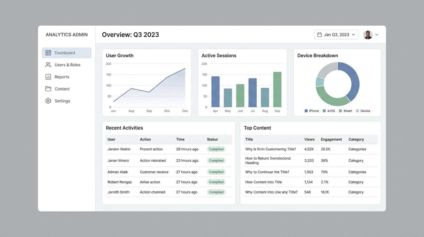
Best for: analytics UI, fintech apps, admin dashboards
Professional and data-driven, like a clean map interface with a single red pin. The bright blue supports interactive states, while the deep red becomes a strong alert or emphasis color. Pair with cool grays to keep charts legible and reduce visual fatigue. Tip: use the red only for exceptions and critical KPIs, not for every accent.
Image example of modern atlas dashboard generated using media.io
12) Gallery Noir & Carmine
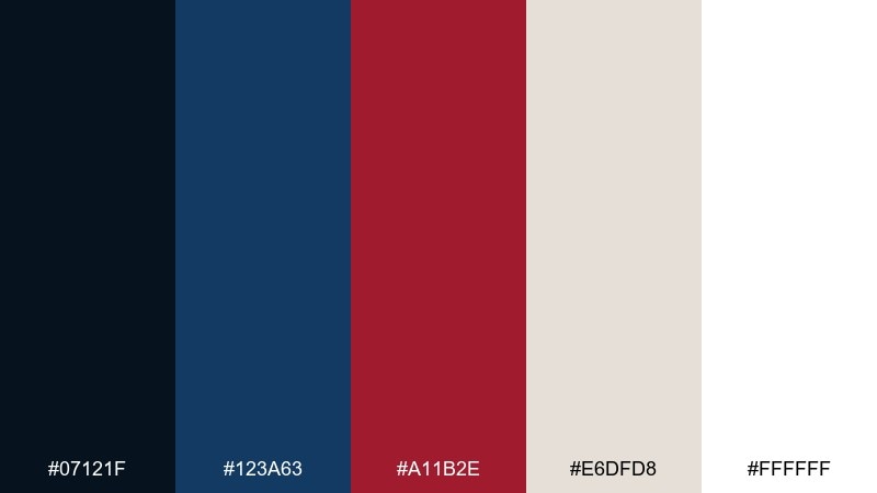
HEX: #07121F #123A63 #A11B2E #E6DFD8 #FFFFFF
Mood: artful, high-end, dramatic
Best for: art exhibitions, gallery invitations, portfolio covers
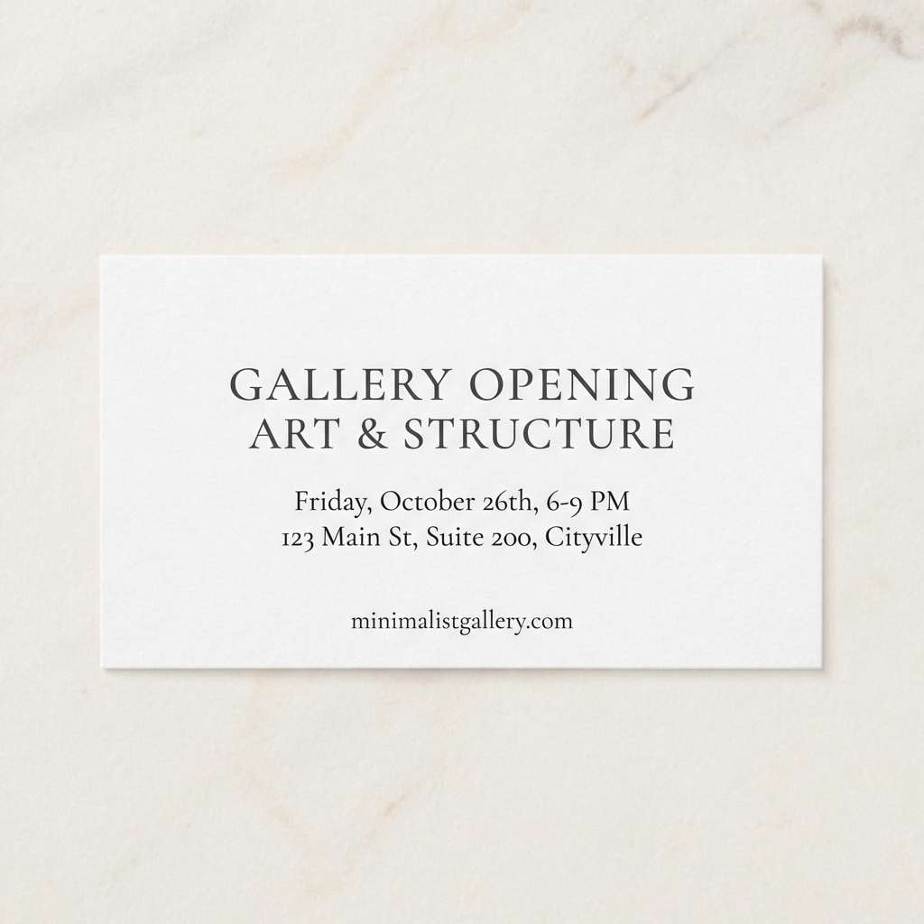
Artful and dramatic, like a quiet gallery room with a single carmine canvas stealing the spotlight. A blue dark red color palette like this works beautifully with lots of negative space and oversized typography. Pair it with matte paper textures and minimalist line art for a curated look. Tip: keep the deepest tones for frames and headers, and let the off-white dominate the page.
Image example of gallery noir & carmine generated using media.io
13) Rosewood Tech
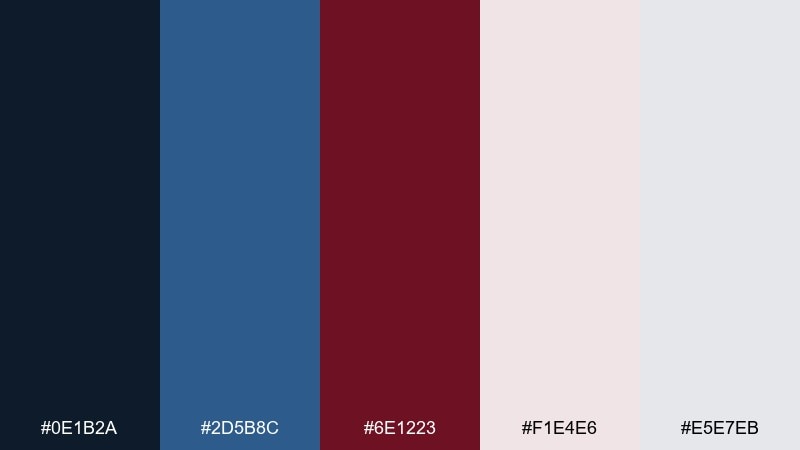
HEX: #0E1B2A #2D5B8C #6E1223 #F1E4E6 #E5E7EB
Mood: sleek, warm, modern
Best for: app onboarding, tech branding, pitch decks
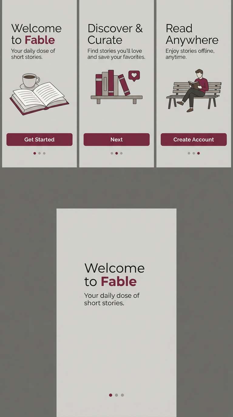
Sleek and warm, like brushed metal softened by rosewood details. The blues set a stable tech tone, while the dark red adds a human, premium edge. Pair with clean iconography and subtle gradients for a contemporary startup vibe. Tip: use the pale rose for onboarding panels to keep screens calm and readable.
Image example of rosewood tech generated using media.io
14) Classic Bookish Blend
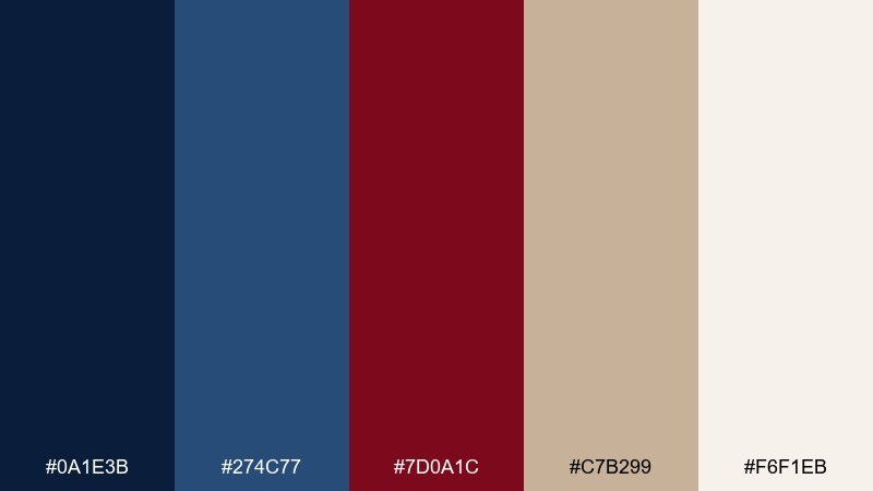
HEX: #0A1E3B #274C77 #7D0A1C #C7B299 #F6F1EB
Mood: literary, nostalgic, grounded
Best for: book covers, stationery, academic branding
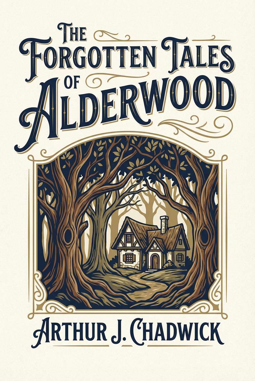
Literary and grounded, like old library stacks with a deep red bookmark tucked inside. The navy and burgundy feel traditional, while the warm tan keeps it approachable. Pair with serif type, small ornaments, and subtle paper grain for a classic print mood. Tip: keep the red for titles or a single emblem to avoid a heavy cover.
Image example of classic bookish blend generated using media.io
15) Red Velvet Wedding Suite
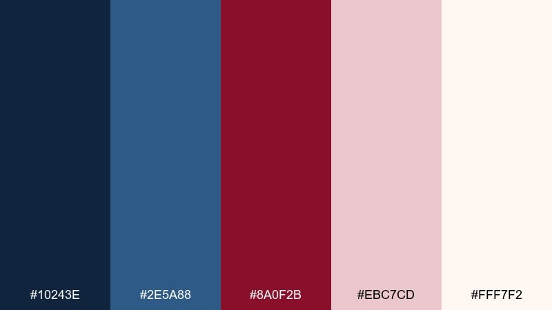
HEX: #10243E #2E5A88 #8A0F2B #EBC7CD #FFF7F2
Mood: romantic, formal, luxurious
Best for: wedding invitations, save-the-dates, RSVP cards
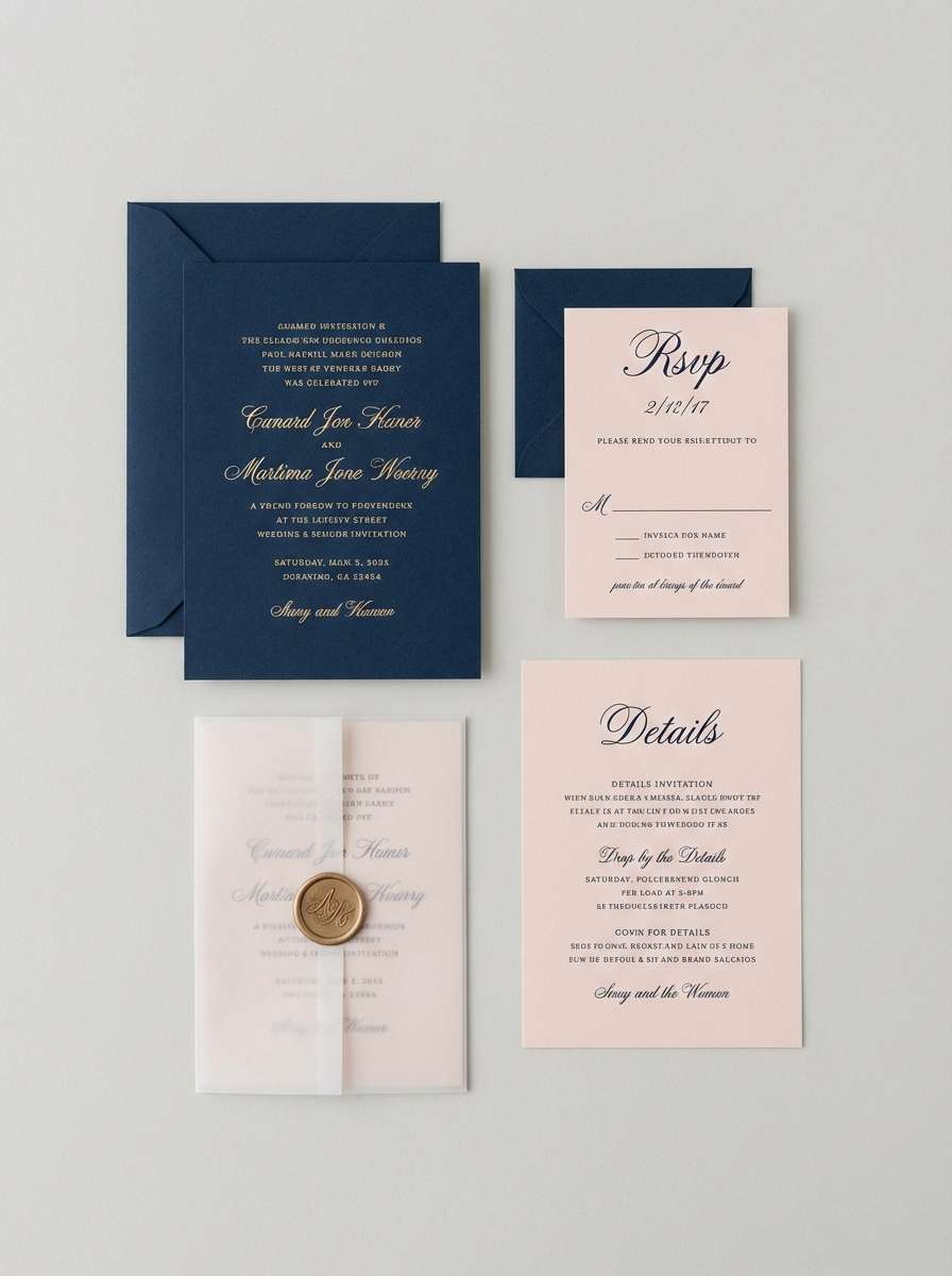
Romantic and formal, like velvet ribbon on crisp stationery. The deep blue keeps the suite elegant, and the rich red makes a beautiful accent for monograms and wax-seal motifs. Pair with off-white paper tones and fine-line florals to stay timeless. Tip: use the blush as a backing layer for details like schedules and accommodation info.
Image example of red velvet wedding suite generated using media.io
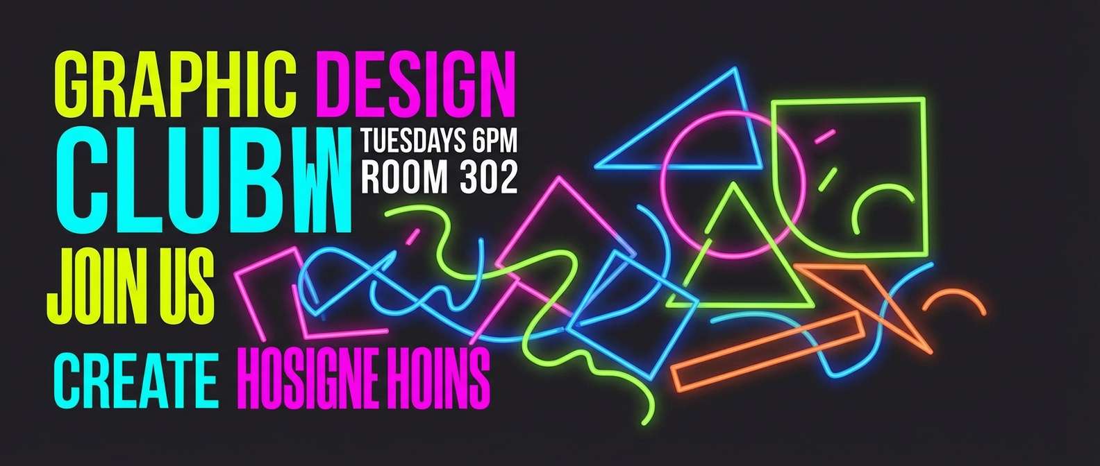
16) Neon Nightlife Accent
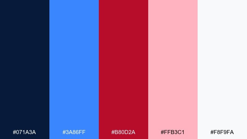
HEX: #071A3A #3A86FF #B80D2A #FFB3C1 #F8F9FA
Mood: electric, youthful, bold
Best for: club flyers, music promos, social story templates
Electric and youthful, like bright signage cutting through a dark city block. The neon blue drives energy, while the hot red keeps calls-to-action impossible to miss. Pair with condensed type and big geometric shapes for a contemporary promo look. Tip: keep light pink as a glow or outline color to avoid harsh edges in social formats.
Image example of neon nightlife accent generated using media.io
17) Maritime Brick
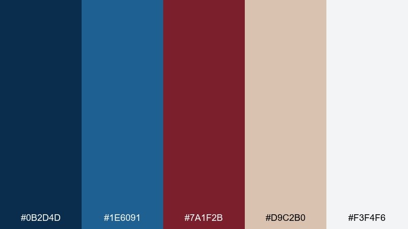
HEX: #0B2D4D #1E6091 #7A1F2B #D9C2B0 #F3F4F6
Mood: rustic, dependable, outdoorsy
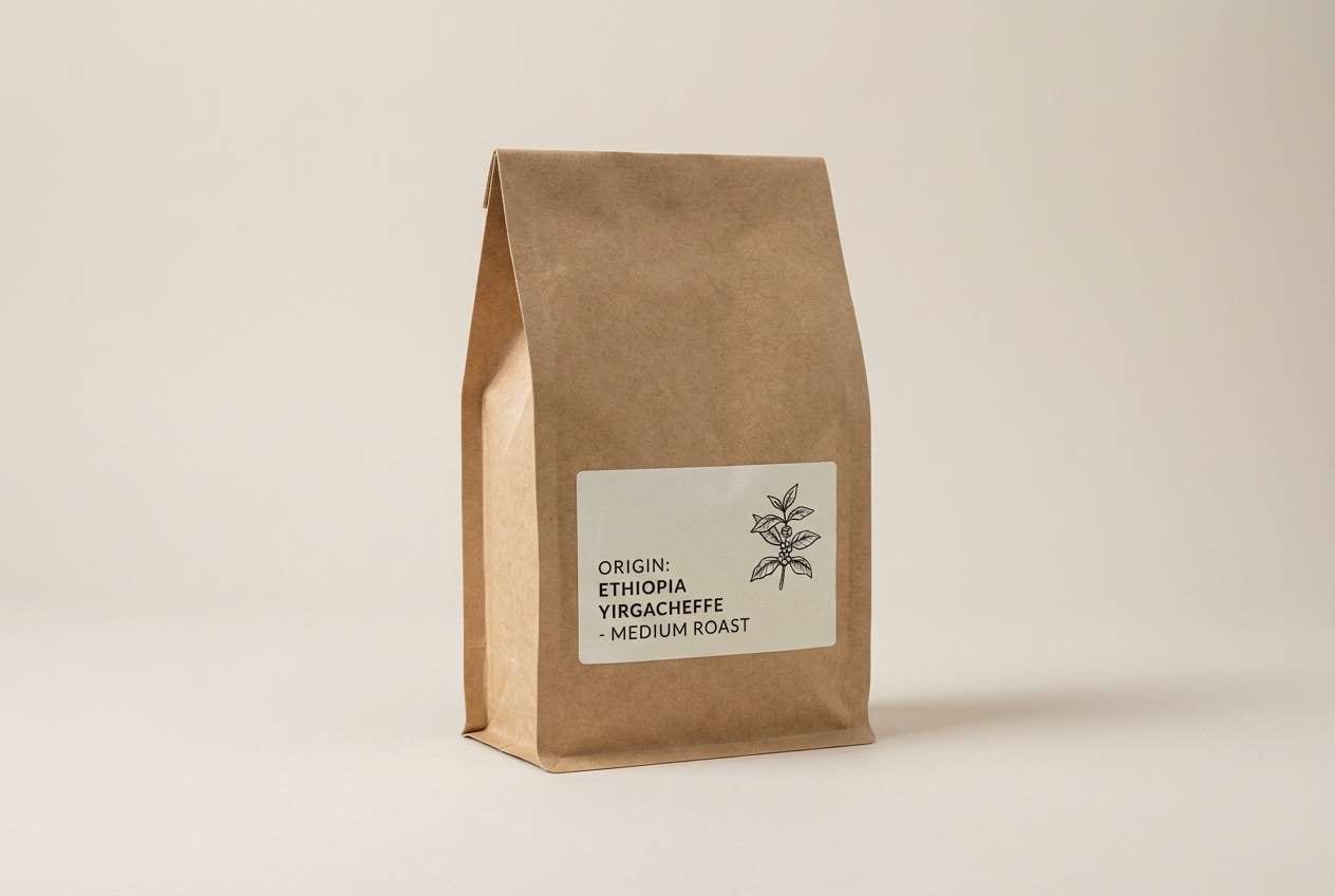
Best for: craft branding, coffee bags, outdoor gear labels
Rustic and dependable, like weathered docks and brick warehouses by the water. The ocean blues bring clarity, and the brick red feels handcrafted and honest. Pair with kraft textures and simple badge marks for small-batch products. Tip: use the tan as a base label color so the darker tones can work as stamps and ink.
Image example of maritime brick generated using media.io
18) Deep Space Pomegranate
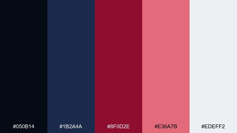
HEX: #050B14 #1B2A4A #8F0D2E #E36A7B #EDEFF2
Mood: mysterious, futuristic, intense
Best for: gaming banners, sci-fi posters, streaming overlays
Mysterious and futuristic, like deep space lit by a pomegranate flare. These blue dark red color combinations are strongest when you lean into dark backgrounds and let the brighter accents do the storytelling. Pair with sharp sans type, light noise, and subtle glows for a modern sci-fi edge. Tip: keep the light gray for UI labels so small text stays readable over near-black.
Image example of deep space pomegranate generated using media.io

19) Slate, Wine, and Cream
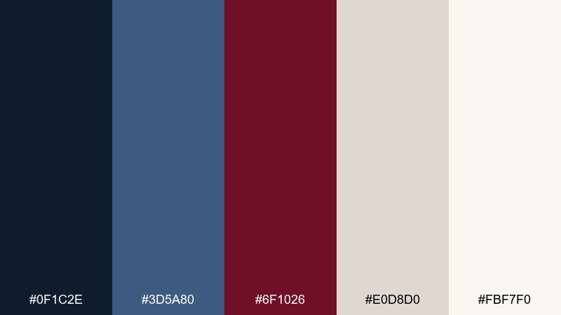
HEX: #0F1C2E #3D5A80 #6F1026 #E0D8D0 #FBF7F0
Mood: calm, balanced, mature
Best for: corporate branding, reports, presentation templates
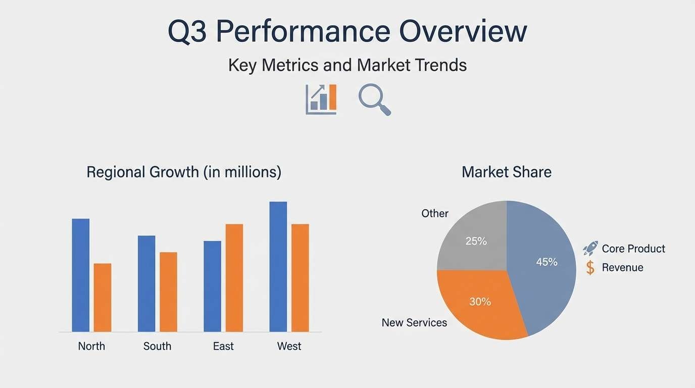
Calm and balanced, like slate stone paired with a glass of red and a cream linen napkin. The muted blue keeps long-form layouts readable, and the wine red adds a dignified accent. Pair with simple charts, consistent spacing, and plenty of cream background. Tip: use the red only for key takeaways and section dividers to guide skimming.
Image example of slate, wine, and cream generated using media.io
20) Stormy Romance
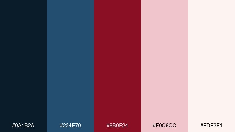
HEX: #0A1B2A #234E70 #8B0F24 #F0C6CC #FDF3F1
Mood: romantic, stormy, soft-glam
Best for: valentines promos, boutique ads, editorial social posts
Romantic and stormy, like raincloud blues softened by a blush-red glow. The palette feels tender without turning sugary, especially when the darker tones frame the layout. Pair with elegant serif headlines and gentle gradients in the pink range. Tip: keep the blush for backgrounds and use the deep red for a single focal element like a price, date, or logo mark.
Image example of stormy romance generated using media.io
What Colors Go Well with Blue Dark Red?
Neutrals are the easiest “third color” to add: warm ivories, creams, and light grays keep blue-and-burgundy schemes readable and print-friendly. They also prevent dark tones from feeling too heavy in UI and branding.
For a softer look, lean into blush, dusty rose, or muted mauve—these bridge the temperature gap between cool blue and warm red. For a sharper modern edge, add a bright cobalt or electric blue as an interactive highlight.
Metallics and earthy accents also work well: gold/bronze for premium packaging and invitations, or tan/kraft for vintage and handcrafted branding.
How to Use a Blue Dark Red Color Palette in Real Designs
Start with roles: pick one deep blue for primary surfaces (headers, navigation, background panels), one neutral for the main canvas, and reserve dark red for emphasis (CTA, badges, key numbers, highlights). This keeps hierarchy consistent across pages and assets.
In UI, treat dark red as “meaningful”: alerts, critical states, and high-priority actions. Use blues for links, focus states, and interactive elements so the interface feels trustworthy and easy to scan.
In print and branding, increase sophistication with texture: paper grain, subtle gradients, or matte finishes. Dark red can carry premium cues, while navy anchors typography and layouts.
Create Blue Dark Red Palette Visuals with AI
If you want to preview how a blue dark red color scheme looks on real assets—posters, packaging, dashboards, or social templates—AI mockups can save hours. You can generate multiple style directions quickly and refine the vibe before design production.
With Media.io’s text-to-image tool, paste a prompt (like the examples above), then iterate on composition, lighting, and typography style. It’s an easy way to validate contrast and mood before committing to final colors.
When you find a palette you like, keep the HEX codes handy and reuse them consistently across web, print, and marketing to build a recognizable brand system.
Blue Dark Red Color Palette FAQs
-
Why do navy and burgundy work so well together?
Navy is cool, stable, and trust-building, while burgundy adds warmth and richness. The pair creates strong contrast without the harshness of pure primary red, so it reads premium and balanced. -
Is a blue dark red color scheme good for websites?
Yes—especially for SaaS, fintech, portfolios, and premium brands. Use blue and neutrals for most surfaces, and apply dark red sparingly for key actions or emphasis to maintain clarity. -
What background color is best with blue and dark red?
Off-white, cream, and very light gray are the safest backgrounds for readability. For dramatic designs, a near-black navy background works well—just keep text in light neutrals. -
How do I keep dark red from overpowering the palette?
Limit dark red to accents (often under 10–15% of the layout) and let blues and neutrals handle large areas. Use lighter tints like blush or dusty rose to soften transitions. -
What accent colors can I add to blue and dark red?
Blush/mauve for softness, tan/kraft for vintage warmth, cool grays for modern UI, and gold/bronze for a premium print feel. Bright cobalt can also add energy for interactive states. -
Which HEX codes are common for “blue dark red” looks?
Deep navies like #0B1D39 or #081A2D and wine reds like #6D0F1A or #8B0F24 are common anchors. Pair them with a light neutral such as #FAFAFA or #F2E9E4 for balance. -
Can I generate mockups for these palettes with AI?
Yes. Use Media.io text-to-image to generate posters, packaging, UI screens, or social creatives, then iterate on prompts while keeping your chosen HEX codes consistent.


