Burgundy and teal is a high-impact pairing: one side rich and grounded, the other cool and refreshing. Together, they create contrast that feels intentional—perfect for brands, interiors, and UI.
Below are 20 burgundy teal color palette ideas with HEX codes, plus ready-to-use prompts you can run in Media.io to generate matching visuals fast.
In this article
- Why Burgundy Teal Palettes Work So Well
-
- velvet harbor
- garnet tide
- antique bistro
- midnight botanical
- art deco lounge
- cozy library
- modern winery
- coastal ember
- nordic contrast
- neo vintage poster
- minimal dashboard
- luxe wedding suite
- retro sportswear
- dark mode app
- autumn market
- spa serenity
- urban gallery
- winter cabin
- museum editorial
- craft packaging
- What Colors Go Well with Burgundy Teal?
- How to Use a Burgundy Teal Color Palette in Real Designs
- Create Burgundy Teal Palette Visuals with AI
Why Burgundy Teal Palettes Work So Well
Burgundy brings depth, warmth, and a premium feel, while teal adds clarity and calm. The mix reads both classic and modern, which is why it works across hospitality, fashion, editorial, and digital products.
This duo also gives you built-in hierarchy: burgundy can handle emphasis (headlines, seals, alerts), and teal can guide interaction (links, buttons, navigational cues). That separation makes designs feel organized, not busy.
Most burgundy-teal palettes pair beautifully with creamy whites, warm tans, charcoal, and metallic golds. Those supporting neutrals keep the contrast elegant and improve legibility in print and on screens.
20+ Burgundy Teal Color Palette Ideas (with HEX Codes)
1) Velvet Harbor
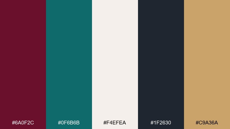
HEX: #6A0F2C #0F6B6B #F4EFEA #1F2630 #C9A36A
Mood: moody, elegant, coastal
Best for: boutique hotel branding, lounge interiors, hero banners
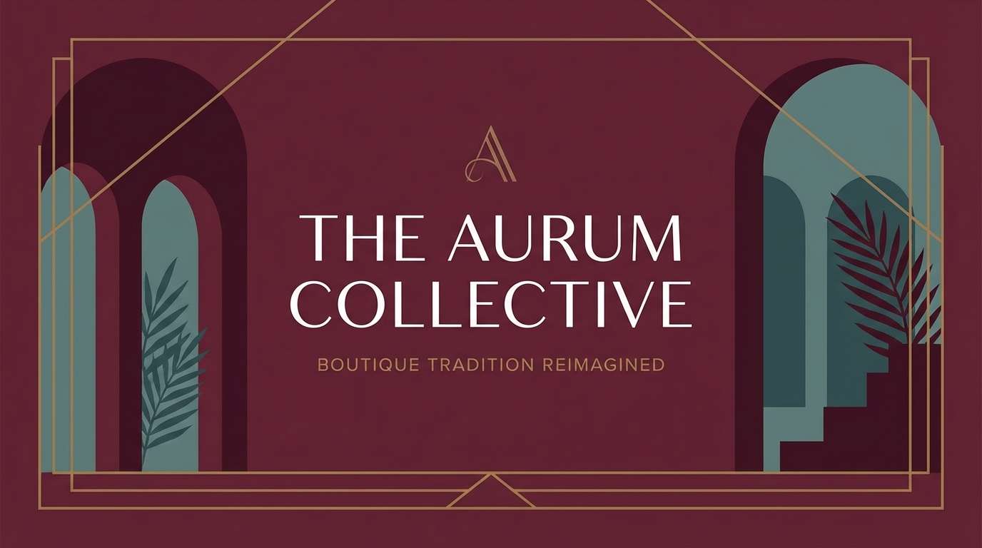
Moody velvet reds and deep-sea teal bring to mind candlelit harbors and polished brass details. Use it for premium hospitality visuals, menu covers, or a bold homepage hero. Pair with warm neutrals and a touch of metallic gold to keep it upscale rather than heavy. Tip: reserve the brass tone for icons and thin rules so the layout stays refined.
Image example of velvet harbor generated using media.io
Media.io is an online AI studio for creating and editing video, image, and audio in your browser.

2) Garnet Tide
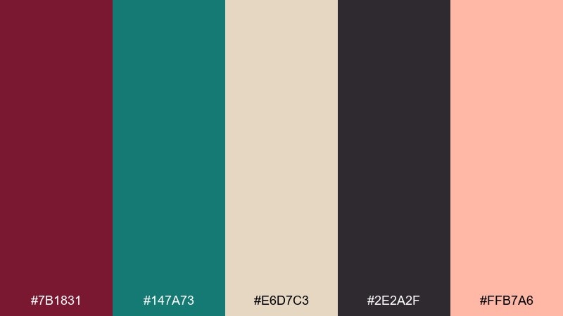
HEX: #7B1831 #147A73 #E6D7C3 #2E2A2F #FFB7A6
Mood: romantic, lively, modern
Best for: beauty campaigns, social graphics, lifestyle branding
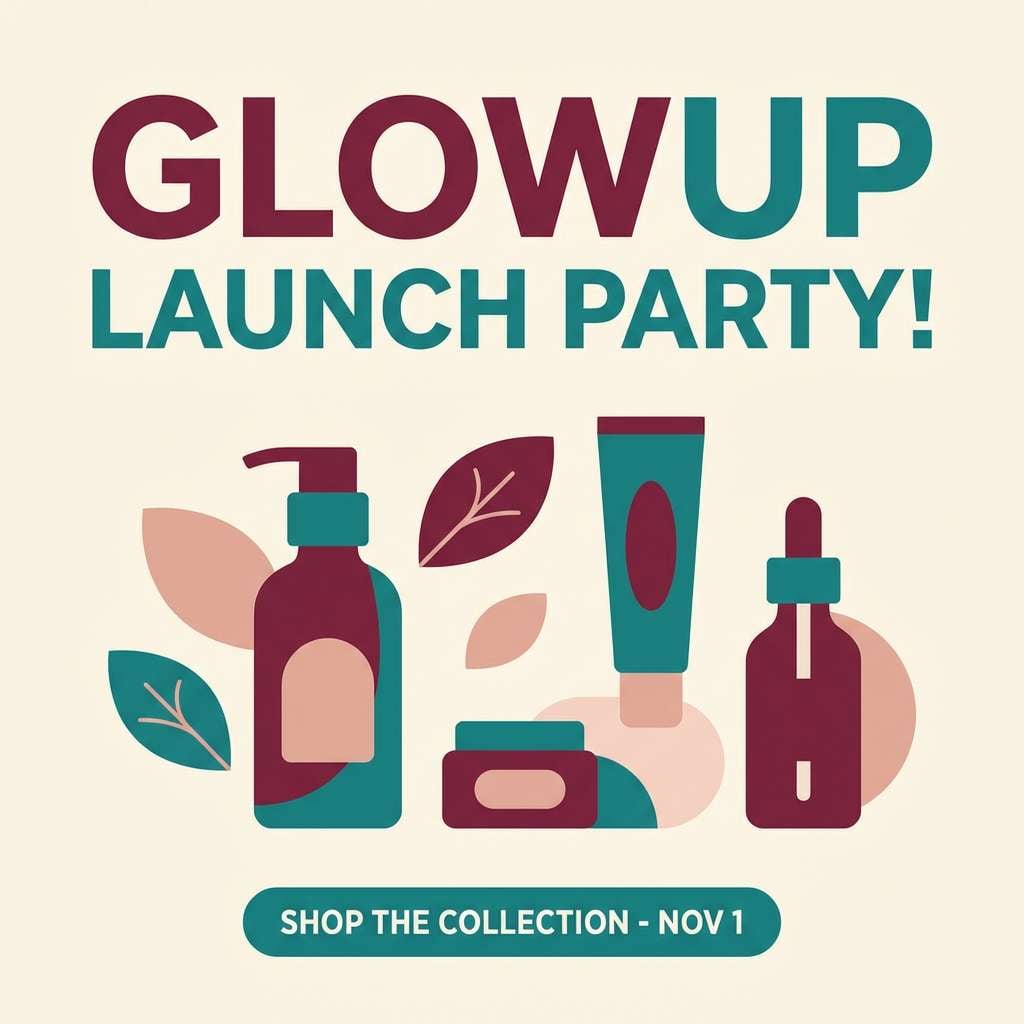
Romantic garnet and fresh teal feel like sunset light hitting the water, with a soft blush lift. These burgundy teal color combinations work beautifully for beauty launches and upbeat social posts. Keep typography dark and crisp, then let blush act as the highlight for stickers, badges, or CTAs. Tip: use the cream as the main canvas to prevent the deeper tones from competing.
Image example of garnet tide generated using media.io
3) Antique Bistro
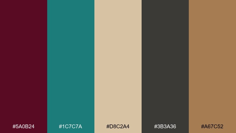
HEX: #5A0B24 #1C7C7A #D8C2A4 #3B3A36 #A67C52
Mood: vintage, warm, inviting
Best for: restaurant menus, cafe interiors, signage
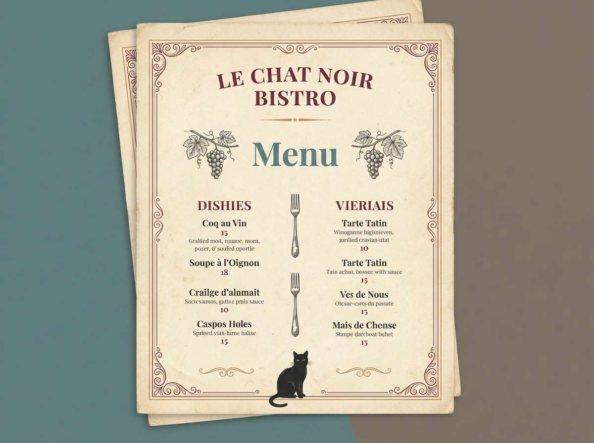
Vintage warmth comes through like worn leather booths and a painted teal door. The tan and cocoa neutrals make the dark red feel approachable, not formal. Use it for menus, storefront signs, and cozy interior accents, especially with serif typography and textured paper. Tip: print the teal slightly muted to preserve the antique feel.
Image example of antique bistro generated using media.io
4) Midnight Botanical
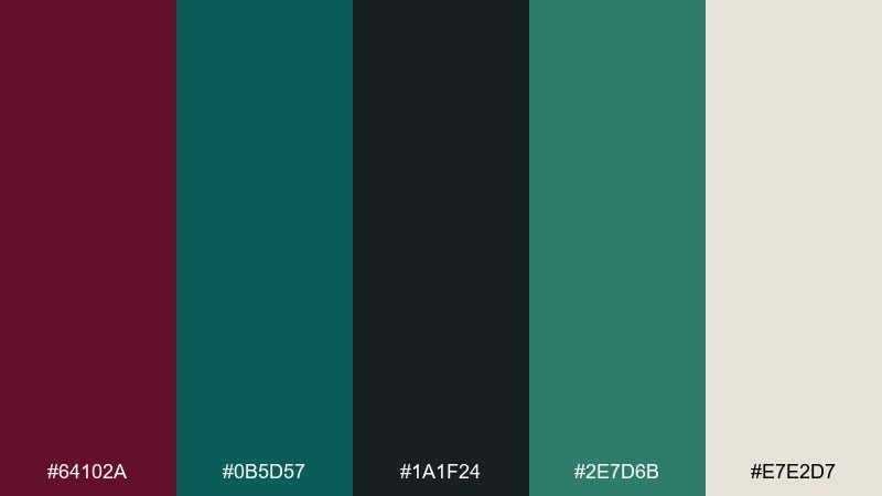
HEX: #64102A #0B5D57 #1A1F24 #2E7D6B #E7E2D7
Mood: mysterious, natural, dramatic
Best for: botanical posters, candle labels, moody editorials
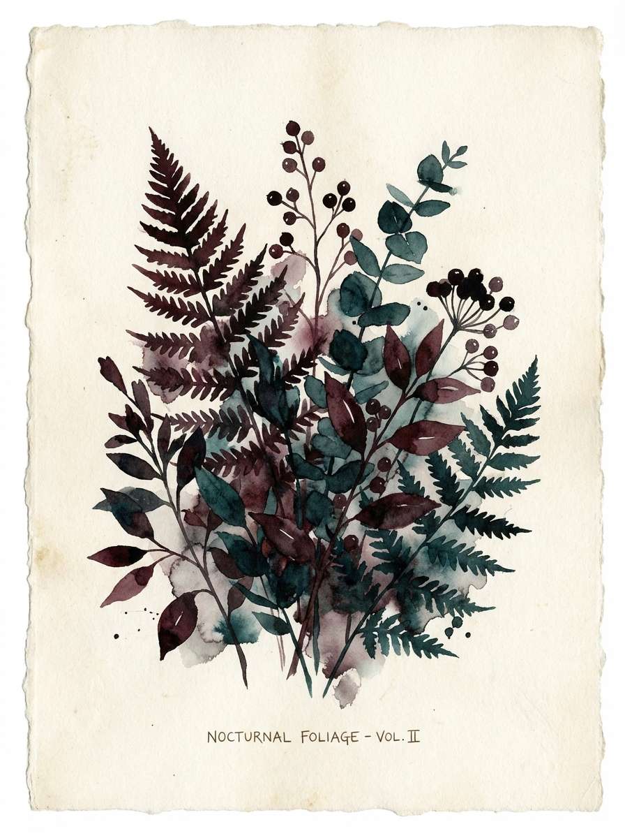
Mysterious midnight tones evoke dense leaves, shadowy stems, and a deep wine glow. As a burgundy teal color scheme, it shines in botanical posters and product labels where you want drama without neon. Pair with off-white paper and fine linework so details stay legible. Tip: use the brighter green-teal for small botanical highlights rather than large blocks.
Image example of midnight botanical generated using media.io
5) Art Deco Lounge
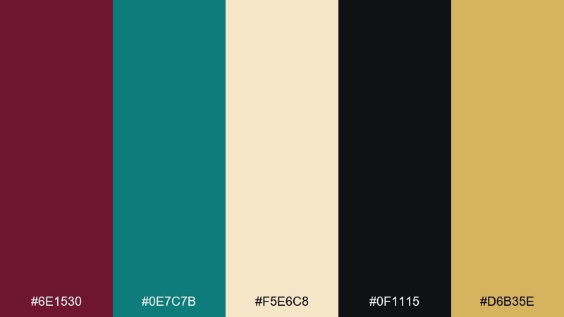
HEX: #6E1530 #0E7C7B #F5E6C8 #0F1115 #D6B35E
Mood: glam, geometric, high-contrast
Best for: event invitations, bar branding, premium ads
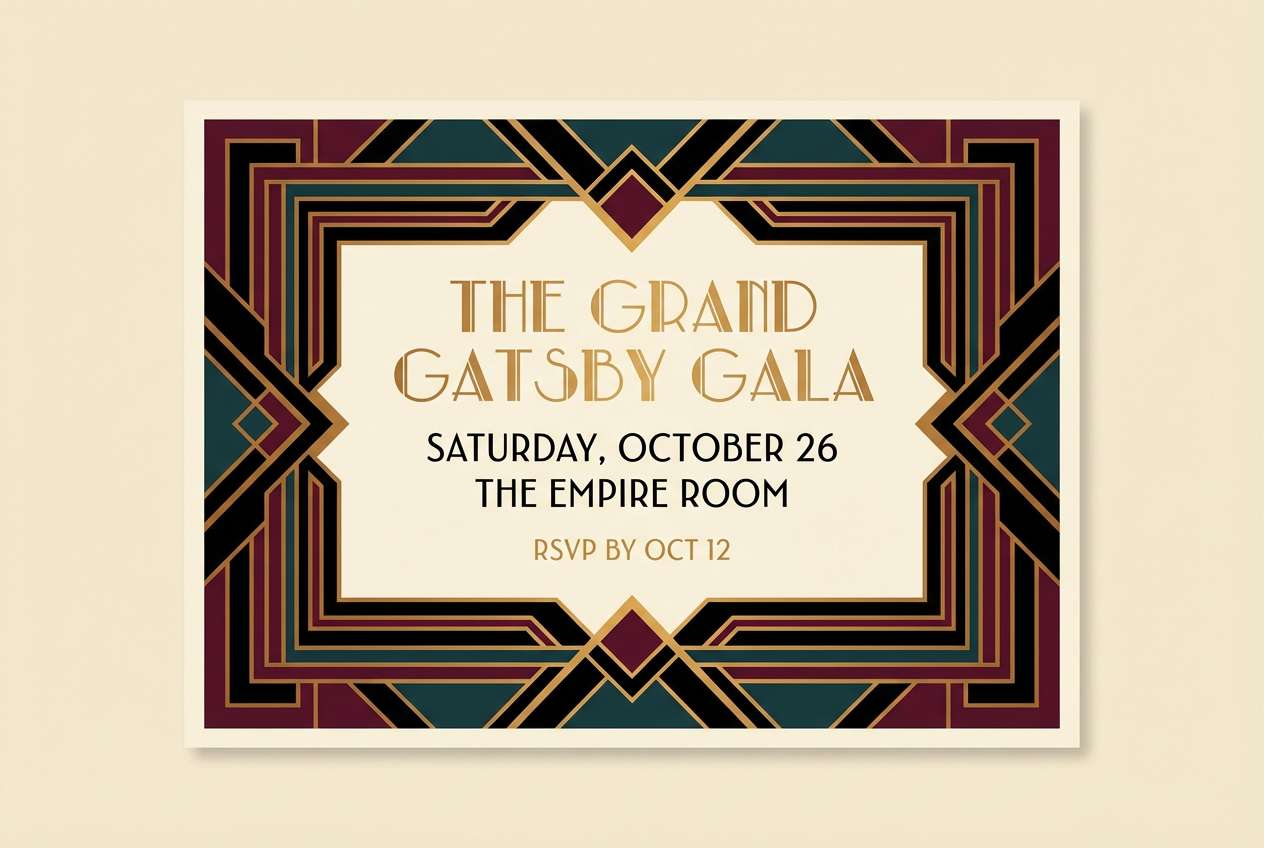
Glam contrast and geometric energy recall an art deco bar with brass rails and deep shadows. The black and gold notes make the red-teal pairing look intentional and luxe. Use it for invitations, club posters, or premium ads with sharp lines and symmetrical layouts. Tip: keep gold to thin frames and dividers for a clean deco finish.
Image example of art deco lounge generated using media.io
6) Cozy Library
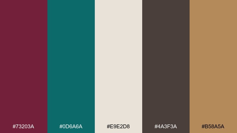
HEX: #73203A #0D6A6A #E9E2D8 #4A3F3A #B58A5A
Mood: cozy, scholarly, grounded
Best for: book covers, study spaces, stationery sets
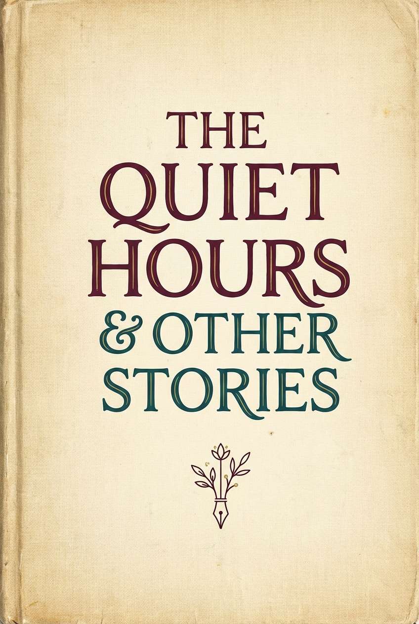
Cozy, scholarly tones suggest aged pages, mahogany shelves, and a teal reading lamp glow. The burgundy teal color palette feels especially strong for book covers, journals, and quiet workspace branding. Pair with paper-like creams and a warm brown for headings to keep it timeless. Tip: use teal for section markers and navigation so the hierarchy reads instantly.
Image example of cozy library generated using media.io
7) Modern Winery
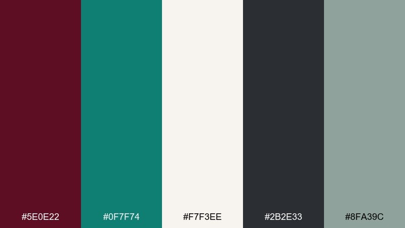
HEX: #5E0E22 #0F7F74 #F7F3EE #2B2E33 #8FA39C
Mood: clean, premium, contemporary
Best for: wine labels, tasting room sites, packaging systems
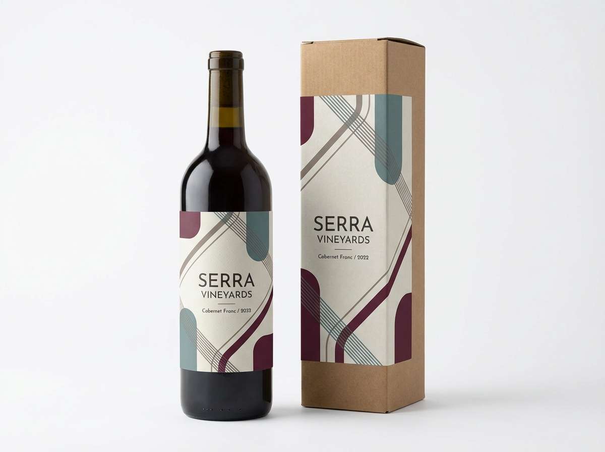
Clean premium tones feel like a modern tasting room with slate counters and crisp labels. The cool gray-green helps the deep red read sophisticated rather than seasonal. Use it for packaging systems, Shopify storefronts, and minimal label layouts with lots of white space. Tip: choose one accent color per panel so the brand looks consistent across varietals.
Image example of modern winery generated using media.io
8) Coastal Ember
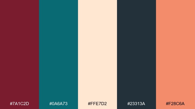
HEX: #7A1C2D #0A6A73 #FFE7D2 #23313A #F28C6A
Mood: sunset, energetic, playful
Best for: travel promos, summer events, product highlights
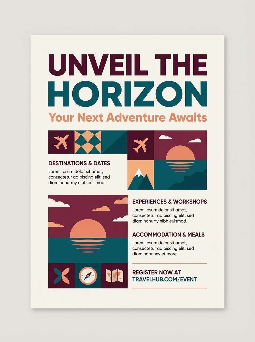
Sunset energy shows up as ember burgundy against ocean teal, lifted by a warm peach accent. A burgundy teal color combination like this fits travel promos, beach-town events, and bright product highlights. Pair with airy photography and keep the navy for text to maintain contrast. Tip: use peach as the single call-to-action color for instant focus.
Image example of coastal ember generated using media.io
9) Nordic Contrast

HEX: #6B1228 #0E6F6B #F8FAFB #2A2F35 #A9B2BA
Mood: minimal, cool, structured
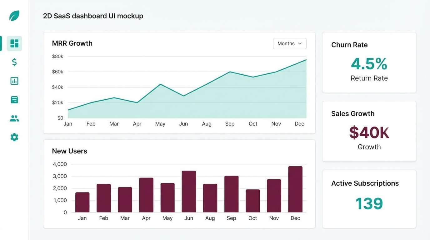
Best for: saas landing pages, dashboards, presentations
Minimal contrast feels like a crisp winter morning with clean lines and calm order. The deep accents pop against the near-white base, making it perfect for data-heavy screens. Use teal for states and charts, burgundy for alerts or emphasis, and keep grays for scaffolding. Tip: limit the burgundy to one UI role to avoid mixed signals.
Image example of nordic contrast generated using media.io
10) Neo Vintage Poster
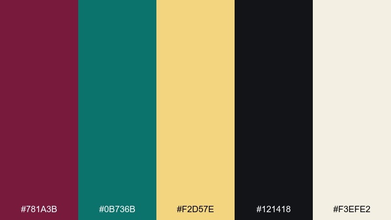
HEX: #781A3B #0B736B #F2D57E #121418 #F3EFE2
Mood: retro, punchy, artistic
Best for: gig posters, festival branding, merch graphics
Retro punch comes through like screen-printed ink on textured stock, with a sunny yellow kick. The dark base keeps the palette grounded while still feeling playful. Use it for gig posters, merch graphics, and punchy announcement slides with chunky type. Tip: let yellow be the headline color and keep teal for supporting shapes.
Image example of neo vintage poster generated using media.io
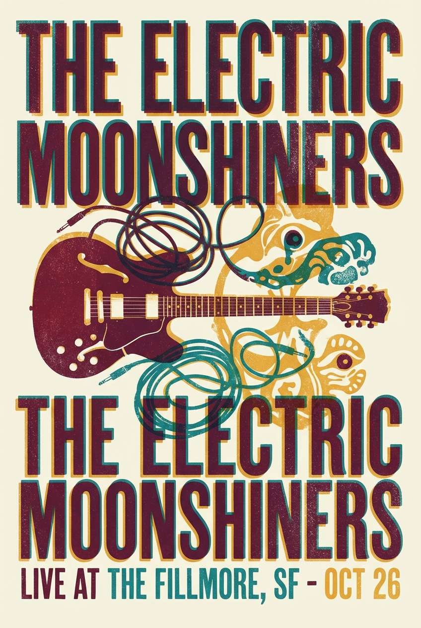
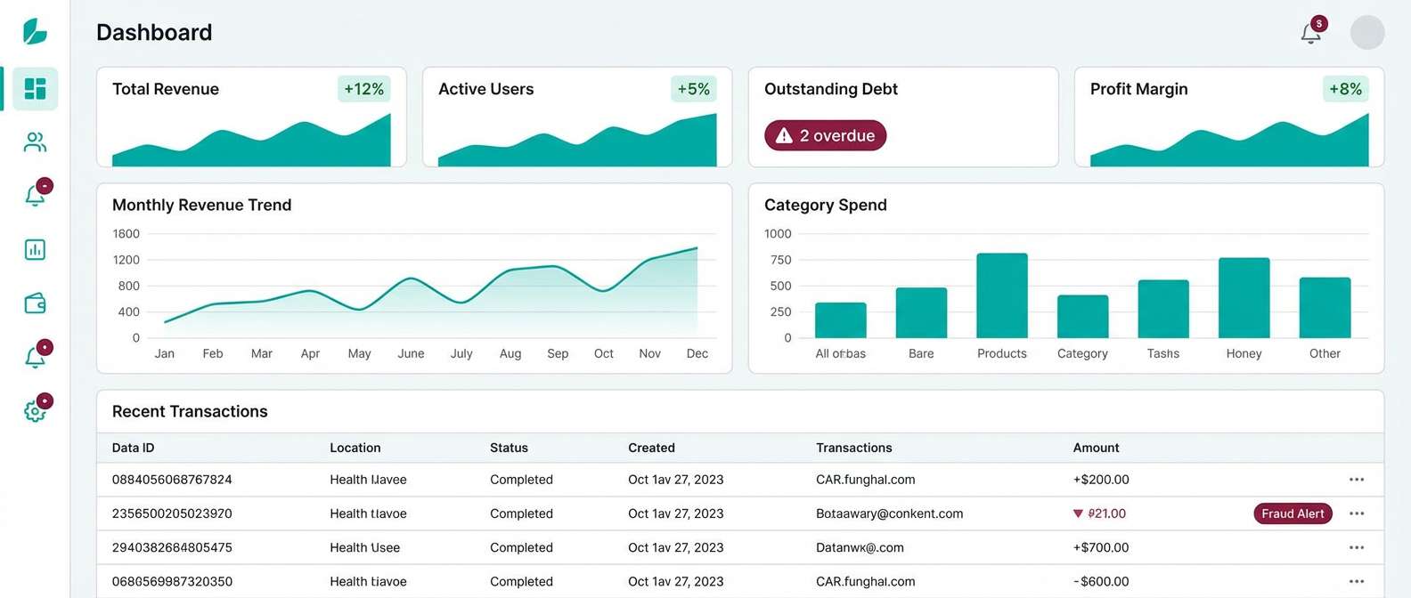
11) Minimal Dashboard
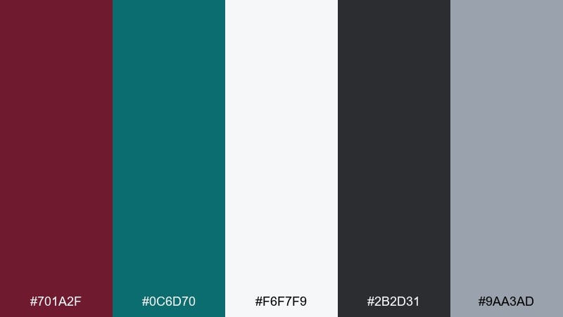
HEX: #701A2F #0C6D70 #F6F7F9 #2B2D31 #9AA3AD
Mood: professional, clear, balanced
Best for: admin panels, fintech apps, analytics UI
Professional clarity feels like a well-organized workspace with crisp contrast and calm accents. The neutral grays keep the interface readable while the richer tones signal priority. Use teal for positive states and burgundy for critical flags, then lean on off-white for breathing room. Tip: set accessible contrast ratios by pairing dark text with the lightest background only.
Image example of minimal dashboard generated using media.io
12) Luxe Wedding Suite
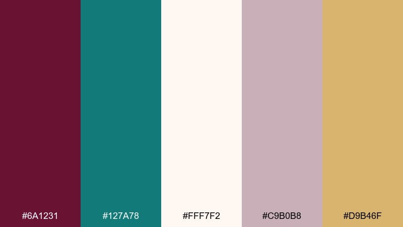
HEX: #6A1231 #127A78 #FFF7F2 #C9B0B8 #D9B46F
Mood: romantic, formal, soft-luxe
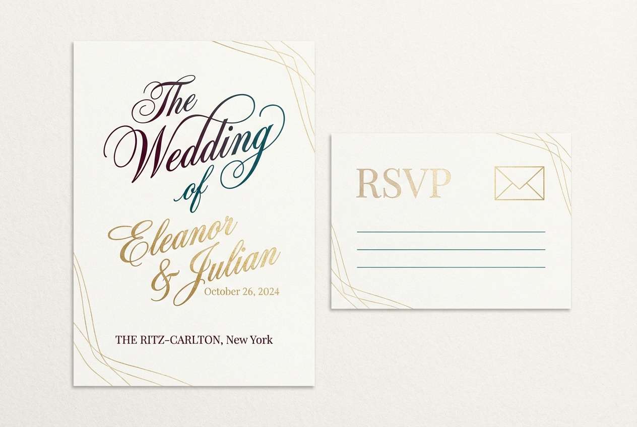
Best for: wedding invitations, RSVP cards, venue signage
Soft-luxe romance suggests satin ribbons, florals, and a hint of champagne shimmer. The blush-neutral base keeps the deeper tones elegant rather than dramatic. Use it for invitation suites, RSVP cards, and venue signage with delicate typography and lots of margin. Tip: print the teal slightly lighter for a refined, airy finish.
Image example of luxe wedding suite generated using media.io
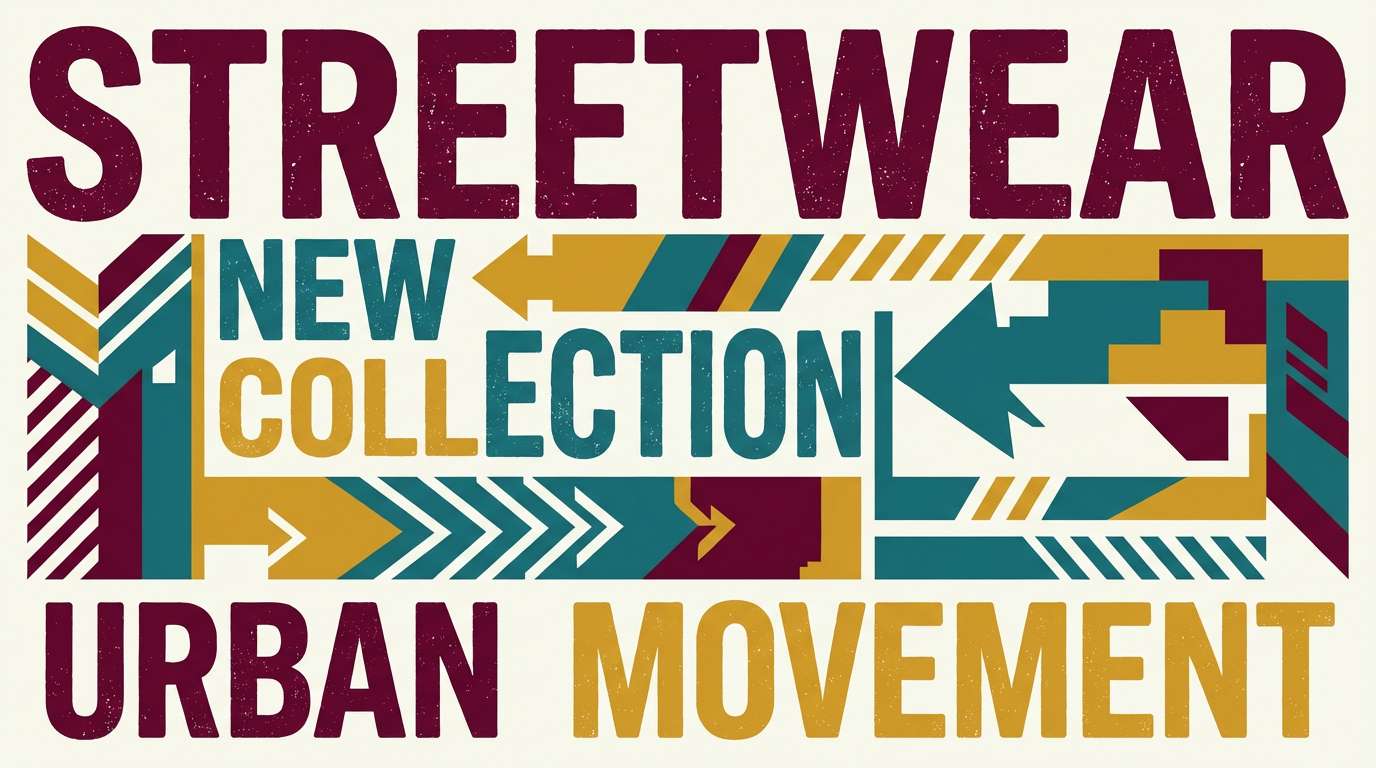
13) Retro Sportswear

HEX: #7F1730 #008A7A #F2F2F0 #1D2024 #F6C445
Mood: bold, sporty, upbeat
Best for: team merch, streetwear drops, campaign banners
Bold sporty energy feels like varsity patches, stadium lights, and a retro stripe. The saturated teal and yellow bring pop while burgundy adds weight. Use it for merch graphics, streetwear lookbooks, and campaign banners with big numbers and strong blocks. Tip: keep the background light so the dark tones do not swallow details.
Image example of retro sportswear generated using media.io
14) Dark Mode App
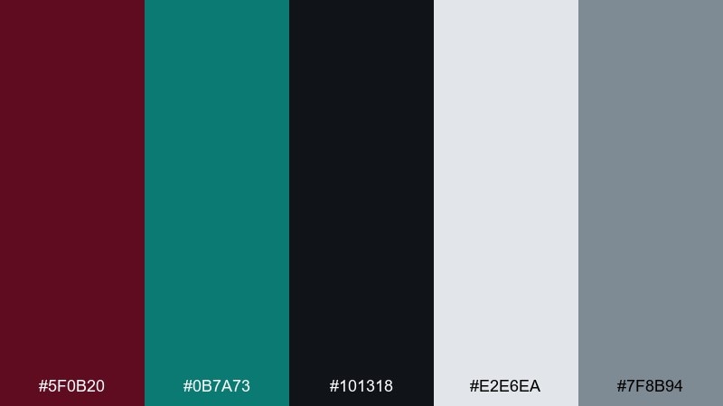
HEX: #5F0B20 #0B7A73 #101318 #E2E6EA #7F8B94
Mood: sleek, techy, high-contrast
Best for: dark UI themes, streaming apps, developer tools
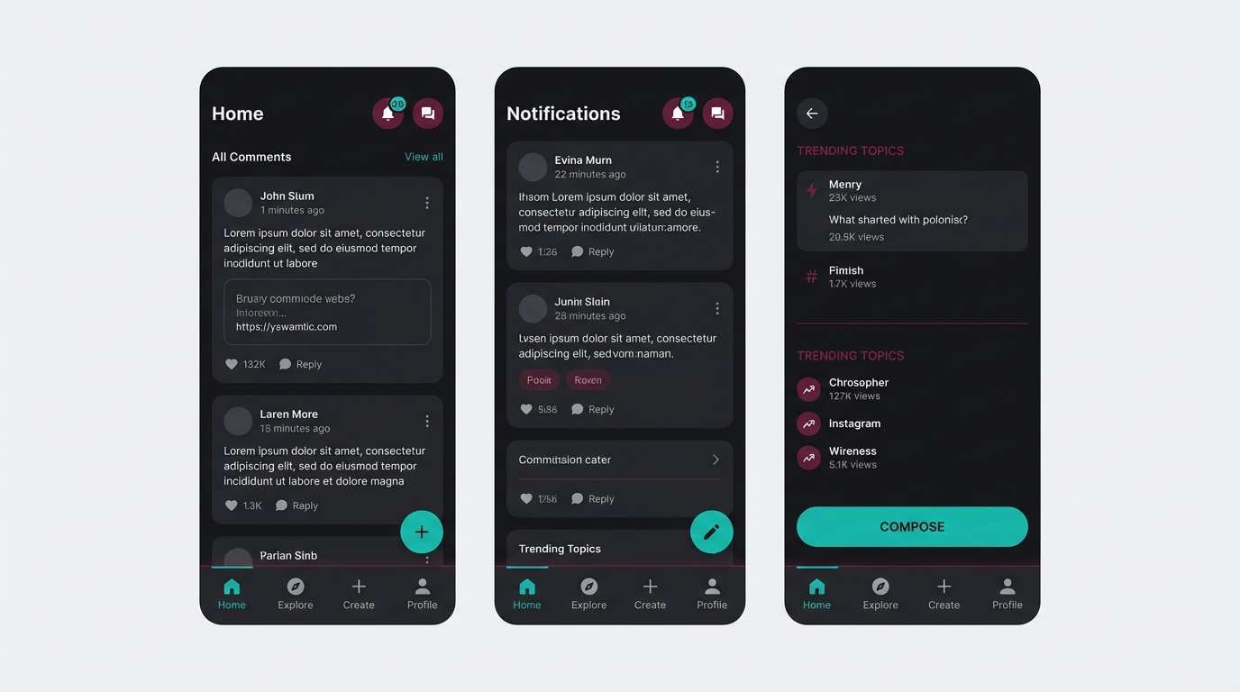
Sleek dark-mode tones evoke neon reflections on glass without turning flashy. Teal reads as active and trustworthy, while burgundy adds depth for highlights and empty states. Use it for streaming interfaces, developer tools, and night-friendly dashboards with clear spacing. Tip: apply teal to primary buttons and keep burgundy for secondary emphasis so actions stay obvious.
Image example of dark mode app generated using media.io
15) Autumn Market
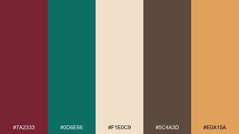
HEX: #7A2333 #0D6E66 #F1E0C9 #5C4A3D #E0A15A
Mood: seasonal, earthy, friendly
Best for: farmers market flyers, fall packaging, craft labels
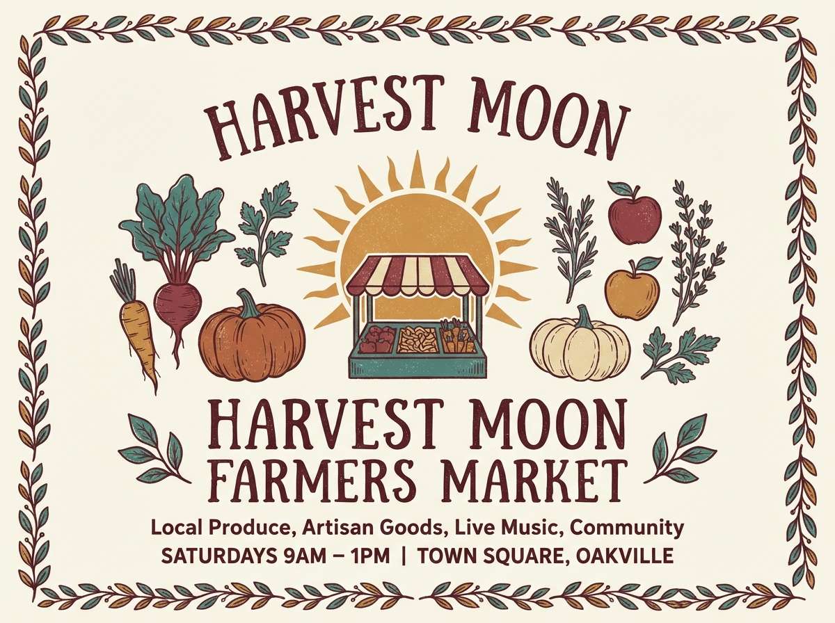
Earthy seasonal warmth feels like dried leaves, kraft paper, and fresh produce stalls. The caramel accent makes the cooler teal feel welcoming instead of cold. Use it for fall packaging, craft labels, and community flyers with hand-drawn icons. Tip: lean on the cream for background and use brown for body text to keep it readable.
Image example of autumn market generated using media.io
16) Spa Serenity
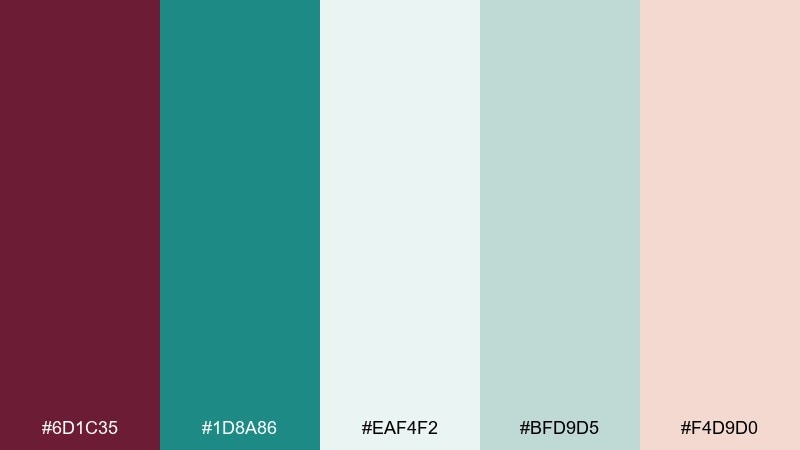
HEX: #6D1C35 #1D8A86 #EAF4F2 #BFD9D5 #F4D9D0
Mood: calm, clean, restorative
Best for: wellness brands, spa menus, skincare UI
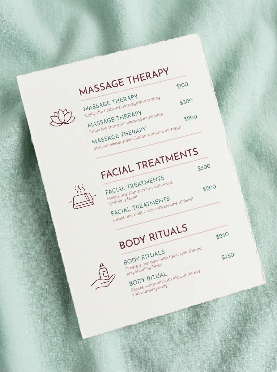
Calm, restorative tones evoke steamed towels, quiet water, and soft blush lighting. The pale mints and pinks keep the deeper accents from feeling too intense. Use it for wellness branding, spa menus, or skincare onboarding screens with gentle gradients. Tip: set the burgundy as a small accent for pricing or key highlights only.
Image example of spa serenity generated using media.io
17) Urban Gallery
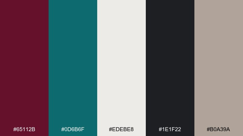
HEX: #65112B #0D6B6F #EDEBE8 #1E1F22 #B0A39A
Mood: artful, modern, understated
Best for: gallery identities, exhibition posters, portfolios
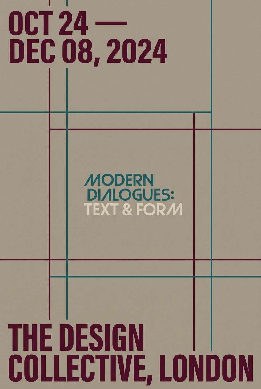
Understated modern tones feel like concrete walls, framed prints, and quiet spotlighting. The palette balances artful drama with plenty of neutral space for photography. Use it for portfolio sites, gallery identities, and exhibition collateral with strong grids. Tip: keep teal for navigation cues and let burgundy mark featured works or dates.
Image example of urban gallery generated using media.io
18) Winter Cabin
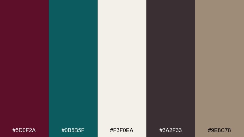
HEX: #5D0F2A #0B5B5F #F3F0EA #3A2F33 #9E8C78
Mood: rustic, quiet, cozy
Best for: holiday cards, lodge branding, warm editorials
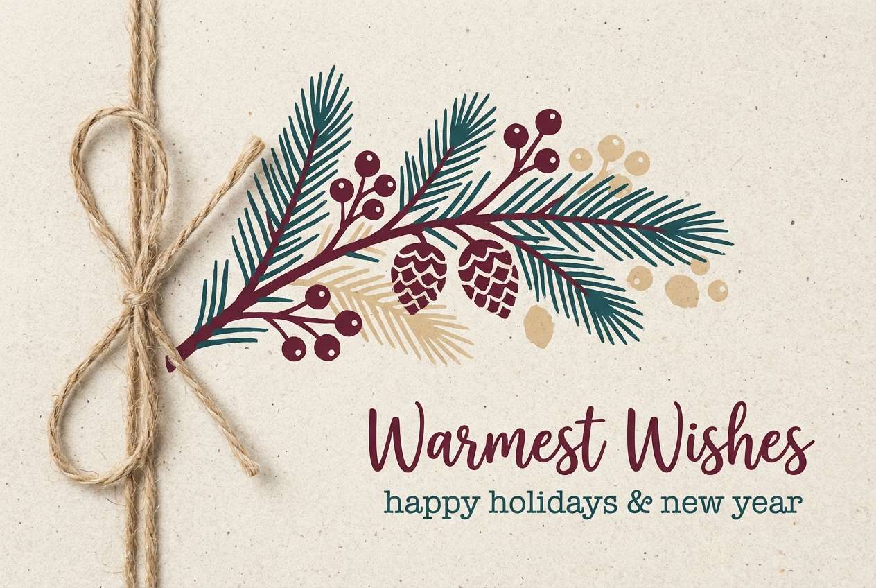
Quiet rustic tones bring to mind wool blankets, pine shadows, and a warm drink by the fire. The soft stone neutral keeps the palette comfortable and not overly festive. Use it for lodge branding, winter editorials, and holiday cards with minimal illustration. Tip: choose the taupe for large backgrounds and keep burgundy for focal elements like seals or stamps.
Image example of winter cabin generated using media.io
19) Museum Editorial
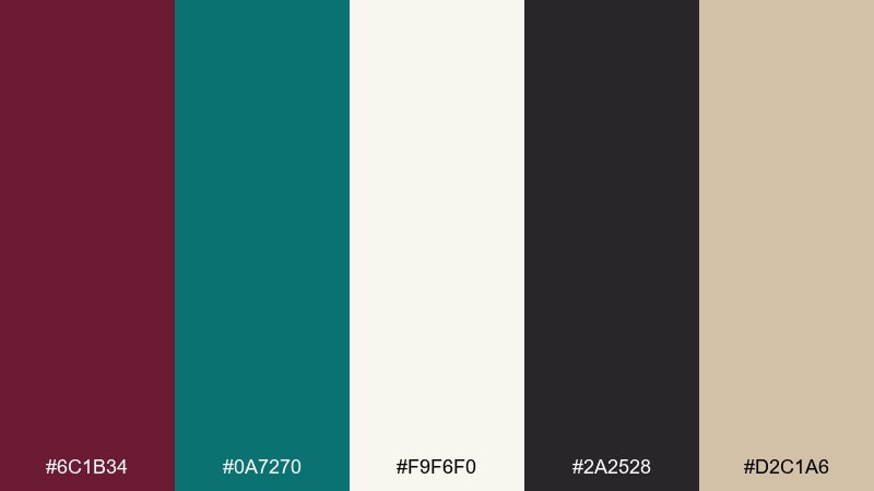
HEX: #6C1B34 #0A7270 #F9F6F0 #2A2528 #D2C1A6
Mood: classic, cultured, refined
Best for: magazine layouts, catalogs, cultural posters
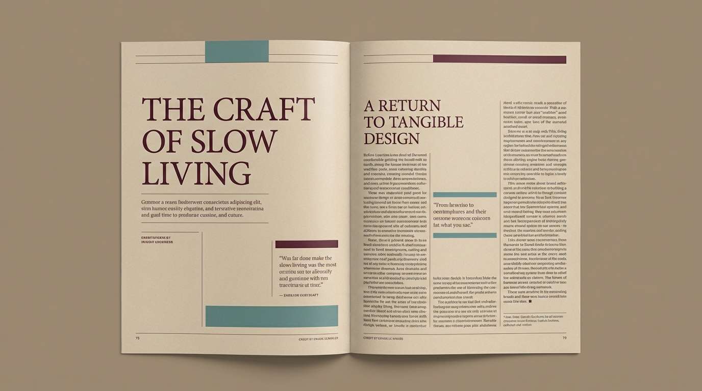
Classic, cultured tones feel like a museum brochure with matte paper and careful typography. The warm beige and ink-like charcoal support long-form readability. Use it for editorial spreads, catalogs, and cultural posters where hierarchy matters. Tip: set teal for pull quotes and burgundy for section openers to guide the eye.
Image example of museum editorial generated using media.io
20) Craft Packaging
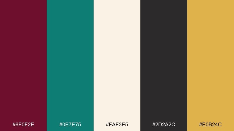
HEX: #6F0F2E #0E7E75 #FAF3E5 #2D2A2C #E0B24C
Mood: handmade, premium, friendly
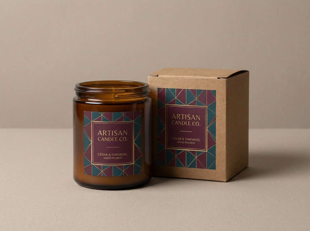
Best for: artisan packaging, candle jars, product ads
Handmade premium vibes come through like a small-batch label finished with a wax seal. The creamy base and golden accent keep the darker tones feeling friendly and giftable. Use it for artisan packaging, candle jars, and clean product ads with simple typographic labels. Tip: keep the gold to a single stamp or foil detail so it reads as intentional craft.
Image example of craft packaging generated using media.io
What Colors Go Well with Burgundy Teal?
Warm neutrals are the easiest “glue” for burgundy and teal: cream, ivory, beige, tan, and taupe soften the contrast and make layouts feel premium. Charcoal and near-black add structure and keep typography sharp.
For accents, gold and brass bring an upscale finish, while blush or peach can add a friendly highlight. If you want a more graphic, poster-like look, introduce a warm yellow in small doses for punch.
In digital work, muted grays are especially useful as scaffolding (cards, borders, dividers). They let burgundy and teal stay focused on meaning—priority, status, and navigation—without visual noise.
How to Use a Burgundy Teal Color Palette in Real Designs
Start with roles, not swatches: pick a light base (cream/off-white), choose teal for interactive elements, and reserve burgundy for emphasis. This keeps hierarchy consistent across pages, screens, or print pieces.
Balance saturation by scaling coverage: use the darker tones in smaller areas (headers, buttons, labels) and let neutrals carry most backgrounds. For interiors, treat teal as an anchor wall or upholstery tone and burgundy as art, textiles, or statement decor.
For accessibility and readability, test contrast early—especially if you’re using teal on light backgrounds or burgundy on dark mode. A small adjustment in brightness can make a big difference in UI clarity.
Create Burgundy Teal Palette Visuals with AI
If you already have HEX codes, you can turn them into on-brand mockups in minutes using Media.io’s text-to-image. Use the prompts above as templates, then swap in your design type (poster, UI, label, invitation) and aspect ratio.
Keep your results consistent by repeating keywords like “flat graphic layout,” “clean typography,” or “print-ready look.” Then iterate: change just one variable at a time (accent color, background texture, or layout style) to refine the vibe.
Burgundy Teal Color Palette FAQs
-
What vibe does a burgundy teal color palette create?
Burgundy adds richness and sophistication, while teal adds calm and freshness. Together they often feel premium, balanced, and slightly dramatic—great for brands that want both warmth and clarity. -
Is burgundy and teal a good combination for branding?
Yes. It’s distinctive without being trendy-only, and it supports clear brand hierarchy: teal can signal trust and usability, while burgundy can highlight premium moments (logos, seals, feature callouts). -
What neutral background works best with burgundy and teal?
Cream, ivory, and warm off-white are the safest choices because they soften contrast and keep the palette elegant. Light gray also works well for modern UI and dashboards. -
Can I use burgundy teal in a dark mode UI?
Yes—choose a near-black base, use teal for primary actions and active states, and keep burgundy for secondary emphasis (badges, highlights). Make sure text contrast meets accessibility guidelines. -
What accent colors pair well with burgundy teal palettes?
Gold/brass for luxe, blush/peach for friendly warmth, and warm yellow for a bold retro punch. Use accents sparingly so burgundy and teal remain the main story. -
How do I keep burgundy and teal from feeling too heavy?
Increase neutral space (cream/off-white), limit how much area the dark colors cover, and reserve metallics or bright accents for small details. In layouts, keep typography crisp and avoid using both burgundy and teal as competing headline colors. -
How can I generate matching visuals for my palette quickly?
Use Media.io text-to-image prompts that specify your subject (UI, invitation, packaging), style (flat, minimalist, print-ready), and include the mood keywords you want. Iterate with small prompt changes to keep results consistent.


