

A gold red color palette blends confidence and celebration with an instant premium feel. It’s a go-to combo for luxury branding, festive campaigns, and standout UI accents.
Below you’ll find 20 curated gold-and-red palettes with HEX codes, plus practical pairing tips and AI prompts you can reuse to generate matching visuals.
In this article
- Why Gold Red Palettes Work So Well
-
- regal garnet gild
- desert festival glow
- velvet opera nights
- autumn spice market
- lunar new year pop
- cabernet candlelight
- modern medal mix
- rose gold romance
- brick and bullion
- theater curtain luxe
- heritage crest tones
- sparkling sangria
- sunset trophy shine
- artisan leather goldleaf
- minimalist ruby accent
- royal parade brights
- classic bistro warmth
- glam noir gold
- festive paper lanterns
- warm baroque elegance
- What Colors Go Well with Gold Red?
- How to Use a Gold Red Color Palette in Real Designs
- Create Gold Red Palette Visuals with AI
Why Gold Red Palettes Work So Well
Red brings urgency, warmth, and attention—perfect for calls to action, headlines, and moments that need to feel energetic. Gold adds perceived value, tradition, and a “celebration” signal that reads instantly in branding and campaigns.
Together, crimson-and-gold combinations create a strong hierarchy: red leads the eye, gold rewards it. When you anchor them with deep neutrals (charcoal, navy, near-black) and airy off-whites, the palette stays bold without becoming visually loud.
Gold red palettes also translate well across mediums. They can look equally at home on premium packaging, wedding stationery, and modern UI—so long as you control saturation and use gold sparingly for accents.
20+ Gold Red Color Palette Ideas (with HEX Codes)
1) Regal Garnet Gild
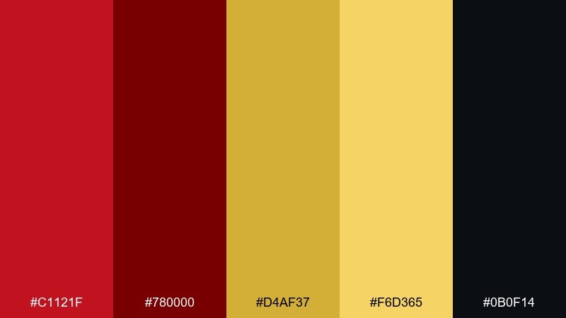
HEX: #C1121F #780000 #D4AF37 #F6D365 #0B0F14
Mood: regal, dramatic, premium
Best for: luxury branding, premium packaging, jewelry ads
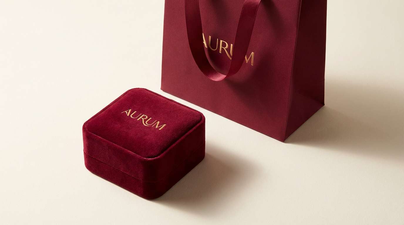
Regal and theatrical, these tones feel like velvet drapes and polished brass under spotlight. Use the deep reds for headlines and hero elements, then bring in gold for trim, icons, and key calls to action. The near-black grounds the palette so it stays sophisticated instead of loud. Tip: reserve the brightest gold for only 5 to 10 percent of the layout to keep the luxury vibe.
Image example of regal garnet gild generated using media.io
Media.io is an online AI studio for creating and editing video, image, and audio in your browser.

2) Desert Festival Glow
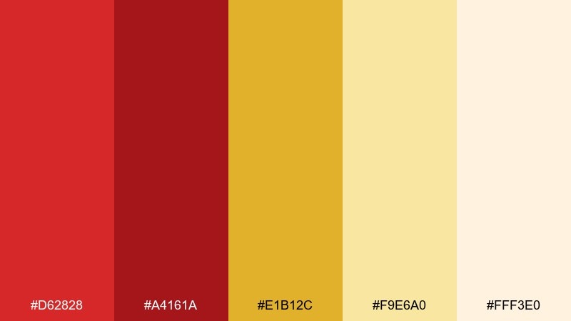
HEX: #D62828 #A4161A #E1B12C #F9E6A0 #FFF3E0
Mood: warm, celebratory, sunny
Best for: event posters, seasonal campaigns, retail banners
Warm and sunlit, this mix evokes lanterns at dusk and golden sand catching the last light. Let the creamy neutrals handle backgrounds so the reds stay readable and energetic. Gold works best as a highlight color for dates, prices, and badges. Tip: add plenty of spacing around red text to avoid visual vibration on bright layouts.
Image example of desert festival glow generated using media.io

3) Velvet Opera Nights
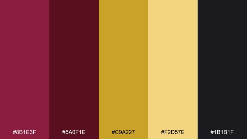
HEX: #8B1E3F #5A0F1E #C9A227 #F2D57E #1B1B1F
Mood: moody, elegant, cinematic
Best for: editorial layouts, album covers, upscale invitations
Moody and cinematic, it reads like stage velvet and vintage gold leaf. These gold red color combinations shine when you keep the darkest wine tone for blocks and use the pale gold for typography contrast. Pair with high-contrast serif fonts and minimal patterns for an editorial finish. Tip: use the muted gold for body text rules and dividers rather than big filled shapes.
Image example of velvet opera nights generated using media.io
4) Autumn Spice Market
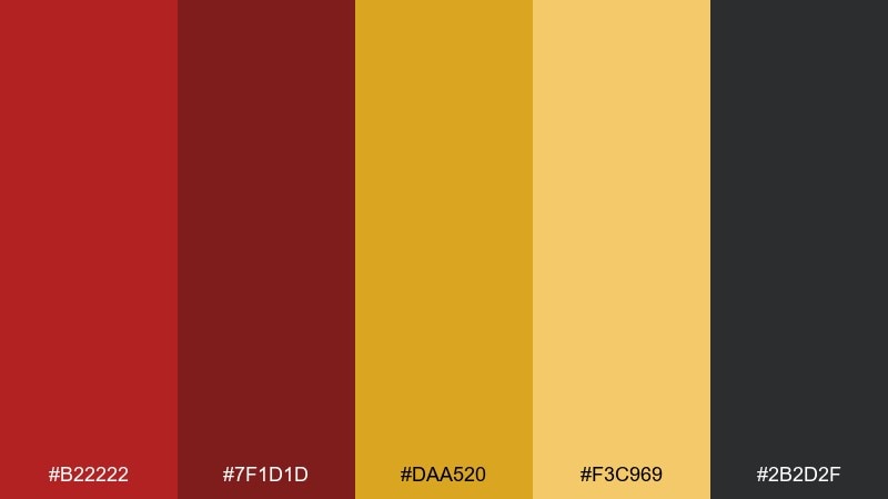
HEX: #B22222 #7F1D1D #DAA520 #F3C969 #2B2D2F
Mood: cozy, rustic, inviting
Best for: food brands, cafe menus, farmers market signage
Cozy and rustic, these tones feel like mulled spices, terracotta stalls, and warm metal trays. Keep the charcoal for text and outlines so the reds and golds can stay rich without hurting legibility. This set loves textured paper backgrounds and simple line icons. Tip: if you print it, choose a slightly matte finish so the gold reads warm, not neon.
Image example of autumn spice market generated using media.io
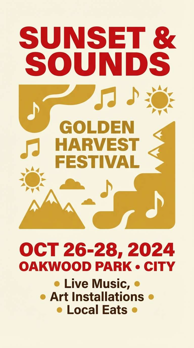
5) Lunar New Year Pop
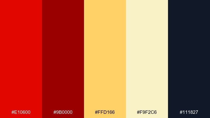
HEX: #E10600 #9B0000 #FFD166 #F9F2C6 #111827
Mood: bold, festive, high-energy
Best for: holiday social posts, promo badges, storefront graphics
Bold and joyful, it brings to mind fireworks, red envelopes, and bright street banners. Use the cream as breathing room so the saturated reds feel intentional rather than overwhelming. The golden yellow is perfect for promo tags, icons, and celebratory details. Tip: limit pure red backgrounds to small panels and let the navy carry most of the weight.
Image example of lunar new year pop generated using media.io
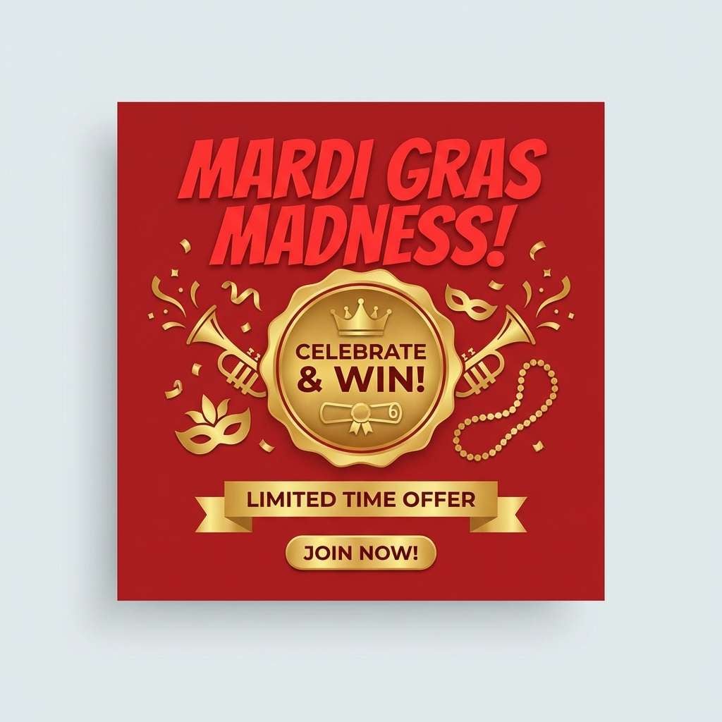
6) Cabernet Candlelight
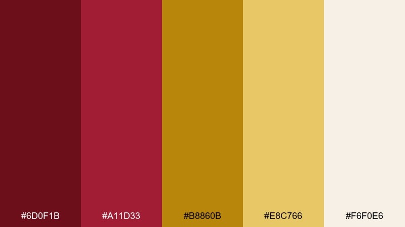
HEX: #6D0F1B #A11D33 #B8860B #E8C766 #F6F0E6
Mood: romantic, intimate, refined
Best for: wedding stationery, wine labels, fine dining brands
Romantic and intimate, these shades feel like candlelight reflecting off a glass of cabernet. The softer cream keeps the palette airy, while gold reads as subtle foil rather than a loud accent. Pair with warm off-white paper and delicate line art for a classic look. Tip: for invitations, print the gold as foil or metallic ink to avoid a flat mustard effect.
Image example of cabernet candlelight generated using media.io
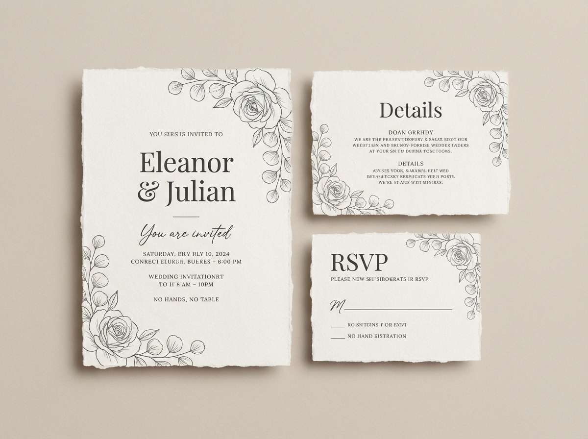
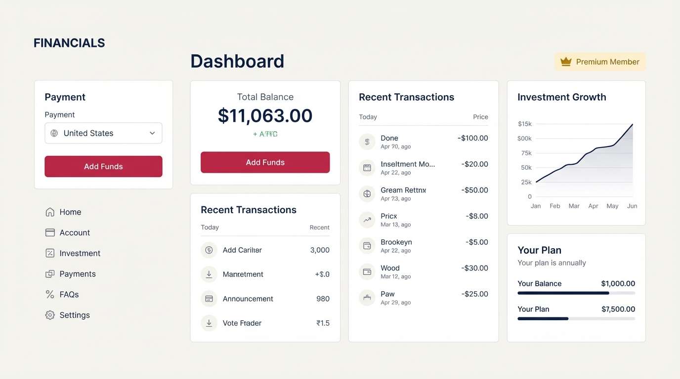
7) Modern Medal Mix
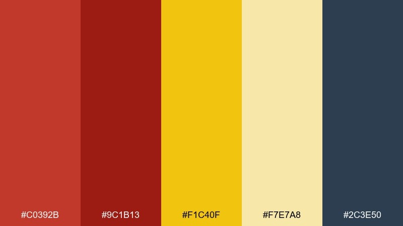
HEX: #C0392B #9C1B13 #F1C40F #F7E7A8 #2C3E50
Mood: confident, sporty, modern
Best for: dashboard UI, product landing pages, SaaS highlights
Confident and modern, it feels like a polished award badge set against a crisp interface. Use the navy as your primary UI base, then bring red into alerts and key actions. Gold is ideal for achievement states, premium tiers, and progress highlights. Tip: keep red and gold buttons separated by neutral spacing so they do not compete for attention.
Image example of modern medal mix generated using media.io

8) Rose Gold Romance
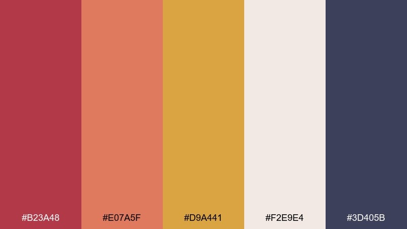
HEX: #B23A48 #E07A5F #D9A441 #F2E9E4 #3D405B
Mood: soft, romantic, stylish
Best for: beauty branding, lifestyle blogs, wedding moodboards
Soft and romantic, it suggests rose petals, warm skin tones, and a gentle golden glow. This gold red color combination works best when red is slightly muted and paired with creamy neutrals. Add the slate blue as a grounding contrast for text, navigation, or secondary packaging panels. Tip: use the coral tone for gradients to create depth without going overly saturated.
Image example of rose gold romance generated using media.io
9) Brick and Bullion
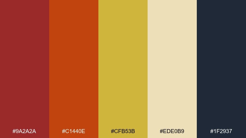
HEX: #9A2A2A #C1440E #CFB53B #EDE0B9 #1F2937
Mood: earthy, bold, handcrafted
Best for: craft packaging, artisan labels, outdoor brands
Earthy and bold, these tones recall kiln-fired brick, sunbaked clay, and weathered brass. Use the deep red for brand marks and headers, then let the sandy neutral carry most backgrounds. Gold reads best as a thin trim, seal, or emblem detail to keep it authentic. Tip: add subtle texture or grain to neutrals to reinforce the handcrafted feel.
Image example of brick and bullion generated using media.io
10) Theater Curtain Luxe
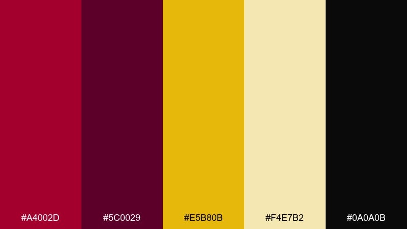
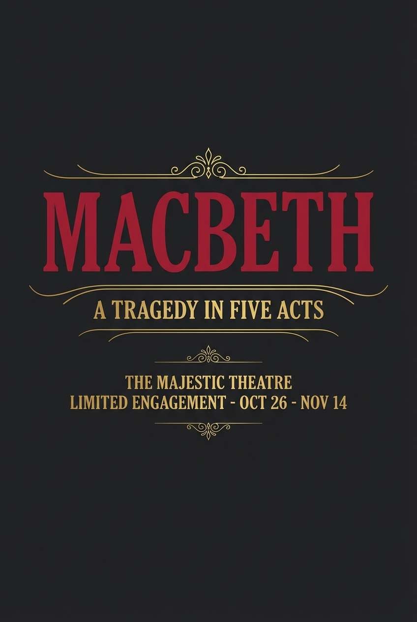
HEX: #A4002D #5C0029 #E5B80B #F4E7B2 #0A0A0B
Mood: dramatic, glamorous, classic
Best for: playbills, gala posters, performing arts branding
Dramatic and glamorous, it channels velvet curtains, brass instruments, and late-night marquees. Use black as the primary background to make reds feel richer and gold feel like spotlight. Keep typography crisp and centered for that classic theater rhythm. Tip: use gold for only the show title or key credits to preserve hierarchy.
Image example of theater curtain luxe generated using media.io
11) Heritage Crest Tones
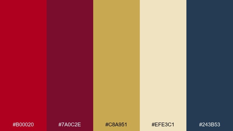
HEX: #B00020 #7A0C2E #C8A951 #EFE3C1 #243B53
Mood: traditional, trustworthy, established
Best for: team crests, institutional branding, certificates
Traditional and trustworthy, these shades feel like stitched patches, ribbon seals, and aged parchment. A gold red color scheme like this works well for crests and badges where contrast and symbolism matter. Pair the navy with serif type and simple heraldic shapes for a timeless look. Tip: keep the cream behind text-heavy areas to maintain accessibility in print and digital.
Image example of heritage crest tones generated using media.io
12) Sparkling Sangria
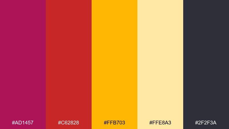
HEX: #AD1457 #C62828 #FFB703 #FFE8A3 #2F2F3A
Mood: playful, vibrant, nightlife
Best for: bar flyers, beverage branding, promo stories
Playful and vibrant, it suggests sangria splashes, neon signs, and golden citrus garnish. These gold red color combinations are perfect when you want energy without drifting into harsh primary tones. Pair with dark charcoal for legible type and let the pale yellow soften busy layouts. Tip: use the brighter gold as a spotlight behind key pricing or limited-time offers.
Image example of sparkling sangria generated using media.io

13) Sunset Trophy Shine
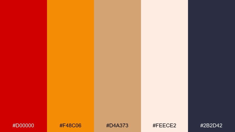
HEX: #D00000 #F48C06 #D4A373 #FEECE2 #2B2D42
Mood: optimistic, warm, youthful
Best for: travel headers, creator thumbnails, summer promos
Optimistic and warm, it feels like a sunset medal glinting on a late-summer evening. Let the peachy off-white take over large areas, then layer red as an accent for emphasis and urgency. The orange-gold bridge makes gradients and icons feel smooth and modern. Tip: use the navy sparingly for body text to keep the whole palette bright.
Image example of sunset trophy shine generated using media.io

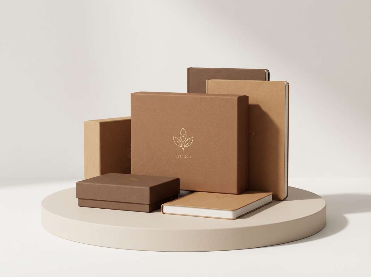
14) Artisan Leather Goldleaf
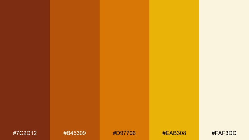
HEX: #7C2D12 #B45309 #D97706 #EAB308 #FAF3DD
Mood: heritage, tactile, warm
Best for: leather goods branding, crafts, premium stationery
Tactile and heritage-inspired, these hues read like worn leather, saddle stitching, and soft gold leaf. Use the deeper browns for logos and borders, then let the lighter cream keep things airy. Gold should show up as a thin foil line, stamp, or seal for maximum impact. Tip: pair with natural textures and restrained typography to keep it authentic.
Image example of artisan leather goldleaf generated using media.io
15) Minimalist Ruby Accent
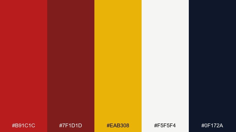
HEX: #B91C1C #7F1D1D #EAB308 #F5F5F4 #0F172A
Mood: clean, modern, high-contrast
Best for: fintech UI, clean branding, presentation decks
Clean and high-contrast, it feels like a crisp white desk with a ruby stamp and a gold seal. This gold red color palette is strongest when the off-white dominates and the brights act as small, intentional signals. Use gold for premium states or micro-highlights, and keep red for primary actions or warnings. Tip: test contrast on buttons and links, especially when gold sits on off-white.
Image example of minimalist ruby accent generated using media.io
16) Royal Parade Brights
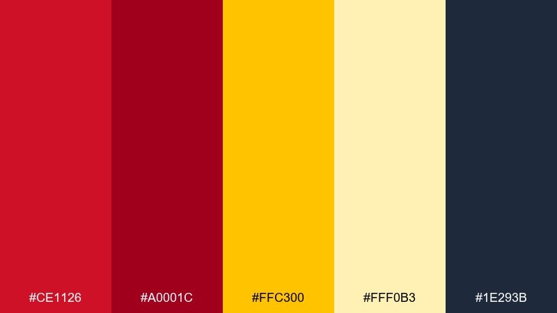
HEX: #CE1126 #A0001C #FFC300 #FFF0B3 #1E293B
Mood: bold, ceremonial, confident
Best for: festival signage, community events, announcement banners
Bold and ceremonial, it echoes flags, parade ribbons, and golden confetti. Use the pale yellow as a friendly background and keep red for the headline layer to command attention. Add the deep slate for secondary text so the design stays readable at a distance. Tip: for signage, increase letter spacing slightly on red text to improve legibility.
Image example of royal parade brights generated using media.io
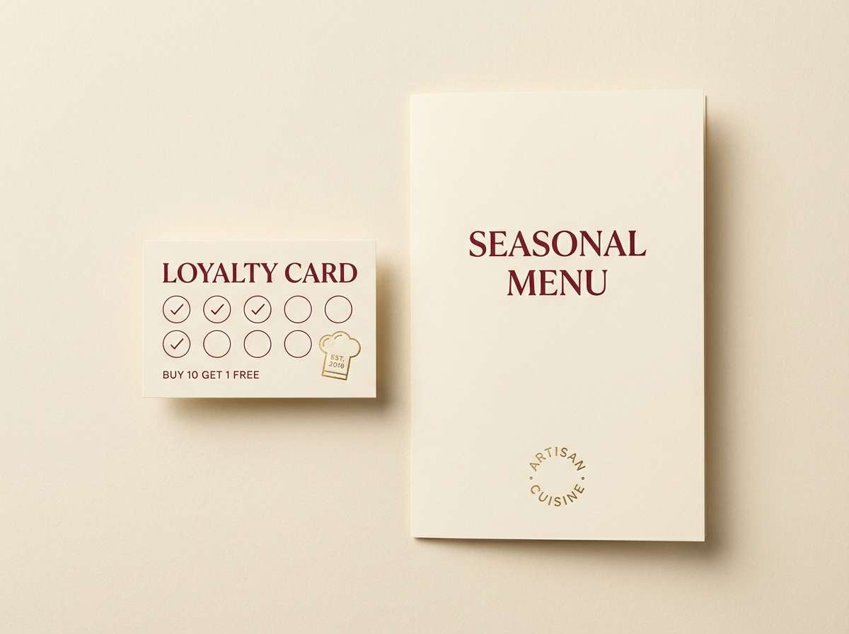
17) Classic Bistro Warmth
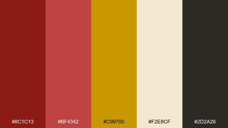
HEX: #8C1C13 #BF4342 #C99700 #F2E8CF #2D2A26
Mood: cozy, nostalgic, welcoming
Best for: restaurant branding, menus, loyalty cards
Cozy and nostalgic, it feels like a candlelit bistro with warm wood and brass fixtures. Let the cream behave as the main canvas, then layer reds for section headers and small illustrations. Gold reads beautifully as a thin border or stamp detail on loyalty materials. Tip: keep the darkest brown for body text to maintain a comfortable reading experience.
Image example of classic bistro warmth generated using media.io
18) Glam Noir Gold
HEX: #A61B2B #6B0217 #FFD700 #C7B299 #0B0B0F
Mood: glamorous, edgy, night-time
Best for: album art, fashion promos, nightlife branding
Glamorous and edgy, it evokes glossy lipstick, black velvet, and gold jewelry under flash. Use black as the dominant base and keep gold for sharp highlights so it feels premium rather than busy. Deep reds work well for titles and focal shapes, while the taupe adds softness to supporting text. Tip: add a subtle grain overlay to reduce banding on dark backgrounds in digital designs.
Image example of glam noir gold generated using media.io
19) Festive Paper Lanterns
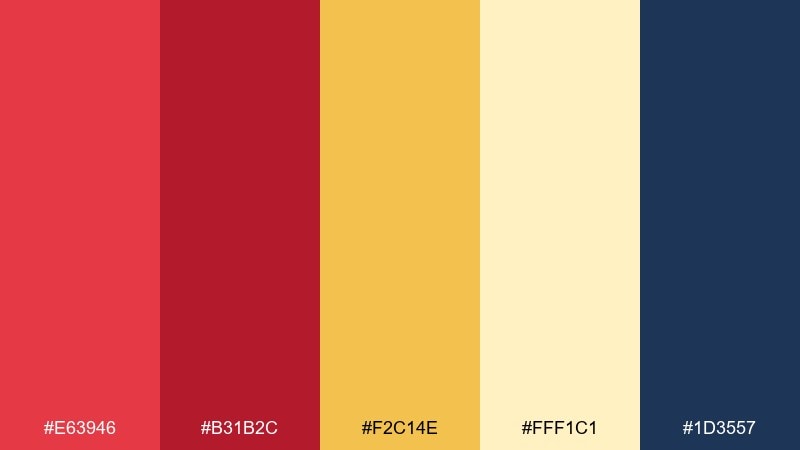
HEX: #E63946 #B31B2C #F2C14E #FFF1C1 #1D3557
Mood: cheerful, friendly, community
Best for: gift wrap patterns, party invites, seasonal collaterals
Cheerful and friendly, it feels like paper lanterns swaying above a street fair. This gold red color palette stays balanced when the buttercream tone takes up most of the space and the brighter red becomes a repeat accent. Use navy for outlines and type to keep everything crisp. Tip: for patterns, vary red at two intensities so the repeat looks lively without becoming noisy.
Image example of festive paper lanterns generated using media.io
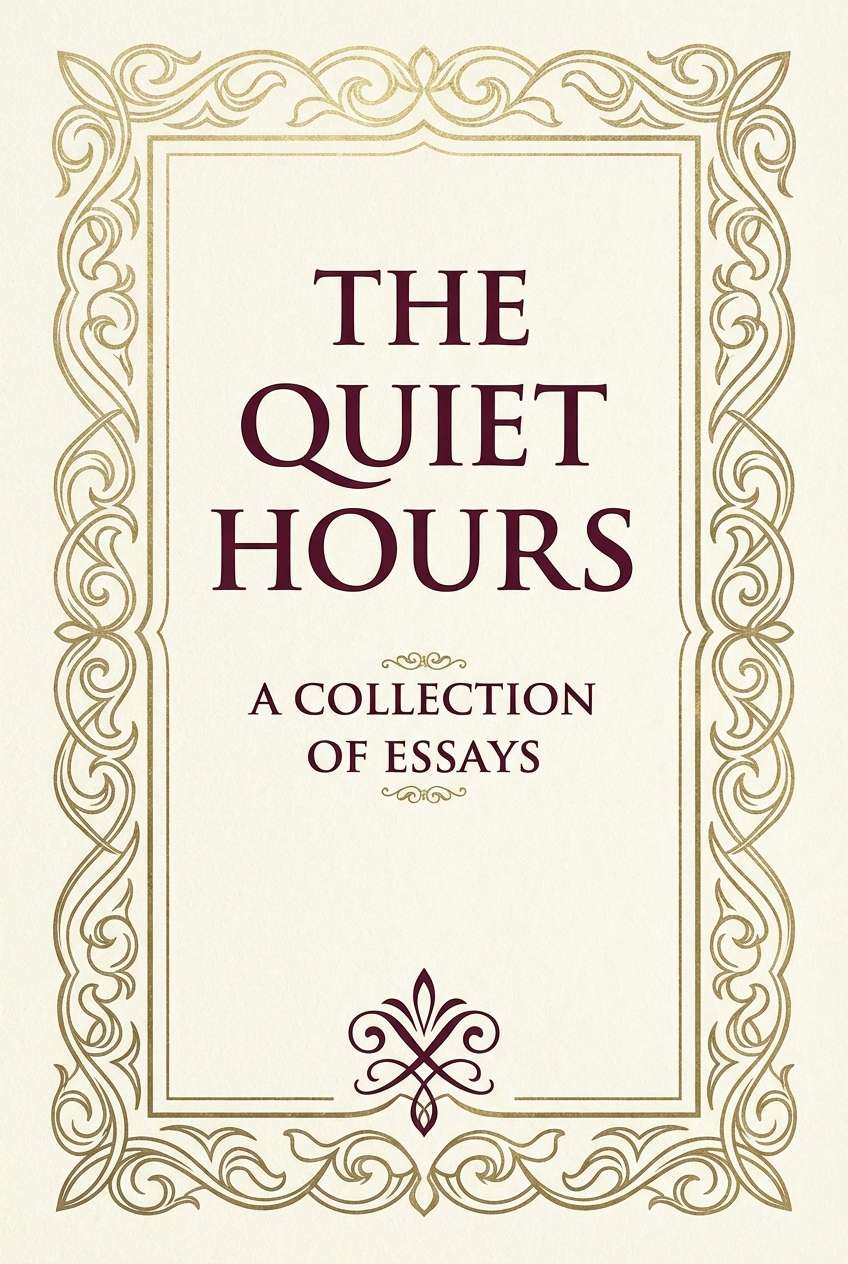
20) Warm Baroque Elegance
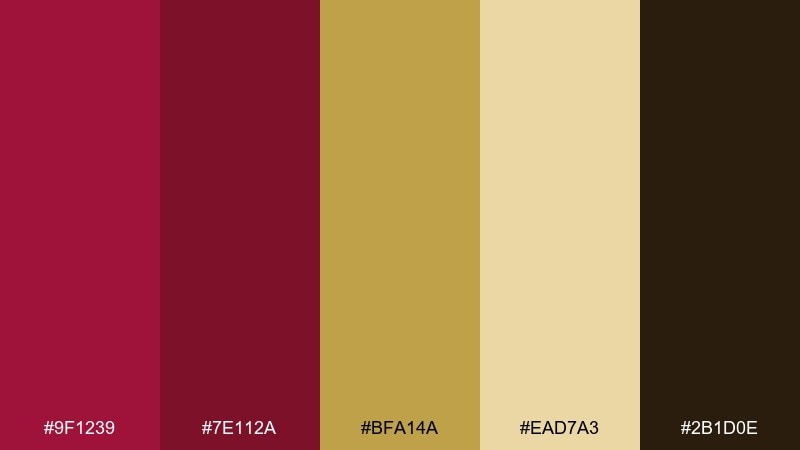
HEX: #9F1239 #7E112A #BFA14A #EAD7A3 #2B1D0E
Mood: ornate, historic, refined
Best for: book covers, museum promos, classical event invites
Ornate and refined, it recalls baroque frames, gallery walls, and antique gilt. Keep the pale gold for background panels and let the deeper reds carry the title and decorative flourishes. Pair with elegant serif type and symmetrical layouts for a timeless impression. Tip: use the dark brown instead of pure black to maintain the palette's warm, historical tone.
Image example of warm baroque elegance generated using media.io
What Colors Go Well with Gold Red?
Neutrals are the easiest win: ivory, warm white, cream, and parchment keep gold from turning brassy and help reds stay readable. For depth, add charcoal, espresso brown, or near-black to create a luxury backdrop.
For modern contrast, navy and slate blue pair especially well with crimson and gold, giving you clean typography and UI structure. If you want softer results, taupe and warm gray can replace black while still keeping the palette grounded.
As accents, consider muted greens (olive, sage) for a classic complementary balance, or peach/coral for warm gradients that bridge red to gold without harsh transitions.
How to Use a Gold Red Color Palette in Real Designs
Start by choosing a “driver” color: use red for attention (CTAs, headlines, badges) and gold for reward (premium labels, borders, icons, dividers). Then assign a neutral as the main canvas so the palette doesn’t overwhelm your layout.
Keep gold usage intentionally limited—thin lines, small emblems, and micro-highlights often look more expensive than large gold blocks. For accessibility, test contrast carefully when placing gold text on light backgrounds; you may need a darker gold or a dark outline.
In print, gold effects look best as foil or metallic ink; in digital, mimic metallic depth with subtle gradients and shadows while keeping saturation controlled.
Create Gold Red Palette Visuals with AI
If you already have HEX codes, you can turn them into consistent mockups by describing materials (foil, velvet, paper), lighting (studio softbox, candlelight), and composition (poster, UI, packaging). This makes the gold-red relationship feel intentional rather than random.
Reuse the prompts above, swap the product type (menu, invitation, hero banner), and keep the palette constraints consistent to generate a cohesive set of assets for campaigns or brand kits.
Use Media.io Text-to-Image to generate fast concept visuals, then iterate on typography and layout once you’ve found the right mood.
Gold Red Color Palette FAQs
-
What does a gold and red color palette communicate in branding?
Gold and red typically signals prestige + energy: gold suggests value and tradition, while red adds urgency and confidence. Together, they’re common in luxury packaging, celebratory campaigns, and “premium tier” UI moments. -
How do I keep gold red designs from looking too loud?
Let a neutral (cream, off-white, charcoal, or navy) take up most of the layout, then use red for key emphasis and gold as a small highlight. Limiting bright gold to about 5–10% of the design often keeps it feeling elegant. -
What background color works best with crimson and gold?
For a luxury look, use near-black/charcoal backgrounds; for a warm, inviting feel, use cream or parchment. Navy is a strong modern alternative that keeps text readable and balances saturated reds. -
Is gold text readable on white backgrounds?
Often not, especially with bright metallic yellows. Use a darker gold, add a darker outline/shadow, or place gold text on a dark panel. Always check contrast for accessibility before finalizing. -
What’s a good accent color to add to a gold red palette?
Navy or slate blue is a popular accent for modern contrast. For a classic complementary option, muted greens like olive or sage work well, especially when the reds lean burgundy. -
Which gold red palettes are best for UI design?
Palettes with strong neutrals (navy/charcoal + off-white) are best for interfaces, such as Modern Medal Mix or Minimalist Ruby Accent. Use red for primary actions/alerts and gold for premium badges and progress highlights. -
How can I create matching gold red visuals quickly?
Use an AI image generator with prompts that specify the style (poster/UI/packaging), materials (foil, velvet, matte paper), and lighting (studio soft light). Then iterate while keeping your HEX choices consistent across outputs.
Next: White Color Palette


