

Vintage color palettes make modern designs feel instantly lived-in—like ink that’s softened with time and paper that’s warmed by light. They’re perfect when you want charm, authenticity, and calm contrast instead of sharp, high-saturation color.
Below are 20 curated vintage color palette ideas with HEX codes, plus practical tips for pairing them in logos, posters, packaging, and UI.
In this article
- Why Vintage Palettes Work So Well
-
- antique porcelain
- sunfaded postcard
- sepia orchard
- dusty carnival
- library leather
- retro diner mint
- old hollywood glam
- prairie quilt
- coastal boardwalk
- midcentury mustard
- gramophone noir
- heirloom rose
- deserted motel sign
- botanical herbarium
- attic trunk
- riverside picnic
- vintage travel tag
- faded denim workshop
- art deco lobby
- candlelit parlor
- What Colors Go Well with Vintage?
- How to Use a Vintage Color Palette in Real Designs
- Create Vintage Palette Visuals with AI
Why Vintage Palettes Work So Well
Vintage palettes are built on softened contrast: muted inks, worn neutrals, and gentle accents that feel familiar. That restraint makes designs easier to read and easier to trust—especially in branding, editorial, and UI.
They also carry built-in storytelling. Sepias, dusty pastels, and aged browns hint at paper, film, fabric, and patina, which adds depth even in clean, modern layouts.
Because the colors are rarely “loud,” vintage schemes pair beautifully with texture (grain, halftone, paper) and classic typography, letting the overall composition do the heavy lifting.
20+ Vintage Color Palette Ideas (with HEX Codes)
1) Antique Porcelain

HEX: #f2efe6 #d9cbb6 #b7a38a #8a7a6a #3f3a36
Mood: soft, heritage, minimal
Best for: editorial layouts, museum branding, stationery
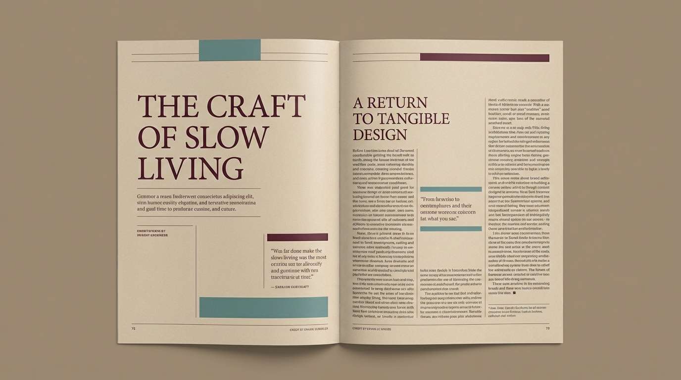
Soft linen whites and tea-stained beiges evoke porcelain cups, handwritten letters, and quiet Sunday mornings. Use it for editorial spreads and timeless brands where readability matters. Pair it with an antique serif and plenty of negative space to keep the look airy. Tip: reserve the charcoal tone for headings and rules so the page never feels heavy.
Image example of antique porcelain generated using media.io
Media.io is an online AI studio for creating and editing video, image, and audio in your browser.

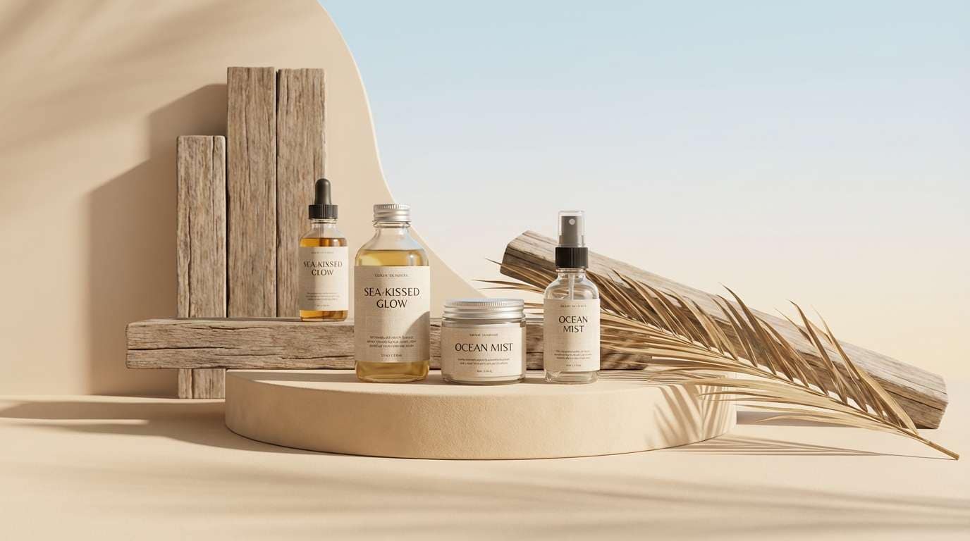
2) Sunfaded Postcard
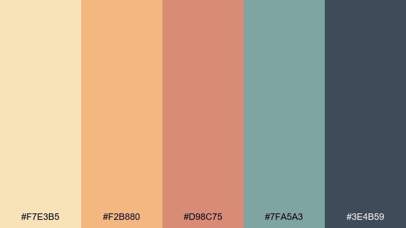
HEX: #f7e3b5 #f2b880 #d98c75 #7fa5a3 #3e4b59
Mood: nostalgic, bright, travel-worn
Best for: travel posters, social graphics, summer event flyers
Warm sand and faded coral feel like ink left in the sun on a seaside postcard. The teal and slate add contrast that keeps the palette from turning sugary. It shines on posters and social graphics where you want warmth without neon. Tip: use the slate for body text and let the coral pop only in small, punchy callouts.
Image example of sunfaded postcard generated using media.io
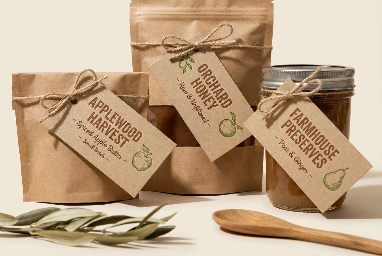
3) Sepia Orchard
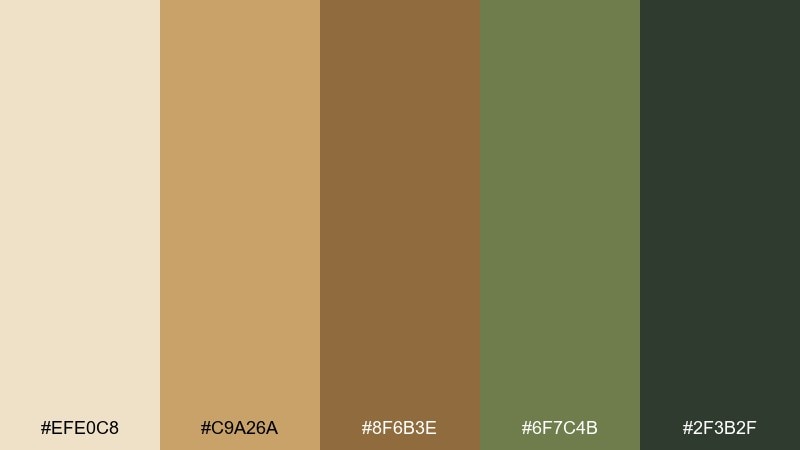
HEX: #efe0c8 #c9a26a #8f6b3e #6f7c4b #2f3b2f
Mood: earthy, rustic, harvest
Best for: farm-to-table branding, craft packaging, menu design
Sepia parchment and orchard greens bring to mind wooden crates, dried leaves, and late-afternoon markets. The darker greens ground the scheme so it feels authentic rather than costume-like. It works beautifully for menus, jar labels, and artisanal packaging with natural materials. Tip: print the tan as the main background and use the deep green sparingly for stamps and seals.
Image example of sepia orchard generated using media.io
4) Dusty Carnival
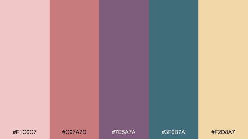
HEX: #f1c6c7 #c97a7d #7e5a7a #3f6b7a #f2d8a7
Mood: playful, faded, theatrical
Best for: album covers, boutique posters, party invitations
Powdery pinks and plum purples feel like painted rides, velvet curtains, and old ticket stubs. The cool teal adds a surprising counterpoint that keeps the palette modern. Use it for boutique posters, invitations, or creative cover art with a nostalgic wink. Tip: keep the cream as a buffer around type so the saturated tones do not fight each other.
Image example of dusty carnival generated using media.io
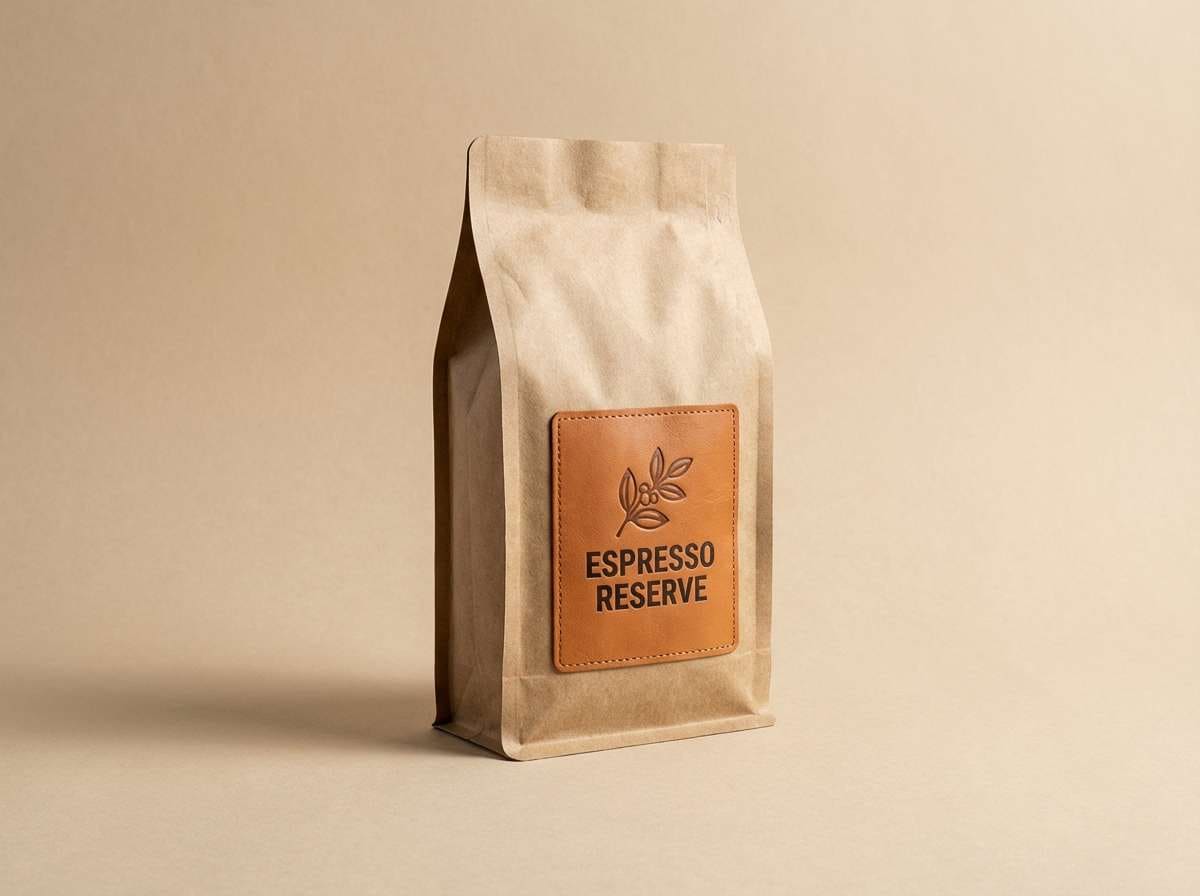
5) Library Leather
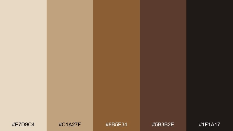
HEX: #e7d9c4 #c1a27f #8b5e34 #5b3b2e #1f1a17
Mood: classic, warm, scholarly
Best for: heritage logos, book covers, premium coffee branding
Buttery parchment and leather browns recall stacked novels, worn spines, and a quiet reading lamp. The near-black anchor makes it feel premium and deliberate. Use it on book covers, heritage logos, and packaging that needs a confident, grounded presence. Tip: emboss the mid-brown as a foil-like accent and let the dark espresso shade carry the brand mark.
Image example of library leather generated using media.io
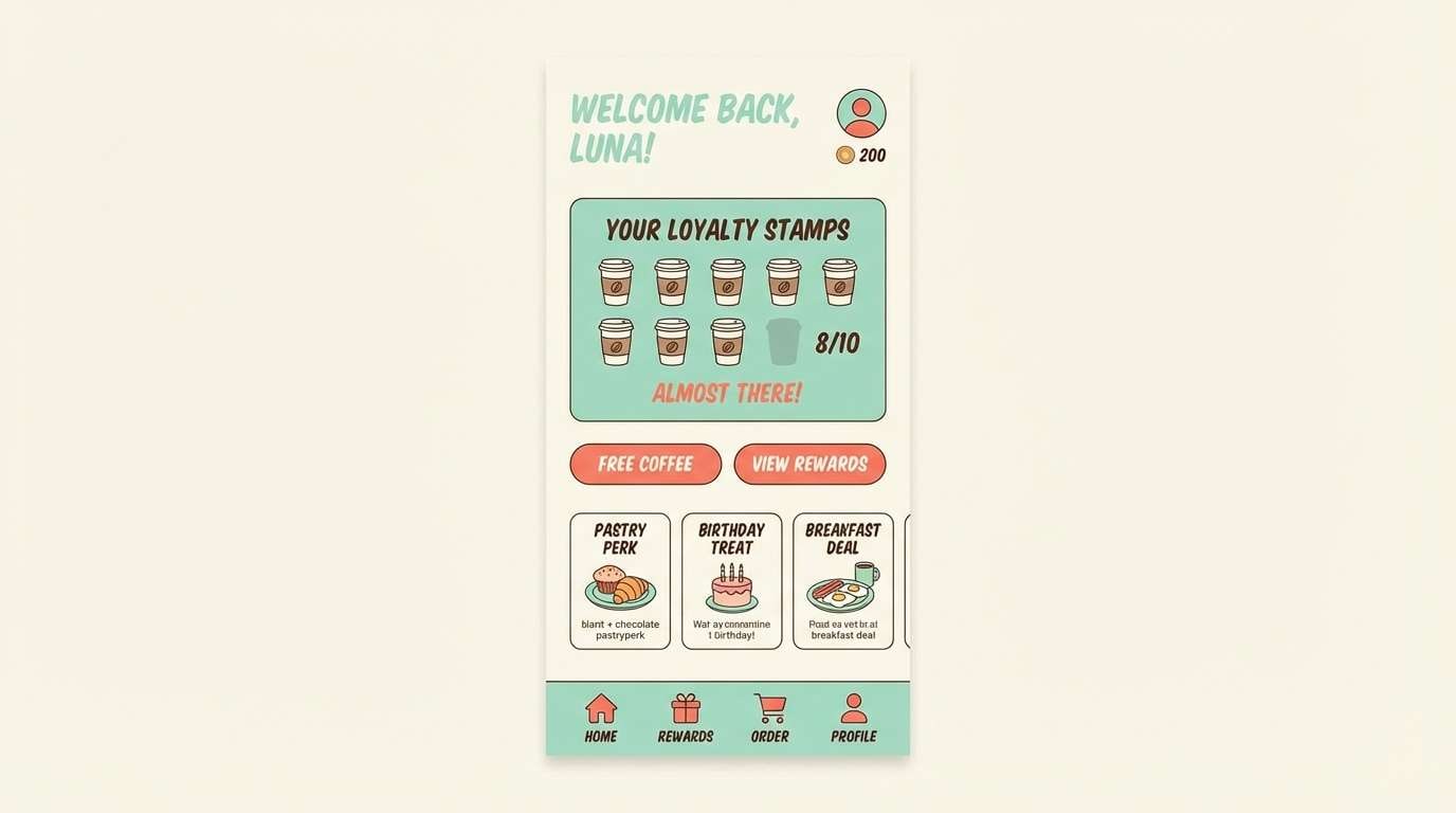
6) Retro Diner Mint
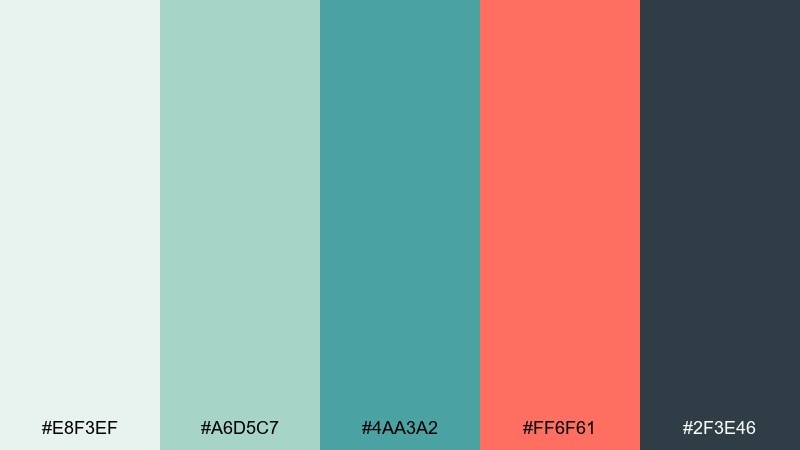
HEX: #e8f3ef #a6d5c7 #4aa3a2 #ff6f61 #2f3e46
Mood: cheerful, clean, retro-pop
Best for: 2d ui mockups, cafe branding, app onboarding screens
Mint tiles and soda-fountain teal evoke chrome stools, jukebox glow, and paper-wrapped burgers. These vintage color combinations work best when the coral is treated as a small, energetic accent. Use the deep blue-gray for navigation and typography to keep the interface crisp. Tip: keep buttons coral but limit them to one primary action per screen.
Image example of retro diner mint generated using media.io
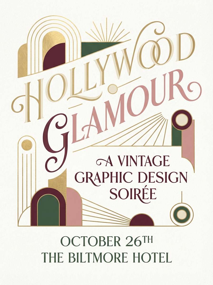
7) Old Hollywood Glam
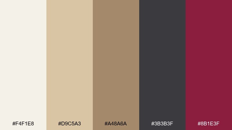
HEX: #f4f1e8 #d9c5a3 #a48a6a #3b3b3f #8b1e3f
Mood: luxurious, dramatic, cinematic
Best for: beauty campaigns, event posters, premium branding
Champagne neutrals with deep burgundy suggest velvet seats, film reels, and a spotlight hit. The charcoal gives the palette the same punch as a classic title card. Use it for beauty branding or evening event posters where you want elegance without gloss overload. Tip: set type in charcoal on cream, then bring in burgundy only for seals, dates, or a single hero element.
Image example of old hollywood glam generated using media.io
8) Prairie Quilt
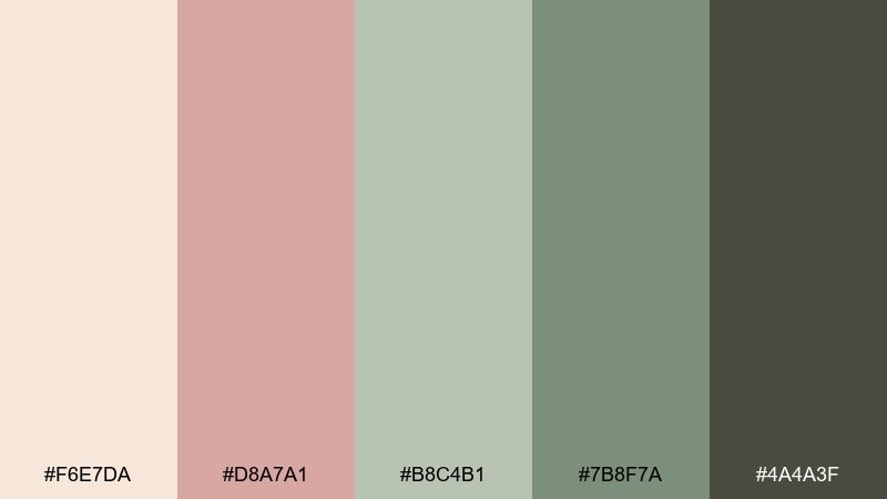
HEX: #f6e7da #d8a7a1 #b8c4b1 #7b8f7a #4a4a3f
Mood: homey, soft, handmade
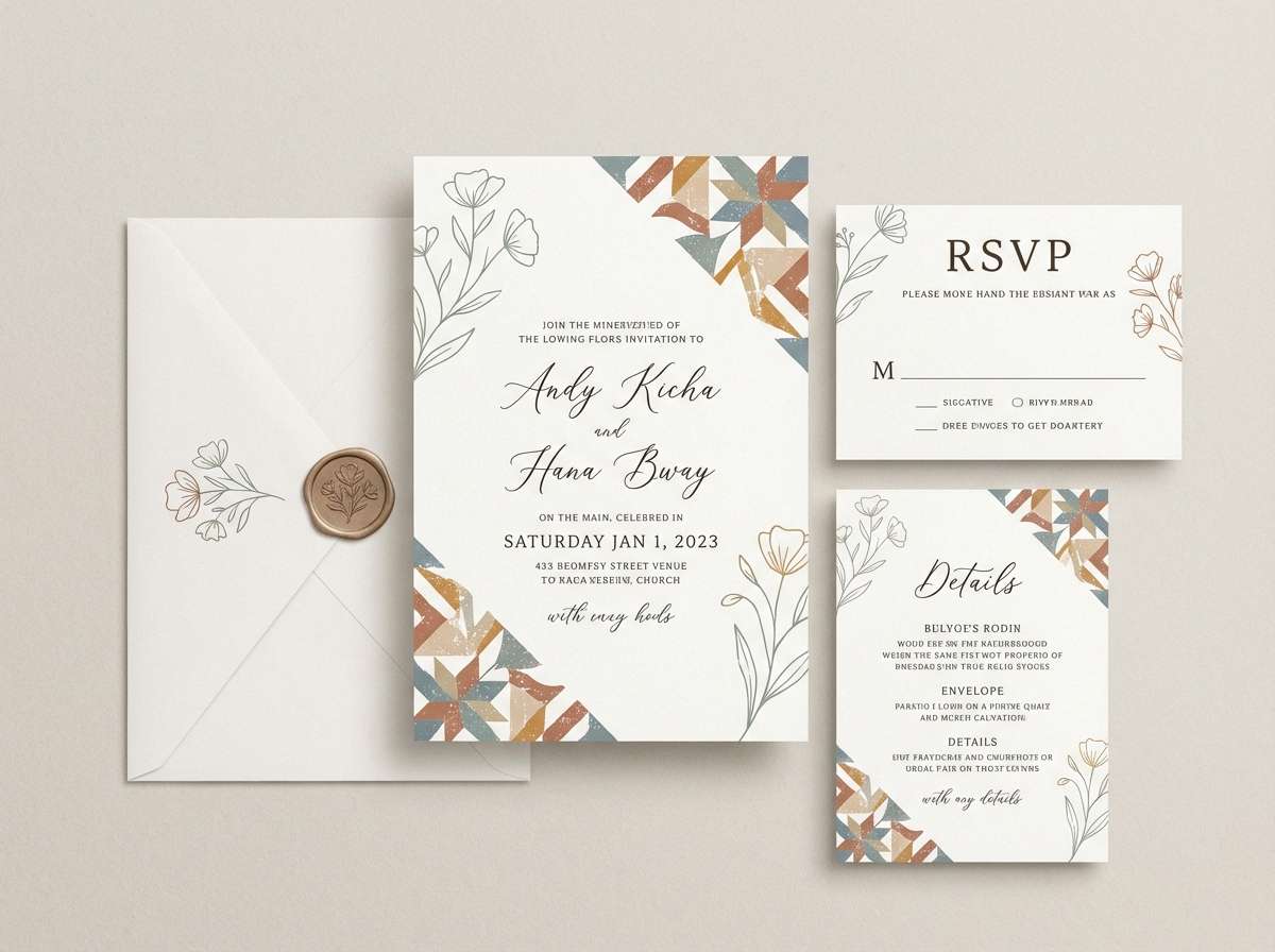
Best for: wedding stationery, lifestyle blogs, craft brand identity
Warm cream, dusty rose, and gentle sage feel like stitched fabric and sunlit curtains. The olive and charcoal add structure so the overall look stays intentional. It fits wedding suites, craft labels, and cozy lifestyle branding. Tip: use the sage as the main supporting color and keep the rose for small flourishes like icons or monograms.
Image example of prairie quilt generated using media.io
9) Coastal Boardwalk
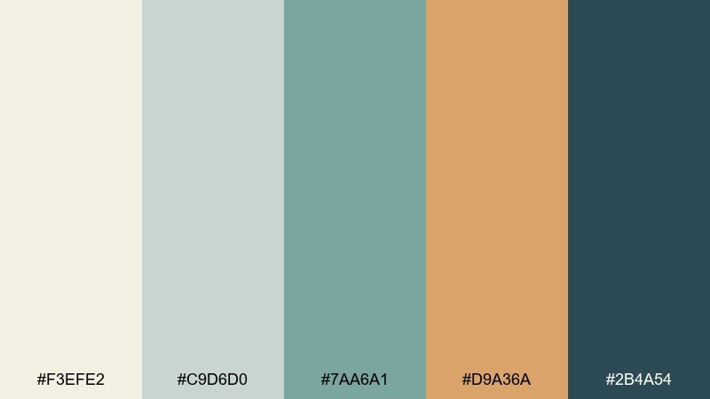
HEX: #f3efe2 #c9d6d0 #7aa6a1 #d9a36a #2b4a54
Mood: breezy, weathered, coastal
Best for: hotel branding, beach product ads, editorial headers
Weathered sea glass and driftwood beige bring to mind salty air and sun-bleached planks. The caramel accent warms the scheme and keeps it from feeling too cool. Use it for coastal hospitality brands, product ads, or editorial headers that need calm confidence. Tip: let the teal do most of the heavy lifting, and use caramel only for highlights like prices or badges.
Image example of coastal boardwalk generated using media.io
10) Midcentury Mustard
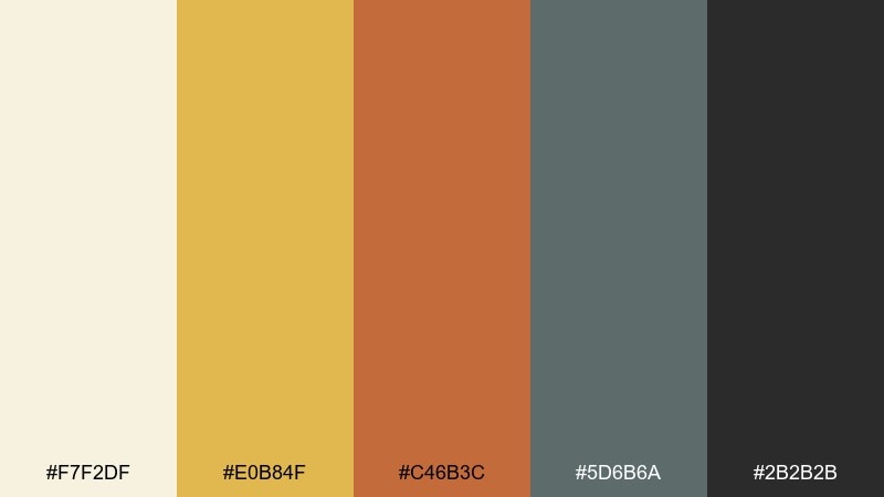
HEX: #f7f2df #e0b84f #c46b3c #5d6b6a #2b2b2b
Mood: bold, structured, retro-modern
Best for: brand systems, presentation slides, packaging labels
Mustard and burnt clay feel like patterned wallpaper and sunlit wood furniture. The cool gray-green adds balance, making the warm tones feel designed instead of loud. Use it in brand systems and slide decks where you want confident color blocks. Tip: keep backgrounds light and use mustard for section headers so charts and tables stay readable.
Image example of midcentury mustard generated using media.io
11) Gramophone Noir
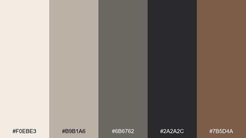
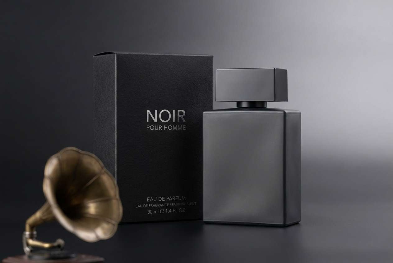
HEX: #f0ebe3 #b9b1a6 #6b6762 #2a2a2c #7b5d4a
Mood: moody, refined, smoky
Best for: coffee labels, menswear branding, photo overlays
Smoky grays and warm walnut recall jazz bars, brass details, and old records spinning late. The near-black gives you strong contrast without the harshness of pure black. Use it for menswear branding, label design, or moody photo overlays. Tip: apply the walnut as a thin accent line or small icon to keep the palette sleek.
Image example of gramophone noir generated using media.io
12) Heirloom Rose
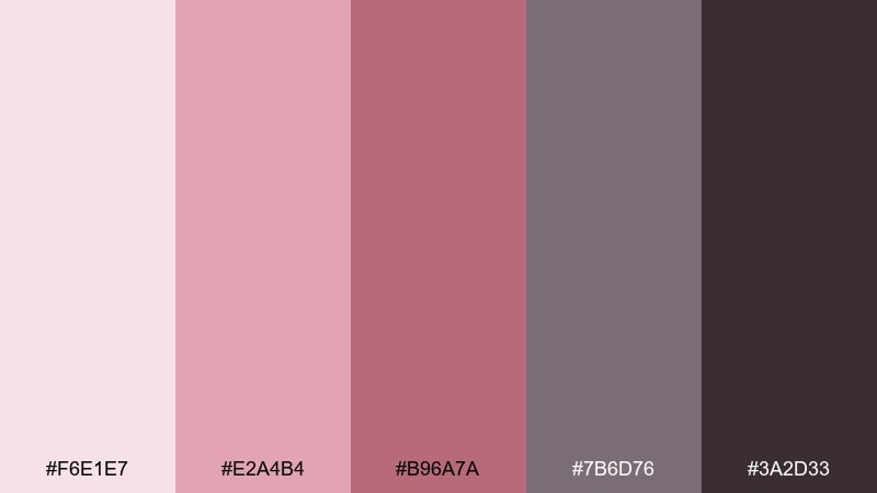
HEX: #f6e1e7 #e2a4b4 #b96a7a #7b6d76 #3a2d33
Mood: romantic, dusty, refined
Best for: beauty branding, wedding suites, boutique packaging
Dusty rose and mauve feel like pressed petals in an old book and a hint of perfume on fabric. As a vintage color palette, it reads instantly romantic without leaning overly sweet. Pair it with warm ivory paper stocks and charcoal typography for a modern edge. Tip: keep the deep plum for logos and monograms so the softer pinks can stay light and breathable.
Image example of heirloom rose generated using media.io
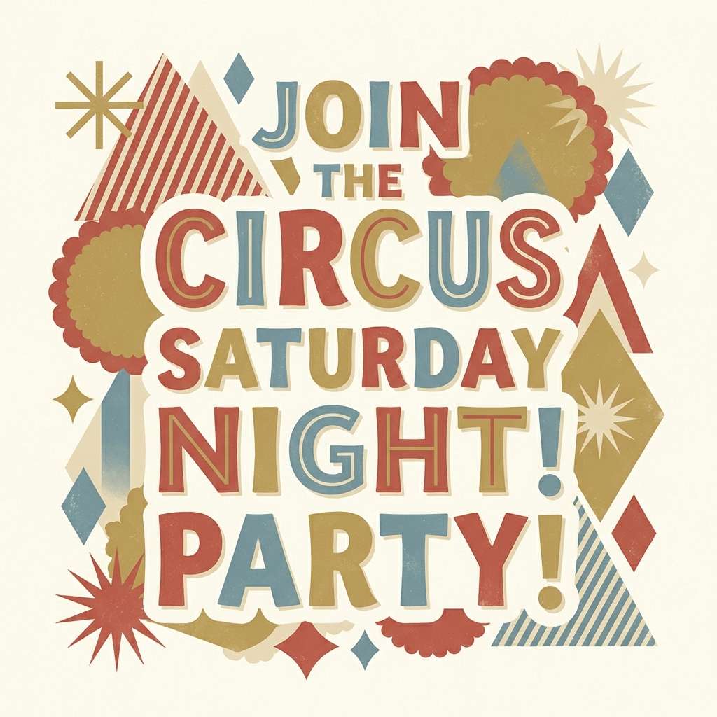
13) Deserted Motel Sign
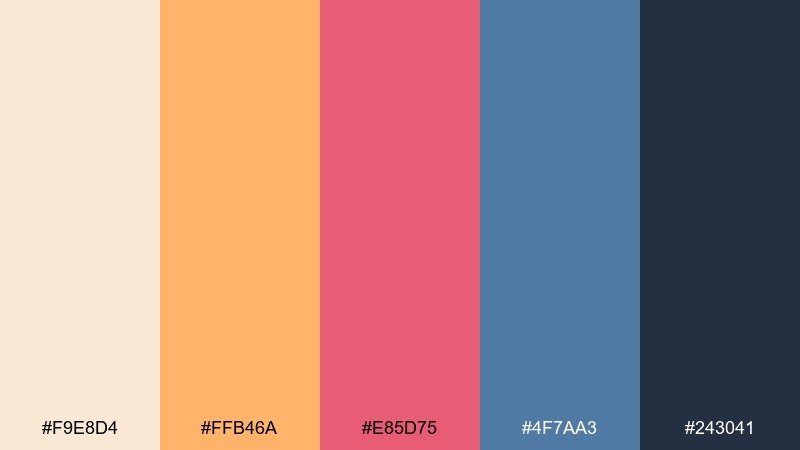
HEX: #f9e8d4 #ffb46a #e85d75 #4f7aa3 #243041
Mood: quirky, sunbaked, cinematic
Best for: album art, retro-inspired ads, bold poster design
Apricot and neon-leaning pink evoke a sunbaked roadside sign flickering at dusk. The denim blue and deep navy add that cinematic cool that keeps the palette from feeling candy-like. Use it for album art, retro ads, or posters that need energy and contrast. Tip: put the navy behind large type and let the apricot act as a glowing halo or highlight.
Image example of deserted motel sign generated using media.io

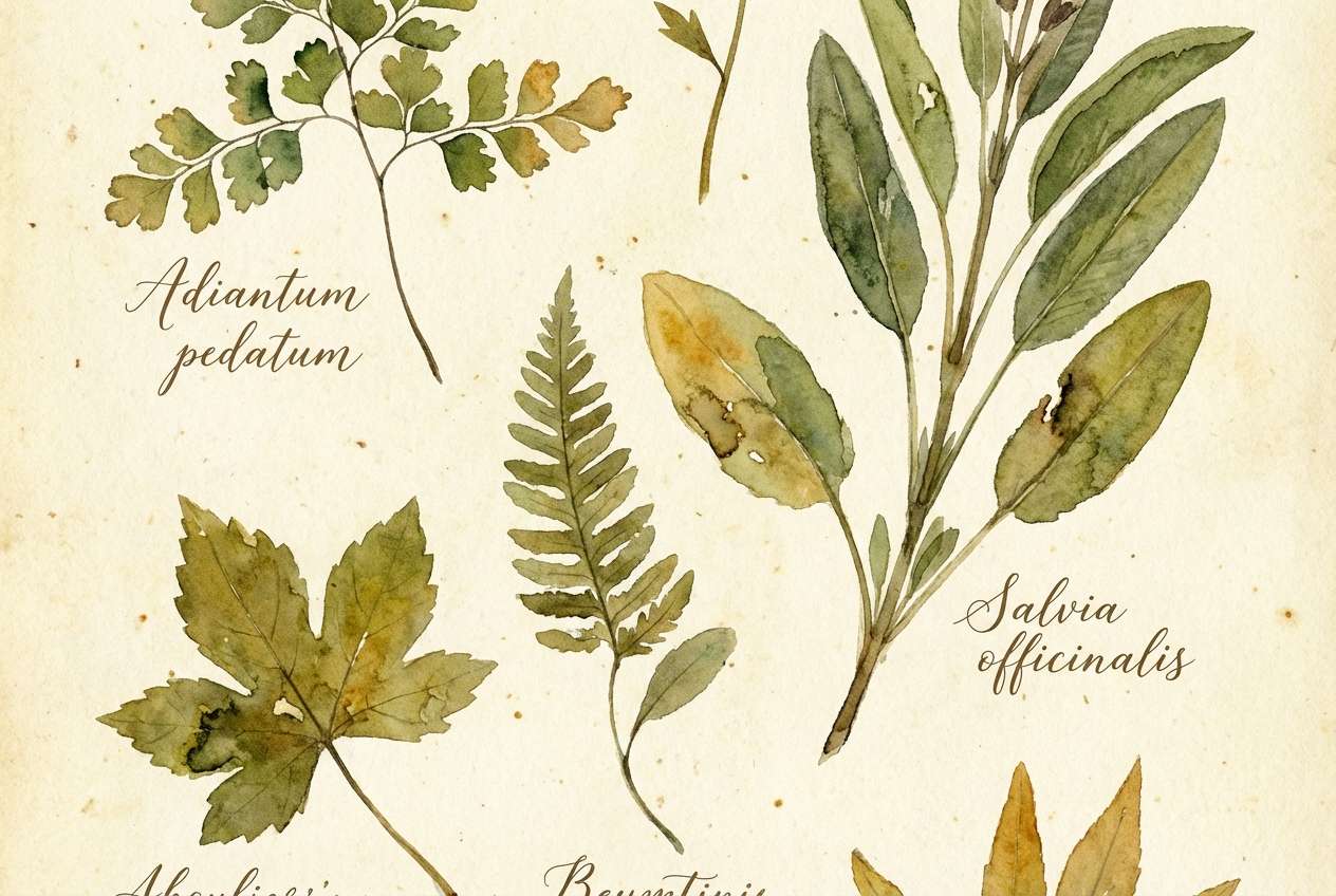
14) Botanical Herbarium
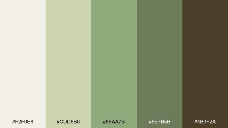
HEX: #f2f0e6 #cdd6b0 #8faa7b #6e7b5b #4b3f2a
Mood: calm, botanical, archival
Best for: watercolor illustrations, apothecary labels, eco branding
Sage greens and parchment cream feel like dried leaves pressed on archival paper. The deep olive and bark brown bring the grounded look of plant stems and soil. It suits eco branding and apothecary labels, especially when paired with delicate line drawings. Tip: use the cream as the main canvas and keep the darkest brown for small text to avoid a muddy print result.
Image example of botanical herbarium generated using media.io
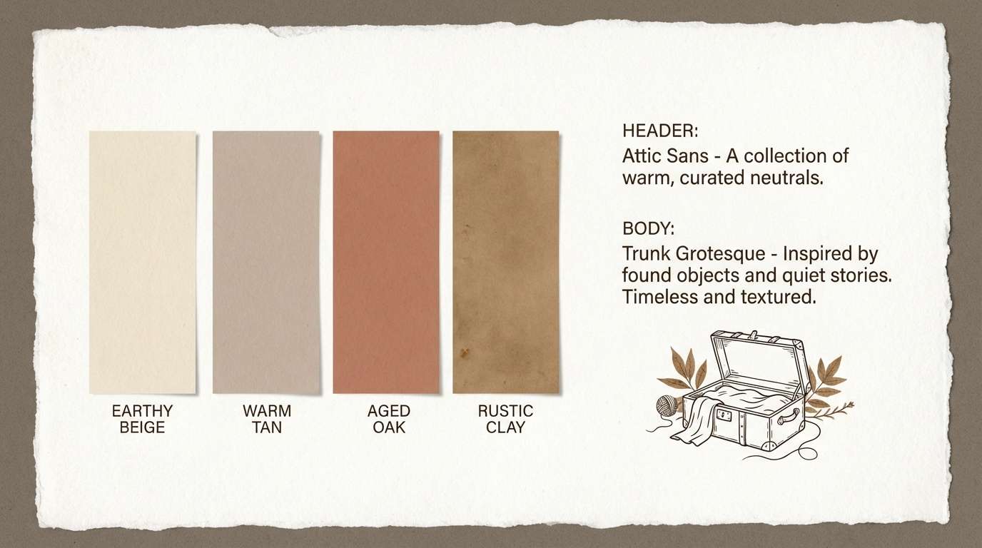
15) Attic Trunk
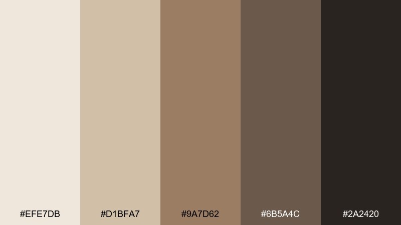
HEX: #efe7db #d1bfa7 #9a7d62 #6b5a4c #2a2420
Mood: muted, tactile, timeworn
Best for: portfolio sites, minimalist branding, interior mood boards
Muted taupes and deep brown feel like old linen, brass locks, and a trunk pulled from the attic. The palette stays neutral but never flat thanks to the warm undertones. Use it for portfolios, interiors mood boards, and calm brand identities that need sophistication. Tip: introduce texture through paper grain or subtle shadows instead of adding extra colors.
Image example of attic trunk generated using media.io
16) Riverside Picnic
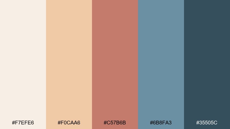
HEX: #f7efe6 #f0caa6 #c57b6b #6b8fa3 #35505c
Mood: friendly, outdoorsy, relaxed
Best for: family event flyers, blog headers, food packaging
Warm bread tones and dusty berry feel like gingham cloth, fruit tarts, and sun on the river. The cool blue-gray adds fresh air and makes the warm hues feel less heavy. Use it for picnic-themed flyers, friendly blog headers, or casual food packaging. Tip: keep the light cream for backgrounds and use the berry tone for key labels like dates or product names.
Image example of riverside picnic generated using media.io
17) Vintage Travel Tag
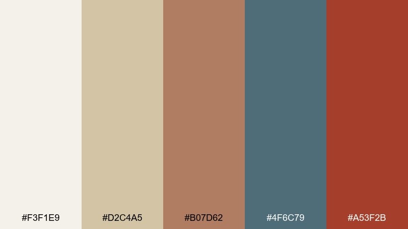
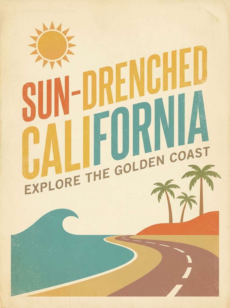
HEX: #f3f1e9 #d2c4a5 #b07d62 #4f6c79 #a53f2b
Mood: adventurous, printed, collectible
Best for: branding for travel shops, sticker packs, editorial sidebars
Creamy paper and muted ink tones evoke luggage tags, stamped passports, and old map edges. These vintage color combinations are ideal for designs that lean on typography, seals, and badge shapes. Use the navy for structure, then let the brick red act like an ink stamp that draws the eye. Tip: keep the red to under 10 percent coverage so it reads as an accent, not a warning color.
Image example of vintage travel tag generated using media.io
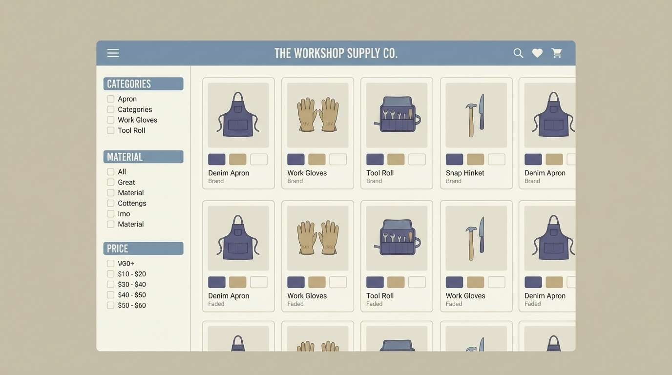
18) Faded Denim Workshop
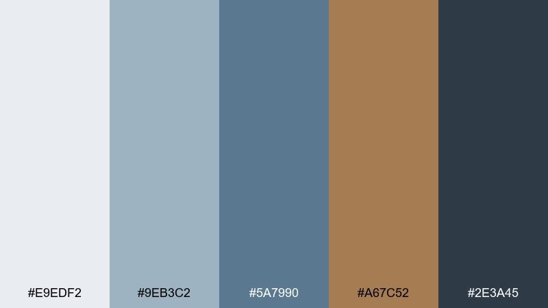
HEX: #e9edf2 #9eb3c2 #5a7990 #a67c52 #2e3a45
Mood: practical, cool, handcrafted
Best for: tool brand identity, ecommerce ui, workwear lookbooks
Denim blues and warm tan suggest work jackets, worn stitching, and a well-used bench. The dark slate provides strong contrast without feeling harsh. Use it for ecommerce UI, workwear lookbooks, or maker brands that need a sturdy, trustworthy feel. Tip: apply the tan as a secondary button color and keep the deepest slate for text and icons.
Image example of faded denim workshop generated using media.io
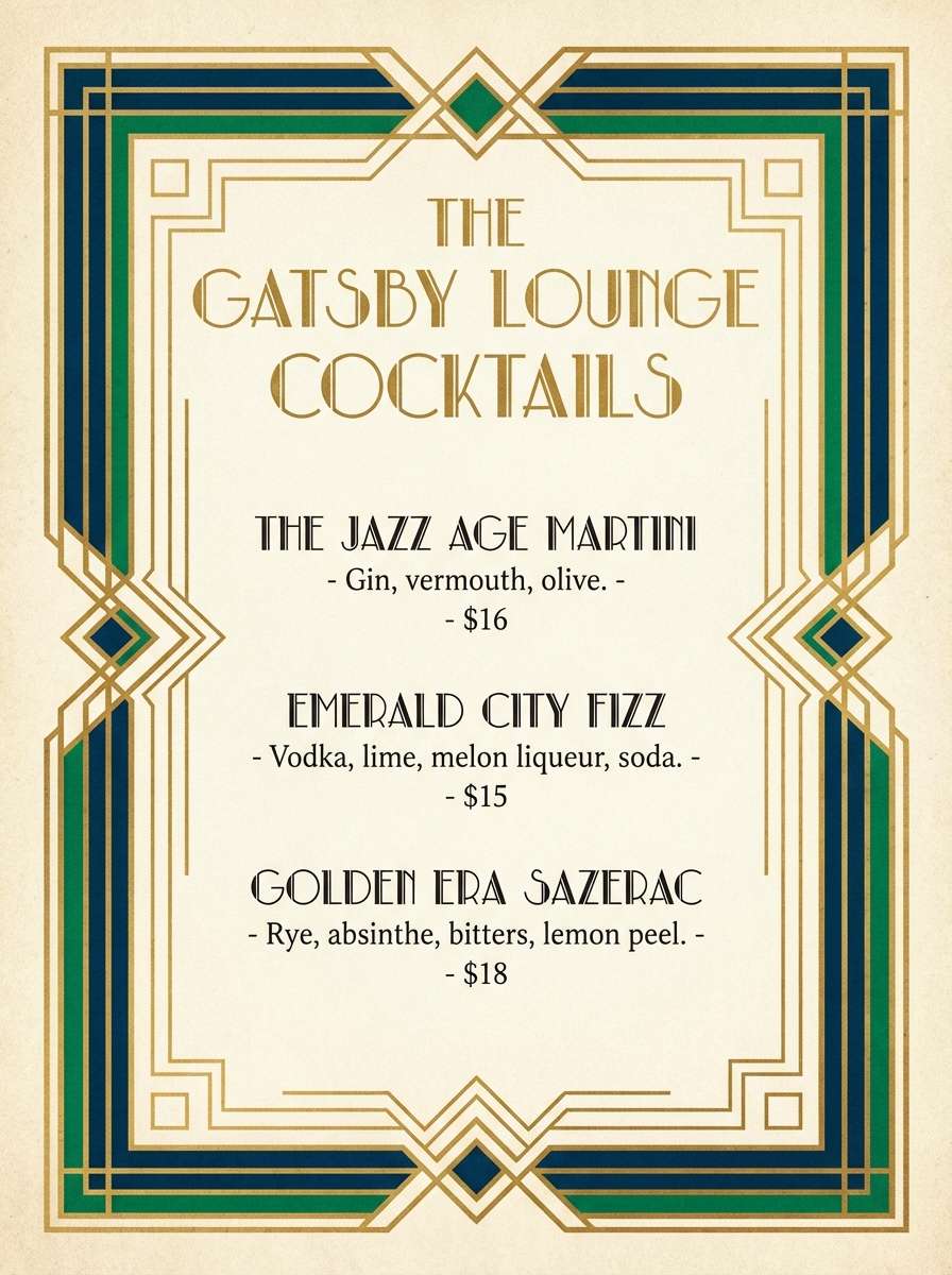
19) Art Deco Lobby
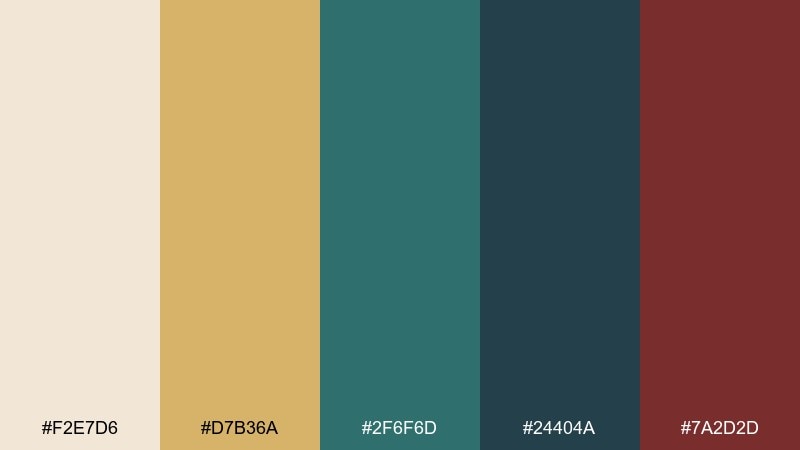
HEX: #f2e7d6 #d7b36a #2f6f6d #24404a #7a2d2d
Mood: opulent, geometric, confident
Best for: hotel branding, cocktail menus, luxury invites
Gold-tinted cream and deep jewel tones feel like a deco lobby with brass rails and tiled floors. The teal pair delivers structure, while the wine red adds a confident flourish. Use it for hotel branding, cocktail menus, and upscale invitations where geometry and contrast matter. Tip: lean into linework and frames, using the gold shade for borders and the teal for main blocks.
Image example of art deco lobby generated using media.io
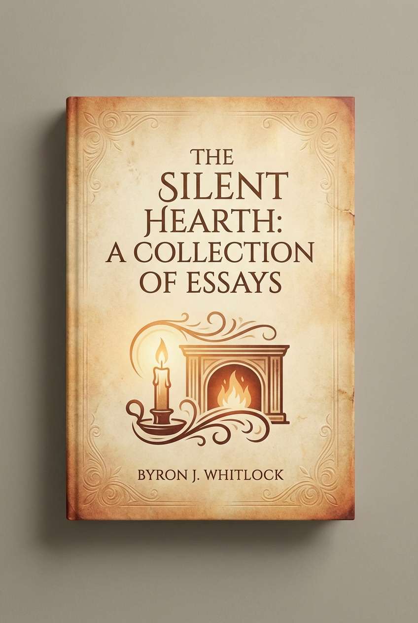
20) Candlelit Parlor
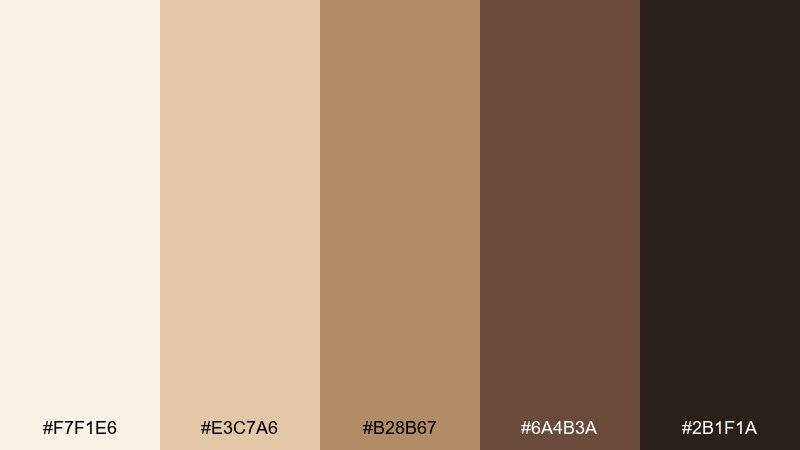
HEX: #f7f1e6 #e3c7a6 #b28b67 #6a4b3a #2b1f1a
Mood: cozy, intimate, classic
Best for: book covers, cozy cafe branding, autumn campaign creatives
Warm cream and toasted caramel conjure candlelight, wood paneling, and quiet conversation. For a vintage color palette that still feels modern, keep contrast high by pairing the darkest brown with generous light space. It works especially well on book covers and cozy cafe branding where warmth is the hero. Tip: use the mid caramel for subtle gradients and avoid overusing the darkest shade in large blocks.
Image example of candlelit parlor generated using media.io
What Colors Go Well with Vintage?
Vintage color schemes pair best with softened neutrals: warm ivory, parchment, putty, taupe, and smoky gray. These “aged paper” bases give your accent colors room to breathe and help the whole layout feel intentional.
For accents, look for faded versions of classics—dusty rose, muted teal, mustard, brick red, walnut brown, and denim blue. They bring personality without the harshness of neon or pure primaries.
If you need extra contrast, swap pure black for charcoal or espresso and use warm off-white instead of stark white. That small tweak keeps the vibe vintage while preserving accessibility and readability.
How to Use a Vintage Color Palette in Real Designs
Start with one dominant neutral, one supporting mid-tone, and one accent. Vintage palettes feel best when the accent is used sparingly—think buttons, badges, dates, or small icons—rather than large blocks everywhere.
Lean into materials and texture: paper grain, subtle noise, halftone dots, or a gentle vignette can make muted tones feel rich instead of flat. Keep the texture light so it doesn’t reduce legibility.
For typography, classic serifs, condensed sans, and editorial-inspired pairing work well. Use the darkest swatch for headings and UI text, and reserve the most saturated color for emphasis only.
Create Vintage Palette Visuals with AI
If you’re pitching a brand concept or building a mood board, generating quick palette-based visuals helps stakeholders “see” the vibe immediately. You can produce posters, packaging mockups, and UI scenes using a consistent prompt style.
In Media.io, simply describe the layout (poster, label, UI), add your vintage mood keywords (sepia, sunfaded, paper texture), and guide the color direction with your palette. Iterate by changing only one element at a time (lighting, texture, or contrast) to keep results consistent.
When you find a winning direction, reuse the same prompt structure across assets so your visuals feel like one cohesive system.
Vintage Color Palette FAQs
-
What is a vintage color palette?
A vintage color palette is a set of colors designed to feel aged, nostalgic, or timeworn—usually built from warm neutrals, muted tones, and softened contrasts (like sepia, dusty rose, sage, mustard, and charcoal). -
What’s the difference between vintage and retro colors?
Retro colors are often brighter and more pop-inspired (think midcentury or 80s-style accents), while vintage palettes typically look more faded, muted, and paper-like. Many designs blend both by keeping one bold accent and muting everything else. -
How do I keep a vintage palette from looking dull?
Use one confident accent (coral, burgundy, mustard, teal) at low coverage, then add texture and strong typography. Also keep contrast high with charcoal/espresso text on warm cream backgrounds. -
What background works best for vintage designs?
Warm off-white, parchment, linen, and light taupe are the safest vintage backgrounds. They preserve the nostalgic feel and improve readability compared to pure white. -
Are vintage palettes good for UI design?
Yes—especially for lifestyle, food, travel, and boutique brands. Use vintage tones as surfaces and secondary elements, but keep interactive states accessible with clear contrast and a limited number of accent colors. -
How many colors should I use in a vintage brand system?
Start with 3 core colors (background, text, accent), then add 2–4 supporting shades for sections, cards, borders, and illustrations. Vintage systems feel more premium when accents stay limited and consistent. -
Can I generate vintage color palette images with AI?
Yes. Use prompts that specify “paper texture,” “muted inks,” “sunfaded,” “archival,” or “sepia,” and describe the design format (poster, packaging, UI). Then iterate while keeping your color direction consistent.


