

Turquoise sits right between blue and green, so it can feel both calming and energizing in the same design. It’s a go-to choice for sea-glass minimalism, tropical brights, and modern UIs that need a clean accent color.
Below are 20+ turquoise color palette ideas with HEX codes, plus practical pairing and usage tips for branding, UI, and print.
In this article
- Why Turquoise Palettes Work So Well
-
- coastal breeze
- tropical lagoon
- spa serenity
- coral reef pop
- midnight current
- sea glass neutrals
- desert oasis
- arctic mint
- peacock jewel
- retro poolside
- minimal teal gray
- citrus surf
- oceanic corporate
- mermaid pastels
- industrial harbor
- winter tide
- botanical wash
- luxe marble
- kids aquarium
- gallery minimal
- sunset marina
- neo mint punch
- What Colors Go Well with Turquoise?
- How to Use a Turquoise Color Palette in Real Designs
- Create Turquoise Palette Visuals with AI
Why Turquoise Palettes Work So Well
Turquoise is naturally versatile: it can read coastal and airy when it’s light, or sleek and tech-forward when it’s deep and blue-leaning. That range makes turquoise palettes easy to adapt across brand styles—from playful to premium.
It’s also a strong “functional” color in design. Turquoise holds up well as an accent for buttons, active states, highlights, and charts because it feels vivid without being as aggressive as pure red.
Finally, turquoise pairs beautifully with both warm and cool companions. Combine it with corals, golds, and oranges for energy, or with grays, navies, and off-whites for a clean, modern system.
20+ Turquoise Color Palette Ideas (with HEX Codes)
1) Coastal Breeze
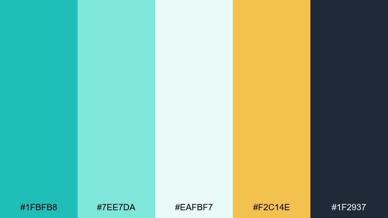
HEX: #1FBFB8 #7EE7DA #EAFBF7 #F2C14E #1F2937
Mood: fresh, airy, relaxed
Best for: travel landing page UI
Fresh, breezy tones like sunlit water and pale foam set a relaxed seaside mood. Use the turquoise as your primary UI color, then lean on the off-white for generous spacing and readability. The warm gold works best as a sparing accent for buttons, badges, or key stats. Pair with charcoal text to keep contrast crisp on both desktop and mobile.
Image example of coastal breeze generated using media.io
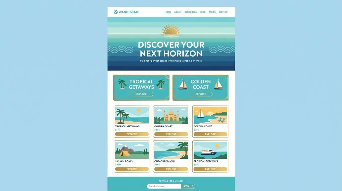
Media.io is an online AI studio for creating and editing video, image, and audio in your browser.

2) Tropical Lagoon
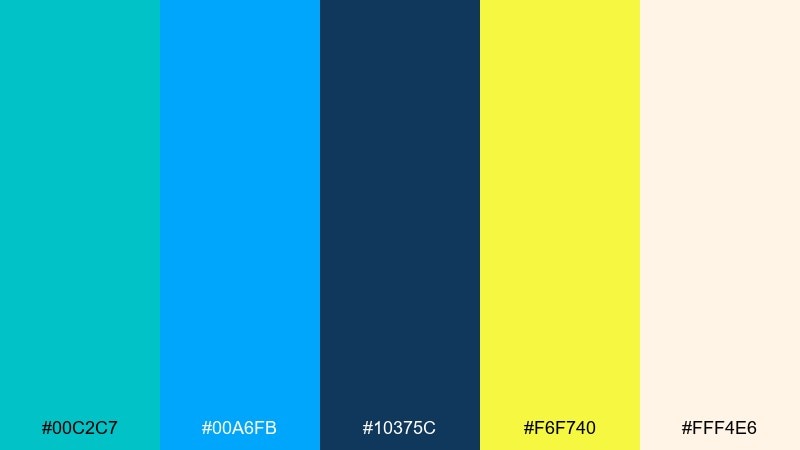
HEX: #00C2C7 #00A6FB #10375C #F6F740 #FFF4E6
Mood: vibrant, energetic, sunny
Best for: summer event poster
Vibrant lagoon hues and punchy citrus yellow feel like heat, music, and late-afternoon sun. Let the turquoise and electric blue carry the headline blocks, then ground everything with deep navy for type. Use the yellow as a high-visibility callout for dates and ticket info. Keep the cream background clean so the colors stay loud without looking busy.
Image example of tropical lagoon generated using media.io

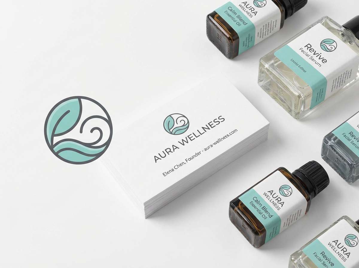
3) Spa Serenity
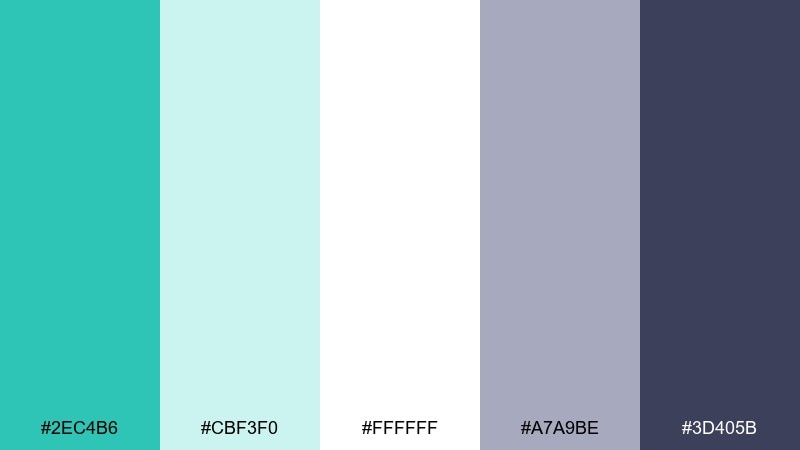
HEX: #2EC4B6 #CBF3F0 #FFFFFF #A7A9BE #3D405B
Mood: calm, clean, restorative
Best for: wellness brand identity
Calm, watery turquoise with soft misty neutrals evokes a quiet spa and a deep exhale. This turquoise color palette shines in logos and packaging when you keep the layout minimal and let whitespace do the work. Use slate for typography and fine lines, reserving the brighter turquoise for seals or key benefits. A matte paper finish pairs nicely with the subdued gray-lavender tone.
Image example of spa serenity generated using media.io
4) Coral Reef Pop
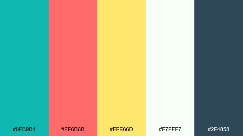
HEX: #0FB9B1 #FF6B6B #FFE66D #F7FFF7 #2F4858
Mood: playful, bold, punchy
Best for: social media ad creative
Playful reef colors feel like snorkeling over bright coral and darting fish. These turquoise color combinations work best with chunky shapes and high-contrast type, especially for quick-scrolling feeds. Use coral for the main CTA and keep yellow for small bursts like price tags. Anchor the design with dark blue-gray text so the brights stay readable.
Image example of coral reef pop generated using media.io

5) Midnight Current
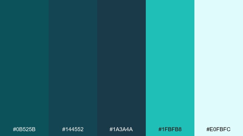
HEX: #0B525B #144552 #1A3A4A #1FBFB8 #E0FBFC
Mood: moody, sleek, modern
Best for: SaaS analytics dashboard UI
Moody deep-sea blues with a glowing turquoise highlight evoke a current moving under moonlight. Build your dashboard with dark panels, then use the bright accent only for active states, charts, and key alerts. Keep backgrounds consistent to avoid visual noise, and reserve the pale ice tint for tooltips and empty states. This palette rewards restraint and clear hierarchy.
Image example of midnight current generated using media.io

6) Sea Glass Neutrals
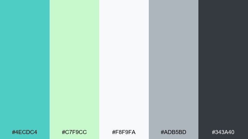
HEX: #4ECDC4 #C7F9CC #F8F9FA #ADB5BD #343A40
Mood: soft, modern, approachable
Best for: modern apartment living room
Soft sea-glass greens and gentle neutrals feel airy, modern, and lived-in. Use the turquoise on textiles like throws or art prints, then keep walls and larger furniture in light gray and off-white. Bring in charcoal through frames, lighting, or a coffee table to add structure. A small touch of mint works well in plants and ceramics without stealing focus.
Image example of sea glass neutrals generated using media.io

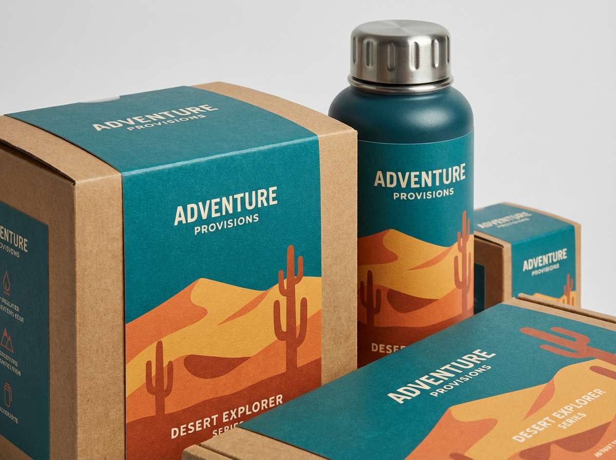
7) Desert Oasis
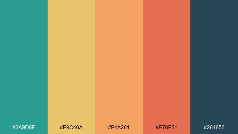
HEX: #2A9D8F #E9C46A #F4A261 #E76F51 #264653
Mood: warm, earthy, adventurous
Best for: outdoor brand packaging
Warm sand and clay tones around a cool oasis teal evoke road trips and sunbaked trails. For packaging, let the teal lead as a bold label block, then use the warm hues for patterns, flavor cues, or product variants. Navy adds a rugged base for typography and barcodes. A simple two-color icon set keeps the look outdoorsy without turning rustic.
Image example of desert oasis generated using media.io
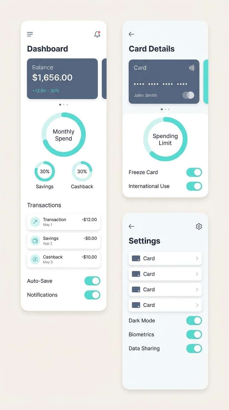
8) Arctic Mint
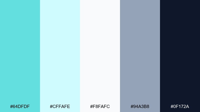
HEX: #64DFDF #CFFAFE #F8FAFC #94A3B8 #0F172A
Mood: crisp, minimal, techy
Best for: fintech mobile app UI screens
Crisp icy mints and cool blues feel like clean air and polished glass. Use the bright aqua for progress indicators and positive states, then keep most surfaces near-white for a premium fintech feel. Slate and near-black give you accessible typography and clear dividers. A subtle gradient between the two light blues adds depth without breaking minimalism.
Image example of arctic mint generated using media.io
9) Peacock Jewel
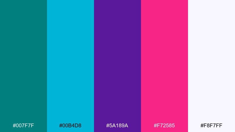
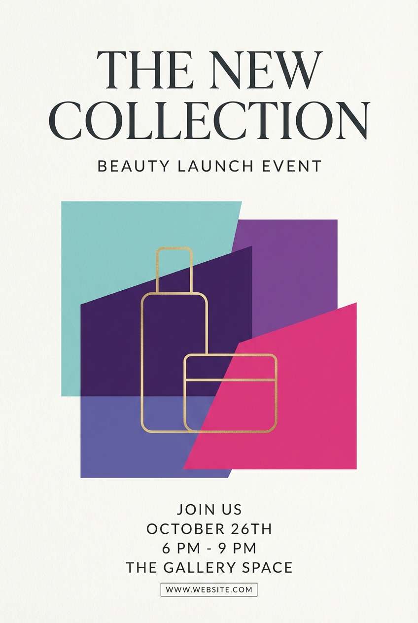
HEX: #007F7F #00B4D8 #5A189A #F72585 #F8F7FF
Mood: dramatic, luxe, expressive
Best for: beauty product launch flyer
Jewel-like turquoise with violet and fuchsia reads glamorous, dramatic, and fashion-forward. Keep the background light so the saturated accents feel intentional rather than heavy. Use violet for headings, turquoise for secondary blocks, and fuchsia for small attention-grabbers like limited-edition badges. Finish with thin linework and generous margins to maintain a luxe vibe.
Image example of peacock jewel generated using media.io
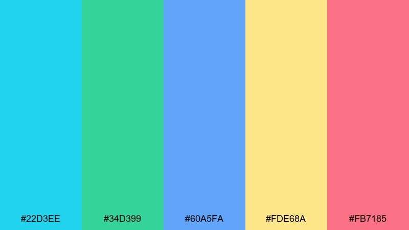
10) Retro Poolside
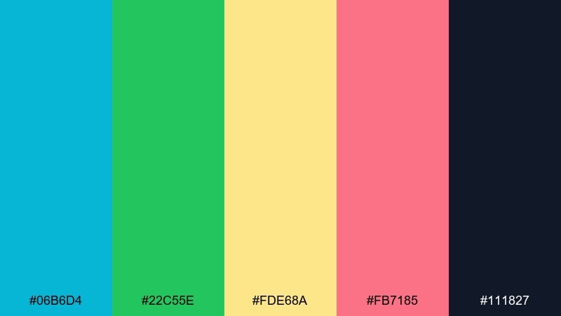
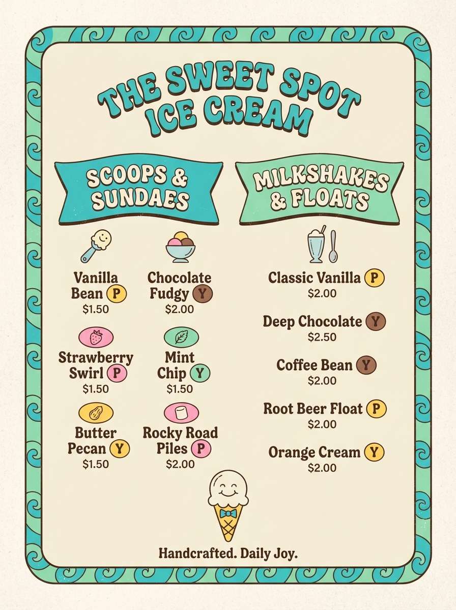
HEX: #06B6D4 #22C55E #FDE68A #FB7185 #111827
Mood: retro, fun, summery
Best for: ice cream shop menu board
Retro pool colors feel like vinyl loungers, neon signs, and cold treats on a hot day. Use turquoise and green for sections and category headers, then sprinkle yellow and pink for flavor highlights. Black keeps pricing and small text readable from a distance. A simple checker or stripe pattern can tie it together without overwhelming the menu items.
Image example of retro poolside generated using media.io
11) Minimal Teal Gray
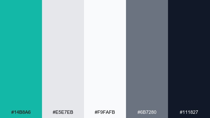
HEX: #14B8A6 #E5E7EB #F9FAFB #6B7280 #111827
Mood: professional, tidy, modern
Best for: B2B website redesign
Clean teal and structured grays create a modern, professional feel with zero fuss. For a B2B site, use the teal sparingly for links, icons, and primary buttons so the interface stays calm. Layer the two light neutrals for sections and cards to add depth without adding color noise. This is a reliable turquoise color palette when you need clarity, not drama.
Image example of minimal teal gray generated using media.io

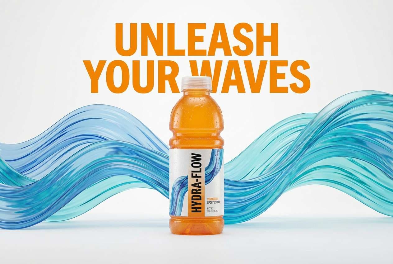
12) Citrus Surf
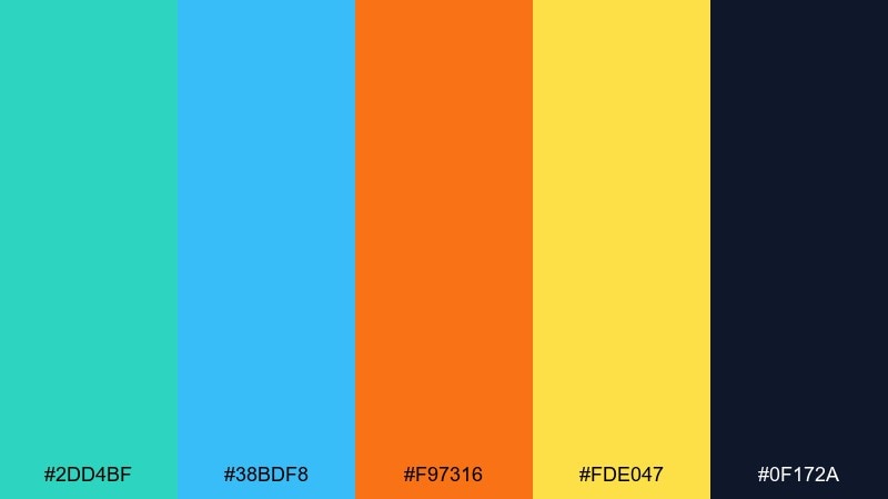
HEX: #2DD4BF #38BDF8 #F97316 #FDE047 #0F172A
Mood: bright, sporty, upbeat
Best for: sports drink product ad
Bright surf tones with citrus pops feel fast, sweaty, and refreshing. Let turquoise and sky blue own the background waves, then punch in orange for the product name and key benefits. Yellow works best as a small energy spark around icons and callouts. Keep the dark navy for legal copy and to frame the layout with confidence.
Image example of citrus surf generated using media.io
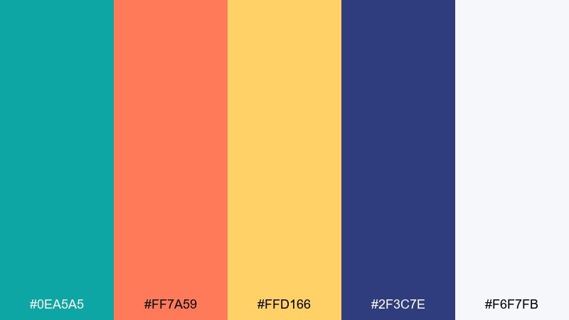
13) Oceanic Corporate
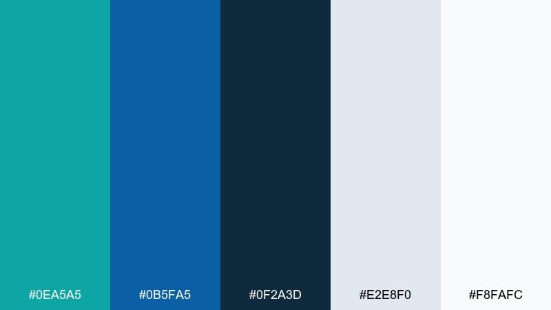
HEX: #0EA5A5 #0B5FA5 #0F2A3D #E2E8F0 #F8FAFC
Mood: trustworthy, composed, confident
Best for: corporate annual report layout
Deep ocean blues with a controlled turquoise accent feel steady and trustworthy. Build your grids with light neutrals, then use turquoise for charts and pull quotes to guide the reader. Navy keeps section headers and footers strong in print. This turquoise color scheme stays polished when you stick to consistent line weights and clear data hierarchy.
Image example of oceanic corporate generated using media.io

14) Mermaid Pastels
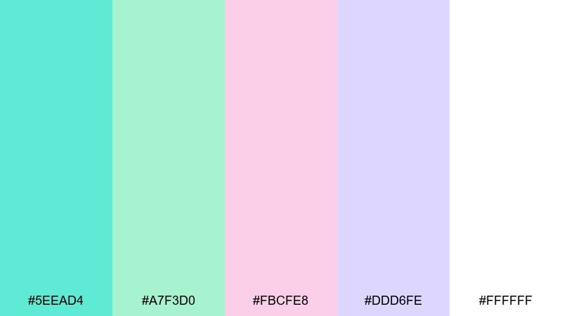
HEX: #5EEAD4 #A7F3D0 #FBCFE8 #DDD6FE #FFFFFF
Mood: dreamy, sweet, whimsical
Best for: baby shower invitation
Dreamy pastels like sea foam and soft candy clouds feel gentle and celebratory. Use turquoise as the main header color, then rotate blush and lavender for decorative elements and icons. Keep type in a muted gray to avoid harsh contrast against the light background. A light watercolor texture makes the invite feel handmade without sacrificing readability.
Image example of mermaid pastels generated using media.io

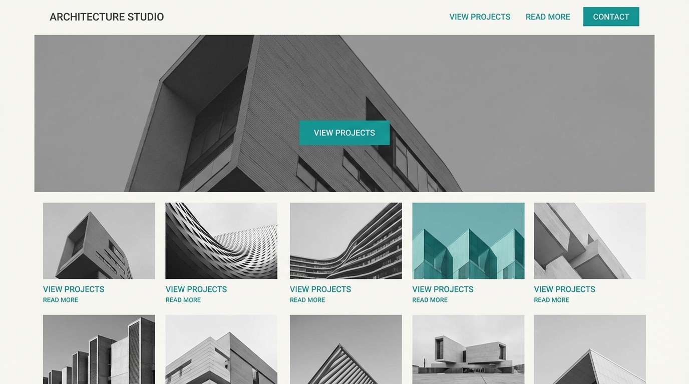
15) Industrial Harbor
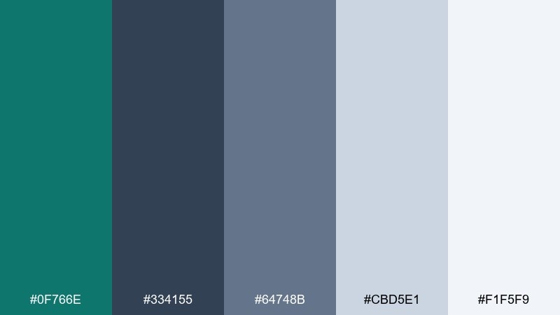
HEX: #0F766E #334155 #64748B #CBD5E1 #F1F5F9
Mood: urban, grounded, utilitarian
Best for: architecture studio website
Cool harbor teal against steel grays feels urban, grounded, and quietly confident. Use teal for hover states and navigation highlights, while the layered grays handle backgrounds and content sections. Keep imagery black-and-white or low-saturation so the color accent stays intentional. A thin grid and plenty of margins will reinforce the architectural precision.
Image example of industrial harbor generated using media.io
16) Winter Tide
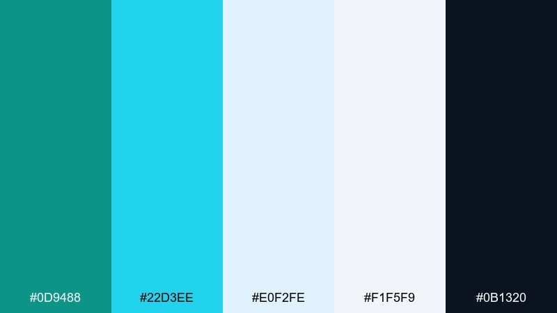
HEX: #0D9488 #22D3EE #E0F2FE #F1F5F9 #0B1320
Mood: cool, crisp, festive
Best for: holiday email newsletter design
Cool tide blues and icy highlights feel crisp, festive, and modern rather than traditional. Use the darkest navy for headings and dividers, then keep turquoise for buttons and featured links. The pale blues are ideal for section bands so the email stays scannable. Add one subtle snowflake pattern at low opacity to nod to the season without clutter.
Image example of winter tide generated using media.io
17) Botanical Wash
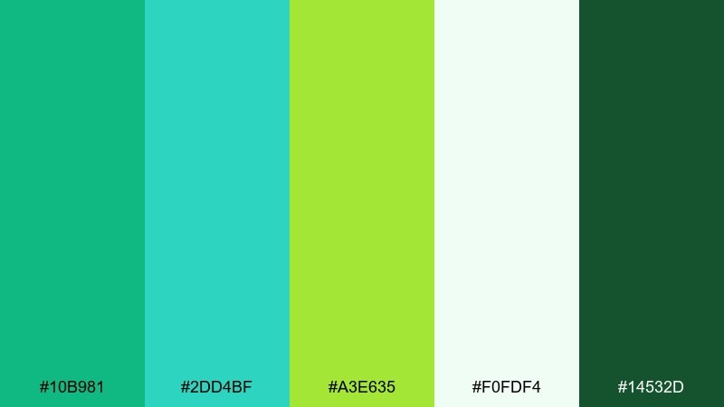
HEX: #10B981 #2DD4BF #A3E635 #F0FDF4 #14532D
Mood: fresh, natural, optimistic
Best for: spring botanical illustration set
Fresh botanical greens with turquoise water tones feel like new leaves after rain. Use the deep forest green for outlines and labels, then wash in soft minty backgrounds to keep it airy. The lime accent is perfect for buds, small flowers, or highlight strokes. Keep the palette light-handed so the illustration stays delicate and springlike.
Image example of botanical wash generated using media.io
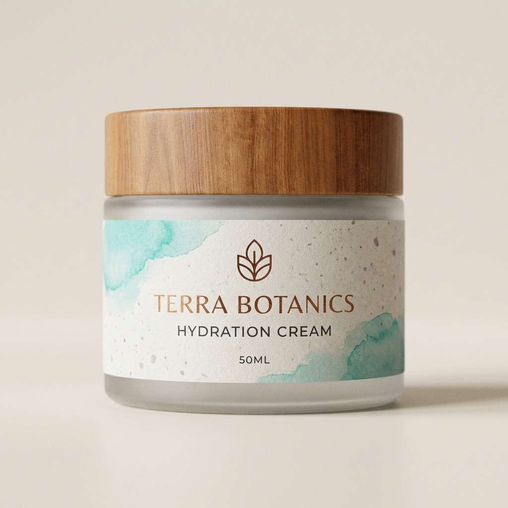
18) Luxe Marble
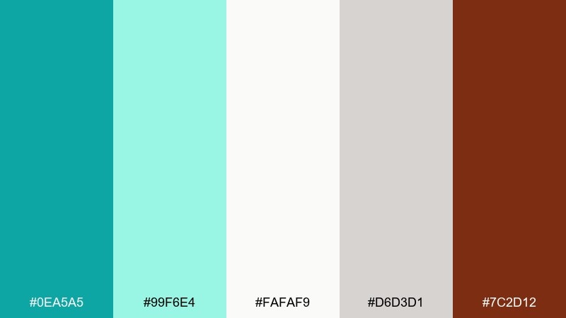
HEX: #0EA5A5 #99F6E4 #FAFAF9 #D6D3D1 #7C2D12
Mood: elegant, upscale, refined
Best for: skincare jar packaging
Elegant turquoise with soft stone neutrals feels like cool marble and boutique shelves. Use the pale tones for the label base, then bring turquoise in through borders, icons, or a simple brand mark. The warm brown works best as a tiny luxury cue for foil stamping or a secondary line name. Keep typography minimalist and align elements carefully for a premium finish.
Image example of luxe marble generated using media.io
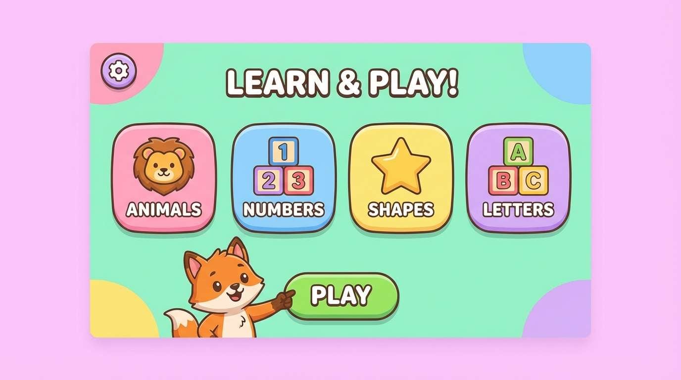
19) Kids Aquarium
HEX: #22D3EE #34D399 #60A5FA #FDE68A #FB7185
Mood: cheerful, playful, friendly
Best for: kids learning app UI
Cheerful aquarium brights feel like bubbles, fish stickers, and animated games. Use turquoise as the main navigation color and rotate the other hues for level badges and illustrations. Keep text in a dark neutral to avoid readability issues on saturated blocks. These turquoise color combinations stay kid-friendly when you stick to rounded shapes and consistent icon styles.
Image example of kids aquarium generated using media.io
20) Gallery Minimal
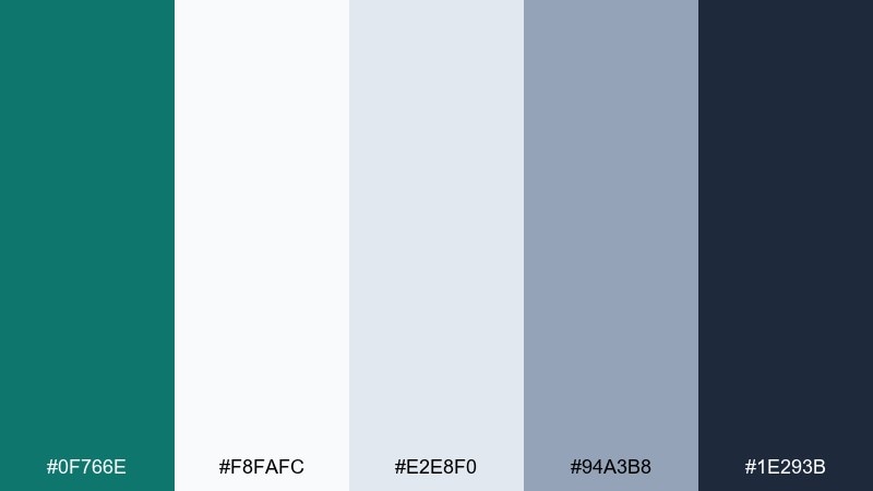
HEX: #0F766E #F8FAFC #E2E8F0 #94A3B8 #1E293B
Mood: quiet, curated, modern
Best for: photography portfolio website
Quiet teal with cool neutrals feels curated, like a calm gallery wall. Use the teal only for micro-interactions such as links, filters, and the active thumbnail border. Let your photography carry the color story while the grays provide structure and breathing room. Keep buttons outlined instead of filled for a refined, minimalist look.
Image example of gallery minimal generated using media.io
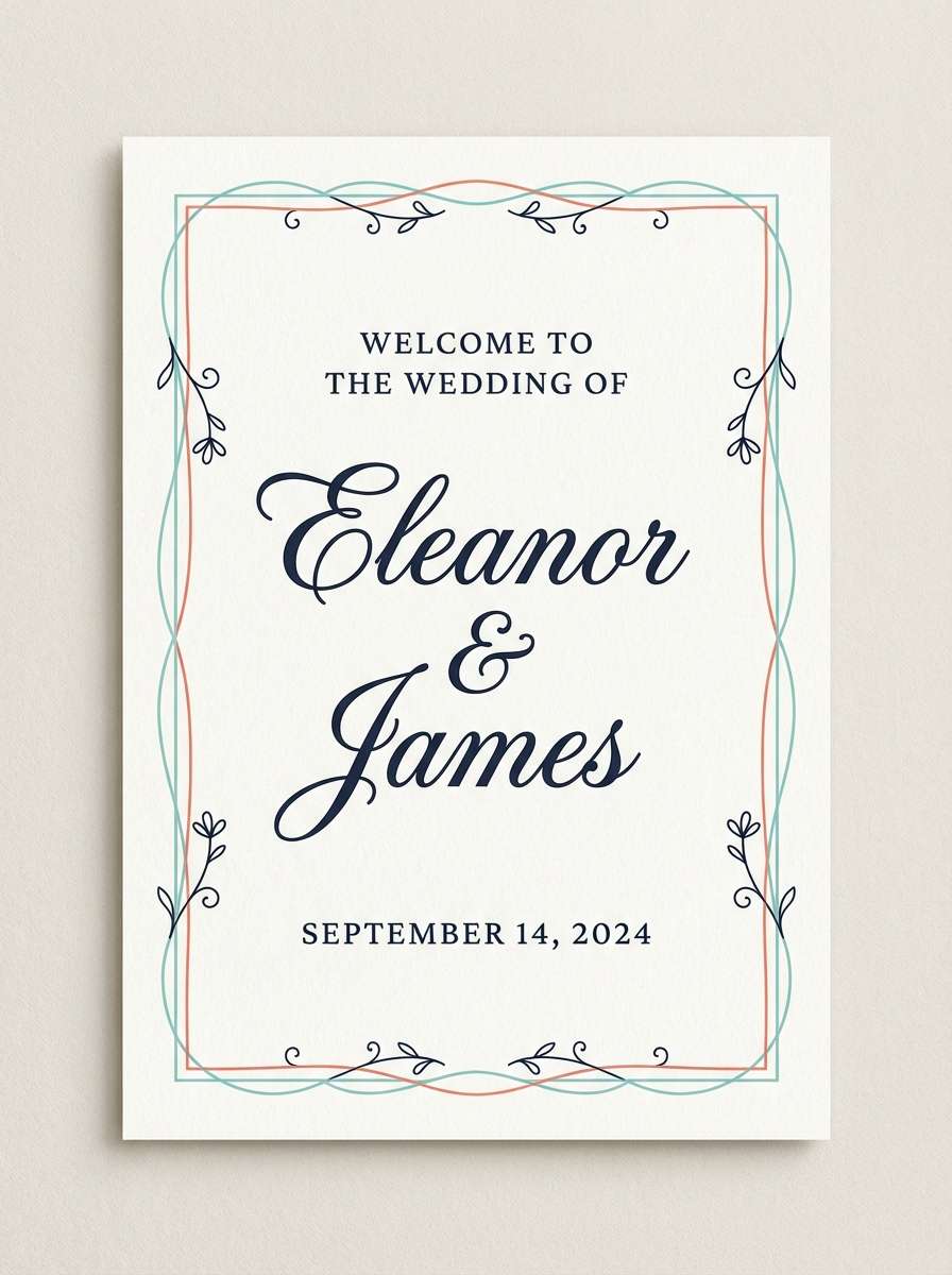
21) Sunset Marina
HEX: #0EA5A5 #FF7A59 #FFD166 #2F3C7E #F6F7FB
Mood: romantic, warm, balanced
Best for: wedding welcome sign
Warm sunset coral and golden light balanced with turquoise feels romantic, like boats at a marina at dusk. Use the navy for names and main text so it stays readable from a distance. Keep turquoise and coral for borders, floral motifs, or a monogram mark. A lightly textured off-white background will keep the sign looking soft and elevated.
Image example of sunset marina generated using media.io
22) Neo Mint Punch
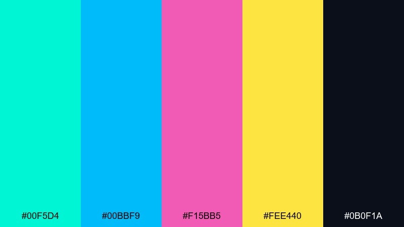
HEX: #00F5D4 #00BBF9 #F15BB5 #FEE440 #0B0F1A
Mood: bold, neon, futuristic
Best for: music app promo banner
Neon mint and hot pink feel futuristic, like club lights reflecting on glossy water. Use the dark base to make the brights pop, then keep typography large and simple. Yellow should be reserved for a single focus element, such as a download badge or limited-time offer. A soft glow effect can help the turquoise feel electric without sacrificing legibility.
Image example of neo mint punch generated using media.io

What Colors Go Well with Turquoise?
Turquoise looks especially clean with neutrals like off-white, light gray, slate, and charcoal—perfect when you need an accessible UI color palette or a minimalist brand system. Deep navy is another reliable partner because it increases contrast without making turquoise feel harsh.
For warmer, more expressive combinations, pair turquoise with coral, peach, terracotta, or golden yellow. These complements create instant energy for posters, ads, packaging, and summer-themed visuals.
If you want something more editorial or luxe, try turquoise with jewel tones like violet, magenta, and deep teal. Keep backgrounds light (or go full dark-mode) and use accents sparingly to maintain hierarchy.
How to Use a Turquoise Color Palette in Real Designs
Start by choosing your “role” for turquoise: primary brand color, UI accent, or background wash. In interfaces, turquoise often performs best as an accent (buttons, links, toggles, chart highlights) while neutrals handle most surfaces.
In print and branding, control saturation to match the mood—muted turquoise feels premium and calm, while bright turquoise feels sporty and playful. Balance it with one warm accent (like gold or coral) and one strong dark for typography.
Always check contrast for text and critical UI elements. Turquoise can look bright but still fail accessibility on white backgrounds, so reserve it for larger elements or pair it with darker supporting colors.
Create Turquoise Palette Visuals with AI
If you already have HEX codes, you can turn them into on-brand mockups fast—social ads, posters, UI screens, packaging, and more. The key is to describe layout, typography style, and where each color should appear (background, accents, type, badges).
With Media.io’s text-to-image, you can generate turquoise palette visuals in consistent styles, then iterate by swapping prompts (e.g., “minimal,” “retro,” “dark mode,” “print layout”) while keeping your colors cohesive.
Pick a palette above, copy the prompt, and customize it for your use case to get a ready-to-share concept image in minutes.
Turquoise Color Palette FAQs
-
What is the best turquoise color palette for a modern website?
Try a neutral-forward set like Minimal Teal Gray or Gallery Minimal. They keep layouts calm and readable while using turquoise for links, buttons, and active states. -
Which colors complement turquoise the most?
Coral and orange are classic warm complements, while navy and charcoal are dependable cool partners for contrast. Gold/yellow works well as a small highlight color. -
Is turquoise better as a primary color or an accent color in UI?
In most UI systems, turquoise performs best as an accent for CTAs, focus states, and data highlights. Use neutrals for large background surfaces to avoid visual fatigue. -
How do I keep a turquoise palette from looking too “beachy”?
Shift toward deeper teals and structured grays (e.g., Industrial Harbor or Oceanic Corporate), reduce saturation, and use clean typography with consistent spacing. -
What turquoise palette works well for dark mode dashboards?
Midnight Current is designed for dark UI: deep blue-greens for panels and a bright turquoise highlight for charts, active states, and alerts. -
Can turquoise work for luxury branding?
Yes—pair turquoise with stone neutrals and a restrained warm detail (like Luxe Marble). Keep layouts minimal and use turquoise as precise linework, icons, or a small brand mark. -
How can I generate turquoise palette design mockups quickly?
Use Media.io text-to-image: describe the format (poster/UI/packaging), specify where turquoise and accents appear, and iterate the prompt until the composition matches your brand.
Next: Blue Gray Color Palette


