

Blue gray is the quiet workhorse of modern color design: cool, refined, and easy to pair with both warm accents and clean neutrals.
Below are 20 curated blue gray color palette ideas (with HEX codes) you can use for UI, interiors, branding, and more—plus quick tips and AI prompts to generate matching visuals.
In this article
Why Blue Gray Palettes Work So Well
Blue gray sits between “trusted blue” and “neutral gray,” so it reads as calm, professional, and polished without feeling cold or sterile. It’s a reliable base when you want a design to feel modern but not trendy.
Because blue gray naturally supports contrast, you can build clear hierarchy with darker nav/headers and light surfaces—especially useful for UI, presentations, and editorial layouts where readability matters.
It’s also a strong bridge color: it pairs easily with warm accents (sand, bronze, blush) and with cooler notes (sage, teal, icy whites), making it flexible across interiors, packaging, and branding systems.
20+ Blue Gray Color Palette Ideas (with HEX Codes)
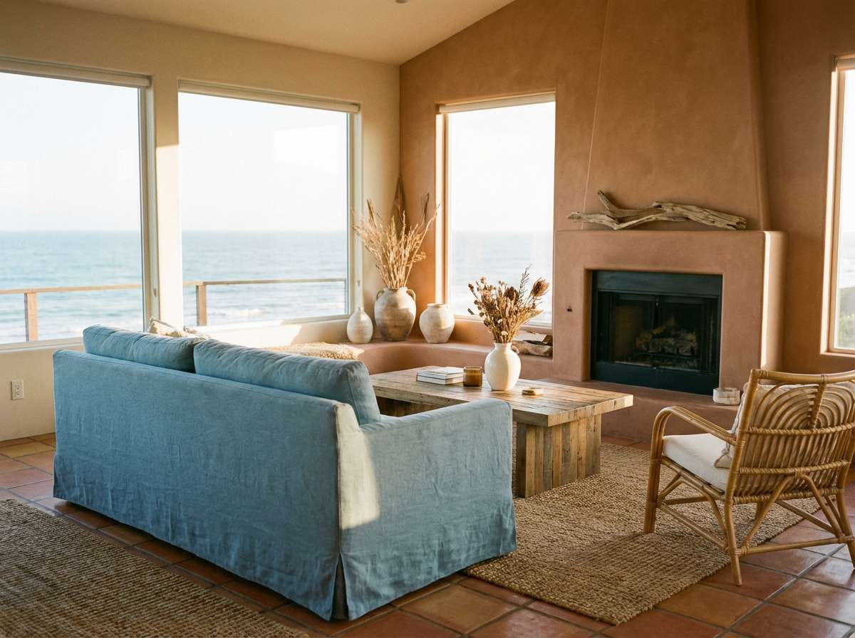
1) Coastal Fog
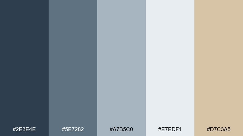
HEX: #2E3E4E #5E7282 #A7B5C0 #E7EDF1 #D7C3A5
Mood: airy, coastal, calm
Best for: beach-house living rooms and relaxed hospitality interiors
Airy and salt-washed, it feels like morning mist rolling over pebble shores. Use the deep blue-gray as your anchor on walls or large textiles, then layer the lighter tones for softness. The sandy accent warms the set and keeps it from reading too cold. Tip: repeat the sand color in two small places (pillows and a rug stripe) to make the room feel intentional.
Image example of coastal fog generated using media.io
Media.io is an online AI studio for creating and editing video, image, and audio in your browser.

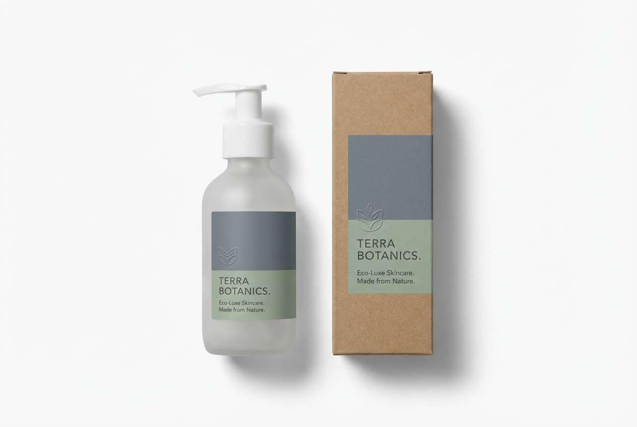
2) Slate and Sage
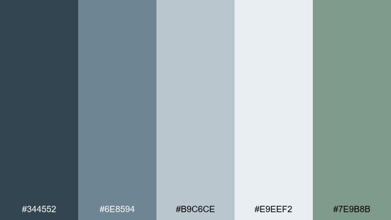
HEX: #344552 #6E8594 #B9C6CE #E9EEF2 #7E9B8B
Mood: grounded, fresh, modern
Best for: eco skincare packaging and wellness brand labels
Grounded slate tones meet a clean sage note, like a quiet spa with eucalyptus in the air. These blue gray color combinations work especially well on matte stocks where subtle shifts show up as premium. Keep typography charcoal or off-white, and use sage for seals, caps, or callouts. Tip: reserve the darkest shade for compliance text so the label stays readable without looking harsh.
Image example of slate and sage generated using media.io
3) Midnight Harbor
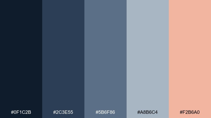
HEX: #0F1C2B #2C3E55 #5B6F86 #A8B6C4 #F2B6A0
Mood: moody, luxe, nocturnal
Best for: cocktail bar branding and evening event promos
Moody and cinematic, it evokes harbor lights reflecting on dark water. Use the inky base for backgrounds, then bring in midtones for icons, patterns, or secondary panels. A soft coral accent adds warmth for CTAs, stamps, or highlight rules without breaking the night vibe. Tip: keep the coral under 10 percent coverage so the palette stays sophisticated.
Image example of midnight harbor generated using media.io
4) Rainy Window
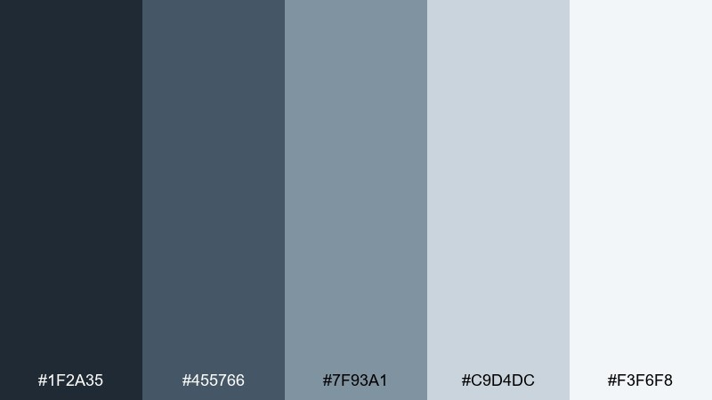
HEX: #1F2A35 #455766 #7F93A1 #C9D4DC #F3F6F8
Mood: quiet, minimal, focused
Best for: analytics dashboards and SaaS UI themes
Quiet and focused, it feels like raindrops streaking down a city window. This blue gray color palette keeps interfaces calm while still giving you clear hierarchy from dark nav to pale surfaces. Pair it with a single bright accent (amber or teal) for active states and alerts. Tip: use the lightest shade as your main canvas to reduce eye fatigue on long sessions.
Image example of rainy window generated using media.io
5) Nordic Steel
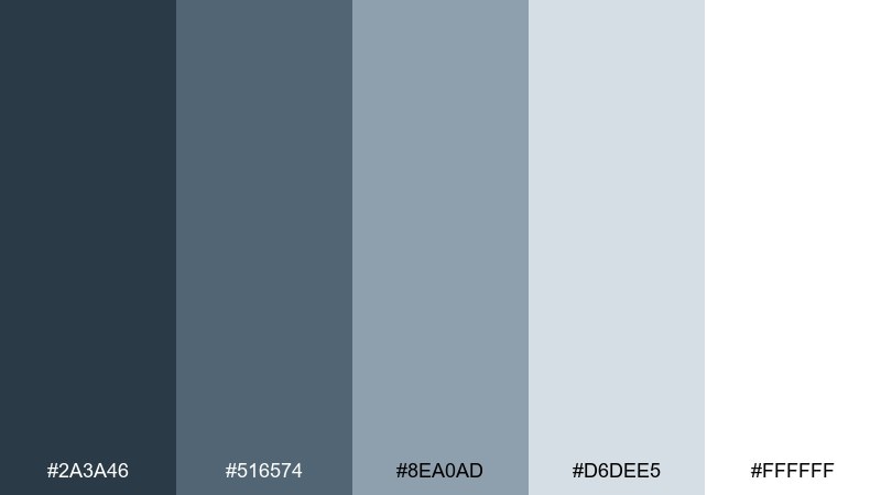
HEX: #2A3A46 #516574 #8EA0AD #D6DEE5 #FFFFFF
Mood: clean, structured, Scandinavian
Best for: corporate slide decks and annual reports
Clean and structured, it brings to mind brushed metal and snowy light. Use the darker tones for headings and section dividers, and let the pale grays carry most of the page. It pairs naturally with crisp white space and simple geometric shapes. Tip: keep charts to two series plus one highlight color so the deck stays effortless to read.
Image example of nordic steel generated using media.io

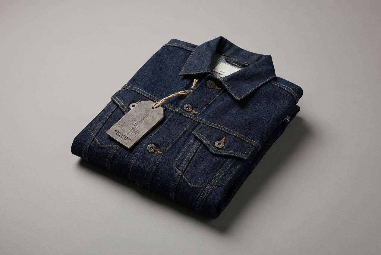
6) Denim Drift
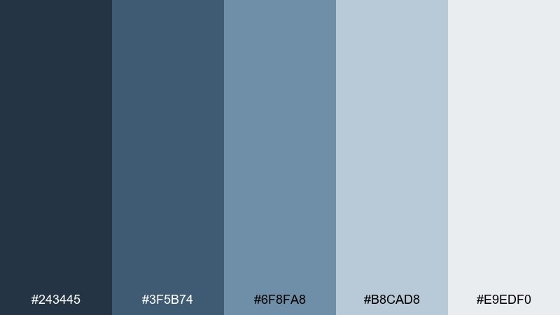
HEX: #243445 #3F5B74 #6F8FA8 #B8CAD8 #E9EDF0
Mood: casual, youthful, outdoorsy
Best for: denim apparel ads and lookbook pages
Casual and windworn, it feels like faded denim on a cool afternoon. Build your base with the darker shades for headlines and framing, then use the lighter blues for backgrounds and negative space. It pairs well with off-white paper textures and minimal black type. Tip: add a subtle grain overlay to make the colors feel more tactile and fashion-forward.
Image example of denim drift generated using media.io
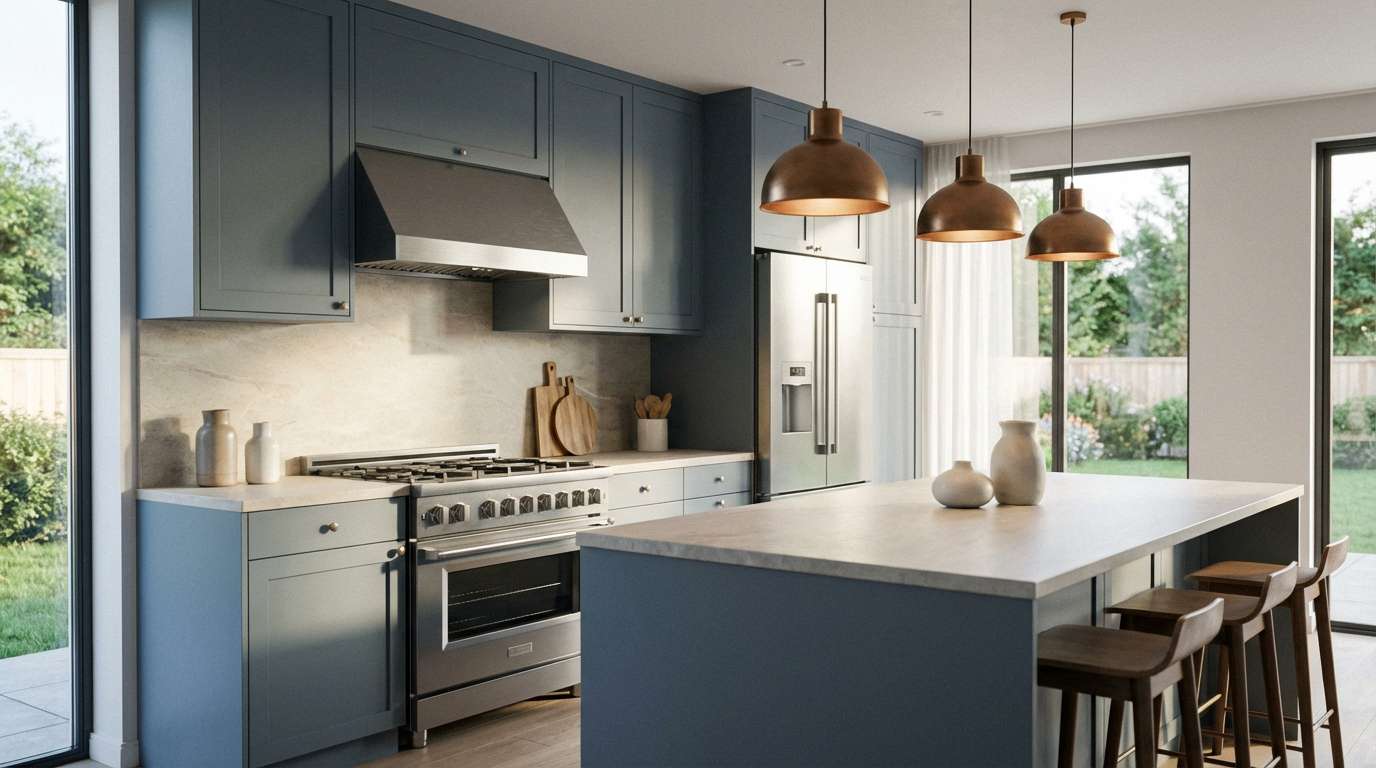
7) Silverstorm
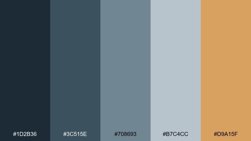
HEX: #1D2B36 #3C515E #708693 #B7C4CC #D9A15F
Mood: dramatic, refined, high-contrast
Best for: modern kitchen finishes and appliance styling
Dramatic and refined, it suggests storm clouds with a flash of warm light. These blue gray color combination choices shine in kitchens where metal, stone, and glass need a cohesive backdrop. Use the bronze accent on hardware, lighting, or a single statement stool to keep the space from feeling sterile. Tip: stick to one warm metal finish so the contrast reads deliberate, not busy.
Image example of silverstorm generated using media.io
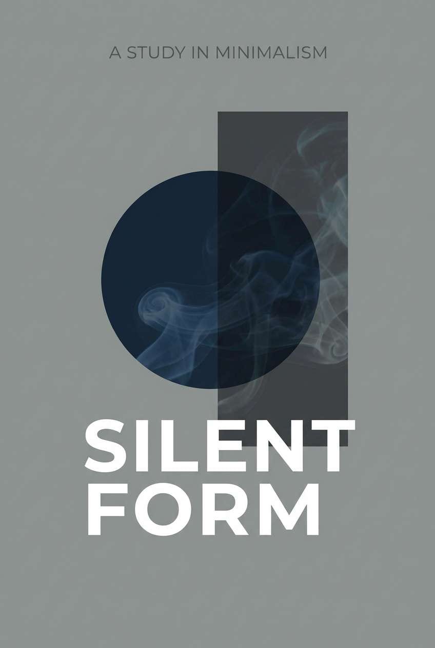
8) Ink and Mist
HEX: #101820 #33404B #667786 #C8D1D8 #F7F9FA
Mood: editorial, crisp, modern
Best for: book covers and minimalist poster typography
Crisp and editorial, it feels like fresh ink drying on smooth paper. Let the near-black handle titles and key typography, while misty grays open up plenty of breathing room. It pairs beautifully with bold serif type or condensed sans for a modern-literary look. Tip: keep a single large block of negative space to make the cover feel premium.
Image example of ink and mist generated using media.io
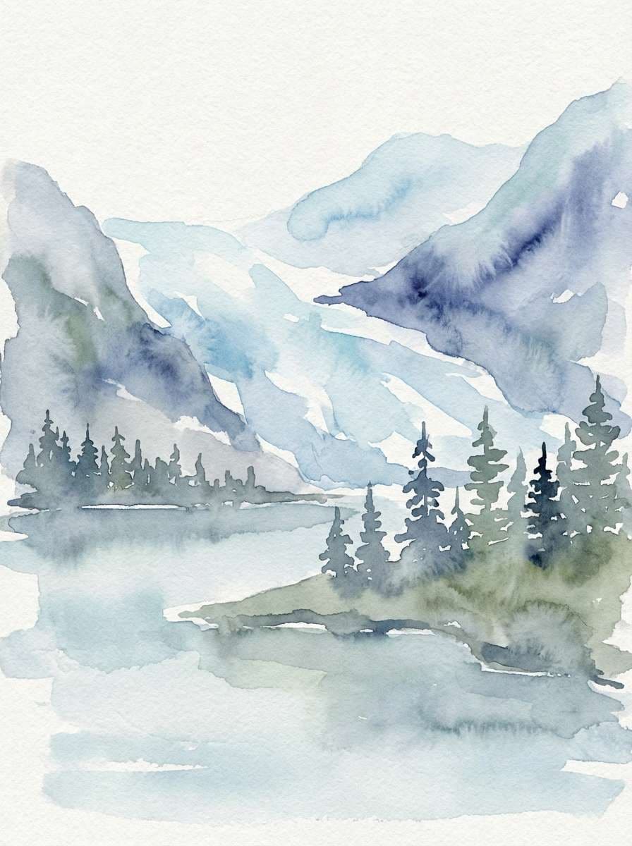
9) Glacier Lake
HEX: #2B3A4A #4F6B7D #7FA7B9 #CFE3EC #F7FBFD
Mood: fresh, airy, outdoors
Best for: watercolor landscape prints and nature blog headers
Fresh and airy, it evokes a glassy alpine lake under pale sky. Use the mid blues for water and shadow shapes, and keep the lightest tones for highlights and mist. It pairs well with pine greens or charcoal linework for definition. Tip: limit hard edges and let wet-on-wet blends do the heavy lifting for a calm, natural finish.
Image example of glacier lake generated using media.io
10) Stormy Orchard
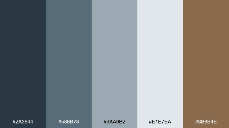
HEX: #2A3844 #586B78 #9AA9B2 #E1E7EA #8B6B4E
Mood: rustic, muted, cozy
Best for: farmhouse kitchens and artisan food branding
Rustic and muted, it feels like an orchard just after rain. The cool neutrals create a clean base, while the warm brown adds a handmade, pantry-friendly touch. Pair it with kraft paper, serif typography, and simple line icons for an authentic look. Tip: use the brown for stamps and ingredient highlights to guide the eye without clutter.
Image example of stormy orchard generated using media.io
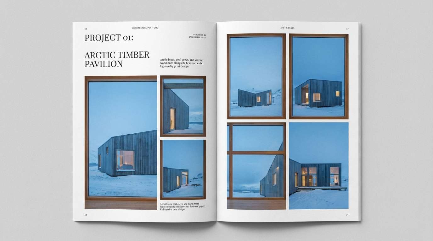
11) Blueprint Studio
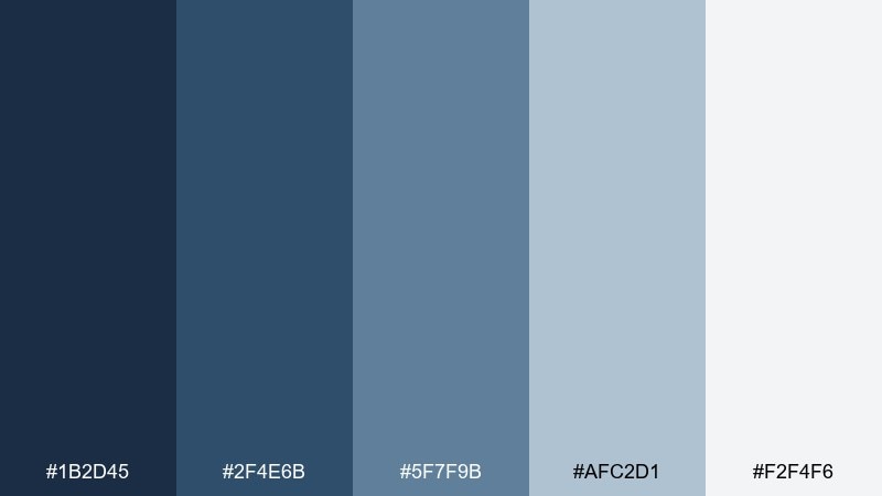
HEX: #1B2D45 #2F4E6B #5F7F9B #AFC2D1 #F2F4F6
Mood: technical, confident, creative
Best for: architecture portfolios and studio lookbooks
Technical and confident, it recalls blueprint paper and drafting lines. Use the darker blues for grids, captions, and section headers, with pale panels to keep layouts readable. It pairs nicely with thin line icons and generous margins for a gallery feel. Tip: set body text in a warm gray to soften the engineering vibe.
Image example of blueprint studio generated using media.io
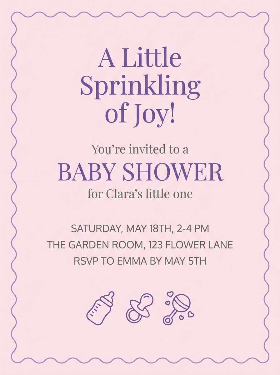
12) Dusty Periwinkle
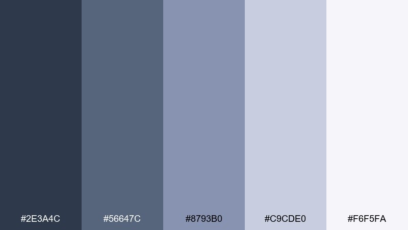
HEX: #2E3A4C #56647C #8793B0 #C9CDE0 #F6F5FA
Mood: soft, dreamy, gentle
Best for: baby shower invitations and sweet stationery sets
Soft and dreamy, it feels like dusk light with a hint of lilac haze. Keep the darker tones for names and key details, while the pale tints create an airy paper-like base. It pairs well with delicate florals, thin borders, and rose-gold foil accents. Tip: choose one script font only, and let the color do the romantic work.
Image example of dusty periwinkle generated using media.io
13) Urban Graphite
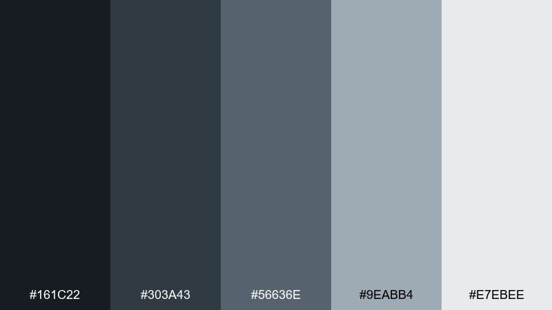
HEX: #161C22 #303A43 #56636E #9EABB4 #E7EBEE
Mood: industrial, sleek, modern
Best for: streetwear social posts and drop announcements
Sleek and industrial, it brings to mind graphite sketches and concrete sidewalks. Use the darkest tones for bold type and frames, then introduce the lighter grays for texture blocks and spacing. It pairs well with high-contrast photography and a single neon accent if you need energy. Tip: keep shadows and overlays consistent so posts look like one cohesive series.
Image example of urban graphite generated using media.io
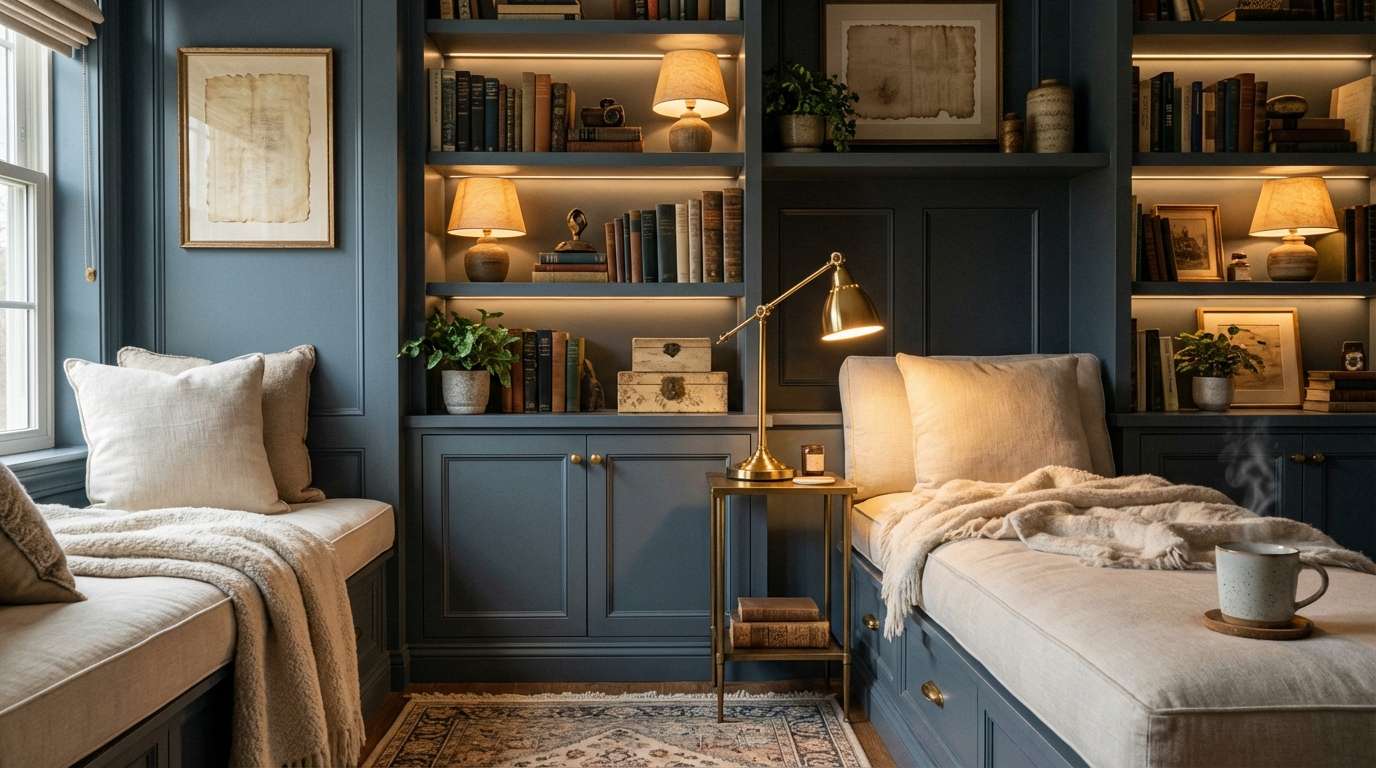
14) Quiet Library
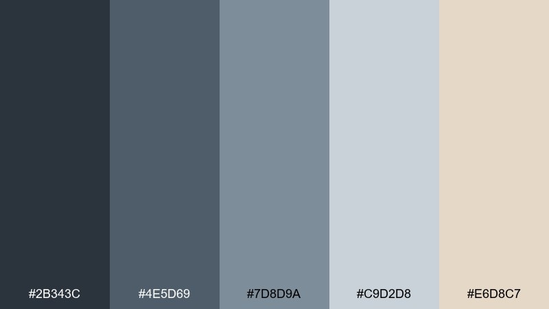
HEX: #2B343C #4E5D69 #7D8D9A #C9D2D8 #E6D8C7
Mood: cozy, thoughtful, timeless
Best for: home offices and reading nook makeovers
Cozy and thoughtful, it feels like worn book cloth and hush in a reading room. The gray-blues build a calm backdrop for wood furniture, while the warm parchment tone keeps everything inviting. Pair it with brass details, leather textures, and soft lamp lighting for a lived-in look. Tip: paint built-ins in the midtone and use the darkest shade only on trim for depth.
Image example of quiet library generated using media.io
15) Arctic Concrete
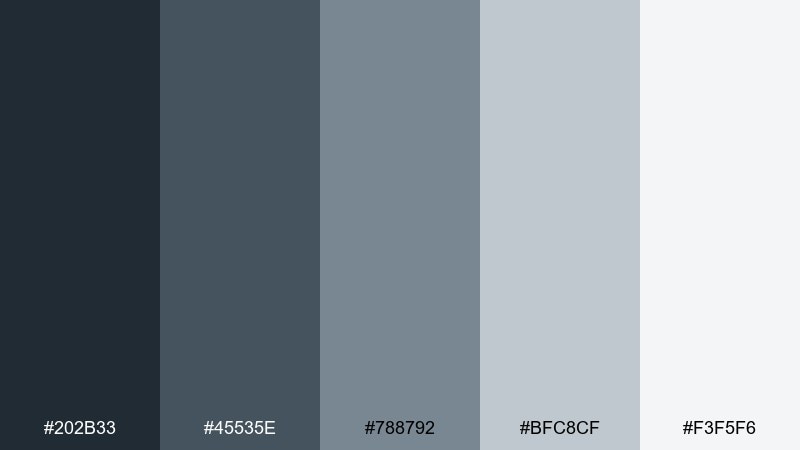
HEX: #202B33 #45535E #788792 #BFC8CF #F3F5F6
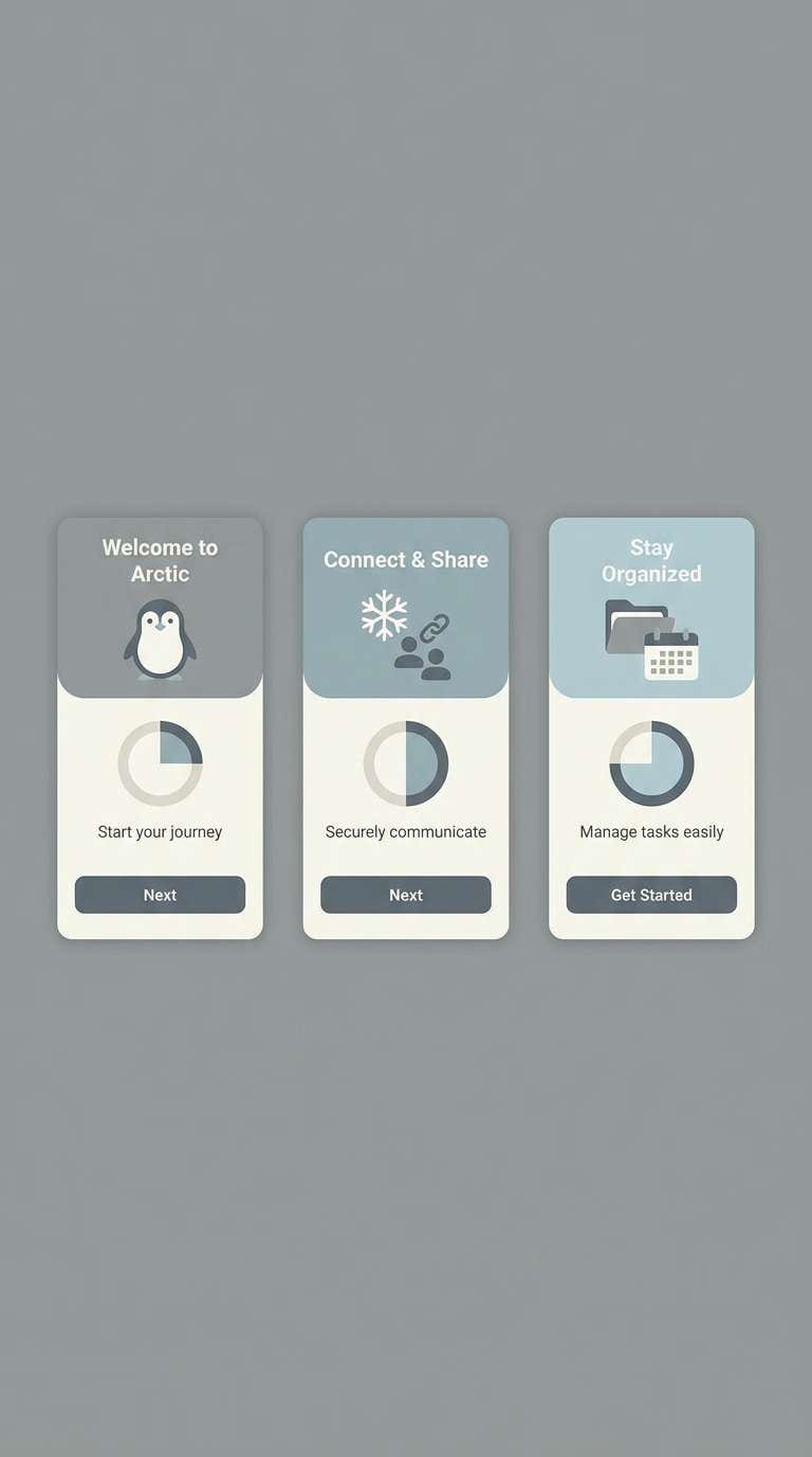
Mood: minimal, cool, architectural
Best for: mobile app onboarding and fintech UI
Minimal and cool, it evokes concrete surfaces under winter light. A blue gray color palette like this excels in onboarding screens where clarity and trust matter most. Pair it with one crisp accent (electric blue or lime) for progress states and key buttons. Tip: use the second-lightest shade for card backgrounds so content feels separated without heavy borders.
Image example of arctic concrete generated using media.io
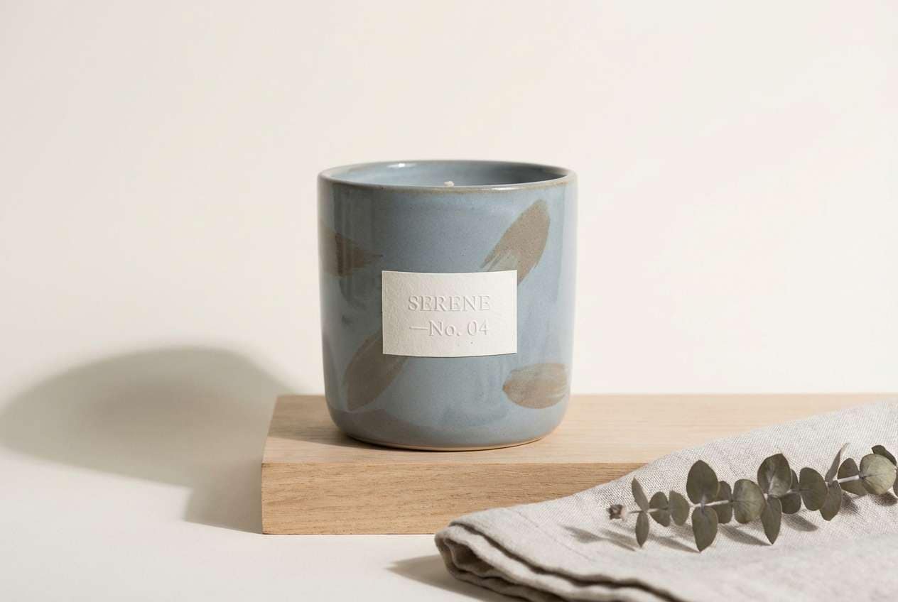
16) Seaside Pebble
HEX: #283744 #516575 #92A3AF #D9E1E6 #B7A190
Mood: natural, balanced, understated
Best for: ceramic candle packaging and lifestyle product ads
Natural and understated, it feels like smooth pebbles and weathered driftwood. Use the cool tones for labels and secondary panels, and let the taupe accent bring a soft, earthy contrast. It pairs well with minimal serif typography and uncoated paper textures. Tip: choose a warm-white background instead of bright white to keep the vibe organic.
Image example of seaside pebble generated using media.io
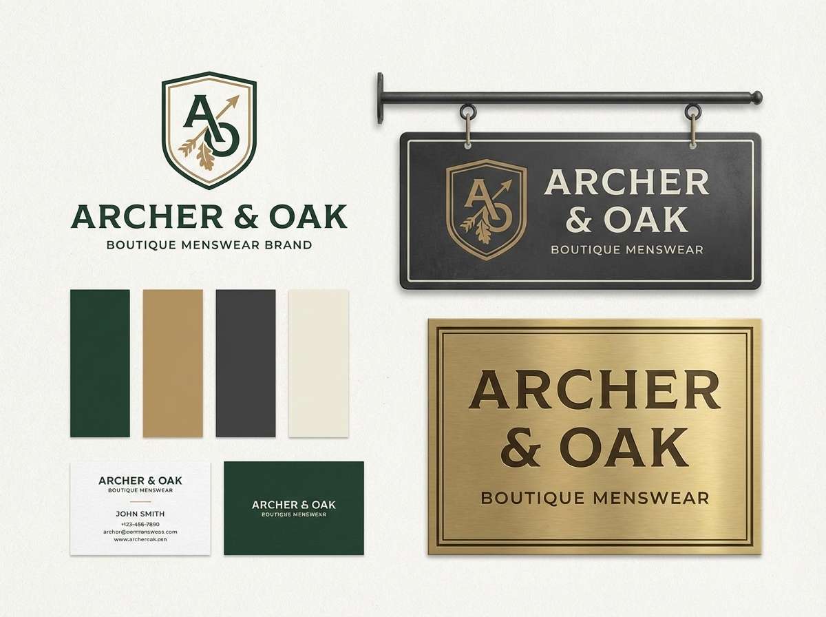
17) Modern Heritage
HEX: #223141 #3E5568 #6D859C #B9C8D3 #C7A574
Mood: classic, confident, warm-accented
Best for: premium menswear branding and boutique signage
Classic and confident, it suggests tailored suiting with a warm brass detail. The deep shades support strong wordmarks and monograms, while the lighter blues keep collateral from feeling too heavy. Pair the gold-tan accent with textured paper, embossing, or subtle patterns for a heritage finish. Tip: use the accent only on rules and icons to maintain a refined balance.
Image example of modern heritage generated using media.io
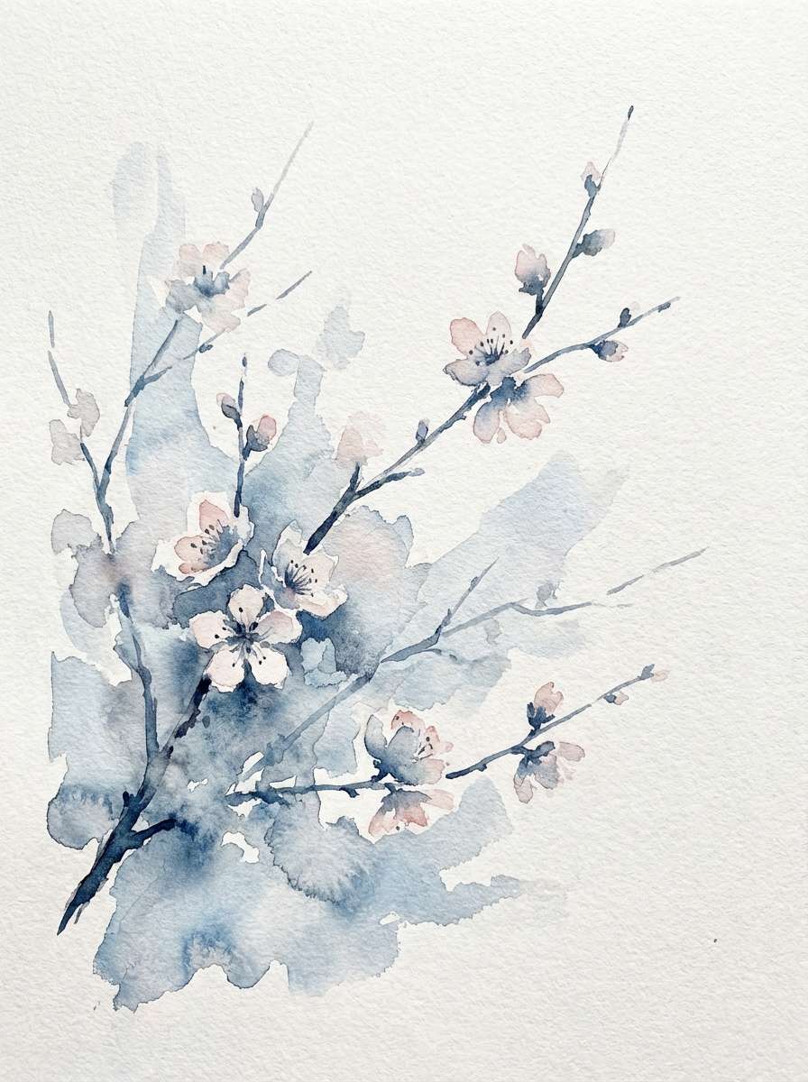
18) Winter Blossom
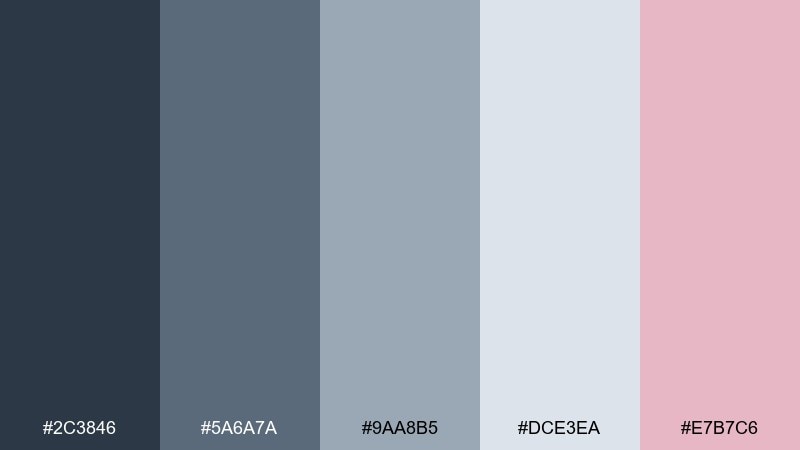
HEX: #2C3846 #5A6A7A #9AA8B5 #DCE3EA #E7B7C6
Mood: soft, romantic, cool-weather
Best for: watercolor floral stationery and seasonal cards
Soft and romantic, it feels like pale petals against a cold sky. The blush accent adds a gentle lift without turning the set overly sweet. Pair it with fine linework, light washes, and plenty of blank space for an elegant card design. Tip: keep the pink for small blossoms and seals so the cool neutrals stay dominant.
Image example of winter blossom generated using media.io
19) Deep Teal Shadow
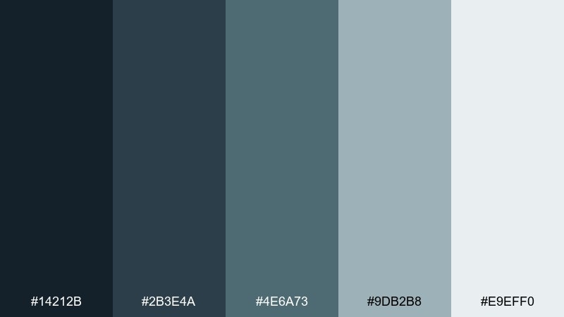
HEX: #14212B #2B3E4A #4E6A73 #9DB2B8 #E9EFF0
Mood: mysterious, cool, contemporary
Best for: tech landing pages and product feature sections
Mysterious and cool, it reads like deep water in low light. Use the darkest shade for hero sections and navigation, then move into misty tones for feature blocks and diagrams. It pairs well with white icons and a single punchy accent like electric cyan for links. Tip: increase line-height and padding when using dark backgrounds to keep the page feeling breathable.
Image example of deep teal shadow generated using media.io
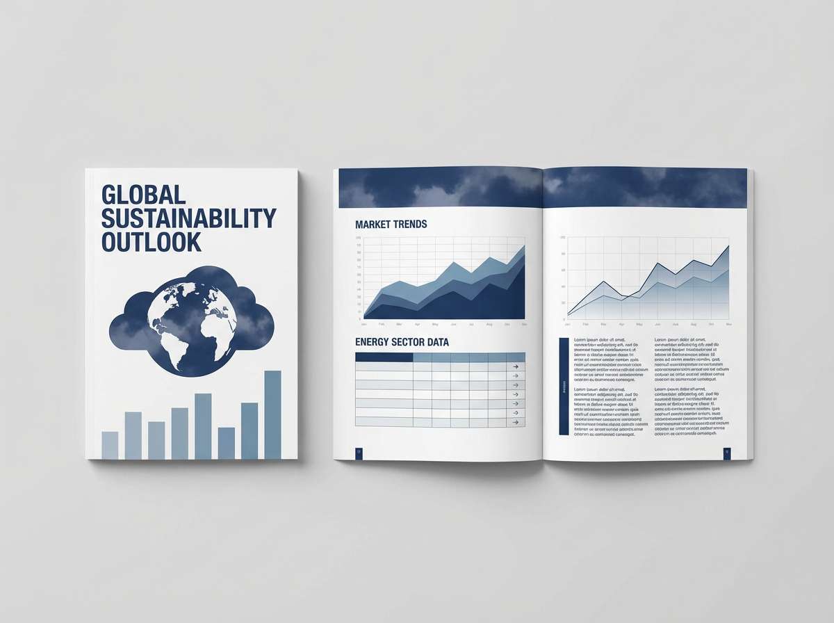
20) Clouded Navy
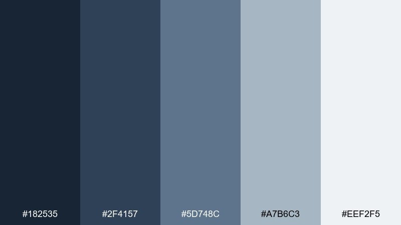
HEX: #182535 #2F4157 #5D748C #A7B6C3 #EEF2F5
Mood: confident, clean, professional
Best for: business reports, proposals, and web headers
Confident and clean, it feels like navy uniforms softened by cloud cover. Use the dark navy-grays for headings and section bars, then rely on pale neutrals for readable body content. It pairs naturally with crisp white, thin dividers, and subtle data visualization. Tip: keep hyperlinks in the mid-blue tone so they stand out without looking overly saturated.
Image example of clouded navy generated using media.io
What Colors Go Well with Blue Gray?
Warm accents are the fastest way to make blue gray feel inviting. Sand, camel, bronze, gold-tan, terracotta, and soft coral add contrast without turning the palette loud.
If you want a fresh, organic look, pair blue gray with muted greens like sage, eucalyptus, or deep teal. These neighbors on the cool side keep the mood calm and contemporary.
For crisp, high-readability design (especially in UI), combine blue gray with clean whites and near-blacks. The neutral range keeps typography sharp and leaves room for one strong accent color for states and CTAs.
How to Use a Blue Gray Color Palette in Real Designs
Start with role assignment: pick one dark blue gray for headings/nav, one midtone for secondary UI or furniture, and one very light tone for background surfaces. This creates hierarchy before you add any accent.
Keep accents intentional and limited—think “under 10% coverage.” Use a single warm note (like sand, bronze, blush) for highlights, icons, badges, or hardware so the system stays cohesive.
In print and branding, blue gray looks premium on matte papers and uncoated stocks. Add texture (grain, linen, watercolor paper) to prevent flatness and help subtle hue shifts show up.
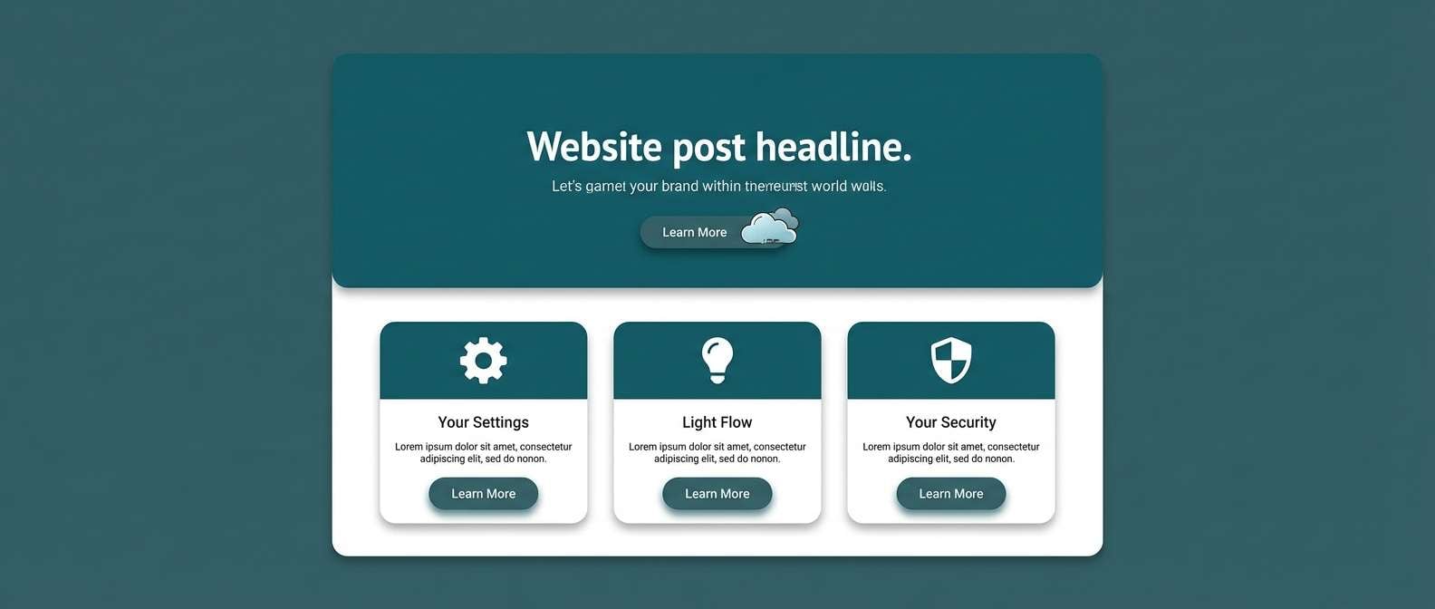
Create Blue Gray Palette Visuals with AI
If you’re pitching a concept or building a moodboard, generating quick visuals can help stakeholders “see” your blue gray color scheme in context—rooms, packaging, UI mockups, or posters.
Use prompts that describe lighting, material, and style (matte, brushed metal, soft daylight, minimal layout). Then apply your HEX colors in the design phase to match the look precisely.
Blue Gray Color Palette FAQs
-
What is a blue gray color palette?
A blue gray color palette is a set of muted blues blended with gray undertones, typically ranging from deep navy-grays to pale misty grays. It’s used to create calm, modern, and professional designs with soft contrast. -
Is blue gray warm or cool?
Most blue grays read as cool, especially when the blue undertone is strong. You can warm them up by adding accents like sand, camel, bronze, or blush and by choosing warmer off-whites instead of pure white. -
What accent colors look best with blue gray?
Great accents include sandy beige, bronze, gold-tan, coral, blush, and muted greens like sage or deep teal. For UI, a single bright accent (amber, cyan, or lime) can work well for active states. -
Which blue gray hex codes are good for modern UI?
Look for a dark anchor (e.g., #1F2A35 or #202B33), midtones for components (#455766 or #788792), and a light surface (#F3F6F8 or #F3F5F6). This structure helps maintain hierarchy and readability. -
How do I keep blue gray from looking dull?
Use contrast deliberately (dark text on light surfaces), add one warm accent, and introduce texture through materials or subtle grain. In layouts, generous whitespace and clear type scales also make blue gray feel crisp rather than flat. -
Can blue gray work for branding?
Yes—blue gray is popular for tech, wellness, finance, and premium retail because it feels trustworthy and refined. Pair it with a distinctive accent and consistent typography to keep the brand recognizable. -
What’s the difference between slate blue gray and steel blue gray?
Slate blue gray tends to be deeper and more muted (a slightly heavier, stone-like feel), while steel blue gray often looks cleaner and brighter, closer to brushed metal. Both sit in the same family but communicate different moods.


