

Gold green color palettes blend the richness of metallic warmth with the grounded calm of nature. The result can feel premium and timeless (think brass + evergreen) or fresh and modern (think mint + soft gold).
Below are 20 gold and green palette ideas with HEX codes, plus practical tips for branding, events, and UI. You can also generate matching visuals with Media.io to test the vibe before you design.
In this article
- Why Gold Green Palettes Work So Well
-
- gilded forest
- sage brass minimal
- emerald gala
- olive orchard
- minted gold pop
- antique brocade
- sunlit canopy
- verdant trophy
- citrus moss
- art deco atrium
- quiet luxury olive
- jade lantern
- spring heirloom
- mossy stone gold
- tropical leaf alloy
- green tea glimmer
- midnight moss gold
- retro casino green
- eucalyptus champagne
- modern herbarium gold
- What Colors Go Well with Gold Green?
- How to Use a Gold Green Color Palette in Real Designs
- Create Gold Green Palette Visuals with AI
Why Gold Green Palettes Work So Well
Gold instantly signals value—whether it’s a true metallic, a warm mustard, or a muted brass. Green brings balance and credibility, ranging from deep heritage greens to modern mints and teals.
Together, gold and green create built-in contrast: warm vs. cool, sparkle vs. matte, highlight vs. base. That contrast helps you create hierarchy in a logo, a UI dashboard, or a printed invitation without relying on extra colors.
It’s also a versatile pairing across industries. You can push it toward luxury (dark greens + restrained gold), wellness (sage + soft champagne), or bold energy (high-chroma greens + bright gold accents).
20+ Gold Green Color Palette Ideas (with HEX Codes)
1) Gilded Forest
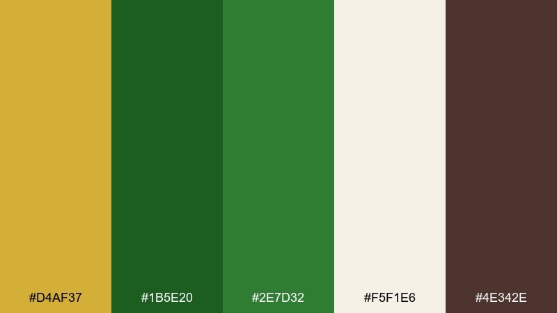
HEX: #D4AF37 #1B5E20 #2E7D32 #F5F1E6 #4E342E
Mood: regal, grounded, organic
Best for: luxury brand identity and packaging
Regal and grounded, like sunlight filtering through old-growth trees and catching on polished metal. This gold green color palette works beautifully for premium packaging, boutique hotels, and heritage-style logos. Pair it with warm neutrals and subtle texture to keep the greens feeling natural rather than sporty. Usage tip: reserve the gold for small highlights like seals, borders, and foil accents so it reads truly luxe.
Image example of gilded forest generated using media.io
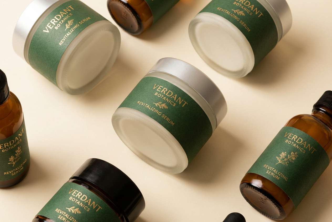
Media.io is an online AI studio for creating and editing video, image, and audio in your browser.

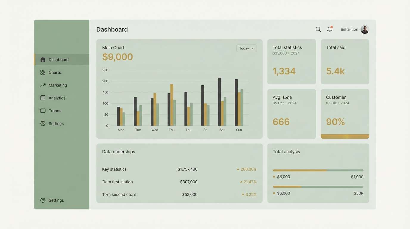
2) Sage Brass Minimal
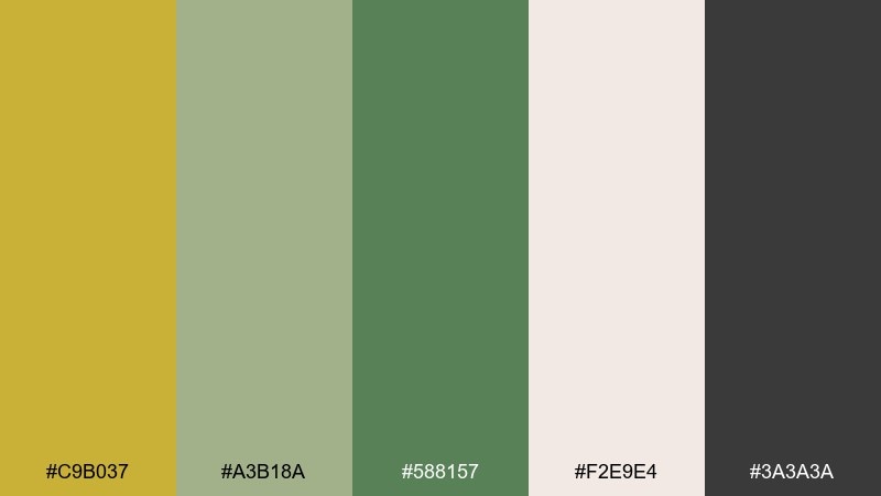
HEX: #C9B037 #A3B18A #588157 #F2E9E4 #3A3A3A
Mood: calm, clean, modern
Best for: 2d ui dashboard design
Calm and clean, like sunlit linen paired with soft sage leaves and a brass detail. These gold green color combinations feel modern for dashboards, analytics screens, and settings pages where clarity matters. Keep the dark gray for type and icons, and use the gold only for active states or key metrics. Usage tip: apply sage as large background panels to reduce glare while maintaining contrast.
Image example of sage brass minimal generated using media.io
3) Emerald Gala

HEX: #C5A100 #006D5B #00897B #0B1320 #F7F0D9
Mood: dramatic, elegant, evening
Best for: formal event invitation design
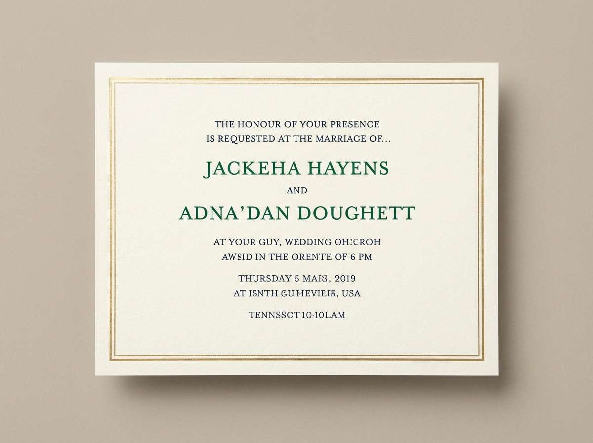
Dramatic and elegant, like emerald velvet under candlelight with a glint of gold. The deep navy-black gives you instant sophistication for invitations, gala programs, and premium RSVP cards. Pair it with a serif headline and lots of negative space to keep the rich tones from feeling heavy. Usage tip: print the gold as a thin frame or monogram for a high-end finish.
Image example of emerald gala generated using media.io
4) Olive Orchard
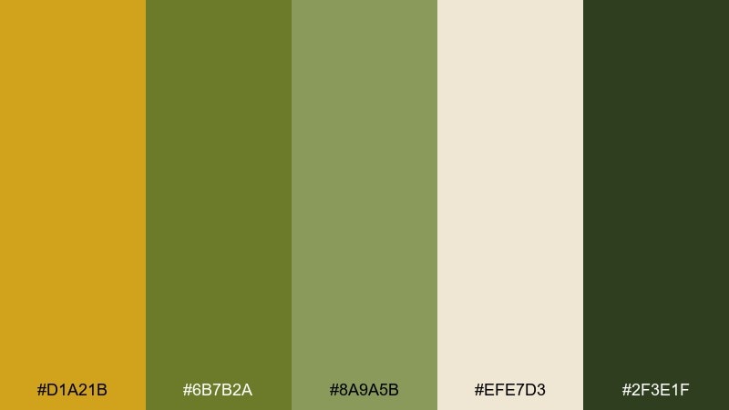
HEX: #D1A21B #6B7B2A #8A9A5B #EFE7D3 #2F3E1F
Mood: rustic, warm, sun-baked
Best for: farm-to-table menu and signage
Rustic and warm, like an orchard path at golden hour with olives and dried herbs in the air. This gold green color palette suits restaurant menus, farmers market signs, and artisanal food labels where you want honest charm. Pair it with off-white paper tones and simple line icons to keep the look approachable. Usage tip: use the darkest green for headers and prices so readability stays strong.
Image example of olive orchard generated using media.io
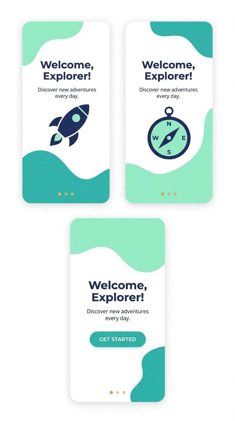
5) Minted Gold Pop
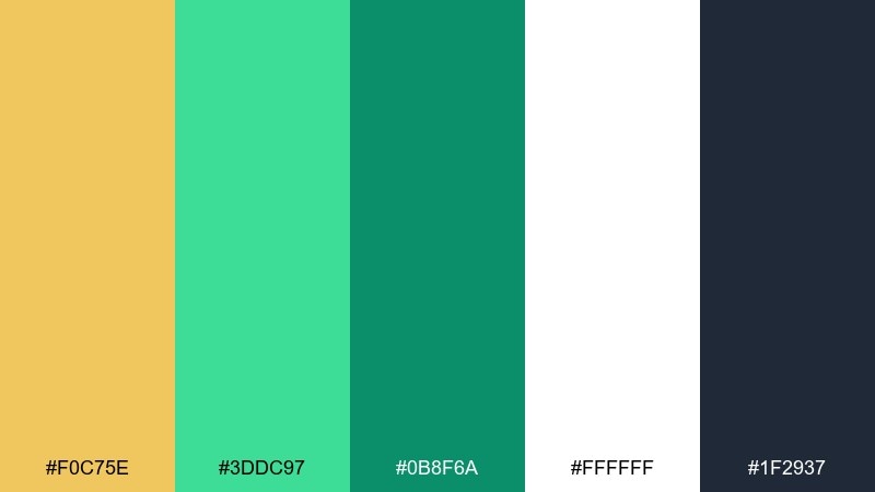
HEX: #F0C75E #3DDC97 #0B8F6A #FFFFFF #1F2937
Mood: fresh, playful, energetic
Best for: app onboarding screens
Fresh and playful, like mint sprigs with a sunny glaze. The bright mint and teal bring energy to onboarding, feature callouts, and friendly fintech experiences. Pair with crisp white space and keep the navy for type to avoid a candy look. Usage tip: animate the gold as a small progress indicator to guide attention without overwhelming the screen.
Image example of minted gold pop generated using media.io
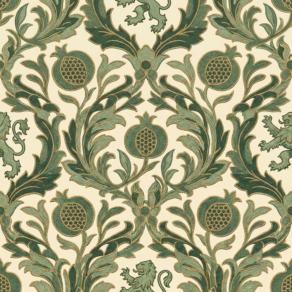
6) Antique Brocade
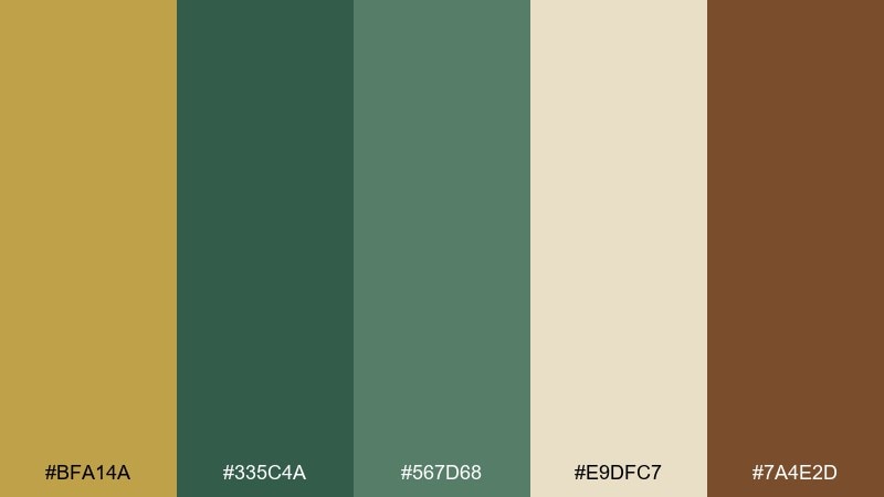
HEX: #BFA14A #335C4A #567D68 #E9DFC7 #7A4E2D
Mood: heritage, textured, cozy
Best for: wallpaper and textile pattern design
Heritage and cozy, like antique fabric with woven greens and a faded golden thread. This gold green color scheme is ideal for wallpaper motifs, stationery borders, and artisan brand patterns. Pair with cream backgrounds and let the brown act as a grounding outline color. Usage tip: keep pattern scale slightly larger so the muted gold reads clearly from a distance.
Image example of antique brocade generated using media.io
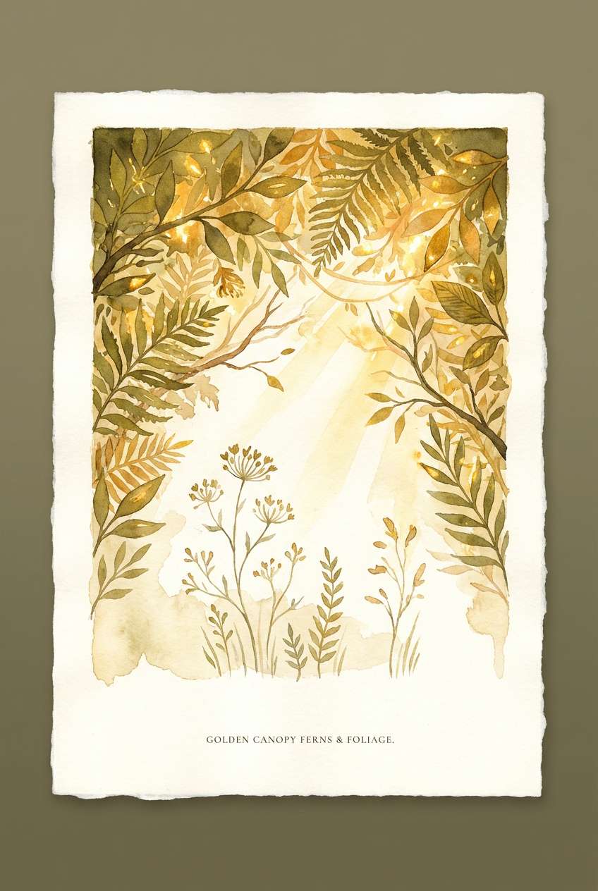
7) Sunlit Canopy
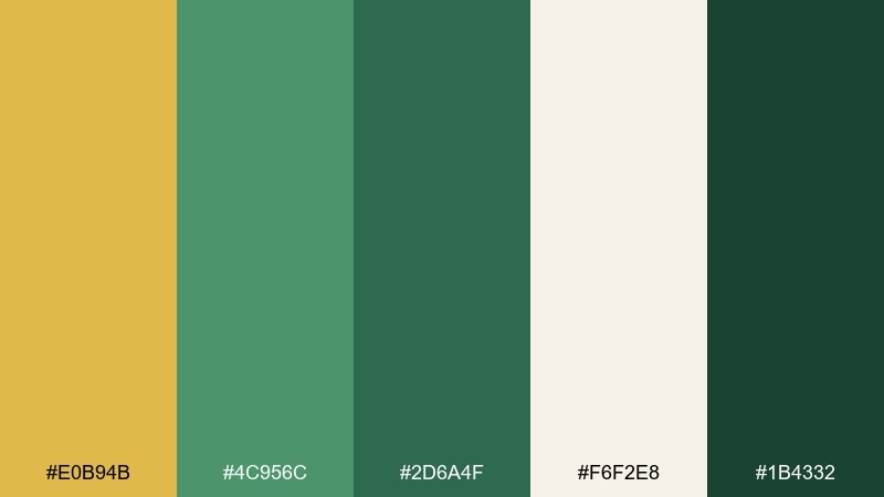
HEX: #E0B94B #4C956C #2D6A4F #F6F2E8 #1B4332
Mood: uplifting, airy, botanical
Best for: botanical illustration poster
Uplifting and airy, like a walk under a leafy canopy where warm light breaks through. These greens feel natural and modern for plant posters, eco campaigns, and nature-themed prints. Pair with soft paper textures and a restrained type treatment so the illustration leads. Usage tip: use the light cream as the main field color to keep the palette bright.
Image example of sunlit canopy generated using media.io
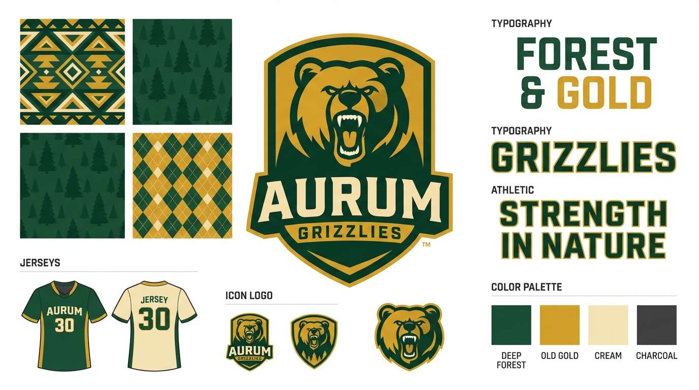
8) Verdant Trophy
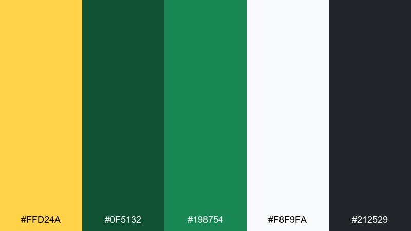
HEX: #FFD24A #0F5132 #198754 #F8F9FA #212529
Mood: bold, competitive, confident
Best for: sports team branding
Bold and confident, like a fresh jersey next to a gleaming trophy. Gold green color combinations like these are made for team marks, league posters, and energetic merch where contrast has to hit fast. Pair the gold with clean white and use the near-black for outlines to keep logos sharp at small sizes. Usage tip: limit mid-green to secondary graphics so the darkest green stays dominant.
Image example of verdant trophy generated using media.io
9) Citrus Moss
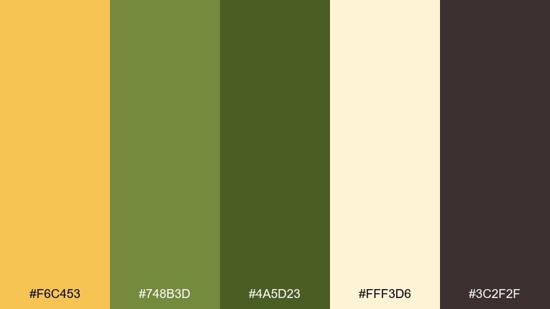
HEX: #F6C453 #748B3D #4A5D23 #FFF3D6 #3C2F2F
Mood: earthy, zesty, outdoorsy
Best for: natural beverage product ad
Earthy with a zesty lift, like citrus peel over damp moss after rain. The creamy tint keeps layouts light while the browns add a craft feel for beverages, snacks, and outdoor lifestyle ads. Pair with hand-drawn ingredient icons and a simple sans font to stay friendly. Usage tip: place the yellow as a top highlight band to suggest freshness without flooding the whole design.
Image example of citrus moss generated using media.io
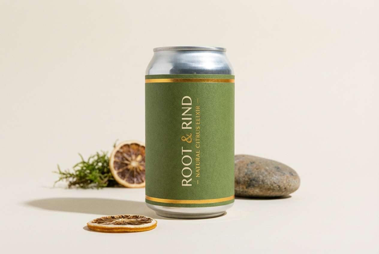
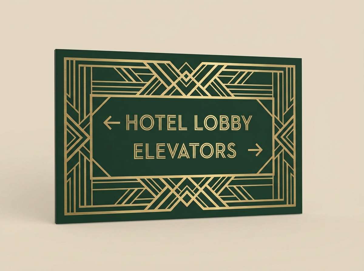
10) Art Deco Atrium
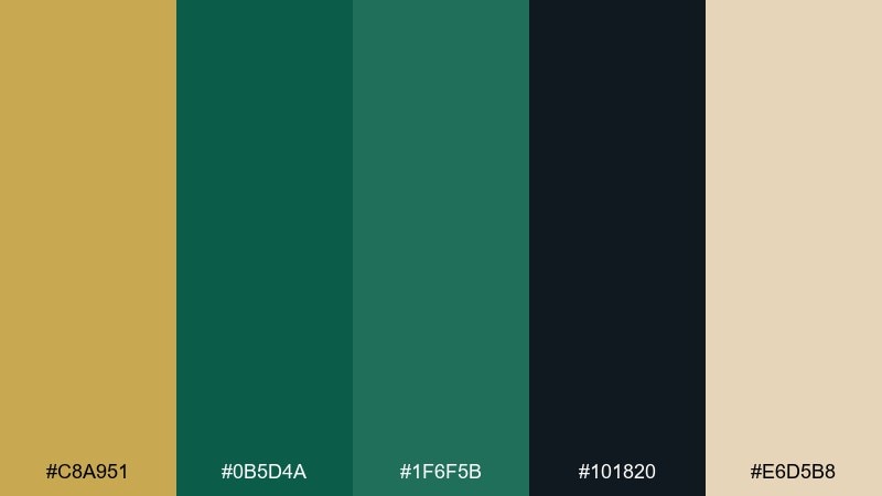
HEX: #C8A951 #0B5D4A #1F6F5B #101820 #E6D5B8
Mood: architectural, glamorous, sleek
Best for: hotel signage and wayfinding
Architectural and glamorous, like an art deco lobby with brass rails and deep green marble. A gold green color combination like this shines on signage systems, monograms, and wayfinding where you want polish without fuss. Pair with geometric linework and a high-contrast typeface for instant legibility. Usage tip: run the near-black behind gold text for maximum readability in low light.
Image example of art deco atrium generated using media.io
11) Quiet Luxury Olive
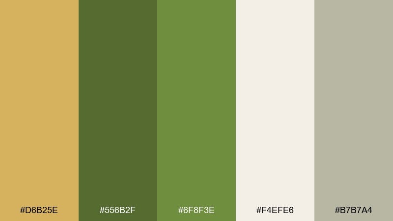
HEX: #D6B25E #556B2F #6F8F3E #F4EFE6 #B7B7A4
Mood: understated, refined, calm
Best for: editorial magazine layout
Understated and refined, like tailored olive suiting with a muted golden pin. The soft grays and warm cream create breathing room for long-form pages, lookbooks, and premium catalogs. Pair with generous margins and one elegant display font to keep it quiet and expensive. Usage tip: use the gold only for section dividers and small pull-quote marks.
Image example of quiet luxury olive generated using media.io
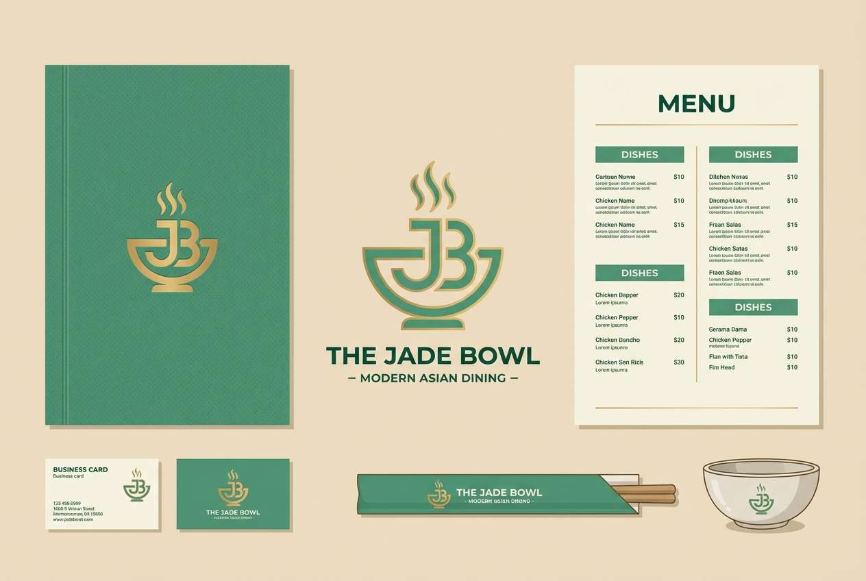
12) Jade Lantern
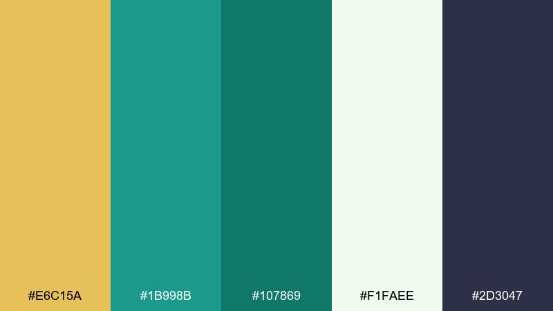
HEX: #E6C15A #1B998B #107869 #F1FAEE #2D3047
Mood: lively, welcoming, modern
Best for: restaurant logo and menu set
Lively and welcoming, like a jade lantern glow against a soft paper wall. The teal-leaning greens feel contemporary for restaurant identities, menu headers, and loyalty cards. Pair with dark indigo for type and let the pale mint act as negative space. Usage tip: use the gold as a small stamp mark for specials or chef picks.
Image example of jade lantern generated using media.io
13) Spring Heirloom
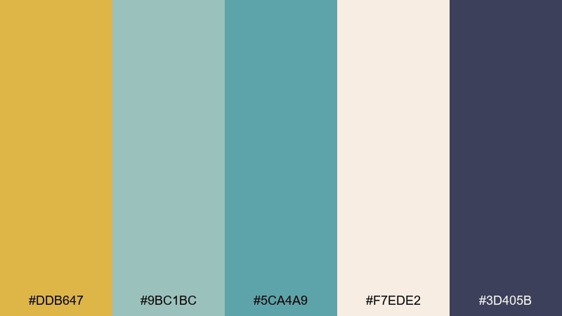
HEX: #DDB647 #9BC1BC #5CA4A9 #F7EDE2 #3D405B
Mood: romantic, fresh, sentimental
Best for: wedding stationery suite
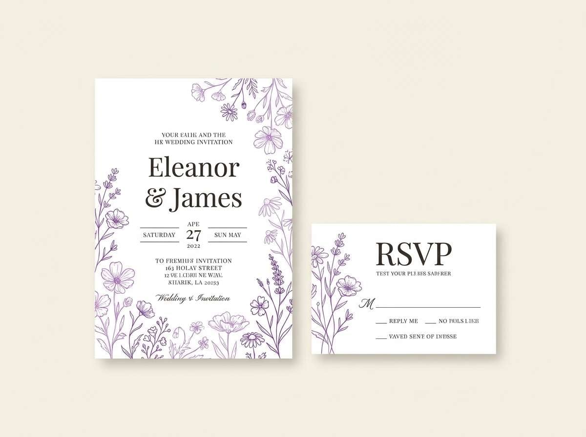
Romantic and fresh, like pressed flowers tucked into a keepsake book with a golden ribbon. This gold green color palette fits spring weddings, bridal showers, and save-the-date suites that need softness without feeling pastel-heavy. Pair with airy script accents and a grounded navy for names and dates. Usage tip: print the gold as a thin flourish or wax-seal motif rather than a full fill.
Image example of spring heirloom generated using media.io
14) Mossy Stone Gold
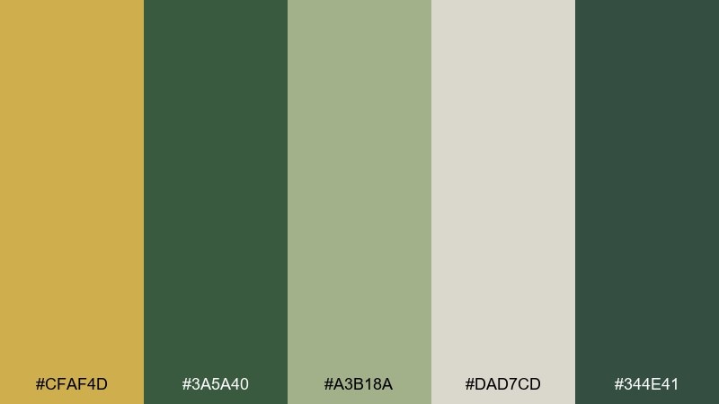
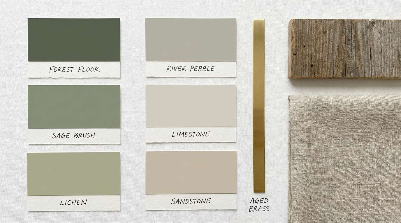
HEX: #CFAF4D #3A5A40 #A3B18A #DAD7CD #344E41
Mood: natural, steady, restorative
Best for: interior paint planning board
Natural and restorative, like moss on stone with a warm glint at the edge. The dusty neutrals make it easy to plan interiors, cabinetry, and accent walls without the colors fighting each other. Pair with matte black hardware and light oak to keep the vibe modern. Usage tip: use the medium sage on larger surfaces and keep the gold to decor and lighting.
Image example of mossy stone gold generated using media.io
15) Tropical Leaf Alloy
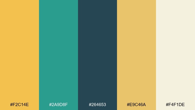
HEX: #F2C14E #2A9D8F #264653 #E9C46A #F4F1DE
Mood: sunny, coastal, upbeat
Best for: social media promo graphics
Sunny and coastal, like tropical leaves against warm sand and a polished metal detail. The teal and deep blue-green add depth for promos, carousel posts, and creator templates. Pair with bold photography or flat shapes, but keep text blocks on the light cream for clarity. Usage tip: alternate the two warm yellows to create hierarchy between headings and buttons.
Image example of tropical leaf alloy generated using media.io
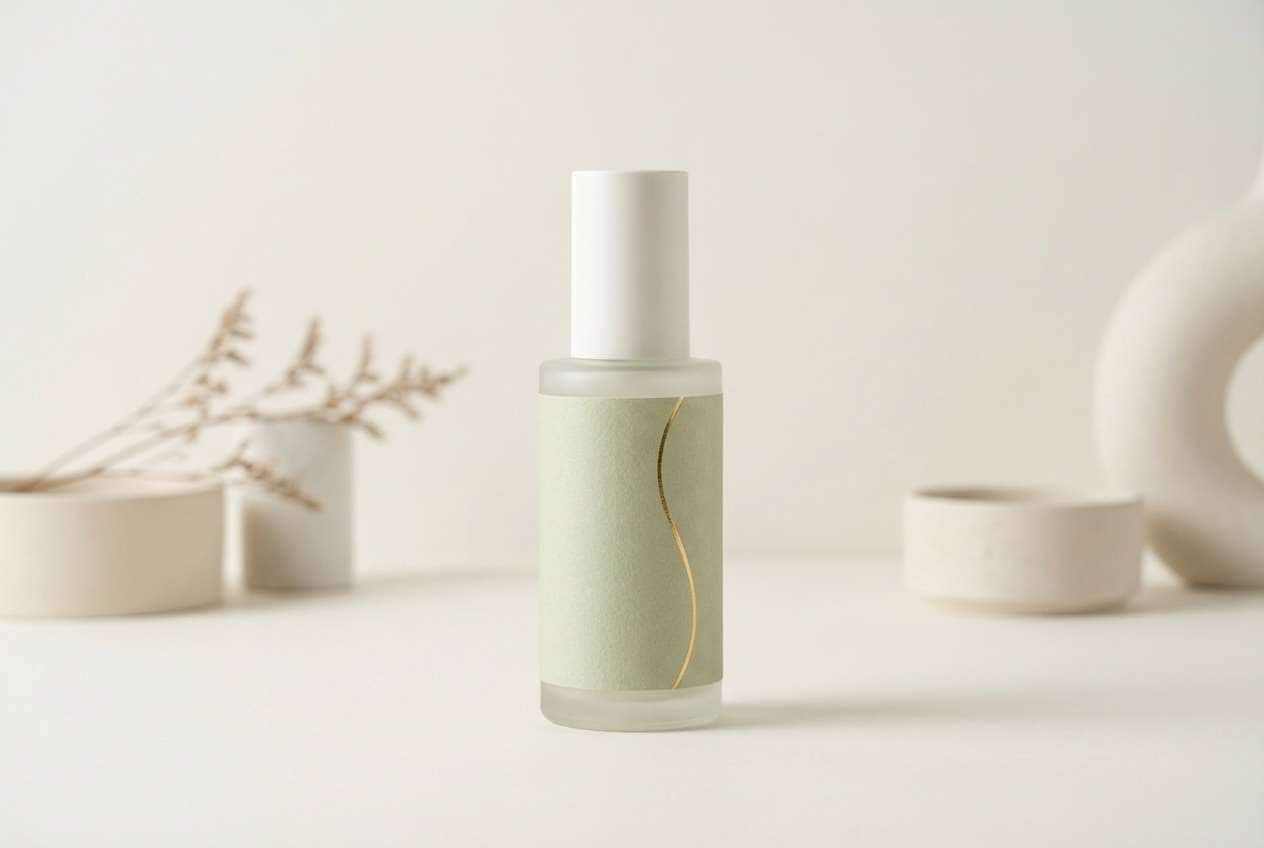
16) Green Tea Glimmer
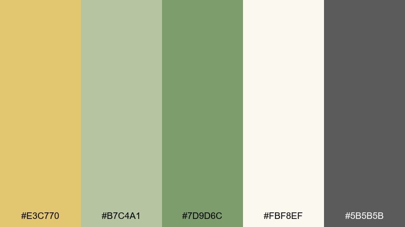
HEX: #E3C770 #B7C4A1 #7D9D6C #FBF8EF #5B5B5B
Mood: soft, wellness, soothing
Best for: skincare label and packaging
Soft and soothing, like green tea steam in the morning with a gentle golden glow. The muted greens feel clean for wellness brands, bath products, and minimalist labels. Pair with light serif typography and plenty of breathing room to reinforce a calm, premium tone. Usage tip: keep the darkest gray for ingredients and legal text to maintain contrast on pale backgrounds.
Image example of green tea glimmer generated using media.io
17) Midnight Moss Gold
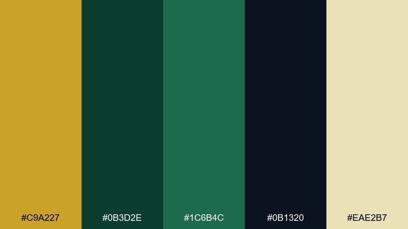
HEX: #C9A227 #0B3D2E #1C6B4C #0B1320 #EAE2B7
Mood: mysterious, cinematic, luxe
Best for: movie poster graphic design
Mysterious and cinematic, like mossy stone lit by a single warm spotlight at midnight. The near-black and deep greens create drama for posters, album covers, and launch announcements. Pair with condensed typography and a restrained gold highlight to keep the mood intense. Usage tip: place the light sand behind credits text so it stays readable without breaking the darkness.
Image example of midnight moss gold generated using media.io
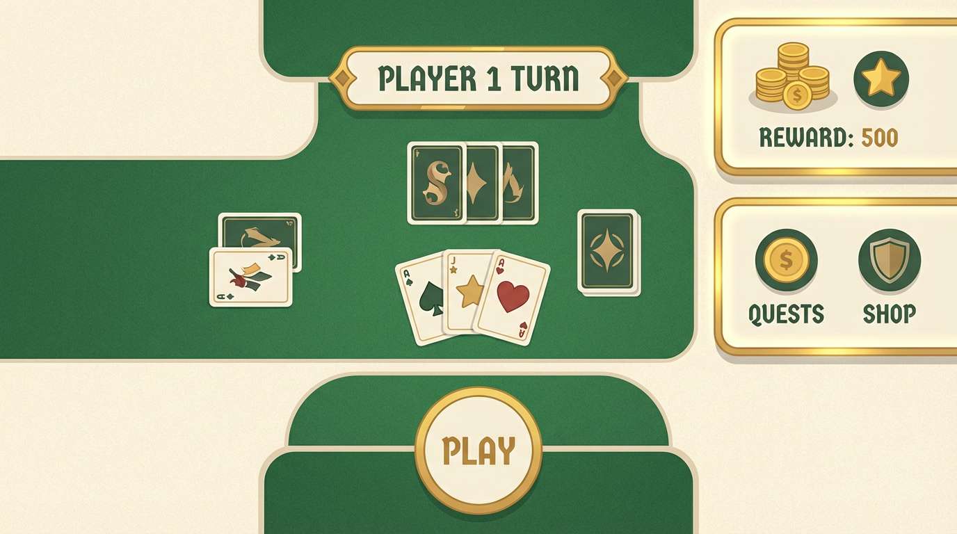
18) Retro Casino Green
HEX: #D4B24C #007F5F #2B9348 #F7F7E8 #3D3D3D
Mood: retro, punchy, playful
Best for: card game ui design
Retro and punchy, like felt tables, bright chips, and warm marquee lights. The lively greens give instant game energy while the creamy neutral keeps screens from feeling harsh. Pair with rounded UI elements and clear iconography for a friendly, arcade-like vibe. Usage tip: use the gold for win states and rewards only, so it feels special.
Image example of retro casino green generated using media.io
19) Eucalyptus Champagne
HEX: #E1C16E #7FB069 #4F772D #F8F1E5 #2F2F2F
Mood: airy, polished, relaxed
Best for: presentation slide template
Airy and polished, like eucalyptus stems arranged beside a glass of champagne. The light cream keeps decks bright, while the greens feel professional without being corporate-cold. Pair with simple charts and thin line icons, and let the gold act as a callout color for key numbers. Usage tip: use the darkest green for section dividers to structure longer presentations.
Image example of eucalyptus champagne generated using media.io
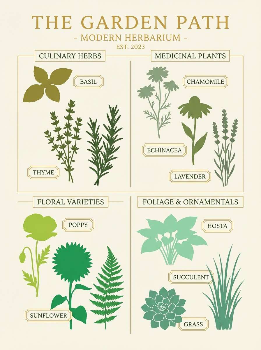
20) Modern Herbarium Gold
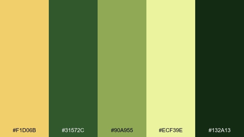
HEX: #F1D06B #31572C #90A955 #ECF39E #132A13
Mood: fresh, educational, outdoors
Best for: garden center poster illustration
Fresh and outdoorsy, like a modern herbarium page with bright leaves pressed flat. The light yellow-green adds a springy lift, while the dark green anchors headings and labels. Pair with simple botanical silhouettes and a clean grid so it feels informative and tidy. Usage tip: use the brightest shade as a highlight behind plant names for quick scanning.
Image example of modern herbarium gold generated using media.io
What Colors Go Well with Gold Green?
Warm neutrals (cream, ivory, sand) make gold feel more metallic and keep green from turning too saturated. They’re ideal for packaging, editorial layouts, and invitations where you want the palette to breathe.
Deep anchors like near-black, charcoal, and navy add contrast and legibility—especially in UI, signage, and posters. If your green is bright, a darker anchor prevents the design from feeling overly playful.
For extra depth, add earthy accents like cocoa brown, terracotta, or muted stone gray. These support olive and forest greens well and help gold read as a highlight rather than a full-field color.
How to Use a Gold Green Color Palette in Real Designs
Assign roles early: let green be the “base” (backgrounds, large areas, primary brand color) and treat gold as the “spark” (borders, icons, active states, small ornaments). This keeps the look premium instead of loud.
Watch contrast in text-heavy layouts. Gold often fails as body text on light backgrounds, so reserve it for UI indicators or print embellishments, and keep typography in charcoal, deep green, or near-black.
Finally, match finish to context: matte greens with satin/brass gold feel understated, while high-contrast emerald + bright gold feels more formal and theatrical. A small shift in gold tone (mustard vs. champagne) can completely change the mood.
Create Gold Green Palette Visuals with AI
If you’re deciding between olive, sage, emerald, or teal greens, generating quick mock visuals helps you confirm the tone before committing to a full brand system. You can also test different lighting and materials to see whether your gold reads as metallic, warm, or flat.
With Media.io’s text-to-image tool, paste a prompt (like the examples above), keep the palette HEX nearby, and iterate until the mood matches your product, event, or interface style.
Gold Green Color Palette FAQs
-
What does a gold and green color palette communicate?
Gold suggests value, celebration, and highlight; green suggests nature, balance, and trust. Together they often read as premium, grounded, and confident—common in luxury, wellness, hospitality, and heritage branding. -
How do I keep gold from overpowering green?
Use gold sparingly as an accent: thin rules, icons, small badges, borders, or foil details. Let green (and a neutral like cream) carry most of the surface area so gold stays special. -
Is gold okay for text in UI designs?
Usually not for body text, especially on light backgrounds—contrast can be too low. Use charcoal/near-black for typography and reserve gold for active states, key metrics, and small emphasis elements. -
Which greens pair best with gold: sage, olive, emerald, or teal?
Sage + gold feels calm and modern; olive + gold feels rustic and “quiet luxury”; emerald + gold feels formal and dramatic; teal + gold feels contemporary and lively. Choose the green based on your brand tone and audience. -
What neutrals work best with gold green palettes?
Cream/ivory and warm paper tones make gold feel richer and keep greens natural. For sharper contrast and a modern look, add charcoal, deep navy, or near-black as an anchor. -
How can I make gold look metallic in print or digital?
In print, use metallic ink or foil when possible. Digitally, simulate metallics with subtle gradients, restrained highlights, and pairing against darker grounds (deep green or near-black) to increase perceived shine. -
Can I generate gold green palette mockups quickly?
Yes—use Media.io’s text-to-image tool to generate packaging, UI, poster, or invitation mockups from prompts, then iterate by swapping HEX codes and adjusting lighting/material cues (brass, foil, satin, matte).
Next: Blue Tan Color Palette


