

Teal and red is one of those rare pairings that can feel both modern and timeless—cool water meeting warm fire. Used well, it creates instant hierarchy, strong emotion, and memorable contrast across digital and print.
Below are 20 teal red color palette ideas (with HEX codes) you can copy for branding, UI, posters, packaging, and décor—plus practical tips for balancing neutrals and accents.
In this article
- Why Teal Red Palettes Work So Well
-
- harbor ember
- desert reef
- vintage bistro
- arctic cranberry
- tropical contrast
- library leather
- coral auditorium
- midnight regatta
- clay pottery
- garden lantern
- retro arcade
- nordic cabin
- festival poster
- minimal commerce ui
- artisan coffee label
- coastal wedding suite
- athletic team kit
- spa brochure
- kids storybook ui
- cinematic title card
- What Colors Go Well with Teal Red?
- How to Use a Teal Red Color Palette in Real Designs
- Create Teal Red Palette Visuals with AI
Why Teal Red Palettes Work So Well
Teal brings stability and clarity, while red adds urgency and emotion. Together, they create a high-impact contrast that naturally guides attention—ideal for calls to action, focal points, and visual hierarchy.
This combo is flexible across styles: a deep teal plus brick red can feel heritage and editorial, while bright teal plus pink-red reads playful and modern. The key is controlling saturation with supportive neutrals like off-white, sand, or charcoal.
Because teal and red sit on opposite sides of the warm/cool spectrum, they balance each other without feeling flat. When you anchor them with a dark text color and a calm background, the palette stays readable and refined.
20+ Teal Red Color Palette Ideas (with HEX Codes)
1) Harbor Ember
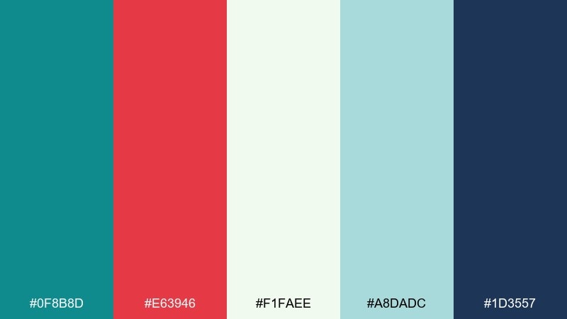
HEX: #0f8b8d #e63946 #f1faee #a8dadc #1d3557
Mood: crisp nautical, confident
Best for: brand identity for coastal, travel, or tech
Crisp sea-glass teal against ember red feels like a harbor at dusk, clean and energetic. Use the navy shade for typography and structure, then let red call out key actions or highlights. It works especially well on off-white layouts where contrast stays comfortable. Tip: keep red to small touches like buttons, badges, or icons to avoid visual noise.
Image example of harbor ember generated using media.io
Media.io is an online AI studio for creating and editing video, image, and audio in your browser.

2) Desert Reef
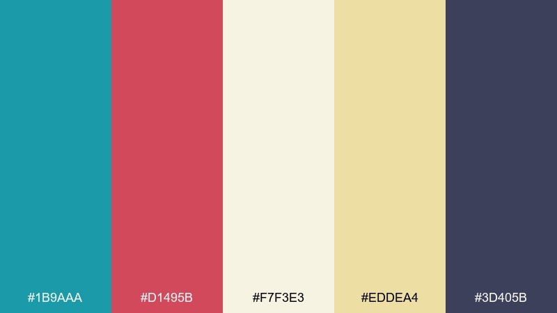
HEX: #1b9aaa #d1495b #f7f3e3 #eddea4 #3d405b
Mood: sun-warmed, relaxed
Best for: living room accents and lifestyle content
Sun-baked sand tones soften the teal and red into an easy, lived-in pairing. Bring in the cream and wheat shades for walls, fabric, or generous negative space, then use teal for larger anchors like rugs or cabinetry. The muted red reads like terracotta and works beautifully in art prints and pillows. Tip: repeat teal twice as often as red for a calmer room balance.
Image example of desert reef generated using media.io
3) Vintage Bistro
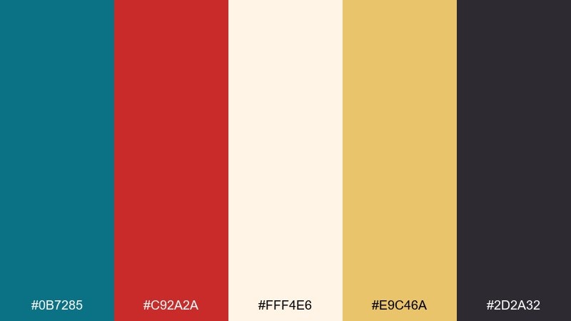
HEX: #0b7285 #c92a2a #fff4e6 #e9c46a #2d2a32
Mood: cozy, appetizing
Best for: restaurant menus and café signage
Rich teal and classic red feel like enamel tiles, handwritten specials, and a warm kitchen glow. Let the creamy background carry most of the space so the food photography and headings breathe. Use the mustard-gold as a secondary highlight for prices, dividers, or seasonal callouts. Tip: choose a serif for the dark text shade and a simple sans for teal labels to keep it readable.
Image example of vintage bistro generated using media.io
4) Arctic Cranberry
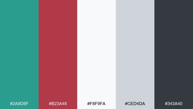
HEX: #2a9d8f #b23a48 #f8f9fa #ced4da #343a40
Mood: clean winter, sharp
Best for: data dashboards and analytics UI
Icy neutrals make the teal and cranberry feel brisk, modern, and precise. This teal red color palette is a strong fit for dashboards where you need clear states and hierarchy without harsh saturation. Use charcoal for text and gridlines, then reserve red for warnings and teal for success or active selections. Tip: keep buttons teal and let red appear only when something needs attention.
Image example of arctic cranberry generated using media.io

5) Tropical Contrast
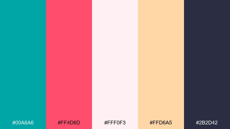
HEX: #00a6a6 #ff4d6d #fff0f3 #ffd6a5 #2b2d42
Mood: playful, summery
Best for: social posts and promotional banners
Bright teal and punchy pink-red feel like beach towels and fruit sorbet, instantly upbeat. Use the soft blush as your background and keep the dark shade for legible headlines. The peach tone is perfect for secondary badges, stickers, or limited-time labels. Tip: add a subtle grain texture to the blush area to keep large blocks from feeling flat.
Image example of tropical contrast generated using media.io

6) Library Leather
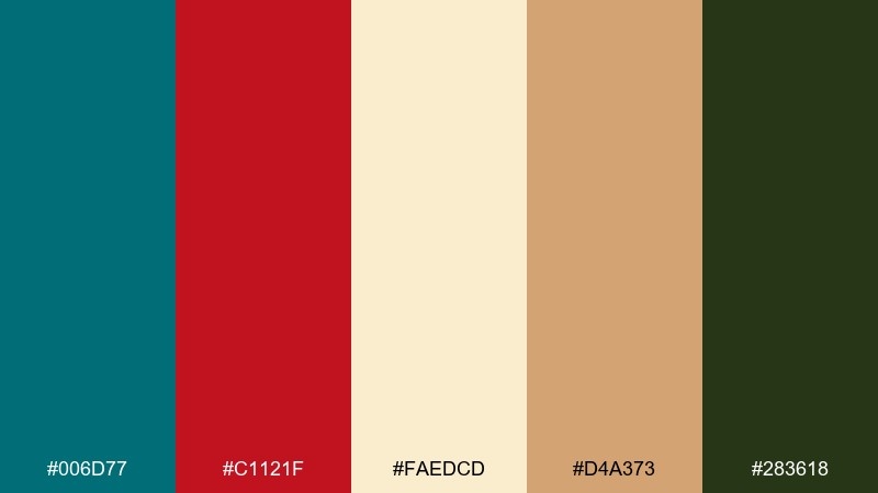
HEX: #006d77 #c1121f #faedcd #d4a373 #283618
Mood: heritage, refined
Best for: book covers and editorial branding
Deep teal and worn red evoke leather bindings, quiet study rooms, and a touch of academia. Let the cream and tan create a paper-like base that feels premium and readable. Use the olive-green as a subtle bridge between the warm and cool sides of the set. Tip: pair with a high-contrast serif headline and keep teal for blocks, rules, and small motifs.
Image example of library leather generated using media.io

7) Coral Auditorium
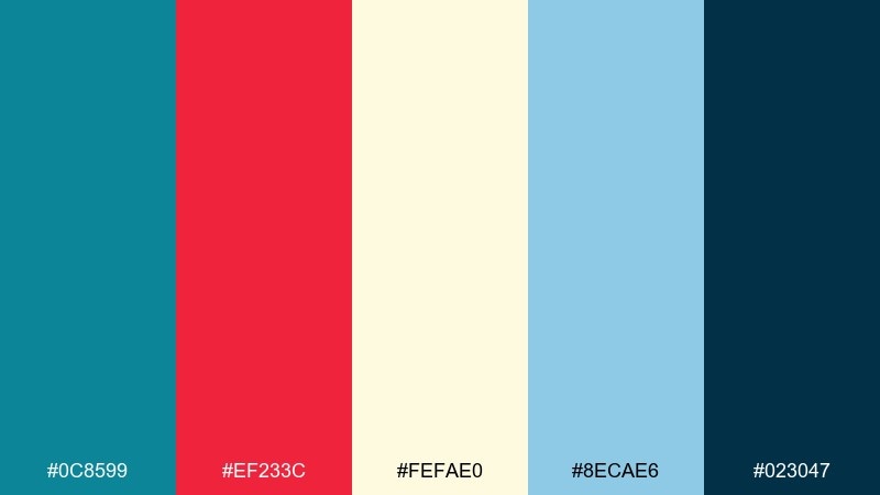
HEX: #0c8599 #ef233c #fefae0 #8ecae6 #023047
Mood: spotlight energy, upbeat
Best for: event posters and conference graphics
Bright teal with stage-red feels like curtains rising and a clear announcement on a marquee. Use the pale cream as open space so titles stay strong from a distance. The sky blue makes a friendly supporting tone for schedules, speakers, or subheads. Tip: keep the darkest navy for small copy and QR codes so they scan reliably.
Image example of coral auditorium generated using media.io

8) Midnight Regatta
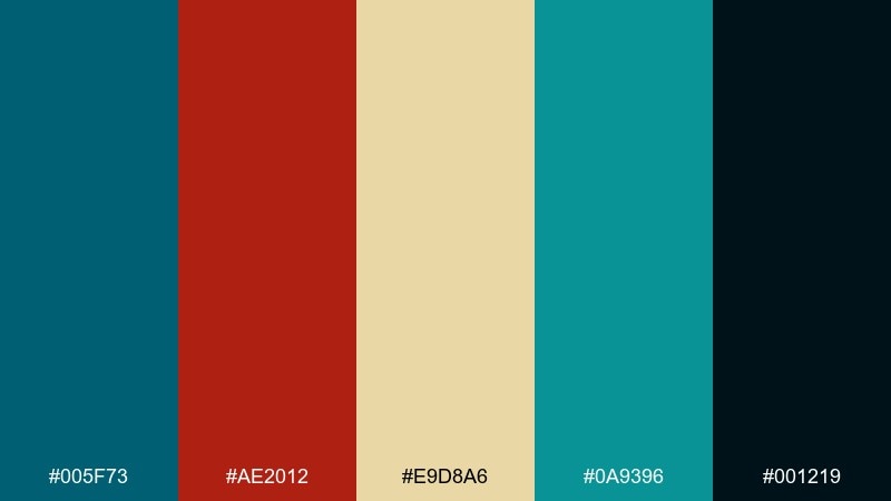
HEX: #005f73 #ae2012 #e9d8a6 #0a9396 #001219
Mood: moody, luxe
Best for: premium branding and hero sections
Inky shadows with coppery red feel cinematic, like sailboats cutting across dark water. Use the near-black for backgrounds and let the light sand tone lift typography and key labels. Teal works best in larger fields or gradients, while the warm red reads as an elegant accent. Tip: try gold-leaning icon strokes on dark backgrounds for a polished finish.
Image example of midnight regatta generated using media.io
9) Clay Pottery
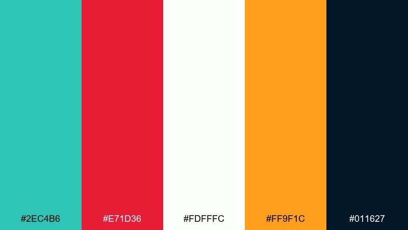
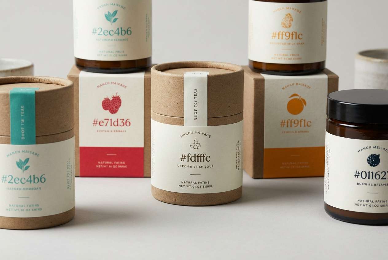
HEX: #2ec4b6 #e71d36 #fdfffc #ff9f1c #011627
Mood: handmade, bold
Best for: artisan product packaging and labels
Fresh teal and tomato red pop like glazed ceramics on a studio shelf. Keep the white bright and generous to make the saturated accents feel intentional rather than loud. Orange adds a friendly handmade warmth for seals, batch numbers, or flavor notes. Tip: use the deep navy for ingredient text so the label stays readable at small sizes.
Image example of clay pottery generated using media.io
10) Garden Lantern
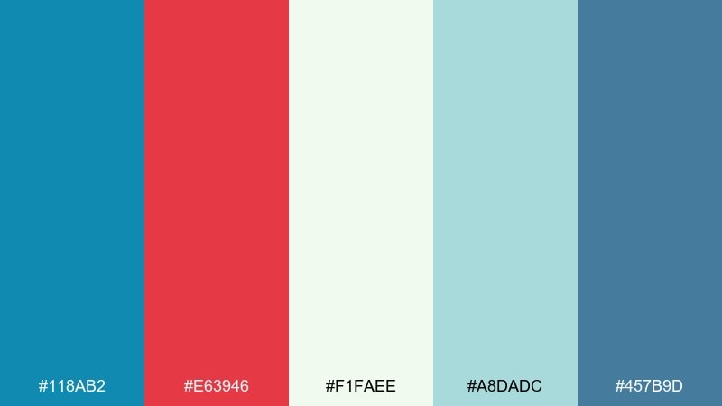
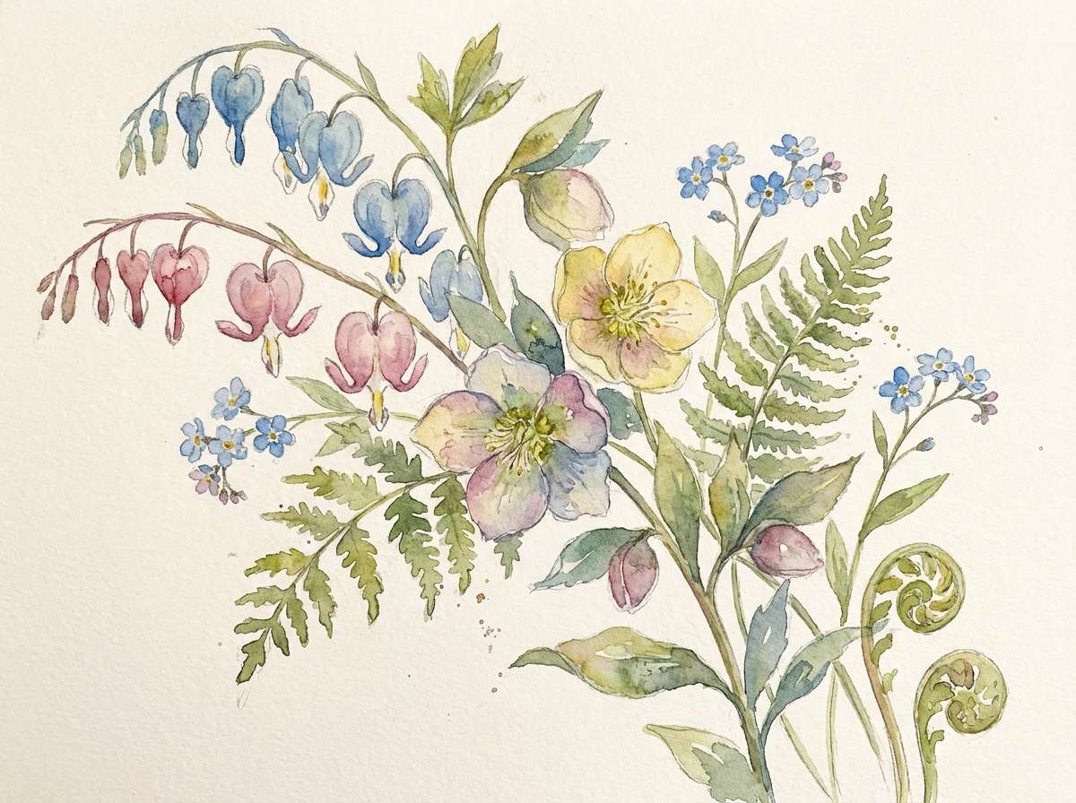
HEX: #118ab2 #e63946 #f1faee #a8dadc #457b9d
Mood: fresh spring, friendly
Best for: botanical illustrations and seasonal promos
Cool teal and lantern red feel like a garden path with bright blooms and morning air. Use the soft mint and pale teal for sky washes, paper texture, or gentle backgrounds. The deeper blue is ideal for outlines, captions, and small detail work. Tip: keep red for flowers and focal points so the composition naturally guides the eye.
Image example of garden lantern generated using media.io
11) Retro Arcade
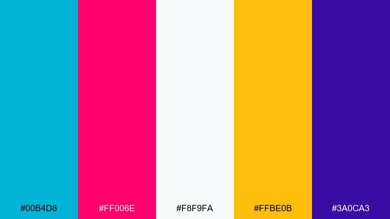
HEX: #00b4d8 #ff006e #f8f9fa #ffbe0b #3a0ca3
Mood: neon fun, high contrast
Best for: gaming interfaces and streaming overlays
Electric teal with hot red-pink feels like arcade lights and fast button mashing. These teal red color combinations shine when you need strong UI hierarchy, especially for active states and notifications. Use white for content panels, then bring in yellow for secondary rewards like coins, badges, or progress highlights. Tip: keep the purple for deep headers and nav bars so the neon accents stay readable.
Image example of retro arcade generated using media.io

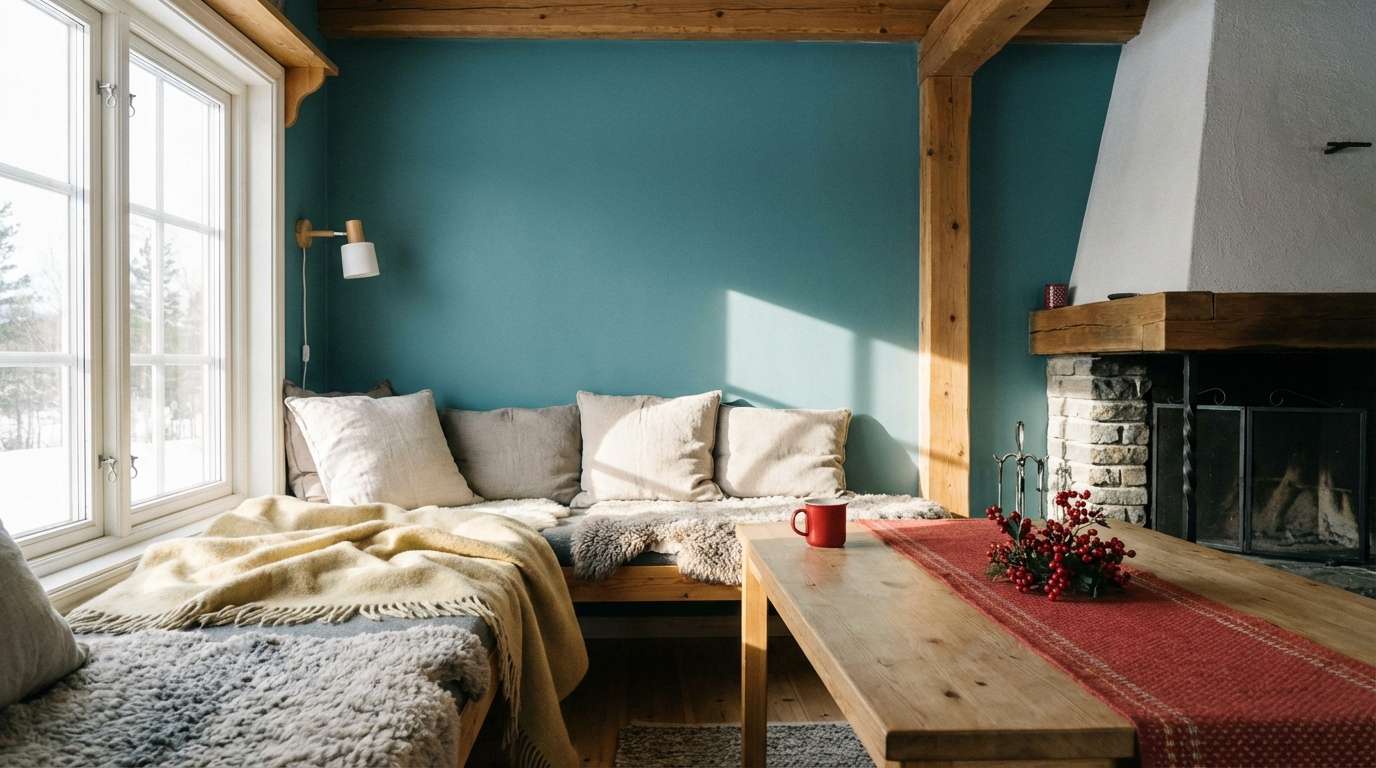
12) Nordic Cabin
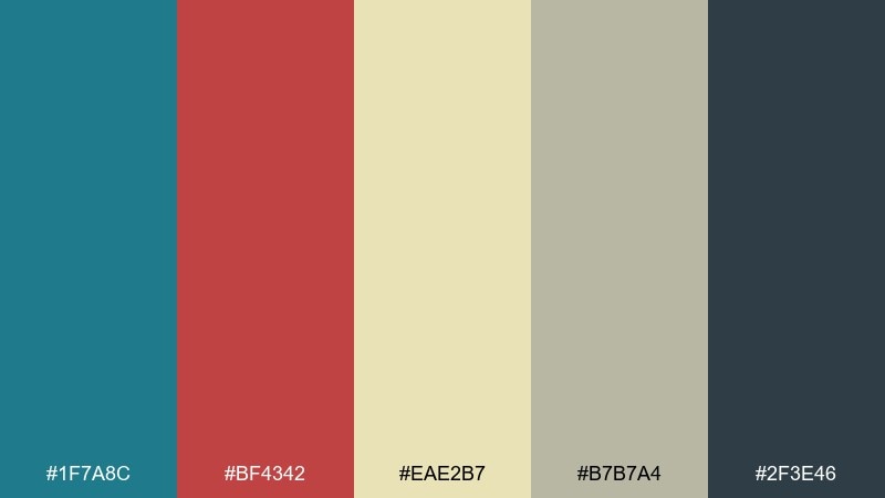
HEX: #1f7a8c #bf4342 #eae2b7 #b7b7a4 #2f3e46
Mood: quiet, grounded
Best for: cozy interiors and home décor boards
Muted teal and brick red feel like painted wood, wool blankets, and a calm winter weekend. Let the warm beige act as the main field, then layer in greige for subtle depth across textiles and backgrounds. Use teal for cabinetry or accent walls, and red for small décor moments like cushions or art. Tip: choose matte finishes to keep the palette soft and natural.
Image example of nordic cabin generated using media.io
13) Festival Poster
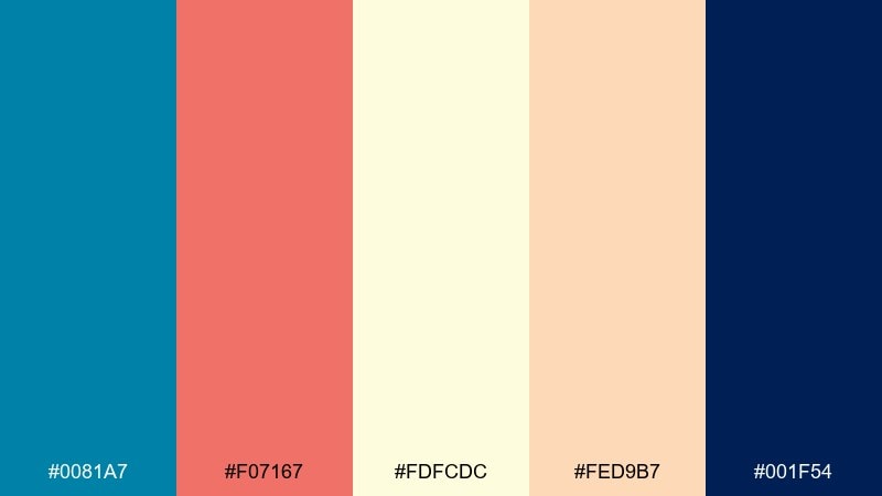
HEX: #0081a7 #f07167 #fdfcdc #fed9b7 #001f54
Mood: sunny, social
Best for: music festival flyers and outdoor events
Bright teal and coral-red feel like summer stages, paper wristbands, and a clear blue sky. Use the pale cream for the main background so the poster reads from afar. Peach is perfect for supporting blocks like lineup tiers or sponsor strips. Tip: set the darkest blue for body copy to keep small text crisp in print.
Image example of festival poster generated using media.io

14) Minimal Commerce UI
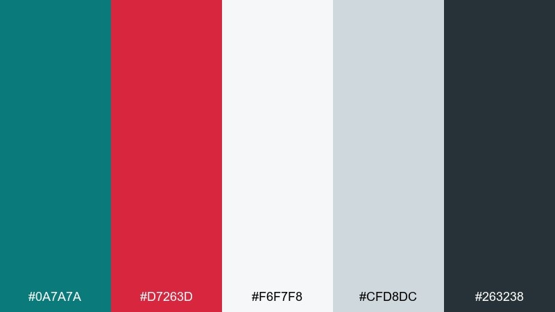
HEX: #0a7a7a #d7263d #f6f7f8 #cfd8dc #263238
Mood: clean, conversion-focused
Best for: ecommerce UI and product pages
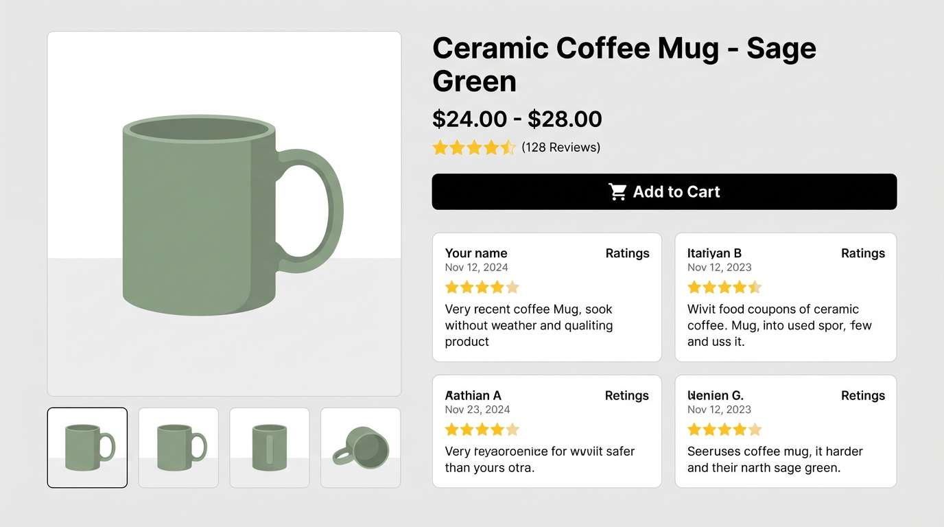
Cool teal with a sharp red accent feels modern, trustworthy, and action-ready. Keep the light grays as your main canvas and use charcoal for typography to protect readability. Teal is ideal for primary actions and selected filters, while red should be reserved for errors, low-stock alerts, or limited-time tags. Tip: use consistent spacing and thin dividers so the palette stays airy rather than busy.
Image example of minimal commerce ui generated using media.io
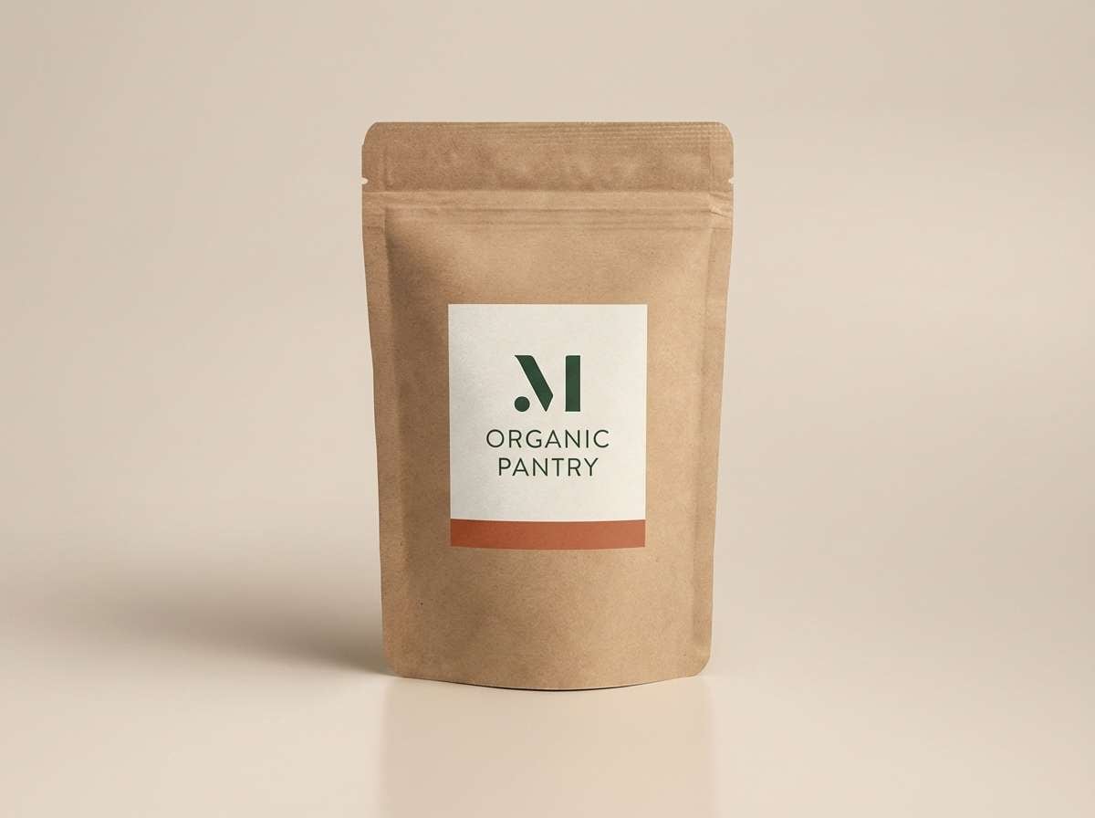
15) Artisan Coffee Label
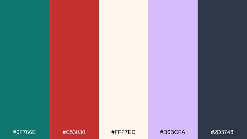
HEX: #0f766e #c53030 #fff7ed #d6bcfa #2d3748
Mood: craft, boutique
Best for: coffee packaging and label systems
Deep teal and roasted red feel like café tiles, stamps, and a warm grinder hum. Use the creamy background to mimic uncoated paper and keep the label approachable. A hint of lavender adds a modern twist for roast notes, origin markers, or seasonal editions. Tip: keep icons and small text in the dark slate so the label prints cleanly.
Image example of artisan coffee label generated using media.io
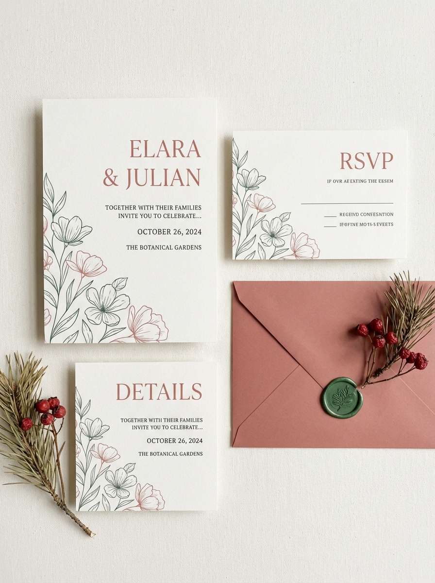
16) Coastal Wedding Suite
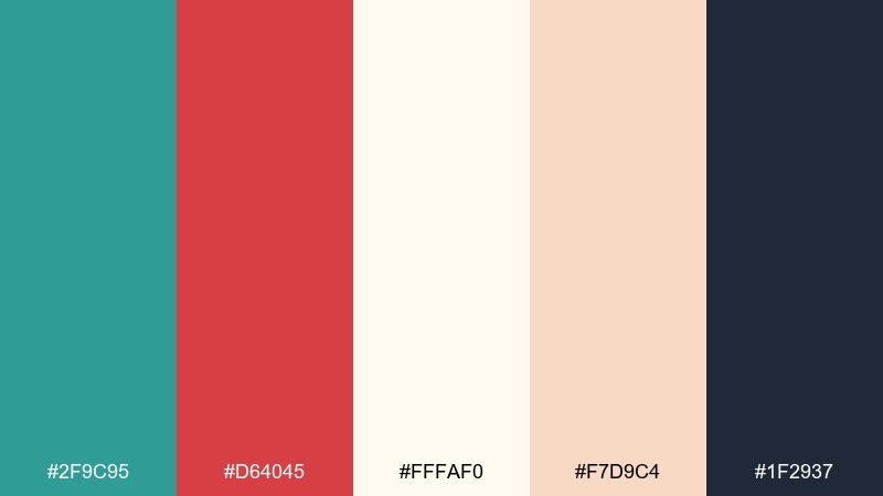
HEX: #2f9c95 #d64045 #fffaf0 #f7d9c4 #1f2937
Mood: romantic, airy
Best for: wedding invitations and day-of stationery
Soft teal and rose-red feel like seaside vows, silk ribbons, and a blush sunset. This teal red color palette stays elegant when you lean on ivory and peach for most of the paper space. Use the deep slate for names and details, then add teal to monograms and red to small flourishes like wax seal accents. Tip: pick one accent for each card so the suite looks cohesive rather than colorful.
Image example of coastal wedding suite generated using media.io
17) Athletic Team Kit
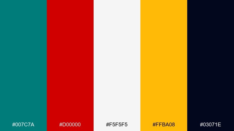
HEX: #007c7a #d00000 #f5f5f5 #ffba08 #03071e
Mood: competitive, bold
Best for: sports branding and team uniforms
Strong teal and true red feel fast, loud, and built for game-day visibility. Use black for the base and let white create sharp contrast for numbers and sponsor marks. The gold works best as a tertiary accent on trims, captain badges, or small pattern hits. Tip: keep the uniform layout simple so the colors do the work from the stands.
Image example of athletic team kit generated using media.io
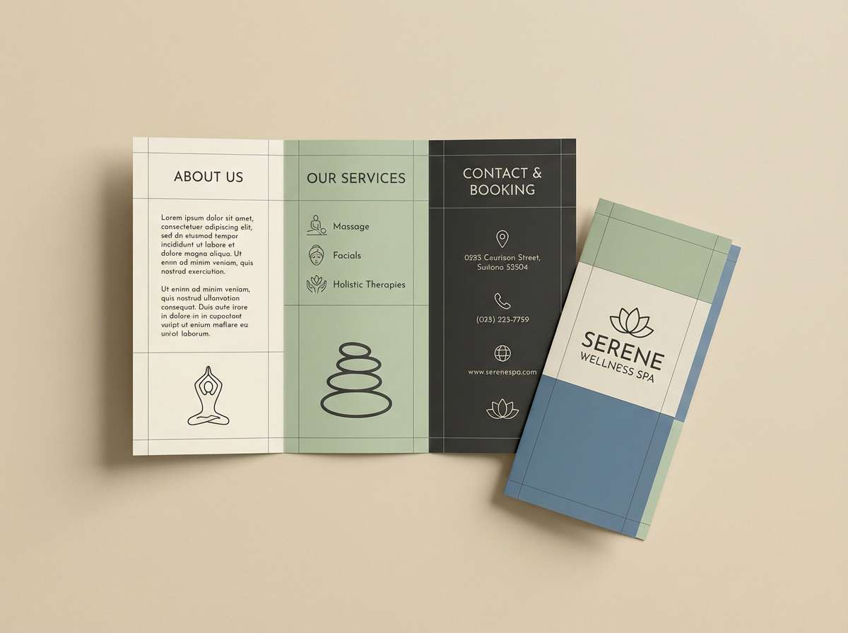
18) Spa Brochure
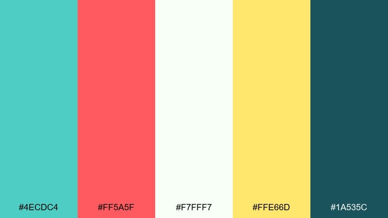
HEX: #4ecdc4 #ff5a5f #f7fff7 #ffe66d #1a535c
Mood: calming, uplifting
Best for: wellness brochures and promo booklets
Fresh teal with a gentle red feels like warm towels and cool water, balanced and inviting. Use the near-white as the dominant background and the deep teal for headings and section dividers. Yellow adds a sunny highlight for callouts like new treatments or seasonal packages. Tip: avoid heavy red blocks, and use it instead for small icons and appointment prompts.
Image example of spa brochure generated using media.io
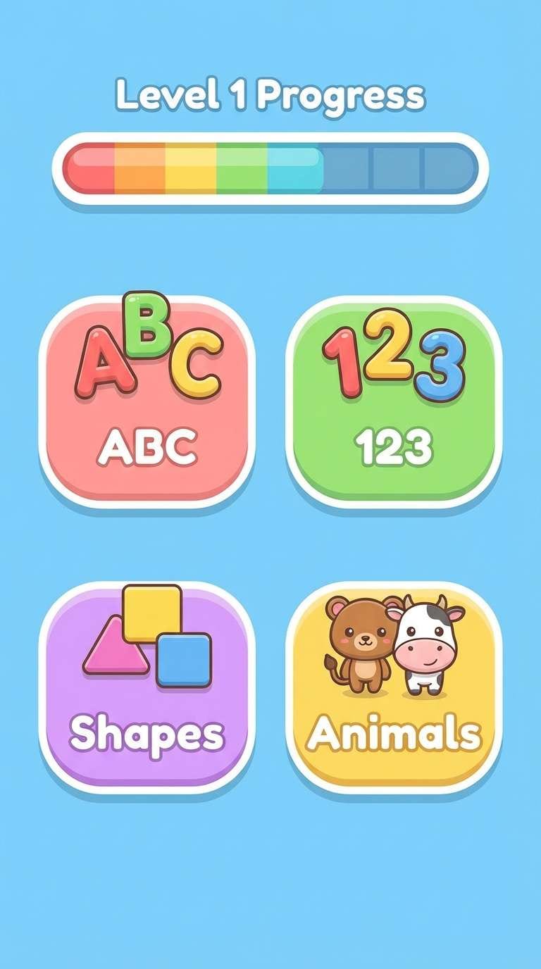
19) Kids Storybook UI
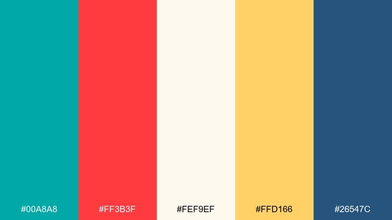
HEX: #00a8a8 #ff3b3f #fef9ef #ffd166 #26547c
Mood: cheerful, friendly
Best for: kids learning apps and storybook screens
Bright teal with a candy-apple red feels playful, safe, and easy to navigate. This teal red color combination works best when you keep backgrounds creamy and reserve the bold hues for buttons and characters. Yellow is perfect for rewards, stars, and progress moments that feel encouraging. Tip: increase button padding and use the navy for text so accessibility stays strong.
Image example of kids storybook ui generated using media.io
20) Cinematic Title Card
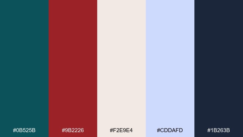
HEX: #0b525b #9b2226 #f2e9e4 #cddafd #1b263b
Mood: dramatic, cinematic
Best for: film posters and title treatments
Dark teal and deep red feel like suspense, velvet curtains, and a slow-build soundtrack. Use the off-white for credits and supporting text, keeping it restrained and elegant. The pale blue works as a subtle glow behind type or as a cool highlight in gradients. Tip: test the red on the darkest navy to ensure small details do not disappear in print.
Image example of cinematic title card generated using media.io
What Colors Go Well with Teal Red?
Neutrals are the easiest match: warm off-whites (ivory, cream), cool whites, and light grays keep teal and red from competing. For text and structure, charcoal or deep navy typically reads cleaner than pure black.
If you want extra warmth, try sand, tan, or muted gold—these bridge teal’s coolness with red’s heat and make the palette feel more natural. For a modern twist, add a soft blush or pale lavender as a quiet supporting accent.
When you need maximum contrast, keep the background light and use teal for primary blocks with red as a tight accent. If you go dark-mode, use near-black/navy with a light sand for typography, then introduce red sparingly.
How to Use a Teal Red Color Palette in Real Designs
Start by assigning roles: pick one main color (often teal), one attention color (red), and one dominant neutral for the background. This keeps pages, posters, and layouts from becoming visually noisy.
For UI, reserve red for critical states (errors, warnings, low stock) and let teal represent positive actions (primary buttons, toggles, active navigation). For print, test small red elements against teal/dark backgrounds to ensure they don’t lose detail.
In branding or décor, repeat the main hue more frequently than the accent—think 60/30/10. Teal can carry large areas (walls, hero sections), while red works best in smaller focal moments (badges, icons, cushions, florals).
Create Teal Red Palette Visuals with AI
If you already have HEX codes, the fastest way to validate a palette is to see it applied to real layouts—posters, UI screens, labels, or room scenes. Visual context helps you spot issues like harsh contrast, muddy neutrals, or accents that feel too loud.
With Media.io’s text-to-image, you can generate palette-based examples in minutes using prompts like “brand identity board,” “ecommerce UI,” or “wedding invitation suite,” then iterate until the balance feels right.
Once you like the direction, keep your prompts consistent and swap only one variable at a time (background, typography color, accent ratio) to build a cohesive set of teal and red assets.
Teal Red Color Palette FAQs
-
Is teal and red a complementary color scheme?
Not perfectly complementary in the strict color-wheel sense (teal sits between blue and green), but teal and red behave like a strong warm/cool contrast. That’s why the pairing feels energetic and balanced when you support it with neutrals. -
How do I keep a teal red palette from looking too “Christmas”?
Shift the red toward coral, rose, brick, or cranberry; mute the teal slightly; and use off-whites, sand, or warm grays instead of bright white. Also avoid using teal and red in equal amounts—make one dominant and the other an accent. -
Which color should be the main color: teal or red?
For most branding and UI, teal works better as the primary because it feels stable and can cover larger areas. Use red as the accent for emphasis—CTAs, badges, warnings, or key highlights. -
What neutrals pair best with teal and red?
Ivory/cream, soft warm gray, light cool gray, and deep navy/charcoal are the most reliable. Choose warm neutrals to soften the contrast, or cool neutrals to make the palette feel sharper and more modern. -
Are teal red palettes good for UI accessibility?
They can be, as long as you don’t rely on color alone to communicate states. Use sufficient contrast for text (often charcoal/navy on light backgrounds), add icons/labels for errors vs success, and test contrast ratios for buttons and links. -
What accent colors can I add to teal and red?
Muted gold, peach, and sand add warmth; pale blue adds airy contrast; and soft lavender can modernize the look. Pick one extra accent and keep it subtle so teal and red remain the main story. -
How can I preview teal and red palettes before designing?
Generate quick mockups (posters, dashboards, packaging, interiors) using AI, then adjust the accent ratio and background neutral until it feels balanced. Media.io makes it easy to iterate with consistent prompts.
Next: Rose Pink Color Palette


