

Rose pink sits in that sweet spot between romantic and modern: soft enough for calm layouts, but rich enough to feel premium when paired with dark neutrals.
Below are 20 rose pink color palette ideas with HEX codes, plus practical tips for branding, UI, weddings, and decor—and a fast way to generate matching visuals.
In this article
Why Rose Pink Palettes Work So Well
Rose pink is versatile because it carries warmth (friendly, human) without the loudness of hot pink. It can read as airy and bridal, or bold and fashion-forward, depending on how much contrast you add.
In digital design, rose pink also performs well as an accent color: it draws attention to buttons and highlights while keeping pages approachable. Pair it with slate, charcoal, or deep plum for legibility and a more premium feel.
In print and decor, rose pink blends naturally with creams, taupes, and warm browns, which helps it avoid looking too “sweet.” That makes it a reliable base for wedding suites, packaging, and interiors.
20+ Rose Pink Color Palette Ideas (with HEX Codes)
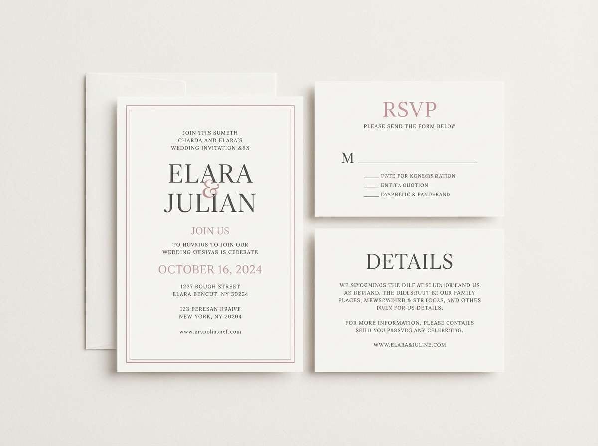
1) Petal Blush
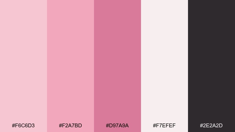
HEX: #F6C6D3 #F2A7BD #D97A9A #F7EFEF #2E2A2D
Mood: romantic, airy
Best for: wedding invitations and stationery
Romantic and airy like fresh petals on linen, these tones feel soft without looking washed out. Use the light blushes as the base, then anchor type and borders with the deep charcoal. It shines on invitations, menus, and RSVP cards where readability matters. Tip: print the pale tones on uncoated stock for a velvety finish.
Image example of petal blush generated using media.io
Media.io is an online AI studio for creating and editing video, image, and audio in your browser.

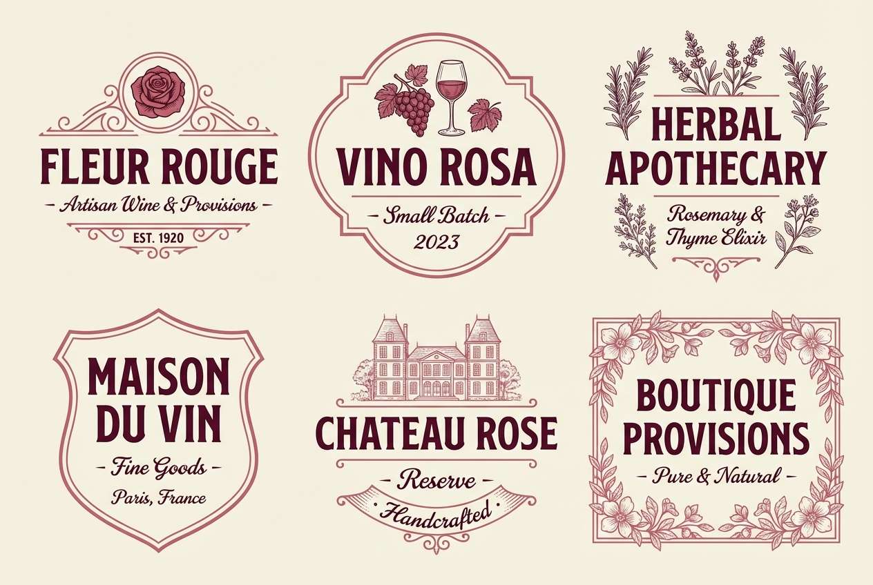
2) Vintage Rose
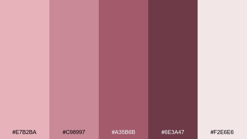
HEX: #E7B2BA #C98997 #A35B6B #6E3A47 #F2E6E6
Mood: nostalgic, warm
Best for: boutique branding and labels
Nostalgic and warm, it recalls faded florals, velvet ribbons, and antique book covers. The mid-rose and wine shades create strong contrast for logos, stamps, and label frames. Pair with cream paper textures and subtle grain to keep it artisan, not overly sweet. Tip: use the darkest shade for small text to avoid muddy printing.
Image example of vintage rose generated using media.io
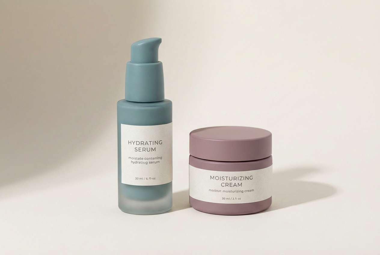
3) Rose Quartz Glow
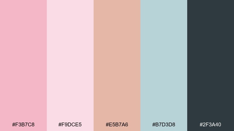
HEX: #F3B7C8 #F9DCE5 #E5B7A6 #B7D3D8 #2F3A40
Mood: fresh, polished
Best for: skincare packaging and product ads
Fresh and polished, these hues feel like quartz light catching on glass. The cool aqua adds a clean spa note, while the deep slate keeps the look premium. This is a smart rose pink color combination for skincare, wellness, and beauty where you want softness with credibility. Tip: keep the blush on the package and reserve slate for ingredients and claims.
Image example of rose quartz glow generated using media.io
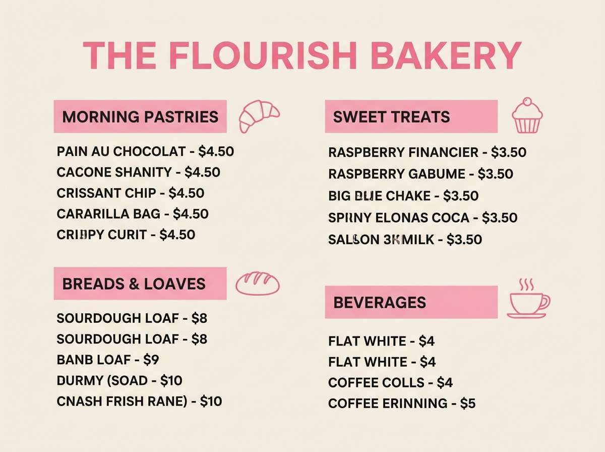
4) Berry Macaron
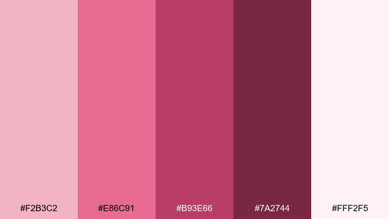
HEX: #F2B3C2 #E86C91 #B93E66 #7A2744 #FFF2F5
Mood: playful, sweet
Best for: bakery menus and social posts
Playful and sweet, it brings to mind berry filling, icing sugar, and glossy jam. The saturated raspberry works best as buttons, headers, or price highlights against the soft cream base. For balance, keep backgrounds light and let the darker berry handle emphasis. Tip: limit the brightest pink to one focal element per layout.
Image example of berry macaron generated using media.io
5) Desert Rose
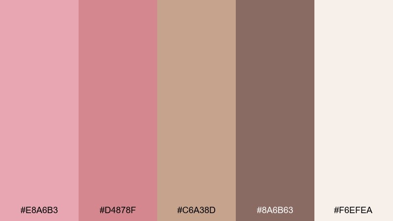
HEX: #E8A6B3 #D4878F #C6A38D #8A6B63 #F6EFEA
Mood: earthy, muted
Best for: interior mood boards and decor styling
Earthy and muted, these tones feel like clay dust, sun-baked stone, and dried roses. Use the warm taupe as a bridge between pink and neutrals for rugs, wall paint, and textile palettes. It pairs naturally with brass, oak, and off-white ceramics. Tip: repeat the deepest brown in small details to keep the room grounded.
Image example of desert rose generated using media.io
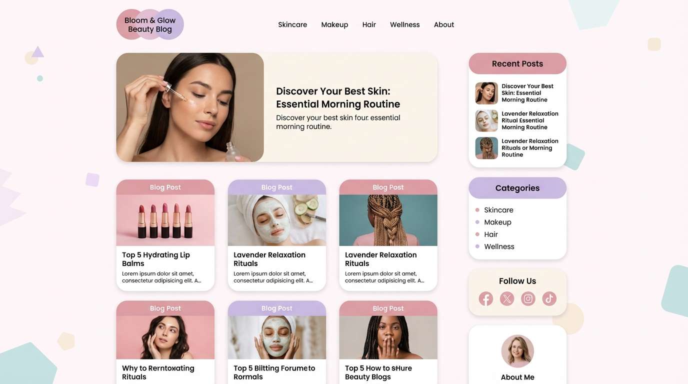
6) Ballet Slipper
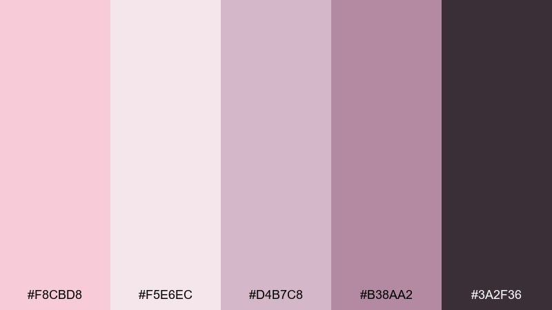
HEX: #F8CBD8 #F5E6EC #D4B7C8 #B38AA2 #3A2F36
Mood: delicate, calm
Best for: beauty blog UI and editorial layouts
Delicate and calm, it evokes satin slippers and powdery blush in soft window light. The lilac-rose midtones make gentle sections and cards, while the deep plum gives crisp headers. As a rose pink color scheme, it works best with generous whitespace and thin dividers. Tip: use the darkest shade for links and keep body text near charcoal for accessibility.
Image example of ballet slipper generated using media.io
7) Sunset Peony
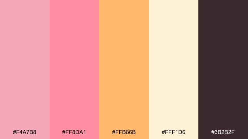
HEX: #F4A7B8 #FF8DA1 #FFB86B #FFF1D6 #3B2B2F
Mood: sunlit, upbeat
Best for: event posters and summer promos
Sunlit and upbeat, this mix feels like peonies at golden hour with a hint of citrus. The apricot accent gives energy without turning neon, especially against the creamy background. It works well for event posters, pop-up promos, and seasonal launches. Tip: keep the warm orange for calls to action so the pink stays soft and inviting.
Image example of sunset peony generated using media.io

8) Cranberry Kiss
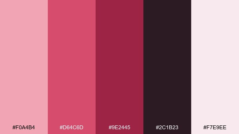
HEX: #F0A4B4 #D64C6D #9E2445 #2C1B23 #F7E9EE
Mood: bold, dramatic
Best for: cosmetics campaigns and hero banners
Bold and dramatic, it suggests cranberry gloss, velvet dresses, and late-night city lights. The near-black plum makes the pinks pop and reads beautifully in large headlines. These rose pink color combinations are ideal for cosmetics, fragrance, and statement landing pages. Tip: add subtle gradients in the mid-rose to create depth without clutter.
Image example of cranberry kiss generated using media.io
9) Rosewater Neutral
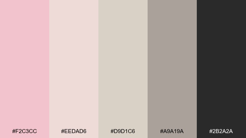
HEX: #F2C3CC #EEDAD6 #D9D1C6 #A9A19A #2B2A2A
Mood: minimal, soothing
Best for: wellness apps and calming dashboards
Minimal and soothing, it feels like warm rosewater with soft stone neutrals. The greige steps keep interfaces mature and help the pink read as a gentle accent rather than a theme. Use the darkest tone for navigation and data labels to maintain clarity. Tip: reserve the blush for highlights like toggles, badges, and success states.
Image example of rosewater neutral generated using media.io
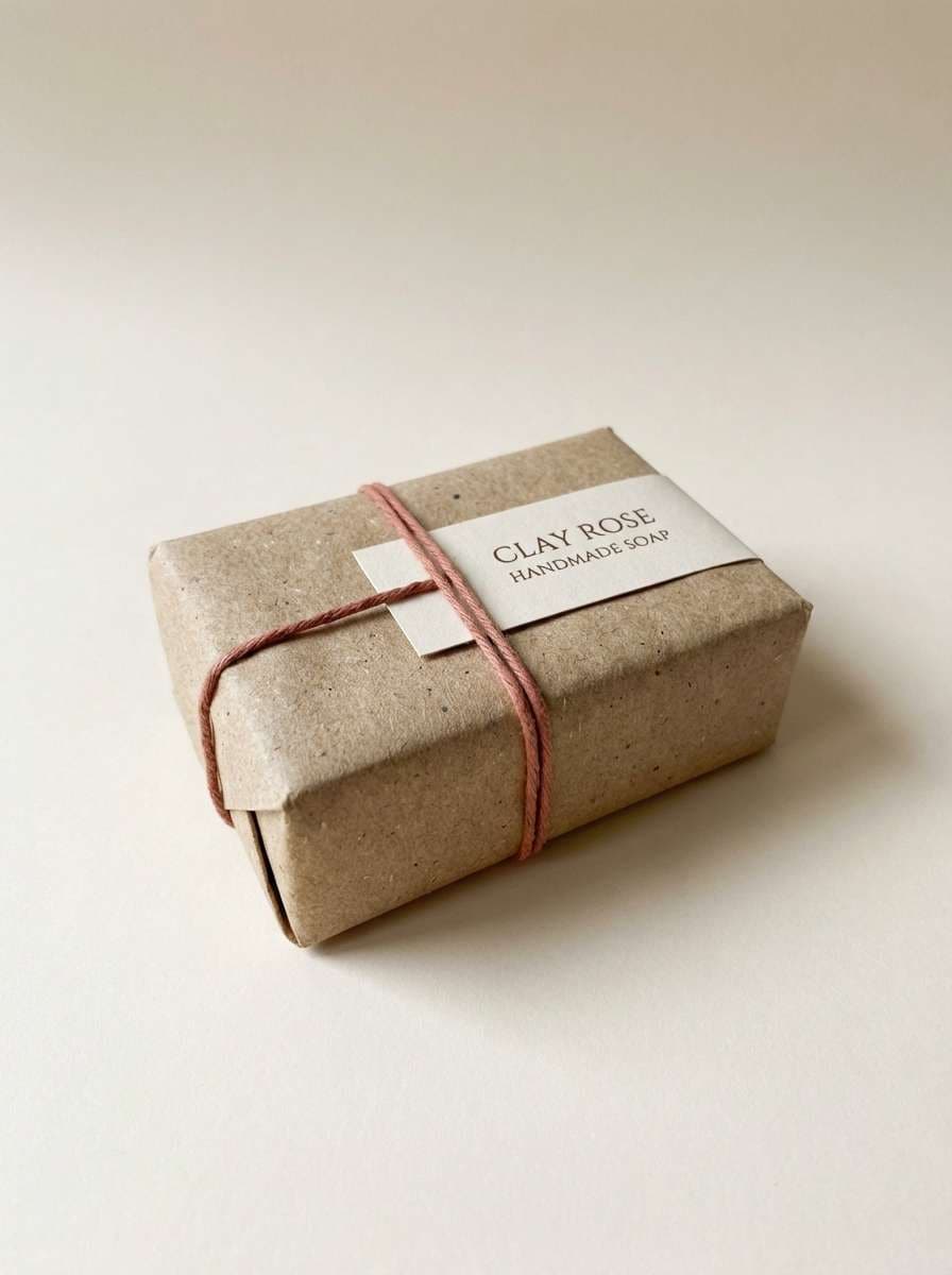
10) Soft Clay Rose
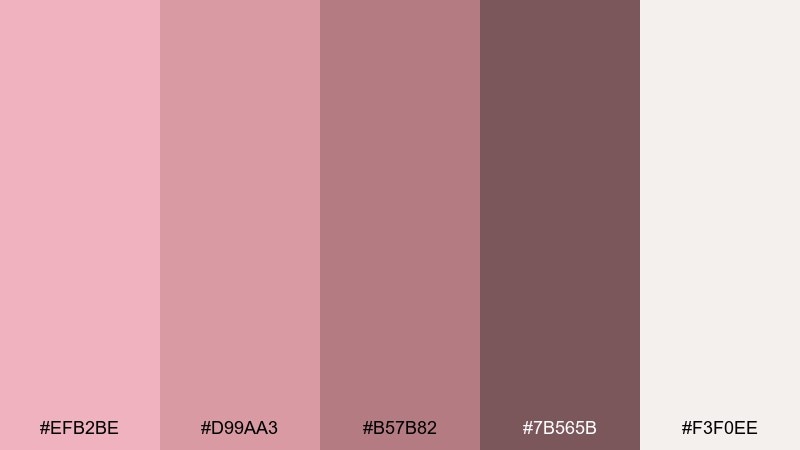
HEX: #EFB2BE #D99AA3 #B57B82 #7B565B #F3F0EE
Mood: cozy, grounded
Best for: handmade product packaging
Cozy and grounded, these shades resemble hand-thrown clay and dried rose hips. The muted midtones suit kraft labels, embossed marks, and simple pattern bands. Pair with warm whites and natural fibers for an honest, handmade feel. Tip: use one ink tone for typography and let the rest appear as blocks or stripes.
Image example of soft clay rose generated using media.io
11) Champagne Rose
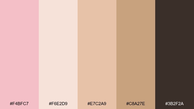
HEX: #F4BFC7 #F6E2D9 #E7C2A9 #C8A27E #3B2F2A
Mood: elegant, celebratory
Best for: luxury event invitations and menus
Elegant and celebratory, it evokes champagne foam, satin ribbons, and candlelit tables. The warm gold-brown notes elevate the pink and keep it from feeling too youthful. It works beautifully for gala invites, tasting menus, and upscale announcements. Tip: add fine linework in the deepest brown to mimic foil without overwhelming the page.
Image example of champagne rose generated using media.io
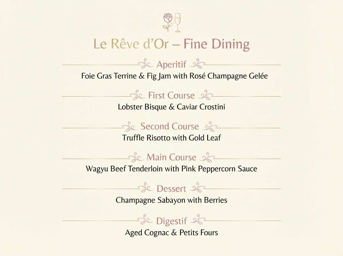
12) Lavender Rose
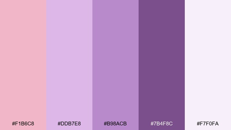
HEX: #F1B6C8 #DDB7E8 #B98ACB #7B4F8C #F7F0FA
Mood: dreamy, creative
Best for: creator branding and streaming overlays
Dreamy and creative, it feels like rose petals drifting into a lavender haze. The purple steps add dimension for gradients, badges, and soft neon-like highlights. Use the pale lilac as a background and the darker violet for titles and frames. Tip: keep icons simple so the color blend stays the star.
Image example of lavender rose generated using media.io
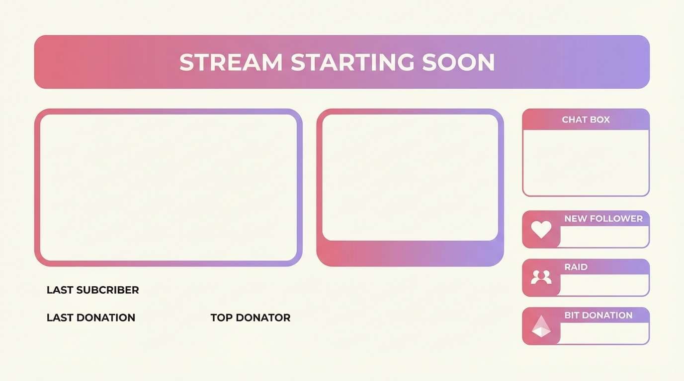
13) Coral Rose Pop
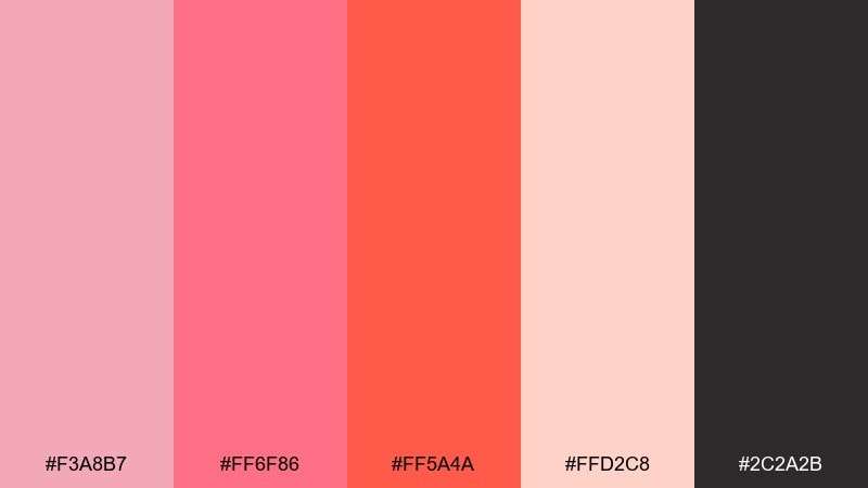
HEX: #F3A8B7 #FF6F86 #FF5A4A #FFD2C8 #2C2A2B
Mood: energetic, modern
Best for: startup landing pages and CTAs
Energetic and modern, the coral edge adds punch like a pop of lipstick against clean skin. The hot accents are best saved for buttons and key metrics, with blush used for supportive sections. It delivers a lively rose pink color combination for brands that want friendly confidence. Tip: pair with lots of white space and a dark neutral nav to avoid visual fatigue.
Image example of coral rose pop generated using media.io
14) Rosewood Night
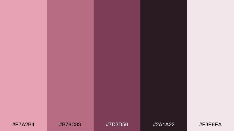
HEX: #E7A2B4 #B76C83 #7D3D56 #2A1A22 #F3E6EA
Mood: moody, refined
Best for: editorial covers and album artwork
Moody and refined, it suggests rosewood lacquer, dim lounges, and slow jazz. The deep near-black brings cinematic contrast, while the dusty rose keeps it romantic. Use it on editorial covers, music artwork, and fashion lookbooks where drama helps. Tip: apply the lightest tint as a soft spotlight behind titles for legibility.
Image example of rosewood night generated using media.io
15) Dusty Pink Minimal
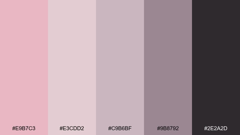
HEX: #E9B7C3 #E3CDD2 #C9B6BF #9B8792 #2E2A2D
Mood: clean, understated
Best for: portfolio websites and case studies
Clean and understated, it feels like matte blush makeup and soft paper stock. The greyed mauves make perfect UI surfaces for cards, tables, and captions. Keep accents subtle and let typography and spacing do the heavy lifting. Tip: choose one muted pink for highlights and keep the rest as supportive neutrals.
Image example of dusty pink minimal generated using media.io
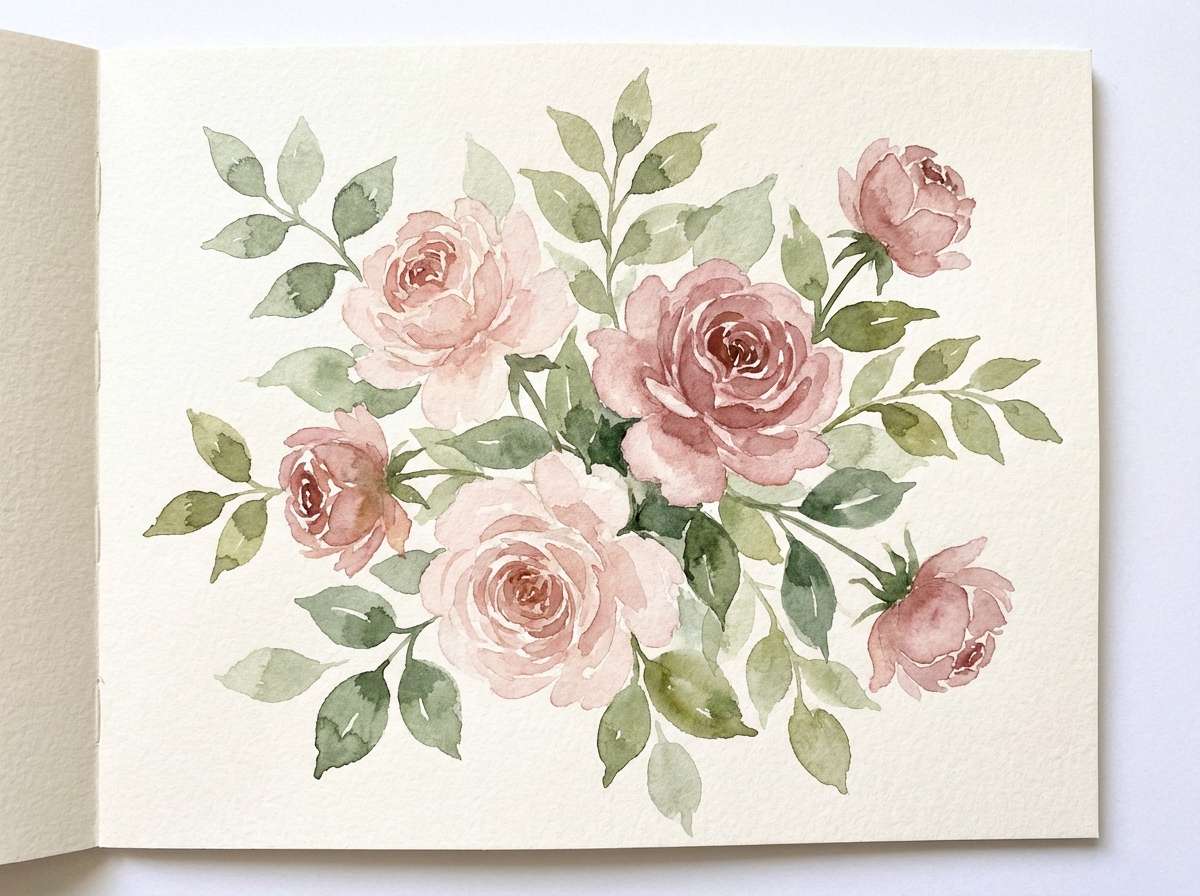
16) Garden Party
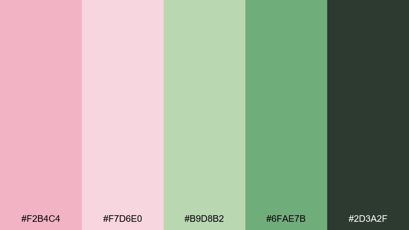
HEX: #F2B4C4 #F7D6E0 #B9D8B2 #6FAE7B #2D3A2F
Mood: fresh, botanical
Best for: spring illustrations and greeting cards
Fresh and botanical, it conjures rose blooms tucked into leafy greens after a spring rain. The greens keep the pink from feeling too sugary and make the layout feel alive. Use it for greeting cards, floral illustrations, and seasonal social graphics. Tip: paint the pinks as translucent washes and layer the greens in darker strokes for depth.
Image example of garden party generated using media.io
17) Modern Rose Tech
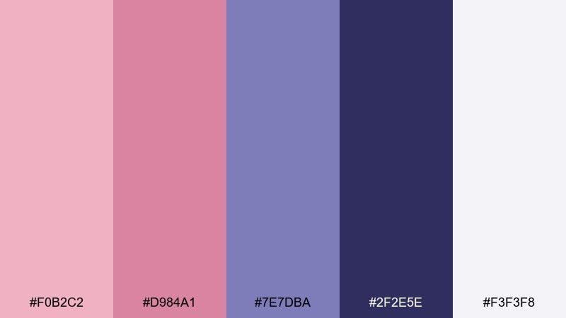
HEX: #F0B2C2 #D984A1 #7E7DBA #2F2E5E #F3F3F8
Mood: sleek, futuristic
Best for: saas UI and product dashboards
Sleek and futuristic, it blends soft rose with electric indigo like neon reflecting on glass. The indigo pair adds authority for navigation, charts, and primary actions. These rose pink color combinations work well for SaaS brands that want approachable warmth without losing a tech edge. Tip: use rose for secondary highlights and let indigo carry the primary button states.
Image example of modern rose tech generated using media.io
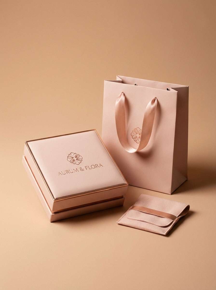
18) Rose Gold Luxe
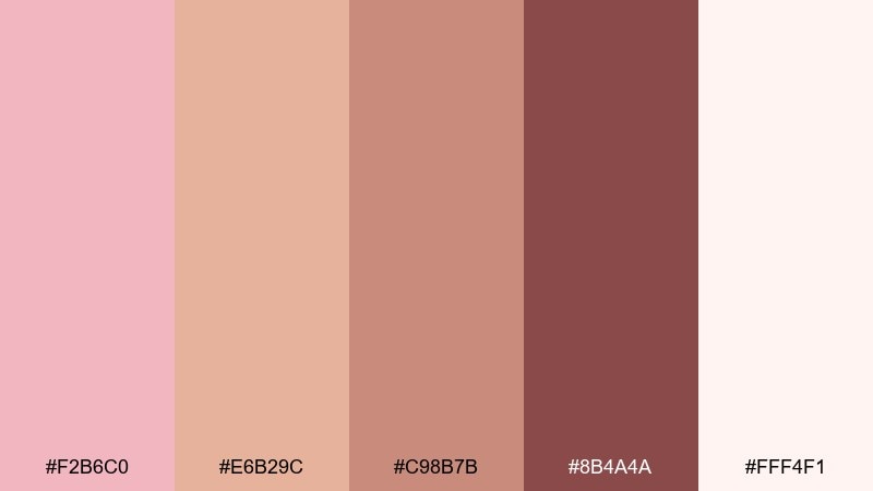
HEX: #F2B6C0 #E6B29C #C98B7B #8B4A4A #FFF4F1
Mood: luxurious, warm
Best for: jewelry product ads and packaging
Luxurious and warm, it reads like rose gold metal against creamy highlights. The coppery midtones make packaging look expensive even with minimal graphics. It suits jewelry ads, gift boxes, and premium unboxing moments. Tip: keep backgrounds bright and use the deepest shade only for tiny marks and logotypes.
Image example of rose gold luxe generated using media.io
19) Nordic Rose
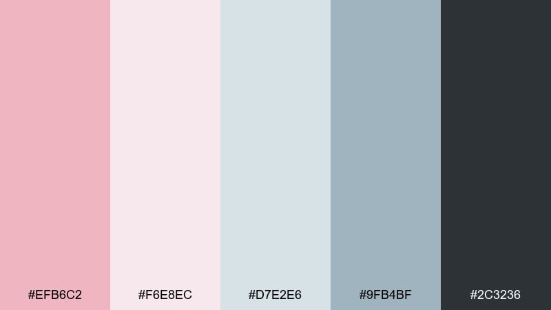
HEX: #EFB6C2 #F6E8EC #D7E2E6 #9FB4BF #2C3236
Mood: cool, modern
Best for: scandinavian-style presentations
Cool and modern, it feels like a blush scarf in a bright Nordic room. The blue-greys calm the pink and make slides look crisp and professional. As a rose pink color palette, it is great for decks, reports, and minimal brand guidelines. Tip: use the steel blue for charts and keep rose for section headers and key callouts.
Image example of nordic rose generated using media.io
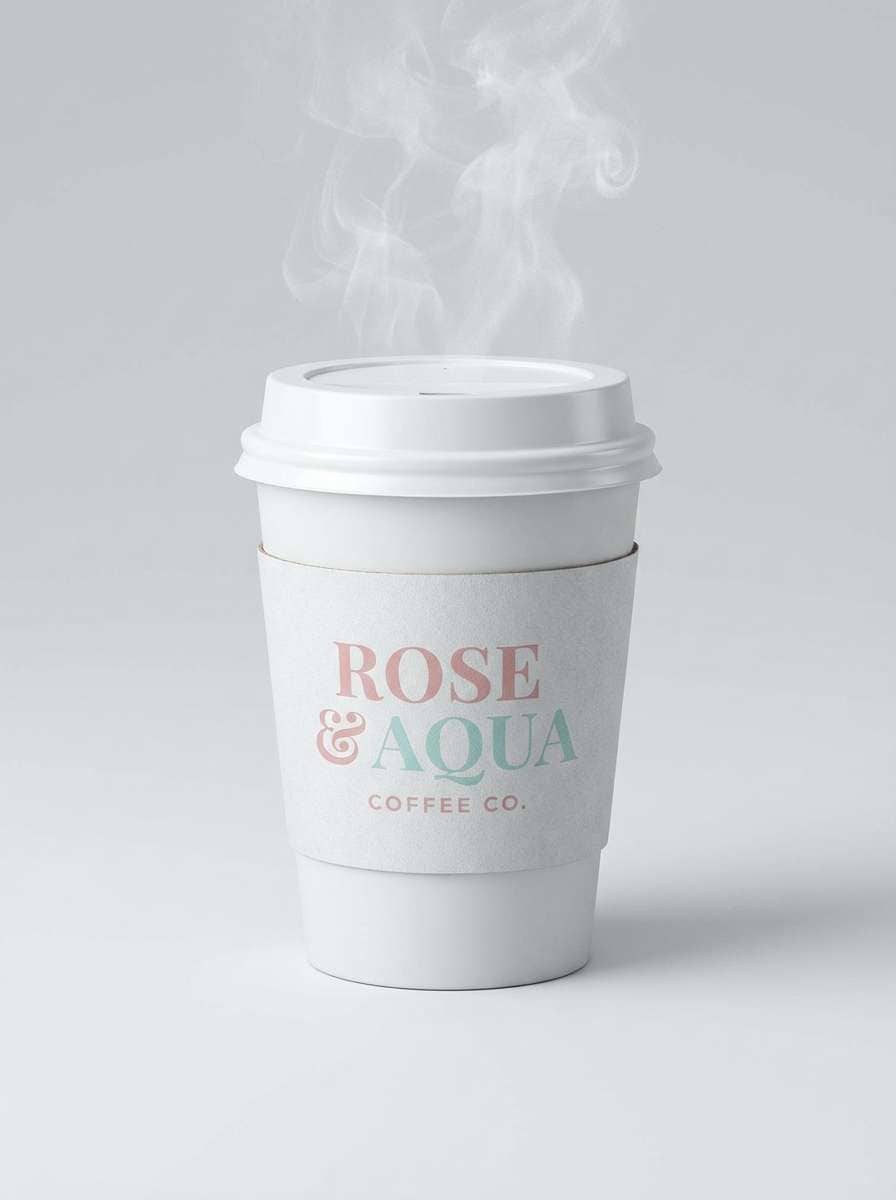
20) Strawberry Milk
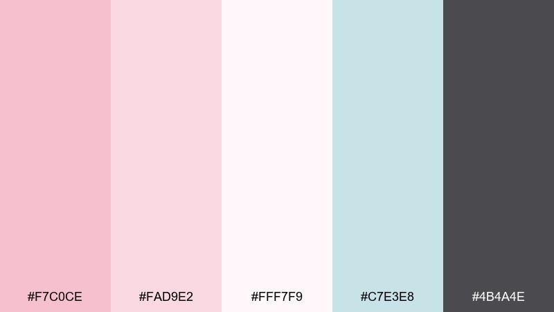
HEX: #F7C0CE #FAD9E2 #FFF7F9 #C7E3E8 #4B4A4E
Mood: soft, cheerful
Best for: cafe branding and cup designs
Soft and cheerful, it brings strawberry milk, whipped foam, and pastel diner tiles to mind. The hint of aqua adds freshness and prevents the pinks from blending together. Use it for cafe branding, seasonal drink promos, and cup prints. Tip: place the darkest neutral behind small text so pastel areas stay clean and readable.
Image example of strawberry milk generated using media.io
What Colors Go Well with Rose Pink?
Neutrals are the easiest win: warm ivory, cream, greige, and soft stone keep rose pink sophisticated and flexible. For contrast, charcoal and deep plum make rose pink feel crisp and editorial.
Cool partners like mint, aqua, and blue-grey create a fresh, clean “spa” vibe that works well in UI and packaging. If you want energy, coral and apricot lift rose pink without going neon.
For a more natural look, pair rose pink with botanical greens (sage, olive, deep forest). This combination is especially strong for spring themes, florals, and lifestyle branding.
How to Use a Rose Pink Color Palette in Real Designs
Start by choosing a role for rose pink: base (background blocks), accent (buttons/badges), or hero (big headlines, banners). In most interfaces, rose pink works best as an accent supported by light neutrals and one dark text color.
For branding and print, test contrast early: rose pink can fade on coated paper or bright screens if you rely only on pale tints. Add a deeper wine/plum or charcoal for type, rules, and key marks.
In decor and weddings, repeat rose pink in small, consistent touches (ribbons, florals, napkins) and use wood, brass, or stone neutrals to keep the overall scene grounded.
Create Rose Pink Palette Visuals with AI
If you already have HEX codes, you can quickly generate matching mockups—posters, labels, UI screens, and mood boards—by describing your layout and calling out rose pink accents.
To keep results consistent, reuse the same prompt structure (subject + style + background + lighting) and only swap palette notes like “rose pink and deep plum” or “blush and blue-grey.”
Use Media.io to turn each palette idea into ready-to-share visuals for presentations, client decks, and social posts in minutes.
Rose Pink Color Palette FAQs
-
What is a rose pink color palette?
A rose pink color palette is a set of coordinated colors built around rose pink (a soft, slightly muted pink). It typically includes light tints for backgrounds, deeper pinks/wines for emphasis, and a dark neutral for readable text. -
Is rose pink the same as blush pink?
They’re close, but not always identical. Blush pink usually skews lighter and more neutral, while rose pink can be a touch deeper or warmer, often sitting between blush and dusty rose. -
What neutral colors pair best with rose pink?
Cream, warm ivory, greige, taupe, and charcoal are the most reliable. They keep rose pink from feeling overly sweet and help maintain clean contrast for UI and print typography. -
What are the best contrasting colors for rose pink in UI?
Deep plum, near-black, slate, or indigo create strong contrast for navigation and headings. Use rose pink mainly for buttons, highlights, and small brand accents to keep interfaces accessible. -
Can rose pink work for modern branding (not just weddings)?
Yes. Pair rose pink with dark neutrals and cool tones like blue-grey or indigo to make it feel sleek and contemporary—great for SaaS, beauty tech, creators, and premium retail. -
How do I keep rose pink from looking too “baby” or “cute”?
Reduce the number of pale tints, add a grounded dark (charcoal/plum), and include a sophisticated neutral (stone/greige). Also rely on whitespace, crisp typography, and minimal shapes. -
How can I generate rose pink palette mockups quickly?
Use an AI text-to-image tool and describe the exact design asset you need (poster, label, UI mockup) plus your palette cues (e.g., “rose pink accents + deep plum typography”). Save prompts for consistent brand-like outputs.
Next: Mint Blue Color Palette


