

Teal and purple is a modern, high-contrast pairing that can feel calm or electric depending on your neutrals and accent choices. It’s especially useful when you want designs that read as both creative and trustworthy.
Below are 20 curated teal purple color palette ideas with HEX codes, plus practical tips for branding, UI, print, and decor so your colors stay clean and readable.
In this article
- Why Teal Purple Palettes Work So Well
-
- lagoon amethyst
- midnight reef
- mint orchid whisper
- velvet tide
- neon kelp
- dusty teal mauve
- arctic iris
- peacock jewelbox
- stormy plum harbor
- retro pool party
- botanical twilight
- galactic spa
- terracotta teal violet
- coffeehouse orchid
- prism ui dark
- soft nursery mermaid
- editorial aubergine teal
- winter evergreen lavender
- sunset boulevard teal
- minimal teal lilac gray
- What Colors Go Well with Teal Purple?
- How to Use a Teal Purple Color Palette in Real Designs
- Create Teal Purple Palette Visuals with AI
Why Teal Purple Palettes Work So Well
Teal brings clarity and balance, while purple adds creativity and depth. Together, they create instant visual interest without relying on overly loud primary colors.
This pairing is flexible across styles: lean into light neutrals for airy wellness branding, or push into deep tones for premium dark-mode UI. You can also dial the mood with saturation—muted versions feel vintage and gentle, while neon versions feel energetic and modern.
Most importantly, teal and purple separate well in hierarchy. That makes them great for interfaces, editorial layouts, and packaging systems where you need clear roles for background, text, and calls to action.
20+ Teal Purple Color Palette Ideas (with HEX Codes)
1) Lagoon Amethyst
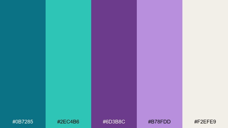
HEX: #0b7285 #2ec4b6 #6d3b8c #b78fdd #f2efe9
Mood: fresh, calming, uplifting
Best for: wellness brand identity and stationery
Fresh lagoon water meets soft amethyst haze, giving a calm but optimistic feel. This teal purple color palette works beautifully for wellness brands, boutique spas, and modern stationery where you want serene energy without looking bland. Pair it with warm off-white textures and simple sans-serif type to keep the look airy. Usage tip: let the light neutral lead for breathing room, then use the darker purple only for headings and small highlights.
Image example of lagoon amethyst generated using media.io
Media.io is an online AI studio for creating and editing video, image, and audio in your browser.

2) Midnight Reef
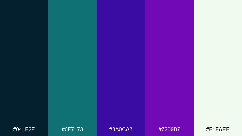
HEX: #041f2e #0f7173 #3a0ca3 #7209b7 #f1faee
Mood: moody, premium, dramatic
Best for: fintech or gaming app UI in dark mode
Moody reef shadows and neon depth create a premium, cinematic vibe. This teal purple color scheme is ideal for dark-mode dashboards where you need clear hierarchy and a confident tech feel. Balance the bold purples with soft near-white text and keep teal for interactive states like toggles and progress bars. Usage tip: reserve the brightest accent for one action per screen to avoid visual noise.
Image example of midnight reef generated using media.io
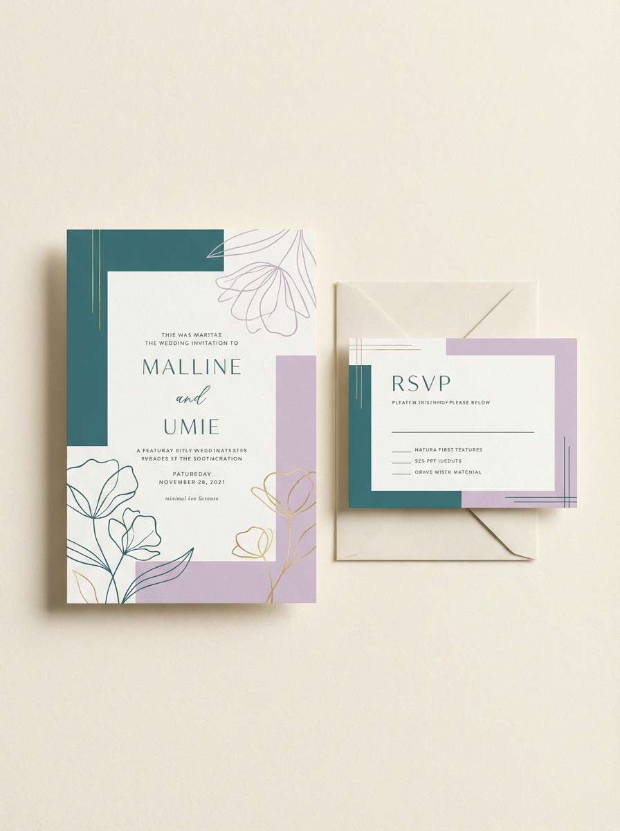
3) Mint Orchid Whisper
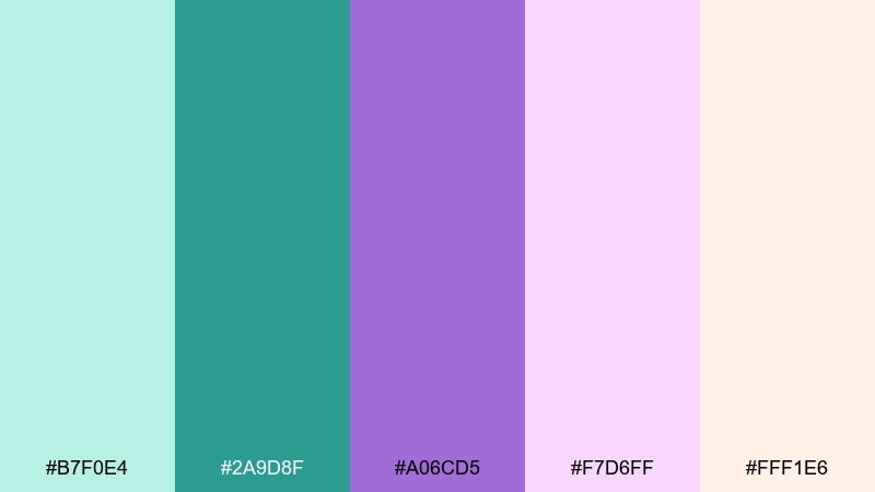
HEX: #b7f0e4 #2a9d8f #a06cd5 #f7d6ff #fff1e6
Mood: soft, romantic, airy
Best for: wedding invitations and RSVP cards
Soft mint mist and orchid petals evoke a gentle, romantic morning. The light tones suit invitations, RSVP sets, and event signage where readability and elegance matter most. Pair with a warm cream paper texture and delicate serif type for a refined finish. Usage tip: print the darkest teal for body text and keep purple for monograms or borders.
Image example of mint orchid whisper generated using media.io
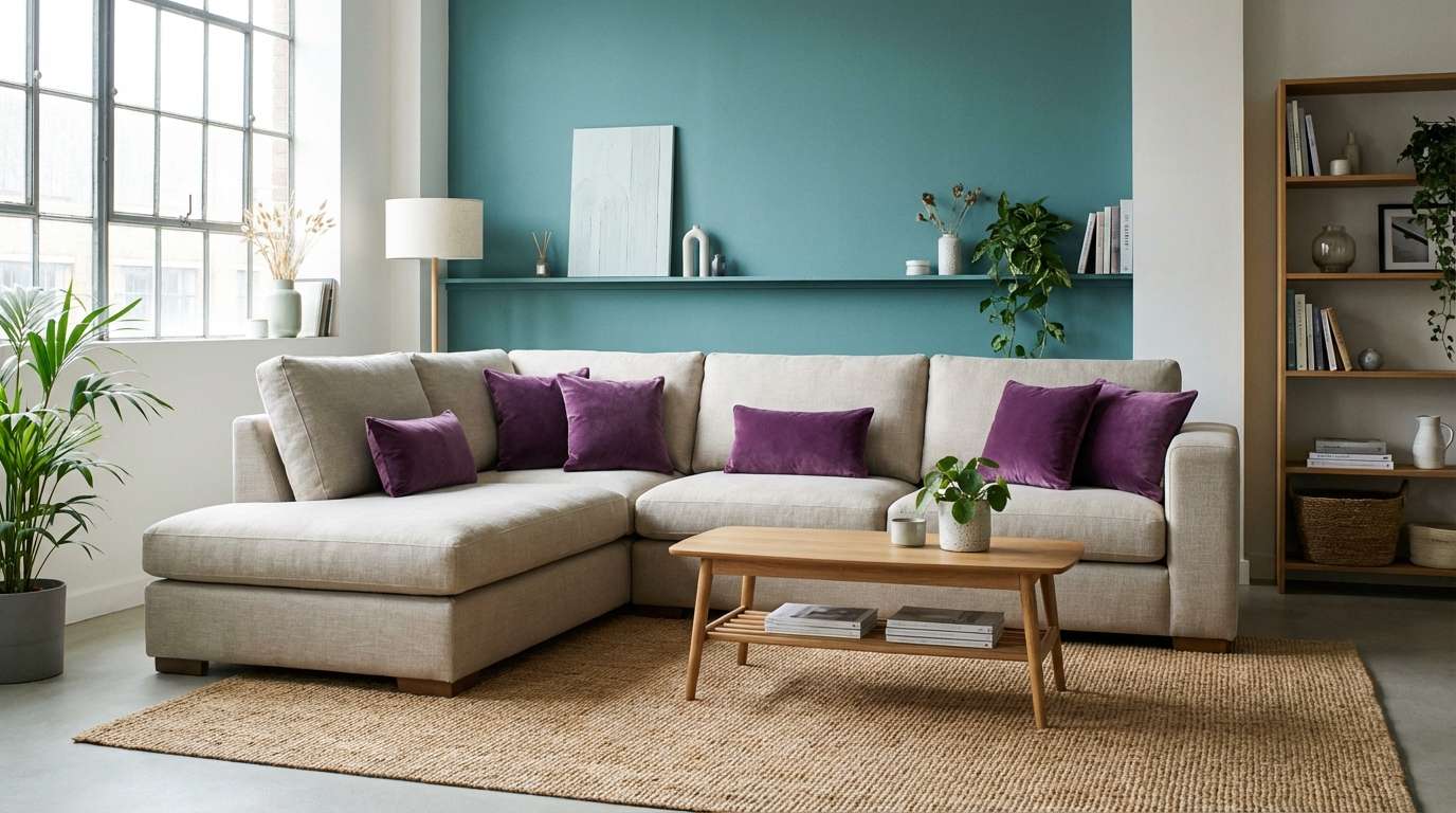
4) Velvet Tide
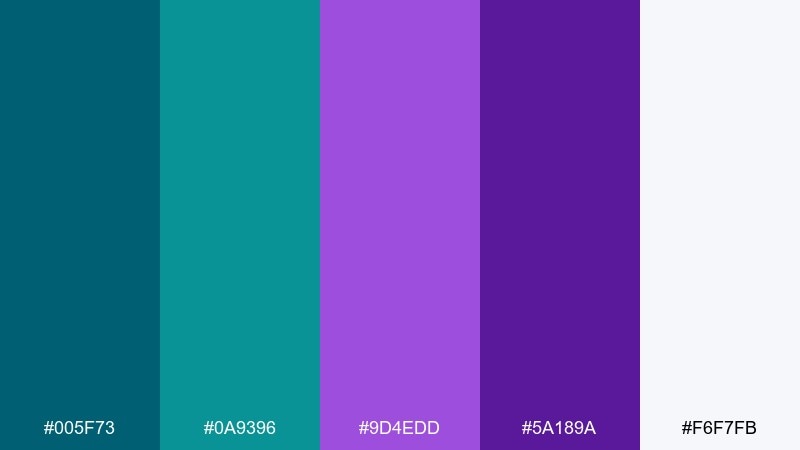
HEX: #005f73 #0a9396 #9d4edd #5a189a #f6f7fb
Mood: confident, sleek, modern
Best for: modern living room accents and decor styling
Velvet shadows with ocean tide energy feel bold, sleek, and slightly luxurious. Use these tones for statement pillows, artwork, or an accent wall, then soften with cool whites and pale neutrals to avoid heaviness. Matte black metal and brushed chrome both pair well here, depending on whether you want edgy or polished. Usage tip: repeat one purple tone in small decor items to make the room feel intentionally styled.
Image example of velvet tide generated using media.io
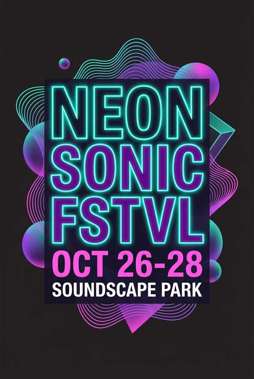
5) Neon Kelp
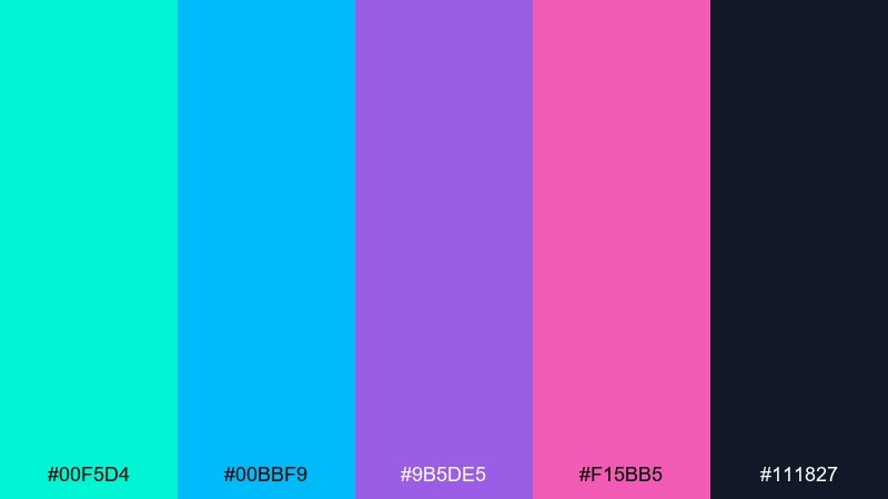
HEX: #00f5d4 #00bbf9 #9b5de5 #f15bb5 #111827
Mood: electric, playful, high-energy
Best for: music festival poster and social promos
Electric kelp glow and nightclub purples deliver instant high-energy impact. This teal purple color combination shines in posters, event promos, and social stories where you want loud contrast and movement. Pair with tight typography and plenty of dark negative space so the brights feel intentional, not chaotic. Usage tip: keep gradients subtle and use solid blocks for dates and venue info to stay readable.
Image example of neon kelp generated using media.io
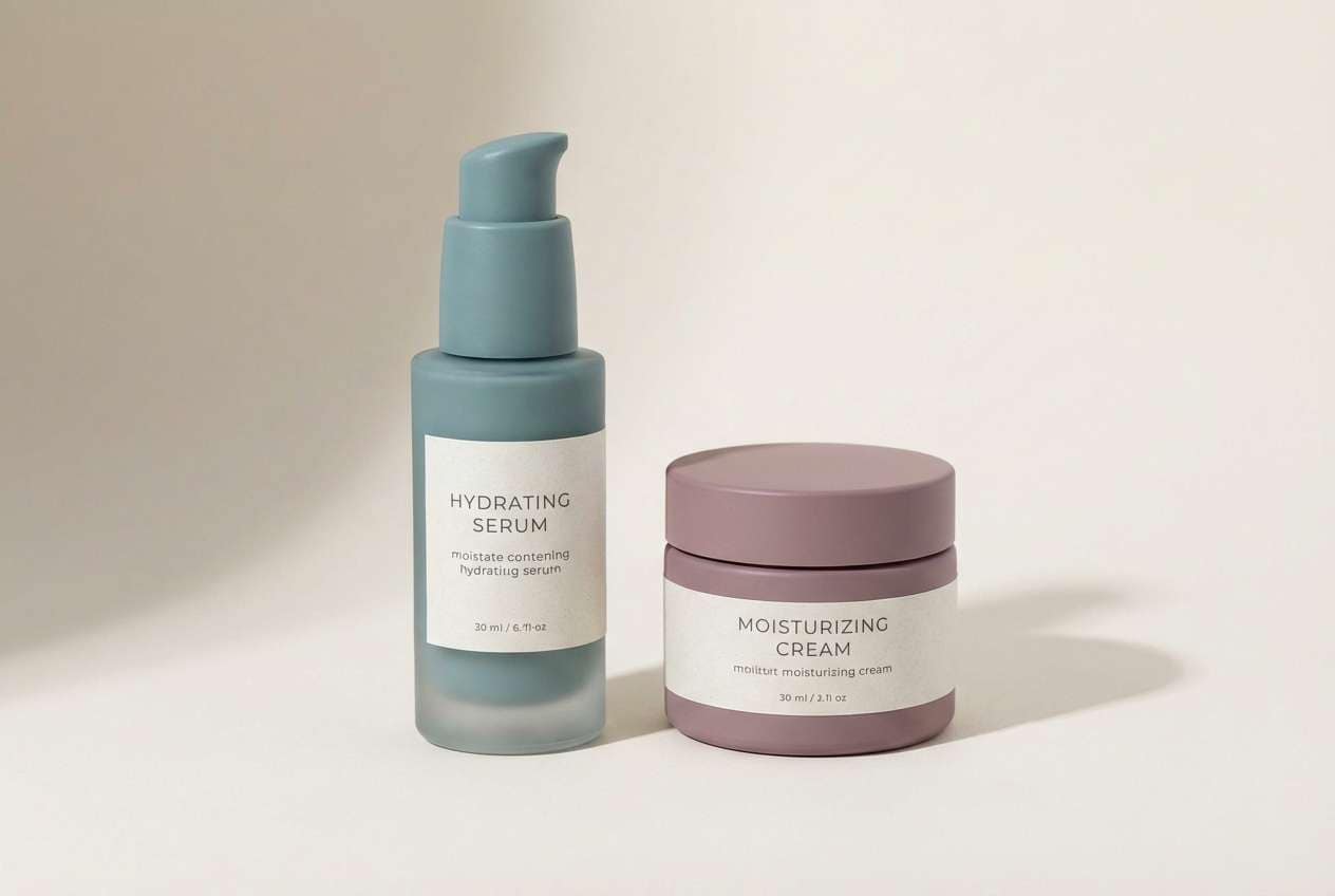
6) Dusty Teal Mauve
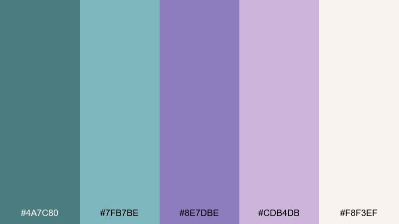
HEX: #4a7c80 #7fb7be #8e7dbe #cdb4db #f8f3ef
Mood: cozy, vintage, gentle
Best for: skincare packaging and calm product labels
Dusty seaside teal and mauve blush feel cozy, vintage, and soothing. These muted tones are great for skincare labels, candle packaging, and small-batch products where you want calm trust. Pair with uncoated paper textures and minimal line icons for a boutique look. Usage tip: use the deeper mauve for the brand mark and keep the light tones as large background fields.
Image example of dusty teal mauve generated using media.io
7) Arctic Iris
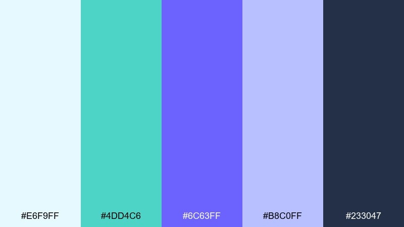
HEX: #e6f9ff #4dd4c6 #6c63ff #b8c0ff #233047
Mood: crisp, optimistic, tech-friendly
Best for: SaaS landing page hero graphics
Crisp arctic light with iris-blue purples creates a clean, optimistic tech tone. It works well for SaaS landing pages, explainer graphics, and onboarding screens that need clarity and a bit of personality. Pair with charcoal text and thin-line icons to keep the layout sharp. Usage tip: make the icy near-white your main canvas, then use teal for primary buttons and purple for secondary links.
Image example of arctic iris generated using media.io
8) Peacock Jewelbox
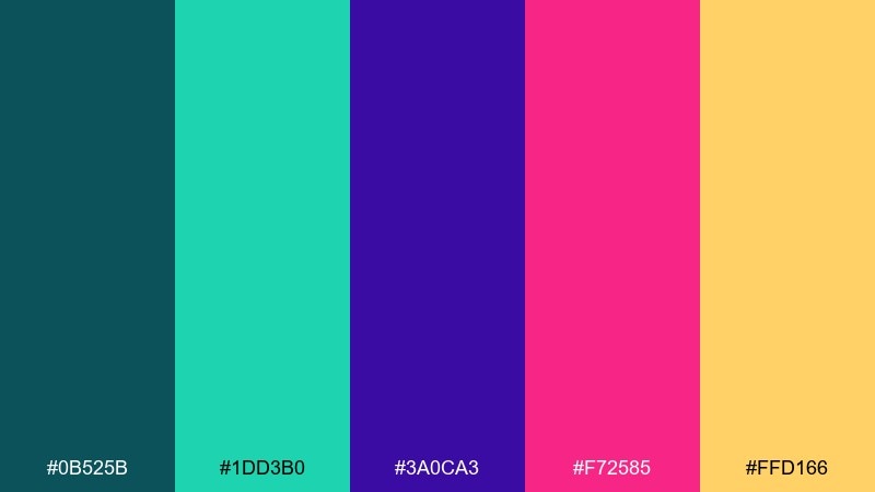
HEX: #0b525b #1dd3b0 #3a0ca3 #f72585 #ffd166
Mood: luxurious, vibrant, expressive
Best for: jewelry promo ads and boutique branding
Jewelbox tones sparkle like peacock feathers under spotlights, feeling luxe and expressive. Use it for boutique branding, jewelry promos, or beauty launches where you want bold elegance. Pair with deep teal backgrounds and let gold act as the premium detail color. Usage tip: keep pink limited to small callouts so it reads as a deliberate pop, not a competing headline color.
Image example of peacock jewelbox generated using media.io
9) Stormy Plum Harbor
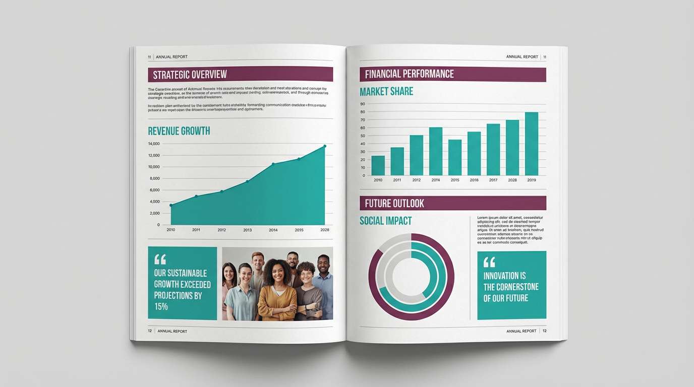
HEX: #264653 #2a9d8f #6a0572 #a4508b #e9ecef
Mood: grounded, artistic, thoughtful
Best for: corporate annual report and brochure layouts
Storm clouds over a plum harbor feel grounded, artistic, and quietly confident. The mix is strong for brochures and reports where you need seriousness without the usual navy-and-gray monotony. Pair with lots of whitespace and use teal for data highlights to guide the eye. Usage tip: keep purple in section headers and pull quotes to create consistent editorial rhythm.
Image example of stormy plum harbor generated using media.io
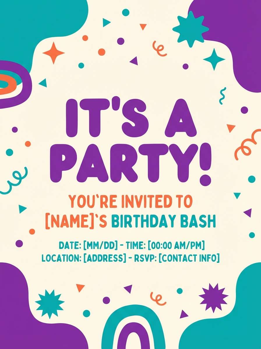
10) Retro Pool Party
HEX: #2ec4b6 #00a8e8 #7b2cbf #ff9f1c #fef9ef
Mood: fun, nostalgic, sunny
Best for: kids birthday flyer and party signage
Sunny pool vibes and retro candy colors feel fun, nostalgic, and welcoming. Use it for kids party flyers, weekend event signage, or playful cafe promos where energy matters more than subtlety. Pair with chunky display fonts and simple shapes to keep it readable from a distance. Usage tip: let orange be the attention grabber, while teal and purple handle the background patterning.
Image example of retro pool party generated using media.io
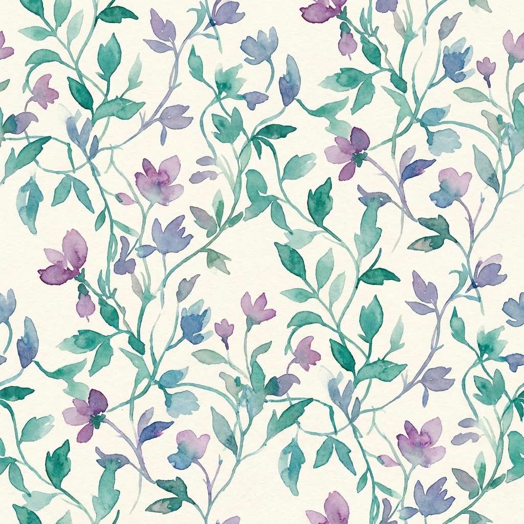
11) Botanical Twilight
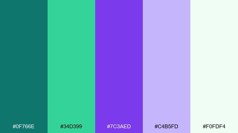
HEX: #0f766e #34d399 #7c3aed #c4b5fd #f0fdf4
Mood: fresh, organic, dreamy
Best for: botanical watercolor patterns and stationery
Fresh leaves at twilight with dreamy violet shadows feels organic and a little magical. These teal purple color combinations are perfect for watercolor patterns, nature-themed stationery, and spring campaign art. Pair with soft cream paper and hand-lettered accents for a crafted look. Usage tip: keep the light lavender as a wash layer and add the deep teal only for focal leaves and stems.
Image example of botanical twilight generated using media.io
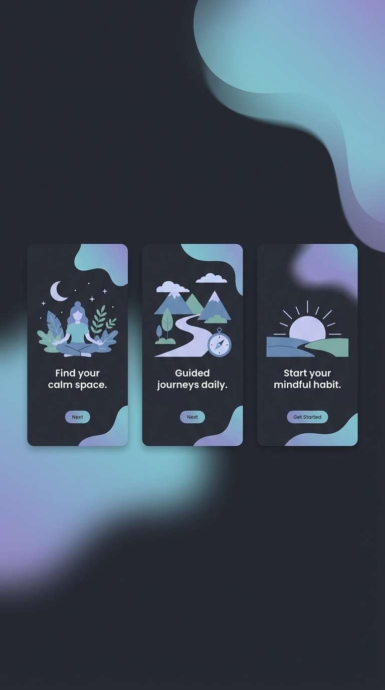
12) Galactic Spa
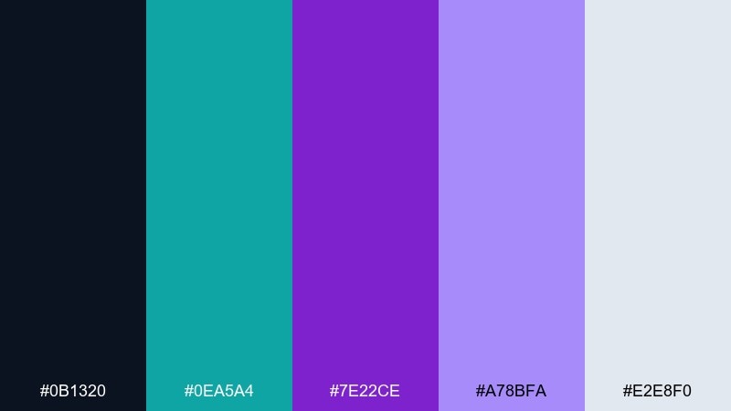
HEX: #0b1320 #0ea5a4 #7e22ce #a78bfa #e2e8f0
Mood: sleek, soothing, futuristic
Best for: meditation app onboarding screens
Sleek galactic darks with soothing neon glow feel futuristic but calming. It fits meditation apps, sleep trackers, and wellness tech where you want night-mode comfort with a premium edge. Pair with soft gray typography and rounded shapes to reduce visual tension. Usage tip: use teal for progress and status, and keep purple for ambient gradients behind cards.
Image example of galactic spa generated using media.io
13) Terracotta Teal Violet
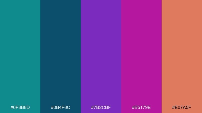
HEX: #0f8b8d #0b4f6c #7b2cbf #b5179e #e07a5f
Mood: bold, creative, worldly
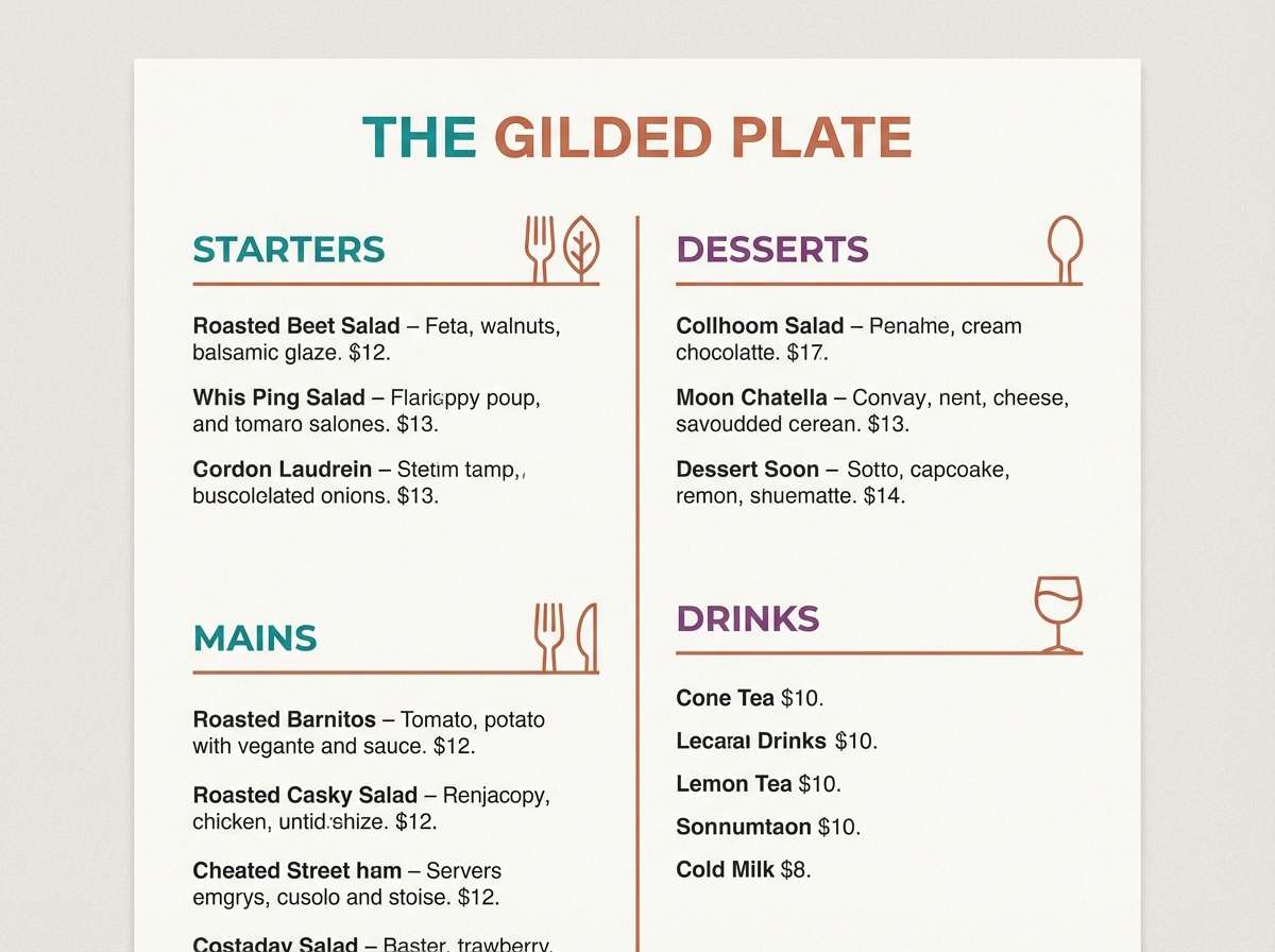
Best for: restaurant menu and cafe brand materials
Bold market colors with a worldly twist feel creative and appetizing. The warm terracotta plays nicely against the cool tones, giving menus and cafe materials a distinctive signature. Pair with off-white stock and simple iconography so the palette feels curated, not busy. Usage tip: use terracotta for price highlights and calls to action, while teal anchors the layout grid.
Image example of terracotta teal violet generated using media.io
14) Coffeehouse Orchid
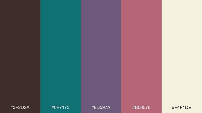
HEX: #3f2d2a #0f7173 #6d597a #b56576 #f4f1de
Mood: warm, intimate, nostalgic
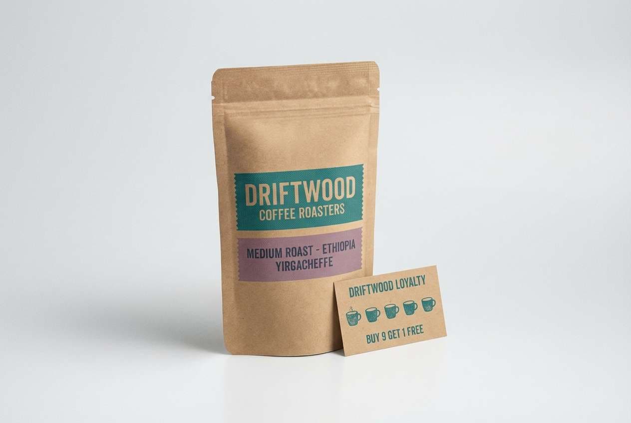
Best for: coffee packaging and loyalty card design
Warm espresso browns with orchid-leaning purples feel intimate and nostalgic. Use it for coffee packaging, loyalty cards, or local roaster branding where you want craft credibility. Pair with kraft textures and minimalist type to keep it grounded. Usage tip: keep the darkest brown for text and borders, and use teal as the small surprise accent on stamps or seals.
Image example of coffeehouse orchid generated using media.io
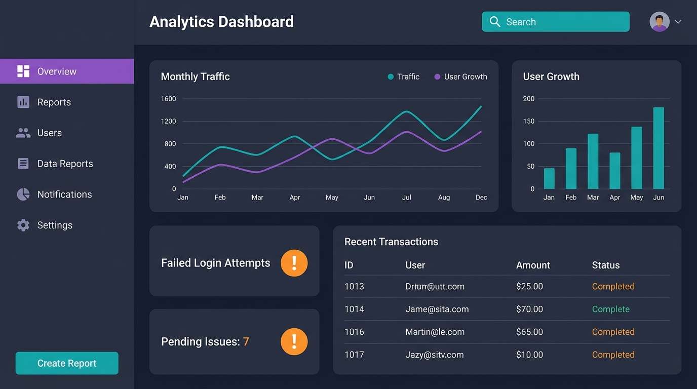
15) Prism UI Dark
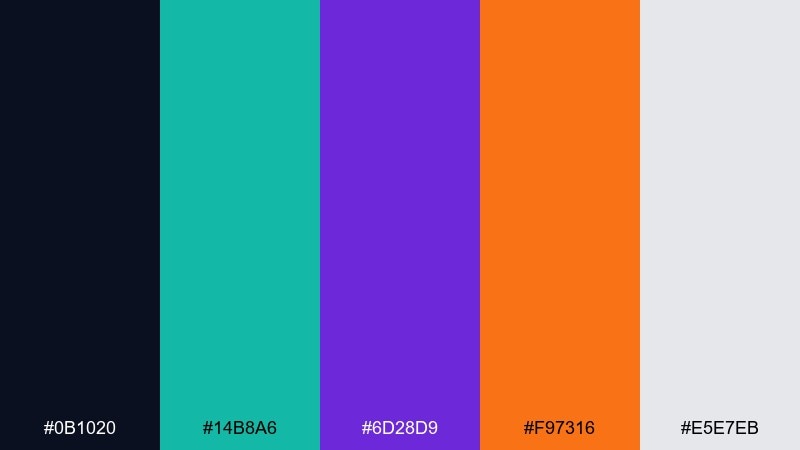
HEX: #0b1020 #14b8a6 #6d28d9 #f97316 #e5e7eb
Mood: sharp, energetic, modern
Best for: analytics dashboard UI with clear status colors
Sharp prism accents on deep space darks feel modern and fast. The contrast is ideal for analytics dashboards where status colors must read instantly without sacrificing style. Pair with neutral grays for tables and use orange only for warnings or spikes. Usage tip: keep teal for primary actions and purple for secondary navigation so users learn the interface rhythm quickly.
Image example of prism ui dark generated using media.io
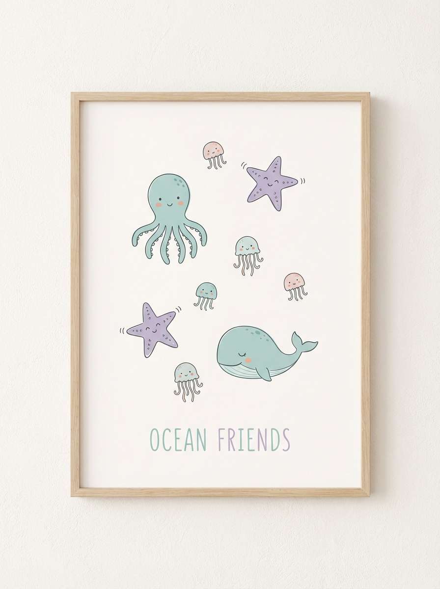
16) Soft Nursery Mermaid
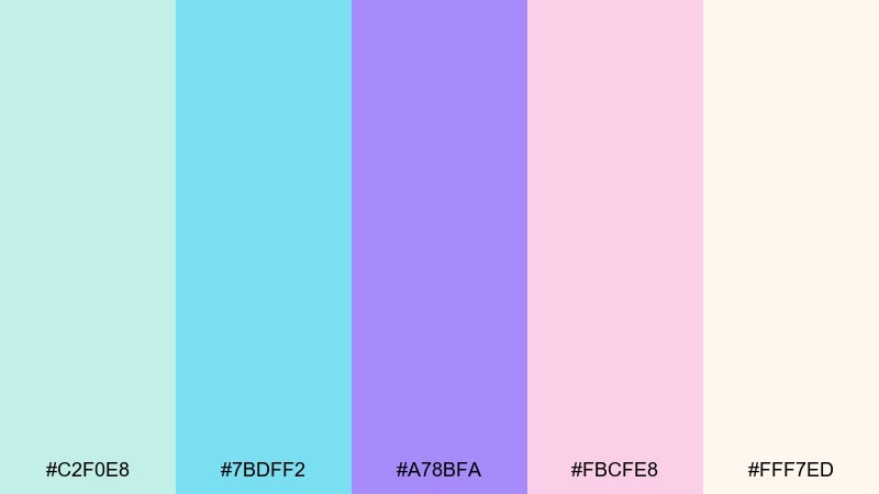
HEX: #c2f0e8 #7bdff2 #a78bfa #fbcfe8 #fff7ed
Mood: sweet, gentle, dreamy
Best for: nursery wall art and baby shower signage
Dreamy mermaid pastels feel sweet, gentle, and reassuring. These tones work well for nursery wall art, baby shower signage, and keepsake prints where softness is the whole point. Pair with warm whites and rounded illustration styles to keep it friendly. Usage tip: use the deeper lavender only for names and key details so the design stays light.
Image example of soft nursery mermaid generated using media.io
17) Editorial Aubergine Teal
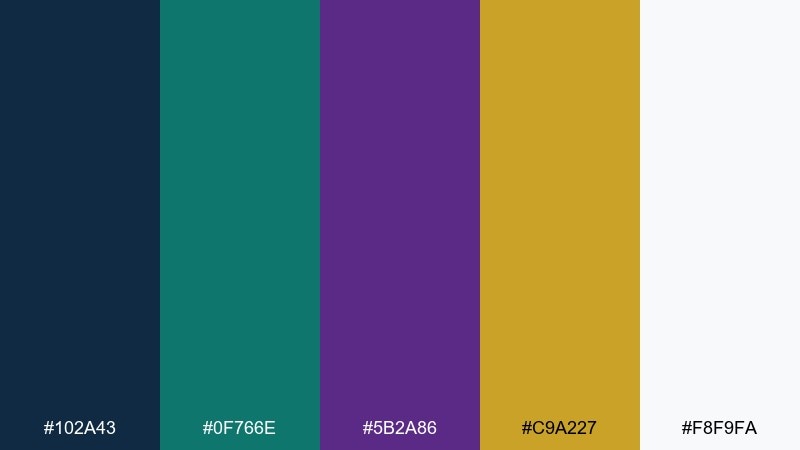
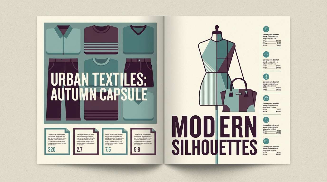
HEX: #102a43 #0f766e #5b2a86 #c9a227 #f8f9fa
Mood: refined, bold, editorial
Best for: fashion lookbook and magazine spreads
Refined aubergine and deep teal feel like an editorial night shoot with crisp styling. Great for lookbooks and magazine spreads where strong contrast helps photography and headlines pop. Pair with generous margins and a classic serif for an upscale cadence. Usage tip: use the gold tone only for small rules and page numbers to keep it premium, not flashy.
Image example of editorial aubergine teal generated using media.io
18) Winter Evergreen Lavender
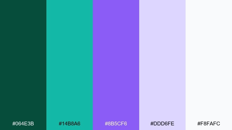
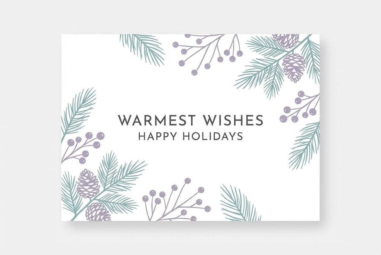
HEX: #064e3b #14b8a6 #8b5cf6 #ddd6fe #f8fafc
Mood: crisp, festive, serene
Best for: holiday greeting cards and winter event invites
Crisp evergreen and lavender frost feel serene, festive, and modern. Use it for winter greeting cards, charity invites, or seasonal email headers that need freshness without the usual red-and-green. Pair with snowy whites and subtle grain for a cozy print finish. Usage tip: keep the darkest green for typography and use lavender as a soft border or envelope liner color.
Image example of winter evergreen lavender generated using media.io
19) Sunset Boulevard Teal
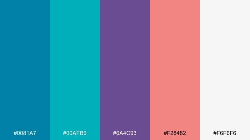
HEX: #0081a7 #00afb9 #6a4c93 #f28482 #f6f6f6
Mood: bright, friendly, contemporary
Best for: lifestyle brand social templates and ads
Bright boulevard teal with a sunset blush feels friendly and contemporary. It suits lifestyle brand social templates, creator merch, and upbeat campaign ads where you want approachability with a stylish twist. Pair with clean white space and bold sans type for a modern, scroll-stopping layout. Usage tip: let teal carry most shapes and frames, then use blush only for one focal sticker or badge.
Image example of sunset boulevard teal generated using media.io
20) Minimal Teal Lilac Gray
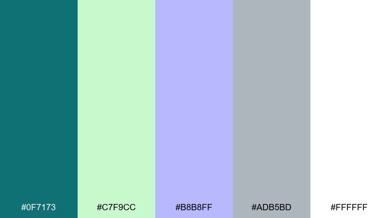
HEX: #0f7173 #c7f9cc #b8b8ff #adb5bd #ffffff
Mood: minimal, clean, approachable
Best for: presentation slide templates and simple web sections
Clean lilac and teal with gentle grays feels minimal and approachable. It works well for slide decks, portfolio pages, and simple web sections where content needs to lead. Pair with plenty of whitespace and consistent icon stroke weights for a cohesive look. Usage tip: keep lilac as a background panel color and use teal strictly for links and emphasis.
Image example of minimal teal lilac gray generated using media.io
What Colors Go Well with Teal Purple?
Clean neutrals are the easiest win: white, warm off-white, light gray, and charcoal help teal and purple feel intentional rather than overwhelming. If you want a softer look, try creamy beige instead of bright white.
Warm accents add bite and contrast. Coral, terracotta, orange, and gold can make a teal and purple palette feel more human and “designed,” especially in packaging, posters, and social creatives.
For deeper, premium systems, add near-black navy tones and cool grays for structure. This keeps the palette usable in UI (cards, borders, dividers) while teal and purple stay reserved for interactive or brand moments.
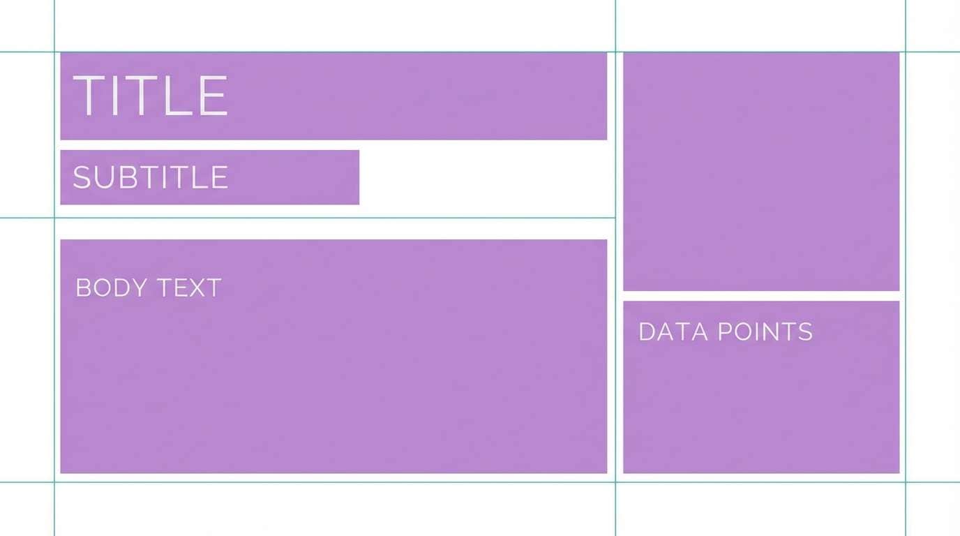
How to Use a Teal Purple Color Palette in Real Designs
Assign roles first: pick one neutral as your main background, one dark tone for text, and then choose teal or purple as the primary brand/action color. Use the other hue as a secondary accent so the hierarchy stays predictable.
Control saturation to manage professionalism. Muted teal and dusty purples work well for skincare, stationery, and editorial layouts, while brighter teals and vivid violets suit entertainment promos and bold tech.
Keep contrast in mind for readability, especially in UI. Use light neutrals behind body text, and reserve the richest purples for headings, badges, and small highlights where they won’t reduce legibility.
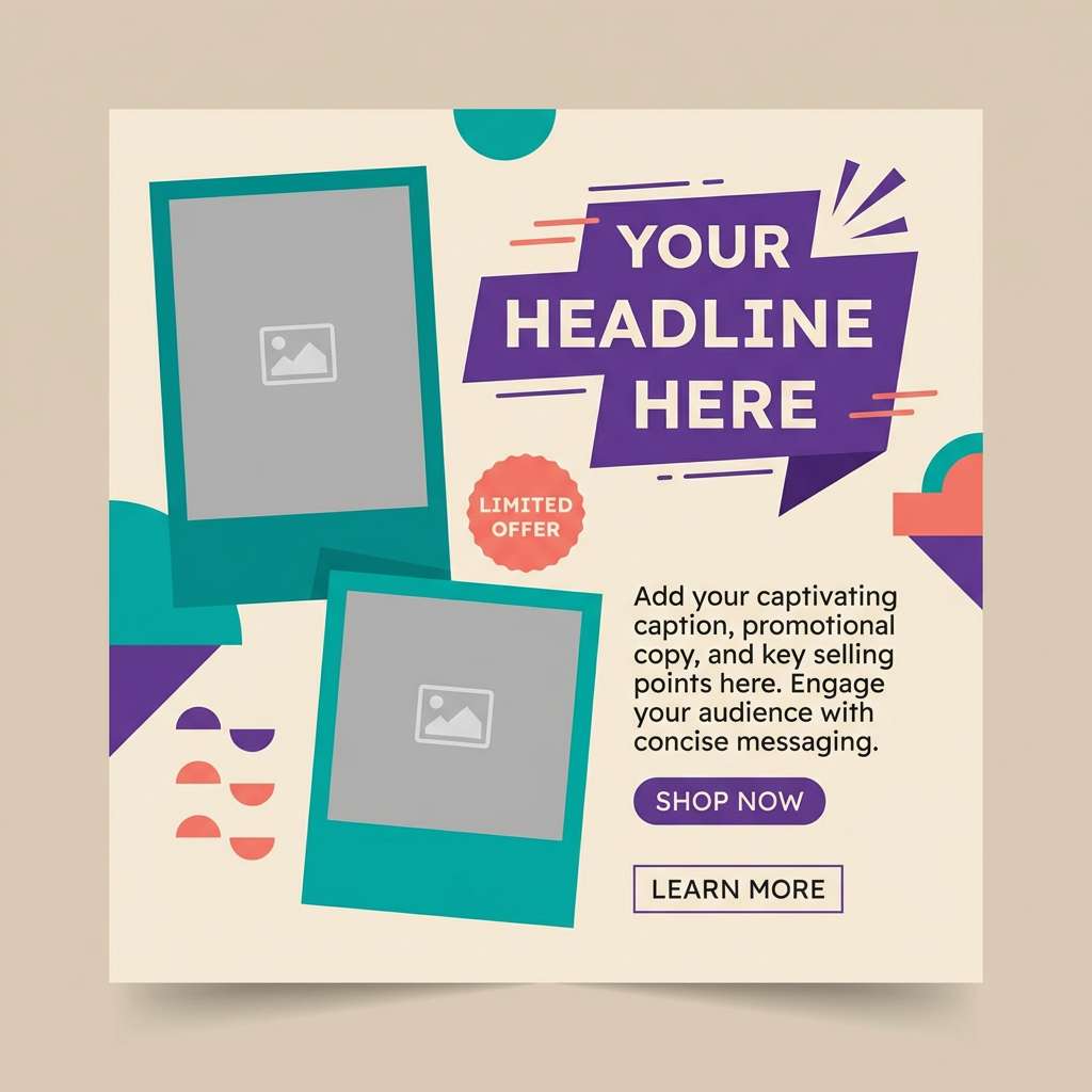
Create Teal Purple Palette Visuals with AI
If you already have HEX codes, you can quickly turn them into moodboards, posters, UI mockups, and product scenes by describing the layout and style—then letting AI generate clean visuals around your palette.
To keep results consistent, mention “color swatches,” your design type (brand board, dashboard, invitation, etc.), and a plain background. Add lighting notes (soft daylight, studio shadows) when you want a polished, realistic look.
When you find a style you like, reuse the same prompt structure and swap only the palette names or scene details. This helps you build a cohesive set of teal purple assets across channels.
Teal Purple Color Palette FAQs
-
What does a teal and purple color palette communicate?
Teal tends to signal clarity, balance, and trust, while purple suggests creativity and depth. Together, a teal purple palette can feel modern and premium without becoming too aggressive. -
Is teal and purple a good combination for branding?
Yes—especially for wellness, tech, beauty, and boutique brands. Use a neutral-heavy base and assign one hue (often teal) as the primary brand/action color, with purple as a supporting accent. -
Which teal purple hex codes are best for dark mode UI?
Use a near-black base (e.g., #041f2e or #0b1020), a bright teal for primary actions (e.g., #14b8a6 or #0ea5a4), and a saturated purple for secondary emphasis (e.g., #6d28d9 or #7209b7) with near-white text. -
How do I keep contrast readable with teal and purple?
Put body text on light neutrals (off-white, light gray) or use near-white text on very dark backgrounds. Reserve mid-tone purples and teals for buttons, labels, icons, and headings where contrast is controlled. -
What accent colors pair well with teal and purple?
Gold, coral, terracotta, and orange add warm contrast and make the palette feel more dimensional. If you prefer minimal looks, stick to grays, white, and charcoal as supporting tones. -
Are teal purple color combinations good for print design?
They can be excellent in print, especially with warm off-whites and slightly muted tones for a refined finish. For best results, avoid over-saturating large areas and keep one strong accent for focal elements. -
How can I generate teal purple palette mockups quickly?
Use an AI text-to-image tool and describe the design type (brand board, invitation set, dashboard) plus “teal and purple color swatches” and a clean background. Reusing the same prompt template helps keep visuals consistent across a campaign.
Next: White Red Color Palette


