

Pink magenta is one of those rare colors that can feel playful, luxurious, futuristic, or romantic—depending on what you pair it with.
Below are curated pink magenta color palette ideas with HEX codes, plus practical tips for using them in branding, UI, posters, and packaging.
In this article
- Why Pink Magenta Palettes Work So Well
-
- neon orchid pop
- rose quartz silk
- berry sorbet minimal
- sunset bougainvillea
- raspberry mocha
- petal punch pastels
- midnight fuchsia glow
- vintage peony paper
- glam lipstick gold
- cyber magenta gradient
- blush concrete
- spring blossom wash
- berry jam pantry
- magenta denim street
- sakura night market
- soft lilac spa
- hot pink espresso
- magenta ocean breeze
- theater curtain rouge
- rosewood velvet
- What Colors Go Well with Pink Magenta?
- How to Use a Pink Magenta Color Palette in Real Designs
- Create Pink Magenta Palette Visuals with AI
Why Pink Magenta Palettes Work So Well
Pink magenta sits in a high-energy zone between pink and purple, so it naturally draws attention. That makes it ideal for brand moments that need instant recognition—CTAs, hero headlines, product badges, or event titles.
It’s also surprisingly versatile: it can read soft and romantic when blended with creams, blushes, and warm browns, or feel techy and electric when paired with deep inks, violets, and neon accents.
Most importantly, pink magenta plays well with strong contrast systems. When you anchor it with near-black, navy, or charcoal, you get bold visual hierarchy without relying on heavy layouts or excessive decoration.
20+ Pink Magenta Color Palette Ideas (with HEX Codes)
1) Neon Orchid Pop
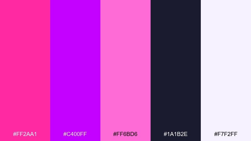
HEX: #FF2AA1 #C400FF #FF6BD6 #1A1B2E #F7F2FF
Mood: electric, bold, nightlife
Best for: beauty product ad and cosmetics launch key visual
Electric and club-ready, these neon orchid tones feel like blacklight posters and glossy lipstick shine. Use the deep midnight navy as your base so the hot pinks stay readable and premium. Pair with clean white for negative space, and keep gradients subtle to avoid banding in print. Tip: reserve the brightest magenta for one hero element like the product name or call-to-action.
Image example of neon orchid pop generated using media.io
Media.io is an online AI studio for creating and editing video, image, and audio in your browser.

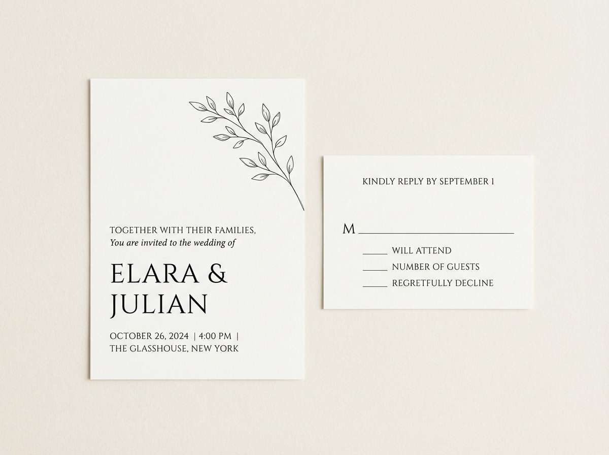
2) Rose Quartz Silk
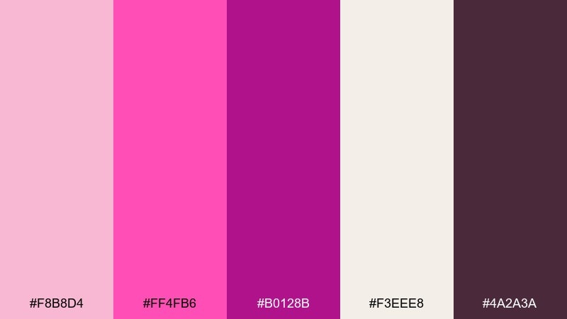
HEX: #F8B8D4 #FF4FB6 #B0128B #F3EEE8 #4A2A3A
Mood: romantic, soft, elegant
Best for: wedding invitation suite and RSVP cards
Romantic and airy, it evokes blush petals, satin ribbons, and candlelit toasts. This pink magenta color palette works best when the dusty cream carries most of the page, letting the deeper berry act as a refined accent. Pair with warm brown text for legibility and a more timeless feel than pure black. Tip: use the mid magenta for headings and keep body copy in the cocoa tone.
Image example of rose quartz silk generated using media.io
3) Berry Sorbet Minimal
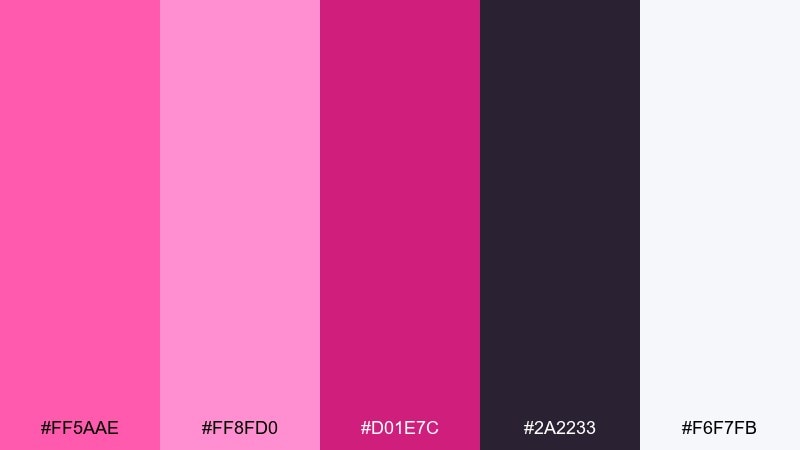
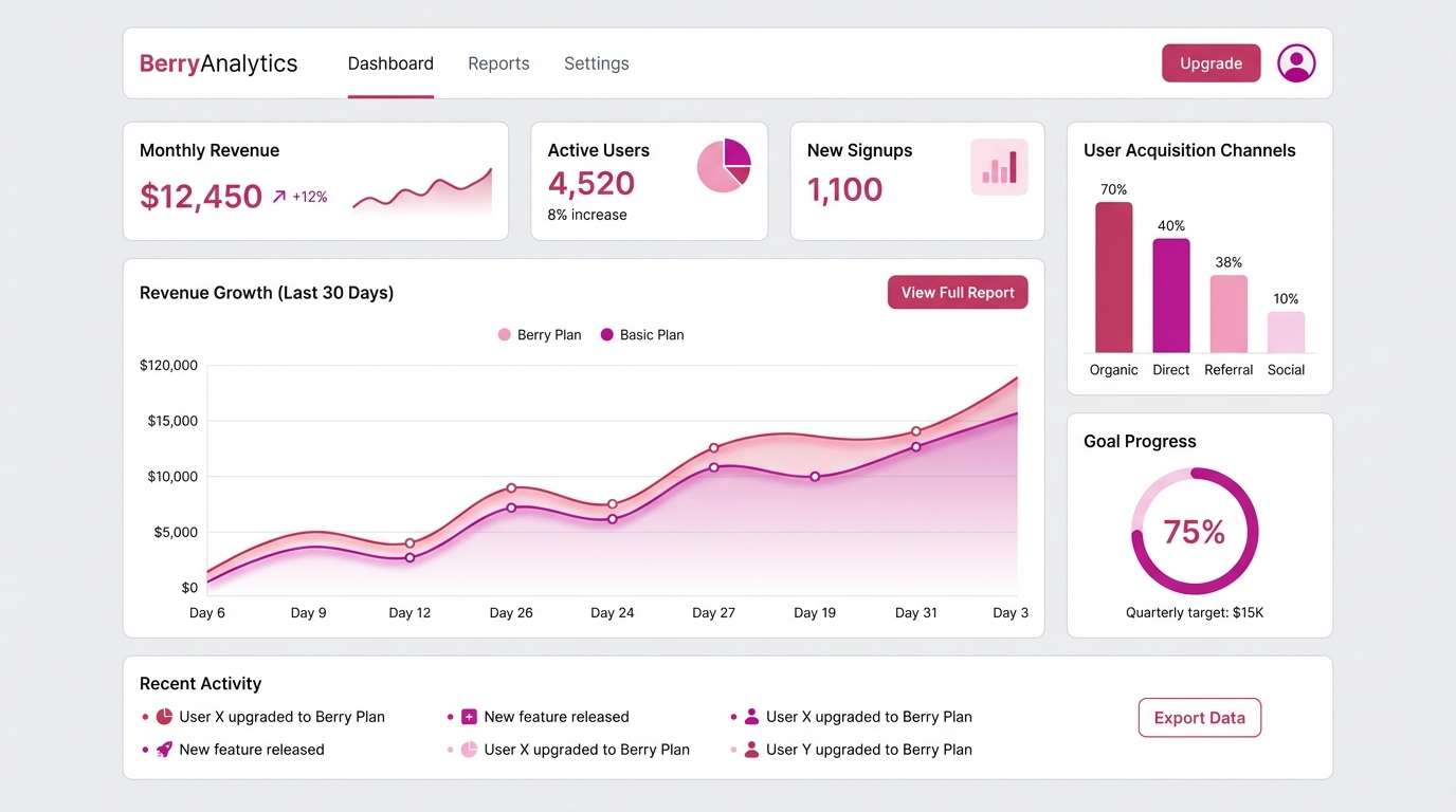
HEX: #FF5AAE #FF8FD0 #D01E7C #2A2233 #F6F7FB
Mood: fresh, modern, clean
Best for: saas dashboard UI and mobile web components
Fresh and minimal, it feels like berry sorbet against a cool porcelain plate. Use the near-white background to keep interfaces calm, then introduce the vivid berry for highlights and active states. Pair the charcoal-purple with labels and icons to avoid harsh contrast. Tip: keep saturation high only on primary buttons and use the softer pink for hover and focus states.
Image example of berry sorbet minimal generated using media.io
4) Sunset Bougainvillea
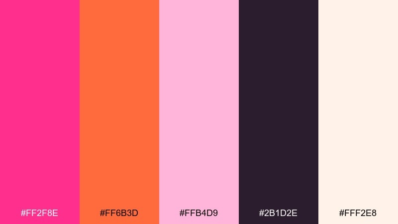
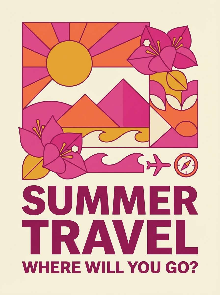
HEX: #FF2F8E #FF6B3D #FFB4D9 #2B1D2E #FFF2E8
Mood: warm, tropical, energetic
Best for: summer travel poster and event promo artwork
Warm and tropical, it brings to mind bougainvillea blooms and late-sunset skies. Let the peachy orange support the magenta so the design feels sunlit rather than overly neon. Pair with a dark plum for type and silhouettes, especially on posters viewed from a distance. Tip: use the pale blush as a buffer between bright blocks to keep layouts breathable.
Image example of sunset bougainvillea generated using media.io
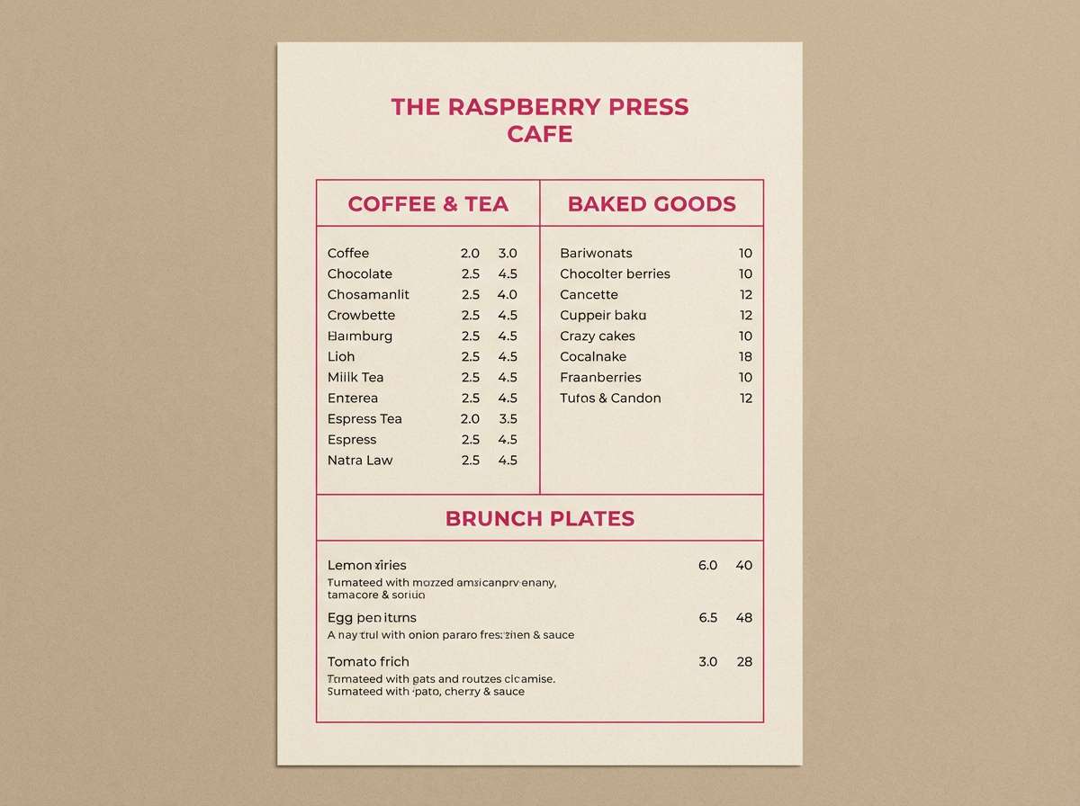
5) Raspberry Mocha
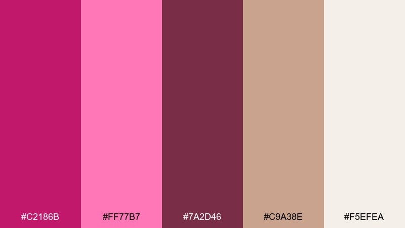
HEX: #C2186B #FF77B7 #7A2D46 #C9A38E #F5EFEA
Mood: cozy, artisanal, inviting
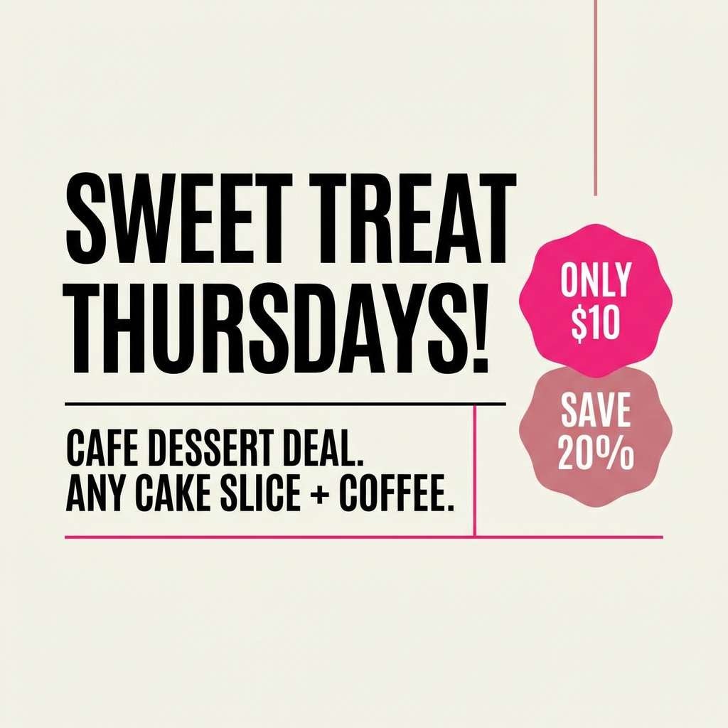
Best for: cafe menu design and small-batch brand identity
Cozy and artisanal, it suggests raspberry jam on toasted brioche and a warm mocha finish. Balance the rich magenta with creamy beige backgrounds for menus and labels that feel handmade but polished. Pair the cocoa brown with the dusty tan for typography and secondary panels. Tip: keep the brighter pink for flavor badges, specials, and small icons rather than large fields.
Image example of raspberry mocha generated using media.io
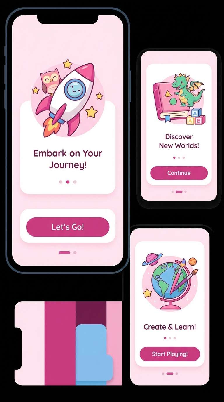
6) Petal Punch Pastels
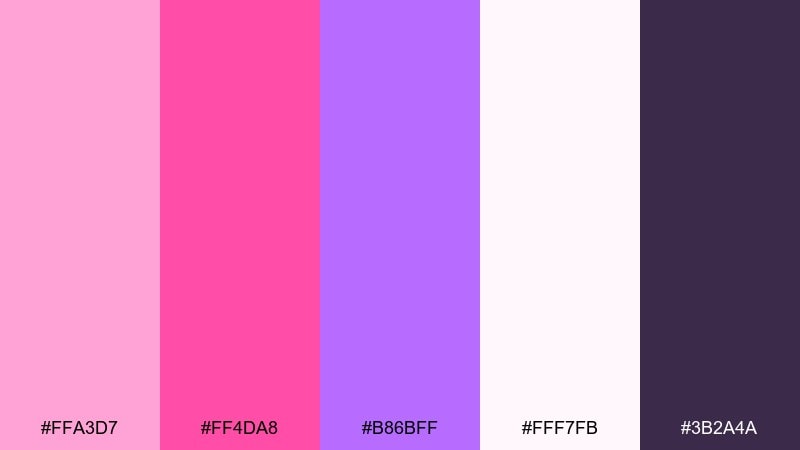
HEX: #FFA3D7 #FF4DA8 #B86BFF #FFF7FB #3B2A4A
Mood: playful, sweet, upbeat
Best for: kids app UI and friendly onboarding screens
Playful and sweet, it feels like confetti sprinkles and cotton-candy clouds. Use the ultra-light blush as the primary canvas, then sprinkle the brighter pink for progress, badges, and fun illustrations. Pair the deep violet with text and icons to keep accessibility strong. Tip: limit the purple to one supporting role such as secondary buttons or section headers.
Image example of petal punch pastels generated using media.io
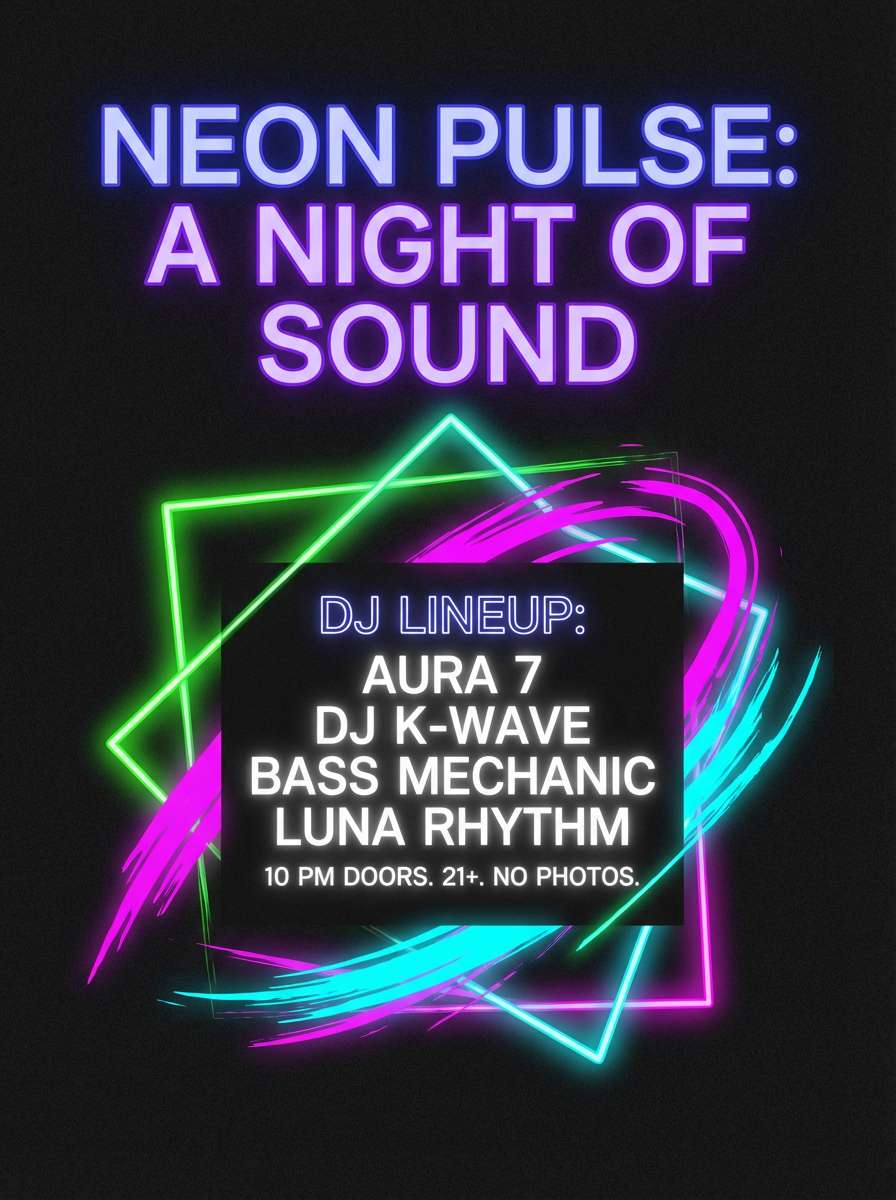
7) Midnight Fuchsia Glow
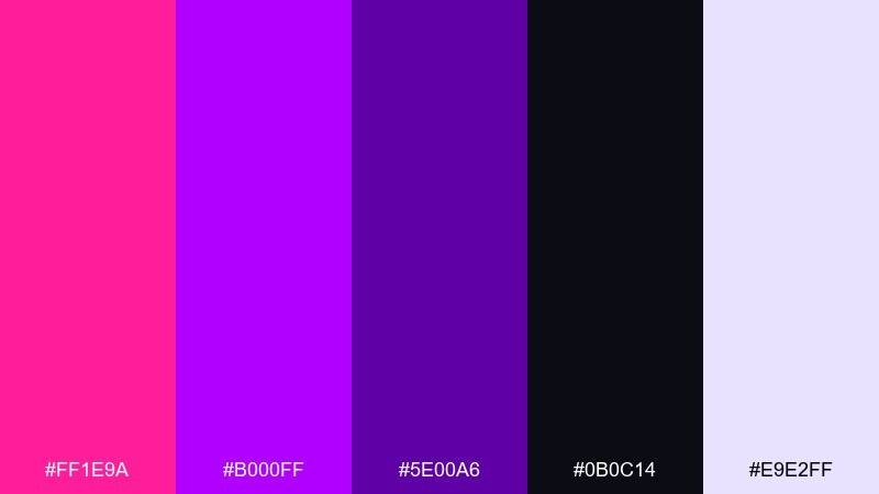
HEX: #FF1E9A #B000FF #5E00A6 #0B0C14 #E9E2FF
Mood: dramatic, futuristic, high-contrast
Best for: nightlife event poster and DJ lineup graphics
Dramatic and futuristic, it reads like neon signage cutting through a dark street. A pink magenta color palette like this thrives on contrast, so keep large areas nearly black and let the fuchsia glow do the talking. Pair the pale lavender as a soft highlight for dates and secondary details. Tip: add subtle grain to gradients for a more cinematic print finish.
Image example of midnight fuchsia glow generated using media.io
8) Vintage Peony Paper
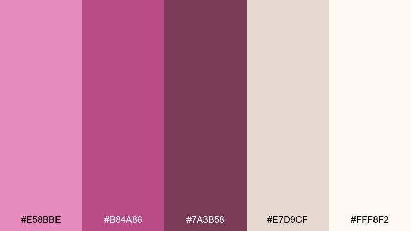
HEX: #E58BBE #B84A86 #7A3B58 #E7D9CF #FFF8F2
Mood: vintage, tender, nostalgic
Best for: stationery, thank-you cards, and journal covers
Vintage and tender, it evokes pressed peonies tucked into an old book. The warm paper neutrals make the pinks feel softer and less trendy, ideal for stationery and keepsake prints. Pair the muted wine tone with small ornamental lines for a classic finish. Tip: use uncoated textures and avoid pure white to keep the palette authentic.
Image example of vintage peony paper generated using media.io

9) Glam Lipstick Gold
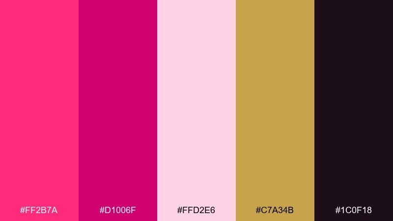
HEX: #FF2B7A #D1006F #FFD2E6 #C7A34B #1C0F18
Mood: glamorous, luxe, confident
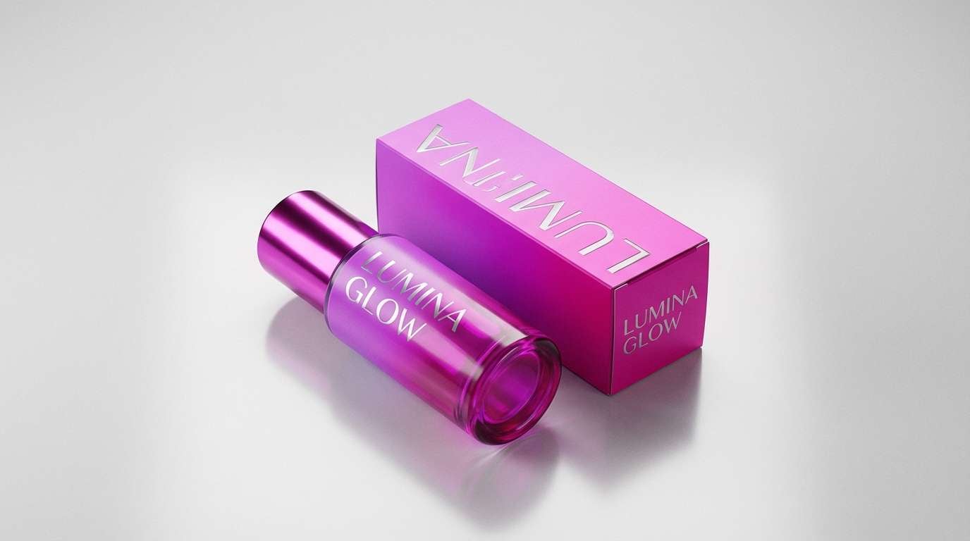
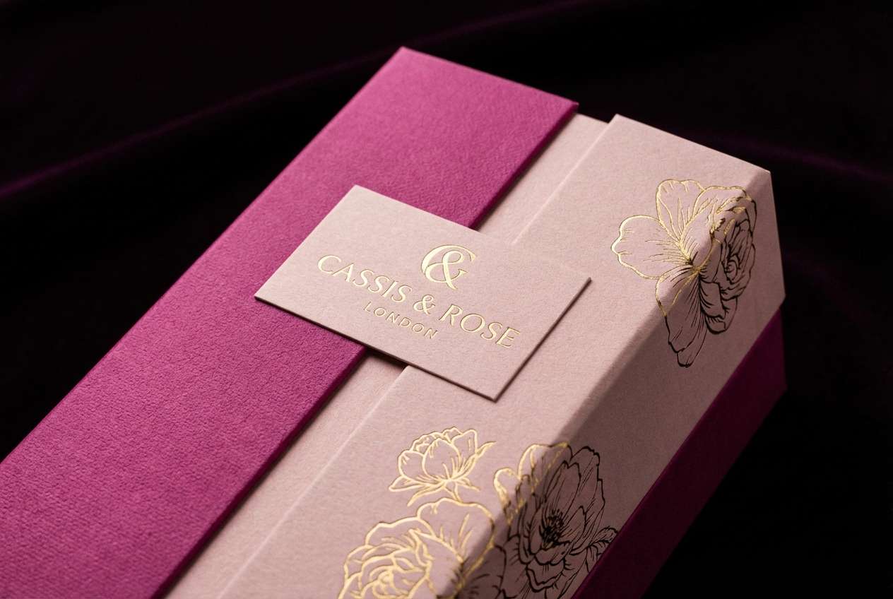
Best for: perfume packaging and premium gift boxes
Glamorous and confident, it channels lipstick lacquer with a flash of gold jewelry. Use the near-black as the anchor so the metallic accent feels intentional and high-end. Pair the soft blush for background panels or label space to keep typography crisp. Tip: keep gold to thin borders, seals, or a single monogram for a luxury cue without looking busy.
Image example of glam lipstick gold generated using media.io
10) Cyber Magenta Gradient
HEX: #FF00A8 #8A00FF #00D7FF #121026 #F3F0FF
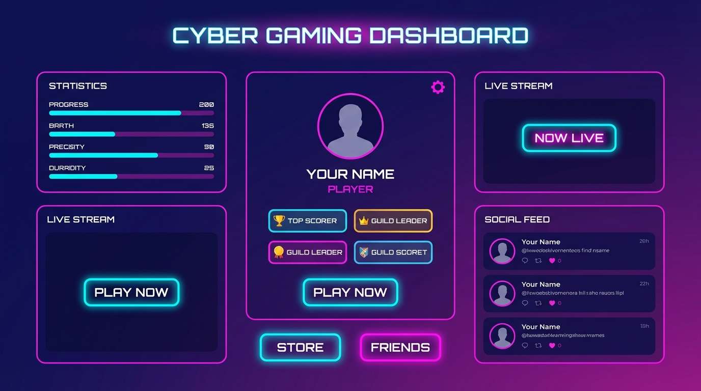
Mood: techy, vibrant, energetic
Best for: gaming UI and streaming overlay panels
Techy and vibrant, it feels like LED strips and synthwave gradients. Pink magenta color combinations shine here when you contrast them with cool cyan and a deep ink base. Use the pale violet for card backgrounds so neon accents stay readable and clean. Tip: apply the cyan sparingly as a status indicator or focus ring to guide attention.
Image example of cyber magenta gradient generated using media.io
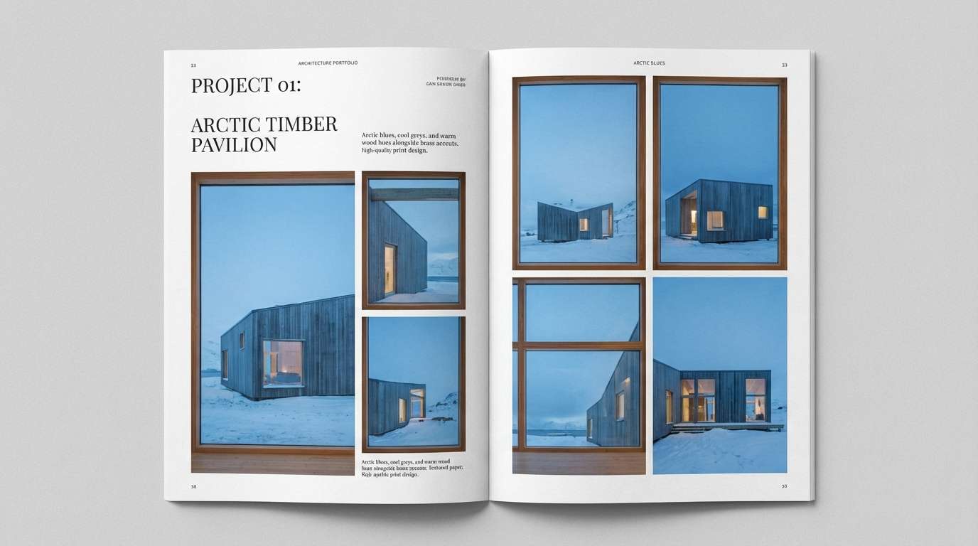
11) Blush Concrete
HEX: #FF6FB1 #D83D8D #7B6F7A #E6E4E7 #2A232B
Mood: urban, muted, sophisticated
Best for: interior mood boards and architecture portfolio pages
Urban and muted, it brings the feel of blush paint against raw concrete. Let the grays do most of the work, then use the magenta tones as precise highlights for callouts and section dividers. Pair the near-black with the mid gray for typographic hierarchy. Tip: keep photos slightly desaturated so the pink accents stay intentional rather than loud.
Image example of blush concrete generated using media.io
12) Spring Blossom Wash
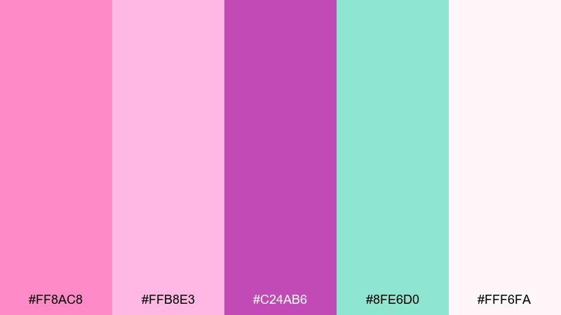
HEX: #FF8AC8 #FFB8E3 #C24AB6 #8FE6D0 #FFF6FA
Mood: airy, floral, optimistic
Best for: botanical illustrations and spring campaign visuals
Airy and floral, it feels like watercolor blossoms drifting across a soft morning sky. Use the minty aqua as a refreshing counterbalance when the pinks start to feel too sweet. Pair the clean off-white as your paper tone for posters and social graphics. Tip: keep edges soft and layered to match the watercolor vibe.
Image example of spring blossom wash generated using media.io
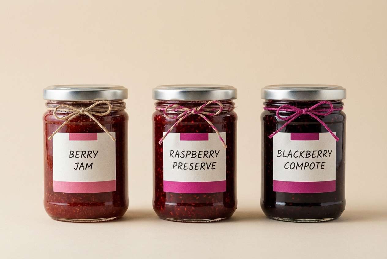
13) Berry Jam Pantry
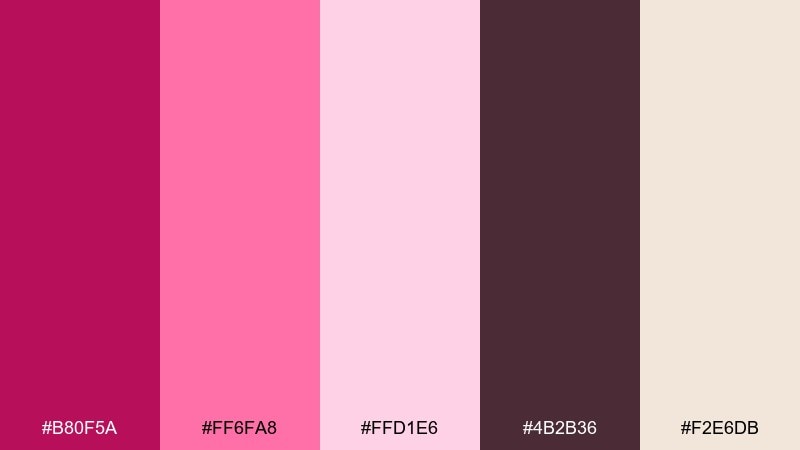
HEX: #B80F5A #FF6FA8 #FFD1E6 #4B2B36 #F2E6DB
Mood: homey, sweet, handcrafted
Best for: jam label design and pantry product packaging
Homey and sweet, it recalls simmering berries and handwritten labels in a sunny kitchen. The cream and cocoa tones create an artisanal base while the magenta adds freshness and flavor cues. Pair the darker berry for product names and the lighter pink for flavor variants. Tip: add a single illustrated fruit icon in the bright pink to make the label pop on shelves.
Image example of berry jam pantry generated using media.io
14) Magenta Denim Street
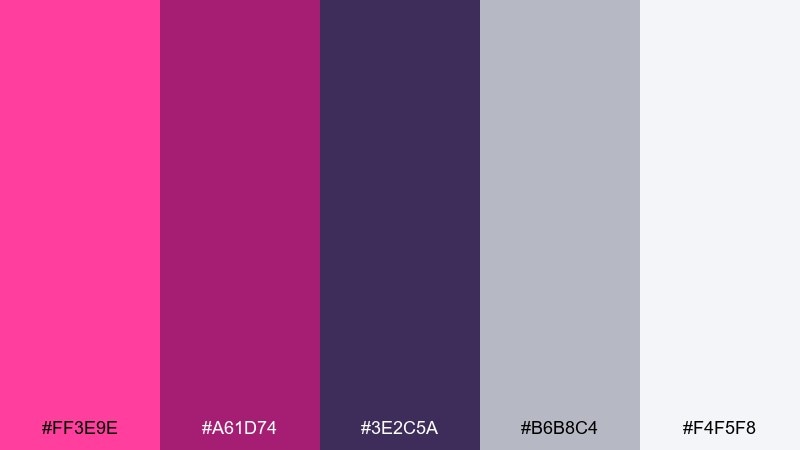
HEX: #FF3E9E #A61D74 #3E2C5A #B6B8C4 #F4F5F8
Mood: street, cool, modern
Best for: fashion lookbook layouts and social carousel design
Street-cool and modern, it feels like a magenta accent stitched into indigo denim. Use the inky violet as the main frame color for lookbooks, then punch up headings with the brighter pink. Pair the light grays for negative space and image borders that keep pages editorial. Tip: restrict the hot pink to one consistent placement, like page numbers or section titles, for a cohesive system.
Image example of magenta denim street generated using media.io
15) Sakura Night Market
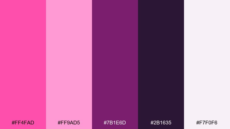
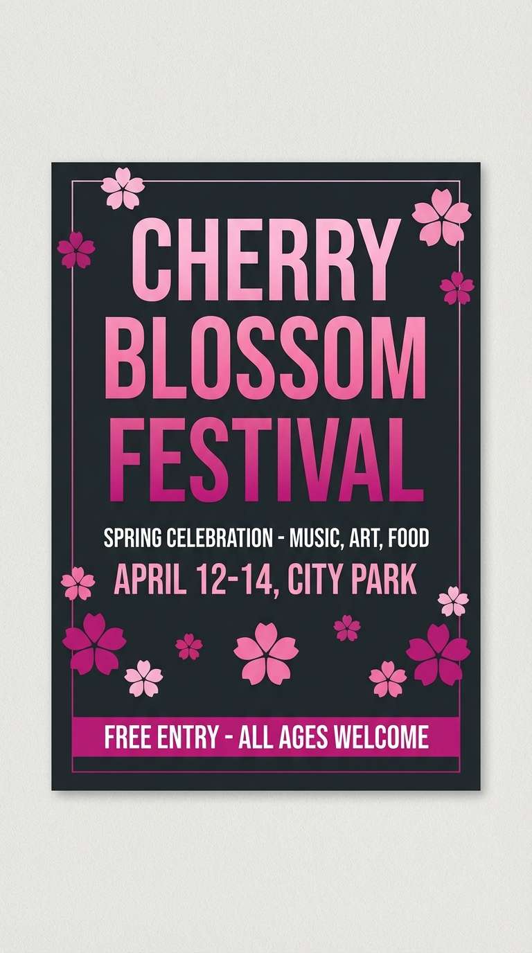
HEX: #FF4FAD #FF9AD5 #7B1E6D #2B1635 #F7F0F6
Mood: lively, dreamy, cultural
Best for: festival flyer and night market event promo
Lively and dreamy, it brings cherry blossoms into a neon-lit night market. A pink magenta color combination like this works when you let the deep plum carry the background and typography. Pair the pale blush with small pattern fills to add texture without noise. Tip: keep the brightest pink for dates and ticket callouts so the hierarchy stays clear.
Image example of sakura night market generated using media.io
16) Soft Lilac Spa
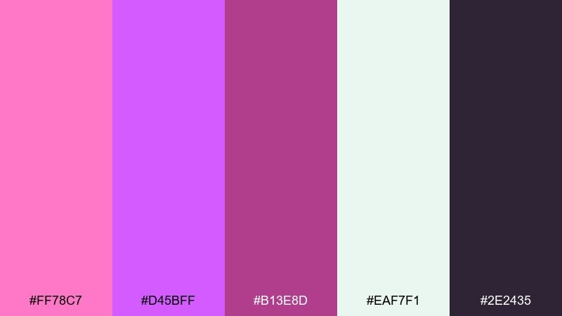
HEX: #FF78C7 #D45BFF #B13E8D #EAF7F1 #2E2435
Mood: calm, soothing, contemporary
Best for: wellness branding and skincare landing pages
Calm and soothing, it suggests aromatherapy mist and soft towels under gentle lighting. Use the minty off-white as your main background to keep the design breathable and clean. Pair the lilac with magenta for subtle gradients in headers and hero sections, then ground everything with the deep charcoal for text. Tip: keep buttons in the medium magenta and reserve lilac for supportive highlights.
Image example of soft lilac spa generated using media.io
17) Hot Pink Espresso
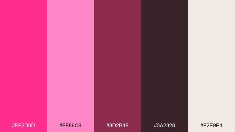
HEX: #FF2D8D #FF86C6 #8D2B4F #3A2328 #F2E9E4
Mood: punchy, trendy, cozy
Best for: social media ad creatives for cafes and dessert brands
Punchy and cozy, it feels like a hot pink sign glowing through a cafe window. Use the creamy neutral for backgrounds and the espresso browns for type to keep ads readable on small screens. Pair the bright pink with the softer rose for layered badges and sticker-like shapes. Tip: keep the darkest brown for prices and offers so the message stays instantly scannable.
Image example of hot pink espresso generated using media.io
18) Magenta Ocean Breeze
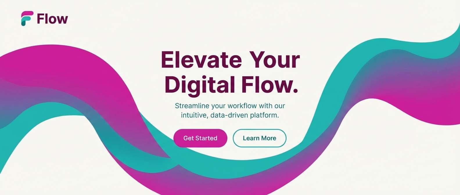
HEX: #FF52B1 #C81D8A #35D2D0 #0E2A3A #F0FBFF
Mood: refreshing, coastal, modern
Best for: app landing hero and marketing web banners
Refreshing and modern, it mixes bright blooms with an ocean breeze edge. Let the airy blue-white create space, then use teal as the cool counterpoint to magenta accents. Pair the deep navy for headings to maintain contrast across wide banners. Tip: use teal for secondary actions so primary buttons can stay confidently pink.
Image example of magenta ocean breeze generated using media.io
19) Theater Curtain Rouge
HEX: #FF3C9D #B0136A #5B1747 #121018 #F4E8F2
Mood: dramatic, theatrical, rich
Best for: stage show poster and performance ticket design
Dramatic and rich, it evokes velvet curtains, spotlights, and a hush before the opening act. Pink magenta color combinations feel especially striking when you set them against near-black and deepen them with wine tones. Pair the pale blush for ticket info panels or sponsor lines so small text stays readable. Tip: keep one high-saturation pink element as the focal point, like the show title, and let everything else support it.
Image example of theater curtain rouge generated using media.io
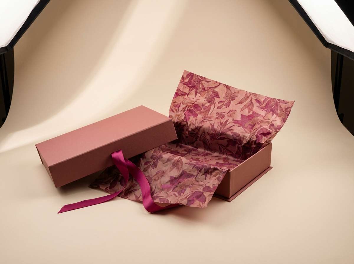
20) Rosewood Velvet
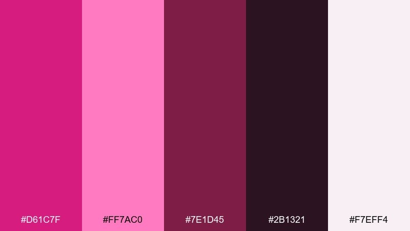
HEX: #D61C7F #FF7AC0 #7E1D45 #2B1321 #F7EFF4
Mood: luxury, intimate, refined
Best for: luxury brand identity and boutique packaging
Luxury and intimate, it feels like rosewood lacquer and soft velvet in a dim boutique. Use the deep burgundy-black as your signature base, then introduce the brighter pink as a controlled accent for logos and seals. Pair the powdery blush as a premium paper tone for tags and inserts. Tip: keep line weights thin and spacing generous so the palette reads upscale rather than loud.
Image example of rosewood velvet generated using media.io
What Colors Go Well with Pink Magenta?
Neutrals are the fastest way to make pink magenta look intentional. Try warm creams, beige paper tones, cocoa browns, or cool light grays when you want the magenta to feel premium rather than overpowering.
For high contrast, anchor magenta with deep inks like navy, near-black, or dark plum. This pairing is ideal for posters, nightlife visuals, or hero sections where you need strong hierarchy and instant focus.
If you want a modern twist, add a cool counter-color: teal, cyan, mint, or icy lavender. These hues balance magenta’s warmth and create a crisp, contemporary palette for UI and digital branding.
How to Use a Pink Magenta Color Palette in Real Designs
Start with role-based usage: choose one magenta as the “primary accent” (buttons, links, key labels), one soft pink as a supporting background, and one dark shade for text. This keeps the design consistent across pages and components.
For print (packaging, invitations, posters), control saturation by letting neutrals take up most of the surface area. Use magenta in focused areas like seals, borders, headlines, or product variants so it reads vibrant but not fluorescent.
For UI, keep accessibility in mind: magenta on white can be low-contrast in small text, so reserve it for larger elements and pair body copy with charcoal, deep plum, or navy for readability.
Create Pink Magenta Palette Visuals with AI
If you already have HEX codes, you can turn them into real mockups fast by generating on-style visuals: packaging shots, poster layouts, UI screens, or brand scenes that match your project.
Use a consistent prompt structure (subject + style + materials + lighting + background) and then inject your pink magenta palette as the dominant accent. This makes iterations feel cohesive across a full campaign.
With Media.io, you can generate, refine, and export palette-based images directly in your browser—ideal for quick mood boards, client presentations, and creative testing.
Pink Magenta Color Palette FAQs
-
What is a pink magenta color palette?
A pink magenta color palette is a set of coordinated colors built around magenta-leaning pinks, usually supported by neutrals (cream, gray, black) and/or contrasting accents (teal, violet, cyan) to create balance and hierarchy. -
Is magenta closer to pink or purple?
Magenta sits between red and purple on the color spectrum. In design, “pink magenta” typically means a bright pink with a noticeable purple bias, which is why it can feel both playful and dramatic. -
What colors pair best with pink magenta for branding?
For premium branding, pair pink magenta with near-black, deep plum, or navy, plus a soft blush or cream for breathing room. For friendly branding, combine it with pastel pinks and a deep violet or charcoal for readable text. -
What’s a good complementary accent to pink magenta?
Teal/cyan accents work especially well because they cool down the warmth of magenta and create a modern, high-energy contrast. Use them sparingly for focus rings, status indicators, or secondary CTAs. -
How do I keep pink magenta from looking too neon?
Reduce the area of high-saturation magenta, anchor the design with darker bases (plum, navy, charcoal), and introduce warm neutrals (cream, beige) to soften the overall effect. In print, subtle grain can also make gradients feel more natural. -
Can I use pink magenta in UI design without hurting readability?
Yes—use pink magenta for buttons, highlights, and larger headings, but keep body text in dark neutrals (charcoal, deep plum, navy). Also test contrast for small labels and avoid long paragraphs in magenta on light backgrounds. -
How can I generate palette-based images for presentations quickly?
Use Media.io Text-to-Image to generate mockups (UI screens, posters, packaging) that feature your pink magenta palette. Keep prompts consistent and iterate by adjusting the background neutral and the accent intensity.
Next: Copper Color Palette


