

Teal gray blends the calm, refreshing feel of teal with the quiet stability of gray—making it one of the easiest “modern neutral” directions for brands, interiors, and UI.
Below are curated teal gray color palette ideas (with HEX codes), plus practical pairing and usage tips you can apply immediately.
In this article
- Why Teal Gray Palettes Work So Well
-
- harbor mist
- nordic tealstone
- slate lagoon
- eucalyptus concrete
- coastal charcoal
- quiet museum
- rainy boardwalk
- aqua graphite
- vintage seaglass
- modern spa
- ink and tide
- silver kelp
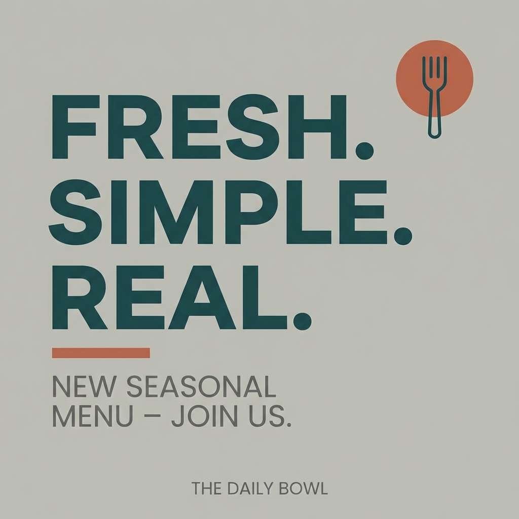
- teal and terracotta
- frosted pine
- soft industrial
- deep sea minimal
- gallery label
- winter lakehouse
- teal gray neon pop
- calm data dashboard
- What Colors Go Well with Teal Gray?
- How to Use a Teal Gray Color Palette in Real Designs
- Create Teal Gray Palette Visuals with AI
Why Teal Gray Palettes Work So Well
Teal brings a clean, modern “freshness,” while gray adds structure and neutrality—so the combo feels balanced instead of loud. That’s why teal gray color palettes work across many styles, from coastal and wellness to fintech and industrial.
Another advantage is flexibility: you can push teal brighter for energy or deepen it for sophistication, then adjust gray from airy to charcoal for contrast and readability. This makes a teal gray color scheme easy to scale from backgrounds to accents.
Finally, teal and gray tend to photograph and render well on screens. With the right contrast choices, you can keep UI accessible and print designs refined without fighting color clashes.
20+ Teal Gray Color Palette Ideas (with HEX Codes)
1) Harbor Mist
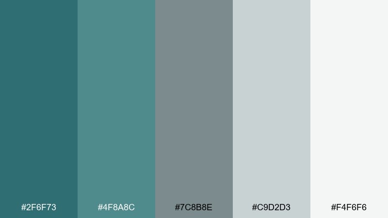
HEX: #2F6F73 #4F8A8C #7C8B8E #C9D2D3 #F4F6F6
Mood: clean, coastal, calming
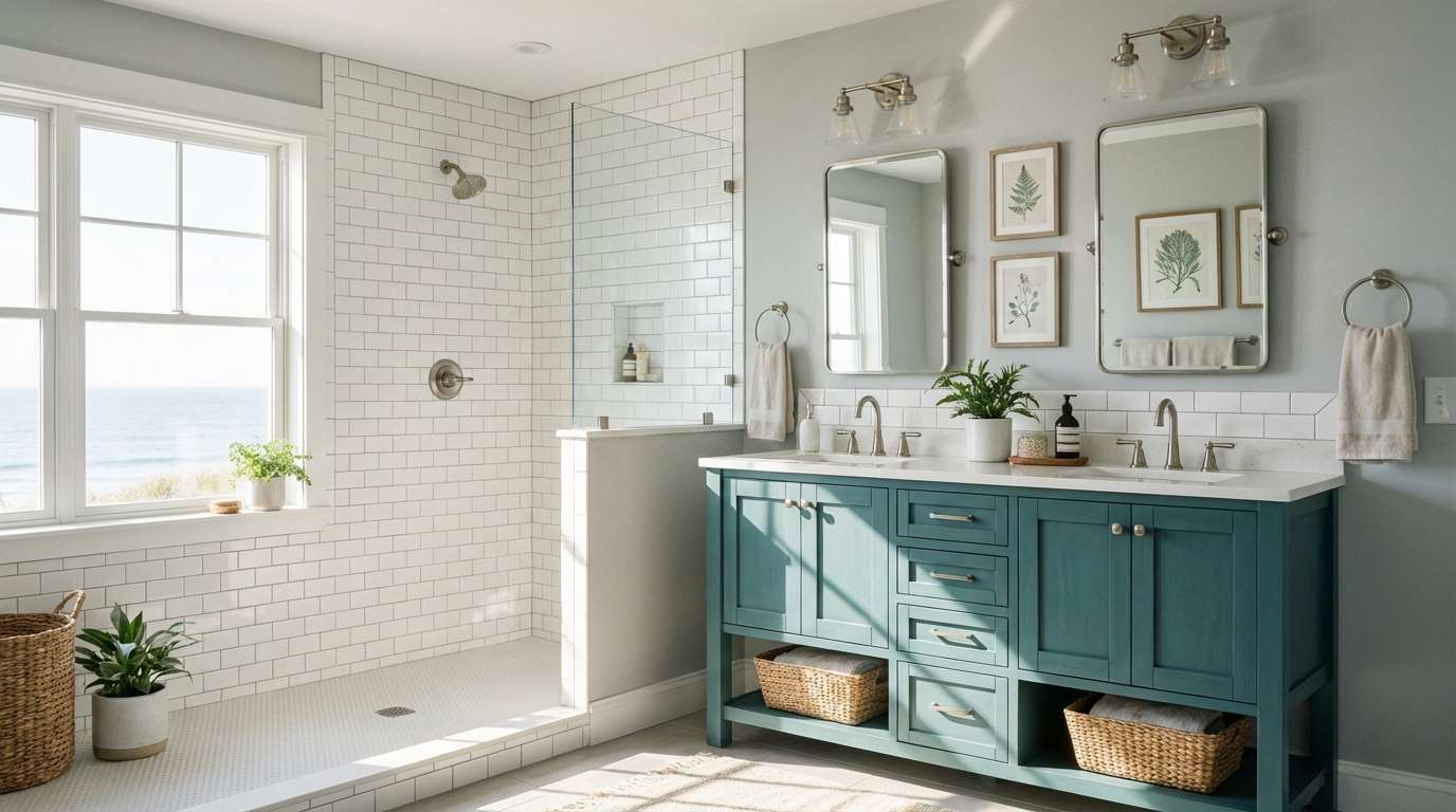
Best for: bathroom remodel and airy interiors
Clean sea-air calm with a misty boardwalk feel and softened edges. Use the deeper teal on cabinetry or an accent wall, then let the light grays carry trim and tile. Pair with brushed nickel, pale oak, and matte white ceramics for a fresh coastal finish. Tip: keep contrast gentle by choosing warm whites over stark bright white.
Image example of harbor mist generated using media.io
Media.io is an online AI studio for creating and editing video, image, and audio in your browser.

2) Nordic Tealstone
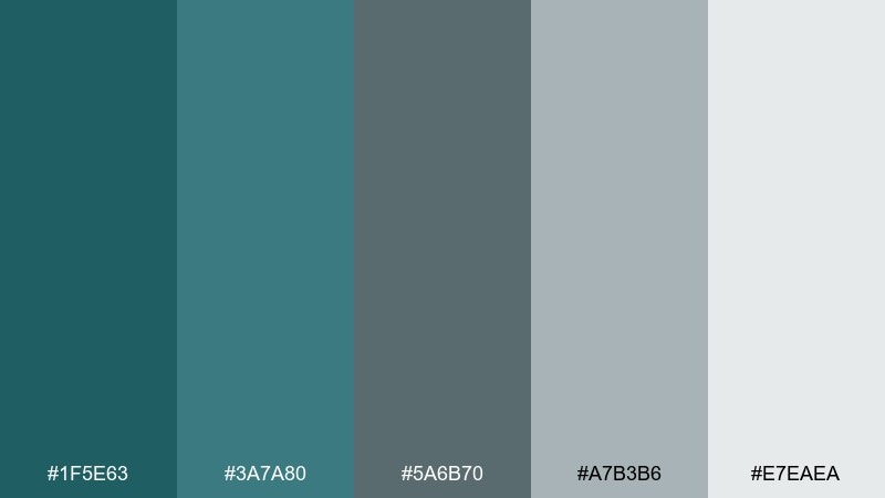
HEX: #1F5E63 #3A7A80 #5A6B70 #A7B3B6 #E7EAEA
Mood: scandi, grounded, modern
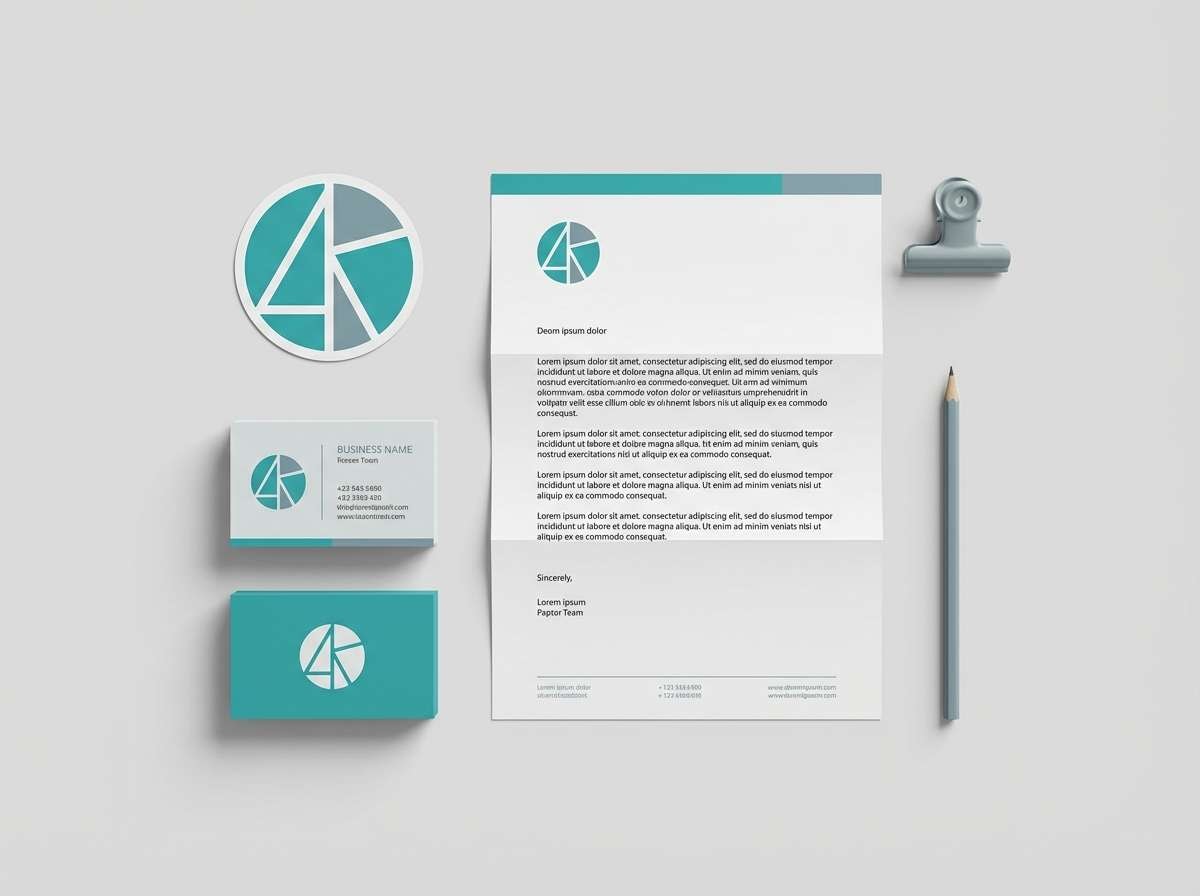
Best for: minimal branding and stationery
Cool Nordic calm, like smooth stone beside still water. This teal gray color palette works beautifully for minimalist logos, business cards, and packaging sleeves where restraint feels premium. Pair it with lots of negative space, simple geometric marks, and a single bold typeface. Tip: reserve the darkest teal for your logo mark to keep text ultra legible.
Image example of nordic tealstone generated using media.io
3) Slate Lagoon
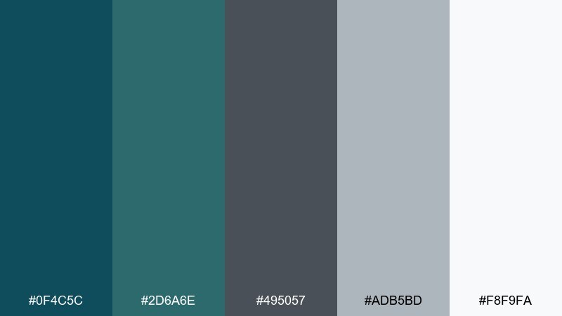
HEX: #0F4C5C #2D6A6E #495057 #ADB5BD #F8F9FA
Mood: moody, editorial, refined
Best for: magazine layouts and lookbooks
Moody lagoon tones meet slate neutrals for an upscale editorial vibe. Use the deep teal for section headers and pull quotes, and let the mid-gray handle body text blocks and captions. It pairs well with monochrome photography, thin rules, and generous margins. Tip: keep the lightest tone as the page background to avoid heavy pages.
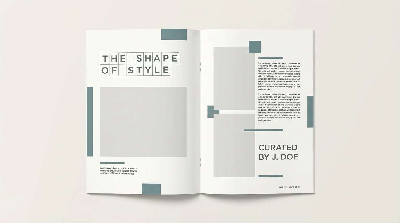
Image example of slate lagoon generated using media.io
4) Eucalyptus Concrete
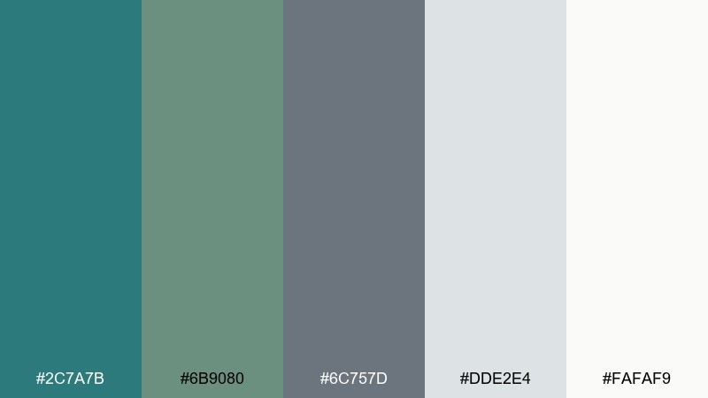
HEX: #2C7A7B #6B9080 #6C757D #DDE2E4 #FAFAF9
Mood: natural, balanced, urban
Best for: cafe interiors and menu design
A leafy eucalyptus note against smooth concrete, calm but still lively. Use the green-leaning tone for accents like banquettes or icons, and anchor it with the cooler grays for a modern urban feel. Pair with light wood, black metal, and warm lighting to keep it welcoming. Tip: repeat the teal twice across signage and menus for a cohesive brand cue.
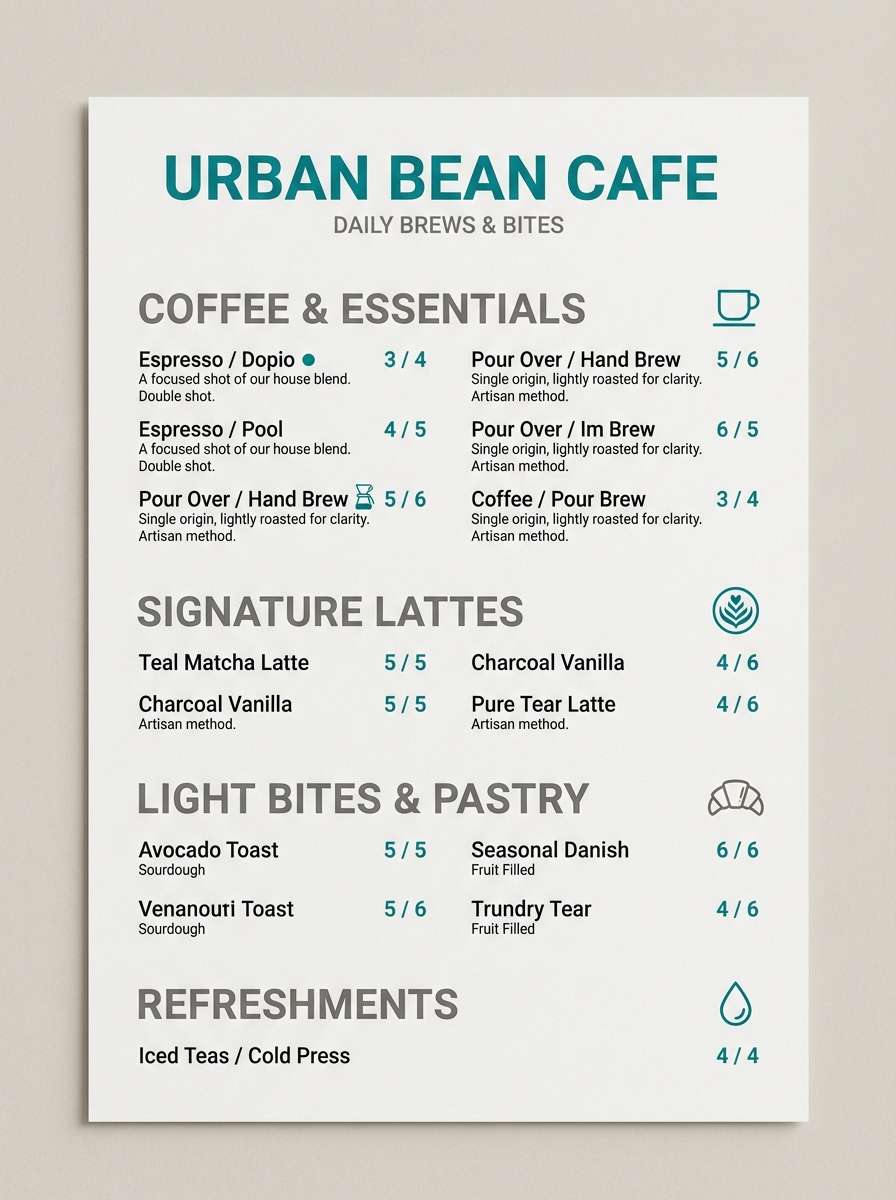
Image example of eucalyptus concrete generated using media.io
5) Coastal Charcoal
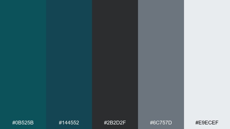
HEX: #0B525B #144552 #2B2D2F #6C757D #E9ECEF
Mood: dramatic, sophisticated, bold
Best for: hero sections and premium websites
Deep coastal water and charcoal shadows create a confident, high-end look. The near-black works great for navigation and footers, while teal adds an elegant accent for links and buttons. Pair with crisp photography and minimal line icons for a modern, premium feel. Tip: keep teal for interactive states so it feels intentional, not decorative.
Image example of coastal charcoal generated using media.io

6) Quiet Museum
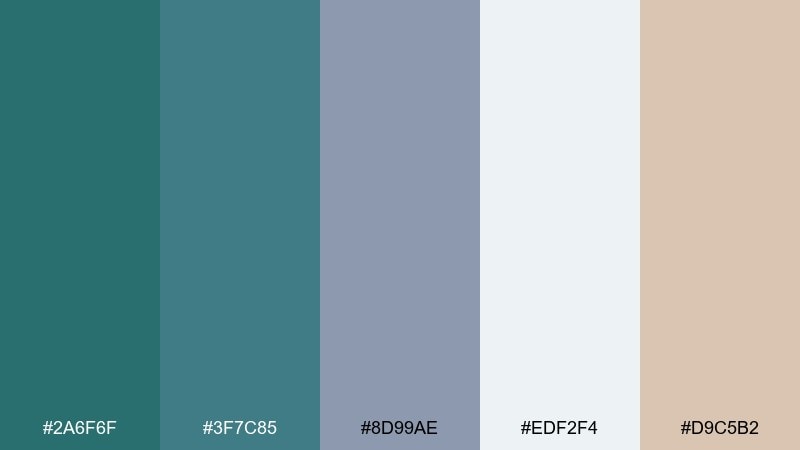
HEX: #2A6F6F #3F7C85 #8D99AE #EDF2F4 #D9C5B2
Mood: quiet, cultured, warm-neutral
Best for: gallery posters and event flyers
Quiet museum lighting and soft stone surfaces give this mix a thoughtful, curated mood. These teal gray color combinations shine on posters where you want calm authority, especially with modern serif typography. Pair the warm beige with textured paper or subtle grain to prevent the cool tones from feeling sterile. Tip: use the dusty slate for body copy and save teal for titles.
Image example of quiet museum generated using media.io
7) Rainy Boardwalk
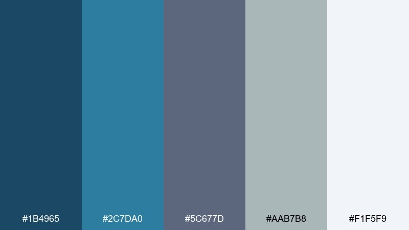
HEX: #1B4965 #2C7DA0 #5C677D #AAB7B8 #F1F5F9
Mood: fresh, breezy, slightly cool
Best for: travel blogs and lifestyle banners
Rainy boardwalk blues with a crisp, breathable finish. Use the brighter blue-teal for highlights like badges and links, and let the grays keep long-form reading easy. Pair with airy photography and white space for a clean lifestyle aesthetic. Tip: keep the medium gray as your default text color to reduce harsh contrast.
Image example of rainy boardwalk generated using media.io
8) Aqua Graphite
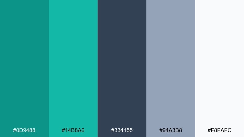
HEX: #0D9488 #14B8A6 #334155 #94A3B8 #F8FAFC
Mood: techy, crisp, energetic
Best for: SaaS UI and dashboard components
Crisp aqua pops against graphite for a modern tech vibe that feels friendly, not cold. Use the brighter teal for primary buttons and active states, while graphite anchors navigation and data labels. Pair with rounded cards, thin dividers, and plenty of spacing for a clean UI rhythm. Tip: limit the bright accent to one or two components per screen to avoid visual noise.
Image example of aqua graphite generated using media.io
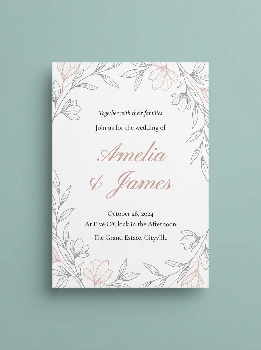
9) Vintage Seaglass
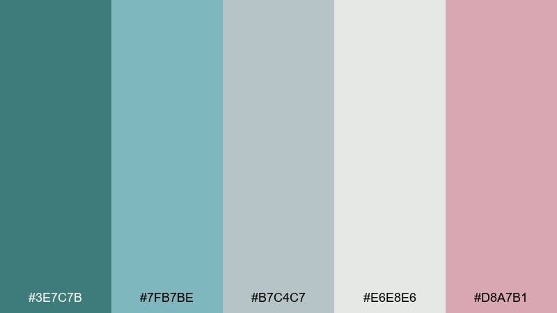
HEX: #3E7C7B #7FB7BE #B7C4C7 #E6E8E6 #D8A7B1
Mood: soft, vintage, romantic
Best for: wedding invitations and save-the-dates
Vintage seaglass softness with a blush whisper feels romantic and understated. Use the pale teal as the base, then layer blush for delicate flourishes and monograms. Pair with textured paper effects, thin line florals, and elegant serif type. Tip: keep the darkest teal only for names and key details to maintain an airy feel.
Image example of vintage seaglass generated using media.io
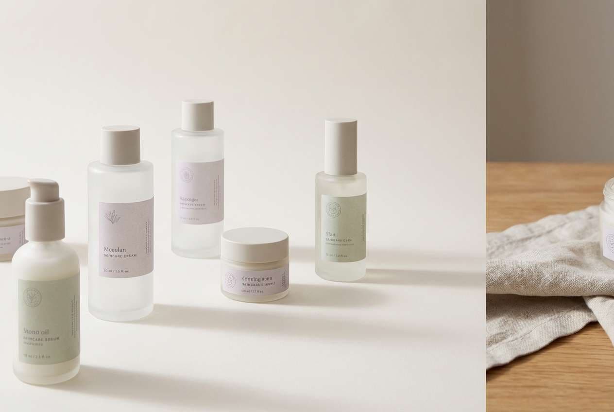
10) Modern Spa
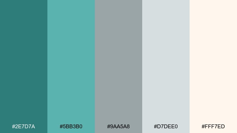
HEX: #2E7D7A #5BB3B0 #9AA5A8 #D7DEE0 #FFF7ED
Mood: soothing, bright, wellness
Best for: skincare packaging and wellness ads
Soothing spa-water tones with warm steam-like whites create instant calm. Use the vibrant teal for labels or callouts, and let the warm white and pale gray do most of the background work. Pair with minimal sans-serif type and matte finishes for a modern wellness look. Tip: add subtle embossing on the lightest tones for a premium tactile cue.
Image example of modern spa generated using media.io
11) Ink and Tide
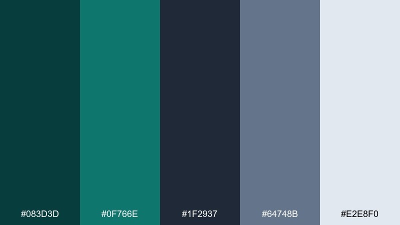
HEX: #083D3D #0F766E #1F2937 #64748B #E2E8F0
Mood: dark, confident, sleek
Best for: fintech branding and landing pages
Inky depth with a tidal teal edge feels decisive and modern. Use the near-black for strong structure like headers, pricing tables, and footers, then highlight key actions with teal. Pair with sharp typography and simple icon sets for a clean fintech feel. Tip: reserve the lightest gray for panels and cards to keep contrast controlled.
Image example of ink and tide generated using media.io
12) Silver Kelp
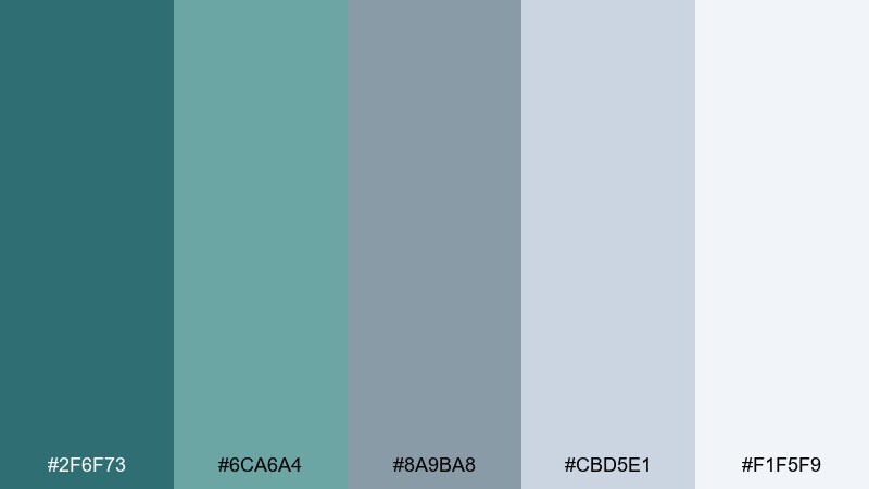
HEX: #2F6F73 #6CA6A4 #8A9BA8 #CBD5E1 #F1F5F9
Mood: light, coastal, polished
Best for: presentation templates and reports
Silvery kelp tones feel polished, calm, and quietly professional. Use the mid teal for section dividers and charts, and the soft grays for backgrounds and tables. Pair with clean data visual styles and consistent iconography for an executive-ready deck. Tip: keep one accent teal for highlights and use tints for secondary chart series.
Image example of silver kelp generated using media.io
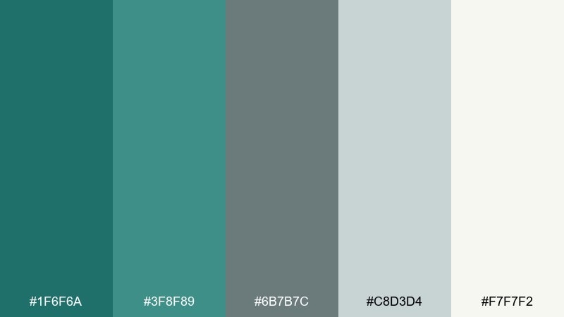
13) Teal and Terracotta
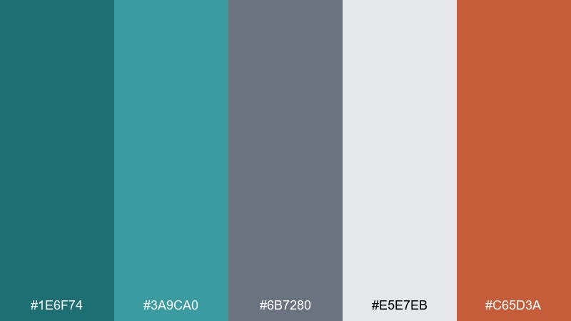
HEX: #1E6F74 #3A9CA0 #6B7280 #E5E7EB #C65D3A
Mood: earthy, modern, inviting
Best for: restaurant branding and social posts
Earthy warmth meets cool water, like clay pottery by a modern pool. These teal gray color combinations get extra personality from the terracotta accent, perfect for food brands that want to feel approachable yet refined. Pair with natural textures, kraft paper, and bold photography to bring the warm note forward. Tip: use terracotta sparingly for price tags, highlights, or a single stamp mark.
Image example of teal and terracotta generated using media.io
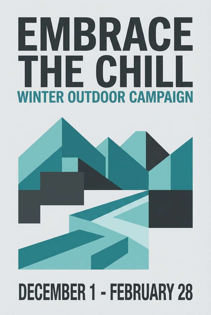
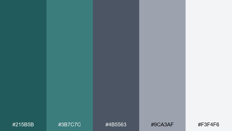
14) Frosted Pine
HEX: #1F6F6A #3F8F89 #6B7B7C #C8D3D4 #F7F7F2
Mood: cool, outdoorsy, serene
Best for: winter outdoor campaign posters
Frosted pine needles and cold air serenity give this mix a crisp seasonal feel. Use the deeper green-teal for titles and key shapes, and let the soft grays mimic snow and fog for balance. Pair with high-contrast landscape imagery and minimal copy for a premium outdoor brand look. Tip: keep gradients subtle so the palette stays clean and modern.
Image example of frosted pine generated using media.io
15) Soft Industrial
HEX: #215B5B #3B7C7C #4B5563 #9CA3AF #F3F4F6
Mood: industrial, softened, practical
Best for: workshop spaces and office interiors
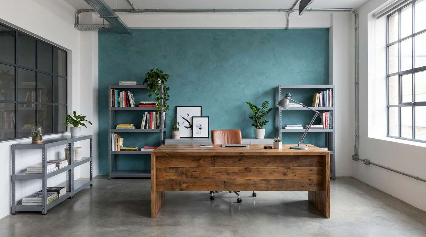
Soft industrial tones feel like painted steel warmed by good lighting. Use the darker slate for furniture or built-ins, then add teal on doors, shelving, or acoustic panels for a subtle lift. Pair with concrete textures, black hardware, and warm wood to keep it from feeling too cold. Tip: choose one teal surface per room so the accent reads intentional.
Image example of soft industrial generated using media.io
16) Deep Sea Minimal
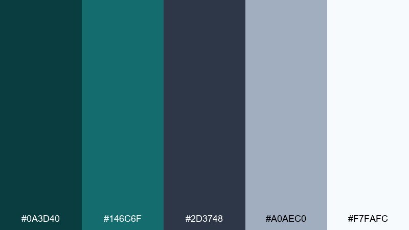
HEX: #0A3D40 #146C6F #2D3748 #A0AEC0 #F7FAFC
Mood: minimal, deep, focused
Best for: app onboarding screens and UI kits
Deep sea darkness with clean light space feels focused and modern. This teal gray color palette is ideal for onboarding screens where you need strong hierarchy without loud colors. Pair the deep teal with simple illustrations and lots of white space, then rely on the cool grays for secondary text. Tip: test contrast for accessibility by keeping body text on the lightest background tone.
Image example of deep sea minimal generated using media.io
17) Gallery Label
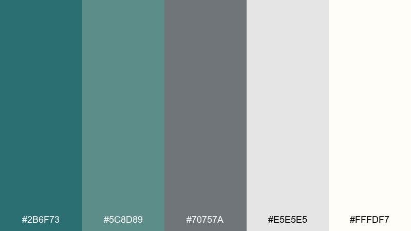
HEX: #2B6F73 #5C8D89 #70757A #E5E5E5 #FFFDF7
Mood: quiet luxury, curated, neutral
Best for: product labels and minimalist packaging
Quiet-luxury neutrals with a soft teal undertone feel curated and timeless. Use the warm off-white for the label base, then set typography in gray for readability and restraint. Pair with subtle foil details or a single teal band to signal brand color without overpowering the label. Tip: keep your logo small and let whitespace do the premium work.
Image example of gallery label generated using media.io
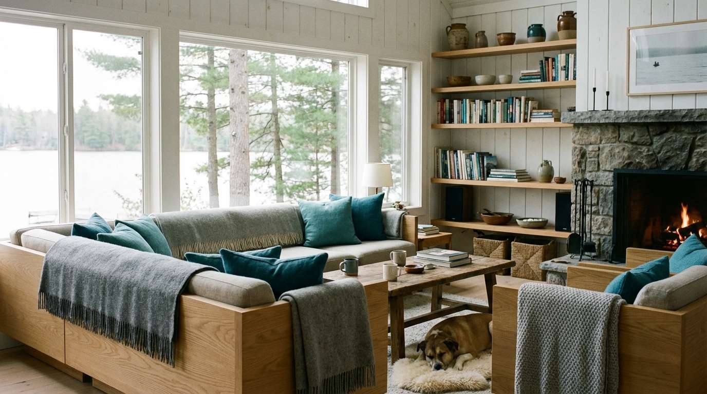
18) Winter Lakehouse
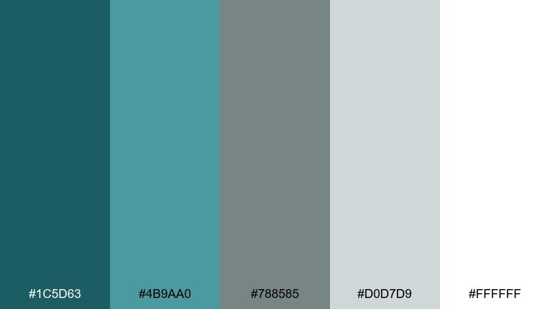
HEX: #1C5D63 #4B9AA0 #788585 #D0D7D9 #FFFFFF
Mood: homey, cool, restful
Best for: living room refresh and textiles
A winter lakehouse mood: quiet mornings, wool blankets, and clear water outside the window. Use teal on throw pillows or a single painted built-in, then keep walls and larger pieces in layered grays and white. Pair with natural linen, light oak, and soft black accents for depth. Tip: add texture first, then color, so the palette feels cozy rather than cold.
Image example of winter lakehouse generated using media.io
19) Teal Gray Neon Pop
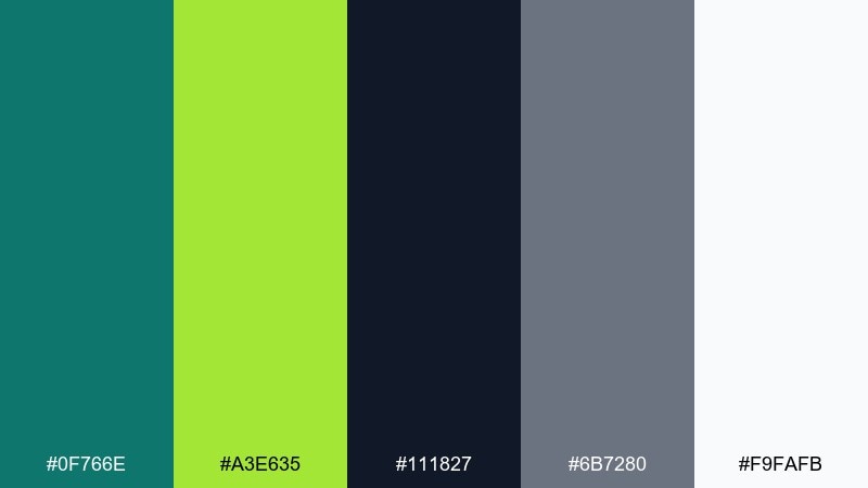
HEX: #0F766E #A3E635 #111827 #6B7280 #F9FAFB
Mood: bold, playful, high-contrast
Best for: music flyers and youth campaigns
Bold contrast with a neon spark feels energetic and a little rebellious. Use the near-black for background fields, let teal handle structure, and drop neon lime only where you need instant attention. Pair with condensed type, big numerals, and sharp shapes for a modern poster look. Tip: keep lime to under 10 percent of the layout so it stays punchy, not chaotic.
Image example of teal gray neon pop generated using media.io
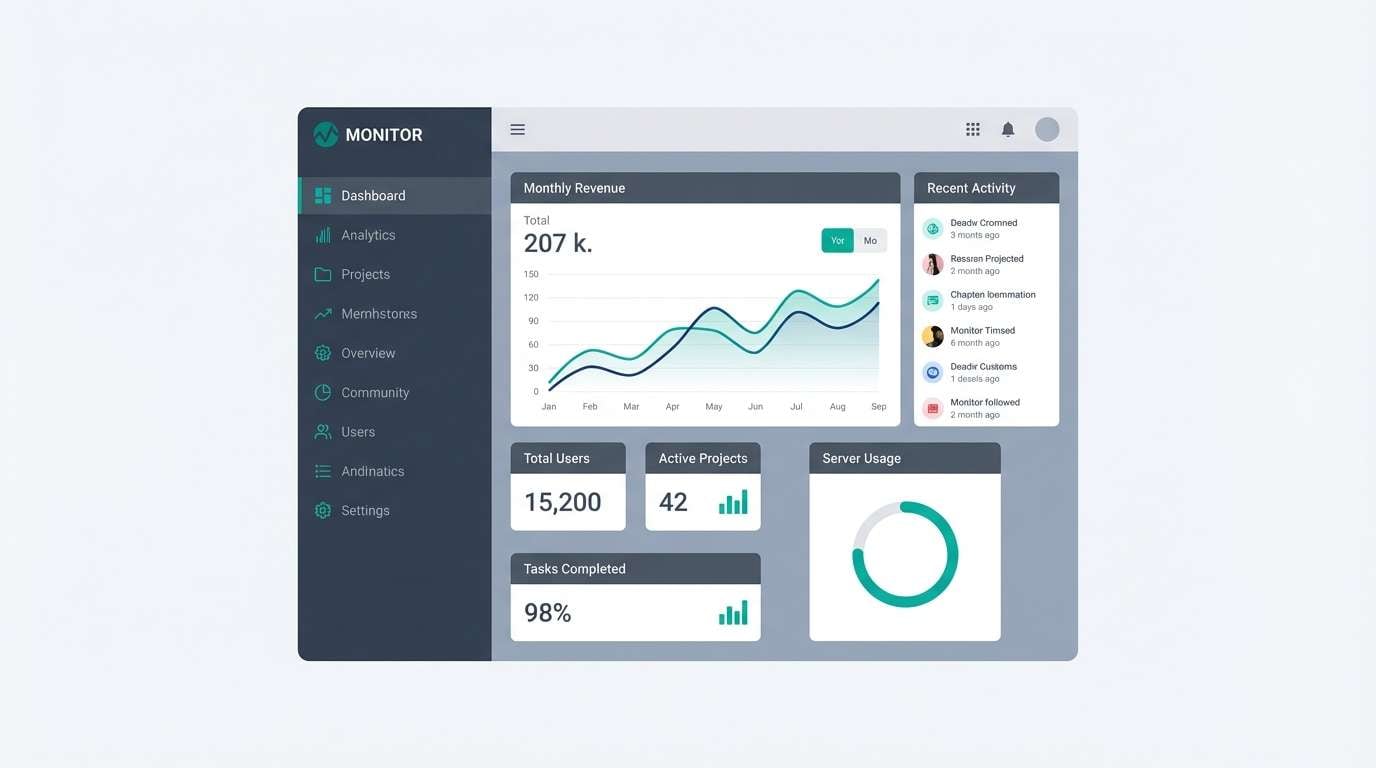
20) Calm Data Dashboard
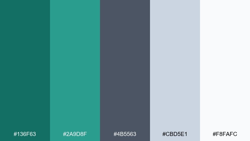
HEX: #136F63 #2A9D8F #4B5563 #CBD5E1 #F8FAFC
Mood: calm, clear, organized
Best for: analytics dashboards and admin panels
Calm clarity for data-heavy screens, like a tidy workspace with soft daylight. A teal gray color scheme like this keeps charts readable while still feeling modern and friendly. Pair the brighter teal with key metrics and use cool grays for grids, dividers, and secondary labels. Tip: set one teal as primary action and keep the second teal for chart highlights only.
Image example of calm data dashboard generated using media.io
What Colors Go Well with Teal Gray?
Neutrals are the easiest match: warm whites, soft greiges, and light silvers keep a teal gray palette airy and versatile. For a more premium feel, charcoal or near-black adds crisp structure (great for navigation bars, titles, and frames).
If you want warmth, add earthy accents like terracotta, clay, camel, or warm beige to counterbalance teal’s coolness. This is a reliable approach for hospitality branding, lifestyle packaging, and cozy interiors.
For bolder contrast, use small pops of neon-lime or bright aqua—best kept to limited UI states, badges, or poster highlights so the scheme stays clean and readable.
How to Use a Teal Gray Color Palette in Real Designs
Start with roles: pick one teal as your “brand/action” color, then assign grays to background, text, borders, and surfaces. This prevents teal from spreading everywhere and keeps hierarchy obvious.
In print and interiors, texture does a lot of work: matte paper, brushed metal, light oak, linen, or concrete-like finishes make teal and gray feel warmer and more dimensional. Use teal on one or two focal elements (signage, cabinetry, pillows, a feature wall) so it reads intentional.
For digital products, check contrast early—especially teal-on-gray combinations. Keep body text on the lightest neutral and use teal for interactive states (buttons, links, toggles) to maintain clarity.
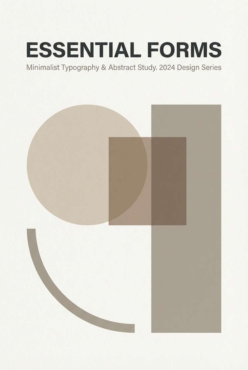
Create Teal Gray Palette Visuals with AI
Want to see these teal gray color combinations in a real scene—like a landing page hero, a cafe menu, or a bathroom remodel concept? Generate quick mockups using AI so you can validate mood, contrast, and materials before you commit.
With Media.io, you can turn a palette into visual directions for branding, UI, posters, and packaging—then iterate fast by swapping accents, lighting, or style keywords while keeping the same HEX-driven vibe.
Teal Gray Color Palette FAQs
-
What does a teal gray color palette communicate in branding?
Most teal gray color schemes signal calm competence: teal feels fresh and trustworthy, while gray adds restraint and professionalism. Together, they work well for modern brands that want to look clean without feeling clinical. -
Is teal and gray a good combination for UI design?
Yes—teal can serve as the primary action color and gray can handle surfaces, borders, and typography. Just verify contrast (especially for teal text on gray backgrounds) to keep screens accessible. -
How do I keep a teal gray palette from feeling too cold?
Add one warm neutral (warm white, beige, camel) or a warm accent (terracotta/blush) and lean into texture—wood, paper grain, or warm lighting. This balances teal’s coolness without changing the overall modern vibe. -
Which teal gray palette is best for a dark, premium website?
Try darker sets like Coastal Charcoal or Ink and Tide, where charcoal/near-black builds structure and teal highlights interactions. Keep the lightest gray for cards and panels to avoid a heavy feel. -
What accent colors pair best with teal and gray?
Terracotta/clay for warmth, neon-lime for high-contrast pop, and off-white for a timeless neutral base. Choose one accent and keep it limited so teal remains the main signature. -
How many colors should I use from a 5-color teal gray palette?
For most projects, use 3 roles: a background neutral, a text/structure gray, and a teal accent. Bring in the other two as tints/shades for hover states, dividers, charts, or secondary surfaces. -
Can I generate teal gray palette mockups for posters, rooms, or dashboards?
Yes—use an AI text-to-image tool to prompt the scene (e.g., “dashboard UI,” “coastal bathroom,” “product label”) and apply teal/gray styling keywords. This helps you preview composition and mood before final production.


