

Teal blue sits in the sweet spot between ocean-calm and tech-clean, so it can feel soothing without looking washed out. That balance makes it a reliable choice for branding, UI, and modern interiors.
Below are 20 teal blue color palette ideas with HEX codes, mood notes, and practical pairing tips—plus AI prompts you can reuse to generate matching visuals.
In this article
Why Teal Blue Palettes Work So Well
Teal blue blends the stability of blue with the freshness of green, which is why it reads as both trustworthy and modern. In practice, that means it can support serious interfaces (dashboards, finance, healthcare) while still feeling approachable.
It also plays nicely with contrast: deep teal-blues give you strong anchors for navigation and headlines, while pale aquas create airy backgrounds that reduce visual fatigue. This makes teal blue especially effective for screens, where comfort and clarity matter.
Finally, teal blue is versatile across styles—coastal, minimalist, retro, and luxury—depending on the accents you choose. Warm partners like coral, gold, and sand can make it feel inviting, while charcoal and navy push it toward cinematic or premium.
20+ Teal Blue Color Palette Ideas (with HEX Codes)
1) Ocean Glass
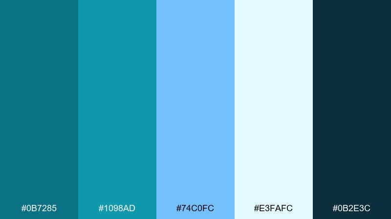
HEX: #0B7285 #1098AD #74C0FC #E3FAFC #0B2E3C
Mood: clean, coastal, refreshing
Best for: wellness branding and skincare packaging
Clean and coastal, like sunlight moving through shallow water over pale sand. This teal blue color palette feels crisp on matte labels and premium on glossy accents. Pair it with white space and minimal typography for a spa-like finish, then use the deep navy as the anchor for ingredient lists. Tip: keep the light aqua as the main background so the darker tones read as calm, not heavy.
Image example of ocean glass generated using media.io
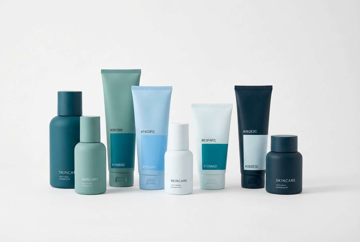
Media.io is an online AI studio for creating and editing video, image, and audio in your browser.

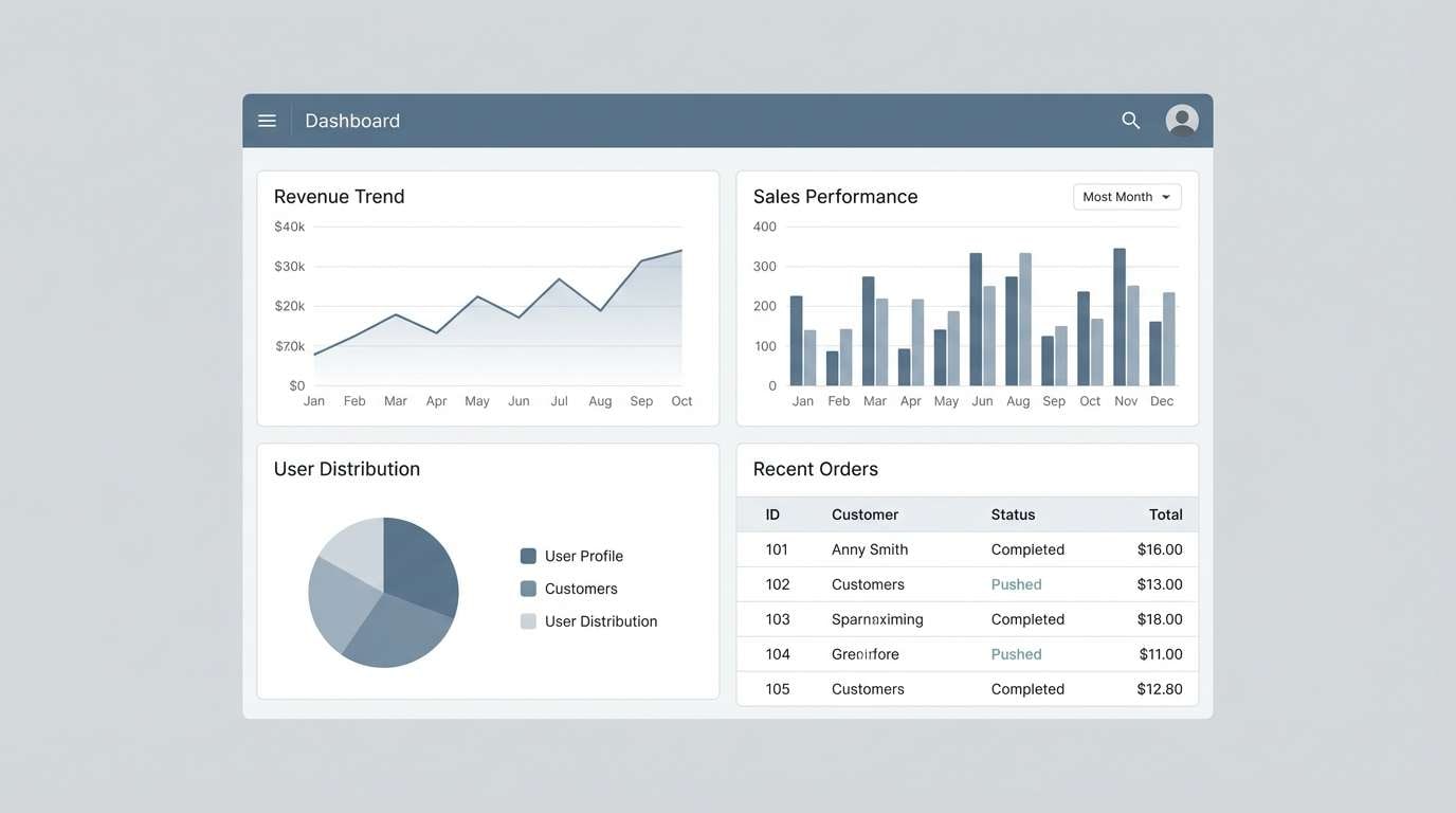
2) Harbor Slate
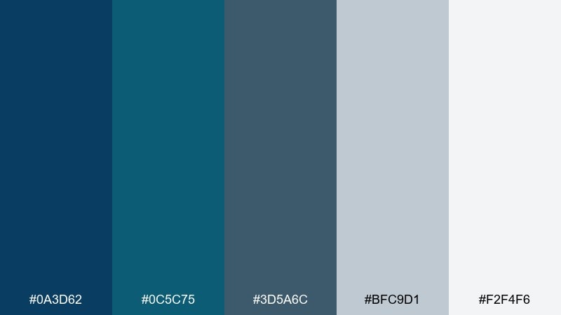
HEX: #0A3D62 #0C5C75 #3D5A6C #BFC9D1 #F2F4F6
Mood: grounded, modern, dependable
Best for: enterprise dashboards and fintech UI
Grounded and dependable, like a harbor at dusk with steel-grey skies. The darker blues create trustworthy structure, while the soft grays keep screens from feeling too saturated. Pair it with crisp white surfaces and a single bright accent for key actions. Tip: reserve the deepest tone for headers and navigation to improve hierarchy without adding extra borders.
Image example of harbor slate generated using media.io
3) Aqua Ink
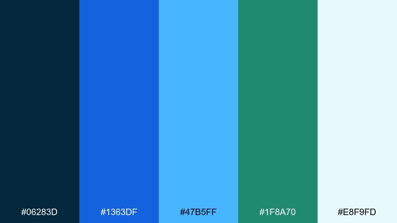
HEX: #06283D #1363DF #47B5FF #1F8A70 #E8F9FD
Mood: bold, energetic, high-contrast
Best for: tech landing pages and hero sections
Bold and energetic, like ink dropped into clear water and snapping into focus. The navy and electric blue bring impact, while the pale icy tint keeps layouts breathable. Pair it with geometric shapes and short punchy headlines for a fast, modern feel. Tip: use the teal as a secondary CTA so the primary button color stays consistent across sections.
Image example of aqua ink generated using media.io

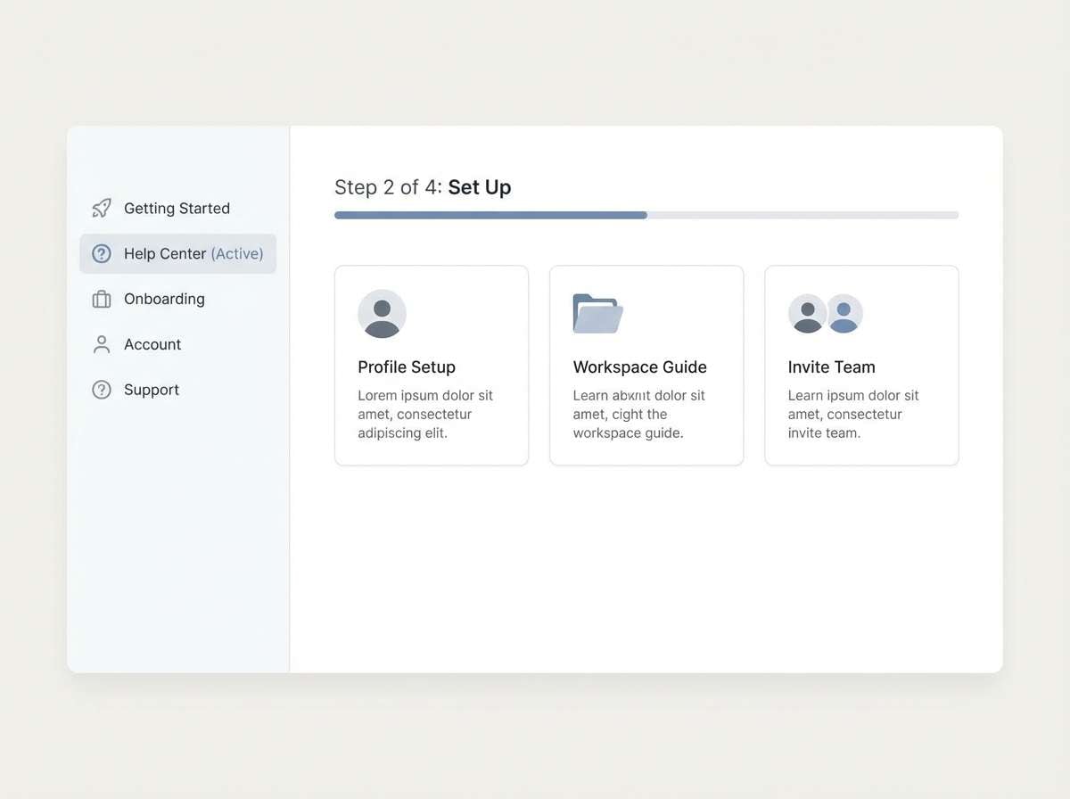
4) Nordic Fjord
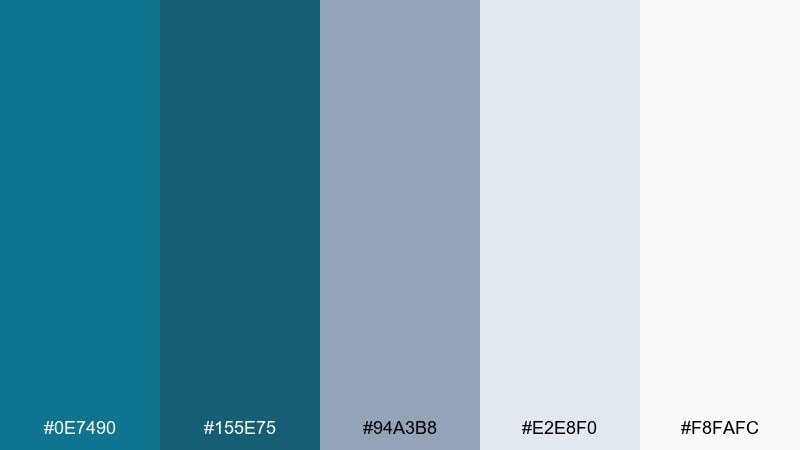
HEX: #0E7490 #155E75 #94A3B8 #E2E8F0 #F8FAFC
Mood: cool, airy, minimalist
Best for: SaaS onboarding and help centers
Cool and airy, like fog drifting through a fjord with clean northern light. This teal blue color scheme supports long reading sessions thanks to gentle neutrals and controlled saturation. Pair it with thin line icons and generous spacing for a calm, informative experience. Tip: keep the mid-teal for links and focus states to make navigation feel consistent.
Image example of nordic fjord generated using media.io
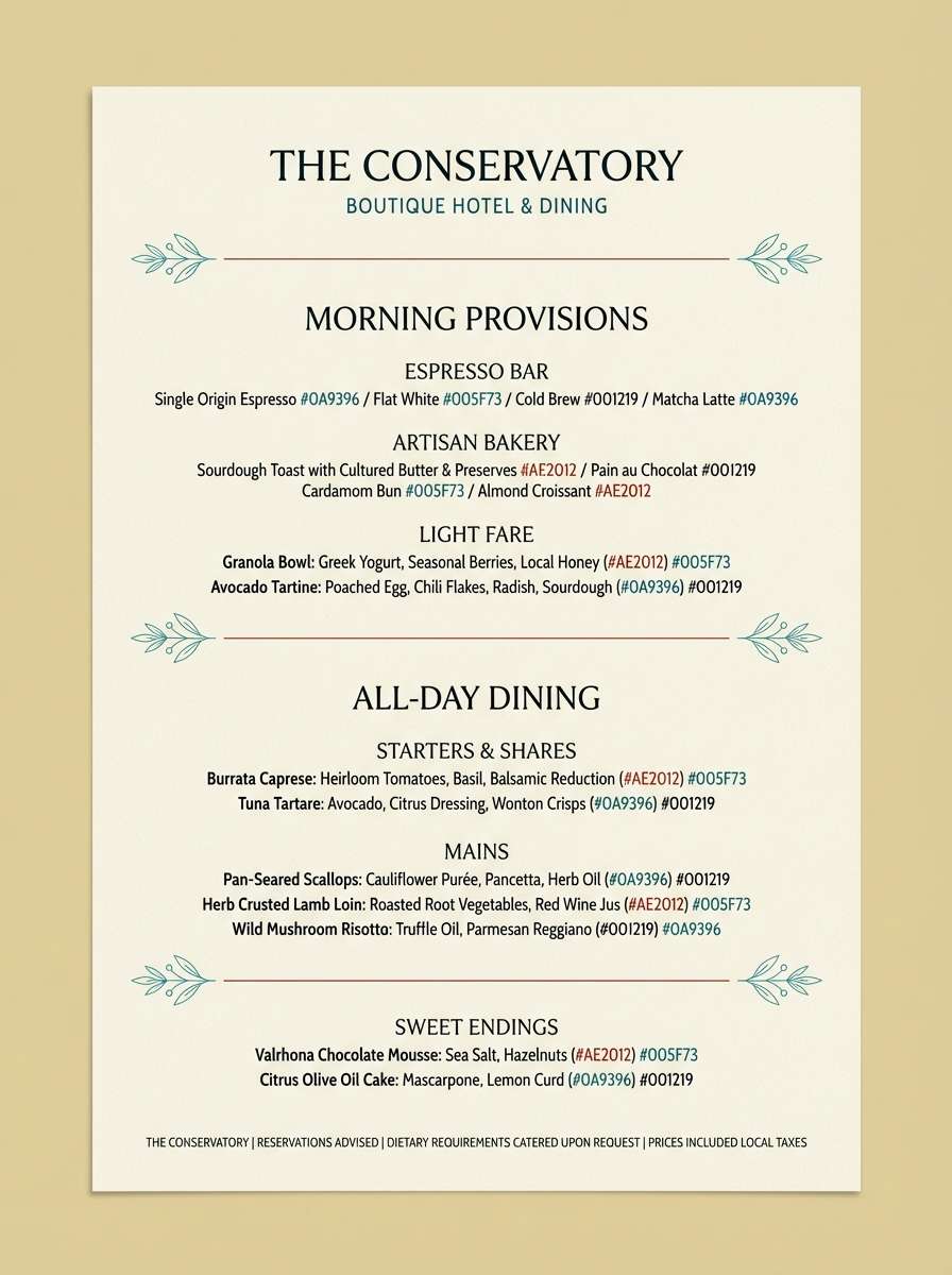
5) Peacock Velvet
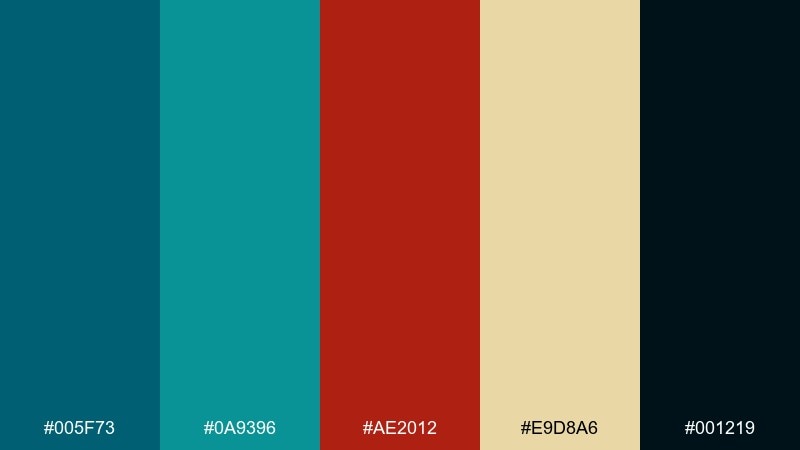
HEX: #005F73 #0A9396 #AE2012 #E9D8A6 #001219
Mood: luxurious, dramatic, artistic
Best for: boutique hotel branding and menus
Luxurious and dramatic, like peacock feathers against velvet shadows. The deep teal and near-black create instant sophistication, while the warm ochre and brick red add a curated, vintage edge. Pair it with serif typography and gold foil details for a high-end touch. Tip: use the red sparingly for highlights so the palette stays rich rather than loud.
Image example of peacock velvet generated using media.io
6) Misty Lagoon
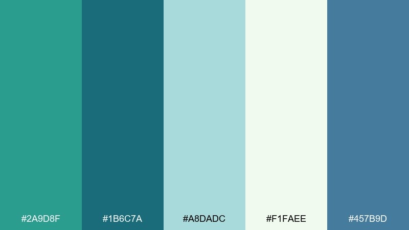
HEX: #2A9D8F #1B6C7A #A8DADC #F1FAEE #457B9D
Mood: soft, breezy, optimistic
Best for: wedding invitations and summer event flyers
Soft and breezy, like a lagoon wrapped in morning mist. The pale mint and airy off-white make text feel light, while the deeper teal-blue tones keep the design grounded. Pair it with delicate scripts or modern sans fonts for a romantic-but-clean look. Tip: print the lightest shade as a background wash so the darker teal stays crisp.
Image example of misty lagoon generated using media.io
7) Deep Sea Neon
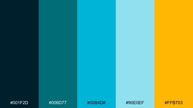
HEX: #001F2D #006D77 #00B4D8 #90E0EF #FFB703
Mood: electric, nightlife, high-impact
Best for: gaming posters and streaming overlays
Electric and nocturnal, like neon signage glowing through deep water. These teal blue color combinations pop hardest when you let the near-black do most of the work as a backdrop. Pair the bright cyan with the warm amber for high-visibility accents and alert states. Tip: keep the amber limited to badges and highlights so it reads as intentional, not distracting.
Image example of deep sea neon generated using media.io
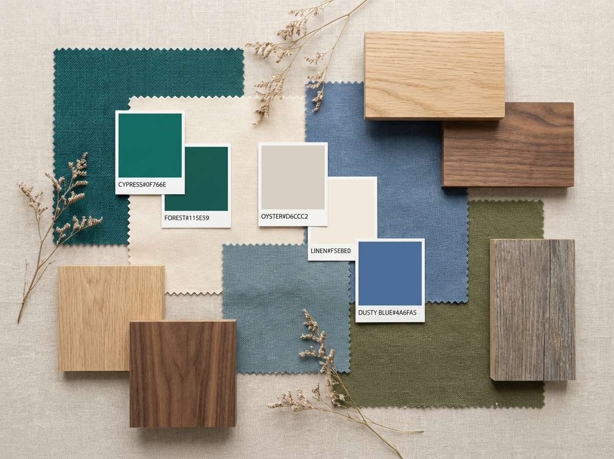
8) Coastal Sandbar
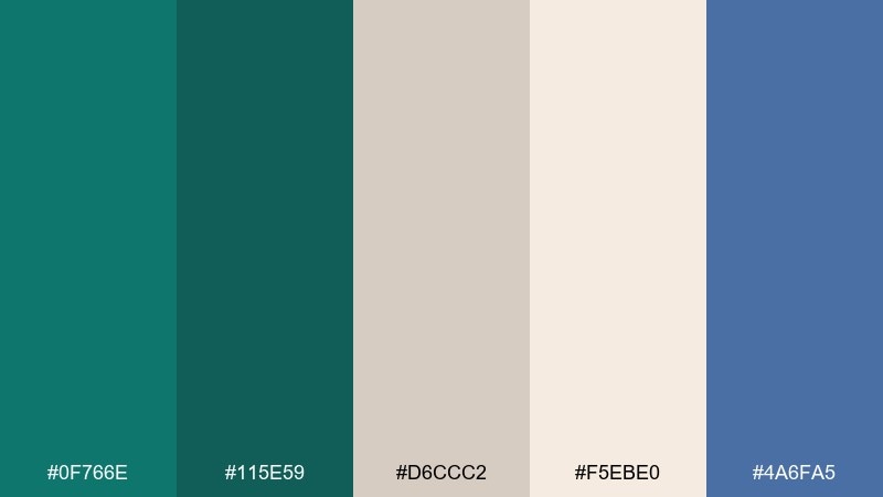
HEX: #0F766E #115E59 #D6CCC2 #F5EBE0 #4A6FA5
Mood: relaxed, natural, sun-warmed
Best for: interior decor mood boards and lifestyle blogs
Relaxed and sun-warmed, like driftwood and sea glass on a quiet sandbar. The beiges soften the teal so rooms and layouts feel welcoming rather than cold. Pair it with rattan textures, light oak, and linen whites for an easy coastal modern vibe. Tip: use the muted blue as a secondary accent to keep the greens from dominating the space.
Image example of coastal sandbar generated using media.io
9) Rainy Window
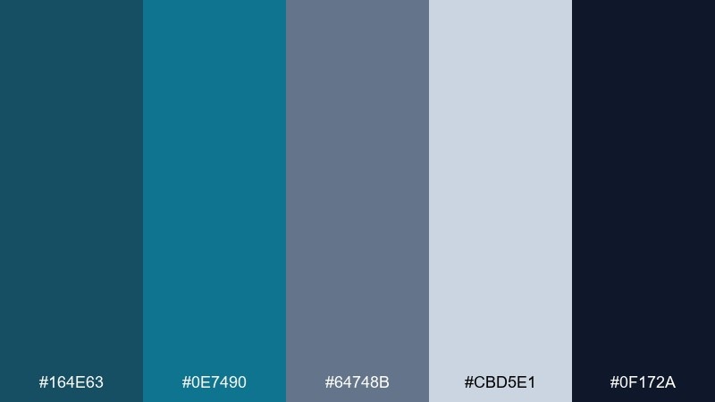
HEX: #164E63 #0E7490 #64748B #CBD5E1 #0F172A
Mood: moody, quiet, professional
Best for: editorial layouts and long-form reports
Moody and quiet, like raindrops blurring city lights through a windowpane. The slate and deep navy create a serious tone that suits data-heavy pages and thoughtful storytelling. Pair it with clean grid systems and subtle dividers instead of heavy boxes. Tip: use the mid-teal for pull quotes to add color without breaking the calm rhythm.
Image example of rainy window generated using media.io
10) Retro Pool Tile
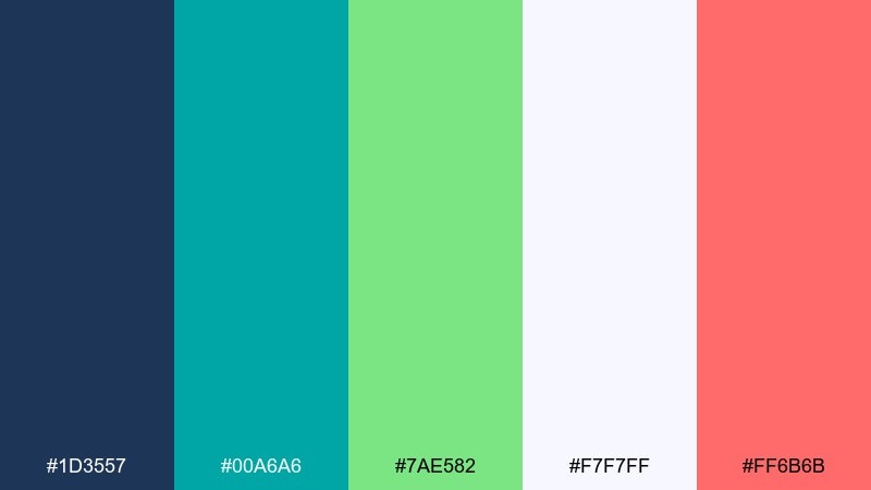
HEX: #1D3557 #00A6A6 #7AE582 #F7F7FF #FF6B6B
Mood: playful, retro, summery
Best for: social media templates and creator branding
Playful and retro, like glossy pool tiles and a classic summer playlist. The bright teal and minty green feel lively against the soft white, while the coral adds friendly punch. Pair it with rounded shapes and chunky type for a throwback vibe. Tip: use coral only for the highest-priority buttons so the feed stays cohesive.
Image example of retro pool tile generated using media.io
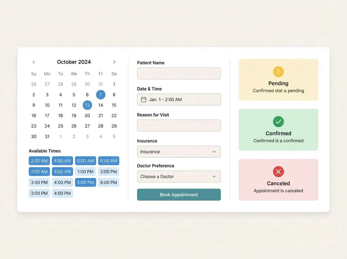
11) Glacier Mint
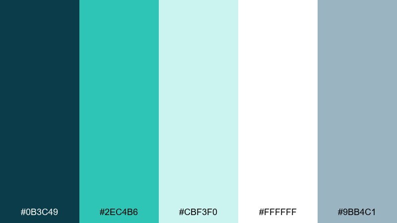
HEX: #0B3C49 #2EC4B6 #CBF3F0 #FFFFFF #9BB4C1
Mood: fresh, light, clinical-clean
Best for: health apps and appointment booking UI
Fresh and clinical-clean, like glacier air and mint water. The bright teal reads as friendly and modern without losing a sense of trust. Pair it with lots of white and soft gray cards to keep forms readable. Tip: keep the mint as a success state and reserve the darkest tone for primary navigation.
Image example of glacier mint generated using media.io
12) Night Aquarium
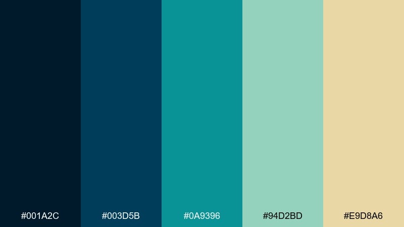
HEX: #001A2C #003D5B #0A9396 #94D2BD #E9D8A6
Mood: immersive, tranquil, cinematic
Best for: podcast covers and music artwork
Immersive and cinematic, like an aquarium glowing after hours. This teal blue color palette works best with strong contrast, letting the dark tones create depth and the seafoam highlight details. Pair it with minimal line art or soft gradients for a modern cover that still feels atmospheric. Tip: keep type in the warm sand tone to stay legible against the deep blues.
Image example of night aquarium generated using media.io

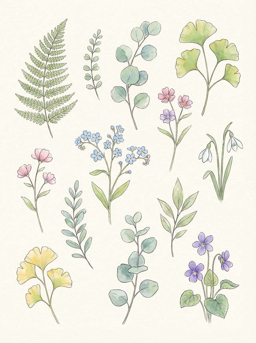
13) Seaglass Botanica
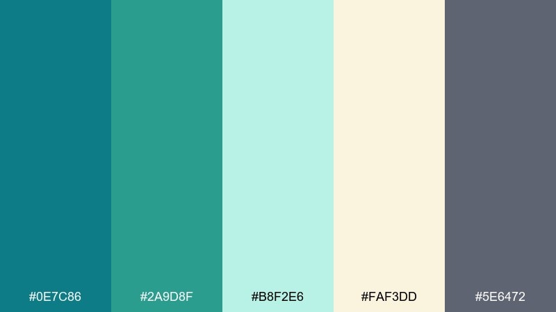
HEX: #0E7C86 #2A9D8F #B8F2E6 #FAF3DD #5E6472
Mood: airy, botanical, calming
Best for: spring botanical illustrations and stationery
Airy and calming, like seaglass tucked among fresh leaves. The creamy off-white softens the greens so the palette feels gentle and organic. Pair it with watercolor washes, fine ink outlines, and plenty of negative space. Tip: use the gray as a subtle ink alternative when black feels too stark.
Image example of seaglass botanica generated using media.io
14) Techwave Gradient
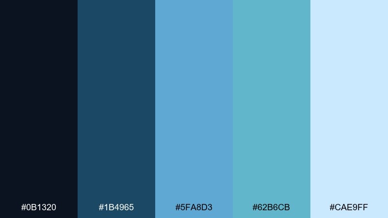
HEX: #0B1320 #1B4965 #5FA8D3 #62B6CB #CAE9FF
Mood: sleek, futuristic, polished
Best for: product UI systems and design tokens
Sleek and futuristic, like a clean gradient rolling across glass. The range from midnight to pale ice makes it easy to build consistent states and elevation. Pair it with neutral grays and one warm accent if you need a touch of human warmth. Tip: map the five tones to a predictable scale so components stay consistent across light and dark surfaces.
Image example of techwave gradient generated using media.io
15) Minimal Clinic
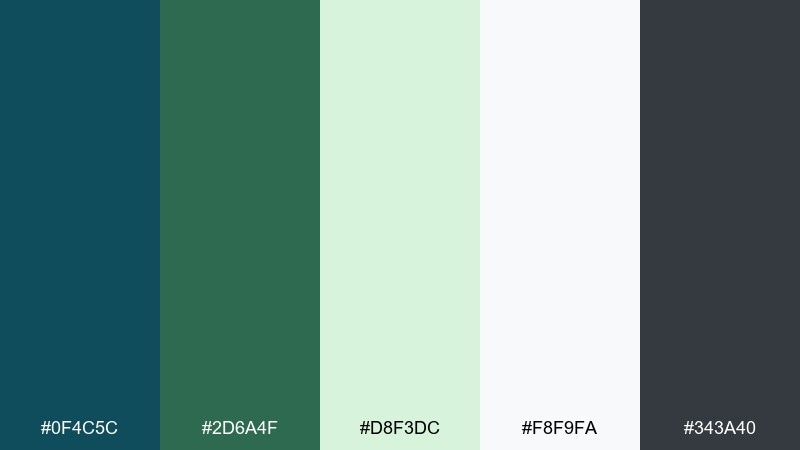
HEX: #0F4C5C #2D6A4F #D8F3DC #F8F9FA #343A40
Mood: calm, hygienic, reassuring
Best for: medical brochures and clinic signage
Calm and reassuring, like a bright clinic with quiet confidence. The pale green-white background keeps content readable while the deeper teal provides a stable visual anchor. Pair it with clear iconography and straightforward copy for wayfinding and instructions. Tip: keep charcoal for body text to avoid the low-contrast look that mid-teals can cause.
Image example of minimal clinic generated using media.io
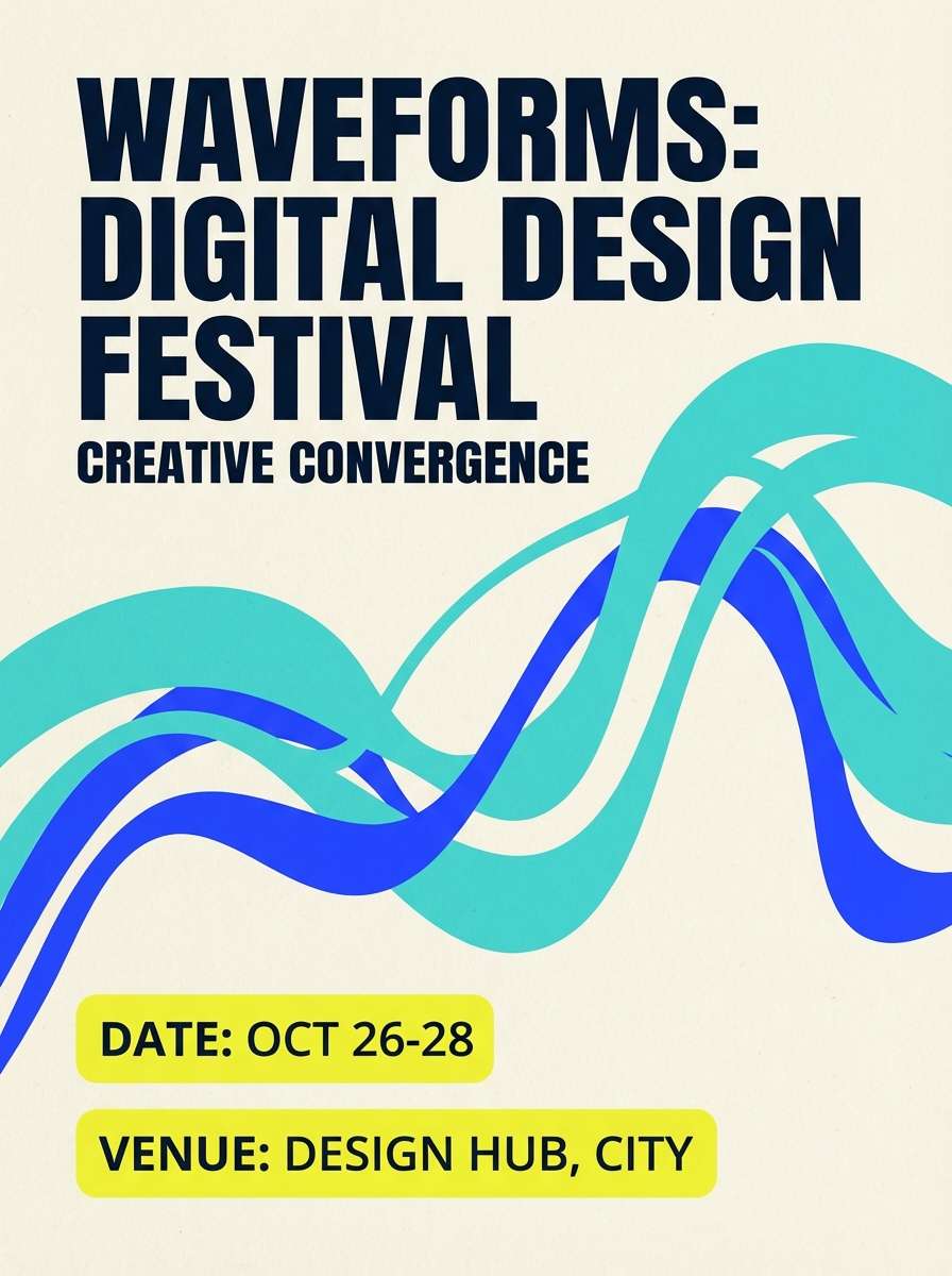
16) Sunset Pier
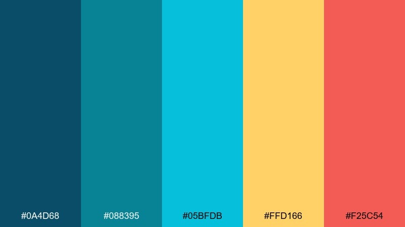
HEX: #0A4D68 #088395 #05BFDB #FFD166 #F25C54
Mood: vibrant, summery, social
Best for: festival posters and event branding
Vibrant and social, like a sunset reflecting off a pier rail after a long beach day. These teal blue color combinations shine when you balance cool water tones with warm sunset accents. Pair it with bold type, simple shapes, and lots of breathing room so the colors feel intentional. Tip: use yellow for dates and ticket info to guide the eye first.
Image example of sunset pier generated using media.io
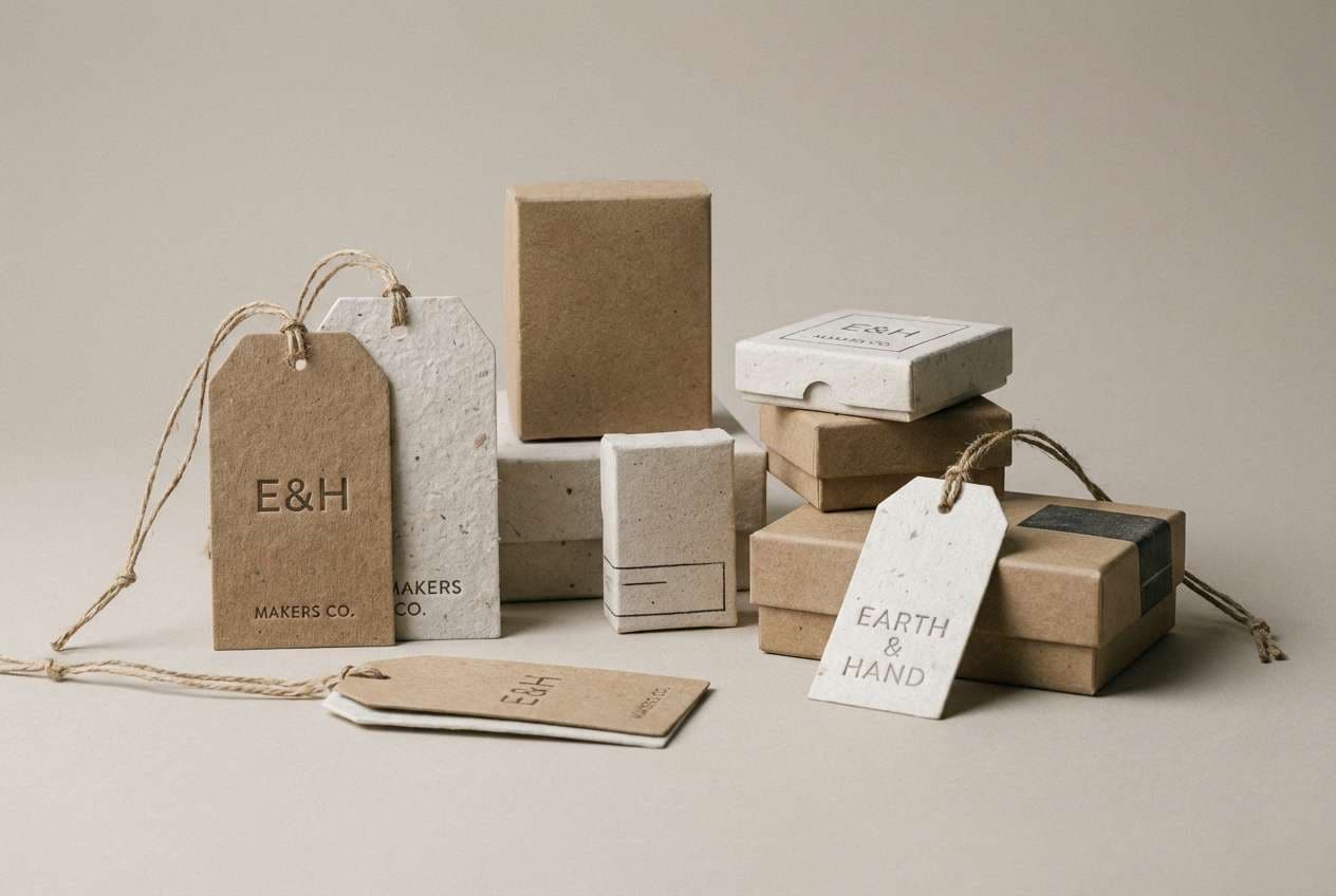
17) Ceramic Studio
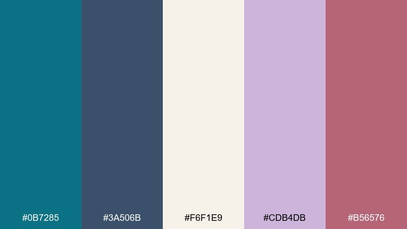
HEX: #0B7285 #3A506B #F6F1E9 #CDB4DB #B56576
Mood: artsy, handmade, warm-modern
Best for: craft shop branding and product tags
Artsy and handmade, like glazed ceramics drying on a studio shelf. The creamy base makes the teal and slate feel softer, while mauve and rose add a tactile, human warmth. Pair it with textured paper and simple stamp-style marks for an authentic feel. Tip: keep teal for the logo and let the warm tones rotate as seasonal accents.
Image example of ceramic studio generated using media.io
18) Art Deco Bay
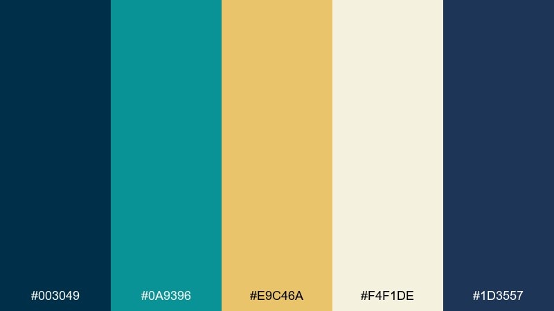
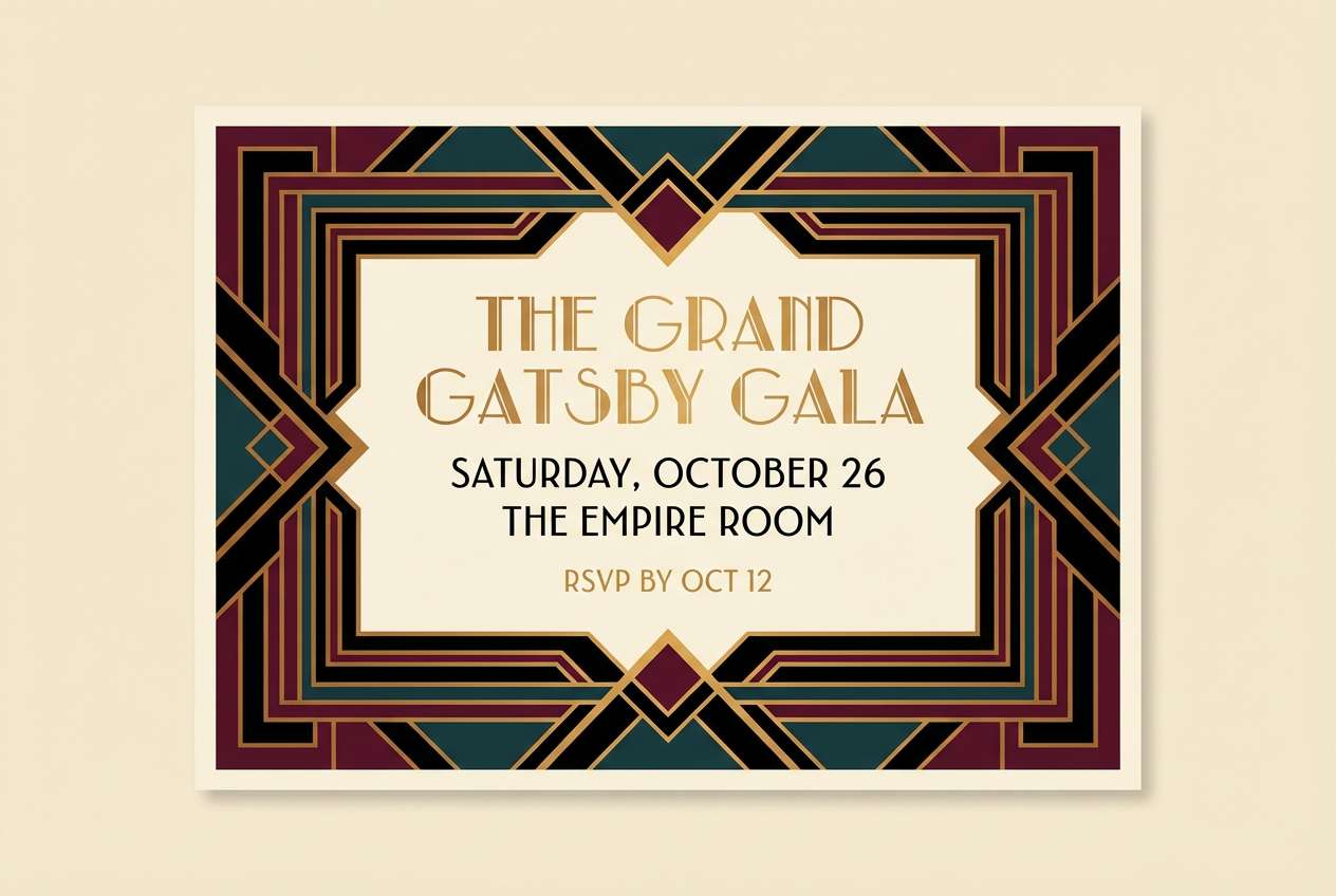
HEX: #003049 #0A9396 #E9C46A #F4F1DE #1D3557
Mood: glam, structured, vintage-modern
Best for: cocktail bar menus and invitations
Glam and structured, like an art deco lobby with brass lines and ocean views. The teal and navy hold strong geometry, while the gold adds a celebratory lift. Pair it with symmetrical layouts and thin line borders for a classic vibe. Tip: use gold for dividers and section headings to make the page feel premium without flooding it with color.
Image example of art deco bay generated using media.io
19) Mountain Lake Fog
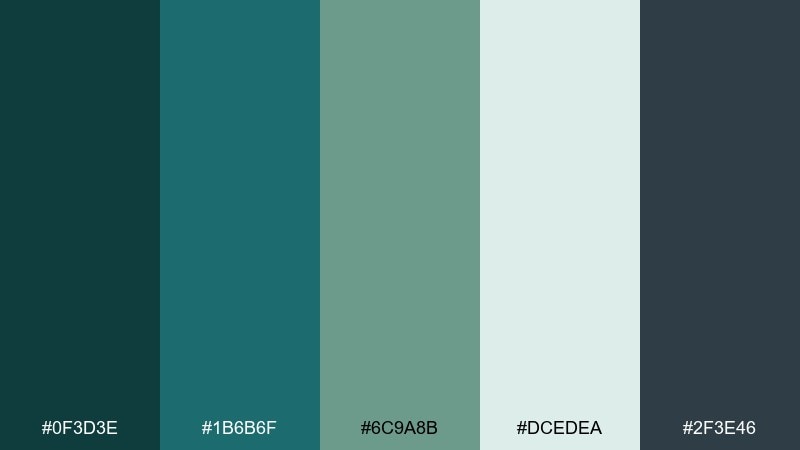
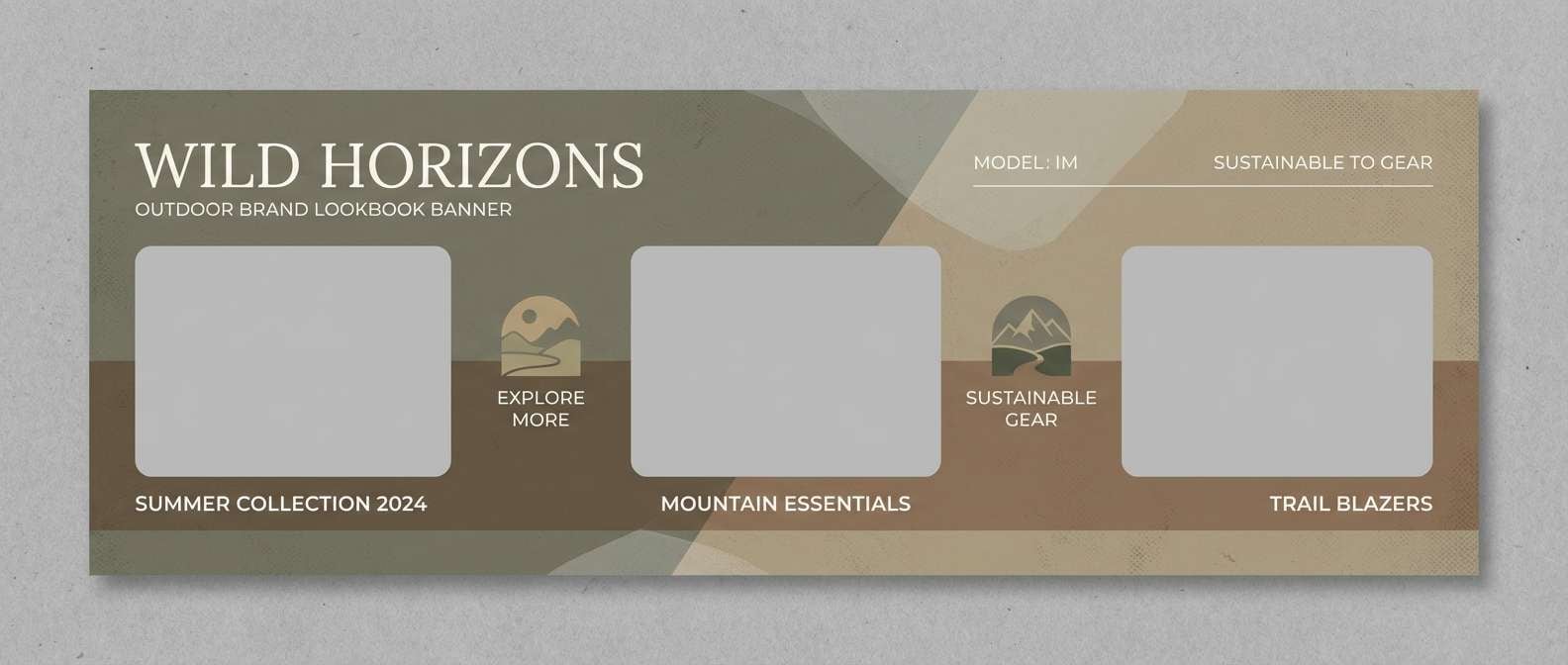
HEX: #0F3D3E #1B6B6F #6C9A8B #DCEDEA #2F3E46
Mood: natural, muted, restorative
Best for: outdoor brand lookbooks and web banners
Natural and restorative, like fog lifting off a mountain lake at dawn. The muted greens keep the teal grounded and earthy, making it ideal for nature-focused storytelling. Pair it with warm neutrals, kraft textures, and documentary-style photography. Tip: use the palest tint for overlay panels so text stays readable on busy images.
Image example of mountain lake fog generated using media.io
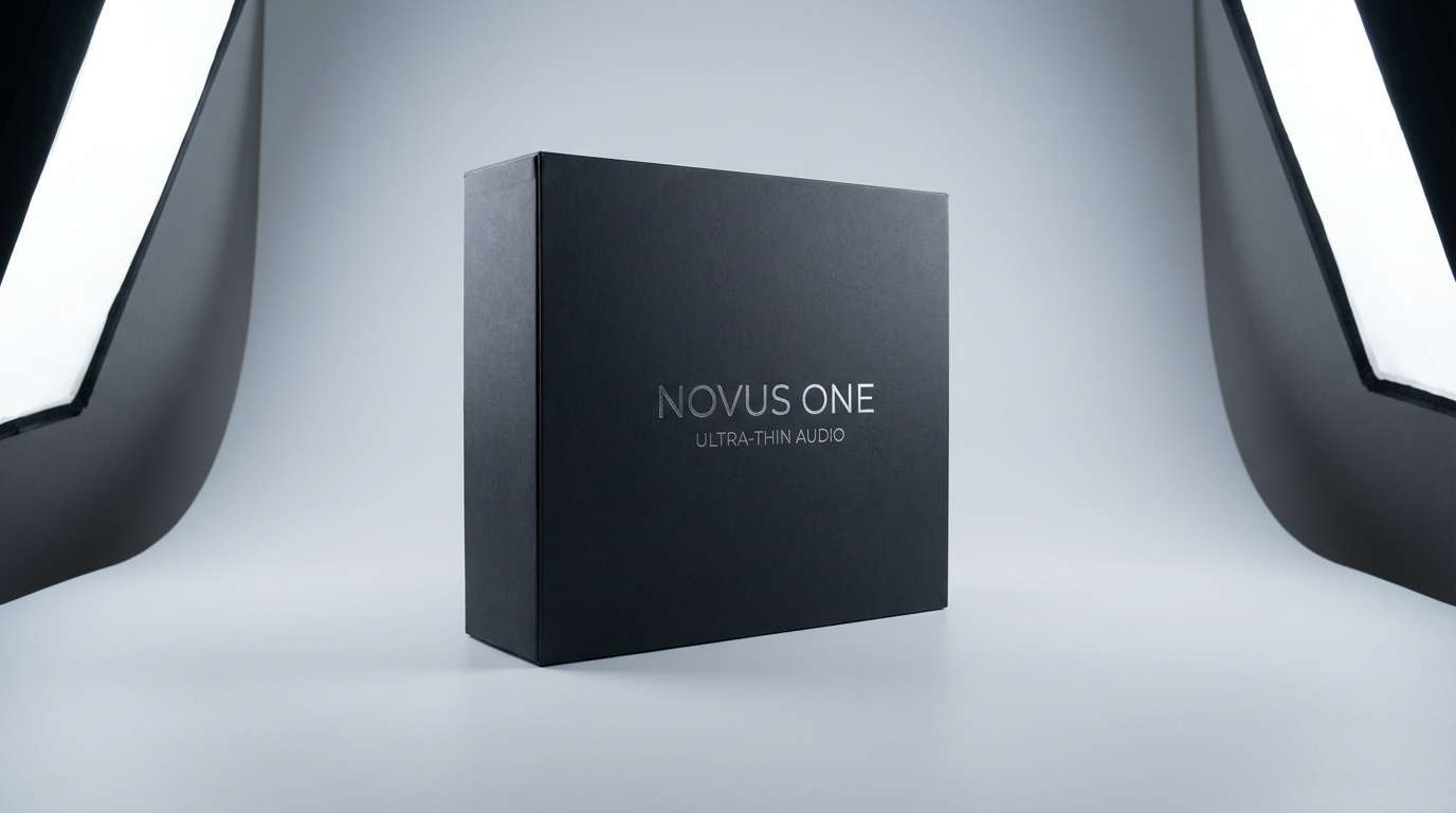
20) Electric Meridian
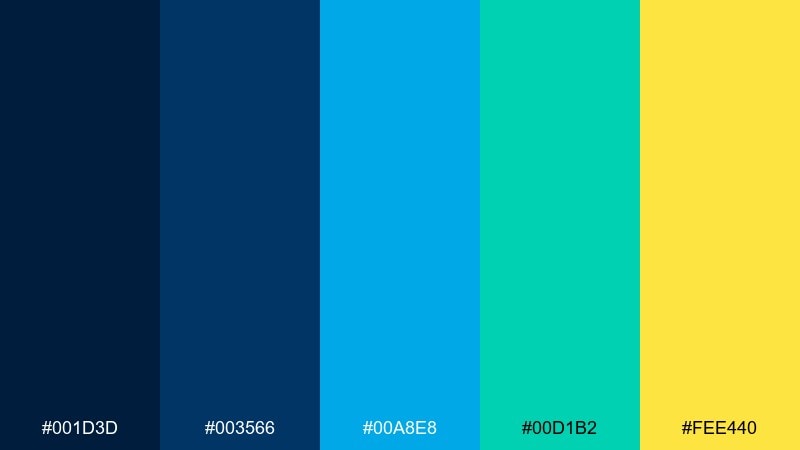
HEX: #001D3D #003566 #00A8E8 #00D1B2 #FEE440
Mood: confident, bright, modern
Best for: product ads and launch graphics
Confident and bright, like a clean beam of light cutting across a night sky. The blues deliver strong tech energy while the aqua-green keeps it fresh and friendly. Pair it with sharp typography and plenty of contrast so the yellow reads as an intentional spotlight. Tip: use yellow only for one focal element per layout, such as price or launch date.
Image example of electric meridian generated using media.io
What Colors Go Well with Teal Blue?
Teal blue pairs beautifully with warm accents that add “human” energy—coral, terracotta, amber, and gold are especially effective for highlights, badges, and calls to action. These opposites create a balanced warm-cool tension that feels intentional.
For calmer looks, use neutrals like sand, beige, warm white, and soft gray to keep teal blue from feeling too cold. If you want a more cinematic or premium tone, combine teal blue with navy, charcoal, and near-black for depth and hierarchy.
To keep the palette cohesive, decide whether teal blue is your main brand color or an accent. Then choose one accent family (warm or neon-bright) and repeat it consistently across components, graphics, and typography.
How to Use a Teal Blue Color Palette in Real Designs
Start by assigning roles to each tone: a deep teal/navy for navigation and headings, a mid teal for links and focus states, and a pale aqua for backgrounds or large surfaces. This prevents teal from competing with itself and makes your hierarchy clearer.
For branding and print, teal blue looks best when you balance ink coverage—use light tints for big areas and save saturated teals for logos, borders, or key shapes. Pair with paper texture (uncoated, linen, kraft) to soften the coolness if the design feels too clinical.
In UI, always check contrast before shipping: teal on white can be low-contrast at smaller sizes, while bright cyan on dark backgrounds can cause eye strain if overused. Treat the brightest tones as accents, not body text colors.
Create Teal Blue Palette Visuals with AI
If you’re building a mood board, ad concept, or UI mockup, generating palette-matched visuals helps you validate the feel before committing to production. With AI, you can quickly explore multiple directions—coastal, minimal, retro, or luxury—using the same teal blue base.
Reuse the prompts above, then iterate by swapping the subject (packaging, poster, dashboard) and adjusting lighting or style keywords (studio shot, flat 2D, editorial layout). Keep the aspect ratio tag as-is so your outputs fit your intended layout.
Once you have a strong visual direction, apply your HEX codes consistently across backgrounds, typography, buttons, and accent elements to keep the system cohesive.
Teal Blue Color Palette FAQs
-
What is the HEX code for teal blue?
Teal blue doesn’t have a single universal HEX value, but common teal-blue anchors include #0B7285, #0E7490, and #005F73. Choose the exact tone based on whether you want it to lean more blue (cooler) or more green (warmer). -
Is teal blue warm or cool?
Teal blue is generally considered a cool color because it sits between blue and green. It can feel slightly warmer when it leans greener (more teal) and cooler when it leans toward cyan/blue. -
What colors go best with teal blue for accents?
High-impact accent colors for teal blue include coral, gold/amber, and sunny yellow. Use them sparingly for CTAs, badges, and key highlights so teal blue remains the main visual identity. -
Does teal blue work well for UI design?
Yes—teal blue is excellent for UI because it feels modern and calming, and it supports strong hierarchy with dark anchors and pale backgrounds. Just make sure link and text colors meet contrast guidelines, especially when using mid-teal on white. -
How do I keep teal blue from looking too cold?
Add warm neutrals (beige, cream, sand) or warm accents (terracotta, coral, gold) and use softer materials or textures in visuals. In layouts, pair teal blue with warm typography choices or imagery that includes skin tones, wood, or sunlight. -
What’s a good teal blue palette for branding?
For clean, premium branding, try palettes like Ocean Glass (fresh and spa-like) or Peacock Velvet (dramatic and luxurious). The best choice depends on whether your brand should feel airy and clinical, or rich and boutique. -
Can I generate teal blue palette images with AI?
Yes. You can use Media.io’s text-to-image tool to generate posters, packaging, UI mockups, and mood boards that match a teal blue color scheme—then refine prompts for style, lighting, and composition.
Next: Teal Green Color Palette


