

Taupe sits in that sweet spot between beige, gray, and brown—neutral enough to feel timeless, but complex enough to look intentional. It’s a go-to base for interiors, brand systems, and UI because it softens contrast without washing designs out.
Below are 20+ taupe color palette ideas with HEX codes, plus practical pairing tips and AI prompts you can use to generate matching visuals fast.
In this article
- Why Taupe Palettes Work So Well
-
- linen cocoa dust
- stone mushroom modern
- rose taupe blush
- olive taupe field
- charcoal sand contrast
- coffee cream workshop
- desert clay minimal
- foggy taupe ui
- vintage bookstore
- spa pebble calm
- brass taupe luxe
- midnight taupe glam
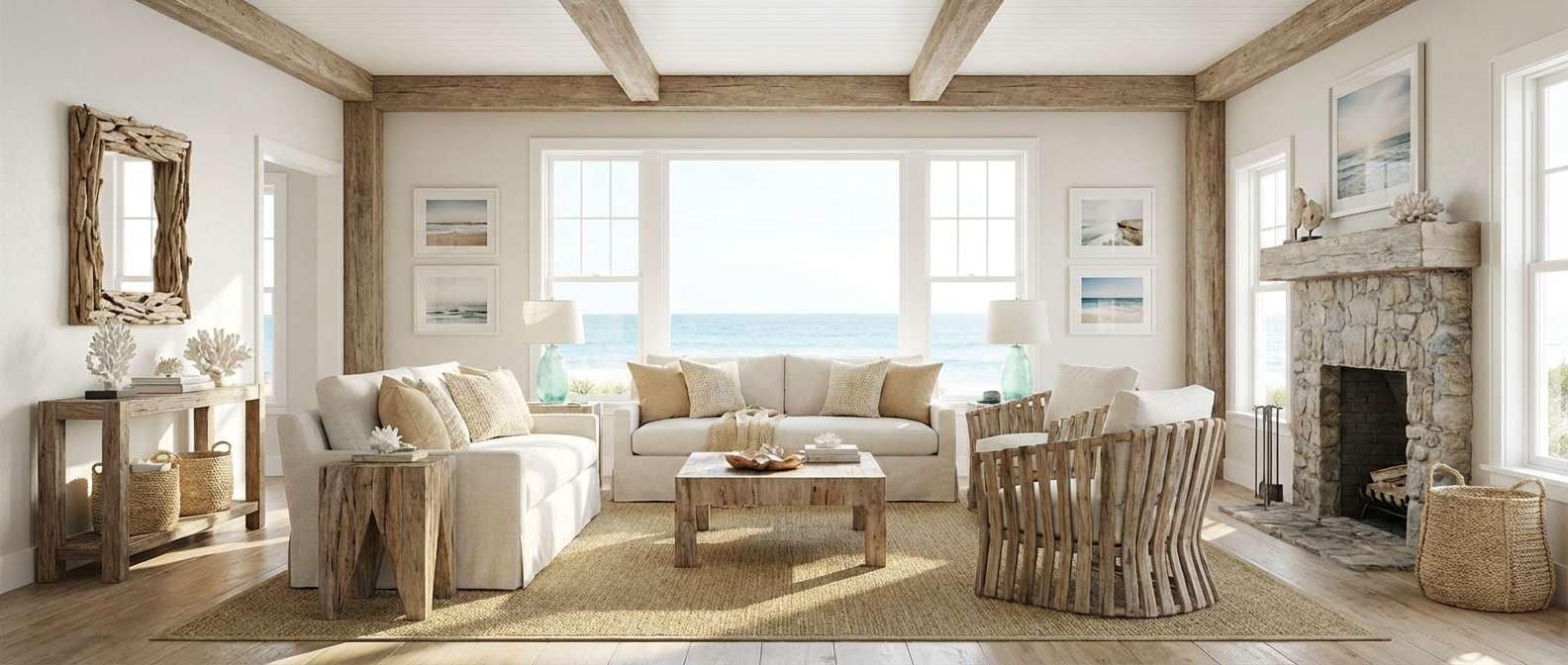
- coastal driftwood
- orchid taupe evening
- terracotta taupe home
- forest cabin neutrals
- monochrome clay studio
- soft taupe wedding suite
- tech startup neutral
- autumn taupe bouquet
- gallery taupe white
- cacao ink studio
- What Colors Go Well with Taupe?
- How to Use a Taupe Color Palette in Real Designs
- Create Taupe Palette Visuals with AI
Why Taupe Palettes Work So Well
Taupe is a “quiet” neutral with built-in depth. Because it carries both warm and cool undertones, it adapts to different lighting, materials, and screen settings better than flat beige or plain gray.
In branding and UI, taupe tones reduce visual fatigue and make typography feel calmer—especially when you reserve the darkest shade for headings, nav, and key UI structure. In interiors, taupe reads as cozy and grounded without turning a room yellow or cold.
Most importantly, taupe plays well with accents. You can push it modern with charcoal and steel, organic with olive and cream, or romantic with blush and orchid—all while keeping a cohesive, neutral foundation.
20+ Taupe Color Palette Ideas (with HEX Codes)
1) Linen Cocoa Dust
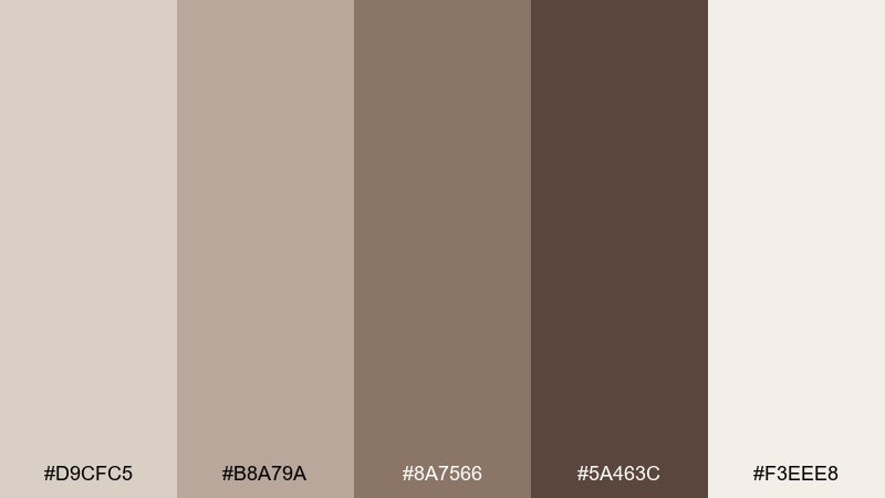
HEX: #d9cfc5 #b8a79a #8a7566 #5a463c #f3eee8
Mood: warm, airy, grounded
Best for: scandinavian interiors and lifestyle branding
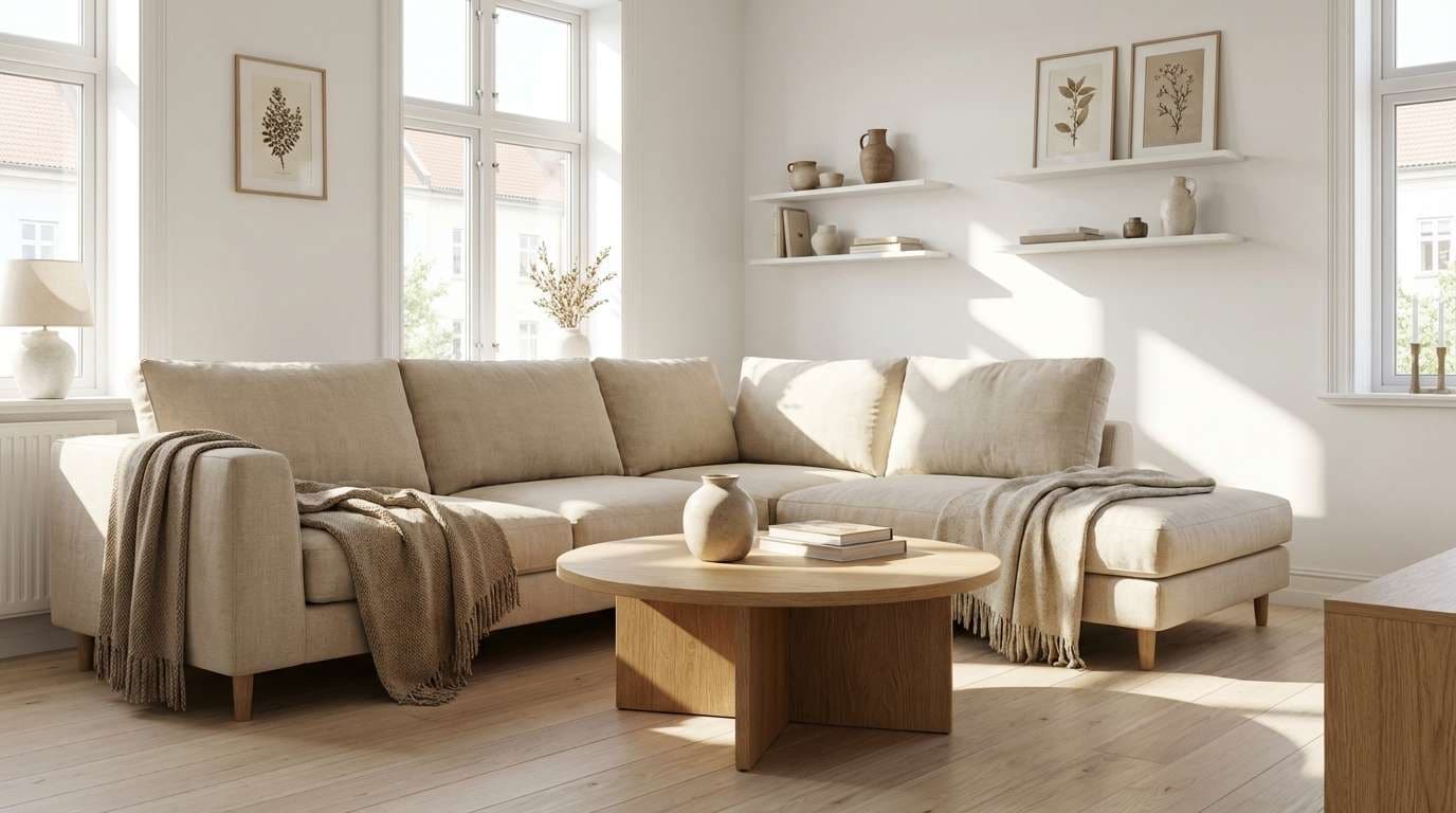
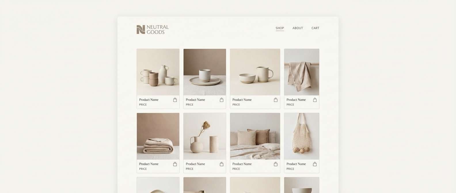
Warm and airy like sunlit linen and a fresh cup of cocoa, these tones feel calm without going flat. Use them for cozy living spaces, wellness brands, or product pages that need quiet confidence. Pair with off-white, matte black hardware, and light oak to keep it modern. Tip: reserve the deep brown for type and small accents so the palette stays breathable.
Image example of linen cocoa dust generated using media.io
Media.io is an online AI studio for creating and editing video, image, and audio in your browser.

2) Stone Mushroom Modern
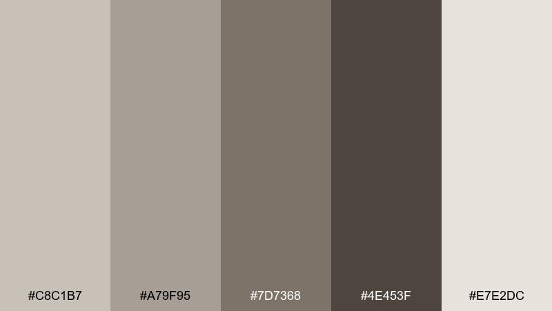
HEX: #c8c1b7 #a79f95 #7d7368 #4e453f #e7e2dc
Mood: cool, modern, refined
Best for: architectural websites and contemporary interiors
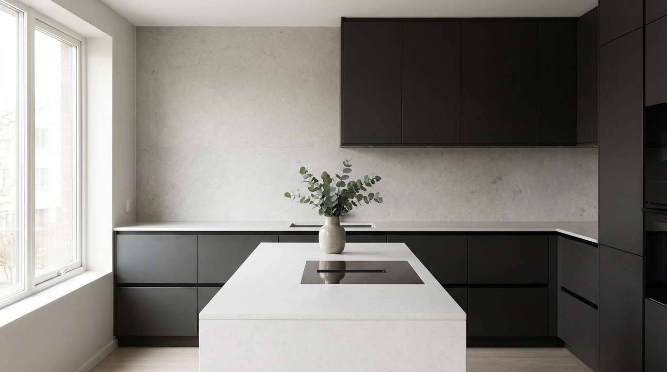
Cool stone and mushroom undertones create a sleek, gallery-like calm. This taupe color palette works beautifully for architecture portfolios, minimalist kitchens, and modern landing pages. Balance it with brushed steel, crisp white, and a single muted blue accent for depth. Tip: apply the mid-tone as your primary surface color and keep the darkest shade for navigation and headings.
Image example of stone mushroom modern generated using media.io
3) Rose Taupe Blush
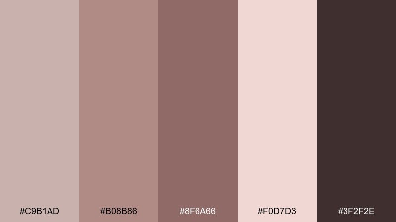
HEX: #c9b1ad #b08b86 #8f6a66 #f0d7d3 #3f2f2e
Mood: romantic, soft, vintage
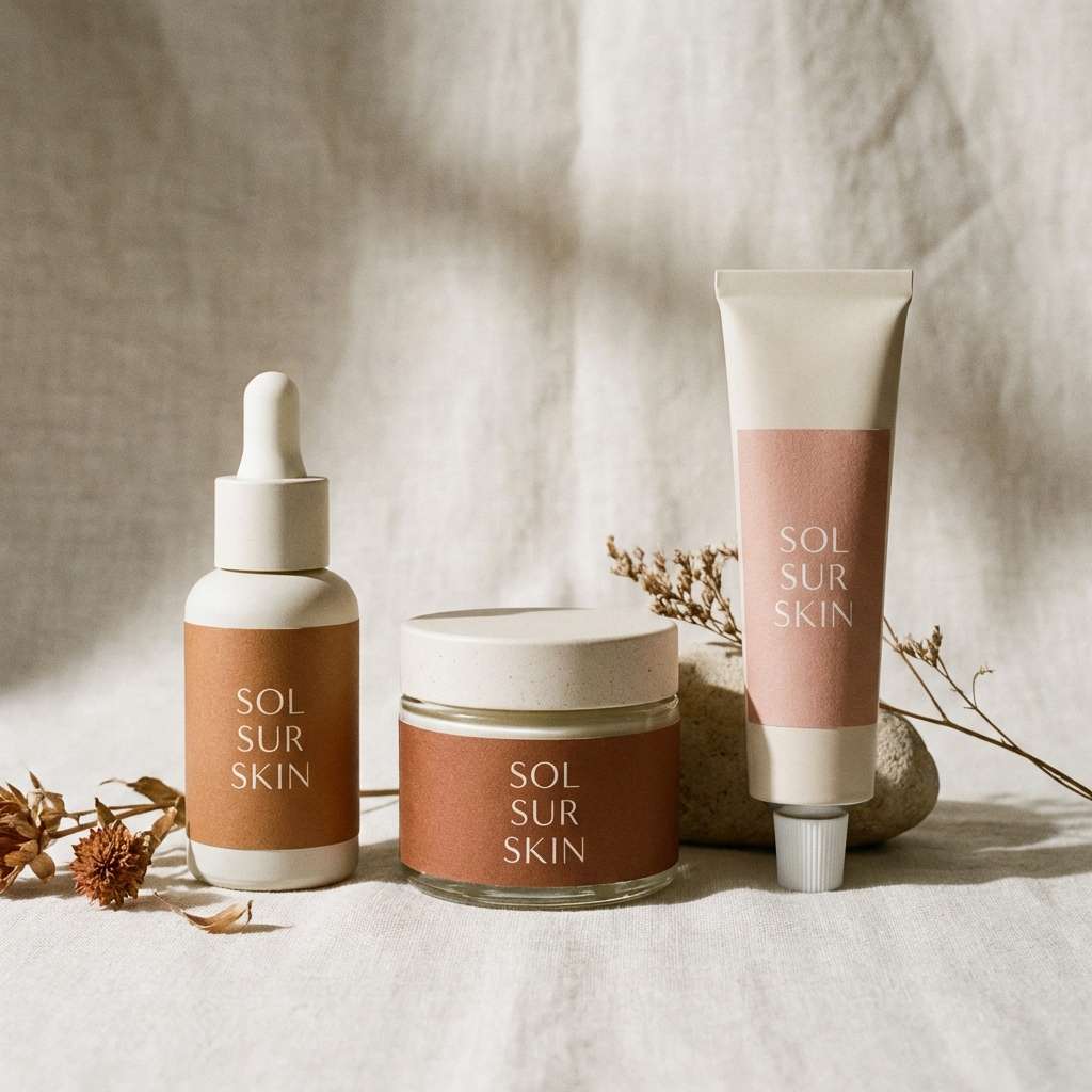
Best for: beauty branding and boutique packaging
Romantic and softly nostalgic, the blush-to-mauve range feels like pressed petals and velvet ribbons. It shines on skincare labels, candle boxes, and feminine editorial layouts. Pair with creamy whites and warm metallics like rose gold or brushed brass for a premium finish. Tip: use the dark cocoa shade for logos and fine text to keep contrast elegant.
Image example of rose taupe blush generated using media.io
4) Olive Taupe Field
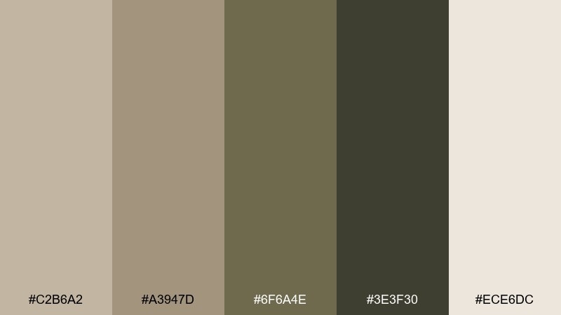
HEX: #c2b6a2 #a3947d #6f6a4e #3e3f30 #ece6dc
Mood: earthy, rustic, outdoorsy
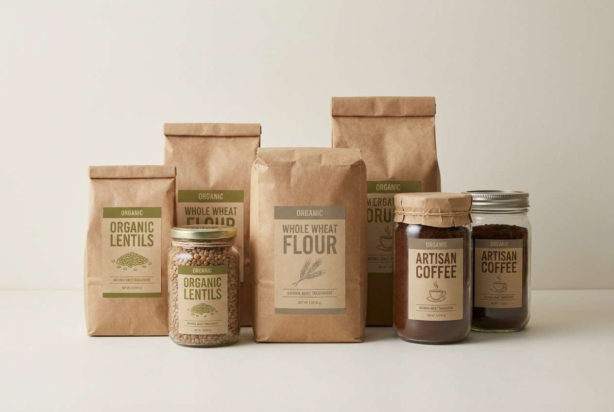
Best for: organic food brands and cabin decor
Earthy and outdoorsy, these shades feel like dry grasses, olive leaves, and worn leather. They fit organic packaging, farm-to-table menus, and rustic home accents. Pair with kraft paper textures, natural wood, and a crisp cream for readability. Tip: let the olive-dark tone act as your anchor color for icons and buttons.
Image example of olive taupe field generated using media.io
5) Charcoal Sand Contrast
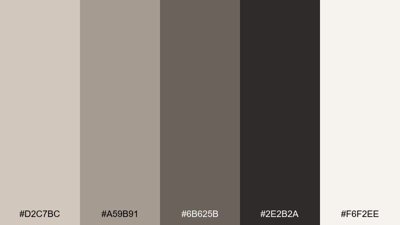
HEX: #d2c7bc #a59b91 #6b625b #2e2b2a #f6f2ee
Mood: bold, minimal, high-contrast
Best for: ui systems and editorial web design
Bold and modern, this mix reads like wind-swept sand against charcoal rock. The taupe color combinations here are ideal for UI themes that need contrast without harsh black-and-white. Pair with a single accent color like saffron, teal, or dusty rose for calls to action. Tip: use the near-black sparingly on large areas to keep the interface feeling light.
Image example of charcoal sand contrast generated using media.io
6) Coffee Cream Workshop
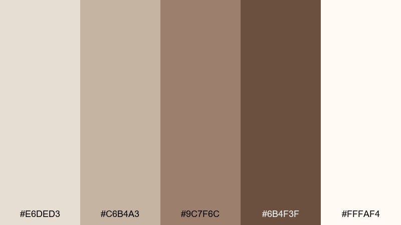
HEX: #e6ded3 #c6b4a3 #9c7f6c #6b4f3f #fffaf4
Mood: cozy, handcrafted, welcoming
Best for: cafes, craft stores, and ecommerce
Cozy and handcrafted, these tones evoke steamed milk, espresso, and worn workbenches. They suit cafe menus, artisan marketplaces, and product pages that benefit from warmth. Pair with hand-drawn line icons, textured paper, and a muted forest green accent. Tip: keep your background on the creamy end so product photography stays true to color.
Image example of coffee cream workshop generated using media.io
7) Desert Clay Minimal
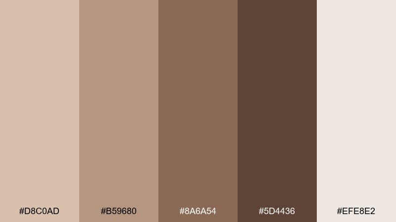
HEX: #d8c0ad #b59680 #8a6a54 #5d4436 #efe8e2
Mood: sunbaked, minimal, earthy
Best for: boho interiors and wellness content
Sunbaked and minimal, these clay-like neutrals feel like desert adobe and soft shadows at dusk. Use them for boho bedrooms, yoga studios, or calm blog layouts. Pair with terracotta ceramics, woven textiles, and a touch of sage to add freshness. Tip: repeat the mid-tone across surfaces to create cohesion, then punch in contrast with the deepest brown.
Image example of desert clay minimal generated using media.io
8) Foggy Taupe UI
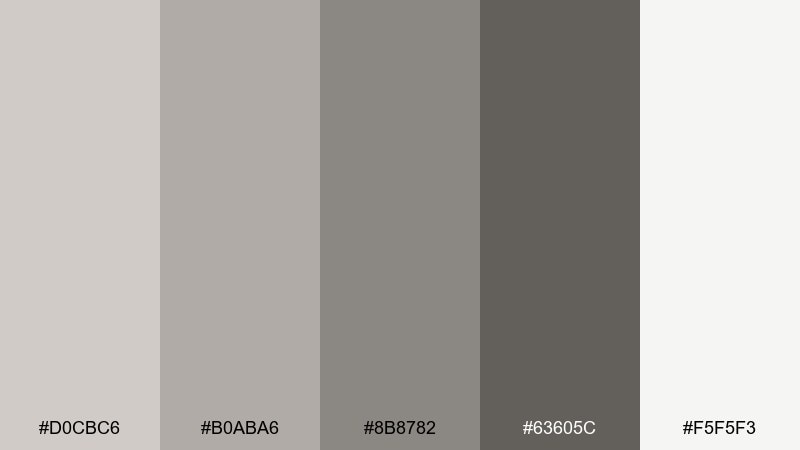
HEX: #d0cbc6 #b0aba6 #8b8782 #63605c #f5f5f3
Mood: quiet, balanced, professional
Best for: saas dashboards and mobile app ui
Quiet and balanced, these foggy neutrals keep screens feeling calm and readable. They work well for analytics dashboards, finance apps, and settings-heavy products where hierarchy matters. Pair with a cool blue or emerald accent for active states and links. Tip: map each shade to a UI token level so components stay consistent across pages.
Image example of foggy taupe ui generated using media.io
9) Vintage Bookstore
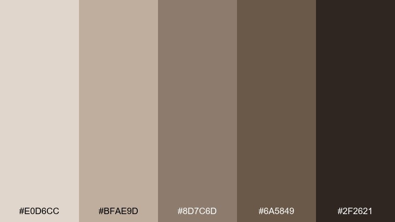
HEX: #e0d6cc #bfae9d #8d7c6d #6a5849 #2f2621
Mood: nostalgic, moody, literary
Best for: editorial layouts and bookish brands
Nostalgic and moody, these shades recall aged paper, leather spines, and quiet corners of a bookstore. As a taupe color scheme, it supports long-form editorial design, podcasts, and author websites without distracting from content. Pair with serif typography, warm cream backgrounds, and subtle grain textures. Tip: use the near-black for body text to keep reading comfortable.
Image example of vintage bookstore generated using media.io
10) Spa Pebble Calm
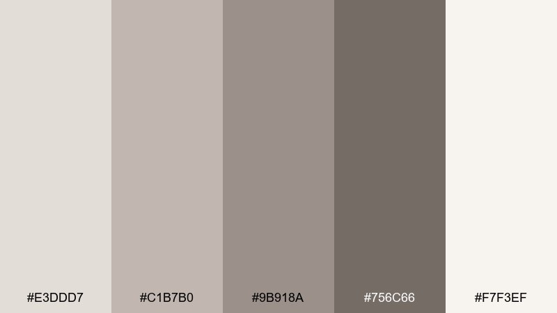
HEX: #e3ddd7 #c1b7b0 #9b918a #756c66 #f7f3ef
Mood: soothing, clean, restorative
Best for: spa brands and minimalist packaging
Soothing like smooth pebbles and steamed towels, these neutrals communicate cleanliness and care. They fit spa branding, hotel amenities, and gentle skincare lines. Pair with soft eucalyptus green, plenty of whitespace, and minimal iconography. Tip: keep photography bright and low-contrast so the palette stays serene.
Image example of spa pebble calm generated using media.io
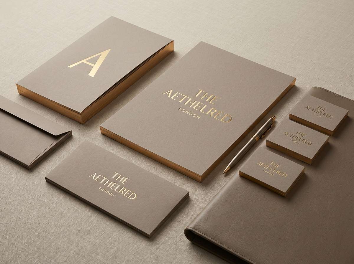
11) Brass Taupe Luxe
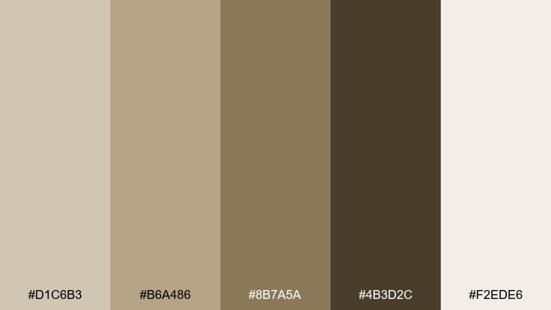
HEX: #d1c6b3 #b6a486 #8b7a5a #4b3d2c #f2ede6
Mood: luxe, warm, upscale
Best for: premium branding and boutique hotels
Luxe and warm, these tones feel like brass fixtures, velvet seating, and candlelit lobbies. The taupe color combinations pair naturally with metallic accents and rich materials for a high-end look. Use them in hotel branding, jewelry packaging, or elegant event collateral. Tip: add brass as a spot color in small doses to keep the design refined rather than flashy.
Image example of brass taupe luxe generated using media.io
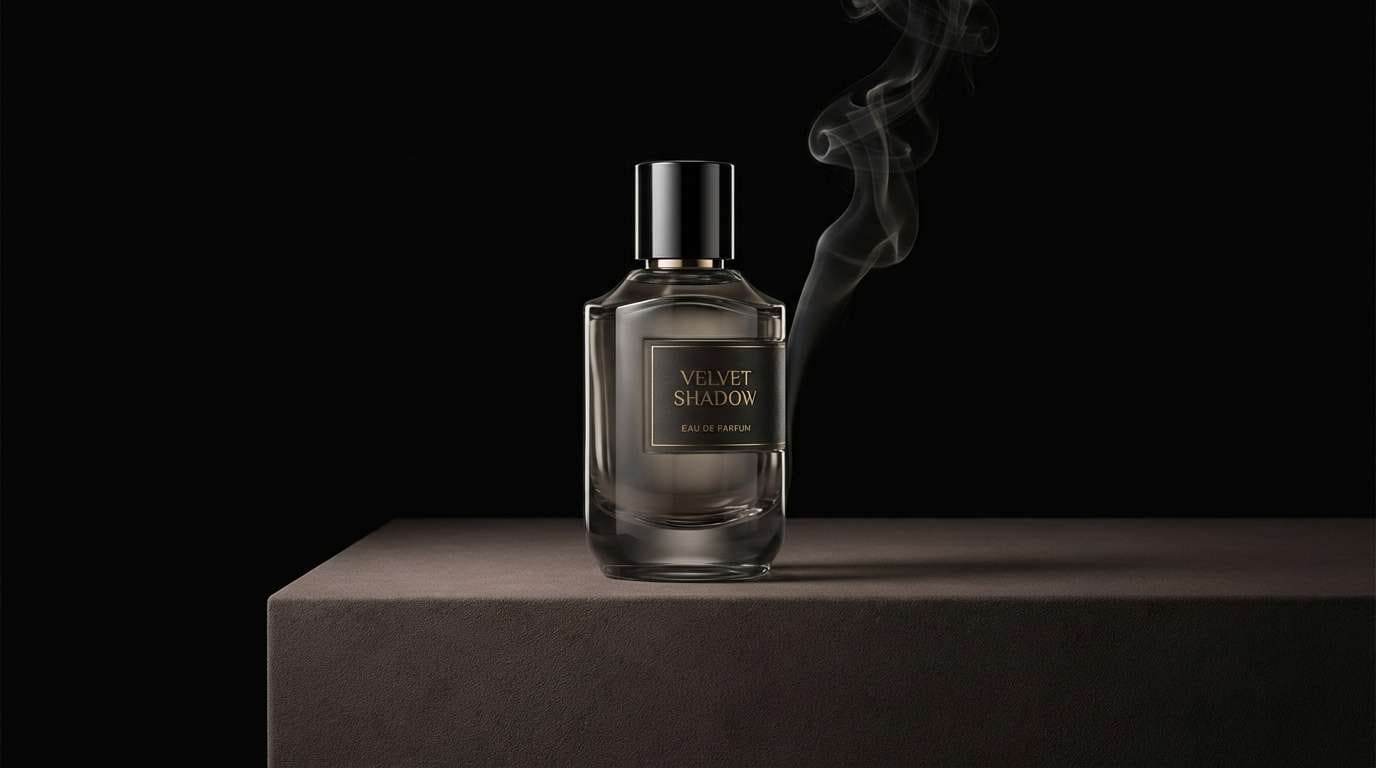
12) Midnight Taupe Glam
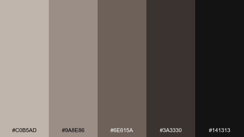
HEX: #c0b5ad #9a8e86 #6e615a #3a3330 #141313
Mood: dramatic, sleek, cinematic
Best for: nightlife promos and fashion branding
Dramatic and sleek, these shades suggest smoky rooms, satin fabric, and late-night city lights. They are strong for fashion lookbooks, fragrance ads, and premium website hero sections. Pair with a pale champagne highlight and sharp typography to keep it crisp. Tip: use the deepest black as a framing color, not a fill, to avoid swallowing details.
Image example of midnight taupe glam generated using media.io
13) Coastal Driftwood
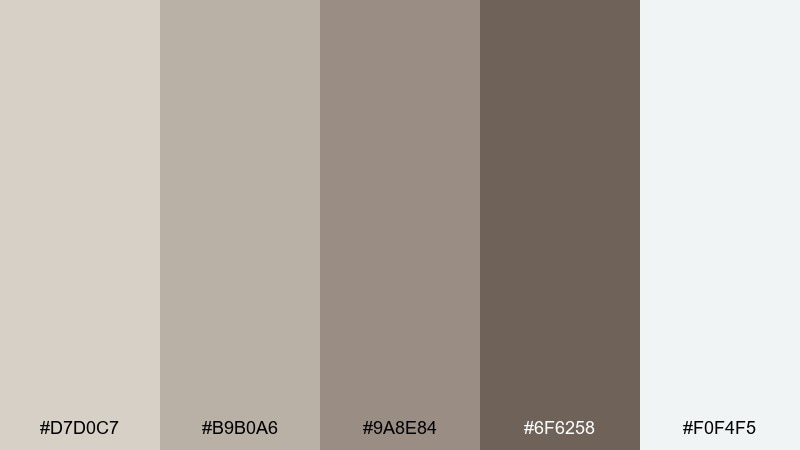
HEX: #d7d0c7 #b9b0a6 #9a8e84 #6f6258 #f0f4f5
Mood: breezy, coastal, relaxed
Best for: beach homes and travel websites
Breezy and relaxed, these driftwood neutrals feel like weathered boards and cool sea air. They suit coastal interiors, travel blogs, and airy ecommerce themes. Pair with misty blues, sea glass green, and plenty of natural light in photos. Tip: keep the coolest light shade as your background to make content feel open.
Image example of coastal driftwood generated using media.io
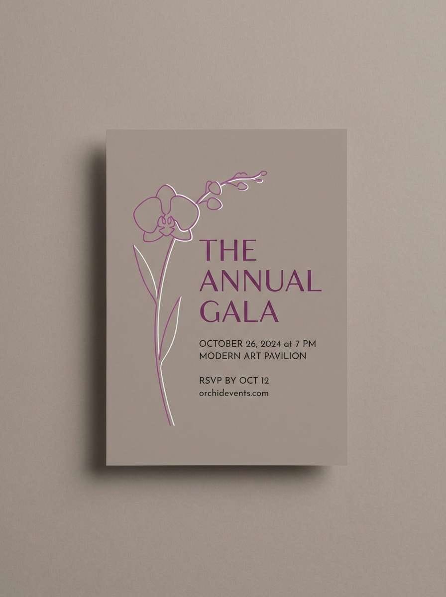
14) Orchid Taupe Evening
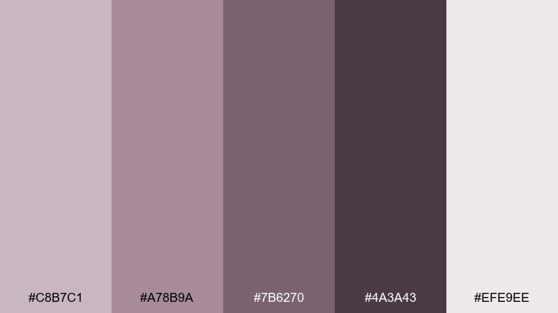
HEX: #c8b7c1 #a78b9a #7b6270 #4a3a43 #efe9ee
Mood: moody, elegant, artistic
Best for: creative portfolios and event design
Moody and elegant, the orchid undertone adds an artistic hush to neutral foundations. It works for portfolio sites, gallery invitations, and boutique event branding where you want softness with edge. Pair with deep plum or ink accents and textured paper stocks. Tip: keep the light lavender-taupe as negative space so the darker tones feel intentional.
Image example of orchid taupe evening generated using media.io
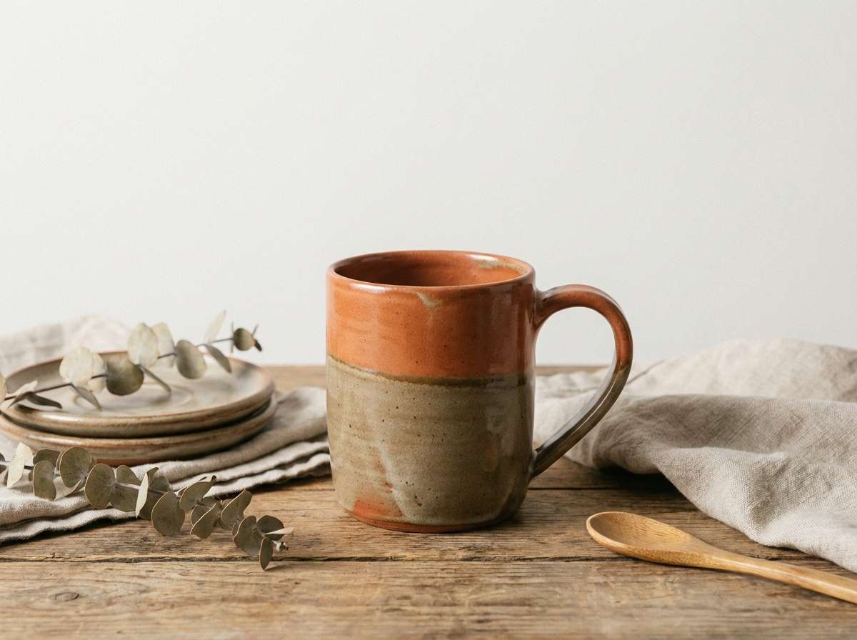
15) Terracotta Taupe Home
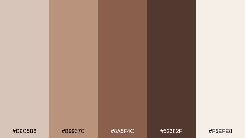
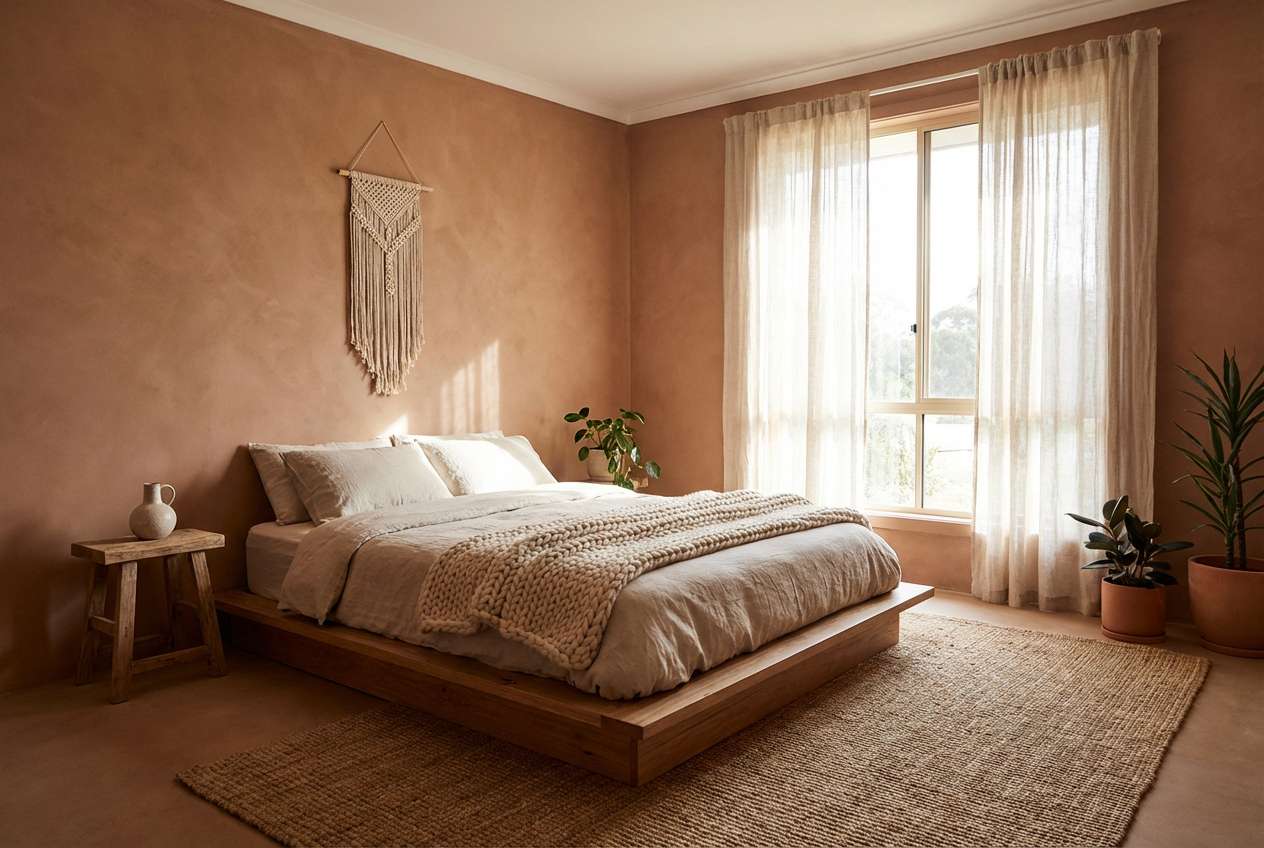
HEX: #d6c5b8 #b9937c #8a5f4c #52382f #f5efe8
Mood: homey, warm, mediterranean
Best for: kitchen decor and home goods branding
Homey and warm, this mix evokes terracotta pots, toasted spices, and sunlit plaster walls. It is a friendly fit for kitchen decor, handmade ceramics, and home goods brands. Pair with creamy whites, olive greenery, and a hint of cobalt for a mediterranean twist. Tip: use the richest terracotta-brown for focal points like buttons, badges, or packaging seals.
Image example of terracotta taupe home generated using media.io
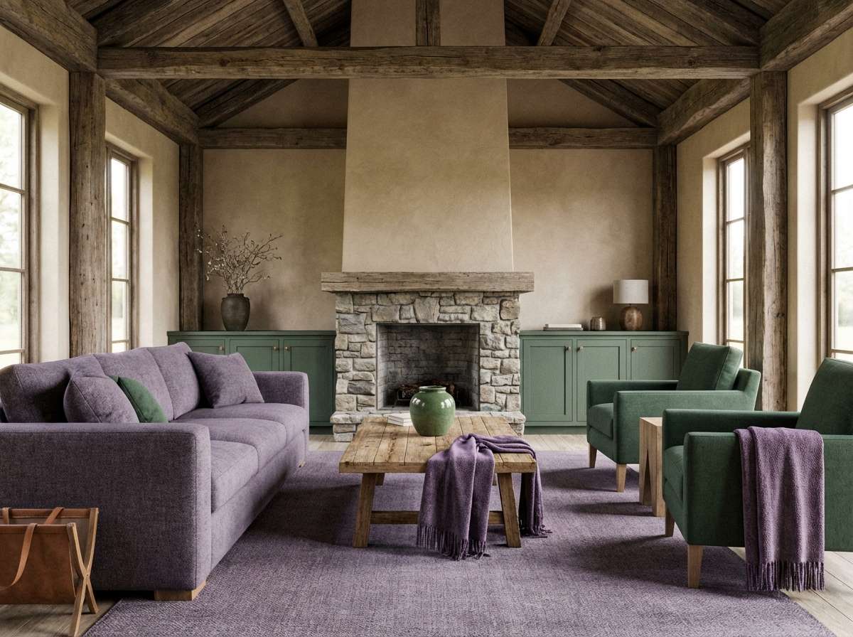
16) Forest Cabin Neutrals
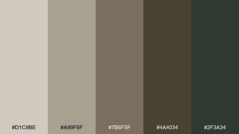
HEX: #d1c9be #a99f8f #7b6f5f #4a4034 #2f3a34
Mood: woodsy, grounded, rugged
Best for: outdoor brands and lodge interiors
Woodsy and grounded, these tones feel like cabin walls, wool blankets, and evergreen shade. They suit outdoor brands, lodge decor, and heritage-style packaging. Pair with raw wood textures and a muted deep green for natural contrast. Tip: keep the darkest green as a supporting accent so the neutrals stay in control.
Image example of forest cabin neutrals generated using media.io
17) Monochrome Clay Studio
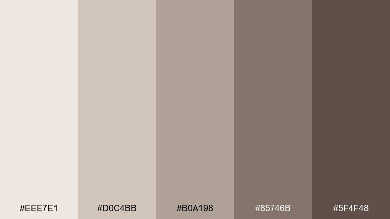
HEX: #eee7e1 #d0c4bb #b0a198 #85746b #5f4f48
Mood: minimal, balanced, studio-clean
Best for: product mockups and neutral photography backdrops
Minimal and studio-clean, these clay neutrals create smooth tonal steps from light to deep. They are perfect for product mockups, portfolio backgrounds, and clean ecommerce category pages. Pair with crisp white highlights and one saturated accent color for emphasis. Tip: use the mid-tone behind products to reduce glare and keep edges readable.
Image example of monochrome clay studio generated using media.io
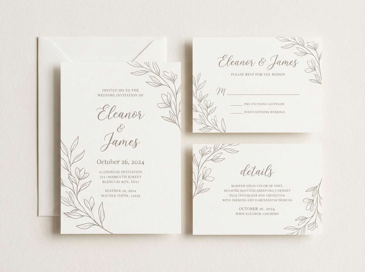
18) Soft Taupe Wedding Suite
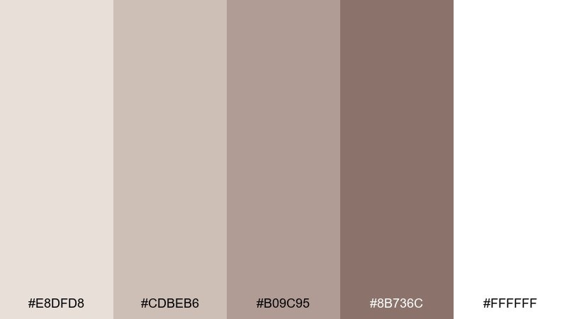
HEX: #e8dfd8 #cdbeb6 #b09c95 #8b736c #ffffff
Mood: romantic, airy, timeless
Best for: wedding invitations and stationery
Romantic and airy, these soft neutrals feel like chiffon, dried florals, and candlelight. This taupe color palette is a natural choice for wedding suites, menus, and place cards that need warmth without heaviness. Pair with delicate line art, warm gray ink, and a hint of dusty rose for freshness. Tip: print the darker taupe on uncoated stock for a tactile, timeless finish.
Image example of soft taupe wedding suite generated using media.io
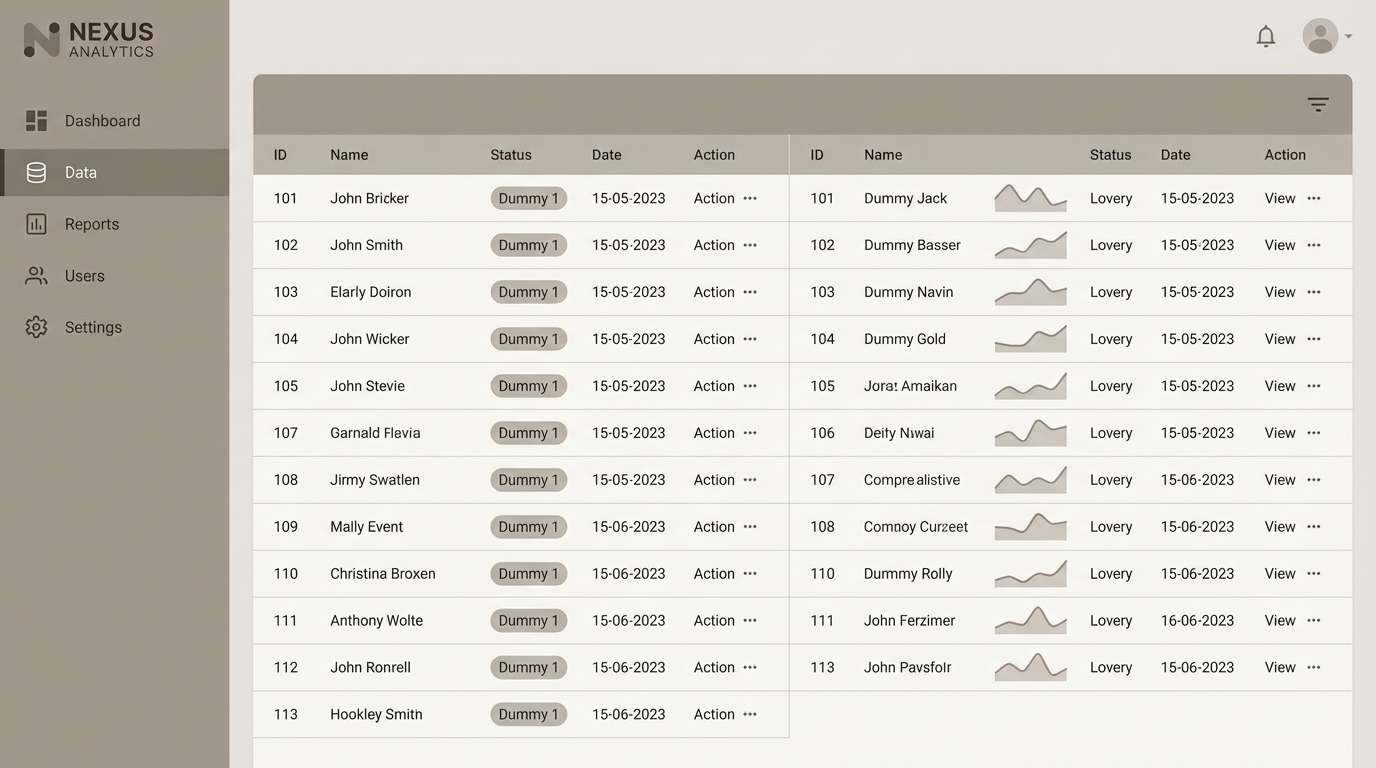
19) Tech Startup Neutral
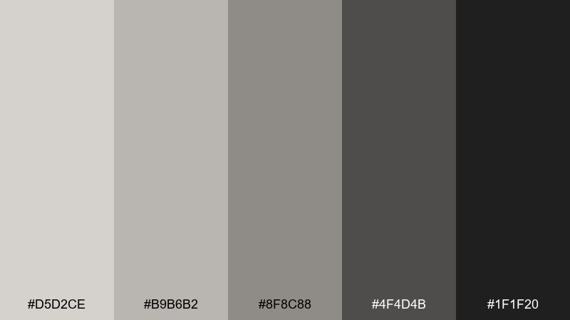
HEX: #d5d2ce #b9b6b2 #8f8c88 #4f4d4b #1f1f20
Mood: sharp, modern, trustworthy
Best for: b2b saas branding and ui design systems
Sharp and modern, these neutrals bring trust and clarity to digital products. They work as a flexible base for a design system, letting charts and highlights stand out. Pair with electric blue or lime accents for clear interactive states and status colors. Tip: set your default surfaces in the lightest gray-taupe to reduce eye strain during long sessions.
Image example of tech startup neutral generated using media.io
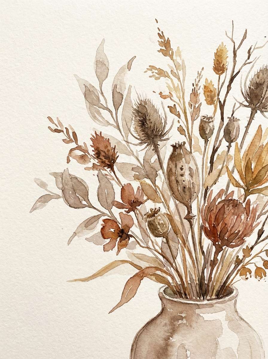
20) Autumn Taupe Bouquet
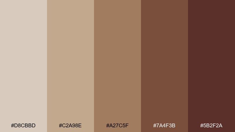
HEX: #d8cbbd #c2a98e #a27c5f #7a4f3b #5b2f2a
Mood: seasonal, rich, inviting
Best for: fall campaigns and floral branding
Seasonal and rich, these shades feel like dried bouquets, cinnamon bark, and late-afternoon warmth. Use them for autumn campaigns, cozy social templates, or artisanal gift packaging. Pair with creamy backgrounds and muted sage to keep the look fresh. Tip: limit the darkest maroon-brown to small details like borders or stamps for a handcrafted vibe.
Image example of autumn taupe bouquet generated using media.io
21) Gallery Taupe White
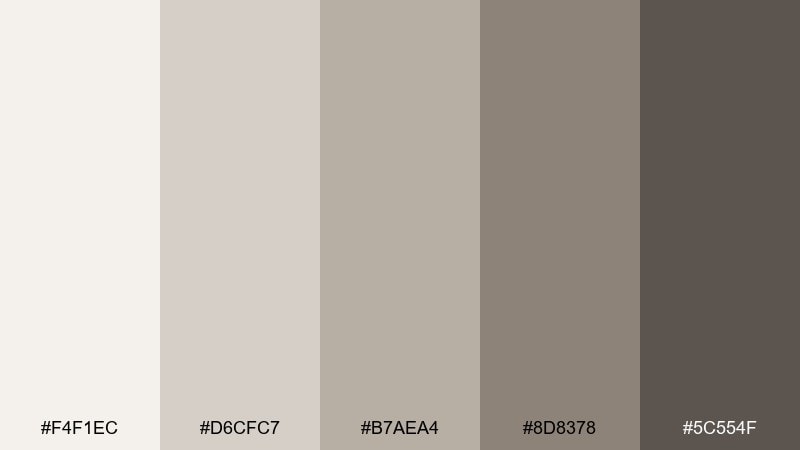
HEX: #f4f1ec #d6cfc7 #b7aea4 #8d8378 #5c554f
Mood: clean, curated, sophisticated
Best for: art portfolios and minimal ecommerce
Clean and curated, these neutrals feel like a bright gallery wall with subtle shadow play. They suit art portfolios, furniture catalogs, and calm ecommerce layouts. Pair with a single saturated accent like ultramarine or vermilion to spotlight key pieces. Tip: keep borders and dividers ultra-light so products and artwork remain the focus.
Image example of gallery taupe white generated using media.io
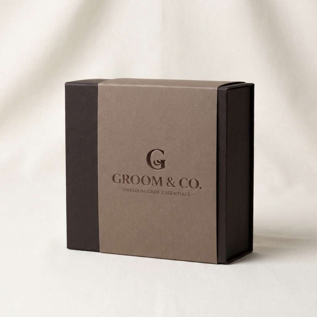
22) Cacao Ink Studio
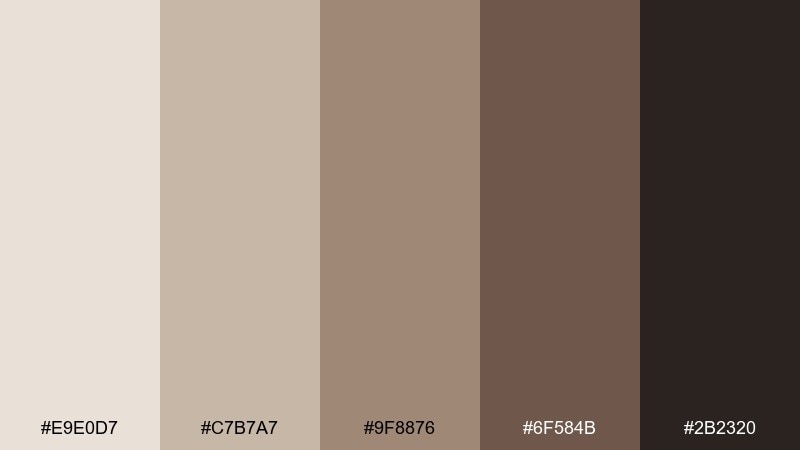
HEX: #e9e0d7 #c7b7a7 #9f8876 #6f584b #2b2320
Mood: moody, artisanal, confident
Best for: coffee brands and masculine packaging
Moody and artisanal, these cacao-to-ink tones bring weight and confidence to branding. The taupe color combination plays well with kraft textures, embossing, and minimalist line marks. Use it for specialty coffee, grooming products, or premium stationery. Tip: print the darkest shade as a rich ink for logos, then let the lighter tones handle background warmth.
Image example of cacao ink studio generated using media.io
What Colors Go Well with Taupe?
Clean neutrals are the easiest match: cream, off-white, and soft gray make taupe look brighter and more modern. For stronger contrast, deep charcoal or near-black gives taupe a crisp edge without the harshness of pure black-and-white.
Earth accents are a natural fit—olive, sage, terracotta, and warm wood tones pull taupe toward an organic, lived-in feel. If you want something more expressive, try dusty rose, muted lavender, or misty blue to add personality while staying refined.
Metallics work especially well with taupe undertones: brass and champagne gold amplify warmth, while brushed steel keeps things cool and architectural.
How to Use a Taupe Color Palette in Real Designs
Start by assigning roles, not just colors. Use your lightest taupe/cream for backgrounds, a mid-tone for surfaces (cards, panels, walls), and the darkest shade for text, navigation, or small architectural accents.
Because taupe is subtle, texture and finish matter. In interiors, combine matte walls with natural textiles, oak, stone, or leather. In digital design, add hierarchy with spacing, borders, and tonal steps—then introduce one accent color for CTAs, links, and highlights.
For accessibility, test contrast early. Taupe-on-taupe can look elegant but may fail readability; keep body text closer to charcoal, and reserve lighter taupes for large areas and supporting UI.
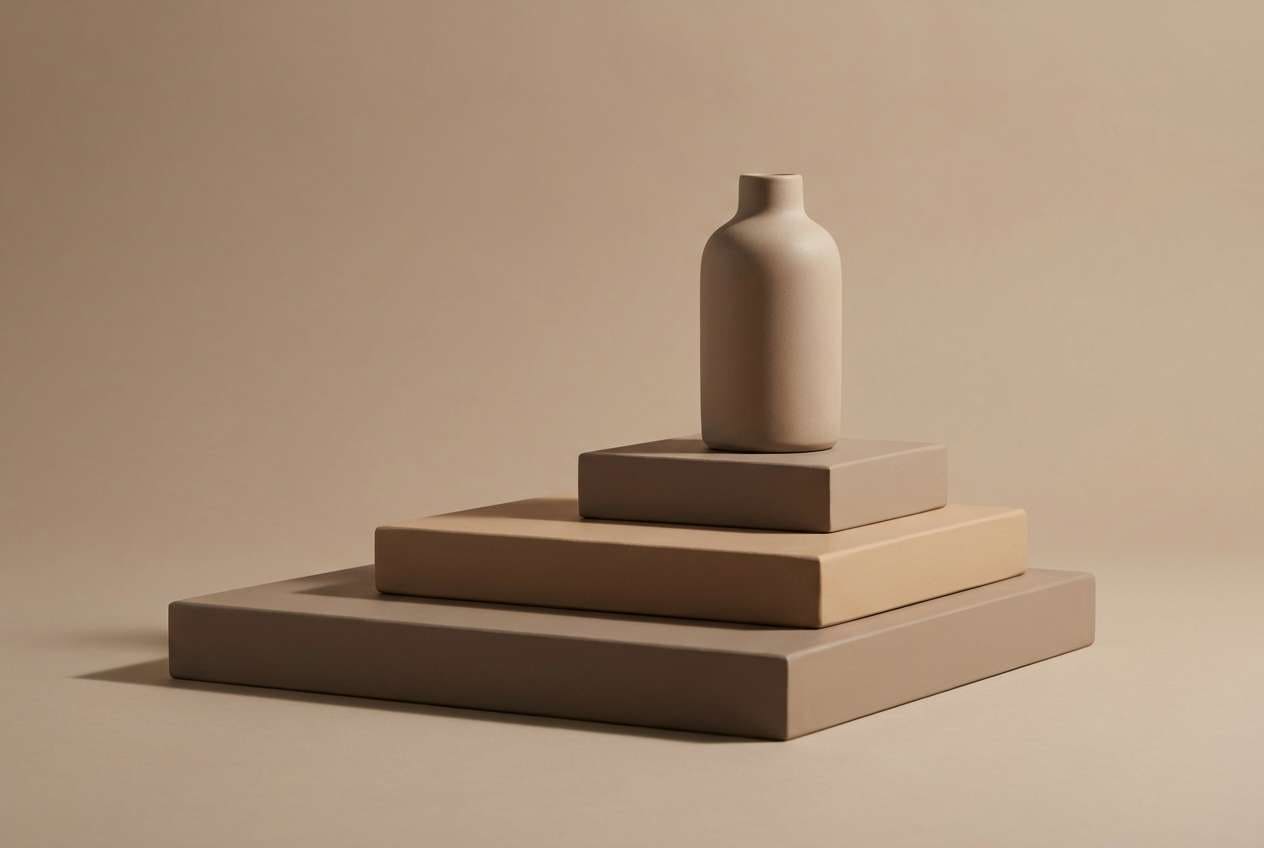
Create Taupe Palette Visuals with AI
If you’re building a moodboard, product mockup, or brand presentation, generating visuals that match your taupe tones can save hours. The key is to describe materials, lighting, and mood (linen, stone, brass, foggy daylight) alongside your design style (minimal, rustic, luxe).
Use the prompts above as plug-and-play starting points, then swap the scene (interior, packaging, UI) to fit your project. Consistent prompts help you produce a cohesive set of images that “feel” like the same palette.
To get started, generate a few variations and pick the one with the closest warmth/coolness to your taupe base—then refine with small prompt tweaks.
Taupe Color Palette FAQs
-
What is taupe, exactly?
Taupe is a neutral that blends brown and gray (sometimes with a hint of beige). Depending on the undertone, it can read warmer (more brown) or cooler (more gray), which is why it works across many styles. -
Is taupe warm or cool?
It can be either. Warm taupe leans brown/cream and pairs well with brass, terracotta, and oak. Cool taupe leans gray/mushroom and pairs well with steel, crisp white, and muted blues. -
What’s the best accent color for a taupe color scheme?
For a safe, modern accent, try muted blue or teal. For organic warmth, use olive or sage. For a romantic look, add dusty rose or orchid tones. Keep accents limited so taupe stays the foundation. -
How do I keep taupe from looking dull in a design?
Add contrast and texture: include a dark anchor (charcoal/near-black), use off-white for breathing room, and bring in materials (grain, linen, stone) or one accent hue to create focal points. -
Can taupe work for UI and app design?
Yes. Taupe-based neutrals are comfortable for long sessions and make bright status colors stand out. Just ensure text contrast is strong (often charcoal on light taupe) and define consistent tonal steps for surfaces and borders. -
What’s the difference between taupe and beige?
Beige is typically warmer and more yellow-leaning, while taupe includes more gray. Taupe often feels more modern and “quiet,” especially in minimal or editorial layouts. -
How can I generate taupe-themed visuals quickly?
Use an AI text-to-image tool and describe the setting (interior, packaging, UI), lighting (soft daylight, studio), and materials (linen, stone, brass). Then iterate with small changes until the images match your taupe palette.


