

Tan is a warm neutral that instantly makes designs feel grounded, approachable, and timeless. It’s versatile enough for modern UI, cozy interiors, and premium branding—without feeling cold or sterile.
Below are 20 tan color palette ideas with HEX codes, plus practical pairing tips and AI prompts you can use to generate matching visuals in seconds.
In this article
- Why Tan Palettes Work So Well
-
- desert linen
- sandstone studio
- cocoa drift
- sunbaked adobe
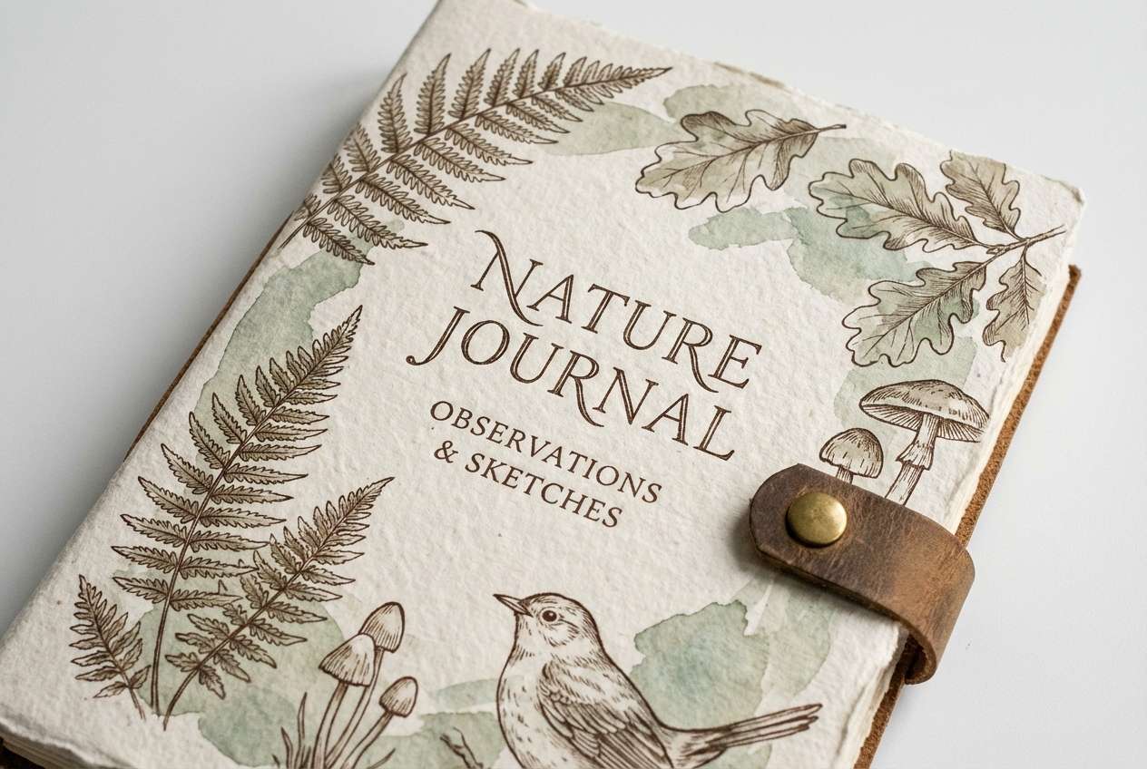
- oatmilk minimal
- camel and sage
- tan and navy classic
- terracotta glow
- sepia meadow
- honeyed copper
- beachboard pastels
- rustic leather
- clay and charcoal
- warm marble
- golden wheat
- espresso cream
- vintage paper
- dune blossom
- walnut orchid
- pebble and teal
- What Colors Go Well with Tan?
- How to Use a Tan Color Palette in Real Designs
- Create Tan Palette Visuals with AI
Why Tan Palettes Work So Well
Tan sits in the sweet spot between beige and brown, so it brings warmth without the heaviness of darker earth tones. That makes it a reliable base color for layouts that need to feel welcoming, calm, and “human.”
Because tan is naturally low-saturation, it plays nicely with both cool and warm accents—navy, teal, sage, terracotta, blush, and even near-black. You can shift the same tan foundation from airy and minimal to rich and premium just by changing the accent and contrast colors.
Tan is also forgiving across materials and lighting, which is why it’s popular in interiors and product photography. In digital design, that translates into backgrounds and surfaces that feel soft on the eyes and easier to read for long-form content.
20+ Tan Color Palette Ideas (with HEX Codes)
1) Desert Linen
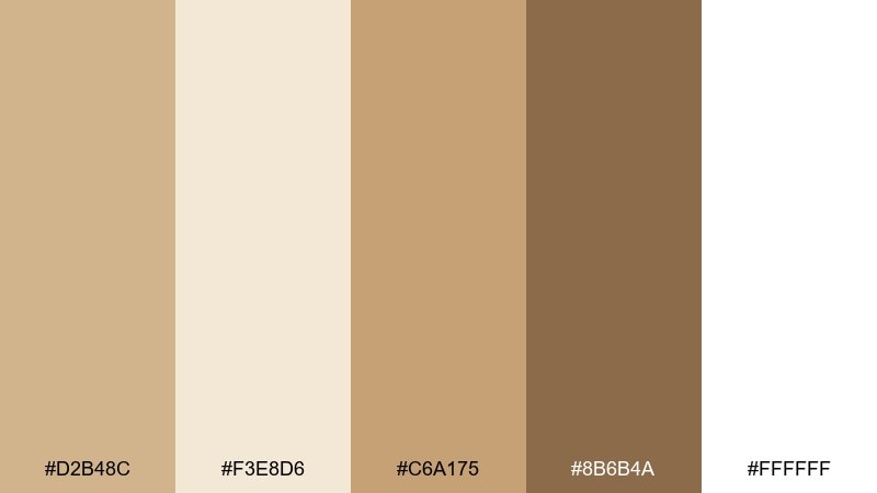
HEX: #D2B48C #F3E8D6 #C6A175 #8B6B4A #FFFFFF
Mood: calm, airy, sunlit
Best for: scandi interiors, wellness branding, landing pages
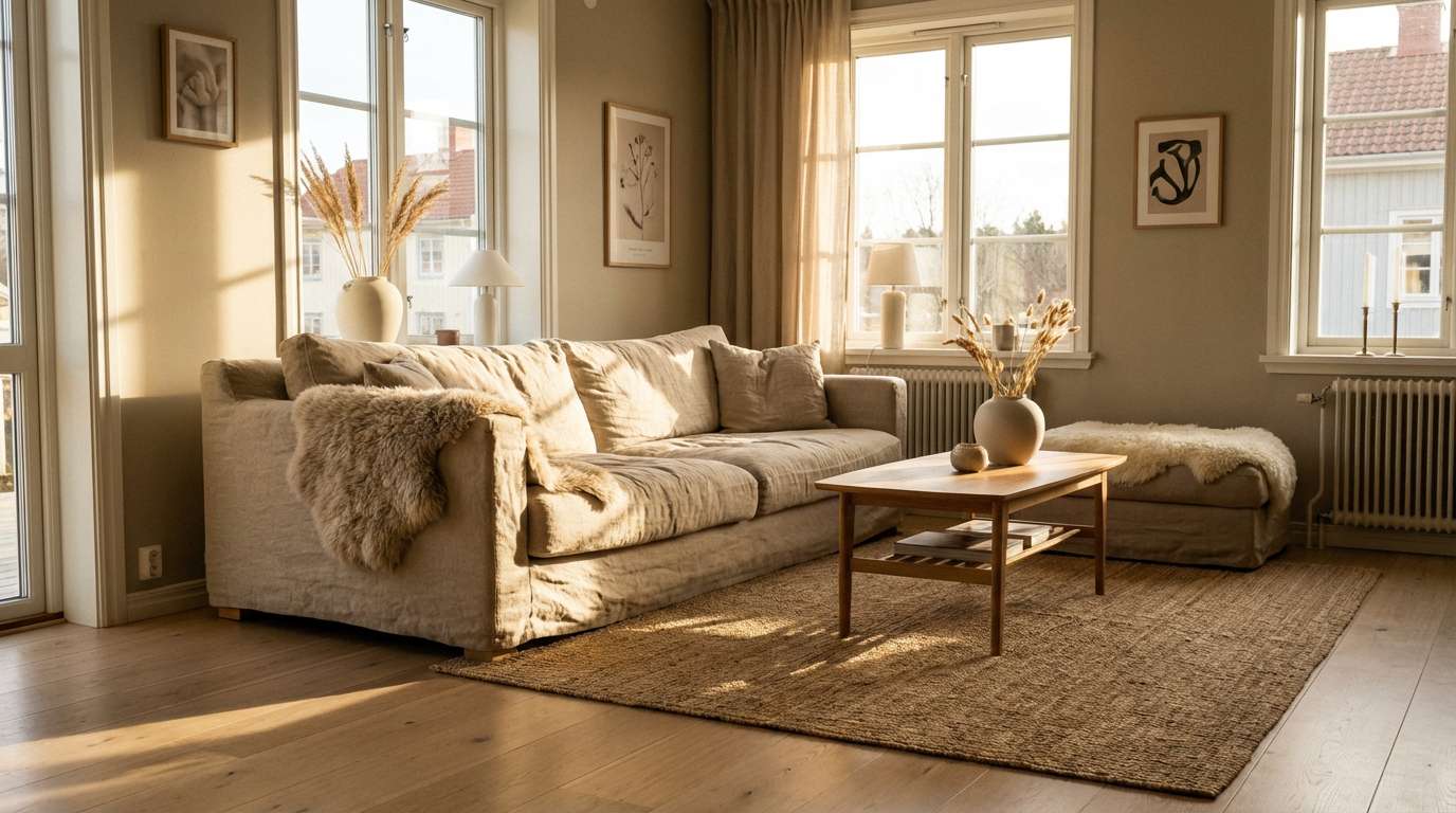
Calm and sunlit, these tones feel like linen curtains drifting in a warm desert breeze. Use the creamy off-white for spacious backgrounds and let the deeper brown anchor headings or furniture accents. It works beautifully with natural textures like oak, rattan, and matte ceramics. Tip: keep contrast accessible by pairing the darkest brown with the lightest cream for key text areas.
Image example of desert linen generated using media.io
Media.io is an online AI studio for creating and editing video, image, and audio in your browser.

2) Sandstone Studio
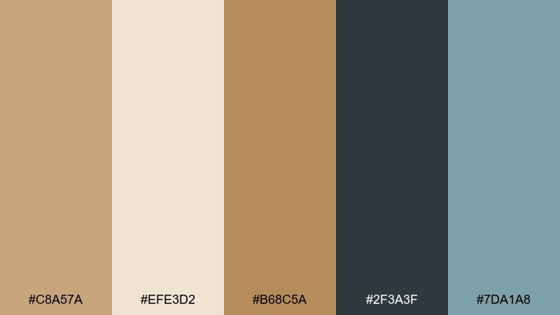
HEX: #C8A57A #EFE3D2 #B68C5A #2F3A3F #7DA1A8
Mood: modern, focused, gallery-clean
Best for: minimal web UI, portfolios, product pages
Modern and gallery-clean, this mix evokes sandstone walls with cool shadowed corners. As a tan color palette, it shines when the light neutrals carry most of the layout and the slate tone handles typography. The muted teal is a tasteful accent for links, toggles, and badges without shouting. Tip: limit teal to one interactive state per component to keep the interface feeling calm.
Image example of sandstone studio generated using media.io
3) Cocoa Drift
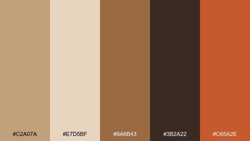
HEX: #C2A07A #E7D5BF #9A6B43 #3B2A22 #C65A2E
Mood: cozy, roasted, boutique
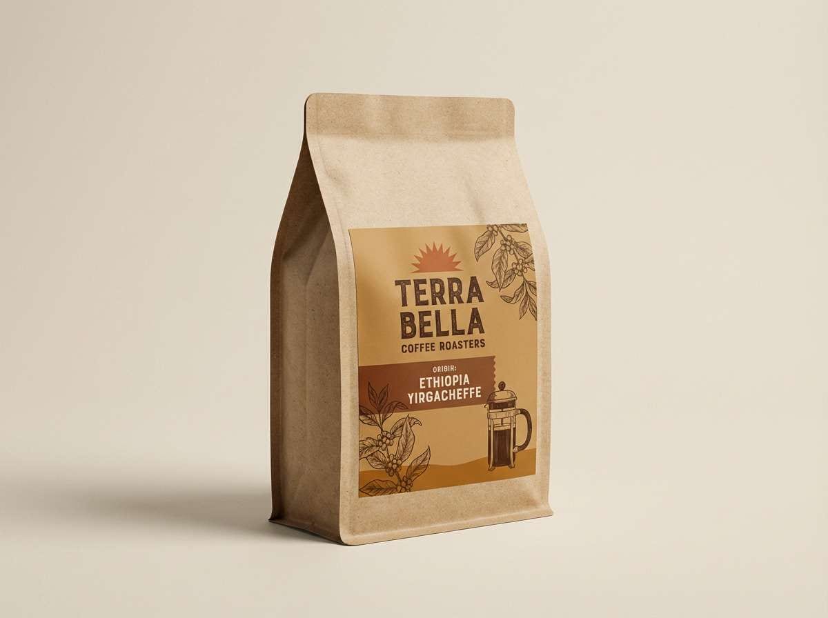
Best for: coffee packaging, artisan goods, food photography overlays
Cozy and roasted, these shades feel like cacao nibs, toasted sugar, and a hint of ember. Use the dark espresso as your premium base for labels, then bring in the warm tan and cream for readability. The burnt orange works best as a small pop for flavor notes, seals, or callouts. Tip: add subtle texture like kraft paper grain to make the browns feel richer rather than flat.
Image example of cocoa drift generated using media.io
4) Sunbaked Adobe
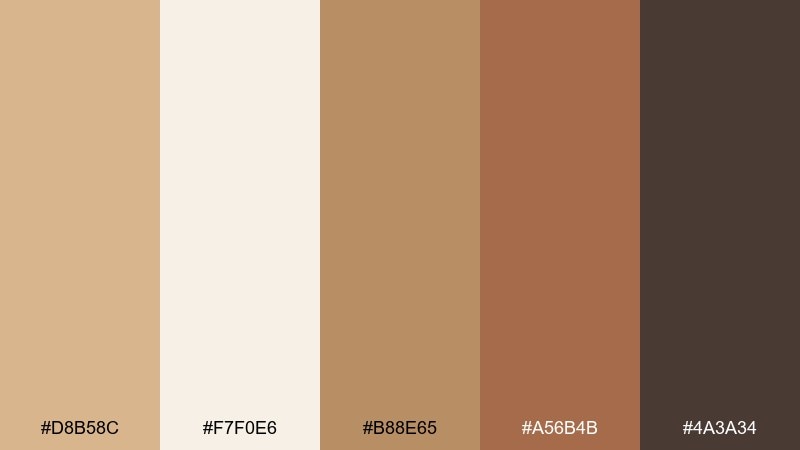
HEX: #D8B58C #F7F0E6 #B88E65 #A56B4B #4A3A34
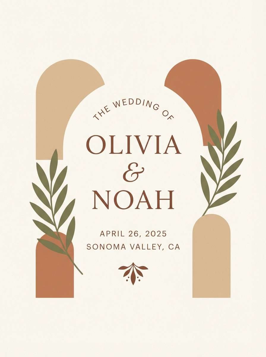
Mood: earthy, handcrafted, warm
Best for: wedding invitations, handmade brands, stationery
Earthy and handcrafted, this set brings to mind adobe walls, clay pots, and golden-hour light. Keep the paper-like cream as the background, then layer tan and clay tones for borders, monograms, and section dividers. The deep brown adds legibility for names and dates without looking stark. Tip: choose an uncoated paper stock or add a subtle speckle texture to match the organic vibe.
Image example of sunbaked adobe generated using media.io
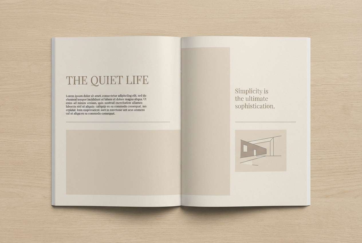
5) Oatmilk Minimal
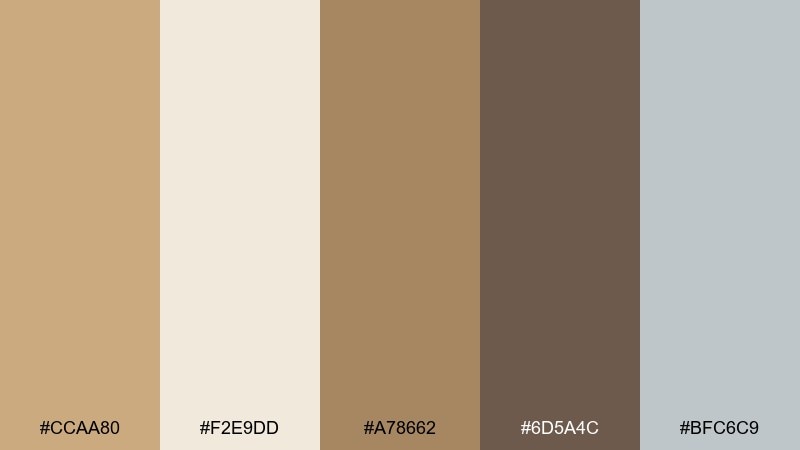
HEX: #CCAA80 #F2E9DD #A78662 #6D5A4C #BFC6C9
Mood: soft, minimal, understated
Best for: editorial layouts, blogs, calm brand systems
Soft and understated, these tones feel like oatmilk foam over warm espresso. Let the pale neutral handle long-form readability, then use the taupe and brown for headings and pull quotes. The cool gray adds a modern edge for rules, captions, and UI chrome inside articles. Tip: keep body text on the lightest shade and reserve the darkest brown for only the most important hierarchy levels.
Image example of oatmilk minimal generated using media.io
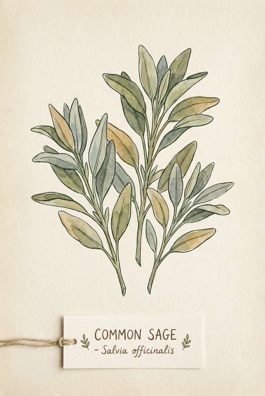
6) Camel and Sage
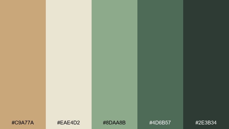
HEX: #C9A77A #EAE4D2 #8DAA8B #4D6B57 #2E3B34
Mood: fresh, natural, grounded
Best for: botanical branding, apothecary labels, eco products
Fresh and grounded, this pairing feels like camel wool beside crushed sage leaves. Use the pale neutral to keep layouts light, then let the greens do the storytelling in icons, seals, and ingredient highlights. The near-black green is perfect for type when you want softer contrast than pure black. Tip: in packaging, print the sage tones with a matte finish to reinforce the natural mood.
Image example of camel and sage generated using media.io
7) Tan and Navy Classic
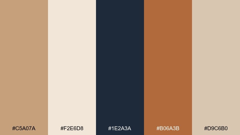
HEX: #C5A07A #F2E6D8 #1E2A3A #B06A3B #D9C6B0
Mood: classic, confident, tailored
Best for: menswear branding, heritage logos, premium ecommerce
Classic and tailored, these colors recall a navy blazer, tan suede, and a copper tie bar. A tan color scheme like this works best when navy carries the heavy weight for typography and navigation, while the light neutral keeps pages breathable. Use the warm copper-brown sparingly for CTAs, price highlights, or stitching details. Tip: pair with serif headlines and plenty of spacing to make the contrast feel intentional, not busy.
Image example of tan and navy classic generated using media.io

8) Terracotta Glow
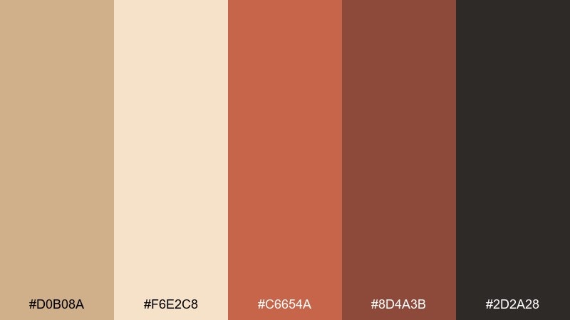
HEX: #D0B08A #F6E2C8 #C6654A #8D4A3B #2D2A28
Mood: warm, lively, sunset
Best for: boho interiors, event branding, social posts
Warm and lively, this mix looks like terracotta tiles lit by a late-afternoon sun. Use the pale peach-tan for backgrounds and the terracotta for energetic highlights like buttons, icons, or feature blocks. The deep brown-black grounds the palette for text and creates strong contrast when needed. Tip: for interiors, echo the terracotta with textured fabrics or clay accessories so the color feels integrated, not painted on.
Image example of terracotta glow generated using media.io
9) Sepia Meadow
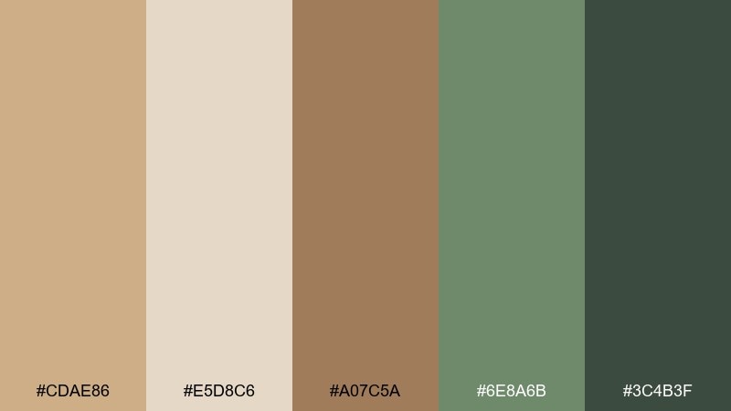
HEX: #CDAE86 #E5D8C6 #A07C5A #6E8A6B #3C4B3F
Mood: nostalgic, outdoorsy, calm
Best for: outdoor brands, journals, nature photography frames
Nostalgic and outdoorsy, these tones feel like dried grasses pressed into a journal page. The sage green makes a gentle secondary color for icons or section headers, while the browns keep things grounded. Use the mid tan for cards and containers to add structure without hard lines. Tip: when framing photos, keep borders in the lightest neutral so images stay the focal point.
Image example of sepia meadow generated using media.io
10) Honeyed Copper
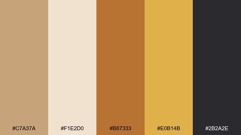
HEX: #C7A37A #F1E2D0 #B87333 #E0B14B #2B2A2E
Mood: glossy, warm, high-end
Best for: skincare ads, jewelry branding, premium product pages
Glossy and warm, these shades evoke honey, copper foil, and a chic evening glow. For tan color combinations that still feel luxe, pair the creamy neutral with the near-black for sharp type and let copper and gold handle highlights. Keep metallic-looking colors as accents on buttons, borders, or badges rather than full backgrounds. Tip: add soft gradients between honey and copper to mimic real light reflection without overwhelming the layout.
Image example of honeyed copper generated using media.io
11) Beachboard Pastels
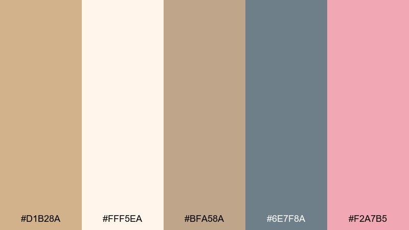
HEX: #D1B28A #FFF5EA #BFA58A #6E7F8A #F2A7B5
Mood: playful, breezy, coastal
Best for: app onboarding, lifestyle creators, light ecommerce
Playful and breezy, these colors feel like driftwood, sea air, and a blush sunset. Use the warm cream to keep screens bright, then introduce the slate blue for navigation and labels. The soft pink works best for micro-accents like notification dots, tags, or illustrations. Tip: keep pastel elements larger and less saturated in gradients to avoid a candy-like look.
Image example of beachboard pastels generated using media.io
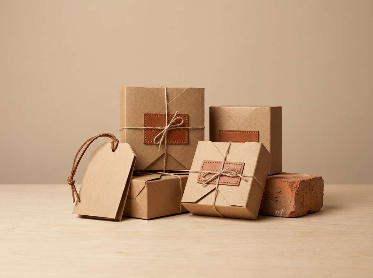
12) Rustic Leather
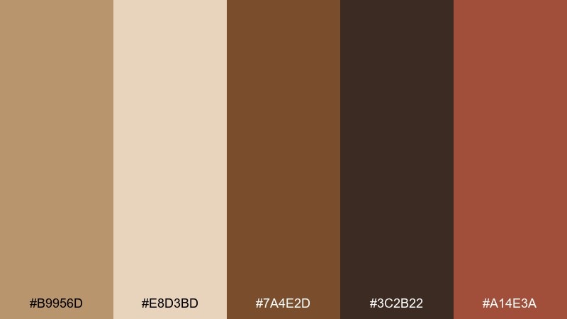
HEX: #B9956D #E8D3BD #7A4E2D #3C2B22 #A14E3A
Mood: rugged, warm, workshop
Best for: leather goods, craft packaging, maker logos
Rugged and warm, this set brings to mind worn leather, saddle stitching, and a well-used workbench. Use the darkest brown as a base for logos and stamps, then layer lighter tans for labels and hangtags. The brick accent adds character for seals, limited editions, or small graphic motifs. Tip: combine with debossed textures or subtle grain patterns to enhance the handcrafted feel.
Image example of rustic leather generated using media.io
13) Clay and Charcoal
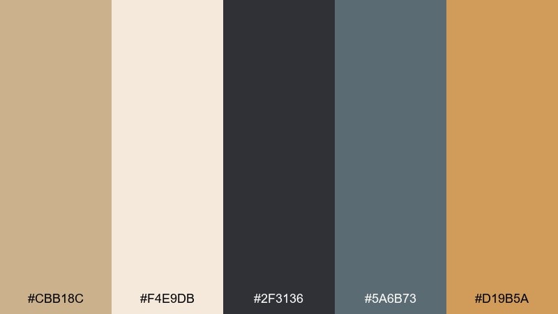
HEX: #CBB18C #F4E9DB #2F3136 #5A6B73 #D19B5A
Mood: urban, balanced, contemporary
Best for: dashboards, SaaS marketing, data visuals
Urban and balanced, these tones feel like clay plaster against charcoal concrete. The light neutral keeps surfaces clean, while charcoal provides crisp structure for type and charts. Use the muted blue-gray for secondary UI and the warm amber as a highlight for key metrics. Tip: reserve the amber for one primary data series so visualizations stay easy to scan.
Image example of clay and charcoal generated using media.io

14) Warm Marble
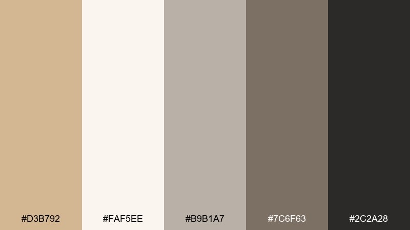
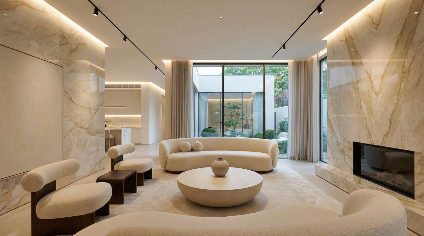
HEX: #D3B792 #FAF5EE #B9B1A7 #7C6F63 #2C2A28
Mood: elegant, quiet, architectural
Best for: interior mood boards, luxury services, portfolios
Elegant and quiet, this mix resembles warm marble veining and soft stone shadows. Use the ivory as the primary canvas and bring in the grays for structure, grids, and subtle dividers. The deep near-black is perfect for refined typography and monograms. Tip: add one tactile element, like fine line patterns or embossed details, to keep the neutrals from feeling flat.
Image example of warm marble generated using media.io
15) Golden Wheat
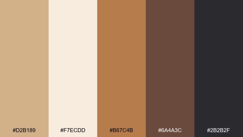
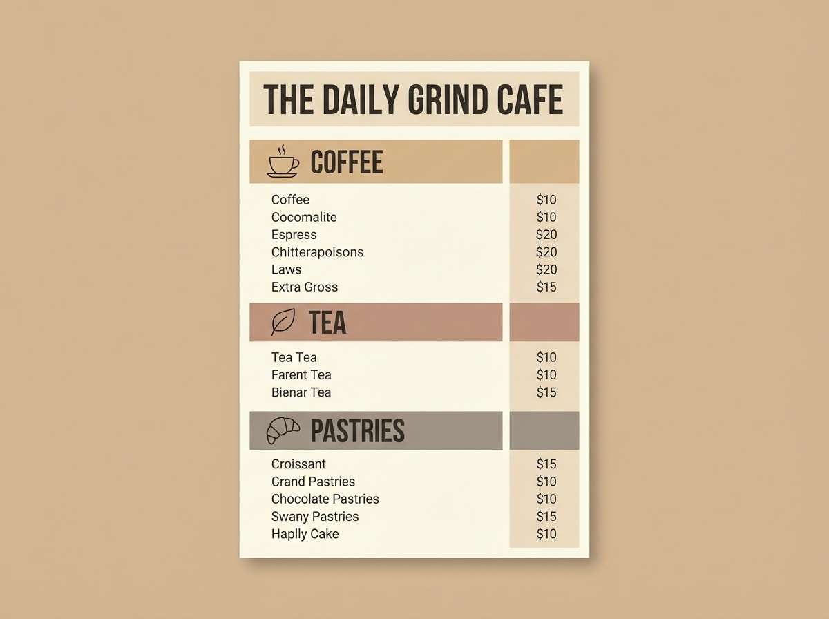
HEX: #D2B189 #F7ECDD #B67C4B #6A4A3C #2B2B2F
Mood: sunny, wholesome, inviting
Best for: food brands, cafes, recipe blogs
Sunny and wholesome, these shades feel like wheat fields and toasted crust. A tan color palette like this excels in food contexts where warmth should look appetizing, not heavy. Use the dark brown for strong headers and the lighter neutrals for menus, cards, and background blocks. Tip: add small, high-contrast price tags or CTA buttons using the near-black to keep conversions clear.
Image example of golden wheat generated using media.io
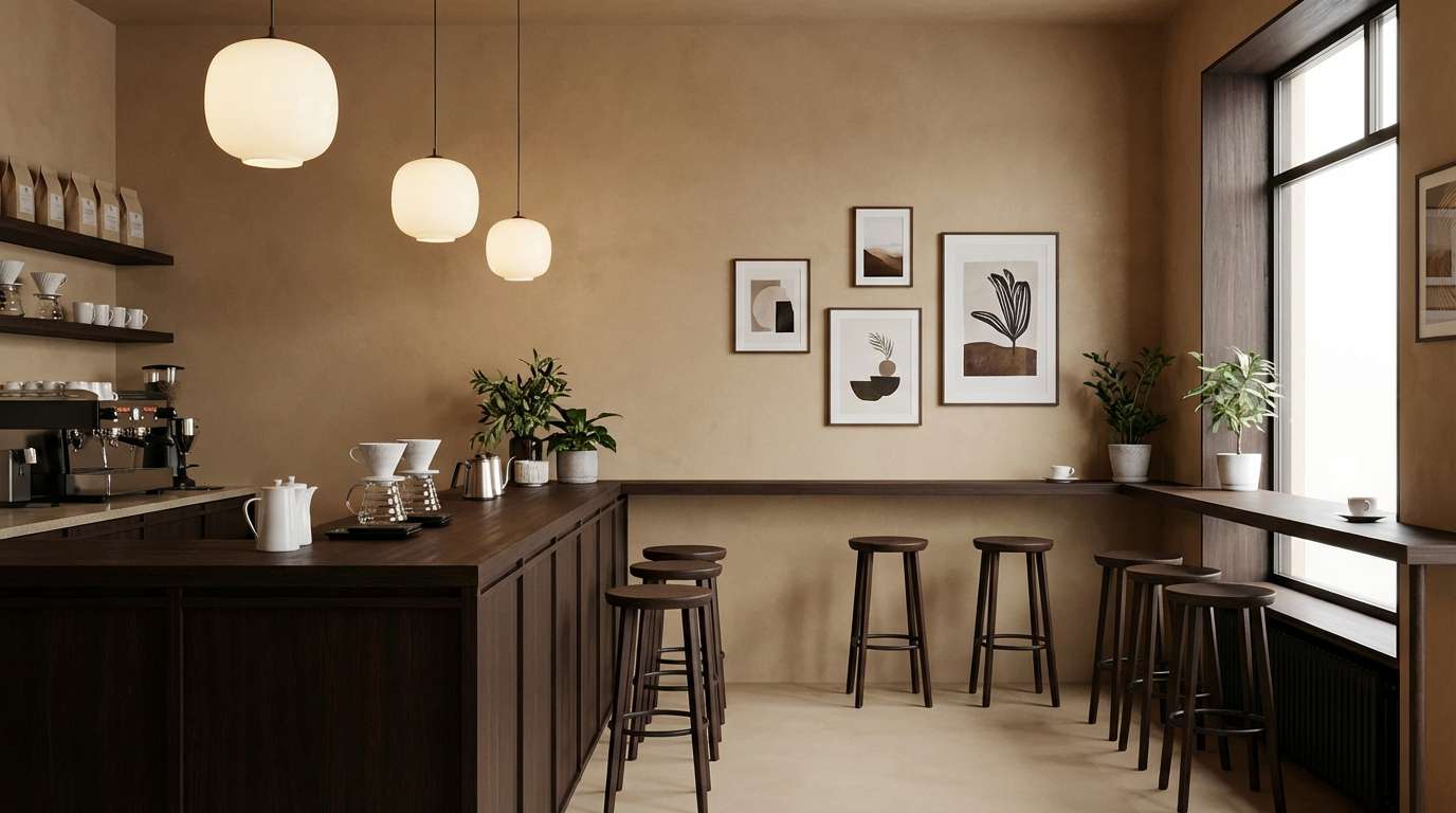
16) Espresso Cream
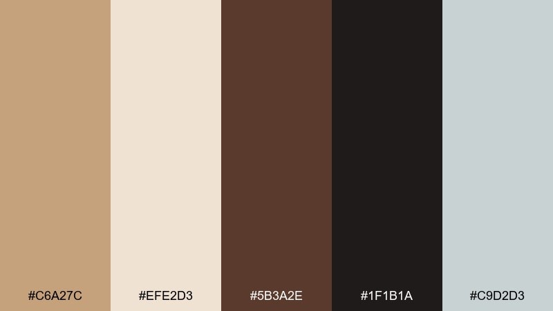
HEX: #C6A27C #EFE2D3 #5B3A2E #1F1B1A #C9D2D3
Mood: cozy, premium, moody
Best for: coffee shops, boutique hotels, photography presets
Cozy and moody, this set feels like a candlelit cafe with espresso and steamed cream. Use the near-black for signage and headers, then soften the overall feel with creamy surfaces and warm tan cards. The cool gray is a smart finishing touch for secondary text and subtle UI borders. Tip: in interiors, match metals to the palette with brushed black or antique bronze for a cohesive look.
Image example of espresso cream generated using media.io
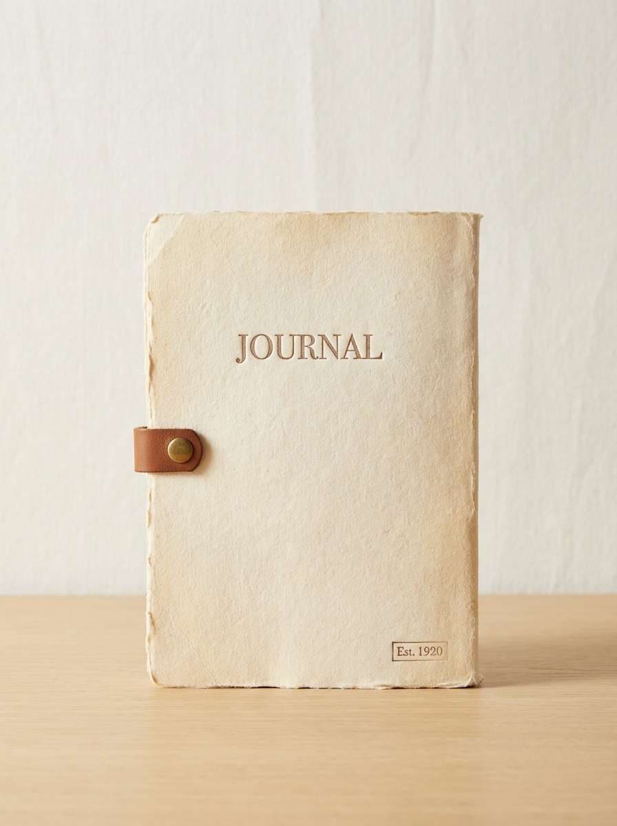
17) Vintage Paper
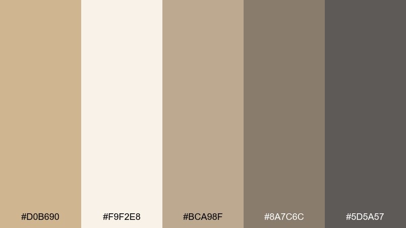
HEX: #D0B690 #F9F2E8 #BCA98F #8A7C6C #5D5A57
Mood: nostalgic, literary, soft
Best for: book covers, resumes, stationery, blogs
Nostalgic and literary, these tones evoke aged paper, soft graphite, and sepia margins. Use the lightest shade as a reading-friendly background and the mid gray-brown for comfortable body text. The deeper gray works well for titles, rules, and understated icons. Tip: pair with a classic serif and slightly increased line height to amplify the bookish mood.
Image example of vintage paper generated using media.io
18) Dune Blossom
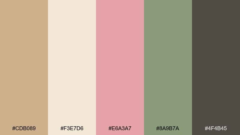
HEX: #CDB089 #F3E7D6 #E6A3A7 #8A9B7A #4F4B45
Mood: romantic, gentle, springlike
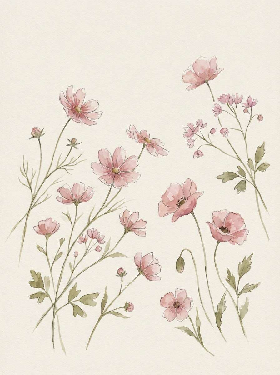
Best for: floral illustrations, baby showers, boutique gifts
Romantic and gentle, these colors feel like wildflowers blooming across soft dunes. The blush pink adds warmth without overpowering the neutrals, while the muted green keeps the look natural. Use the dark gray-brown for type so the delicate tones stay crisp. Tip: in print, keep pink in larger shapes and use thin green lines for stems and borders to maintain a light touch.
Image example of dune blossom generated using media.io
19) Walnut Orchid
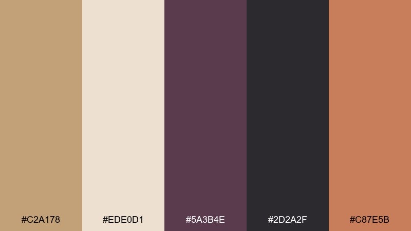
HEX: #C2A178 #EDE0D1 #5A3B4E #2D2A2F #C87E5B
Mood: artsy, dramatic, refined
Best for: fashion lookbooks, creative studios, album art
Artsy and refined, this mix reads like walnut wood with a deep orchid shadow. Use the light neutral for negative space, then let the plum and near-black carry headlines and strong editorial type. The warm coral-brown is a great accent for buttons, captions, or small geometric details. Tip: keep photos slightly desaturated so the plum accent stays the standout.
Image example of walnut orchid generated using media.io
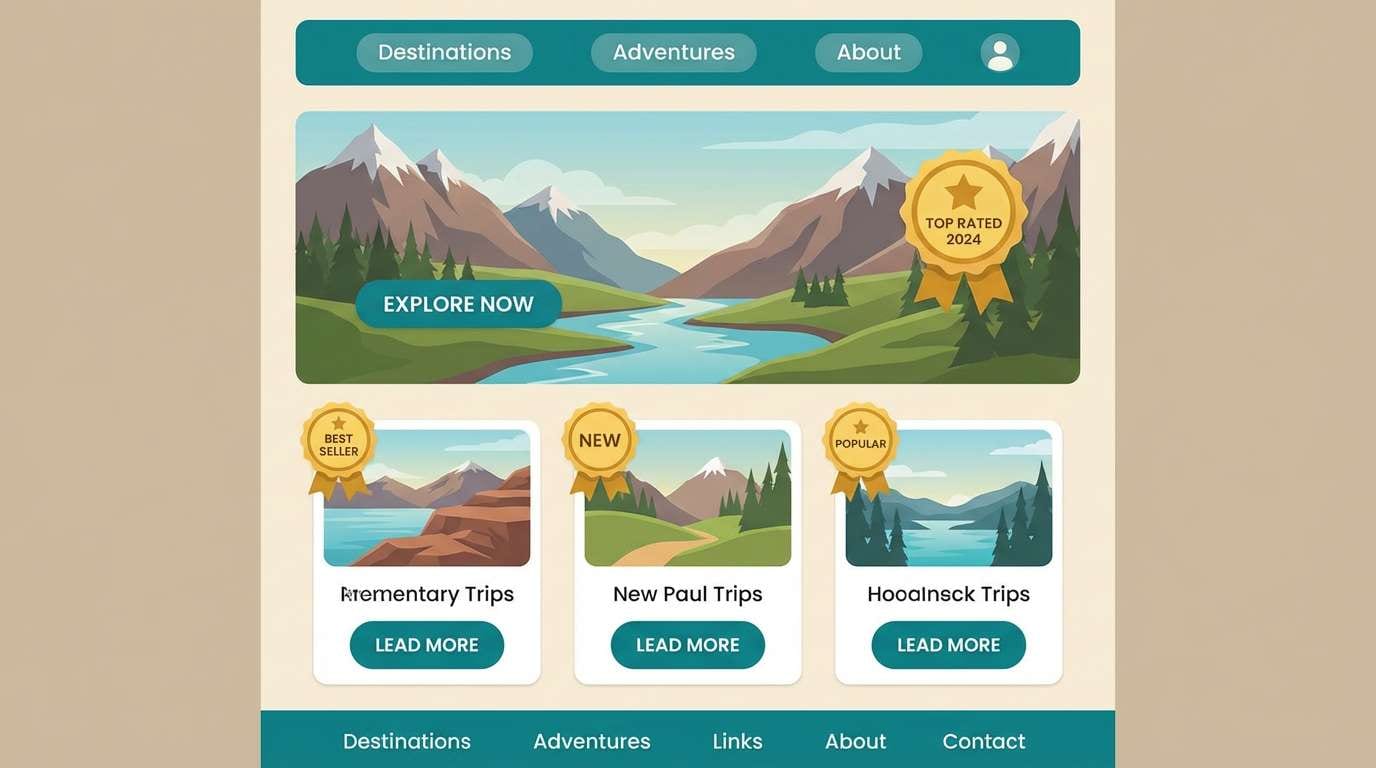
20) Pebble and Teal
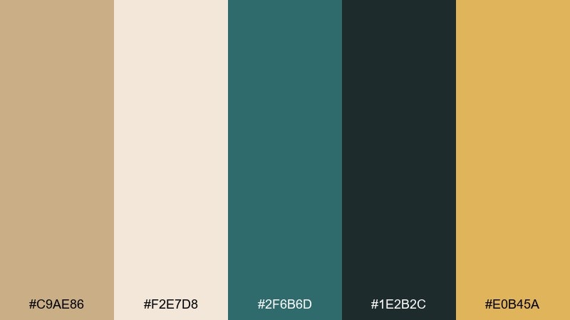
HEX: #C9AE86 #F2E7D8 #2F6B6D #1E2B2C #E0B45A
Mood: fresh, outdoors, modern
Best for: travel sites, outdoor gear UI, modern branding
Fresh and modern, these tones feel like smooth pebbles beside cool teal water. Use the warm neutrals as your foundation, then let teal define interactive elements and navigation. The golden accent works nicely for ratings, highlights, or small badges without clashing. Tip: if you are designing a UI, keep teal for primary actions and use the dark green-black for text to maintain contrast.
Image example of pebble and teal generated using media.io
What Colors Go Well with Tan?
Tan pairs beautifully with deep, cool anchors like navy, charcoal, and near-black—these combinations feel classic and high-contrast without looking harsh. If you want a more natural, outdoorsy direction, try sage, olive, or muted teal for a calm, botanical balance.
For warmth and energy, lean into terracotta, copper, rust, and honey-gold accents. These keep the palette cohesive because they share similar undertones with tan, making highlights feel intentional rather than random.
If you’re after something softer, blush pink and warm ivory are easy wins. They lighten tan’s earthy base and create a gentle, lifestyle-friendly feel for packaging, social graphics, or onboarding screens.
How to Use a Tan Color Palette in Real Designs
Start by assigning roles: let a light tan or cream handle backgrounds, then use a mid-tan for cards and surfaces. Reserve the darkest shade (espresso/charcoal/navy) for typography and key UI structure so readability stays strong.
Keep accents disciplined. Tan looks best when one accent color carries the “personality” (teal, sage, terracotta, or gold) and is reused consistently across buttons, icons, and highlights.
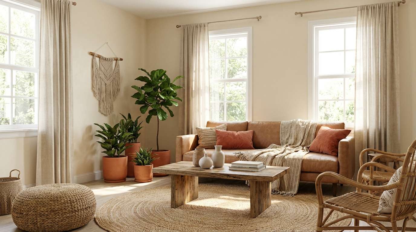
In branding and interiors, texture matters as much as hue. Pair tan palettes with materials like linen, kraft paper, oak, brushed metal, or subtle grain overlays to make neutrals feel rich instead of flat.
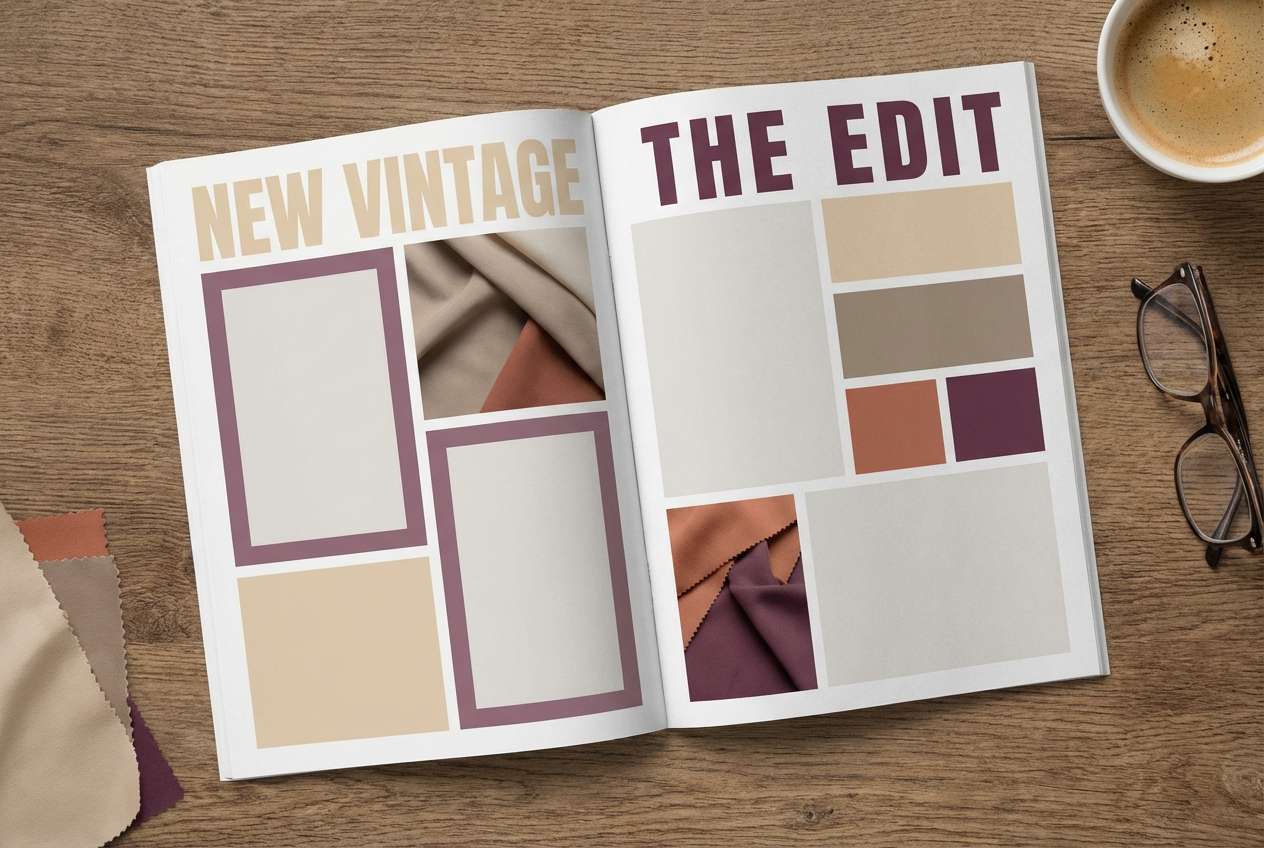
Create Tan Palette Visuals with AI
If you already have HEX codes, you can generate matching mockups (rooms, packaging, UI screens, invitations) by describing the scene and referencing the palette vibe—sunlit, moody, minimal, rustic, or luxe.
Use the sample prompts above as templates: swap the subject (e.g., “skincare bottle” to “candle label”) and keep the lighting and composition notes for consistent results. This is a fast way to build brand mood boards or campaign creatives.
With Media.io, you can create tan-themed images in your browser and iterate quickly—perfect for testing multiple directions before committing to a final design.
Tan Color Palette FAQs
-
Is tan a warm or cool color?
Tan is typically a warm neutral because it’s based on brown with added white, often carrying yellow or orange undertones. Some tans can lean cooler when they include more gray (taupe-like) influence. -
What is a good contrasting color for tan?
Navy, charcoal, and near-black create strong, elegant contrast with tan while staying sophisticated. For a softer contrast, use deep forest green or dark teal. -
Which tan palette works best for modern UI design?
Look for palettes that include a slate/charcoal text color and a restrained accent, such as “Sandstone Studio” or “Clay and Charcoal.” They keep interfaces clean while still feeling warm. -
How do I keep tan designs from looking dull?
Add one clear accent (teal, terracotta, copper, blush) and increase contrast for typography. Texture (grain, paper, fabric) and subtle shadows also make tan-heavy layouts feel more dimensional. -
What colors go well with tan for branding?
For premium branding, pair tan with near-black plus copper or gold accents. For eco or wellness brands, tan with sage/olive and creamy off-whites is a reliable, natural combination. -
Can I use tan as a background color for text-heavy pages?
Yes—choose a very light tan/cream for the background and use a deep brown/charcoal for body text. This reduces glare compared to pure white while keeping readability high. -
How can I generate product or room mockups that match my tan palette?
Use an AI text-to-image tool and describe the scene, lighting, and materials (linen, oak, kraft paper, matte ceramic), then keep your palette consistent across iterations. The prompts in this guide are a great starting point.
Next: Magenta Color Palette


