

Magenta is a high-impact color that sits between red and purple, which makes it feel both energetic and expressive. In branding and UI, it can instantly signal creativity, boldness, and modern personality.
Below are magenta color palette ideas (with HEX codes) you can apply to posters, websites, packaging, and print. Use the examples to see how each combination behaves in real layouts.
In this article
- Why Magenta Palettes Work So Well
-
- neon orchid
- berry noir
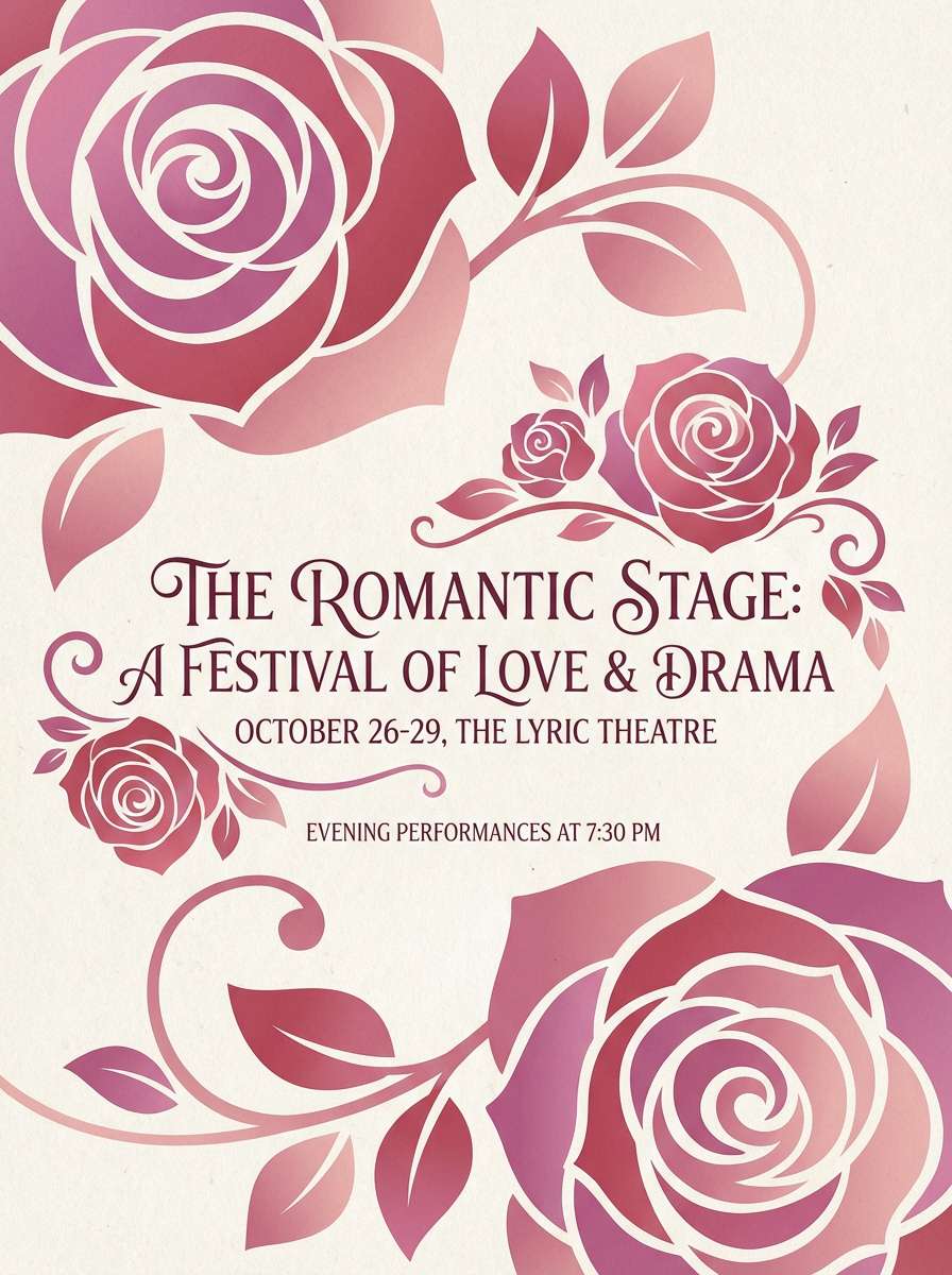
- rose quartz punch
- sunset bougainvillea
- velvet plum
- candy pop
- fuchsia citrus
- magenta mist
- retro arcade
- art deco rouge
- sakura nightfall
- cosmic bloom
- wedding peony
- urban graffiti
- minimal blush
- tropical hibiscus
- nordic magenta
- wine and clay
- galaxy glam
- classroom creative
- opera rose
- What Colors Go Well with Magenta?
- How to Use a Magenta Color Palette in Real Designs
- Create Magenta Palette Visuals with AI
Why Magenta Palettes Work So Well
Magenta palettes work because the hue naturally creates strong focal points. Even small magenta accents can guide attention to headlines, CTAs, icons, and key UI states.
It also pairs well with both warm and cool companions. Combine it with navy or charcoal for a premium look, or bring in teal/cyan for a modern tech edge with clean contrast.
Finally, magenta offers a wide range of usable tones—from soft blush tints to neon fuchsia—so you can keep the same “brand color” while adapting to different layouts and mediums.
20+ Magenta Color Palette Ideas (with HEX Codes)
1) Neon Orchid
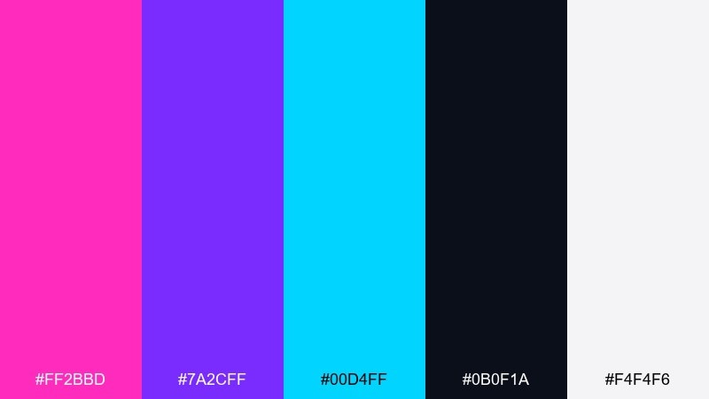
HEX: #ff2bbd #7a2cff #00d4ff #0b0f1a #f4f4f6
Mood: electric, futuristic
Best for: music festival poster design
Electric and futuristic, it feels like neon tubes against a midnight skyline. Use it for high-energy posters, club flyers, and event promos where contrast needs to pop from a distance. Pair the bright tones with deep black for legibility, then let cyan act as the punchy counter-accent. Tip: keep body text in near-white and reserve the hot hues for headlines and icons.
Image example of neon orchid generated using media.io
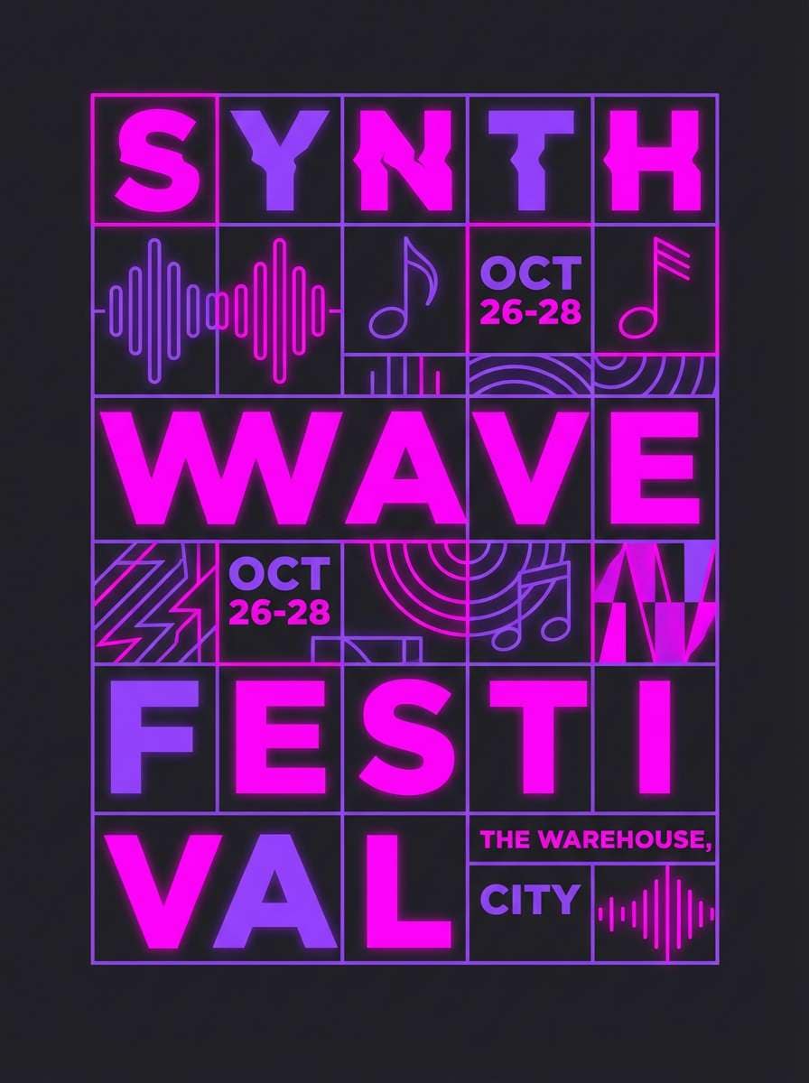
Media.io is an online AI studio for creating and editing video, image, and audio in your browser.

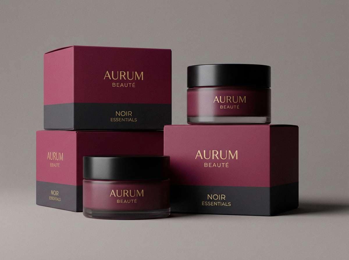
2) Berry Noir
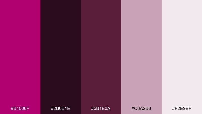
HEX: #b1006f #2b0b1e #5b1e3a #c8a2b6 #f2e9ef
Mood: moody, luxe
Best for: beauty brand packaging
Moody and luxe, it evokes crushed berries, velvet fabric, and low light. It works beautifully on premium beauty packaging, labels, and small-format product cards where deep tones feel sophisticated. Balance the dark base with soft blush for breathing room and use the wine shade for trims and borders. Tip: add a matte finish and keep typography minimal to amplify the upscale vibe.
Image example of berry noir generated using media.io
3) Rose Quartz Punch
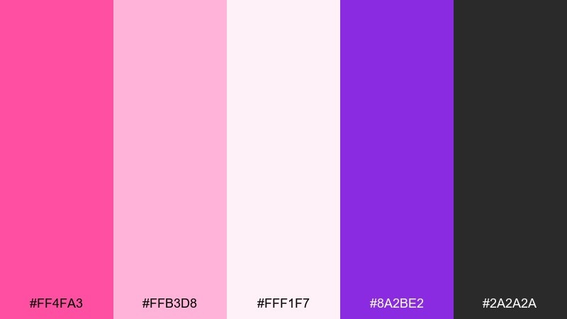
HEX: #ff4fa3 #ffb3d8 #fff1f7 #8a2be2 #2a2a2a
Mood: playful, romantic
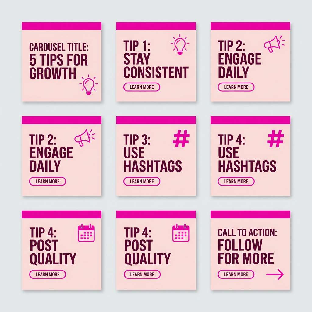
Best for: social media carousel templates
Playful and romantic, it feels like rose petals with a fizzy pop of candy. For social carousels and lifestyle promos, lean on the pale tints as the canvas and let the brighter pink do the attention-grabbing. Add violet sparingly to keep the mix modern instead of overly sweet. Tip: use charcoal for text so small captions stay readable over blush backgrounds.
Image example of rose quartz punch generated using media.io
4) Sunset Bougainvillea
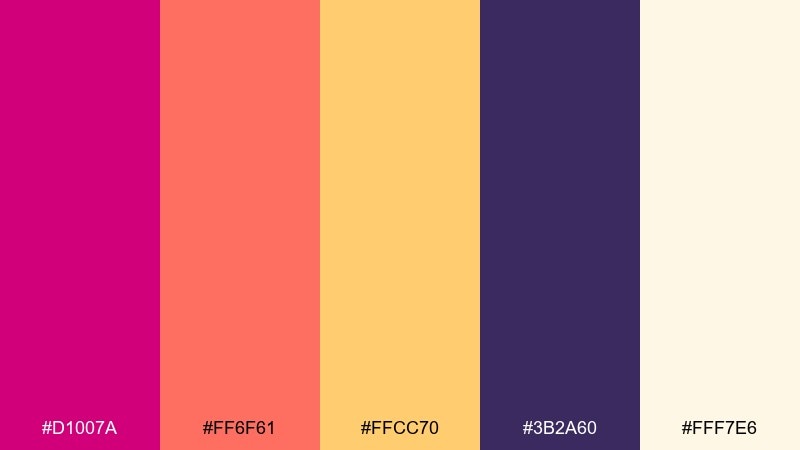
HEX: #d1007a #ff6f61 #ffcc70 #3b2a60 #fff7e6
Mood: warm, optimistic
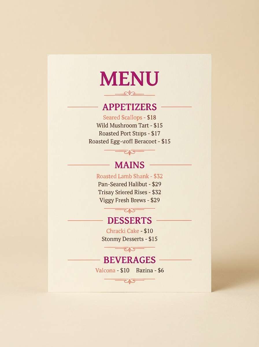
Best for: restaurant menu design
Warm and optimistic, it brings to mind sunset blooms and golden hour light. It suits restaurant menus and seasonal specials, especially when you want a cheerful, appetite-friendly feel. Use the cream as the main background, then highlight section headers in magenta and use coral for callouts like chef picks. Tip: keep the purple as a thin rule line or footer bar to anchor the warmth.
Image example of sunset bougainvillea generated using media.io
5) Velvet Plum
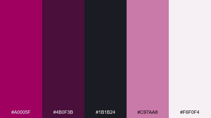
HEX: #a0005f #4b0f3b #1b1b24 #c97aa8 #f6f0f4
Mood: dramatic, elegant
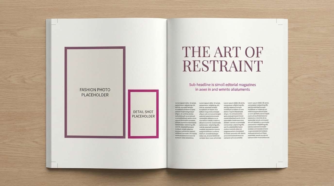
Best for: editorial magazine layout
Dramatic and elegant, it feels like velvet curtains and a spotlighted runway. Use it for fashion editorials and premium lookbooks where deep contrast helps photography feel richer. Let off-white carry the page, reserve plum for titles, and use blush for pull quotes or page numbers. Tip: limit the darkest shade to margins and headers so spreads do not feel heavy.
Image example of velvet plum generated using media.io
6) Candy Pop
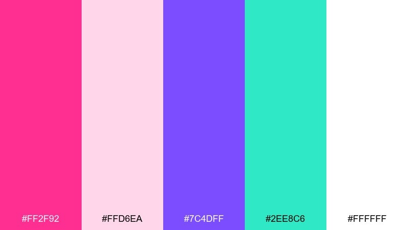
HEX: #ff2f92 #ffd6ea #7c4dff #2ee8c6 #ffffff
Mood: cheerful, youthful
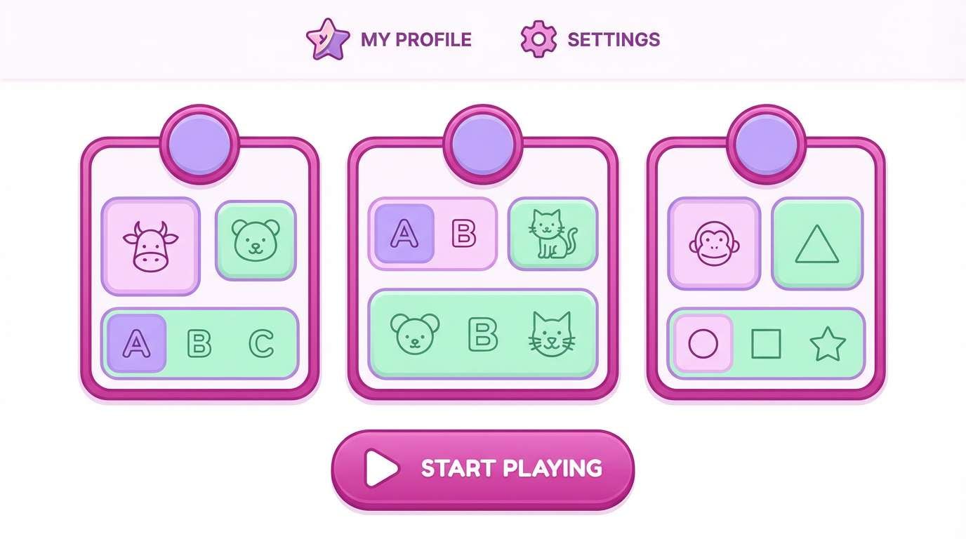
Best for: kids app UI mockup
Cheerful and youthful, it feels like gummies, stickers, and bright after-school energy. The magenta color scheme shines in kids UI when you keep surfaces white and use color for buttons, badges, and progress states. Pair violet for primary actions and mint for success or confirmation cues. Tip: test accessibility early by darkening magenta slightly for small labels and icon strokes.
Image example of candy pop generated using media.io
7) Fuchsia Citrus
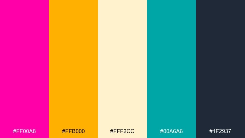
HEX: #ff00a8 #ffb000 #fff2cc #00a6a6 #1f2937
Mood: bold, energetic
Best for: product launch landing page UI
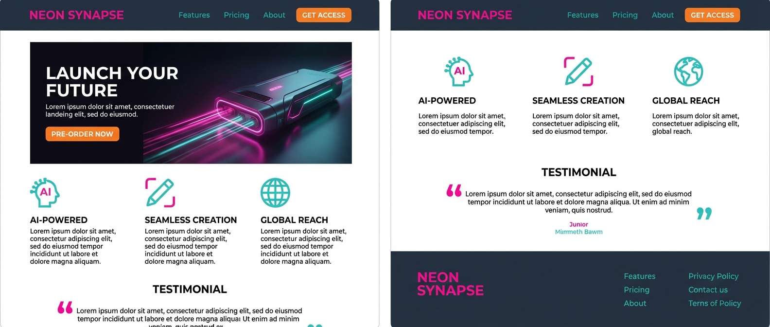
Bold and energetic, it reads like fuchsia lipstick next to fresh citrus peel. For landing pages, use the dark slate for structure, then let the bright hues guide the eye to CTAs and key stats. Teal keeps the warmth from feeling too fiery and adds a modern tech edge. Tip: keep orange for one primary CTA style and use fuchsia for secondary highlights to avoid visual noise.
Image example of fuchsia citrus generated using media.io
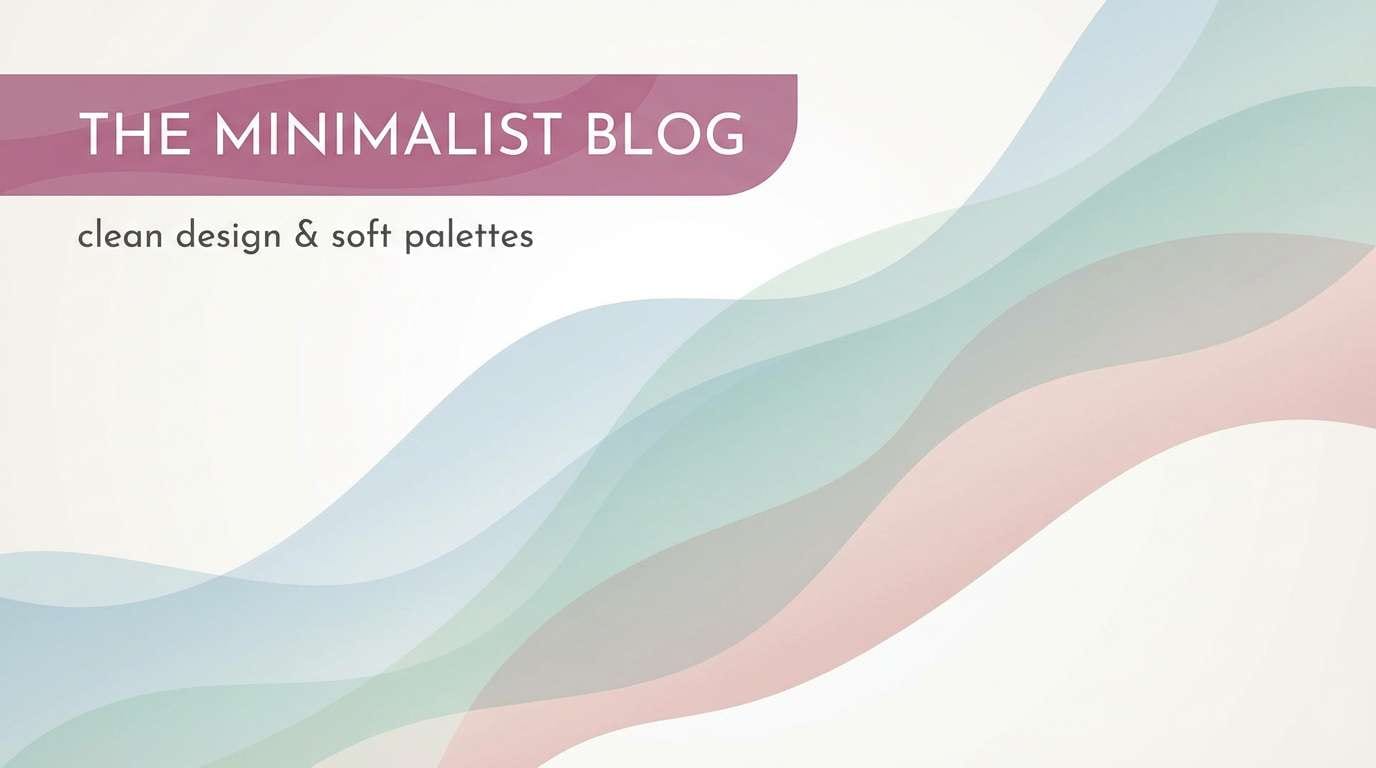
8) Magenta Mist
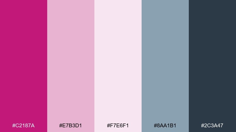
HEX: #c2187a #e7b3d1 #f7e6f1 #8aa1b1 #2c3a47
Mood: soft, airy
Best for: wellness blog header graphics
Soft and airy, it evokes morning fog tinted with gentle florals. It works well for wellness headers, meditation content, and lifestyle blog graphics where calm is the priority. Pair the muted blue-gray with the deeper magenta to create quiet contrast without harsh edges. Tip: use the lightest tint as the background and apply magenta only to key words or small icons.
Image example of magenta mist generated using media.io
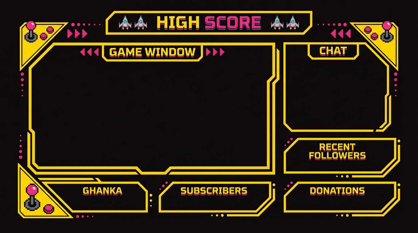
9) Retro Arcade
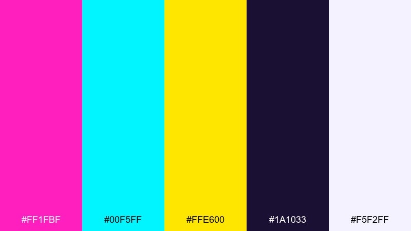
HEX: #ff1fbf #00f5ff #ffe600 #1a1033 #f5f2ff
Mood: nostalgic, high-contrast
Best for: stream overlay graphics
Nostalgic and high-contrast, it feels like arcade cabinets and pixel glow. Use it for stream overlays and esports panels where clarity matters during fast motion. Keep the dark indigo as the base layer and reserve yellow for alerts, wins, or highlights that should never be missed. Tip: apply a consistent stroke weight on neon elements so the overlay reads crisply at small sizes.
Image example of retro arcade generated using media.io
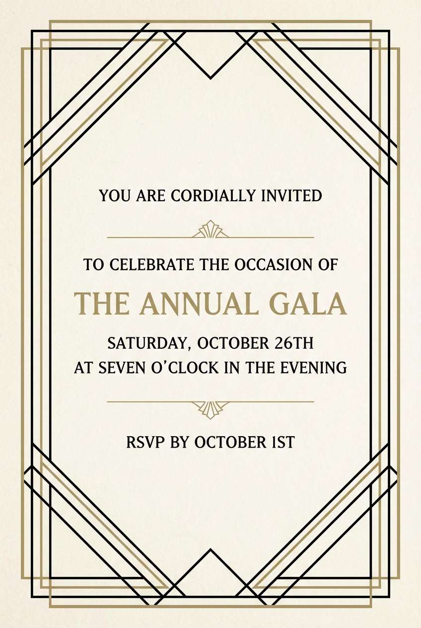
10) Art Deco Rouge
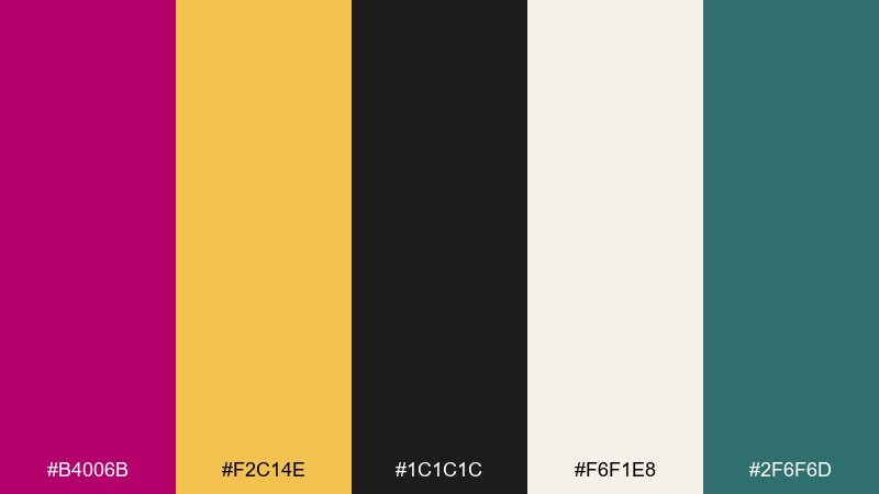
HEX: #b4006b #f2c14e #1c1c1c #f6f1e8 #2f6f6d
Mood: glamorous, structured
Best for: wedding invitation suite
Glamorous and structured, it brings art deco geometry and gilded details to mind. It is ideal for wedding invitations and formal event suites where a little sparkle feels timeless. Pair gold with black for the typography and use magenta as a monogram or border accent rather than the whole background. Tip: emboss the gold or simulate foil with subtle gradients while keeping the layout symmetrical.
Image example of art deco rouge generated using media.io
11) Sakura Nightfall
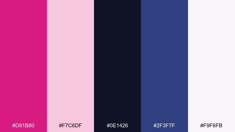
HEX: #d81b80 #f7c6df #0e1426 #2f3f7f #f9f6fb
Mood: dreamy, cinematic
Best for: album cover artwork
Dreamy and cinematic, it suggests cherry blossoms drifting through a night sky. The light pinks keep the mood tender while the navy and indigo add drama for album cover layouts. Try a central title in off-white and use magenta as a glow or highlight around key shapes. Tip: avoid using both dark blues equally, and pick one as the primary shadow color for cohesion.
Image example of sakura nightfall generated using media.io
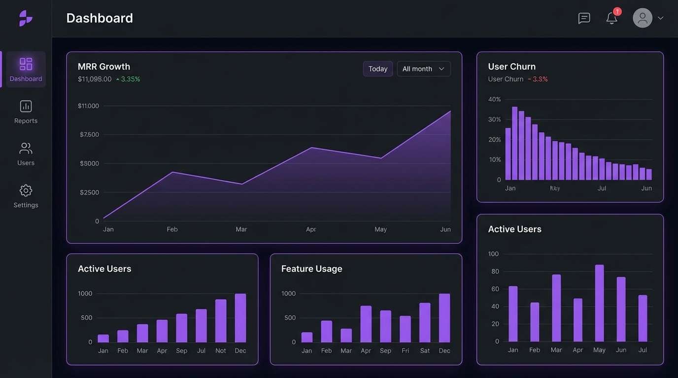
12) Cosmic Bloom
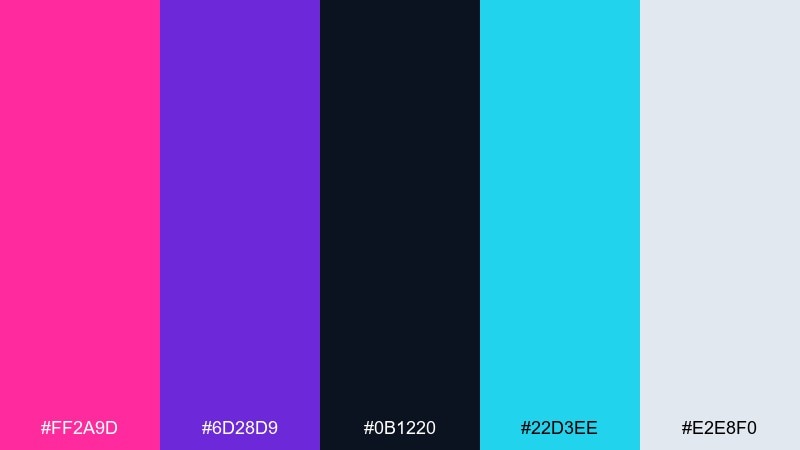
HEX: #ff2a9d #6d28d9 #0b1220 #22d3ee #e2e8f0
Mood: cosmic, modern
Best for: SaaS dashboard UI mockup
Cosmic and modern, it feels like glowing nebulae over a deep space backdrop. A magenta color palette like this works well for dark-mode dashboards when you keep charts consistent and accents purposeful. Pair cyan with magenta for data highlights, and use the light gray for labels and table separators. Tip: limit the brightest colors to two chart series so the UI stays calm and readable.
Image example of cosmic bloom generated using media.io
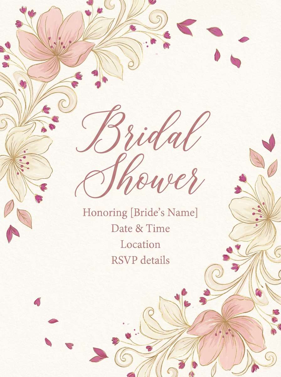
13) Wedding Peony
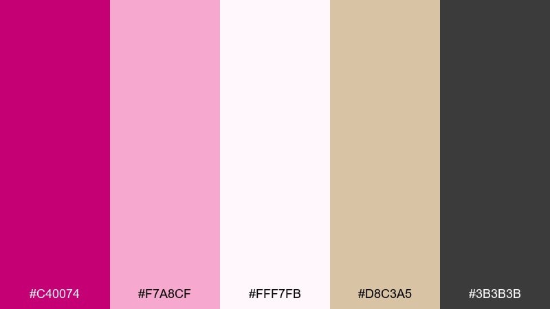
HEX: #c40074 #f7a8cf #fff7fb #d8c3a5 #3b3b3b
Mood: romantic, refined
Best for: bridal shower flyer
Romantic and refined, it recalls peony petals, silk ribbons, and handwritten notes. It suits bridal shower flyers and RSVP cards where softness should still feel polished. Pair the warm beige with blush backgrounds and keep charcoal text for crisp readability. Tip: use magenta only for small flourishes like date markers, icons, or a thin border to keep it elegant.
Image example of wedding peony generated using media.io
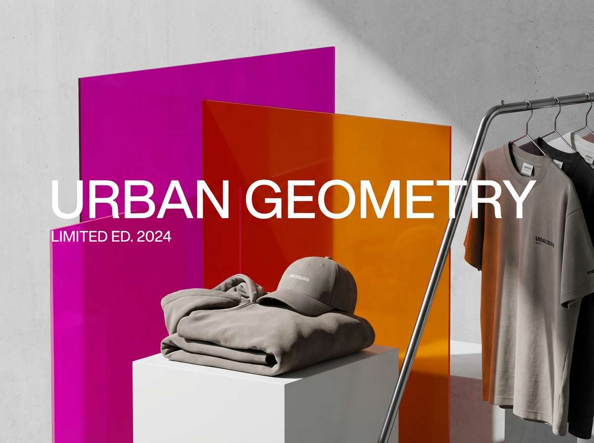
14) Urban Graffiti
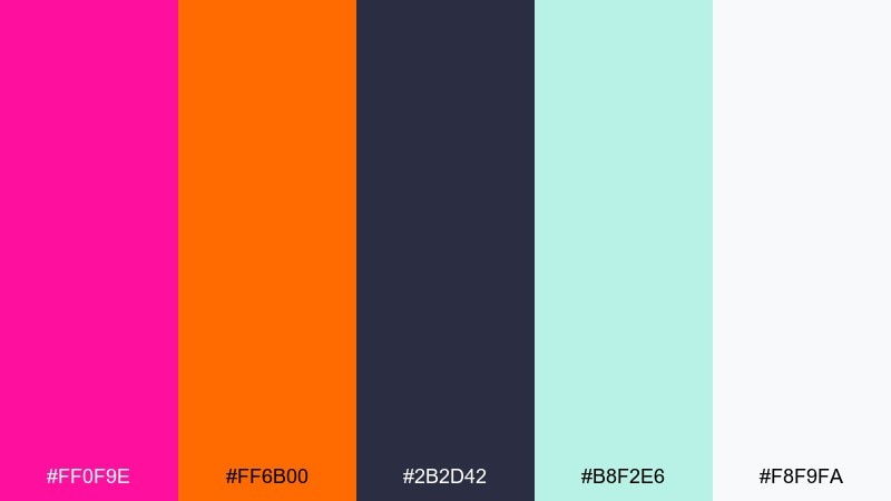
HEX: #ff0f9e #ff6b00 #2b2d42 #b8f2e6 #f8f9fa
Mood: street, punchy
Best for: streetwear product ad
Street and punchy, it brings spray paint hits and bold stickers to mind. Use these magenta color combinations for streetwear ads where you want energy without losing structure. Pair the dark blue-gray as a solid base, then let orange and magenta fight for attention in a controlled way through blocks and tags. Tip: keep backgrounds mostly clean white and use the bright hues as layered callouts.
Image example of urban graffiti generated using media.io
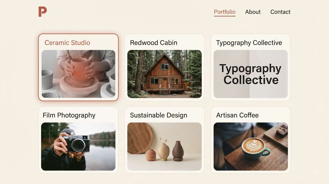
15) Minimal Blush
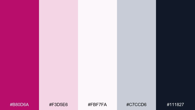
HEX: #b80d6a #f3d5e6 #fbf7fa #c7ccd6 #111827
Mood: clean, understated
Best for: portfolio website UI
Clean and understated, it feels like airy paper with a single inked signature. It is a great fit for portfolios and personal sites where you want personality without visual clutter. Use the blush tints for section backgrounds and let the navy-black handle navigation and body text. Tip: set magenta as the hover and active state color so interactions feel intentional and consistent.
Image example of minimal blush generated using media.io
16) Tropical Hibiscus
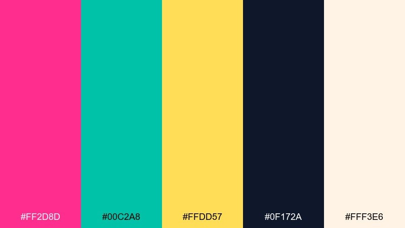
HEX: #ff2d8d #00c2a8 #ffdd57 #0f172a #fff3e6
Mood: tropical, sunny
Best for: summer sale poster
Tropical and sunny, it evokes hibiscus blooms, teal water, and bright beach towels. It works for summer sale posters and seasonal campaigns where the goal is upbeat urgency. Pair the deep navy for text and outlines, then use yellow for price bursts and teal for secondary banners. Tip: keep magenta on the hero shapes and avoid using it for small text so readability stays high.
Image example of tropical hibiscus generated using media.io

17) Nordic Magenta
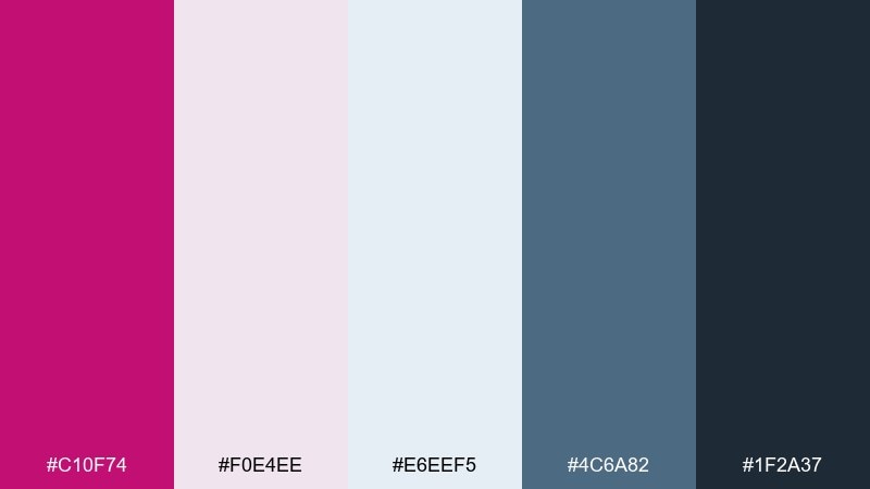
HEX: #c10f74 #f0e4ee #e6eef5 #4c6a82 #1f2a37
Mood: cool, balanced
Best for: annual report layout
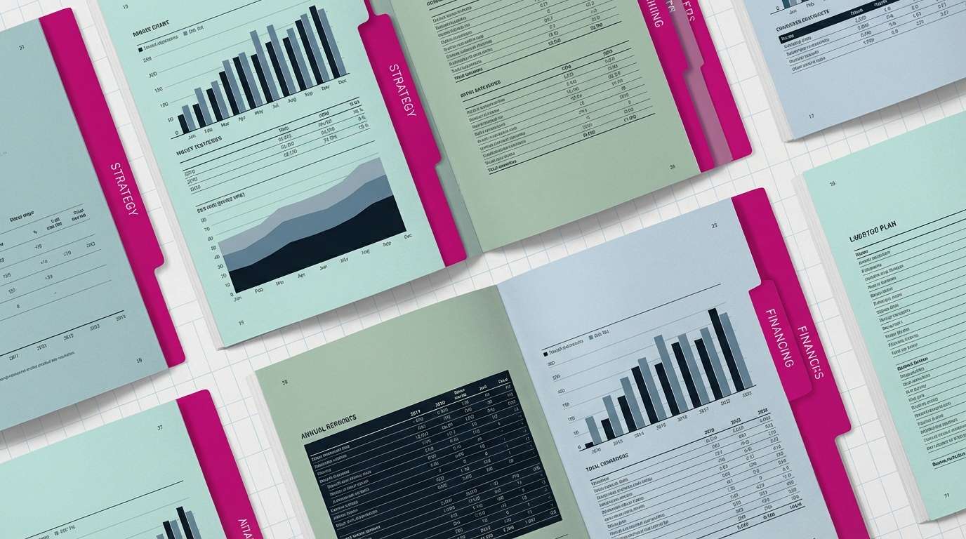
Cool and balanced, it feels like a Scandinavian interior with a bold textile accent. It is a smart choice for annual reports and business documents that need a modern, trustworthy tone. Use pale gray-lilac for large sections, blue-gray for charts, and magenta for key metrics or chapter tabs. Tip: keep headings consistent in the darkest shade and use magenta only as an index color for navigation.
Image example of nordic magenta generated using media.io
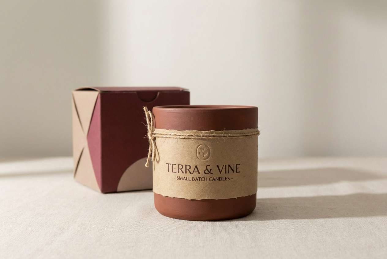
18) Wine and Clay
HEX: #9b005d #c65d4e #e8c7b3 #2f2a2a #f7f2ef
Mood: earthy, artisanal
Best for: handmade candle label
Earthy and artisanal, it suggests mulled wine, terracotta pots, and handmade paper. It fits candle labels and small-batch packaging where warmth and craft should lead the story. Pair the clay tones with soft off-white for the base, then use deep wine for logos and ingredient highlights. Tip: choose textured paper stock and keep the palette in large blocks rather than tiny details.
Image example of wine and clay generated using media.io
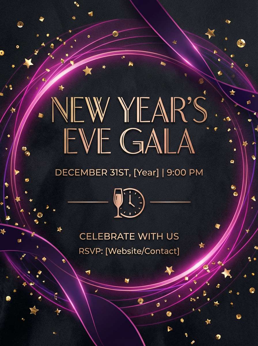
19) Galaxy Glam
HEX: #ff33b4 #a855f7 #111827 #fbbf24 #f3f4f6
Mood: glam, celebratory
Best for: New Year party invitation
Glam and celebratory, it feels like confetti catching light in a midnight ballroom. A magenta color palette like this is perfect for party invitations where you want sparkle without going full rainbow. Pair gold for key details like date and venue, and keep the dark base for an elegant, high-contrast backdrop. Tip: use the light gray for secondary copy so the invite stays readable while still feeling luxe.
Image example of galaxy glam generated using media.io
20) Classroom Creative
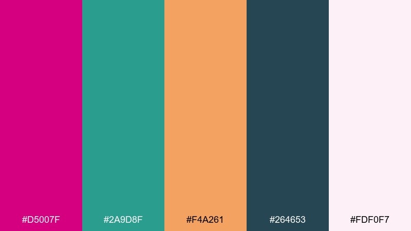
HEX: #d5007f #2a9d8f #f4a261 #264653 #fdf0f7
Mood: friendly, confident
Best for: online course slide template
Friendly and confident, it feels like bright markers on a clean whiteboard. Use these magenta color combinations for course slides where you want energy, but still need clear hierarchy for learning. Pair the deep teal for headings, keep the pale pink as the canvas, and use orange only for callouts or quiz answers. Tip: repeat the same accent color per slide type so learners recognize patterns quickly.
Image example of classroom creative generated using media.io
21) Opera Rose
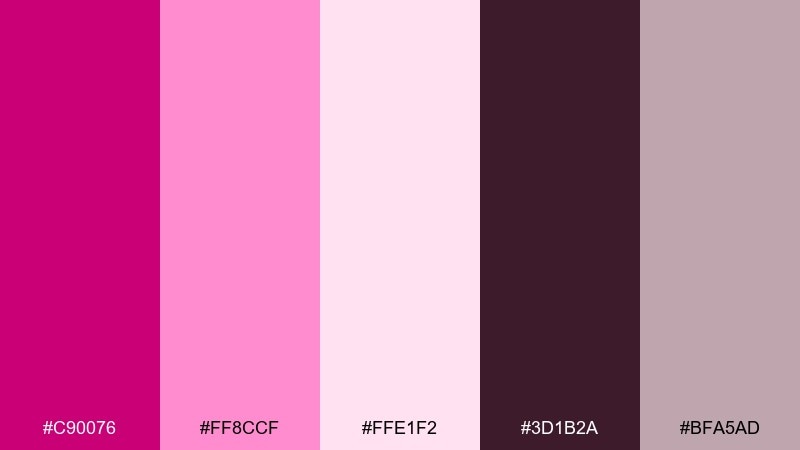
HEX: #c90076 #ff8ccf #ffe1f2 #3d1b2a #bfa5ad
Mood: theatrical, romantic
Best for: theater event flyer
Theatrical and romantic, it recalls opera curtains, roses, and a warm spotlight. It is ideal for theater flyers and cultural events where elegance should still feel approachable. Pair the deep brown-plum with blush for titles and use the dusty mauve to soften blocks of information like dates and seat tiers. Tip: set a strong typographic scale and keep decorative elements minimal so the mood stays refined.
Image example of opera rose generated using media.io
What Colors Go Well with Magenta?
Neutrals like charcoal, ink black, and off-white are reliable partners for magenta. They stabilize the intensity and make type and UI elements easier to read.
For modern contrast, pair magenta with teal, cyan, or cool blue-gray. This combination is common in digital products because it looks vibrant while still feeling clean and structured.
If you want warmth, bring in gold, amber, coral, or soft beige. These add a celebratory or artisanal feel—great for invitations, packaging, and editorial accents.
How to Use a Magenta Color Palette in Real Designs
Decide what role magenta plays: hero, accent, or interaction state. In most layouts, magenta performs best as an accent (buttons, highlights, labels) rather than a full background.
For UI, prioritize contrast and consistency: keep text on near-white or near-black surfaces, and reuse the same magenta tone for active/hover states so the interface feels predictable.
For print and branding, test swatches early across paper types and finishes. Magenta shifts noticeably between coated vs. uncoated stock, so it helps to lock in a primary HEX/CMYK match before production.
Create Magenta Palette Visuals with AI
If you want to preview a magenta palette in posters, landing pages, or packaging, AI mockups can speed up exploration. You can test different tones, typography, and layout styles without building everything from scratch.
With Media.io’s text-to-image tool, paste a prompt, specify the aspect ratio, and generate visuals that match your palette’s mood—then iterate quickly until the composition feels right.
Magenta Color Palette FAQs
-
What is the HEX code for magenta?
Pure magenta is commonly represented as #FF00FF in RGB/HEX. In real design palettes, “magenta” often shifts warmer (toward hot pink) or cooler (toward purple) depending on the intended mood. -
Is magenta the same as fuchsia or hot pink?
They are closely related but not identical. Fuchsia is often used as a name for bright magenta in digital contexts, while hot pink typically leans a bit redder and lighter. Always rely on HEX values rather than names for accuracy. -
What colors complement magenta?
Cool complements include teal/cyan and deep blues (navy/indigo). For a refined look, pair magenta with charcoal, black, and off-white; for a warm, festive feel, add gold or coral. -
How do I keep magenta readable in UI design?
Use magenta mainly for accents and interactive states, and keep body text in near-black or near-white. If magenta is used behind text, choose a very light tint or add a dark overlay to maintain contrast. -
Does magenta print the same as it looks on screen?
Not always. Magenta can shift in CMYK printing depending on ink profiles, paper stock, and finish. Do a proof (or at least a test print) and adjust the color values before final production. -
What’s a good magenta palette for modern branding?
Try pairing magenta with a dark neutral (charcoal/navy) and one cool accent (teal/cyan) for a modern, tech-friendly look. Palettes like Cosmic Bloom or Fuchsia Citrus are strong starting points. -
Can I generate magenta palette mockups with AI?
Yes. Use Media.io’s text-to-image generator to create poster, UI, or packaging-style visuals from a prompt, and include your magenta HEX references in the description for better consistency.


