Tan brown is a warm neutral that brings instant comfort, structure, and “natural” realism to a design. It sits between beige and brown, which makes it easy to layer with light creams or anchor with deeper espresso tones.
Below are 20 curated tan brown color palette ideas with HEX codes for interiors, branding, print, and UI—plus practical tips and AI prompts you can reuse to generate matching visuals.
In this article
- Why Tan Brown Palettes Work So Well
-
- desert clay neutrals
- walnut latte blend
- canyon sunset
- linen and leather
- mocha copper glow
- sandstone minimal
- rustic cabin warmth
- caramel sage accent
- terra and cream
- toasted almond ui
- chocolate and blush
- sepia editorial
- bronze denim contrast
- oat milk packaging
- clay pottery studio
- autumn market poster
- dune botanical wash
- heritage brand stamp
- cozy cafe menu
- nightfall espresso
- What Colors Go Well with Tan Brown?
- How to Use a Tan Brown Color Palette in Real Designs
- Create Tan Brown Palette Visuals with AI
Why Tan Brown Palettes Work So Well
Tan brown palettes feel grounded because they’re closely tied to familiar materials—wood, leather, clay, sand, and paper. That material association makes designs look believable and “lived-in,” even when layouts are minimal.
They also scale well across use cases: light tans can act like a soft white for backgrounds, while deeper browns provide contrast for typography, buttons, or focal elements without the harshness of pure black.
Finally, tan brown plays nicely with accent colors (sage, navy, copper, blush) because it’s neutral but still warm. That warmth helps accents feel intentional rather than overly saturated or disconnected.
20+ Tan Brown Color Palette Ideas (with HEX Codes)
1) Desert Clay Neutrals
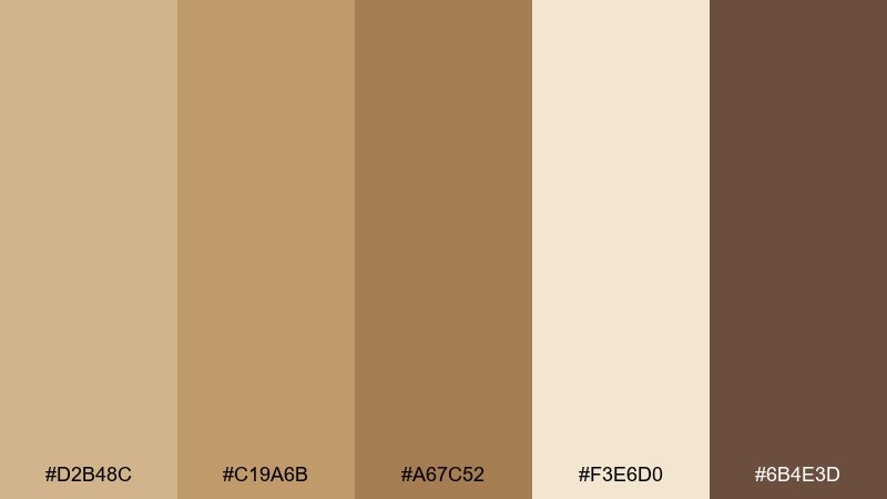
HEX: #D2B48C #C19A6B #A67C52 #F3E6D0 #6B4E3D
Mood: sunbaked and calm
Best for: living room interior styling
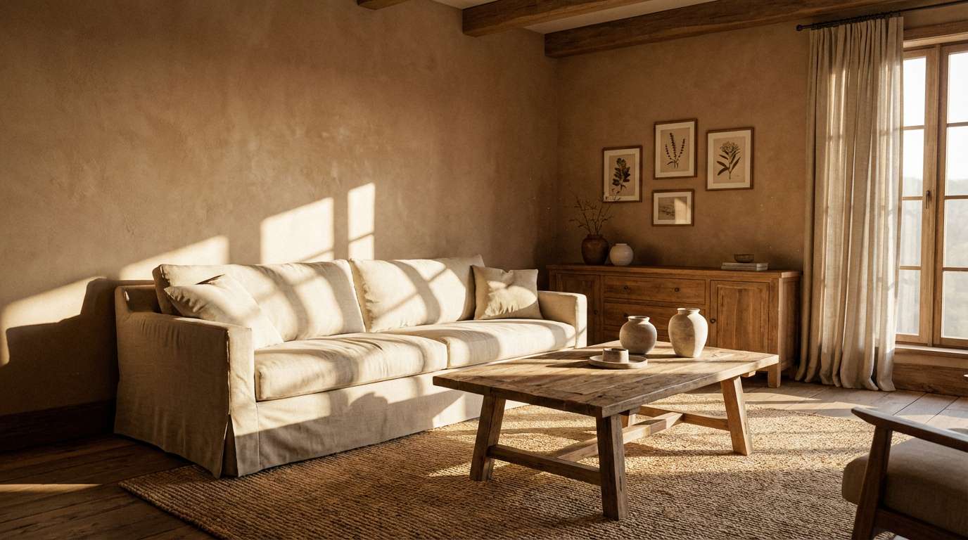
Sunbaked and calm, these tones feel like clay walls, soft linen, and late-afternoon light. Use them for sofas, rugs, and built-ins where you want warmth without heaviness. Pair with off-white textures, matte black hardware, and a few olive plants for contrast. Tip: keep the darkest brown to 10 to 15 percent to avoid a muddy room.
Image example of desert clay neutrals generated using media.io
Media.io is an online AI studio for creating and editing video, image, and audio in your browser.

2) Walnut Latte Blend
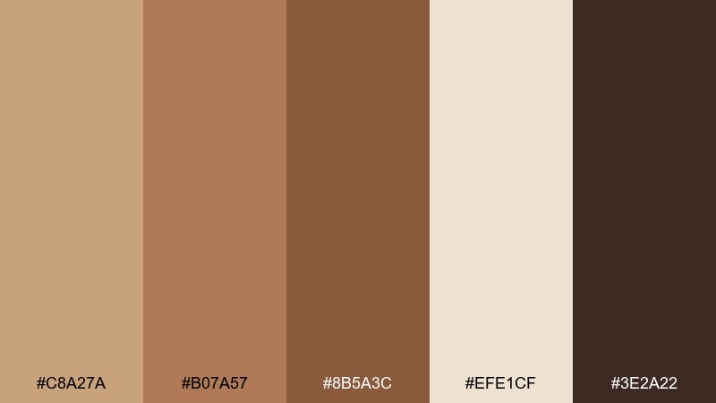
HEX: #C8A27A #B07A57 #8B5A3C #EFE1CF #3E2A22
Mood: cozy and aromatic
Best for: coffee shop branding
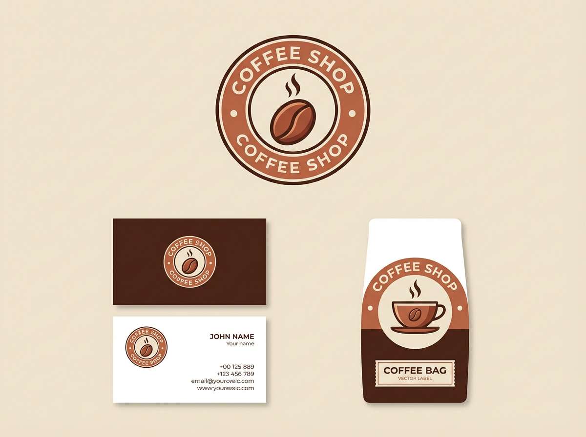
Cozy and aromatic, the mix reads like espresso crema swirling into warm milk. It works beautifully for logos, loyalty cards, and packaging where you want approachable craft. Pair with creamy paper stock and a deep near-black for typography to keep it premium. Tip: use the mid tan as your main background so dark text stays crisp.
Image example of walnut latte blend generated using media.io
3) Canyon Sunset
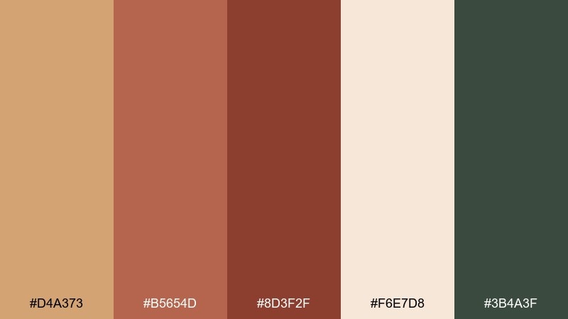
HEX: #D4A373 #B5654D #8D3F2F #F6E7D8 #3B4A3F
Mood: adventurous and cinematic
Best for: travel poster design
Adventurous and cinematic, it evokes canyon cliffs, dusty trails, and a green horizon at dusk. These tan brown color combinations shine in bold headlines and large color blocks where contrast matters. Pair with a muted forest green and plenty of negative space to keep the layout modern. Tip: reserve the deepest red-brown for key callouts like dates or locations.
Image example of canyon sunset generated using media.io

4) Linen and Leather
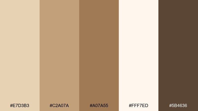
HEX: #E7D3B3 #C2A07A #A07A55 #FFF7ED #5B4636
Mood: elegant and understated
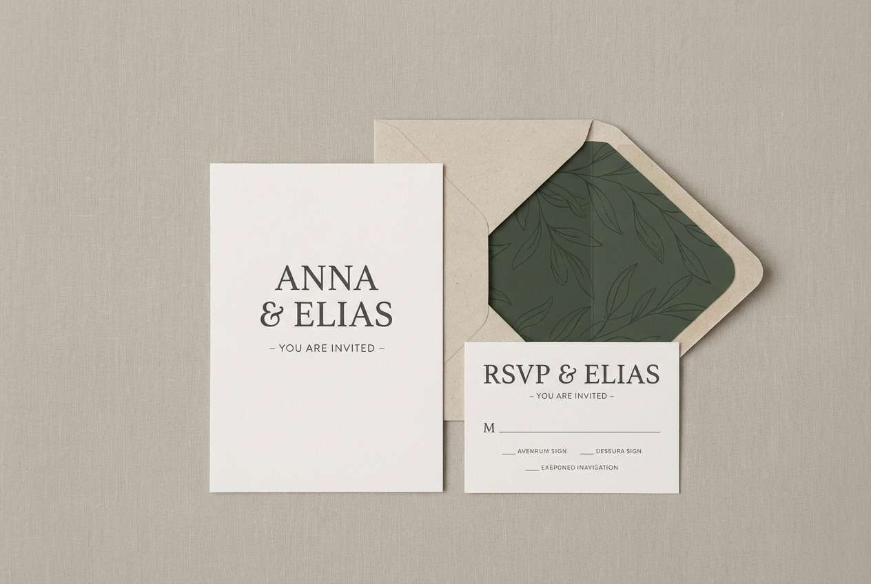
Best for: wedding invitation suite
Elegant and understated, these tones feel like pressed stationery, leather-bound vows, and soft candlelight. They are ideal for invitation suites, monograms, and minimal line art. Pair with warm ivory paper, gold foil details, and a restrained serif to elevate the look. Tip: keep ink colors to the darker browns so fine text remains legible.
Image example of linen and leather generated using media.io
5) Mocha Copper Glow
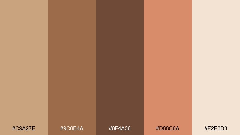
HEX: #C9A27E #9C6B4A #6F4A36 #D88C6A #F2E3D3
Mood: warm and luminous
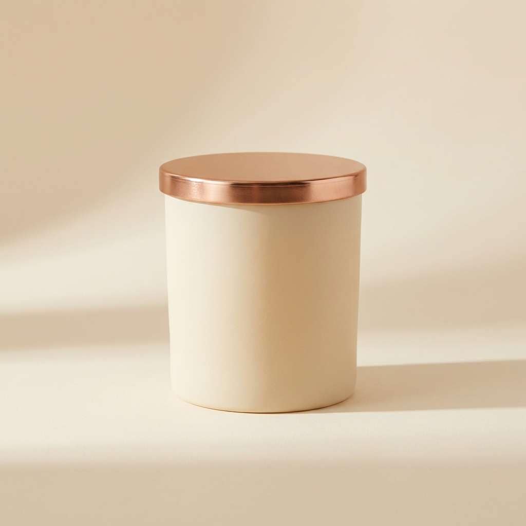
Best for: candle product ad
Warm and luminous, it suggests copper reflections on a mocha surface. Use it for product ads that need a gentle sense of luxury without looking too formal. Pair with creamy backdrops and a single copper accent for a clean, studio-ready finish. Tip: let the peachy copper act as the only bright note so the set stays cohesive.
Image example of mocha copper glow generated using media.io
6) Sandstone Minimal
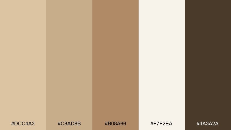
HEX: #DCC4A3 #C8AD8B #B08A66 #F7F2EA #4A3A2A
Mood: clean and airy
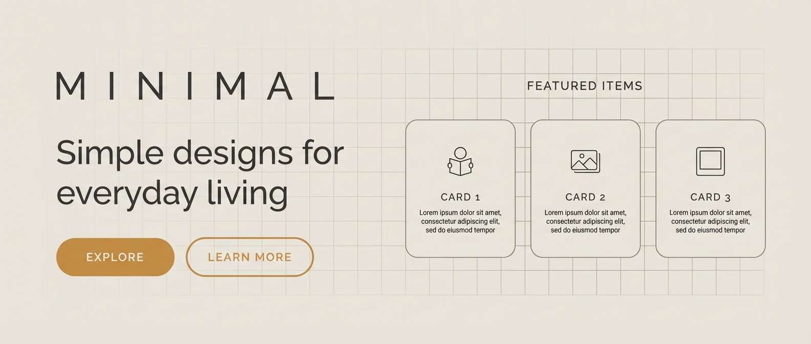
Best for: portfolio website hero section
Clean and airy, these sands and browns feel like smooth stone and bright gallery walls. They work well for hero sections, service pages, and any layout where you want calm focus. Pair with charcoal text and subtle line icons to keep it sharp. Tip: use the lightest tone for backgrounds and save the darkest for buttons and links.
Image example of sandstone minimal generated using media.io
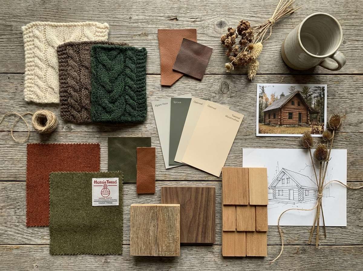
7) Rustic Cabin Warmth
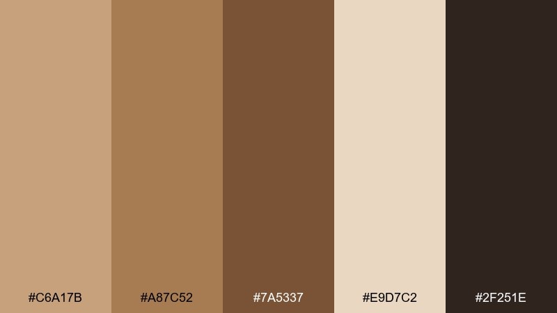
HEX: #C6A17B #A87C52 #7A5337 #E9D7C2 #2F251E
Mood: rustic and grounded
Best for: cabin interior moodboard
Rustic and grounded, it feels like weathered beams, wool blankets, and a crackling stove. Use it in moodboards for cabins, lodges, or any space that leans natural and tactile. Pair with plaid patterns, raw wood grain, and warm lighting to amplify the cozy effect. Tip: balance the darkest tone with lighter textiles so the room does not feel heavy.
Image example of rustic cabin warmth generated using media.io
8) Caramel Sage Accent
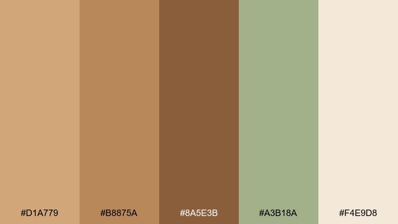
HEX: #D1A779 #B8875A #8A5E3B #A3B18A #F4E9D8
Mood: fresh and welcoming
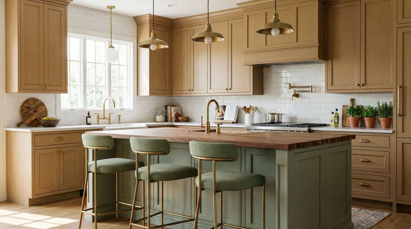
Best for: kitchen makeover accents
Fresh and welcoming, it brings caramel warmth with a quiet hit of garden sage. These tones suit kitchens, breakfast nooks, and open shelving where you want a lived-in look. Pair with white subway tile, brushed brass, and leafy herbs to keep it bright. Tip: use sage for small accents like stools or textiles rather than large cabinets.
Image example of caramel sage accent generated using media.io
9) Terra and Cream
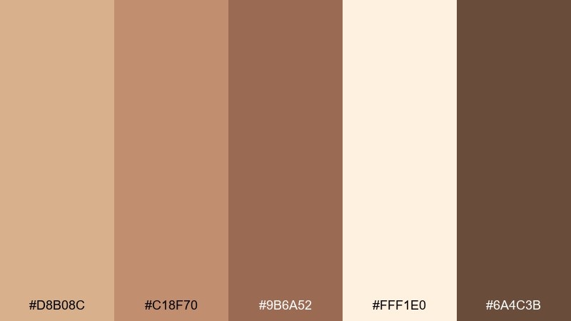
HEX: #D8B08C #C18F70 #9B6A52 #FFF1E0 #6A4C3B
Mood: soft and sunlit
Best for: lookbook backgrounds
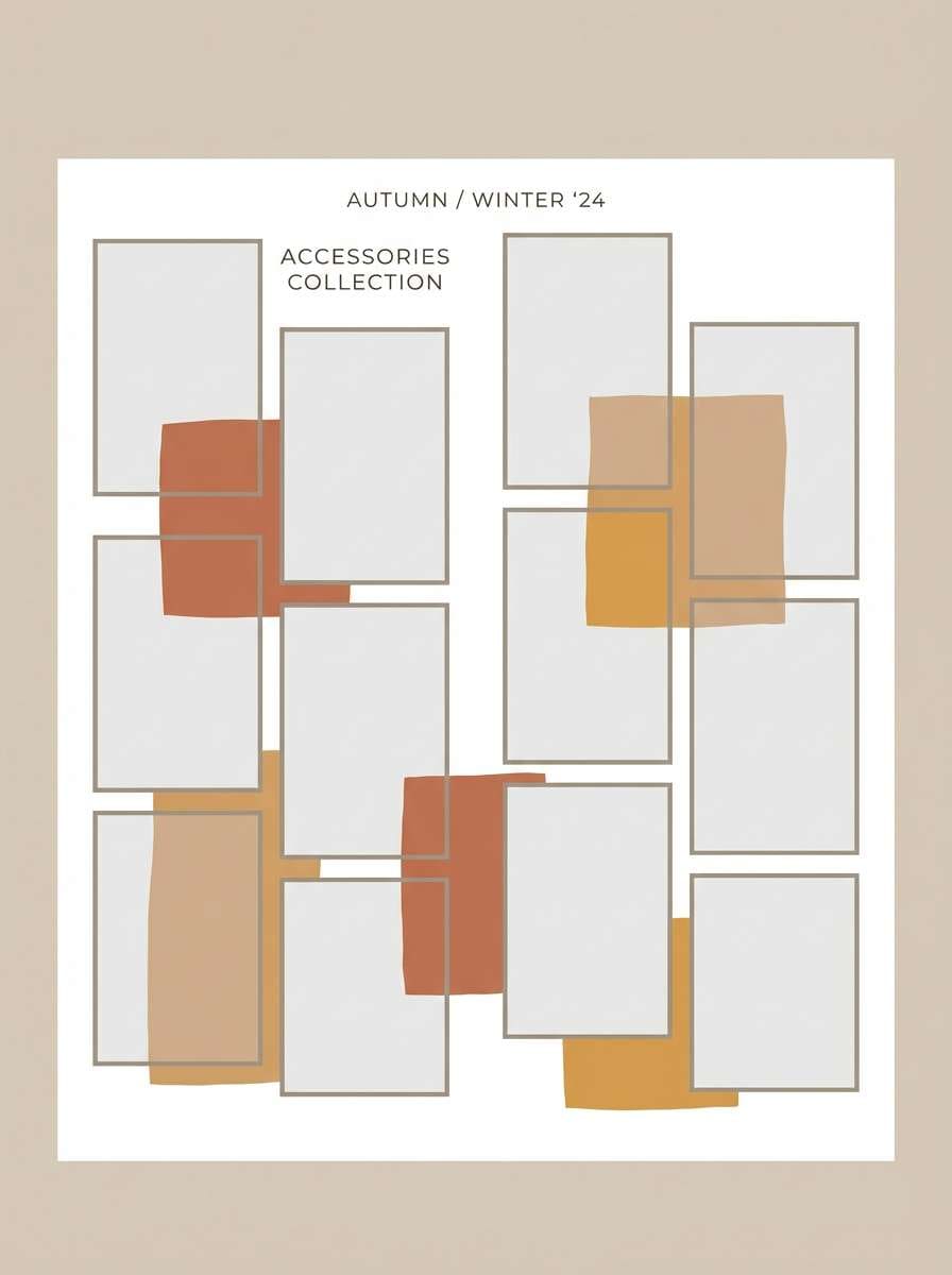
Soft and sunlit, it reads like terracotta dust against whipped cream. It is great for fashion lookbooks, lifestyle slides, and product grids that need gentle warmth. Pair with off-white margins and minimal black type for a clean editorial feel. Tip: keep photos slightly desaturated so the background tones stay in control.
Image example of terra and cream generated using media.io
10) Toasted Almond UI
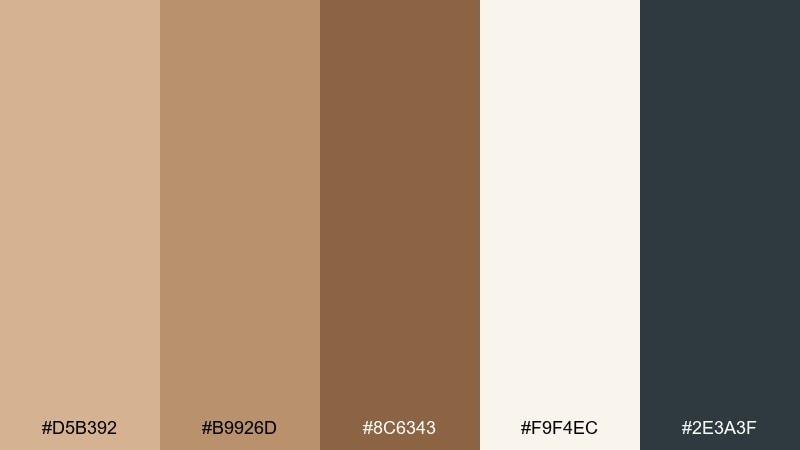
HEX: #D5B392 #B9926D #8C6343 #F9F4EC #2E3A3F
Mood: calm and trustworthy
Best for: fintech dashboard UI
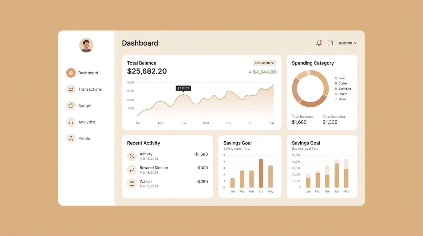
Calm and trustworthy, it feels like toasted almond paired with cool slate ink. The tan brown color scheme works well for dashboards that need warmth but still read professional. Pair with a blue-gray for charts, and keep spacing generous for clarity. Tip: use the darkest tone for navigation and the lightest for card surfaces to maintain hierarchy.
Image example of toasted almond ui generated using media.io
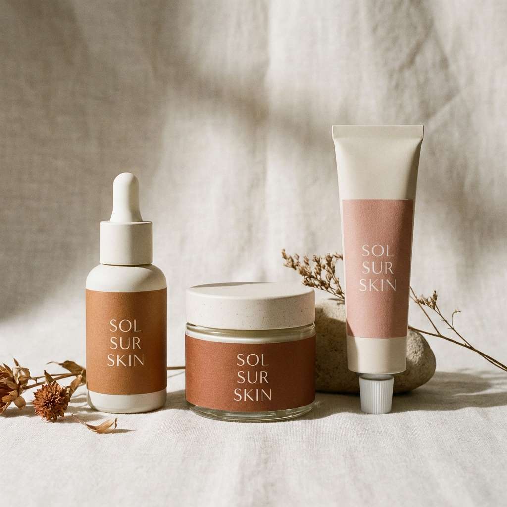
11) Chocolate and Blush
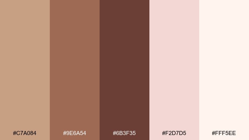
HEX: #C7A084 #9E6A54 #6B3F35 #F2D7D5 #FFF5EE
Mood: romantic and modern
Best for: beauty packaging visuals
Romantic and modern, it blends rich cocoa with a soft blush highlight. Use it for cosmetics, skincare, or boutique labels where you want warmth with a gentle feminine note. Pair with minimal typography and glossy finishes to keep it contemporary. Tip: let blush appear on secondary elements only so the browns stay dominant.
Image example of chocolate and blush generated using media.io
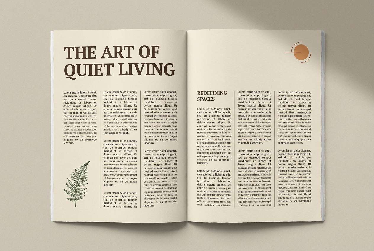
12) Sepia Editorial
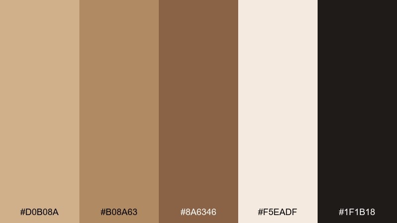
HEX: #D0B08A #B08A63 #8A6346 #F5EADF #1F1B18
Mood: classic and literary
Best for: magazine editorial layout
Classic and literary, the sepia range feels like archival photos and creamy newsprint. It is perfect for long-form articles, magazine spreads, and portfolio case studies. Pair with sharp black text and subtle rules to keep it readable. Tip: keep backgrounds slightly warm rather than pure white to reduce glare and add softness.
Image example of sepia editorial generated using media.io
13) Bronze Denim Contrast
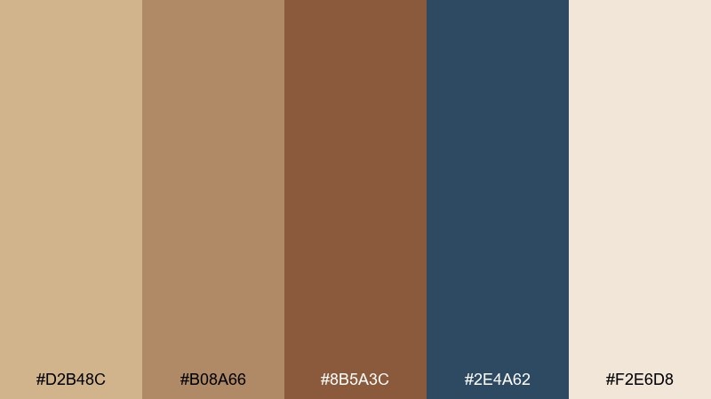
HEX: #D2B48C #B08A66 #8B5A3C #2E4A62 #F2E6D8
Mood: bold and confident
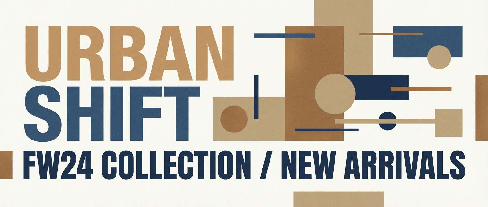
Best for: streetwear campaign graphics
Bold and confident, it pairs bronzed warmth with a denim-blue punch. These tan brown color combinations are ideal for streetwear graphics, landing pages, and campaign banners that need edge. Pair with condensed type and gritty gradients sparingly so the palette stays clean. Tip: use the blue only for key highlights like buttons or drop titles.
Image example of bronze denim contrast generated using media.io
14) Oat Milk Packaging
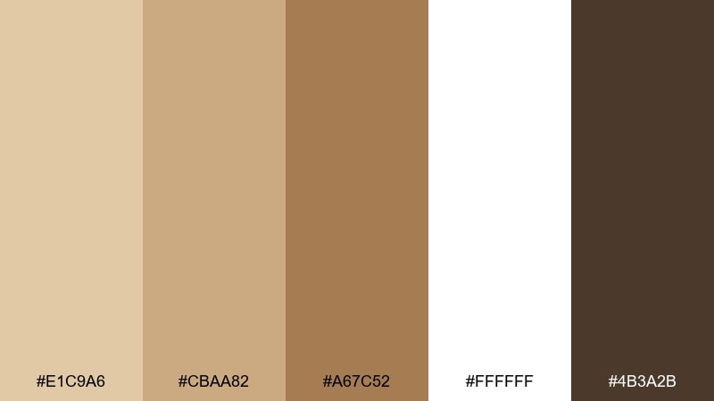
HEX: #E1C9A6 #CBAA82 #A67C52 #FFFFFF #4B3A2B
Mood: clean and wholesome
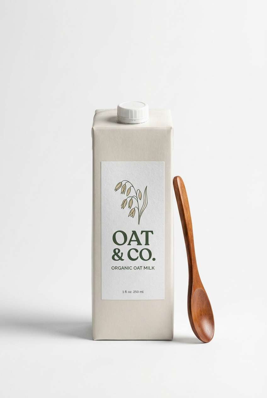
Best for: beverage carton packaging
Clean and wholesome, it feels like oats, paper fiber, and a bright morning kitchen. Use it for carton packaging, nutrition panels, and shelf-ready product shots. Pair with crisp white and a deep cocoa brown for clear labeling. Tip: keep the mid tan for large panels and reserve the darkest tone for type to meet contrast needs.
Image example of oat milk packaging generated using media.io
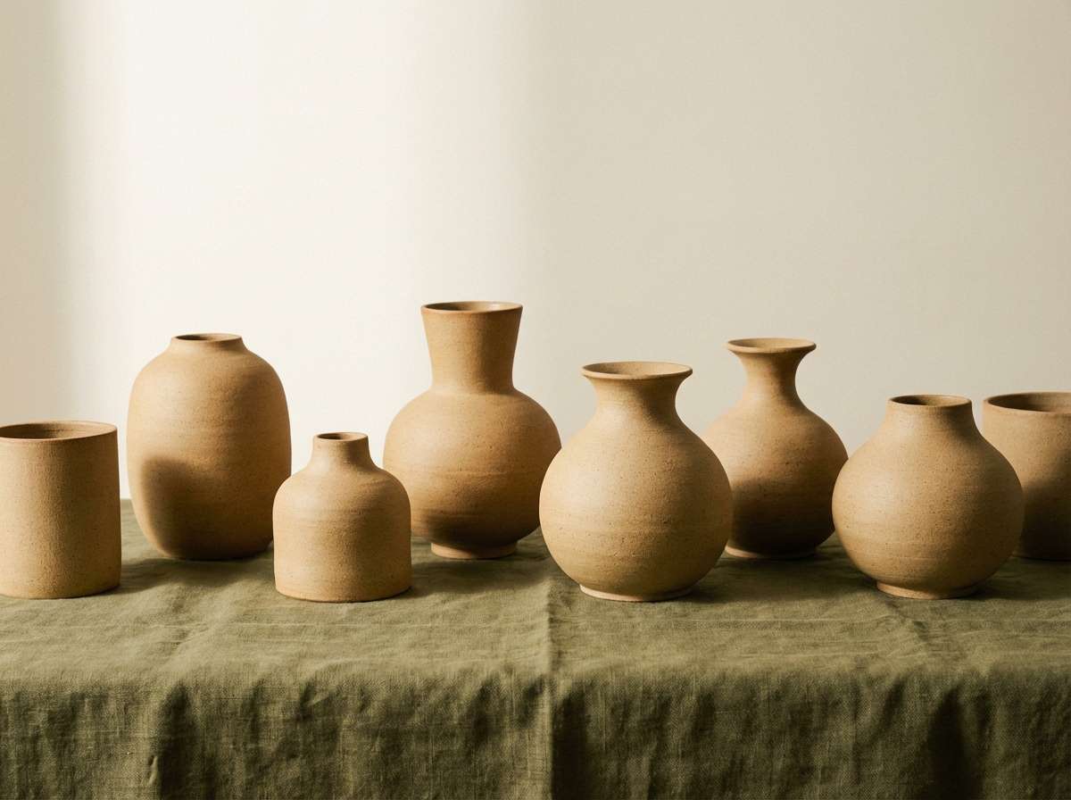
15) Clay Pottery Studio
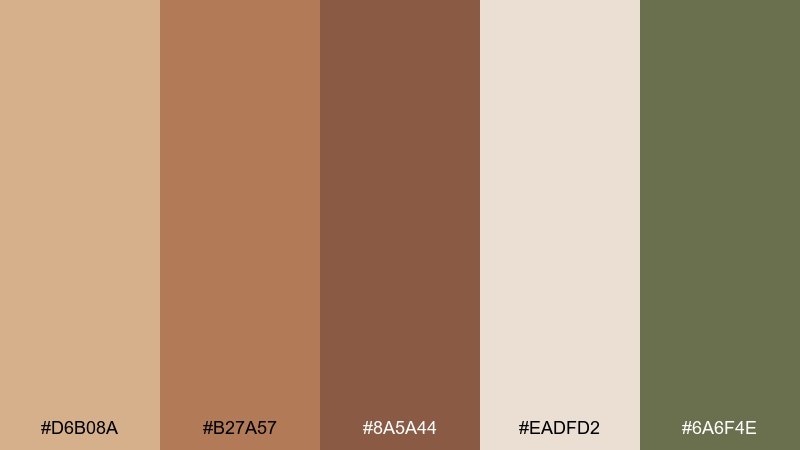
HEX: #D6B08A #B27A57 #8A5A44 #EADFD2 #6A6F4E
Mood: handmade and organic
Best for: ceramics product photography
Handmade and organic, it evokes wet clay, kiln warmth, and quiet studio greens. It suits pottery brands, artisan catalogs, and product pages that lean tactile and real. Pair with rough paper textures and muted olive accents to reinforce the craft feel. Tip: use the light taupe as a backdrop so forms and shadows read clearly.
Image example of clay pottery studio generated using media.io
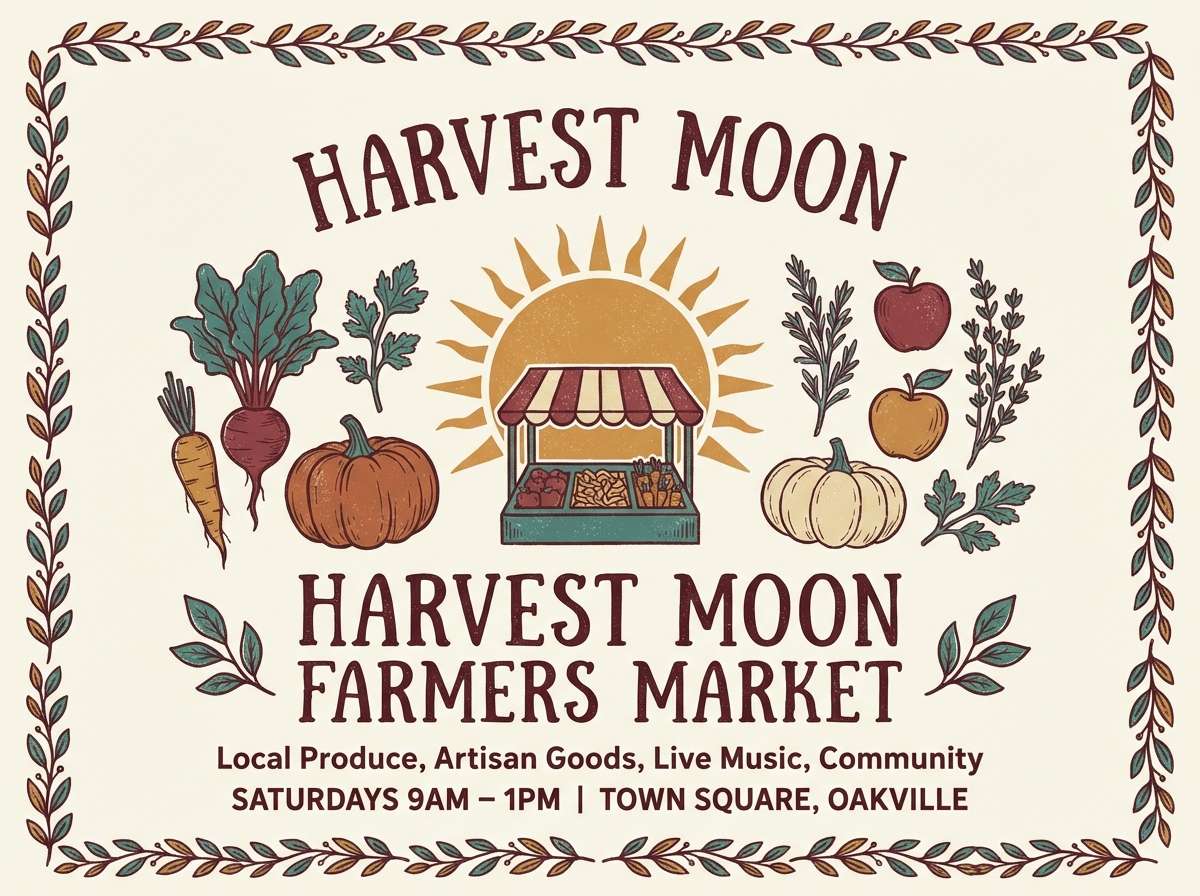
16) Autumn Market Poster
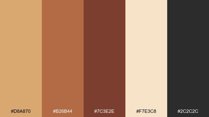
HEX: #D8A870 #B26B44 #7C3E2E #F7E3C8 #2C2C2C
Mood: festive and earthy
Best for: farmers market event flyer
Festive and earthy, it feels like dried leaves, cinnamon, and warm paper. Use it for seasonal event flyers, signage, and social posts where you want instant autumn energy. Pair with bold black type and simple icons like pumpkins or wheat for quick readability. Tip: keep the background light and place the darker browns behind only the most important details.
Image example of autumn market poster generated using media.io
17) Dune Botanical Wash
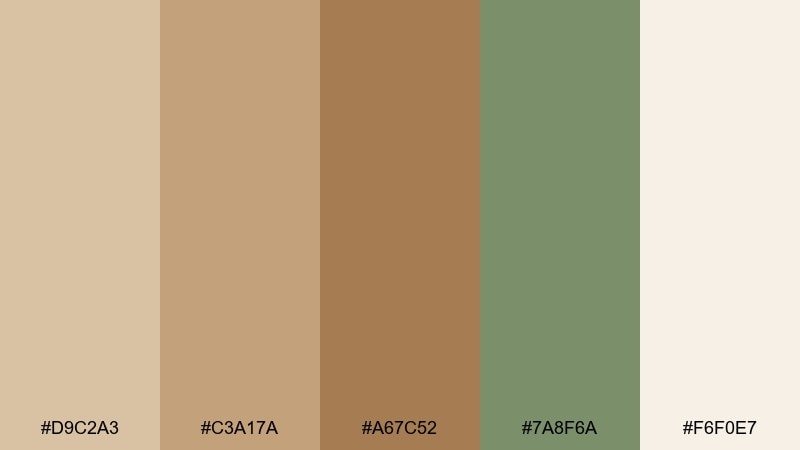
HEX: #D9C2A3 #C3A17A #A67C52 #7A8F6A #F6F0E7
Mood: soft and natural
Best for: botanical illustration set
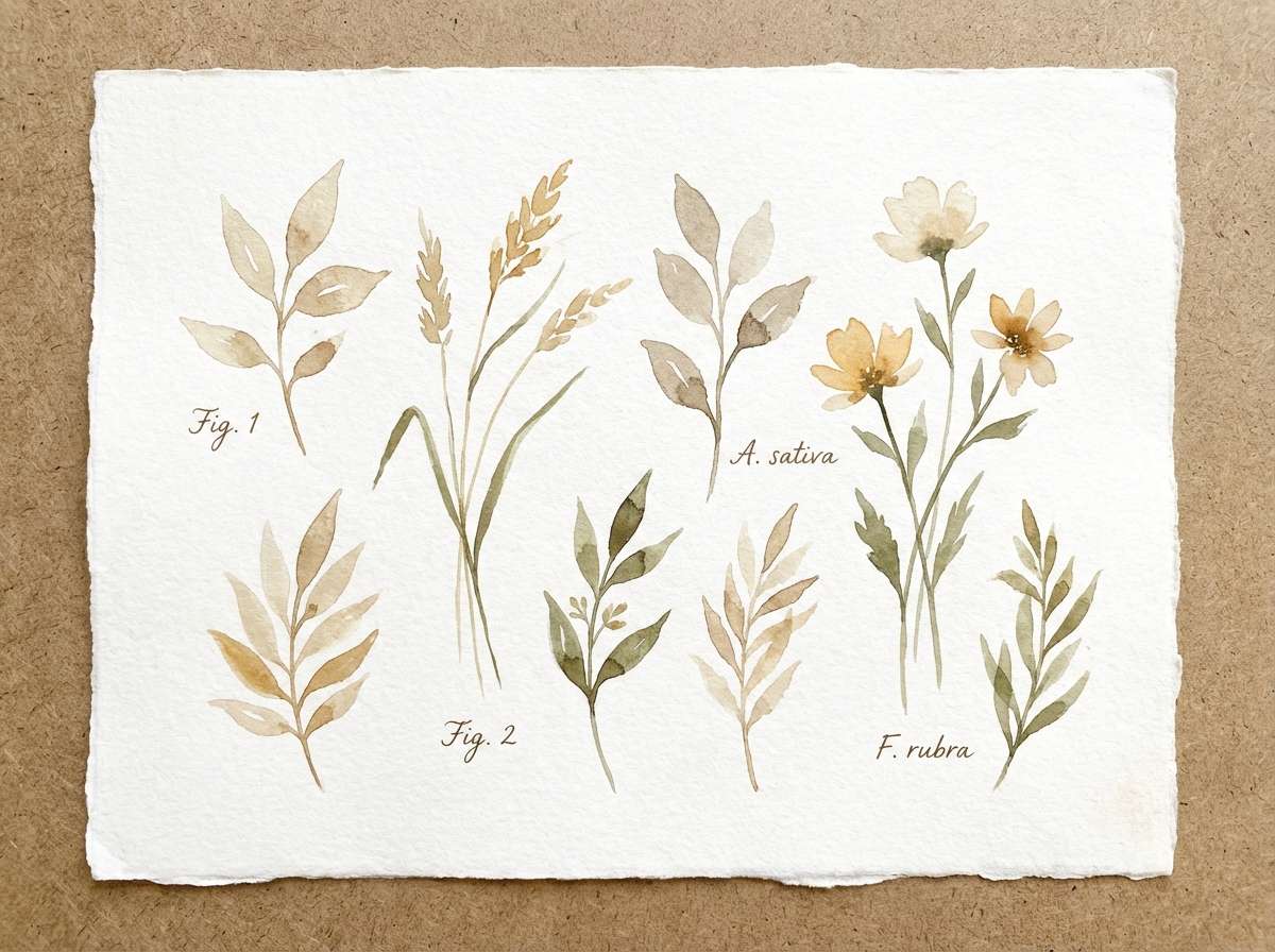
Soft and natural, it suggests dunes under pale sky with a muted green sprig. It is great for botanical prints, journaling stickers, and gentle social graphics. Pair with watercolor textures and light linework to keep the palette airy. Tip: let the green show up as small leaf accents so the sands stay dominant.
Image example of dune botanical wash generated using media.io
18) Heritage Brand Stamp
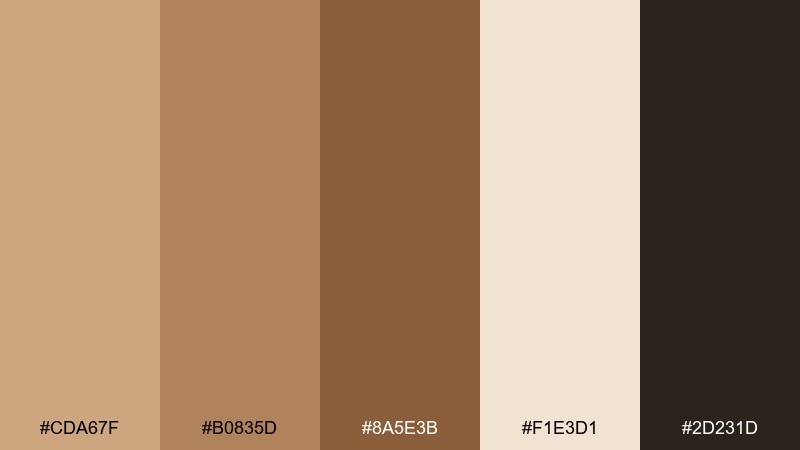
HEX: #CDA67F #B0835D #8A5E3B #F1E3D1 #2D231D
Mood: heritage and authentic
Best for: logo and stationery system
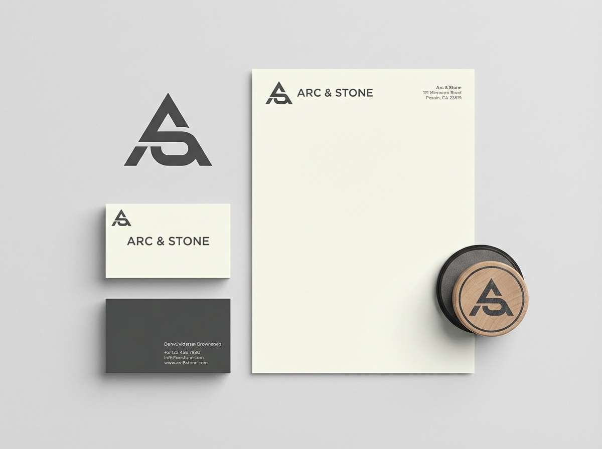
Heritage and authentic, it recalls stamped kraft paper and well-worn leather goods. Use this tan brown color palette for logos, monograms, and stationery where craftsmanship is the message. Pair with a single serif family, plenty of spacing, and subtle texture to avoid looking dated. Tip: keep the darkest shade for the mark and use the lighter tones for backgrounds and envelopes.
Image example of heritage brand stamp generated using media.io
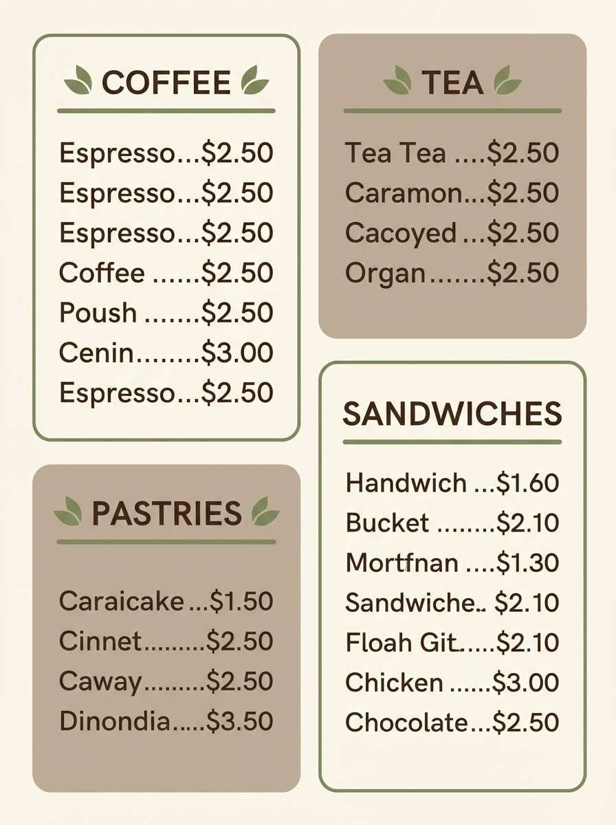
19) Cozy Cafe Menu
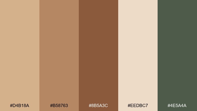
HEX: #D4B18A #B58763 #8B5A3C #EEDBC7 #4E5A4A
Mood: friendly and rustic
Best for: printed cafe menu design
Friendly and rustic, it feels like steamed milk foam, toasted pastry, and a hint of herbs. It works for menus, table tents, and chalkboard-style graphics that still need to look polished. Pair with a muted green accent and simple dividers to organize sections. Tip: use the cream tone for the main menu background to keep prices readable.
Image example of cozy cafe menu generated using media.io
20) Nightfall Espresso
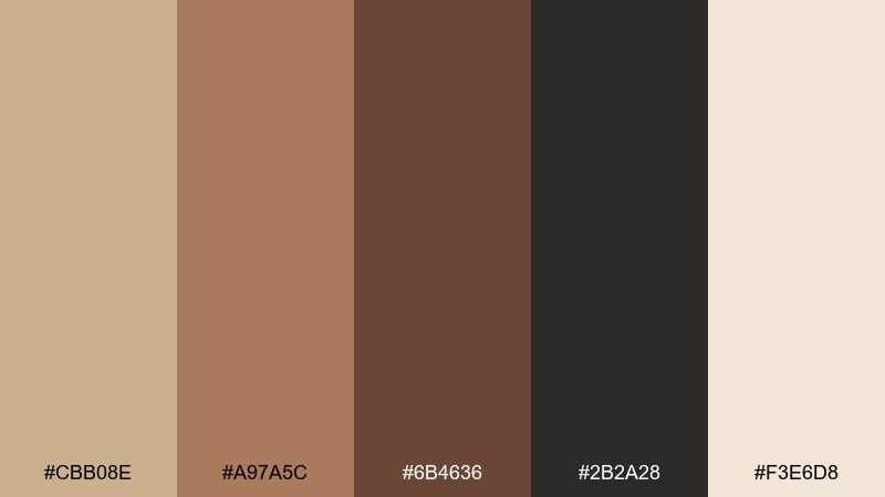
HEX: #CBB08E #A97A5C #6B4636 #2B2A28 #F3E6D8
Mood: moody and refined
Best for: luxury watch product ad
Moody and refined, it brings espresso depth with a soft cream highlight. It is strong for luxury product ads where you want drama without harsh contrast. Pair with near-black backgrounds, subtle reflections, and minimal copy to keep it premium. Tip: add the light cream as a rim light or small label area so details pop.
Image example of nightfall espresso generated using media.io

What Colors Go Well with Tan Brown?
Tan brown pairs effortlessly with soft neutrals like ivory, cream, and warm white—these keep the overall look bright while preserving the palette’s natural warmth. For a modern feel, add charcoal or near-black instead of pure black.
Muted greens (sage, olive, forest) are a top match because they echo nature and provide calm contrast. If you need a cooler, sharper accent, try navy or denim blue to make tan look more intentional and graphic.
For a premium touch, use metals and mineral tones: copper and bronze amplify warmth, while slate or blue-gray tones add a balanced, professional edge for UI and branding.
How to Use a Tan Brown Color Palette in Real Designs
Start by choosing a “base tan” for the largest surfaces (backgrounds, walls, hero blocks), then layer a lighter cream for breathing room and a deeper brown for structure (text, borders, CTAs). This keeps tan from feeling flat or dusty.
In interiors, let texture do the work—linen, wood grain, and matte ceramics keep tan brown from reading as plain beige. In branding and print, subtle paper textures or warm off-white stock can make the palette feel crafted and intentional.
For UI, prioritize accessibility: use the darkest brown or a cool near-black for text, and reserve mid-tans for cards and panels. Keep accents (green, navy, copper) limited to a few key actions to maintain clarity.
Create Tan Brown Palette Visuals with AI
If you already have HEX codes, you can turn them into on-brand mockups fast by describing the scene (interior, packaging, UI) and the vibe (cozy, minimal, premium). Consistent lighting and simple compositions help warm neutrals look clean—not muddy.
Reuse the prompts above, then iterate by swapping a single detail (material, background tone, accent color) to explore variations while keeping the same tan brown foundation.
With Media.io’s text-to-image tool, you can generate matching visuals for ads, hero sections, moodboards, and product concepts in minutes—no advanced design setup needed.
Tan Brown Color Palette FAQs
-
What is the HEX code for a classic tan brown?
A widely used “classic tan” reference is #D2B48C (often called Tan). It’s a balanced warm neutral that works well as a base color in palettes. -
Does tan brown work for modern UI design?
Yes—use very light tans for backgrounds (#F7F2EA, #F9F4EC), deep browns or near-black for text, and keep one cool accent (slate, navy, blue-gray) for focus states and charts. -
What accent color looks best with tan brown?
Muted greens (sage/olive) are the most natural pairing, while navy/denim blue creates a sharper, more contemporary contrast. Copper accents add a premium, warm glow. -
How do I keep tan brown from looking muddy?
Increase value contrast: pair tan with a clean light (cream/ivory) and a clearly darker anchor (espresso/charcoal). Limit the darkest shade to smaller areas and avoid using too many mid-browns at once. -
Is tan brown good for branding?
Tan brown is great for brands that want “craft,” “heritage,” “organic,” or “wholesome” cues—coffee, skincare, lifestyle goods, food packaging, and boutique services especially. -
What typography colors are readable on tan backgrounds?
Use deep cocoa brown, charcoal, or near-black for body text, and test contrast for accessibility. For headings, you can also use a darker warm brown to stay cohesive while remaining legible. -
Can I use tan brown with bright colors?
You can, but keep brights as small accents (buttons, labels, icons). Tan brown is at its best when the palette stays restrained and relies on texture and contrast rather than multiple saturated hues.


