

Green and navy blue is a timeless pairing: nature-forward greens bring freshness, while navy adds depth, structure, and trust.
Below are ready-to-use green navy blue color palettes with HEX codes, mood notes, and practical guidance for branding, UI, packaging, and print.
In this article
- Why Green Navy Blue Palettes Work So Well
-
- coastal evergreen
- midnight conservatory
- harbor pine
- emerald ink
- rainforest night
- juniper blueprint
- seaweed & sail
- cedar & deep sea
- alpine twilight
- mossy harbor
- teal spruce minimal
- bottle green & admiral
- seaglass nightfall
- forest navy utility
- canopy after dark
- minted maritime
- deep lagoon serif
- garden tech
- evergreen denim
- navy herbarium
- tidepool contrast
- verdant night transit
- What Colors Go Well with Green Navy Blue?
- How to Use a Green Navy Blue Color Palette in Real Designs
- Create Green Navy Blue Palette Visuals with AI
Why Green Navy Blue Palettes Work So Well
Green and navy blue balance emotion and credibility: green signals growth, health, and stability, while navy communicates intelligence, professionalism, and calm authority.
This pairing is naturally high-contrast without feeling harsh. Navy can anchor typography and navigation, and green can guide attention to actions, highlights, and key information.
Because both colors have strong real-world associations (oceans, forests, night skies), green navy blue palettes often feel “already branded,” making them ideal for UI systems, packaging, and editorial layouts.
20+ Green Navy Blue Color Palette Ideas (with HEX Codes)
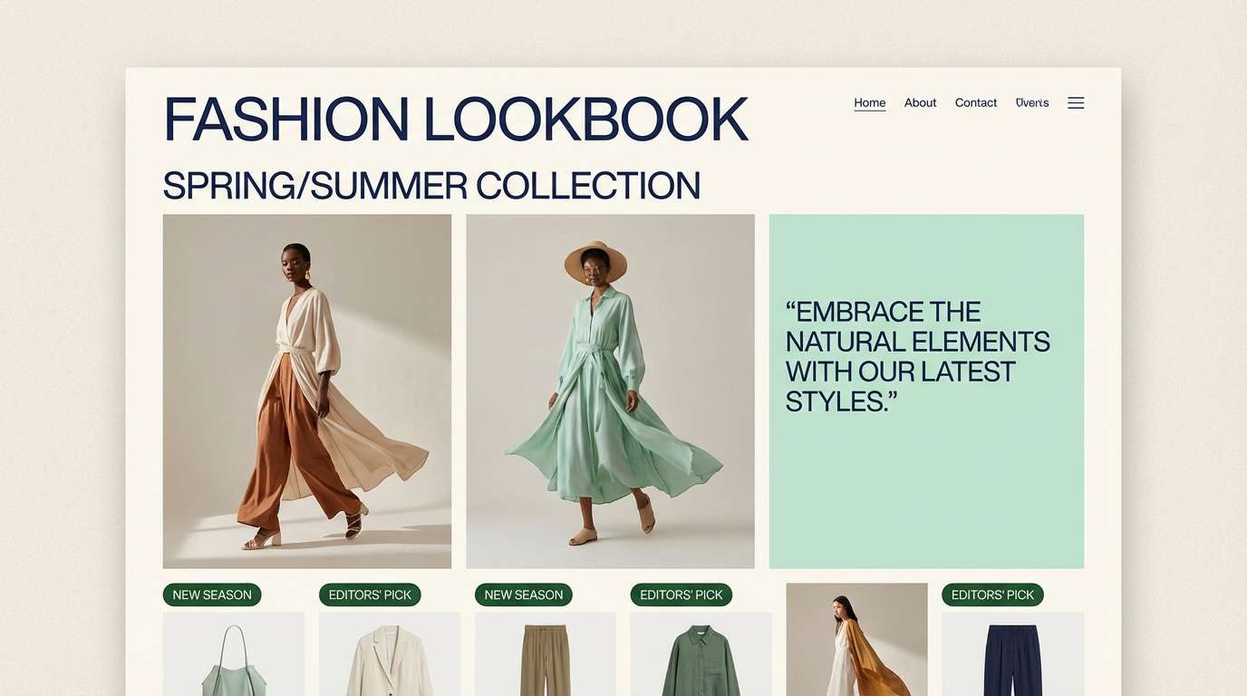
1) Coastal Evergreen
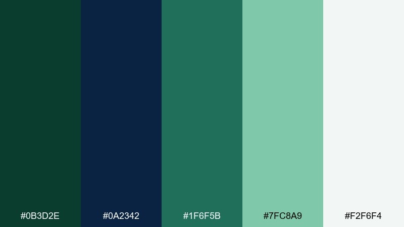
HEX: #0B3D2E #0A2342 #1F6F5B #7FC8A9 #F2F6F4
Mood: fresh, calm, coastal
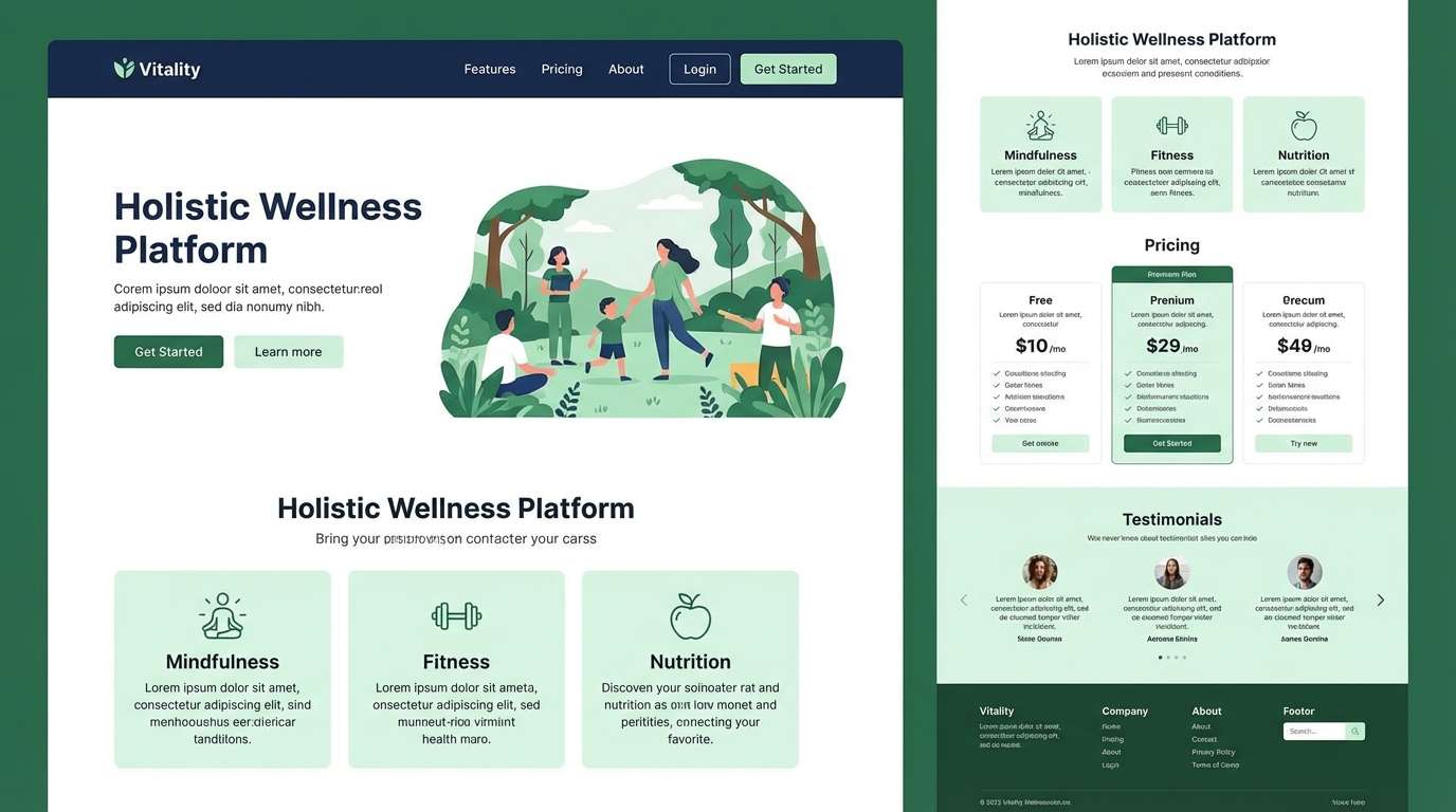
Best for: wellness brand landing page UI
Fresh sea air and evergreen dunes give this set a clean, confident feel. Use the deep navy for headers and navigation, then bring in the greens for buttons and highlights. The pale off-white keeps layouts breathable and modern. Tip: reserve the mint tone for secondary actions so primary CTAs stay clear.
Image example of coastal evergreen generated using media.io
Media.io is an online AI studio for creating and editing video, image, and audio in your browser.

2) Midnight Conservatory
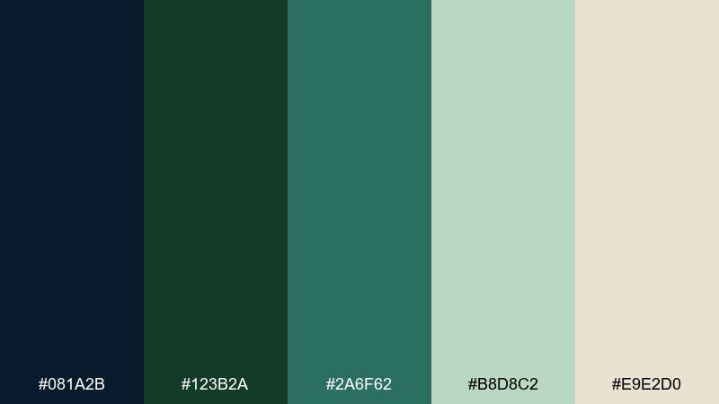
HEX: #081A2B #123B2A #2A6F62 #B8D8C2 #E9E2D0
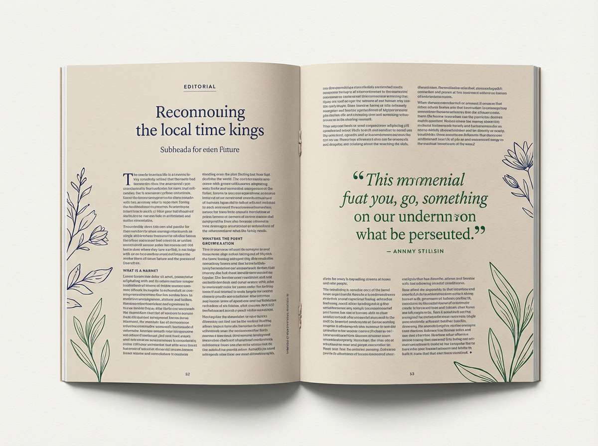
Mood: moody, refined, botanical
Best for: editorial magazine spread
Moody greenhouse shadows and glossy leaves set a refined, story-driven tone. Let the inky navy carry body text and rules, while the deep green anchors pull quotes. Use the warm beige as paper color to avoid a cold, overly digital look. Tip: keep accent teal to small motifs and section markers for a premium finish.
Image example of midnight conservatory generated using media.io
3) Harbor Pine
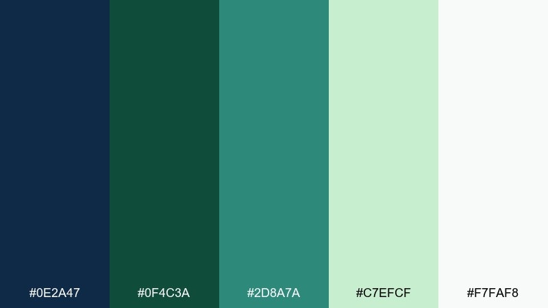
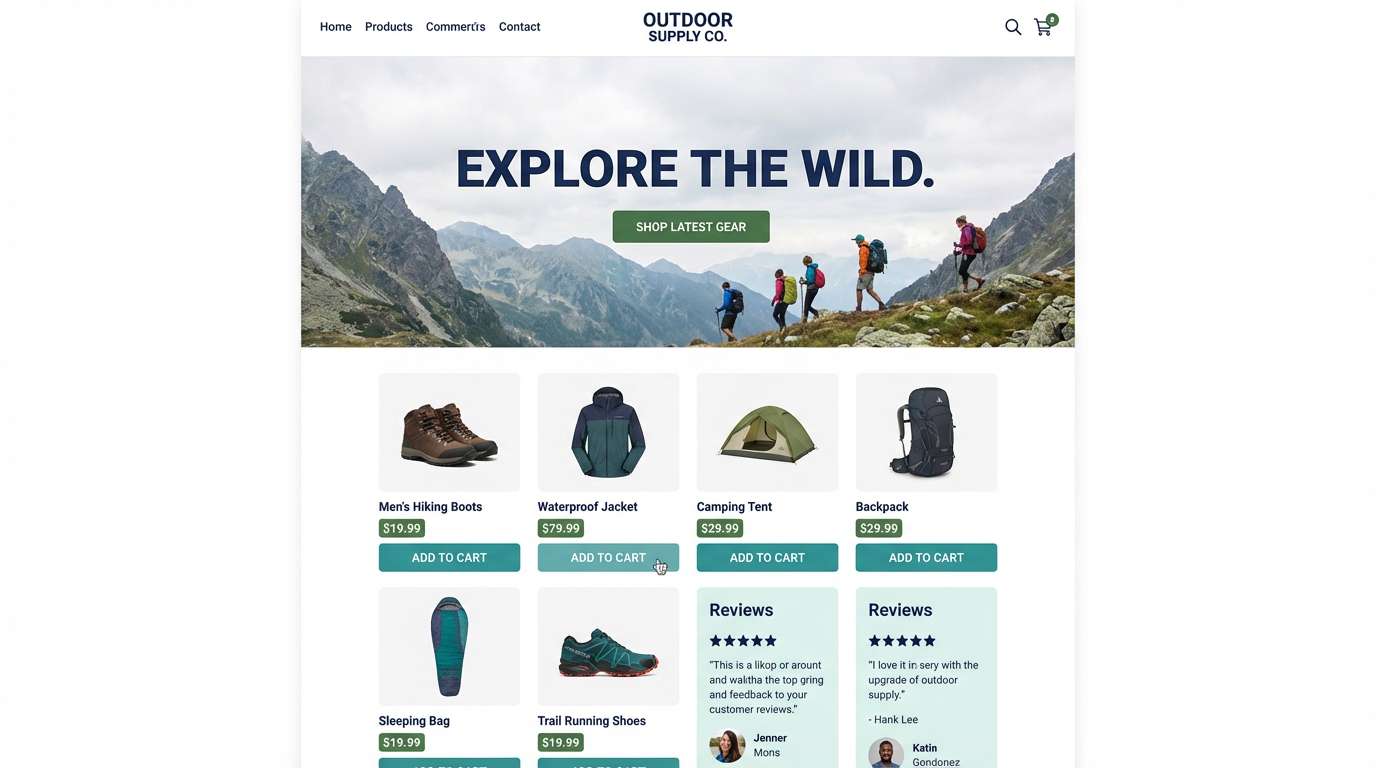
HEX: #0E2A47 #0F4C3A #2D8A7A #C7EFCF #F7FAF8
Mood: crisp, nautical, outdoorsy
Best for: outdoor gear ecommerce homepage
Crisp harbor air and pine-lined trails make the contrast feel energetic and outdoors-ready. This green navy blue color palette works best when navy handles price and trust elements, while green takes over badges and add-to-cart moments. Keep the light mint for background panels and reviews to maintain clarity. Tip: use the teal as a hover state to show interactivity without adding new colors.
Image example of harbor pine generated using media.io
4) Emerald Ink
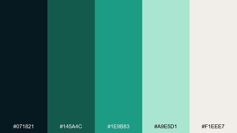
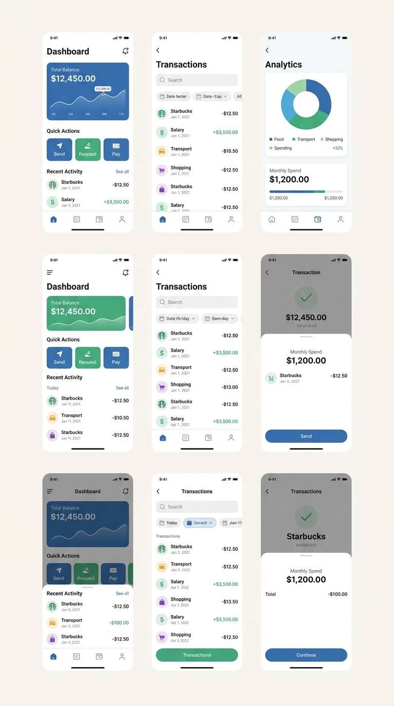
HEX: #071821 #145A4C #1E9B83 #A9E5D1 #F1EEE7
Mood: sleek, modern, high-contrast
Best for: fintech mobile app UI screens
Sleek ink tones paired with emerald light feel modern and trustworthy. Use the near-black navy for backgrounds and charts, then rely on emerald for primary actions and key metrics. The soft mint brings accessibility to cards and forms without washing out content. Tip: keep saturated teal to success states and micro-highlights so the interface stays calm.
Image example of emerald ink generated using media.io
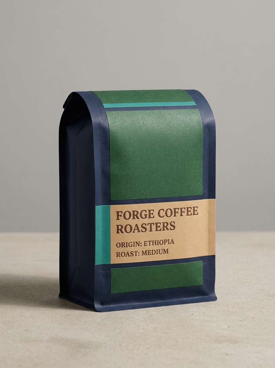
5) Rainforest Night
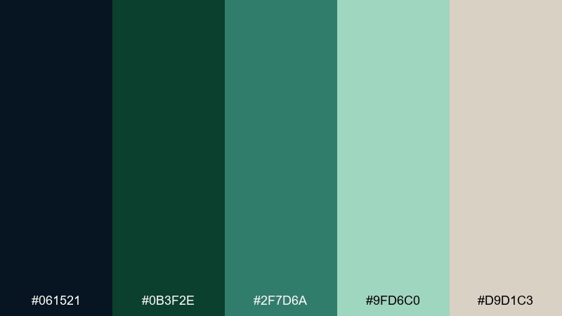
HEX: #061521 #0B3F2E #2F7D6A #9FD6C0 #D9D1C3
Mood: lush, cinematic, grounded
Best for: craft coffee packaging
Lush rainforest depth and late-night café lighting create a grounded, cinematic vibe. Put the dark navy on the bag as the base, then layer rich green for brand blocks and labels. The soft tan works well for tasting notes and small typography. Tip: foil-stamp the teal accent sparingly to highlight origin or roast level without clutter.
Image example of rainforest night generated using media.io
6) Juniper Blueprint
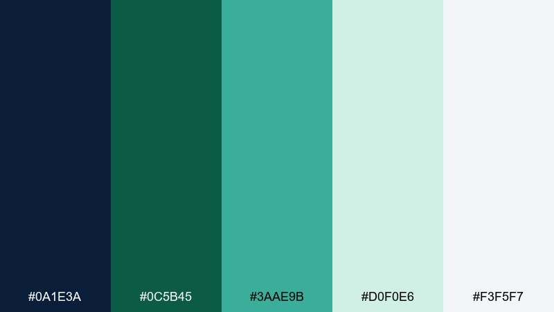
HEX: #0A1E3A #0C5B45 #3AAE9B #D0F0E6 #F3F5F7
Mood: technical, clean, optimistic
Best for: B2B SaaS dashboard UI
Blueprint precision with a juniper lift makes data feel approachable instead of intimidating. Use navy for charts, tables, and sidebars, then apply green to status badges and key toggles. The pale aqua is ideal for empty states and subtle sectioning. Tip: keep teal for one standout KPI so the dashboard has a clear visual hierarchy.
Image example of juniper blueprint generated using media.io
7) Seaweed & Sail
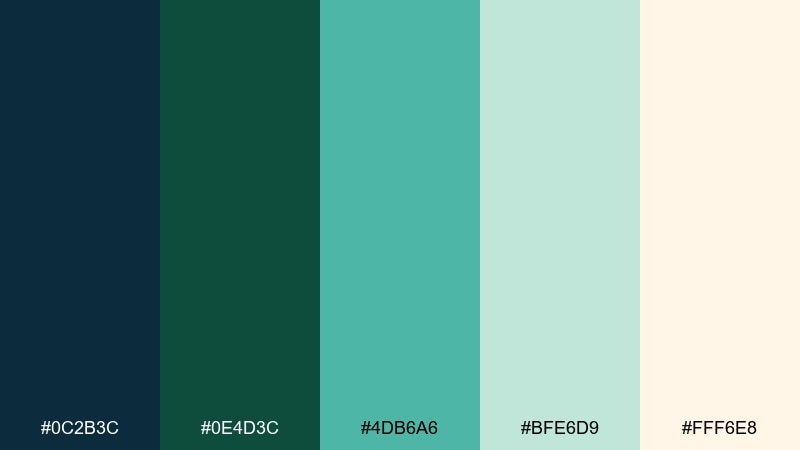
HEX: #0C2B3C #0E4D3C #4DB6A6 #BFE6D9 #FFF6E8
Mood: breezy, friendly, modern
Best for: summer event poster design
Breezy marina vibes and sun-bleached paper give the colors an easy, friendly charm. These green navy blue color combinations shine on posters where navy headlines need strong legibility and green supports subheads and icons. Use the warm cream as the background to keep it seasonal and inviting. Tip: add a single teal shape behind the date to make the information pop at a distance.
Image example of seaweed & sail generated using media.io

8) Cedar & Deep Sea
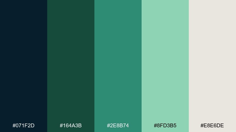
HEX: #071F2D #164A3B #2E8B74 #8FD3B5 #E8E6DE
Mood: classic, trustworthy, warm
Best for: law firm or advisory branding
Classic cedar warmth paired with deep-sea navy feels steady and trustworthy. Use navy for the wordmark and primary type, then bring in cedar green for secondary marks and section dividers. The soft greige keeps stationery and web pages from feeling stark. Tip: choose one green for brand assets and reserve the lighter mint strictly for backgrounds.
Image example of cedar & deep sea generated using media.io
9) Alpine Twilight
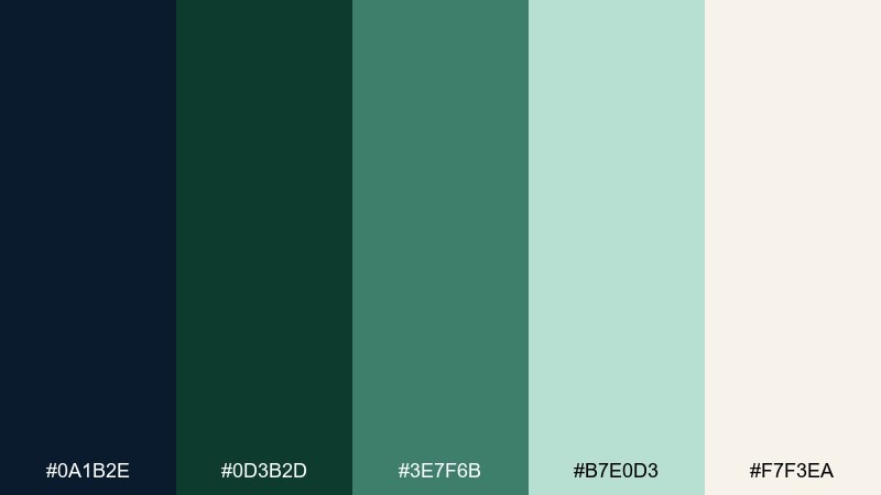
HEX: #0A1B2E #0D3B2D #3E7F6B #B7E0D3 #F7F3EA
Mood: crisp, serene, elevated
Best for: spa brochure layout
Crisp alpine air at twilight makes the palette feel serene yet elevated. Pair navy titles with generous whitespace, then use the muted green for section headers and icons. The light mint is perfect for soft gradients and panel backgrounds in print. Tip: keep contrast high for small copy by placing it on the warm off-white, not the mint.
Image example of alpine twilight generated using media.io
10) Mossy Harbor
HEX: #0B2239 #1B5E4B #2FAE9A #CDEFE7 #F0EEE9
Mood: approachable, contemporary, calm
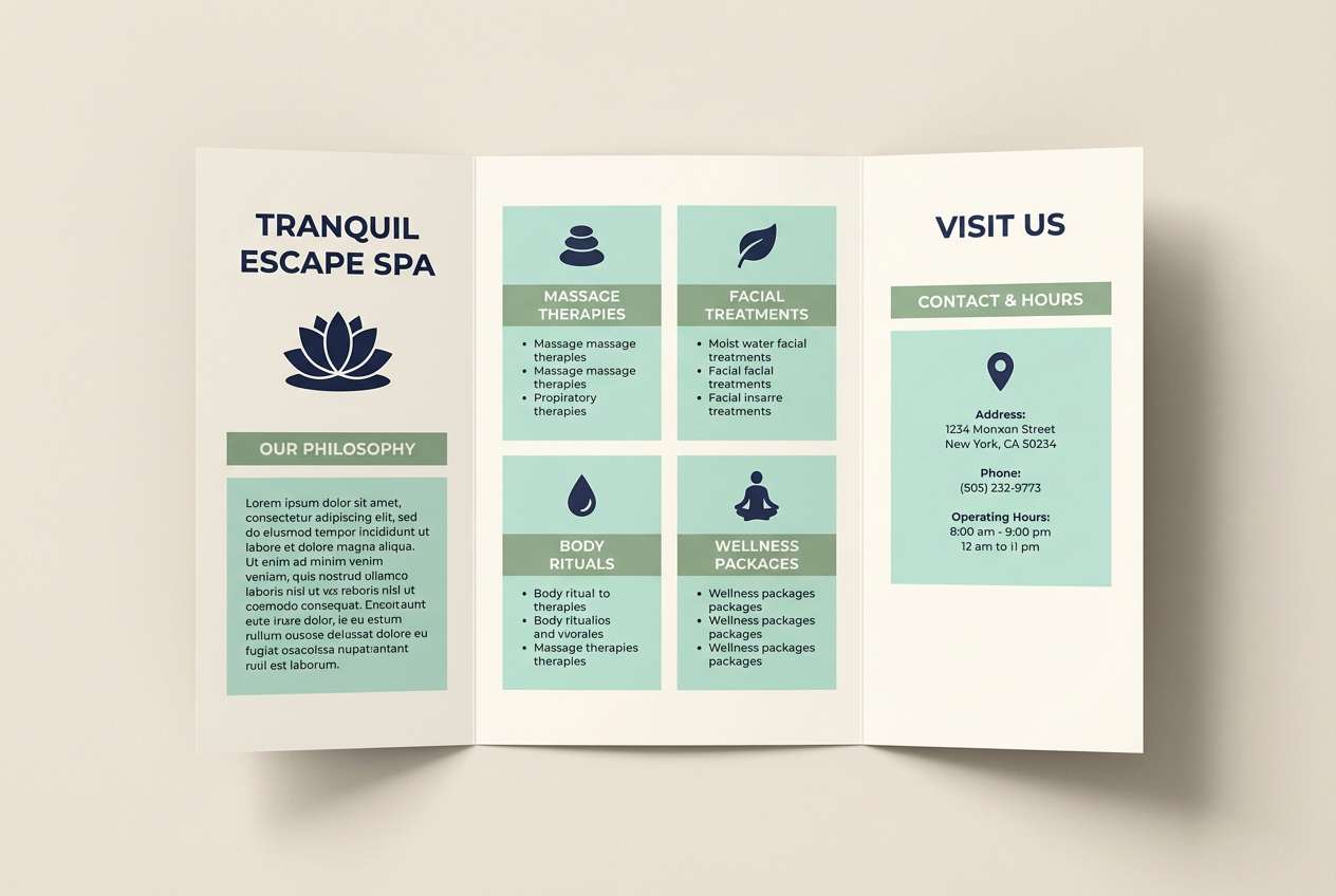
Best for: nonprofit annual report
Moss-covered docks and calm water lend an approachable, contemporary feel. Let navy handle long-form readability, and use green as a consistent signal for programs, impact metrics, and callouts. The pale aqua makes great background bands for charts and infographics. Tip: repeat the teal only in data highlights to keep the report cohesive and easy to scan.
Image example of mossy harbor generated using media.io
11) Teal Spruce Minimal
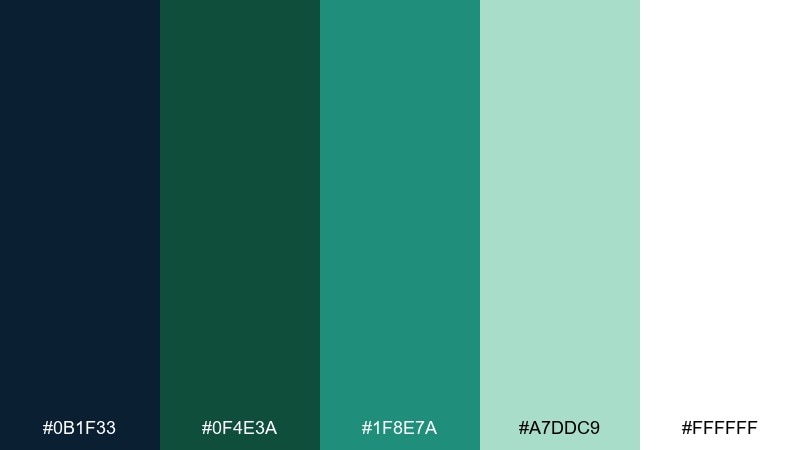
HEX: #0B1F33 #0F4E3A #1F8E7A #A7DDC9 #FFFFFF
Mood: minimal, sharp, digital
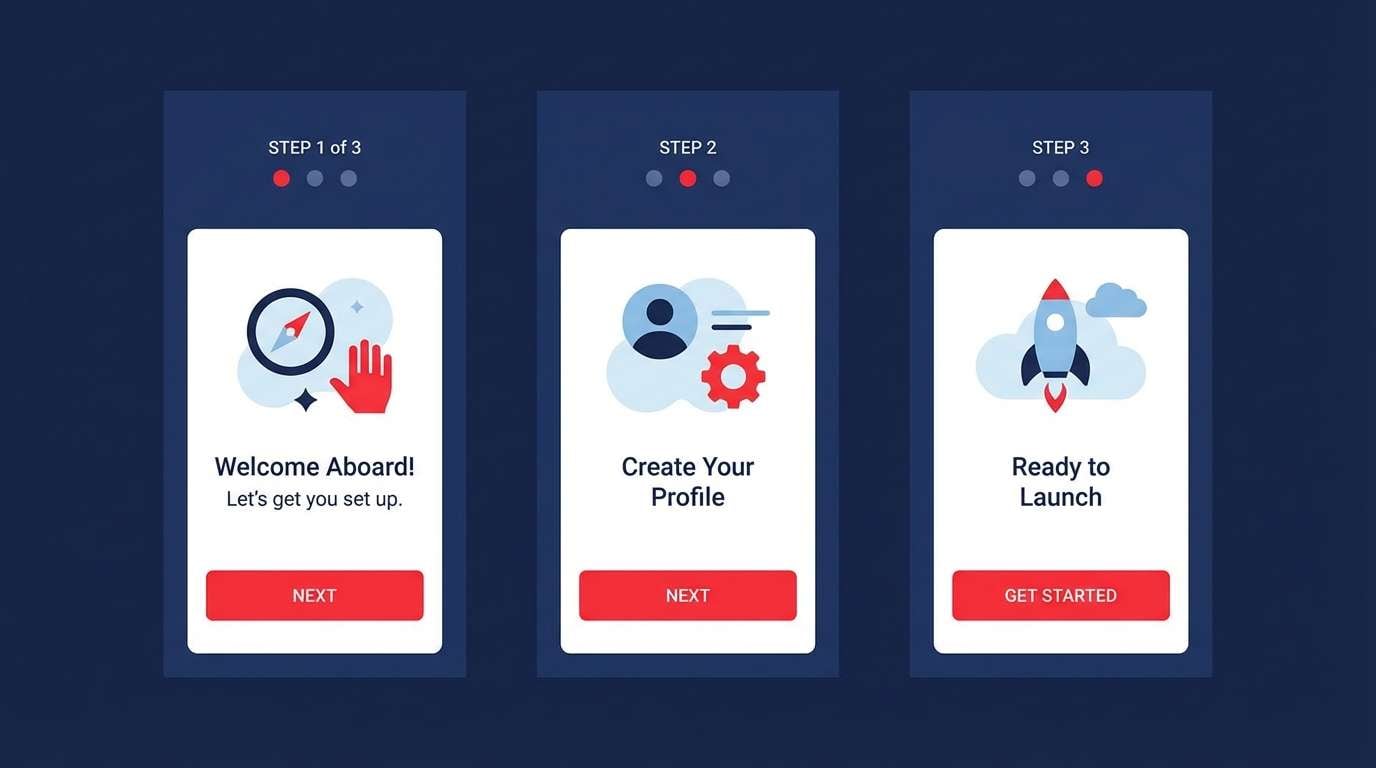
Best for: product onboarding UI flow
Minimal contrast with a spruce-teal lift keeps onboarding feeling crisp and confident. Use white as the main canvas, navy for headings, and green for progress indicators. The teal works well for friendly micro-interactions like tooltips and toggles. Tip: keep forms mostly neutral and use color only to confirm successful steps.
Image example of teal spruce minimal generated using media.io
12) Bottle Green & Admiral
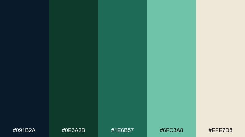
HEX: #091B2A #0E3A2B #1E6B57 #6FC3A8 #EFE7D8
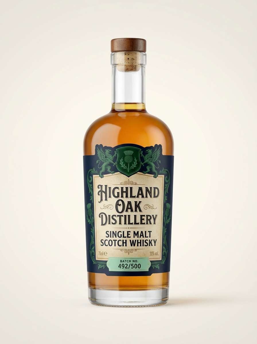
Mood: heritage, premium, composed
Best for: spirits label design
Heritage bottle green against admiral navy feels premium and composed. Use navy for the label base and border work, then bring bottle green into crests, seals, and secondary text blocks. The warm parchment tone keeps the design from feeling too cold or corporate. Tip: use the minty accent only for a small batch number or award mark.
Image example of bottle green & admiral generated using media.io
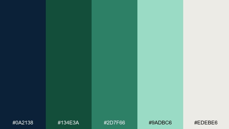
13) Seaglass Nightfall
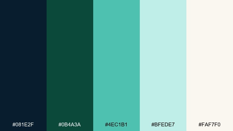
HEX: #081E2F #0B4A3A #4EC1B1 #BFEDE7 #FAF7F0
Mood: light, airy, modern
Best for: wedding invitation suite
Seaglass glow at nightfall feels airy, modern, and quietly romantic. Set navy for names and formal type, and use green for small ornaments, rules, and RSVP details. The pale aqua makes a beautiful wash behind monograms or venue illustrations. Tip: keep embellishments minimal so the teal accent reads as intentional, not decorative noise.
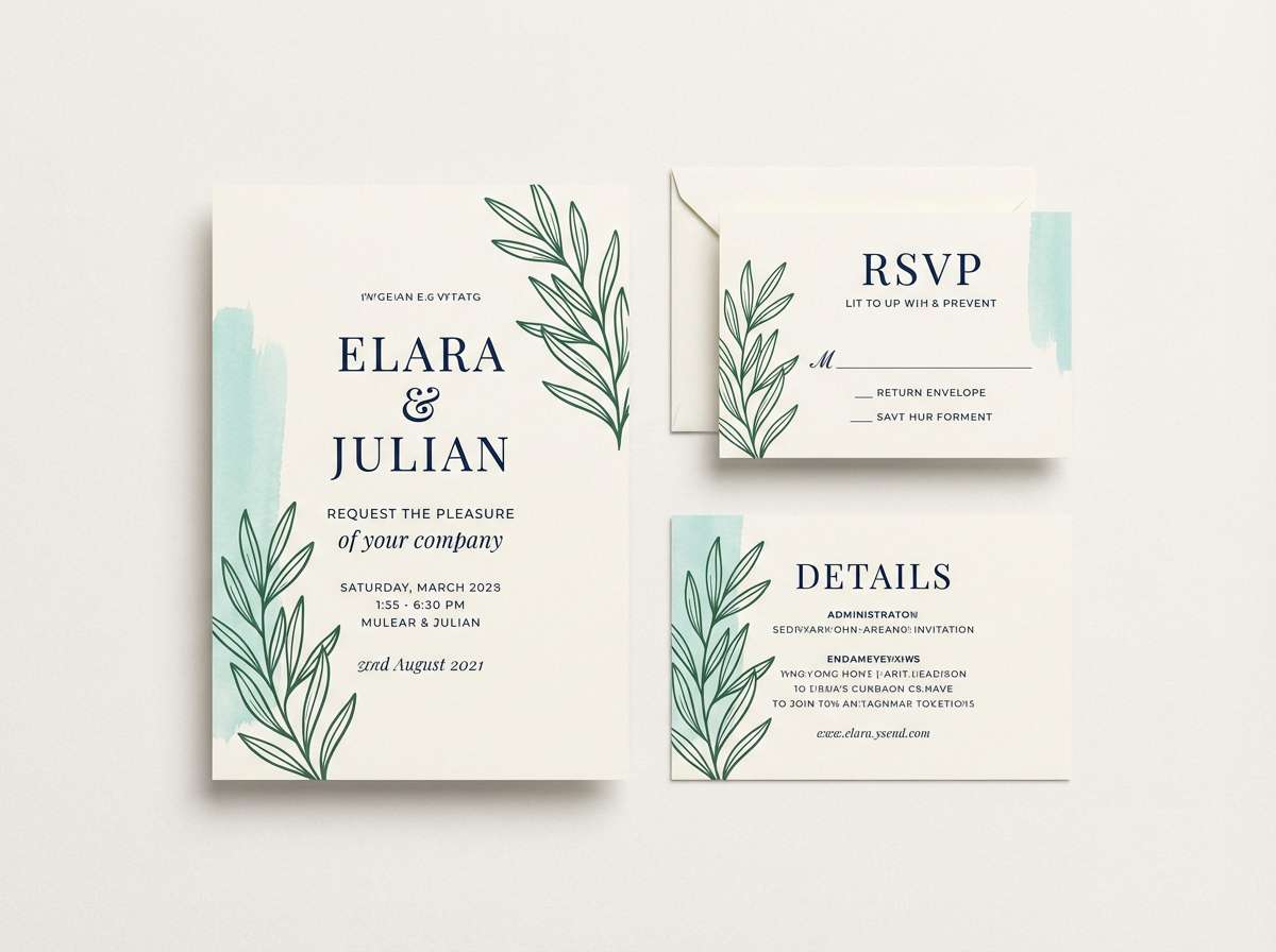
Image example of seaglass nightfall generated using media.io
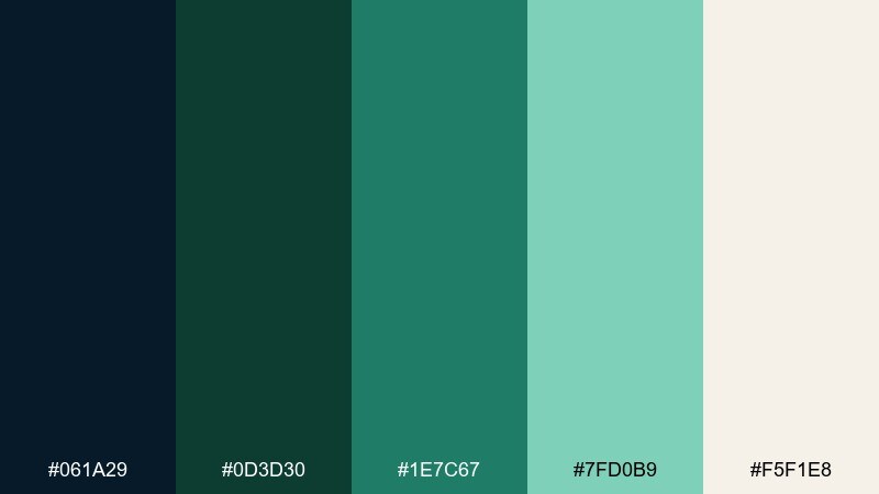
14) Forest Navy Utility
HEX: #0A2138 #134E3A #2D7F66 #9ADBC6 #EDEBE6
Mood: practical, rugged, dependable
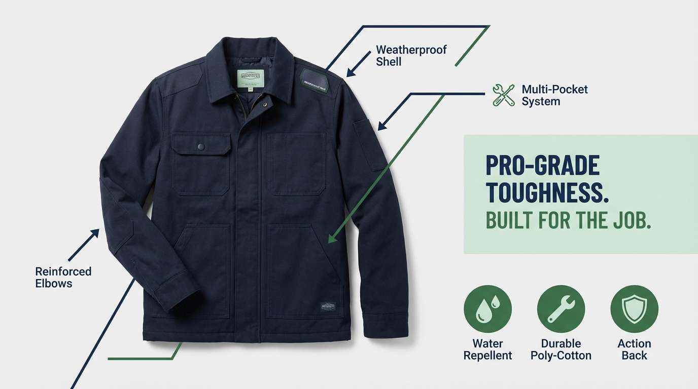
Best for: workwear product ad
Rugged utility tones feel dependable, like well-worn canvas and forest shade. Use navy as the hero backdrop for high contrast product shots, then apply green to feature callouts and spec icons. The mint works best as a subtle gradient panel behind text. Tip: keep icon fills consistent in one green to avoid visual clutter across modules.
Image example of forest navy utility generated using media.io
15) Canopy After Dark
HEX: #061A29 #0D3D30 #1E7C67 #7FD0B9 #F5F1E8
Mood: mysterious, lush, elegant
Best for: restaurant menu design
Mysterious canopy shadows and candlelit greens create an elegant dinner mood. This green navy blue color palette is ideal for menus where navy headings feel upscale and greens highlight specials or dietary icons. Use the warm off-white as the paper base to keep text readable. Tip: limit the bright mint to one area, like a chef recommendation badge, for maximum impact.
Image example of canopy after dark generated using media.io
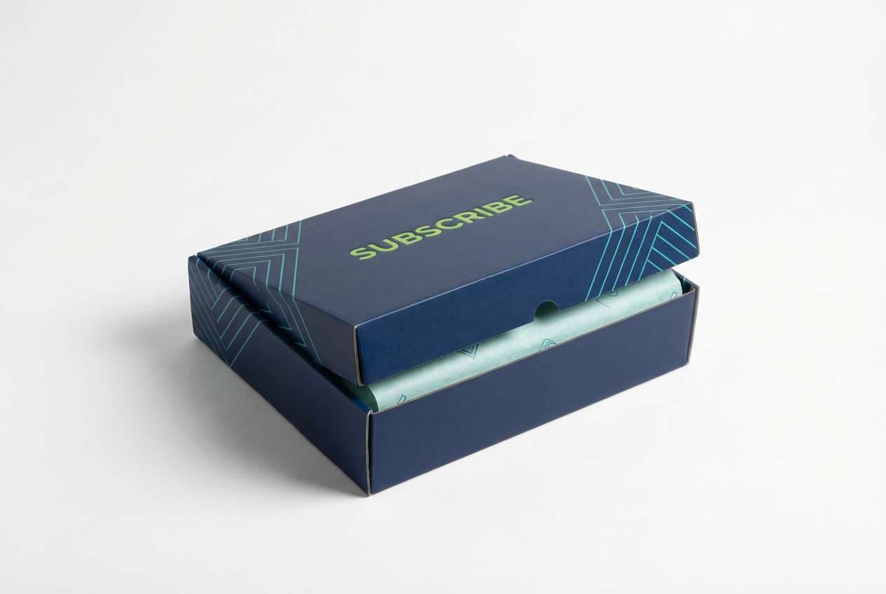
16) Minted Maritime
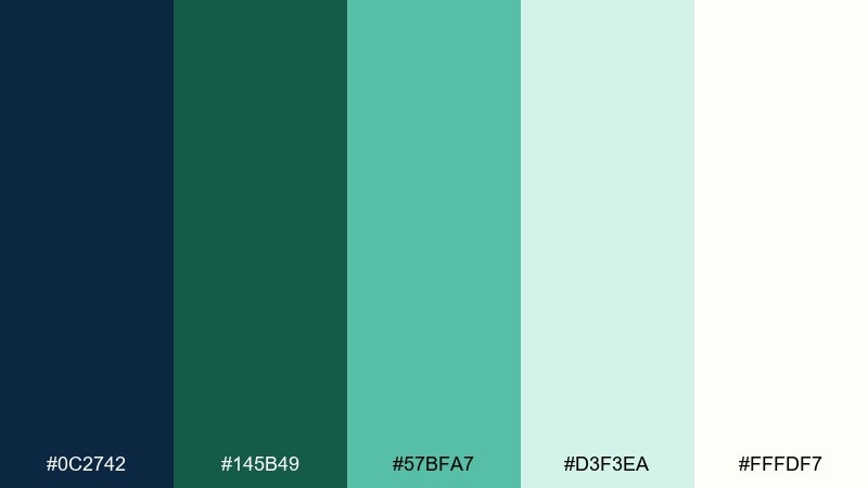
HEX: #0C2742 #145B49 #57BFA7 #D3F3EA #FFFDF7
Mood: bright, upbeat, clean
Best for: subscription box packaging
Bright maritime tones with a minty lift feel upbeat and clean. Use navy for the outer box base and typography, then bring green into pattern work or brand marks. The pale aqua is perfect for interior print details and unboxing moments. Tip: print teal on small geometric repeats so it reads lively without overpowering the brand name.
Image example of minted maritime generated using media.io
17) Deep Lagoon Serif
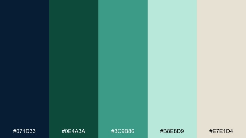
HEX: #071D33 #0E4A3A #3C9B86 #B8E8D9 #E7E1D4
Mood: literary, cultured, composed
Best for: book cover design
Deep lagoon colors with a serif-led vibe feel literary and cultured. Use navy as the dominant field for title contrast, and apply the greens to author name bands or subtle illustration overlays. The warm greige keeps the cover from becoming too stark. Tip: choose either teal or mint for accents, not both, to maintain a strong focal point.
Image example of deep lagoon serif generated using media.io
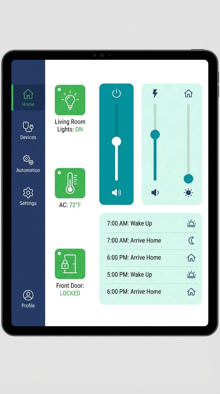
18) Garden Tech
HEX: #0A233A #11624E #22A68C #A6E3D2 #F4F7F6
Mood: smart, clean, eco-modern
Best for: smart home app UI
Smart, eco-modern energy comes through like a tidy garden with well-tuned sensors. Use navy for navigation and device cards, then assign green to active states and system health. The pale mint makes an excellent background for automation rules and schedules. Tip: keep teal reserved for one interactive control style so users learn patterns quickly.
Image example of garden tech generated using media.io
19) Evergreen Denim
HEX: #0B2A3F #0F513E #2E8E77 #92D9C4 #F6F0E6
Mood: casual, confident, youthful
Best for: streetwear lookbook page
Casual denim navy with evergreen depth feels confident and youthful. Green works well for size tags, drops, and limited-edition badges, while navy anchors headlines and pricing. The warm off-white keeps photos and typography from fighting for attention. Tip: use the mint tone behind pull quotes to break up long scrolling pages.
Image example of evergreen denim generated using media.io
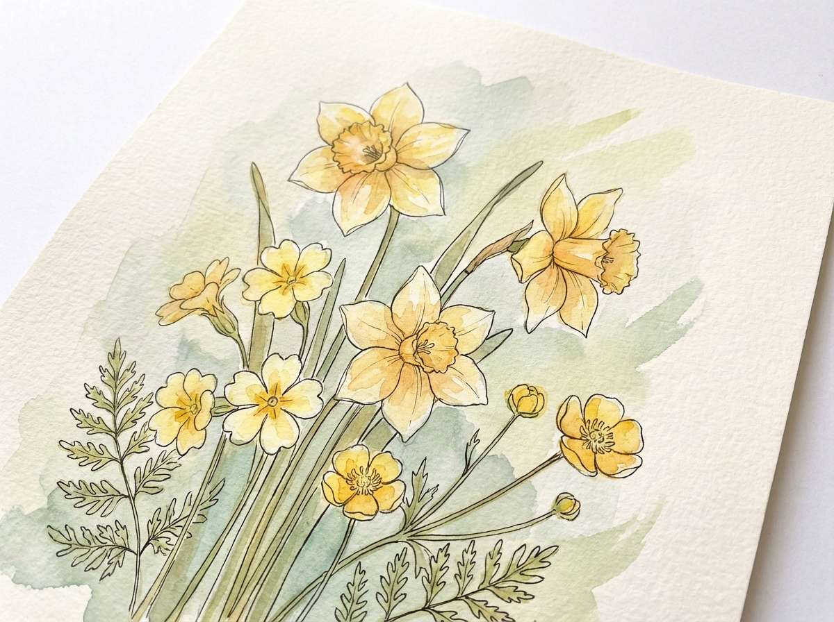
20) Navy Herbarium
HEX: #061B2D #0C4737 #2F8F7A #BEE8D8 #F9F6EE
Mood: natural, gentle, artisanal
Best for: botanical illustration print
Gentle herbarium tones feel natural and artisanal, like pressed leaves on aged paper. These green navy blue color combinations work beautifully with watercolor textures and fine linework. Use navy for outlines and captions, and let greens fill the foliage with soft variation. Tip: keep the light mint as negative space to preserve that airy, gallery-like look.
Image example of navy herbarium generated using media.io
21) Tidepool Contrast
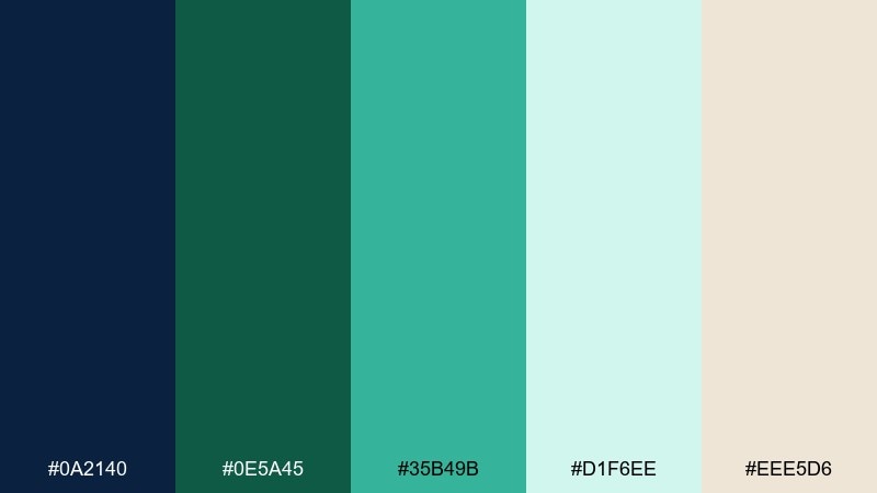
HEX: #0A2140 #0E5A45 #35B49B #D1F6EE #EEE5D6
Mood: playful, punchy, fresh
Best for: startup pitch deck template
Tidepool brightness against deep blue brings playful, punchy contrast. Use navy for slide titles and charts, then make green your consistent color for growth, traction, and positive metrics. The pale aqua is great for section dividers and background blocks behind diagrams. Tip: treat teal as your one spotlight color for key numbers so the story stays focused.
Image example of tidepool contrast generated using media.io

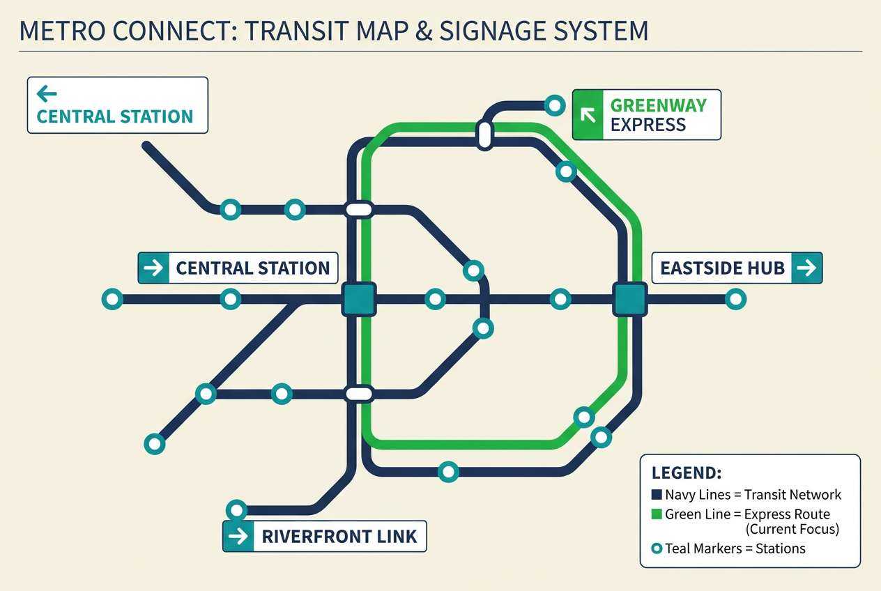
22) Verdant Night Transit
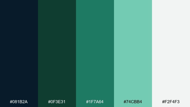
HEX: #081B2A #0F3E31 #1F7A64 #74CBB4 #F2F4F3
Mood: urban, efficient, modern
Best for: transit map and signage system
Urban night transit energy feels efficient, modern, and easy to navigate. A green navy blue color combination helps wayfinding stay legible, with navy for base routes and green for line highlights and station markers. Use the light tones for accessible backgrounds and legend panels. Tip: standardize icon strokes in navy so color alone communicates route priority.
Image example of verdant night transit generated using media.io
What Colors Go Well with Green Navy Blue?
Warm neutrals are the easiest win: ivory, cream, warm greige, and parchment soften navy’s seriousness and keep green feeling natural rather than neon. They’re especially strong for print, packaging, and editorial layouts.
For accents, teal and mint create a modern “fresh tech” vibe, while metallics like gold (or a warm brass tone) can make the scheme feel premium. If you need more contrast, introduce a near-black or charcoal for text and UI borders.
To avoid visual noise, choose one accent family (teal/mint or warm metallic/terracotta) and keep it consistent across buttons, highlights, and data points.
How to Use a Green Navy Blue Color Palette in Real Designs
Assign roles first: use navy for foundations (headers, navigation, body text, charts), and use green for meaning (success states, active toggles, badges, and CTAs). This creates a predictable hierarchy users learn quickly.
Use light tints (off-white, pale mint, warm beige) as your background system for cards, sections, and spacing. That keeps the palette readable and prevents dark navy from dominating the page.
For branding, pick one hero green and one hero navy, then treat the remaining shades as supporting tones. This makes your logo, packaging, and UI feel unified across different materials and lighting conditions.
Create Green Navy Blue Palette Visuals with AI
If you want to see these palettes in action, generate fast mockups for UI screens, posters, packaging, and brand boards using text prompts. This helps you validate contrast, mood, and hierarchy before committing to production.
With Media.io, you can turn a palette idea into multiple design directions in minutes—then iterate by adjusting lighting, textures, layout style, and color dominance.
Green Navy Blue Color Palette FAQs
-
What does a green and navy blue color scheme communicate?
It typically communicates trust, stability, and competence (navy) plus growth, calm, and nature-forward energy (green). Together, they feel professional but not cold. -
Is green and navy blue a good palette for branding?
Yes—especially for finance, health, sustainability, outdoor, education, and B2B SaaS brands. Navy anchors the identity, while green provides a distinctive, memorable accent for actions and highlights. -
Which background colors work best with green navy blue palettes?
Warm off-whites, cream, parchment, and soft greige are the most forgiving backgrounds. They keep navy readable and make greens look natural rather than overly saturated. -
How do I keep a green navy blue UI from feeling too dark?
Use navy mainly for navigation and typography, not full-page backgrounds, and rely on light neutrals or pale mint panels for the main canvas. Reserve the brightest teal/mint for small interactive cues. -
What’s a simple rule for choosing accents with green and navy?
Pick one accent lane: either cool accents (teal/mint/aqua) for a modern digital feel, or warm accents (parchment/gold/terracotta) for a premium, editorial feel—then keep it consistent. -
Can I use green navy blue for data visualization?
Yes. Use navy for axes, labels, and baseline series; use green for positive metrics or primary series; and use one lighter mint/aqua for highlights or selection states to maintain clarity. -
How can I preview a green navy blue palette on real designs quickly?
Generate mockups with an AI image tool using a clear prompt (layout type, style, and where each color is applied). Iterating on a few prompts helps you confirm mood and readability fast.
Next: Black Red Color Palette


