Sunset color palettes are made for contrast: warm corals, peaches, and golds fading into dusk purples and navy blues. That built-in gradient gives your designs instant depth without feeling busy.
Below are 20 sunset color palette ideas with HEX codes, plus prompts and example visuals you can recreate (or remix) with Media.io for branding, posters, and UI.
In this article
- Why Sunset Palettes Work So Well
-
- coral horizon
- apricot glow
- desert dusk
- pink afterglow
- tangerine fade
- saffron sky
- mauve twilight
- lavender evening
- golden hour neutrals
- sun-kissed citrus
- seaside sunset
- rust & rose
- peach sorbet
- firelight ember
- berry sunset
- oceanline dusk
- soft sand gradient
- violet coastal
- canyon clay
- midnight after sunset
- What Colors Go Well with Sunset?
- How to Use a Sunset Color Palette in Real Designs
- Create Sunset Palette Visuals with AI
Why Sunset Palettes Work So Well
A sunset color scheme naturally balances warmth and coolness, which makes it feel both emotional and usable. You get attention-grabbing coral/orange highlights plus deeper dusk tones that support readability.
These palettes also imply a ready-made gradient, so your UI backgrounds, poster headers, and hero sections can look layered without adding extra elements. Even a simple block layout feels more dimensional.
Finally, sunset color combinations are flexible across styles—minimal, editorial, playful, or premium—because you can dial saturation up for energy or lean into muted mauves and navies for elegance.
20+ Sunset Color Palette Ideas (with HEX Codes)
1) Coral Horizon
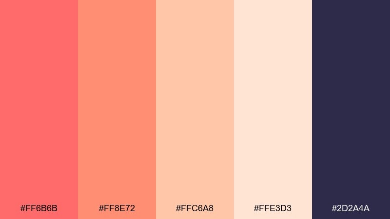
HEX: #FF6B6B #FF8E72 #FFC6A8 #FFE3D3 #2D2A4A
Mood: energetic, welcoming, modern
Best for: landing page hero sections and brand accents
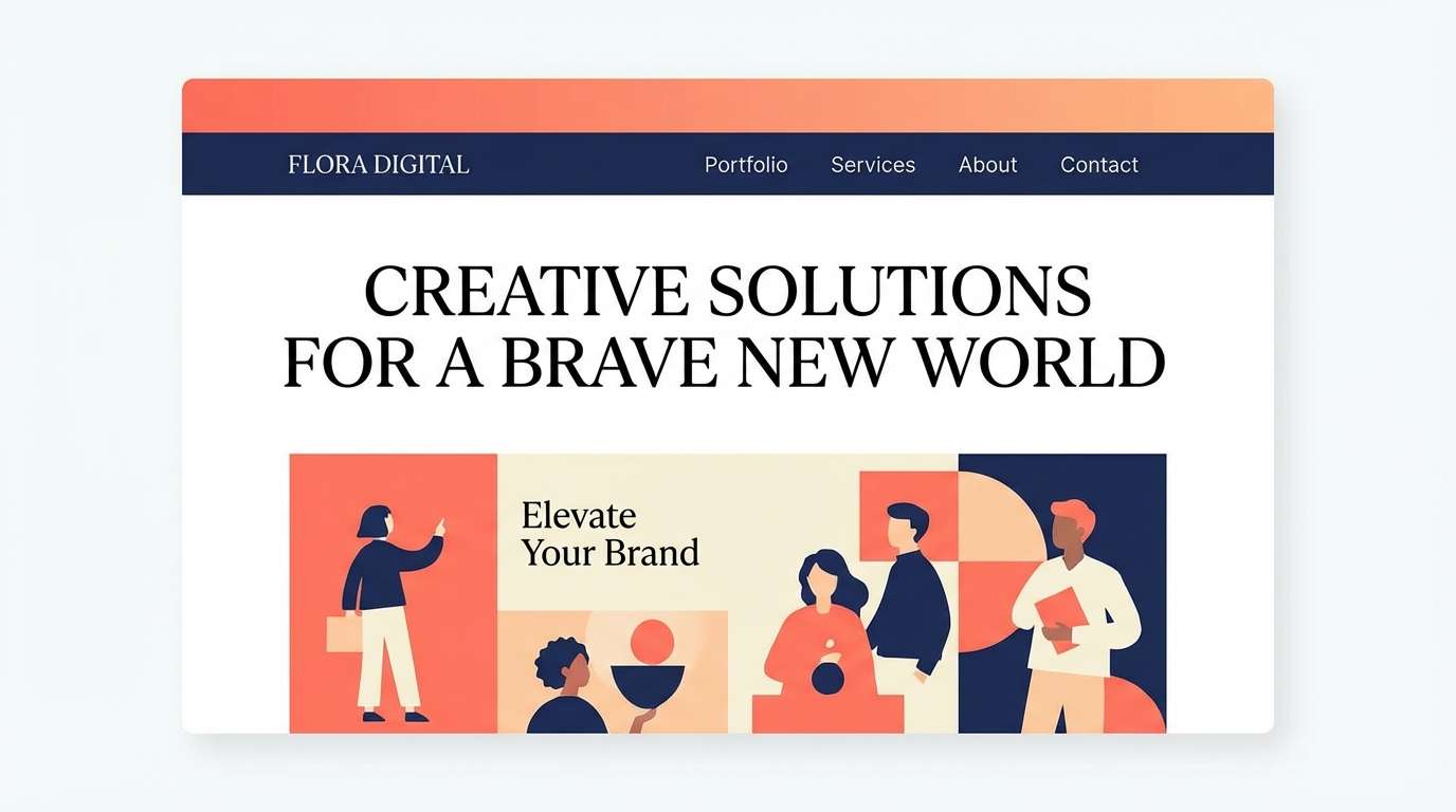
Energetic and friendly, these tones feel like the last bright minutes before the sun dips below the skyline. The warm corals and peachy highlights pop beautifully against the deep navy base. Use it for hero banners, call-to-action buttons, and social templates, then pair with clean sans-serif type and lots of whitespace. Tip: keep the navy for text and navigation to maintain contrast and readability.
Image example of coral horizon generated using media.io
Media.io is an online AI studio for creating and editing video, image, and audio in your browser.

2) Apricot Glow
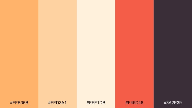
HEX: #FFB36B #FFD3A1 #FFF1DB #F45D48 #3A2E39
Mood: soft, cozy, appetizing
Best for: food packaging and cafe menus
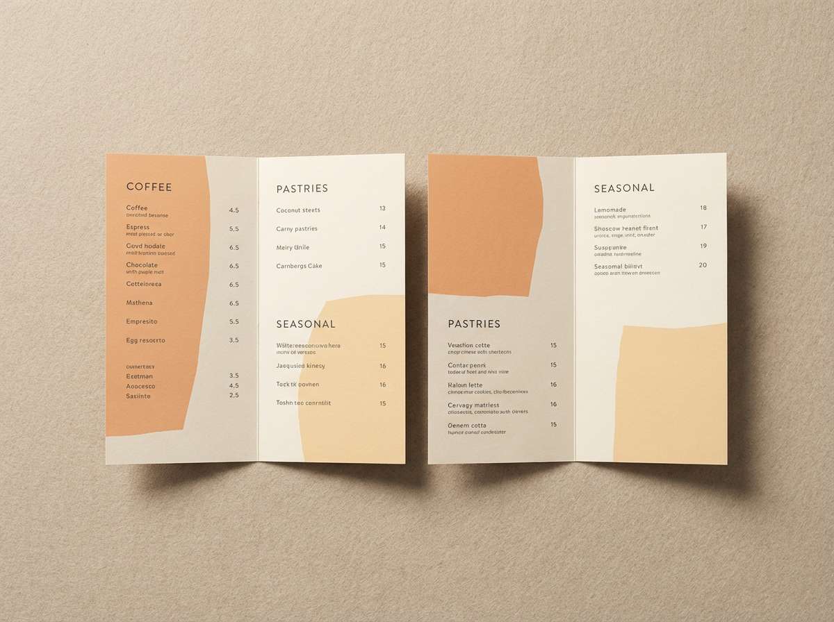
Soft and cozy, these apricot tones read like warm light hitting linen at dusk. The creamy neutrals keep layouts airy, while the tomato-red accent adds appetite appeal. It works especially well for menus, bakery labels, and seasonal promo cards, paired with handwritten or rounded serif type. Tip: reserve the red for prices or limited-time badges so it feels intentional, not loud.
Image example of apricot glow generated using media.io
3) Desert Dusk
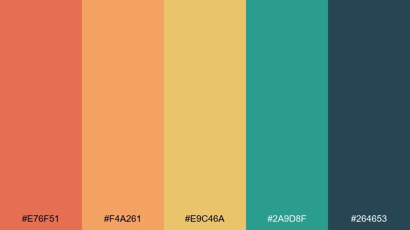
HEX: #E76F51 #F4A261 #E9C46A #2A9D8F #264653
Mood: earthy, adventurous, grounded
Best for: outdoor brands and travel editorial layouts
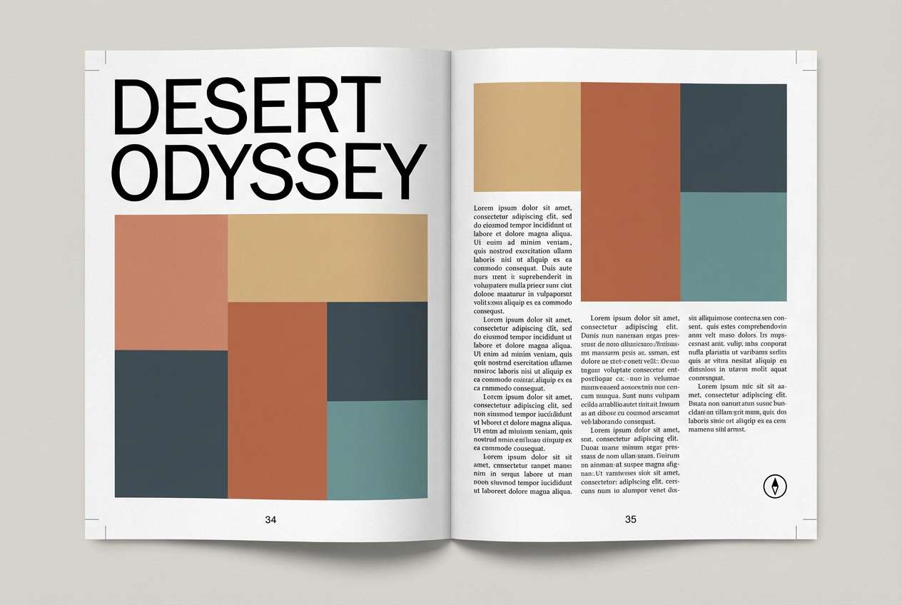
Earthy and adventurous, this mix evokes canyon rock, sun-baked sand, and cool evening air. The teal and deep slate keep the warmth from feeling overly sweet, making it great for travel stories, outdoor gear, and nature-focused campaigns. Pair it with textured paper backgrounds or subtle grain to enhance the rugged feel. Tip: use teal for links and icons to guide the eye without competing with the warm headline colors.
Image example of desert dusk generated using media.io
4) Pink Afterglow
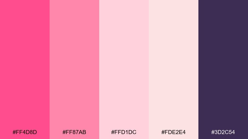
HEX: #FF4D8D #FF87AB #FFD1DC #FDE2E4 #3D2C54
Mood: romantic, playful, luminous
Best for: beauty branding and event invitations
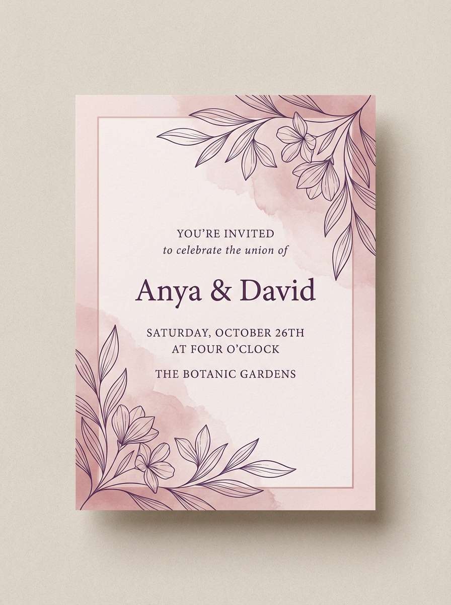
Romantic and luminous, these pinks feel like the sky lingering after sunset with a soft violet edge. The darker purple anchors the sweetness, so designs stay polished instead of candy-like. Use it for skincare labels, bridal shower invites, or lifestyle socials, then pair with delicate line icons and airy spacing. Tip: set body copy in the deep purple to keep legibility high on pastel backgrounds.
Image example of pink afterglow generated using media.io
5) Tangerine Fade
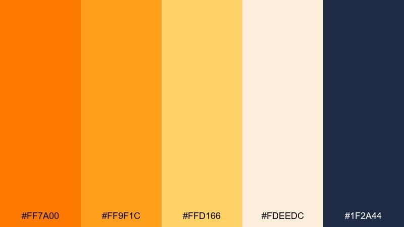
HEX: #FF7A00 #FF9F1C #FFD166 #FDEEDC #1F2A44
Mood: bold, optimistic, high-contrast
Best for: app onboarding screens and CTA-driven pages
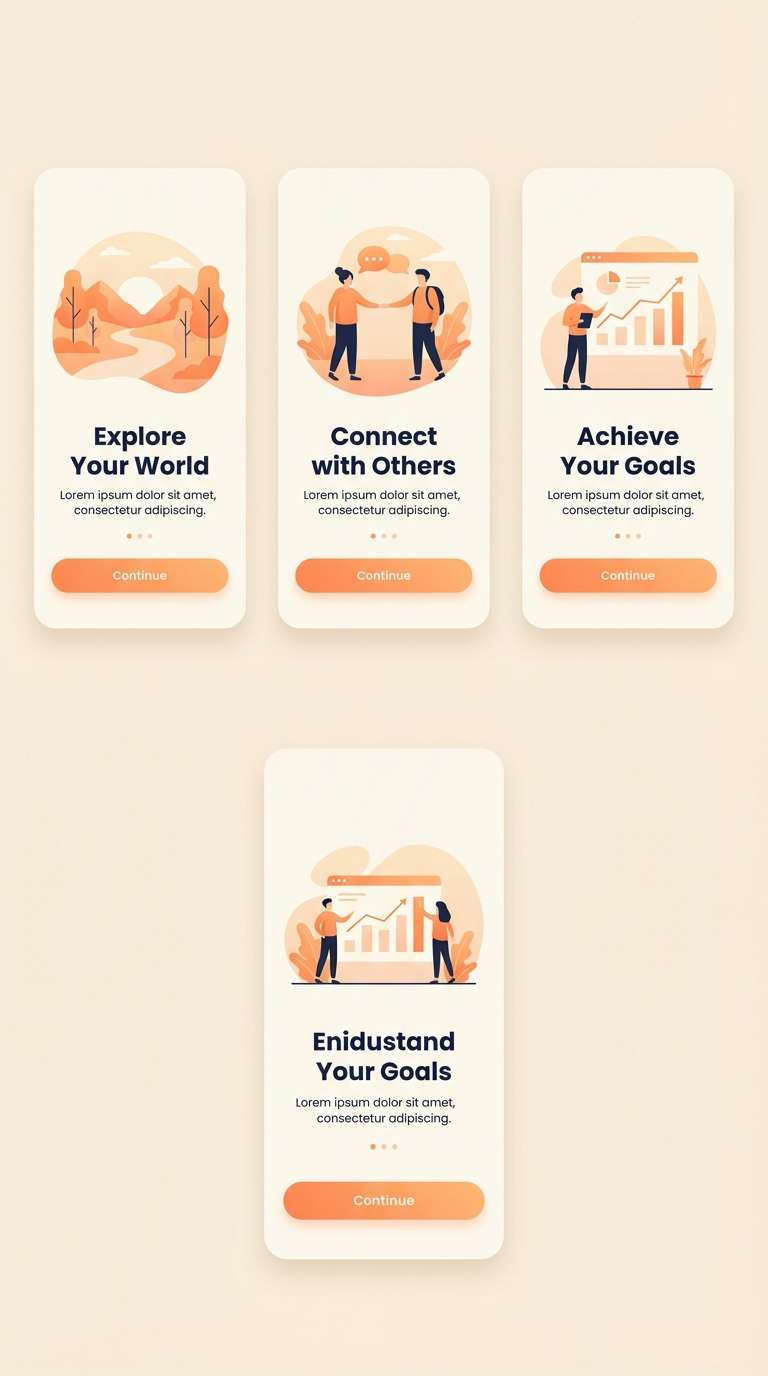
Bold and optimistic, these tangerine tones look like a sunbeam cutting through a cool evening sky. The creamy off-white softens the punchy oranges, while the dark blue gives you instant contrast for UI text. It’s ideal for onboarding, promo popups, and conversion-focused sections, paired with simple icons and strong hierarchy. Tip: use the brightest orange only for primary buttons so the interface doesn’t feel overly hot.
Image example of tangerine fade generated using media.io
6) Saffron Sky
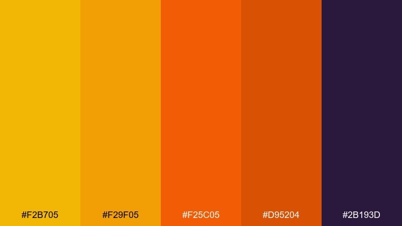
HEX: #F2B705 #F29F05 #F25C05 #D95204 #2B193D
Mood: fiery, festive, dramatic
Best for: music posters and seasonal campaign graphics
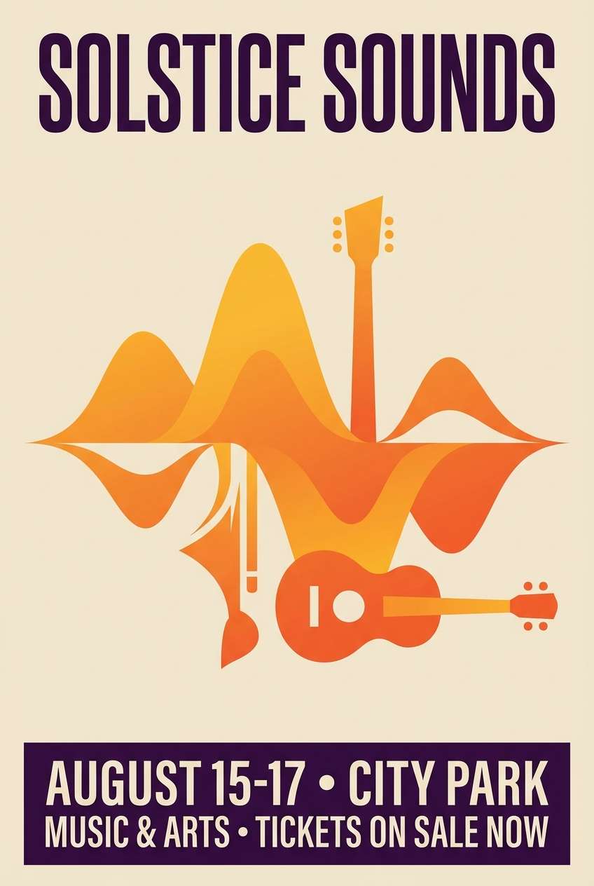
Fiery and festive, this set reads like glowing lanterns against a nightfall backdrop. The stacked gold-to-orange hues create some of the most striking sunset color combinations, especially when the deep purple is used as a framing color. It’s a strong fit for concert posters, holiday promos, and limited-edition drops, paired with bold condensed type. Tip: keep gradients smooth and add a touch of grain for a premium print feel.
Image example of saffron sky generated using media.io
7) Mauve Twilight
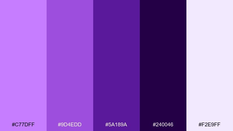
HEX: #C77DFF #9D4EDD #5A189A #240046 #F2E9FF
Mood: mysterious, dreamy, premium
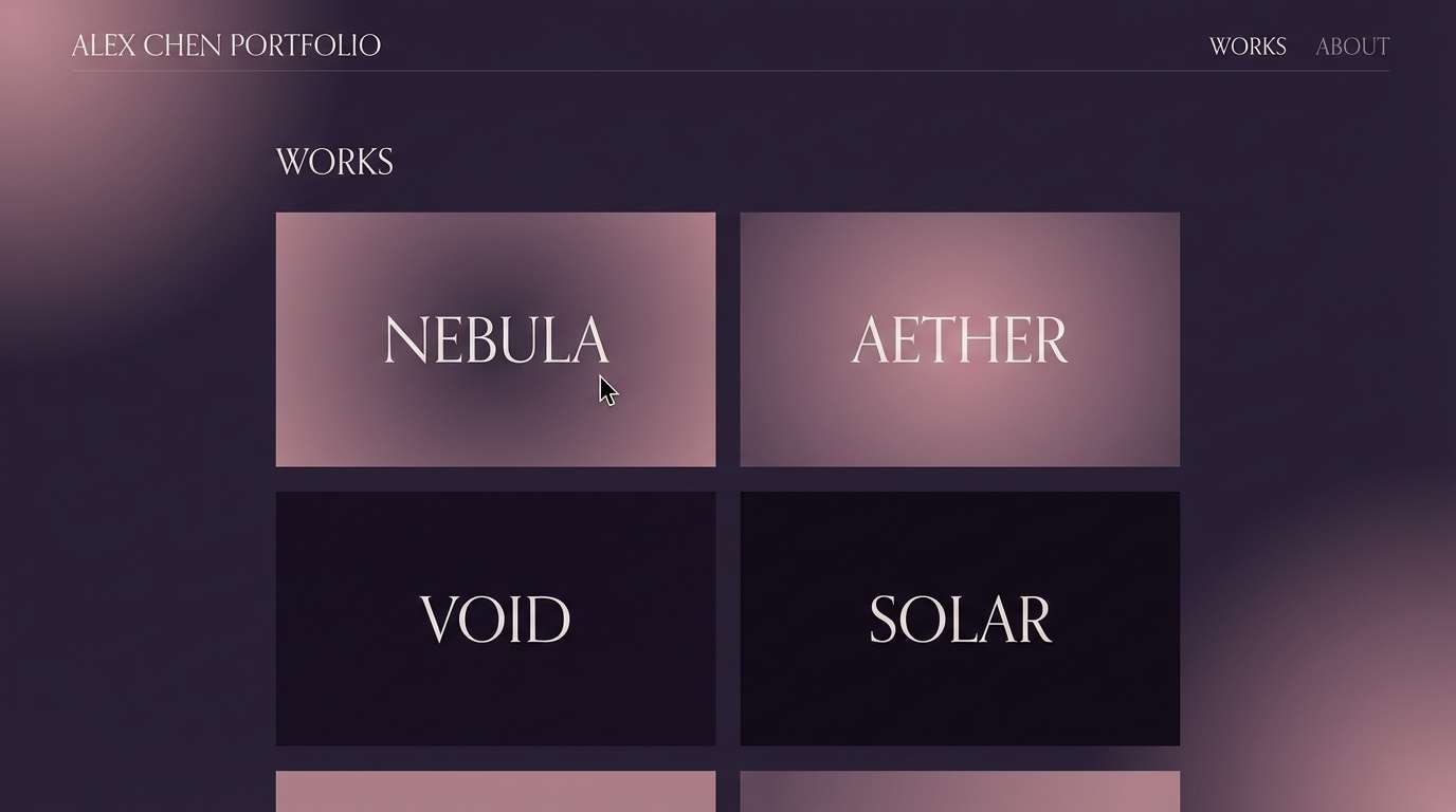
Best for: creative portfolios and luxury service sites
Mysterious and dreamy, these purples feel like twilight settling in with a soft luminous haze. The pale lavender highlight keeps the deeper shades from getting heavy, which works well for editorial-like websites and elegant portfolio pages. Pair it with subtle gradients, thin dividers, and plenty of negative space for a premium look. Tip: use the lightest tint for hover states to keep interactions gentle but visible.
Image example of mauve twilight generated using media.io
8) Lavender Evening
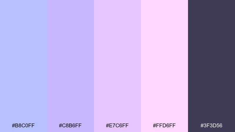
HEX: #B8C0FF #C8B6FF #E7C6FF #FFD6FF #3F3D56
Mood: calm, airy, soothing
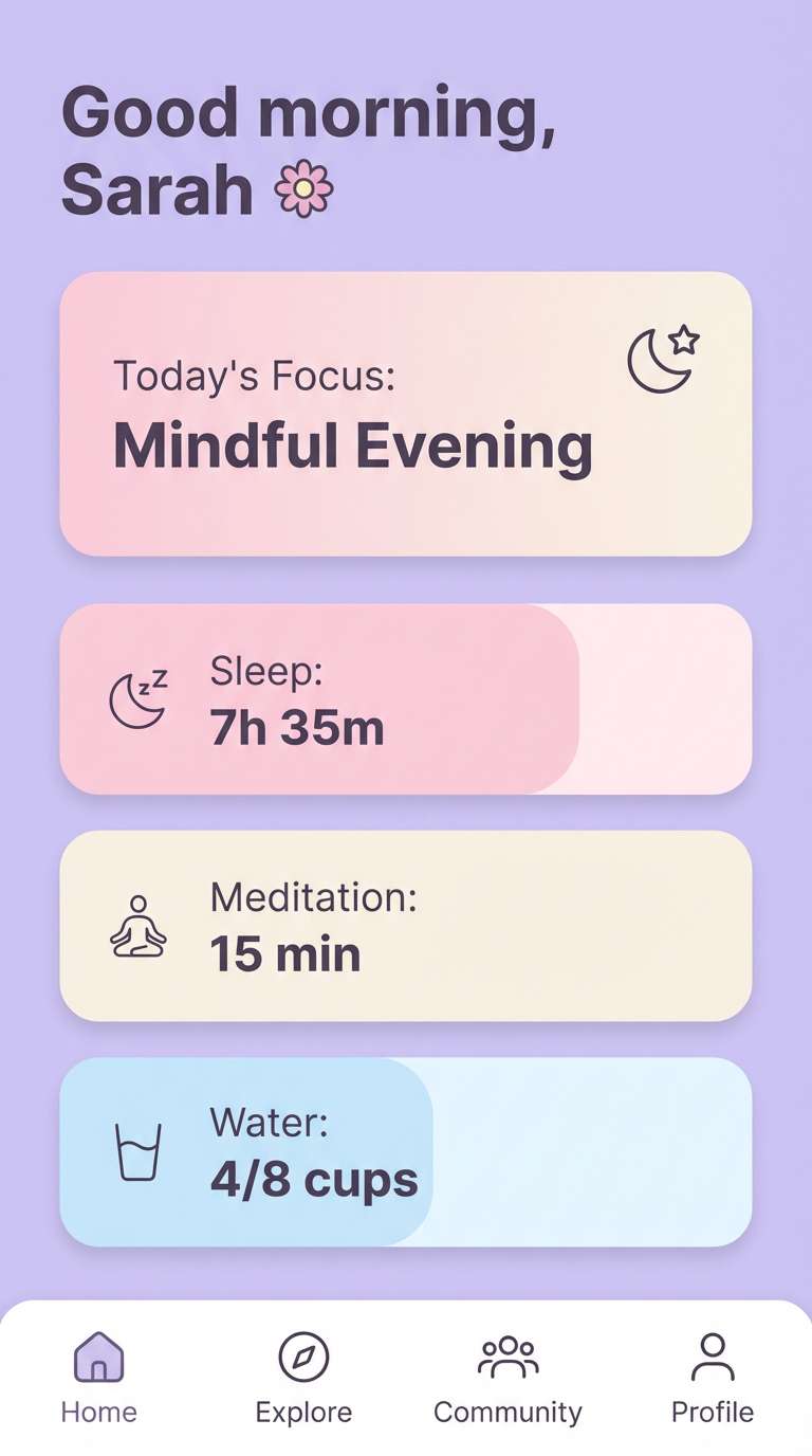
Best for: wellness apps and meditation content
Calm and airy, these lavender pastels evoke a quiet sky just after the light turns soft. The charcoal-violet base provides structure for navigation and text, while the pink-lilac tints keep everything gentle. Use it in wellness apps, sleep routines, and journal templates, paired with rounded UI components and light shadows. Tip: avoid pure white; the pale lilac works better as a background to maintain the soothing tone.
Image example of lavender evening generated using media.io
9) Golden Hour Neutrals
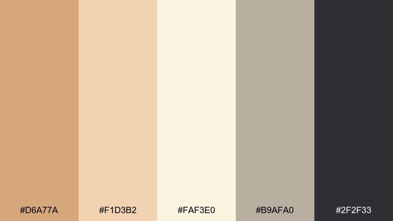
HEX: #D6A77A #F1D3B2 #FAF3E0 #B9AFA0 #2F2F33
Mood: warm, minimal, timeless
Best for: interior design lookbooks and lifestyle blogs
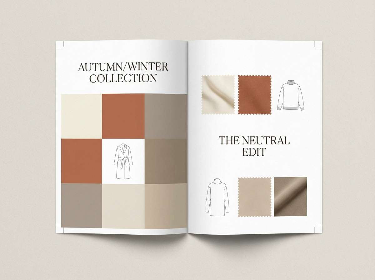
Warm and timeless, these neutrals feel like sunlight washing over stone, linen, and wood. The gentle browns and creams create a relaxed base, while the near-charcoal adds a crisp editorial edge. It’s perfect for lookbooks, blog headers, and product catalogs, paired with classic serif headlines and muted photography. Tip: use the mid-taupe for dividers and captions to keep the layout soft but structured.
Image example of golden hour neutrals generated using media.io
10) Sun-Kissed Citrus
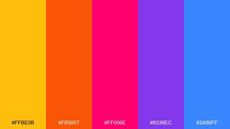
HEX: #FFBE0B #FB5607 #FF006E #8338EC #3A86FF
Mood: vibrant, youthful, punchy
Best for: creator brand kits and social media graphics
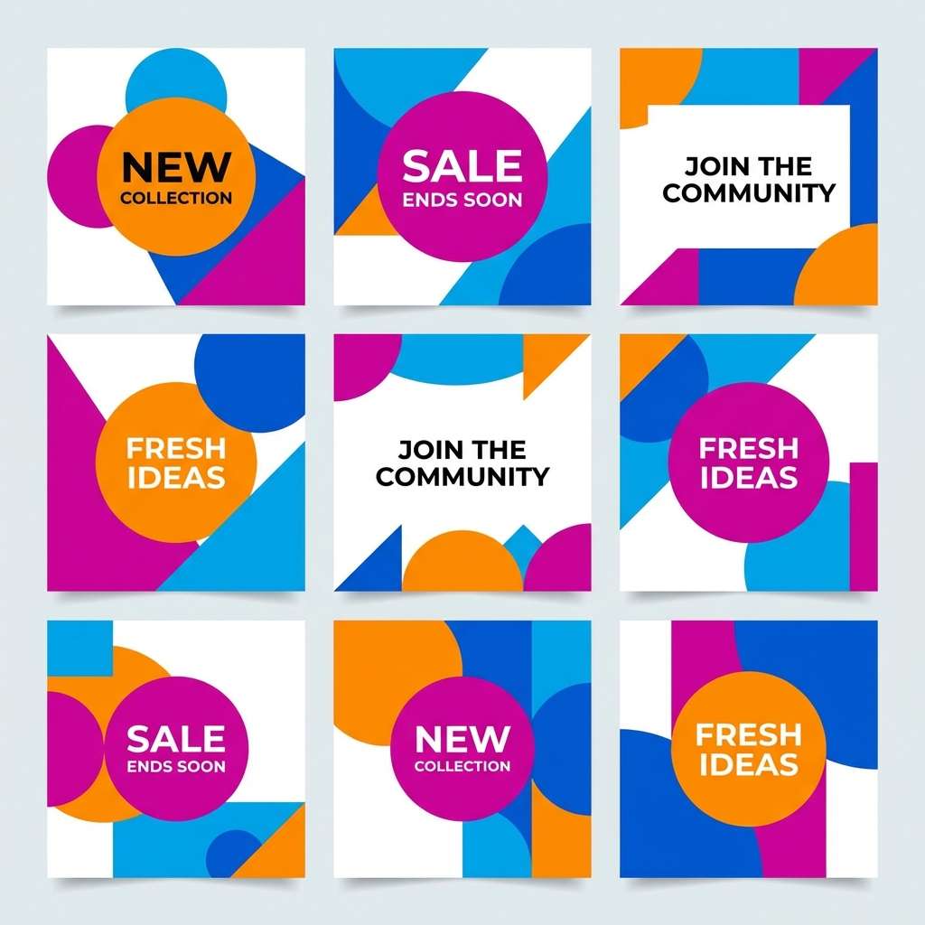
Vibrant and punchy, this mix feels like neon light hitting the clouds at the end of the day. The high-saturation mix is made for bold sunset color combinations, especially when you keep one hue dominant and use the rest as accents. It shines on social templates, creator brand kits, and promo slides, paired with chunky type and playful stickers. Tip: limit gradients to two colors at a time to avoid visual noise.
Image example of sun-kissed citrus generated using media.io
11) Seaside Sunset
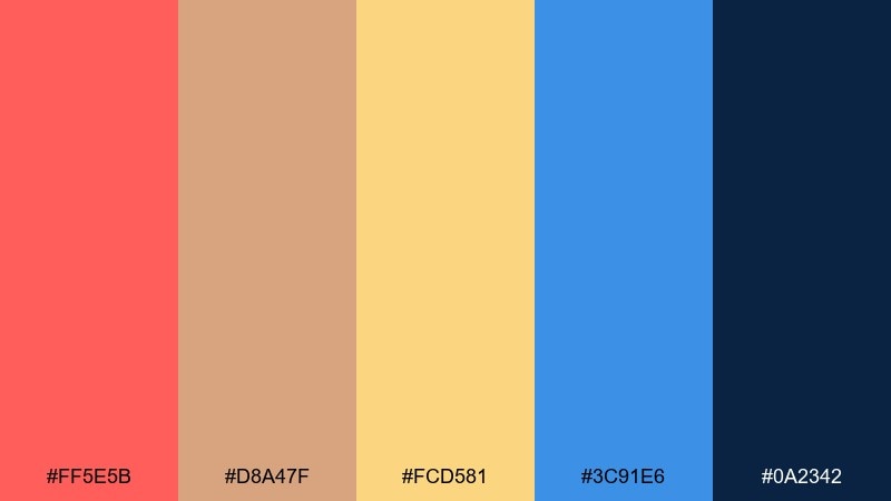
HEX: #FF5E5B #D8A47F #FCD581 #3C91E6 #0A2342
Mood: fresh, coastal, balanced
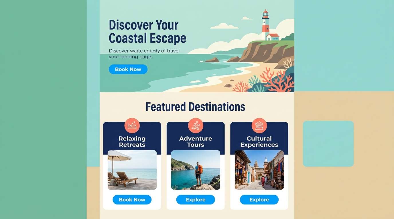
Best for: travel landing pages and summer ads
Fresh and coastal, these colors evoke warm shoreline light with a cool ocean breeze. The coral and sand tones keep the design inviting, while the blues add clarity and trust for buttons and links. For a classic sunset color palette feel, use coral sparingly as an accent and let the deep blue carry your typography. Tip: add subtle wave-like curves or soft gradients to reinforce the seaside theme without using photos.
Image example of seaside sunset generated using media.io
12) Rust & Rose
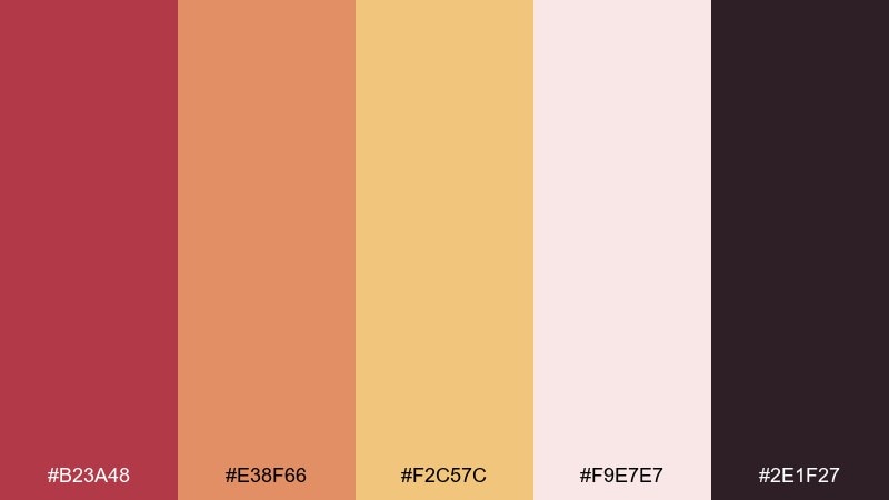
HEX: #B23A48 #E38F66 #F2C57C #F9E7E7 #2E1F27
Mood: vintage, romantic, grounded
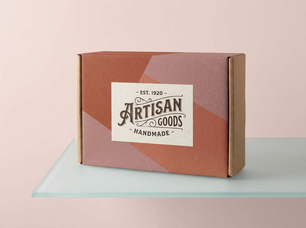
Best for: wedding stationery and boutique packaging
Vintage and romantic, this pairing feels like dried roses, candlelight, and warm rust-toned fabric. The blush background keeps layouts delicate, while the near-black plum adds sophistication for text and monograms. Use it for wedding suites, boutique tags, and gift boxes, paired with letterpress textures or foil details. Tip: choose one “hero” shade (rust or rose) and keep the other for small flourishes like borders and icons.
Image example of rust & rose generated using media.io
13) Peach Sorbet
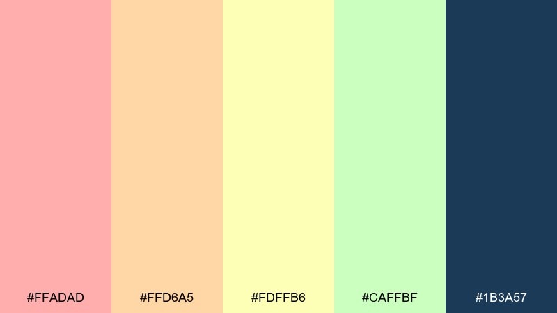
HEX: #FFADAD #FFD6A5 #FDFFB6 #CAFFBF #1B3A57
Mood: cheerful, light, friendly
Best for: kids brands and playful UI illustrations
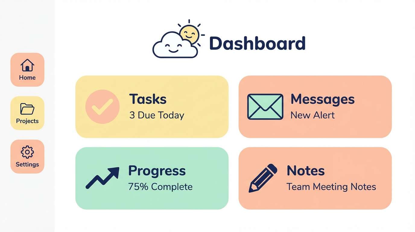
Cheerful and light, these pastel brights look like scoops of sorbet under soft evening light. The cool navy adds a crisp anchor so the palette stays readable and not overly sugary. It works for kids’ brands, playful dashboards, and illustration-heavy pages, paired with rounded shapes and simple line icons. Tip: keep text and outlines in navy, and use the pastels for fills and highlights.
Image example of peach sorbet generated using media.io
14) Firelight Ember
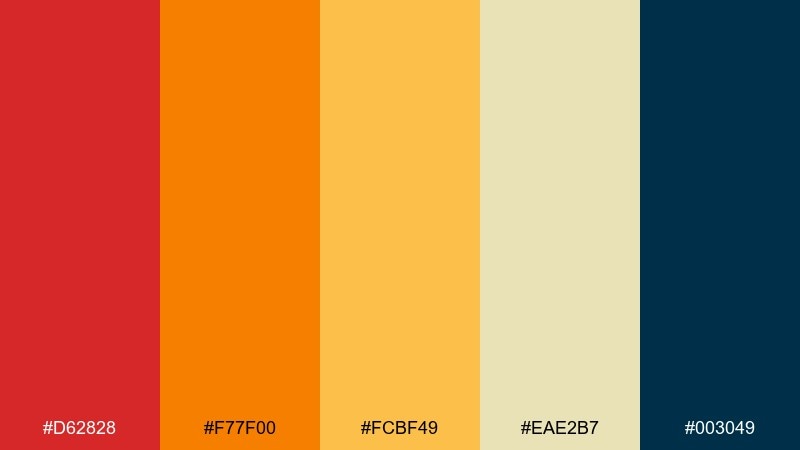
HEX: #D62828 #F77F00 #FCBF49 #EAE2B7 #003049
Mood: bold, cinematic, confident
Best for: sports promos and product launch posters
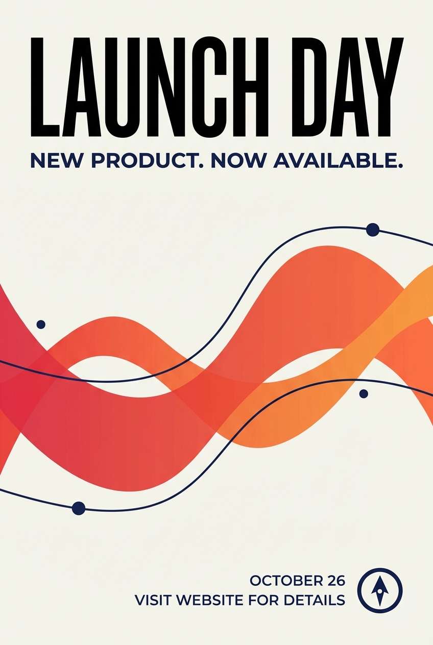
Bold and cinematic, these hues feel like firelight flickering against a deep evening sky. The red-orange core gives instant energy, while the navy keeps layouts sharp and confident. Use it for launch posters, sports promos, and headline-driven ads where you need impact in a split second. Tip: set large type in navy on the lighter yellow for maximum contrast and a premium finish.
Image example of firelight ember generated using media.io
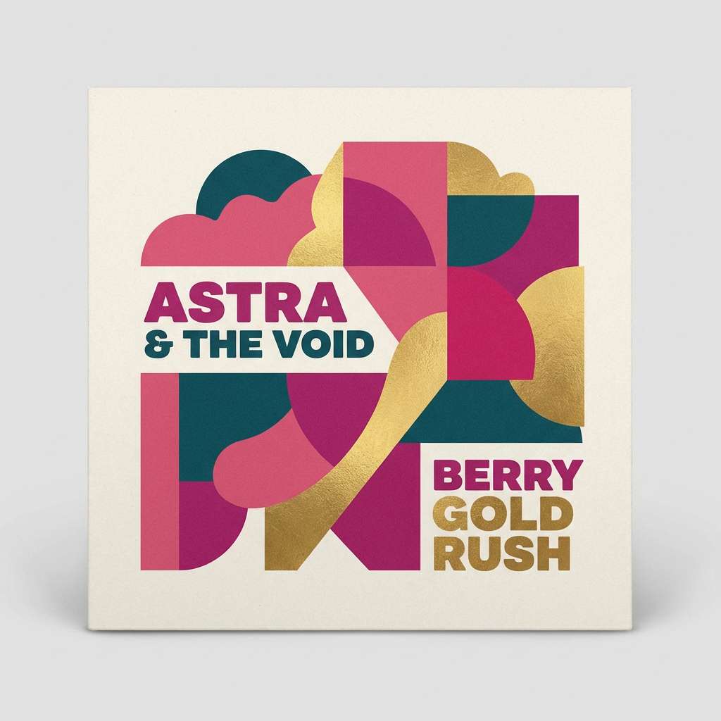
15) Berry Sunset
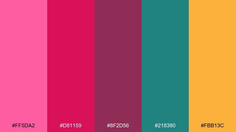
HEX: #FF5DA2 #D81159 #8F2D56 #218380 #FBB13C
Mood: playful, edgy, creative
Best for: music cover art and creator merch
Playful and edgy, these berry tones feel like city lights reflecting on clouds at dusk. The teal adds an unexpected cool note that keeps the pinks from feeling one-note. Use it for album covers, merch graphics, and bold thumbnails, paired with high-contrast type and simple geometric shapes. Tip: treat the gold as a highlight color for badges, stars, or small icon accents.
Image example of berry sunset generated using media.io
16) Oceanline Dusk
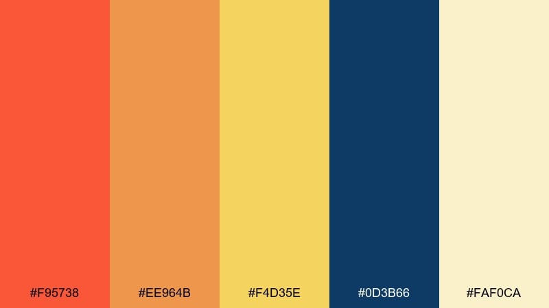
HEX: #F95738 #EE964B #F4D35E #0D3B66 #FAF0CA
Mood: sunlit, nautical, crisp
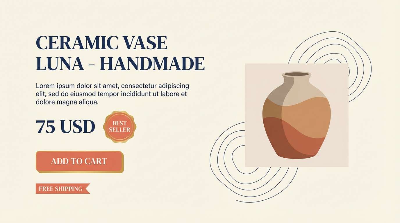
Best for: ecommerce product pages and summer lookbooks
Sunlit and crisp, this set feels like a warm boardwalk glow meeting cool deep water. The creamy background keeps product photography looking clean, while the navy provides structure for pricing and UI elements. It’s a smart choice for ecommerce, summer collections, and catalog headers, paired with minimal iconography and clear spacing. Tip: use the yellow for small attention cues like sale tags rather than large blocks.
Image example of oceanline dusk generated using media.io
17) Soft Sand Gradient
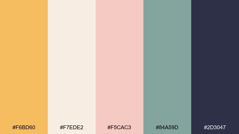
HEX: #F6BD60 #F7EDE2 #F5CAC3 #84A59D #2D3047
Mood: gentle, modern, relaxed
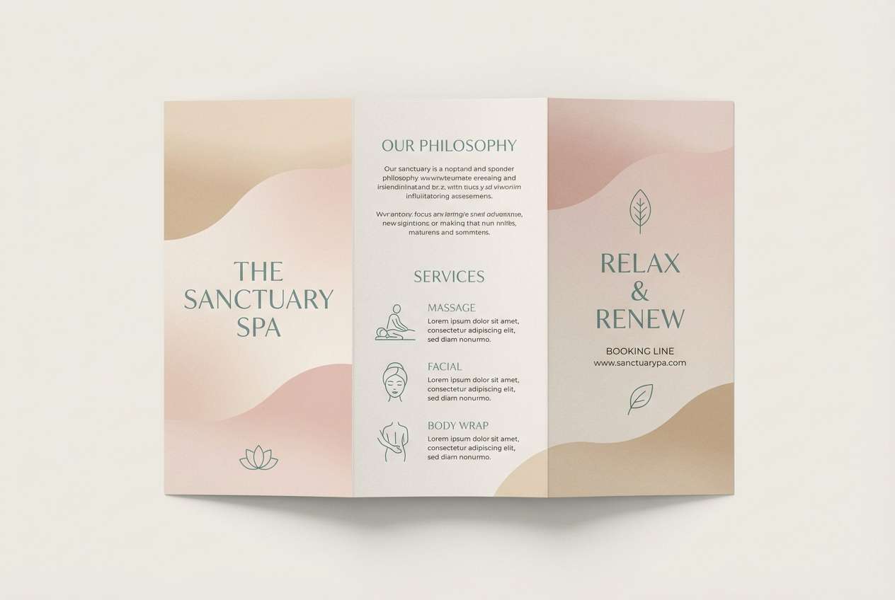
Best for: spa brochures and calming brand identity
Gentle and relaxed, these tones evoke warm sand, blush clouds, and a muted sea breeze. The desaturated teal-green keeps the palette modern, while the deep ink shade gives you a reliable foundation for text. It suits spa brochures, calm brand identities, and minimalist presentations, paired with thin-line icons and soft gradients. Tip: use the blush as a background tint behind photography to unify mixed images.
Image example of soft sand gradient generated using media.io
18) Violet Coastal
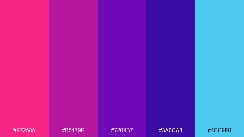
HEX: #F72585 #B5179E #7209B7 #3A0CA3 #4CC9F0
Mood: electric, modern, nightlife
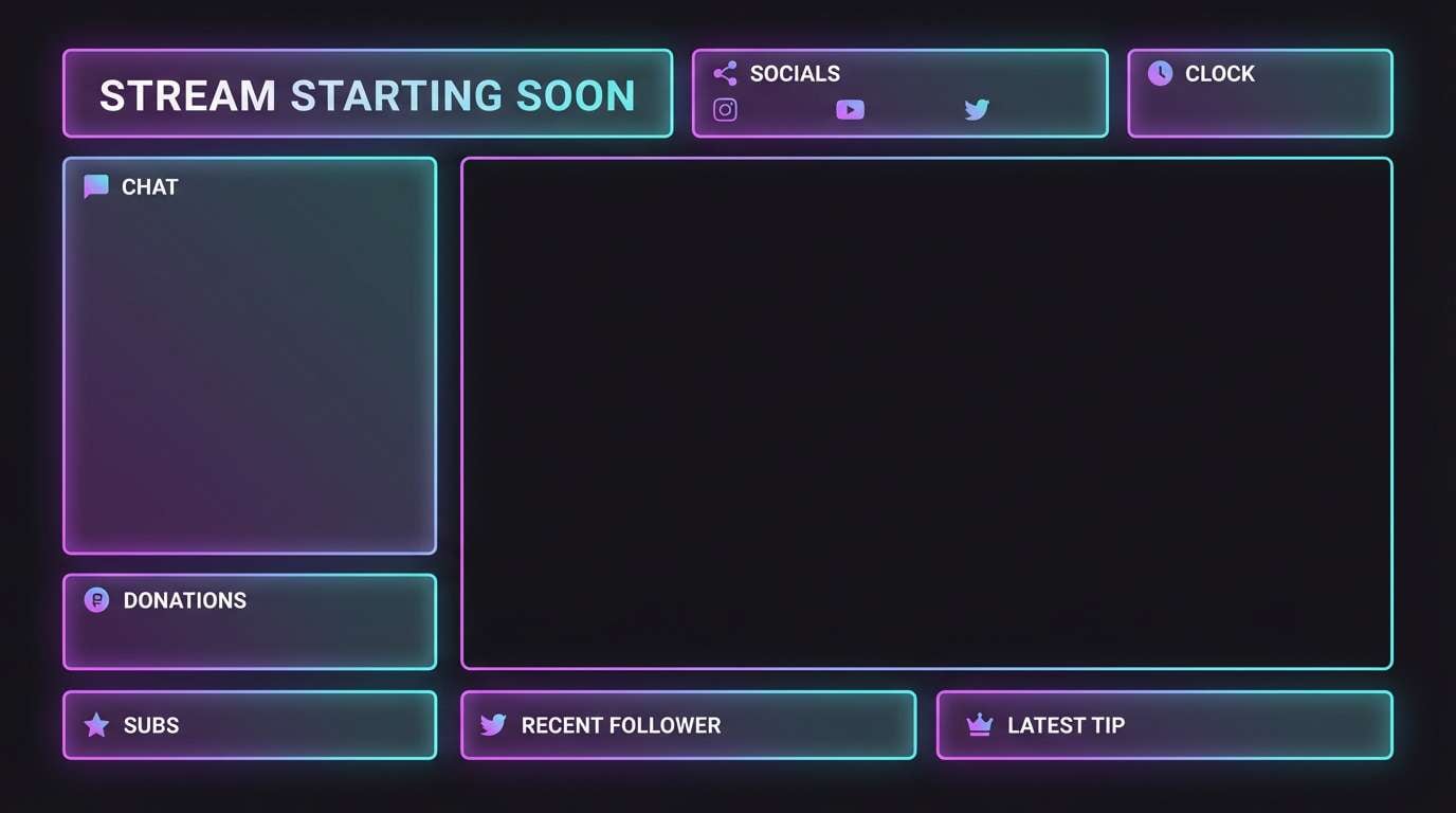
Best for: tech event banners and streaming overlays
Electric and modern, these purples and cyan feel like a coastal nightlife skyline with neon haze. The cool cyan works as a sharp highlight, while the layered violets create depth for gradients and backdrops. Use it for event banners, streaming overlays, and tech promos, paired with bold sans fonts and simple grid-based layouts. Tip: keep cyan for UI highlights and links so it stays special and readable.
Image example of violet coastal generated using media.io
19) Canyon Clay
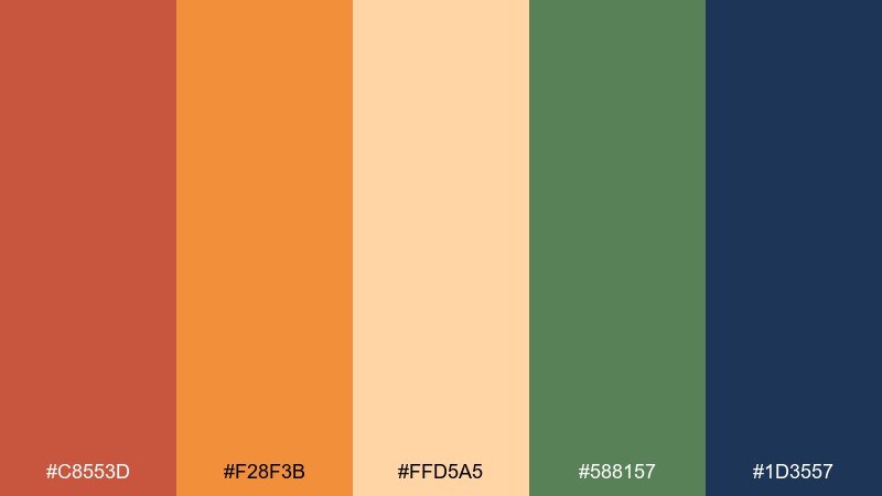
HEX: #C8553D #F28F3B #FFD5A5 #588157 #1D3557
Mood: natural, rugged, warm
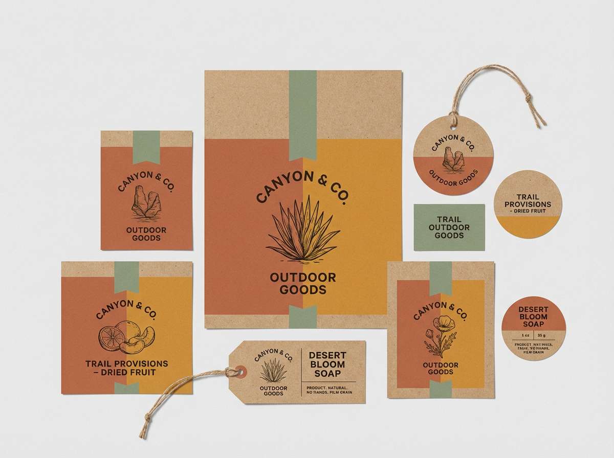
Best for: outdoor product packaging and labels
Natural and rugged, these clay and ochre tones feel like sunlit cliffs with a hint of sage brush. The green adds an organic counterpoint to the warm oranges, and the deep blue keeps label text crisp. It’s a great fit for trail snacks, skincare with botanicals, or artisan goods, paired with kraft textures and stamped-style typography. Tip: print the light peach as the base and use the clay color for bold brand marks to avoid muddy results.
Image example of canyon clay generated using media.io
20) Midnight After Sunset
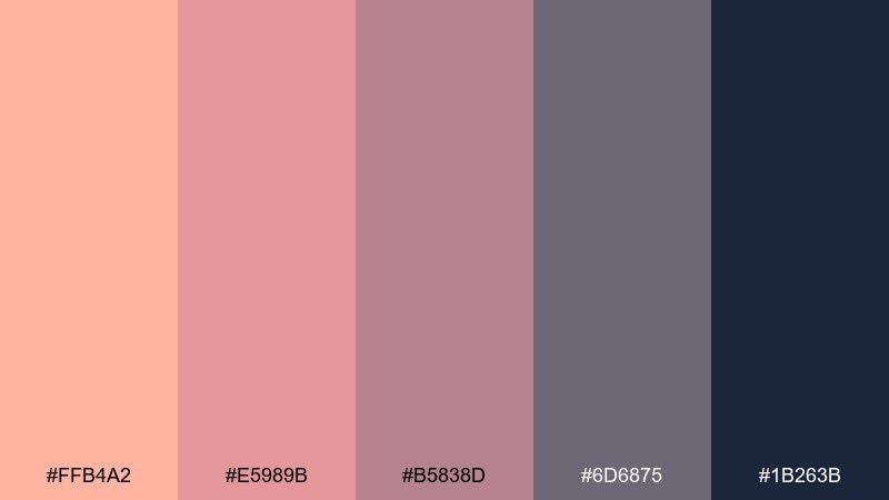
HEX: #FFB4A2 #E5989B #B5838D #6D6875 #1B263B
Mood: moody, elegant, understated
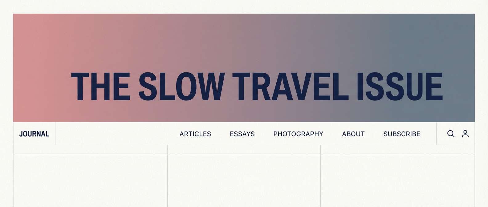
Best for: premium UI themes and editorial headers
Moody and elegant, these dusty pinks fade into slate like the last light disappearing into night. The progression gives you a ready-made gradient for headers, while the deep navy anchors the design with a modern finish. Use this sunset color palette for premium UI themes, blog mastheads, and refined brand systems, paired with minimalist icons and restrained photography. Tip: apply the mid mauve as your secondary button color so the interface keeps a soft, upscale rhythm.
Image example of midnight after sunset generated using media.io
What Colors Go Well with Sunset?
Sunset palettes pair best with grounded neutrals and deep darks. Navy blue, charcoal, espresso brown, and deep aubergine make warm corals and oranges feel more refined while keeping text readable.
For a fresher, coastal twist, combine sunset warms with ocean blues or muted teals. This creates a warm-to-cool gradient that’s ideal for travel, ecommerce, and summer campaigns.
If you want a bolder look, add one high-saturation accent (like magenta or electric cyan) and keep the rest calmer. The key is to let one color lead and use the others for hierarchy.
How to Use a Sunset Color Palette in Real Designs
Start with roles, not just colors: pick one dark shade for typography/navigation, one mid-tone for secondary UI, and one bright warm for primary CTAs. This prevents “pretty but unreadable” layouts.
Use sunset gradients where they feel natural—hero sections, poster headers, story backgrounds, and cards—then keep body areas lighter and simpler. A little grain or soft shadow can make gradients feel more premium.
Finally, test contrast on key components (buttons, price tags, form labels). Many sunset tones are mid-value, so anchoring with navy/charcoal is the easiest way to maintain accessibility.
Create Sunset Palette Visuals with AI
If you already have HEX codes, you can turn them into real design examples fast by generating mockups with consistent prompts—then iterate by swapping one hue at a time. This is an easy way to explore multiple sunset color combinations without rebuilding layouts.
Try creating a landing hero, poster, invitation, or UI screen using the prompts above, then adjust the “mood” by nudging saturation or shifting the darkest color toward navy blue for stronger contrast.
When you find a direction you like, generate a few variations (different ratios, typography styles, or background textures) so your brand system has options that still feel cohesive.
Sunset Color Palette FAQs
-
What is a sunset color palette?
A sunset color palette is a warm-to-cool set of colors inspired by golden hour and dusk—typically coral, peach, orange, gold, pink, and finishing with purples or navy for depth and contrast. -
What are the best sunset colors for UI design?
Use a deep navy or charcoal for text and navigation, a soft cream/lilac for backgrounds, and one bright warm (tangerine/coral) for primary CTAs. This keeps the sunset look while maintaining readability. -
How do I make a sunset gradient look smooth?
Choose colors with a clear value progression (light to dark), limit the gradient to 2–3 stops, and add subtle grain if needed to reduce banding—especially for posters and large backgrounds. -
Do sunset color schemes work for branding?
Yes—sunset palettes feel optimistic and human, and they’re memorable. The key is to define a consistent “anchor” dark (often navy) and use warm tones as accents so the brand stays clean and scalable. -
What dark color pairs best with coral and orange?
Navy blue and deep violet are top choices because they provide strong contrast without the harshness of pure black. They also reinforce the dusk side of the sunset theme. -
How many colors should a sunset palette include?
Five is a practical sweet spot: one dark anchor, one light background, and 2–3 warm mid/bright accents. That’s enough for hierarchy across web, print, and social templates. -
Can I generate sunset palette mockups with AI?
Yes. Use Media.io Text-to-Image with a clear design prompt (like “landing page hero” or “poster layout”), mention the sunset mood, and iterate by swapping one color or background texture at a time.
Next: Navy Blue Color Palette


