

Summer color palettes are all about light, clarity, and effortless contrast—think sun-washed neutrals, pool blues, citrus brights, and leafy greens.
Below are 20 summer color palette ideas with HEX codes, plus practical ways to apply them in branding, UI, and print.
In this article
- Why Summer Palettes Work So Well
-
- coastal breeze
- citrus splash
- poolside pop
- sandstone linen
- watermelon sorbet
- lavender haze
- sunlit terracotta
- seaglass mint
- golden hour glow
- berry picnic
- coral reef
- tropic canopy
- ice cream pastels
- ocean twilight
- marina neutrals
- festival neon
- orchard morning
- desert oasis
- yacht club navy
- sunset boardwalk
- What Colors Go Well with Summer?
- How to Use a Summer Color Palette in Real Designs
- Create Summer Palette Visuals with AI
Why Summer Palettes Work So Well
Summer palettes feel instantly welcoming because they mirror natural light: brighter backgrounds, cleaner hues, and warm accents that read as optimistic rather than intense.
They’re also easy to build hierarchy with. A pale “sky” or “sand” base creates breathing room, while saturated teals, corals, and navies can be reserved for CTAs, headings, and key UI states.
Finally, summer color schemes are versatile across mediums. The same set can look airy on a website, vivid on a poster, and premium in print when you balance contrast and saturation.
20+ Summer Color Palette Ideas (with HEX Codes)
1) Coastal Breeze
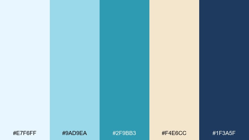
HEX: #e7f6ff #9ad9ea #2f9bb3 #f4e6cc #1f3a5f
Mood: fresh, airy, seaside
Best for: travel branding, resort websites, and clean landing pages
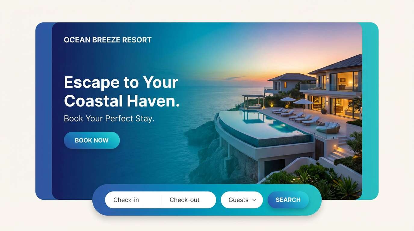
Fresh ocean air and sun-bleached boardwalks come to mind, with cool blues balanced by sandy warmth. Use the pale blue as your background, then layer teal for buttons and links. Navy anchors headlines and gives contrast without feeling heavy. Tip: pair with thin-line icons and plenty of whitespace for a breezy, premium look.
Image example of coastal breeze generated using media.io
Media.io is an online AI studio for creating and editing video, image, and audio in your browser.

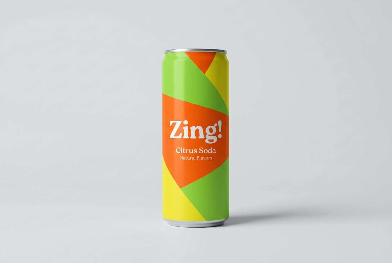
2) Citrus Splash
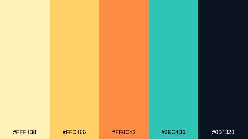
HEX: #fff1b8 #ffd166 #ff8c42 #2ec4b6 #0b1320
Mood: zesty, energetic, modern
Best for: food packaging, cafe promos, and punchy social ads
Zesty citrus and sparkling soda vibes make this mix feel instantly upbeat. Let the lemon and tangerine lead for highlights, while teal keeps the heat under control. The near-black adds sharp readability for menus, labels, and price tags. Tip: reserve the brightest orange for calls to action so it stays special.
Image example of citrus splash generated using media.io
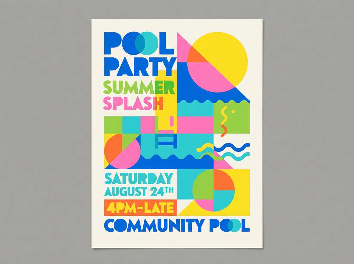
3) Poolside Pop
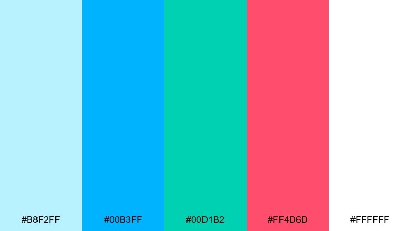
HEX: #b8f2ff #00b3ff #00d1b2 #ff4d6d #ffffff
Mood: playful, bright, splashy
Best for: event flyers, swimwear drops, and creator thumbnails
Playful splashes of pool water and neon floats give this set its bold, high-contrast energy. These summer color combinations work best with big shapes, thick type, and simple layouts that can handle the punch. Use aqua and white as the base, then drop in pink for emphasis and teal for secondary elements. Tip: keep gradients subtle so the palette stays crisp rather than chaotic.
Image example of poolside pop generated using media.io
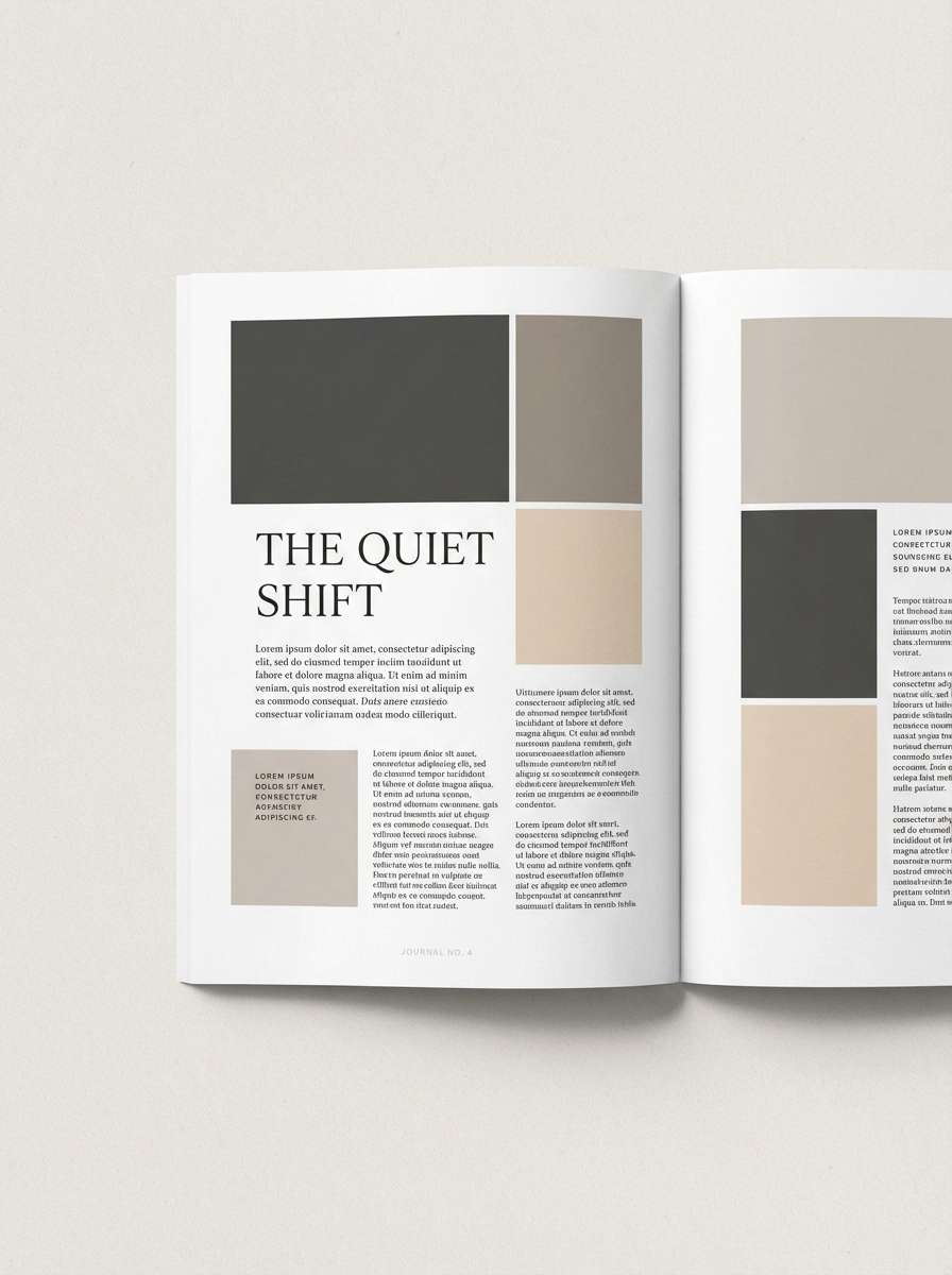
4) Sandstone Linen
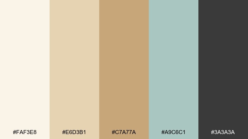
HEX: #faf3e8 #e6d3b1 #c7a77a #a9c6c1 #3a3a3a
Mood: calm, natural, understated
Best for: interior moodboards, wellness brands, and editorial layouts
Soft linen, warm stone, and a hint of sea-glass make this feel relaxed and quietly upscale. Use the off-white as a canvas, then build depth with tan and sandstone for sections and cards. The muted aqua is an elegant accent for links, dividers, or icon fills. Tip: add texture (paper grain or subtle fabric) to amplify the natural vibe without adding more colors.
Image example of sandstone linen generated using media.io
5) Watermelon Sorbet
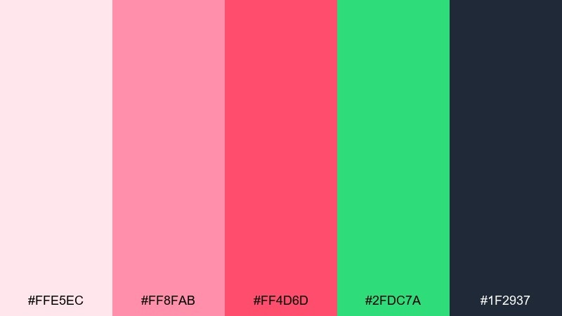
HEX: #ffe5ec #ff8fab #ff4d6d #2fdc7a #1f2937
Mood: sweet, fun, youthful
Best for: beauty launches, seasonal email headers, and playful branding
Juicy fruit and cold sorbet tones bring a cheerful, feel-good punch. Keep the blush background light, then use pink and red as headline accents and badges. The fresh green is perfect for secondary buttons or small illustrations, while charcoal keeps text readable. Tip: limit red to one key element per screen so it stays appetizing, not aggressive.
Image example of watermelon sorbet generated using media.io

6) Lavender Haze
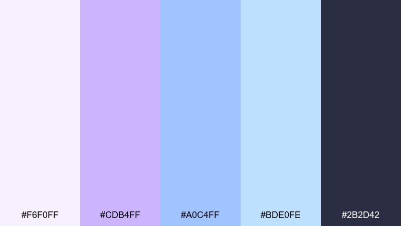
HEX: #f6f0ff #cdb4ff #a0c4ff #bde0fe #2b2d42
Mood: dreamy, soft, airy
Best for: wedding stationery, self-care apps, and gentle product pages
Dreamy twilight skies and lavender fields create a calm, floaty mood. This summer color combination shines with elegant serif type and delicate line art. Use the pale lavender for backgrounds, then pick one mid-tone blue for buttons to keep hierarchy clear. Tip: add a small charcoal footer or header bar to stabilize the light tones.
Image example of lavender haze generated using media.io
7) Sunlit Terracotta
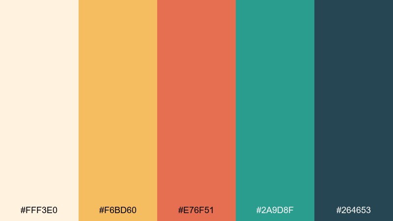
HEX: #fff3e0 #f6bd60 #e76f51 #2a9d8f #264653
Mood: warm, earthy, sunbaked
Best for: boutique hotels, ceramics shops, and lifestyle blogs
Sunbaked clay, golden light, and cool shade under an awning give this palette its balance. Let cream and honey handle large areas, then use terracotta for headlines or featured product tags. Teal is a strong counterpoint for links and highlights, while deep blue keeps the overall design grounded. Tip: pair with warm photography and avoid pure white so everything stays cohesive.
Image example of sunlit terracotta generated using media.io

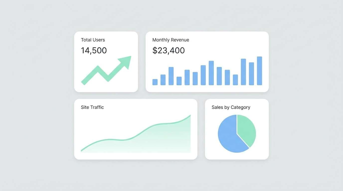
8) Seaglass Mint
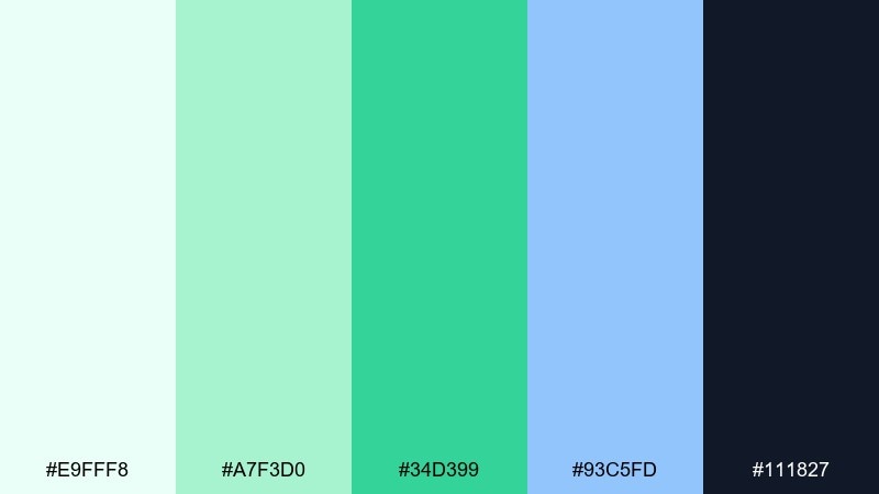
HEX: #e9fff8 #a7f3d0 #34d399 #93c5fd #111827
Mood: clean, minty, uplifting
Best for: health dashboards, fintech UI, and minimal app themes
Cool seaglass and fresh mint leaves make this set feel crisp and optimistic. Use the lightest tint for panels and cards, then rely on the deeper green for success states and key actions. The soft blue works well for informational highlights without competing with green. Tip: keep icon strokes consistent and use the dark slate only for primary text to maintain calm.
Image example of seaglass mint generated using media.io
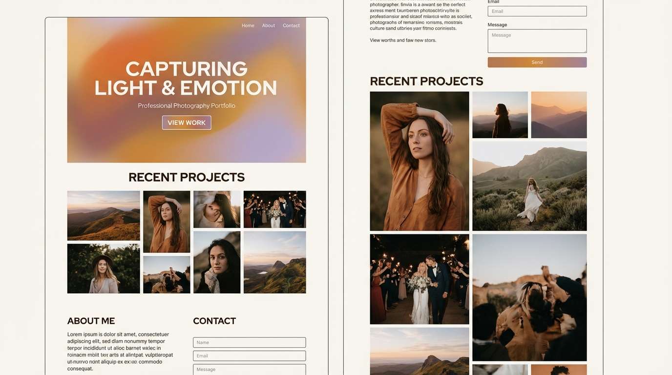
9) Golden Hour Glow
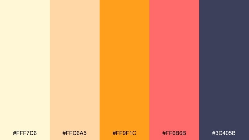
HEX: #fff7d6 #ffd6a5 #ff9f1c #ff6b6b #3d405b
Mood: warm, radiant, cinematic
Best for: creator branding, photography portfolios, and promo landing pages
Golden-hour light and soft lens flare give these tones a cinematic warmth. As a summer color scheme, it excels when you let the yellows own the background and save coral for highlights. The deep indigo is ideal for navigation and type, keeping contrast strong without harsh black. Tip: add one subtle gradient from cream to peach to mimic real light.
Image example of golden hour glow generated using media.io
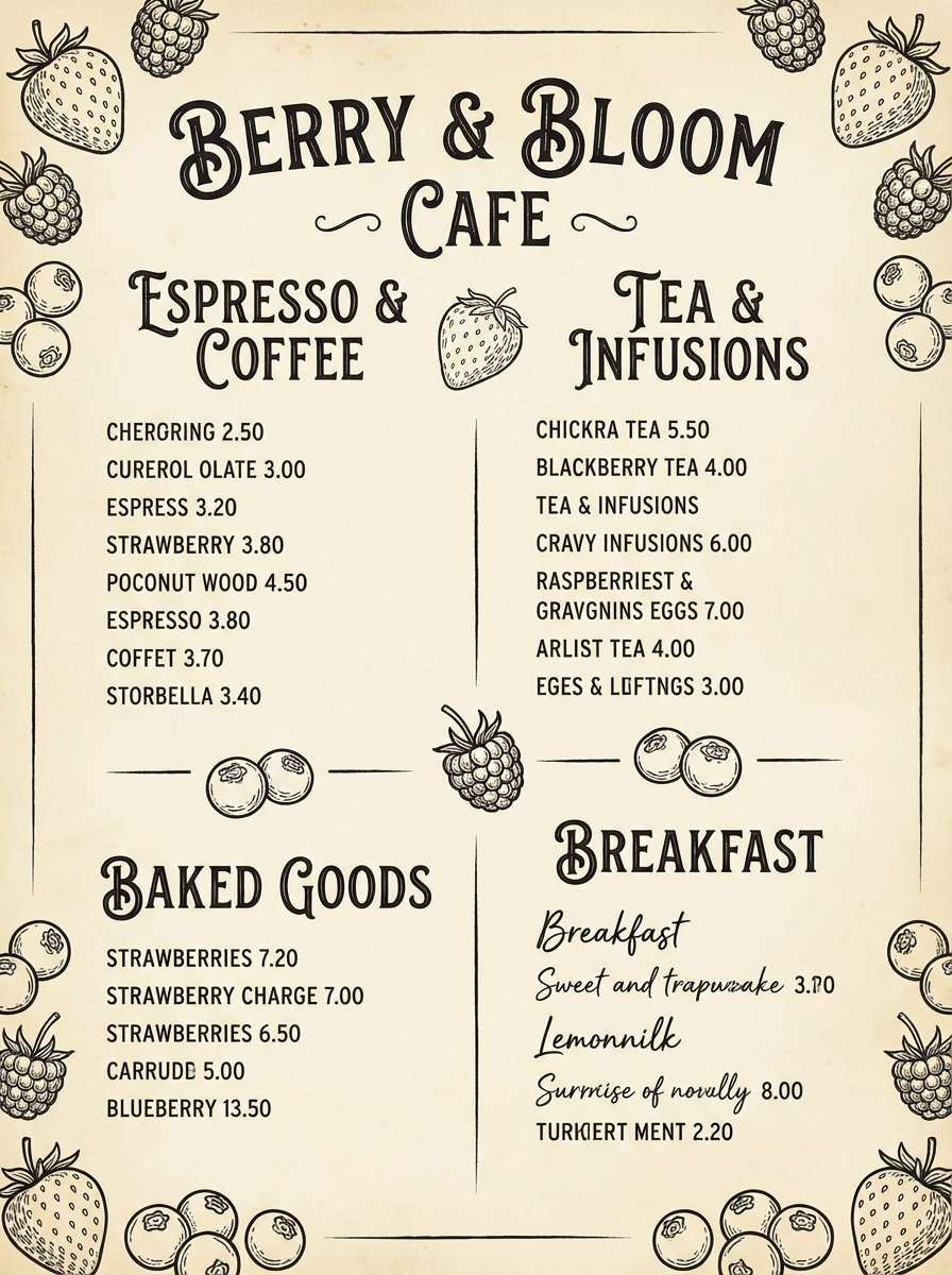
10) Berry Picnic
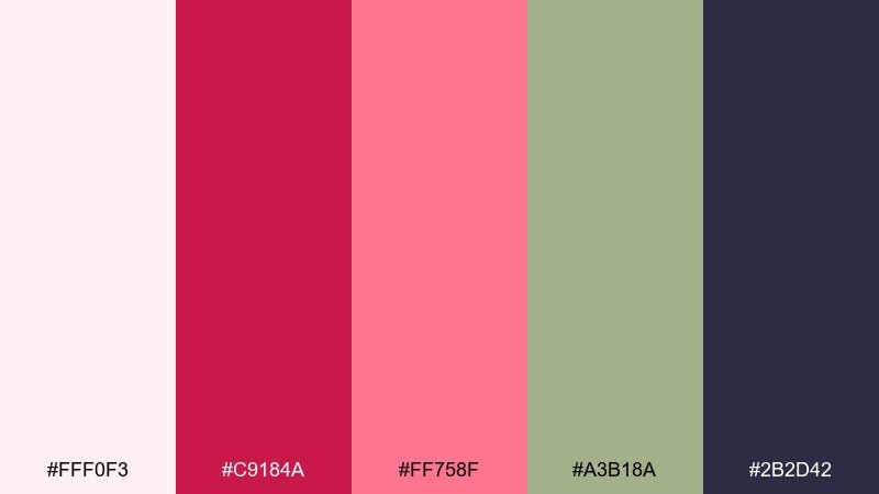
HEX: #fff0f3 #c9184a #ff758f #a3b18a #2b2d42
Mood: romantic, cozy, playful
Best for: boutique food labels, café menus, and social templates
A picnic blanket vibe with berries and soft greens feels charming and slightly vintage. Use the pale blush for negative space, then bring in raspberry for headings and key price points. The sage green works as a calm secondary accent that pairs well with natural textures. Tip: try a subtle paper background and rounded badges to keep the mood friendly.
Image example of berry picnic generated using media.io
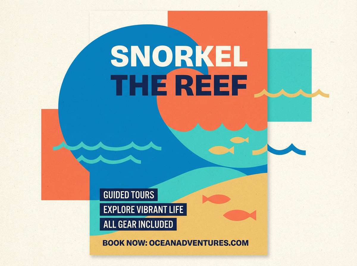
11) Coral Reef
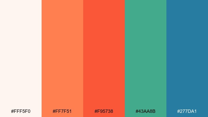
HEX: #fff5f0 #ff7f51 #f95738 #43aa8b #277da1
Mood: tropical, vibrant, adventurous
Best for: snorkeling tours, summer campaigns, and sportswear promos
Bright coral and tropical water tones feel adventurous, like reef dives and sunlit waves. Make coral the hero for buttons and banners, then use teal for secondary CTAs and supporting graphics. The ocean blue adds depth for headers and section breaks. Tip: keep backgrounds warm and light so the saturated accents pop without clashing.
Image example of coral reef generated using media.io
12) Tropic Canopy
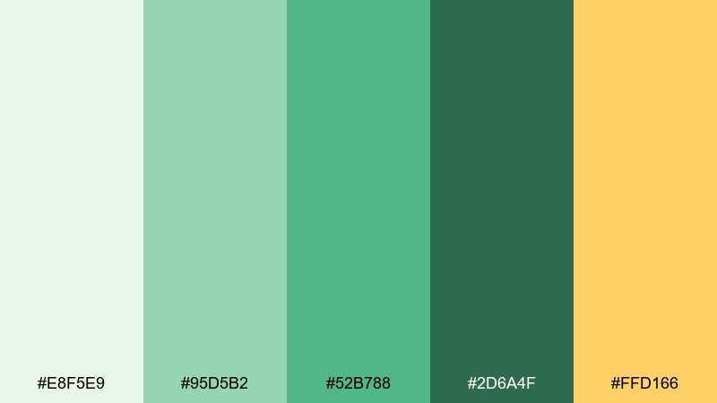
HEX: #e8f5e9 #95d5b2 #52b788 #2d6a4f #ffd166
Mood: lush, lively, outdoorsy
Best for: eco brands, botanical packaging, and nature blog headers
Lush canopy greens with a sunlit yellow accent feel alive and outdoorsy. Build your base with the pale green, then step down through mid and deep greens for hierarchy and depth. The yellow works best as a small highlight for badges, icons, or key stats. Tip: pair with botanical illustrations and avoid heavy shadows for a fresh, modern feel.
Image example of tropic canopy generated using media.io
13) Ice Cream Pastels
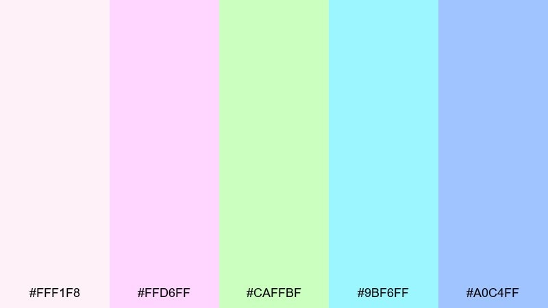
HEX: #fff1f8 #ffd6ff #caffbf #9bf6ff #a0c4ff
Mood: sweet, light, nostalgic
Best for: kids brands, pastel UI themes, and playful packaging
Soft scoops of strawberry, mint, and blue raspberry give this mix a nostalgic sweetness. These summer color combinations feel best with rounded shapes, friendly type, and generous spacing. Use one pastel as the dominant background, then choose just two others for components to prevent visual noise. Tip: add dark text only where needed and keep the rest airy to preserve the candy-like vibe.
Image example of ice cream pastels generated using media.io
14) Ocean Twilight
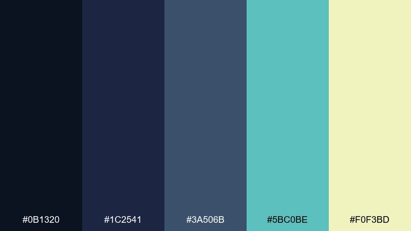
HEX: #0b1320 #1c2541 #3a506b #5bc0be #f0f3bd
Mood: moody, cool, sophisticated
Best for: tech branding, night event promos, and modern editorials
Deep twilight blues with a cool teal glow feel sleek, like ocean water after sunset. Use the darkest tone for backgrounds and navigation, then bring in teal for interactive states and charts. The soft butter tint adds a refined highlight for labels and subtle illumination. Tip: keep typography high-contrast and avoid adding extra brights so the mood stays premium.
Image example of ocean twilight generated using media.io
15) Marina Neutrals
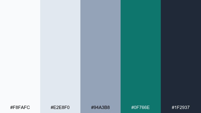
HEX: #f8fafc #e2e8f0 #94a3b8 #0f766e #1f2937
Mood: minimal, polished, nautical
Best for: professional decks, SaaS sites, and corporate rebrands
Crisp neutrals with a harbor-teal accent feel polished and dependable. Use the light grays for layouts and tables, then rely on teal for key actions and data highlights. The dark slate provides strong typography contrast that still feels softer than true black. Tip: pair with thin dividers and consistent spacing for a clean, executive look.
Image example of marina neutrals generated using media.io
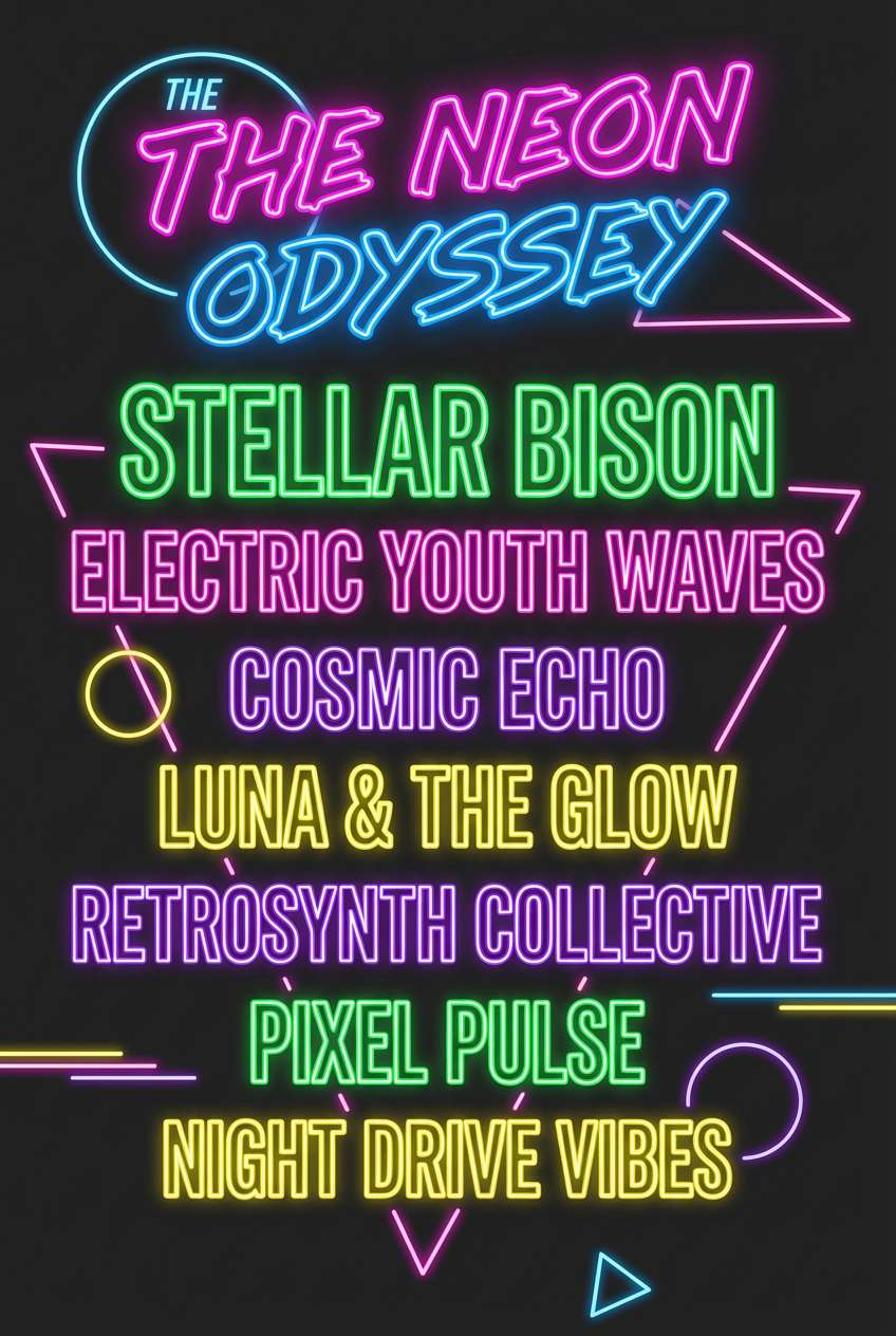
16) Festival Neon
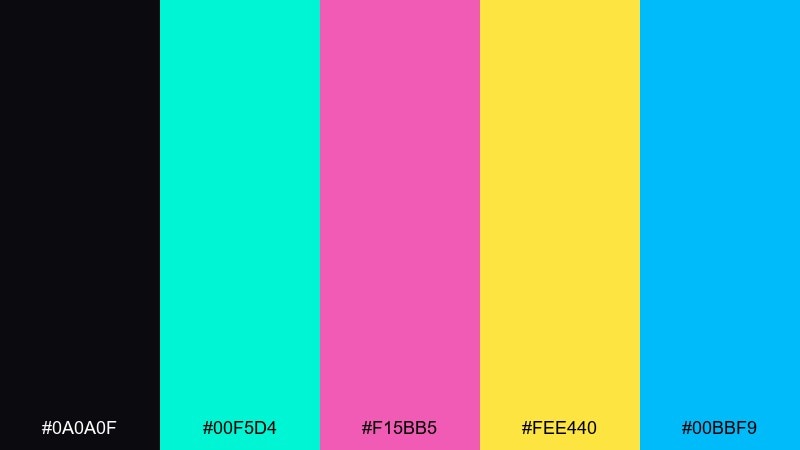
HEX: #0a0a0f #00f5d4 #f15bb5 #fee440 #00bbf9
Mood: bold, electric, nightlife
Best for: music lineups, streetwear drops, and high-impact ads
Electric neon lights and late-night festival energy make this palette impossible to ignore. Keep the black as your base, then use one neon per component to avoid clutter. Yellow works well for dates and ticket prices, while cyan and blue can split primary and secondary actions. Tip: add subtle glow effects sparingly so it feels intentional, not messy.
Image example of festival neon generated using media.io
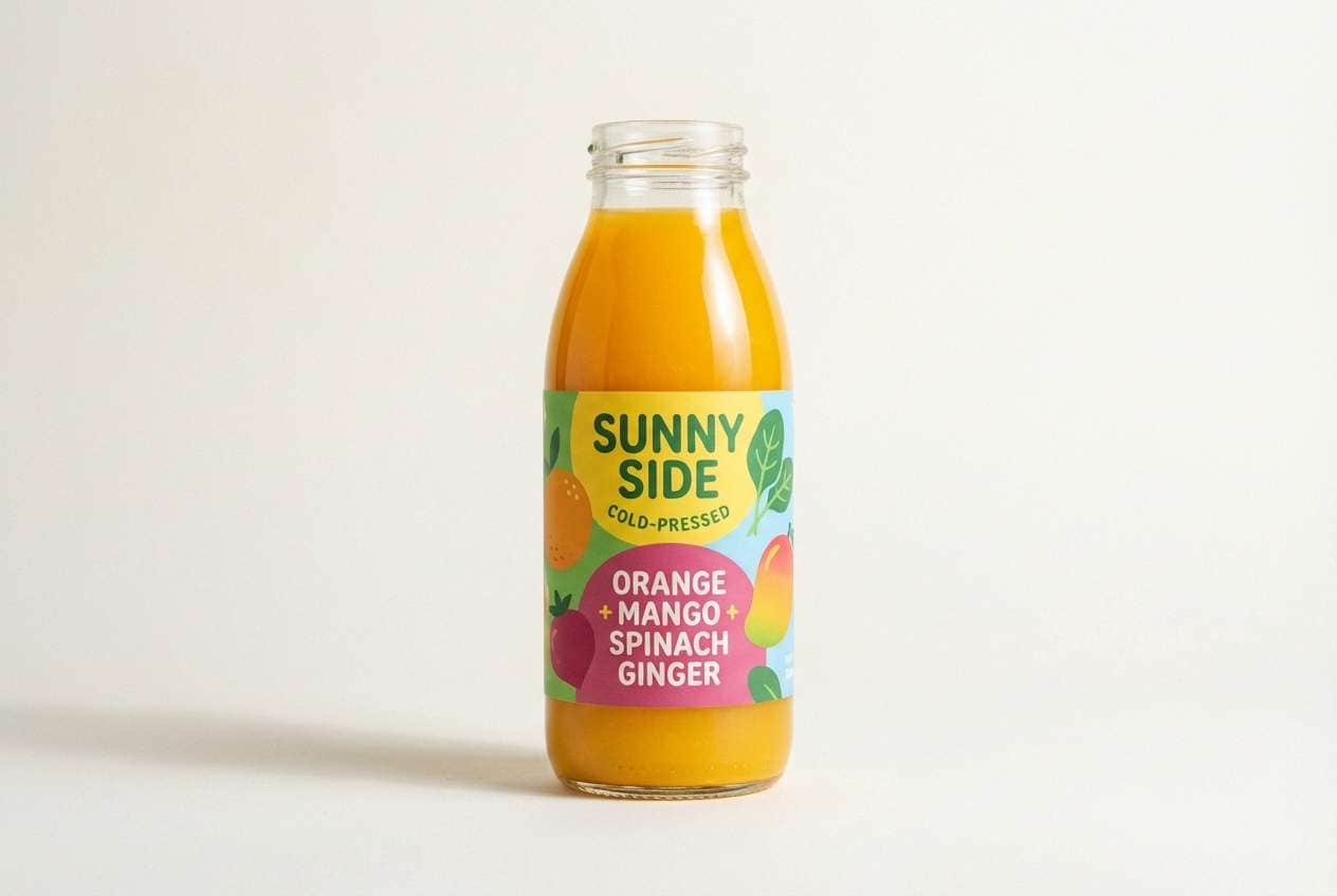
17) Orchard Morning
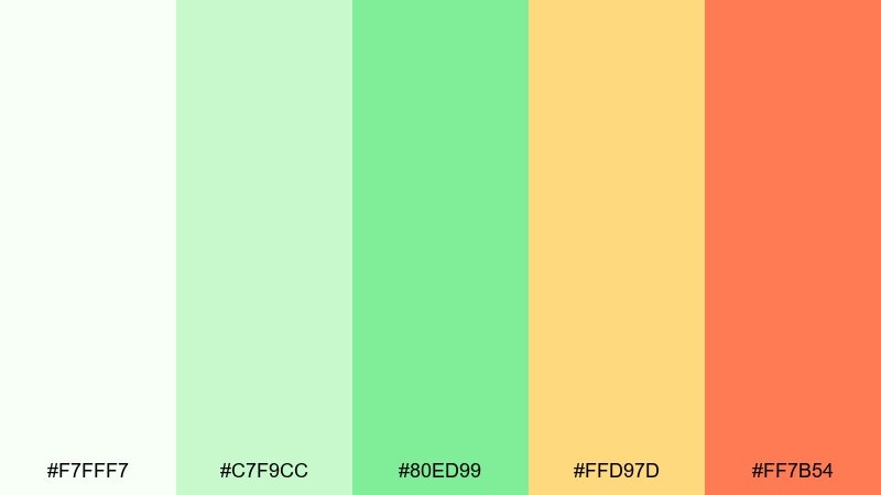
HEX: #f7fff7 #c7f9cc #80ed99 #ffd97d #ff7b54
Mood: optimistic, fresh, sunny
Best for: farmers market signage, juice labels, and friendly web banners
Fresh-picked fruit and early sunlight come through in these cheerful greens and warm accents. Use the soft white-green as a background, then let mid greens carry headers and key UI states. Yellow and apricot are great for small bursts like icons, stickers, or promo tags. Tip: pair with hand-drawn illustrations to keep the vibe approachable.
Image example of orchard morning generated using media.io
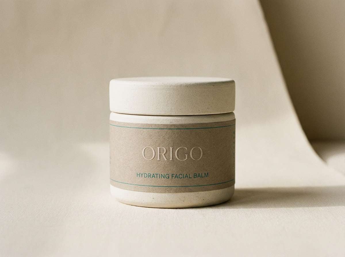
18) Desert Oasis
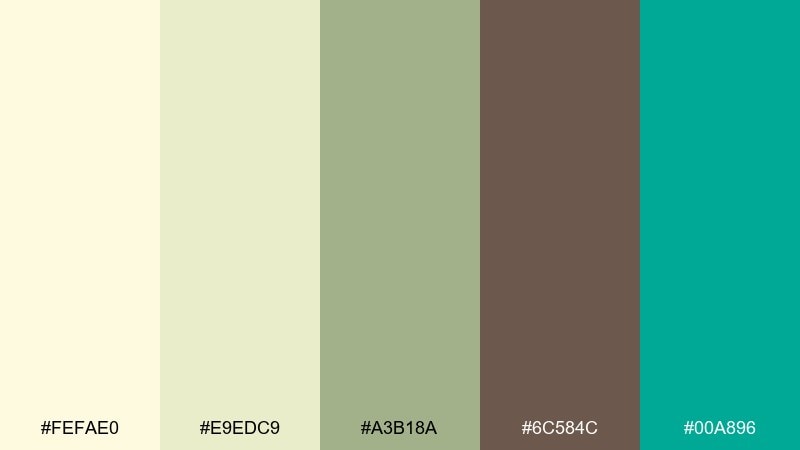
HEX: #fefae0 #e9edc9 #a3b18a #6c584c #00a896
Mood: earthy, calm, refreshing
Best for: spa branding, boutique skincare, and lifestyle newsletters
Dry desert sand with a cool oasis splash feels grounded yet refreshing. Start with the creamy tones for backgrounds and cards, then use olive for headings and dividers. The teal is your clean accent for buttons, links, or small graphic details. Tip: combine with warm neutrals in photography to keep the teal feeling like a deliberate pop.
Image example of desert oasis generated using media.io
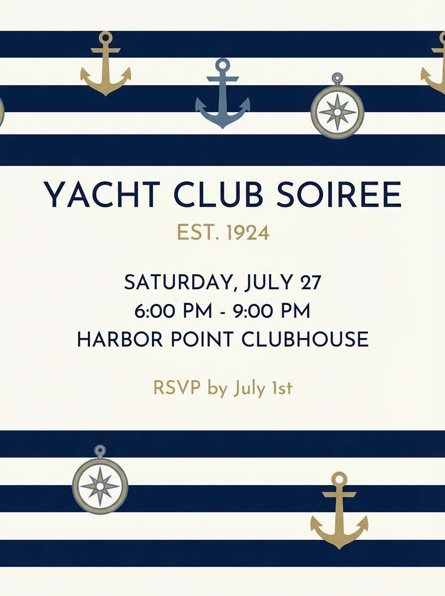
19) Yacht Club Navy
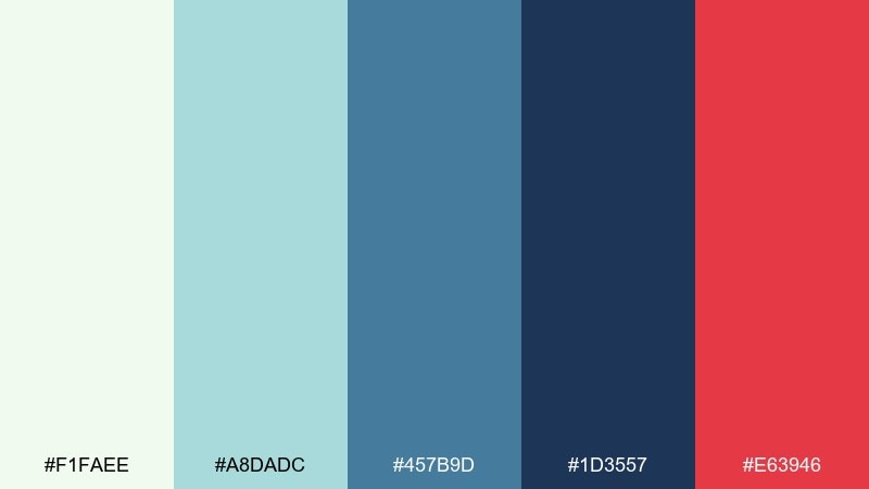
HEX: #f1faee #a8dadc #457b9d #1d3557 #e63946
Mood: classic, sporty, nautical
Best for: preppy apparel brands, club invites, and crisp web headers
Classic nautical tones feel sporty and timeless, like polished rails and crisp uniforms. Use the whites and pale aqua for clean space, then layer blues for structure and hierarchy. The red accent should be tiny and intentional: a badge, a dot, or a single CTA. Tip: pair with bold sans type and simple stripes for a confident, traditional look.
Image example of yacht club navy generated using media.io
20) Sunset Boardwalk
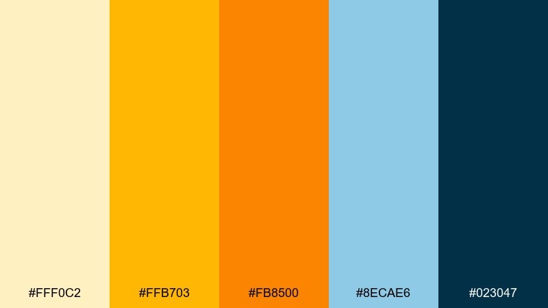
HEX: #fff0c2 #ffb703 #fb8500 #8ecae6 #023047
Mood: warm, nostalgic, vibrant
Best for: travel posters, outdoor event promos, and bold brand refreshes
Warm boardwalk lights and a cooling ocean breeze create an upbeat contrast. For a summer color palette that still reads professional, keep the dark blue for text and navigation, then use amber and orange as controlled highlights. The soft sky blue can sit behind cards or illustration elements to ease the heat. Tip: try oversized headlines with plenty of spacing so the bright tones feel intentional, not loud.
Image example of sunset boardwalk generated using media.io
What Colors Go Well with Summer?
Summer colors pair best when you balance a light base (off-white, pale sky blue, soft blush) with one or two saturated accents (coral, teal, tangerine). This keeps the palette feeling sunny without getting visually noisy.
Cool tones like aqua, seafoam, and periwinkle naturally complement warm shades like peach, amber, and terracotta—especially when you include an anchoring dark (navy, charcoal, deep indigo) for contrast.
If you want an instantly “seasonal” vibe, combine ocean blues + sand neutrals + a fruit accent (watermelon pink, citrus orange, or lime green) in small doses.
How to Use a Summer Color Palette in Real Designs
Start with role-based color assignment: pick one background color, one primary action color, one secondary accent, and one text/contrast color. Summer palettes work best when the lightest tone does the heavy lifting across large areas.
For UI, keep accessibility in mind by using the darkest swatch for body text and navigation, and reserve bright accents for buttons, highlights, and status chips. In print, consider slightly warming your whites (cream instead of pure #fff) to keep everything cohesive.
To avoid a “kidsy” look, reduce the number of saturated colors on a single screen and use spacing, typography, and subtle textures (paper grain, soft gradients) to create a premium summer feel.
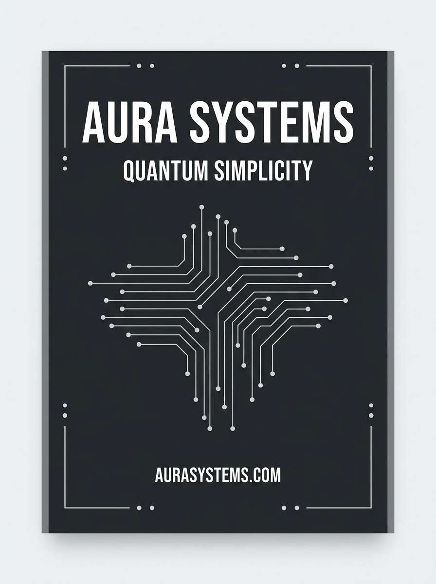
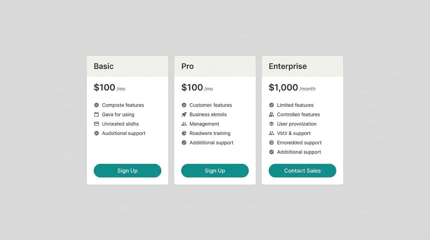
Create Summer Palette Visuals with AI
Want to see your summer color scheme in context—on packaging, posters, landing pages, or app UI? Generate quick mockups with AI so you can test mood, contrast, and hierarchy before committing.
Use the prompts above as a starting point, then swap in your product type (skincare jar, cafe menu, travel flyer) and keep the aspect ratio tag intact for consistent outputs.
Once you like the direction, refine with small iterations: “cleaner layout,” “more whitespace,” “rounded buttons,” or “minimal shadows” to match your brand style.
Summer Color Palette FAQs
-
What are the best summer colors for a website?
Light sky blues, soft creams, seafoam/mint, and a single bright accent (coral or tangerine) work well. Add navy or charcoal for readable text and clear UI hierarchy. -
How do I make a summer color palette look professional (not childish)?
Use one light neutral as the main background, limit brights to 1–2 accents, and include a deep anchor color (navy/indigo/slate). Typography and spacing do a lot of the “premium” work. -
What’s a good summer palette for branding?
Coastal and citrus palettes are reliable: airy blue + sand + navy for travel/lifestyle, or lemon/orange + teal + near-black for modern food and retail brands. -
Which summer colors are best for UI and dashboards?
Try mint/teal with soft blues and a dark slate for text (for example, Seaglass Mint). These combinations feel fresh while keeping charts and status states easy to distinguish. -
How many colors should a summer color scheme include?
For most designs, 5 colors is plenty: a background, a surface/card color, a primary action, a secondary accent, and a text/anchor color. You can add tints via opacity rather than new hues. -
What colors go well with coral in summer palettes?
Coral pairs nicely with warm off-whites, sandy neutrals, teal/sea-green, and ocean blues. Keep coral for key highlights so it stays vibrant and intentional. -
Can I generate summer palette mockups with AI?
Yes. Use an AI text-to-image tool to generate posters, UI screens, packaging, or brand boards using your chosen HEX-inspired colors and a clear prompt describing layout, style, and aspect ratio.


