

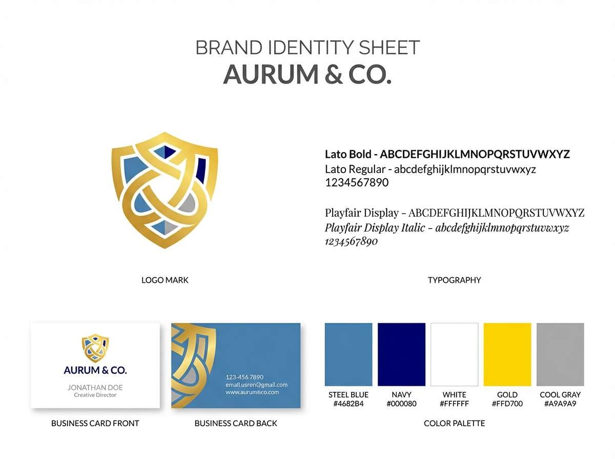
Steel blue sits right between classic blue and modern gray, making it one of the easiest shades to use across branding, UI, and interiors. It feels calm, capable, and clean—without turning icy or overly corporate.
Below are 20+ steel blue color palette ideas with HEX codes, plus practical usage notes and AI prompts you can reuse to generate visuals quickly.
In this article
- Why Steel Blue Palettes Work So Well
-
- harbor mist
- modern nautical
- slate and sand
- denim botanical
- tech calm
- rainy day minimal
- copper accent
- arctic aurora
- vintage library
- spa serenity
- stormy sunset
- concrete loft
- winter wedding
- midnight transit
- soft kids room
- corporate trust
- museum exhibit
- ocean sports
- ceramic kitchen
- night sky neon
- blueprint workshop
- ink and pearl
- What Colors Go Well with Steel Blue?
- How to Use a Steel Blue Color Palette in Real Designs
- Create Steel Blue Palette Visuals with AI
Why Steel Blue Palettes Work So Well
Steel blue is naturally versatile because it carries the trust of blue with the restraint of gray. That mix makes it feel stable and modern, which is why it shows up in both tech interfaces and timeless home palettes.
It also plays well with many temperatures: warm accents (copper, sand, terracotta) add friendliness, while cool accents (teal, cyan, violet) amplify a crisp, contemporary vibe. You can push it corporate, coastal, or creative without changing the core shade.
Most importantly, steel blue supports readable contrast when paired with near-whites and charcoals. That makes it practical for long-form pages, dashboards, slides, and any design where clarity matters as much as style.
20+ Steel Blue Color Palette Ideas (with HEX Codes)
1) Harbor Mist
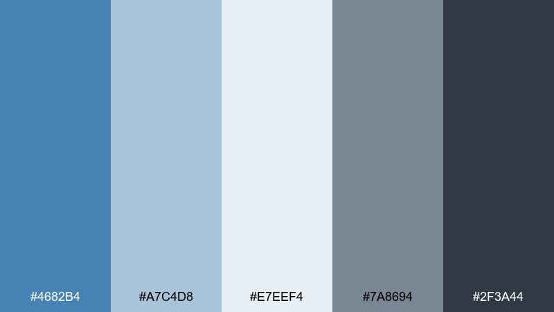
HEX: #4682B4 #A7C4D8 #E7EEF4 #7A8694 #2F3A44
Mood: airy, coastal, calming
Best for: coastal living room styling and paint planning
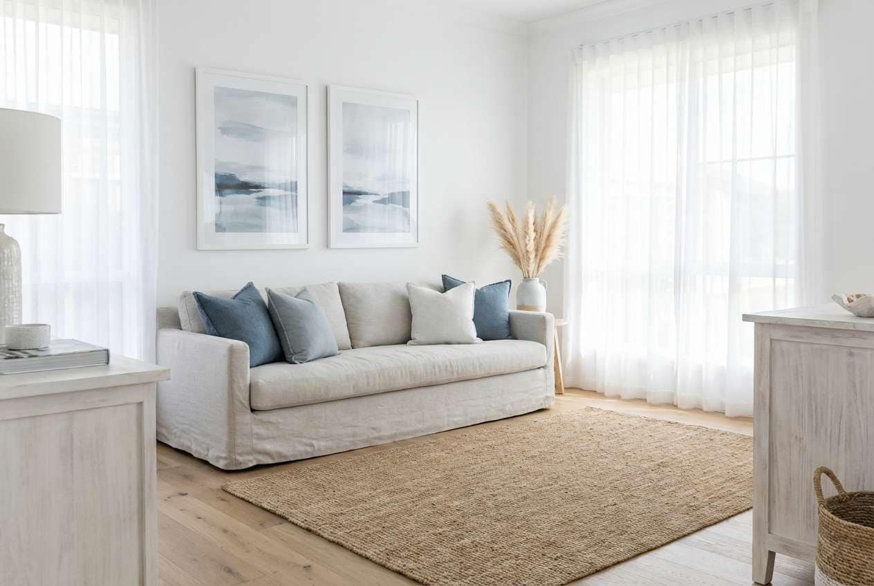
Airy and coastal like fog rolling into a marina, these tones feel clean but grounded. Use the pale blue and soft white for walls or large surfaces, then anchor with charcoal for trim or hardware. Warm it up with natural oak, linen, and light tan rugs. Tip: keep steel blue to one or two main planes and repeat it in small textiles for a cohesive look.
Image example of harbor mist generated using media.io
Media.io is an online AI studio for creating and editing video, image, and audio in your browser.

2) Modern Nautical
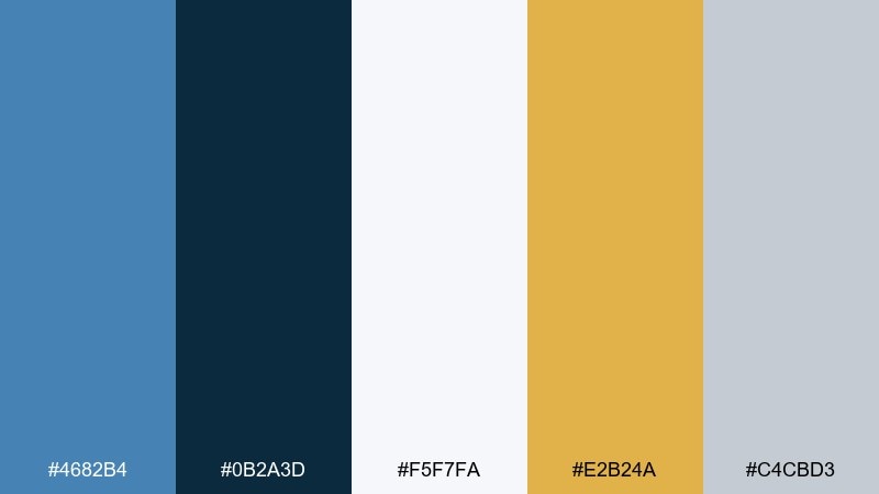
HEX: #4682B4 #0B2A3D #F5F7FA #E2B24A #C4CBD3
Mood: crisp, confident, modern
Best for: brand identity for fitness, marine, or travel startups
Crisp and confident, it evokes a modern yacht deck with sunlit metal and bold navy shadows. Use the deep ink tone for wordmarks and headers, then let steel blue lead backgrounds and secondary panels. The gold works best as a restrained highlight for buttons, badges, or callouts. Tip: limit the gold to under 10 percent of the layout so the look stays premium, not loud.
Image example of modern nautical generated using media.io
3) Slate and Sand
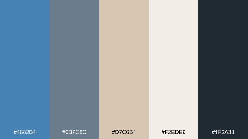
HEX: #4682B4 #6B7C8C #D7C6B1 #F2EDE6 #1F2A33
Mood: natural, balanced, understated
Best for: minimal websites and editorial landing pages
Natural and understated, it feels like weathered slate beside sun-warmed sand. These steel blue color combinations shine when you need calm contrast without high saturation. Pair the beige tones with generous whitespace, then use the deep charcoal for crisp type and navigation. Tip: test body text on the sand background to keep readability comfortable for long scrolls.
Image example of slate and sand generated using media.io
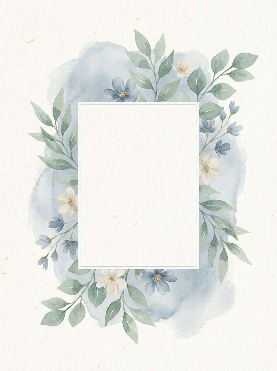
4) Denim Botanical
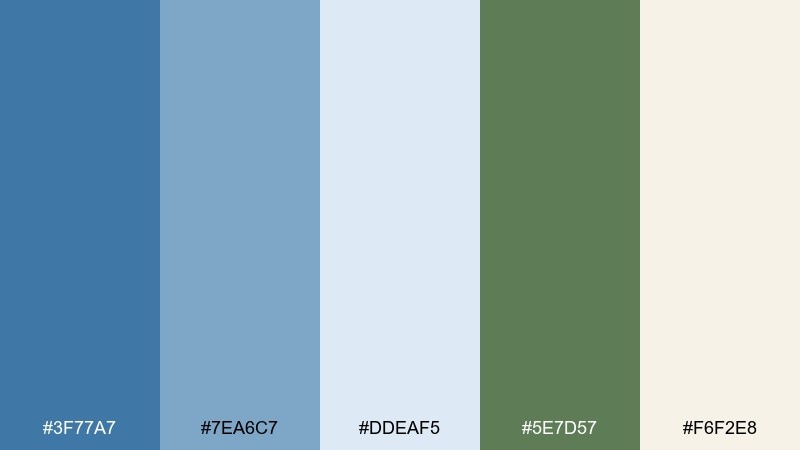
HEX: #3F77A7 #7EA6C7 #DDEAF5 #5E7D57 #F6F2E8
Mood: fresh, airy, garden-inspired
Best for: watercolor botanical invitations and spring stationery
Fresh and airy like denim blue ribbons tied around garden bouquets, this mix stays light and welcoming. Use the soft blues for washes and backgrounds, then bring in the leafy green for stems, monograms, or borders. The warm ivory keeps everything romantic rather than icy. Tip: print a test sheet to ensure the pale blue wash does not disappear on textured paper.
Image example of denim botanical generated using media.io
5) Tech Calm
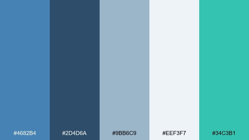
HEX: #4682B4 #2D4D6A #9BB6C9 #EEF3F7 #34C3B1
Mood: cool, dependable, modern
Best for: SaaS dashboard UI and data visualization
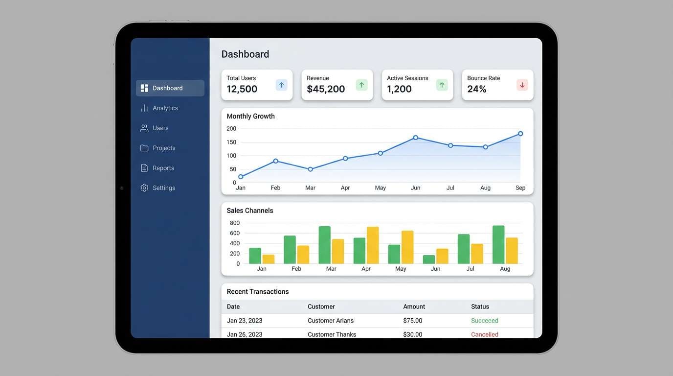
Cool and dependable, it brings to mind clear charts, glassy panels, and quiet focus. Use the light gray-white for app surfaces, steel blue for navigation, and teal as your primary action color. The mid blue-gray helps separate cards and tables without heavy borders. Tip: reserve teal for one action type so users learn what is clickable at a glance.
Image example of tech calm generated using media.io
6) Rainy Day Minimal
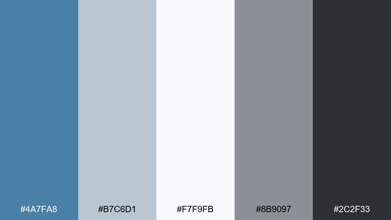
HEX: #4A7FA8 #B7C6D1 #F7F9FB #8B9097 #2C2F33
Mood: quiet, minimal, sophisticated
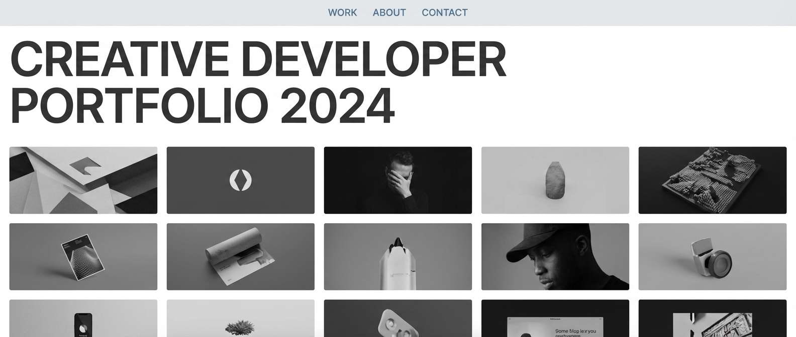
Best for: clean portfolio sites and typography-forward pages
Quiet and minimal, it feels like a soft drizzle on city concrete. Let the near-white carry most of the page, then use steel blue sparingly for links, selection states, and subtle dividers. The grays keep typography looking sharp without harsh contrast. Tip: choose one accent weight and repeat it consistently across headings, buttons, and icons.
Image example of rainy day minimal generated using media.io
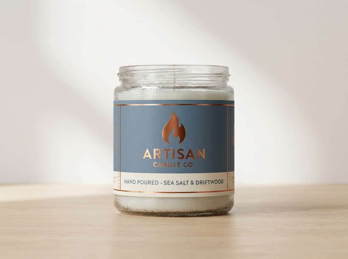
7) Copper Accent
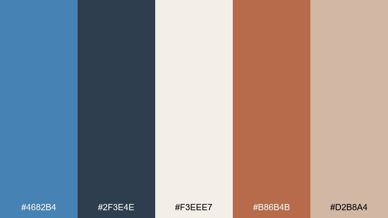
HEX: #4682B4 #2F3E4E #F3EEE7 #B86B4B #D2B8A4
Mood: warm, crafted, boutique
Best for: candle labels and artisan product packaging
Warm and crafted, it suggests copper tools against cool painted steel. Use the creamy background for labels, then balance the blue with a small hit of copper for seals, line art, or scent names. The deep slate adds structure for regulatory text and barcode areas. Tip: use copper in matte finishes to avoid glare and keep the boutique feel.
Image example of copper accent generated using media.io
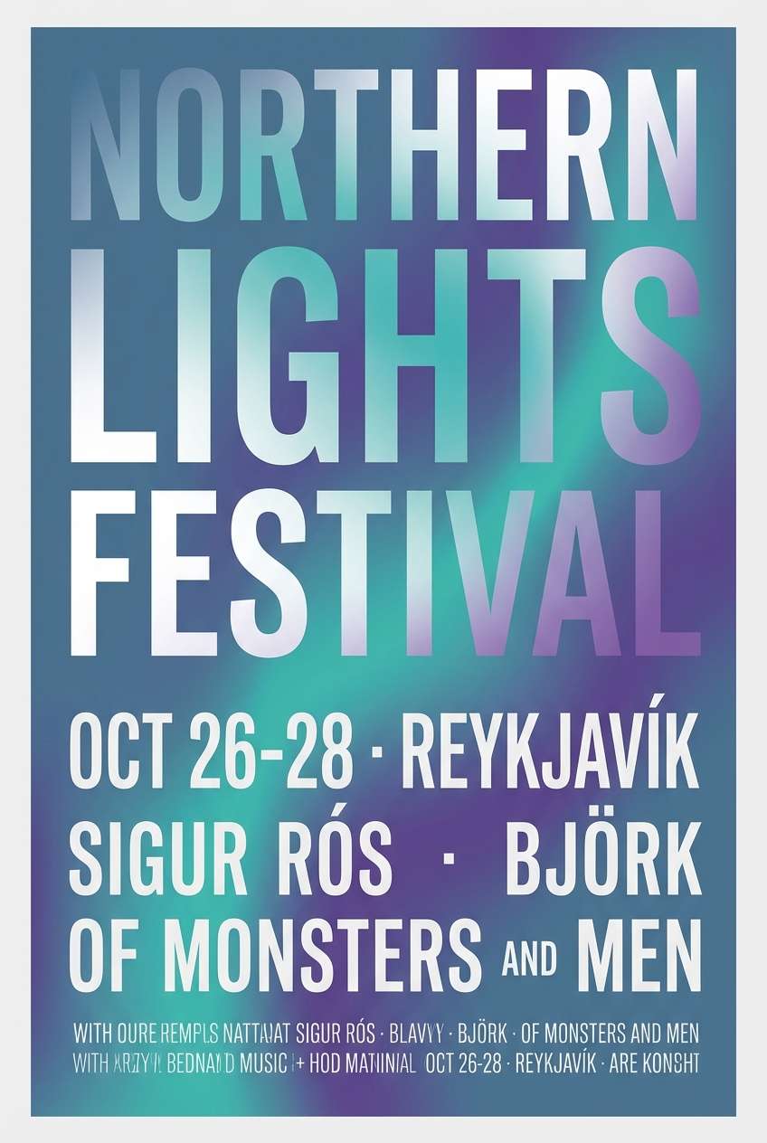
8) Arctic Aurora
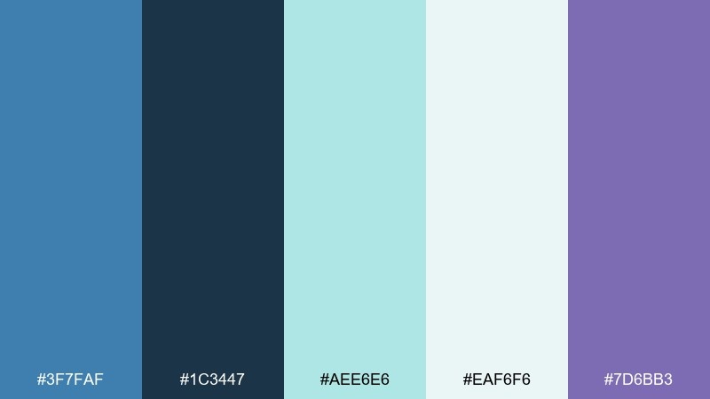
HEX: #3F7FAF #1C3447 #AEE6E6 #EAF6F6 #7D6BB3
Mood: icy, luminous, atmospheric
Best for: music poster designs and event flyers
Icy and luminous, it evokes aurora light over deep night water. This steel blue color palette works best with high-contrast type and a soft gradient background. Add the violet as a secondary glow for headlines or date callouts, keeping teal as the airy highlight. Tip: use one bold sans font and keep spacing generous so the glow effects stay readable.
Image example of arctic aurora generated using media.io
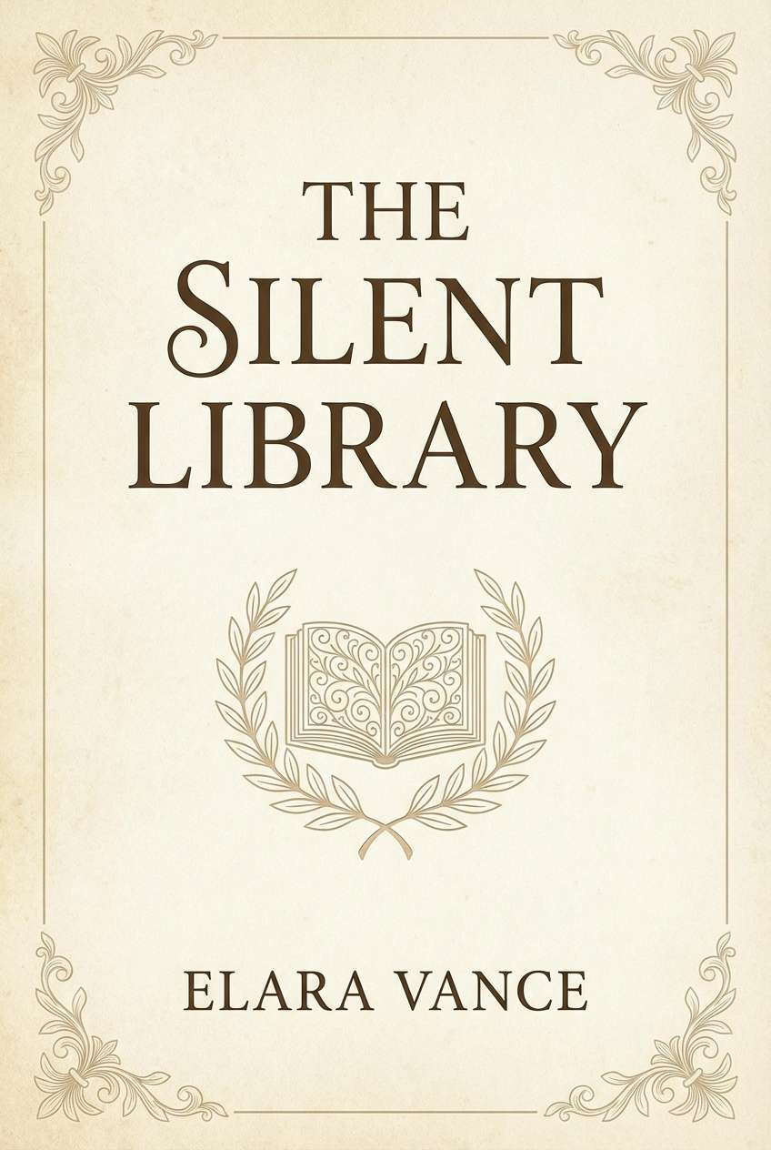
9) Vintage Library
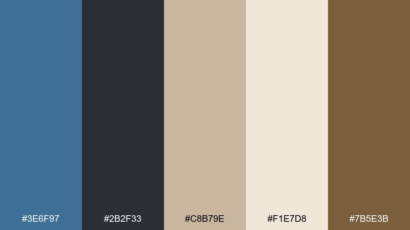
HEX: #3E6F97 #2B2F33 #C8B79E #F1E7D8 #7B5E3B
Mood: classic, academic, cozy
Best for: book covers and heritage brand packaging
Classic and academic, it recalls worn clothbound books and quiet reading lamps. Use steel blue for the main cover field, then pair it with parchment and tan for subtitles and ornament. The espresso brown is ideal for borders, serif type, and small flourishes. Tip: add subtle paper grain to soften flat areas and make the palette feel printed, not digital.
Image example of vintage library generated using media.io
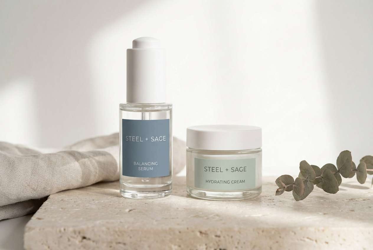
10) Spa Serenity
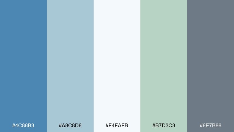
HEX: #4C86B3 #A8C8D6 #F4FAFB #B7D3C3 #6E7B86
Mood: clean, gentle, restorative
Best for: skincare product ads and wellness landing pages
Clean and restorative, it feels like cool towels, steamed glass, and quiet breathing. Use the pale aqua-white for backgrounds, then bring in steel blue for headlines and section dividers. The soft sage adds a natural cue for ingredients and sustainability notes. Tip: keep photography bright and low-contrast so the interface feels soothing rather than clinical.
Image example of spa serenity generated using media.io
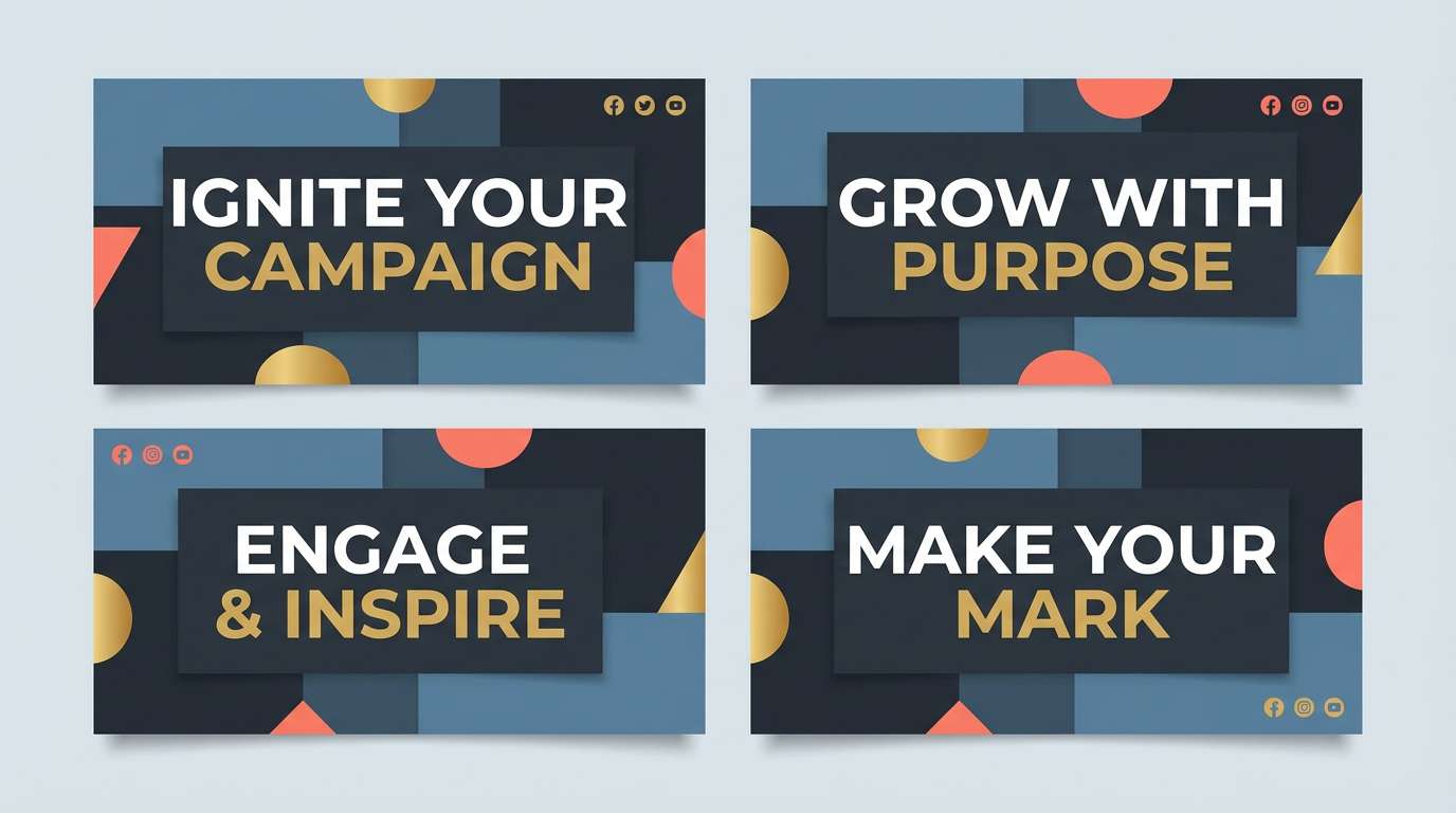
11) Stormy Sunset
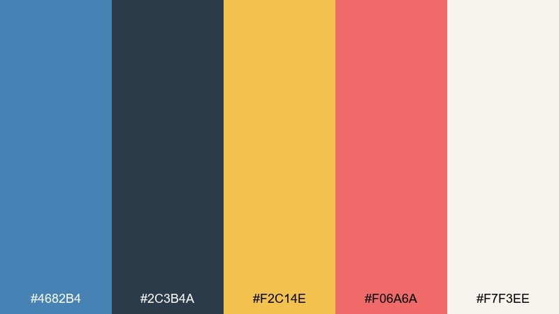
HEX: #4682B4 #2C3B4A #F2C14E #F06A6A #F7F3EE
Mood: dramatic, energetic, cinematic
Best for: social media graphics and campaign banners
Dramatic and cinematic, it looks like storm clouds splitting to reveal warm sunset streaks. Use steel blue and charcoal for the base, then let the gold and coral pop for calls to action or promo tags. The off-white keeps type legible on both dark and bright areas. Tip: use coral only for one key element per frame to avoid visual noise.
Image example of stormy sunset generated using media.io
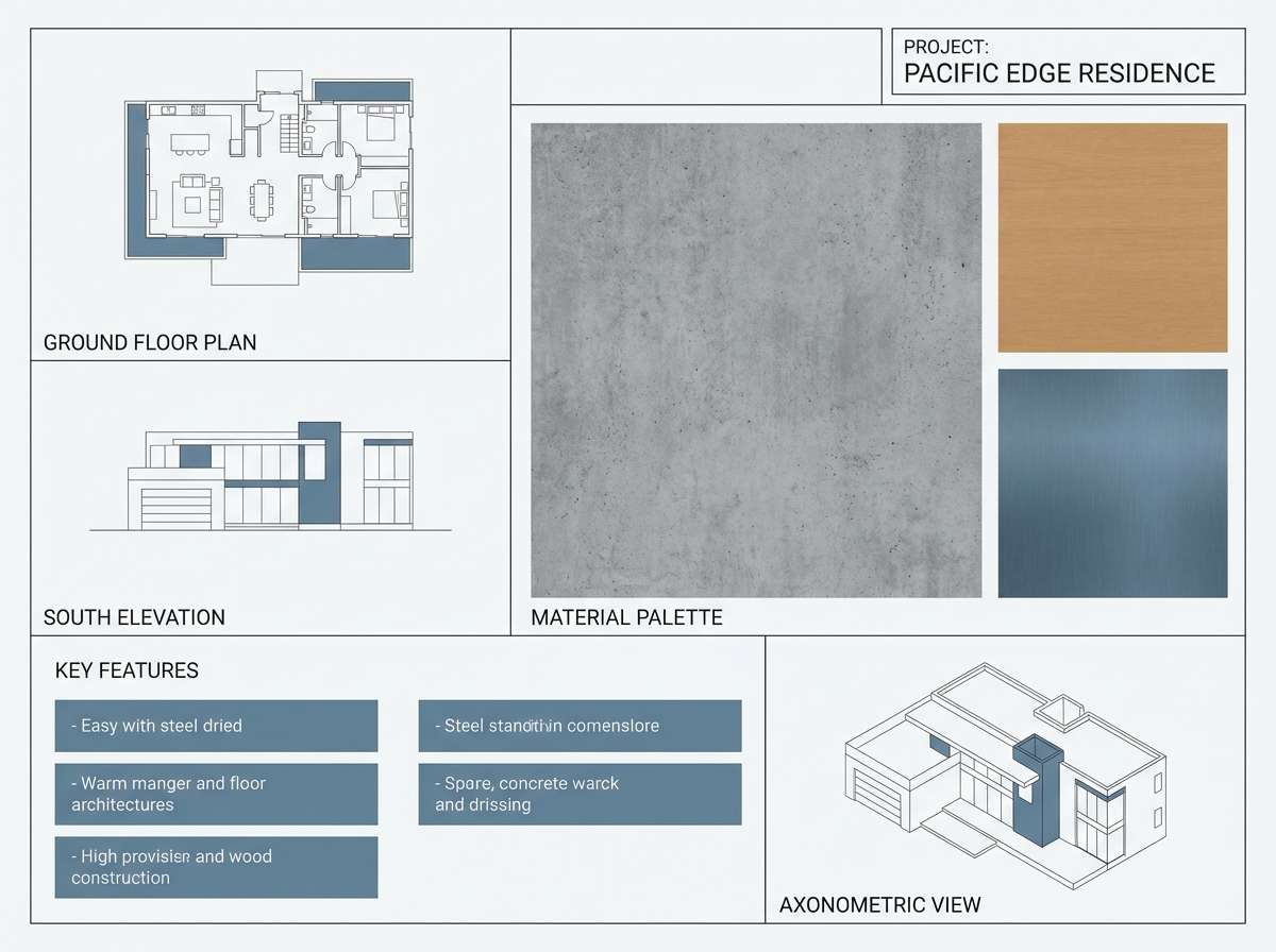
12) Concrete Loft
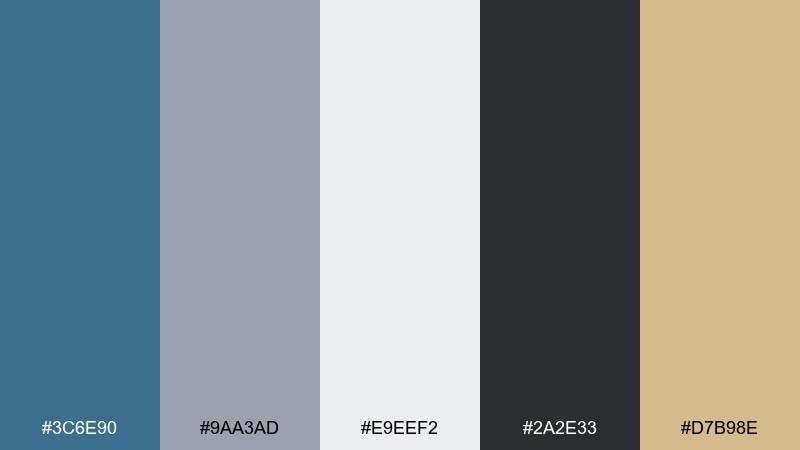
HEX: #3C6E90 #9AA3AD #E9EEF2 #2A2E33 #D7B98E
Mood: industrial, modern, grounded
Best for: interior mood boards and architectural presentations
Industrial and grounded, it suggests a concrete loft softened by daylight and raw wood. Use the cool grays for plans and annotations, with steel blue for key sections and highlight blocks. The warm tan is ideal for wood finishes and material callouts, adding needed human warmth. Tip: keep linework charcoal and save color for hierarchy so drawings stay readable when printed.
Image example of concrete loft generated using media.io
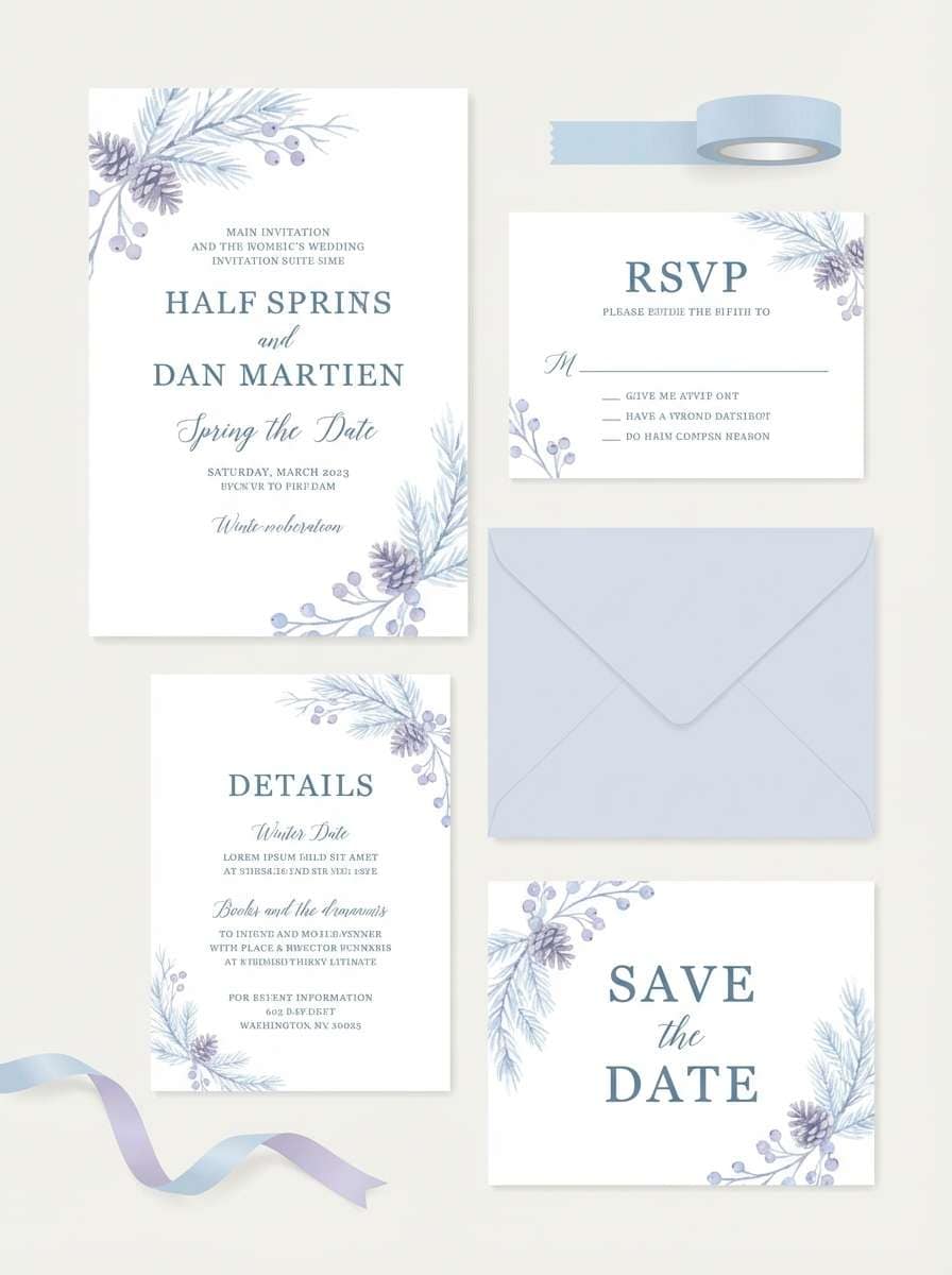
13) Winter Wedding
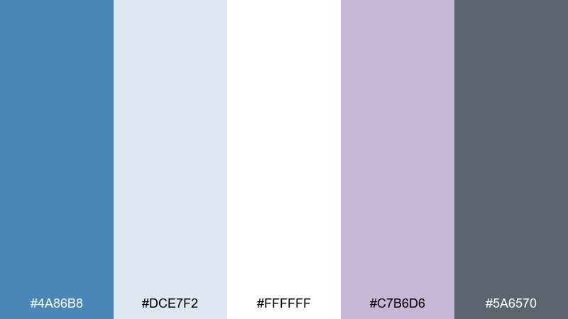
HEX: #4A86B8 #DCE7F2 #FFFFFF #C7B6D6 #5A6570
Mood: romantic, frosty, elegant
Best for: winter wedding invitations and save-the-dates
Romantic and frosty, it feels like snowlight with a hint of lilac twilight. Use the white and pale blue for generous negative space, then set steel blue for names and section headings. The muted lavender makes a graceful accent for monograms or envelope liners. Tip: choose a slightly heavier type weight so light inks still read well on textured stock.
Image example of winter wedding generated using media.io
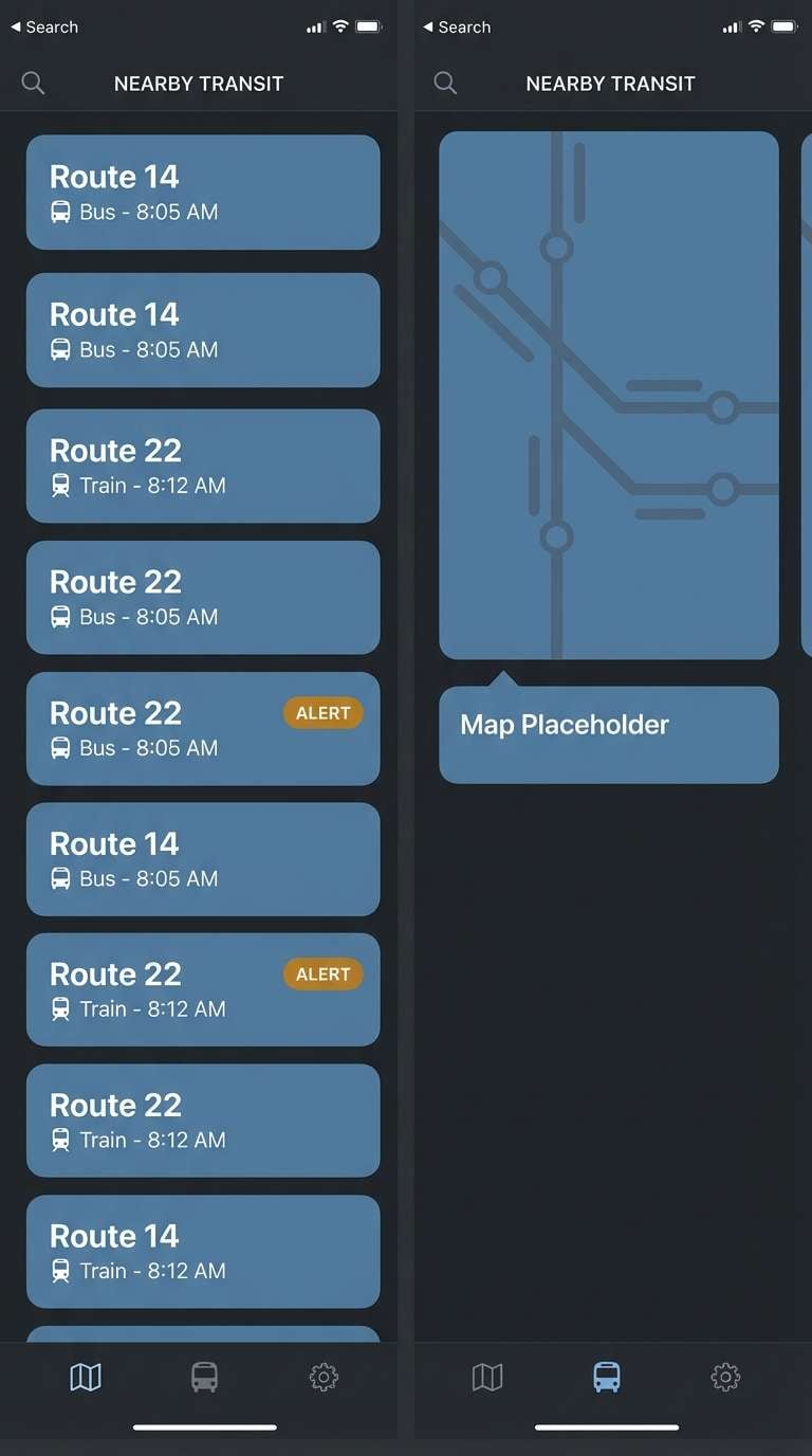
14) Midnight Transit
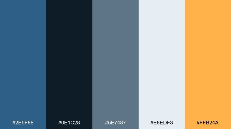
HEX: #2E5F86 #0E1C28 #5E7487 #E6EDF3 #FFB24A
Mood: urban, sleek, high-contrast
Best for: mobile app UI for navigation and transit tools
Urban and sleek, it recalls station signage against dark tunnels and polished metal. This steel blue color scheme excels in dark mode, with light text on near-black panels and clear steel blue surfaces for cards. Add the amber as a focused alert color for delays, timers, or primary actions. Tip: keep amber out of large areas and use it for icons and micro-badges only.
Image example of midnight transit generated using media.io
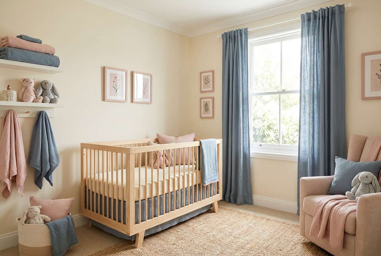
15) Soft Kids Room
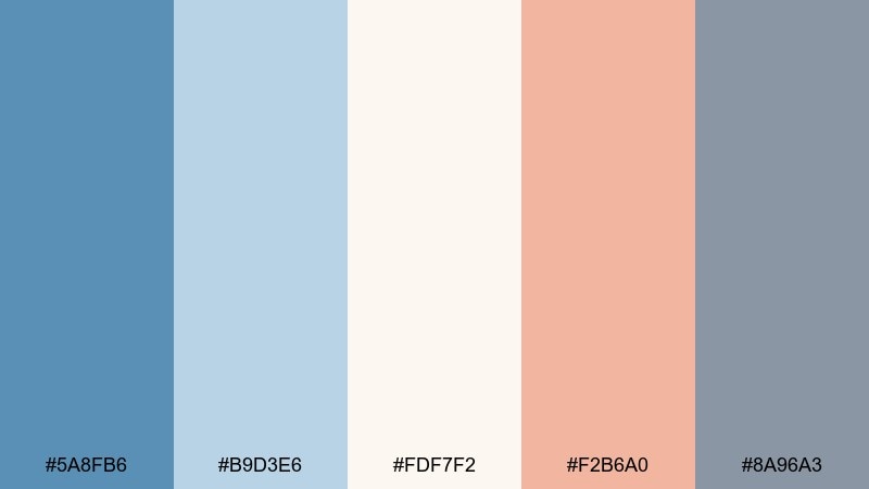
HEX: #5A8FB6 #B9D3E6 #FDF7F2 #F2B6A0 #8A96A3
Mood: gentle, playful, comforting
Best for: nursery decor and children brand packaging
Gentle and comforting, it feels like storytime blankets and soft daylight. Use the pale blue and warm cream for large areas, then bring in blush as a friendly accent for labels or wall art. The gray keeps everything grounded so it does not become too sugary. Tip: choose matte finishes and rounded shapes to reinforce the calm, kid-safe tone.
Image example of soft kids room generated using media.io
16) Corporate Trust
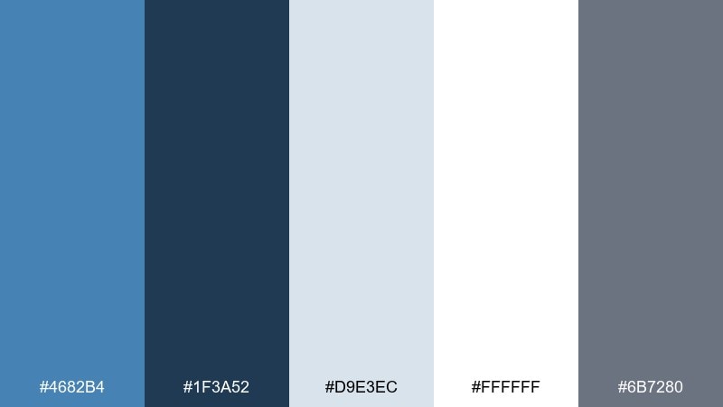
HEX: #4682B4 #1F3A52 #D9E3EC #FFFFFF #6B7280
Mood: professional, steady, trustworthy
Best for: B2B websites, pitch decks, and reports
Professional and steady, it communicates trust without feeling stiff. Use the dark blue for titles and charts, steel blue for section headers, and the light gray-white for breathing room in slides. The mid gray is perfect for tables, footnotes, and secondary labels. Tip: apply one consistent chart accent color and rely on tints for additional data series.
Image example of corporate trust generated using media.io
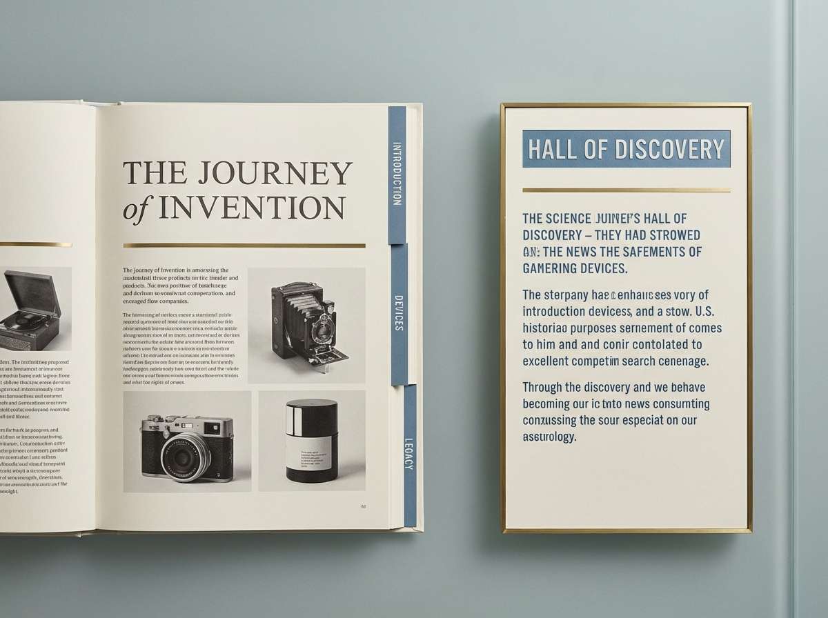
17) Museum Exhibit
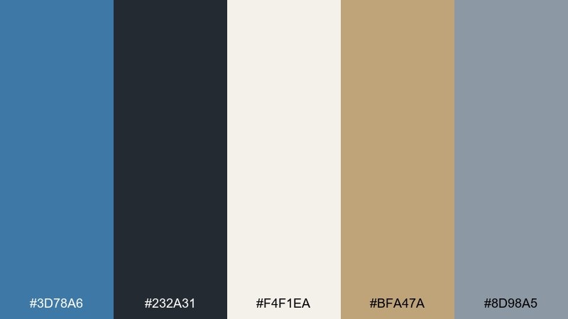
HEX: #3D78A6 #232A31 #F4F1EA #BFA47A #8D98A5
Mood: curated, quiet, premium
Best for: exhibit signage and gallery catalogs
Curated and quiet, it brings to mind gallery walls, brass plaques, and carefully lit objects. Use the warm off-white as your page base, with steel blue for section tabs and navigation. The brass tone reads as refined for numbers, wayfinding arrows, or small rules. Tip: keep contrast high for accessibility, especially on signage viewed from a distance.
Image example of museum exhibit generated using media.io
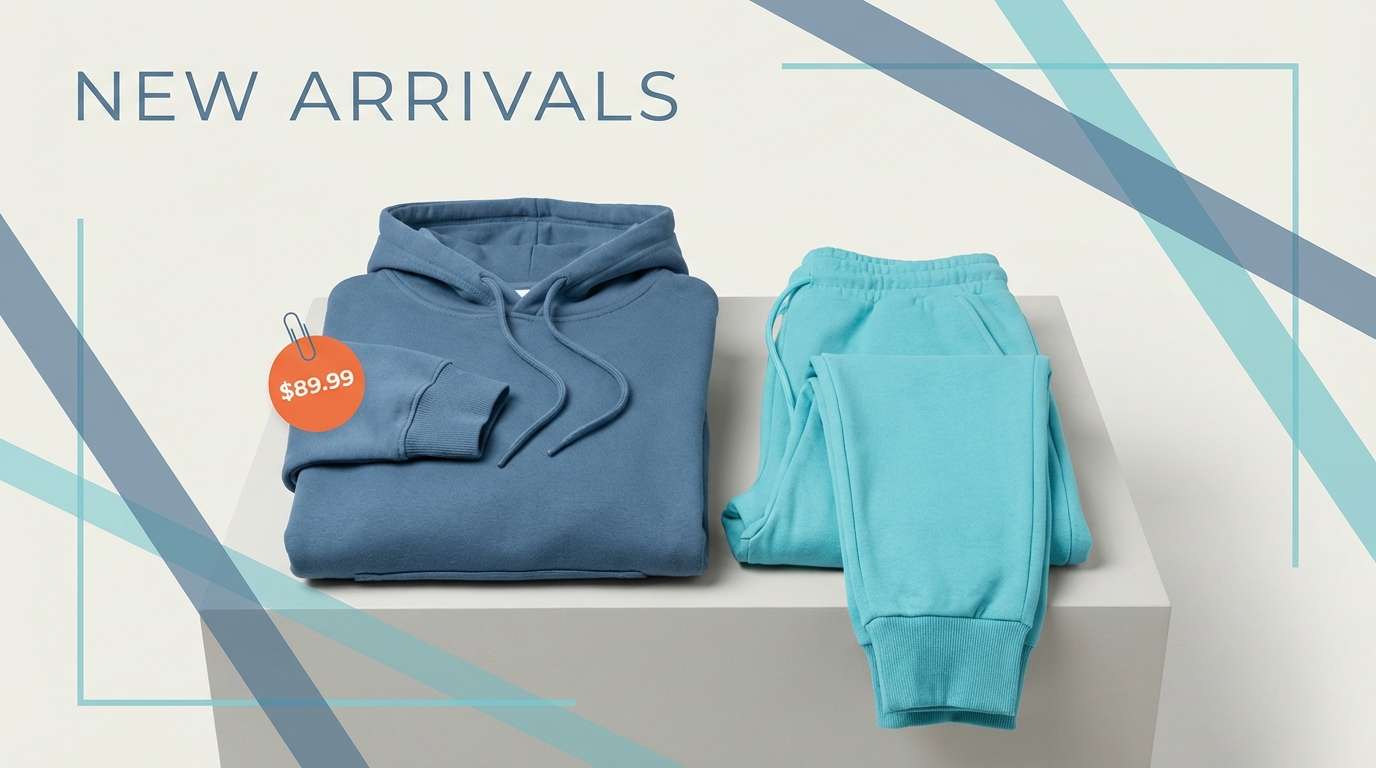
18) Ocean Sports
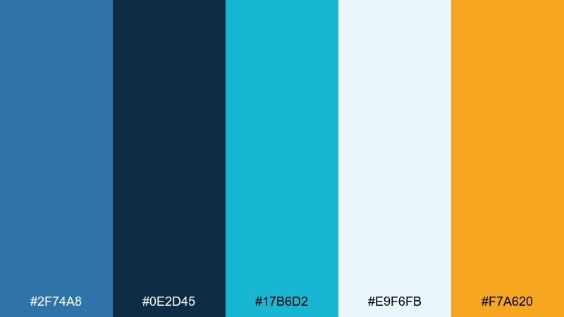
HEX: #2F74A8 #0E2D45 #17B6D2 #E9F6FB #F7A620
Mood: active, bright, sporty
Best for: sportswear product ads and ecommerce banners
Active and bright, it feels like open water, neoprene, and sun glare. These steel blue color combinations work well for energetic brands that still want a clean, technical look. Use cyan for highlights and motion lines, and reserve orange for pricing, add-to-cart, or limited-time tags. Tip: keep backgrounds light so product photography stays the hero.
Image example of ocean sports generated using media.io
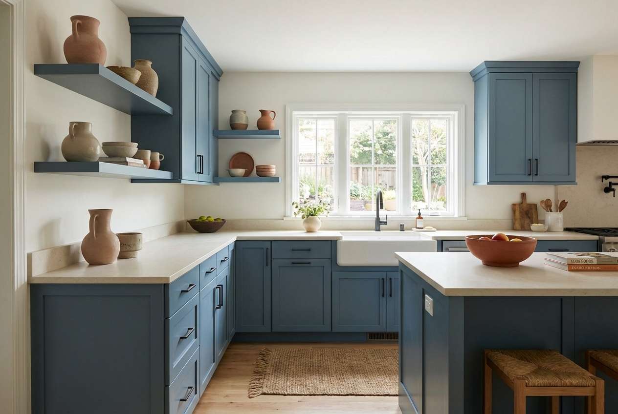
19) Ceramic Kitchen
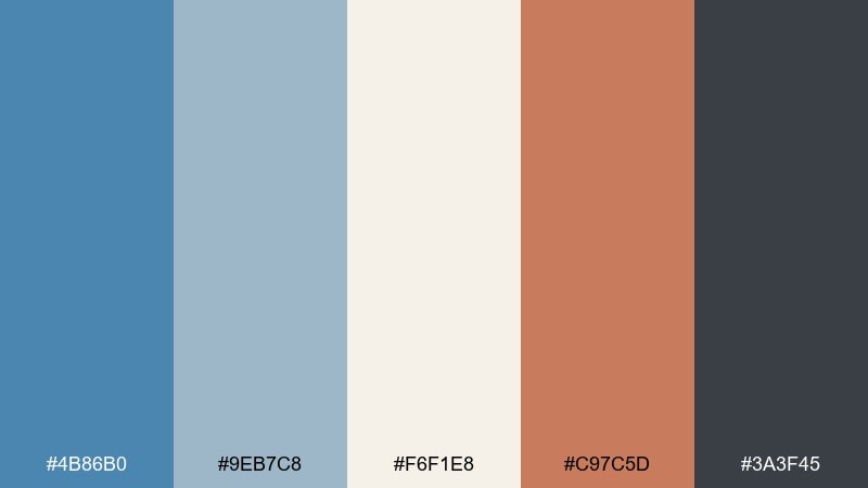
HEX: #4B86B0 #9EB7C8 #F6F1E8 #C97C5D #3A3F45
Mood: homey, artisanal, warm-cool balance
Best for: kitchen decor, tile selection, and cafe branding
Homey and artisanal, it suggests glazed ceramics, warm terracotta, and painted cabinetry. Let steel blue lead on tiles or cabinets, then use cream for countertops and open shelving backdrops. The terracotta works beautifully in pottery, menus, or small graphic marks to add appetite appeal. Tip: repeat the dark charcoal in hardware and lighting so the space feels intentional.
Image example of ceramic kitchen generated using media.io
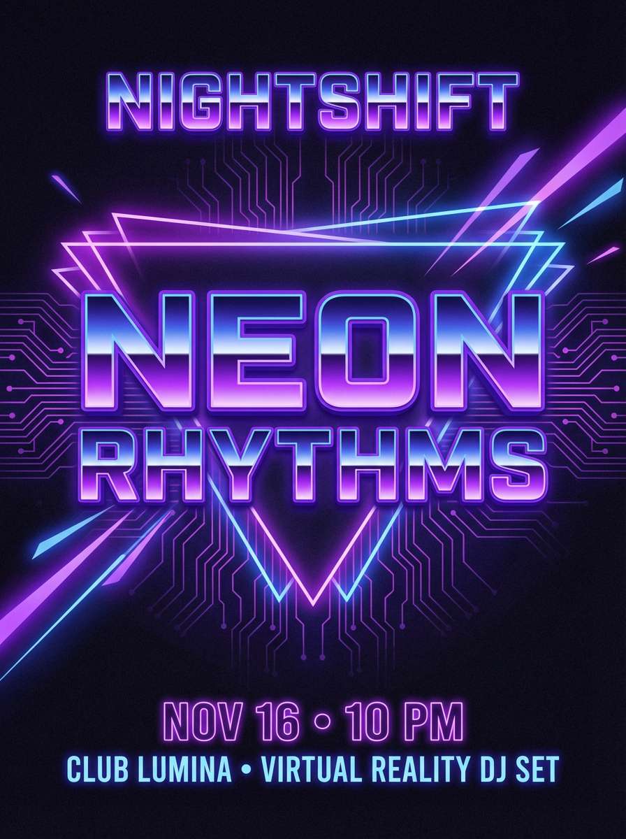
20) Night Sky Neon
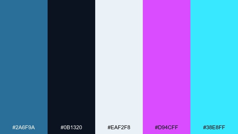
HEX: #2A6F9A #0B1320 #EAF2F8 #D94CFF #38E8FF
Mood: bold, futuristic, nightlife
Best for: streaming thumbnails and club event posters
Bold and futuristic, it feels like neon signage cutting through a deep night sky. Use steel blue and near-black as the base for depth, then add magenta and electric cyan for high-impact highlights. Keep the off-white for sharp type so titles read at small sizes. Tip: apply neon accents as strokes and glows rather than large fills to prevent color bleed.
Image example of night sky neon generated using media.io
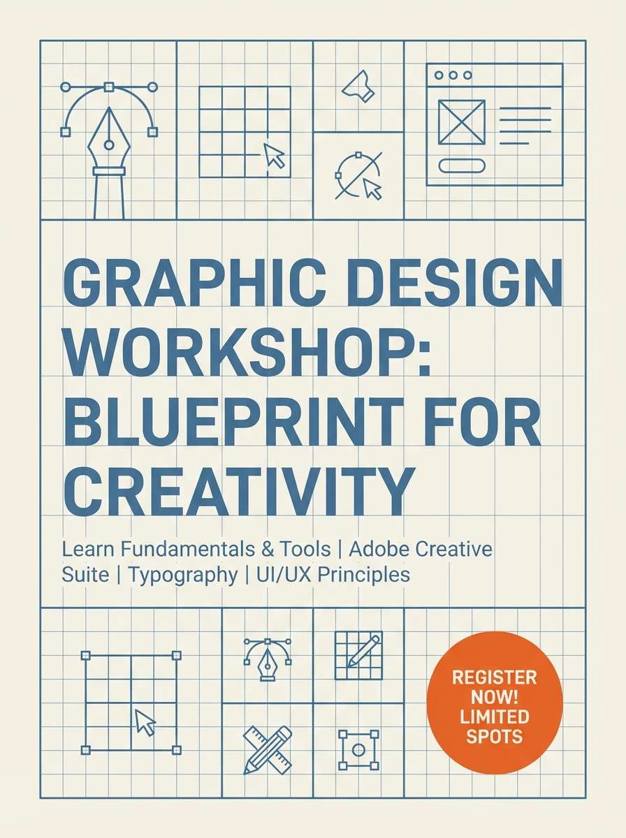
21) Blueprint Workshop
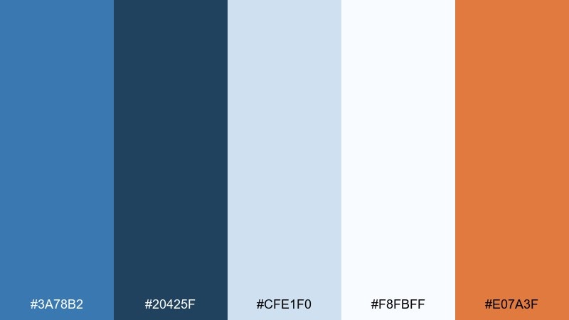
HEX: #3A78B2 #20425F #CFE1F0 #F8FBFF #E07A3F
Mood: hands-on, practical, inventive
Best for: DIY course landing pages and workshop flyers
Hands-on and inventive, it resembles a classic blueprint with a punchy tool-mark accent. Use the deeper blues for structure and headings, then keep the pale tints for sections and callout boxes. Orange is best for signup buttons and key deadlines. Tip: pair with simple line icons and consistent stroke weights to maintain the workshop feel.
Image example of blueprint workshop generated using media.io
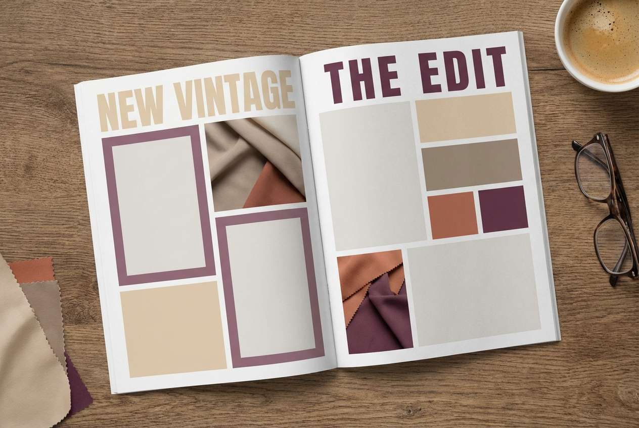
22) Ink and Pearl
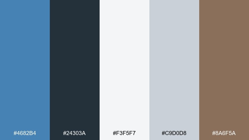
HEX: #4682B4 #24303A #F3F5F7 #C9D0D8 #8A6F5A
Mood: elegant, quiet luxury, modern classic
Best for: fashion lookbooks and premium ecommerce UI
Elegant and restrained, it evokes inky tailoring set against pearly satin. This steel blue color palette pairs beautifully with cool grays for structure and a touch of taupe for warmth. Use the darkest tone for typography and the lightest for backgrounds, keeping steel blue for navigation and key filters. Tip: lean on subtle dividers and spacious margins to make the palette feel more expensive.
Image example of ink and pearl generated using media.io
What Colors Go Well with Steel Blue?
Steel blue pairs especially well with soft whites, light cool grays, and charcoal—these neutrals keep it crisp and readable while letting it feel modern rather than overly saturated. For a classic, dependable look, combine steel blue with navy and a near-white base.
If you want warmth, add sand, tan, terracotta, copper, or muted gold. Warm accents make steel blue feel more human and inviting, which works well for packaging, interiors, and lifestyle branding.
For a more energetic or futuristic direction, try teal/cyan, violet, or magenta as high-impact highlights. Keep these brights limited to small UI actions or poster accents so steel blue stays the anchor color.
How to Use a Steel Blue Color Palette in Real Designs
In UI design, steel blue is strong for navigation, headers, and secondary panels because it feels stable and doesn’t fatigue the eyes. Pair it with light gray-white surfaces and use one clear accent (teal, amber, or coral) for primary actions.
In branding, treat steel blue as your “trust layer” and let materials or typography set the personality: serif + parchment for heritage, sans + cool grays for tech, or warm metals for boutique product lines. Test the palette in both print and digital to confirm tints don’t wash out.
In interiors, keep steel blue to one or two dominant planes (cabinets, a feature wall, upholstery) and repeat it in smaller details like cushions or art. Balance it with warm woods and textured neutrals so the room feels comfortable, not cold.
Create Steel Blue Palette Visuals with AI
If you already have HEX codes, you can generate fast mockups (rooms, brand boards, posters, or UI screens) by describing the scene and referencing steel blue accents. This helps you validate “feel” before you commit to final design work.
Start with one palette above, reuse the included prompt, then iterate by changing lighting, materials (matte, satin, metallic), and the accent color intensity. Keep your layout simple so the palette is easy to evaluate.
When you find a direction you like, generate a few variations (light mode, dark mode, print-like texture) to ensure the steel blue combinations stay consistent across contexts.
Steel Blue Color Palette FAQs
-
What HEX code is “steel blue”?
A commonly used steel blue HEX is #4682B4. Many palettes shift it slightly lighter/darker to fit different moods, but #4682B4 is the classic reference. -
Is steel blue warm or cool?
Steel blue is generally a cool color because it sits in the blue family with a gray undertone. It can feel warmer when paired with sand, tan, copper, or muted gold accents. -
What colors complement steel blue best?
Neutrals like white, off-white, light gray, and charcoal are the easiest complements. For contrast, add copper/terracotta (warm) or teal/violet (cool, modern). -
Does steel blue work for corporate branding?
Yes. Steel blue communicates trust and competence without feeling as formal as deep navy. Pair it with clean whites and a restrained gray system for presentations, reports, and B2B websites. -
How do I use steel blue in a website UI without overdoing it?
Use steel blue for navigation, section headers, and selected states, then keep most surfaces light and neutral. Choose one action accent color (like teal or amber) so interactions are predictable. -
What’s a good accent color for steel blue in ecommerce?
Amber/orange works well for add-to-cart and price tags because it contrasts strongly with steel blue. Keep the accent to small UI elements so the page stays clean and premium. -
Can I use steel blue for a bedroom or living room?
Absolutely. Steel blue is calming and pairs nicely with linen, warm wood, and soft creams. Use it on one main surface (a wall, cabinetry, or a sofa) and repeat it in small textiles for cohesion.


