

Gray silver sits at the sweet spot between minimal and premium. It feels clean like modern UI, but still carries a subtle metallic “finish” that elevates branding and interiors.
Below are curated gray silver palette combinations with HEX codes, plus practical tips for pairing accents, managing contrast, and generating on-brand visuals fast.
In this article
Why Gray Silver Palettes Work So Well
Gray silver palettes are naturally versatile because they behave like “quiet structure” in a layout or space. They create hierarchy through value (light-to-dark) instead of relying on loud hues.
Silver-leaning grays also read as modern and precise, which is why they’re common in SaaS dashboards, product pages, and premium brand identities. Even small shifts (cool, warm, blue-gray, violet-gray) can change the mood without breaking neutrality.
Most importantly, gray silver makes accents look intentional. One strong highlight color can do all the work for CTAs, status states, or decor, while the neutrals keep everything cohesive.
20+ Gray Silver Color Palette Ideas (with HEX Codes)
1) Urban Chrome
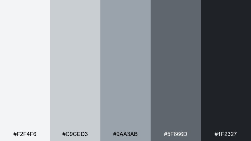
HEX: #f2f4f6 #c9ced3 #9aa3ab #5f666d #1f2327
Mood: sleek, metropolitan, high-contrast
Best for: SaaS dashboard UI and product analytics screens
Sleek and metropolitan, these tones feel like brushed metal against city night glass. The range moves from airy silver to deep charcoal, giving layouts a clear hierarchy without loud color. Use it for dashboards, admin panels, and data-heavy pages, then pair with a single accent like electric blue or lime for status states. Tip: reserve the darkest shade for text and nav, and keep mid-grays for cards to avoid a flat UI.
Image example of urban chrome generated using media.io
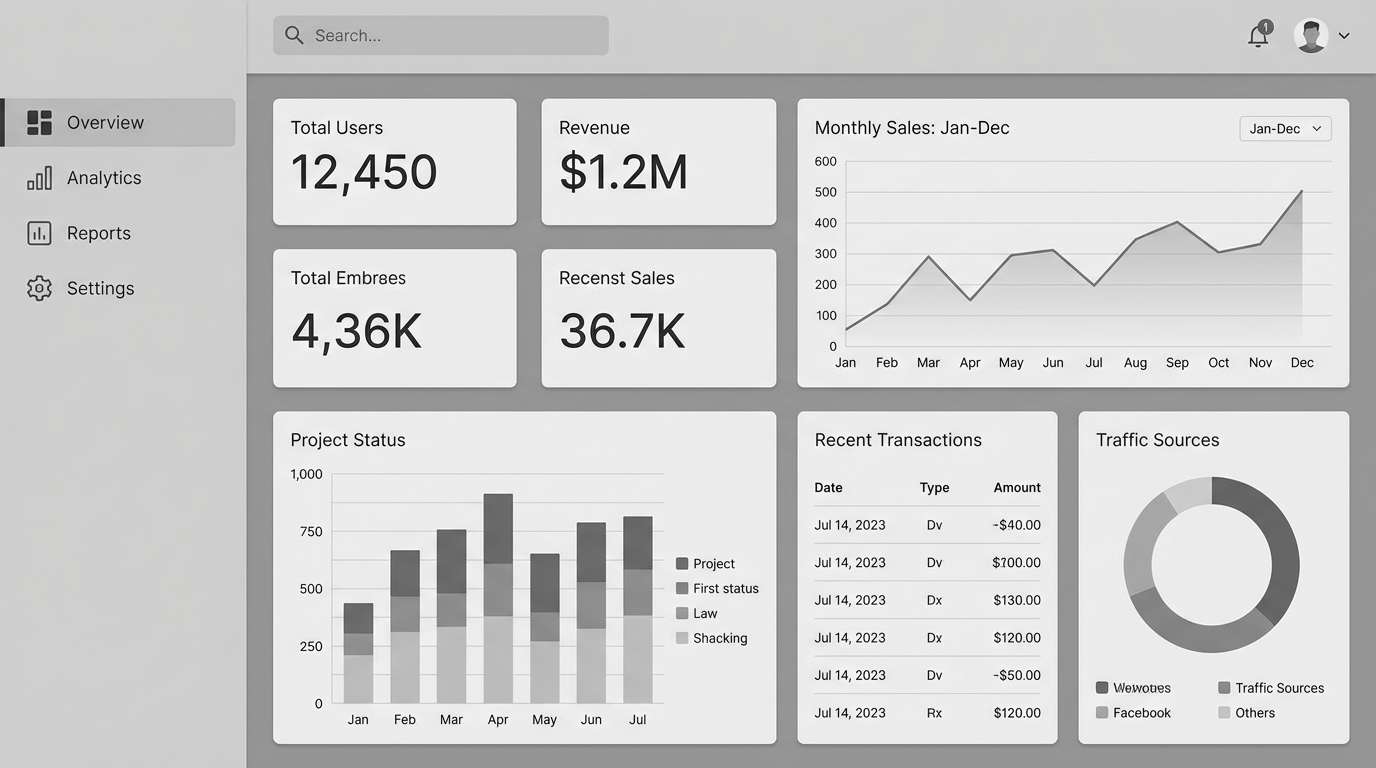
Media.io is an online AI studio for creating and editing video, image, and audio in your browser.

2) Foggy Harbor
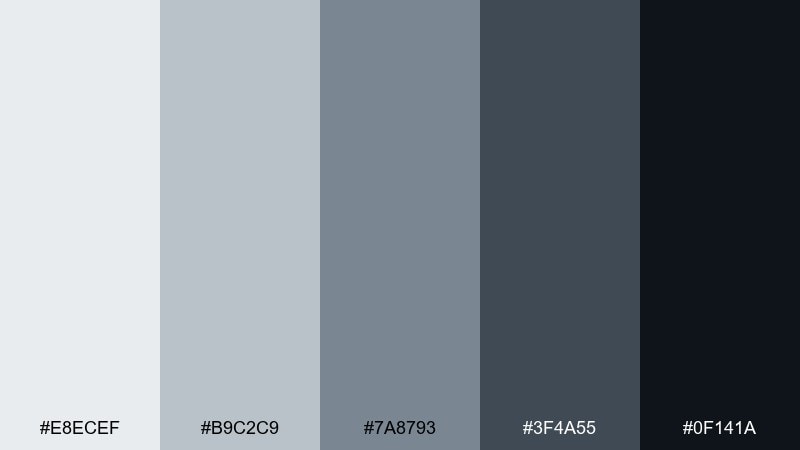
HEX: #e8ecef #b9c2c9 #7a8793 #3f4a55 #0f141a
Mood: misty, calm, coastal
Best for: modern living rooms and open-plan interiors
Misty and calm, it reads like early fog rolling over a quiet harbor. The cool silvers keep spaces airy while the inky base adds depth for focal points and hardware. It works beautifully on walls, cabinetry, and textiles when paired with warm oak, linen, or matte black fixtures. Tip: repeat the lightest shade on ceilings and trim to make low-light rooms feel taller.
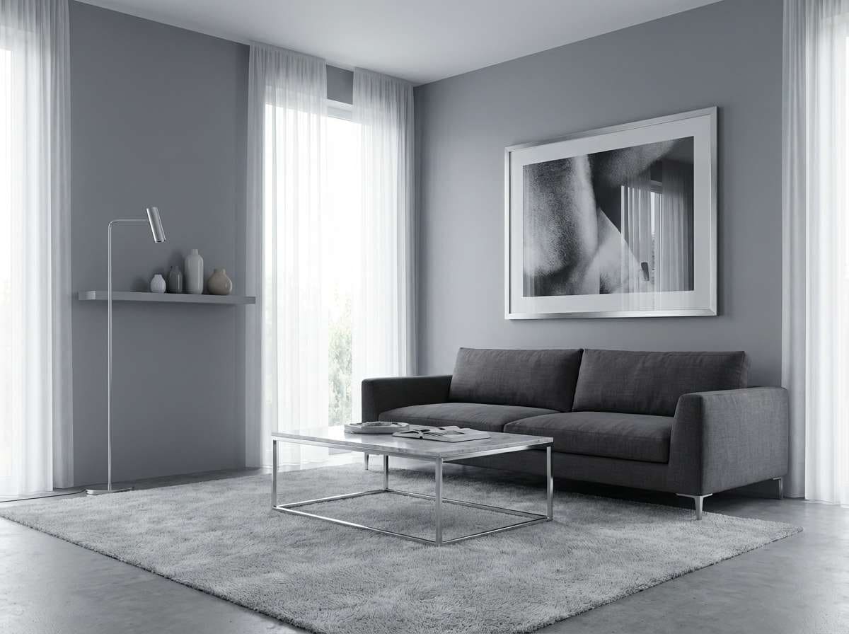
Image example of foggy harbor generated using media.io
3) Satin Graphite
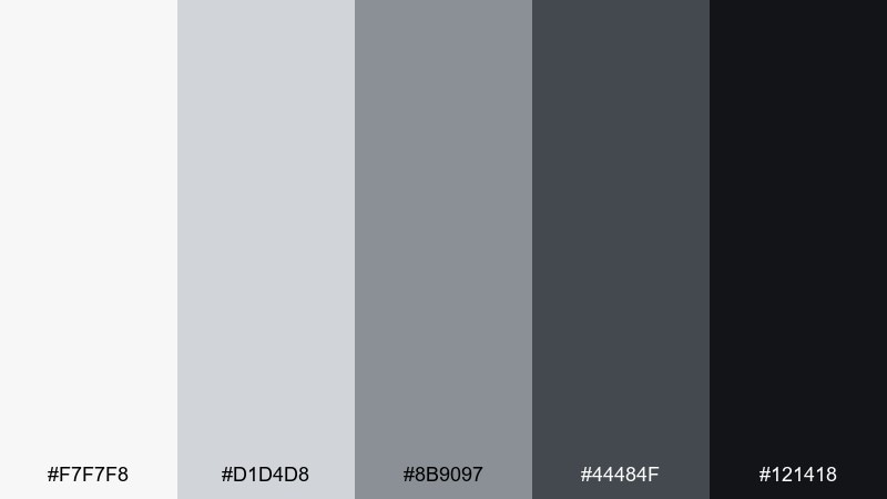
HEX: #f7f7f8 #d1d4d8 #8b9097 #44484f #121418
Mood: refined, editorial, modern
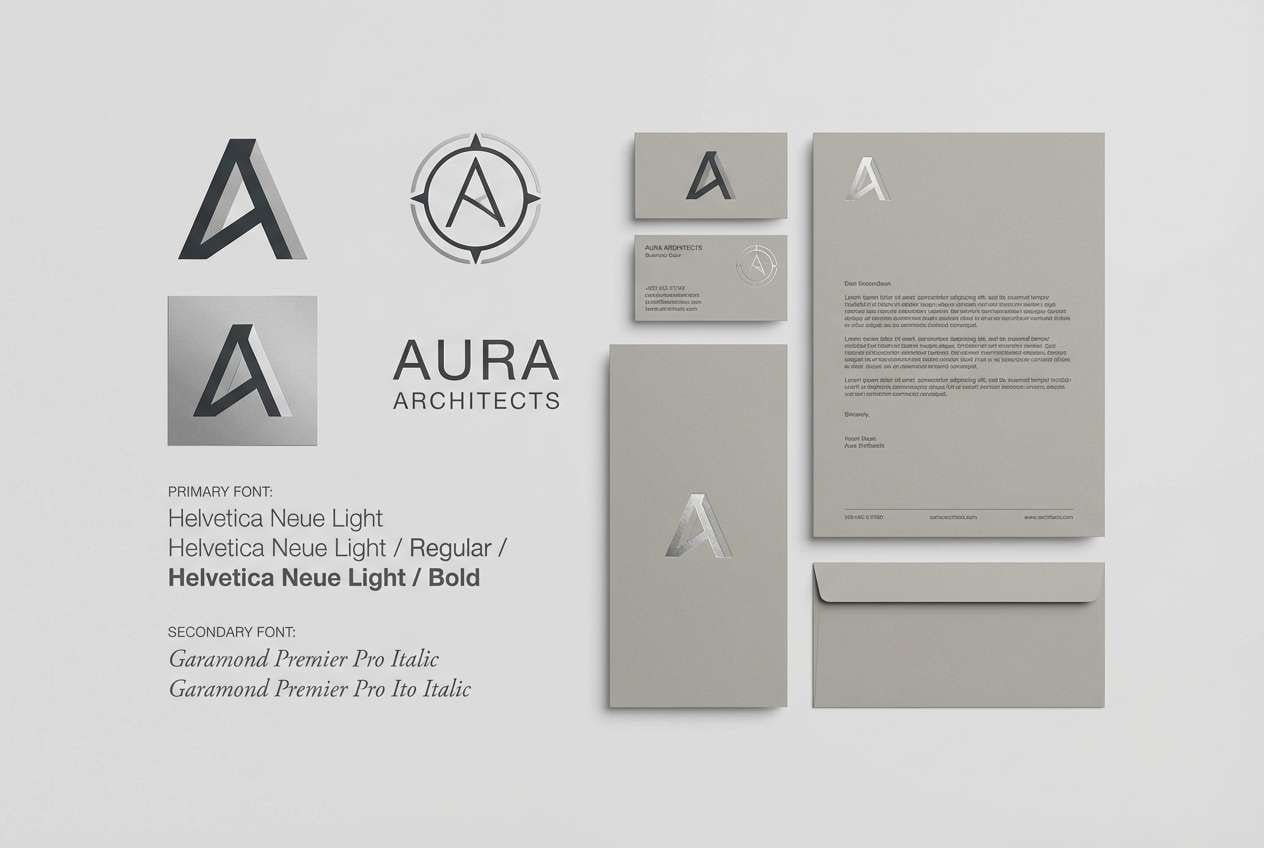
Best for: brand identity for tech and premium services
Refined and editorial, the satin highlights and graphite shadows feel like a fresh magazine spread. This gray silver color palette is a safe bet for premium brands that want restraint without looking cold. Pair it with a warm neutral like oat or a confident accent like cobalt to add personality. Tip: use the near-black for logos and headlines, then keep backgrounds in off-white to preserve contrast.
Image example of satin graphite generated using media.io
4) Pearl Workshop
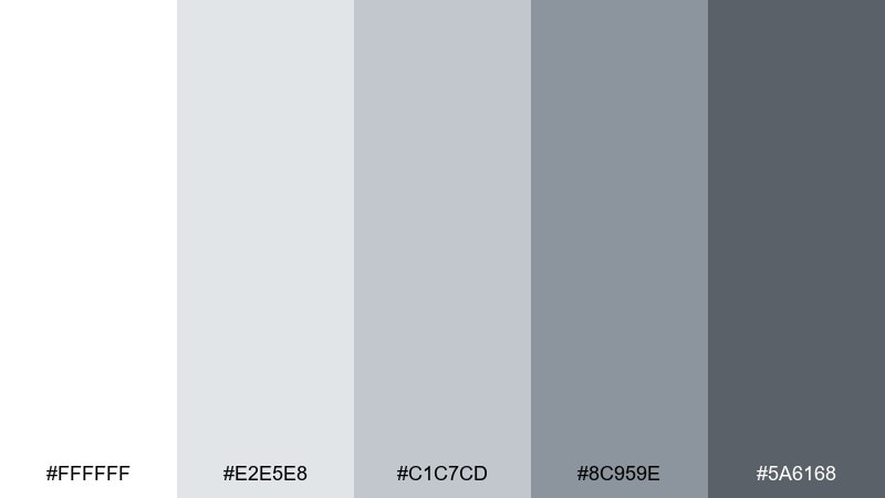
HEX: #ffffff #e2e5e8 #c1c7cd #8c959e #5a6168
Mood: bright, practical, studio-clean
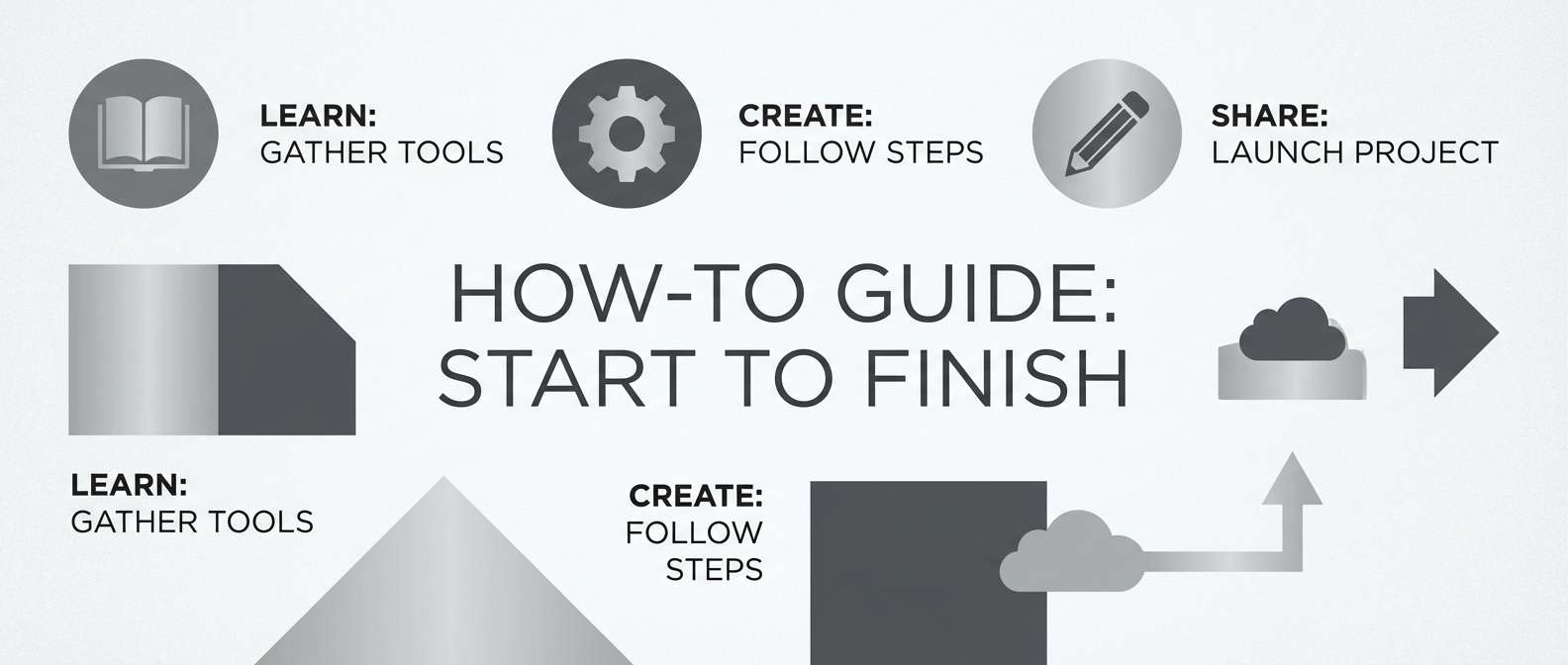
Best for: craft stores, workshop blogs, and how-to thumbnails
Bright and practical, it feels like a sunlit studio with neatly labeled drawers. The clean whites keep content readable while the mid-grays add structure for borders, captions, and callouts. Use it for tutorials, ecommerce categories, and step-by-step graphics, then pair with one friendly pop color like coral or mint. Tip: keep shadows subtle by using the second-darkest shade sparingly to avoid a gritty look.
Image example of pearl workshop generated using media.io
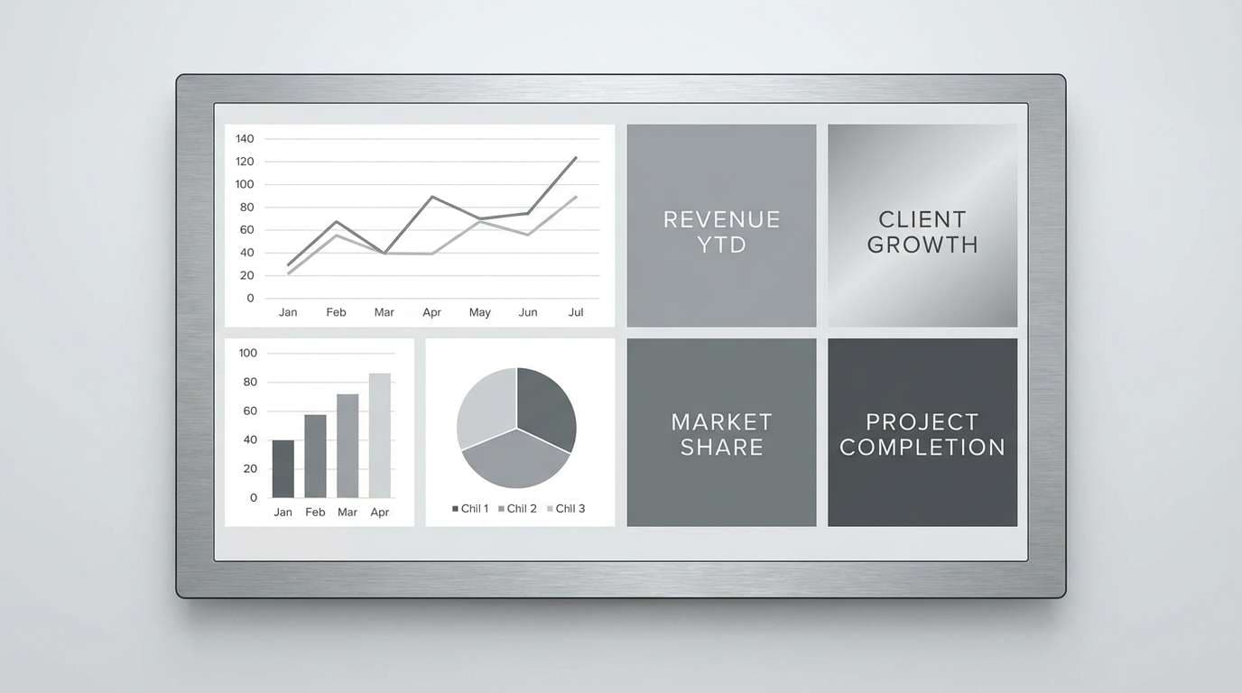
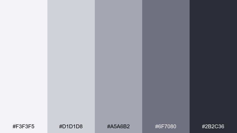
5) Lunar Concrete
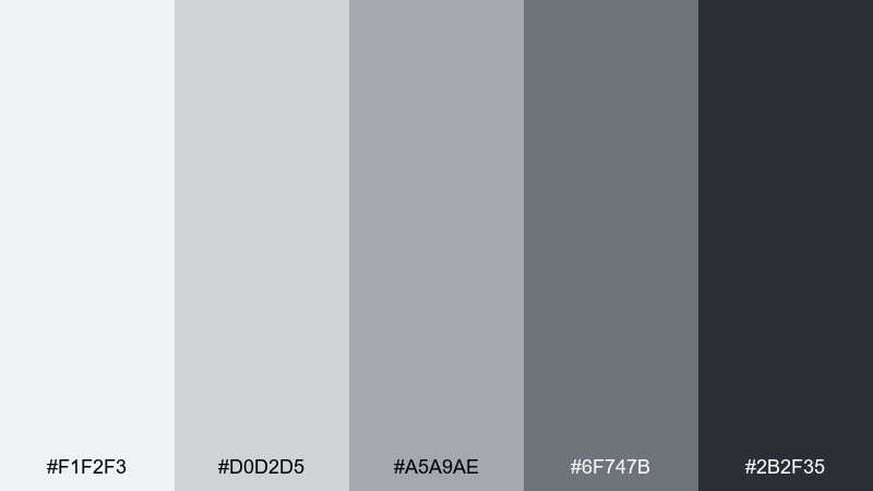
HEX: #f1f2f3 #d0d2d5 #a5a9ae #6f747b #2b2f35
Mood: industrial, grounded, architectural
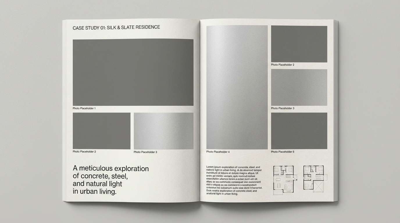
Best for: architecture portfolios and project case studies
Industrial and grounded, it evokes moonlit concrete and crisp edges. The palette supports large imagery while keeping captions, grids, and diagrams neat. It suits architecture sites, product case studies, and presentation decks, especially when paired with warm wood photos or copper accents. Tip: use the darkest tone only for key labels so the overall page stays spacious.
Image example of lunar concrete generated using media.io
6) Birch Ash
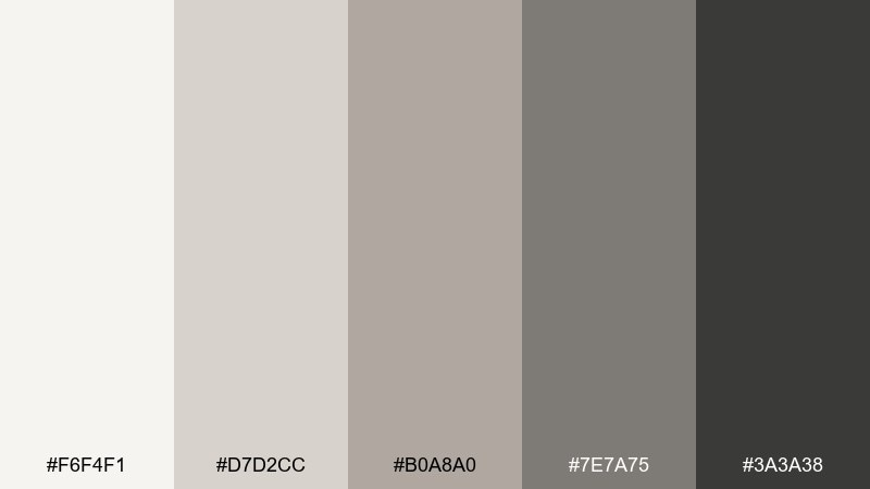
HEX: #f6f4f1 #d7d2cc #b0a8a0 #7e7a75 #3a3a38
Mood: warm neutral, organic, cozy
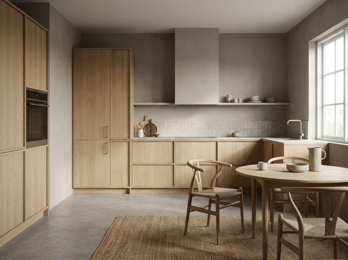
Best for: Scandinavian kitchens and lifestyle branding
Warm and organic, it looks like birch bark and soft fireplace ash. This gray silver color combination leans cozy, making it ideal for lifestyle brands that want neutral calm without stark white. Pair with natural textures like stoneware, cotton, and pale oak, and add a muted sage or clay accent for seasonal variation. Tip: keep the warm beige-gray as your primary background to prevent the scheme from feeling cold.
Image example of birch ash generated using media.io
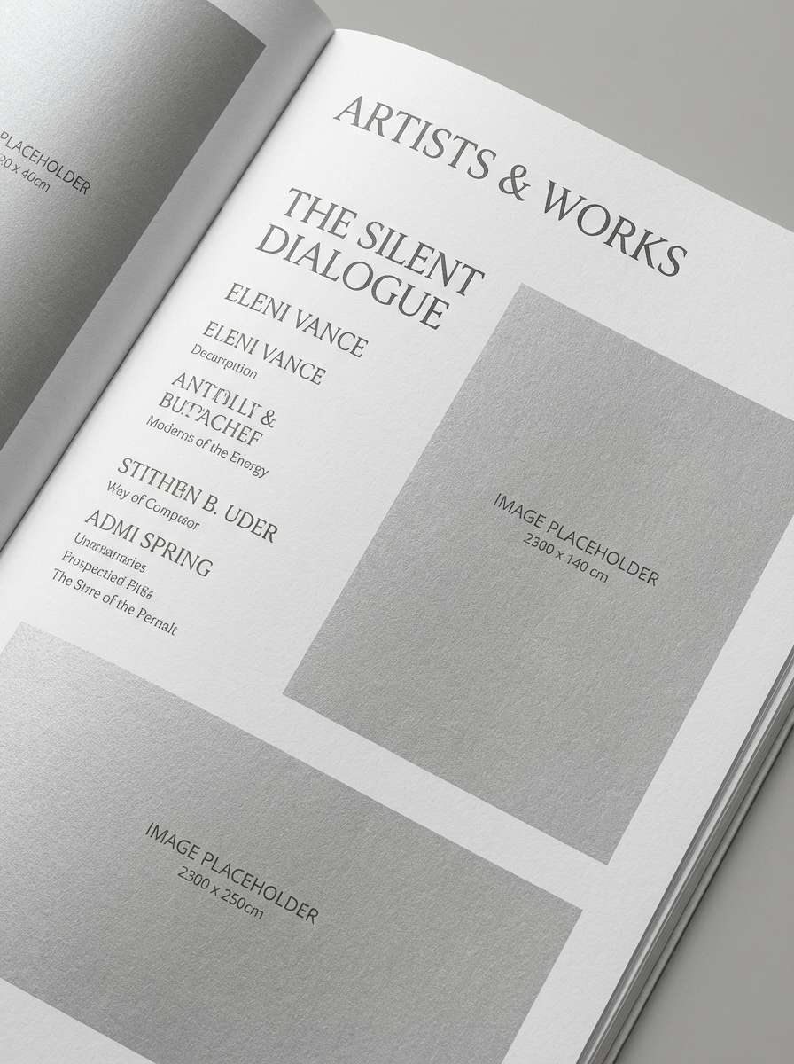
7) Museum Minimal
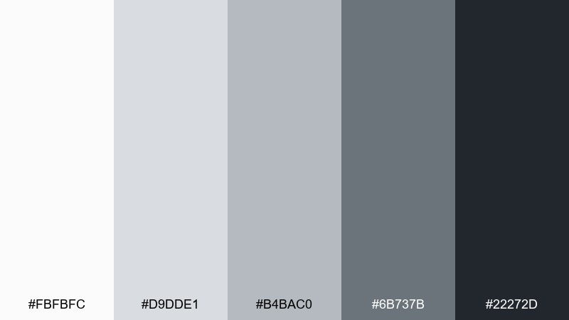
HEX: #fbfbfc #d9dde1 #b4bac0 #6b737b #22272d
Mood: quiet luxury, gallery-like, crisp
Best for: art galleries, museums, and exhibition catalogs
Quiet and gallery-like, it recalls white walls, polished signage, and hushed rooms. The soft silvers keep attention on artwork while the charcoal anchors titles and navigation. Use it in catalogs, event pages, and exhibit wayfinding, then pair with one refined accent like deep burgundy for highlights. Tip: set generous whitespace and thin rules using the light gray to get that museum-grade finish.
Image example of museum minimal generated using media.io
8) Stormy Steel
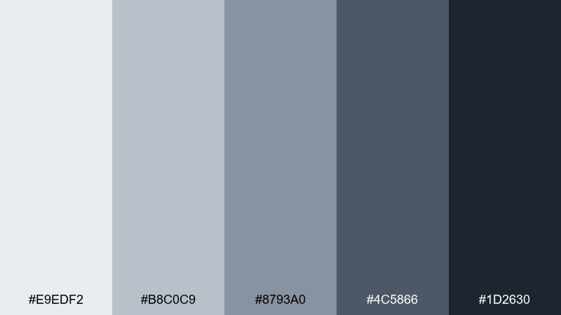
HEX: #e9edf2 #b8c0c9 #8793a0 #4c5866 #1d2630
Mood: dramatic, cool, confident
Best for: gaming sites and cinematic landing pages
Dramatic and cool, it feels like steel clouds before a storm. The blue-leaning grays add tension and energy without moving into full color. Use it for hero sections, trailers, and bold CTAs, then pair with neon cyan or hot magenta for a modern edge. Tip: apply the darkest shade as a vignette behind headlines to make type pop instantly.
Image example of stormy steel generated using media.io

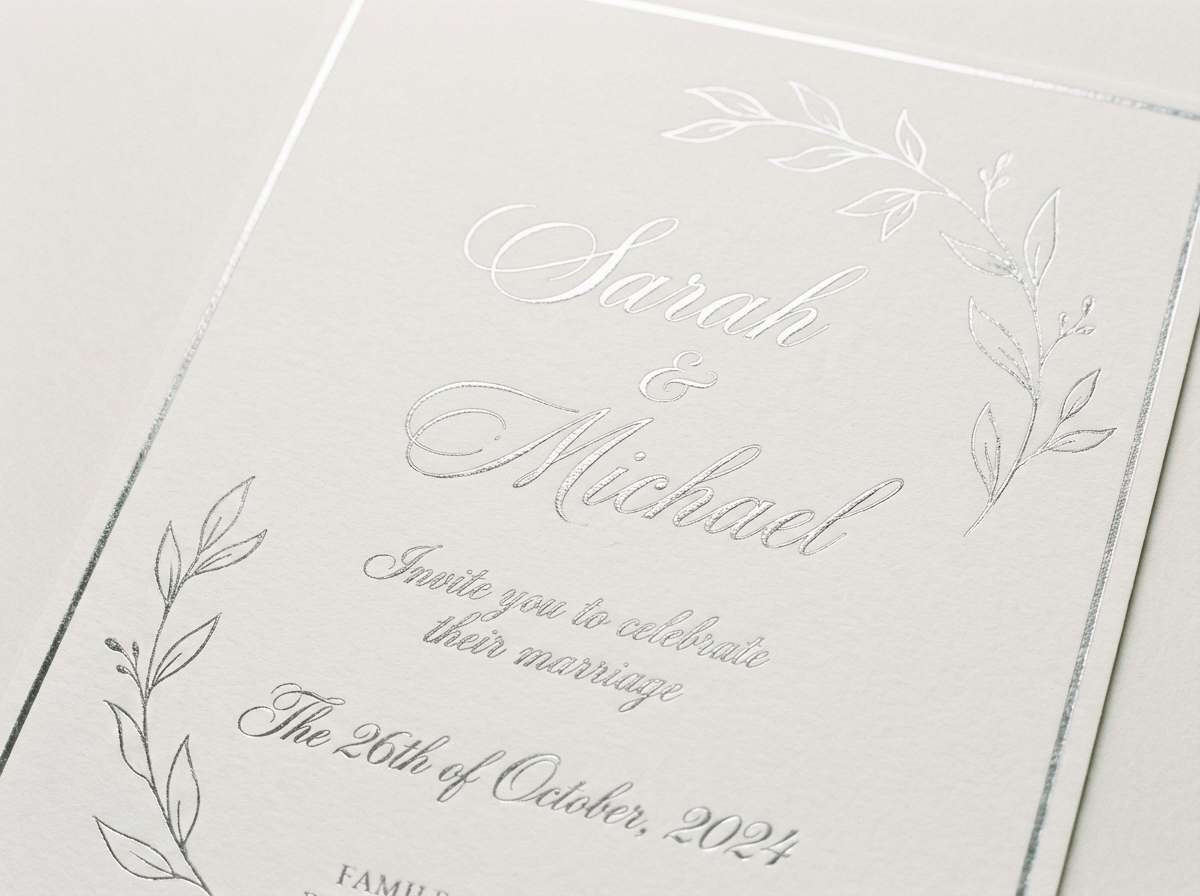
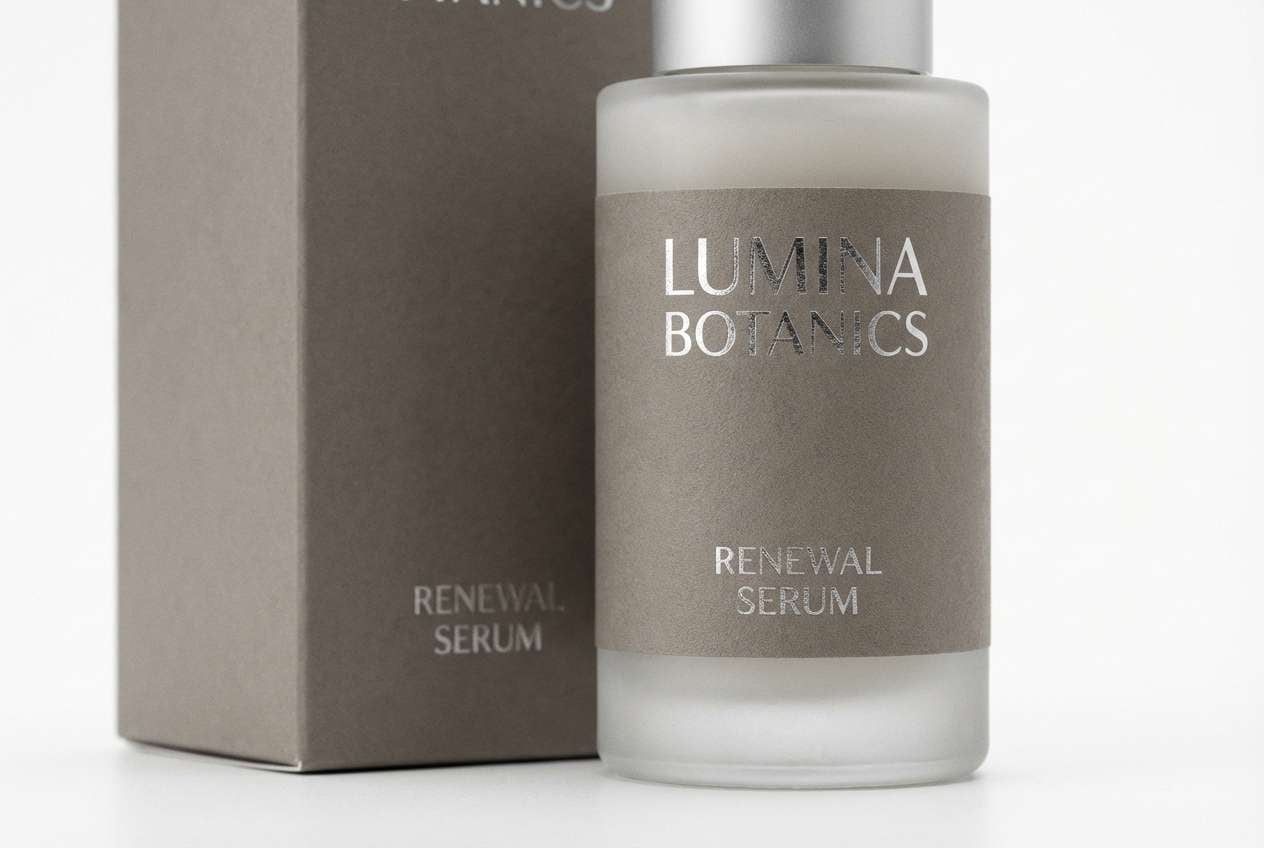
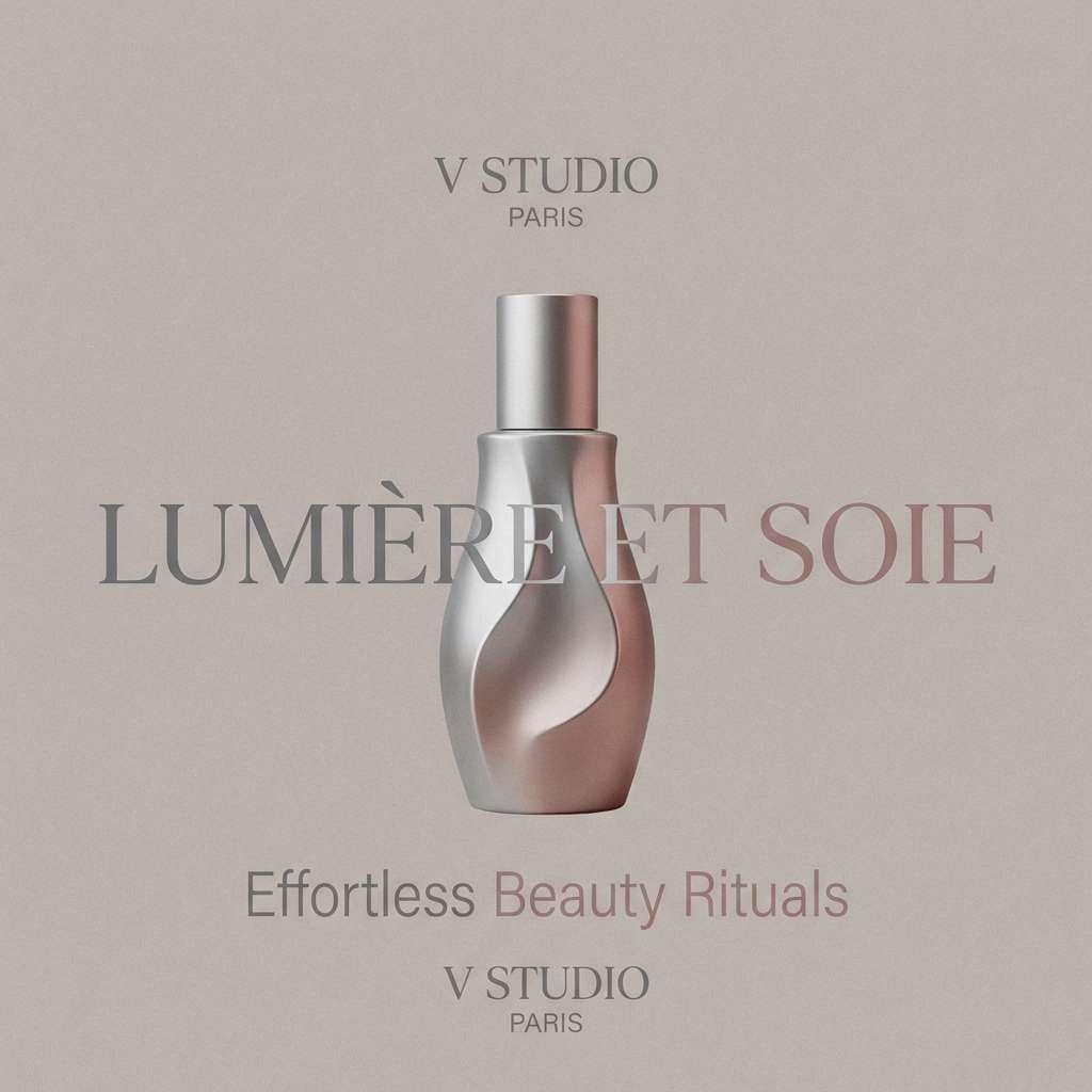
9) Cold Champagne
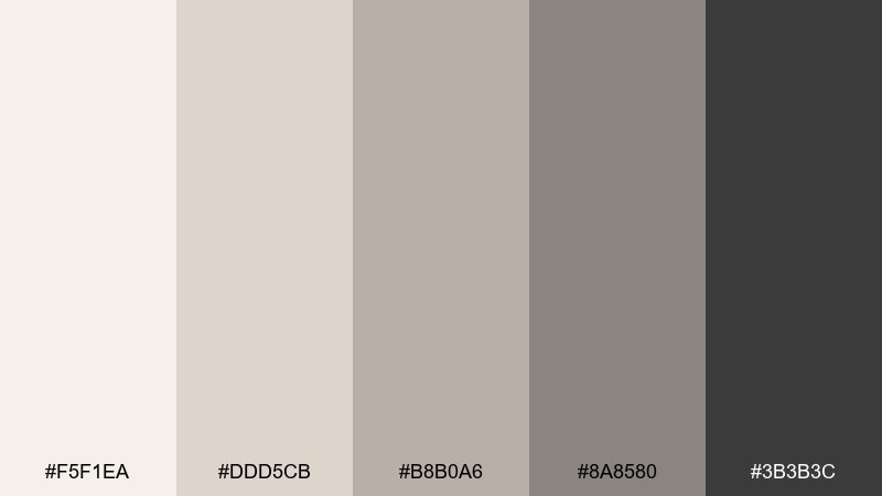
HEX: #f5f1ea #ddd5cb #b8b0a6 #8a8580 #3b3b3c
Mood: elegant, softly warm, celebratory
Best for: wedding invitations and upscale event branding
Elegant and softly warm, it suggests chilled champagne, satin ribbon, and candlelit glassware. These gray silver color combinations work well for formal invitations, menus, and venue signage, especially with metallic foil effects. Pair with blush, ivory, or a deep green to create a romantic contrast that still feels modern. Tip: simulate silver foil by using the lightest shade as the highlight and the mid-gray for subtle bevel shadows.
Image example of cold champagne generated using media.io
10) Circuit Dust
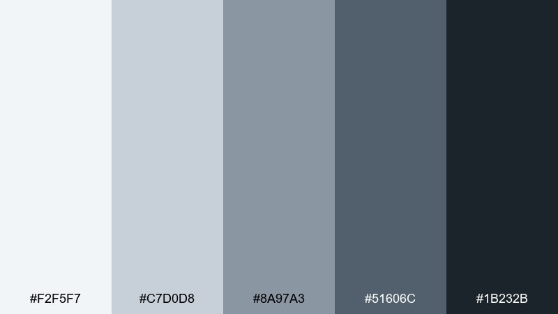
HEX: #f2f5f7 #c7d0d8 #8a97a3 #51606c #1b232b
Mood: technical, crisp, slightly futuristic
Best for: developer docs and enterprise UI systems
Technical and crisp, it feels like clean hardware brushed down after a build. The cool midtones are perfect for tables, code blocks, and subtle dividers that do not fight readability. Use it for docs, design systems, and B2B apps, and pair with a single bright accent for links and active states. Tip: keep contrast accessible by using the darkest shade for body text and the palest for page backgrounds.
Image example of circuit dust generated using media.io
11) Winter Cashmere
HEX: #faf8f6 #e3ded9 #c3bbb3 #8e877f #4c4743
Mood: soft, comforting, understated
Best for: cosmetics packaging and wellness products
Soft and comforting, it brings to mind cashmere wraps and quiet winter mornings. The warm gray neutrals flatter skincare and wellness visuals, making labels feel gentle and trustworthy. Pair with matte gold, dusty pink, or muted lavender to add a premium touch without shouting. Tip: print-friendly designs look best when you keep large areas in the two lightest shades and reserve dark tones for small type only.
Image example of winter cashmere generated using media.io
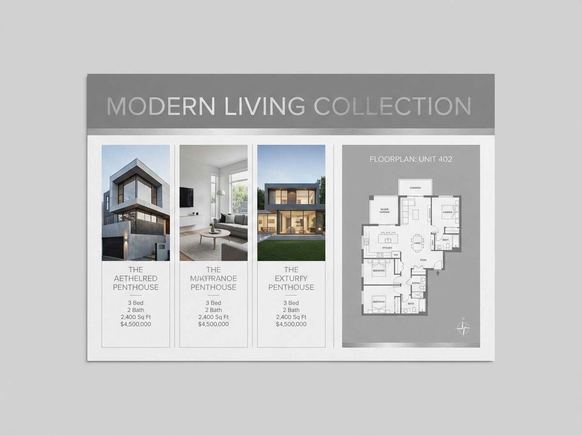
12) Monochrome Loft
HEX: #f8f9fa #d4d7db #aeb4bb #707983 #2d333a
Mood: modern, airy, urban-home
Best for: real estate listings and property brochures
Modern and airy, it feels like a sunlit loft with concrete floors and clean lines. The balanced mid-grays are great for floorplan overlays, listing cards, and subtle icons. Pair with warm wood photography or a muted terracotta accent to keep the look inviting. Tip: keep listing price tags in the darkest shade for instant scanability.
Image example of monochrome loft generated using media.io
13) Glacier Ink
HEX: #edf3f7 #c4d1dc #90a5b5 #4c6a7f #10202c
Mood: icy, nautical, intelligent
Best for: finance apps and trust-first branding
Icy and intelligent, it reads like glacier water meeting dark ink. The blue-gray shift adds confidence for finance, consulting, and security brands without going overly corporate. Pair with a crisp white and a restrained teal accent for buttons and highlights. Tip: use the deep navy-gray for charts and key numbers to keep data legible on light backgrounds.
Image example of glacier ink generated using media.io
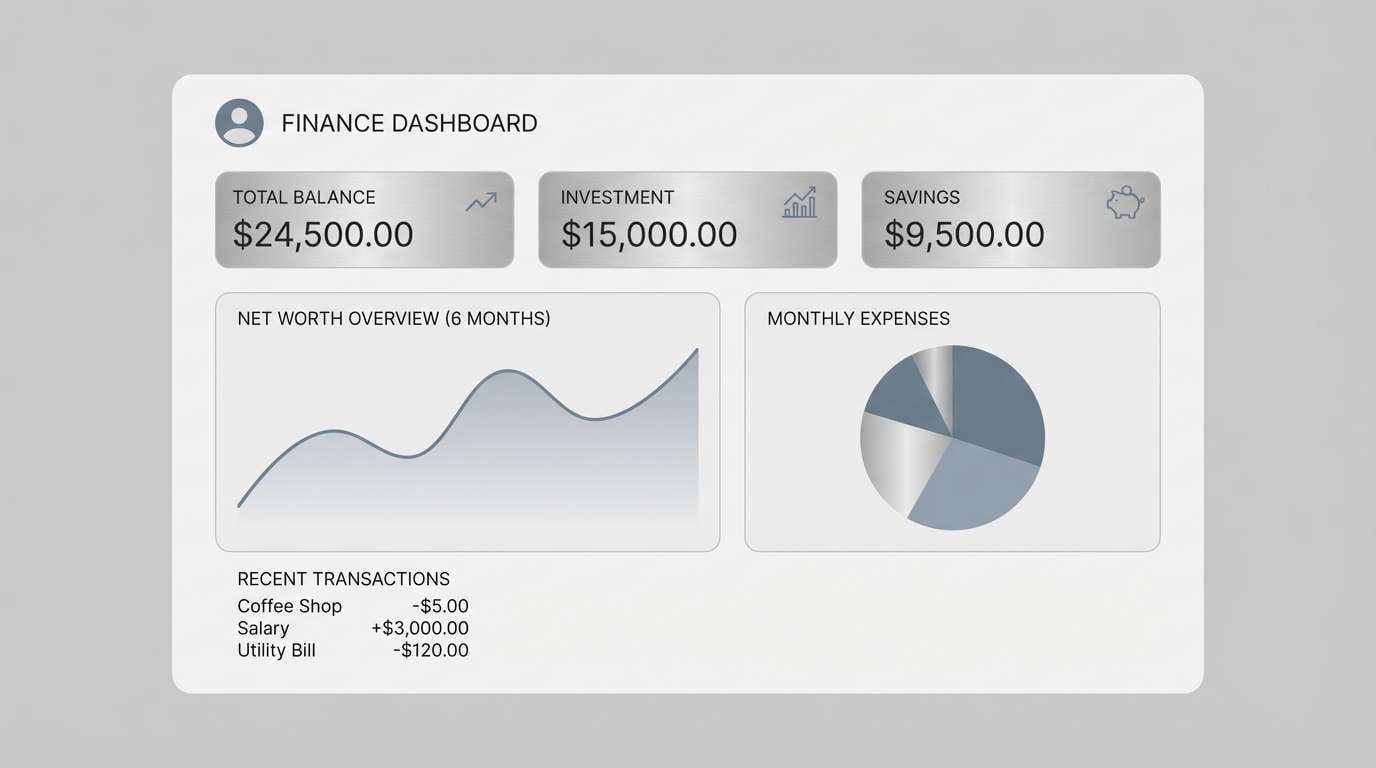
14) Quiet Alloy
HEX: #f4f6f8 #cfd5db #a0a8b1 #6a727c #2a3036
Mood: balanced, professional, understated
Best for: corporate slide decks and annual reports
Balanced and professional, it feels like a well-tailored suit with a subtle sheen. This gray silver color palette keeps presentations sharp while leaving room for charts, photography, and brand accents. Pair with one signature color from your logo to guide attention across sections. Tip: apply the mid-gray to grid lines and table borders so data stays readable without visual clutter.
Image example of quiet alloy generated using media.io
15) Soft Pewter Rose
HEX: #f7f1f3 #e0d3d6 #bfa8ae #8b6f77 #3f2f35
Mood: romantic, modern vintage, gentle
Best for: beauty brands and boutique social posts
Romantic with a modern vintage twist, it blends pewter with a dusty rose hush. The soft pink-gray makes skin tones feel flattering in photography while keeping typography crisp. Pair with creamy whites and a touch of metallic silver for a luxe finish. Tip: use the deepest plum-gray for small text only, letting the lighter tones do the heavy lifting.
Image example of soft pewter rose generated using media.io
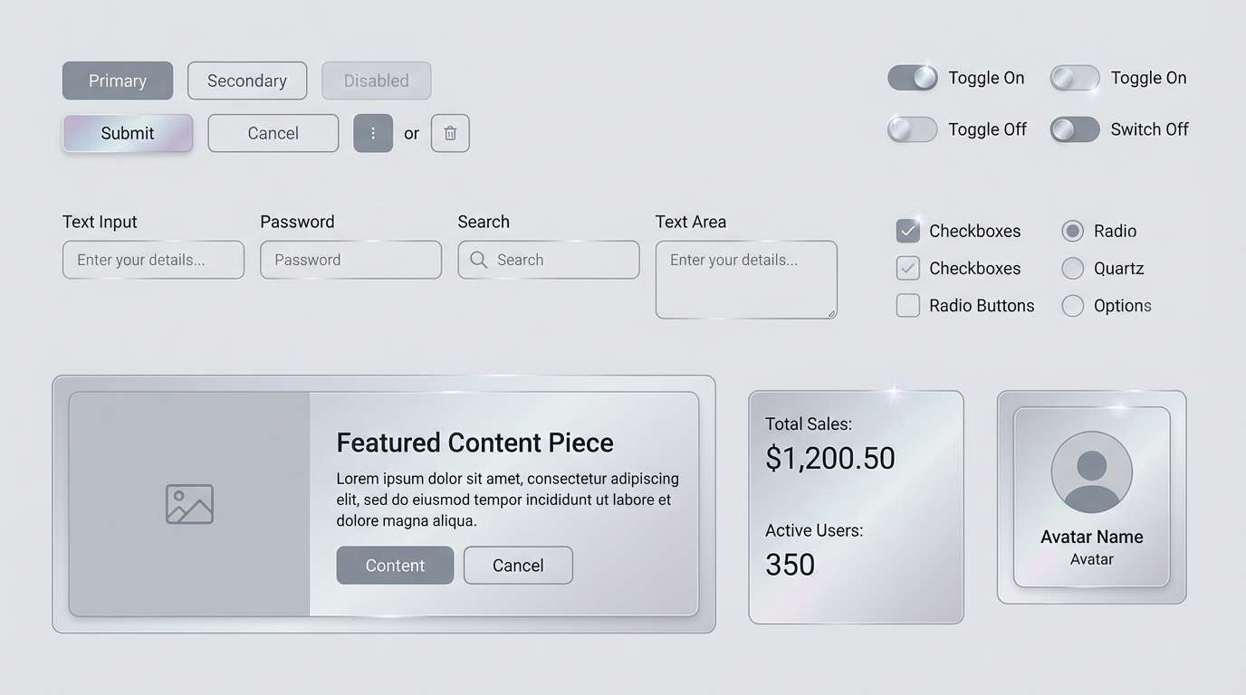
16) Metro Quartz
HEX: #f3f3f5 #d1d1d8 #a5a6b2 #6f7080 #2b2c36
Mood: cool, polished, contemporary
Best for: mobile app UI kits and component libraries
Cool and polished, it brings to mind quartz reflections under station lights. The slightly violet-leaning grays give interfaces a fresh, contemporary feel without becoming colorful. Pair with bright white and a single saturated accent for selected states and badges. Tip: keep disabled components in the two lightest shades so accessibility contrast stays under control.
Image example of metro quartz generated using media.io
17) Steel and Sand
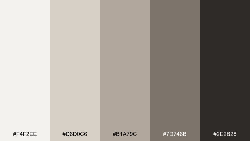
HEX: #f4f2ee #d6d0c6 #b1a79c #7d746b #2e2b28
Mood: earthy, modern rustic, grounded
Best for: cafe menus and hospitality branding
Earthy and grounded, it mixes steel neutrals with sand-warmed grays. The palette feels welcoming for cafes, hotels, and packaging that needs a natural, modern edge. Pair with kraft paper textures, espresso browns, and a muted green for a calm, organic look. Tip: print menus on an off-white stock and use the darkest shade only for headings and prices.
Image example of steel and sand generated using media.io
18) Mercury Dusk
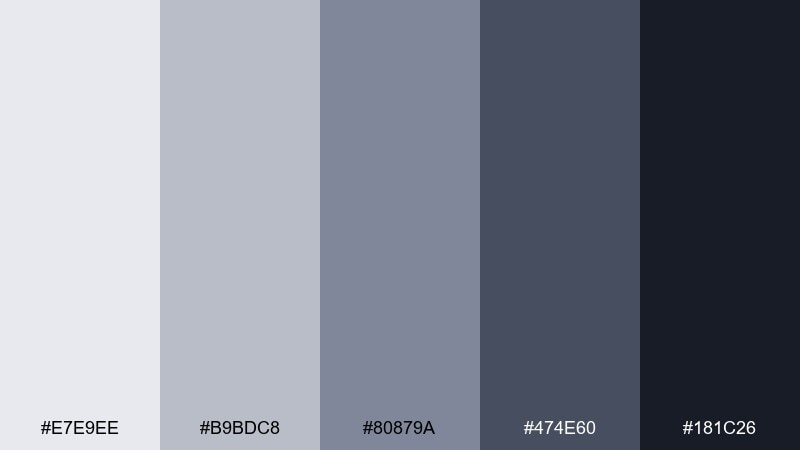
HEX: #e7e9ee #b9bdc8 #80879a #474e60 #181c26
Mood: moody, cinematic, futuristic
Best for: album covers and event posters
Moody and cinematic, it looks like mercury reflections fading into dusk. These gray silver color combinations shine on posters and covers where typography needs to feel sharp and modern. Pair with a single high-voltage accent like acid green or ultraviolet for instant impact. Tip: use grain or a subtle gradient between the mid and dark tones to avoid banding in large backgrounds.
Image example of mercury dusk generated using media.io

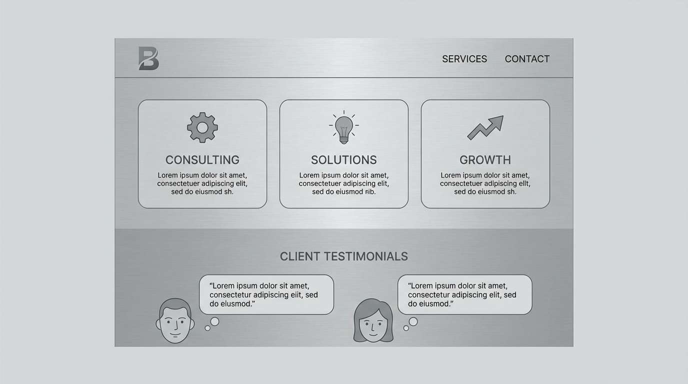
19) Polished Slate
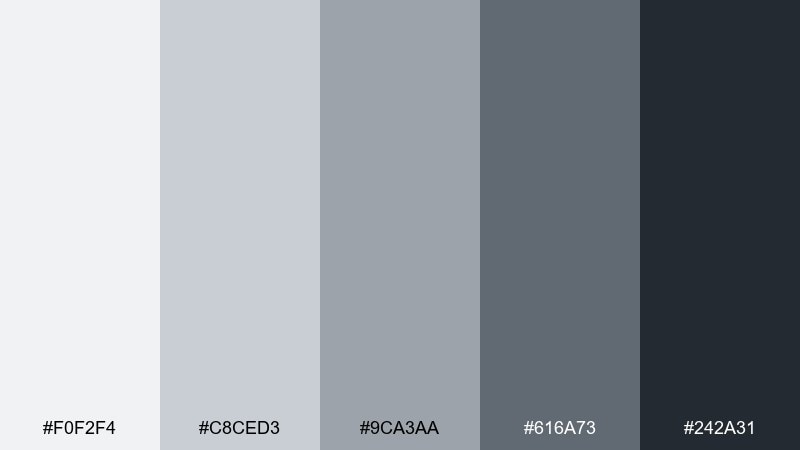
HEX: #f0f2f4 #c8ced3 #9ca3aa #616a73 #242a31
Mood: clean, dependable, modern classic
Best for: business websites and service landing pages
Clean and dependable, it feels like polished slate after rain. The middle values are ideal for section breaks, icon fills, and subtle button states that still read clearly. Pair with a warm accent like amber or a calm teal to make CTAs feel intentional. Tip: keep backgrounds in the lightest two shades and use slate only for navigation and footer blocks.
Image example of polished slate generated using media.io
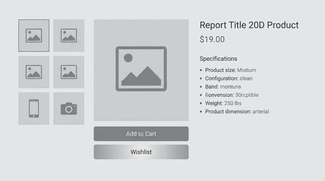
20) Clouded Titanium
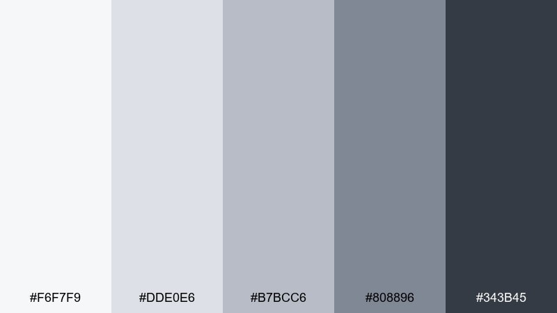
HEX: #f6f7f9 #dde0e6 #b7bcc6 #808896 #343b45
Mood: light, airy, tech-forward
Best for: hardware product pages and ecommerce galleries
Light and tech-forward, it evokes clouded titanium and precision-cut edges. The gentle contrast makes products feel premium while keeping pages bright and scroll-friendly. Pair with clean white space, subtle shadows, and a single accent color for buy buttons. Tip: use the third shade for borders and separators so gallery grids stay crisp without looking heavy.
Image example of clouded titanium generated using media.io
What Colors Go Well with Gray Silver?
Gray silver pairs effortlessly with crisp whites, near-blacks, and charcoal because they share the same neutral base. This keeps layouts clean and makes typography and spacing feel more intentional.
For accents, choose either “cold energy” (electric blue, cyan, lime) or “warm sophistication” (amber, blush, oat, muted terracotta). The more neutral your grays are, the more saturated your accent can be without looking messy.
If you want a softer, premium finish, use muted greens, dusty pinks, and deep burgundy. These tones add character while letting the silver grays stay in control.
How to Use a Gray Silver Color Palette in Real Designs
Start by assigning roles: one light background, one surface/card gray, one mid-gray for borders, and one dark for text and navigation. This prevents the common “everything is the same gray” problem and keeps contrast predictable.
In UI, reserve your brightest accent for interactive states (primary CTA, active tab, links), and keep all secondary UI chrome (dividers, disabled states) within the light-to-mid grays. In interiors or branding, repeat one silver tone across materials (metal, stone, fabric) so the palette feels deliberate rather than accidental.
When you need extra depth, add texture: subtle gradients, soft shadows, or grain can make silver palettes feel tactile and less flat—especially in large backgrounds.
Create Gray Silver Palette Visuals with AI
If you’re building mood boards, UI mockups, or branded graphics, generating quick visuals helps you confirm whether your gray silver tones feel cool, warm, or perfectly neutral in context.
With Media.io, you can turn prompts (like “dashboard UI,” “catalog layout,” or “wedding invitation”) into consistent palette-driven images—ideal for testing typography contrast, product presentation, and overall vibe.
Pick one palette above, reuse its prompt, and tweak only the subject (UI, interior, poster) to keep your look cohesive across designs.
Gray Silver Color Palette FAQs
-
What’s the difference between gray and silver in design?
Gray is typically a neutral without shine, while silver suggests a lighter, slightly metallic-looking gray. In digital design, “silver” usually means higher brightness with cool undertones and crisp contrast. -
How do I keep a gray silver palette from feeling flat?
Use strong value separation (light background + dark text), add one accent color for focus, and introduce texture via subtle gradients, shadows, or grain. Also vary surfaces: backgrounds, cards, and borders should not share the same gray. -
What accent colors look best with gray silver?
For modern UI: cyan, electric blue, lime, or magenta. For elegant branding: amber, blush, deep green, or burgundy. Choose one primary accent and keep the rest neutral to avoid a “muddy” look. -
Is gray silver good for accessibility in UI?
Yes, if you manage contrast carefully. Use the darkest shade for body text, keep backgrounds in the lightest shades, and test interactive elements to ensure they meet contrast guidelines. -
Which gray silver palette is best for dashboards?
Urban Chrome, Circuit Dust, and Glacier Ink are strong choices because they offer clear hierarchy from off-white to near-black, making tables, charts, and navigation easy to scan. -
Which gray silver palette works for warm, cozy interiors or lifestyle brands?
Birch Ash, Winter Cashmere, and Steel and Sand lean warmer and more organic. They pair especially well with oak, linen, stone textures, and muted green accents. -
Can I generate matching mockups for these palettes quickly?
Yes. Use Media.io’s text-to-image tool, keep the palette consistent, and reuse a base prompt (UI kit, living room render, poster layout) while changing only the scene details to create a coherent set.


