

Royal color palettes are built on deep blues, rich purples, and warm metallic accents that instantly signal quality, tradition, and confidence.
Below are modern royal color combinations with HEX codes—easy to plug into branding, UI, packaging, invites, and decor without looking old-fashioned.
In this article
- Why Royal Palettes Work So Well
-
- crown jewel
- velvet throne
- scepter and silk
- regency library
- emerald court
- imperial nightfall
- gilded orchid
- sapphire procession
- burgundy mantle
- palace marble
- sunlit heraldry
- royal harbor
- winter coronation
- amethyst parade
- crown and canvas
- royal garden watercolor
- midnight masquerade
- porcelain tiara
- dragon crest
- silk banner
- antique crownroom
- What Colors Go Well with Royal?
- How to Use a Royal Color Palette in Real Designs
- Create Royal Palette Visuals with AI
Why Royal Palettes Work So Well
Royal tones feel elevated because they combine dark, stable bases (navy, midnight, plum) with luminous accents (gold, ivory, blush) that create instant hierarchy. Your eye naturally reads them as “foreground” and “detail,” which is perfect for premium layouts.
These colors also carry cultural cues—formal uniforms, ceremonial fabrics, and heritage materials—so even modern designs can borrow that sense of authority and craftsmanship without adding extra decoration.
When you keep gold controlled and let neutrals do the heavy lifting, a royal color scheme becomes versatile: it can look minimal for UI, cinematic for posters, or warm and inviting for hospitality.
20+ Royal Color Palette Ideas (with HEX Codes)
1) Crown Jewel
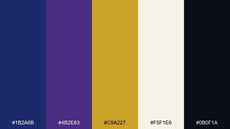
HEX: #1B2A6B #4B2E83 #C9A227 #F5F1E6 #0B0F1A
Mood: majestic and high-contrast
Best for: luxury branding and premium packaging
Majestic and high-contrast, it evokes velvet curtains, polished gold, and a midnight procession. The mix of sapphire blue and amethyst reads like a royal color palette without feeling costume-like. Use the dark shade for backgrounds, let the gold act as a disciplined accent, and keep the ivory for breathing room. Pair with foil stamping or embossed details to amplify the premium feel, and limit gold to key touchpoints like logos or seals.
Image example of crown jewel generated using media.io
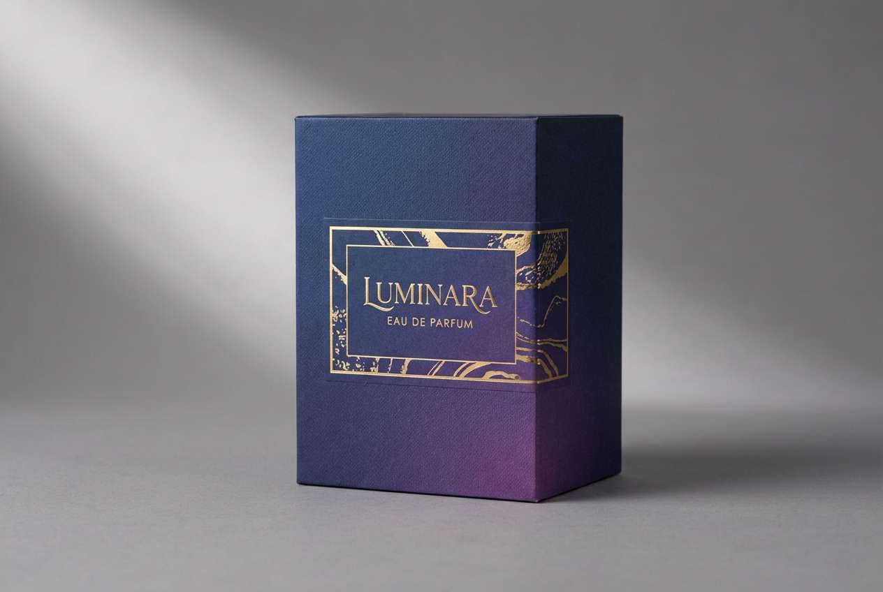
Media.io is an online AI studio for creating and editing video, image, and audio in your browser.

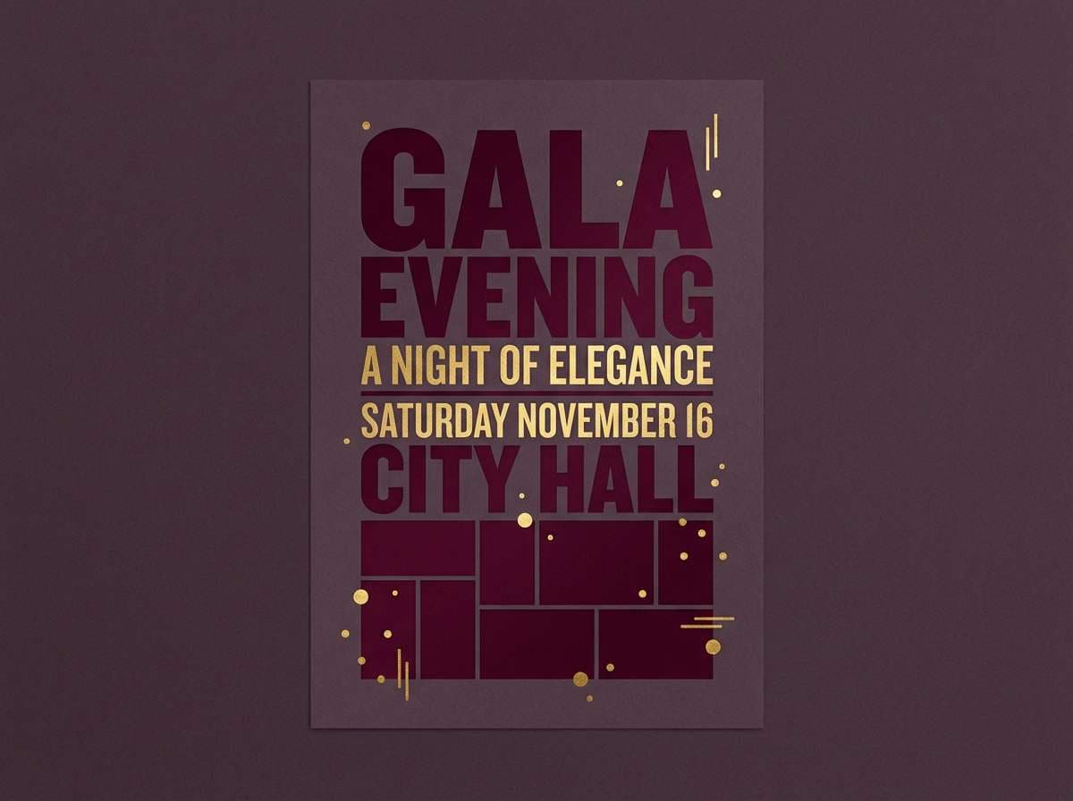
2) Velvet Throne
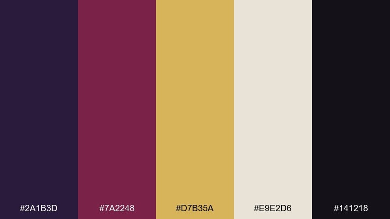
HEX: #2A1B3D #7A2248 #D7B35A #E9E2D6 #141218
Mood: dramatic and theatrical
Best for: poster design for events and performances
Dramatic and theatrical, it feels like candlelight catching velvet drapes and gilded frames. The wine red adds emotion while the deep plum keeps the look grounded. Use the pale neutral as the stage for typography, then reserve gold for dates, icons, and small borders. A condensed serif paired with a clean sans will keep the drama elegant instead of loud.
Image example of velvet throne generated using media.io
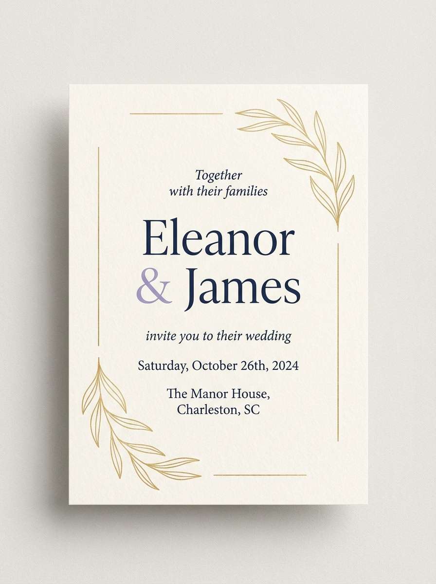
3) Scepter and Silk
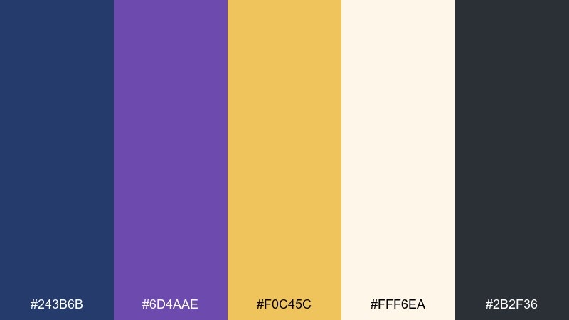
HEX: #243B6B #6D4AAE #F0C45C #FFF6EA #2B2F36
Mood: romantic and polished
Best for: wedding invitations and formal stationery
Romantic and polished, it brings to mind silk ribbons, wax seals, and a soft candle glow. Lavender-purple keeps the tone celebratory while the navy adds structure for headings and monograms. Place the cream shade as the main paper color, then use gold for linework or small motifs like crests. For a clean finish, keep body text in charcoal and avoid using navy for long paragraphs.
Image example of scepter and silk generated using media.io
4) Regency Library
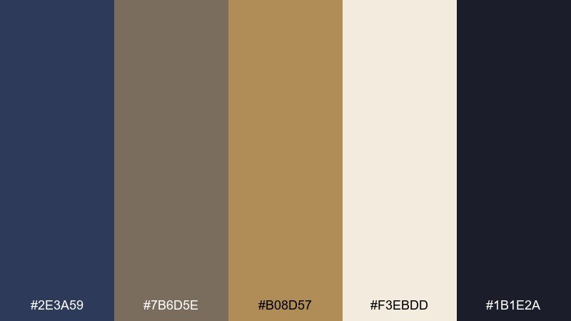
HEX: #2E3A59 #7B6D5E #B08D57 #F3EBDD #1B1E2A
Mood: scholarly and stately
Best for: editorial layouts and book design
Scholarly and stately, it recalls leather spines, walnut desks, and warm lamplight. The muted browns soften the navy so pages feel classic, not cold. Use the cream tone for background and margins, then bring in gold-brown for pull quotes and section dividers. A subtle paper texture and generous whitespace will make the palette feel expensive and readable.
Image example of regency library generated using media.io
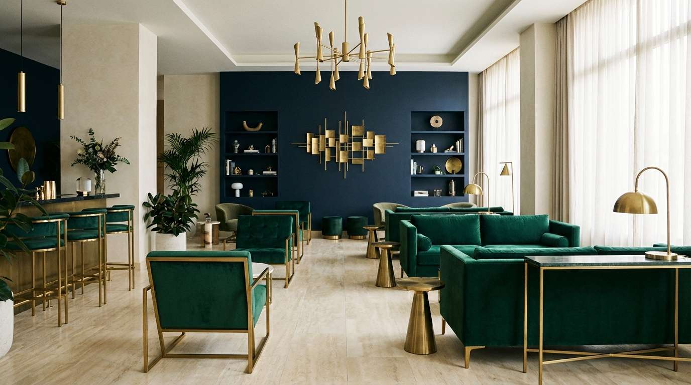
5) Emerald Court
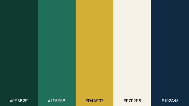
HEX: #0E3B2E #1F6F5B #D4AF37 #F7F2E8 #102A43
Mood: opulent and verdant
Best for: hotel interiors and upscale decor accents
Opulent and verdant, it feels like an emerald hall with brass fixtures and cool stone. The greens carry the richness, while navy adds depth for trim, signage, or feature walls. Keep the light neutral dominant to avoid a heavy room, then sprinkle gold through hardware, frames, or lighting. A good tip is to use the darker green on one focal surface and repeat it in small textiles for cohesion.
Image example of emerald court generated using media.io
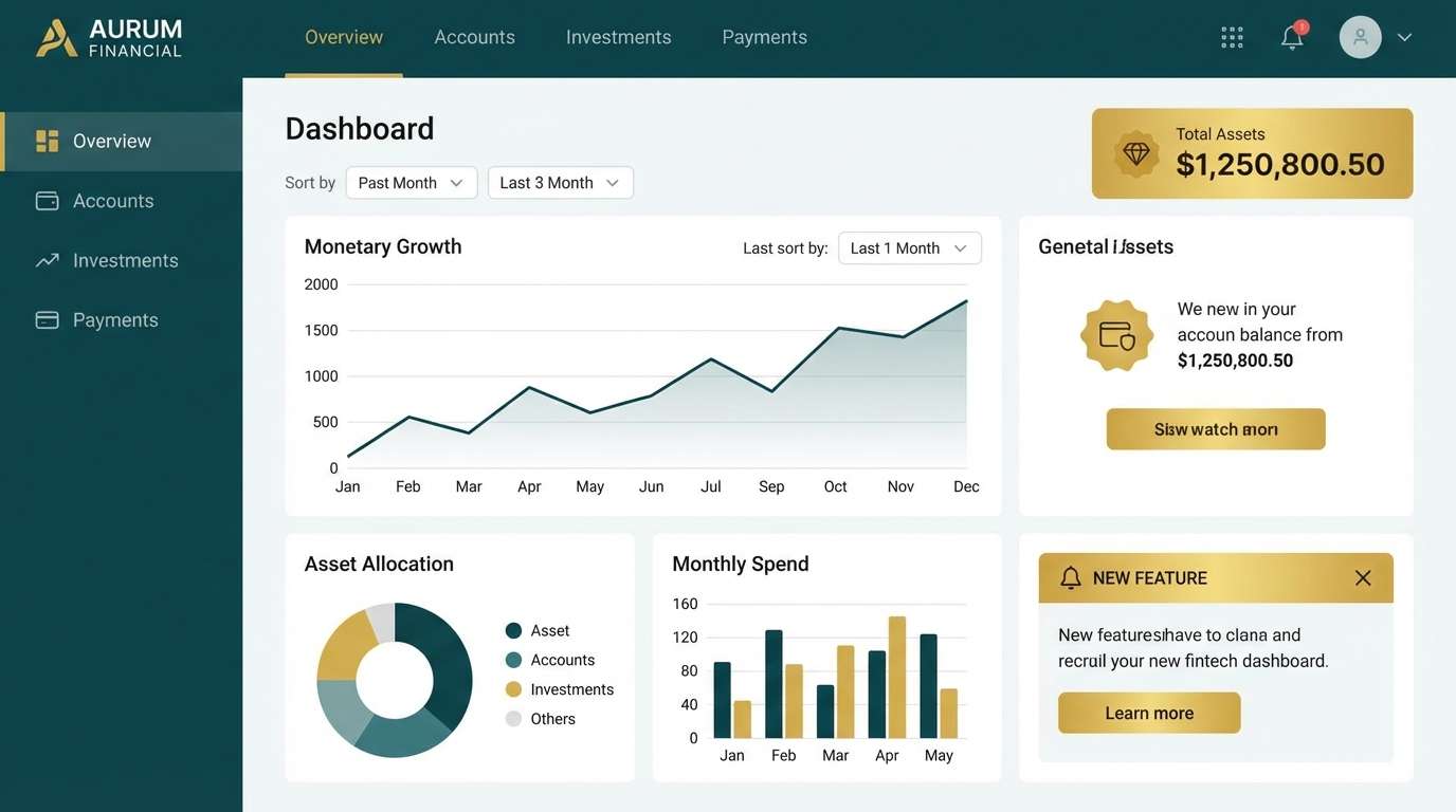
6) Imperial Nightfall
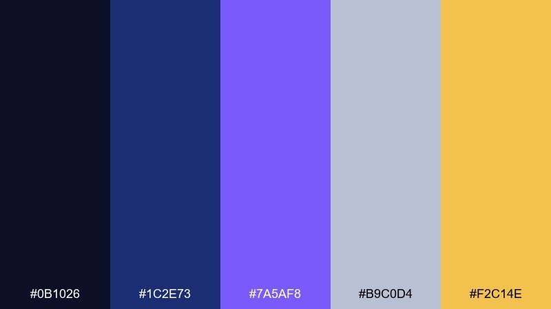
HEX: #0B1026 #1C2E73 #7A5AF8 #B9C0D4 #F2C14E
Mood: sleek and futuristic
Best for: fintech dashboards and dark-mode UI
Sleek and futuristic, it suggests city lights against a deep night sky. The electric violet gives the interface energy, while the muted gray-blue keeps it calm and professional. As a royal color scheme for dark mode, use navy for main surfaces, gray-blue for cards, and gold only for primary CTAs or status badges. Aim for accessible contrast by keeping body text on the lighter neutral and reserving violet for highlights and active states.
Image example of imperial nightfall generated using media.io
7) Gilded Orchid
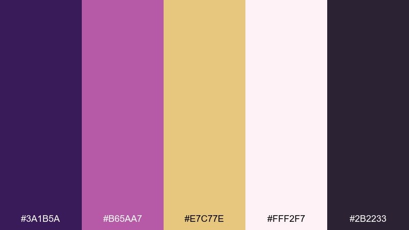
HEX: #3A1B5A #B65AA7 #E7C77E #FFF2F7 #2B2233
Mood: luxurious and romantic
Best for: cosmetics ads and beauty packaging
Luxurious and romantic, it feels like orchid petals with a sheen of gold dust. The pink-violet keeps the palette modern while the deep plum adds editorial drama. Use the blush tone to keep layouts airy, then bring in gold for small typography, seals, or cap colors. For a premium look, keep gradients subtle and let one solid dark block anchor the composition.
Image example of gilded orchid generated using media.io
8) Sapphire Procession
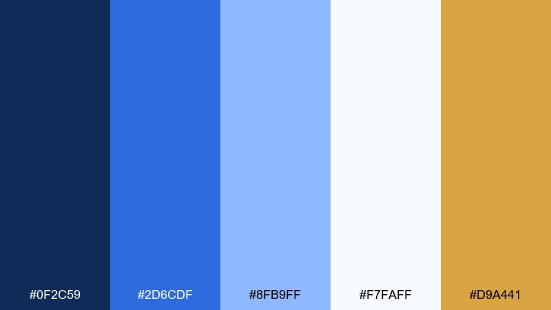
HEX: #0F2C59 #2D6CDF #8FB9FF #F7FAFF #D9A441
Mood: confident and crisp
Best for: SaaS onboarding and app UI
Confident and crisp, it reads like bright uniforms against a clear sky. The blues stack nicely for hierarchy, from primary navigation to subtle highlights. Use white for content space, then apply gold sparingly for success states or key milestones. A helpful tip is to keep charts in the medium and light blues so the gold can remain a true accent instead of a data color.
Image example of sapphire procession generated using media.io

9) Burgundy Mantle
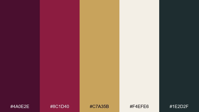
HEX: #4A0E2E #8C1D40 #C7A35B #F4EFE6 #1E2D2F
Mood: rich and intimate
Best for: fine dining menus and hospitality print
Rich and intimate, it evokes a candlelit dining room and a velvet cloak draped over a chair. Burgundy sets a sensual tone, while deep teal-black keeps the look refined. Use the cream as the paper base, then bring in gold-brown for rules, icons, and dish highlights. For readability, keep long menu descriptions in the darkest shade and use burgundy only for section titles.
Image example of burgundy mantle generated using media.io
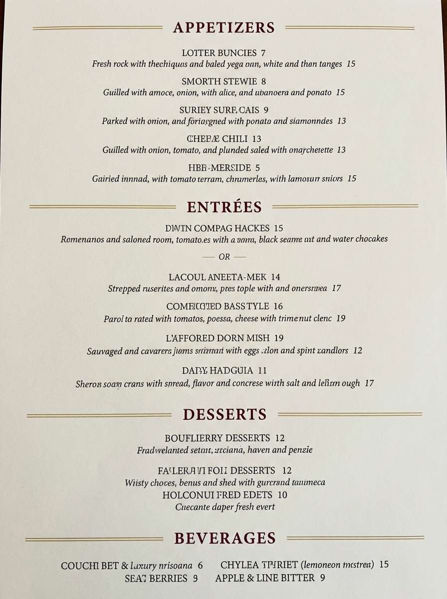
10) Palace Marble
HEX: #141B2D #2F3C7E #D7B46A #F6F4F0 #8B93A7
Mood: clean and elevated
Best for: brand identity systems and jewelry websites
Clean and elevated, it feels like cool marble under soft gallery lighting. The inky navy and periwinkle-blue create a poised contrast that stays modern. For a royal color palette that works online, keep backgrounds bright, use navy for navigation and headings, and let gold highlight micro-details like icons and hover states. One simple tip is to avoid large gold blocks and instead use thin strokes or small badges for a refined finish.
Image example of palace marble generated using media.io
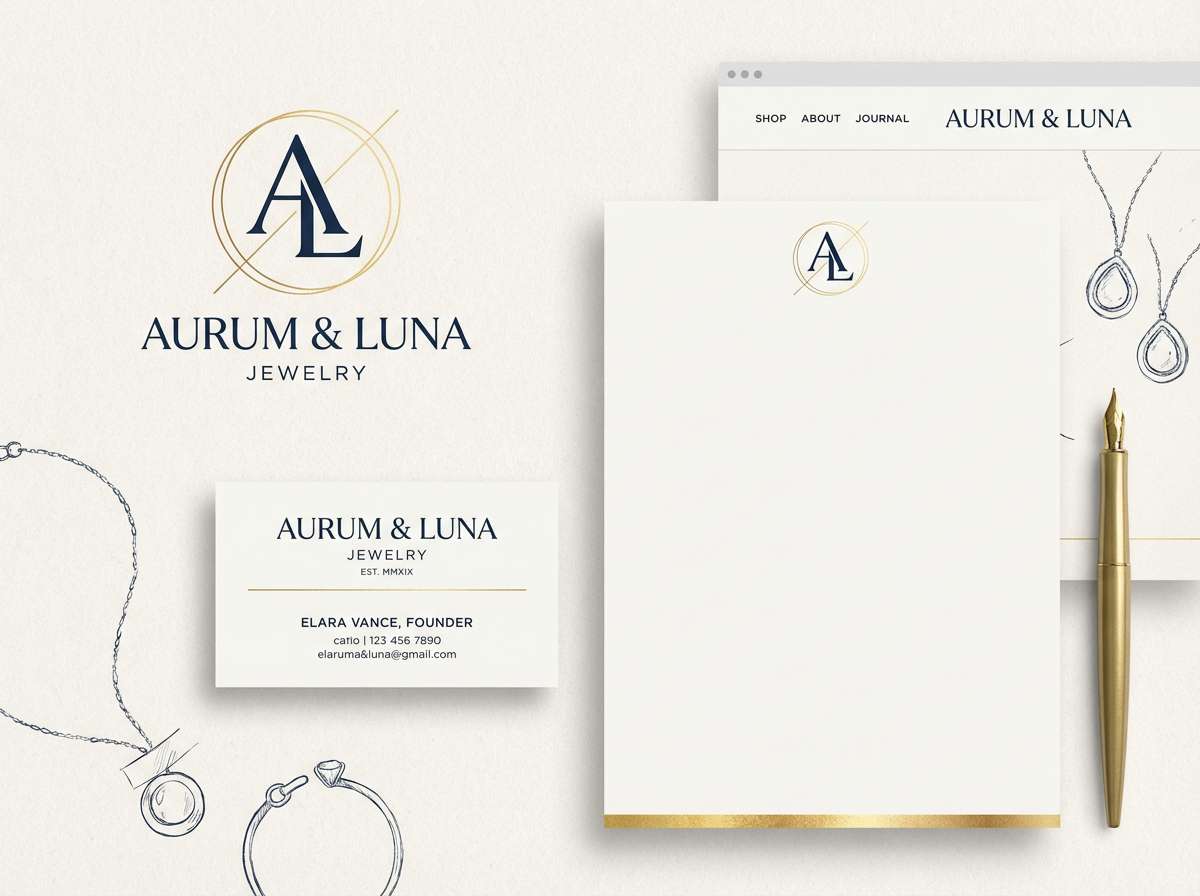
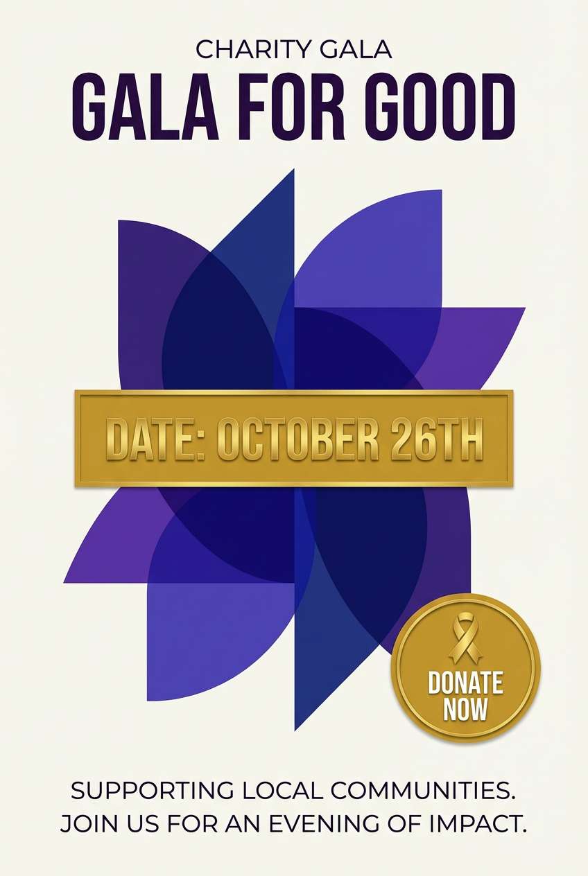
11) Sunlit Heraldry
HEX: #2B2D8E #5A3FC0 #F1C644 #FFF7D6 #2B2B2B
Mood: festive and bold
Best for: charity gala flyers and social graphics
Festive and bold, it brings to mind banners in sunlight and crisp brass instruments. The purple-blue duo offers strong contrast for headlines, while buttery yellow keeps the mood celebratory. Use the pale cream for background so the darker tones can carry the hierarchy, and reserve the gold for key calls to action. A practical move is to keep typography mostly in charcoal to avoid eye strain on bright yellows.
Image example of sunlit heraldry generated using media.io
12) Royal Harbor
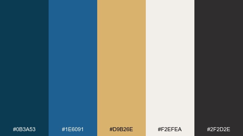
HEX: #0B3A53 #1E6091 #D9B26E #F2EFEA #2F2D2E
Mood: calm and nautical-luxe
Best for: travel brochures and resort branding
Calm and nautical-luxe, it feels like deep water beside sun-warmed stone. The layered blues are dependable for large areas, while the sandy gold adds a tasteful vacation glow. Use the light neutral as the base for readability, then add gold to maps, icons, and section labels. Keep photography consistent with cool tones so the blues look intentional rather than mismatched.
Image example of royal harbor generated using media.io
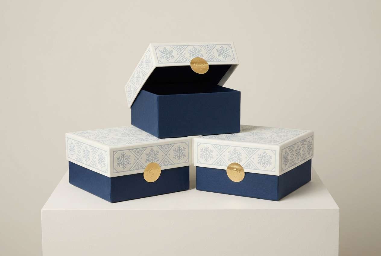
13) Winter Coronation
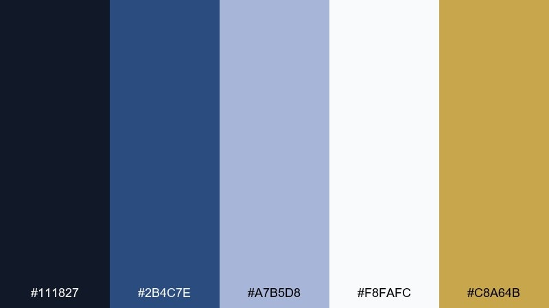
HEX: #111827 #2B4C7E #A7B5D8 #F8FAFC #C8A64B
Mood: icy and ceremonial
Best for: holiday gift packaging and seasonal promos
Icy and ceremonial, it suggests frost on stone and a warm glint of metalwork. The soft blue-gray keeps the palette airy while navy gives it structure. Use white as the dominant base, then let gold handle small seasonal touches like ribbons, stickers, or limited-edition marks. A smart tip is to keep gold in matte or brushed finishes so the look stays modern rather than flashy.
Image example of winter coronation generated using media.io
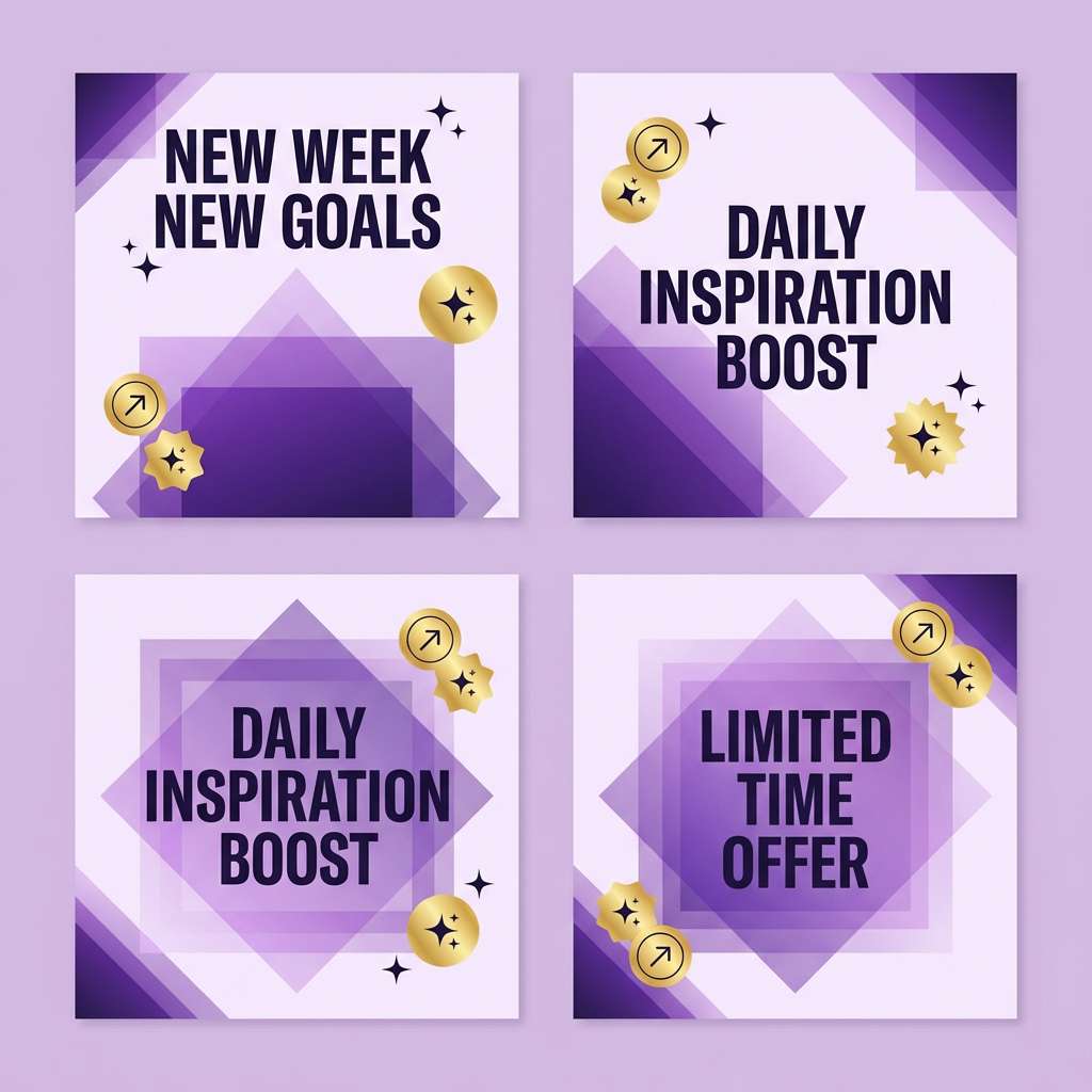
14) Amethyst Parade
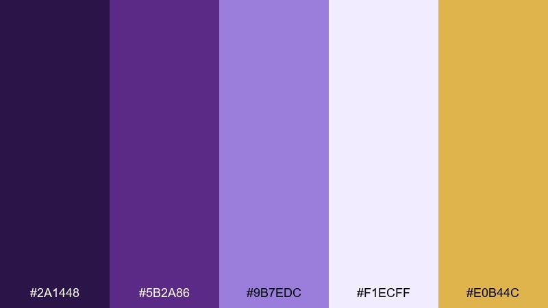
HEX: #2A1448 #5B2A86 #9B7EDC #F1ECFF #E0B44C
Mood: playful and regal
Best for: creative social templates and creator branding
Playful and regal, it feels like confetti drifting through purple spotlights. The amethyst range gives you built-in depth for gradients, buttons, and stickers. Use the pale lavender as a canvas, then highlight key UI chips with the gold accent. Keep shadows subtle and rely on the darker purple for contrast so text stays crisp in small formats.
Image example of amethyst parade generated using media.io
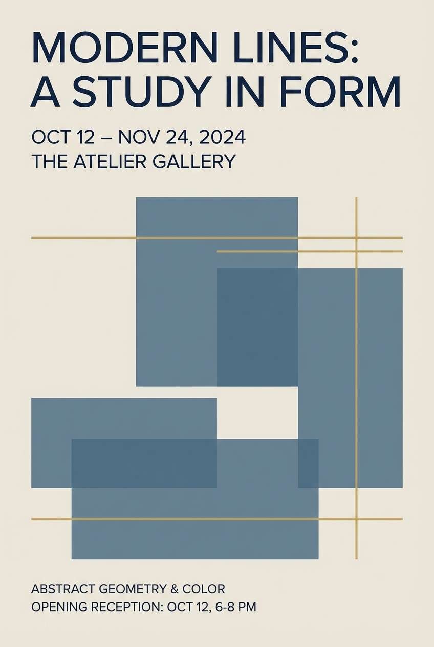
15) Crown and Canvas
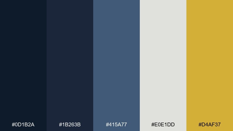
HEX: #0D1B2A #1B263B #415A77 #E0E1DD #D4AF37
Mood: gallery-classic and refined
Best for: art gallery posters and exhibition identities
Gallery-classic and refined, it evokes framed prints, slate walls, and a careful spotlight. The blue-grays behave like elegant neutrals, letting type and artwork breathe. These royal color combinations work best when you keep gold as a thin rule, logo mark, or ticket detail rather than a full background. Tip: use the light gray for negative space and keep body copy in the darkest navy for museum-level readability.
Image example of crown and canvas generated using media.io
16) Royal Garden Watercolor
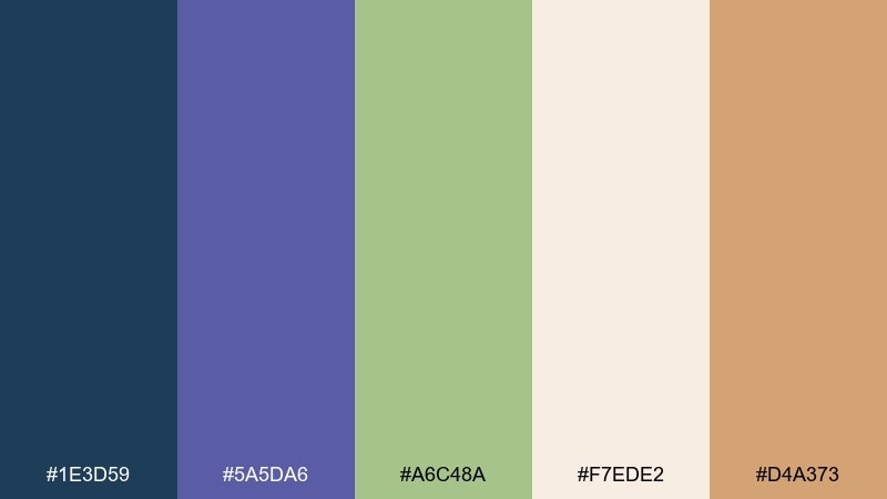
HEX: #1E3D59 #5A5DA6 #A6C48A #F7EDE2 #D4A373
Mood: fresh and storybook
Best for: botanical illustrations and spring invites
Fresh and storybook, it feels like painted petals with a hint of twilight blue. Soft green balances the purples so the palette stays airy, not heavy. Use the cream tone as your paper wash, then layer florals in lavender and sage with a warm tan for stems or borders. A good tip is to keep linework minimal and let watercolor edges provide the texture.
Image example of royal garden watercolor generated using media.io
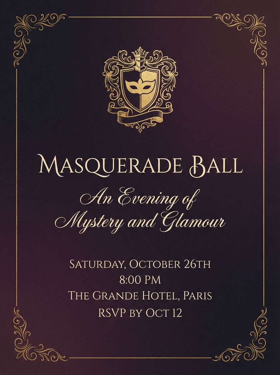
17) Midnight Masquerade
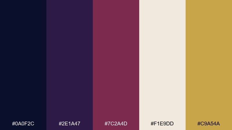
HEX: #0A0F2C #2E1A47 #7C2A4D #F1E9DD #C9A54A
Mood: mysterious and cinematic
Best for: masquerade invitations and nightlife promos
Mysterious and cinematic, it suggests masks, chandeliers, and a hush before the music starts. The plum and burgundy add drama, while the warm neutral keeps the layout legible. Use gold for the event name or a single emblem, and keep the background mostly midnight blue for atmosphere. Tip: choose one ornate element, like a border or crest, and keep everything else minimal to avoid clutter.
Image example of midnight masquerade generated using media.io
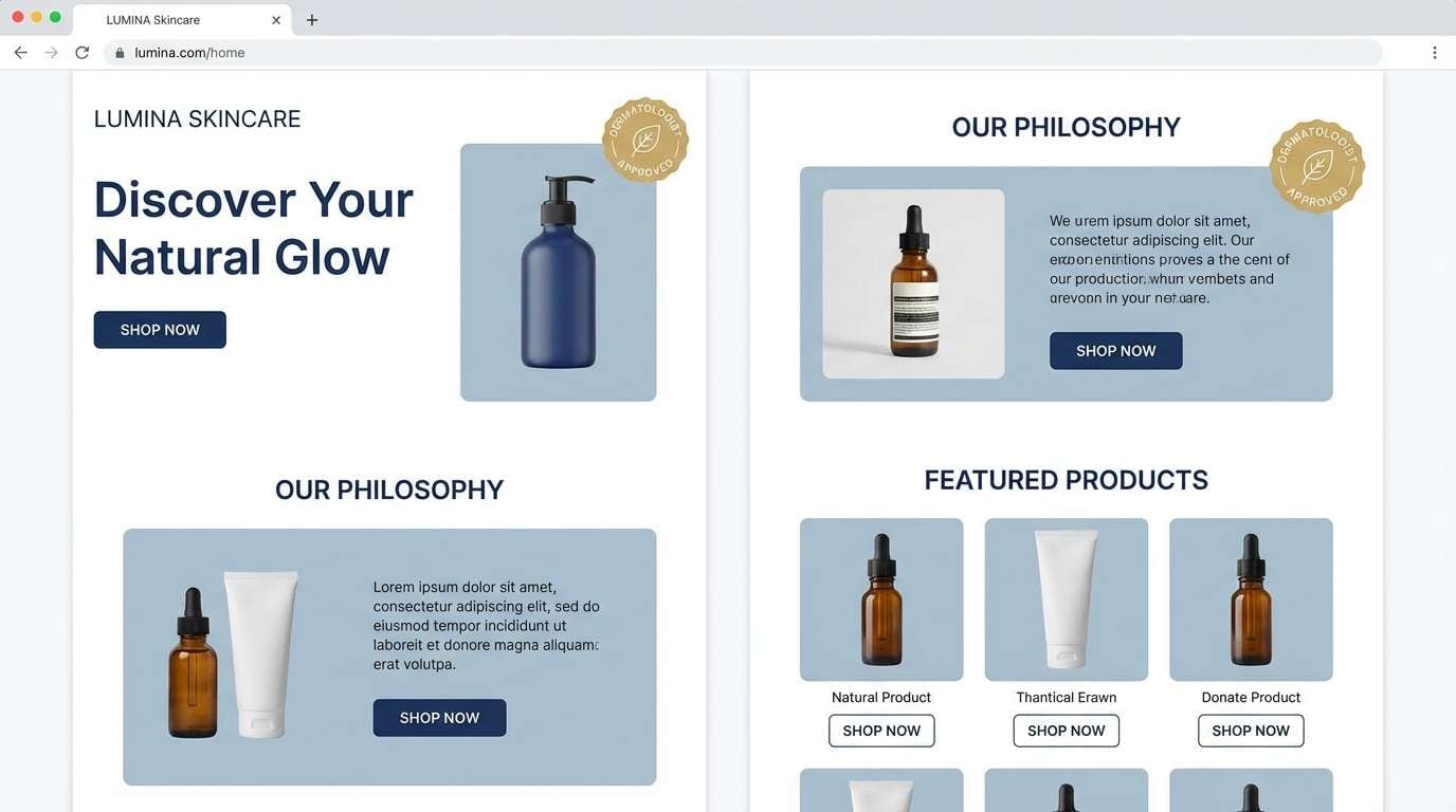
18) Porcelain Tiara
HEX: #1A2A44 #3E5C76 #D8E2DC #F8F5F2 #C9A227
Mood: minimal and aristocratic
Best for: wellness branding and skincare landing pages
Minimal and aristocratic, it feels like porcelain, cool air, and a small gold clasp. The blue-grays are gentle enough for wellness while still reading premium. Use the near-white as the main field, then apply the darker navy for headings and navigation to keep structure. A small touch of gold for badges or trust marks is all you need to signal quality without breaking the calm.
Image example of porcelain tiara generated using media.io
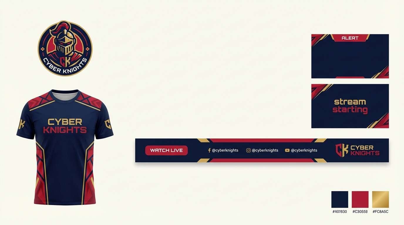
19) Dragon Crest
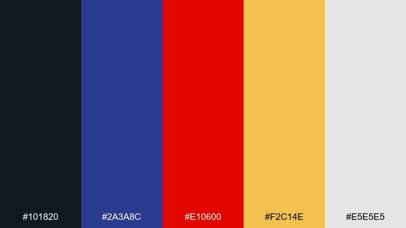
HEX: #101820 #2A3A8C #E10600 #F2C14E #E5E5E5
Mood: bold and competitive
Best for: esports branding and team graphics
Bold and competitive, it feels like a crest on a banner under arena lights. The blue anchors the identity, while the red delivers instant energy and focus. Use gray as the background for flexibility across streams and overlays, then let gold highlight wins, ranks, or key stats. Tip: keep red to short bursts like callouts and badges so it stays powerful instead of overwhelming.
Image example of dragon crest generated using media.io
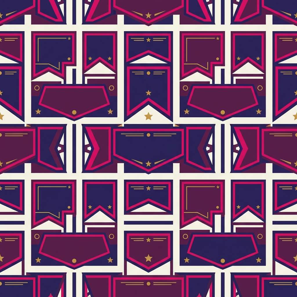
20) Silk Banner
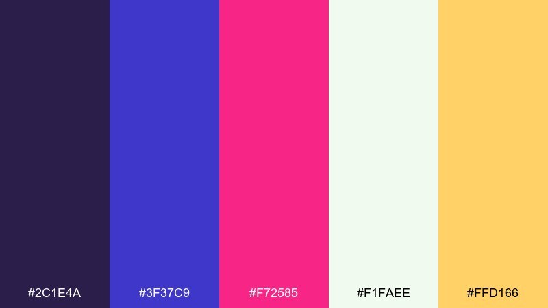
HEX: #2C1E4A #3F37C9 #F72585 #F1FAEE #FFD166
Mood: vibrant and modern-regal
Best for: pattern design and digital backgrounds
Vibrant and modern-regal, it looks like dyed silk catching light in motion. The saturated indigo and magenta make patterns pop without losing sophistication. Use the off-white as negative space so the bright tones can breathe, and add gold for tiny motifs or repeat anchors. Tip: in dense patterns, drop one of the brights and rely on tints to avoid visual noise.
Image example of silk banner generated using media.io
21) Antique Crownroom
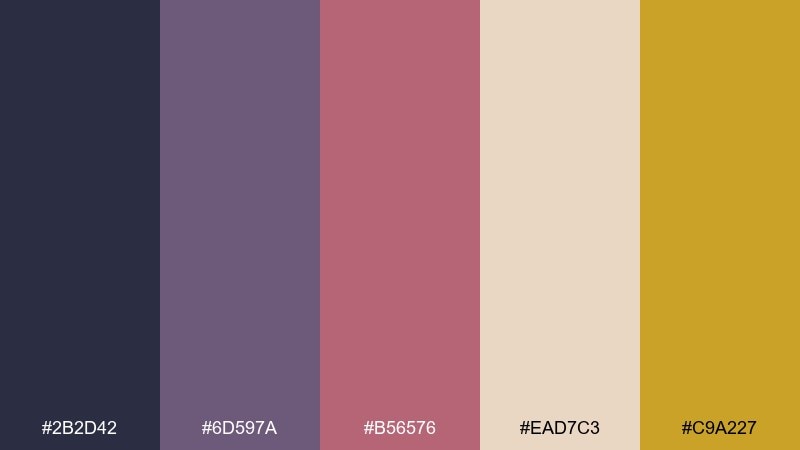
HEX: #2B2D42 #6D597A #B56576 #EAD7C3 #C9A227
Mood: nostalgic and elegant
Best for: book covers and vintage-inspired branding
Nostalgic and elegant, it evokes an old salon, faded velvet, and warm paper edges. The mauve and rose tones soften the darker base, making it ideal for literary or heritage projects. Use the parchment neutral as the main field, and keep gold for small flourishes like rules, stars, or a spine badge. A helpful tip is to add subtle grain or letterpress texture so the colors feel authentically vintage.
Image example of antique crownroom generated using media.io
What Colors Go Well with Royal?
Royal blues and purples pair best with warm metals and soft neutrals. Gold, champagne, ivory, and parchment keep the look luxe while improving readability and balance.
For a modern edge, add cool supports like slate, blue-gray, and misty lavender. These tones preserve the “regal” feeling without making the palette too heavy or traditional.
If you need energy, use small doses of high-impact accents—crimson, magenta, or electric violet—then let a dark navy or plum stay in charge as the anchor color.
How to Use a Royal Color Palette in Real Designs
Start with one deep base (navy/plum) and one light base (ivory/near-white). This gives you instant contrast for layout structure: headers, footers, panels, and content areas.
Use gold as a “signal” color, not a fill color—think icons, borders, badges, and primary CTAs. Keeping it scarce makes it look more premium and prevents designs from turning brassy.
In UI, reserve the brightest hue (violet, cobalt, or red) for active states and key highlights. In print, consider texture (foil, emboss, matte paper) to make royal color combinations feel tangible and upscale.
Create Royal Palette Visuals with AI
If you already have HEX codes, you can turn them into consistent visual concepts fast: packaging mockups, posters, landing pages, and branded social templates that stay on-palette.
To keep results cohesive, mention the palette’s key colors in your prompt (e.g., “deep navy, amethyst purple, subtle gold accents”) and specify the style (studio shot, flat UI, editorial layout).
Generate a few variations, then keep one element constant—lighting, background, or composition—so your royal color scheme looks like a real system rather than random outputs.
Royal Color Palette FAQs
-
What is a royal color palette?
A royal color palette typically features deep blues and purples (like navy, sapphire, plum, or amethyst) paired with refined neutrals (ivory, cream, gray) and a metallic accent—most often gold—to create an elevated, ceremonial feel. -
What HEX code is “royal blue”?
There isn’t one universal royal blue HEX code, but common “royal blue” picks include #4169E1 and deeper, more premium variations like #1B2A6B or #0F2C59 depending on the look you want. -
Does purple and gold always look royal?
Purple and gold is a classic regal pairing, but it looks most premium when gold is used sparingly (small accents) and purple is balanced with a light neutral like ivory or blush to avoid a costume-like result. -
What colors go with navy and gold?
Navy and gold pair well with off-white/ivory for clean contrast, blue-gray for modern minimalism, and muted browns or parchment tones for a heritage, editorial vibe. -
How do I use a royal color scheme in a dark-mode UI?
Use navy/midnight as the main surface, a muted gray-blue for cards, and keep gold for primary CTAs or badges. Reserve bright violet/blue for active states and ensure text contrast meets accessibility guidelines. -
How much gold should I use in a luxury branding palette?
Think “highlight,” not “background.” Use gold for logos, thin rules, icons, and seals—usually a small percentage of the layout—so it reads as premium rather than overpowering. -
Can royal palettes work for modern minimalist brands?
Yes—choose cooler neutrals (white, blue-gray), keep typography clean, and restrict metallic accents to micro-details. Palettes like Porcelain Tiara or Palace Marble are designed for a modern, minimal royal feel.
Next: Retro Color Palette


